


Google Data Studio helps you get more out of your analytics.
Once you know you’ve got a proper setup and you’ve audited your data so that it’s trustworthy, you need to mobilize your data. You need it to be usable and accessible for stakeholders. How you share your data stories can make all the difference in getting things done.
While there are many ways to draw up reports in Google Analytics, Google Data Studio is my favorite and (in my opinion) the easiest. It shouldn’t take you longer than a few hours noodling in the interface to produce a good looking and interactive report.
Get brand new analytics strategies straight to your inbox every week. 23,739 people already are!
Why Use Google Data Studio Anyway?
Data Studio is essentially Google’s free version of Tableau.
Google’s Data Studio is a new breed of technology. Most people are used to pulling data to an external tool like Microsoft Excel--but with Data Studio, we can simply create a dashboard online and interact and collaborate in the same way that we can using other Google cloud services like Google Sheets.
This makes it super easy to iterate upon as the data updates in realtime in your Data Studio dashboard, and it’s really easy to share these dashboards with any stakeholders. The tool is also easy to use and super intuitive (in my opinion).
One of the biggest benefits of using Data Studio is that it can access and combine many different data sources with ease. You can pull Analytics, AdWords, YouTube, Google Sheets, MySQL, etc., and many data sources have native integrations so you really don’t have to work hard to set up a pipeline.
And of course, the tool is free as well, which is a plus.
Google Data Studio Basics: Getting Your Feet Wet
Okay, let’s dive into the platform and get started. When you get signed up, you should be greeted by an interface that looks like this…
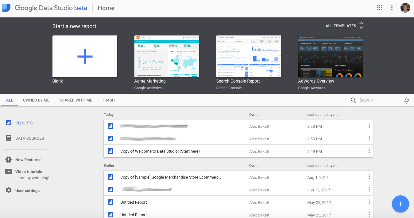
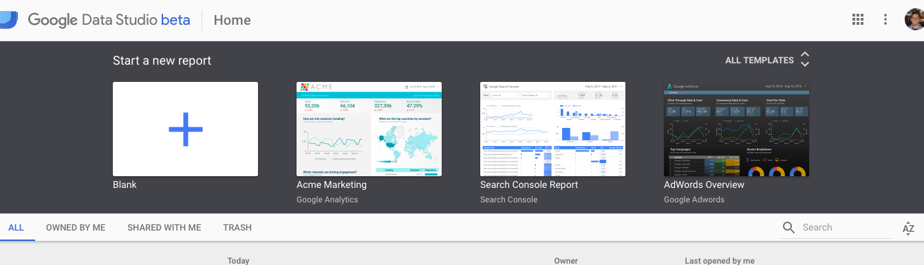
On the top bar, you’re given the option to create a new report with a premade template or by scratch. When starting out, I recommend using a template (if only to become inspired and see the possibilities). Later on, when you’ve had some experience with the platform, building reports from scratch is quite easy and useful, though.
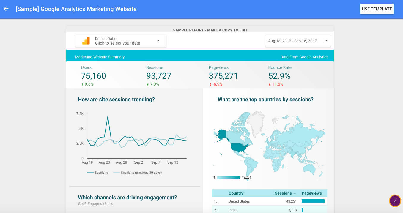
But first, let’s dive into one of the premade reports quickly. This one is “Acme Marketing,” which as you can see below the title, is a report made for Google Analytics data. Once you click on it, you’ll see a preview screen and you can press “Use Template” in the top right corner to get started with your own data.
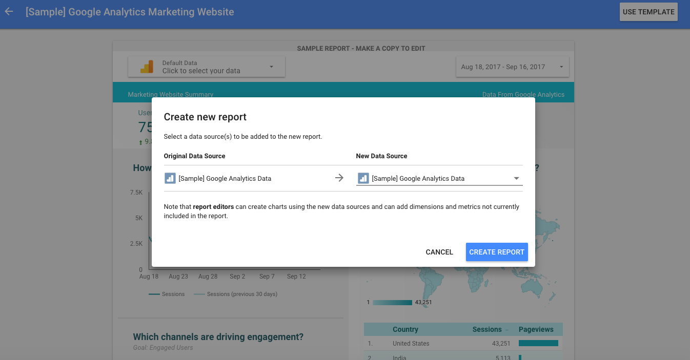
After you click Use Template, you’ll be asked to select a data source. We’ll talk more about data sources later--but for now, you can just choose sample Google Analytics data to play around with.
From there, feel free to mess around with the report. Add things, change things, delete things, press buttons.
The good thing is that it’s risk-free.
Where you could likely mess up a Google Analytics setup (given the right permissions), it’s really hard to do damage to a Data Studio report, especially given the fact you’re using sample data. The best way to learn this tool isn’t necessarily by reading articles or watching tutorials, it’s simply by messing around and noodling with the tool. If you can get your hands on some sample data, you can easily learn to build cool bar charts and time series visualizations.
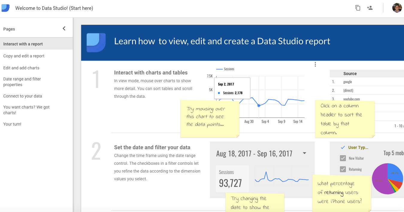
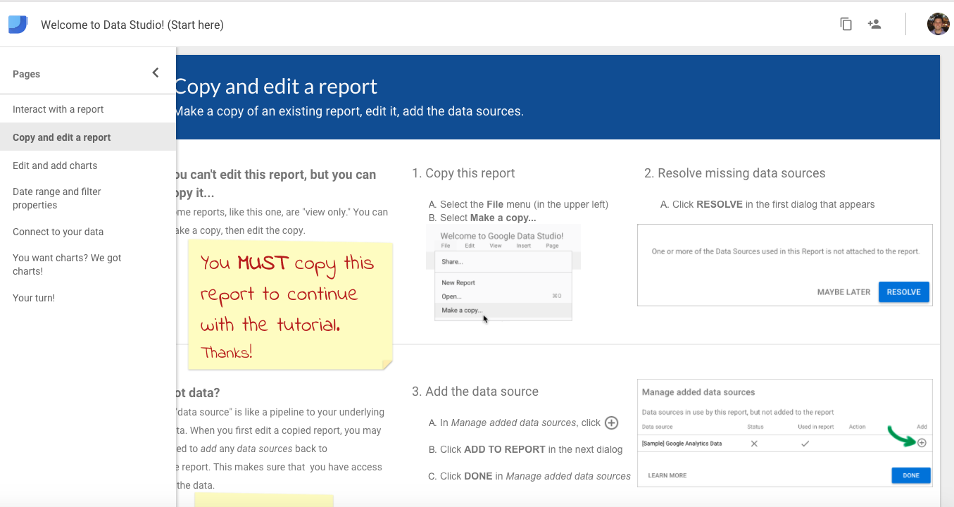
Something else to look into is Data Studio’s built-in onboarding modules. You should be able to access a report called “Welcome to Data Studio (Start Here).” Give that a try and you’ll get a nice report with annotations to see what is possible with the tool.
That’s just the first section (interact with a report), but it also includes a full interactive tutorial to help you learn how to troubleshoot problems, add data sources, and create charts. Just check out the “Copy and Edit a Report” section to get started there.
Google also offers a series of training videos that may be helpful (however, it’s my opinion that they’re quite boring).
Finally, CXL Institute offers a Data Studio training class that is quite good. However, I still believe the best way to learn is just to do. So. let’s get started with data sources.
Connecting Data Sources in Google Data Studio
For every report you set up, you need to connect a data source.
A "data source" in Google Data Studio is like a pipeline that feeds data into your Data Studio report/dashboard. It’s what feeds the raw numbers into the platform so that you can actually make pretty charts and graphs.
Luckily, Data Studio has a ton of super easy integrations, so you won’t have to struggle very hard to get set up.
On the welcome screen, click on Data Sources on the left hand side of the screen, which should bring you to a screen with existing connectors (if you’ve added any in the past). Once you’re there, look to the lower right hand side of the screen for the big blue + button, and click that. From there, you can add new connectors. It should look like this…
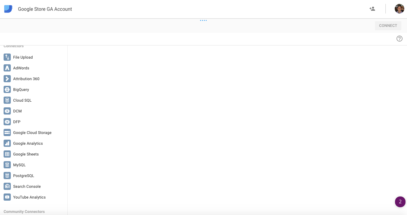
As you can see, there are many options to get set up. Some of the pre-built connectors include…
- File upload (e.g. from Excel)
- AdWords
- Attribution 360
- BigQuery
- MySQL
- Google Sheets
- Google Analytics
- YouTube Analytics
- Search Console
...and many more. In this light, you can see that Data Studio is more than just an external Google Analytics dashboard.
You can connect and blend different data sources to get really interesting data stories.
Inspiring Report Examples
By the way, if you want to see some super inspiring examples of Google Data Studio reports, just flip through this gallery of example reports.
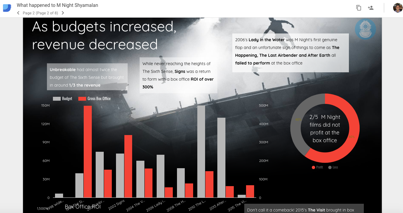
One of my favorite uses of Data Studio is a report called “What Happened to M Night Shyamalan.” It’s a far cry from your expected Google Analytics traffic and conversions report, and it shows you how you can build cool stuff with some creativity.
As I mentioned, you have a lot of flexibility when connecting data sources. Just think about the “upload a file” option, which lets you add data you’ve ever worked within Excel.
Excel to Google Sheets
I want to mention one pro tip regarding Excel docs, though: if you plan on connecting an Excel file, consider moving it to Google Sheets. It updates in real time with the Data Studio integration, so there’s a lot less work and complexity, especially if you’re dealing with rapidly changing data.
Add Google Analytics as a data source
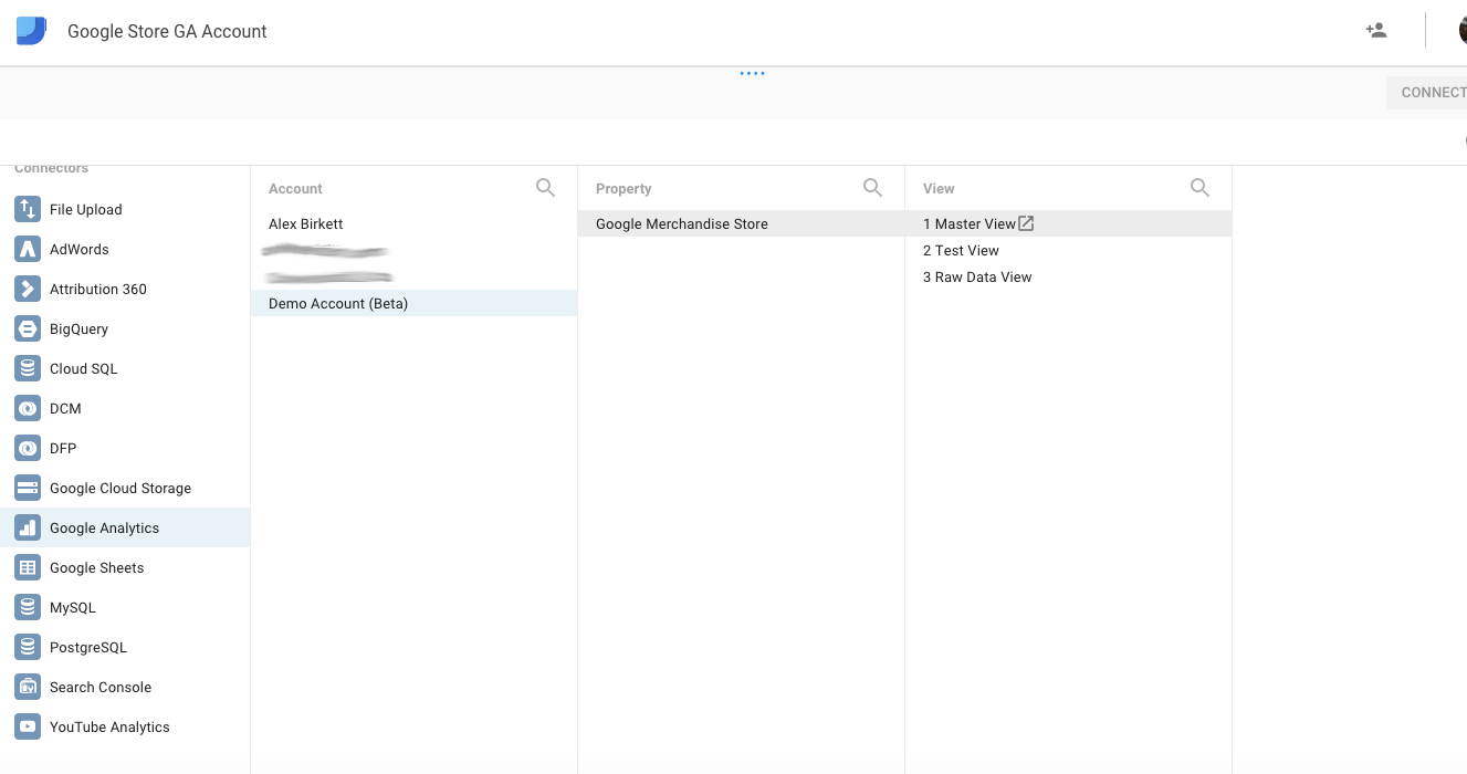
Okay, continuing on, let’s add Google Analytics as a data source. If you weren’t aware, you can get access to Google’s demo account, which is a live Google Analytics account for their merchandise store. Click Google Analytics on the left hand side, and follow the account hierarchy out to pick the right data view you’d like to connect.
This, then, will bring you to a somewhat bewildering page where you can edit your connection to with a dizzying degree of options.
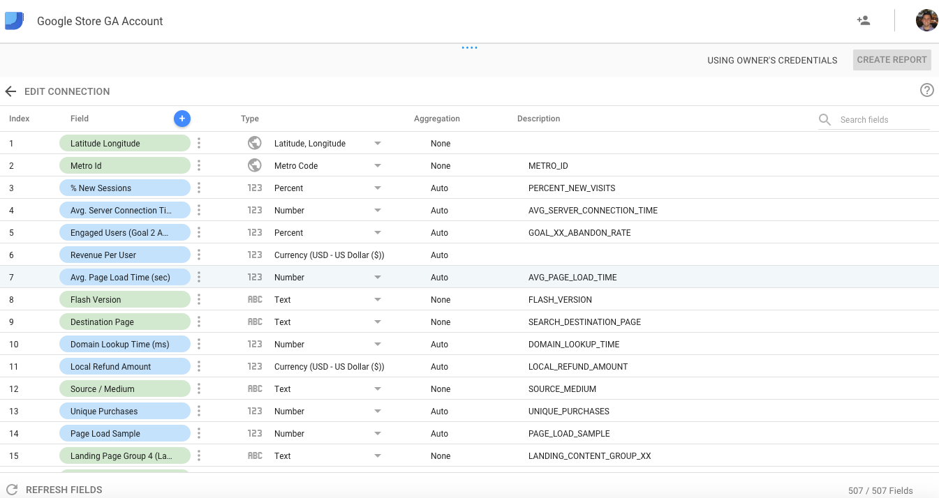
You have field, type, and aggregation, and these basically tell Data Studio what kind of data they’ll be working with. When you’re any other Google tool, like Google Analytics or AdWords, it’s generally pretty straightforward and accurate. However, if you’re connecting a file or Google Sheets or something with more customizability, you’ll definitely want to double check to see if all the data types are accurate.
Since we’re just connecting Google Analytics now, let’s move on and keep the connection settings as is.
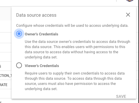
Last point with connections...you’ll need to choose a way to access this data.
You can choose either Owner’s or Viewer’s credential. Of course, Viewer’s has much less accessibility and visibility, so it’s ideal if you can get Owner’s credentials.
There’s a lot more nuance within data connectors, as this is really the most important part. Get the data integration right, and making the charts is simple (though not easy - design and visualization is very difficult to get right).
However, it would take a book to go through each integration, from BigQuery to Excel file uploads to Google Sheets, so we can move on from the boring stuff to actually creating charts and doing some data visualization.
Google Data Studio Charts and Visualization Tools
The first thing to know about data studio is that there are endless ways to design and sculpt your reports. That’s why I recommend, if you’re new, to start with a template.
As mentioned previously, we can use a report like the “Acme Marketing” one from the top banner along with some sample Google Analytics data to play around and learn about some chart options. For instance, you can see from the screenshot below that you get a good use case for a time series chart, a geo map, a bar chart, and several “score cards.”

After some exploration, though, you’ll probably want to create your own bespoke report. Don’t worry, the interface is very easy. The top horizontal bar under the menu contains icons of select charts you can add, and you can also access these options from the “Insert” menu:
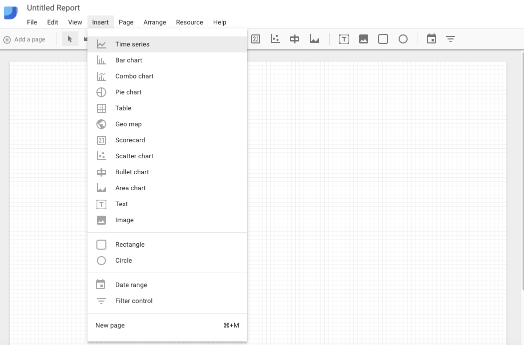
The basic types of charts you’ll have access to are:
- Time series
- Bar chart
- Combo chart
- Pie chart
- Table
- Geo map
- Scorecard
- Scatter chart
- Bullet chart
- Area chart
Plus, you can add design elements like text, images, and shapes.
Finally, you’re able to add data ranges and filter controls that viewers with whom you share the report can use to interact with the report (e.g. they could see what sales and traffic data was for the month of May or April and with X filter on the data).
There are so many permutations of a Data Studio report that I won’t dive too deeply into setting them up. But to show you a quick one, I’ll choose a time series and visualize Sessions by User Type.
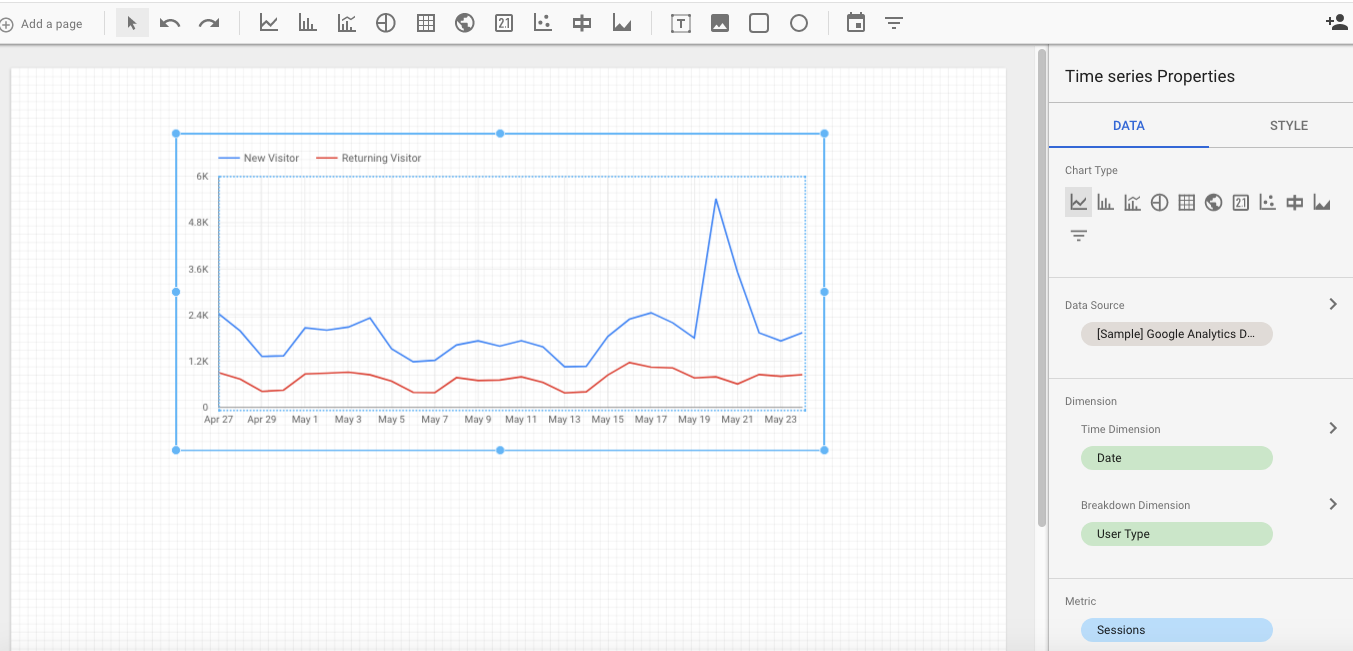
Basically, you choose all your inputs within the form on the right hand side. You can filter your data, add segments, choose the data range - anything. You can also add styling to the cart. Your options are (almost) endless.
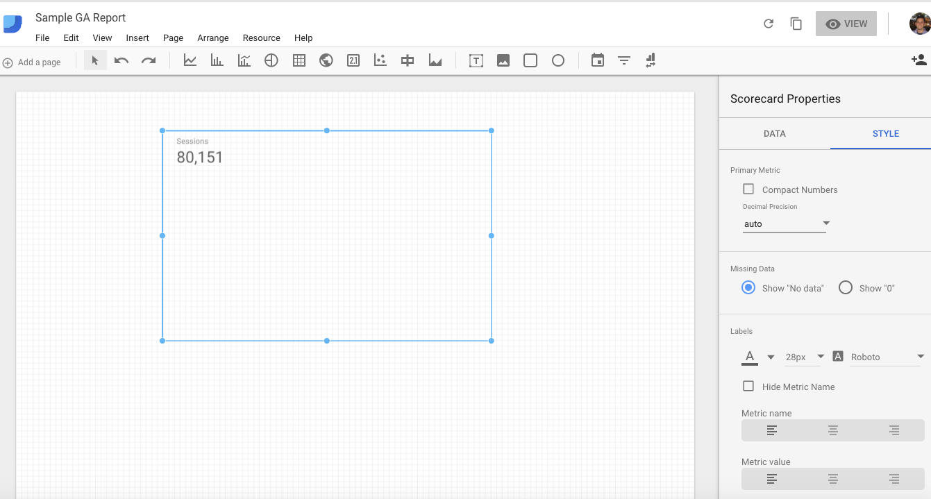
Another common element you’ll likely use with Data Studio is a score card. This is simply a summary of a single metric. They’re most commonly used to visualize key performance indicators and important high level metrics such as sales, traffic, or daily active users.
Again, the options are endless. With that in mind, when you’re first learning the tool, might I suggest a “stream of conscious” free hand approach? Just play around. See what kind of charts you can make and what dimensions and metrics you can use as inputs.
Just play around and see what’s possible with charts and visualization.
Of course, when you’re actually building reports for your company or clients, you should approach it more strategically. What business questions do you want to answer, what metrics and charts will help you make decisions, what information do your stakeholders care about, etc. But when you’re first learning, just get a feel for what’s possible.
Data Visualization Best Practices in Google Data Studio
First off, I want to add a disclaimer: I’m not a designer. I’m not going to blow you away with any elaborate design tips here, and you should probably work with a talented designer if you really want to perfect your analytics reports.
That said, there are some best practices and tips that can help you when you’re getting started with Google Data Studio.
Style
You’ll notice that, when you’re building your report and you add a chart, there is a tab that says Style.
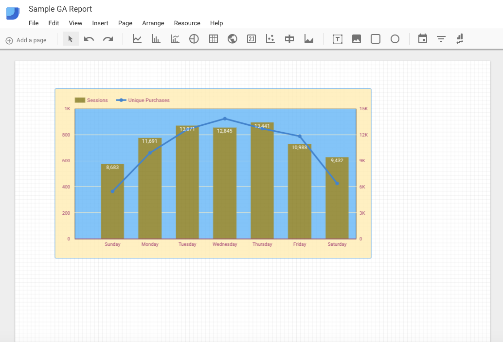
This allows you to customize the appearance of elements in your report. The following chart design example should not be taken as a “good” example; I just picked some random colors and whatnot to show you that it’s possible to customize everything from the background color of the chart to which side the axis is on and whether you use a line or bars to visualize the data…
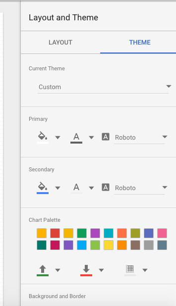
Theme
This brings me to my first best practice: you should usually just modify Theme settings instead of individual styling options.
If you’re actually a designer, I’d imagine this advice would seem a bit green--but if you’re a beginner, stick with the thematic design. You can find the Theme design menu if you just click on a blank space on your report. It will be on the right hand side.
Other than that, there are some common data visualization best practices that also apply to Data Studio, such as:
- Use the grid lines to make sure elements are inline and spaced evenly
- Know and design for your audience
- Communication and clarity over cleverness and beauty
- Provide labels and explanations where necessary
- Simplify! Make things as easy to skim and understand as possible
- Don’t lie or mislead with visualization tactics
- Don’t use dual axis charts (such as the one I did above in the example)
- Pay attention to detail (do your pie charts add up to 100%)
Again, I’m not a design or a data visualization expert. I just go by a handy heuristic: your data visualization shouldn’t make people think, “WTF?”
Beyond basics
Beyond the basics, here are some sources for further reading on data visualization tips and best practices:
Wrap Up on Google Data Studio
Google Data Studio is a useful, straightforward, powerful, and fun tool you can use to analyze, share, and interact with data.
It’s a new tool (still in beta, actually), so I’m sure much of the interface will change over the years, and they’ll only continue to improve its UX and capabilities.
In addition, this article is simply a primer. It’s enough to get you started, but there are a variety of advanced-level workarounds and tactics you can use within the tool (for instance, this article shows you how to build funnels in Data Studio). That’s all to say, there’s a world to explore with data visualization and storytelling here. Hopefully, this guide helps you get started, but now it’s on you to explore and innovate and build some beautiful dashboards.