Facebook ad examples are only valuable if they have real data behind them.
Luckily for you, our Facebook ad agency has that data for you + a lot more in this article.
Now, there are over 8 million businesses running ads on Facebook right now.
99% of those ads are very average.
Then there’s the 1%—the most creative, out-of-the-box, successful ads that convert like nobody’s business and have competitors absolutely scrambling.
Where are those ads?
Right here.
They’re not the same old copy-and-pasted shit you’re seeing in all the other example articles.
We’ve compiled, the best, most inspiring, obsessively updated list of Facebook ad examples of all different types, from all different industries, with a range of objectives; from large, expensive productions to ads shot with a phone.
I guarantee you will get at least 25 new and improved ideas for your own Facebook Ads by the end of this post—no matter your brand, industry, goal, or budget.
👇 Go straight for the type of inspo you’re looking for: 👇
Facebook ad examples with proven results
Facebook ad examples by ad format / creative type
⟶ The best Facebook image ad examples
⟶ The best Facebook video ad examples
⟶ The best Facebook carousel ad examples
⟶ The best Facebook ad copy examples
Facebook ad examples by content focus
⟶ The best product-focused Facebook ad examples
⟶ The best B2B and service-focused Facebook ad examples
⟶ The best testimonial Facebook ad examples
⟶ The best promotional offer Facebook ad examples
Facebook ad examples by campaign objective
⟶ The best Facebook brand awareness ad examples
⟶ The best Facebook consideration and lead generation ad examples
⟶ The best Facebook conversion ad examples
Get brand new Facebook ad strategies straight to your inbox every week. 23,739 people already are!
An ad may look great, but who cares how good it looks if it didn’t convert? For that reason, we wanted to start off with great Facebook ads that our team has actually run so we can talk about real results.
The following ads are all ones we’re proud to say brought our clients success.
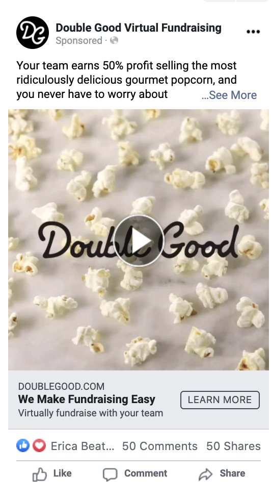
You know an ad campaign is good when the brand literally ends up selling out of the product. Whoops. A 62% increase in conversions and 39% decrease in CPA tends to have that effect.
We hit those positive results by using customized ad sets to make all imagery and copy hyper-relevant to a specific target audience. Want to know what our other secret was? The Facebook Power 5. Read the full case study here.
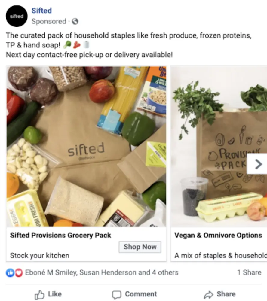
When Covid-19 hit, Sifted needed to get the word out. Their grocery delivery service could be a huge help to so many people during such a tough time.
By focusing ad copy and visuals on the variety of items they stock and their next day contact-free pickup or delivery we saw a 5,100% increase in conversions and a 4,232% increase in revenue.
It helped to have a service that was in demand, but through fine tuning of the ad targeting and creative we saw the conversion rate increase by 972% and the ROAS increase by 8,000%.
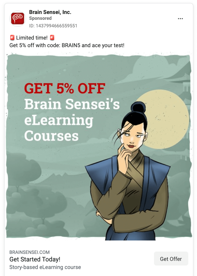
Brain Sensei has positive numbers all around with this campaign of ads. They saw a 382% increase in ROAS, a 31% increase in conversions, and a 31% increase in revenue.
KlientBoost helped test variations to find what worked best including copy. We made the limited-time offer stand out with emojis and added the offer into the actual creative.
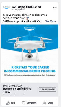
DARTdrones took their business to the next level. As a result of these Facebook ads we increased conversions by 223% and decreased the CPA by 65%.
It was all about working smarter, not harder. The optimization grew the conversion rate by 135% and captured more clicks than ever before with a 400% increase in traffic. Read the full case study here.
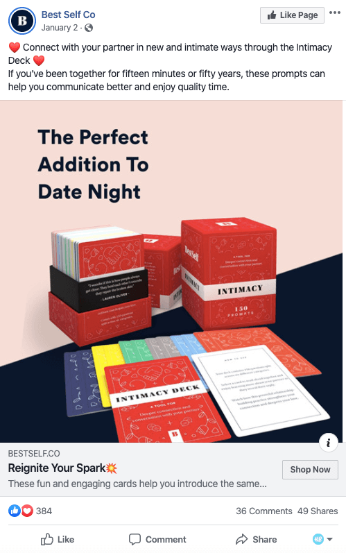
Sometimes the time of year really matters when it comes to your promotions, and the ad surrounding this intimacy deck shows that.
During the month of January, directly ahead of Valentine’s Day in mid-February, this ad saw an 11% increase in return on ad spend (ROAS).
What’s different? Our messaging about using it for “date night” was much more effective than other ads that were only highlighting the “reignite spark” messaging. A lot of longtime couples forget to take time for themselves, so this calls out an easy, fun way to get that done.
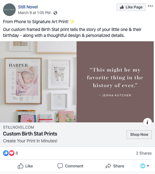
This Still Novel ad saw a 47% drop in cost per action (CPA) and a 52% increase in ROAS.
This ad’s testimonial combined with the copy talking about how fast and easy the service is gets people excited to buy.
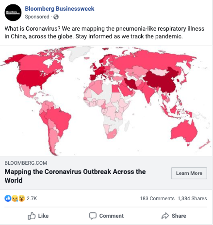
Scary map, I know. But why did this work so well? Well, it’s foolish to assume that recent events don’t affect recent campaigns. And the truth is that COVID-19 is playing a big role in advertising during these stressful times.
The results: an 8% decrease in CPA – and that’s coming from an already very healthy campaign
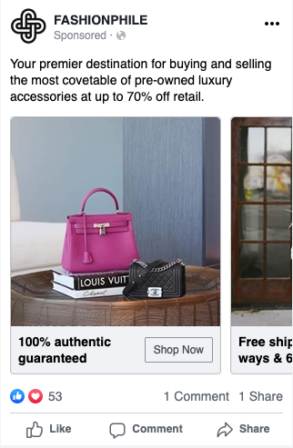
The results? 27% decrease in CPA and 76% increase in ROAS.
This ad hits all the value props that their ideal customer is looking for: 100% guarantee of authenticity, heavily discounted retail price, and a lovely display of the product to show both quality, color, and size.
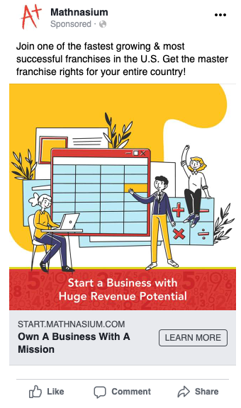
A good reason to learn from this bad boy: 37% decrease in CPA!
What do we like about this ad? It hits all potential entrepreneur questions: business with a mission, huge revenue potential, fastest growing and successful franchise in the U.S., and also getting exclusive rights for your country.
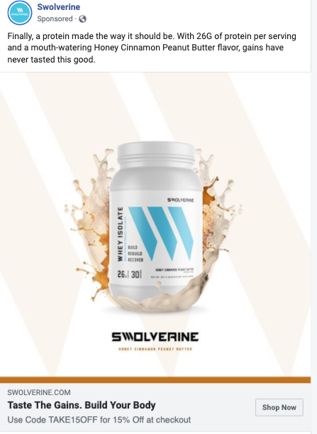
136% increase in ROAS. I don’t even need to emphasize how impressive that is, do I?
What’s one of the biggest negatives with protein powders? It tastes bad. And this ad goes against that and talks about how great the new flavor tastes – calling out and immediately solving one of the product’s primary pain points.
And it’s all brought together with that fantastic headline: “Taste The Gains.”
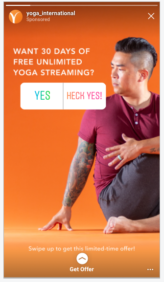
This Yoga International ad saw a 29% decrease in CPA.
What works? Polling ads! This is a newer ad type, but it feels organic and gives the user the opportunity to engage with the ad in a fun way. This ad also gets a huge value proposition of a long free trial along with the sense of urgency from the “limited-time offer.”
Videos on Facebook generate up to 8 billion views each day, including video ad creative. This is why Facebook video ads can be so powerful for grabbing your audience’s attention and getting them to take the action you’re looking for.
These video ads range from basic slideshows to full productions, and you can choose the style that works for your brand. And if you’re looking to hire actors, check out Backstage. (Full disclosure – we work with them.)
Check out these video Facebook ad examples to learn more about how you can be using video in your digital advertising strategy.
With Facebook being such a visual platform, there’s extra importance on the creative, but don’t let that pressure make you think that you need to go find the best photographer out there. In these examples you’ll find that
- Simplicity is a good thing
- Graphic design can elevate a basic image
- In-app text features are convenient and ideal
- Colors can make an ad pop out of a newsfeed
- And that sometimes the best images look like they came straight from your camera roll.
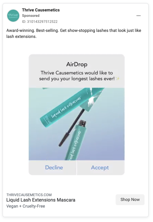
This simple graphic will stop users mid-scroll, thinking they’re receiving an AirDrop. It’s attention-grabbing and creative...unless that user is on a desktop or has an Android. Hopefully, this ad is only targeting iPhone users.
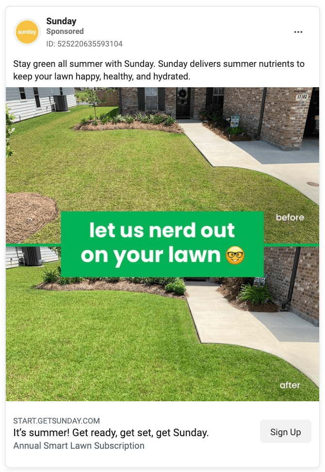
A simple before and after can go a long way with ads. They let the picture do the talking. Attention is directed towards the lawn because of the basic text addition.
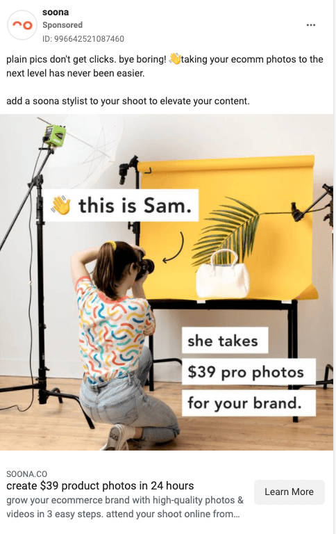
Another example of how a simple image with text that looks like it could have been added in-app goes a long way. It’s a good ad when the visuals say everything you need to know.
Bonus points for pointing out the name of the photographer pictured. It makes the ad feel more personable like you know exactly who you’d be hiring.
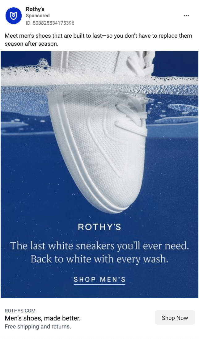
Rothy’s definitely hired a professional photographer for this and it shows—in a good way. The fact that the camera angle seems to be coming from within the water is an attention-grabber. It lets the image do the talking.
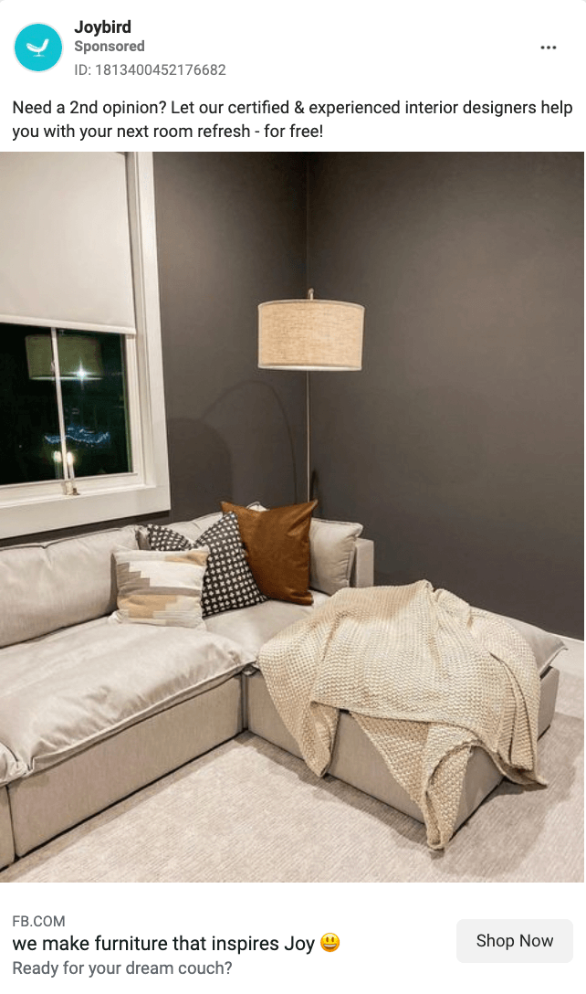
Joybird’s image might have you wondering why it’s included in this list. It doesn’t seem like anything particularly special, it’s no high-quality photo...you probably could take a photo similar to this in your own home.
You’d be right.
That’s the point.
This is still a pretty room, with a nice-looking couch and nice pillows, but as you scroll through your newsfeed it would probably look like a friend’s post and that’s what they’re going for.
It makes the ad feel like it’s coming from a friend versus a brand trying to shove their product down your news feed.
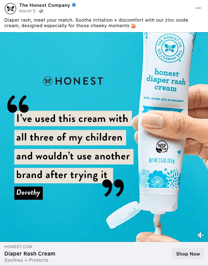
This Facebook ad image works because they have a short but powerful testimonial paired with the product the testimonial is referring to. The blank, colorful background grabs the eye and diverts your attention straight to the quote.
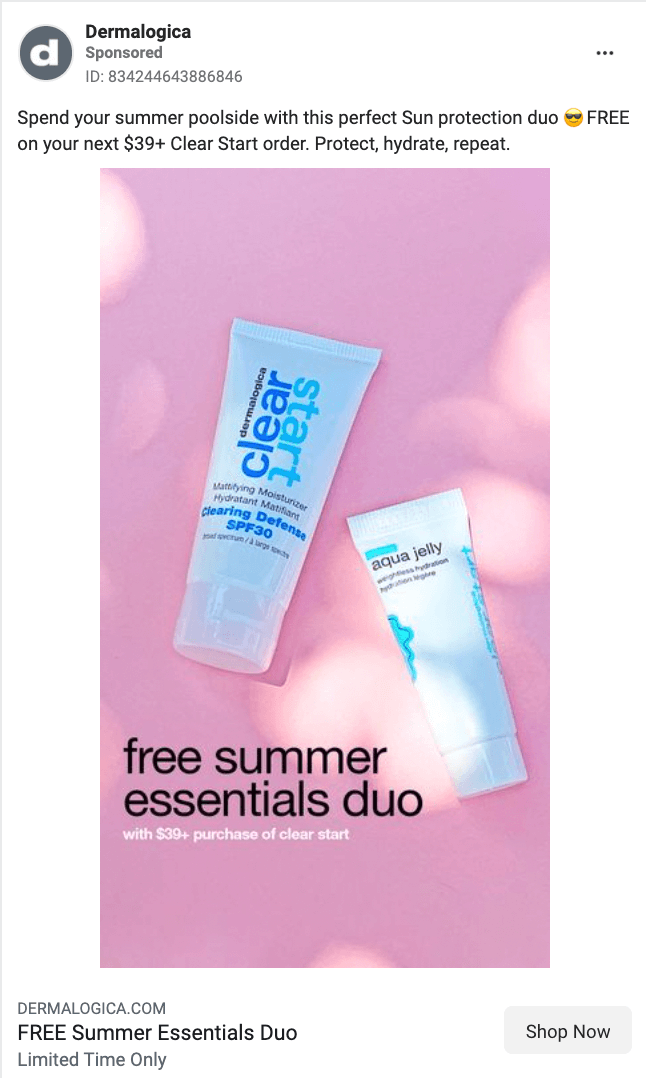
This ad is another example of a simple photo with basic text. The little spots of sunlight keep it bright and summery to match the product. The text is a black font to make the deal they’re trying to advertise stick out.
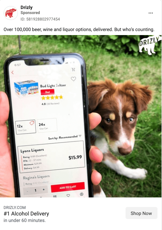
Straight from someone’s camera roll with tons of personality. It shows the product in-use so you understand exactly what’s happening without reading any copy. Also, who doesn’t love a good dog pic?
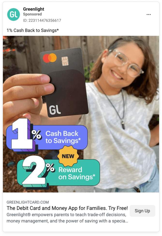
Greenlight paired a camera roll-esque photo with graphics. If a child holding a credit card didn’t catch your attention, the big numbers and bright colors will. Greenlight is also running the same ads without the graphics. I wonder which one is performing best for them? It’s always good practice to test these things.
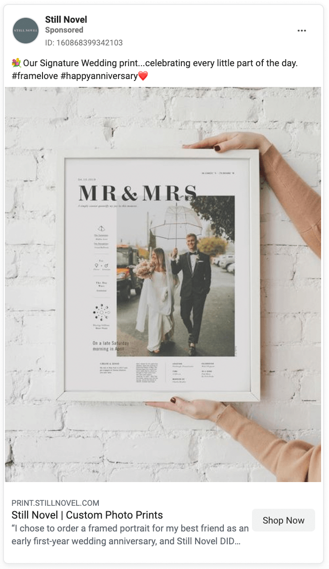
Still Novel presents an aesthetically pleasing photo. By having a woman’s arms in there, it provides some context for the product. It allows you to get an idea of how big the frames are and how it would look on a plain wall. Seeing somebody else’s wedding photos and details too, allows you to imagine what yours might look like.
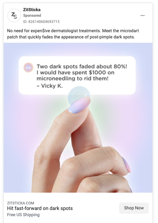
Colors alone can influence up to 90% of an initial impression. The soft purples, pinks, and greens that lead the eye to the product and testimonial are soft but aesthetically pleasing.
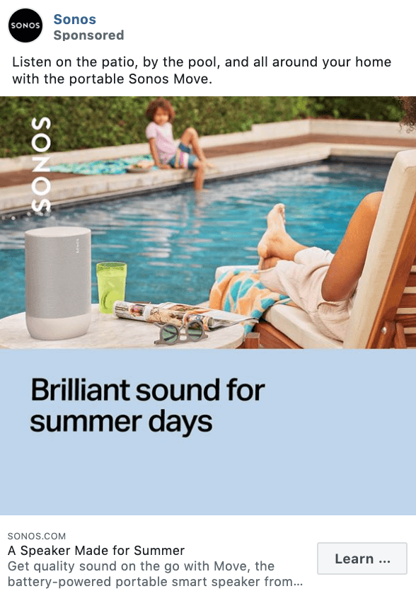
Ah, what is a pool day without some good tunes to listen to? The lifestyle photo alongside the color blocking design makes this a plain good ad.
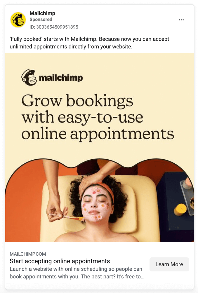
This example from Mailchimp is a winner because there’s a clear photo paired with value-based copy that highlights one of Mailchimp’s service benefits.
The right image can work wonders, but you’ll notice that a majority of ads are videos.
Why’s that?
Shoppers that watch videos are 1.81 times more likely to make a purchase, in comparison to non-video viewers.
In fact, Bitelab did an experiment where they found that video ads bring in 270% more leads than images.
If you have a video of your product, create an A/B test where it’s used in place of your Facebook ad image. The results might surprise you…
A few video best practices:
- Optimize your ad for each placement. Upload a video with the best ratio for where it’s showing:
- Facebook Feed - 4:5
- Facebook Instant Articles - 16:9
- Facebook In-Steam Video - 16:9 or 1:1
- Facebook Marketplace - 4:5
- Facebook Search Results - 4:5
- Facebook Video Feeds - 4:5
- Facebook Stories - 9:16
- Audience Network Native, Banner and Interstitial - 9:16
- Audience Network Rewarded Video - 9:16
- Messenger Stories - 9:16
- The first few seconds are the most important. People lose attention after 8 seconds.
- Always add captions: Each video in the Facebook news feed is soundless by default. To get your message to the people, add captions to all the videos shared on the social media platform. According to Facebook, captioned video ads increase video view time by an average of 12%. In one study of Facebook video ads, 41% of videos were almost meaningless without sound.
- Choose an enticing thumbnail or upload a custom image. The thumbnail image in a video ad is the still image people see before a video starts and after it ends.
Ruggable leans on user-generated content to fuel its Facebook ad strategy, like the one above.
Not only does UGC deliver an authentic punch of credibility, but this particular video spotlights a perfect Ruggable use case: when you have dogs that dirty your rugs.
No matter who watches this ad, it's hard to imagine they won't relate, and perhaps even think to themselves, "Hmm, I wonder what other situations I can think of that would be easier if I could wash my rug."
Drunk Elephant is a skincare company best known for their scientific formulations and distinct brand (neon) colors.
Not only is this ad well-branded so viewers know it's Drunk Elephant immediately (brand recall is a big problem when you don't have distinct brand assets), but it spotlights the main benefits of their new peptide moisturizer in a fun, energetic way in less than 15 seconds.
It’s hard to make a 6-second video entertaining, but Pillow Cube nailed it. They didn’t take themselves too seriously, they leaned into the comedy approach while still managing to educate viewers on the main pain all their buyers experience: the most-annoying arm that gets in the way of side sleeping.
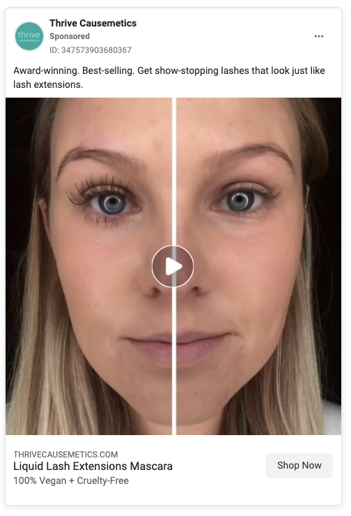
Thrive Causemetics is a prime example of the power of a thumbnail. This video is actually just a full frame video of the woman applying mascara, which is common in the makeup world. But Thrive knows that the thumbnail is the first thing shown on a video (that’s why we included it as one of our recommended best-practices), so they made it a before and after shot.
As she applies the mascara in a full video (without the line down the middle) they show this thumbnail image comparing before and after a couple times to emphasize how effective the product is.
Short and sweet. Airbnb turned text-based graphics and a couple of photos into a six-second video that manages to tell a story. From those six seconds, we know that this man is able to fund his retirement through hosting on Airbnb. It’s a great awareness-level ad. Simplicity is a good thing.
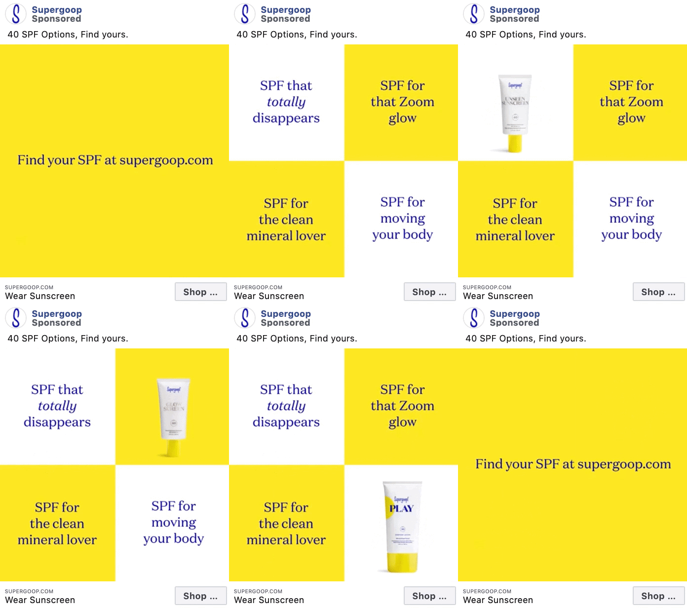
Supergoop’s video ad showcasing its various sunscreen products is a great example of a slideshow ad.
This video type doesn’t take a huge production team on your end – simply gather some photos or cut-outs like we see in this ad example, and sew them together using a video app.
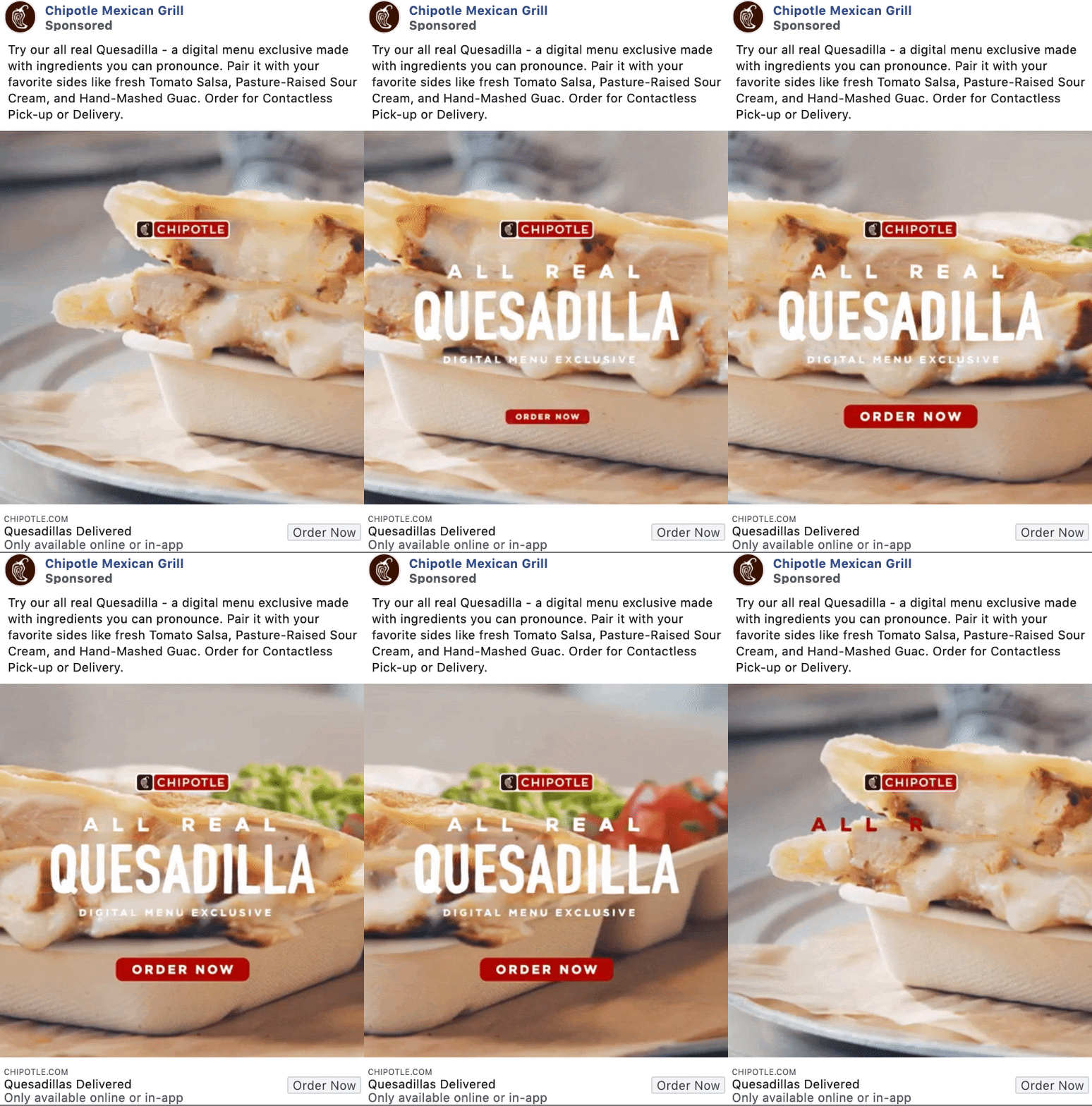
Who doesn’t love a good food video? Chipotle is absolutely playing to their audience with this video ad.
And the added call-to-action to order pick-up or delivery now is definitely enticing to any hungry person stumbling across this video ad.
Hulu
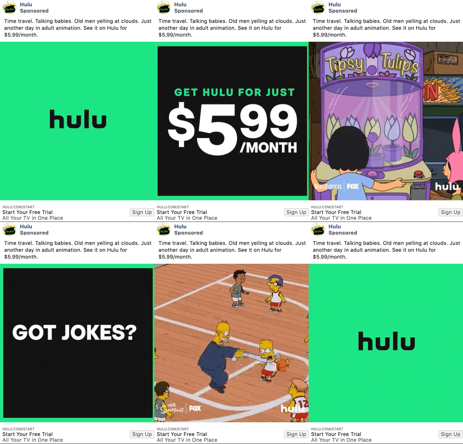
Hulu’s video ads are a bit unique as they constantly have tons of video footage and assets to use for ad creation.
This ad focuses on shows their subscribers can watch on their platform, providing an incentive for people who may not have signed up for Hulu yet to click that Sign Up button.
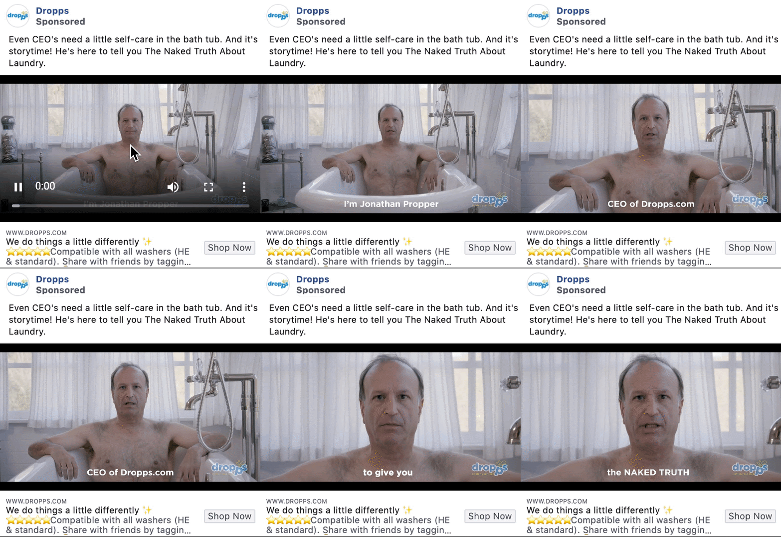
Give your brand a bit of humor. This video ad by Dropps showcases their CEO in the bathtub telling you a story about laundry.
Not every video ad is going to be cut and dry. Some need to have a naked executive taking a bath to catch your audience’s eye.
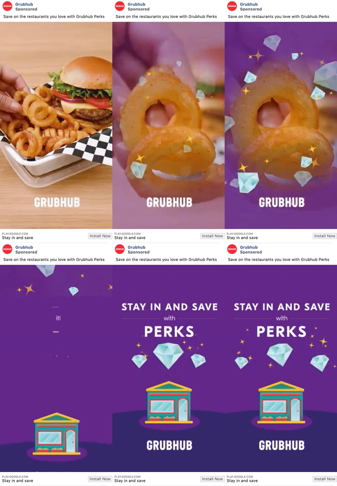
GrubHub’s video ads are quick and to the point. Let the food do the talking and follow it up with a call-to-action for their perks program. Who could resist?
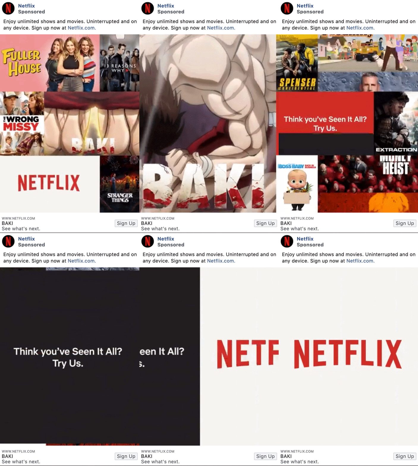
This Netflix ad example is a classic example of not knowing where to look first, but it works for them and what they’re selling. This ad showcases several of the platform's most popular shows at the moment, grabbing attention and attracting sign-ups.
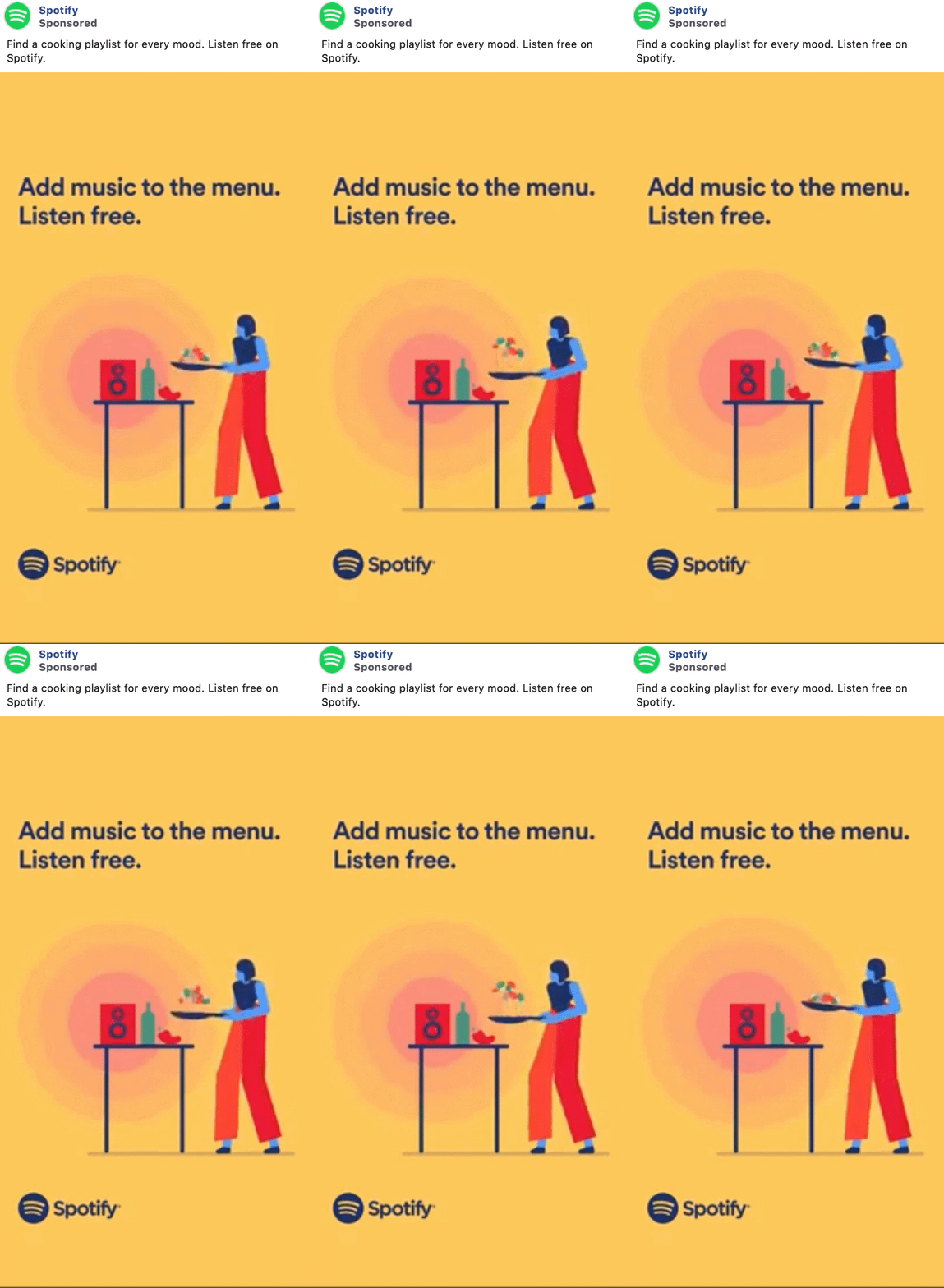
Your video doesn’t have to be long to do the job. This Spotify ad is 3 seconds long and showcases a repetitive animation of someone in the kitchen flipping vegetables in a pan paired with quick, concise copy selling their product.
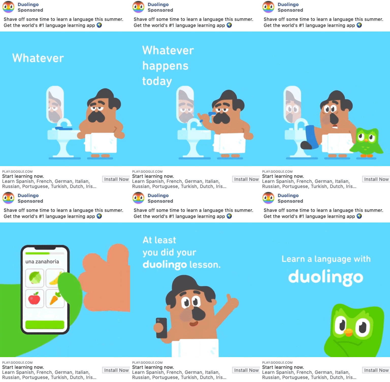
Duolingo is famous for the humor they bring into their brand messaging, and it shows in this adorably animated video.
Humor and personality can work for a brand, as long as you’re brave enough to give it a try.
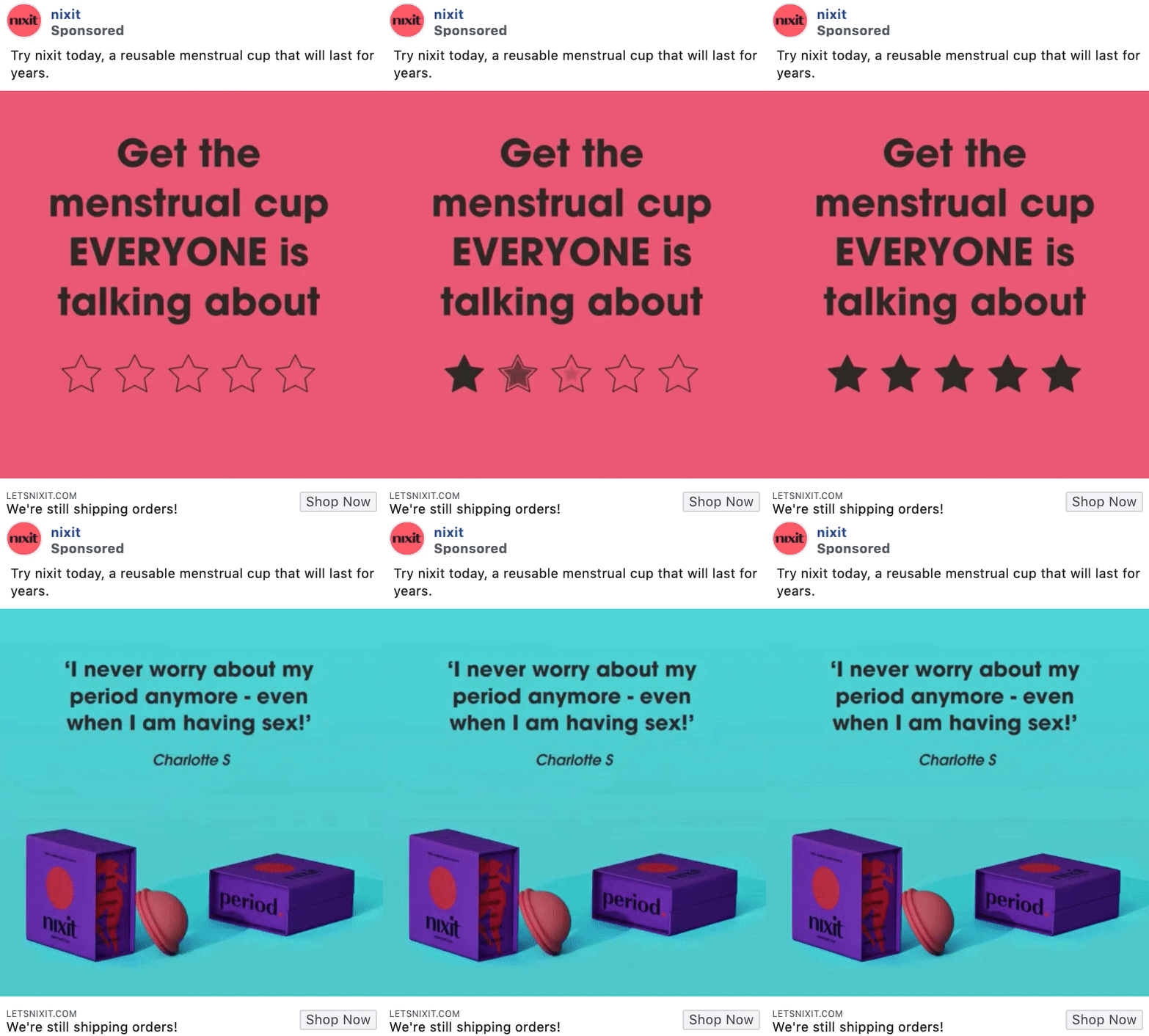
Nixit’s video ad example is a great peek into how stop motion videos can look in Facebook ads, and they’ve absolutely nailed this one.
A basic stop motion video that lasts only a few seconds won’t take days to complete, and they’ve perfectly ended the video with their bright colors, bold fonts, and compelling copy.
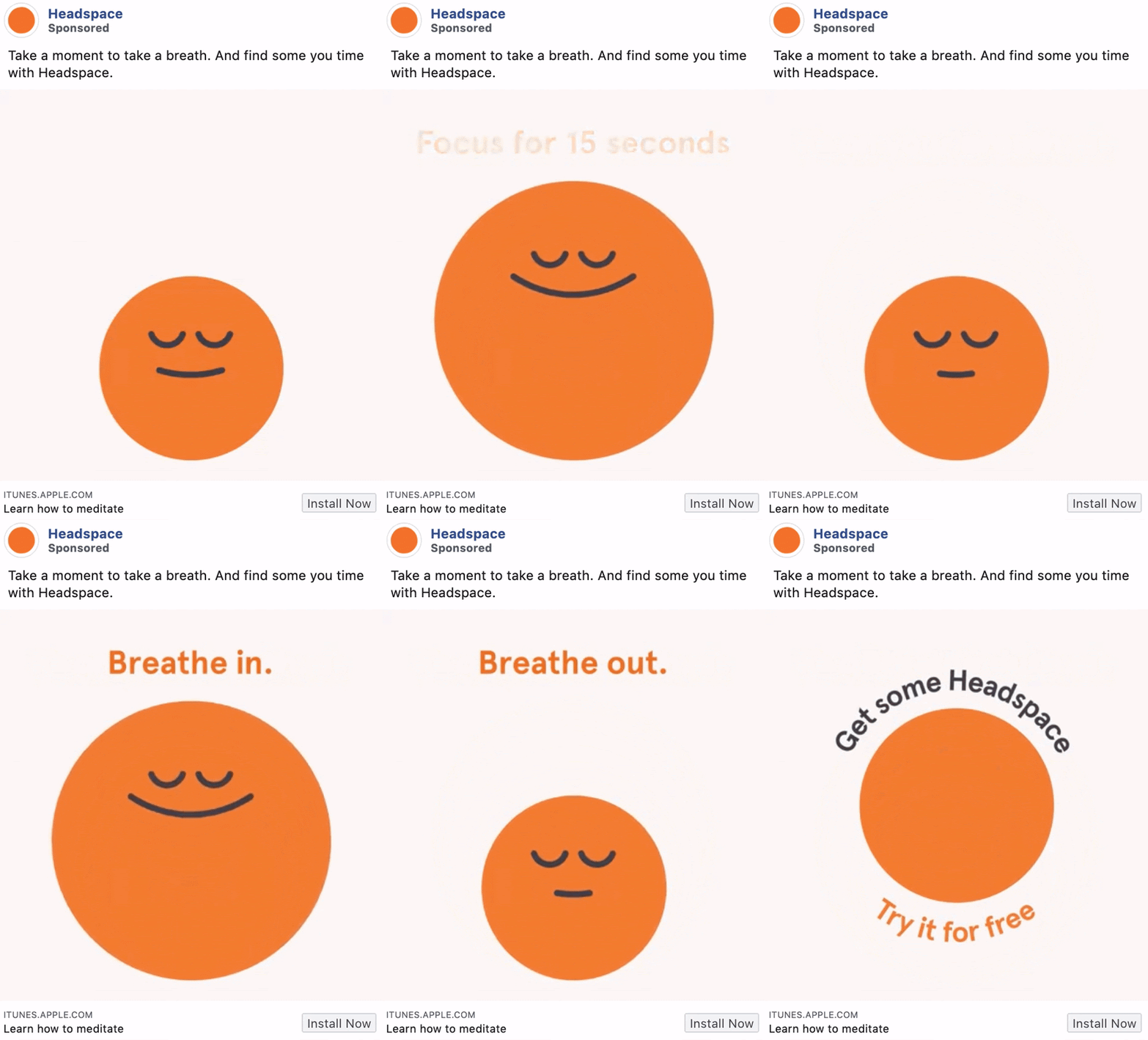
Headspace’s video ad is a fantastic example of how they’re using their product to create compelling ads that really grab attention and sell their product.
By using shapes and simple copy to simulate a breathing exercise, they’re immediately roping their target audience in and getting them interested in downloading their app.
Now it’s time to move onto our next category of ad examples – carousel ads. These types of ads are basically a slideshow of images or videos that users can click through on their own. Carousels can be 10 images or videos within a single ad, each with its own link.
With more creative space within an ad, you can highlight different products, showcase specific details about one product, service or promotion, or tell a story about your brand that develops across each carousel card.
You can choose to let Facebook optimize the order of the carousel images, based on each card's performance. But if you're using the format to tell a sequential story, make sure you opt-out of the automatic optimization feature.
Let’s dive into a few top examples of these so that you can really grasp the potential that carousel ads could have for your business.
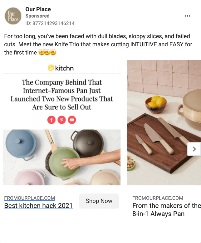
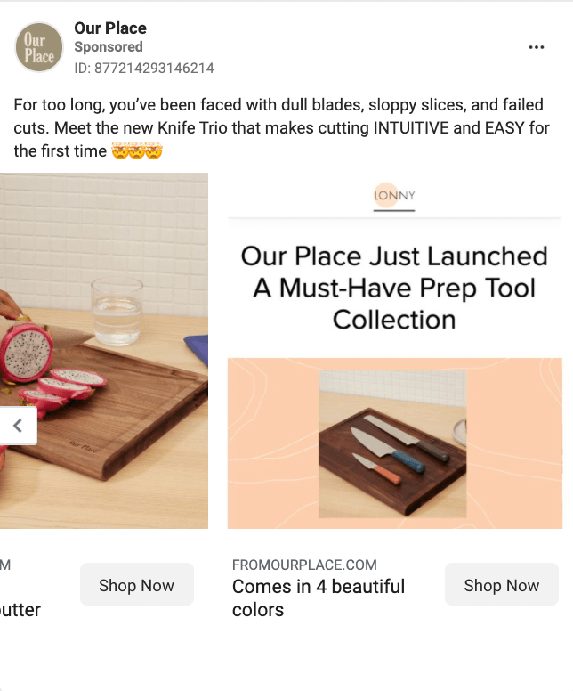
Our Place mixes screenshots of press features with aesthetically pleasing product shots that are styled to look like they could be in your home.
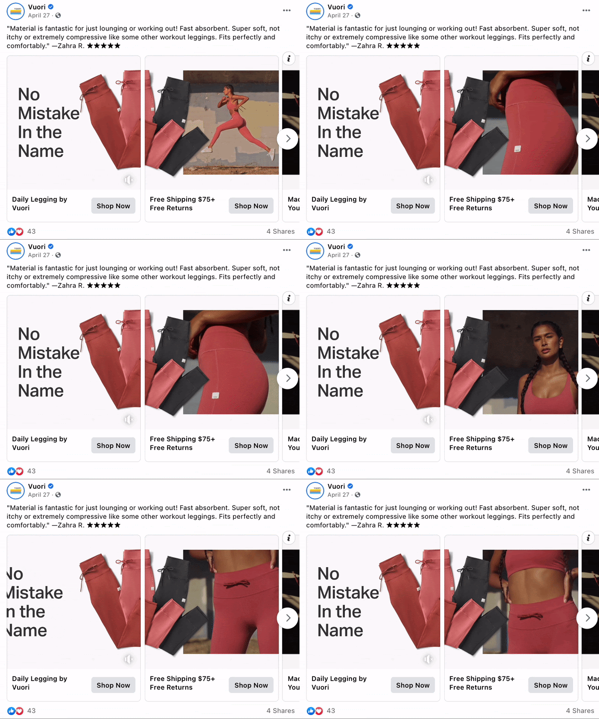
Vuori’s carousel ad plays an eye-catching trick to stop viewers during their scroll. If the flashing text on the first slide doesn’t stop them, then the model sprinting into the folded pairs will. The carousel has great movement and blends all the slides together cohesively which makes you want to keep scrolling through.
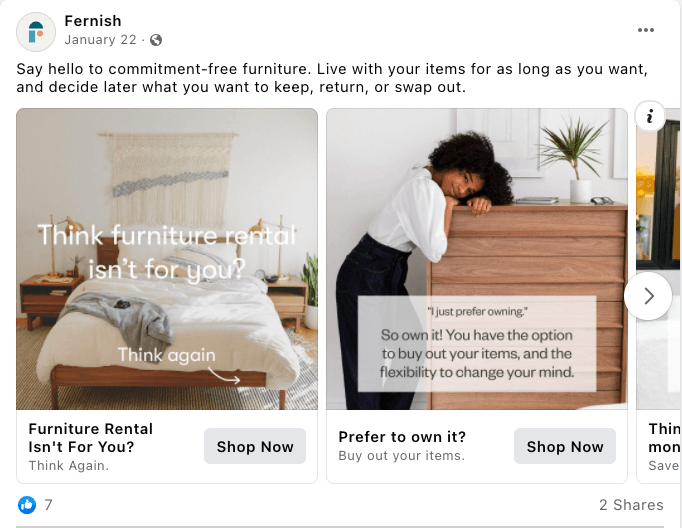
Fernish took on the challenge of addressing a buying concern in every single carousel slide. They present it with a nice image and a block of copy in the answer and question format.
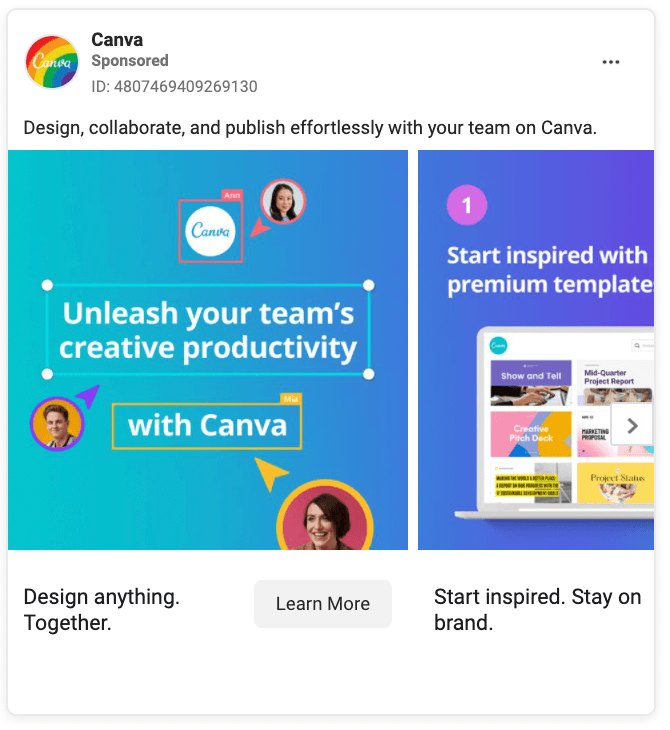
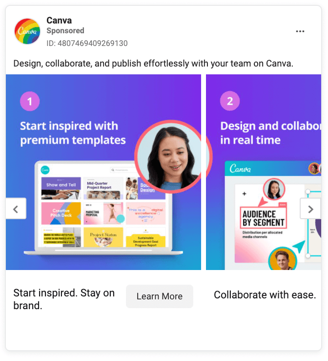
Carousel slide designs don’t have to blend in with one another, but it helps encourage engagement. This one in particular from Canva has the first slide as a “title slide” and all slides following are each a how-to step.
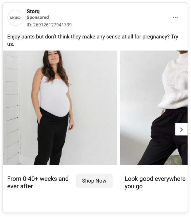
This carousel from Storq highlights a specific product feature: pants that fit during pregnancy and after. You don’t need to read any copy to get the message. You see a pregnant woman wearing the pants in the first slide and a non-pregnant woman wearing them in the second slide.
Telling a product story visually is always the best way to go.
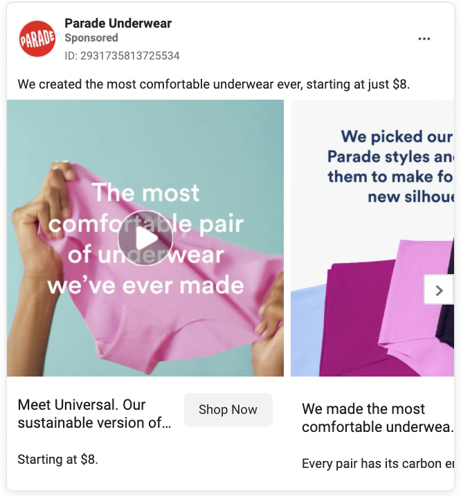
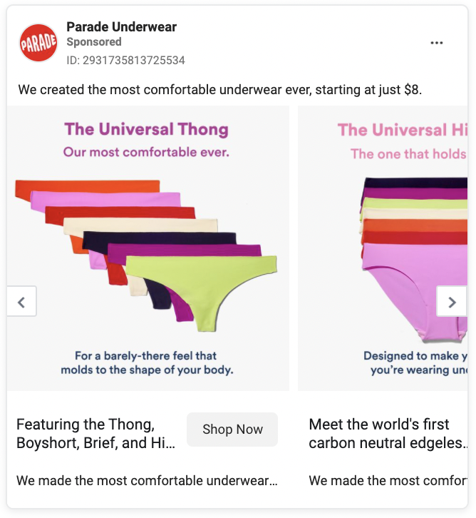
Parade Underwear gets the carousel party started by using a video with a testimonial as the first slide of the carousel. It hooks viewers in. The following slides are all used for education, so viewers can compare different styles and see all their color options.
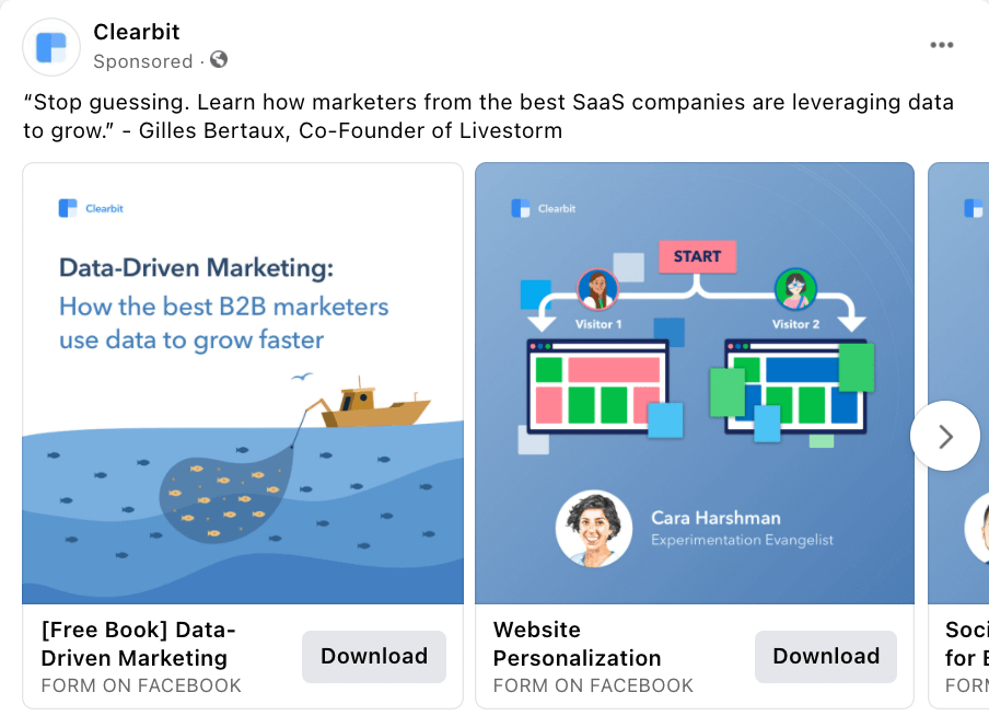
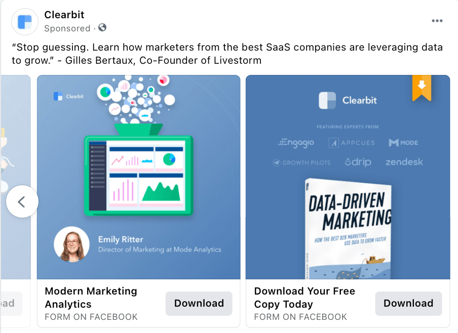
In this case, Clearbit is advertising a free ebook. If an ad viewer isn’t ready to commit to a download, they can scroll through each slide to learn about some of the topics the ebook will cover.
What’s really smart about this ad though is that they included photos of the experts that help provide info for the ebook, giving it a personal touch. And then on the last slide, they have a bright bookmark symbol with an arrow down towards their call-to-action.
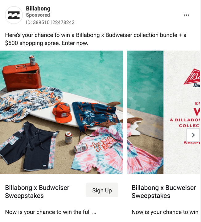
Billabong could have just posted a boring graphic to encourage viewers to enter their sweepstakes. To make it more engaging, they used an eye-catching lifestyle photo. The copy alerts the viewer of the sweepstakes and then they engage with the carousel and click over to the next slide to get the details.
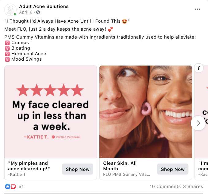
An A+ carousel ad from Adult Acne Solutions. Starting with a simple, short testimonial paired with the five stars. Then your eyes are drawn to the faces. As weird as it might sound, people like looking at other people’s faces on the web. When they feel like someone’s gazing at them, they can’t resist finding out more.
From the colors to the smiles to the stars to the soft pinks, this post will stand out among all the other posts on your news feed.
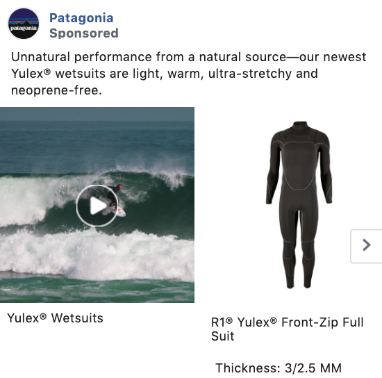
This Patagonia ad is simple, but perfect. The carousel ad switches between a lifestyle video of their product in use and the actual product photo as it’s seen in their online store.
Giving users the ability to see both of these options upfront can show them just how much potential they could have by purchasing a Patagonia product.
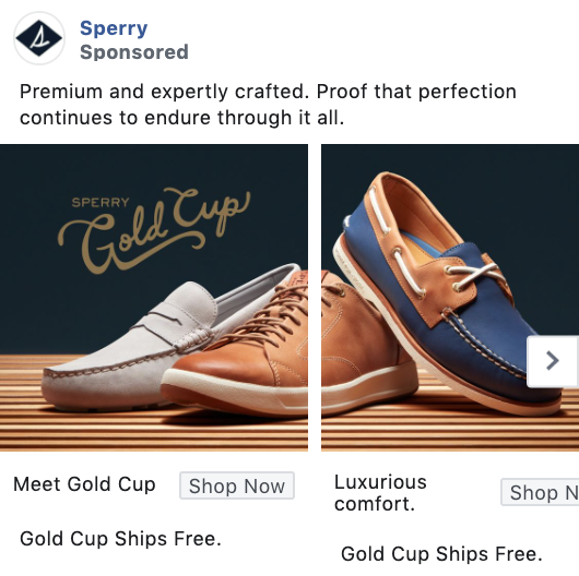
This Sperry carousel ad is equal parts creative and visually appealing. By stitching photos together like this, they’ve created an elongated image that users can’t help but want to scroll through.
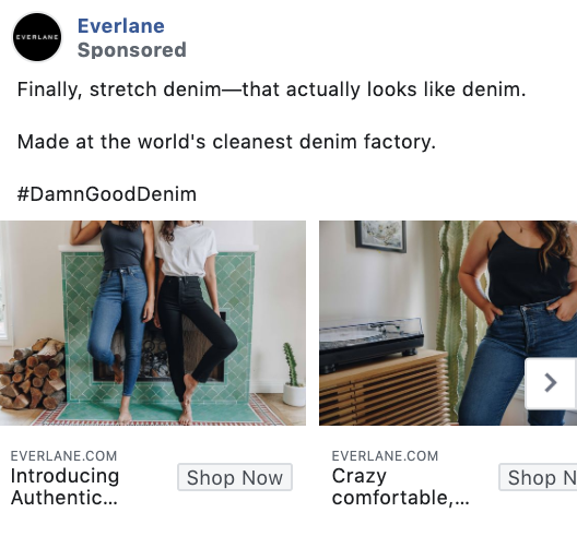
Everlane takes their carousel ad here and uses a simple but effective strategy – showcasing a different product in each one of their sections.
This is a great way to get the most out of an ad, rather than creating separate ads for each product you want to promote, especially if they’re similar.
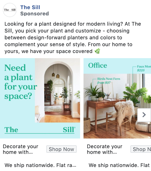
This carousel ad by The Sill includes a happy medium of photos and graphics combined together to tell a story.
They take viewers through different parts of a home in each slide, showcasing how amazing life could be with greenery.
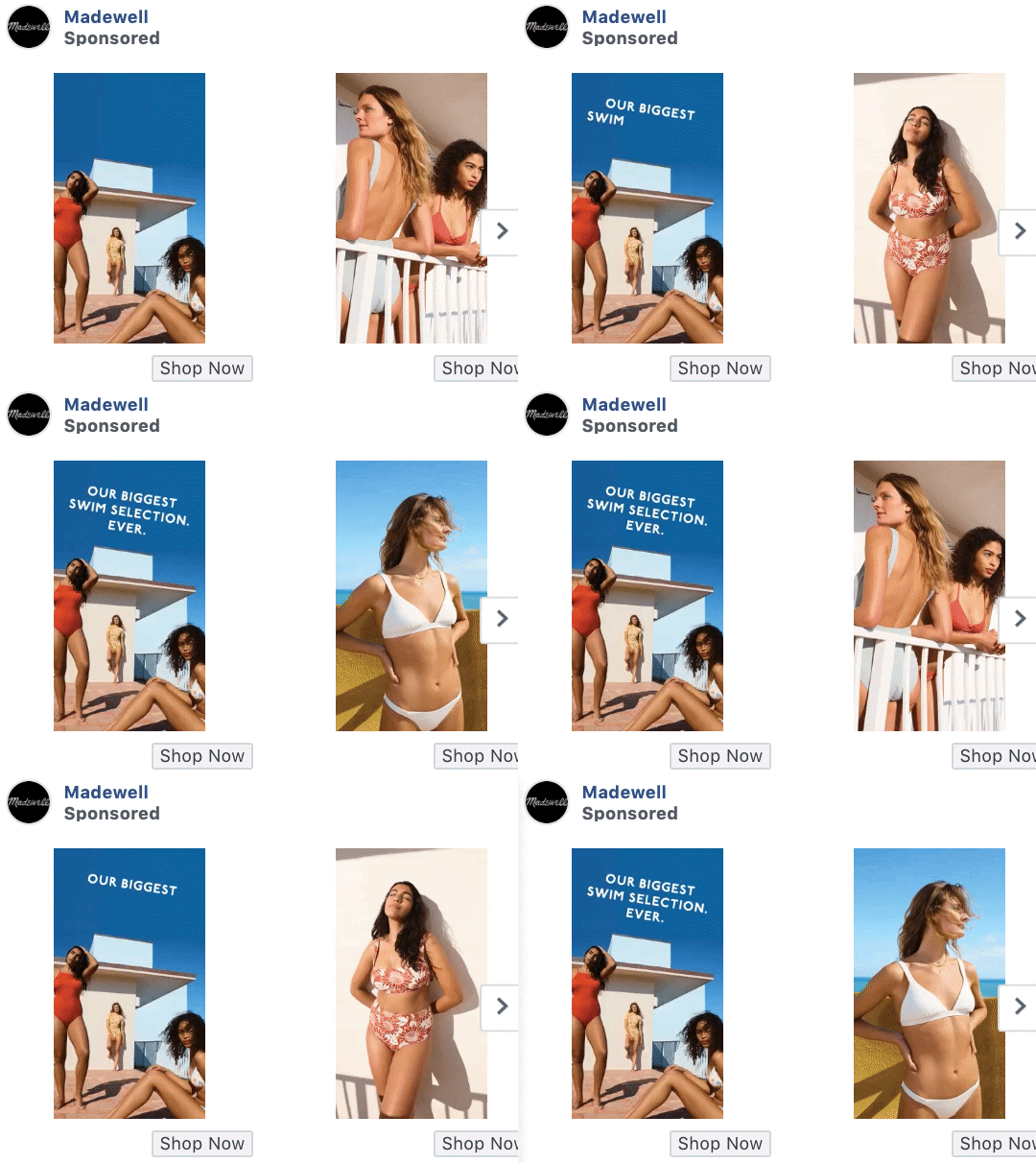
This Madewell ad is unique because they’ve combined both video and carousel ads into one, placing a video on each slide. This can be effective because it helps them to get even more potential out of a single ad set.
This stunning carousel ad gives users a sneak peek into what their jewelry boxes can look like, if only they click on that Shop Now button and get to purchasing.
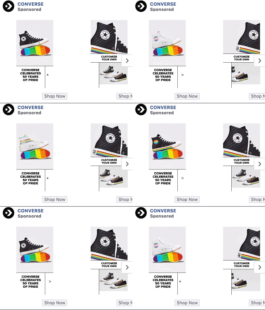
Videos and photos don’t have to take up the whole square of the carousel slide. Converse’s clever use of stitching together videos, white space, and graphics will enable it to stick out because it’s different from other posts.
They differentiated it in such a way that also highlights the products and leads to purchases.
While Facebook is a very visual platform, sometimes the ad copy is actually the driving force in helping customers make a decision. It can be the cherry on top of powerful creative imagery or videos.
The best copy will
- Have a call-to-action (CTA). You need to be direct about what you want people to do. There’s a call-to-action button, but reinforcing what you want the viewer to do within the copy is always best.
- Be easy to read. If somebody sees a big paragraph of copy, they’re going to scroll right on past it. Focus on bulleted copy and short sentences with space in between.
- Include emojis anytime it makes sense. Emojis are processed by the brain as non-verbal information, which means we interpret them. as emotional communications. This gives the emoji the power to enhance the message of whatever we’re trying to convey.
- And be conversational. You’re working with a social platform. Make sure your ads don’t sound like a robot. Your copy can come off as conversational and still match your brand, whether it's for professionals or speaking to millennials.
Here are a few awesome Facebook ad examples where it’s all about the ad copy.
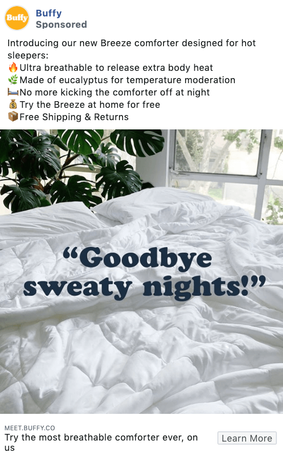
This ad copy starts out with a question which is a great way to garner attention. They organize the points they want to make in a bulleted format, but instead of using plain bullets, they use emojis.
Once you understand the product benefits, you see direct quotes from customers in their ad graphics, showcasing that real people are using and loving their product.
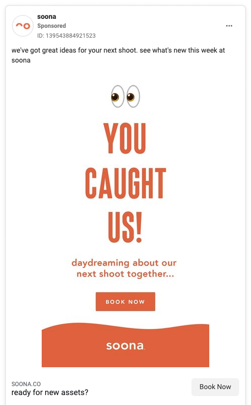
Soona is a great example of using copy that talks directly to the consumer. By addressing “you,” it bonds the ad to only the person reading it. Then the ad copy talks about the future in terms of “our” next shoot, which makes you reader feel like the brand really cares. You’re in it together.
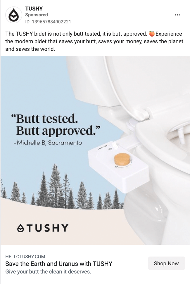
Tushy knows they sell a product used in the bathroom. It can be awkward or uncomfortable to talk about, so they lean into it. By making things fun with the copy, they loosen up the visitor and make the product more approachable.
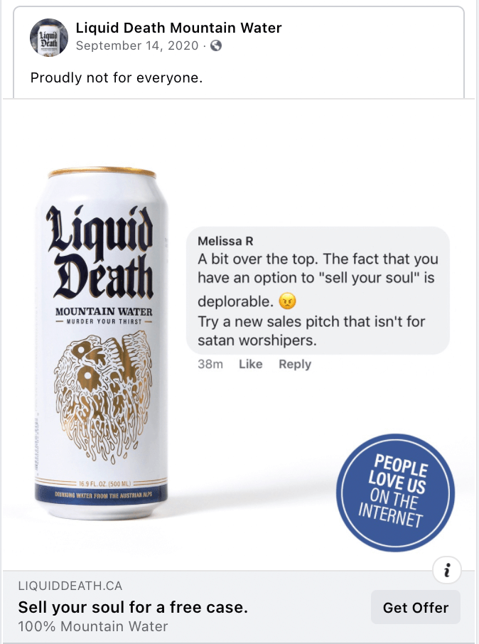
If you try to make your product for everybody, you’ll end up making it for nobody. The more specific you can be with your target audience, the better you can match your ad copy and images to match what your target audience responds to.
Liquid Death really leaned into this. It’s obvious just by their product name that they’re not trying to appeal to everybody. Their copy is on-brand for them. The sass and use of a bad testimonial will speak to the exact people they want which will end up in conversions.
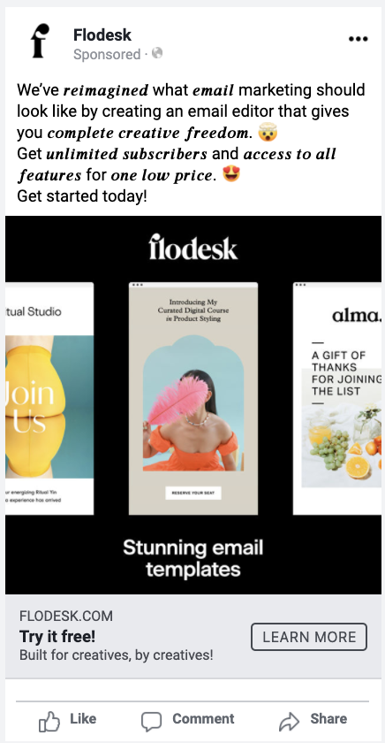
Flodesk’s ad copy is good to begin with and their use of symbols and different fonts is a creative tactic to catch attention and highlight specific words that need emphasis.
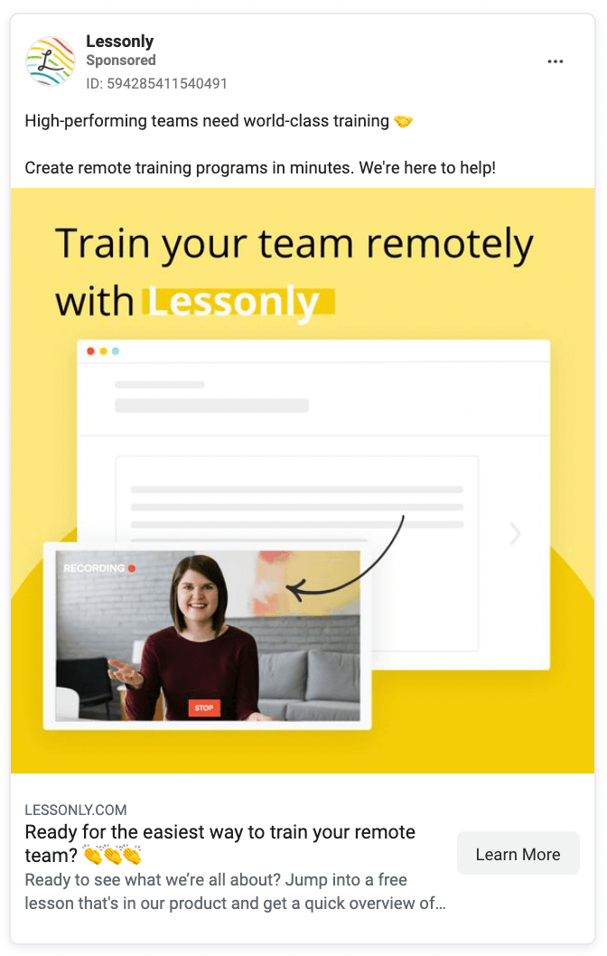
Lessonly keeps ad copy simple and focused on the benefits. They include the call to action of “create remote training programs in minutes.”
They also incorporate emojis into the ad header along with a question which will make viewers pause.
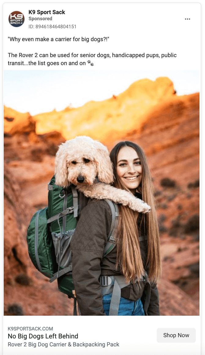
Don’t beat around the busy with your ad copy. K9 Sport Sack didn’t. They clearly get asked why they make dog carriers for big dogs a lot—and they have a good reason.
For senior dogs, handicapped dogs, or public transit. They’re helping the target audience identify themselves. It helps get new customers from people that didn’t even know they had a solution to their problem.
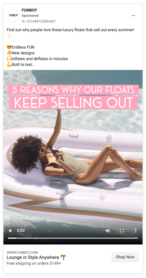
Funboy uses good copywriting from the caption to the video.
People like to skim-read, so when you put the copy in listicle format, it makes information easy to understand. In this case, Funboy summarizes the five reasons that their product keeps selling out.
Give special attention to their decision to also say that the products keep selling out instead of the five reasons why their product is popular. The choice to note that the floats sell out adds an extra urgency to purchase if you really like it, before they sell out (again).
Simple and silly is the approach Coravin took. How many times have you debated opening a bottle of wine because you don’t want to drink the entire bottle, but you also don’t want it to go bad?
The caption copy of “drink a glass of whatever, whenever” is the casual nature you wish you could have while opening a bottle. Then they add a good laugh in the copy on the video that says “pairs well with seeing the clothes you wore in high school described as a ‘vintage aesthetic.’”
Coravin nailed the conversational tone. They know how their audience is talking and they match it.
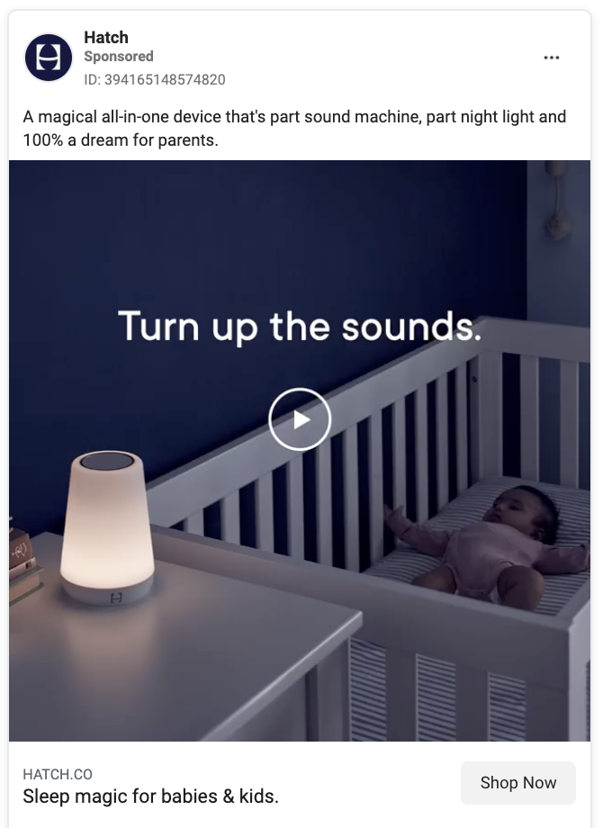
Every new mom is afraid of waking a baby that just fell asleep. This ad copy from Hatch speaks to the feeling that a mom could get from their product. It hits on the emotions by showing the sleeping baby and the copy that says “turn up the sounds” despite that.
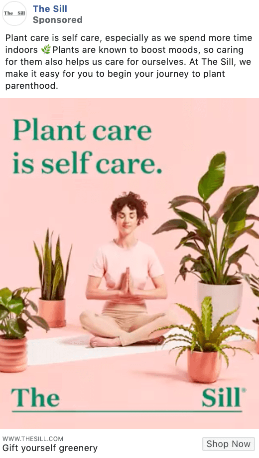
The Sill’s ad copy makes it all about you. Rather than making the ad about selling, they flip the focus back to doing something for you. It’s a smart tactic that helps to make the viewer feel important and emotionally motivated to buy a product.
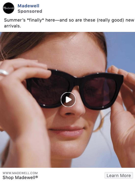
This simple and casual copy shows that you don’t always have to be clever or hip in what you’re writing. Just be real with your audience.
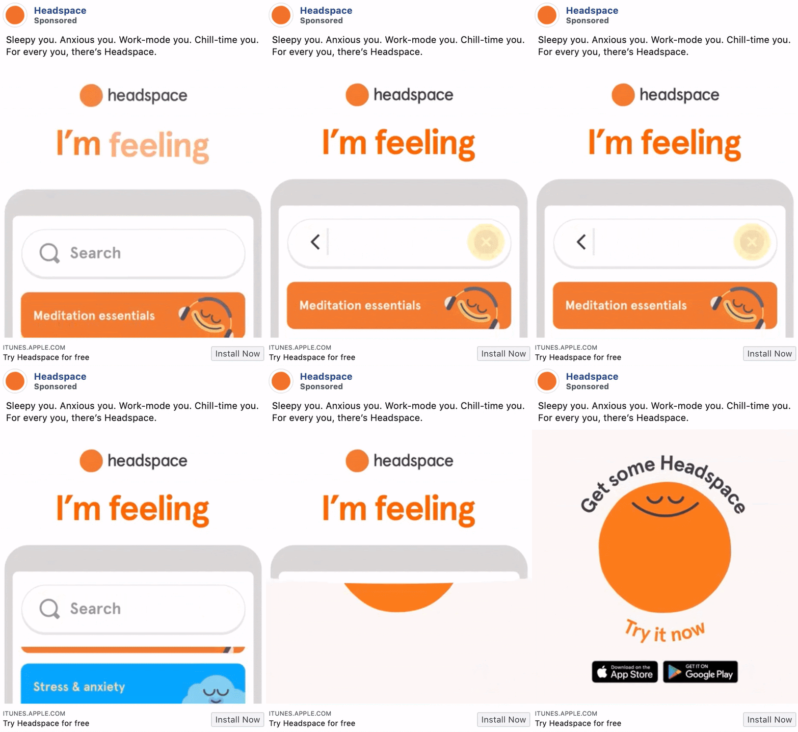
The copy in this Headspace ad is simple, straight to the point, and focuses 100% on the customer. And for an app focusing on self-care and mental health, they’ve done a fantastic job here.
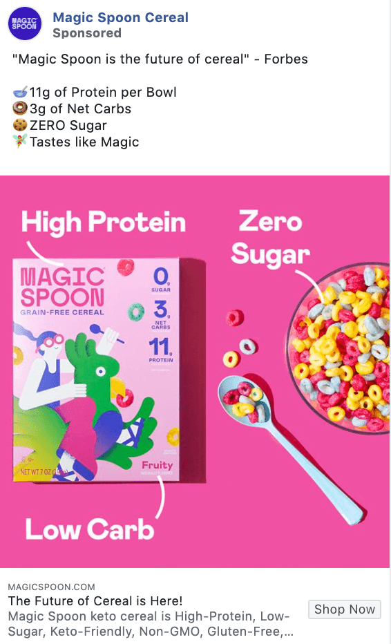
We’re loving the use of emoji to add visuals into the copy in this Magic Spoon Cereal ad, as well as sharing the direct benefits of their cereal. Any parent trying to get healthy breakfast foods for their kids will instantly be intrigued.
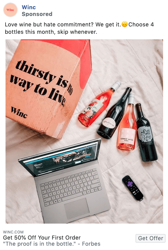
Inject some personality into your copy like we see here in this Winc ad. It incites a small chuckle out of their reader, making them that much more likely to click that Get Offer button.
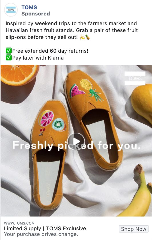
The copy in this TOMS ad is all about exclusivity. Love these shoes? Buy them now, before supplies sell out and you’ve lost your chance.
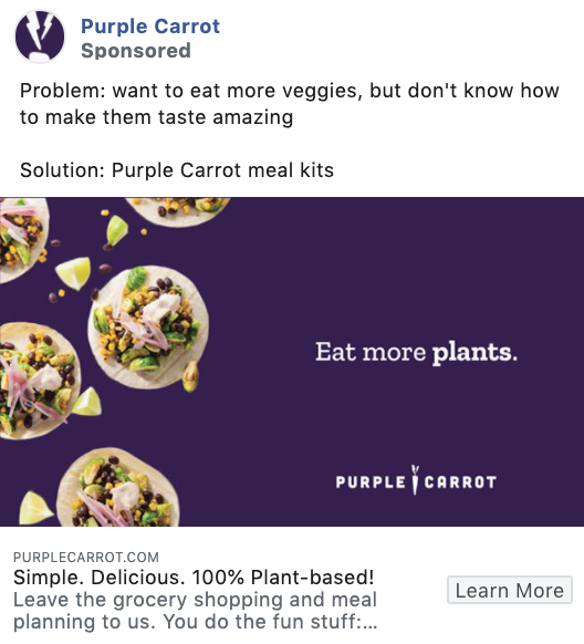
You’ve got a problem. Purple Carrot has the solution. That’s the exact style of this ad copy and it’s incredibly effective.
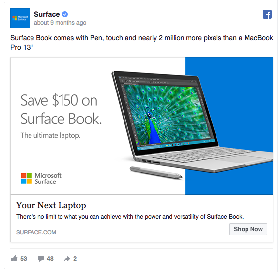
Microsoft Surface’s Facebook ad example includes the text, “Surface Book comes with Pen, touch, and nearly 2 million more pixels than a MacBook Pro 13.”
This is why adding the statement could be considered a smart move for the brand.
For once, Surface says that it has considerably more pixels than its main competitor: MacBook Pro 13.
By mentioning the MacBook in their ad, they take advantage of their competitor’s fame.
Simply describing the number of pixels in their PC wouldn’t tell most ad viewers a thing — but comparing the number to the well-known MacBook Pro establishes a strong anchor point for the comparison.
There are so many different brands and thus, so many different ways to sell. Some focus on the product, some need to focus on a service. Some have amazing testimonials to show off and some find success with a promotion. From small businesses to enterprises, check out all these examples from a variety of content focuses to get ideas on what your brand could try.
All of these examples put the product front and center. If you have a great product and great visuals, this can work wonders. The following examples make their products shine in different ways.
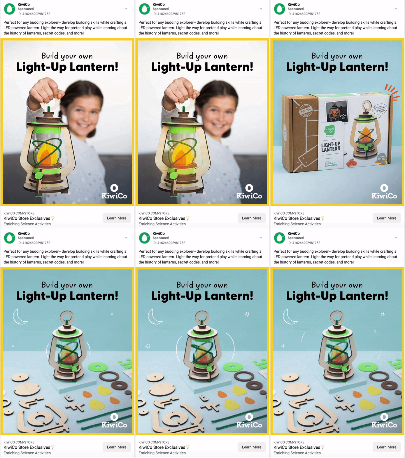
KiwiCo makes fun DIY projects for kids so they feature the product in three different ways. They start off in the box, how you’d receive it. Then post-build, but with all the pieces from an unmade one laid out so you can clearly understand what you start with. They end it with a girl smiling and holding the product.
You can easily understand what the product is, how to use it, and that it’ll make your kid happy.
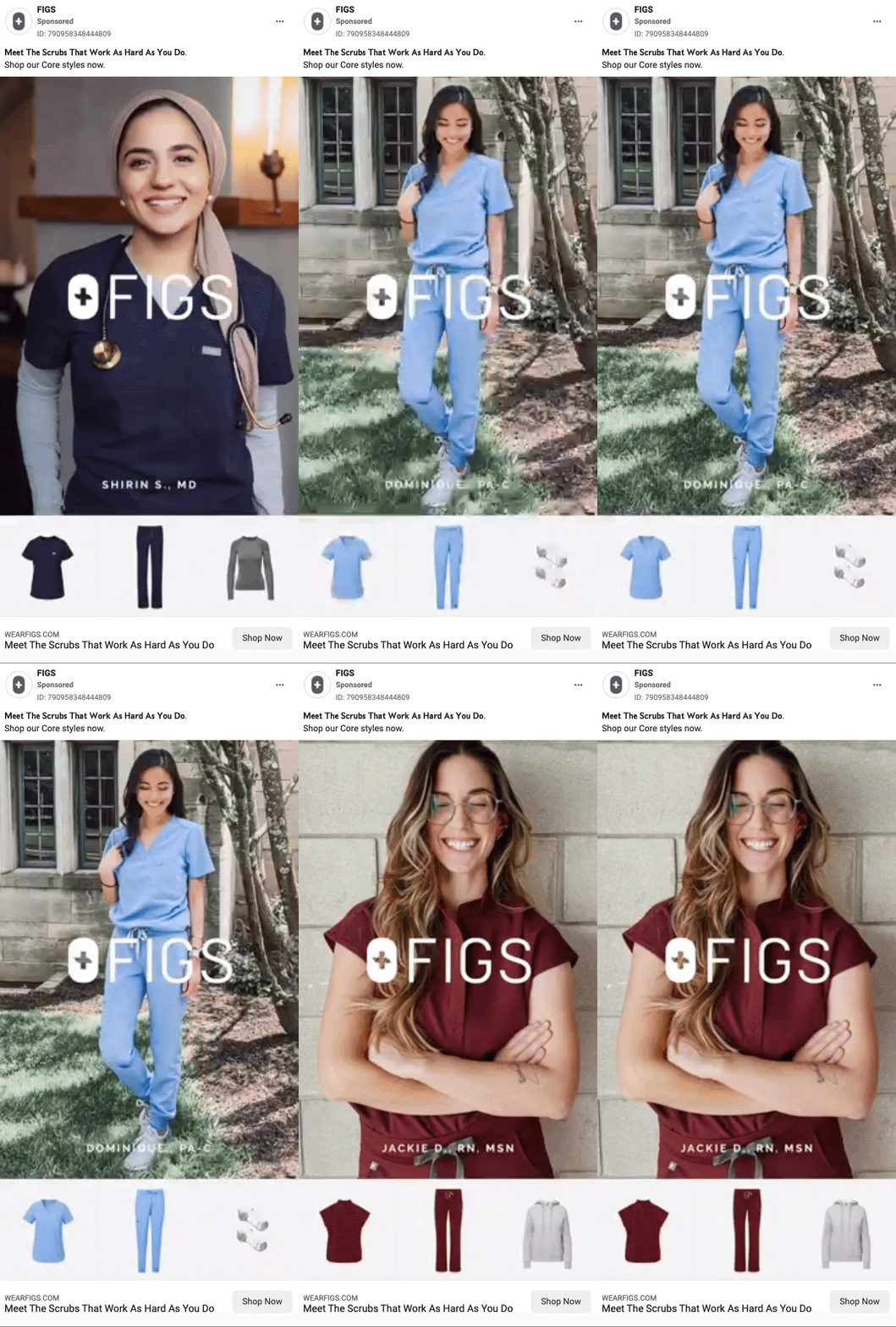
A quick slideshow of three different colored outfit combos from real nurses. FIGS’ ad is a good example because it’s quick, shows variety and features the product worn and along with plain product shots so the viewer can easily imagine themselves in the outfit.
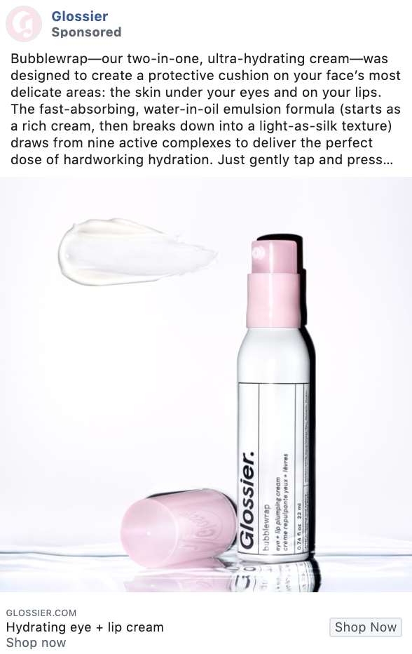
Glossier
This ad example by Glossier is so incredibly simple and so effective at the same time. Basic flat lay photos alongside some compelling copy can work wonderfully for getting paying customers into the “door” of your eCommerce store.
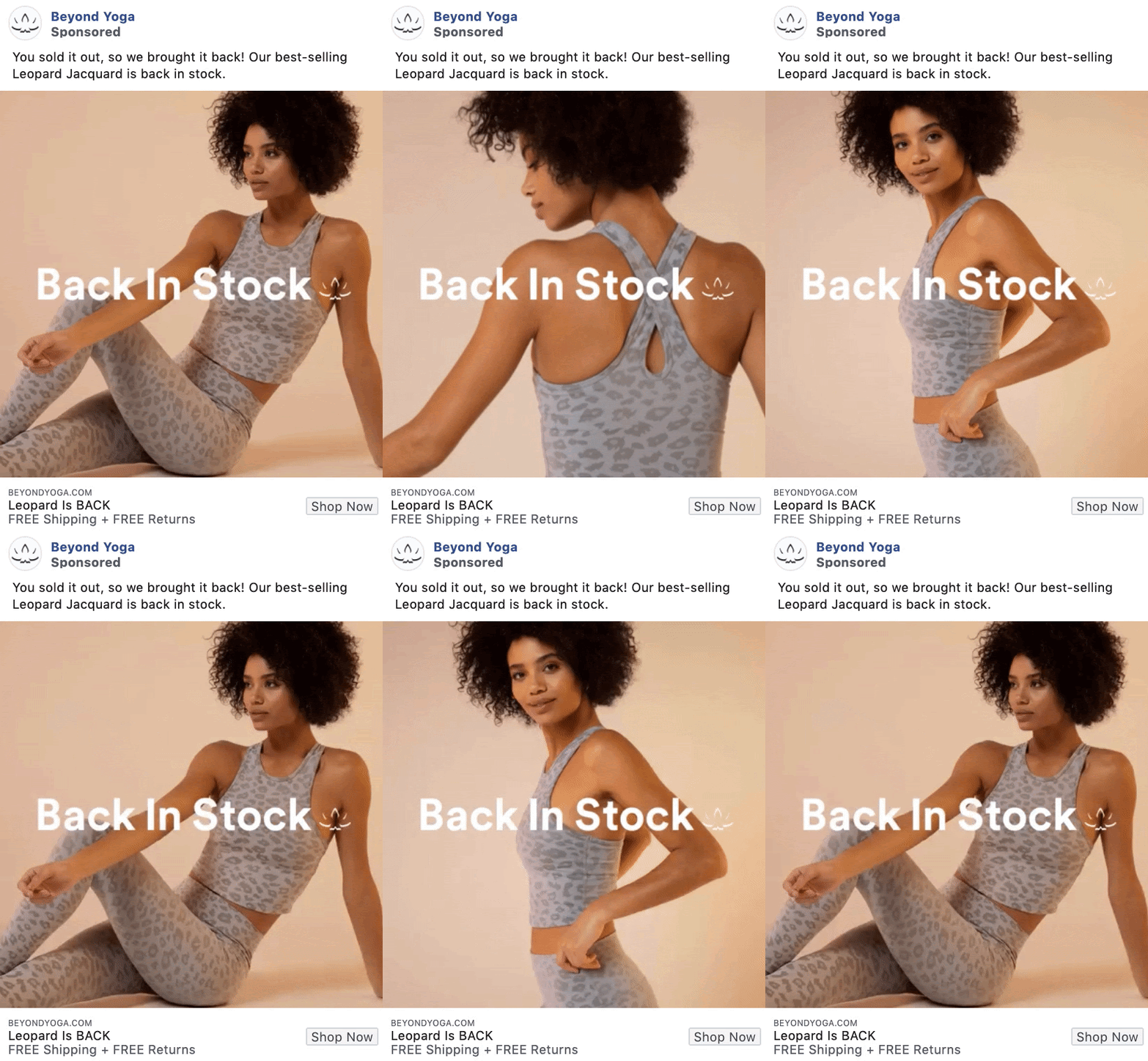
This slideshow ad uses a few photos of this awesome, best-selling product to reel in potential buyers and get them to click to their website and add to cart.
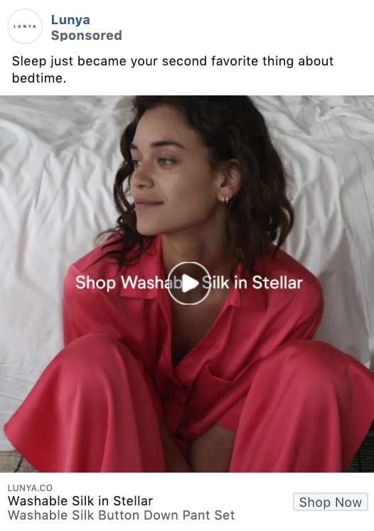
Sometimes a short, 10-second video of someone in your product is all you need to really make the sale.
I mean, look at how comfortable this woman looks. And with a basic text overlay selling the product, even more, I can hear buyers clicking that Shop Now button.
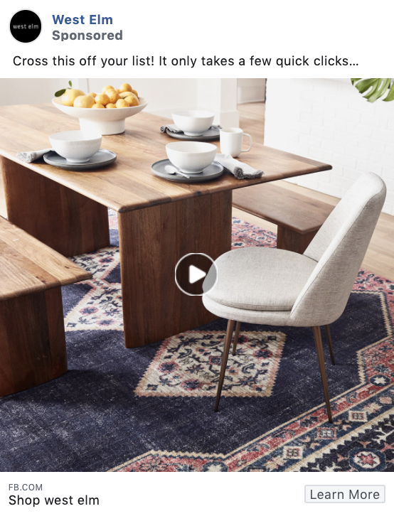
You don’t always need a carousel ad to showcase a variety of products. A short video like this one with seamless transitions is another great way to appeal to consumers.
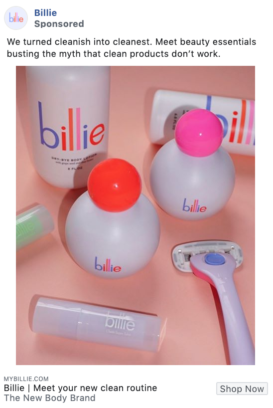
This Billie ad example uses brightly colored photos of their products as their ad asset, and it works. The eye-catching photo grabs user attention as they scroll through their Facebook feed, making them pause to see what the fuss is all about.
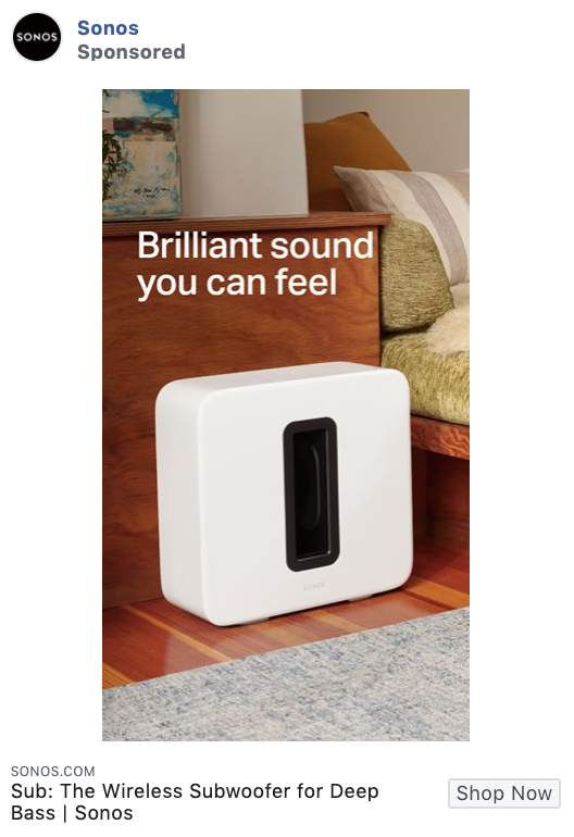
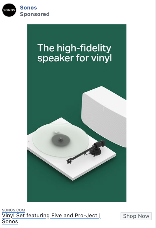
We love a good, clean design, and that’s exactly what we have here with these Sonos ads. With a simple look and a short, branded message, these are a couple of spot-on ad designs that highlight the product.
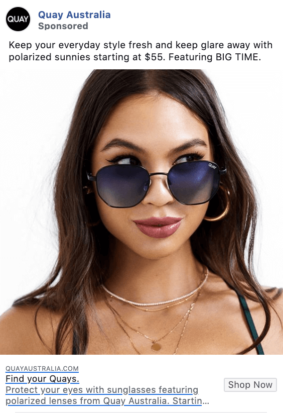
This ad is simple but effective, showcasing a woman wearing a pair of their sunglasses. They also let users know right in the caption which specific pair these are in case they want to come back later and check them out, rather than clicking immediately.
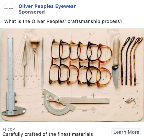
While this ad isn’t showing a finished product, sometimes the behind-the-scenes and the in-between can be fun for an audience to see as well.
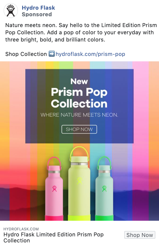
We’re back with the bright colors in this Hydro Flask ad. This ad is perfectly using a rainbow color backdrop and similarly colored water bottles to grab attention and attract users to buy now.
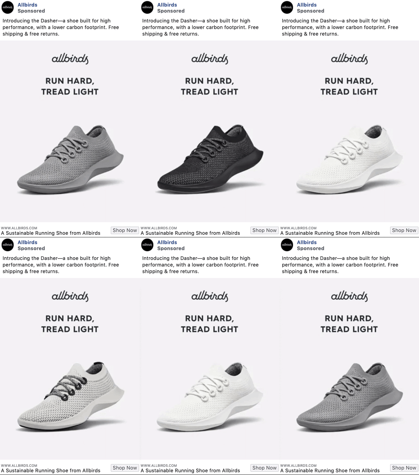
This simple slideshow ad keeps to a monochromatic greyscale color theme by showcasing all of the various colors of this specific shoe. This is a great way to let viewers know that your brand is sure to have something for everyone.
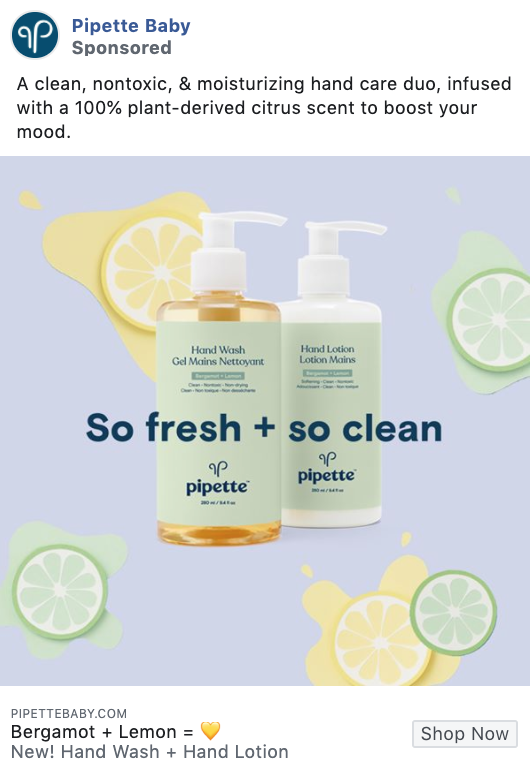
This Facebook ad example’s focus on pastel colors and clean design really catches their target audience’s eyes. Plus, the “So fresh + so clean” copy is going to stand out to any new or expecting mom.
Bottom line? Know what your audience wants to see and give it to them.
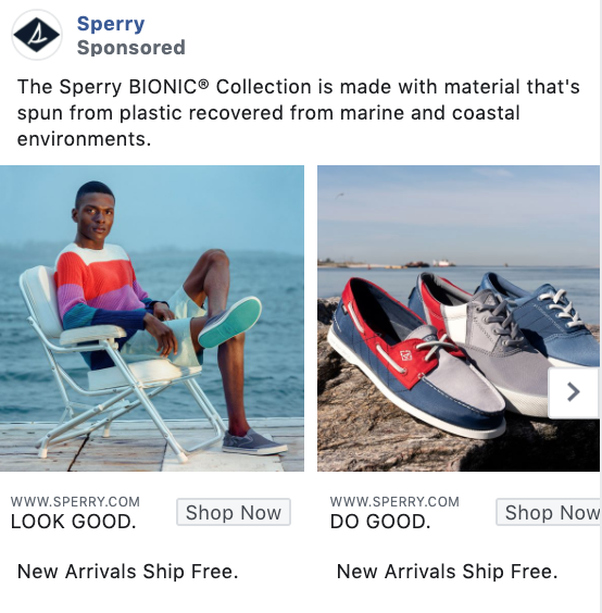
Sperry’s product ad is another great example of showcasing a product next to that product in action. They let their audience get a glimpse into what they can do with the product without having to imagine it.
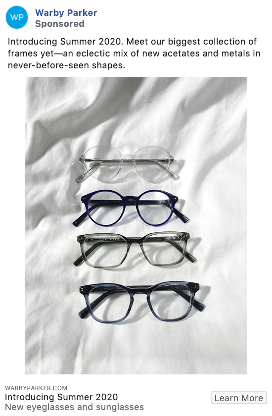
Warby Parker’s simple product ad showcases a few frames from their new collection against clean, white linen. You can take this photo with your smartphone and still create an engaging Facebook ad.
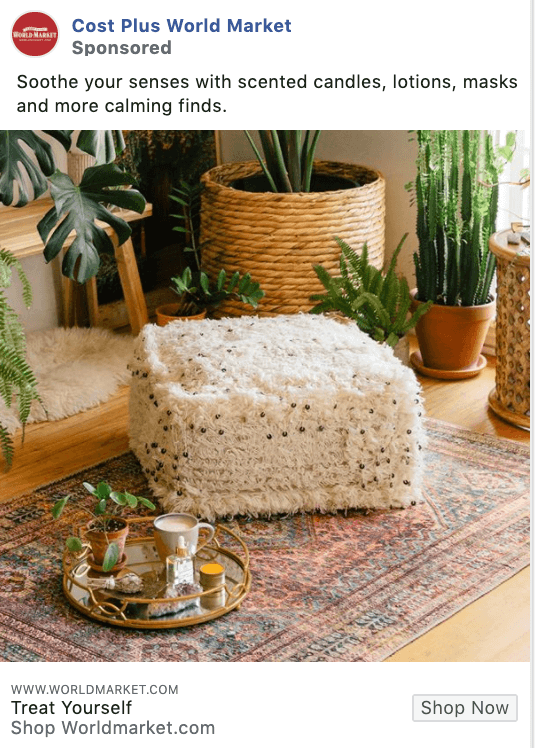
This is a great ad from World Market showcasing several of their products within a single photo. It shows the massive selection that consumers can find, getting them ready to open their wallets and buy…a lot of items.
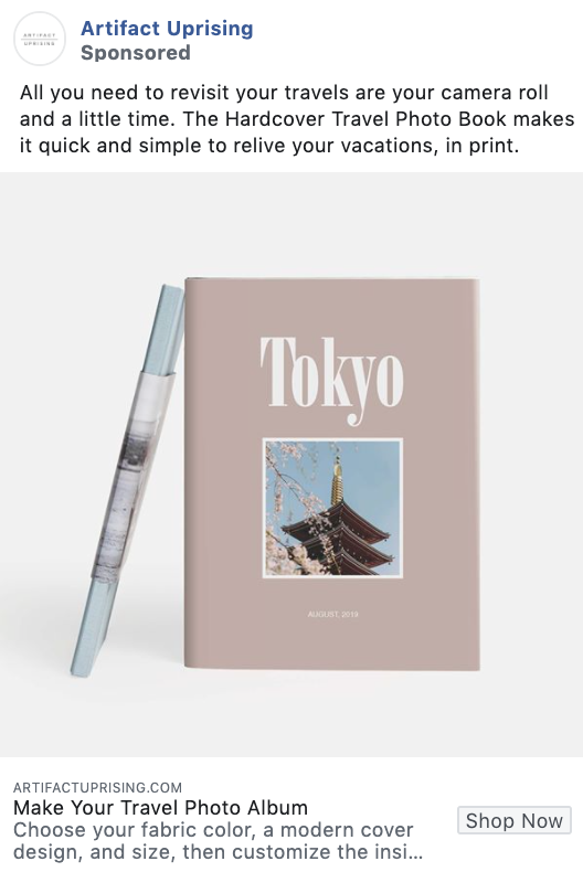
This is a great product ad as it’s simple yet still so visually appealing. Showcasing a stunning travel photo book cover design against a plain background allows their product to stand out more.
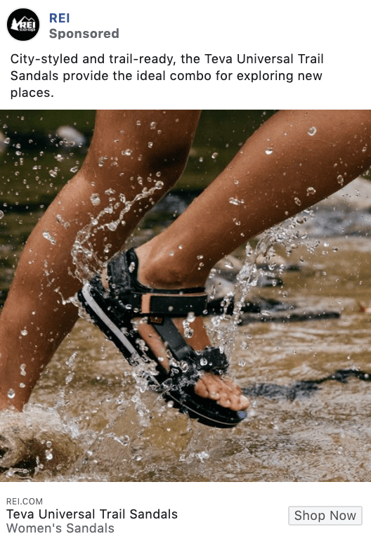
This REI ad showcases a stunning, real-life photo of the products in use. They’re saying, “Want to spend more time outdoors? You need REI.”
Not every brand sells products and not every ad needs to be product-focused. We’ve put together a list of our favorite B2B and service-based Facebook ad examples to showcase how these guys are also winning at digital advertising.
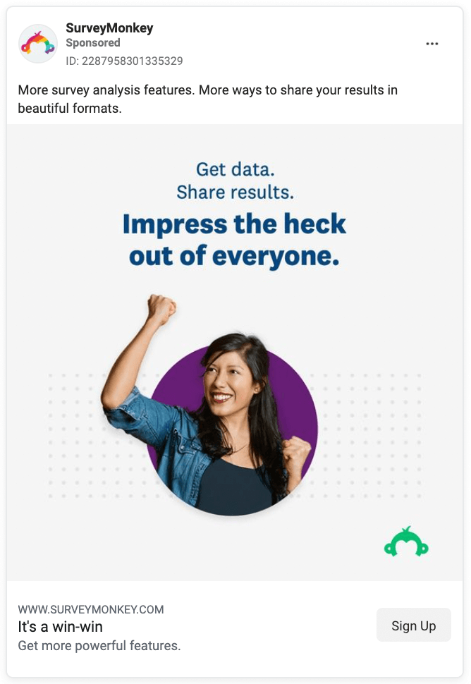
Survey Monkey focuses on showing a person that makes the viewer think it’s what they would look like if they used the service. Happiness is infectious. Smiles sell. They elicit more customer joy as well as a greater product liking.
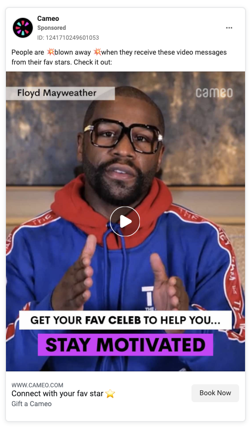
Getting a celebrity like Floyd Mayweather to speak on your service’s behalf helps, but Cameo doesn’t totally rely on it. This entire ad video is filled with a slideshow of reasons to use their service. The use-cases help nudge viewers to purchase.
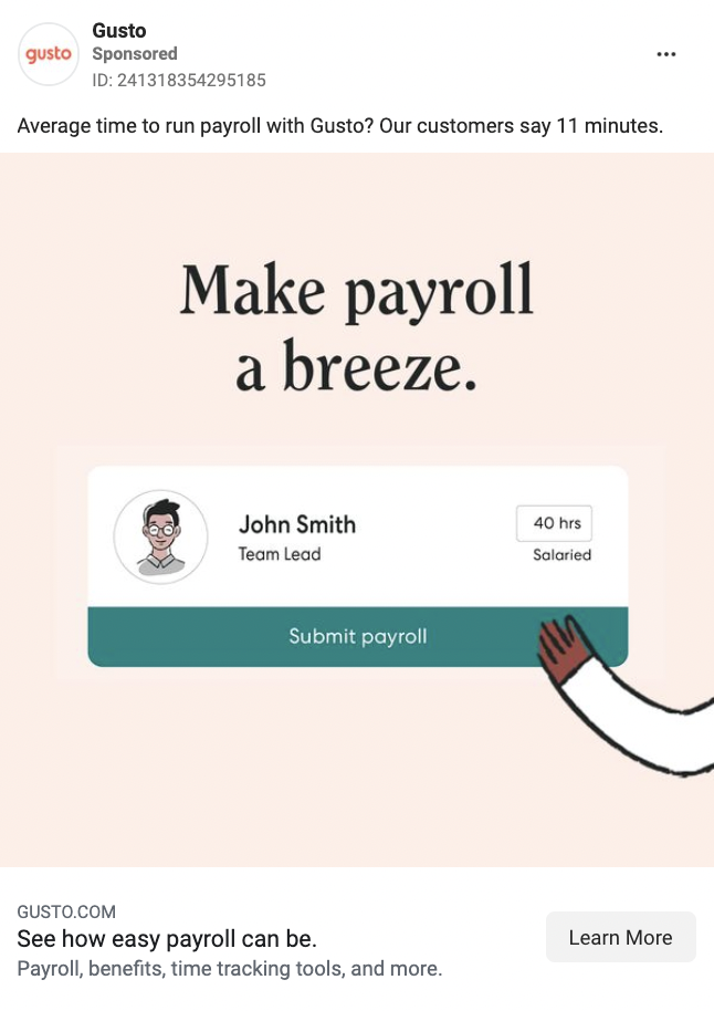
If you know the top paint point that your product solves, put that front and center. That’s what Gusto does in their ads. Don’t focus on the service. Focus on the benefit.
Bonus points for the ad copy that provides an average time to run payroll. People like numbers, they give authority to your ad.
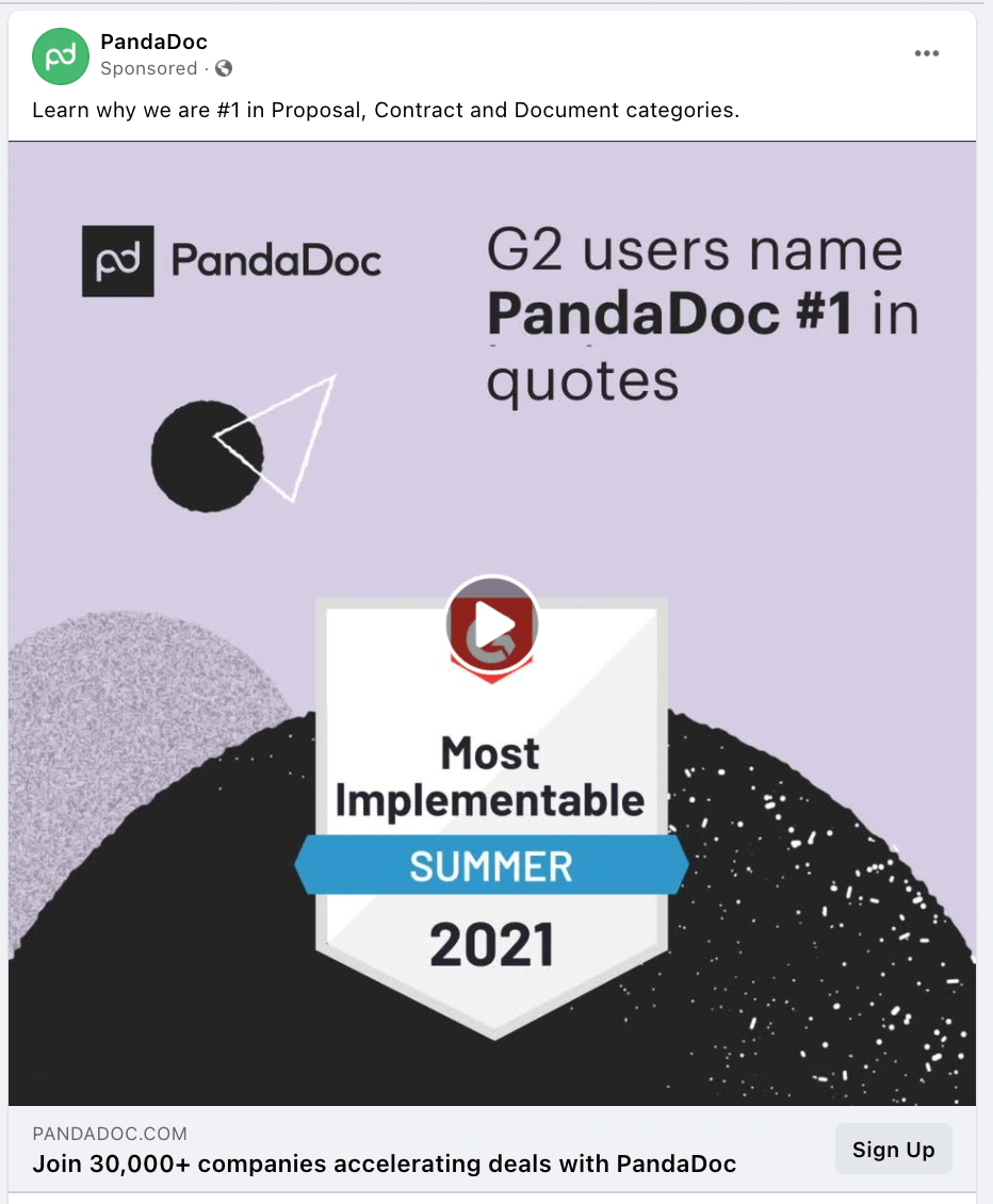
G2 is one of the most trusted service review sites, so PandaDoc let’s them do the talking. Because it’s so universally recognized and trusted, it speaks volumes about how great the product is.
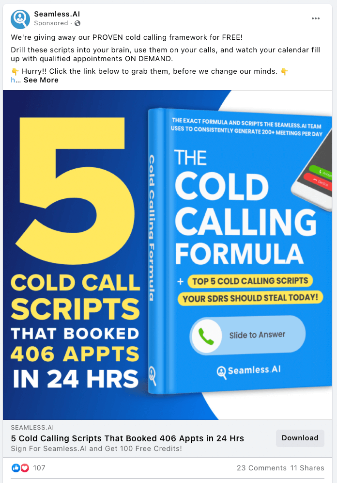
The reality is that B2B marketing and many service-based businesses have a longer buying cycle. Offering a downloadable asset is good for the beginning and middle of the funnel because it provides value.
This ad puts the value right in front of your face. The exact numbers give it the authority and give potential results that viewers could also expect. There’s a lot going on but the big numbers guide the eye.
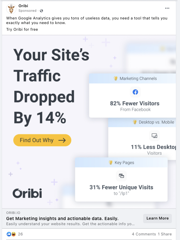
Oribi gives users a sampling of the insights their service provides. They also phrase the biggest copy within the image to address the viewer. It allows the viewer to imagine what it would be like to use the service.
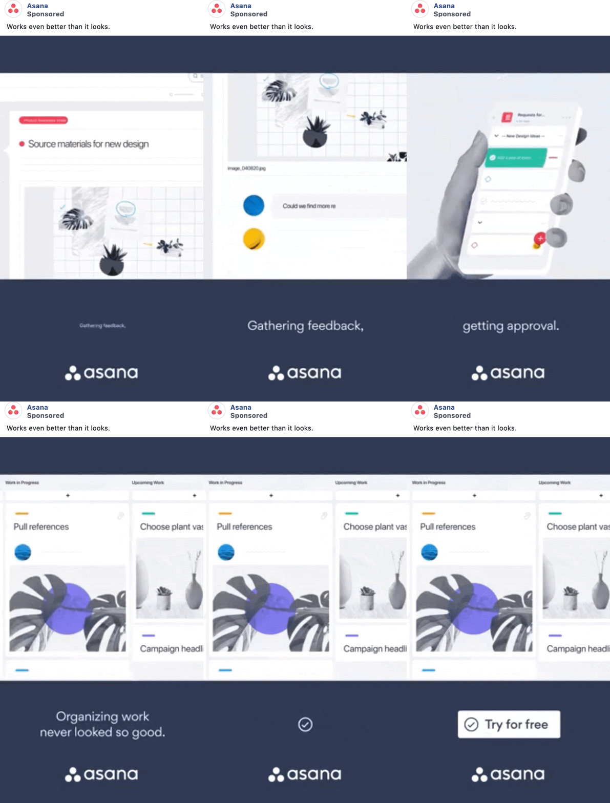
This video ad showing a quick overview of how their service works is a great way to get people interested. They’re showing off their user-friendly interface to entice people looking for easy-to-use project management software.

Duolingo isn’t B2B by any means, but their app does provide a service, and with this cute animation and their #1 Education App copy, this ad is doing a lot to promote said service.
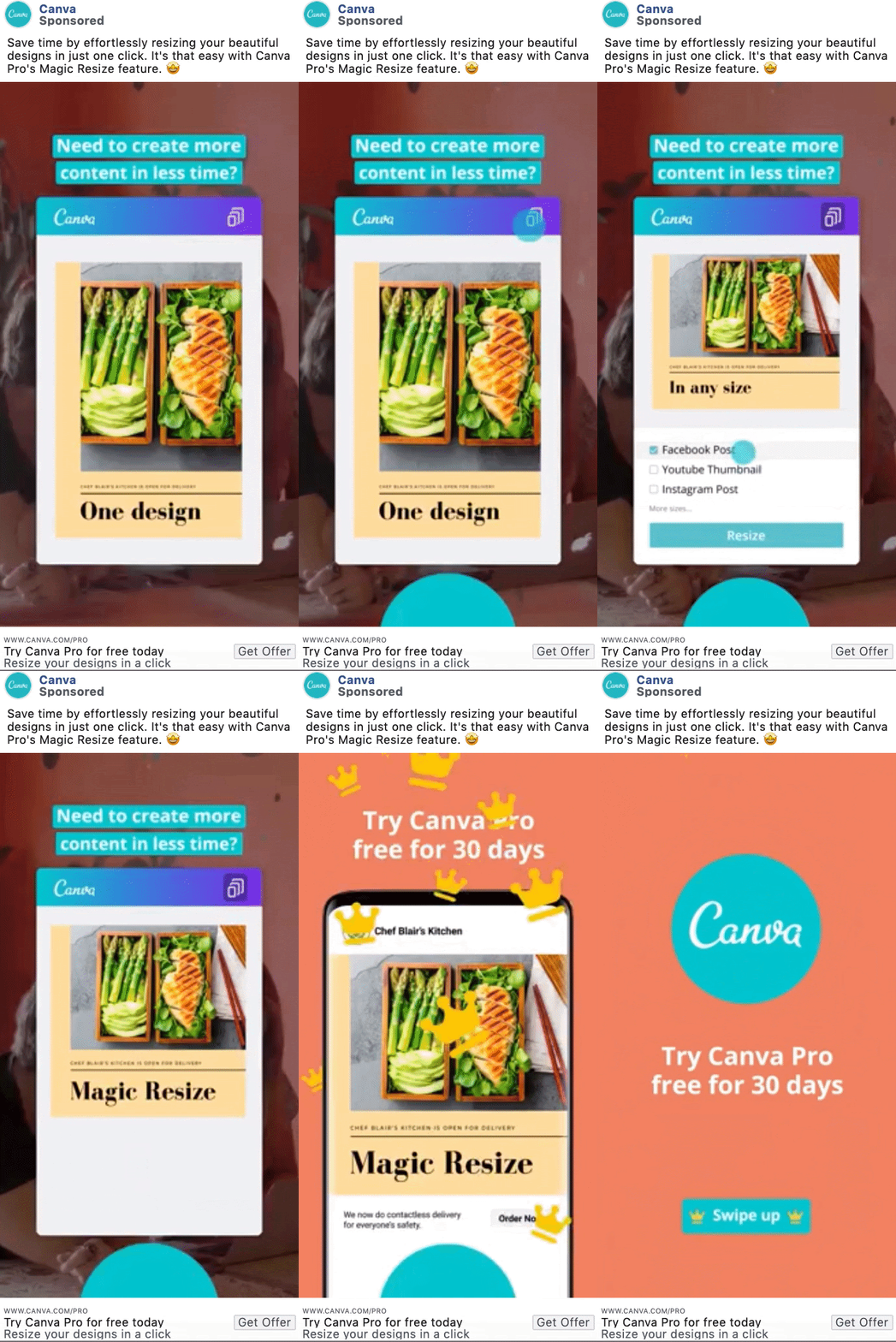
This is another great example of a SaaS ad, giving a sneak peek into how their software is used and what can be created with it.
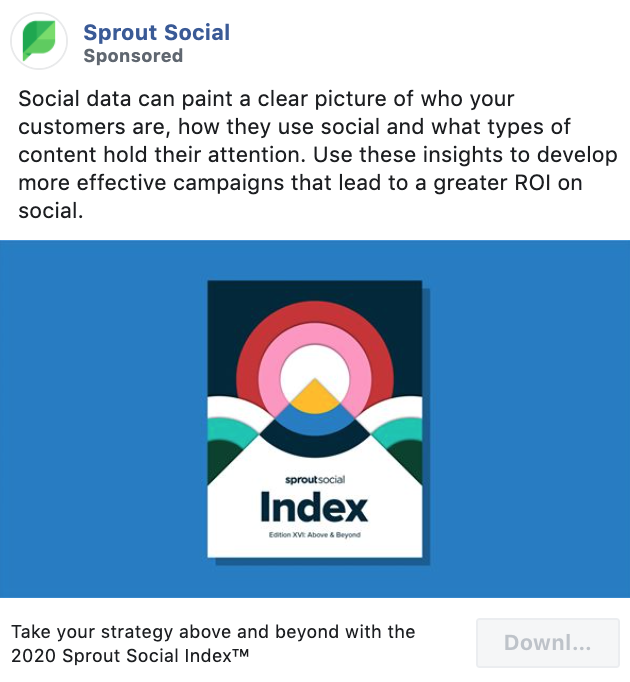
Sprout Social is a well-known social media management SaaS, and this ad is designed to help them generate leads to nurture and eventually convince them to sign up for their software.
Starting out with a lead generation ad is a great tactic for many types of B2B and SaaS businesses.
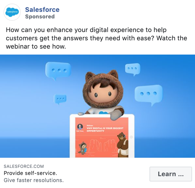
Salesforce is another SaaS company that helps sales teams keep their contacts and leads organized. This cute illustration promoting a webinar – another lead generation tactic – helps to grab attention while people scroll down their Facebook feed.
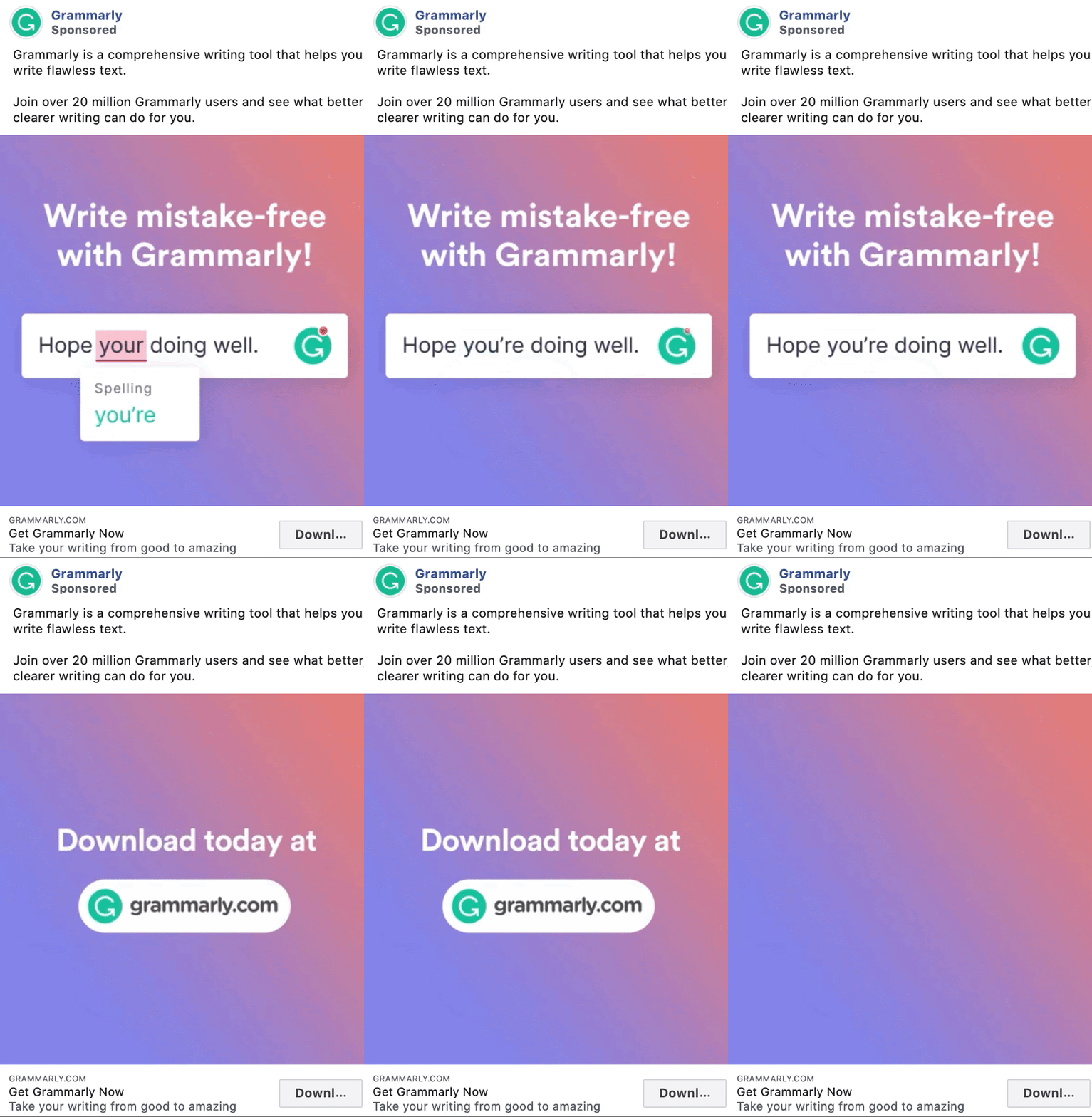
Grammarly’s ad is a very simple tutorial of how their product works, and anyone who could use some help with spelling or grammar is likely to immediately hit that Download button.
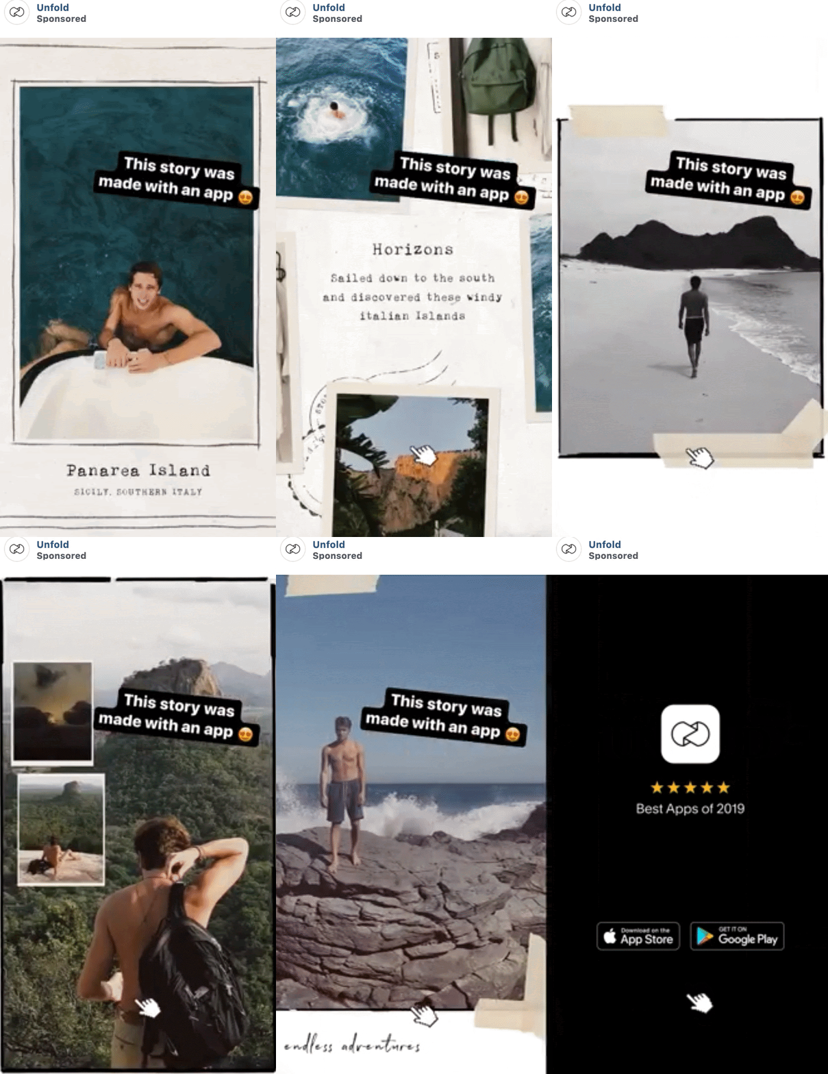
This Unfold ad lets the end product do the selling. By using in-app text features on the ads, it also makes the ad come across as if it’s just another story from a friend vs an ad from a brand.
Another great way to sell your product or service through your Facebook ads is by sharing social proof, or customer reviews and testimonials.
83% of people trust reviews over ads, so putting them together is a winning combination.
In fact, there’s no need to limit yourself to customer testimonials. You can also get a boost from these sources:
- Testimonials from your employees: Many employees do this without asking -— especially if your company is a great place to work —- but it doesn’t hurt to ask them to share their positive experiences with the world.
- Industry experts: If a busy influencer takes the time to give you a review, they must think you’re worth talking to. There’s also the halo effect – when an influencer praises your brand, people will associate you with the famous person’s glory and fame.
- Third-party reviews: Visit niche review sites in your industry such as Yelp, TrustRadius or G2Crowd — and look at the existing reviews for your product or service. These could serve as social proof for your next Facebook ads campaign.
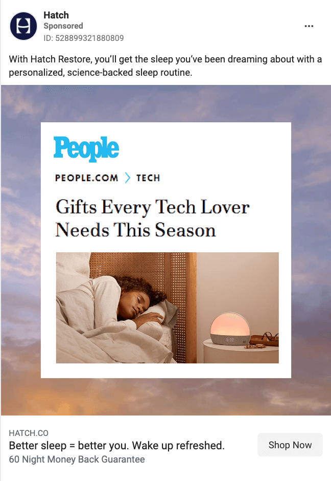
Press from popular magazines is their own form of social proof. Hatch used a screenshot of a People article that their product was featured in. Placing it on top of a video of a dreamy sunset, keeps it on-brand and interesting.
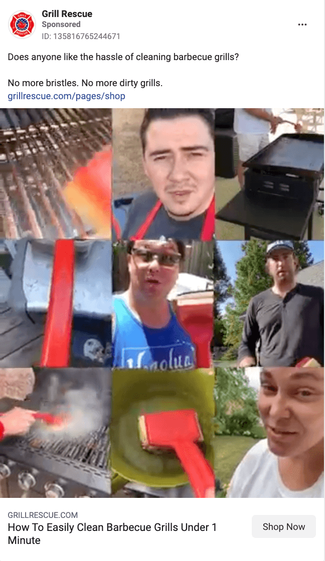
Grill Rescue compiled nine different testimonial videos into one. While it can be overwhelming, it’s also powerful. You see all these people raving about the product and you get FOMO. You want to be part of the crowd.
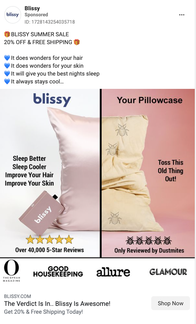
Blissy’s image compares their pillow to others. They add in social proof at the bottom by putting the logos of all the brands that have recommended their pillow.
Smaller, but also significant is the copy under the stars that says they have over 40,000 5-star reviews. That’s powerful.
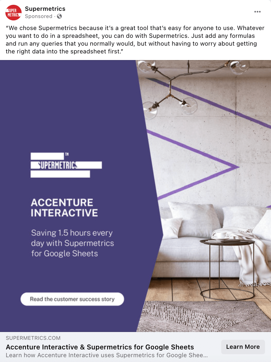
Supermetrics chose to add their social proof two ways: in the caption and as the marketed content. The caption features a direct quote and the actual ad content CTA is to read a customer success story.
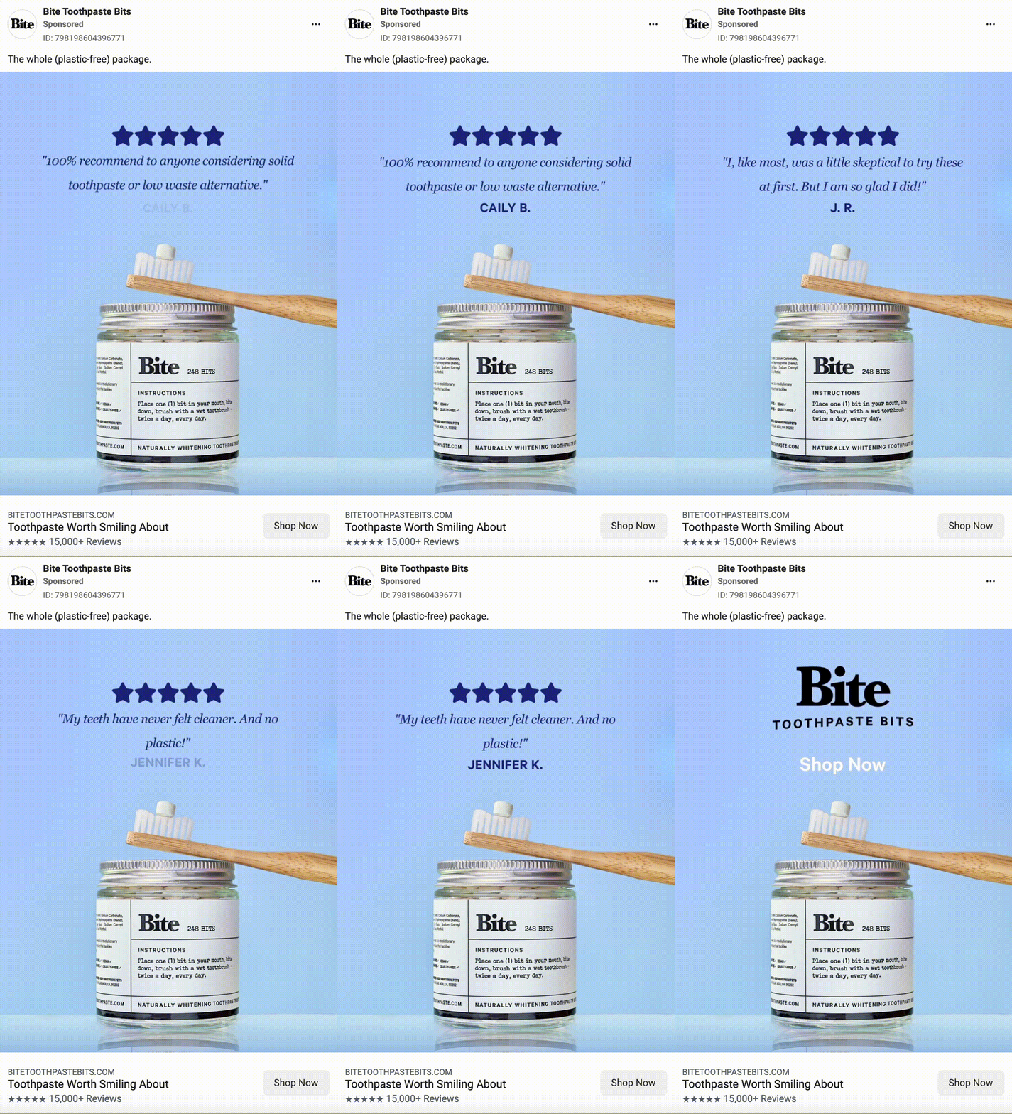
Bite’s ad cycles through a series of short testimonials. The visuals of the five stars within the testimonials and within the headline hammer the social proof points home.
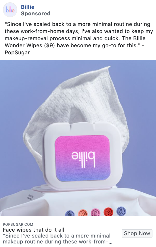
Billie chose to use a review from popular magazine, PopSugar. Rather than clicking through to Billie’s website to shop, they take the viewers to PopSugar.com to read the full review.
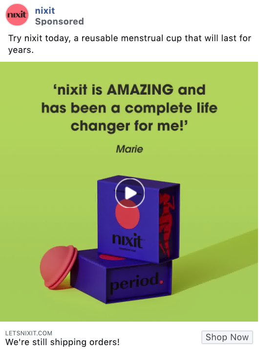
Not only will the bold colors in this Nixit ad grab attention, but the testimonials directly in the ad video give even more credibility to their product and their brand.
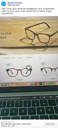
This Warby Parker ad showcases a video review from one of their customers on how the process works, creating an authentic ad that will attract new buyers.
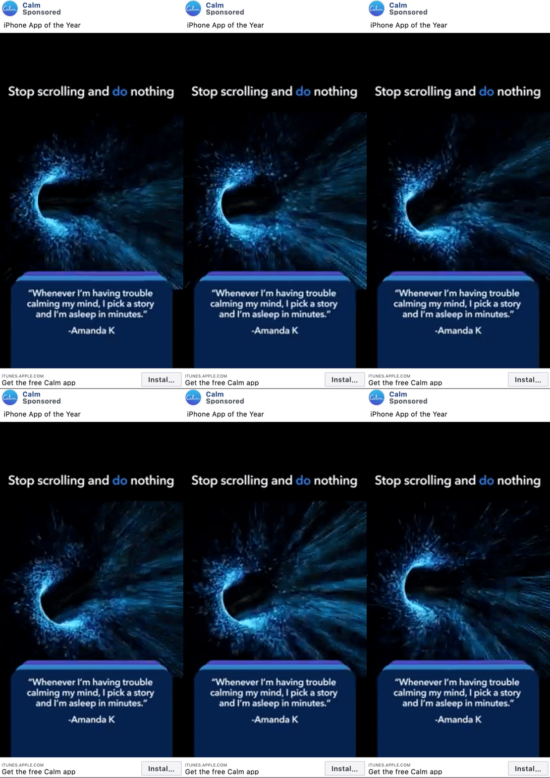
Not only do these Calm ads include reviews from their users, the ad on the right shares awards and accolades the app has gotten from reputable sources as well, giving even more credibility to this app and how well it works.
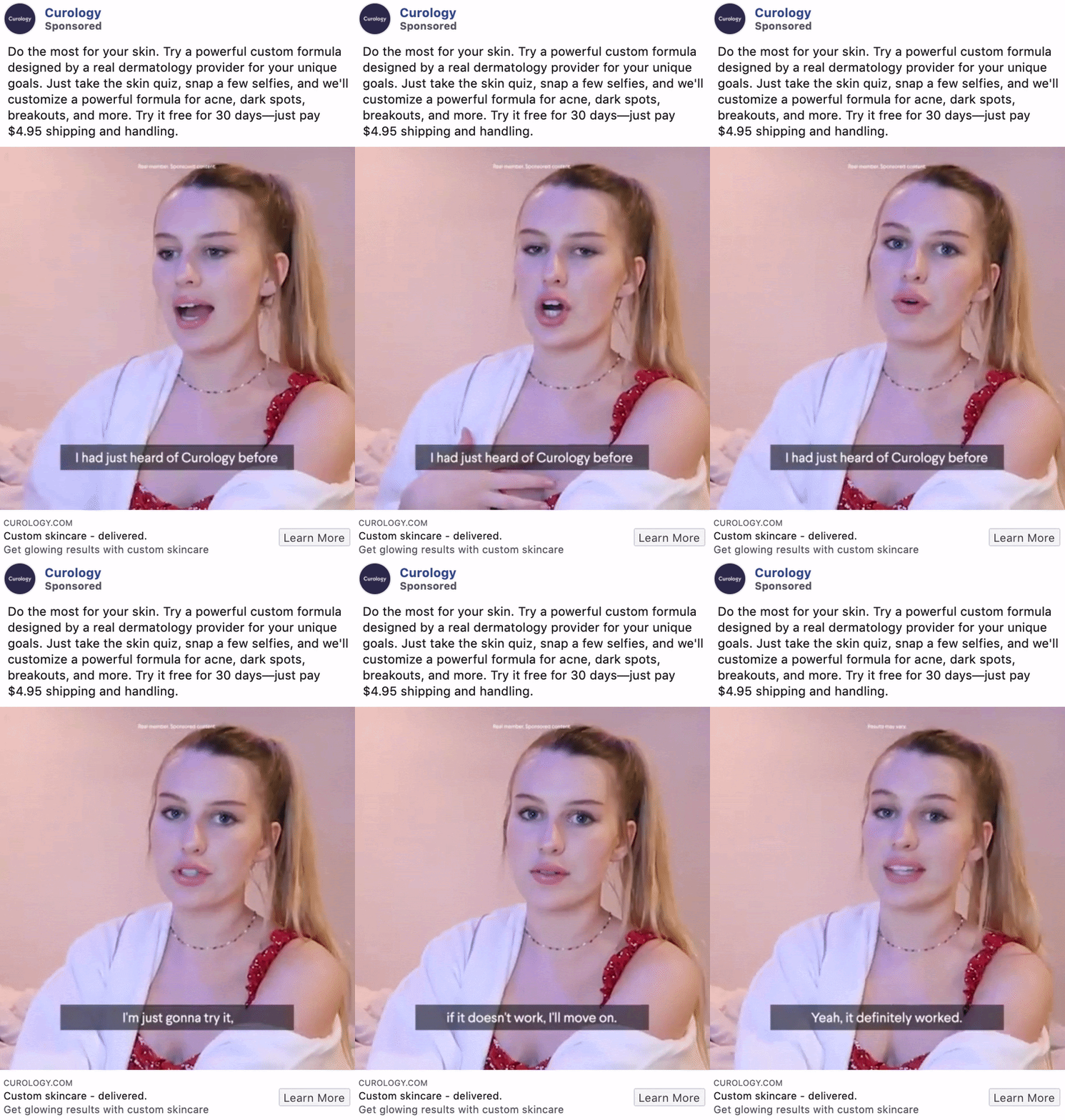
Working with influencers to get reviews for your product or service is another great way to showcase social proof for your audience, just like Curology did here.
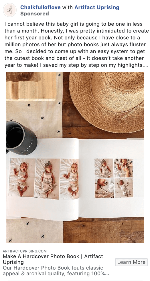
This Artifact Uprising ad is unique in that it isn’t even created from Artifact Uprising’s account. Instead, this is another example of an influencer campaign, where the influencer tagged the brand, and the brand promoted the post.
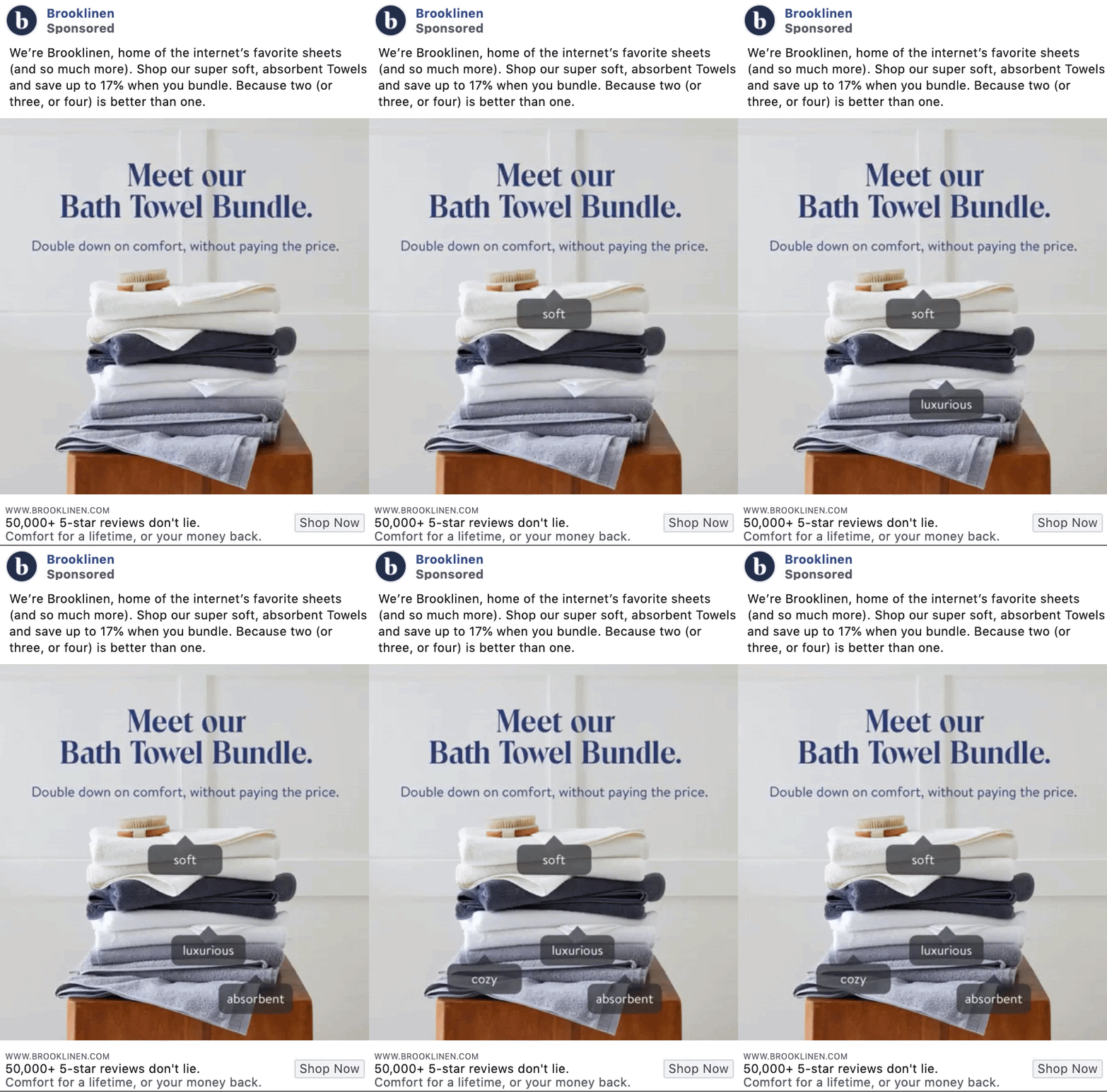
The social proof here is subtle – it’s in the title line of their ad information. “50,000+ 5-star reviews don’t lie” is a great tagline to help sell your product and build trust.
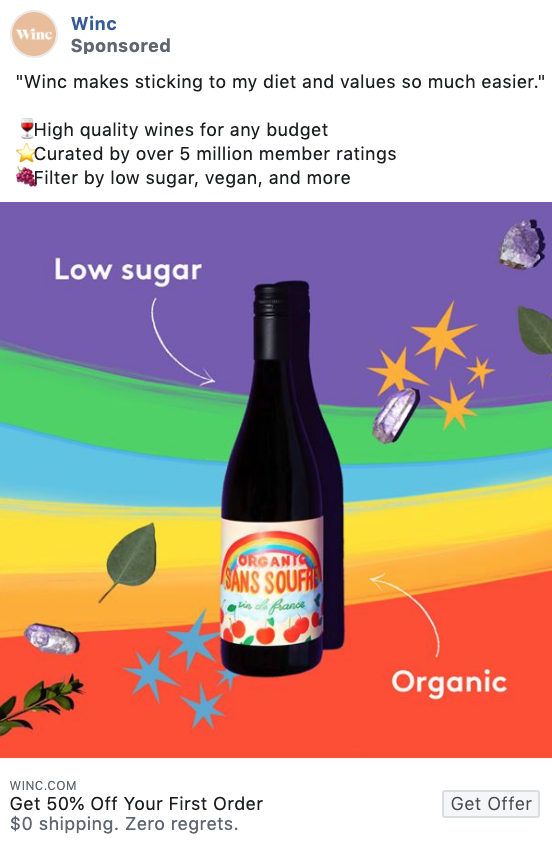
This ad has everything – bright colors, emojis, a direct customer quote, and a 50% off your first order promotion. We love to see it.
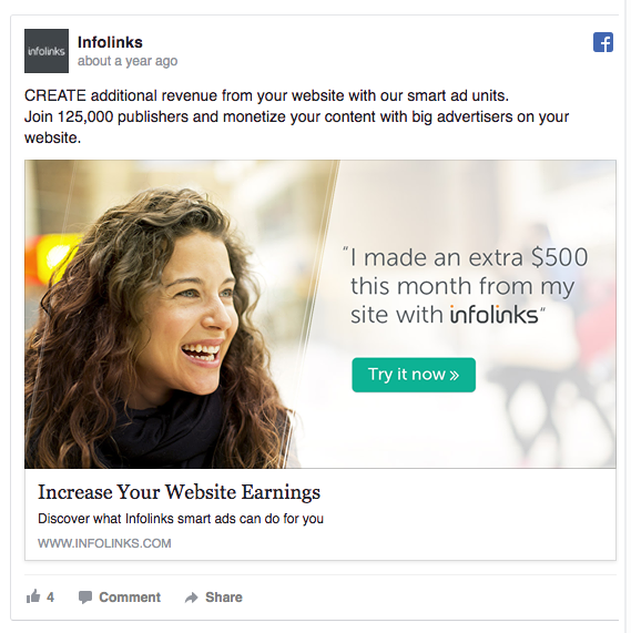
Infolinks’ Facebook ad image displays a quote by one of their customers: “I made an extra $500 this month from my site with Infolinks.”
What makes this ad extremely powerful is the real photo of the client.
Marketing Experiments shows that using a real person associated with your product instead of a stock photo increases conversion by 35%.
Promotions are an essential part of business. Whether it’s picking up business during the slow times, celebrating a holiday, or getting rid of old inventory. So what’s the best way to advertise your promotion? In the next few examples, we’ll see brands that are doing it right. From birthdays to trials to your standard sale.
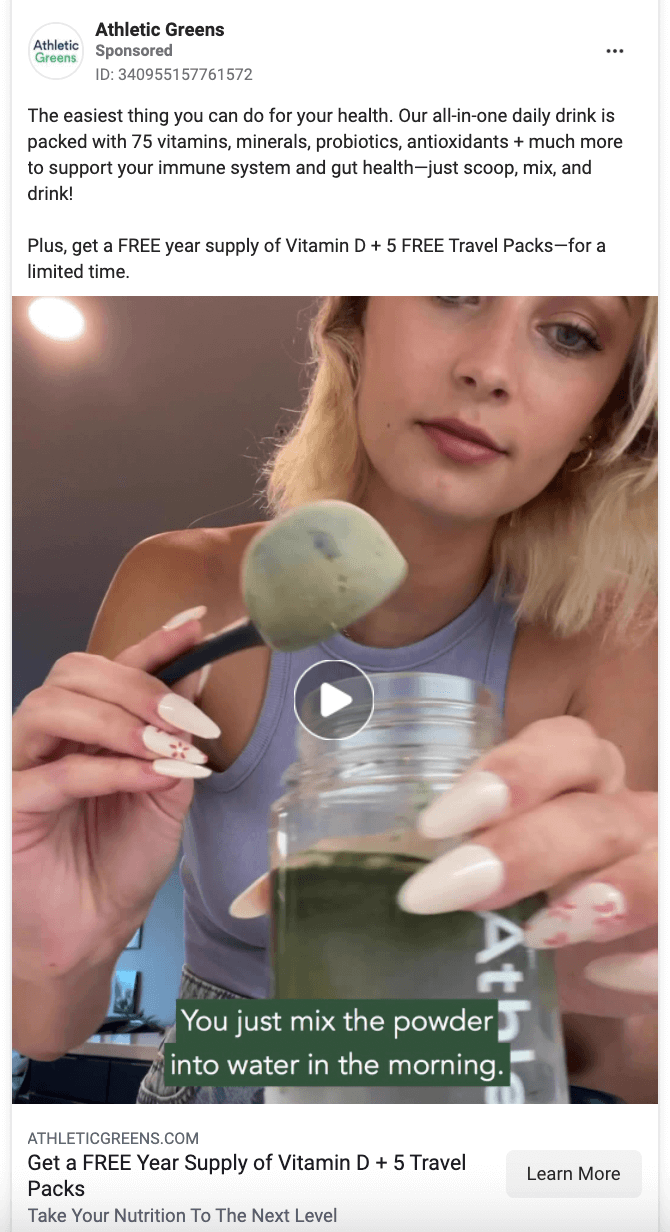
Athletic Greens uses a promo to help get brand new customers. The content features a woman using the main product they’re advertising while the caption and headlines peak to the added bonus of getting a free year supply of Vitamin D and travel packs.
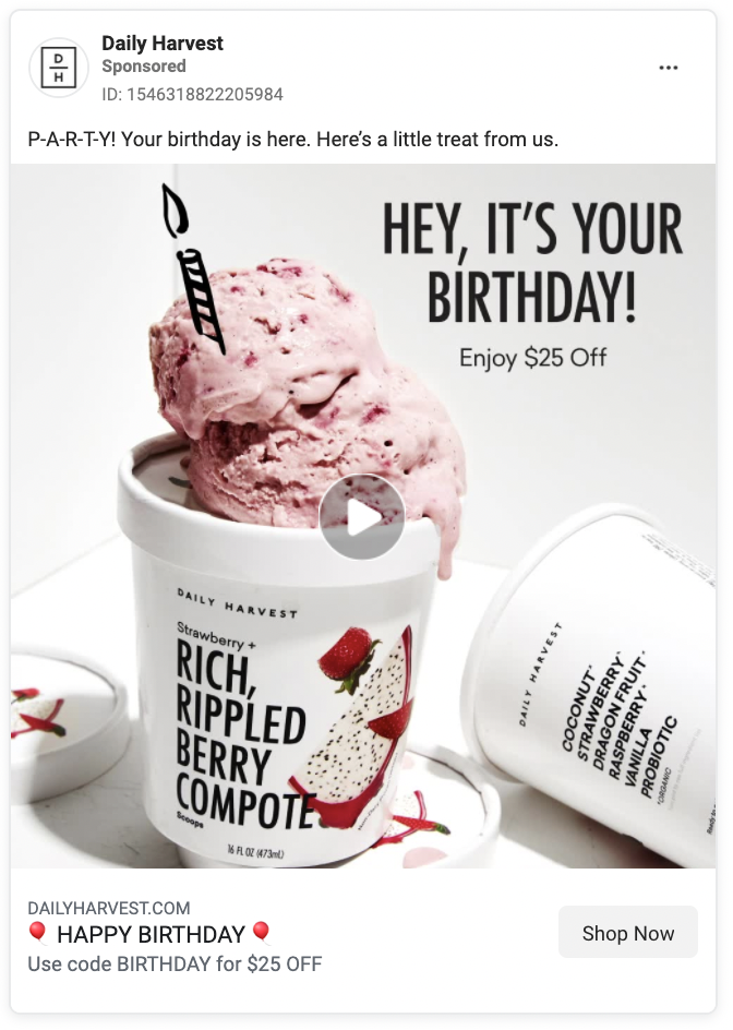
If you ask for your customer’s birthday, it’s an easy way to connect with them later on in the year. Whenever it’s their birthday you can surprise and delight them with a promo. It makes them feel seen and special.
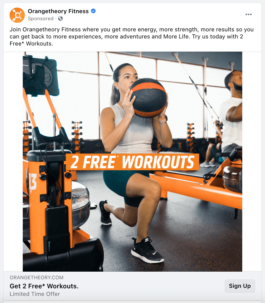
The simpler the promo, the better. Orangetheory Fitness offers two free workouts. It’s highlighted in the actual image, front and center, as well as on the headline.
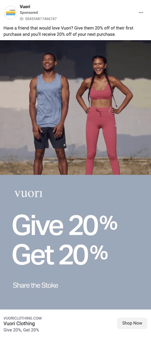
Vuori's promotion is hard to miss, which is a good thing. It’s also a simple one to explain which makes it more appealing. They still could have utilized the headline to hammer the point home.
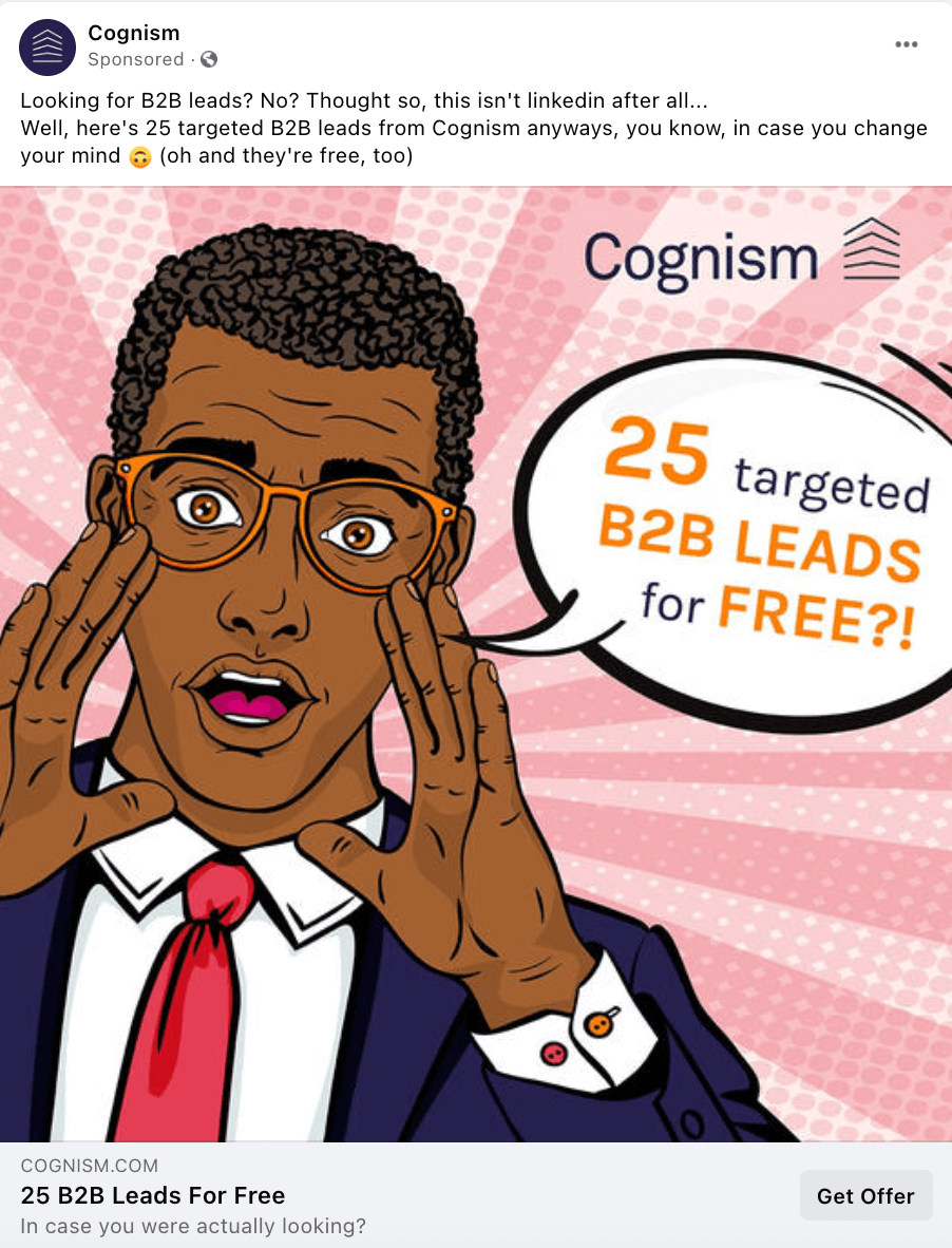
This ad stuck out from the rest of the news feed. Not only does the graphic of the man pop, but the promotion does too. 25 B2B leads for free. For B2Bs, leads are a hot commodity. It’s a deal you can’t pass up.
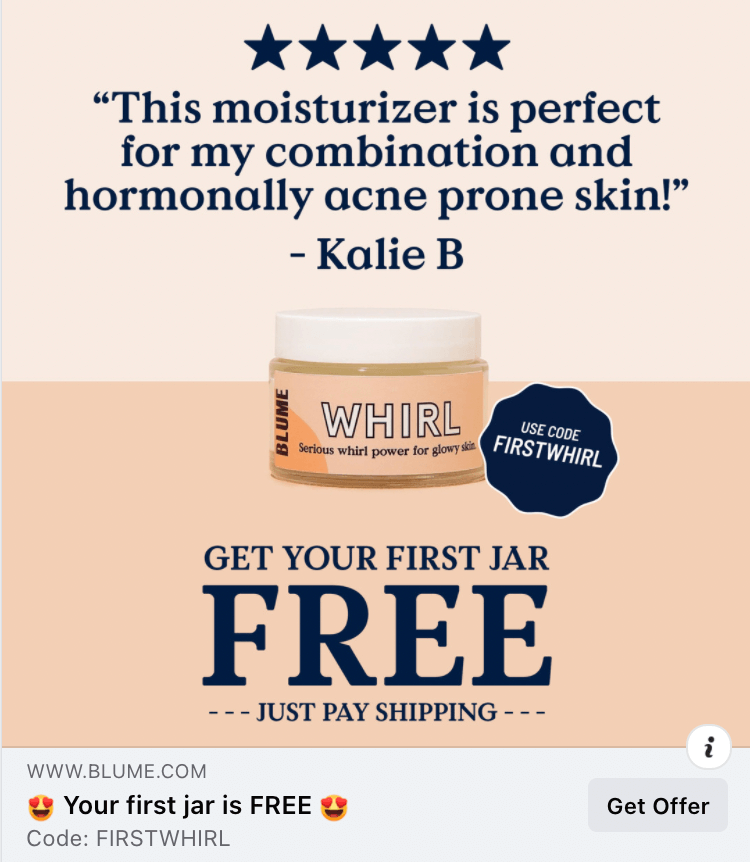
When “Free” is the biggest word on the ad, you’re bound to get eyes. Pair it with a testimonial and emojis and you’re destined for success.
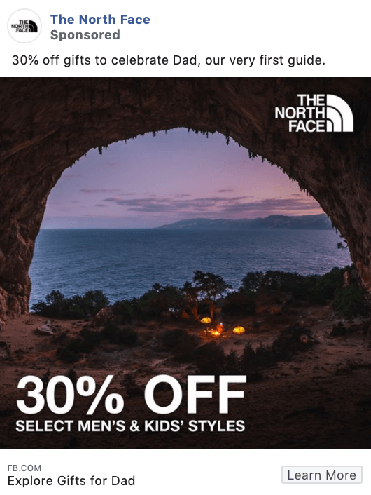
If you’re running a discount or promotion for various holidays, you absolutely want to create an ad campaign surrounding that. The ROI from additional awareness of your sale will nearly always be worth it.
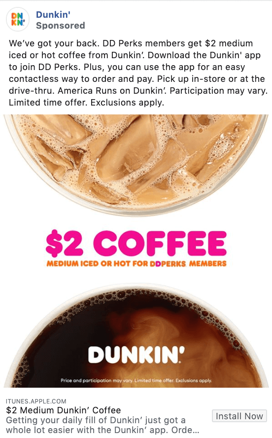
Heavy copy doesn’t always work in a Facebook ad, but in this example where Dunkin is thoroughly explaining their perks program, it’s necessary.
Less is typically more unless you need the verbiage to give your audience a more thorough understanding.
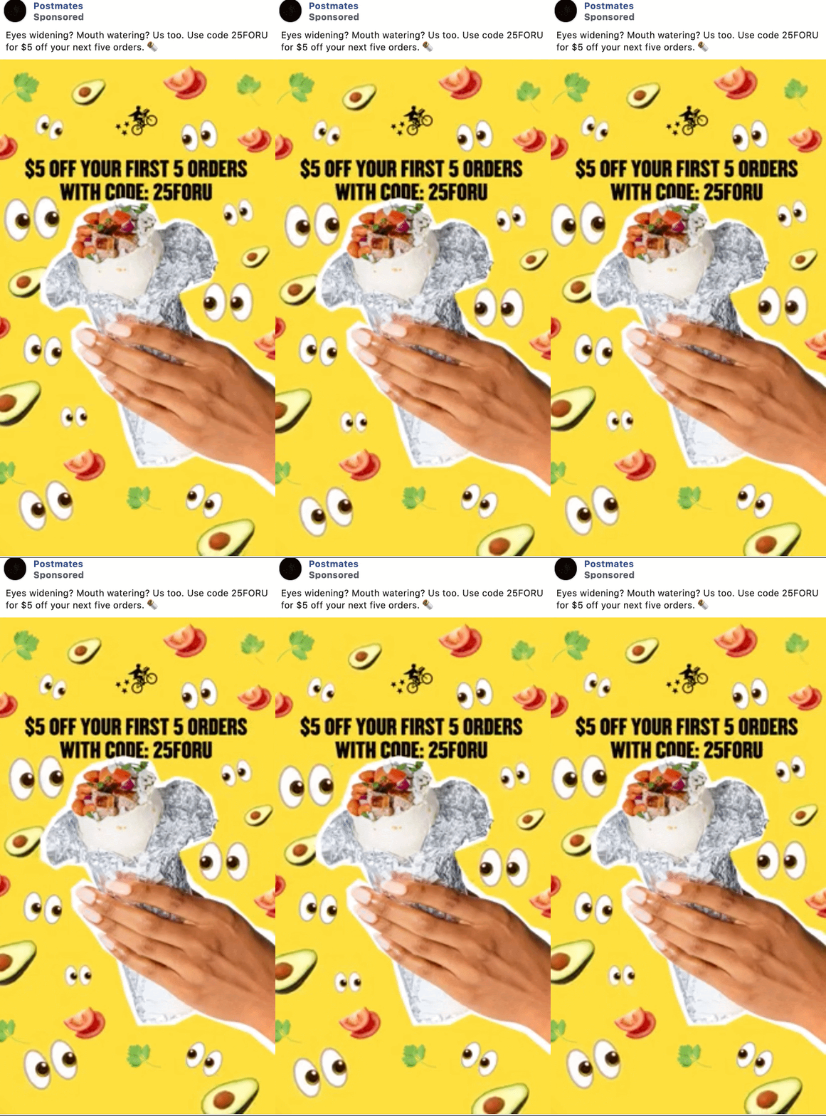
The unique graphics help initially grab attention, but it’s the discount that is ultimately going to reel the customers in.
Including a promo code right in your ad is a great way to get people to take action immediately – they don’t want to forget about this discount.
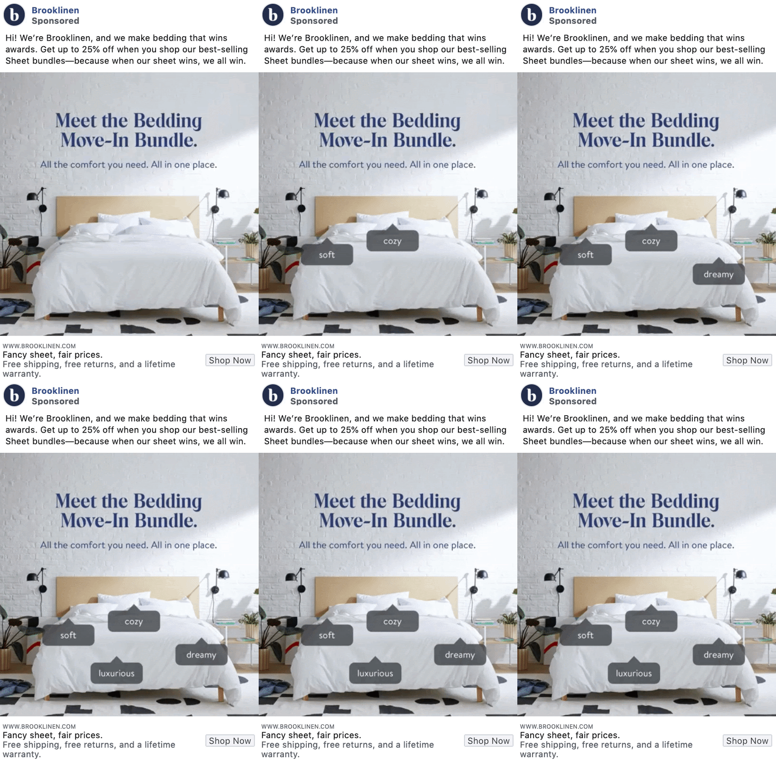
Bedding is not a cheap investment, but Brooklinen’s focus on fair prices and their 25% off bundles can really help take the edge off when someone needs new sheets or a comforter.
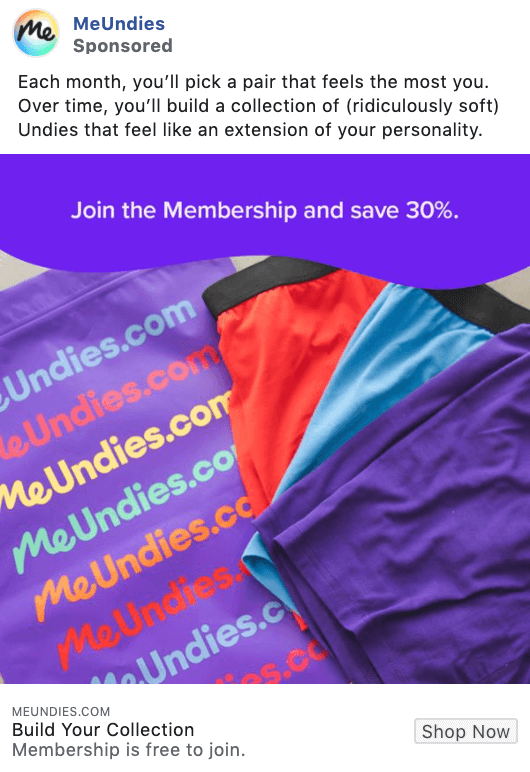
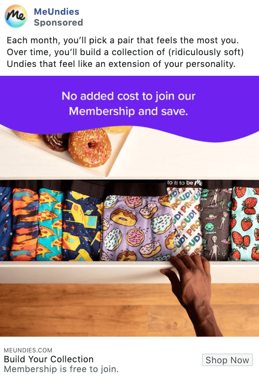
This ad by MeUndies is all about promoting their membership plan to help their customers save. If you have a unique program or membership plan, creating a campaign to showcase it is always a good idea.
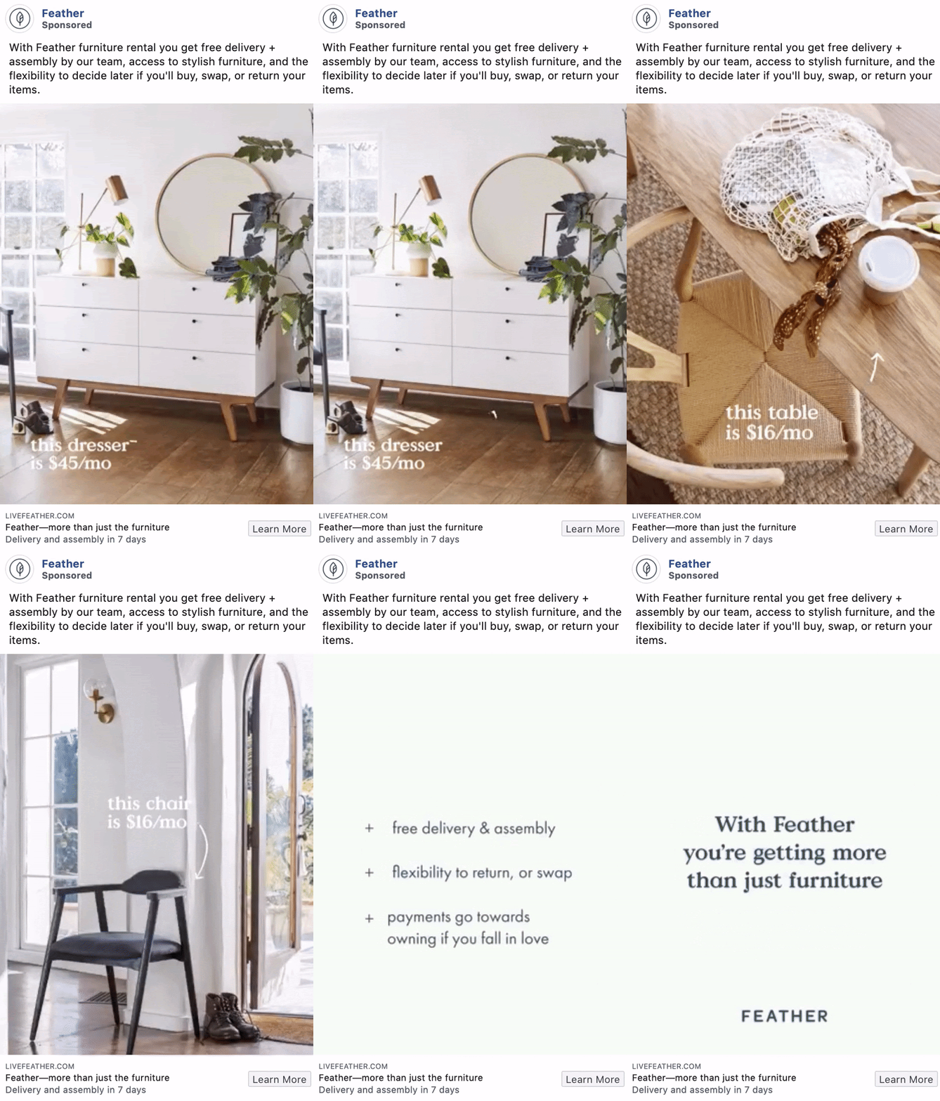
We love the transparent pricing in these ads, plus the free delivery. By pointing to each product in the video and giving their prices right on the spot, someone who might be in the market for furniture rental will be all ears.
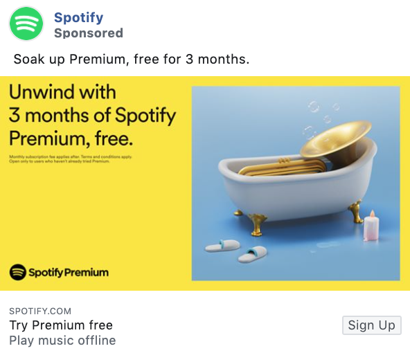
Spotify’s brightly colored ads pop off the page and grab users’ eyes. However, it’s the 3 months of Spotify Premium for free that will really rope new customers in.
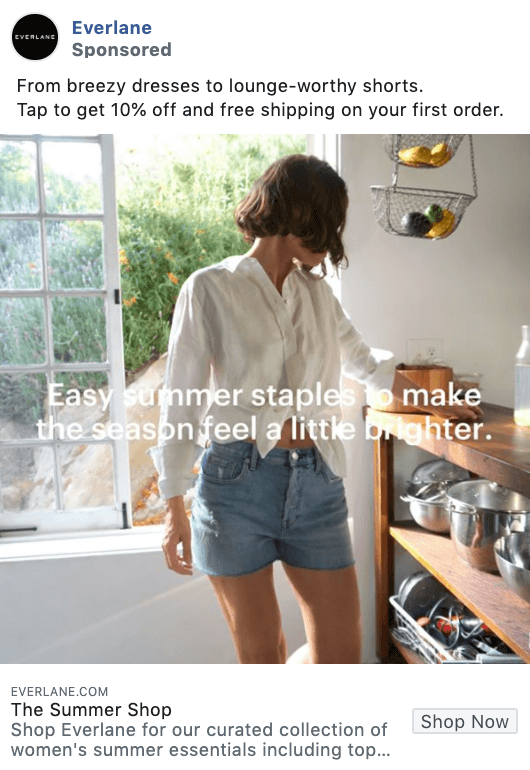
A simple lifestyle photo accompanied with a 10% off discount for first-time buyers is sometimes all you need to generate the response you’re looking for.
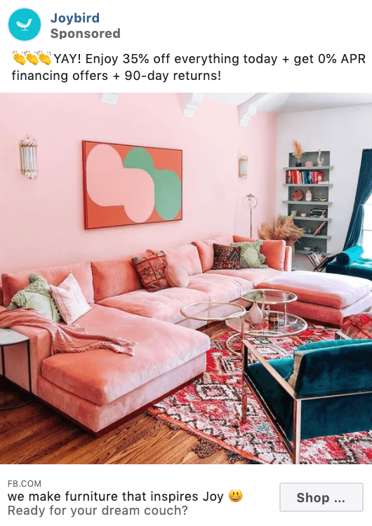
This relatable copy mixed with an exclusive 35% off discount and a stunning pink room is absolutely the way to sell furniture – or, anything, really.
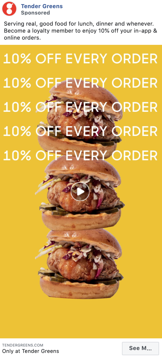
Just in case you missed their 10% off discount in the ad copy, Tender Greens has made sure you won’t miss it in their ad’s animation. Repetition is often a great advertising technique to ensure your audience remembers what you’re offering.
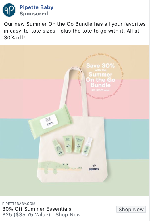
This is a compelling ad because they’ve included a photo of everything their target audience could buy in this summer bundle alongside a 30% off sale. It’s transparent and a beautifully designed ad to boot.
Every Facebook ad campaign starts with an objective. From a high level, there are three options: awareness, consideration, or conversions.
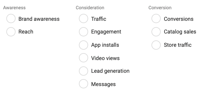
While we can’t confirm exactly which objective the following examples were set up for, we can guess. If the CTA is strong, the objective should be clear and every good ad has a strong CTA. Awareness is top of for more top of funnel activities, consideration is that big chunk of middle of the funnel, and conversions is going for bottom of the funnel.
Michael Aagaard has been doing button tests for more than four years. After seeing test after test, he developed two simple questions to help marketers write the all-important CTA button copy:
- What is my prospect’s motivation for clicking this button?
- What is my prospect going to get when (s)he clicks this button?
Answering those two questions will give you a much more specific and effective direction for your CTA — and hopefully lead to more conversions.
The following Facebook ad awareness examples vary from having no CTA to leading viewers to education blog content. From Saas to retail and beyond. The main goal of them all is to eyes on the ad.
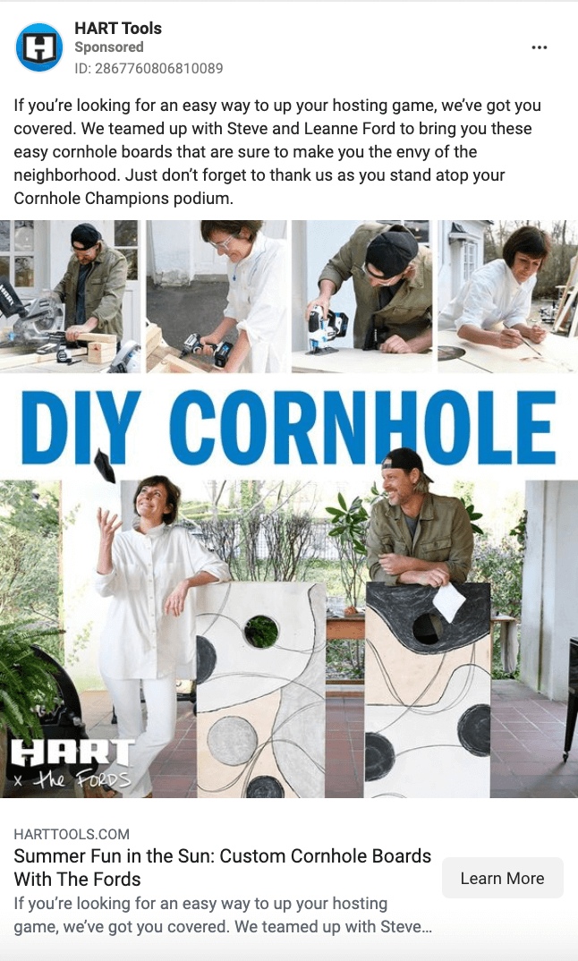
HART Tools sells everything from saws to leaf blowers, but that’s not the priority here. All they’re focusing on is providing value. They’re giving free plans to build a cornhole set. If you want to use their tools, great. They’re trying to associate positive feelings with their brand.
The biggest part of brand awareness is just letting people know you exist. You want them to understand your unique value proposition, the value you provide to the world. This ad from seed does a great job of that.
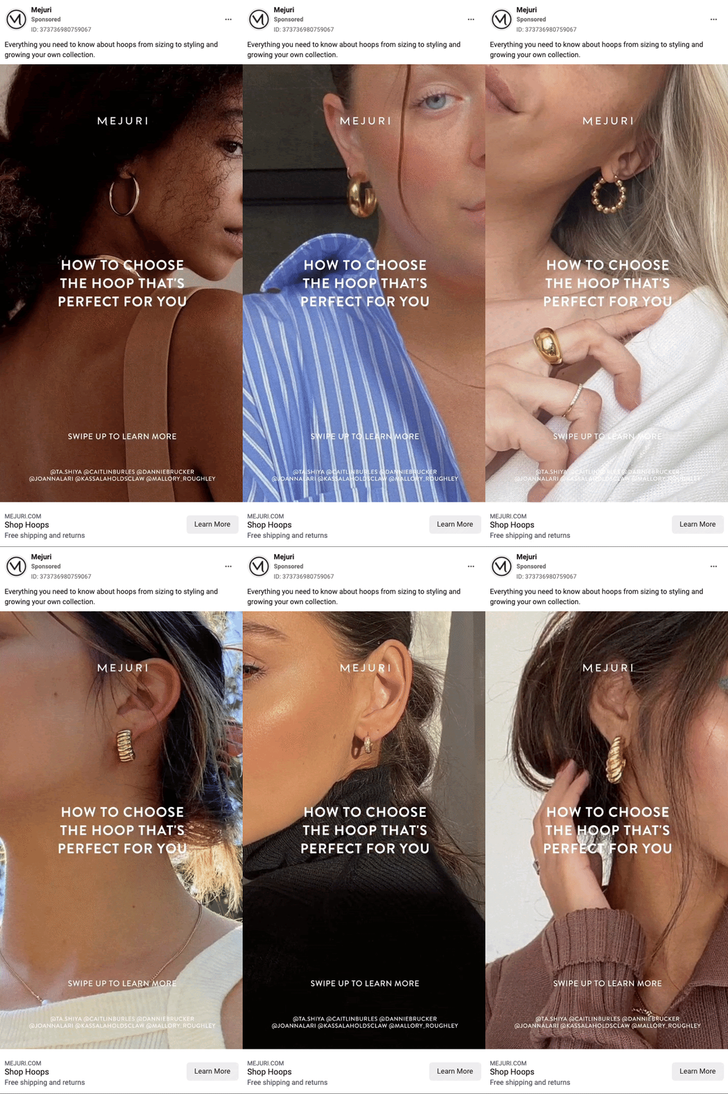
Mejuri’s brand awareness ads help them get noticed as experts in styling. You want to buy products from people who know what they’re doing. They still include a Learn More button to see how influencers and stylists are using their products.
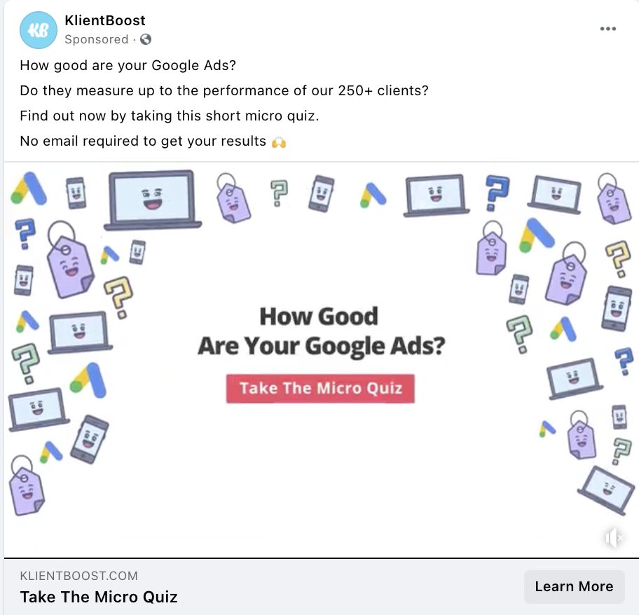
Klientboost’s awareness ads aren’t pushy, just helpful. We put together a quiz for Google Ads users to learn from. There’s no commitment, no email needed, just straight value. By doing this we’re bringing awareness of our brand and agency services.
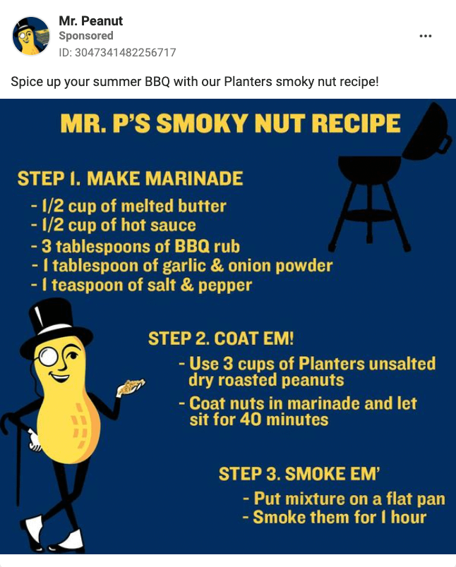
Mr.Peanut isn’t looking for any commitment either. All he’s offering is a delicious recipe. There’s no call-to-action, no push to sell. They most likely target people who engage with the ad later with a message to purchase the product.
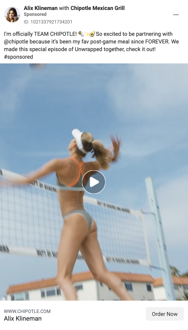
Chipotle sponsors athletes and lets them spread the word. While the main goal of the caption is to let people know that Alix Klinemen is now partnered with Chipotle, they still include an “Order Now” CTA.
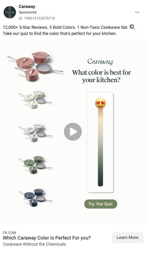
In this ad, Caraway is trying to bring awareness to the different colors that they offer in their pots and pans. By adding the smiley and advertising a quiz, the focus stays on awareness versus pushing a product. It also gamifies the message.
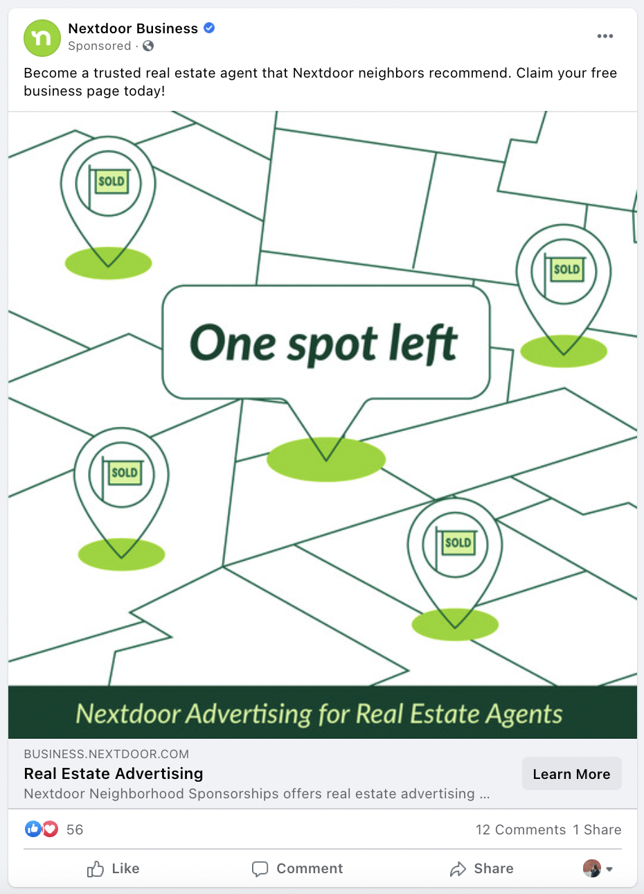
Nextdoor uses ads to bring awareness to their advertising program. It’s a little meta, but it works. While the one spot left isn’t relative to the context of the ad, it still catches attention and makes you read the copy.
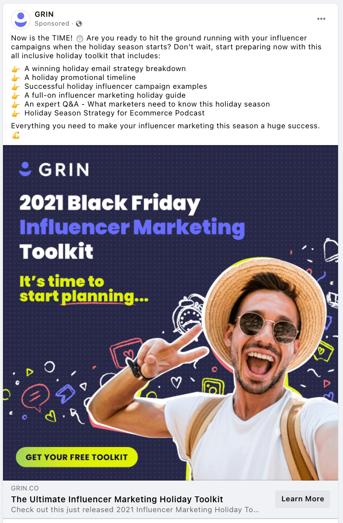
Offering value instead of selling is a big key to successful awareness ads. GRIN is offering an entire toolkit to master influencer marketing in their awareness ads.
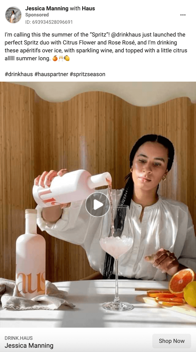
Haus takes advantage of influencers to push awareness-level content. They have the influencers film themselves making a cocktail of their choice using Haus and then puts money behind the organic post.
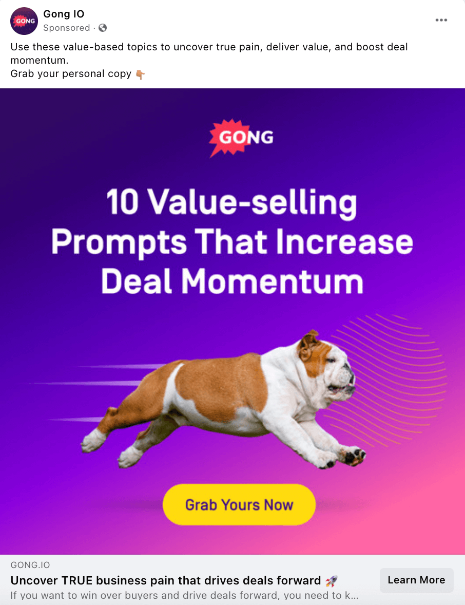
If the dog flying through the air didn’t make you stop, the copy did. Gong IO is offering insights to to sell better that will then lead to awareness of their product.
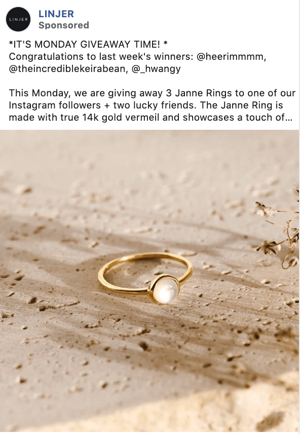
Really want to get people excited about your products? Host a giveaway! And to get even more entries and awareness about your business, you can create an ad surrounding your giveaway.
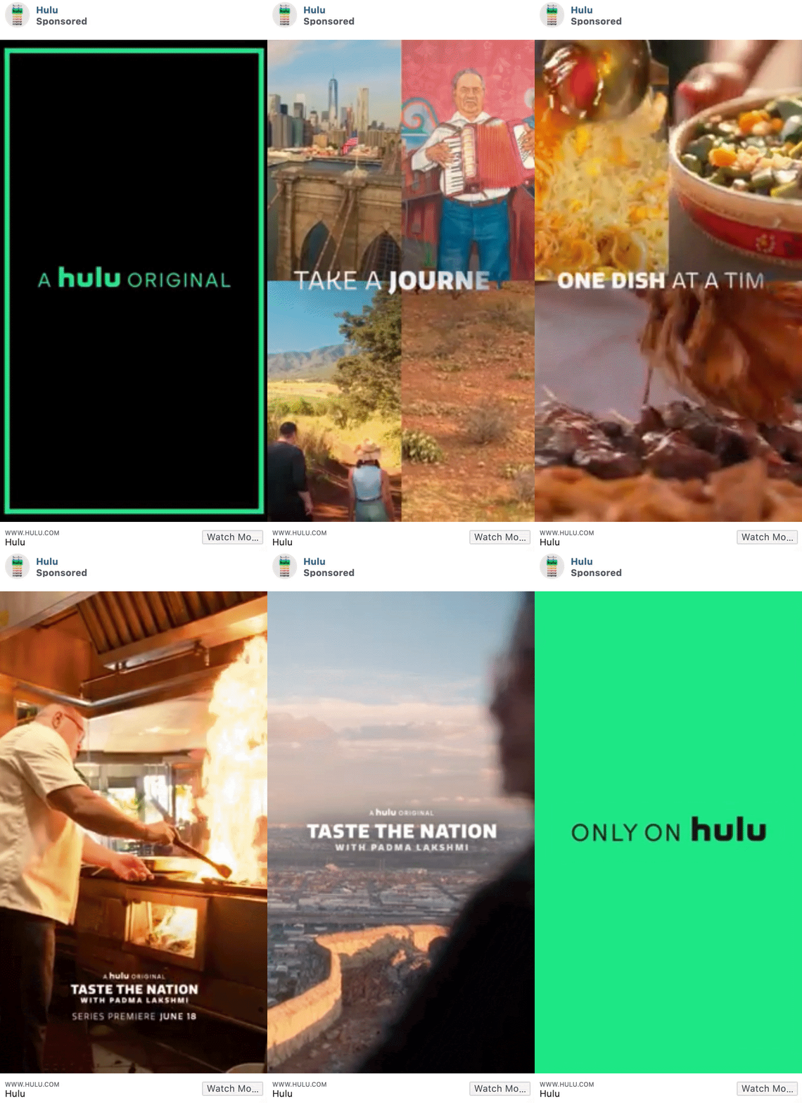
Hulu uses a few action-packed, colorful clips from the show, Taste The Nation, to get the attention of users. The enticing compilation brings awareness of the show and provides a CTA if you want to watch.
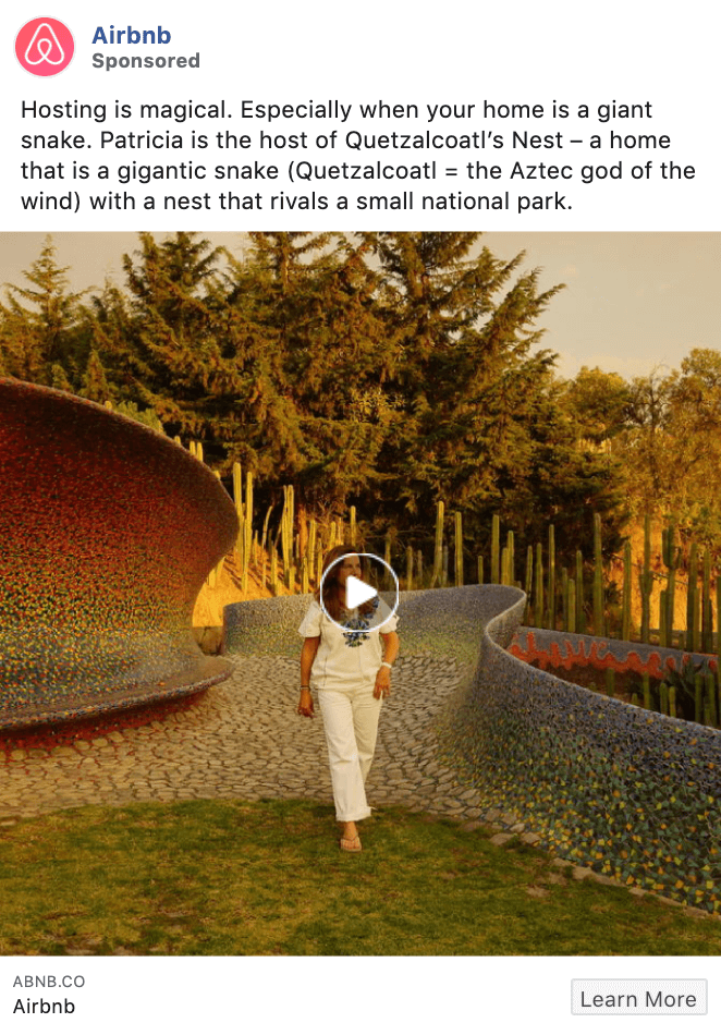
Anyone who knows Airbnb knows that they’re all about showcasing the lifestyle of both hosts and travelers. Sharing areas that Airbnb users can stay is a great way to draw people into their app that may have never joined.
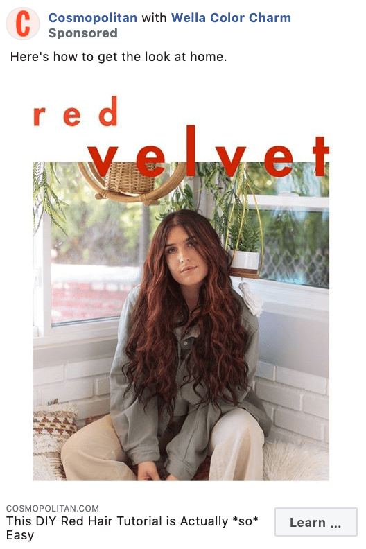
While this ad may be able to fall into the consideration category, it’s bringing awareness to a new trend which will also help them be seen as the place to go to learn about the latest styles.
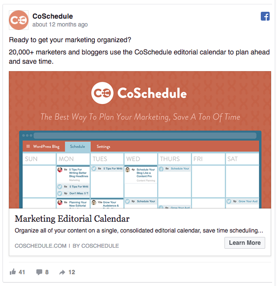
The ad’s colorful design pops into your eyes right from the News Feed, making CoSchedule’s logo memorable while increasing brand awareness.
The Facebook ad reads: “20,000+ marketers and bloggers use the CoSchedule editorial calendar to plan ahead and save time.”
Et voila, in this one sentence, they’ve managed to establish trust, target a specific audience, and reveal the benefit of their product.
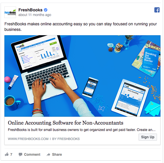
FreshBooks’ Facebook ad starts by saying: “FreshBooks makes online accounting easy so you can stay focused on running your business.”
With this one sentence, the ad clearly states who the target audience is: people who spend too much time on accounting instead of managing their business. Sounds like small business owners, doesn’t it?
In addition to a colorful, relatable image the headline brings it home. In just five words they can clearly articulate who they are and who they’re for. It’s said in a convincing way that will be sure to catch the eye of their target audience and make them want to learn more.
Consideration and lead generation is broad. It’s everything from traffic to post engagement to app installs, video views, lead generation, and messaging.
In the next few examples, you’ll see how a variety of brands go at the middle of the funnel.
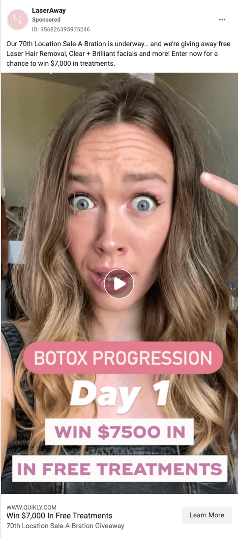
LaserAway is running an ad for a giveaway. Every person who enters the giveaway is a new lead for them.
Warby kept things low production and let their app speak for itself. When you have a good product, that’s the best way to go. Seeing these examples of people using the app and how cool it is is the best way to convince viewers to hit the install button.
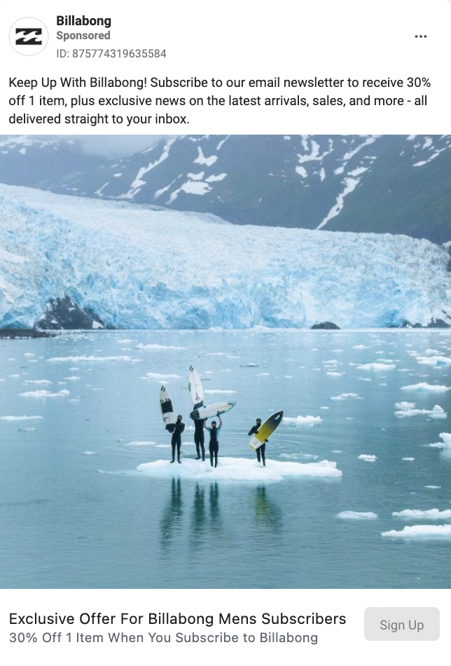
Billabong is trying to capture the attention of people that would be interested in a promotion. They’re enticing them to join their newsletter with a coupon. Every email subscriber is a valuable lead. Their jaw-dropping image of surfers standing on a piece of glacier in the middle of the ocean helps stop scrollers.
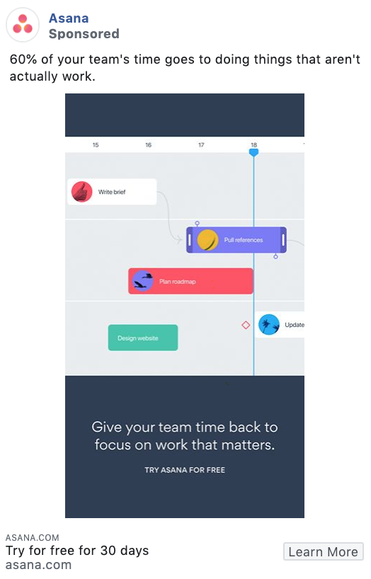
Offering a free trial can also be a compelling ad to run. We also love the flat, colorful design in this ad graphic, appealing to Asana’s target customer.
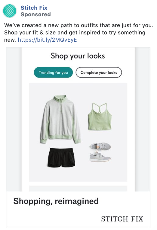
Stitch Fix has got its ad game right. Anytime someone browses some of the closet options on their site, they have a retargeting campaign that will then show the user Facebook ads based on their clothing preferences.
Genius, right? Now we might not all have the budget that Stitch Fix does, but retargeting ads don’t have to cost an arm and a leg, and they can be great at grabbing buyers who may not have been totally ready before.
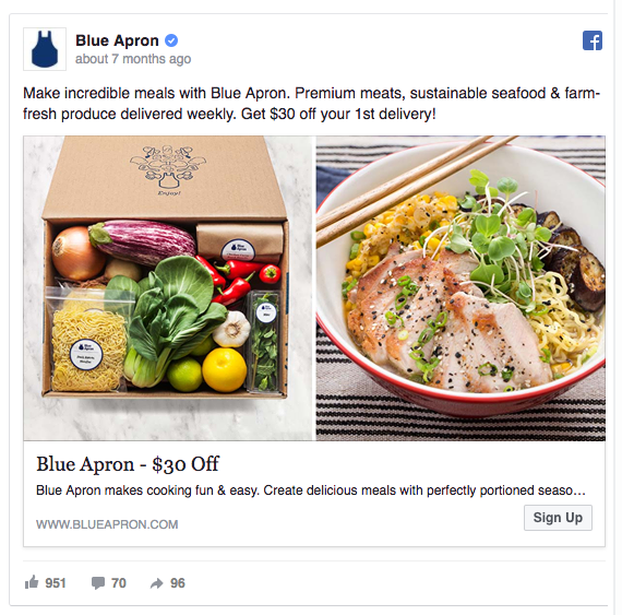
Blue Apron has put some real effort into the images, as they know that delicious-looking fresh food is a crucial selling point.
If your product needs to be unpacked or prepared in some way or another, it makes a lot of sense to let people see both of these phases. Showcasing a closed subscription box or a pile of Legos could potentially arise a lot less powerful feelings than displaying the final result – a delicious meal, or a Star Wars Lego spaceship.
Blue Apron also offers $30 off the first delivery. This eliminates of one of the biggest objections: “I don’t know if I like the product and I’m unsure whether to spend money on it.” By offering the first product/order for free, you’ll cross the barrier and start a conversation with your audience.
Once a person says “Yes” to you once, they’re more likely to continue doing so. The first “Yes” will start a sequence that’s harder to break than continue.
Getting people to accept your free offer is a powerful first step to converting them to paying customers. As explained by CopyBlogger:
“We are driven to remain consistent in our attitudes, words, and actions. So, when we are led to make a commitment of some kind, to go on record or take a stand or make a decision, there is an urge to remain consistent with that original commitment later on.“
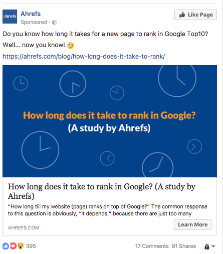
Do you know how long it takes for a new page to rank in Google Top10?
We do because we clicked on this ad by Ahrefs and read the entire study.
Alright, we’ll tell you: Only 5.7% of all newly published pages will get to Google’s Top 10 within a year.
Ahrefs’ Facebook ad presents an original case study that tells a story, which people love. Check the likes counter below the post.
Ahrefs also uses cliffhangers effectively. A cliffhanger is an information gap that people can’t help but explore. The recipe to an effective cliffhanger is simple: Tell a compelling story, but leave it unresolved. That’s exactly what Ahrefs does by leaving their study’s answer hidden until you click and find out.
Gerard Zaltman, the author of How Customers Think: Essential Insights into the Mind of the Market, found that 95% of cognition happens outside of our conscious brain and inside our subconscious, emotional brain.
Thinking of a story lights up our emotional brains, which is where we make our buying decisions.
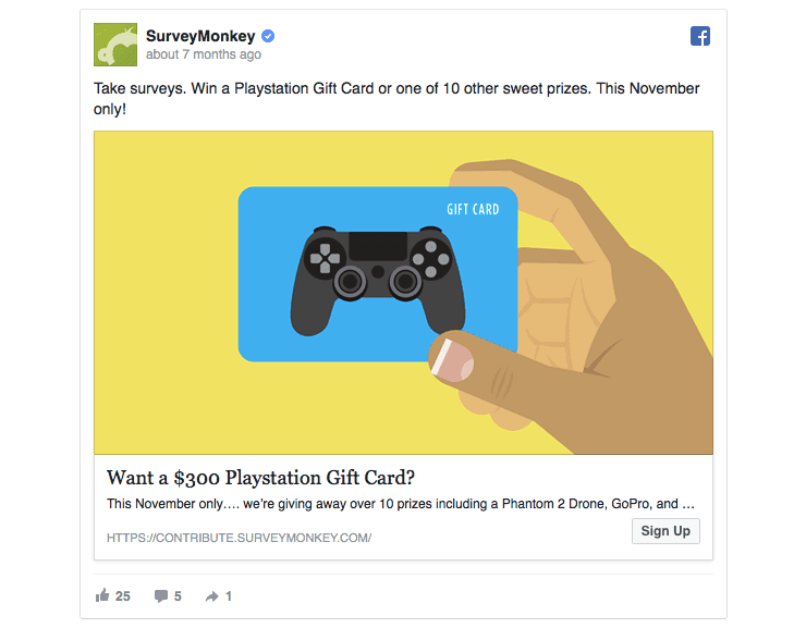
SurveyMonkey wants you to take their surveys. In return, they’re offering a chance to win a $300 Playstation Gift Card or other high-value prizes.
Giving away rewards works in multiple ways. First, they’ll get people to answer surveys uploaded by others in need.
But there’s another hidden goal: whenever someone takes a survey, they’ll remember SurveyMonkey as a go-to tool for creating online polls.
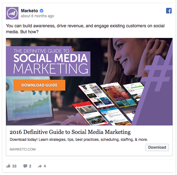
Marketo’s ad isn’t a regular Facebook ad; it’s a Facebook Lead Ad.
Lead Ads give people a quick way to opt into things like newsletters, quotes, and offers without leaving the Facebook news feed.
All you need to do is enter your contact details in exchange for the goods.
As someone clicks anywhere but the Download button, they’ll land on Marketo’s lead generation landing page. In a way, Facebook Lead Ads could potentially let you double down on the chances of getting new prospects.
Marketo’s Facebook ad also says Download three times — in the ad image, on the call-to-action button, and in the link description.
The Rule of 7 states that a prospect needs to “hear” the advertiser’s message at least seven times before they’ll take action to buy that product or service. While seven repetitions are clearly too much for a Facebook ad, three could be the golden formula.
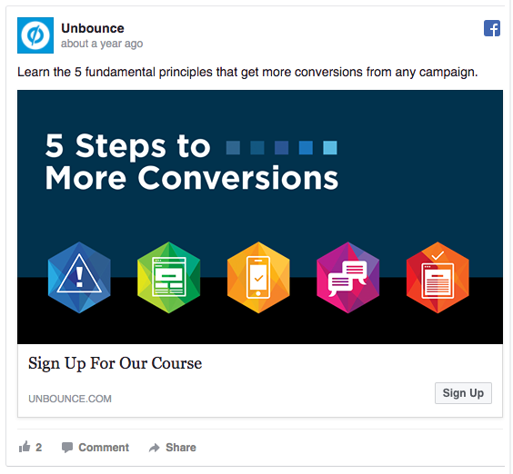
Unbounce’s Facebook ad hints that they can deliver conversions in five simple steps.
The simplicity of the process is there before you, loud and clear, marked by five colorful icons.
If your ads are too complicated to understand in a few seconds, people give up as quickly as they started reading in the first place. Sometimes it makes sense to leave some ideas unmentioned in the ad and explain everything in depth on your landing page. A study showed that 59% of people actually never read more than the headline of a Facebook share, so yes, you want to be brief.
The five icons in Unbounce’s ad draw attention and help structure the ad’s message. As KISSmetrics puts it: “Icons help give users a point of reference – particularly when navigating a site or when scrolling and scanning over a page.”
If there was an easy five-step method to double your leads, every marketer would jump on it. We all know that there are no such shortcuts, but we’re still intrigued by the promise of an effortless achievement.
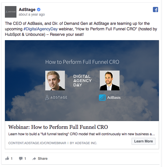
Including influencers in your marketing campaigns gives your brand a touch of their glory and fame. According to some resources, sharing branded content via influencers results in 3x-10x higher conversion rates.
It also includes a low-threat offer of joining a webinar. It’s valuable and non-binding and matches the PPC channel temperature.
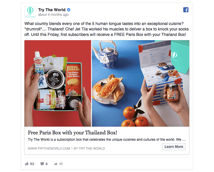
The image showcases the product at the most exciting moment of its lifecycle. They make it almost graspable.
The promo of “Free Paris Box with your Thailand Box!” is a winner. If you were unsure about ordering the subscription before, now you’re almost convinced you’re getting a great bargain. When the online store 2BigFeet introduced free shipping for orders over $100, their conversions went up 50%. Free extras can be the right nudge to help people make the final decision to purchase the product.
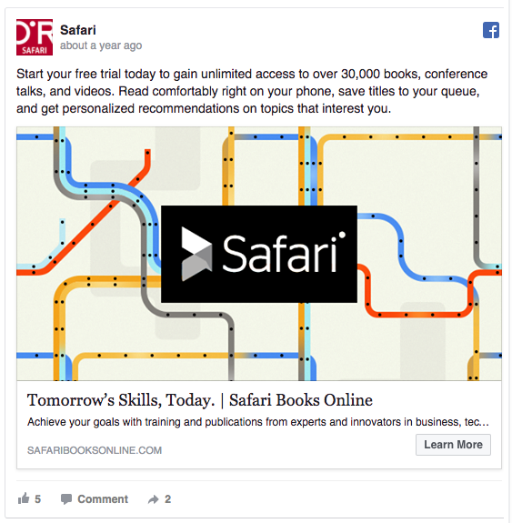
By adding (six!) action verbs to the ad copy, they make it more actionable and energizing for the reader. The decision-making part of our brain also happens to be the most primitive, making it act on simple and actionable word.
The copy addresses the reader as “you”? Everything they suggest is targeted at the reader, declaring that the maximum benefit of the product is for the person reading the ad, not the brand.
Need more action verbs? Buffer has put together a massive list of 189 magnetic words that make your copywriting almost impossible to resist.
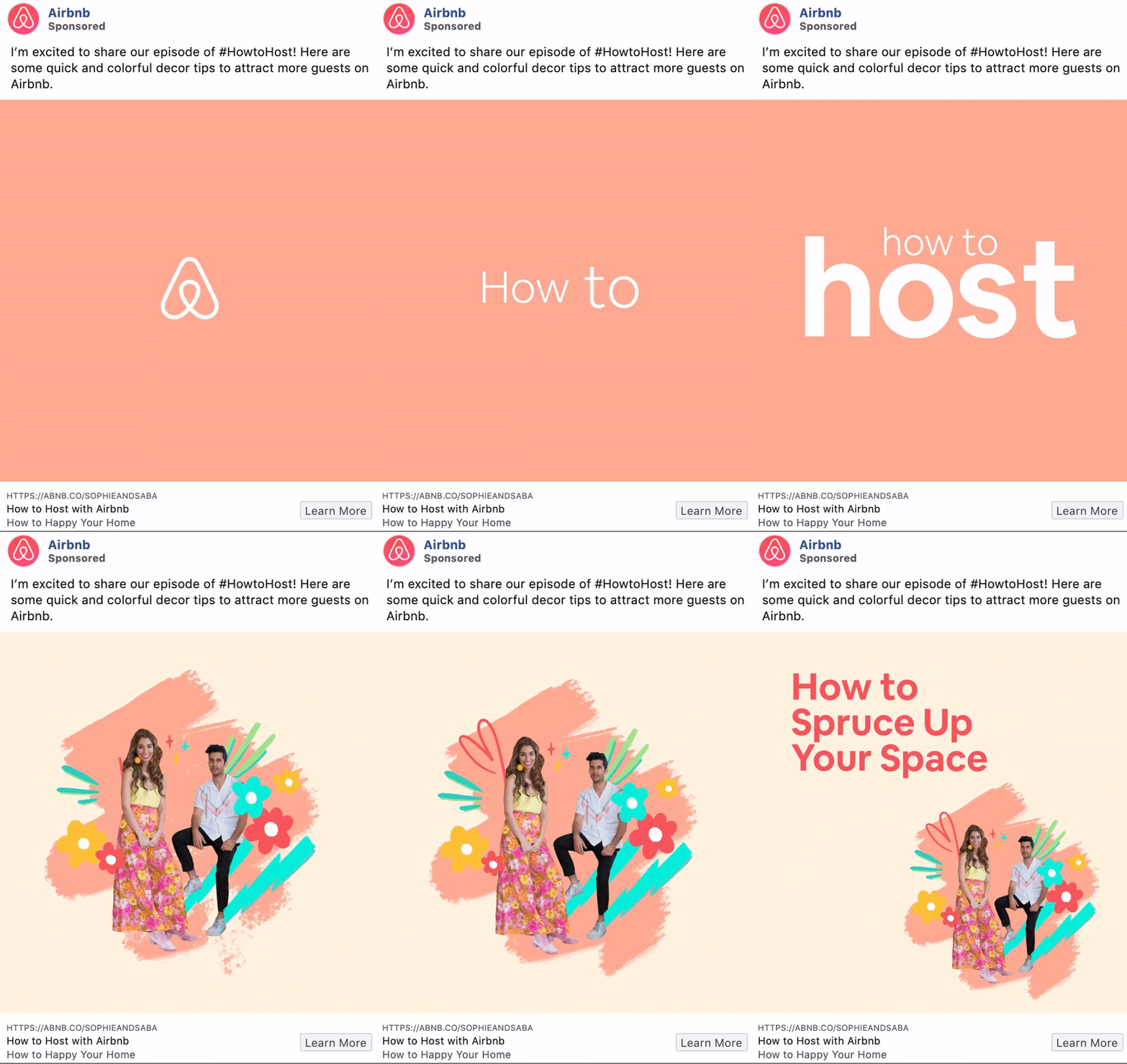
Sometimes lead generation needs to start with top of funnel content. In this case, Airbnb is trying to educate users about how to become a host in a fun way.
This ad incorporates real video clips with abstract elements like animations, illustrations, shapes and more, and creates a stunning and effective video ad.
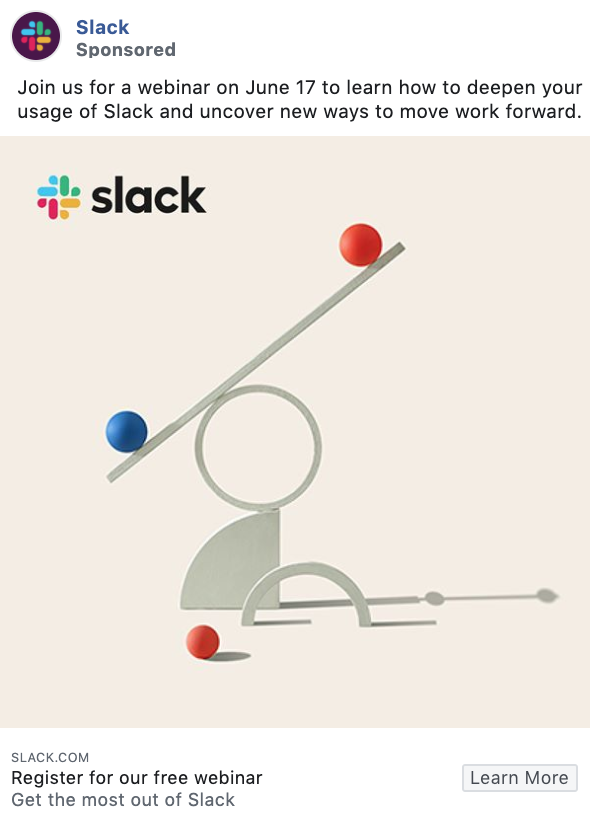
Slack, the team communication tool, is using a webinar to generate leads. Since the messaging is value-first, viewers will be more likely to click on the ad. It’s free AND they will get to learn how to use Slack to its fullest potential
Conversions can be retargeting, conversions, straight sales, or even attracting store traffic. We have examples for it all.
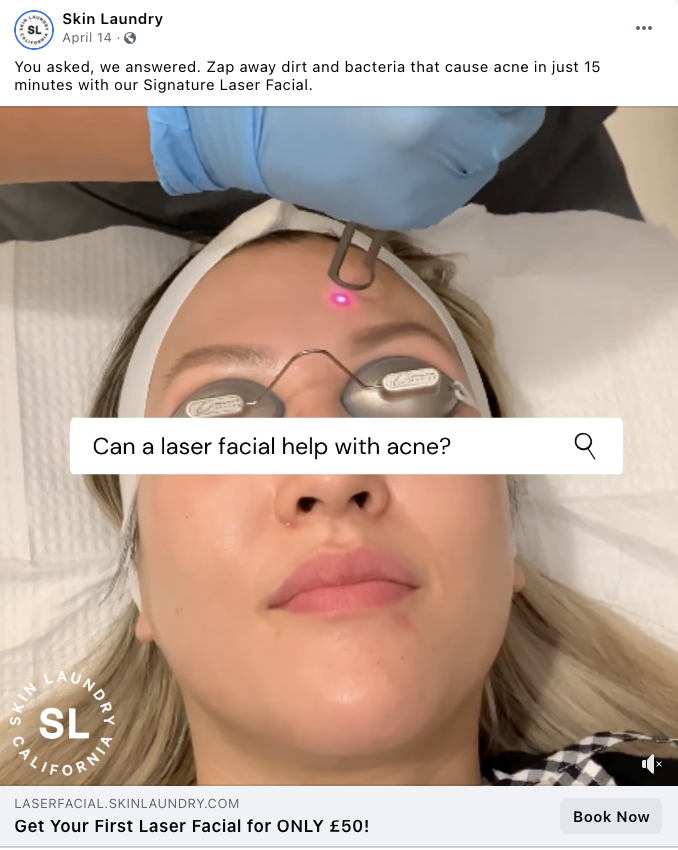
Skin Laundry used the trend of adding a sticker of a Google search to their image. It addresses concerns and gets them to tip over into booking territory.
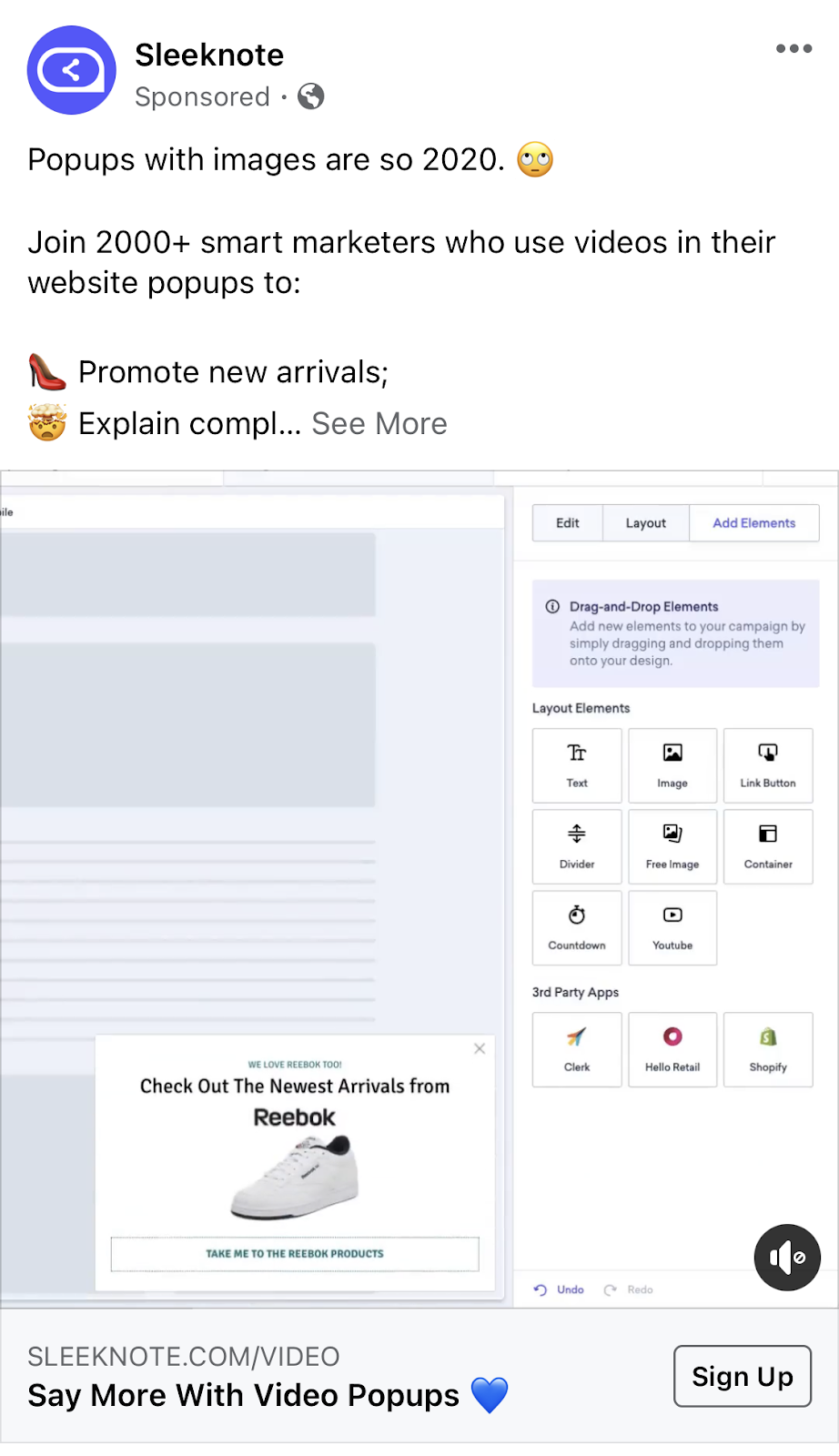
Sleeknote is targeting mid-funnel traffic with this ad. They add in social proof and an emoji-bullet list of all the benefits of using them.
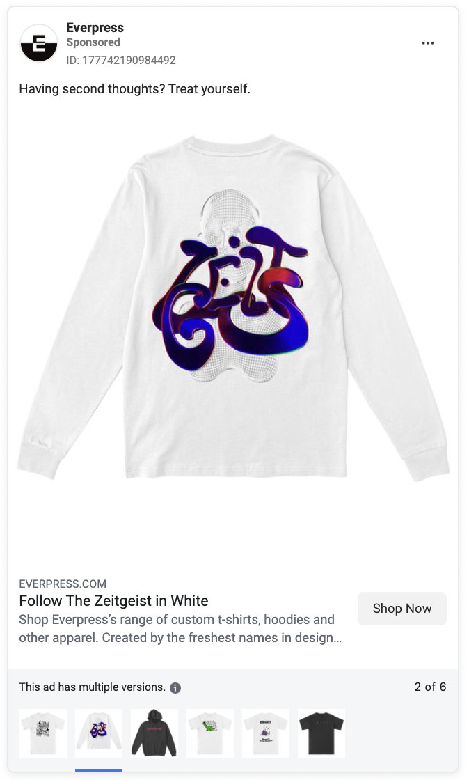
Everpress keeps things simple, but emotional. Their retargeting ads will show you the exact product you were looking at and give you the reason not to have second thoughts.
In addition to a fun video, Misfits markets uses an example of what their product can provide to try and get people to the purchase point.
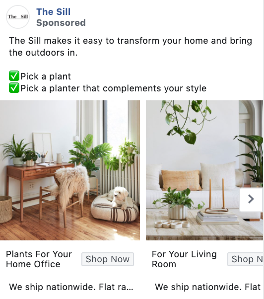
The Sill speaks to the two-step process of getting one of their products. It’s convincing and helps get potential customers to buy.
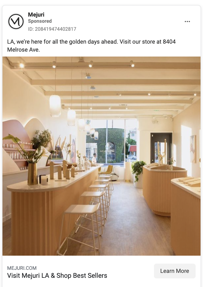
Mejuri’s ad is for their new store in Los Angeles. Since their audience appreciates an aesthetic space, they let the photos of the store do the convincing.
Tend knows their target audience very well. They’re into branding, they’re young and they’re hip. The video feeds into the social trend of an office tour.
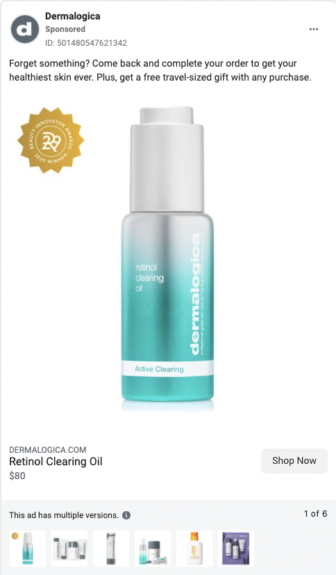
Dermalogica’s retargeting ads don’t let you forget about the product you were looking at. Then they sweeten the deal with a free travel-size.
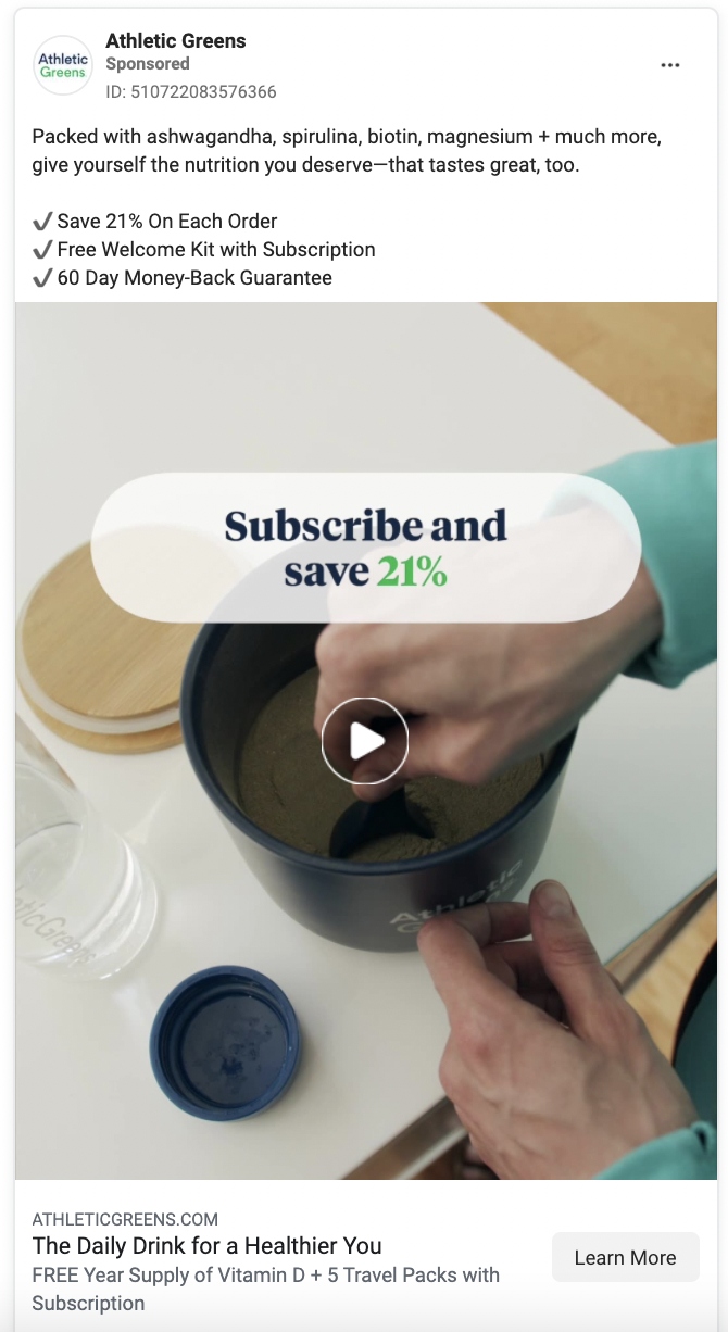
Athletic Greens put the product benefits first and the potential savings front and center. They hope that by showing the value and adding copy that lessens the commitment (60 day money back guarantee), that people will be pushed to purchase.
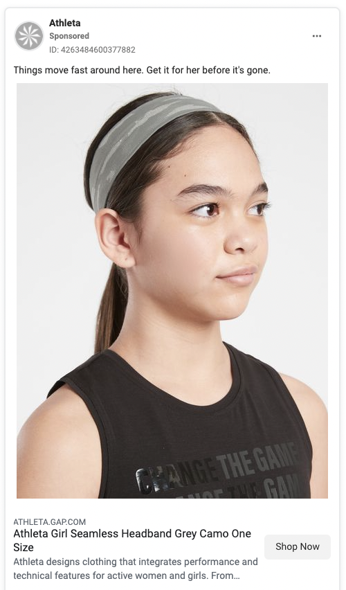
Athleta’s retargeting ad goes for urgency. They try to remind potential buyers that the product will be gone if they don’t buy it soon.
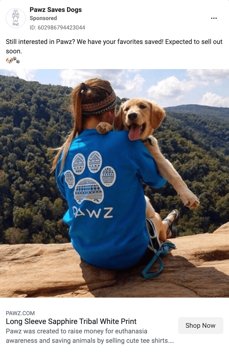
Pawz retargeting ads hit you with a lifestyle shot of the product you were eyeing and urges you to purchase before they’re all gone.
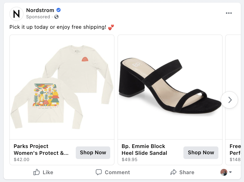
Sometimes all the convincing we need to make a purchase is free shipping. Nordstrom puts their eggs in that basket when using retargeting ads.
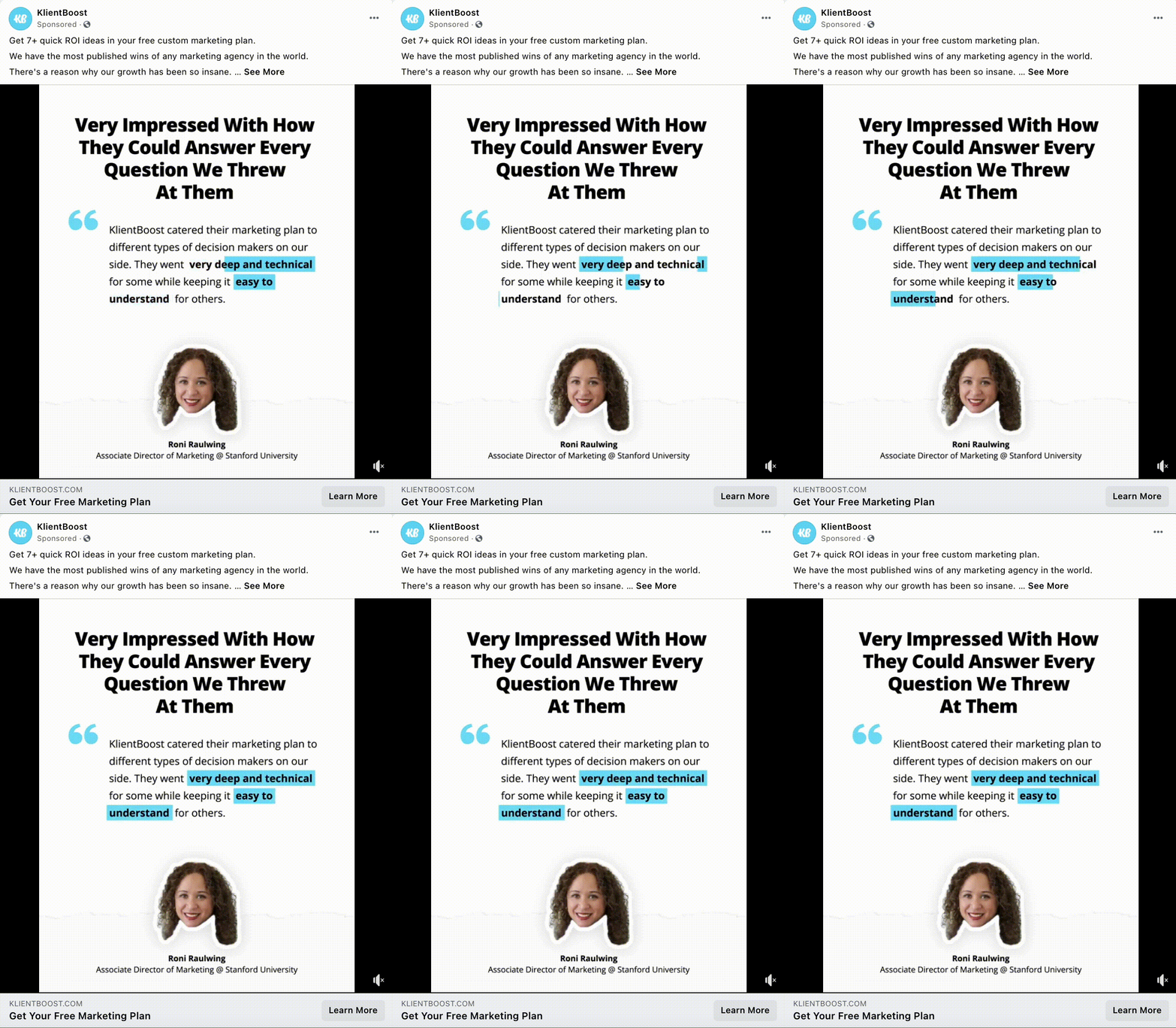
We know that hiring an agency can be a hard decision. There’s a lot of pressure to choose the right one and spend money wisely. We know how helpful testimonials can be when looking to purchase, so we like to put some of our client quotes front and center after someone has been eyeing us to convince them to take the plunge.
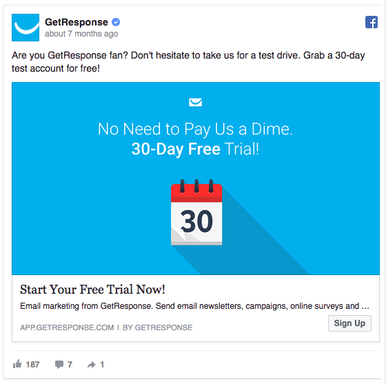
When appearing in the messy Facebook news feed, GetResponse’s sky-blue ad draws all sorts of attention to itself.
It’s so colorful that it’s almost impossible to ignore.
Another reason we like this ad is the headline: “Start Your Free Trial Now!”
As we’ll expand on below, clear commands that leave no room for doubt are always better than a generic “Learn More” or “Submit” button.
Now, today, right away… all these words contribute to a sense of urgency and nudge people to take action without thinking it over too much. Applying urgency on a landing page helped one entrepreneur increase sales by 332%.
Feeling inspired? We sure hope so. Take the best of the best and make them better. Be sure to share what you end up doing and maybe you’ll find it in this list.
And if you want to see some results like the ones from our ads, learn more about how we can help you improve your overall ROI.
Looking for more Facebook ad tips? Here’s some of our best:
- 49 Closely-Guarded Facebook Ad Tips For Bigger Wins [2022]
- 16 Expert Tips To Optimize Facebook Ads For The Highest ROI
- 24 Smart Tips For A Better Than Average Facebook Ads CTR [Proven]
- 21 Secret Facebook Ad Strategies That Win [2022 Update]
- Top Facebook Interest Targeting Tips All Experts Rely On [Plus A Secret Hack]