Thinking about call-to-action (CTA) examples will put you to sleep faster than counting sheep.
Shop Now. Sign Up. Subscribe. Learn More.
Yawwwwwwn 😴
You’re searching for examples because you’re sick of those bland examples—us too. You need more clicks and that boring stuff just isn’t cutting it.
Well, your marketing wake-up call has arrived. We’ve loaded up on the most unique, creative, and successful CTA examples across all of marketing, from Google Ads to landing pages, that will get you inspired to up the game on your own.
Better yet, by the end of this article, you’ll be fully loaded with at least15 new CTA ideas for your own ads or landing pages that will catch more attention and get more clicks than ever before.
Get brand new marketing strategies straight to your inbox. 23,739 people already are!
A call-to-action, also known as a CTA, is a clickable button or link on your site or in your email, or on your ad. You want people to click your CTA. You call them to action. Typically, these actions look like this:
- Download
- Submit
- Subscribe
- Sign up
- Purchase
CTAs can also look like this:
- Want to learn more? Click here.
- Never want to miss an update? Subscribe now.
Ugh. So boring.
Those are boring CTAs.
The problem with a ton of CTAs across the internet is that they have no razzle. They are devoid of dazzle. Bleakly bereft of bling.
Sadly stripped of style.
The best call-to-actions are simple—but they have sparkle.
There’s something about them that convinces a user to make their mouse work.
Button clickers more often turn into leads than non-button-clickers.
You want those leads in your marketing funnel so you’re going to put some thought into your call-to-actions because now you realize what a powerful tool they are in your digital marketer’s toolbox.
According to Unbounce, 90% of website visitors read headlines and call-to-action copy. They might not read for substance, but they scan what you shout about at the top and they look for what you’re asking them to do.
9 out of 10 people will fix their eyes on your CTA prize. If 90% of all visitors are likely to read your CTA, don’t eff up your CTA.
Side note: We’ve found the same sort of high success rates from our Breadcrumb Technique (more on that below).
Now hear this:
The last thing you want is to get visitors to your page (with paid ads or with hard-won SEO prowess) only to watch those visitors bounce because your CTA bites great big donkey balls.
When that happens, your CTA looks at you with sadness in its eyes—it struggles with abandonment. On top of that, your ads budget scoffs at you.
You resolve to turn that unclicked frown upside down and turn those scoffing tsk-tsks into terrific CTRs.
That’s why you’re here.
So let’s figure it out.
Every call-to-action serves a purpose and knowing what works and what doesn’t will change how you design your ads and landing pages.
Our deep dive into hundreds of calls-to-actions trained a spotlight on a few key takeaways:
Only use a single call-to-action per page, form, email, etc. As soon as you introduce a second CTA, you worsen your visitors’ attention ratio and lessen your chance of them converting on even a single CTA.
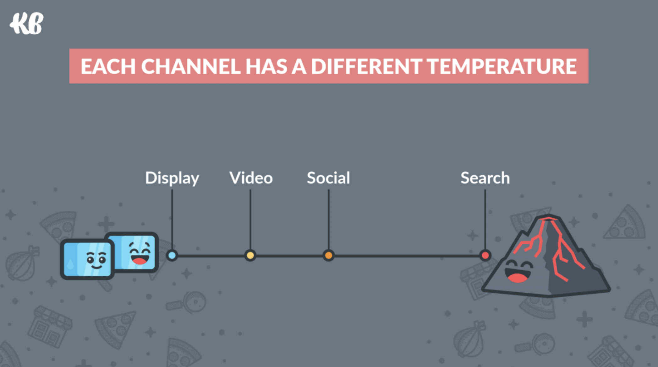
Your CTA should mirror the conversion temperature of your traffic.
For example, if you’re a lawyer and your CTA is a “Book a Free Consultation” but your visitor got there from a direct Display ad (cold lead), you’ll find that you won’t get conversions on a highly-demanding CTA like that.
We did this research and shared it on stage at Unbounce’s Call To Action (CTA) Conference.
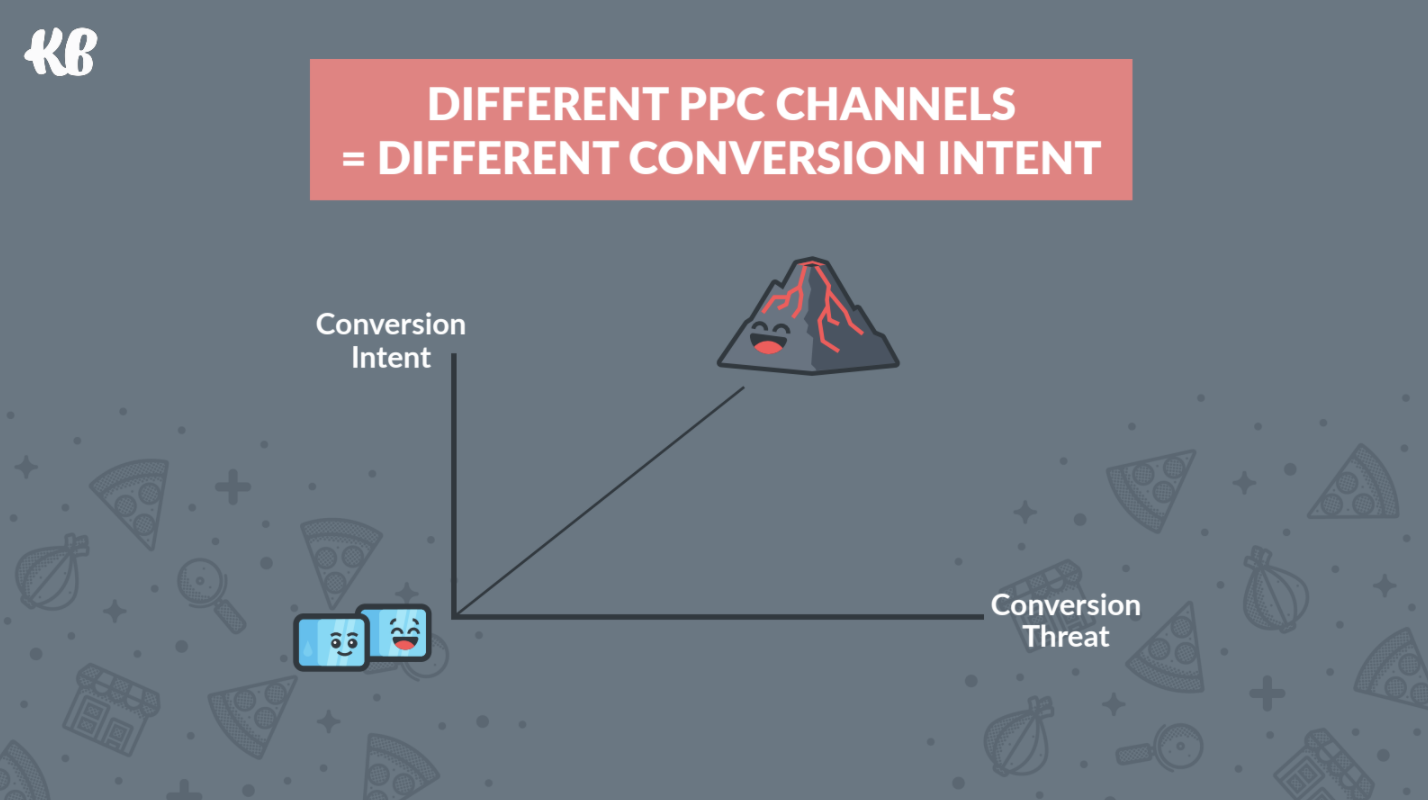
Cold traffic doesn’t convert well with a hot (threatening) CTA, but hot traffic CAN easily convert on a cold CTA. For optimal performance, you need both to match in temperature.
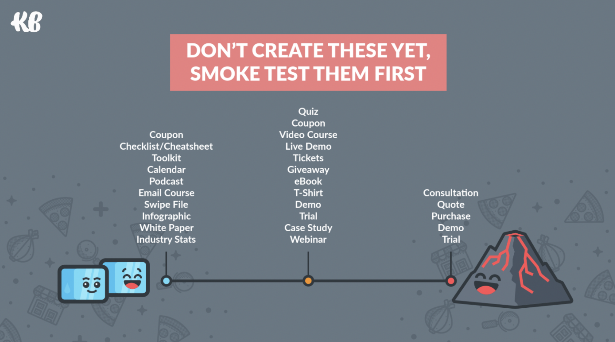
Consider your CTA copy.
Take the “Free Consultation” example.
Almost every lawyer offers a “Free Consultation.” What happens if you define the outcome of what the visitor cares about not the thing that happens to get to that outcome?
You get better performance.
You still offer a “Free Consultation”—but you introduce it with a qualifier (results).
Something like this:
Injury Lawyer: See What Your Case Is Worth > Book a Free Consultation
Divorce Lawyer: Learn Your Divorce Rights or Get Confidential Help > Book a Free Consultation
Business Lawyer: Get Your Questions Answered Now > Book a Free Consultation
Better, huh?
It’s often the case that your CTA is a button at the bottom of a landing page form. Those form fields are more threatening than the CTA itself.
Unless your landing page answered enough questions to lock in your visitor in the first 5 seconds (or less), any form that asks for name, email, and phone number will scare the visitor away.
They don’t trust you yet and they aren’t ready to hand over their personal contact information. Especially when they know giving you that information means putting up with an annoying sales call or pushy email.
So, instead, consider using The Breadcrumb Technique. Here’s a 3:43 Boost Bit video that walks you through how this awesome technique works.
But, in a nutshell (if you hate fun videos), it’s as simple as breaking up your form into progressive increments of heat/threat and adapting your CTA to the form process.
Come again, partner?
Let’s break it down like Blanco Brown:
Breadcrumbs lead your visitor along a trail to the goodies at the end.
It’s a hand-holding technique where you take away objections by breaking down the decision-making process into multiple non-threatening steps:
- You remove any objections from step one by asking a question the visitor doesn’t mind answering. They follow the first crumb.
- You ask them a few more simple questions after that. Now they’re engaged. They’re a few crumbs farther along the conversion path.
- Once they’ve answered easy-to-answer questions, they are cozier with answering the big question. They’ve warmed up to things now and they’re closer to committing.
- Ask the big question. They’ve already followed your bread crumbs to the end of the path and they’re at the door. Now they want to see what’s behind the door.
In Hansel and Gretel folklore, those breadcrumbs lead to a candy-coated door with a lot of death inside (the conversion). Without the bread crumb technique, the witch leaps out of the bushes with skin-flaying knives and asks the scared siblings if she can eat them whole.
They run away.
That’s poorly planned execution right there.
Instead, the clever witch puts down a path of candies that leads to her candy house. Hansel and Gretel feel it’s worth a peek inside. They open the door. The witch gets her morbid conversion.
Modern stories are fewer Brothers Grimm, though.
Marketing versions of the breadcrumb analogy serve up a happy ending.
The big question at the end leads to conversion—click the button and get a helpful goodie. Visitors will click that breadcrumbed button because they’re so close to completing that sense of accomplishment that they’re not willing to back out now.
They want that goody.
It’s psychology.
In most cases, make sure your CTA button color pops against other elements on the page. Make the button color the opposite of the background color. This is also known as complementary colors (opposites on the color wheel).
Got a bright blue background or, more likely, a bright blue gradient (hello, 2020)? Plaster a bright orange-yellow button on it.
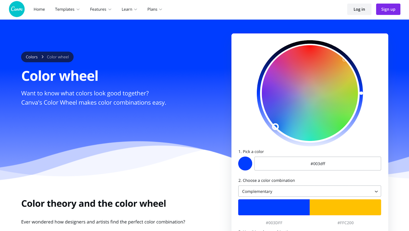
Check out the Canva Color Wheel. Click anywhere on the wheel (or select your background color) and choose the complementary color. Grab the hex code. That’s the color your button should be.
It’s addicting.
Word of warning: Submit is the hellspawn of terrible CTAs across the universe.
If “Submit” is the best you can do, cash in your chips and head home sad and poor.
Only, don’t do that.
You’re not boring, and when the chips are down, you buckle down and play smart. Playing smart in the world of the CTA is all about creativity. “Submit” is not creative. It is a poor use of good real estate.
Personalize your CTA. Odds are it will perform 202% better than a generic CTA.
Button-based CTAs increase click-through rates by up to 28% over (non-styled) generic text-based CTAs.
A/B test the words and visuals of your CTAs so you deliver the best CTAs possible for your audience in the future.
Key CTA takeaways: Cheeeeyeck! That’s a Texas-sized 10-4.
The what and the why are in the bag.
Now, let’s look at different types of CTA examples.
It’s common practice for advertisers to link ads to a custom landing page of a website instead of a generic home page or service/product page.
The reason why is simple: landing pages are short, usually above the fold (what the user sees when they land—below the fold is the stuff users see if they scroll down), have one message, one form, and one action button. There is no menu bar or other navigation button.
The user can only do two things on a landing page:
- Fill out the form and click the button
- Not fill out the form and click away (bounce).
Fewer options limit choice. 50% of that choice is to say yes to your CTA.
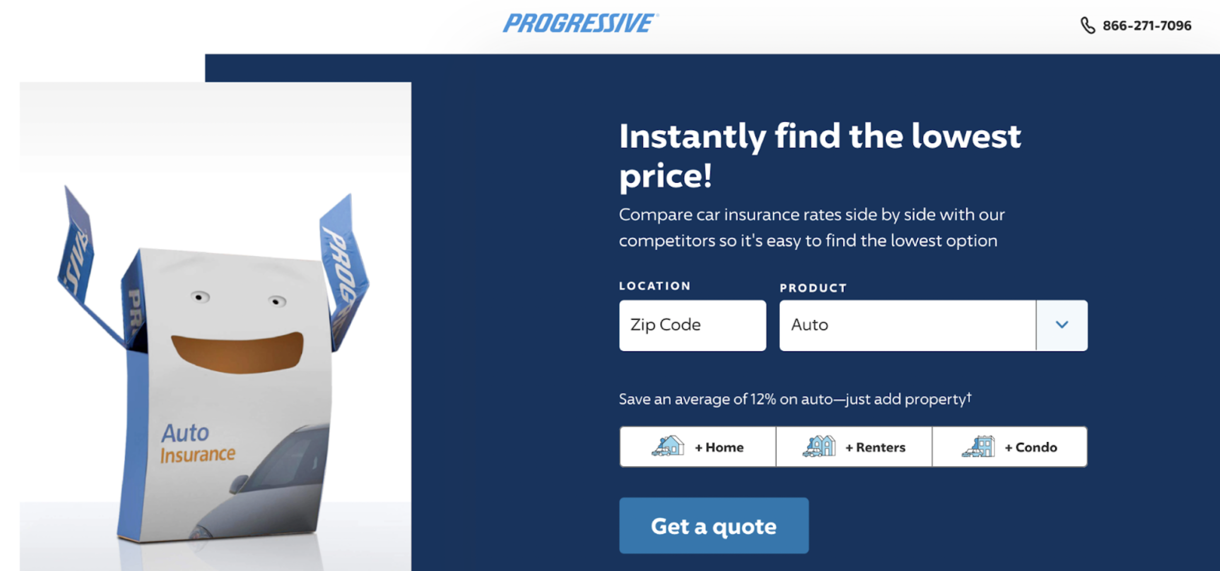
This Progressive CTA drives leads with a concise “Get a quote” button. With the CTA button above the fold, a potential customer will know what next steps to take within seconds of landing on the page.
They either want to get a quote (and instantly find the lowest price) or they don’t. They probably don’t if there isn’t a qualifier: Instantly find the lowest price along with a subheader: compare insurance rates and pick the cheapest option.
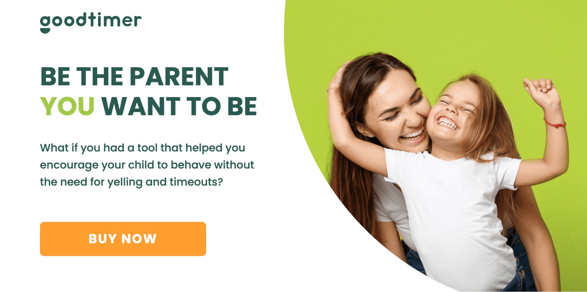
A boring BUY NOW button ain’t winning any originality contests. But a picture like that, and a title that very clearly defines the result doesn’t mess around. Want a tool that helps you keep your cool so you don’t dwell in the dumps of despair for being a frustrated parent? Buy that help now.
Click. CLICK.
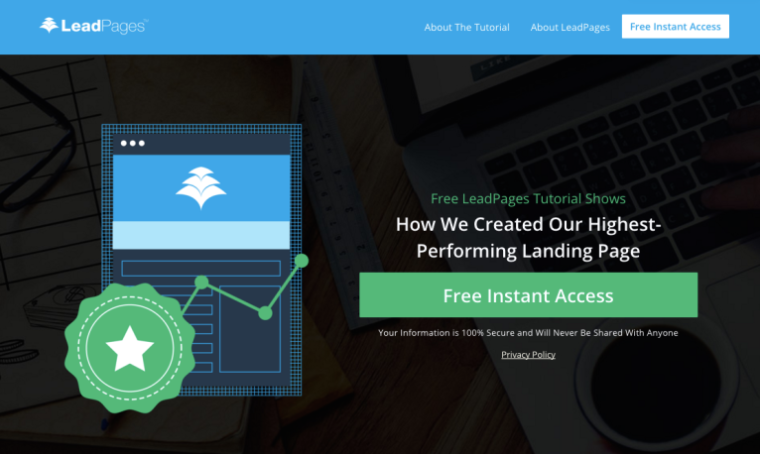
Don’t add extra words to your CTA button. Add the extra copy underneath or next to the button to communicate that extra information like in this example from LeadPages.
Copyblogger calls this type of text a “click trigger,” and cites a case study showing that click triggers increase conversions.
Here, the click trigger reduces credit card anxiety.
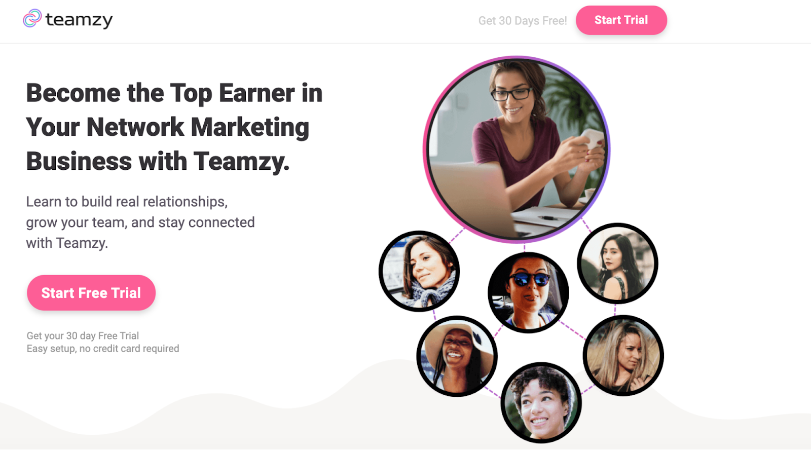
Teamzy’s landing page demonstrates that advertisers are not restricted to one CTA button. You can have several CTA buttons, in fact. They just all have to be the same one. The two pink “Start Free Trial” and “Start Trial” buttons give users more clickable options to start a free trial.
Not more choice—more click opportunities.
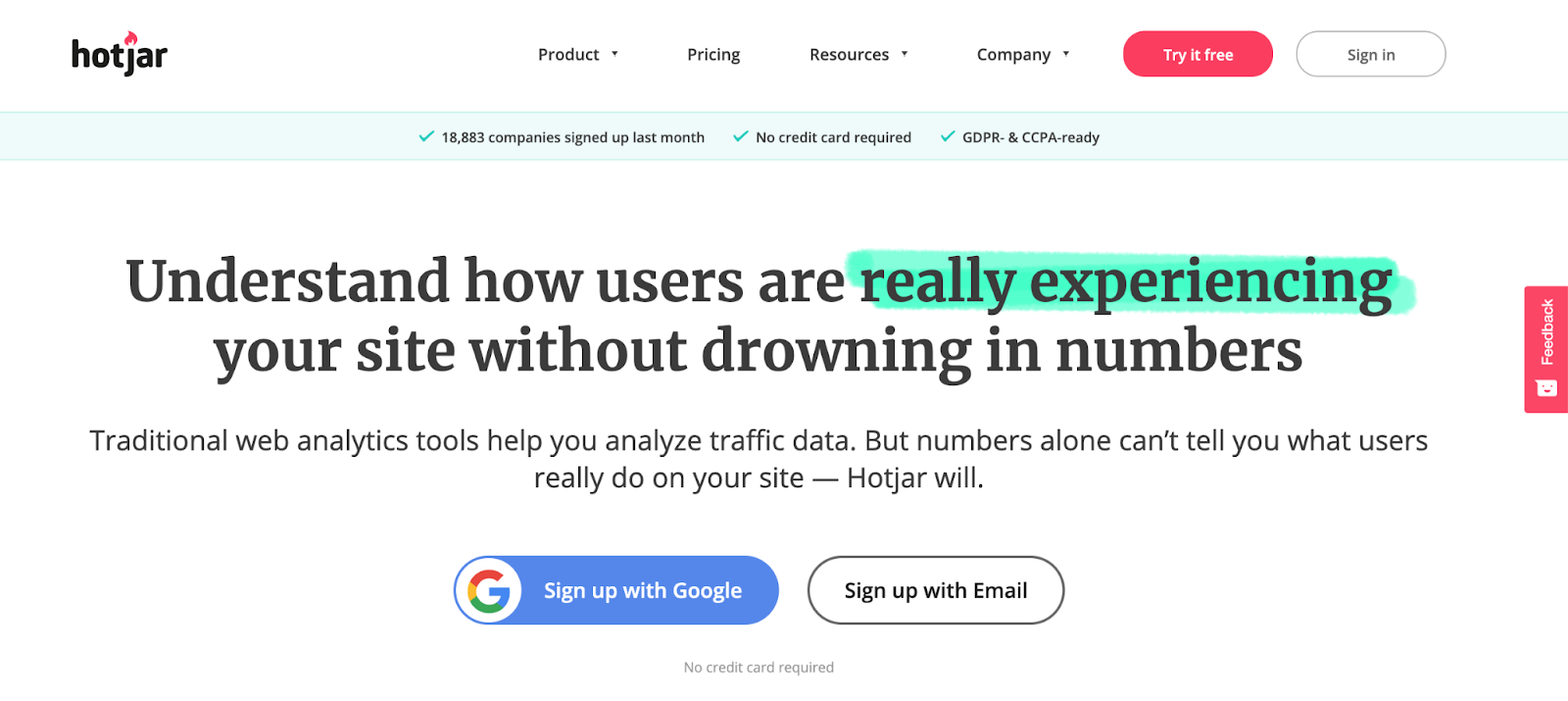
Hotjar – an expert in conversion rate optimization on their own, gracefully demonstrates the popular “Sign Up” call-to-action on their homepage. To give their prospective customers a seamless experience, they have implemented a direct integration with Gmail allowing users to sign up in one click.
Making the sign up stage easy reduces friction at the conversion stage.
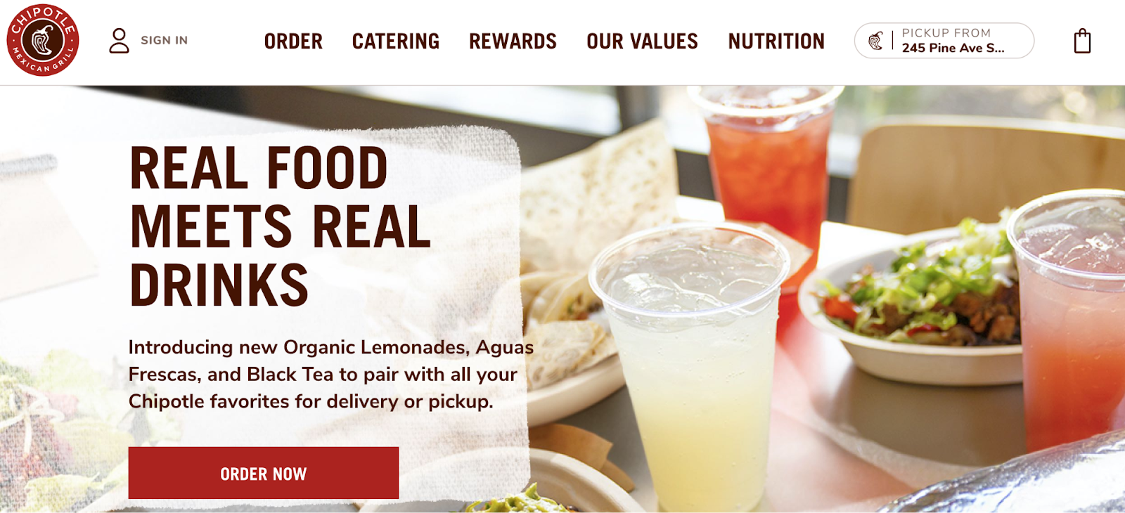
A good call-to-action tells a user exactly what to do. While the headline and images on a web page compel the user to convert, a good call-to-action should tell them how. Chipotle executes this concept beautifully with its “Order Now” button.
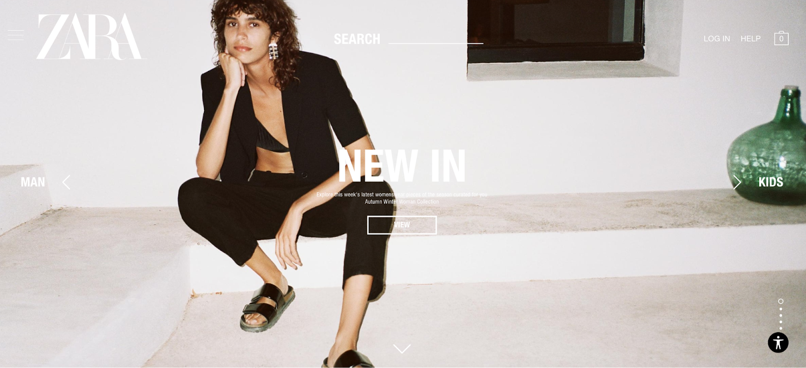
Zara’s homepage takes a more fashion-savvy approach to your typical eCommerce call-to-action. Instead of coaxing users to buy right away, Zara’s homepage features a “View” button that directs users to Zara’s newest clothing lines.
This nurturing approach takes top of funnel (TOFU) users from the home page to a more bottom of the funnel (BOFU) product page where a customer will choose their size, and then move on to check out.
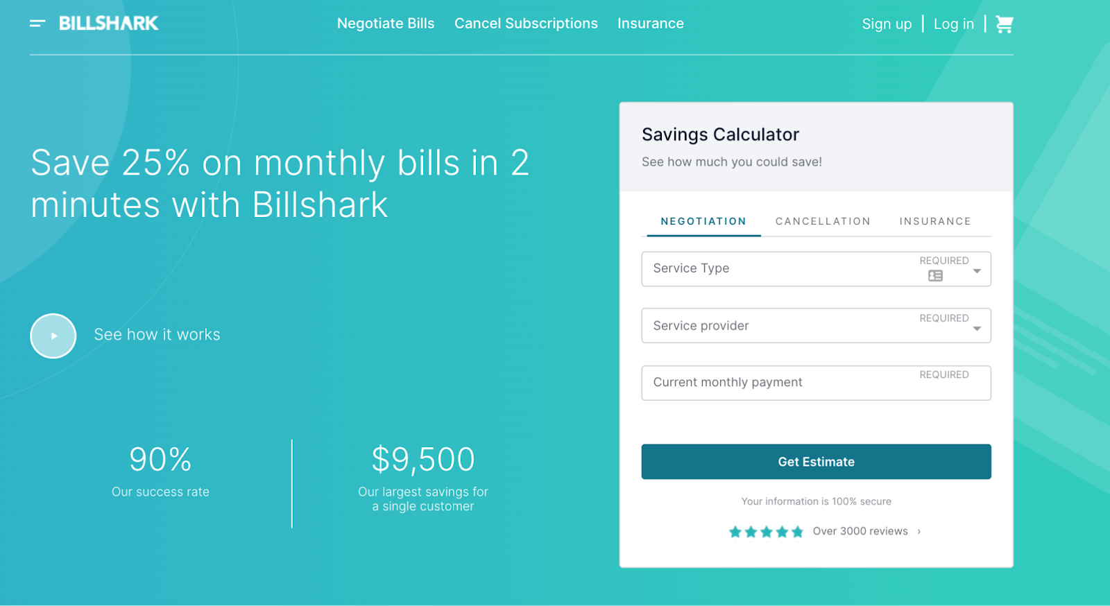
Billshark’s homepage features a “Get Estimate” call-to-action under a savings calculator. This gives users a reward for taking the next step.
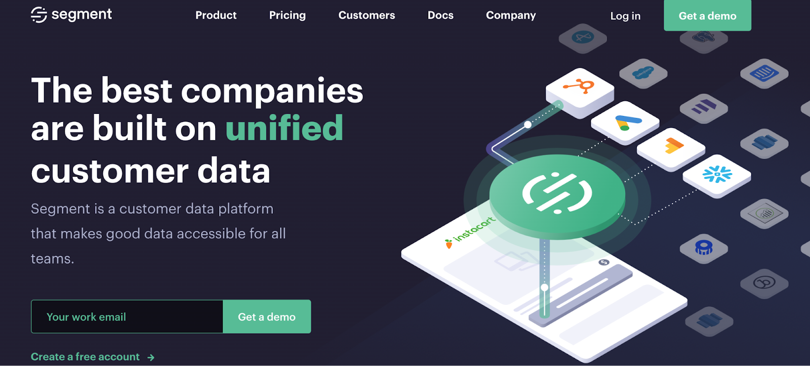
If your product is a SaaS (Software as a Service), your customer journey might involve a longer cycle and a bit of lead nurturing. In this case, “Get a demo” is a popular call-to-action choice.
“Get a demo” is both a descriptive and concise way to nudge your prospective customer in the right direction.
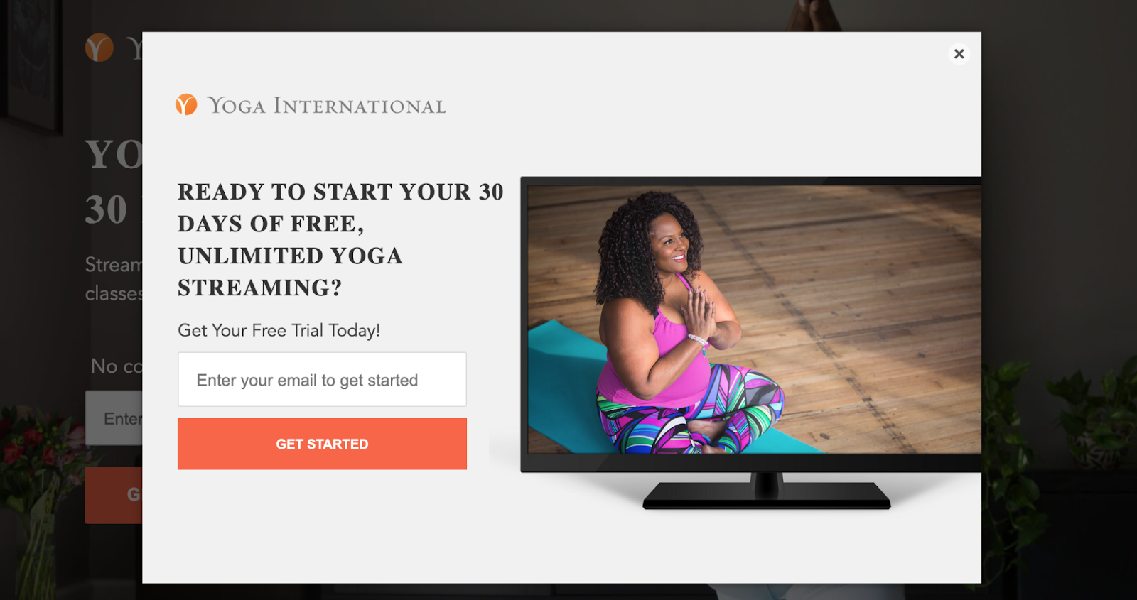
People love free things, so it’s not a surprise that adding “free” to your call-to-action has a large impact on conversion rates. In this example, Yoga International adds “Get 30 Days Of Free Yoga” to stretch and lift their conversion rates.
Plus there’s a click trigger (extra copy above or below the button): No commitments. Cancel any time.

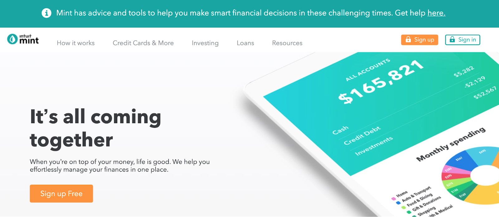
Why are people reluctant to sign up for a service? Because they fear hidden costs. Adding free to your call-to-action button is a non-threatening way to convince your website visitors to sign up, like in this example from Mint.
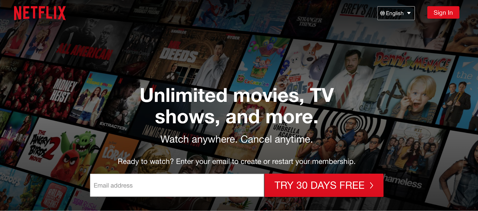
A free trial introduces your product to a potential customer, as demonstrated by Netflix using a 30 Day trial in this example.
Everything is above the fold and a one-month free trial is a good amount of time to try a thing. Free trials are designed to get users in the door, then get them hooked.
Plus, QuickSprout found that Red CTAs boost conversion rates by 21%.
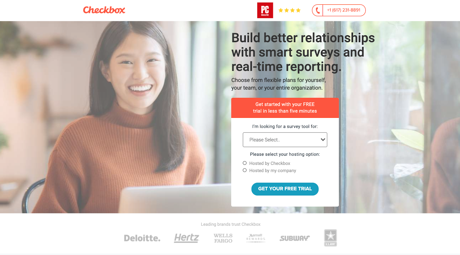
Implying ownership can empower your landing page’s visitor to take the next step. Try to work the word “your” into your call-to-action if it makes sense.
In this example from Checkbox Survey, we found that “Get Your Free Trial” saw a 37% higher conversion rate than “Get Started.”
When it comes to call-to-actions, you don’t have to stick to the tried and true “sign up” or “shop now.” In fact, please don’t. Use your charm and wit to craft something unique.
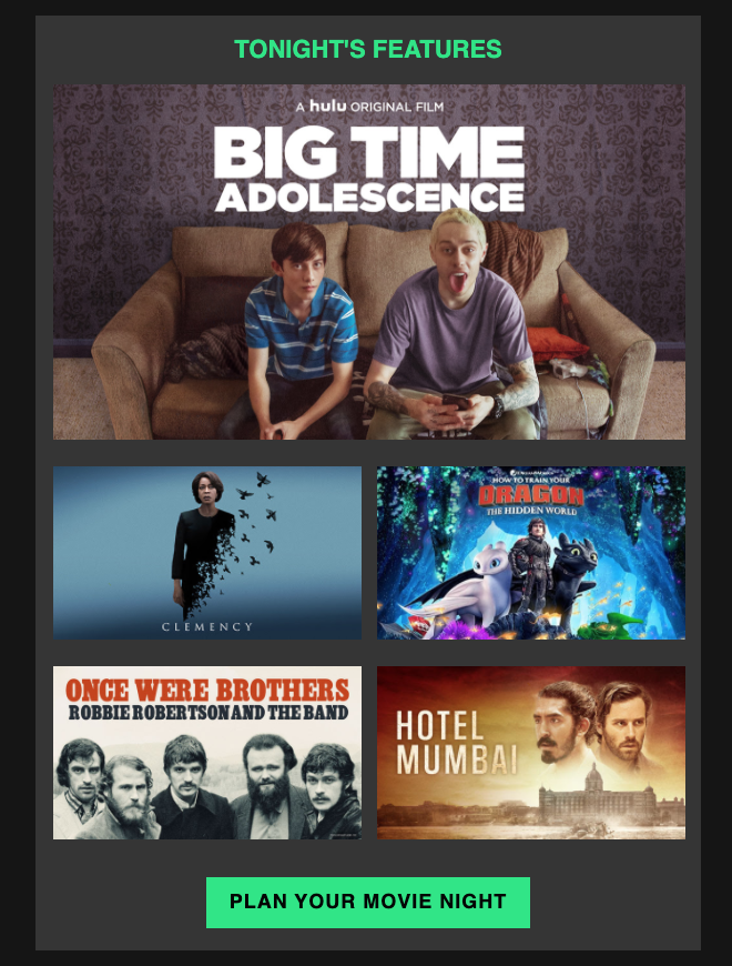
According to Hubspot, personalized CTA’s perform 42% better than untargeted CTA’s. Hulu uses a green call-to-action button to encourage users to plan their own personal movie night.
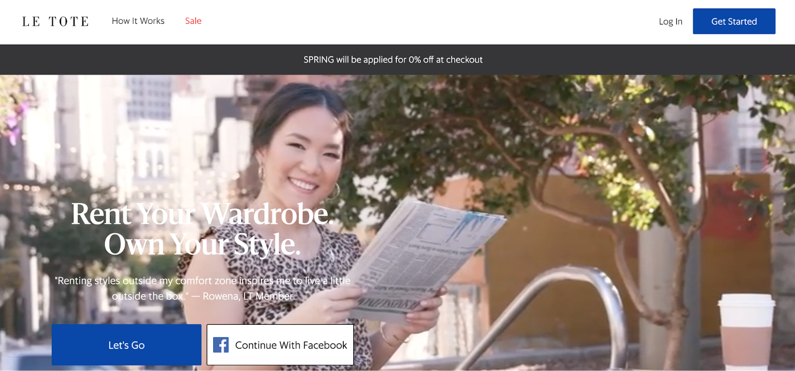
Using inclusive language like “us” and “let’s” in your CTA is a fun way to let your customers know that we are all doing this together, like in this example from Le Tote.
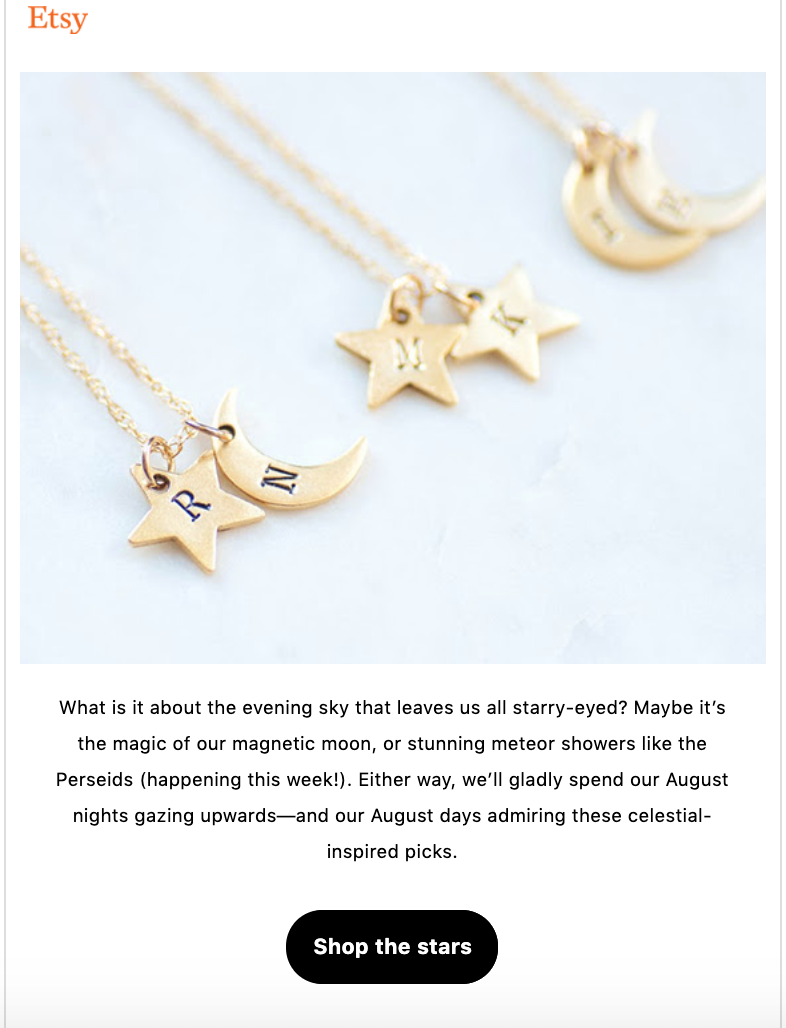
There we go. Good on you, Etsy. Etsy isn’t afraid to get creative.
Take a queue from this handmade/vintage/craft eCommerce giant.
Feel free to flex your copywriting skills in your call-to-action.
In this example, Etsy uses “Shop the stars” to entice people to buy “the best” (jewelry) from their platform.
And Etsy took a moment to butter us up with some poetic imagery. Get your coin purse out.
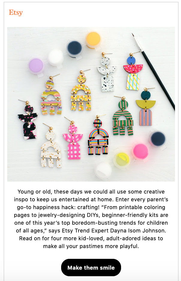
Make them smile might just be the nicest call-to-action you’ve ever heard. When customizing and tailoring your CTA button add an emotional pull to your copywriting. This one speaks right to parents about their kids’ happiness.
Shop Now is an Ecommerce call-to-action staple. It’s a clear and evident way to let your website visitors know that they can buy your product online, which is important for convenience—or because of a pandemic.
Which isn’t to say this button wouldn’t be even better with a CTA that said something like Get Some or Get Yours—amiright? 😉
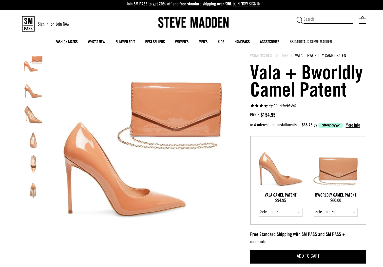
No product page would be complete without an add to cart call-to-action like in this example from Steve Madden. The add to cart is a pivot moment in the e-commerce sales funnel when the prospective customer shows intent to buy.
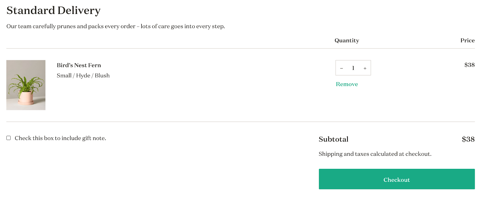
The Sill’s simple checkout call-to-action button is thoughtfully placed under the order summary. The Checkout button is essential to move your customer to the stage where they enter their payment method.
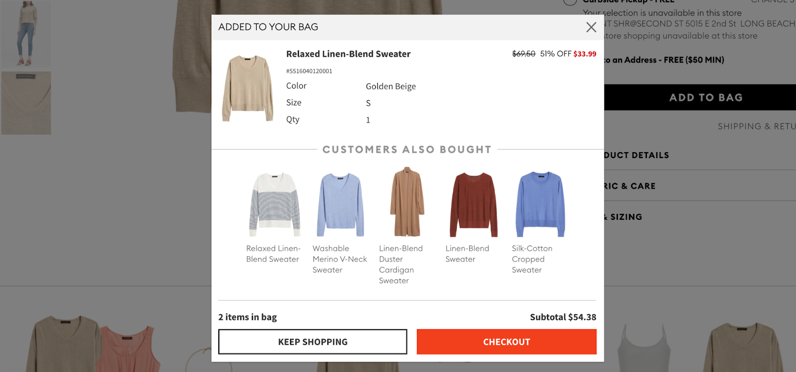
Increasing Average order value is a key component to marketing success. A larger average order value improves return on ad spend and grows revenue. Banana Republic uses a “Keep Shopping” call-to-action after adding an item to the shopping cart to encourage customers to buy more—the upsell!
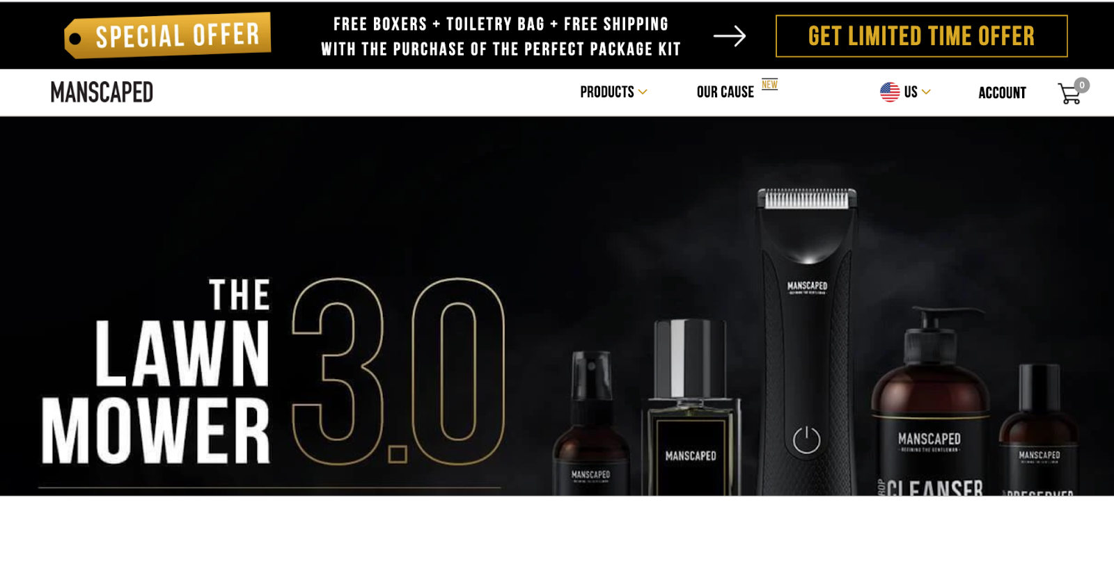
When promoting a sale, make sure you have a call-to-action highlighting the sale’s value proposition. Like in this example from Manscaped where they execute a “Get Limited Time Offer.” The special offer lists all the goodies and the CTA conveys the urgency of getting those goodies.
So, in one banner bar, I know that Manscaped
- has a special offer
- what that special offer is
- it won’t stick around for long.
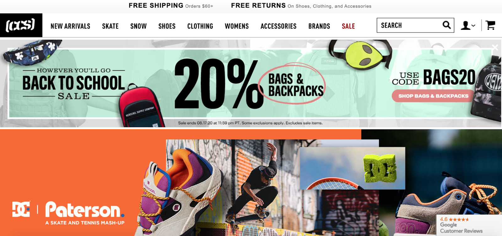
In this example from CCS.com, they use a clickable banner with a specific call-to-action telling a potential customer to “Shop Bags & Backpacks.” That’s very specific. There’s also a powerful click trigger here (a coupon for 20% off)
Yoga International uses a Pop-Up offer to capture email addresses and drive free-trial sign-ups. Full-screen calls-to-action, such as exit popups perform better than any other CTA. The “Get Started” call-to-action gives the user an easy way to begin their yoga journey.
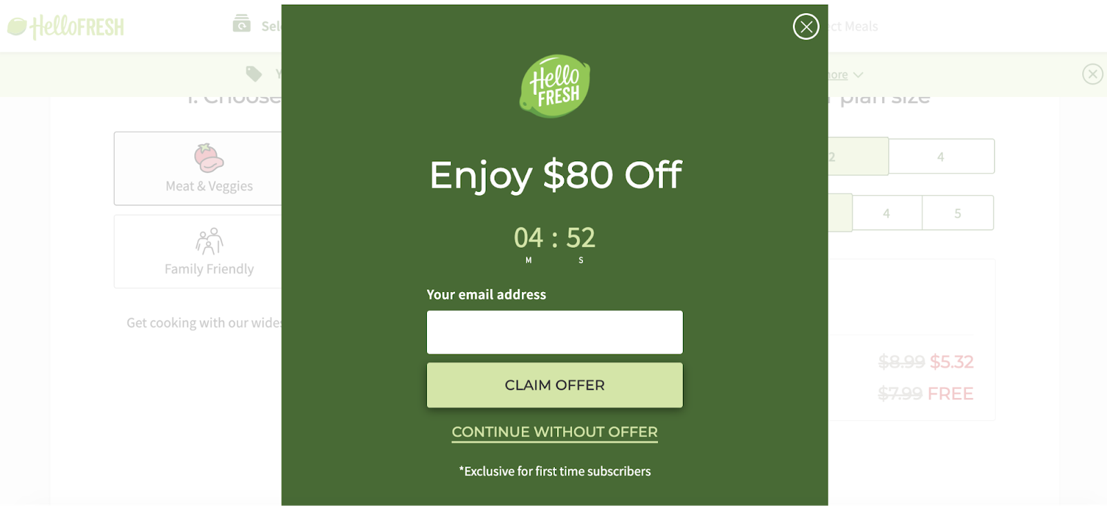
Hello Fresh uses a countdown timer to add urgency to their “Claim Offer” call-to-action. Applying urgency on a landing page helped one marketer increase sales by 332%.
Where it’s appropriate, best practices call for elements of urgency, scarcity, or exclusivity.
All of these marketing tools are persuasive hooks. They are loaded with value.
Why?
Because everyone wants access to special things (scarcity), and everyone likes to be part of special things (exclusivity), and nothing motivates a click more than the click option going away shortly (urgency).
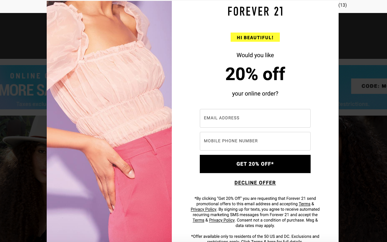
Forever 21 uses “Get 20% Off” to drive users to sign up for their mailing list and then receive the 20% off coupon in the form of an email follow up.
This call-to-action highlights the offer, bringing the discount to the forefront of the customer’s mind. By using the word “Get” Forever 21 implies that they are giving the customer a gift or something of value.
Using a discount is a great way to increase conversion rates!
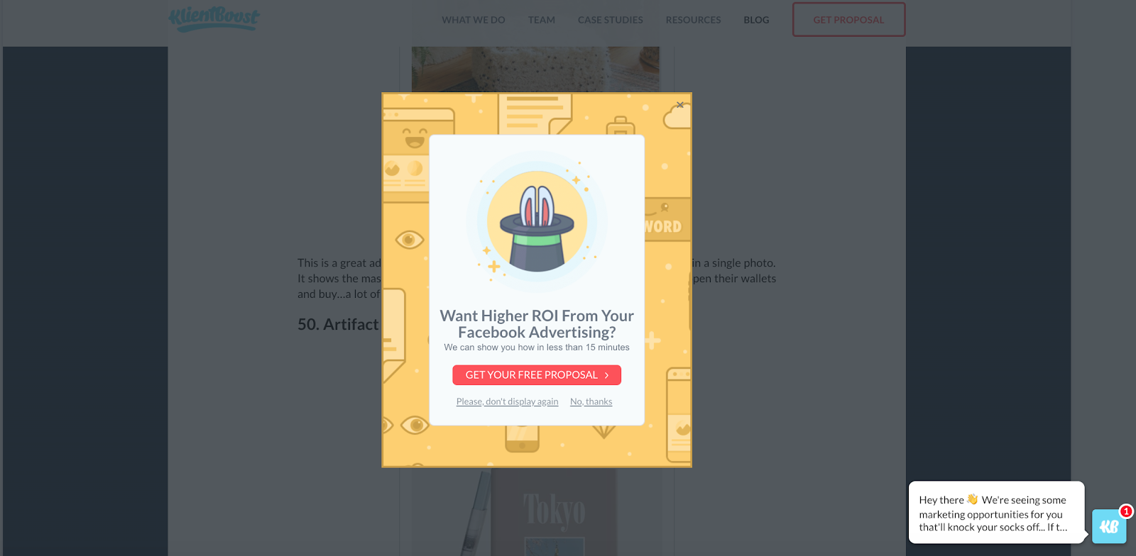
Yes, we are using ourselves as an example in our own blog post. Why? Because we practice what we preach. If you spend a sufficient amount of time exploring the KlientBoost website you’ll get a pop up prompt that says “Get Your Free Proposal.”
So what are you waiting for? Get your KlientBoost proposal today.
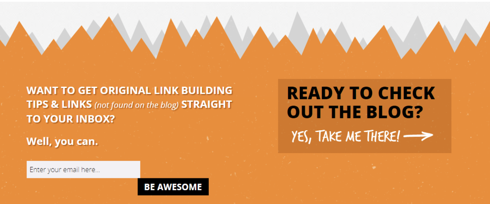
The buying process happens 3 times faster from emails than on social media. That’s why it is so important to have a strong, direct call-to-action to build your email marketing list.
In this example from Point Blank SEO, they play to your ego by asking you to sign up for link-building tips with a CTA that conveys you will be awesome for doing so. They also use exclusivity as a hook by telling you that only you will see these special tips because they are “not found on the blog.”
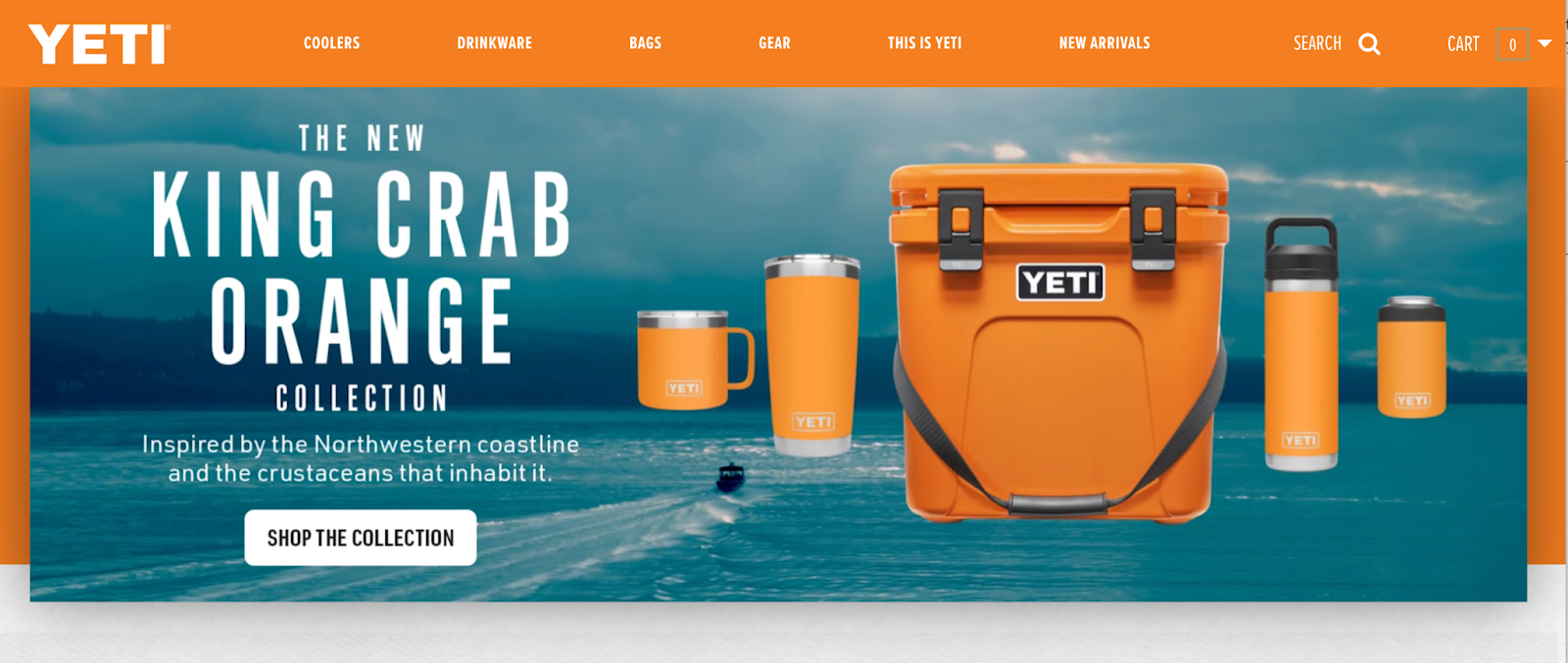
Who doesn’t love a call-to-action that’s clear and transparent upon landing? Yeti wants you to shop their new “King Crab Orange” collection. They tell you what inspired the new collection and hit you with brilliant contrast between the product and the background. Shopping that collection is the first action I take.
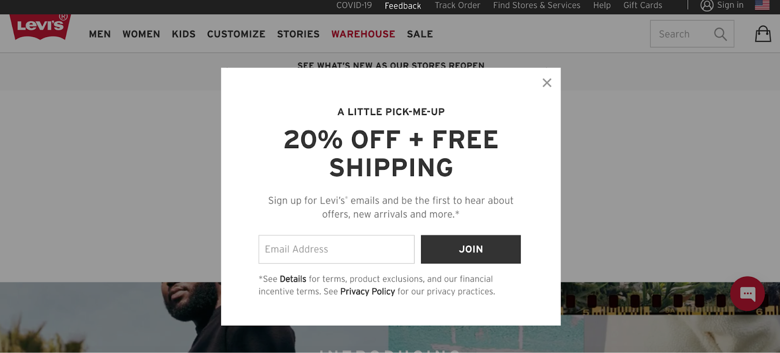
Levi’s uses inclusive language to get website visitors to join their email list with their “Join” CTA button. Plus, they added in a 20% Off + Free Shipping offer to wrangle customers in. A “join” or join now CTA is a simple and friendly way to ask for email sign-ups that adds an exclusive touch to the button, elevating it above “sign up.”
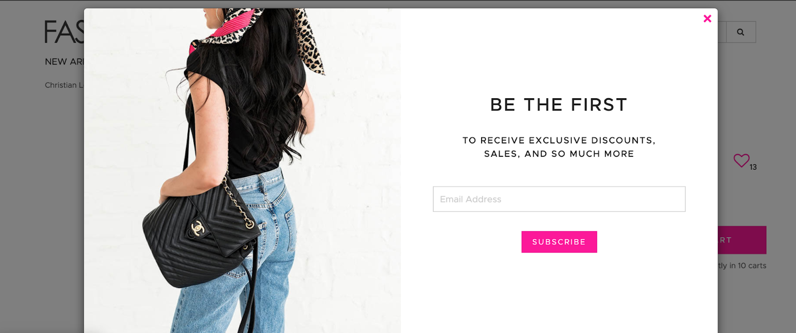
Fashionphile uses the popular “subscribe” to drive new email subscribers. It’s popular because it’s universal for “sign up” without saying “sign up.” Subscribe conveys the promise of something. In this example, the pink button on the white background really makes the call-to-action pop while keeping a consistent, clean design.

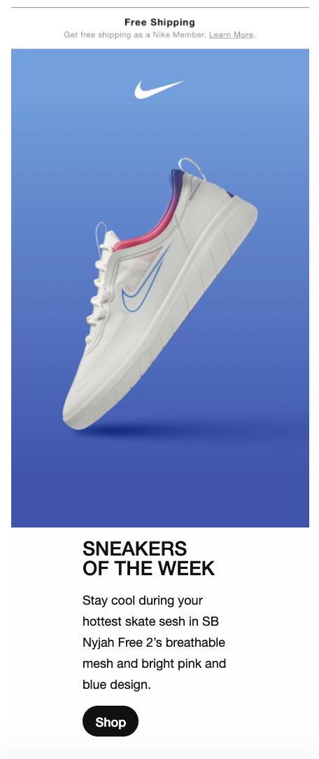
It’s important to include action phrases in your marketing emails. Call-to-actions in email campaigns are imperative to drive results. In this example, Nike uses a product-focused image as the bulk of their email, with a concise “Shop” button that truly pops.
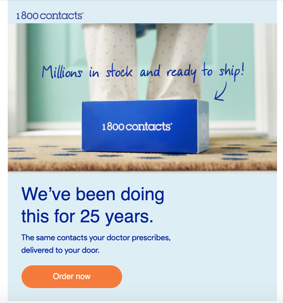
Email marketing for companies like 1800 Contacts is especially important. It’s a way for the brand to say “hey, don’t forget you need these!”. In this example, the “Order Now” button does just that.
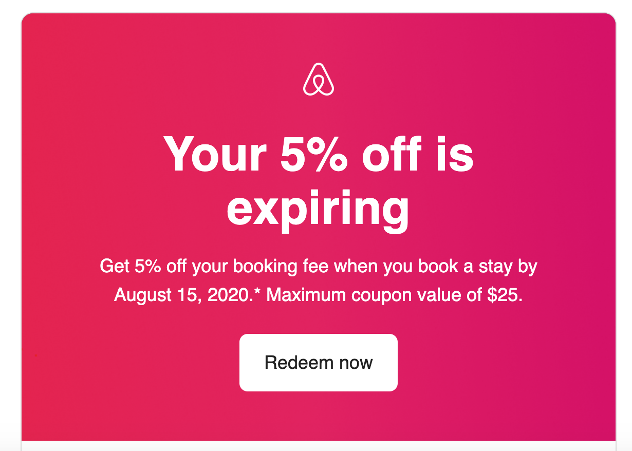
Another great approach to email marketing is sending your loyal email subscribers promotions. Airbnb uses a Redeem now CTA that really focuses on the action verb redeem. Also, using the word “now” expresses a sense of urgency that is echoed throughout the ad copy in the email.
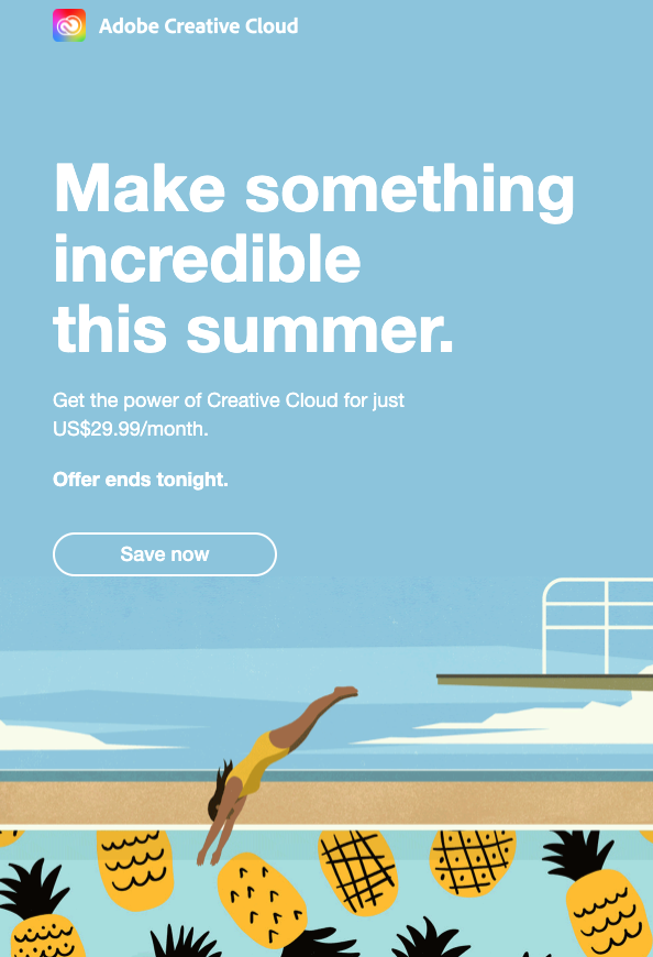
In this example, AdobeCloud encourages you to make something incredible. And not only that, but they also use a clickable button directing you to Save Now. So, not only are you going to make something incredible this summer but you’re also going to save along the way! This example demonstrates both intrinsic motivation and incentive.
1.86 billion people worldwide are connected to a small business on Facebook making advertising on Facebook a key component to many brands strategies.
Facebook Ads are a great way to reach your target audience. Facebook Ads come with 17 predetermined call-to-action options that are sure to make you take the next step.
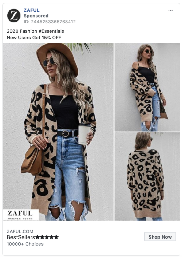
For eCommerce brands, “Shop Now” is the recommended CTA button for your Facebook advertisements. Brands like Zaful have built their entire business by acquiring customers through Facebook.
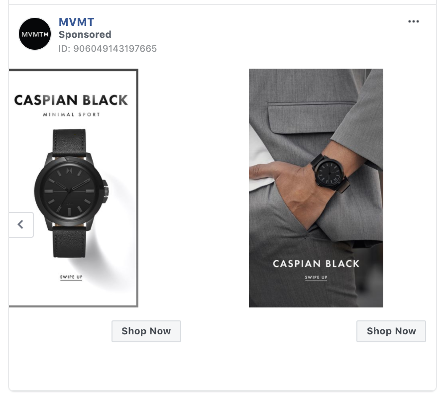
The Shop Now button is usually favored by brands looking for a direct eCommerce response. MVMT illustrates how the “Shop Now” Button can enhance your Facebook carousel ad. Pro Tip: You can point the “Shop Now” button to a different landing page for each card in your carousel.
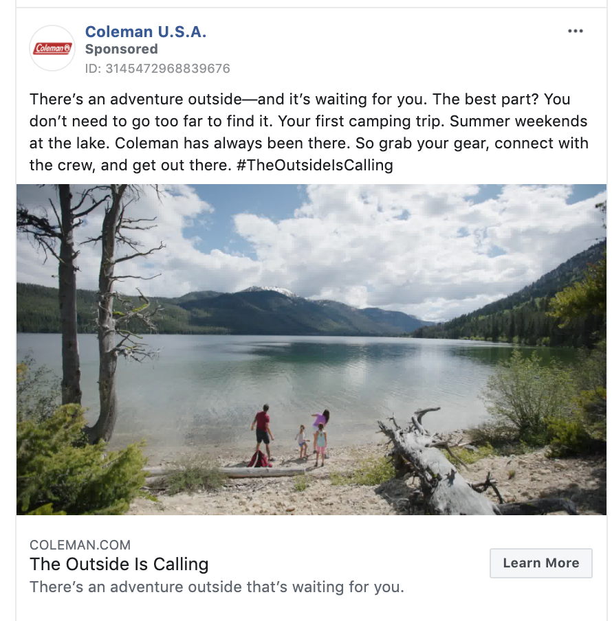
“Learn More” is Facebook’s default call-to-action button, but that doesn’t mean it doesn’t work. “Learn More” requires little commitment from the ad viewer, and is a great way to nurture prospective customers by getting them engaged with your brand.
“Learn More” tends to see solid click-through-rates and is used by large consumer brands like in this example from Coleman.
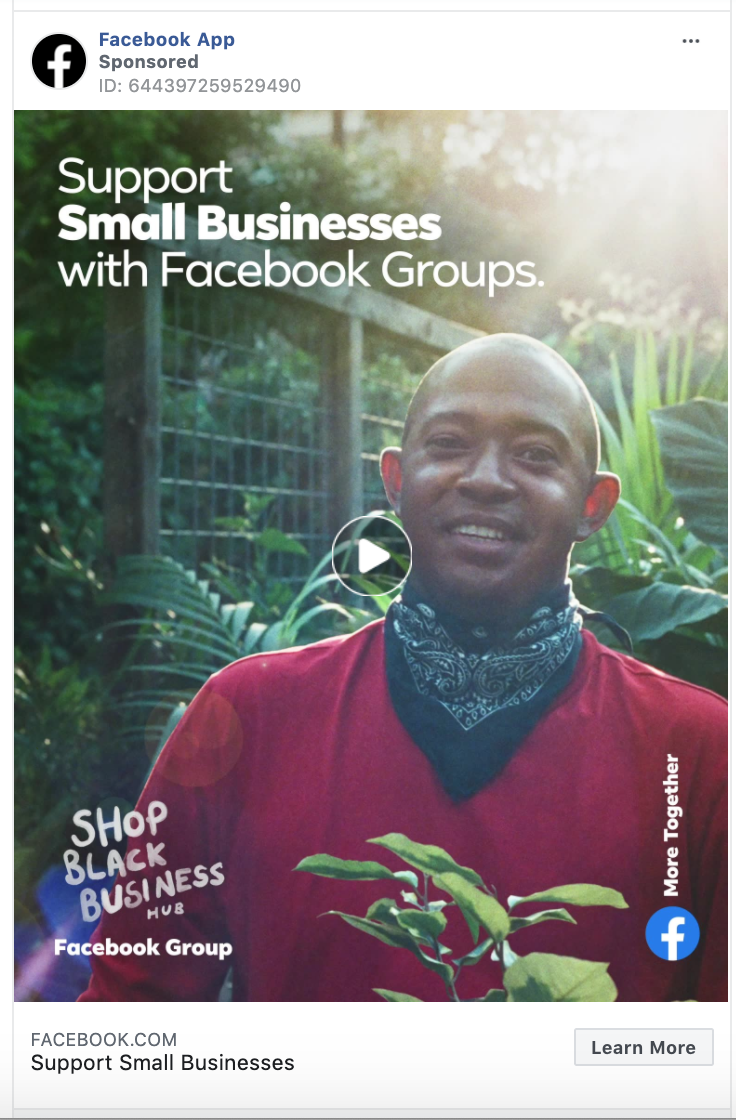
In this example, we check in on Facebook themselves to see what they are doing in their own ads. Here, you can see that Facebook uses the “Learn More” button to educate people about Facebook Groups for small businesses.
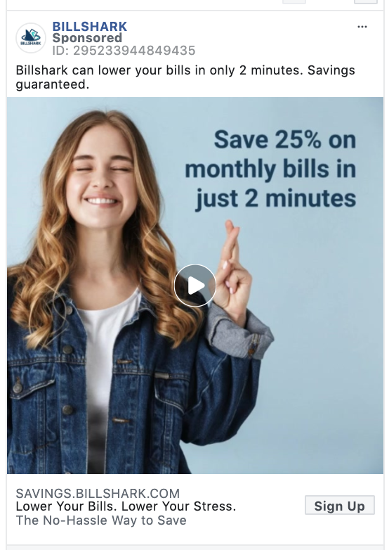
Hey, we’re working with preset options here. And “Sign Up” is a straightforward call-to-action for any advertiser looking to drive leads for a service. In this case, Billshark uses “Sign Up” to drive lead acquisitions.
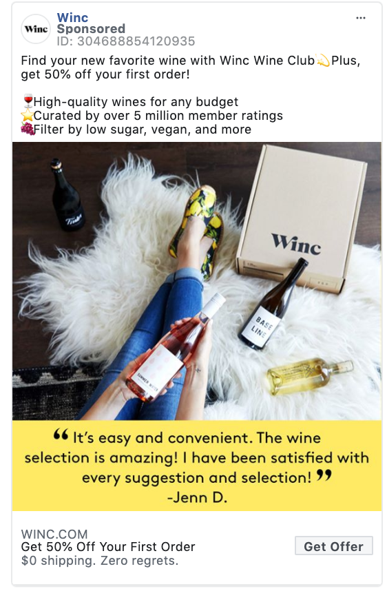
Winc shows how to promote an offer with both the ad copy and the “Get Offer” CTA button. Promoting a discount on your first order is a great way to grow your customer base!
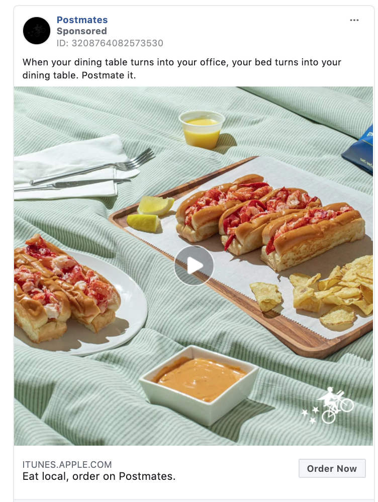
The “Order Now” CTA button might just be the best thing since sliced bread. Order Postmates while scrolling Instagram? Yes, please.
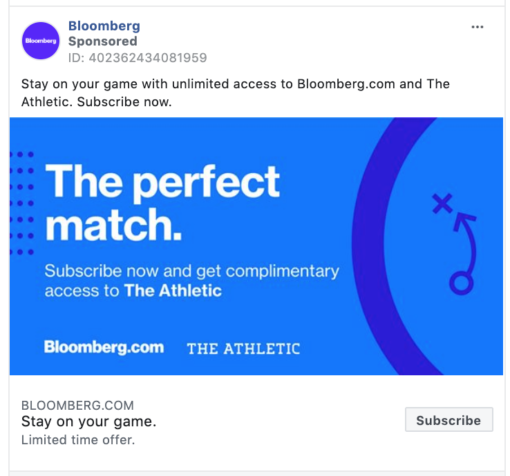
“Subscribe” is popular among news sources, magazines, and subscription boxes. This example from Bloomberg illustrates the “Subscribe” to drive subscriptions to The Athletic.
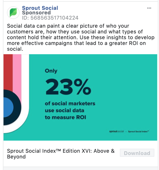
The “Download” clickable button is direct and straight to the point.
In July 2020, over 98% of active user accounts worldwide accessed their social networks via their mobile phones.
So the download call-to-action is a great way to reach people when they are on their mobile device.
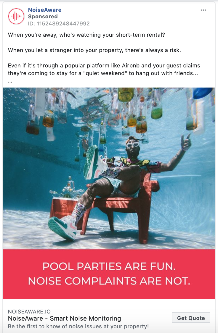
I’m sorry, what do you mean? This isn’t clear.
Kidding.
Offering a quote is a great way to get customers in the door. It’s a zero commitment call-to-action that is easier to get users to click compared to “Buy Now.”
“Get Showtimes” is recommended for movie theatres, plays, and concerts. AMC Theatres uses “Get Showtimes” in this example below.
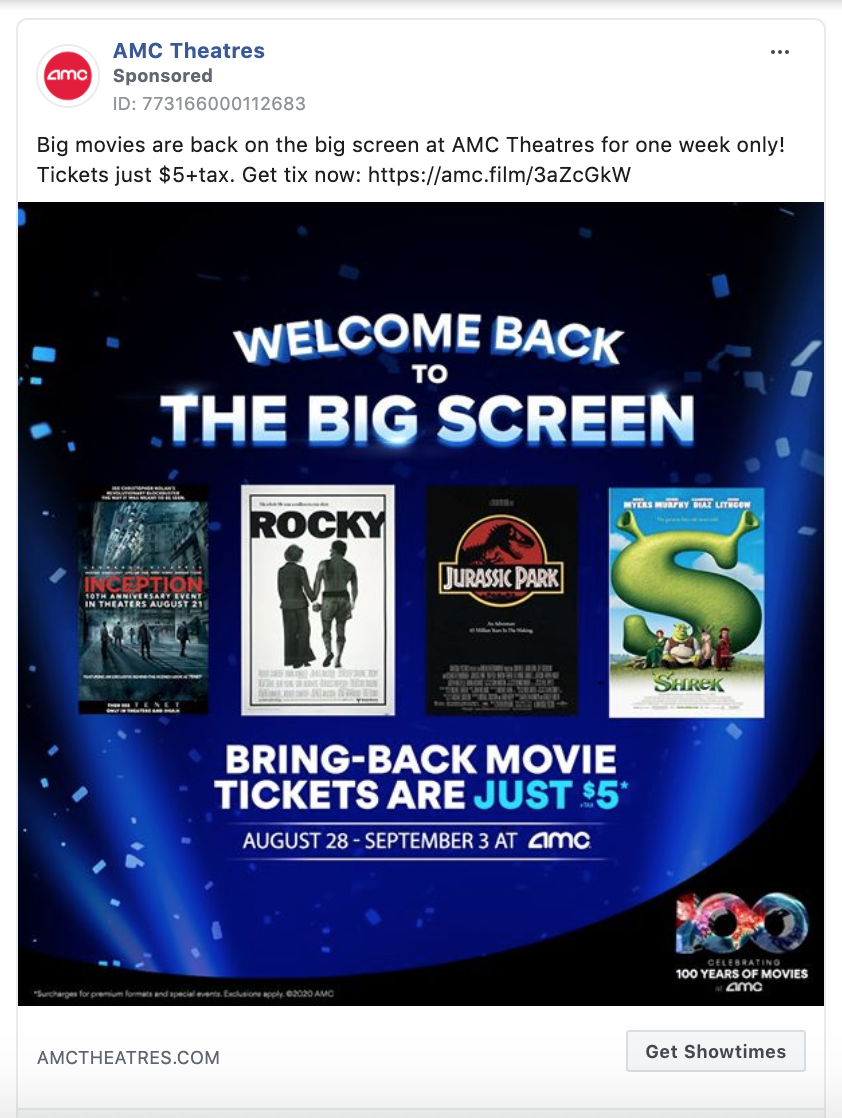
Love this one.
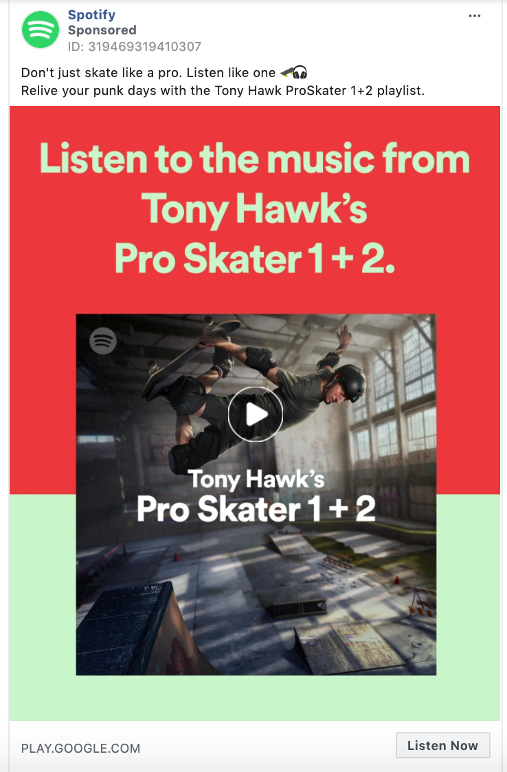
“Listen Now” is a favorite of industry giants like Spotify, Apple, and Pandora. If you are promoting music, a podcast, webinar, seminar, or audiobook definitely use the “Listen Now” call-to-action.
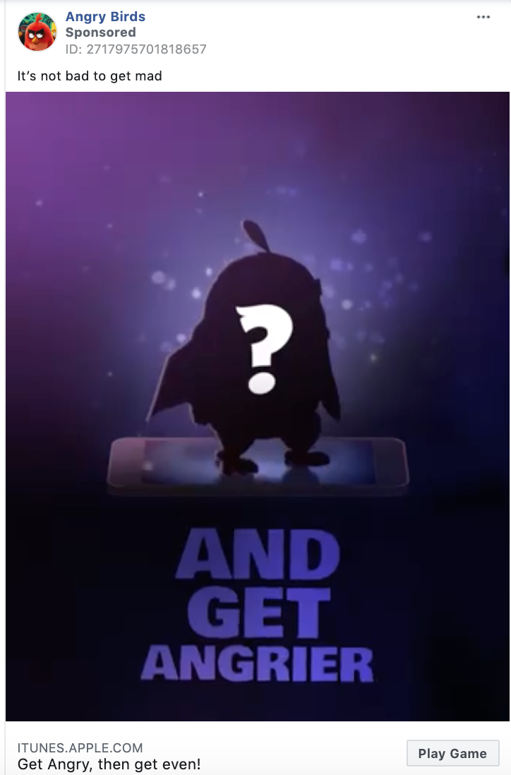
A less common pre-set CTA button when you are creating an ad in Facebook’s Business Manager is “Play Game.” If you are promoting a game or an app convince your ad viewers to have some fun, and use “Play Game.”
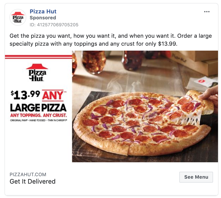
Promote your restaurant with the “See Menu” call-to-action like Pizza Hut does in this example. This is a top of funnel way to drive take out orders or customers to your restaurant.
As streaming platforms like Peacock TV grow, the “Watch More” call-to-action is becoming increasingly popular. If you promote television, movies, or even just want people to watch your entire promotional video, use “Watch More.”
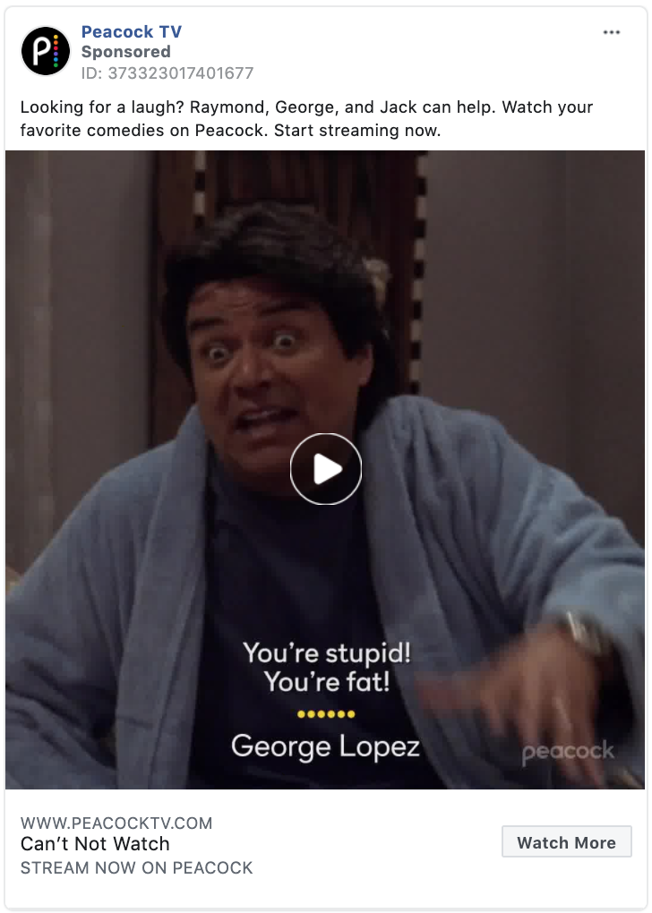
This is an exciting CTA that no doubt causes a mild adrenaline spike that sends positive energy through the body of your button clicker.
Use “Apply now” if your digital marketing goal is to drive job applicants, apartment rentals, or if you are a higher education institution like the University of Phoenix in this example.

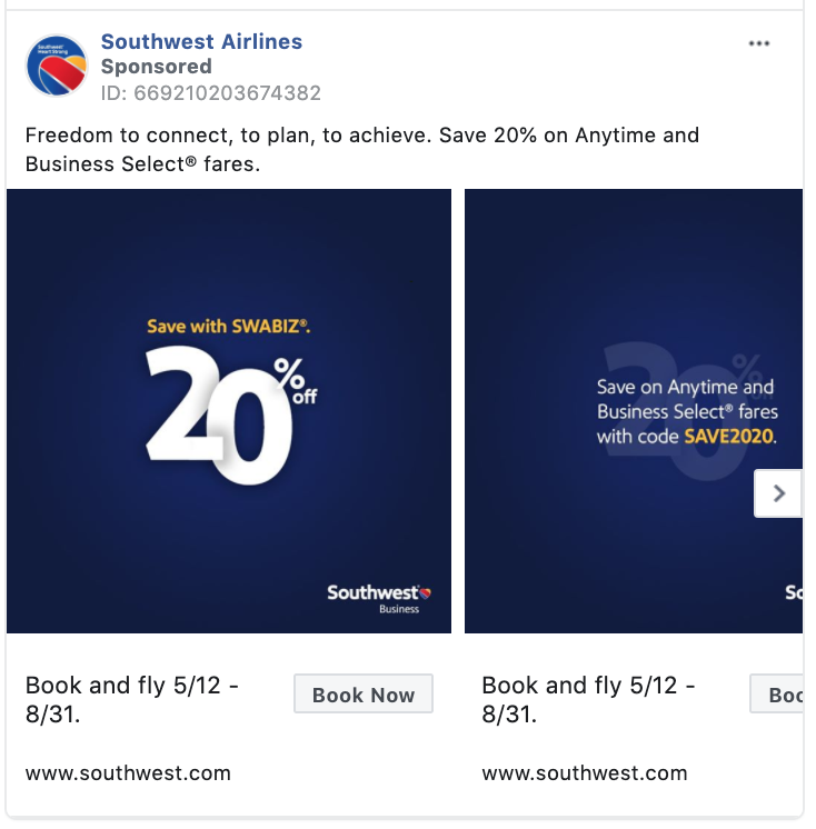
Airlines and hotels are big fans of the simple CTA “Book Now.” Southwest Airlines uses the action words “Book Now” in their ad to direct its users towards the next steps of booking a flight.
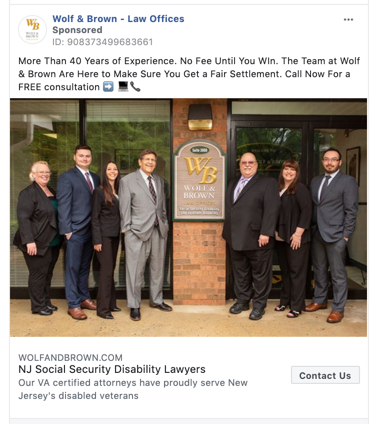
“Contact Us” is compelling and can be used in many cases. In this example, we highlight a law firm using the “Contact Us” call-to-action clickable button. If you are looking to drive phone calls to your business “Contact Us” is effective.
Many non-profit organizations use Facebook ads as a way to build donations toward their cause. In this example, the World Food Program USA shows how to use the “Donate Now” call-to-action.

Google Ads are often overlooked in conversations around call-to-actions. But here at Klientboost, we are absolutely obsessed with Google Ads.
There is no reason you shouldn’t incorporate a call-to-action in your Google ad copy to increase your click-through-rates.
You can even use A/B testing to determine which call-to-action drives the best click-through rates. These examples below will inspire you to spruce up your Google ad copy.
Many brands that have an eCommerce faucet use a “Shop” in their Google search ad copy. For established brands like Adidas, “Shop The Official Site” is a great call-to-action that not only encourages the user to take action, but also adds an element of authenticity to the ad.

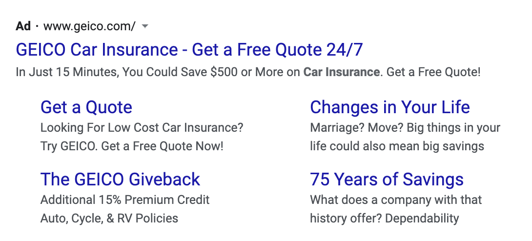
Geico uses a “Get a Free Quote 24/7” in their Google ads headline. It’s important to work in an action verb to entice people to click on your ad. When writing your call-to-action remember that Google ad headlines have a character limit of 30.
In this example, Upside Avenue uses “Download Our Investment Guide” as a compelling call-to-action to drive clicks to their site and generate interest from potential investors.

Asana uses a “Try Asana for Free” in their text ad. The best CTAs rope in their audience with an offer.

One of our last examples highlights responsive display ads on the Google Ads interface.
Display advertising reaches your target audience through visuals like images and videos on networks of publisher websites like the Google Display Network.
When creating a display ad, Google allows you to customize your call-to-action with the options below.
- Automated
- Apply Now
- Book Now
- Contact Us
- Download
- Learn More
- Install
- Visit Site
- Shop Now
- Sign Up
- Get Quote
- Subscribe

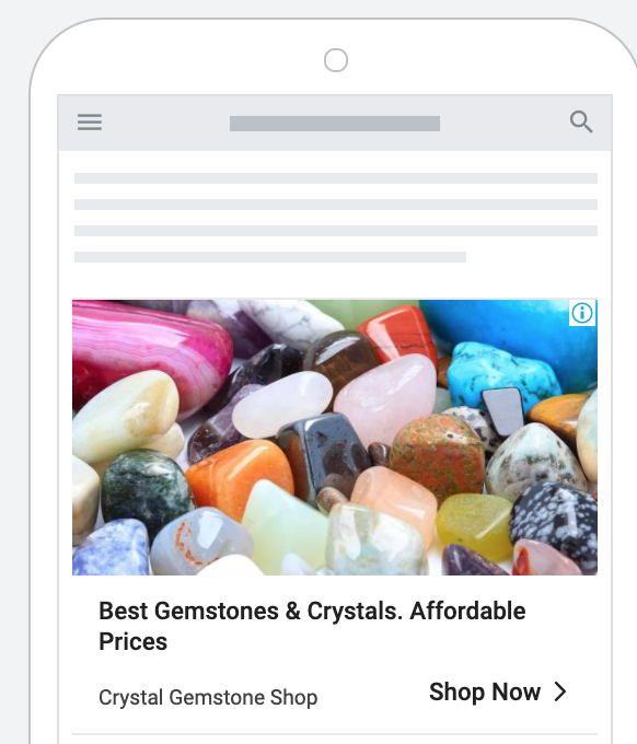
In this example, Crystal Gemstone Shop uses a “Shop Now” CTA to drive direct sales from their display ad. If you are looking to drive sales from your Display ads, try using a remarketing audience for the best results.
According to Kenshoo, consumers are 70% more likely to convert with retargeting.
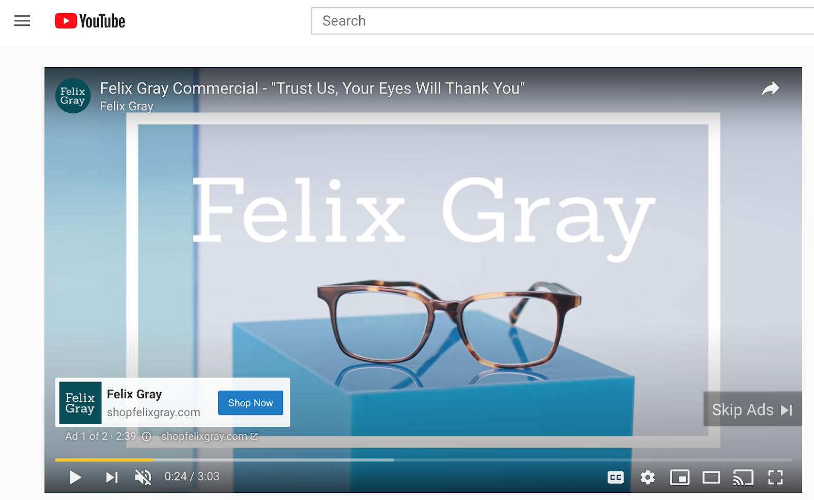
Youtube has dedicated an entire ad overlay to call-to-action.
A call-to-action (CTA) overlay is an interactive element that appears over an ad that drives clicks to your website. An overlay appears when the video starts and collapses into a thumbnail image after 15 seconds.
Felix Grey uses the “Shop now” call-to-action overlay in its Youtube TrueView in-stream ad. The Shop Now CTA gives users a way to take direct action from the Youtube ad.
This option, as well as advanced targeting methods, is another reason advertising on YouTube may work better for your brand compared to a more traditional approach.
Well, that was 61 examples of call-to-actions on different platforms.
Now, let’s get into how to execute the perfect CTA in your marketing campaigns.
Every single campaign you run, on every platform or medium, will need a CTA.
Here are the key takeaways for constructing the perfect words to spring your customers into action, and skyrocket your business.
- Determine Your Goal
- Use action words and verbs
- Ensure that your CTA is visible and above the web pages fold
- Add a clickable element or make your CTA into a button
- Always A/B test your CTA’s for continued success
Your goal is to win clicks. But how many clicks? This depends on your past results, your dedicated effort, and your plausible projections. Set the bar at something achievable, but don’t slouch. Set it high enough so that hitting that marker will feel great.
Picking the right word is important on an action button. And because you’re after an action, the word you use will be a verb. Verbs are by definition action words. We learned that in grade one.
You have a literal ton of action words to choose from (if your options are pre-set on a social marketing platform like Facebook).
So go for originality. Have fun with it!
Try these on for size:
- Get to it
- Click
- I’m in!
- Can’t wait
- Heck yes
- Whoop!
If someone has to scroll down to find your action button, that’s a fail. You can put information under the fold (below what a user sees on their screen), but not the CTA. That CTA goes right in front of their eyeballs right away.
There’s nothing anywhere that says that you can’t bury your action desire in a plain HTML link. But why not style your CTAs as buttons and take advantage of size, contrast, and immediate recognition?
Make your CTAs buttons, friends. Unless you are raw coding (and you aren’t in 2021), every CMS and every theme has a drop-and-drag button option.
Use it.
Throwing something out there in the digital void is important. Throwing out something incredible is more important. But how will you know if it was blah or incredible?
You know because you don’t make one CTA. You make two. Then you test out which one does better. A/B testing refines your marketing and gives you something to show to your boss in graph form.
Execute it, then measure it.
Then make it into a pretty graphic for brownie points.
Have you crafted the perfect CTA recipe? What tactics did you use and what were the impacts on your business?
Let us know below! 👇👇