


A landing page is a standalone web page built for targeted campaigns, optimized for conversions.
But what separates a good landing page from a great landing page? Or a low-converting landing page from a high-converting landing page? Or a contemporary landing page from an outdated landing page?
A lot.
As marketers and conversion optimizers get more experienced with each passing year, the list of landing page best practices keeps growing and growing.
In the words of H.G. Wells, “adapt or die.”
So we’re doing what we do every year: adapting to the landing page zeitgeist of 2023 the only way we know how…
With a list.
We curated a list of the 23 hottest (and most effective) landing page trends of the new year, including 60+ real-world landing page examples and screenshots from the businesses leading the way.
Whether you're an eCommerce shop, small business, enterprise, or freelancer, this list is for you.
Bonus: To make the list more digestible, we broke it up into six different categories, each category representing a pillar of effective landing page design:
Get brand new landing page strategies straight to your inbox every week. 23,739 people already are!
Landing page strategy trends
“Tactics without strategy is the noise before defeat.”
The same applies to your landing pages.
A great landing page will only go as far as a great strategy will take it: who are you targeting, what will you say, how will you position, and what will you offer?
It’s 2023, and two strategic trends have stuck out from the rest:
- Single conversion goal
- Competitor comparison
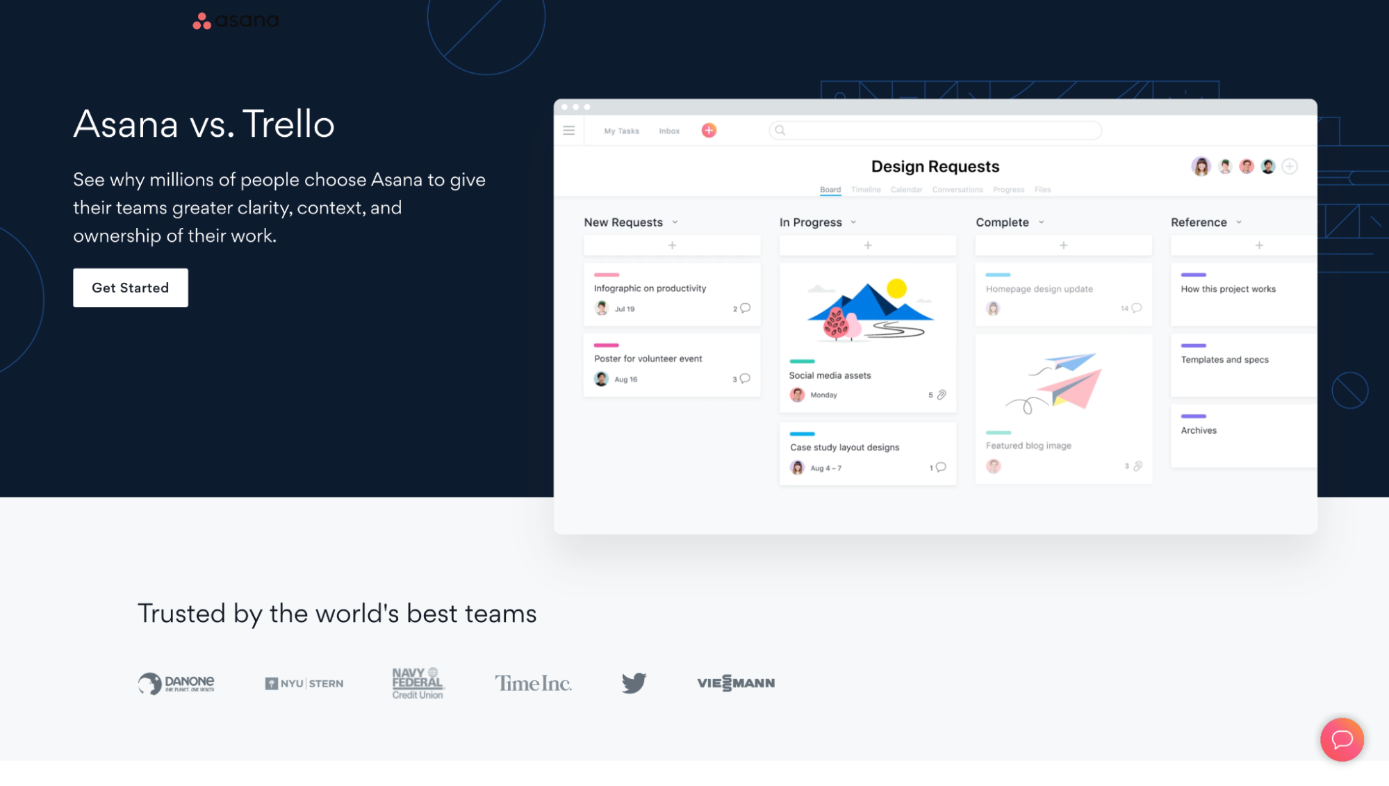
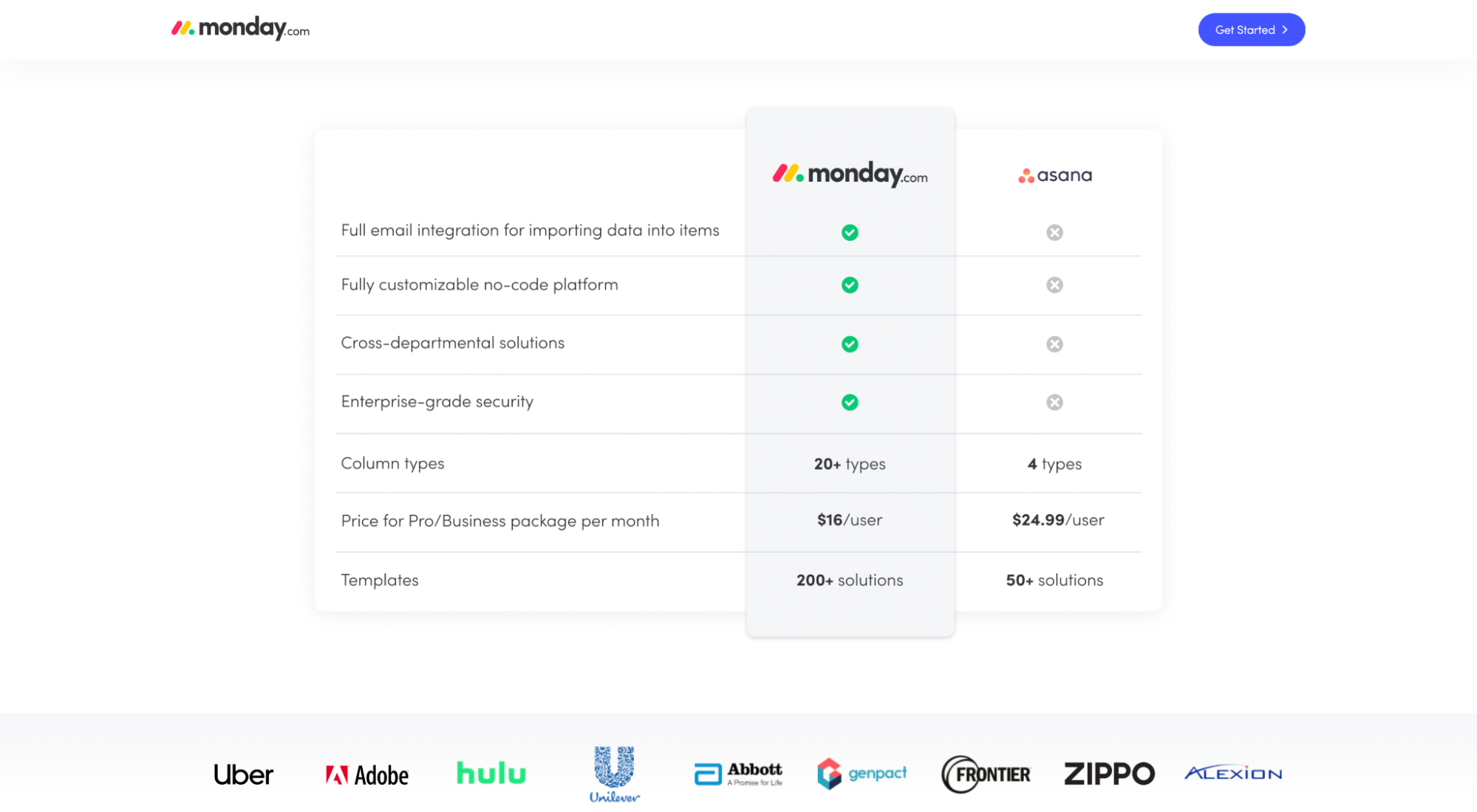
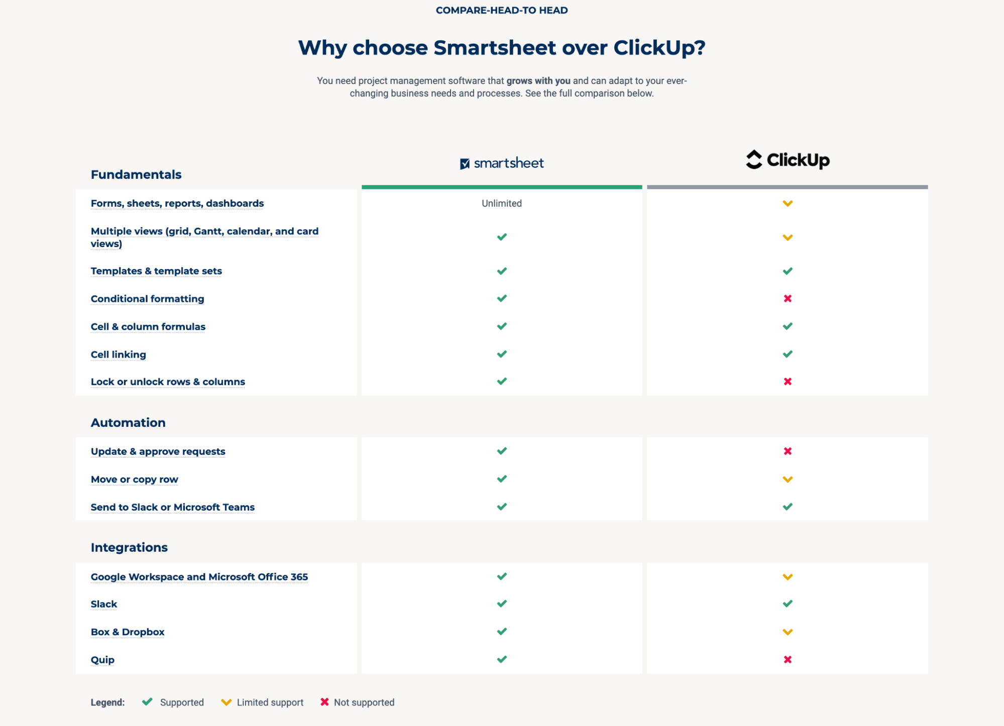
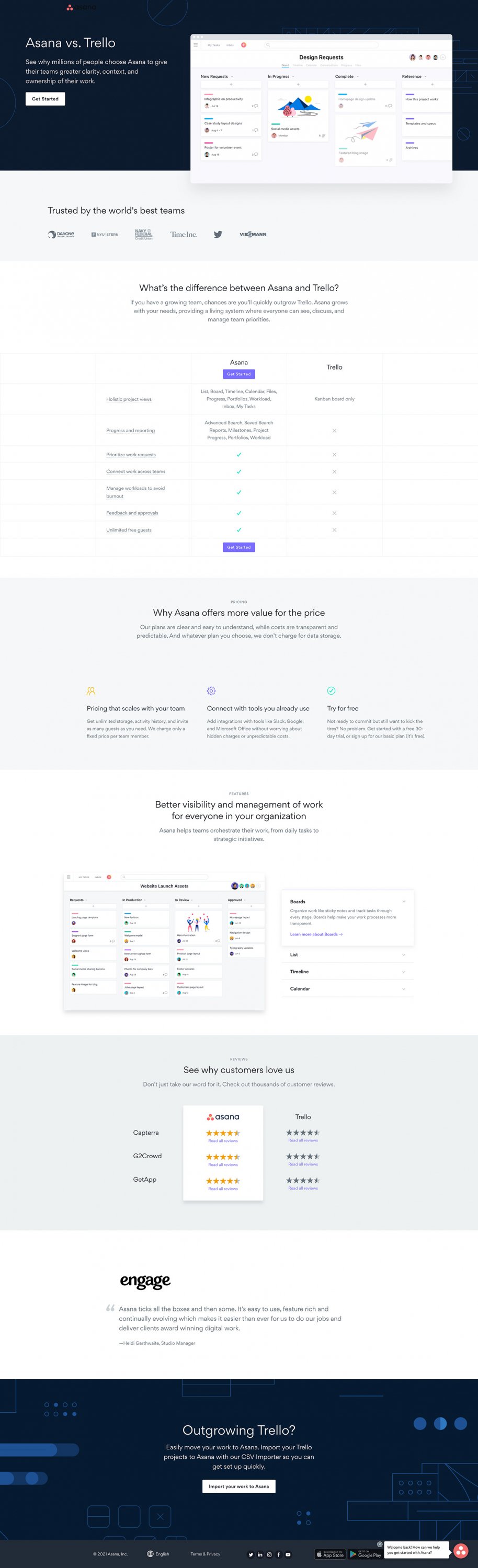
1. Competitor comparison
Feature parity is real.
This means more and more prospects and potential customers are searching for comparison terms like “Brand A vs. Brand B” or “Brand B vs. Brand D.”
As businesses look for creative ways to win this critical moment of truth, comparison campaigns with dedicated landing pages have popped up everywhere.
For example, in the project management software industry, Asana has a campaign that compares them to Trello, Monday has a campaign that compares them to Asana, and ClickUp has a campaign that compares them to Monday.
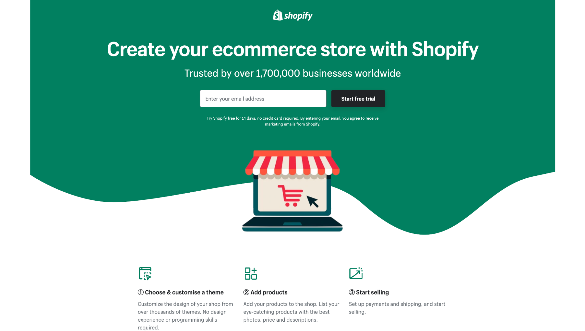
2. Single conversion goal
A conversion goal refers to the objective you want your landing page to accomplish.
In other words, what action will your landing page persuade visitors to take immediately? That’s your conversion goal.
Start a free trial?
Fill out the lead form?
Purchase now?
Something else?
When it comes to increasing landing page conversions, the fewer the conversion goals, the higher the conversion rates. Simple.
In fact, adding multiple offers can decrease conversion rates by 266%.
Therefore, it should come as no surprise that one of the most ubiquitous landing page trends of the last few years has been to eliminate ancillary conversion goals and focus landing pages on a single path to conversion only.
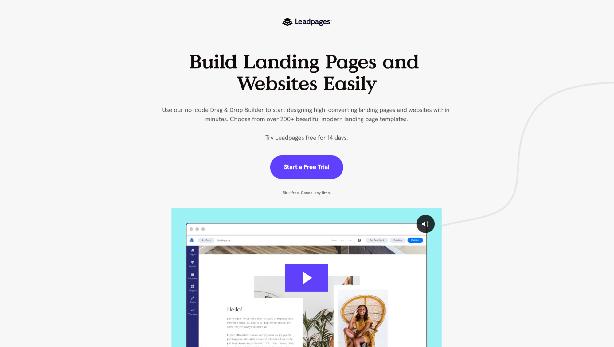
For example, Shopify, Cigna, and Leadpages below all include one offer with one CTA. No options to watch a demo, learn more, download a guide, or convert on a separate offer.
Landing page copy trends
Strong copy delivers your value proposition, creates a sense of urgency, and motivates action.
In 2023, four landing page copywriting trends have stood out from the crowd:
- Command headlines
- Conversational copy
- "How it works" sections
- Strong benefits
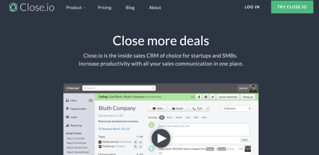
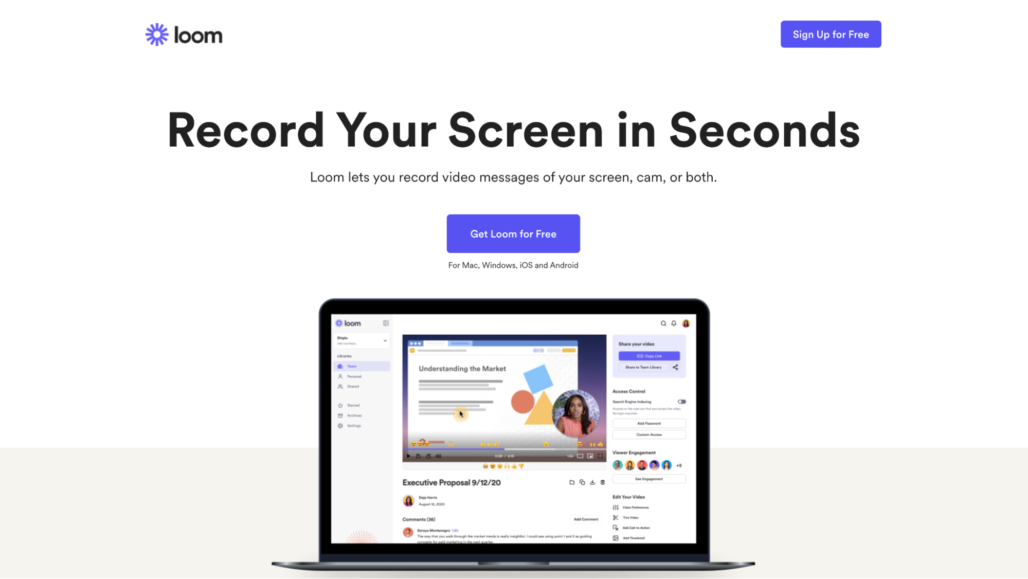
3. Command headlines
Command headlines refer to headlines that finish the sentence, “I want to…” They’re one of the quickest and simplest ways to put your value proposition front and center.
Gone are the days of sales-y abstract headlines. Today, businesses are using clear and obvious headlines that speak to the fundamental needs of their visitors. They’re not beating around the bush.
For example, Close.io captures the core job their prospects need to get done using a single headline that completes the sentence “I want to…” with “close more deals.”
Or Loom uses a command headline to finish the sentence “I want to…” with “record my screen in seconds.”
4. Conversational copy
Conversational copy is copy that trades in industry jargon, fluffy words, and robotic sentence structures for natural, casual language (as if in conversation).
Why is conversational copy important? Comprehension.
The average reading level of your landing page visitors is between 8th-9th grade. Speak their language, not like you’re writing a university thesis on quantum mechanics.
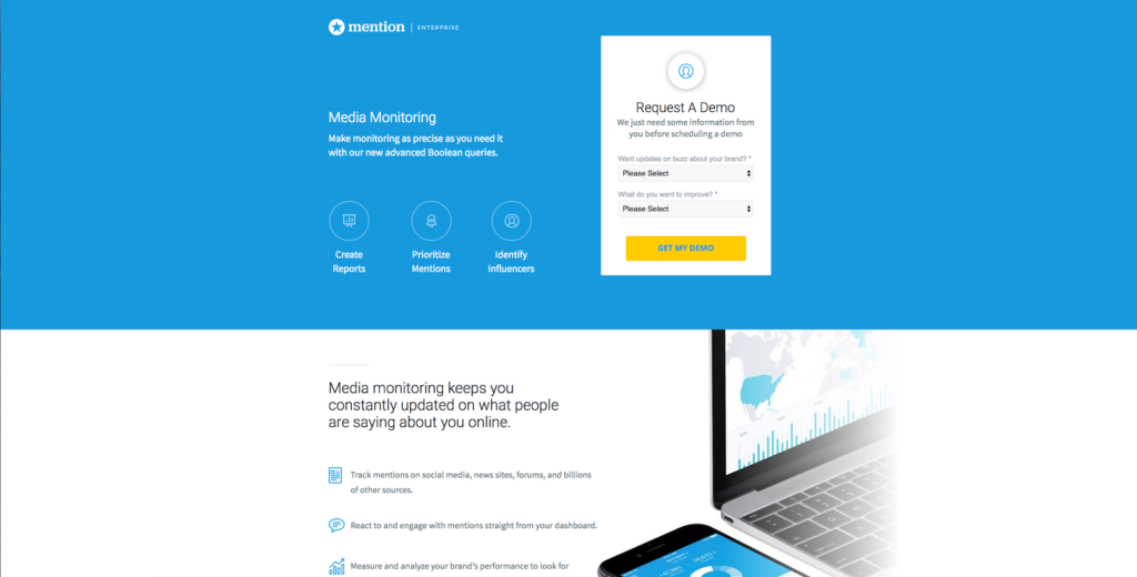
For example, we increased conversions for Mention by 31% by swapping their old, stuffy copy for a conversational copy:

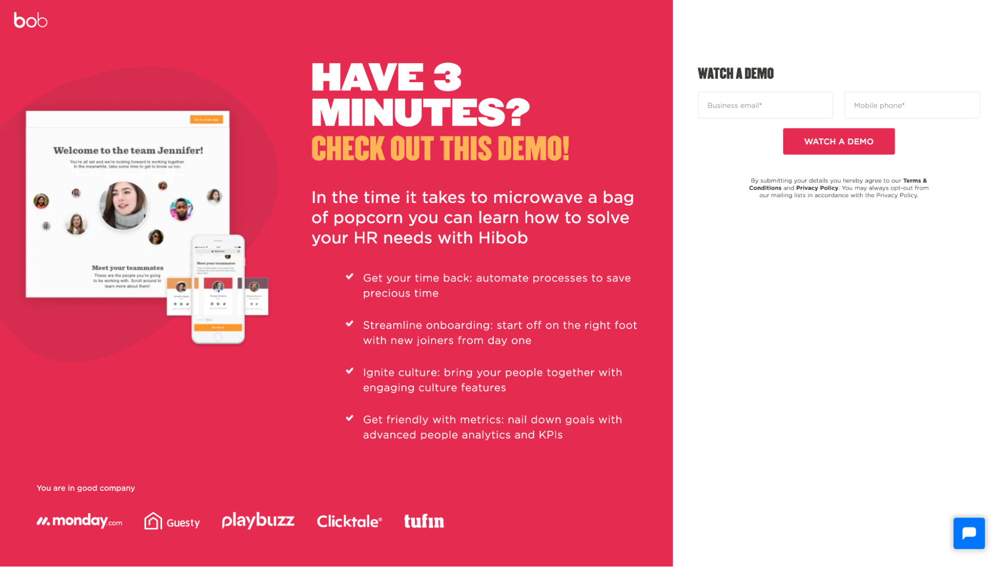
Bob HR also masterfully demonstrates conversational copy within their lead capture page:
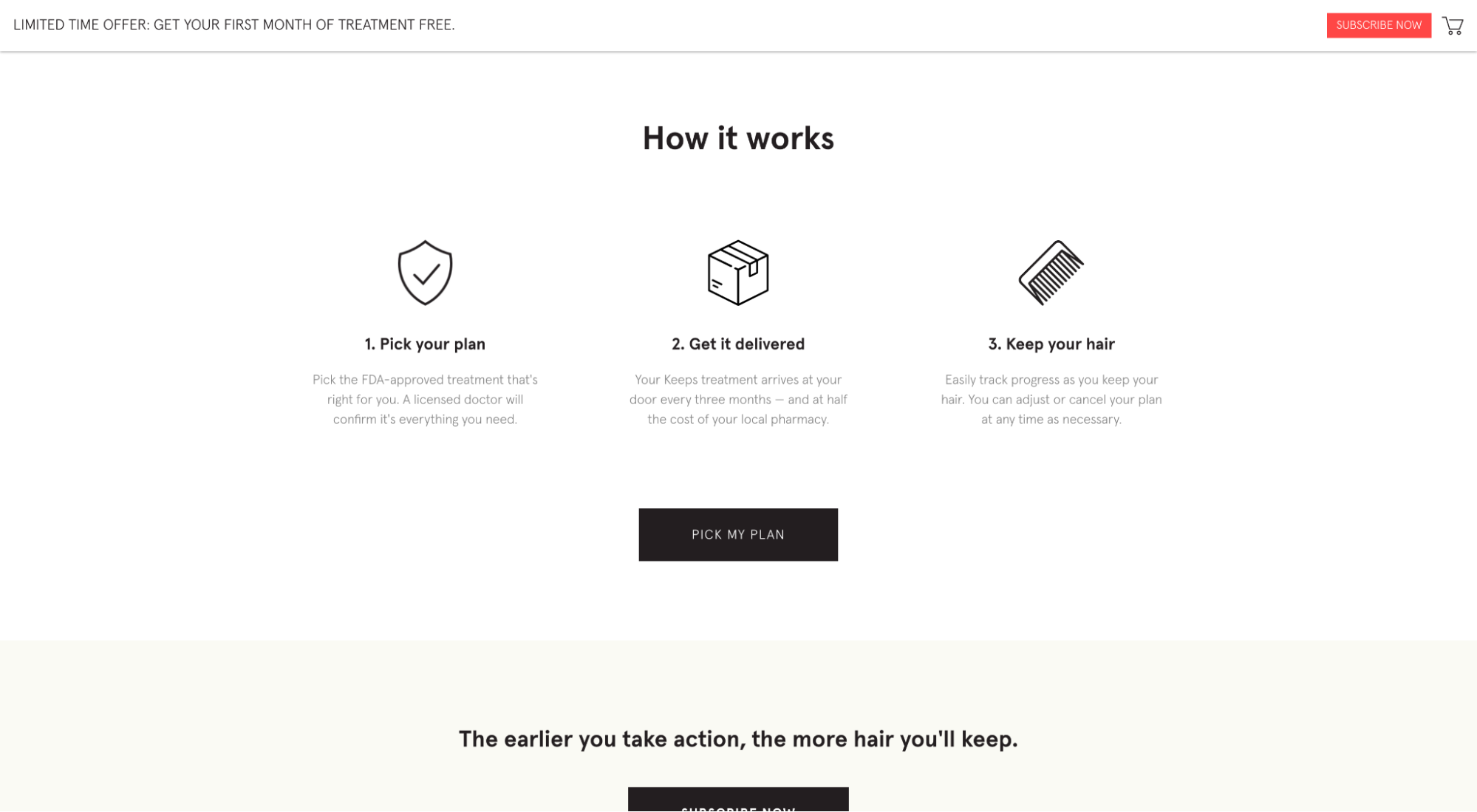
5. How it works sections (guided steps)
The hidden costs of switching providers, learning new software, or mastering a product weighs heavy on your prospects' minds.
It doesn’t help that your visitors likely don’t know how to buy and implement what it is you sell yet.
“How it works” sections break down your product or service into smaller, more digestible steps that make onboarding, mastery, or results feel conquerable, not overwhelming—and they’re everywhere in 2023.
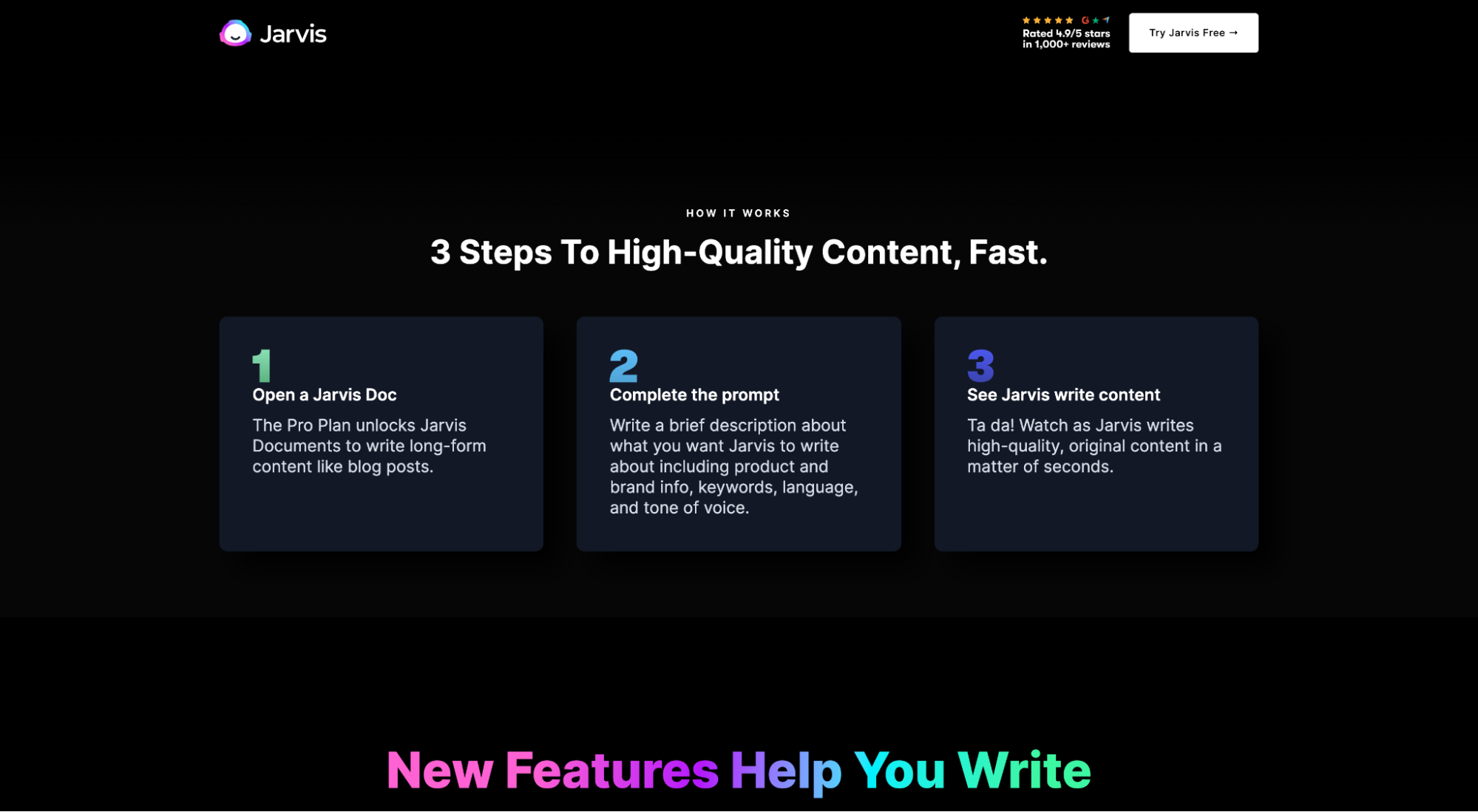
For example, Jarvis has a how it works section to take their otherwise ambiguous AI copywriting process and make it feel simple and intuitive in three steps:
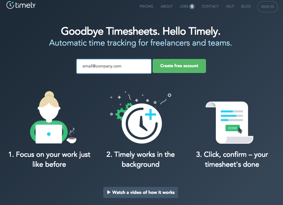
Or Timely uses a simple how it works section to make their time-tracking software feel as easy as painting by numbers:
And Keeps uses their how it works section to show how to buy and receive new products:
6. Strong benefits
Finally, it’s 2023, and benefits (not features) rule the world. Everyone give yourself a collective round of applause. 👏👏👏
Gone are the days of long feature lists and arbitrary product information. Today, businesses know more about their customers than ever before, and it’s showing up on their landing pages in the form of irresistible benefits.
Unlike features, a good benefits section handles objections, agitates pain points, and motivates visitors to solve their problems now, not later.
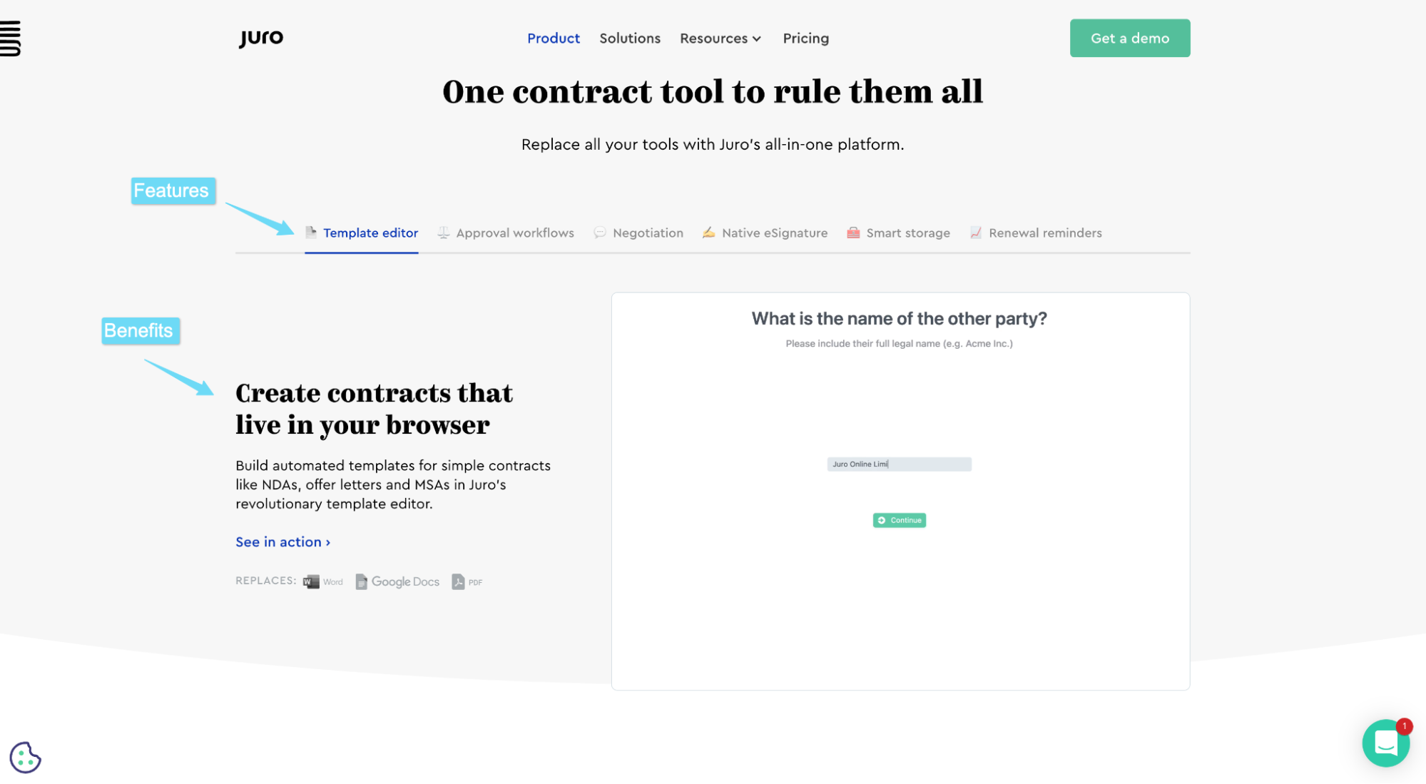
For example, Juro uses their landing page to spotlight their features, but instead of listing them in an independent features section with little context, they support each main feature with a benefit and image. After all, it’s not the features that matter; it’s what those features can do.
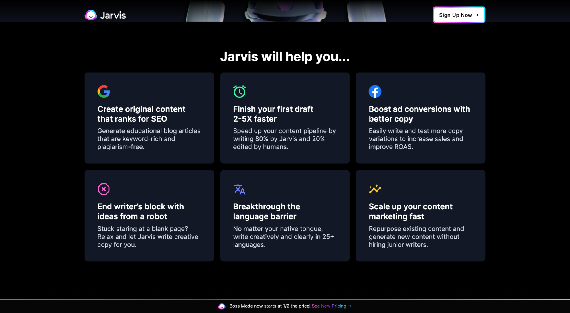
Or Jarvis, who packages their core benefits into a “Jarvis will help you…” section.
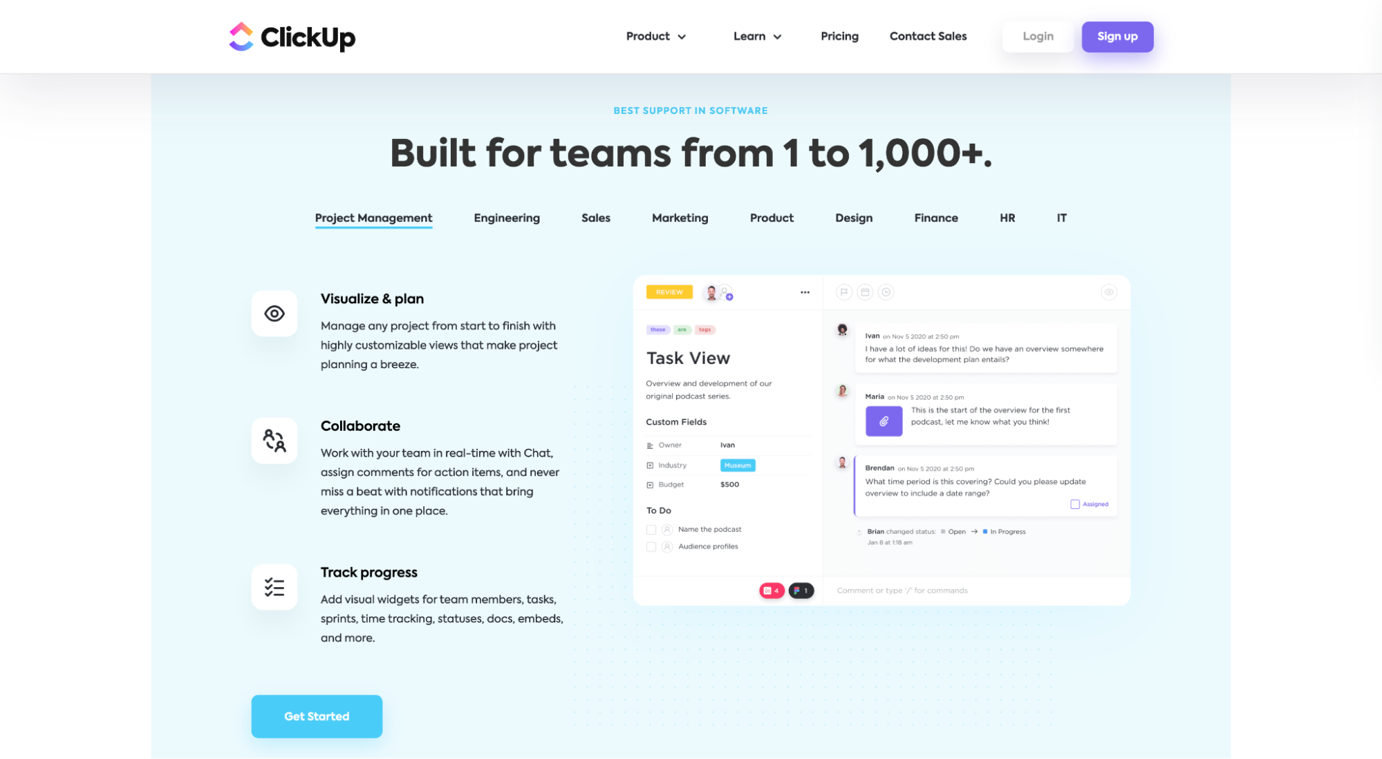
Or ClickUp, who, like Juro, beautifully summarize their features with benefits using a tabbed layout.
Landing page design trends
Landing page design matters. A lot.
- 50% of people say they won’t recommend a website or landing page with poor design
- 38% of people will stop engaging with a website or landing page that they feel is unattractive
- 75% of people make judgements about a website’s credibility based on the design
In 2023, these eye-catching landing page design trends continue to stand out:
- No navigation/footer
- Live demo
- Illustrations
- Real people
- Product video shorts
- Split screen
- Minimal design
- Drop shadows
7. No navigation or footer
More and more landing pages have opted for a 1:1 attention ratio in 2023. Instead of featuring mega navigation bars, social icons, or footer links (all of which offer exit opportunities), landing pages have shunned them all together, opting for a single primary link instead.
One conversion goal. One link (to complete the conversion goal).
Does it work?
In a Hubspot test, they found that removing their navigation increased conversions by 100%.
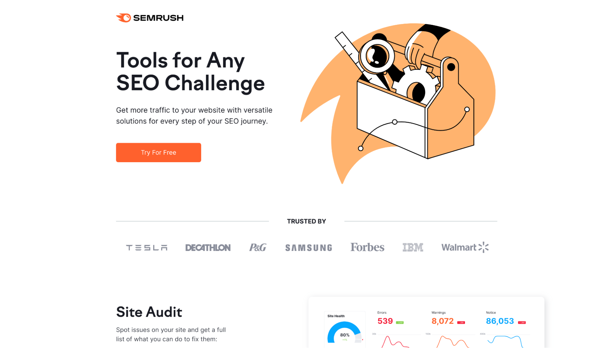
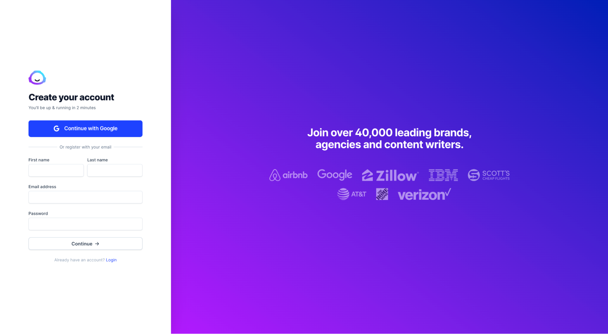
For example, SEMRush’s landing page has no navigation, footer or social links.
Aside from the terms of use and privacy policy links, the only other link is to start a free trial:
The same goes for Shopify. No navigation bar, no footer, no social icons. Just one link: Start free trial.
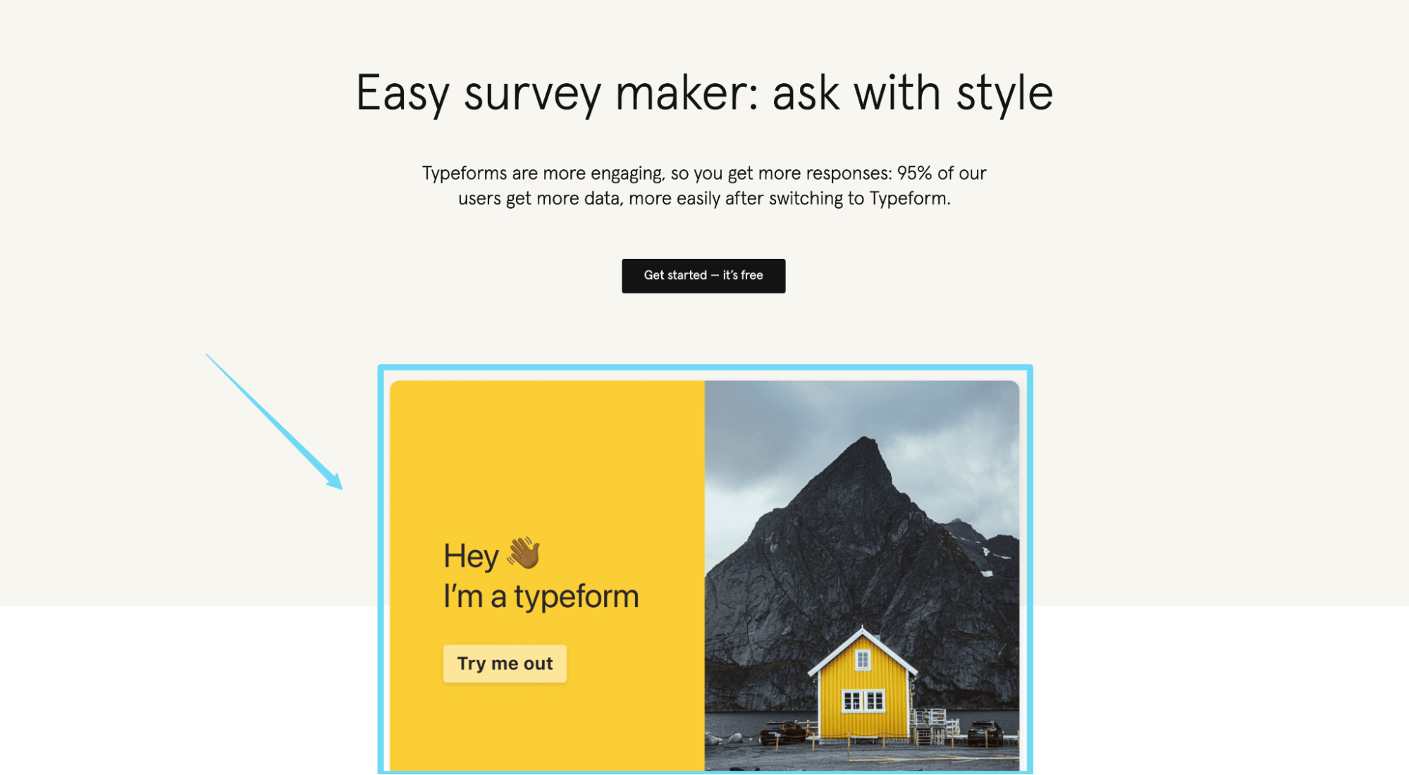
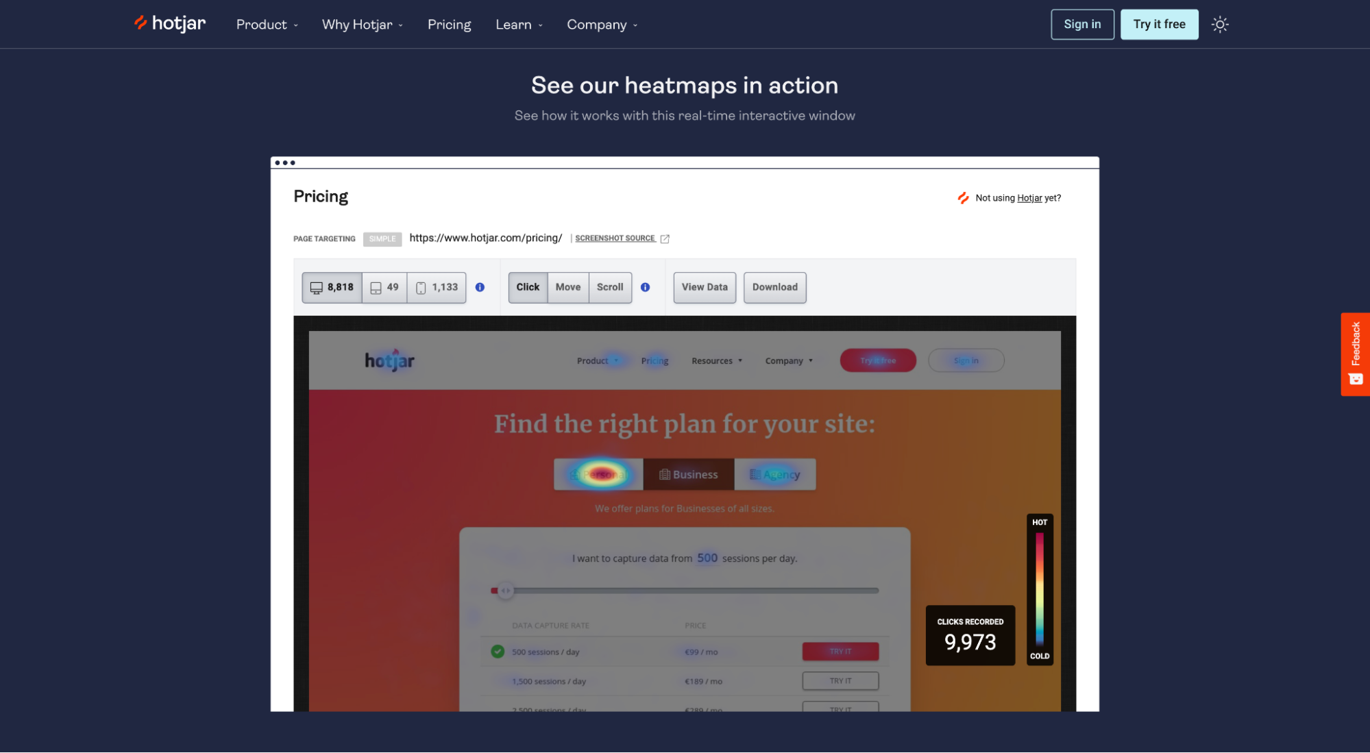
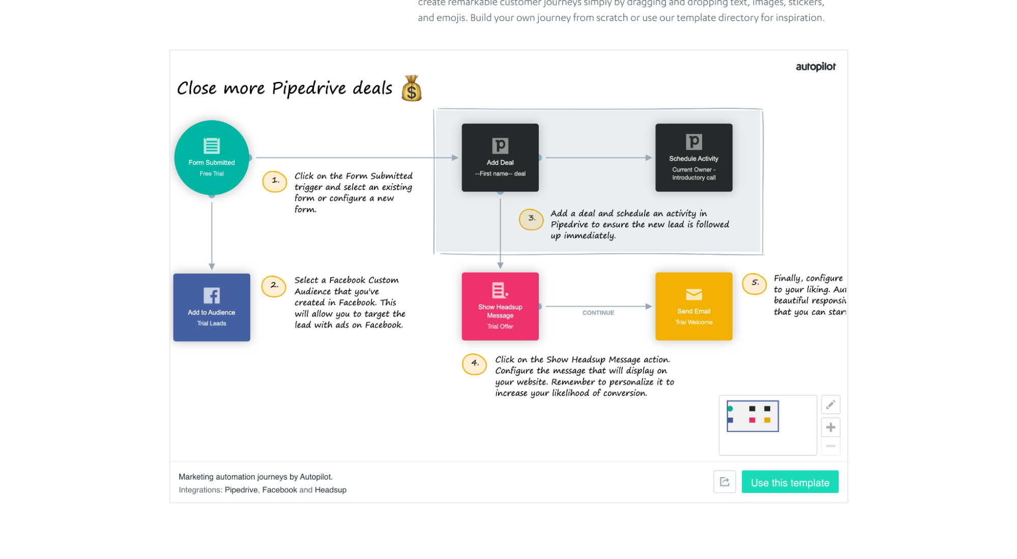
8. Live demo embeds
Sure, you can offer a video demo in exchange for an email, or play a product video that shows viewers “under the hood.”
But what about embedding your actual product within the landing page?
That’s exactly what Typeform, Hotjar, and Autopilot do—and we’re starting to see it more often.
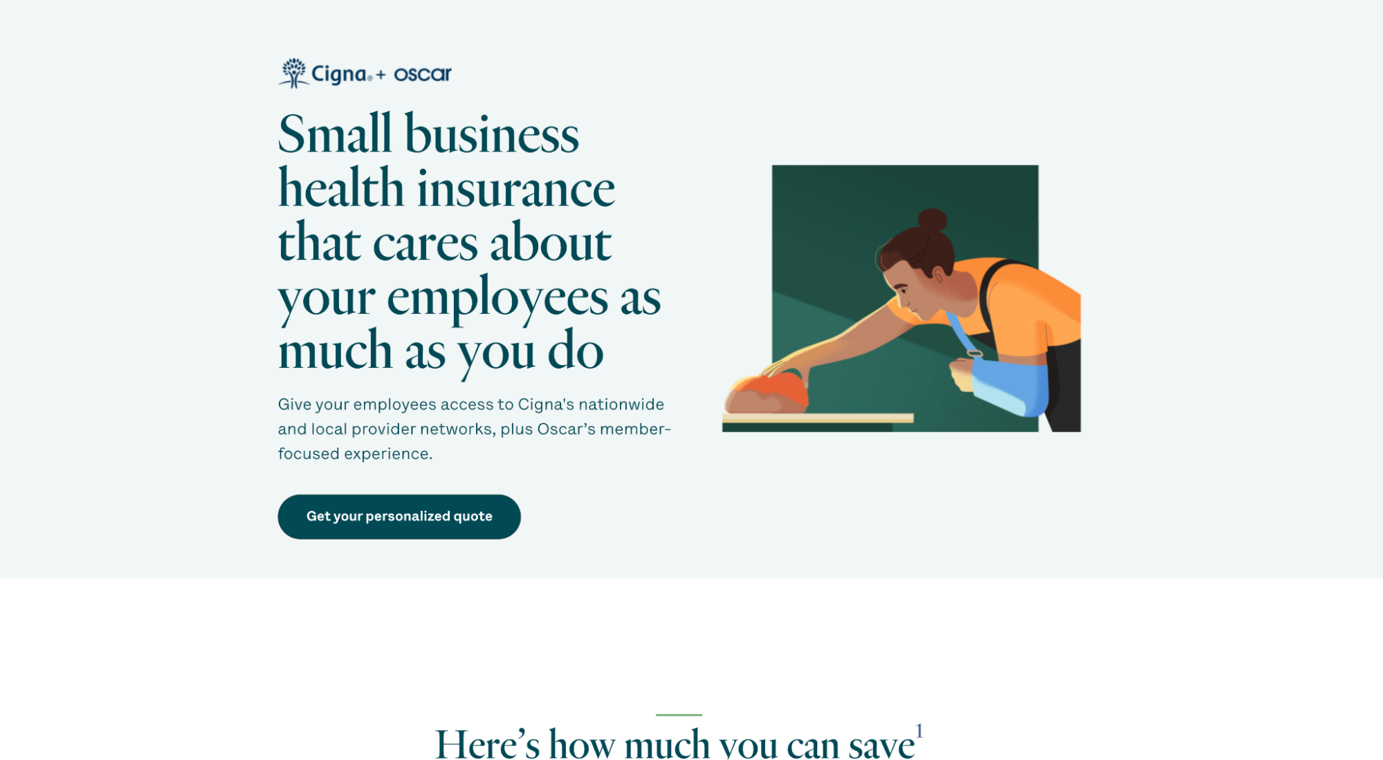
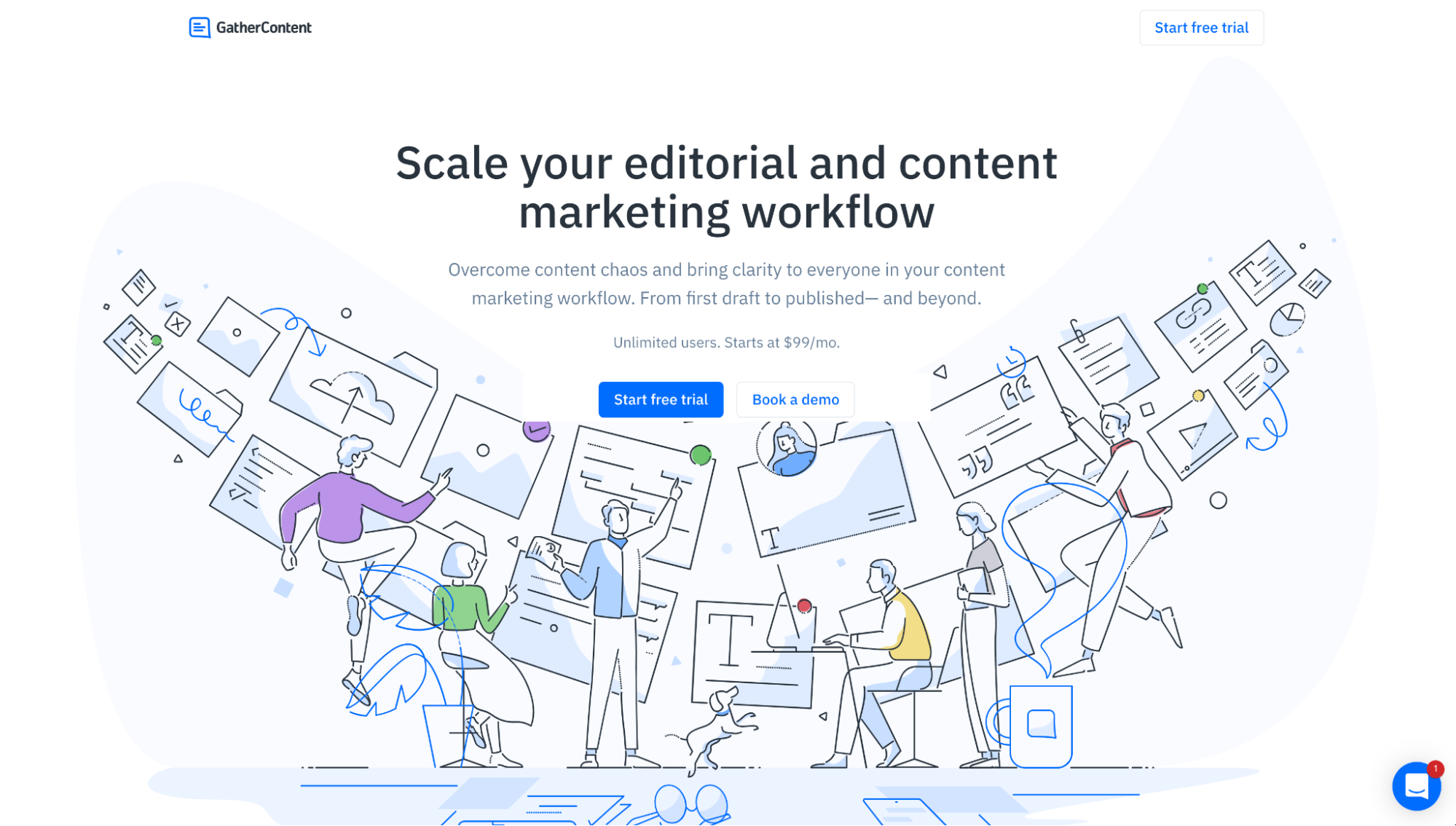
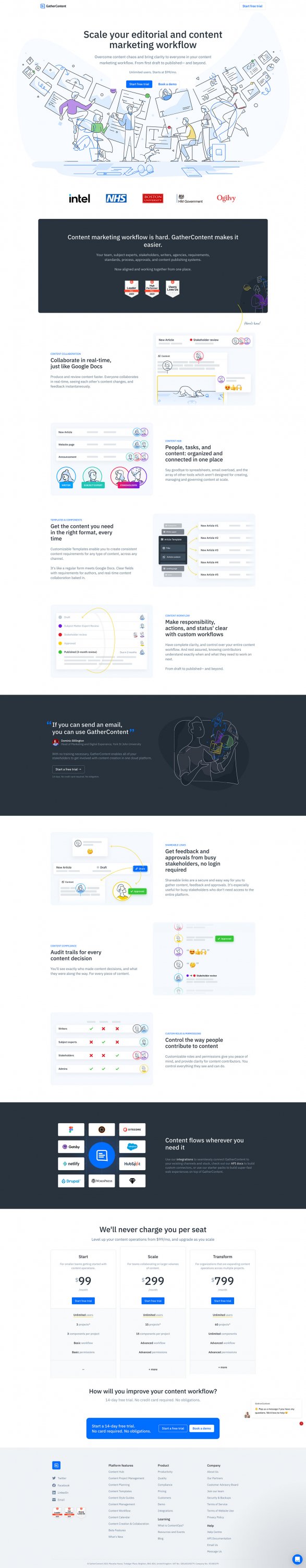
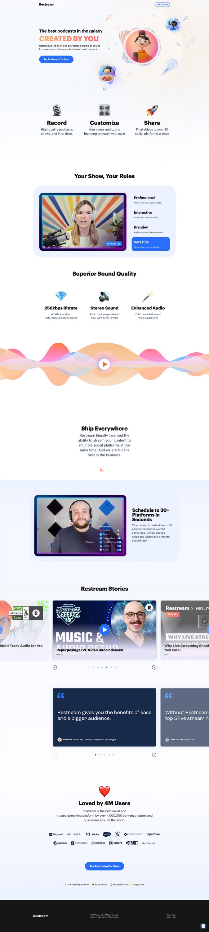
9. Custom illustrations
Custom illustrations arrived on the scene a few years back. But judging by the looks of things, they’re officially here to stay (until some marketer declares them “dead”).
Custom illustrations give companies a chance to express their unique personality, provide context to their unique value proposition (and fill space with meaning), and make their landing pages stand out from competitors.
For example, GatherContent uses a custom illustration as their main hero shot, then peppers more throughout the landing page.
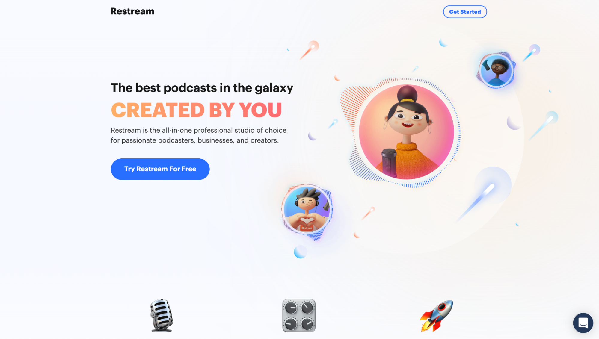
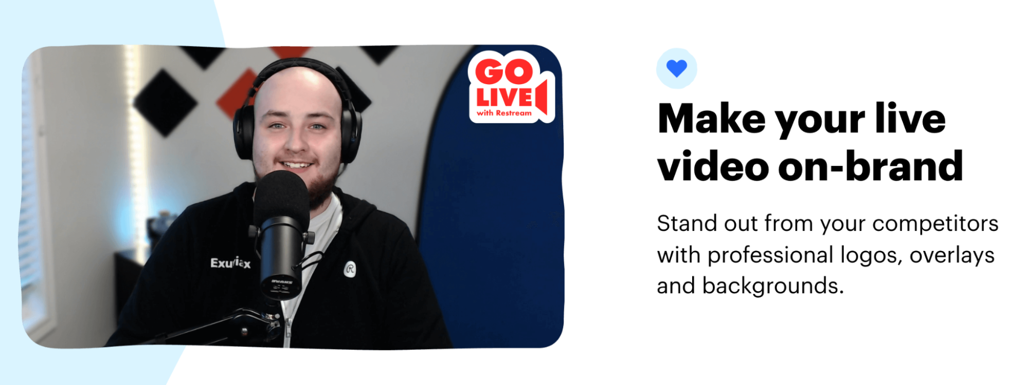
Or Restream uses custom illustrations to showcase its distinct branding.
Or Oscar uses custom illustrations in place of real people:
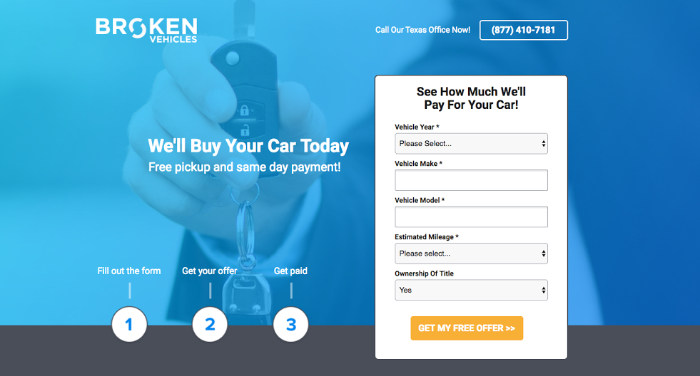
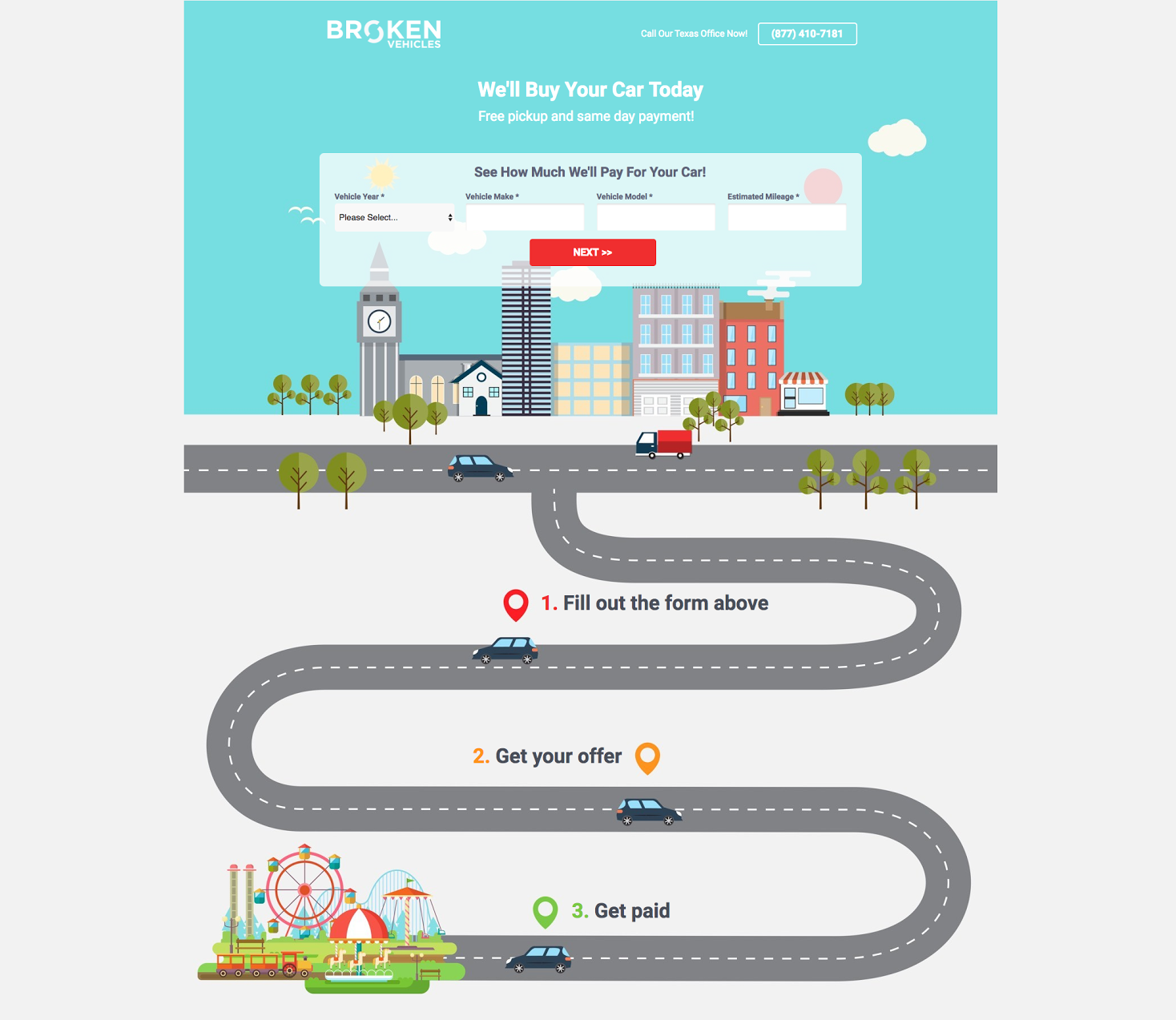
And last, we transformed a Broken Vehicles landing page using custom illustrations and achieved a 13% increase in conversions.
10. Custom photography
Finally, marketers have shuttered (pun intended) cringe-worthy stock photography in favor of real people.
In a world where professional photography has never been easier or more affordable, there’s no excuse for stock garbage. Show real customers and real employees really using your products and services.
Unlike stock photos, custom photos give you 100% control over the look and feel of your brand.
For example, Restream uses custom photos of their actual employees to provide context to Restream features and benefits.
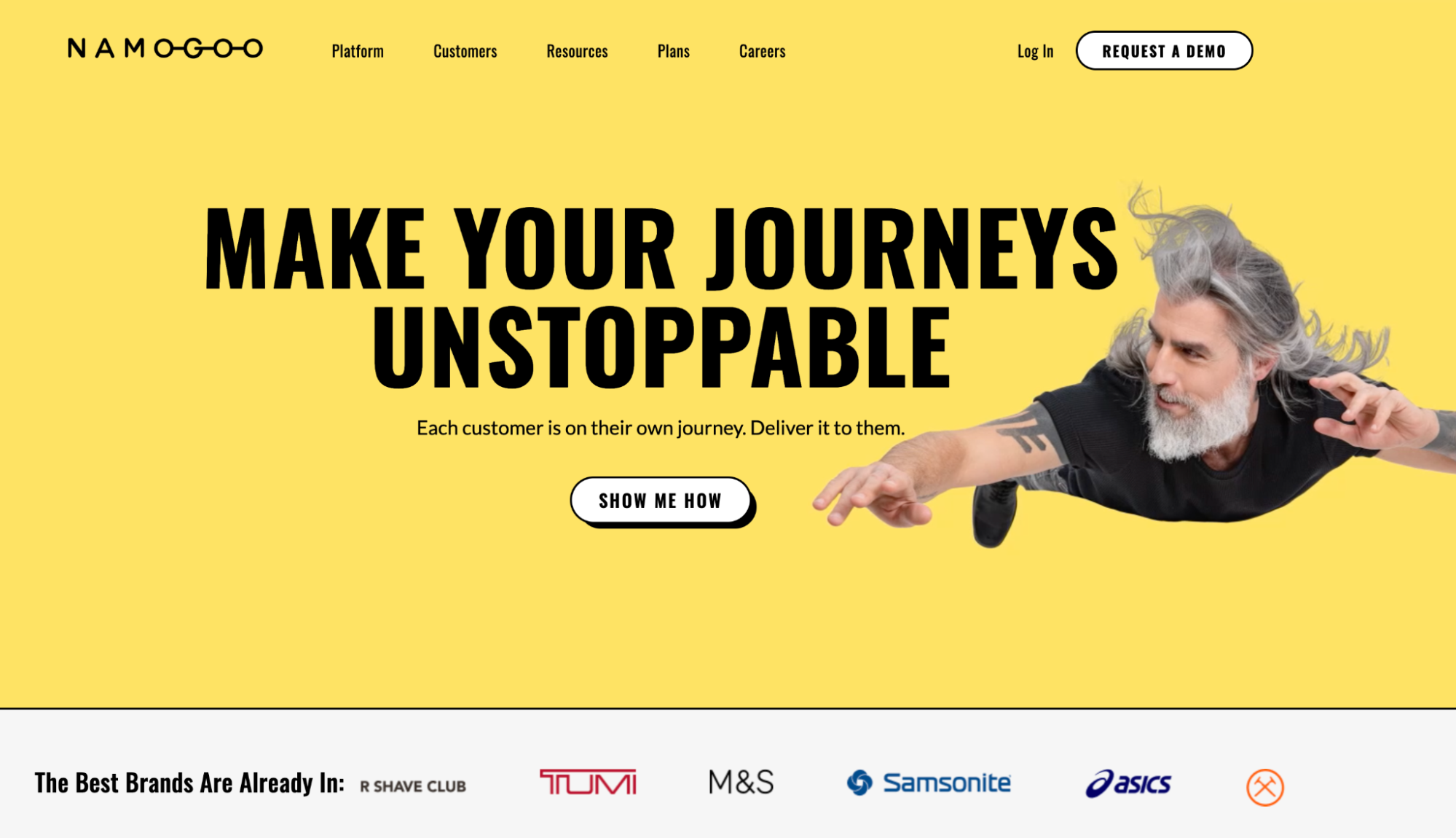
Or Namagoo uses custom photos to showcase their unique sense of humor:
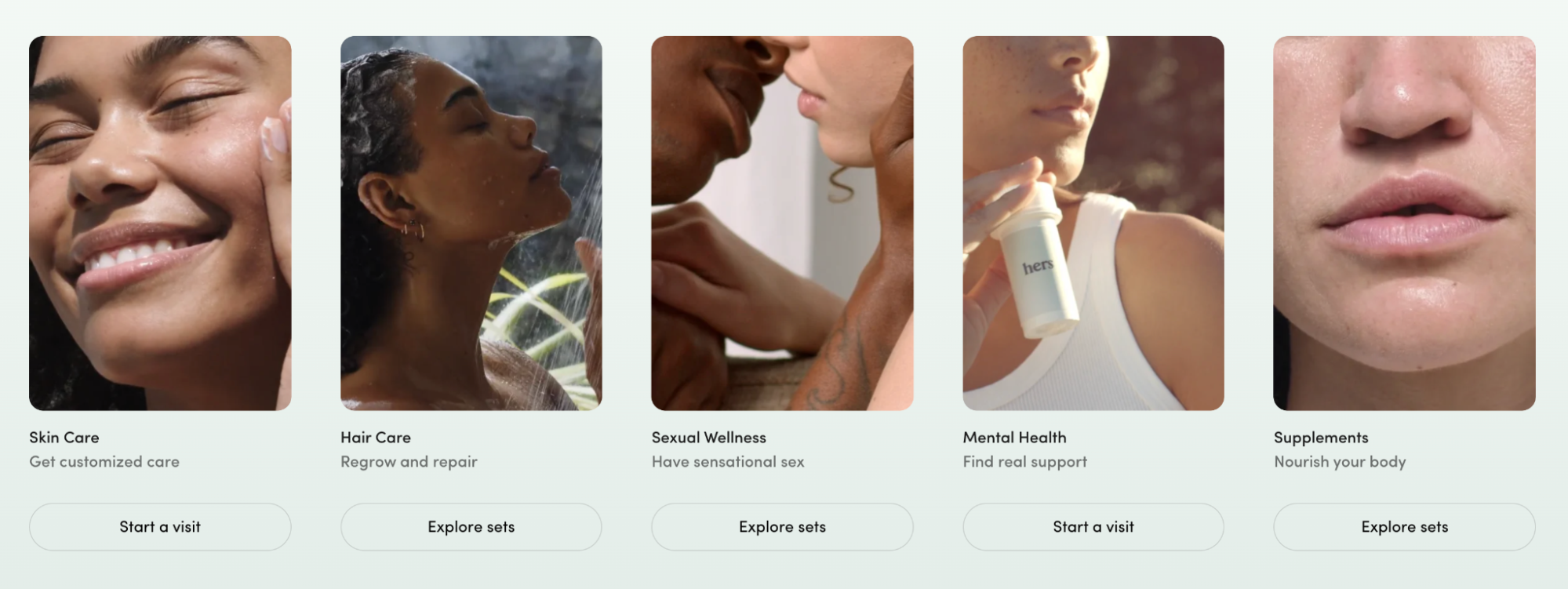
Or Hers uses custom photography to show off their—OMG IS THAT MILEY CYRUS????

No, but seriously, Hers has mastered landing page photography:
11. Narrative style product videos
In 2023, the B2B world is stepping up its landing page video game with thoughtful brand stories.
Goodbye, boring product videos. Hello scripted, narrative shorts.
Leading the way is Keap with their 2.5-minute masterpiece (featured on their CRM landing pages):
What is Keap? An Easy Sales and Marketing Automation Software + CRM
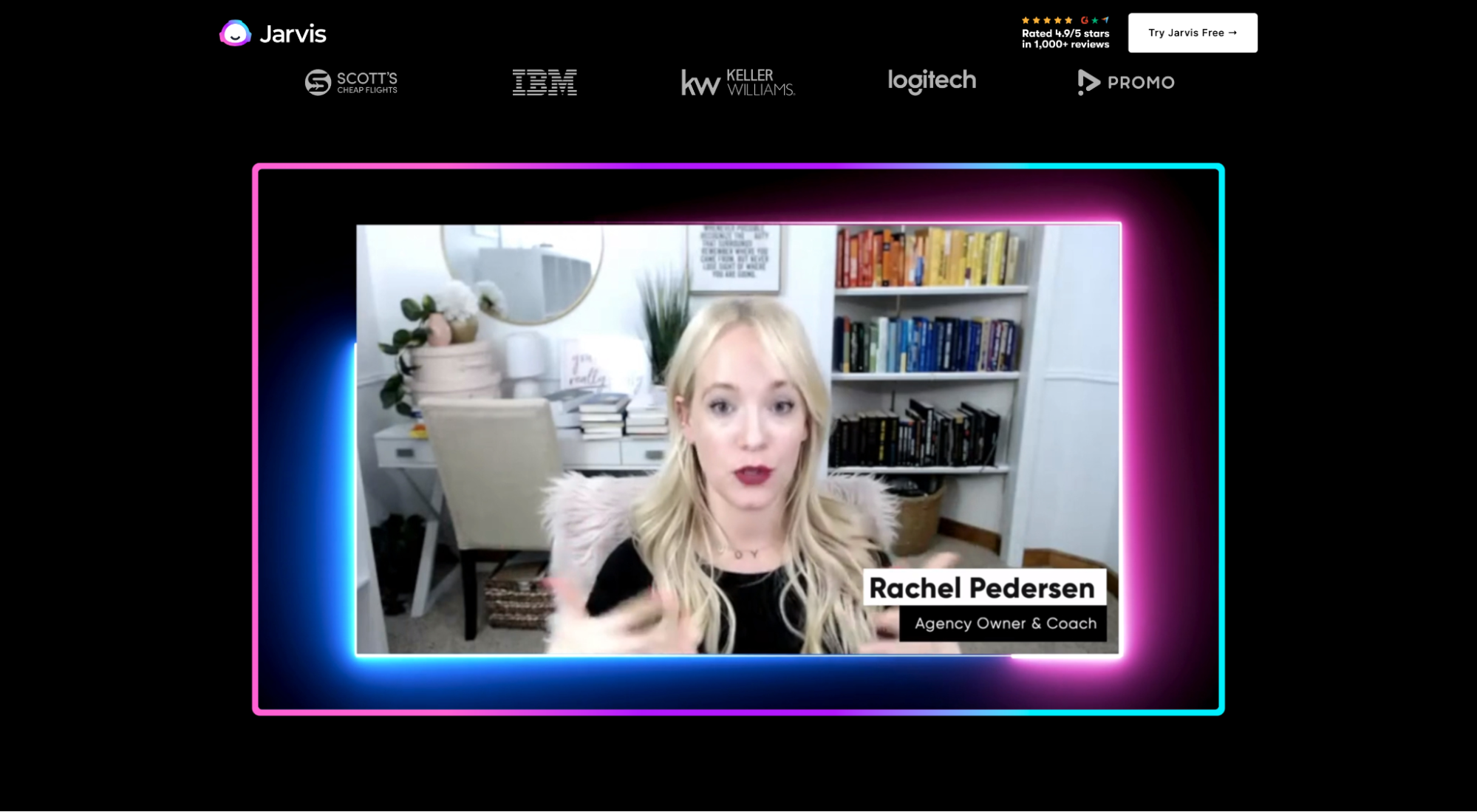
Or Jarvis’ product video complete with motion graphics, client testimonials, and high-energy narration.
Why do videos matter? Unbounce found that adding a video to your landing page can increase conversions by 80%. That's why.
12. Split-screen design (two columns)
A split-screen landing page, or two-column layout, is a landing page that bifurcates into two separate columns. The two-column layout makes it easier for the brain to process structured information.
Though not super common, we’ve definitely noticed a rise in split-screen designs over the last year.
For example, Crypto’s latest NFT landing page features a split-screen, with a form on the left and the copy on the right.
Or InvisionApp’s split-screen landing page for their new product Freehand, featuring copy on the left and a hero image on the right.
And last, Stitch Fix’s landing page with a customer hero shot on the left and a form on the right.
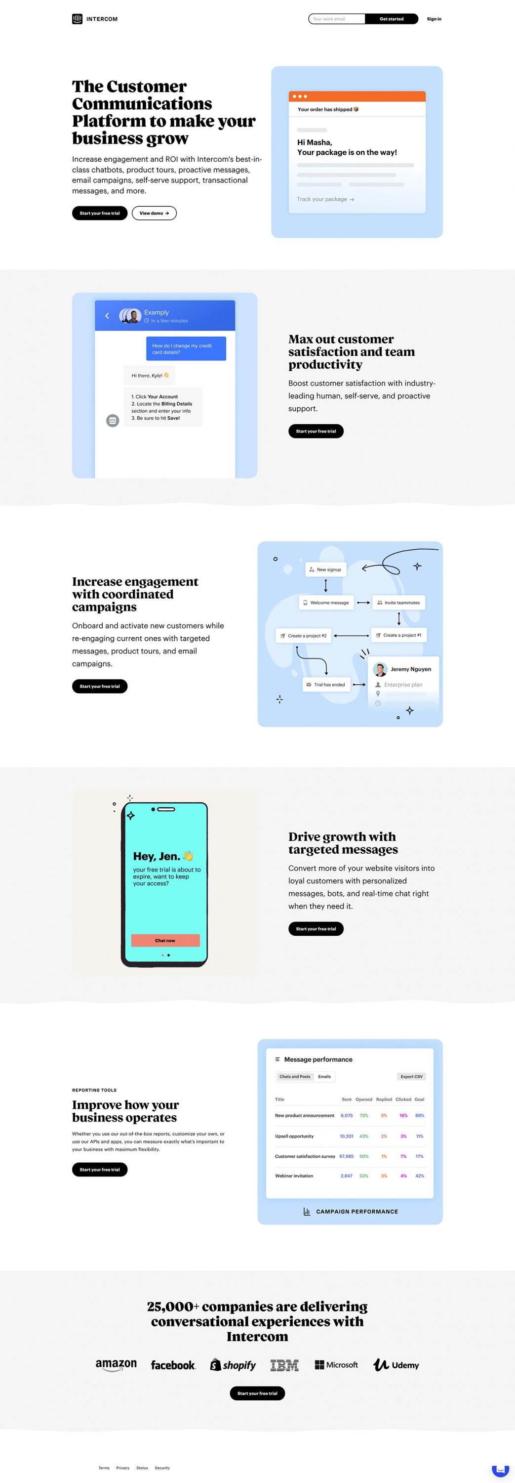
13. Minimal design
As conversion designers and copywriters have grown more skilled and experienced, landing pages have grown more sophisticated and minimal. (Phew.)
Fewer words. More impact.
Design principles like minimalism will always matter since they keep your pages clean and uncluttered.
After all, simplicity and minimalism is an effective way to reduce your visitors' cognitive load and keep them from thinking their way out of converting.
Simple and minimalist design trends include things like:
- White space
- Simple, direct copy
- Clear, direct headlines
- Clear, direct CTAs
- Fewer colors
- Contrasting CTA colors
- Encapsulation
- High readability
For example, Wix masters minimal design with their Editor X landing page:
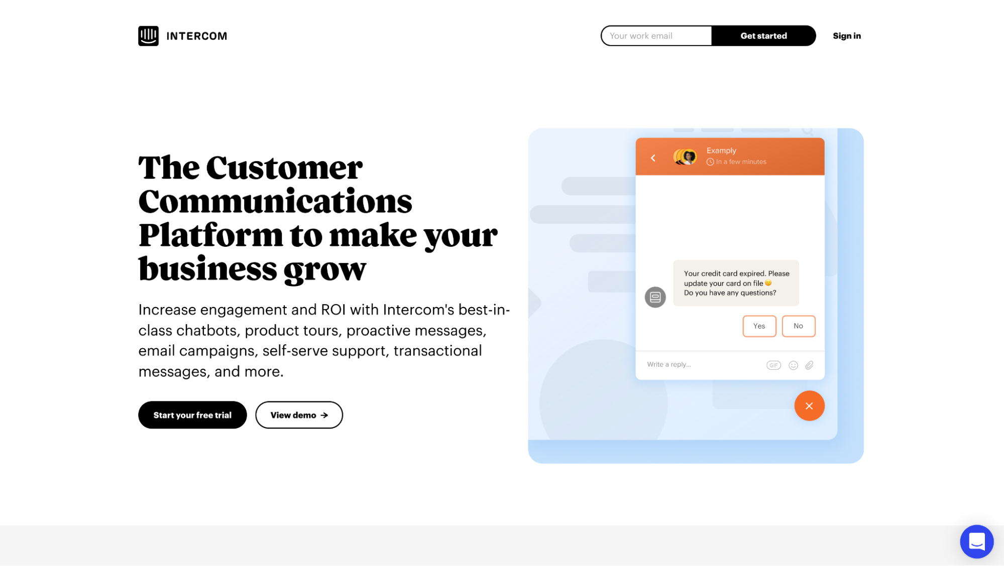
Or Intercom, which delivers a feature-rich, product-rich value proposition in less than 100 words.
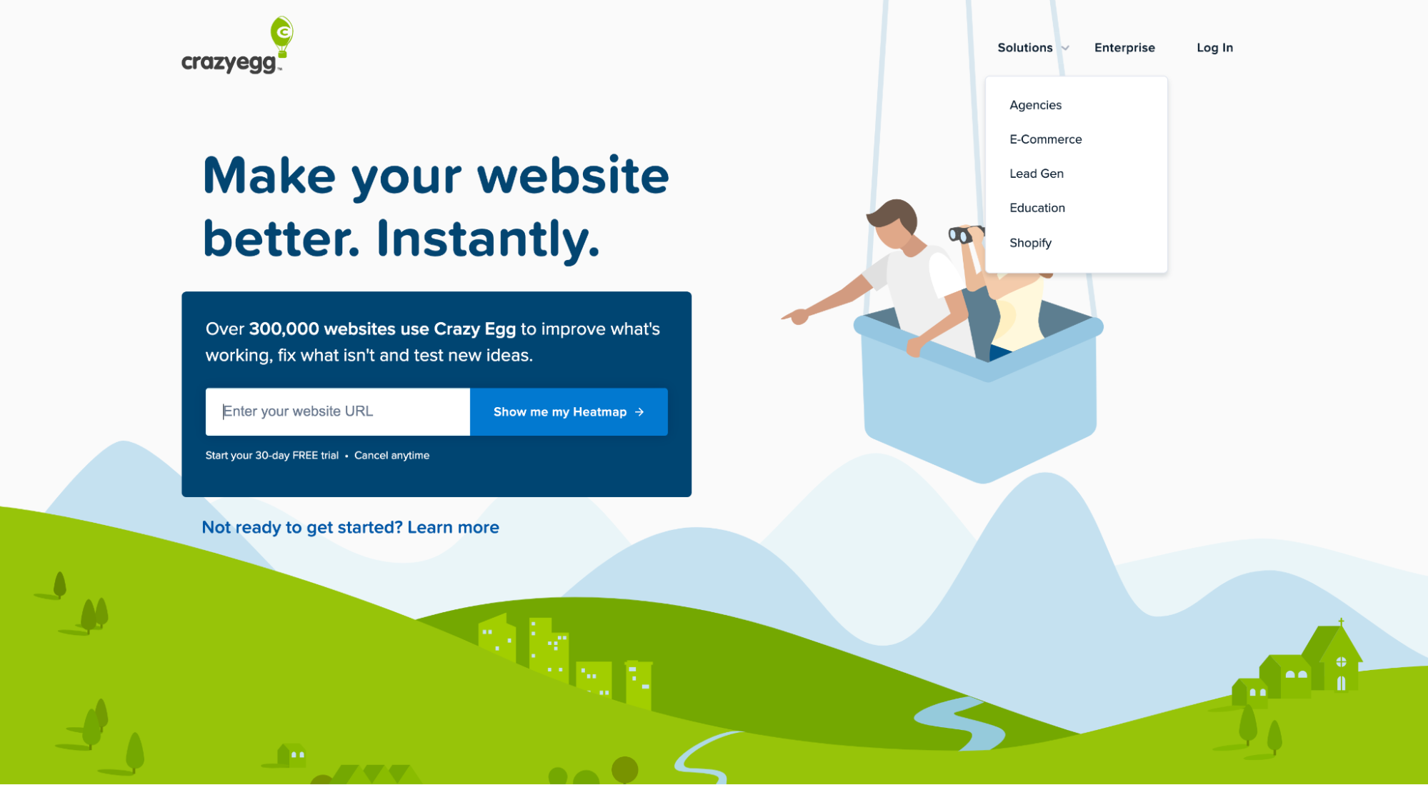
Or CrazyEgg, who uses a splash page to deliver a headline, subheadline, and CTA all above the fold.
14. Drop shadows
We. Love. Drop shadows.
With a bit of CSS, you can create beautiful contrast and separation between your graphical elements and your background, all while giving your landing page a sense of dimension and depth.
Drop shadows are everywhere in 2023.
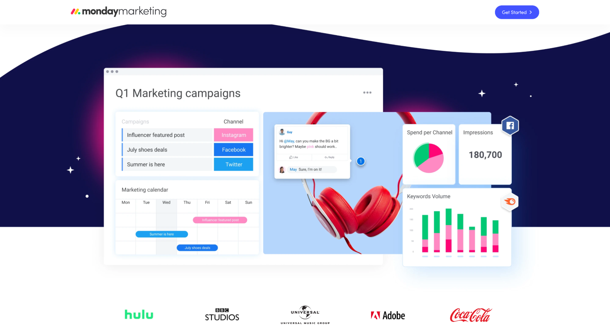
For example, Monday uses colored drop shadows to make their light image pop off a dark background.
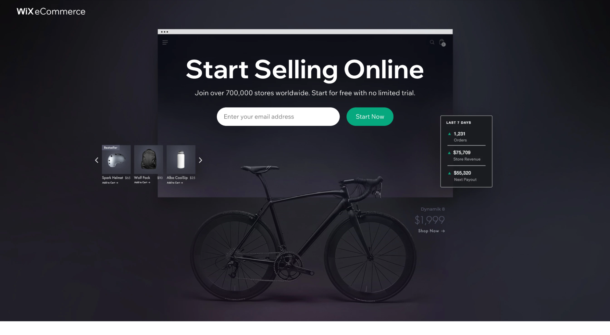
Wix uses drop shadows to make their dark image pop off their dark background.
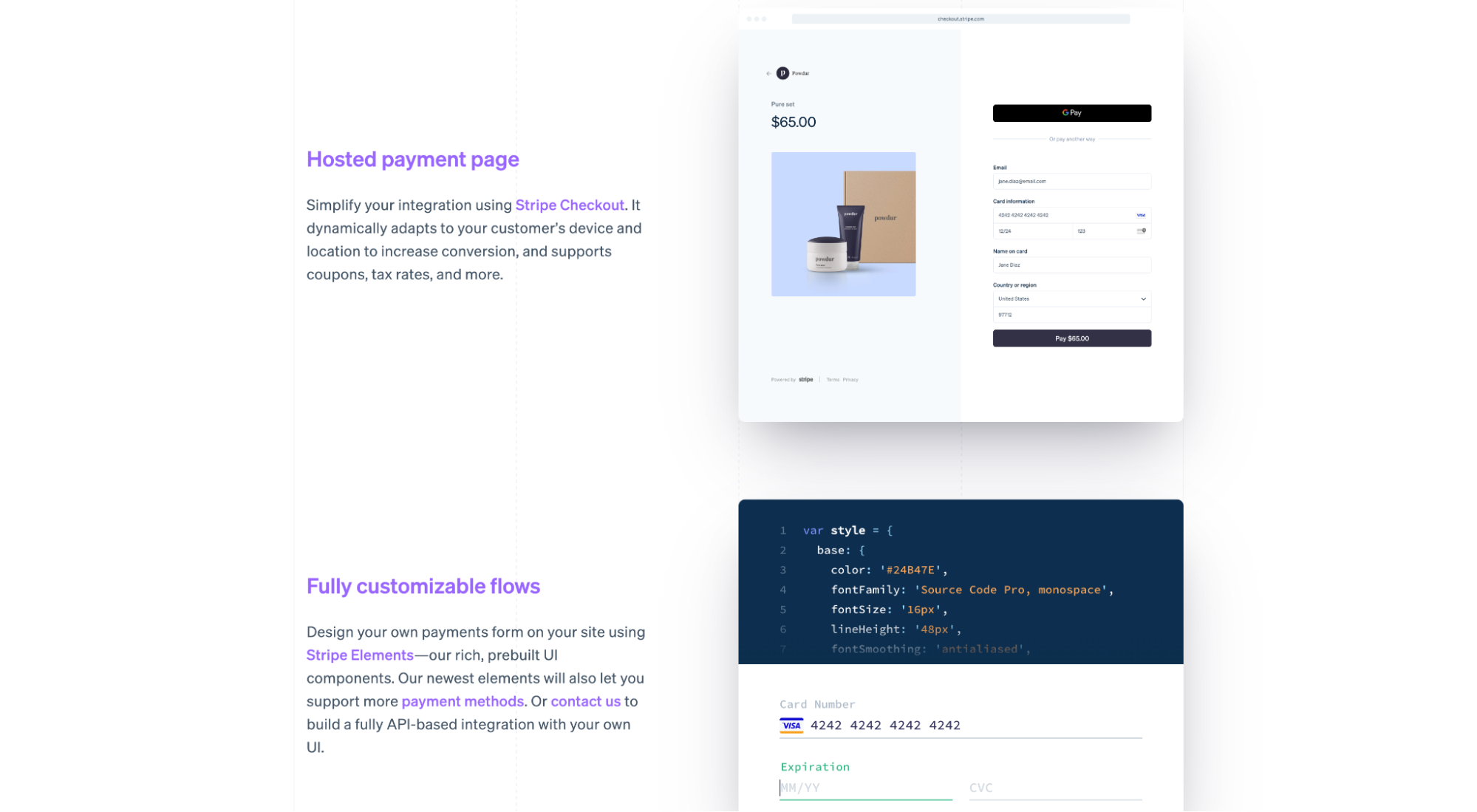
And Stripe uses subtle shadows to make their product shots pop off the page.
Landing page social proof trends
Social proof refers to the psychological phenomenon where people copy the actions of others when they’re uncertain about what to do.
When it comes to landing pages, social proof in the form of testimonials, star ratings, or client logos increases conversion by providing prospects with a list of reputable businesses who, when put in the same situation as them, chose your business.
In 2023, the following social proof trends have taken precedence over the rest:
- Testimonial cards
- Account creation page social proof
- User stats
- Third-party star ratings (G2, Capterra, TrustPilot)
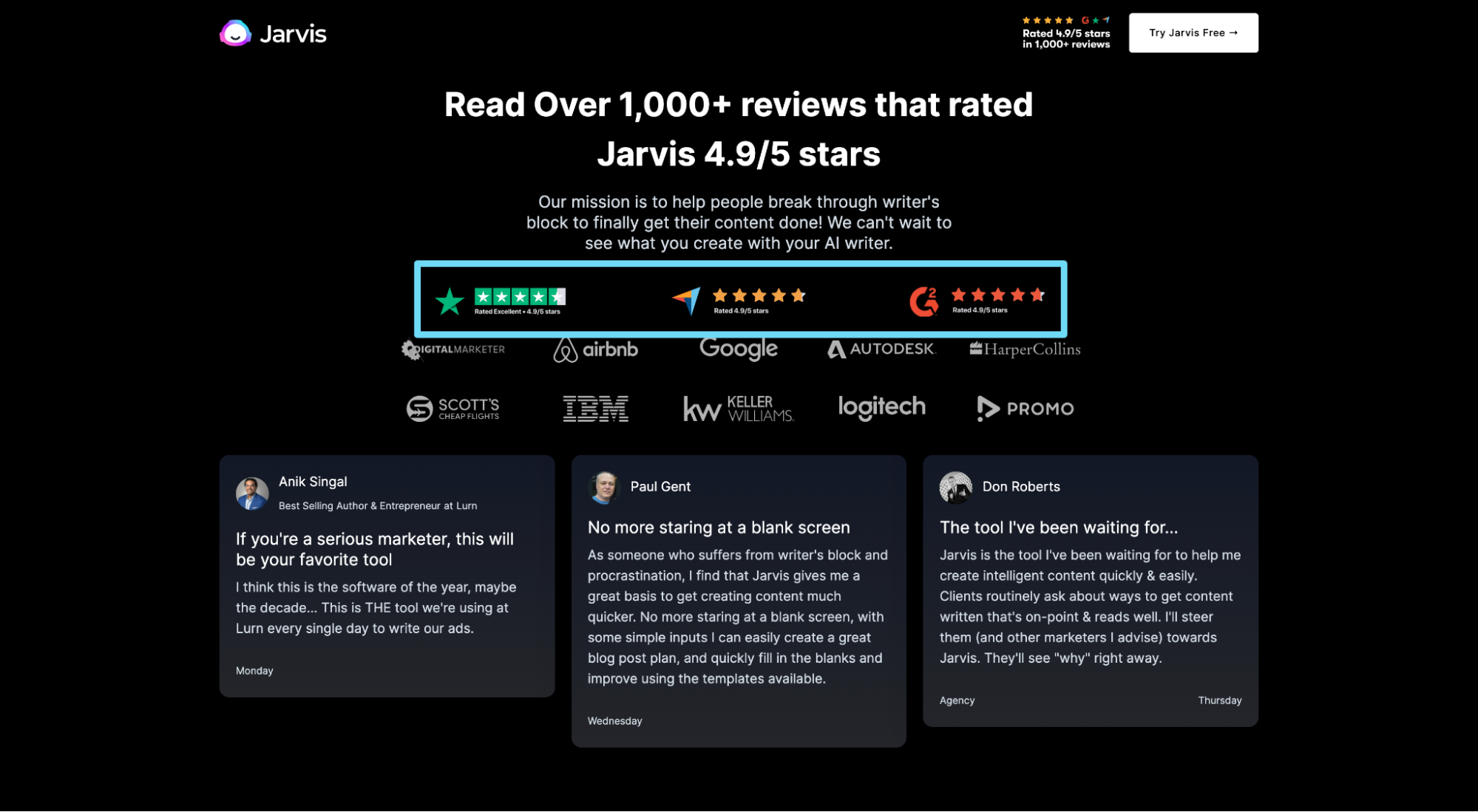
15. Testimonial cards
Testimonial cards look like embedded Twitter cards, only for testimonials.
More and more landing pages have opted to feature dozens (if not hundreds) of testimonials using testimonial cards—and we like it!
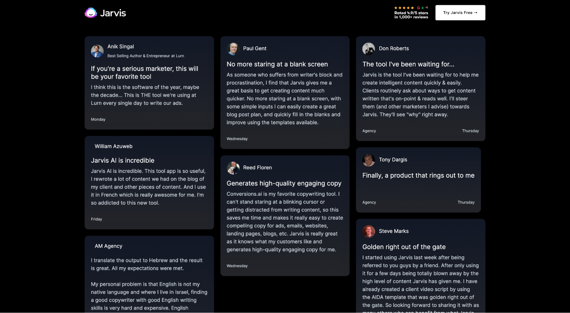
For example, Jarvis features exactly 100 testimonial cards on their free trial landing page.
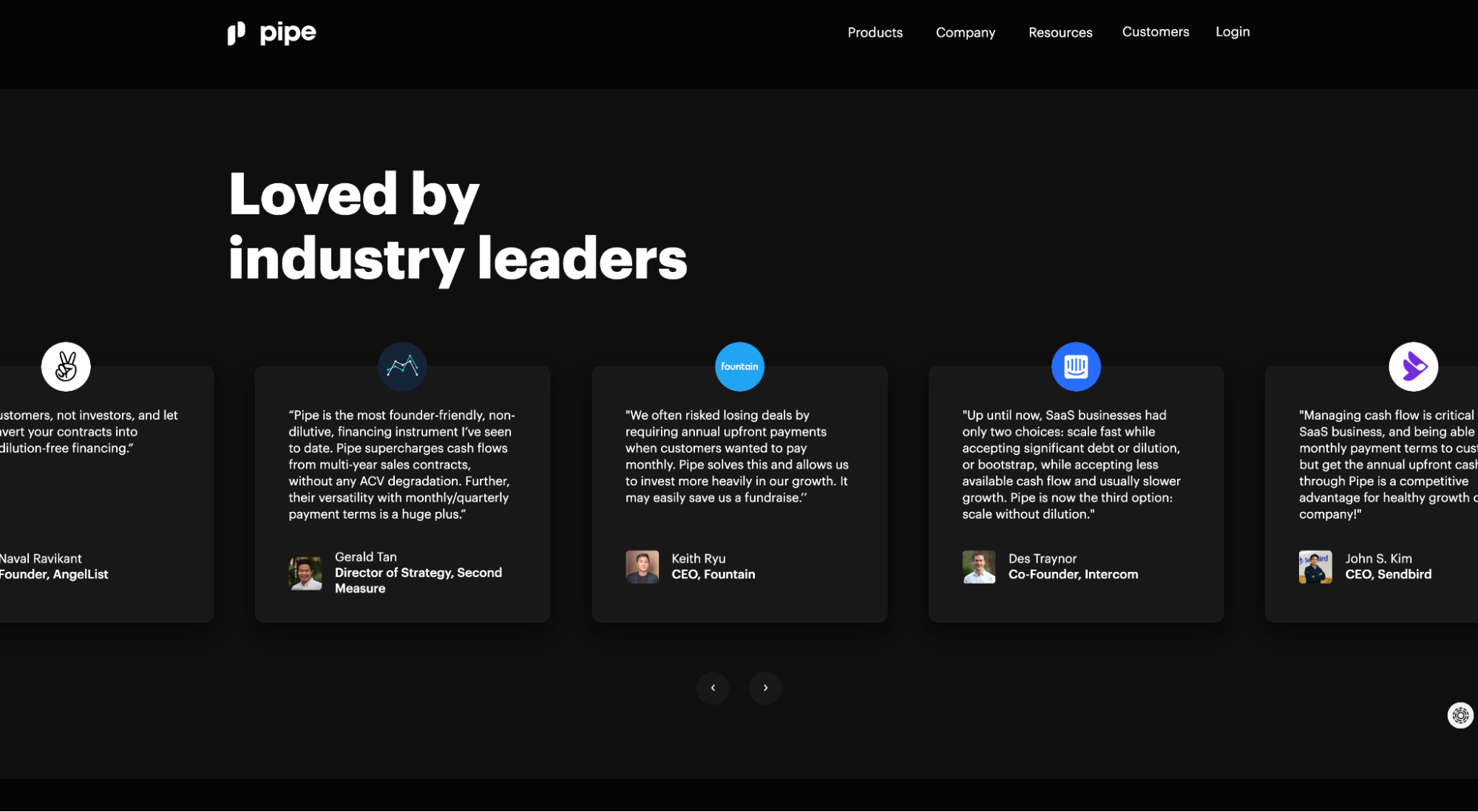
Pipe features testimonial cards from some of the startup world’s most famous founders.
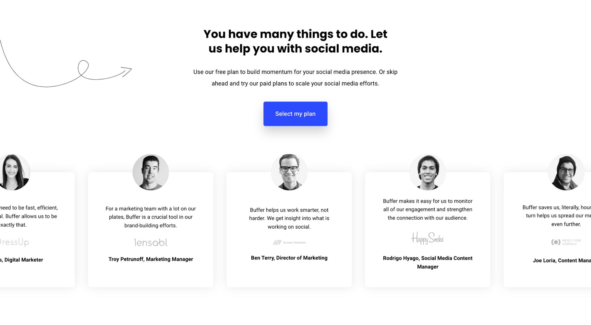
And Buffer uses a similar scroll function to feature dozens of testimonial cards from prominent clients.
16. Account creation page social proof
Every new page represents an opportunity to motivate action or lose momentum. Which means you should pepper every page with social proof.
For example, if you have a click-through landing page that directs visitors to an account creation page immediately after clicking on your CTA button, it should include social proof to remind prospects to keep moving forward.
And that’s exactly what the best click-through landing pages are doing in 2023.
For example, when you click-through on Jarvis’ “Start free trial” CTA, it sends you to an account creation page supported by social proof in the form of client logos and user stats.
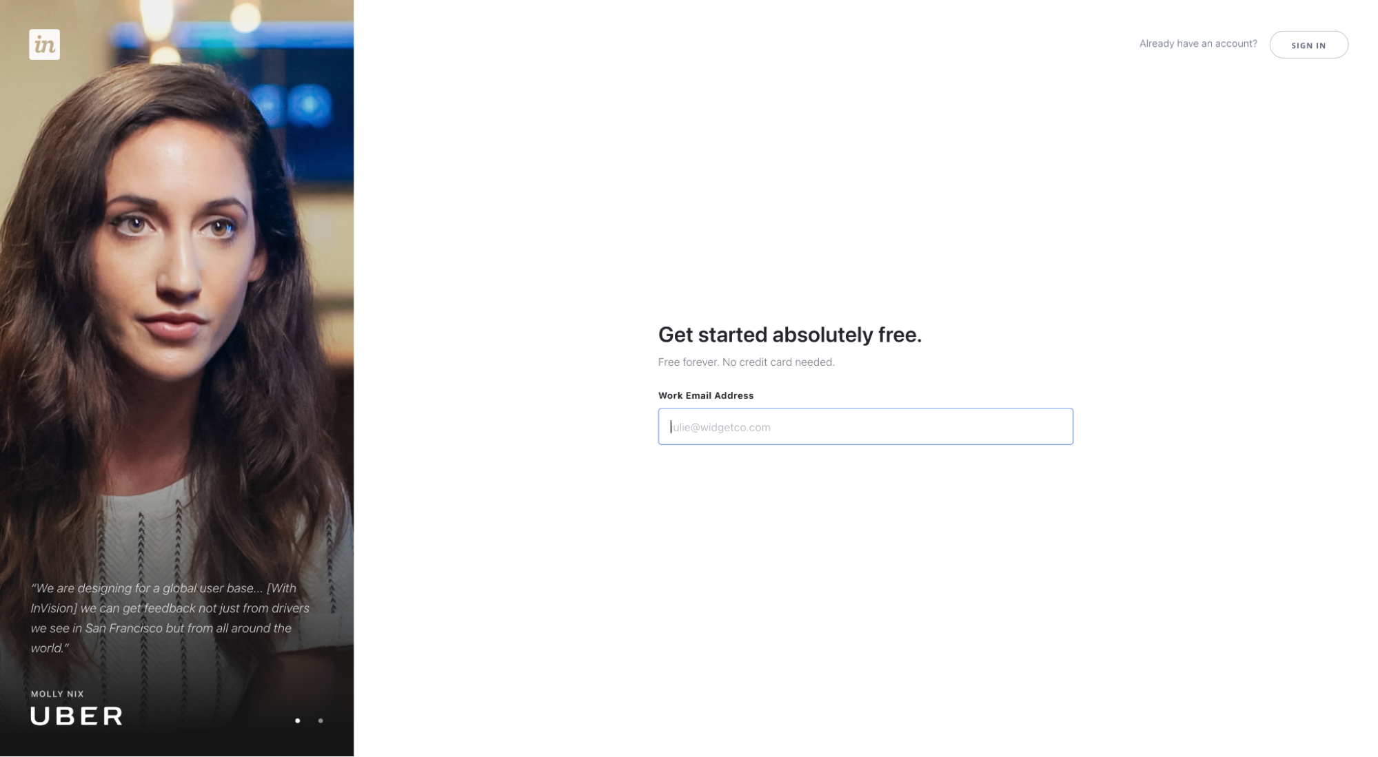
Or when you click on InvisionApp’s CTA to start a free trial, it takes you to an account creation page supported by a testimonial from an Uber employee.
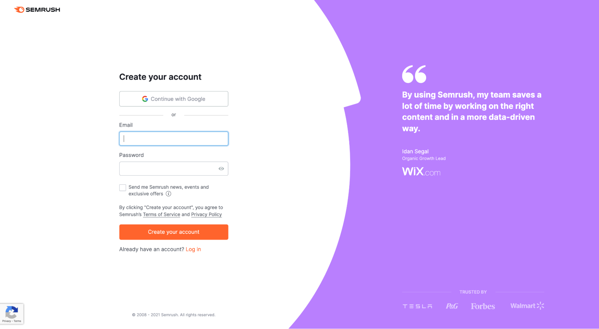
Or when you click on SEMRush’s CTA to start a free trial, it takes you to an account creation page supported by a testimonial from a Wix employee.
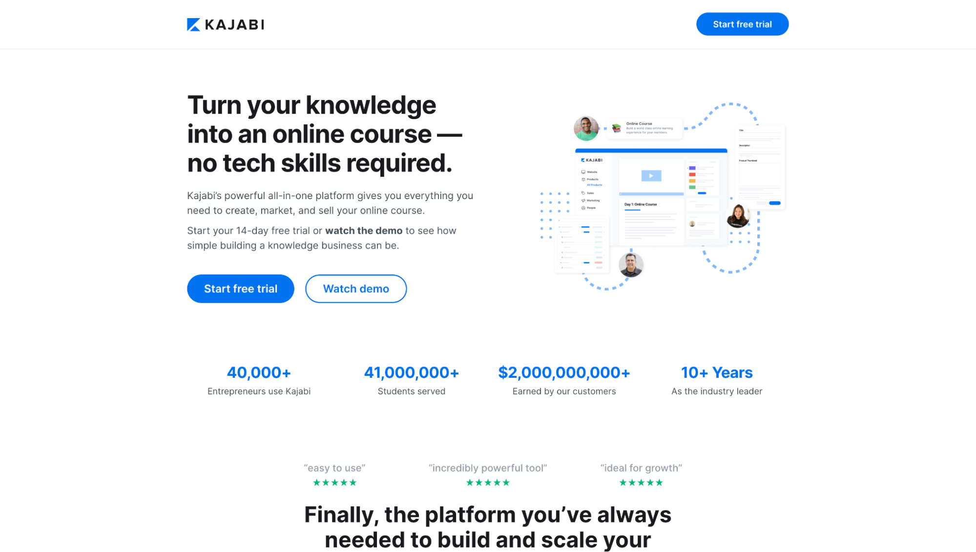
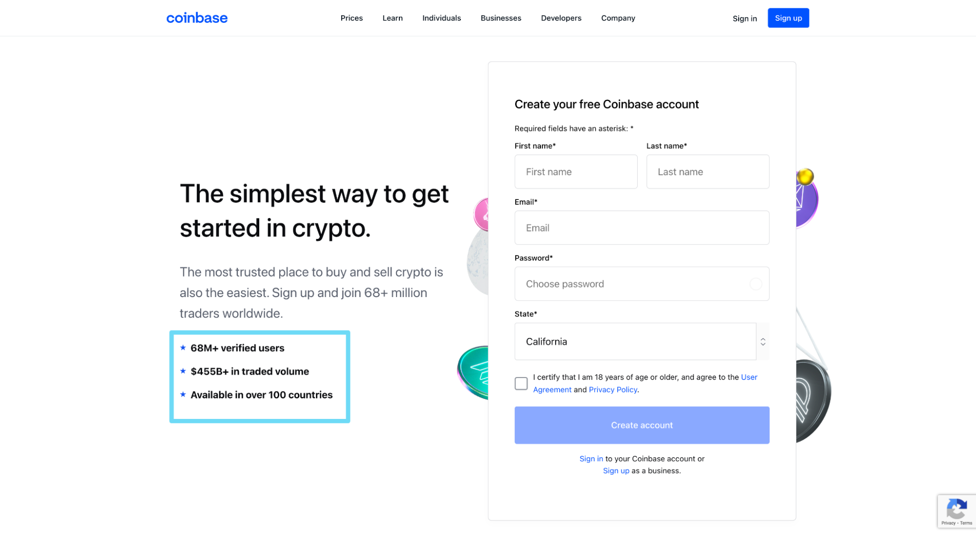
17. User stats
User stat social proof is when you showcase the success your clients have had using your products or services. We’re starting to see it everywhere.
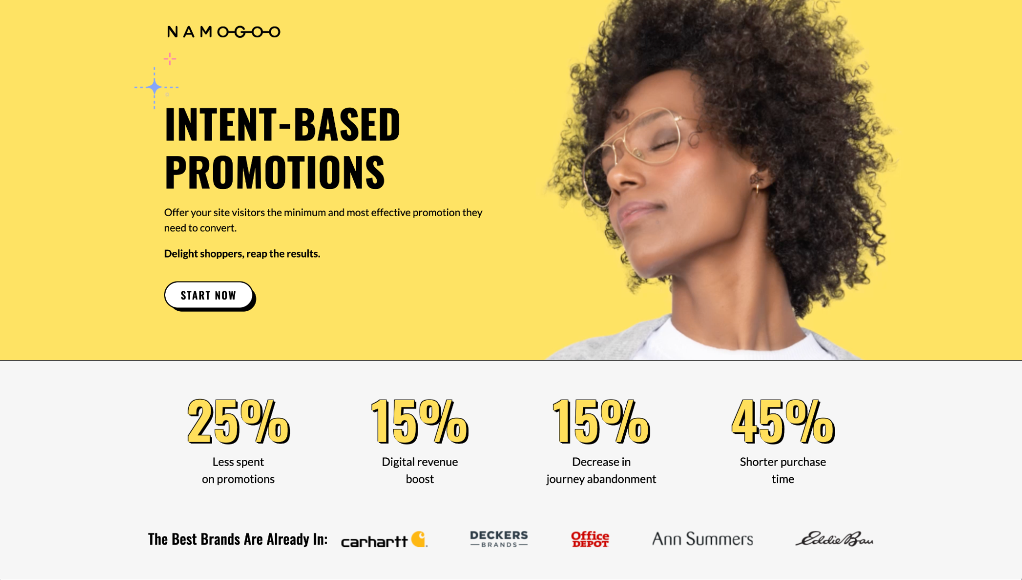
For example, Namogoo showcases their customers’ average money saved on promotions, increase in revenue, decrease in abandonment, and decrease in sales cycle duration.
Kajabi showcases the combined number of students and revenue their platform facilitates.
And Coinbase showcases their total number of verified users and the total dollar amount of trades on their platform.
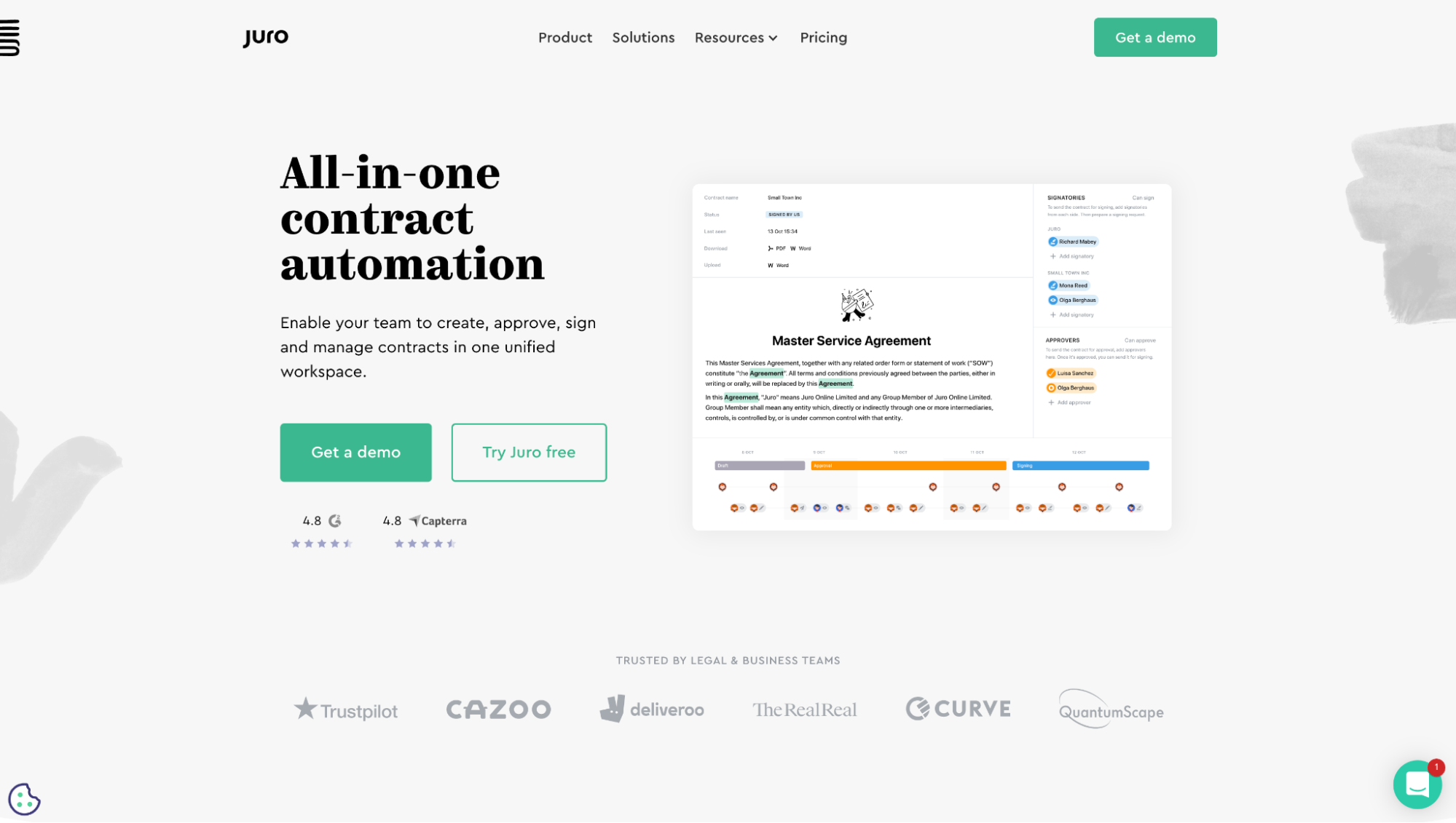
18. Third-party star ratings
As third-party review aggregators continue to strengthen their own brands, more and more of the businesses they collect reviews for (especially SaaS landing pages) are starting to use their logos and star ratings as social proof on their landing pages.
For example, Juro features their G2 and Capterra star ratings with logos.
Jarvis features their TrustPilot, G2, and Capterra star ratings with logos.
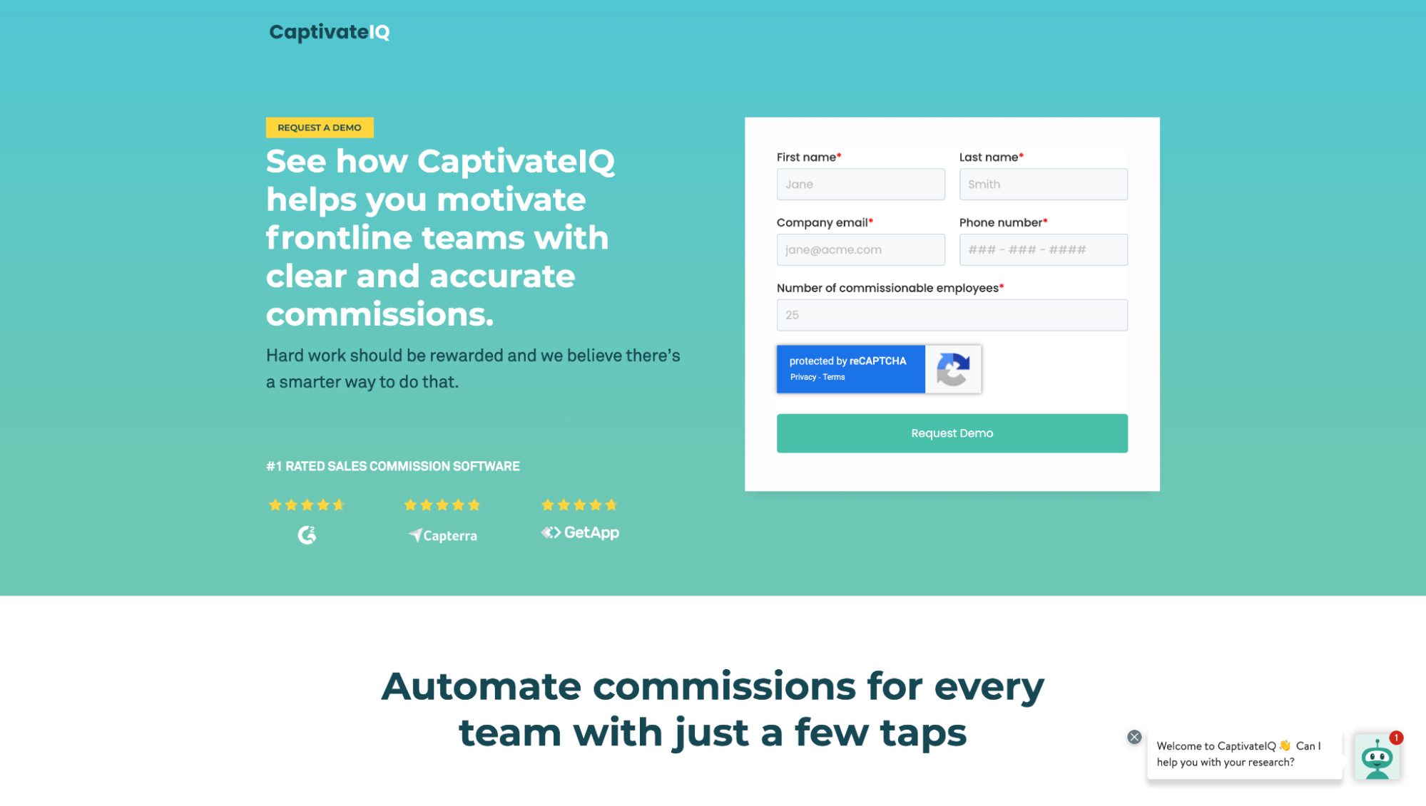
And CaptivateIG features their G2, Capterra, and GetApp star ratings with logos.
Landing page call-to-action (CTA) trends
People don’t know how to buy your products and services.
CTAs (typically in the form of a CTA button) provides explicit instructions on what steps to take next.
In 2023, the following CTA trends reign supreme:
- Benefit copy
- Button contrast
- Click triggers
19. Benefit copy
What’s out: Generic CTAs like submit, click here, sign-up, register.
What’s in: Action-oriented CTAs that include a benefit and remind prospects of the reward on the other side.
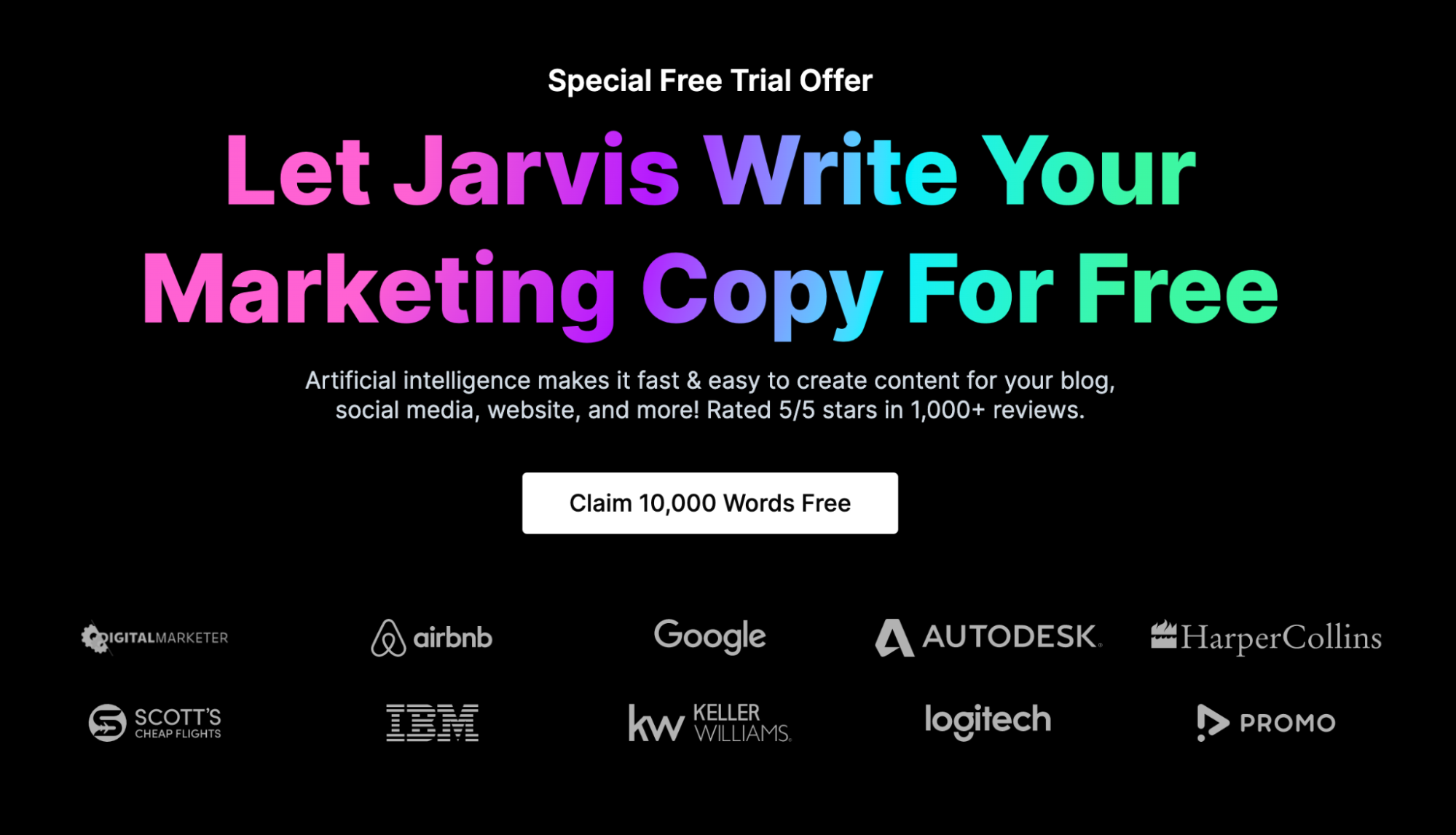
For example, Jarvis puts their offer and benefit directly in the CTA button copy: Clam 10,000 words free.
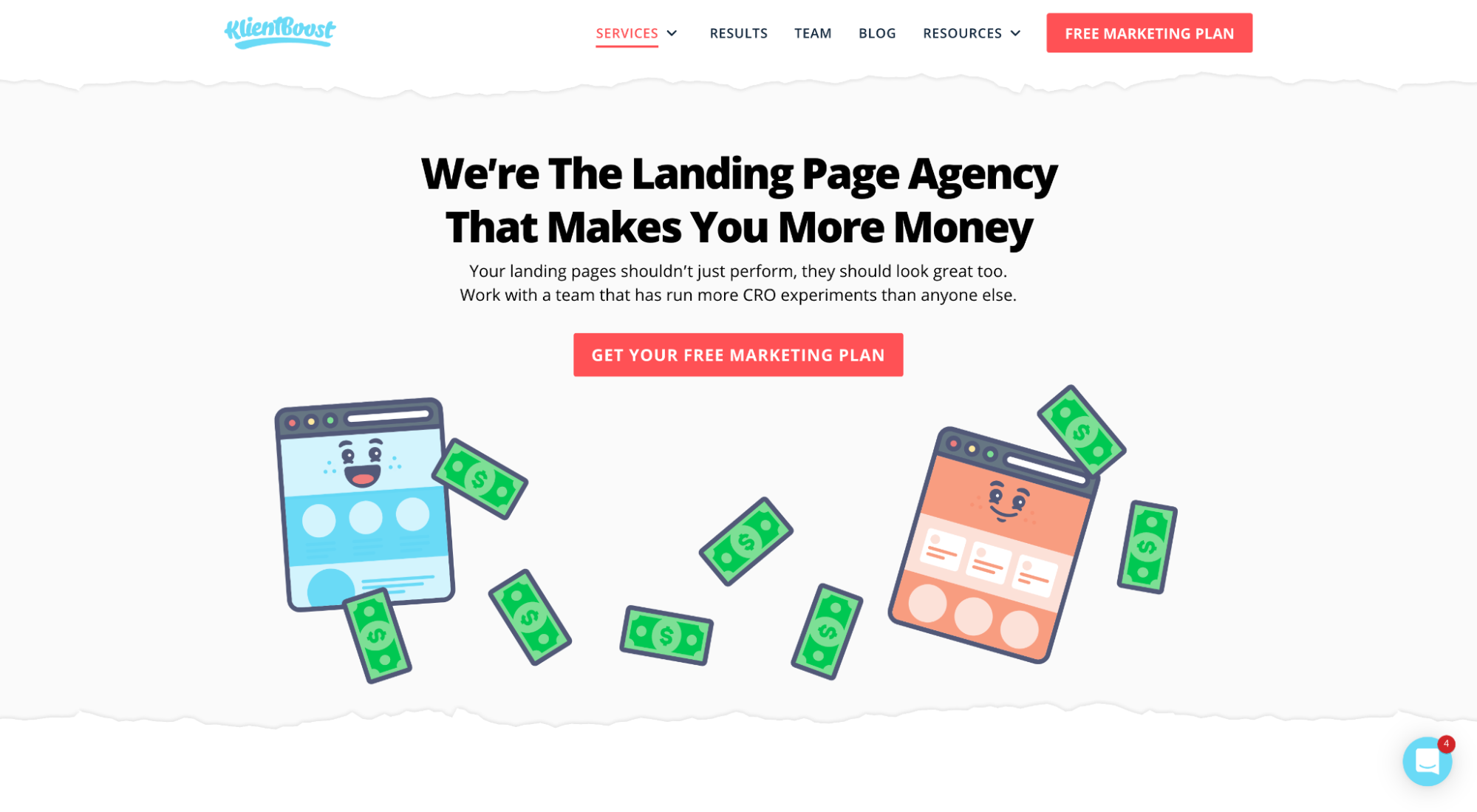
We do the same in our button copy: Get your free marketing plan.
And CrazyEgg does the same in theirs: Show me my heatmap.
20. Button contrast
Buttons that pop. Simple.
It turns out that conversions have more to do with color contrast (button color vs. background) than they do with the color of the button.
Button color matters, but only in regard to whether or not it contrasts with the background and pops off the page.
Landing pages (and web design) had a moment years back where designers traded in button contrast for transparent buttons (outlined buttons) and monochromatic colors.
Thankfully, that was a passing fad. Button contrast is officially here to stay.
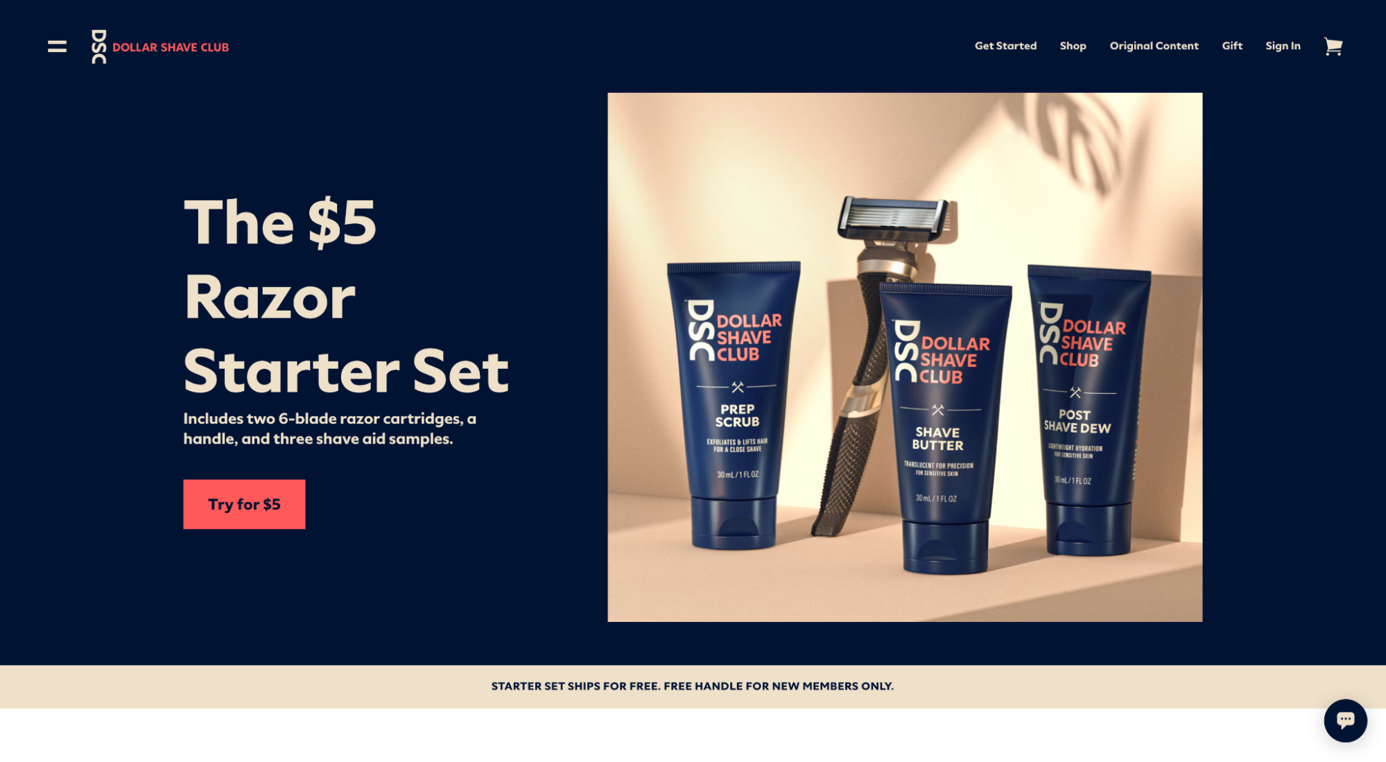
For example, Dollar Shave Club juxtaposes its navy blue background with a bright red button.
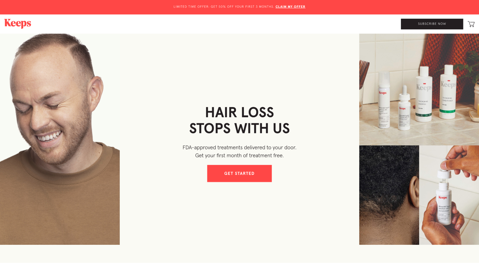
Keeps juxtaposing their tan background with a bright red button.
And Unbound contrasts their royal blue button with their white background.
21. Click triggers
Click triggers are subtle phrases or copy near or around a CTA button designed to temper anxiety and entice clicks.
Think of them like motivational quotes right before you cross the finish line.
Some of the best landing pages of 2023 have called on the help of click triggers to get their prospects across the finish line.
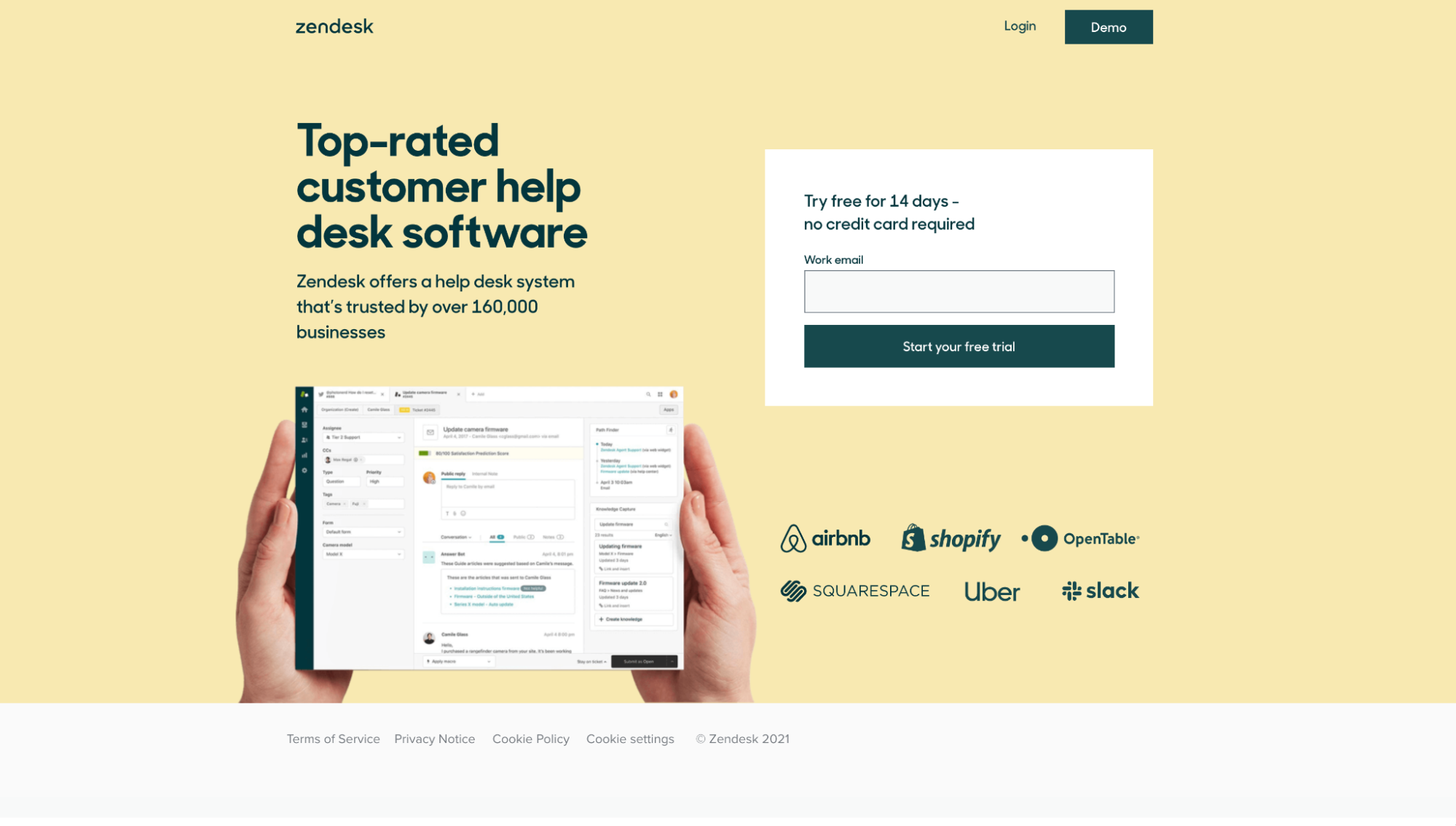
For example, Zendesk uses the click trigger, “Try free for 14 days- no credit card required.”
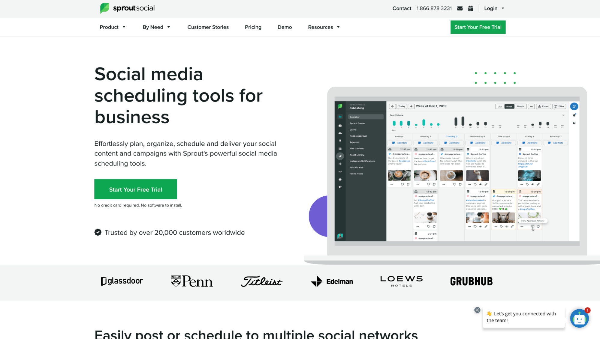
SproutSocial uses the click trigger “No credit card required. No software to install.”
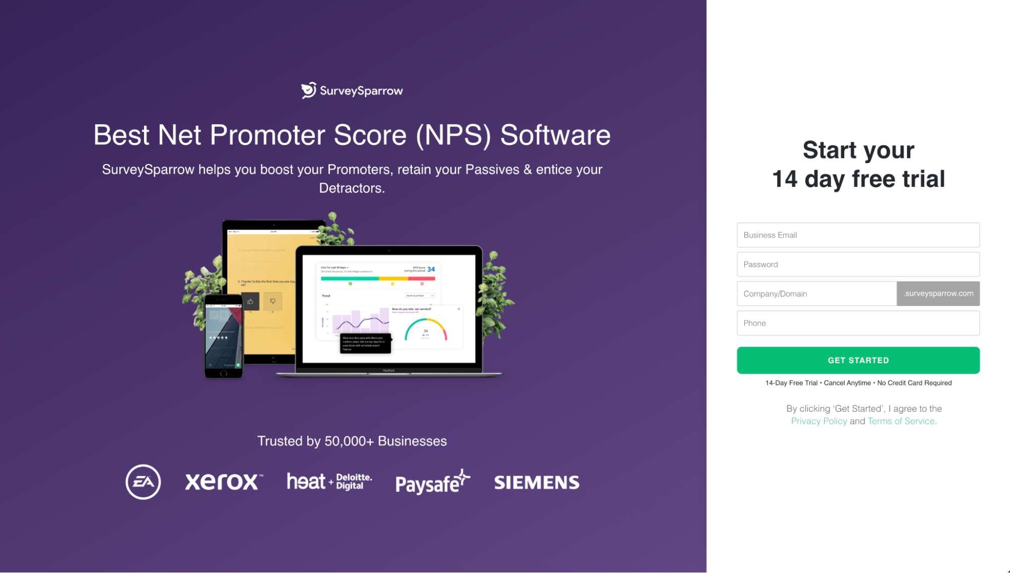
And SurveySparrow uses the click trigger, “14-day free trial • Cancel anytime • No credit card required.”
Landing page form trends
Last, but certainly not least, lead capture forms.
If you’re using lead generation landing pages to capture and qualify leads that your sales team can close later, pay attention to two of the most common trends of 2023:
- Multi-step forms
- Google One Tap
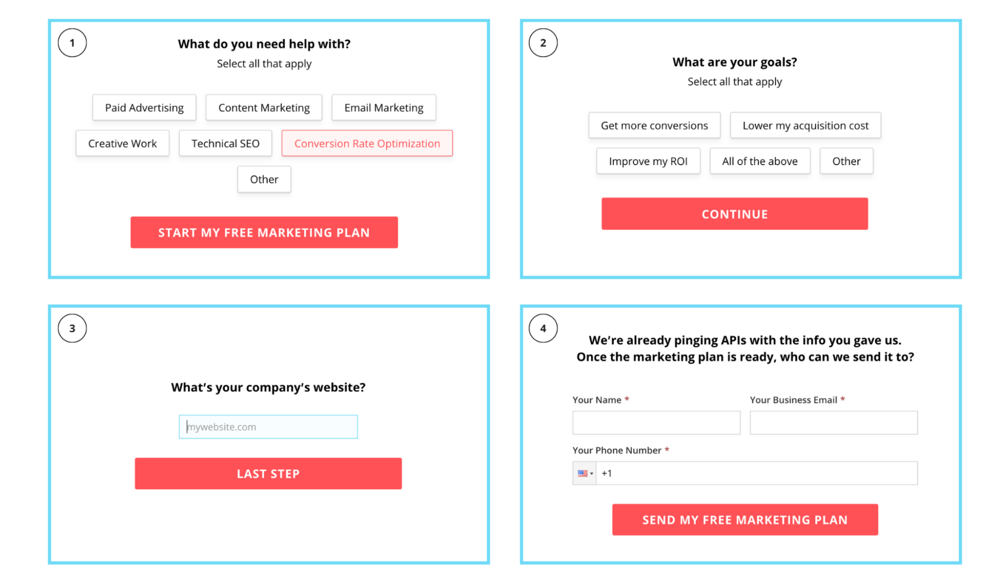
22. Multi-step forms (breadcrumb technique)
A multi-step form (AKA the breadcrumb technique) refers to a 3-4 step form that uses the “Yes Ladder” to micro-convert visitors through to a conversion.
For example, using the breadcrumb technique, instead of asking all of your questions in one, long lead capture form, you spread them across 3-4 different steps, then ask the least intimidating questions first, most questions last (email, phone, etc.).
By placing easy questions first (and getting prospects to commit to the form), you increase your chances of conversions.
When it comes to landing pages, multi-step forms are having a moment. And we’re here for it.
For example, take a look at our multi-step form below.
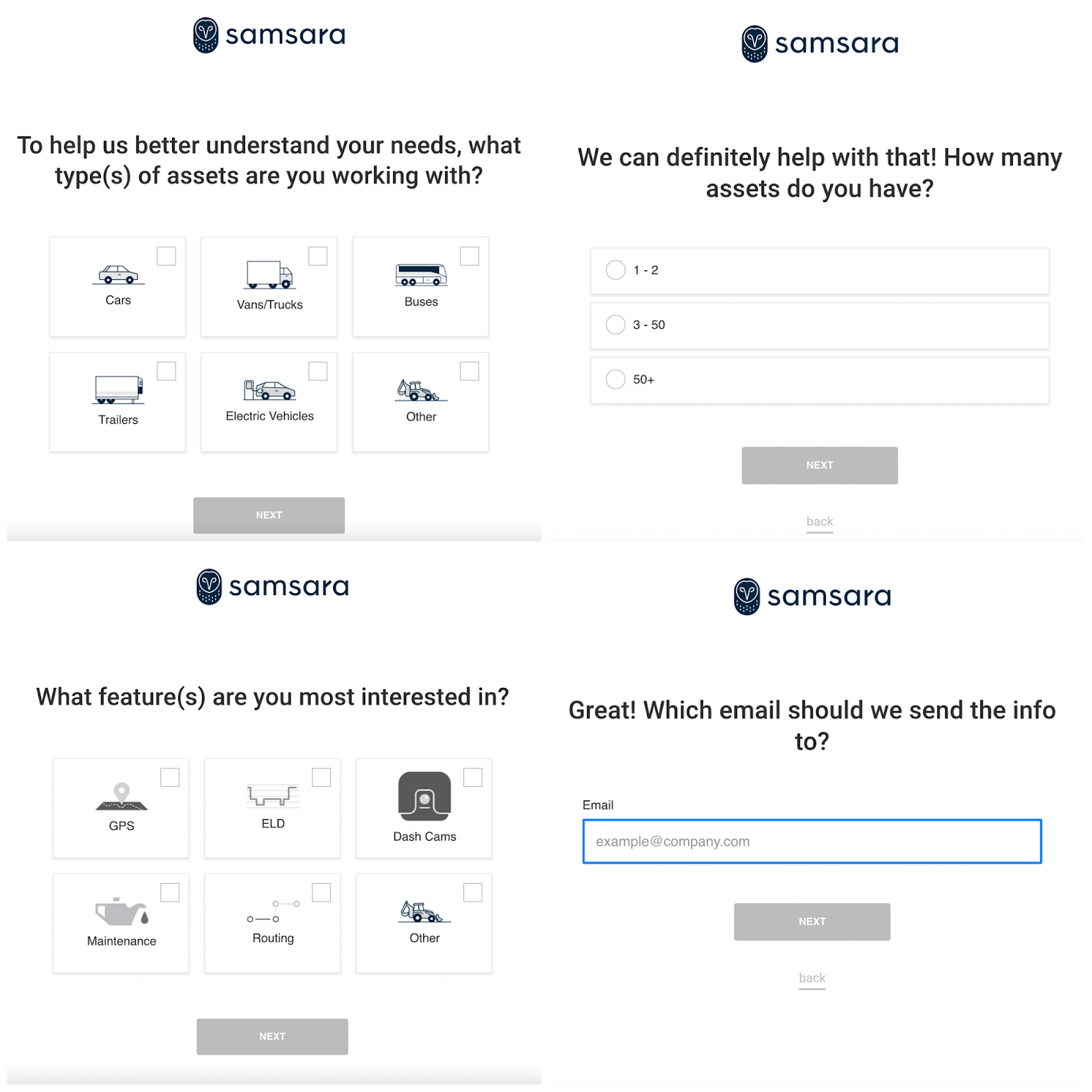
Samsara uses a similar multi-step form, only theirs makes use of images and icons:
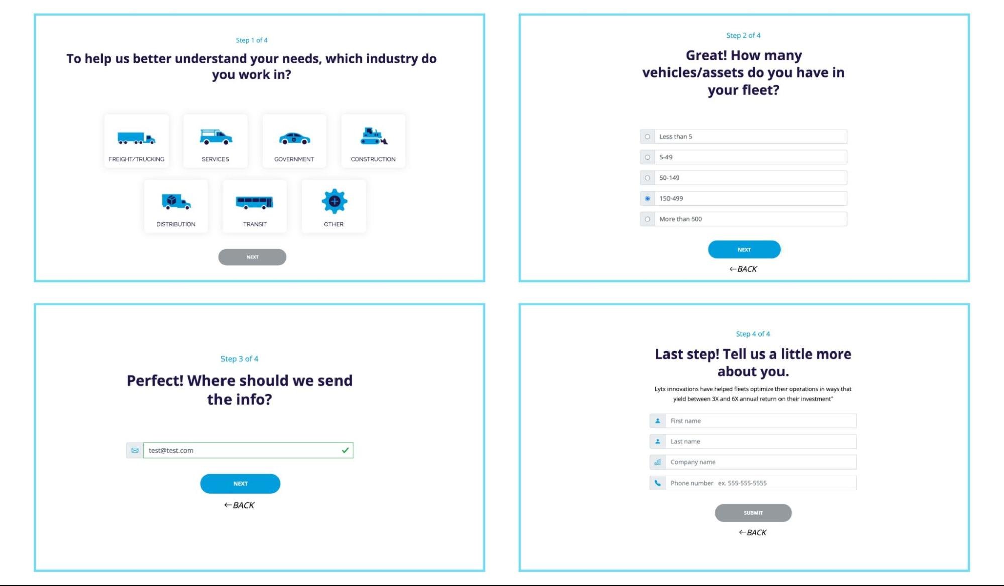
And last, Lytx uses a multi-step form to qualify leads:
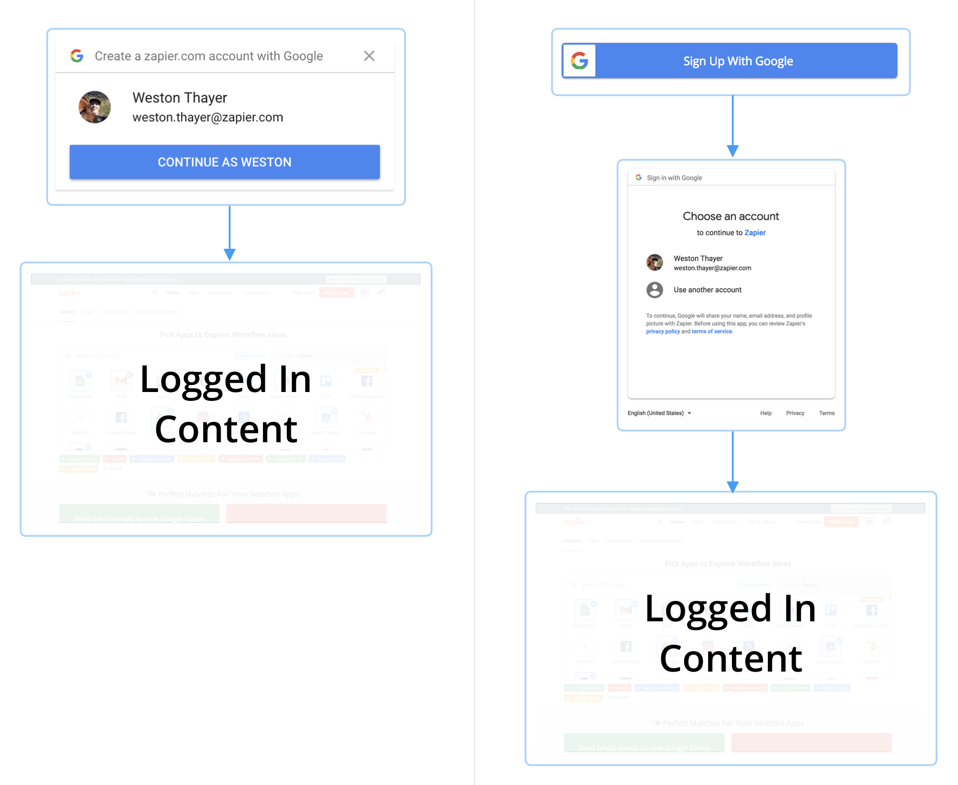
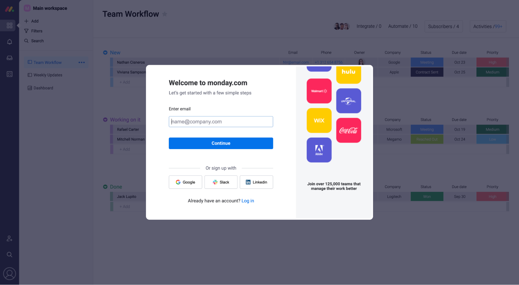
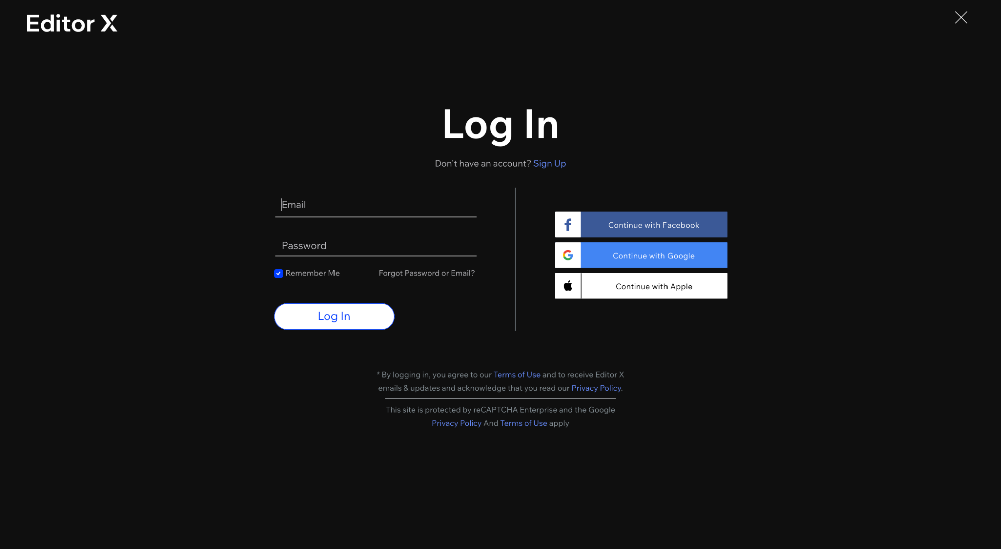
23. Google One Tap
Google One Tap is Google’s evolution of Google OAuth (“Sign up with Google”), the authentication protocol that allows users to log in or sign up with their Gmail credentials instead of filling out a form.
How it works: Basically, Google One tap detects a user’s logged-in Chrome or Gmail session and gives that user the option to log in with the recognized account or select another Gmail account. You don’t even need a new password.
Does it work?
According to Zapier, Google One Tap increased conversions by 20%.
According to Pinterest, Google One Tap increased web (desktop) sign-up conversions by 47%.
And according to Reddit, Google One Tap helped them double their new user sign-ups.
So yeah, it works.
Who’s using it? Tons of SaaS brands.
For example, Hotjar, Monday, SEMRush, and Editor X (Wix) all use One Tap.

Do trends make effective landing pages?
Good news: Unlike other types of trends, in the marketing world, we can measure landing page trends to see which work and which don’t.
Thankfully, many of the trends mentioned in this article already have data to support their effectiveness. But for the ones that don’t, we recommend testing them on your own first.
Whatever you do, trends or not, don’t forget the time-tested, data-backed principles that have grounded effective landing page design for the last decade:
- Headline/subheadline: A clear and compelling headline that grabs attention, communicates a benefit and articulates your offer.
- Conversion design: Either an F-shaped or Z-shaped information hierarchy that moves visitors down the page, draws attention to buttons or conversion opportunities and reduces cognitive load.
- Strong copy: Heavy on benefits, light on features. The best landing pages use copy to persuade visitors and motivate action now.
- Visual aids: Not just any graphics, photos, or illustrations; but visual elements that provide context to your copy, make the invisible parts of your product or service visible, and make your brand feel distinct and human (not stock and
- Social proof: Testimonials, user stats, client logos, star ratings, and industry-relevant awards pepper your landing page with much-needed trust and credibility.
- Irresistible offer: Not multiple conversion goals; just one.
- CTA: An enticing, action-oriented CTA that reminds visitors of the value awaiting them on the other side.
- Mobile optimized: Fast on any device, any browser, any screen resolution.
- 1:1 attention ratio: The closest you can get to a 1:1 relationship between the number of links on a page and the number of conversion goals.
Key takeaways
The best landing page design is the design that works best. Period.
And you only discover that through experimentation.
So no matter which trends you choose to adopt from this list, A/B test them first.
With that, we’ll leave you with three honorable mention landing page trends and five not-so honorable mention trends (they were hot, but now they’re not).
Honorable mention:
- Bold fonts and typography: Like, really big headlines within hero sections.
- Chatbots: Fewer instances of live chat, more instances of chatbots.
- Product shots: Whether it’s screengrabs of SaaS dashboards or high-quality product photography, landers have done a great job visualizing their products.
- Mobile devices: We can’t call mobile design a trend, really. Moreso a pillar of good landing page user experience at this point. But in 2023, businesses have stepped up their mobile landing page game—a lot.
What’s out?
- Pop-ups: We noticed fewer pop-ups than ever before (especially the ones that pop up as soon as you load the page). Finally.
- Interactive design: In 2022/2023, we saw less parallax scrolling, interactive designs, and animations. Likely because mobile-friendliness and page speed (i.e. fast load times) has taken clear precedence over anything else, and interactivity doesn't usually play nice with either.
- Multiple conversion goals: Landing pages have gotten more and more focused over the years, and we love it.
- Long landers: We’ve tested landers with long-form copy that have beaten short-form copy. But in 2023, the minimum scroll is in, long-form is out.
- Background video: This was HOT circa 2017. But many landing pages have done away with slow-loading background videos.
Happy conversion optimization!
P.S. Did one of your favorite trends not make the list? Share it on social media!


