Are your ad retargeting campaign images the best they can be? Are your ad retargeting campaigns not getting the results you were hoping for?
Maybe you’ve tried switching up the ad copy, or the ad image…with no luck.
Don’t be discouraged. We've got you covered in this blog post, or you can skip ahead to get even more insight on retargeting campaigns in general...
Get brand new PPC strategies straight to your inbox every week. 23,739 people already are!
Okay, so if you’ve run some tests swapping in different ad images, you’re on the right track.
According to Consumer Acquisition, images account for 75% to 90% of ad conversions. It makes sense, considering the image is the first thing people will see when they come across your ad.
But simply switching up your ad design won’t necessarily guarantee success. You need to put deliberate, strategic thought into your ad images.
There are multiple factors that contribute to the success of an ad retargeting campaign: audience segmentation, timing, budget, and - of course - the ad design.
If you create ad images with a specific, strategic goal in mind, you can increase your conversions in a calculated and scalable way.
With that in mind, here are 7 strategic ways to use images in ad retargeting campaigns.
#1: Create Geo-Targeted Ads With Location-Based Images
It’s good practice to match ads with specific audiences.
Location-based ad targeting can be highly effective if you have a brick and mortar business, if your customer base is local, or if you’re looking to expand your audience to specific locations.
Successful geo-targeting relies heavily on effective audience segmentation. That being said, you can still leverage your ad images to deliver relevant, targeted messaging to your audience.
Repurpose One Image for Different Locations
While this isn’t exactly an image tip, it’s worth mentioning.
You don’t have to invest a ton of time intro creating multiple ad images for different locations. It can be as simple as repurposing one image with different text.
This is known as dynamic text replacement. It’s a great way to test different copy while also stretching your image further.
For example, Instacart recently came to my city, Toronto. Since initially visiting their site, I’ve been retargeted with Toronto-specific ads on Facebook:
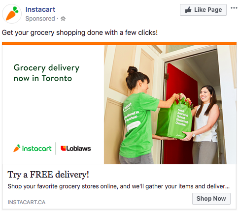
This tactic is both targeted and scalable. It would be easy to run multiple similar ads targeting different locations, simply varying the image text.
If the image is applicable to all geo-targeted audiences, this is a good approach. But say you were targeting two user groups: 1) in a colder environment and 2) in a warmer environment, this may be a circumstance where you would want the image to change. For instance, it’s not relatable for someone in Southern California to see someone in a snow jacket with snow around them.
Use Images of Landmarks to Engage Locals
Another way to grab the attention of a local crowd is to run ads that feature landmarks locals would recognize.
I’m frequently being targeted with ads that feature Toronto’s most notable landmark, the CN Tower. Here’s an example of an ad I saw just today by Opencare:
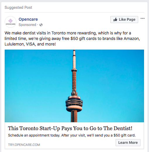
Opencare is a Toronto-based company and their business is to connect people with doctors in their cities. First, they caught my eye with the familiar picture of the CN Tower. Then, they pulled me in with some Toronto-specific copy.
In a big city with a rising cost of living like Toronto, an ad for a company that “pays you to go to the dentist” would certainly appeal to a good chunk of people.
#2: Include a Call-to-Action in the Ad Image
Odds are that at this point, someone coming across your ad has already thought about buying your product or service. Now you just have to give them that extra nudge with a call to action in your ad.
It’s good practice to include a call-to-action in the ad copy. But when people are scrolling past an ad, they don’t always stop to read the copy.
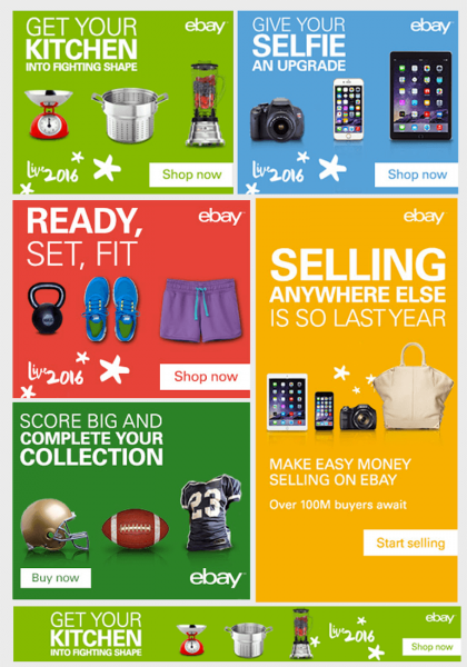
You can help make sure that people won’t miss your CTA by including it directly in your ad image. For example, take a look at how Ebay seamlessly incorporate simple CTAs into their web banners:
To do this effectively, you should make sure that your product or service is clearly understood on first glance. After all, why would somebody want to “Buy Now” or “Click to Download” if they don’t know what they’re getting?
That’s where a product image, or an image of your service at work, can help make your CTA more compelling.
Include a CTA “Button”
To take your CTA a step further, you could opt to include a CTA “button” on your image.
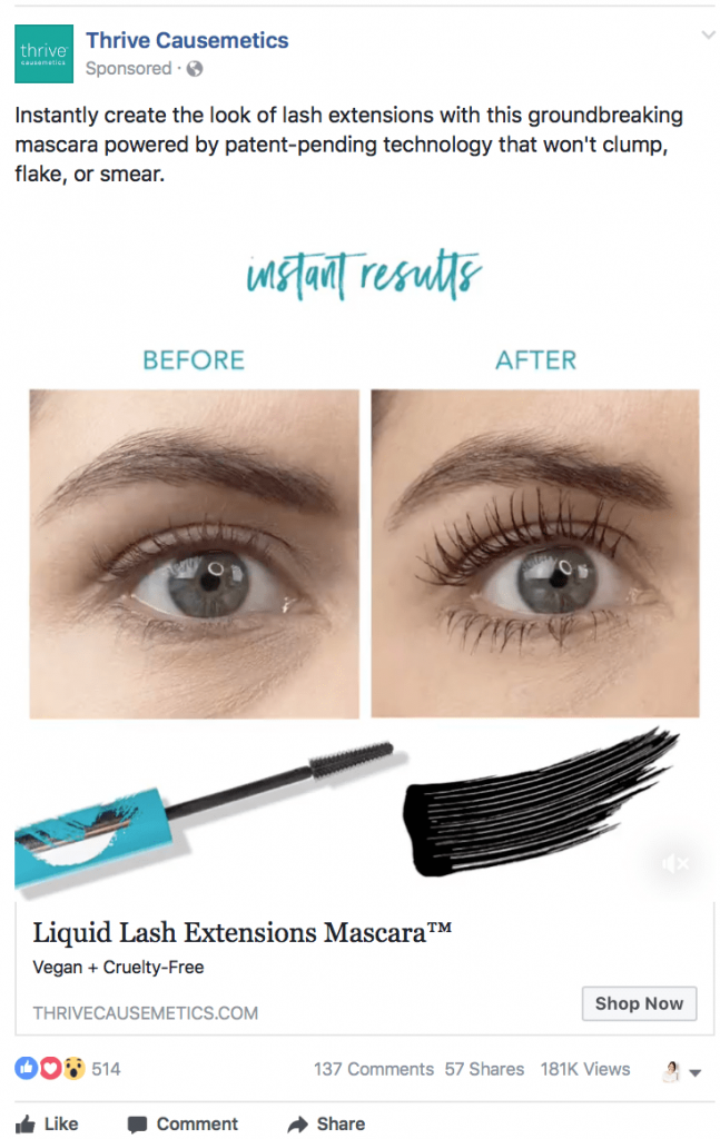
For example, at Venngage we ran a test to see which types of Facebook images resulted in the most clicks. The ads were for an ebook about creating epic social media visuals.
The ad images we tested included images with just text, images featuring charts, and images featuring celebrities. After running 35 different ads, this ad was the second most successful ad we ran (the first was an ad featuring Oprah):
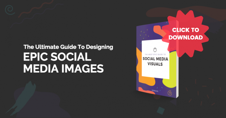
There were a few things that we think contributed to the success of this particular ad image:
One, the big, red CTA button asking readers to “Click to Download”.
Two, the product image of the guide that you would receive by clicking.
Three, the bold, contrasting color scheme, which I’ll get to next.
#3: Use Contrasting Color Schemes to Attract Attention
In the same Facebook ad study I mentioned, we looked at which colors schemes got better engagement than others.
By and large, we found that dark, starkly contrasting color schemes got more clicks:
But that doesn’t mean that dark colors automatically convert better.
To draw a parallel, many (maybe too many) studies have been done about which color works best for call-to-action buttons. Most marketers will agree that the specific color of the CTA button doesn’t matter -- what does matter is that it stand out against the background.
The same can be said for ad images. Dark colors will stand out against a neutral-toned newsfeed.
#4: Include the Value Proposition In the Ad Image
Similar to how you can include a call to action in your actual ad image, you can also put the value proposition front and center.
Images are perfect for this, because they can show your audience value right away.
Remember the saying, “Show, don’t tell”? The idea applies here.
Show readers your value proposition in numerical terms
For example, if you’re offering a discount, or if you want to promote a particular plan, you could tell your audience how much they’ll be saving in the ad image.
That’s what Goodfood did in this ad:

The light blue chunk of the ad stands out from the background, making the “$60 OFF!” hard to miss.
Use images that show the positive results of your product or service
Is your business going to improve your customers’ lives? Prove it.
Pick images that show the positive results your product or service delivers.
For example, take the classic before-and-after shots. They show you the value of their product or service upfront, enticing you to click for the details:
You could also use images that provide social proof. Social proof can take the form of using pictures of thought leaders who endorse your product, pictures of satisfied customers, or graphics showing your successes.
For example, Nature Made provide social proof in their ad image by touting their certification:

The recognizable certification symbol on their ad image ensures customers that they can be trusted.
#5: Use Images That Appeal to Your Audience’s Emotions
One of the oldest marketing tips in the book is to appeal to your audience’s emotions, and it’s no less valuable when you’re designing Facebook ads.
According to a study conducted at the University of Adelaide, ads that elicited an emotional response had a 30% greater sales impact than ads that elicited a low response.
Think of it as looking for another way to present the value of your product or service to your audience.
What are the emotions that your audience will get from your product or service? What will they be missing out on if they ignore your product or service? How will their lives be improved by your product or service?
Look for images that reflect those emotions.
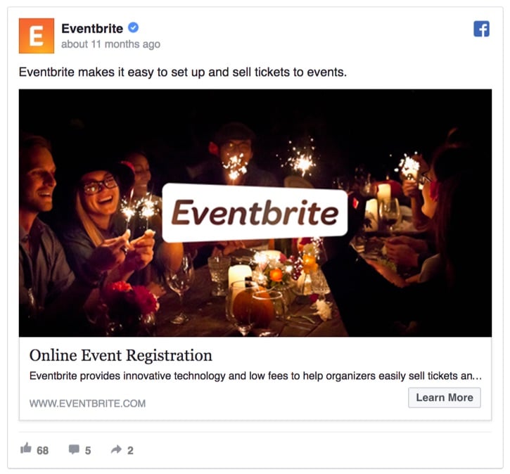
For example, Eventbrite uses a photo of a group of friends smiling to reflect the joy that events can bring people:
But emotional imagery isn’t just about the content of an image. The color scheme also plays a big role in how we perceive an image.
Studies in color psychology tell us that certain colors elicit different emotional responses in people.
For example, blue is often perceived as being “trustworthy” and “calming”. Maybe that’s why a deed “midnight blue” is the second most popular color used by 456 notable brands.
Black is the number one color used. Black is considered to be “elegant” and “powerful”. That’s probably why so many car companies use greys, and why so many sportswear companies use black in their branding.
When you’re designing your ad images, try to tap into the emotion that will drive someone to want to buy your product, download your ebook, enroll in your course - whatever the converting action may be.
#6: Show Multiple Products or Features Using a Carousel Ad
A carousel ad allows you to use multiple images. This can help you make a more convincing case for your product or service.
In fact, carousel ads get 10x more clicks than static ads on Facebook. What’s more, marketing agencies PL & Partners and FiveFifty have both reported that they find carousel ads to be particularly effective in retargeting campaigns.
A carousel ad could be something as simple as showing some more products related to the ones a person originally clicked on your site. For example, here are some products iHerb suggested to me after I checked out their site for health food products:

But carousel ads also give you the opportunity to advertise multiple features or benefits for your service. Rather than trying to boil your pitch down to one point, you can offer up to five of your most compelling features.
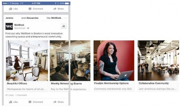
For example, WeWork used a carousel ad to show four different features that they offer. Each feature is paired with a different photo to give their audience a better understanding of what they can expect from the coworking space company:
I’ve even seen carousel ads used to create a panoramic image. There’s a ton of different ways you could use a carousel ad to engage your audience.
#7: Rotate Your Ad Images to Prevent Exhaustion
This is another ad best practice that too many businesses ignore.
While regularly testing different ad images can help you optimize your ads, that isn’t the only reason you should change your ad visuals. It’s also a good idea to rotate ad images to prevent your audience from getting tired of seeing the same thing over and over again.
This could involve changing up the entire ad, or simply changing up the image. For example, LinkedIn has rotated several ads for LinkedIn Business:
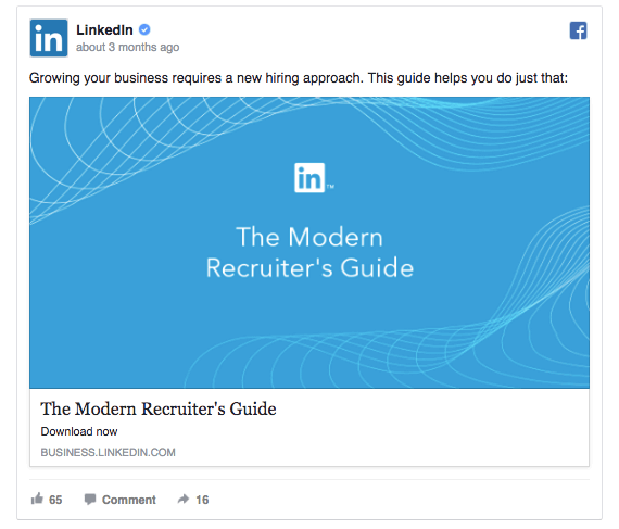
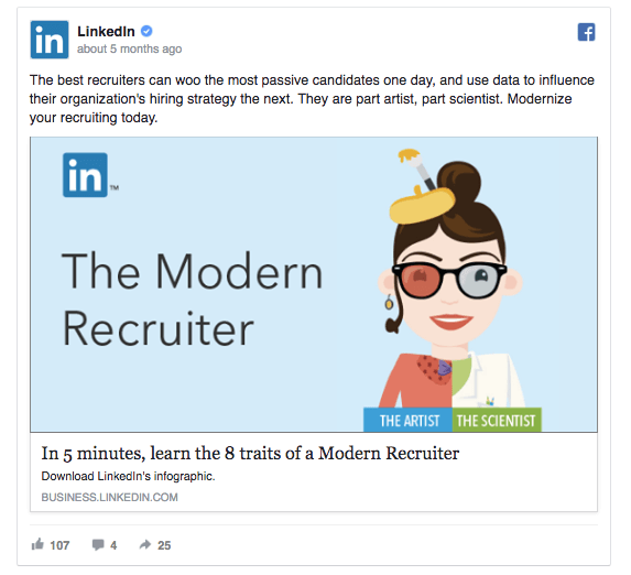
Rotating ads will help the content seem fresh. It will also give you a chance to try different tactics on your audience, since one visual may be more convincing for certain people than another.
Conclusion: Ad Retargeting Campaign Images Do Make a Difference
Since your ad image is the thing that attracts your audience’s eyes, put some careful thought into your visuals.
When it comes time to design your ad images, keep these two questions top-of-mind:
- How can I grab my audience’s attention with my ad (i.e. what will get them to stop scrolling)?
- How can I use images, colors, numbers, and concise text to reinforce value to my audience?
If you’re having trouble figuring out where to start with your ad design, it can help to start with an ad template.
Your product or service is already in their mind. Use visuals in your ads to remind them why they were interested in the first place.