


Lead generation forms are everywhere online.
Companies use them to capture quality leads and provide information that’s valuable to their audience who will benefit from that information.
But lead generation forms throw up red flags 😡
Nobody wants junk in their inbox and the best way to stop that from happening is to flip those forms the finger.
In this post, we’ll give you seven ways to turn that nuh-uh 😡 into excitement 👏
We’ve teamed up with Formstack to bring you seven quick wins you can use to improve your forms and increase your conversion rates.

By the end, you’ll know how to
- make your form a positive thing
- remove threat
- create a lead generation form potential leads want to fill out
We can hear your doubt 🙄. Give us a little over five minutes to turn that doubt into confidence 🤑
- What is a lead generation form?
- How do you make lead generation forms?
- What are the benefits of lead generation forms?
- Curb appeal: crappy-looking forms don’t convert
- Multi-step forms
- Where things go: page position matters
- Conditional logic: personalize the experience
- Interaction: create specific CTAs
- Analyze your forms: A/B tests
- Vacancy insights: use partial submissions & bottlenecks
- The best lead generation forms
Get brand new conversion strategies straight to your inbox every week. 23,739 people already are!
What is a lead generation form?
A lead generation form is an online form with fields and a button that gathers information from website visitors who are potential customers (new leads). These leads feed into your CRM app (customer relationship management software) like HubSpot or SalesForce so you can target them with offers in the future 🤑
There are different types of lead gen forms:
- Contact forms
- Registration forms (webinars, courses, etc.)
- Newsletter sign up forms (email marketing)
How do you make lead generation forms?
Inserting a form on your website is typically as easy as plunking a module on your page (usually above the fold) from within your CMS (like WordPress, Shopify, HubSpot, Wix, SquareSpace, etc.).
But you can also use standalone form builders like Formstack and Typeform that have hundreds of form templates to build drag-and-drop, mobile-friendly lead capture forms.

What are the benefits of lead generation forms?
The obvious benefit of a great lead generation form to you is that it generates leads (to convert potential customers into actual customers). But here are some other benefits. High-converting lead gen forms
- are easy to implement
- segment your leads automatically
- come with built-in analytics to improve optimization

But the benefit of a great lead generation form for your potential customers is that it
- is fun
- reduces the cognitive load with multi-step questions
- uses conditional logic to personalize each question
You might notice that all the benefits for the customer come from the multi-step nature of great lead gen forms. We’ll get to that very important piece of the puzzle, but first, let’s talk about how important the aesthetic of your form is.
Curb appeal: crappy-looking forms don’t convert
When it comes to form design, looking good goes beyond cosmetics. A beautiful form uses design principles to get that initial “I’ll consider this” handshake going on in the mind of your potential form-filler-outer.
A clean color palette with lots of empty space isn’t threatening. In fact, it’s inviting. How you make the questions look plays an important role in convincing your visitors to step through it to the end (when they convert).
Typeform has this down to a science. That’s why they highlight the importance of design in their unique value proposition (UVP).
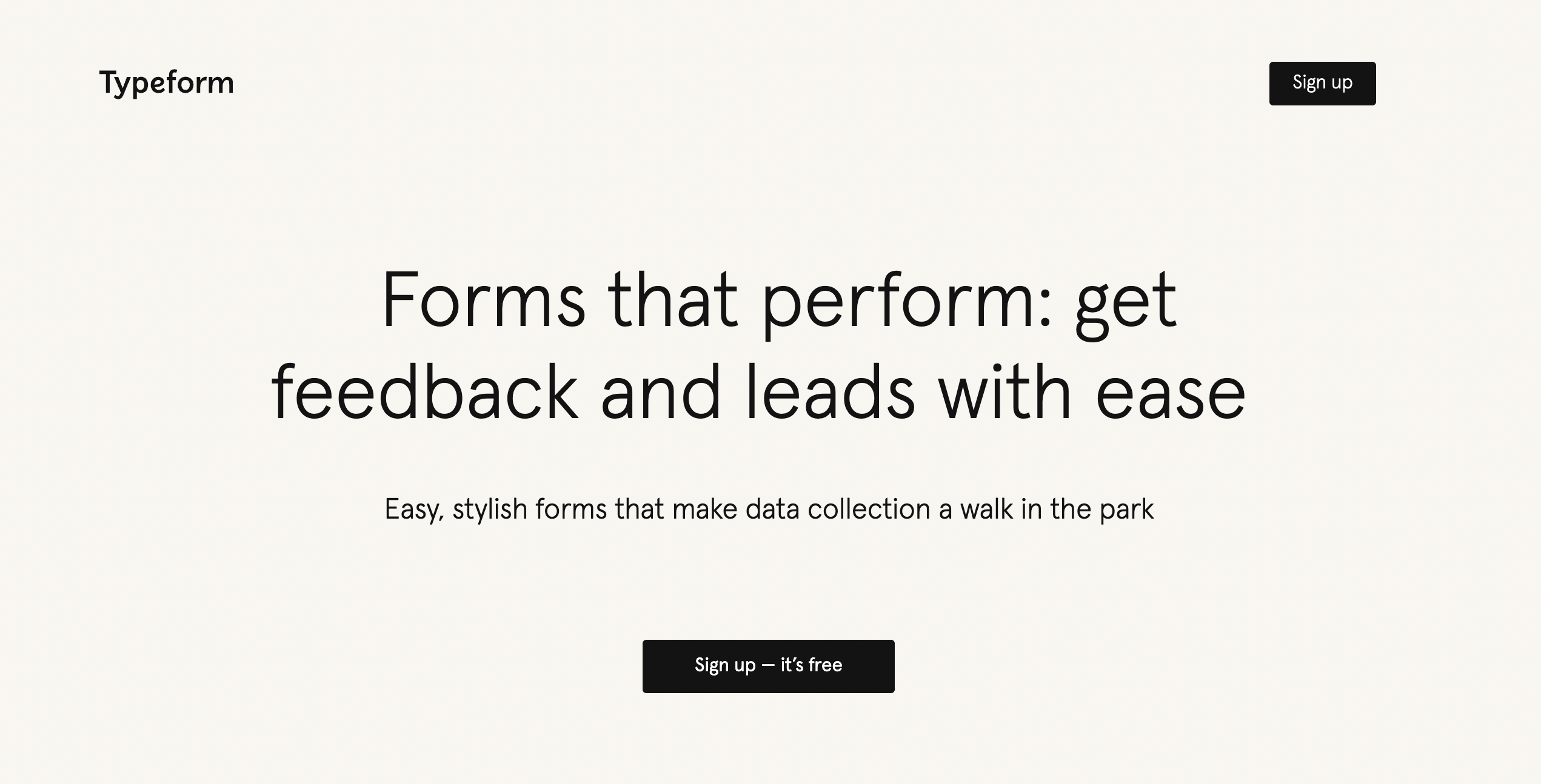
How to style your CTA
Another style element you need to think about on your high-converting forms has to do with CTA (call-to-action) contrast.
Aside from using the right words on your form conversion button, making your CTA stand out with a complementary color that pops from the background can make a significant difference to your conversion rate (CTR).
Canva has a free tool that tells you what CTA color you should use based on your brand color:

Try different colors and test to see which CTA button lifts conversions the most. While you’re testing things out, see if radio buttons, checkboxes, or multiple-choice fields convert better than plain fields.
Multi-step forms
If you take nothing else from this post, take this: multi-step forms convert better than single-step lead generation forms.
If you still think making your forms as simple as possible gives you the highest chance they’ll be completed, think again.
Using a multi-step form sounds counterintuitive, but the truth is that simplified forms are threatening. They ask too much too fast and scare away could-be converters.
Your job is to reduce the friction a form creates so someone is willing to opt in. Prospects have to warm up to the idea that giving you their contact information is worth what they’ll get when they submit the form.
The best way to warm up a prospect is to use a persuasive psychology tactic called the yes ladder. At KlientBoost, we took that psychology to heart and applied it to lead generation forms, developing the Breadcrumb Technique. 👈 You should read that post.
What happened when we did that? A lot more conversions, that’s what.
Why? Because we didn’t ask for contact information right off the bat and we didn’t hit potential leads with a super long form.
We asked for simple stuff first.
We warmed up to the eventual conversion by taking away the anxiety that makes people snub forms in the first place.
By moving the “big ask” (conversion action) to the second or third step of the form, users are more likely to finish the process they started and you’re more likely to generate leads.
Use the micro-conversion concept to get your visitors to answer easy questions to start. Increase the threat level as your visitors move through your form, saving the most intrusive fields, like name, phone number, and email, for the final step.
Like this:

Engage your visitors first with micro conversions (even if the initial form fields aren’t super necessary to qualify your visitors), to baby-step them toward a more likely conversion.
Trust us, if you break up your form into many steps and save the most threatening form fields to the end, you’ll see more conversions.
By the time they get to the last step, they’re invested. They’re more willing to hand over their business email in exchange for what they want after already doing some work to get there—hooray.
Multi-step forms make the trade-off worth it.
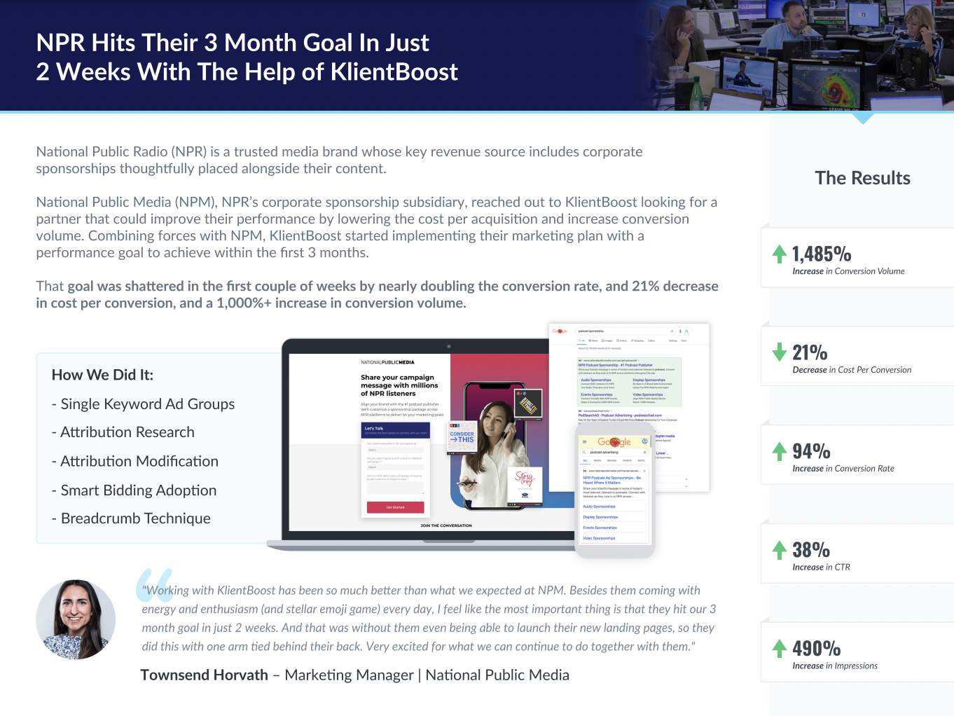
One of our clients increased their conversion rate by a whopping 1485%, in part because we started using the breadcrumb technique to multi-step their forms.
Now let’s talk about where the lead gen form should go on your web page.
Where things go: page position matters
Where you place your form on your landing page impacts your conversion rate success.
You have two choices:
- Place your form right at the top of your landing page above the fold
- Place your form below the fold
What does that mean?
“Above the fold” is a hangover term that comes from the newspaper industry when the most important news of the day appeared in the top half of the front page where everyone could see it (even when it was folded on the newsstand).
Today, we consume information rapidly and sometimes that opening snapshot is the only thing we consider before moving on. We’ll read the headline (the H1), maybe the blurb under the headline (H2), and maybe the webform at right. If those three things are engaging, maybe we scroll down the page to read more.
But maybe not.
And that’s why your biggest chance of grabbing a conversion happens when you put your form right at the top of your landing page.
“People scroll vertically more than they used to, but new eyetracking data shows that they will still look more above the page fold than below it.”
—NN Group
Except…what if your opening shot is a full-width video?
Sometimes your page design calls for a form beneath the fold. And that’s okay.
“Don’t cram everything above the fold. Countless tests and scroll-click-tracking studies have shown that visitors are willing to scroll… as long as they know there’s something to scroll down for.”
—Joanna Wiebe, Copyhackers
How will you know?
Place your form above the fold and below the fold and see which one puts more conversions in your funnel.
Conditional logic: personalize the experience
Tailoring information specifically for your visitors is ultimately the thing that’ll win over their conversions. User experience is key.
With conditional logic, you can ask context-specific questions that are based on your visitor’s preceding answers. It’s an effective way to make your online form experience relevant to your visitor.
Here’s what Formstack’s conditional logic sample looks like:


Why ask a question that’s irrelevant when you can ask one that makes your visitor feel special and like you’re actually listening to them?
Conditional logic forms get to the answers you want and capture the information you need, by categorizing your visitors into different segments depending on their submitted answers.
The questions are more and more tailored with every question they answer, making your campaign copy even more relevant.
Interaction: create specific CTAs
Your visitors come from different URLs and search for your product or service using different keyphrases. That means they fall into different stages of the decision-making cycle. And that means they need different CTAs to convert.
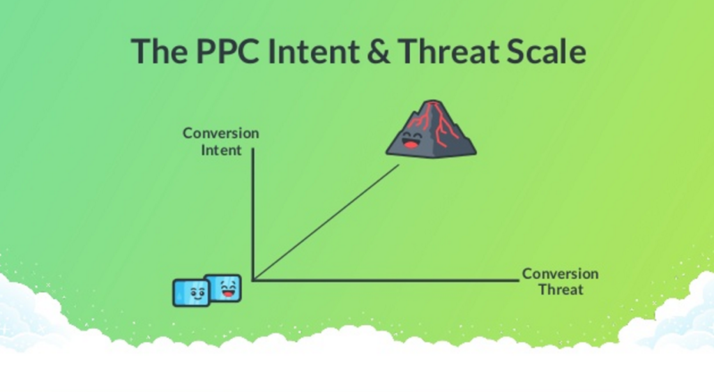
Test out different CTAs depending on where they are in your conversion funnel and what their conversion intent level is. Try to match the conversion intent level with the conversion threat temperature:
Tip: Visitors who come from Display have colder temperatures and will likely convert with colder CTA temperatures. Visitors who come from search have higher intent levels and will react better to warmer CTA threat levels.
Here are some CTA ideas varied by their PPC origin and channel temperature:
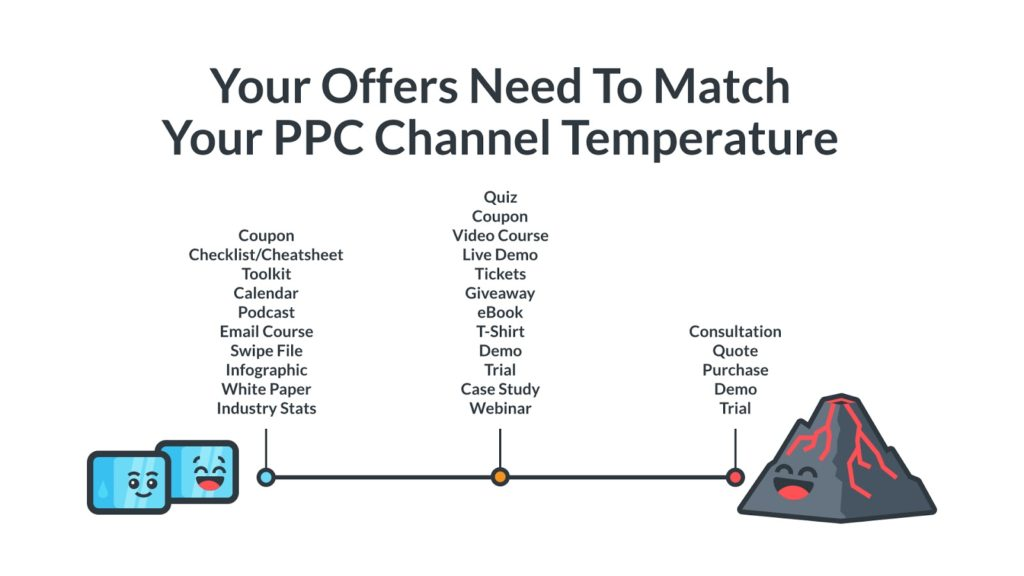
Match your CTA threat level to your visitor’s conversion intent level and see if that encourages visitors to complete forms all the way through to conversion clicks.
Analyze your forms: A/B tests
The best way to optimize your forms is to test out each 👏 and 👏 every👏 part.
Test different versions of form headlines, copywriting, form length, colors, and fields to see which version will get you the most conversions.

A/B testing is an effective way to objectively test out one variant at a time so you always use the highest-converting form element to max out possible conversions for your sales team.
Vacancy insights: use partial submissions & bottlenecks
Dangit. Your prospect only filled out part of your form, so you didn’t get that full conversion.
This doesn’t mean your shot at converting that visitor is over.
Turn a negative into a positive by capturing the information your visitor did leave and use it to make it easier for them next time.
With Formstack’s multi-step forms, you can create forms that allow users to save and resume which creates a partial capture. And if your visitor revisits your form, their captured and saved info will already be there making the form completion that much easier.
You can also gather data on where your forms are abandoned to pinpoint the form’s bottlenecks and friction points preventing form completion.
Identify and fix those tricky spots on your partially completed forms and test out various elements that could improve completion rates.
The best lead generation forms
Creating an online lead gen form that converts doesn’t have to be a dreadful experience.
Use the seven steps above to create striking forms that take visitors on a non-threatening journey that’s personalized to them. Test what works and what doesn’t, then optimize your online forms to get even more conversions.
As always, consider where your audience comes from so you can tailor your experience to theirs. The more the two align, the more likely you’ll gain a new form completion and conversion (and potentially a new customer for life).
Want to know another way to convert potential leads?
Case studies.
KlientBoost has more published case studies than any other marketing team on the planet because we know how valuable they are to our conversion funnel.
Find out how to make a case study that boosts your conversion rates in our next article.


