Would you ever think that changing ONE word in a signup form could result in a double-digit increase in conversions?
Believe it, because it’s true. We’ll even show you an example of it later in the post.
If you look at a customer’s entire buying journey from the first touchpoint to purchase, it can be intimidating. But if you break that journey into a cohesive funnel, with different parts that each have their own goal, it’s easier to digest and strategize.
It will allow you to think of all the little details that you can optimize to accurately target, tweak marketing campaigns, and increase your return on investment in marketing or sales efforts.
- Why should you care about conversion funnels?
- What is a conversion funnel in marketing?
- Four stages of a conversion funnel
- What challenges do brands face with conversion funnels?
- 4 common reasons for conversion funnel drop-off
- How to create a successful conversion funnel
- 7 tips for conversion funnel optimization
- BONUS: 8 tips for a better funnel
- Time to optimize your funnel
Get brand new conversion strategies straight to your inbox every week. 23,739 people already are!
Why should you care about conversion funnels?
If you’re selling a product or service, you definitely have a conversion funnel in place, even if it isn’t a good one.
As users move from getting to know more about your company, to decide if they need your product or service, to comparing with similar providers, to making a final or even repeat purchase, you need to know how to respond to their desires and objections. This is why tracking and conversion funnel optimization is essential to keeping the pipeline flowing.
What is a conversion funnel in marketing?
In marketing, a conversion funnel is the representation of your buyer’s journey. It details the steps a potential visitor to your website and landing page might take to complete a desired action or series of actions. That action could be buying a product, signing up for a service, or even subscribing to a newsletter.
Four stages of a conversion funnel
A typical conversion funnel has four stages: attract, convert, close, and delight.
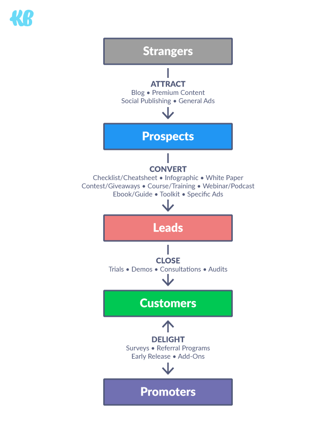
1. Attract: The Awareness Stage
At the top of the marketing funnel (TOFU) or Awareness stage, your marketing efforts are trying to gain more exposure and capture the attention of various individuals across multiple platforms and channels.
These individuals may not even know they have a need or problem. At this stage, you’re letting people know your brand exists and what it offers — to keep it top of their mind, in case such a need or problem arises for which your product/service could be the solution.
The first time a user visits your landing page, they may come from a piece of content shared on social media, a search engine, or a recommendation from a friend or online reviewer without any real intentions of engaging with your brand beyond just a quick glance.
Your marketing strategy at this stage of the conversion funnel should focus on delighting and educating visitors so that they feel comfortable engaging with your brand.
Focus on your intriguing brand story with the goal of getting potential visitors to relate and feel connected. One way to do this is to be authentic and humanize the brand a bit.
Get in touch with the “why” behind your brand before you craft your story and messaging. If potential visitors feel they are doing some good beyond just adding to your bank account, or that they have a greater purpose in their commitments/actions, it could help move them along to the Interest stage quicker.
2. Interest: The Comparison Stage
As a visitor moves past the Awareness stage into the Interest stage or middle of the funnel (MOFU), you want to build even more interest in the type of products or services you offer.
Before someone can even build an interest in your specific products and services, they must first have an interest in the type of products or services you offer overall. (Notice the funnel gets smaller because not everyone who is aware of your product will be interested.)
This is the browsing or “window shopping” segment of the funnel. The visitor may have realized they have a need or problem, increasing the likelihood of converting — so content, ads and offers should be tailored toward addressing specific needs or problems of the individual.
These visitors are more serious about making a purchase, but they haven’t decided what they’re going to buy or who they’re going to buy it from.
This is the stage where a visitor wants to learn more about your offerings — and how you might meet their current (and future) needs or interests.
At this point, you are still seeking to educate and delight as you warm up your visitors and leads. However, they might be ready to make a small commitment now by providing low-threat information to access an e-book or watch a webinar.
3. Desire: The Decision-Making Stage
At the Desire and Decision-Making stage, you probably have a little more insight on specific preferences or behaviors of your ideal customer and have planted initial seeds of desire.
But there are still a few key points to keep in mind at this stage:
- A visitor might have already converted to a lead that you’re nurturing, and he or she is thinking about completing the desired action. You can provide assurance and ease objections with testimonials, case studies, reviews, and other social proof.
- A visitor is probably looking at products or services on your site as well as on your competitors’. Therefore, your marketing message should be more benefit-focused, highlighting unique value propositions and differentiators.
- Since your lead is warmed up and probably considering making a purchase from you, sales-focused offerings like trials or demos are more acceptable.
- Make the call to action clear and concise, and set expectations of what will happen after the visitor or lead takes the desired action, so there are no surprises.
If you take the time to thoughtfully implement these tips in your marketing strategy, you should be able to drive more conversions.
4. Action: The Commitment Stage
The final and most important section of the conversion funnel is where the user commits.
Up until this point, your leads have been traveling through the funnel and taking smaller actions, such as signing up for your newsletter or downloading an eBook, which are often referred to as micro conversions. Yet your ultimate goal is to persuade your leads to convert and make a purchase.
If a lot of visitors churn at this stage, it indicates that your lead nurturing tactics are in poor shape. At this point, they should be primed and ready to take action.
Depending on your goal, a lead should be strongly qualified at this stage, ready to break out his or her credit card or start filling out their contact information on a form. Your marketing messages at this stage should focus on the process — what the visitor needs to know to successfully complete the action and what he or she can expect after.
Middle of the funnel is usually where you weed out any broad competition. As you near the bottom of the funnel (BOFU), you should be looking to compete with strategies and content used by your close competitors. Hopefully, they’re the only ones your leads are still considering.
Next, think of ways to improve how you target, where you target, and what you provide on all levels. You can offer to cut a greater percentage of customer costs or offer more enhanced case studies. Go big or go home.
What challenges do brands face with conversion funnels?
Small leaks in your funnel can compound over time to cost you a huge amount of revenue. Here’s a calculation below — these are the average numbers for 5,000 visitors.
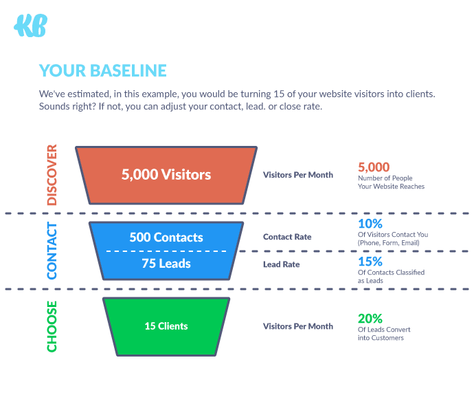
A conversion funnel is an idea. It’s a way to visualize and comprehend the flow and conversion of prospects into customers. If you can understand and analyze the process, you can take action to improve that flow.
See the difference in size from the top to the bottom? Only a small number of visitors to your website and landing page are likely to make it to the action step. That’s the bad news. The good news is, you can make the bottom of the funnel (the sales funnel) wider using conversion funnel optimization. More on tips and tactics for that later.
No matter how they get to you, as many as 73% of leads are not even ready to be sold.
Even from the pool that is qualified, half of them aren’t ready to buy. That puts the odds against you right out of the gate. Be patient and continue to provide the education and value these leads are interested in.
4 common reasons for conversion funnel drop-off
So what leads to conversion funnel drop-off?
1. Not offering the next step in any of the stages.
If someone follows a social media link to a piece of your content, don’t expect them to be proactive and browse the rest of your site. Offer them related or most popular content and products while on the site, or even after they leave. Give them a place to go next.
2. Not communicating the benefits of your offer in the Interest or Desire stage.
It’s not enough to just explain how your products or services work. What problem do they solve? How do they improve your customers’ lives? If they aren’t hearing this information until they hit the sales funnel, it’s too late.
3. Not using strong calls-to-action in the Interest or Desire stage.
Use strong language and brightly colored buttons for your CTAs. “Sign up for a free trial,” “Join our VIPs,” and “Buy now” are all examples of strong calls-to-action. They are clear and concise on the desired action you want the user to take.
4. Having a complicated Action stage.
Think about your sign up, subscription, or checkout process. Are you asking for too much information? Is your process several pages long? Strip action pages down to the essentials—no links, no large images or video—and make the action as painless as possible. If there’s a conversion process on your site, spend the money and effort to make it more user-friendly.
How to create a successful conversion funnel
Now that we have covered common challenges and reasons for drop-off, let’s cover how you can create a successful conversion funnel.
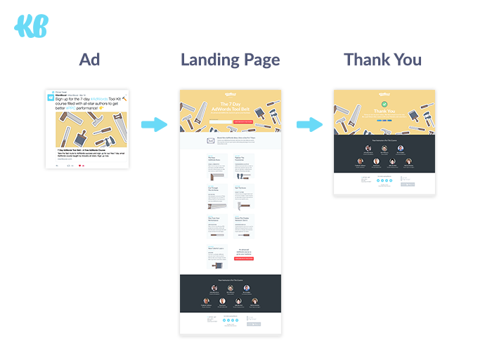
With these recommendations, you can take your best shot at converting more qualified leads.
Explore how customers are finding you
For the first stage of Awareness, ask yourself, “Where are my customers coming from and how did they become aware of my product?” Then, look at the percentage of people taking that first step and consider…
- Did you advertise? If so, what is your click-through rate? How many people saw your ad and clicked on it?
- Do you get traffic from organic search results? If so, which pieces of content reach more people?
- Do people find you through social media? If so, do they click through to your website & landing page to learn more? What seems to be getting the most engagement?
Make sure you’re properly targeting your audience, so you aren’t pulling in completely unqualified leads into your funnel. You’ll spend too much time and money trying to convert those that aren’t fully warmed up or don’t have a real interest. Define your target audience or buyer personas in advance. You can always cast a wider net later if you feel you aren’t getting enough business.
Visualize the conversion funnel using Google Analytics or Hotjar
Google Analytics is the gift that keeps on giving. By setting up all the conversions you’re looking for throughout the funnel as goals, you’re able to view the path to those goals. The visualization is a benefit when it comes to funnel analysis.
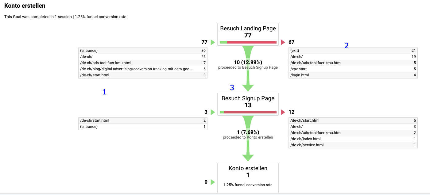
Setting up Google Analytics Conversion Funnel would allow you to analyze whether your visitors are seeing pages in the order that you intend for them to be seen or if there’s a problem.
However, the process to set up Google Analytics for visualizing a conversion funnel can be a little confusing. One other option is Hotjar, another one of our favorites.
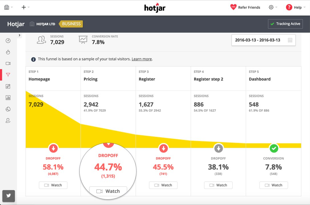
You’ll still need to set up goals in Google Analytics, but that’s not the hard part. The added benefit you get with Hotjar is the watch functionality.
7 tips for conversion funnel optimization
There are multiple inbound marketing and lead generation channels that can help you reach your audience and continue to keep them engaged.
At KlientBoost, we focus on PPC and conversion rate optimization (CRO). But you can use email marketing, social and search engine optimization, and more to continue exploring and feeding your pipeline.
The goal is to pull rather than push people through the funnel. To do so, you have to look at not just the individual components or channels, but the conversion funnel as a whole. You want your messaging and branding to be consistent across the board and aligned with your goals as well as your potential customers’ interests and needs as they change.
Let’s dive into some of the conversion funnel channels and mediums to move people through the four stages of the funnel: Awareness, Interest, Desire/Decision, and Action.
1. Run ads
Paid online ads can appear on display, search, or social networks.
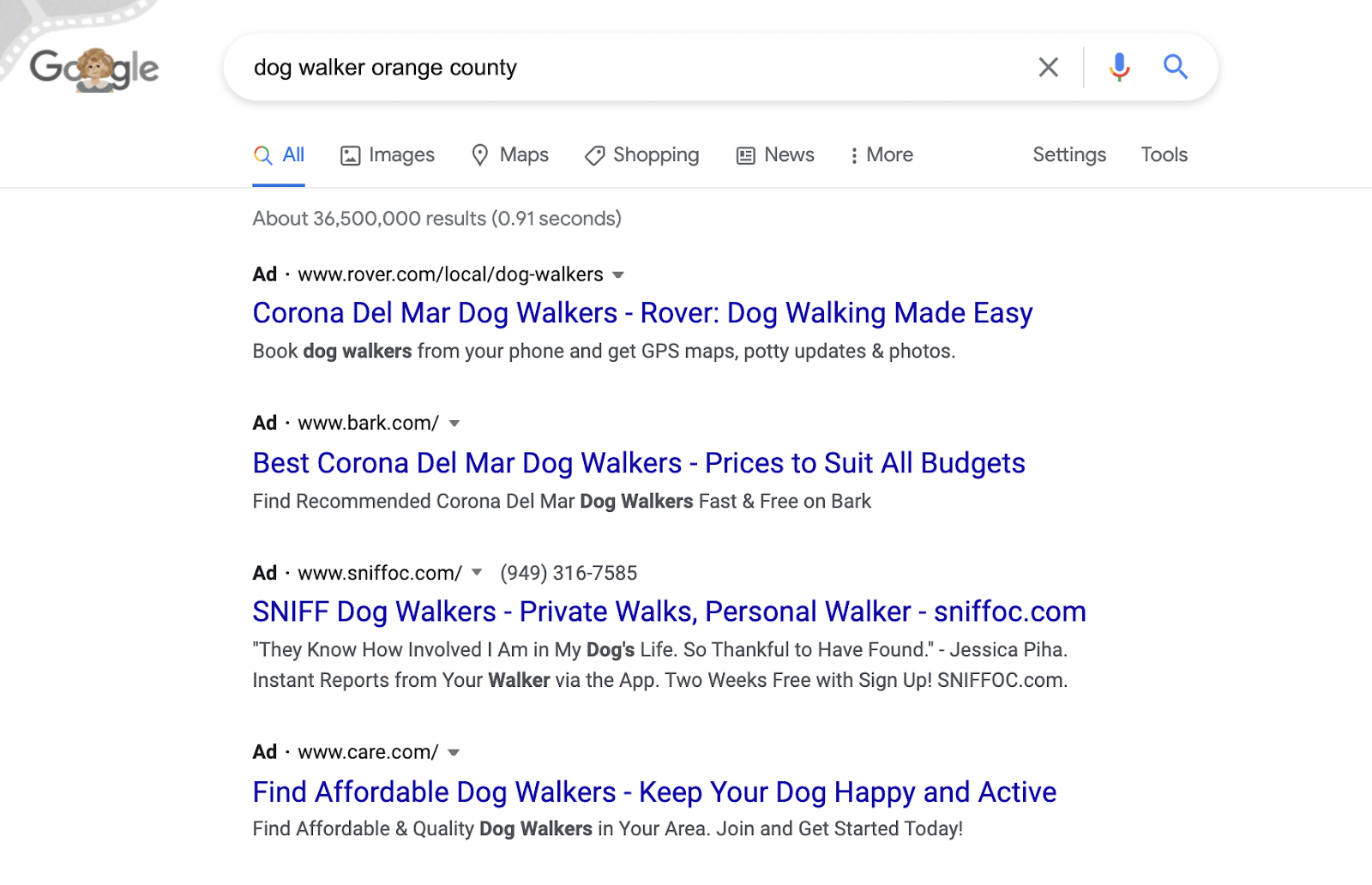
Ads can play an important role of your overall funnel. Not only can they help to fill the top of your funnel, but they can also help move visitors along the funnel.
Start by running ads that grab the attention of your target audience. They're going to do that by communicating the problem that you solve and the value you can provide clearly.
This is the gateway. These ads link to the landing page, which helps narrow in on a specific action that you want your leads to complete.
If someone doesn't complete the conversion, they can easily be retargeted. Maybe they wanted to purchase, but got distracted or wanted to do research first. Don't let them forget you.
If you aren’t sure where to start on crafting effective PPC campaigns, check out a post we wrote about how to do just that.
2. Design a relevant landing page
Landing pages are great to bring your traffic to a concise, clean page that shows only the most necessary information about your product or service.
We covered the best practices from A to Z in this post so we'll give you a rundown of the basics here.
When creating pages, it’s important to be aware of the “temperature” of your traffic. This goes back to the four steps of our funnel: is this traffic cold and unaware of who you even are? Does this traffic know about their problem, but isn’t sure about their solution?
Lastly, is this traffic hot enough to be sure of you and what they want, and are they on the verge of buying? (You can learn more about traffic temperature in our post here.)
The information on your landing page needs to be based on the kind of traffic you’re bringing in.
Right off the bat, you’re going to need to cover your Unique Value Proposition (UVP) and personalize the copy for the particular target audience. As we’ve talked about above, this means you talk about one or multiple things that set you apart from your competitors. “What do I get out of it as a customer? Why should I go to you over anyone else?”
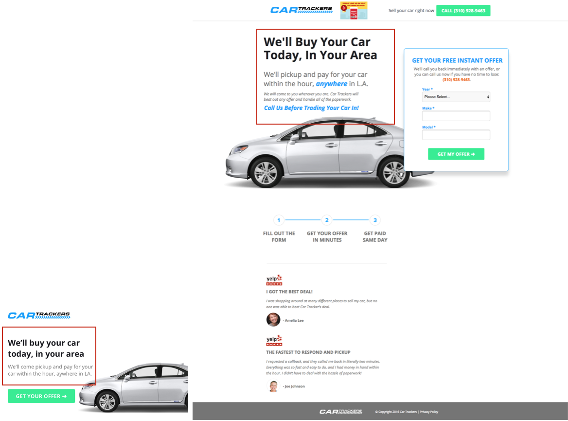
For example, here’s a landing page we created for a client with a remarkable 45% conversion rate:
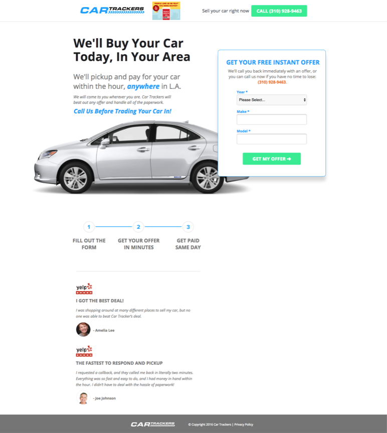
Clear as day, the UVP is explained in the headline and subhead of the page. It is important to test placement and the way the UVP is phrased.
The UVP is one thing, but it’s important to explain the benefits of this service: it’s quick, local, and there’s no paperwork hassle. These benefits support the UVP.
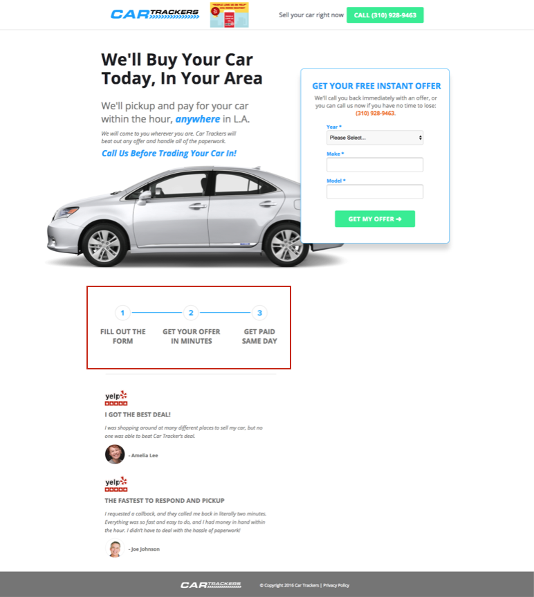
Learn more about this in our post on landing page testing.
Last but not least, you’ll need to make sure that your message and CTA on the landing page matches the ad that your leads came from. If a restaurant says Javier’s Mexican Food on the outside but it’s a Taco Bell on the inside, people will be pissed.
3. Social Proof
How do your customers know that you and your product/service are trustworthy? By including social proof on your landing pages and product page.
Testimonials of previous and current users and awards are great ways to quell those fears. FAQs with answers, how-it-works videos, badges of certifications, and client logos can also help reassure someone who isn’t quite sure if you’re the right fit for them.
Testimonials can be used on everything from a homepage to a product page or even on a contact page.
4. Clearly define customer next steps with a call-to-action (CTA)
Be short and clear with your CTAs.
Here are some low-threat CTAs to try: receive, get, view, enjoy, discover, see, play, claim.
And I highly recommend staying AWAY these words: submit, sign up, learn more, or click here. These phrases are too vague, and they tell the lead that he or she needs to do something rather than get something.
People don’t like doing work, especially for things they’re not even sure they want. Make it easy for them and assure them that you’re doing the heavy lifting to create a pleasant and simple experience.
Also, consider keeping your CTAs above the fold for better visibility. It’s possible this can increase the number of visitors that see your CTA. You might also try a CTA that pops up to capture your visitors’ attention when they try to leave.
Next, stand out! Use colors in a button that is different from your website and landing page. Design great graphics that get noticed or do anything these amazing 61 examples did.
Finally, limit each landing page to one CTA, so the visitor doesn’t get confused about what action to take. You can test different wording on your CTA buttons, and test the number of CTA buttons on the page, as long as they all go to the same end goal.
5. Create a form
If you’re attempting to gather leads, you’ll need a form.
In our experience, we’ve found that multi-step forms generally perform better than one big long opt-in form. Your goal is to get the visitor to micro-convert on a step with fields/questions that are easy to answer.
We call this the Breadcrumb Technique. It’s the art of eventually getting to what you want (the conversion) by getting visitors to accept/say yes to much smaller requests first.
This means having non-threatening, qualifying questions on the first step followed by questions asking for personal information on a subsequent step.
The reasoning behind the multi-step strategy is that people who have already started something are more likely to finish it. People who complete Step 1, therefore, are more inclined to complete the remaining steps. When people see a form asking for their phone number and email right away, however, they might become skittish.
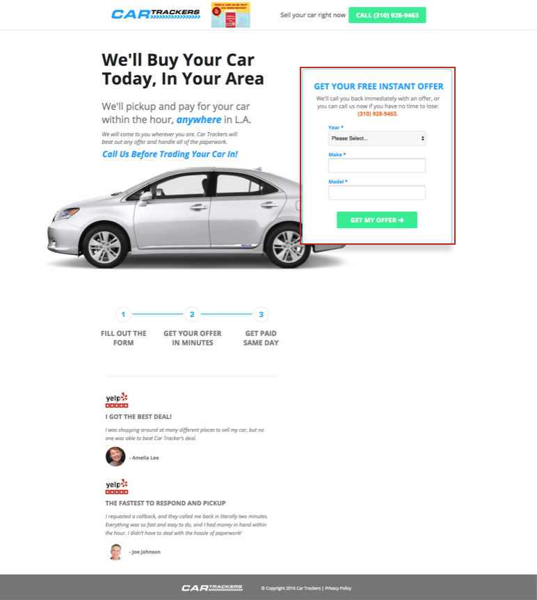
Notice that the form copy explains the benefit of giving info:
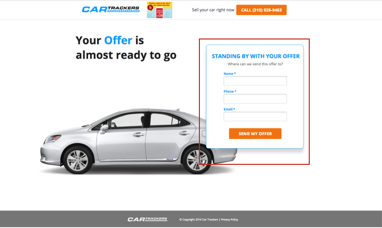
An important thing to keep in mind on any page is explaining to the lead what they’re going to get out of giving away their information and what is going to happen next.
You can use WisePops to build form pop-ups that fuel list building and lead generation.
6. Thank you page
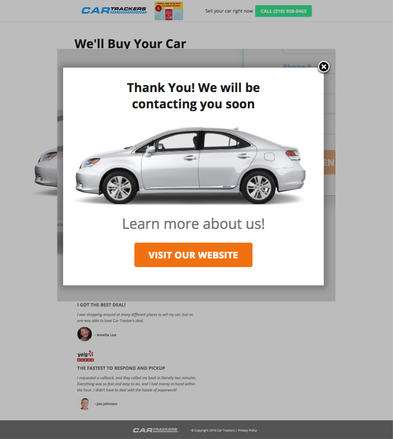
Even though you’ve already captured a conversion at this point, thank you/confirmation pages are a crucial step in the funneling process. Here’s why:
- They let the customer know that their inquiry/information has been received.
- If the goal of the page was to download a whitepaper or guide, this is where the download link should be.
- The thank you page allows for next steps, like a link to homepage or social media for more information. It can also have other exploratory links like “you might also be interested in…”
7. Personalized email
Keep the customer warm by thanking them for signing up with you. You never know if he or she might be interested in repeat purchases or conversions down the line.
A thank you email provides immediate value to the customer. You can custom tailor your email to sound more personal. This makes a great first or even final impression.
Like the thank you page, this is another great opportunity to be specific about what can be expected in the next steps: Will they be receiving a call? When? If they started a free trial, has that gone into effect? If they’ve signed up for a demo, when will the demo happen?
Use custom fields to personalize emails and add them to specific messaging drips, depending on their specific interests and needs, ensures the messaging is always relevant and provides value. Thus, as potential customers move through the four stages, they should also be added and removed from email drip campaigns accordingly.
You can also use email marketing to drive repeat purchases or conversions and turn your customers into promoters. Offer similar recommendations or let them know if a product upgrade is coming out for which they might be interested in.
You can also send out surveys via email in an attempt to improve your product/service offerings and messaging, in turn, optimizing your conversion funnel better for a particular target audience.
BONUS: 8 tips for a better funnel
1. Get visitors to make a small commitment
You wouldn’t marry someone on the first date, would you?
Well, maybe some of you would. But the point is that it’s easier to start a free trial than buy a membership. It’s even easier to download a free guide than start a trial; there’s a big difference between asking for an email and asking for a credit card. This is dependent on where your leads are in the sales funnel, and it needs to be considered in your CTA.
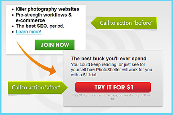
For instance, Photoshelter was able to double their sales because they discovered their visitors were anxious to test the product before purchasing. They also discovered that people who tested the product were more likely to continue using it.
Based on that information, they decided to add a $1 trial offer to their sales page.
Multi-step landing pages, which we talked about earlier, are another way of getting leads to micro-convert.
There’s nothing in the world that you can do to get 100% of your website visitors to convert. All you can do is try to widen the bottom of the conversion funnel from, say, a mere 4% to 17%. With that being said, there are plenty of things you can do to increase your chances of conversion.
2. Use the decoy effect to increase conversions
By incorporating a false choice, like an overpriced product option, into your lineup, you make your preferred offer not seem so bad anymore.
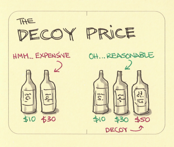
Dan Ariely, Professor of Psychology, tested this theory on his students with a simple experiment.
He asked them to choose from three magazine subscriptions, and the results were as follows:
A) Online subscription – $59 (chosen by 16 students)
B) Print version only – $125 (chosen by 0 students)
C) Web and print subscription – $125 (chosen by 84 students)
As you can see, almost all students chose Option C, as it appeared to be a better deal overall.
This is the Decoy Effect in action. Explore how you can use this idea on a product page.
3. Use exit-intent technology to increase conversions
Give your visitors additional value with discounts, contests, or special limited-time offers. This can create a huge fear of missing out.
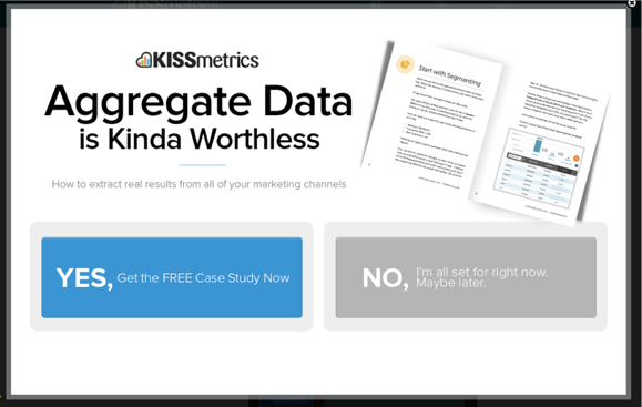
If you can’t get them to complete the action you wanted, you can at least get their information with another deal — the ol’ switcheroo.
This is an easy strategy for any eCommerce company to employ cart abandonment tactics. If somebody adds an item to their shopping cart, it’s a no-brainer to go after them with a second attempt.
Liking the sound of that? Here’s 22 exit-intent hacks to get your brain spinning.
4. Use heatmaps, polls, and chats to learn how your audience thinks
If your customers are not telling you directly what they don’t like about your product or service, it’ll be very hard for you to improve.
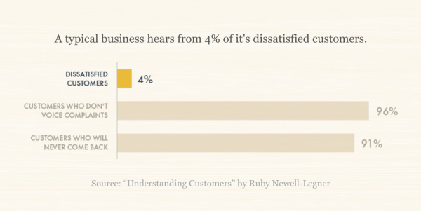
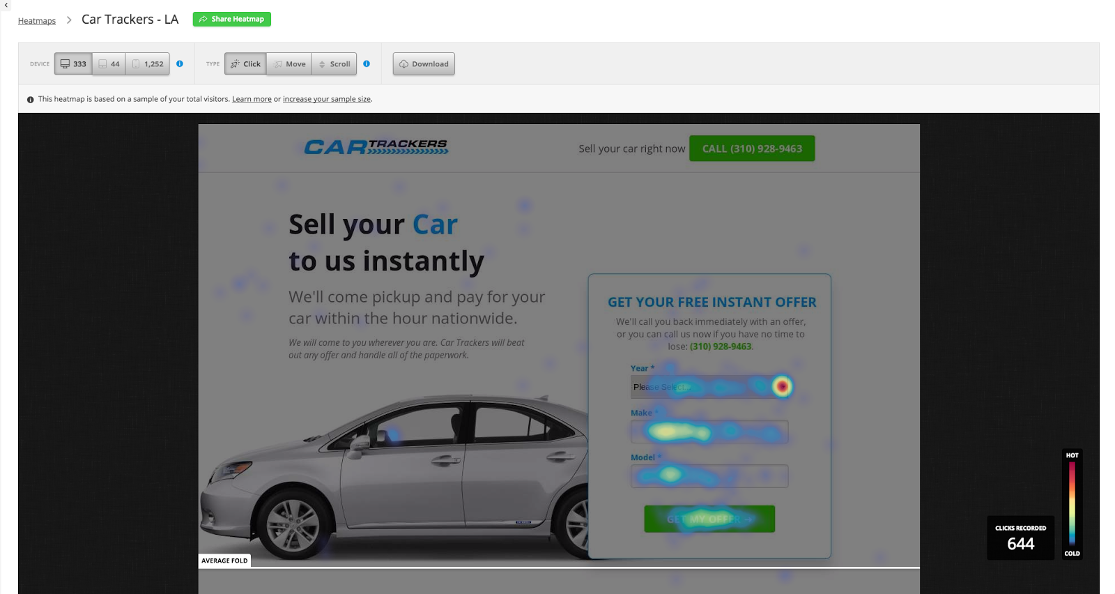
A great tool to get feedback from website and landing page visitors is HotJar. You can create heatmaps, polls, and surveys. Heat maps show where your visitors are looking and engaging.
Further reading: Heatmaps: A Secret Weapon For Understanding User Behavior
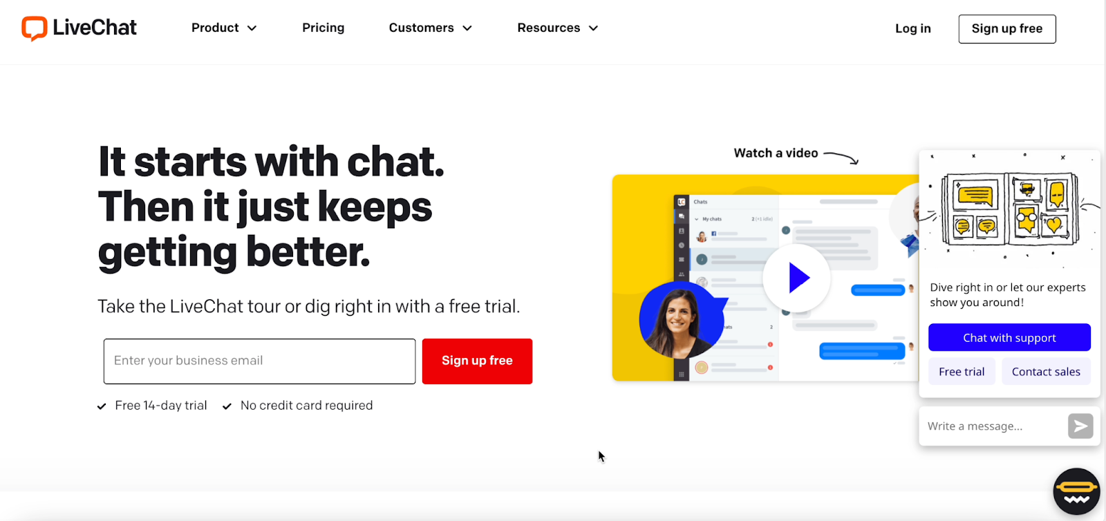
Chat boxes like Olark, Intercom, or Live Chat are also useful to find out what’s up with your visitors while they are browsing or engaging on your website & landing page. Try to resolve any issues or answer any questions before they leave your website & landing page.
Further reading: 13 Ways To Use A Chatbot For More Conversions [With Real Results]
5. Improve your site’s speed
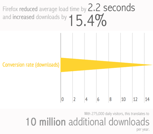
Fact: A one-second delay in page response can result in a 7% reduction in conversions.
And when Firefox reduced average load time by 2.2 seconds, they increased conversions by 15.4%.
The biggest things you can do to help speed things along are:
- Change Your Web Hosting
- Resizing Your Images with Tinyjpg(dot)com
- Compress Your Site with Gzip
- Use Chrome User Experience Report
Google has a free tool called PageSpeed Insights that can give you a quick glance at the speed of your website. The assessment is based on what they call Core Web Vitals.
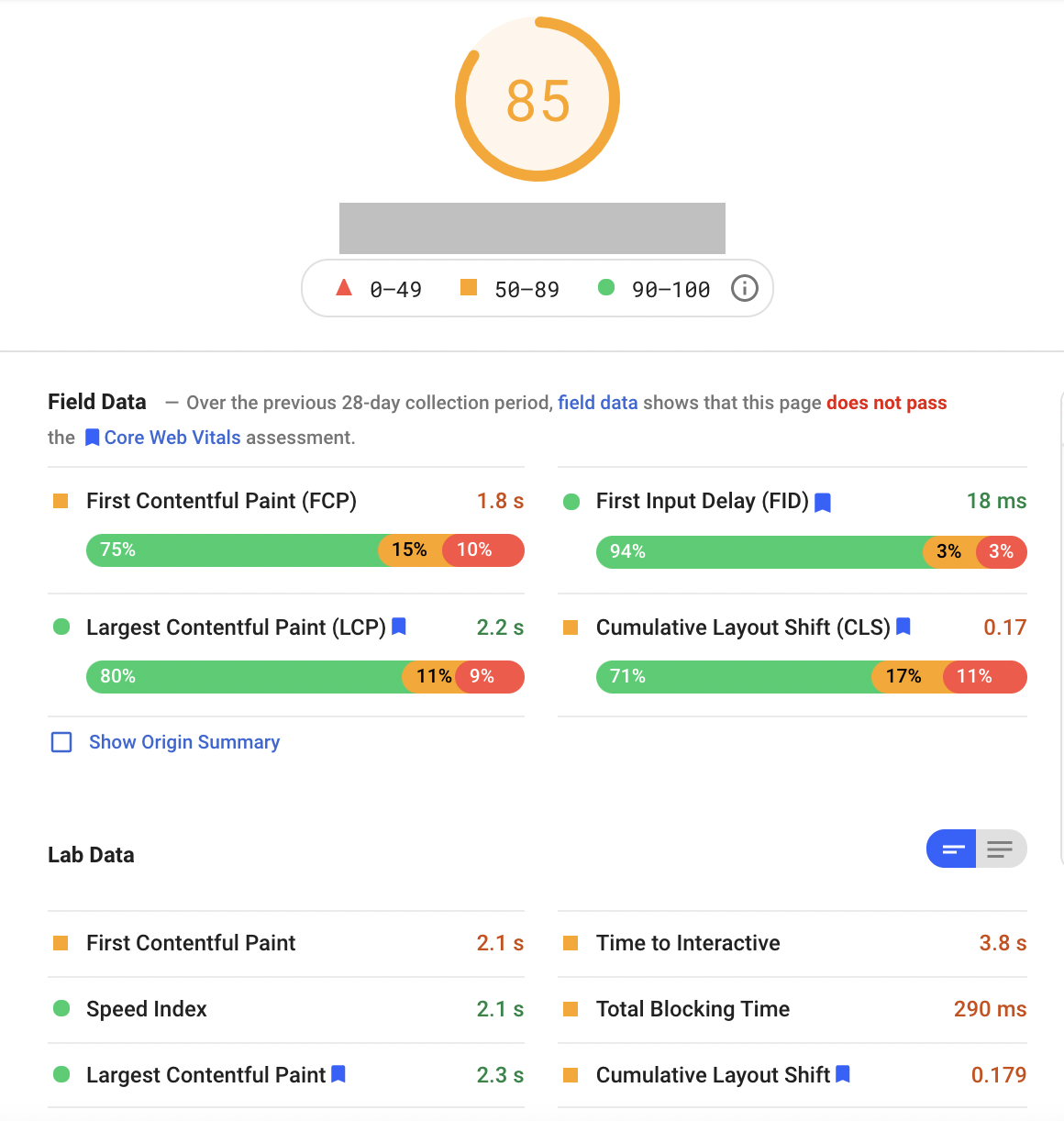
The data from PageSpeed Insights will allow you to quickly assess performance without requiring you to manually instrument analytics on your pages.
An added bonus is that faster website speed will increase your page performance and SEO.
Further reading: 6 Sure-Fire Page Speed Tips For Your Fastest Page Ever [2022 Research]
6. Start testing (and don't stop)
Figure out what your audience responds too. You can guess all day, but testing will give you the facts. You'd be surprised at what a big difference a small adjustment can make. Take MOXĒ for example. By testing different headlines and CTAs, we were able to find a version that increased conversions by 30%.
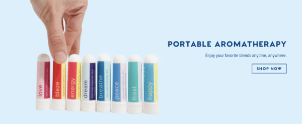
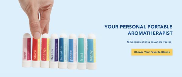
It doesn't need to be complicated. As long as you can start with a good hypothesis and be able to accurately measure an outcome, you can constantly be testing for optimization opportunities.
Not sure where to start? Here are our favorite 15 low-effort, high-value A/B testing ideas to boost conversions.
7. Use positive framing to persuade and convert more people
A study in Scientific American found that the human preference for positive information deeply rooted in our minds.
In the real world, this manifests in fields ranging from marketing to medicine:

If you want to maintain the urgency of FOMO while portraying your offer positively, Neuromarketing recommends expressing the problem or risk in negative terms, and your solution using positive framing.
8. Increase conversions with dynamic text replacement
With PPC, you're usually targeting several keywords, but only have one landing page.
A solution for this is dynamic text replacement. Text on your page will automatically switch out with what your prospect searched.
An example of this is below with our client Yumpu. Prospects were searching to turn their PDFs into flipbooks, newspapers, catalogs, and books. We made “flipbooks” dynamic to accommodate any of those search terms. This makes the messaging more personal and specific to the prospect’s needs, which can help increase the chances that they’ll convert.
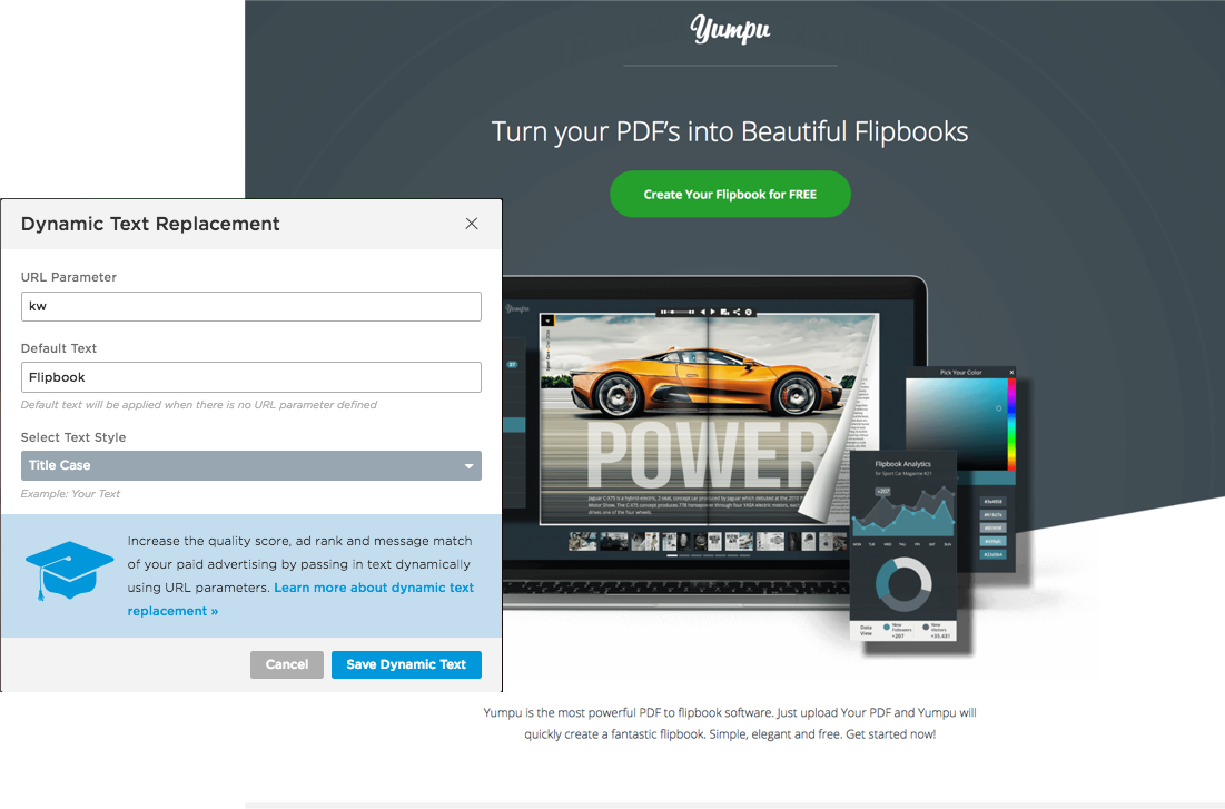
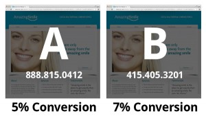
You can also use geographic specifics such as “Find the best rates in Phoenix” and “Phoenix” would switch out for whatever city the prospect is searching.
Callrail allows for dynamic phone numbers. Statistically speaking, customers are more likely to call a phone number that appears local than an 800 number. The more local, relevant, and personable you can appear, the better.
Armed with these eight tips, you should be in good shape to really create an experience for your visitors, leads and even customers that is unmatched by your competition.
Time to optimize your funnel
If creating and optimizing your conversion funnel was easy, all marketers would be rolling in dough.
The whole point of having a conversion funnel is to break the journey down into sections. Each section has its own purpose, its own goals, its metrics.
With that, they each have their own strategies—from the minute details to the big picture concepts. The practice of conversion rate optimization (CRO) digs into all the small details.
Now that you have a solid overview of what a conversion funnel is and what to look for, you’re ready to dive into the strategies for the top and bottom of the funnel.
With enough research, time, and tweaks followed by analysis and a/b testing, you will start to see more traffic, more conversions, and ultimately more sales.
