


Digital marketing is known for its ubiquitous use of metaphors.
Drive traffic. Win customers. Nurture prospects. Close deals. Hack your marketing funnel (WTF?).
But my favorite metaphor is “land.” It’s not even close, actually.
As if your website visitors descended from the heavens of the Internet, with their cute little cloud-shaped parachutes, GoPros strapped to their foreheads, adorned in safety goggles and helmets, and landed directly on the cushy landing zone/runway below “HTTPS.”
Cute, amiright?
But landing pages are more than just imagined (and super cute) metaphors for your visitors' final destination.
And the truth is, even though your website visitors can “land” on any cushy page of your site, not every page is a landing page.
🤯🤯🤯 We know.
In this article, we’re going to get to the bottom of the internet’s runway once and for all. By the end, you'll have a solid understanding of all the landing page basics so that you're ready to become an expert by going through our entire landing page guide.
Get brand new landing page strategies straight to your inbox every week. 23,739 people already are!
What is a landing page?
A landing page (AKA “lander” or lead page) is a dedicated page on your website built to convert specific sources of traffic, like ad traffic or promotional traffic, faster and better than any other page.
Unlike a normal page on your website (e.g., home page or service page), a landing page doesn’t live in your main navigation, it’s not indexable by search engines (landing pages don’t get SEO), and not everyone will see it.
Most importantly, a landing page doesn’t send traffic to other pages; it is the destination. The goal of every landing page is to provide the information, urgency, and motivation needed to act now, not later. That means no outbound links in your logo, in the navigation, or anywhere else on the page.
Whether a lead, download, subscription, or purchase, whichever goal you set, the purpose of your landing page is to help complete it instantly.
💡 Further reading: Why Use a Landing Page? 45 Conversion-Related Reasons.
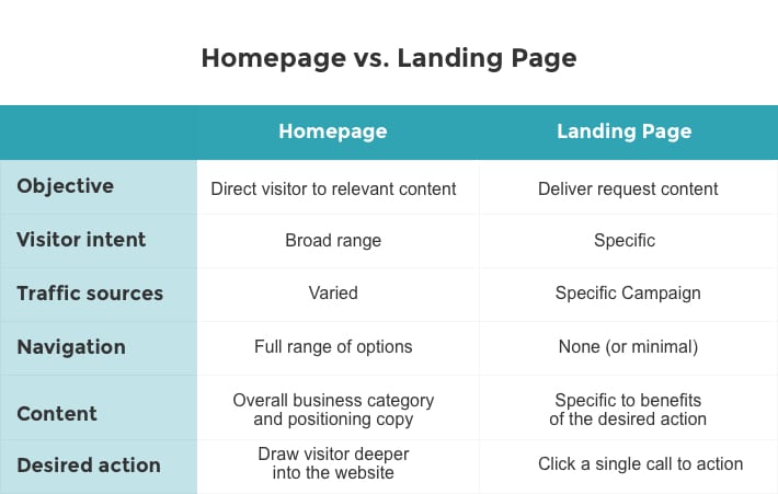
Landing page vs. homepage
Visitors can “land” on many different pages of your website.
But not every page on your website is a landing page.
If you didn’t design and develop the page for a specific source of traffic and marketing campaign (and not other sources or campaigns), and it doesn’t provide an offer and call-to-action (CTA), then it’s not a landing page.
As we like to say, think of your homepage like a bridge to conversion (or many different bridges to conversion). Visitors can enter on the home page and navigate to a specific page with ease, but the goal of the home page is not to convert traffic—it’s to offer a bridge to a page that does. A landing page, on the other hand, provides no such bridges; it converts traffic within one seamless page experience.
💡 Further reading: Landing Page vs. Website: How They’re Different (And Which is Better)
Don’t let Google fool you
Inside Google Analytics, if you navigate to behavior > site content > landing pages, you’ll see an entire dashboard of metrics related to “landing pages.”
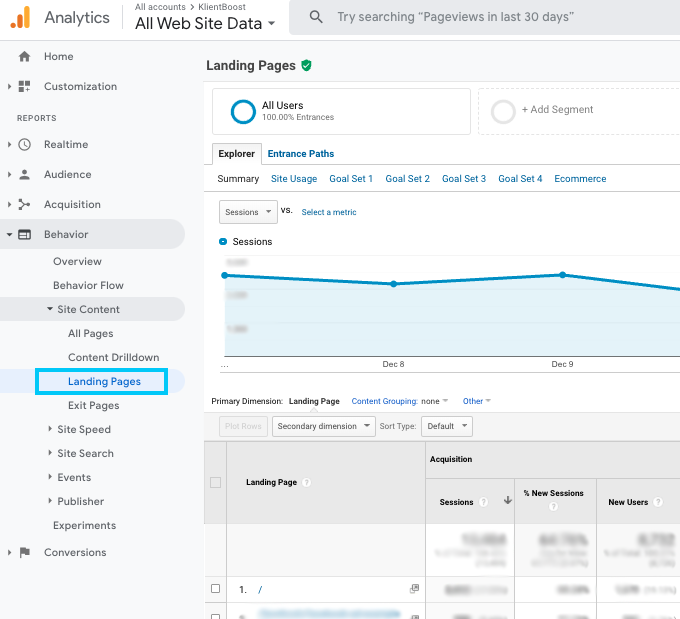
These are not real landing pages like the ones we’re discussing in this article; they’re any page through which visitors entered your website.
Your real landing pages will also show up here, but Google also considers your home page, contact page, blog posts, or services pages “landing pages” in this instance.
Benefits of landing pages
Good landing pages offer tons of benefits, but five stand out as the most important:
- Focused
- Frictionless
- Easy and scalable
- Testable
- Measurable
1. Focused
With a landing page, you can create a hyper-relevant experience for a specific segment of your addressable market.
Everything from the headline to the subheading to the body copy to the offer of a landing page is tailored to a specific audience and goal. Nothing else.
Focus skyrockets conversions: 46% of landing pages contain more than one offer, but including more than one offer can decrease conversion rates by 266%.
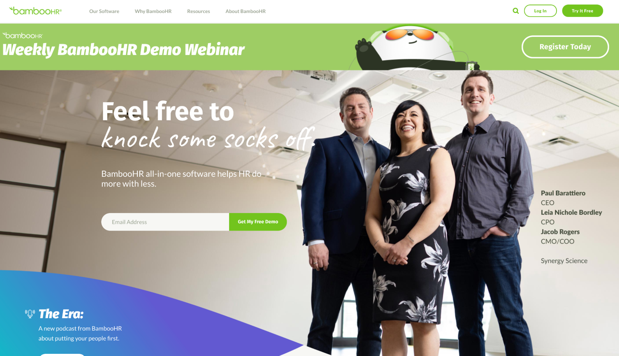
For example, if we look at Bamboo (HR software) homepage, we get a broad message that speaks to every vertical:
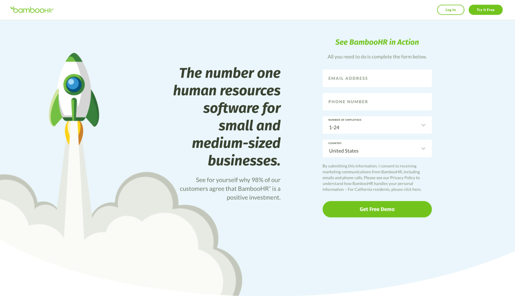
But if we look at one of their landing pages, they use a tailored message targeted toward their small business (SMBs) target segment:
2. Frictionless
You’ve likely heard that humans have a shorter attention span than goldfish. It’s total B.S., but we do get easily distracted when we’re burdened by choice.
A landing page eliminates friction, tempers anxiety, and creates a clear and unabated path to conversion by removing choice—and it works.
The average conversion rate of a landing page is 9.7% (much higher than any other page) and businesses see an increase in leads by 55% when they increase the number of landing pages they have from 10 to 15.
💡 Further reading: 38 Landing Page Stats Every Marketer Should Know.
3. Easy and scalable
Though content management systems (CMS) like SquareSpace and Wix, and software like Elementor for WordPress, have made website creation easier for non-coders, adding a new web page usually requires help from the design and development departments.
Any way you slice it, when a piece of creative needs to touch multiple departments before going live, you’re bound to run into hang-ups.
Not with landing pages.
Loads of landing page builders (software) exist that help you create landing pages from templates in minutes using a what What You See Is What You Get (WYSIWYG) drag-and-drop editor (no coding required).
Anyone can create a landing page with the right software, even non-tech roles like writers, designers, project managers, and content marketers. Which makes landing pages easier to create, faster to publish, and more scalable than a website.
4. Testable
Have you ever tried running an A/B test (AKA “split test”) for a normal website page, sans software?
Not so easy.
But with landing page software, creating multiple versions of the same page and distributing traffic between variants is baked into the service. Literally, you don’t have to manage any of the technical aspects that make an A/B test work. The software will even collect the data, measure conversion rates, and crown a winning variant.
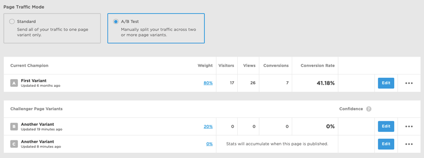
💡 Further reading: 9 Landing Page Split Testing Ideas for More Conversions
5. Measurable
When it comes to PPC, since landing pages function as the only website page a specific campaign’s traffic will land on (and traffic unrelated to the campaign won’t dilute the data), attribution is easy.
You can close the loop, from click to conversion (ad to thank you page), all in one ecosystem. Which makes measuring cost per conversion and conversion rates much easier.
The same applies to content upgrades, webinar registrations, or email subscriptions: since the landing page is the only page you can opt-in from, measuring click-through rates (CTR), conversion rates and goal completions is black and white.
When should you use a landing page?
You can use a landing page for virtually any kind of campaign. There are no rules, but let’s explore some of the most common use cases:
- Direct response campaigns: PPC, radio, email offer, or a billboard with CTA
- Promotional campaigns: flash sale, free trial, giveaway, contest, content series
- Even registration: in-person, meetup, conference, or virtual events
- Webinar registration: live or on-demand webinars
- Content upgrades: lead magnets, downloads, whitepapers, courses, tools, free ebook
- Coming soon: early bird access, launch notifications, product reservation, waitlist
- Email subscription: newsletter, drip email campaigns, course, subscriber-only content
- Surveys: customer surveys, NPS, market research
- Referral programs: discount codes, referral links, affiliate programs
Types of landing pages
Landing pages come in all shapes, sizes, speeds, and colors.
In general, you can group landing pages into two primary categories
- Click-through landing pages: When the visitor can complete your conversion goal on their own
- Lead capture landing pages: When you need to qualify or collect contact information before the prospect can move forward
Click-through landing pages
A click-through landing page is a landing page without a form. Instead of a form, it uses a call-to-action (CTA) button that visitors have to “click-through” to move from landing page to conversion (which is usually a shopping cart or checkout page).
When should you use a click-through landing page? For bottom-of-the-funnel offers when visitors can complete their purchase or conversion online without the help of a sales rep.
Common CTAs used on click-through landers include:
- Add to cart
- Buy now
- Try it free
- Get started
- Buy now
- Apply now
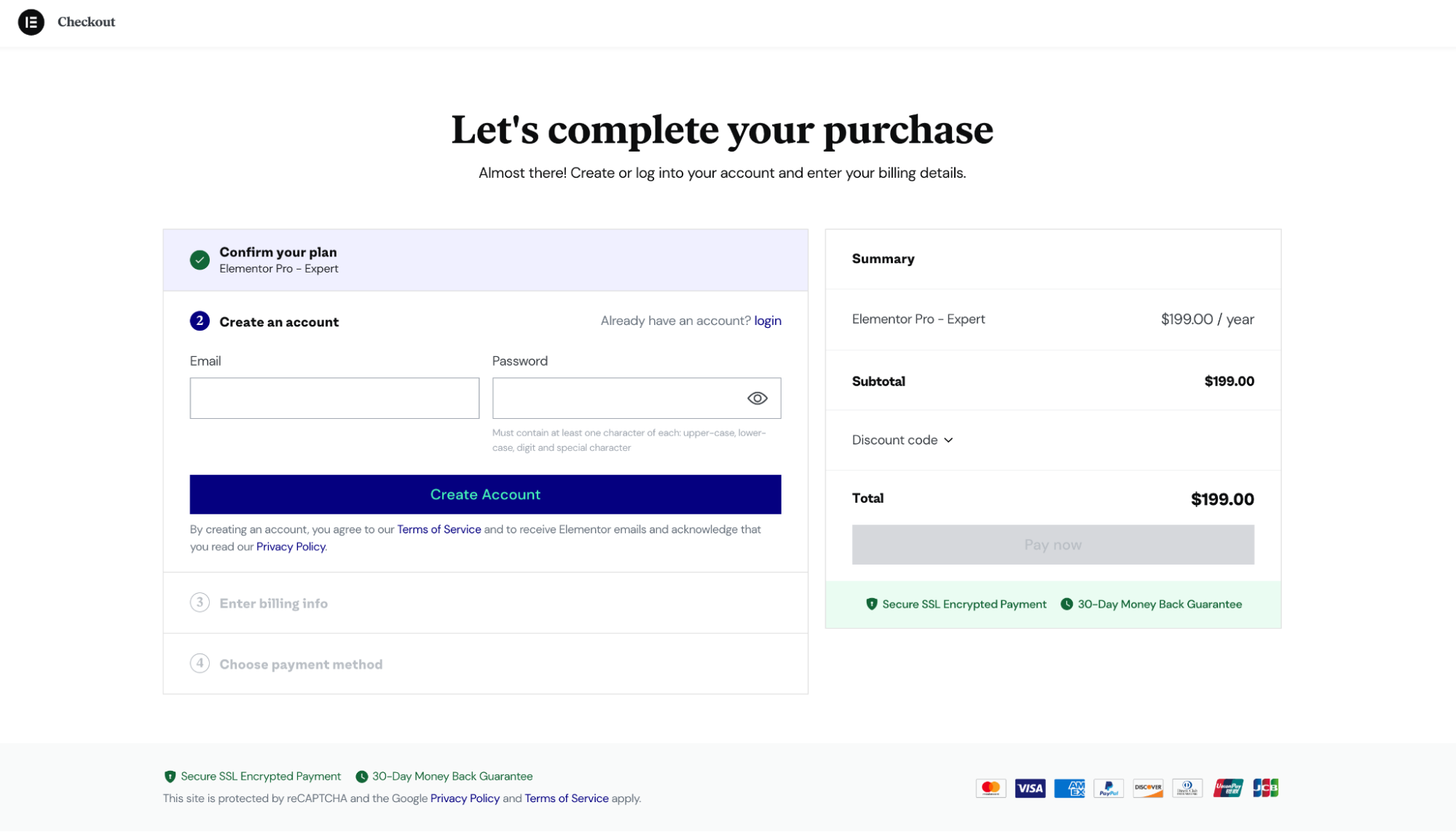
For example, this Elementor lead page uses the “buy now” call to action:
When you click on “buy now,” it takes you to a checkout page where you can complete your purchase:
Lead capture landing pages
A lead capture landing page (or lead generation landing page) is a landing page that includes a form for visitors to submit their contact information through.
Typically, lead gen forms ask for a combination of contact information and demographic/firmographic information like business size, number of employees, or website URL.
Use lead capture landing pages when you want to qualify leads before selling a service, or when you want to collect first-party data in exchange for a download like a guide or a whitepaper.
Common lead capture landing page CTAs include:
- Request a quote
- Get proposal
- Sign-up
- Book a demo
- Submit
- Download
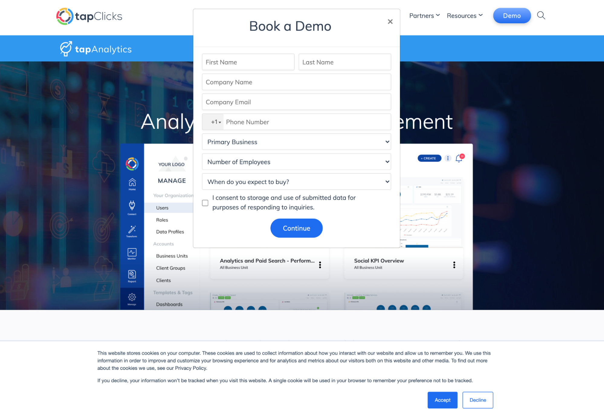
For example, this TapClick lander uses a “Book a demo” CTA that pops up a form when you clock on it:
Another popular example of a lead capture landing page is a squeeze page.
A squeeze page is a landing page specifically designed to capture emails (just emails) in exchange for something exclusive, like a download, webinar, newsletter, or membership.
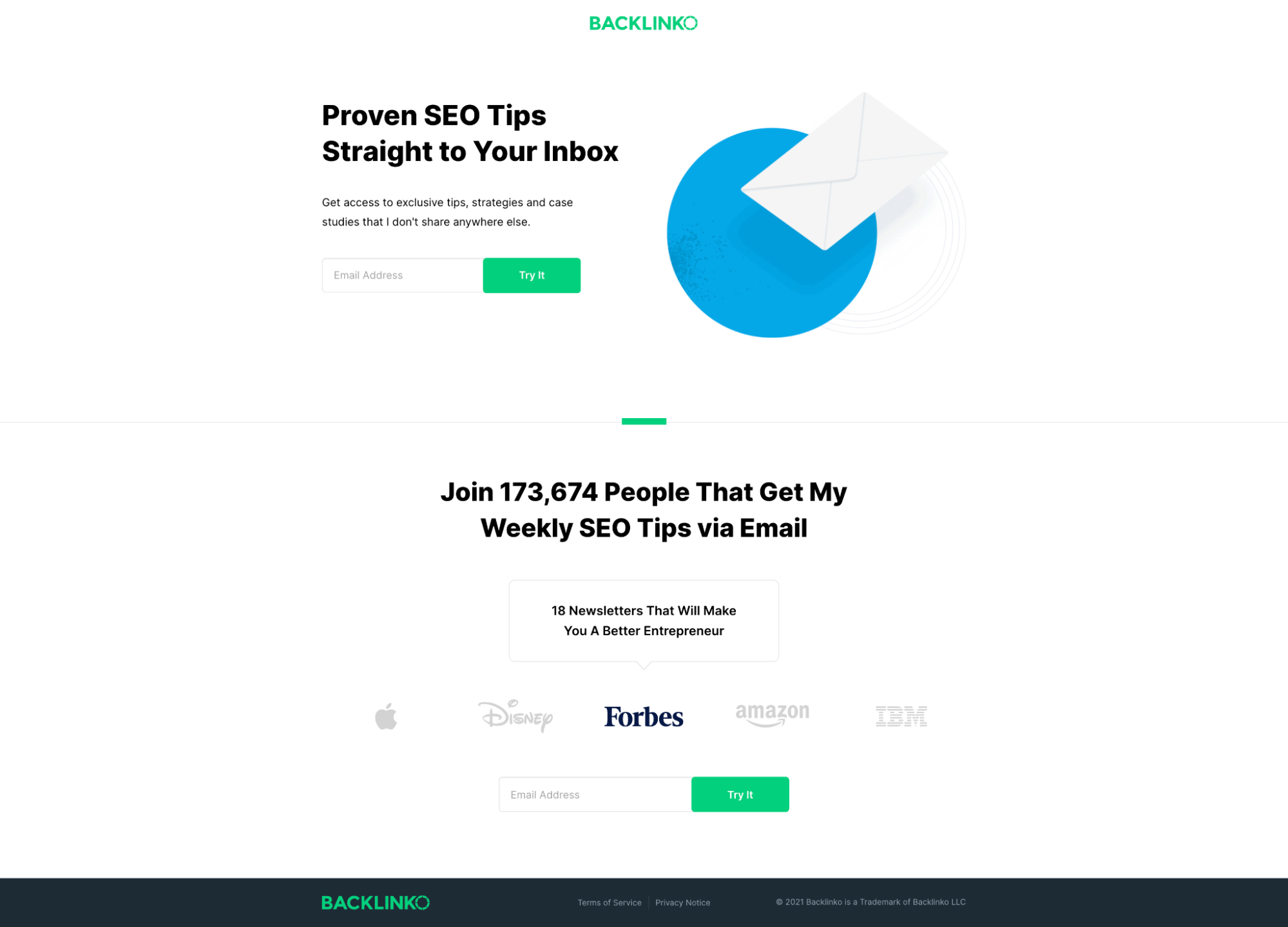
For example, this Backlinko squeeze page helped Brian Dean grow email subscribers to over 170,000 subscribers:
Elements of a high-converting landing page
Lucky for you, we wrote an entire article on how to create the perfect landing page: Landing Page Layout - The Science Behind Conversions.
But let’s review the core elements of a high-converting landing page in brief.
- Headline: Your headline delivers your most compelling value proposition while crystallizing your offer. It should answer the question: what will I gain from this?
- Subheadline: Your subheading directly follows your headline, and it helps support your value proposition by building urgency and motivating a desired action.
- Benefits and features: Features explain what your offer includes. Benefits explain why those features will change your life. Good copywriting is heavy on the latter, light on the former.
- Hero shot: Your hero shot is a primary visual that sits above the fold and provides visual context to your value proposition.
- Social proof: Social proof refers to testimonials, reviews, case studies and publicity. I.e., third-party recommendations that support your offer and value proposition.
- Call-to-action: Your CTA copy tells visitors how to complete the conversion. It’s like the sign hanging above the checkout aisle at the grocery store that tells shoppers exactly where to go to buy.
- Confirmation page: Though not a part of the actual landing page, a confirmation page is where you send visitors after they convert. No conversion process is complete without one. Use a confirmation page to let visitors know what to expect next or to share valuable resources.
- Design: A well-designed landing page uses visuals to add emphasis, incorporates a lot of white space, uses guiding lines to direct attention, and builds trust by repeating design elements, styling consistently, and leveraging smooth transitions.
- Video: Not all landing pages include videos, but videos can improve conversion by 86%.
- Forms: Not all landing pages need forms, but for the ones that do, forms should be short, concise and frictionless. The more form fields, the lower your conversions, which is why we like to use the breadcrumb technique for forms.
- Fast loading: Last, but certainly not least, page speed. Like any other page on your website, your landing pages should load within 1-2 seconds. Conversion rates drop by 4.42% for each additional second of load time (0-5 seconds).
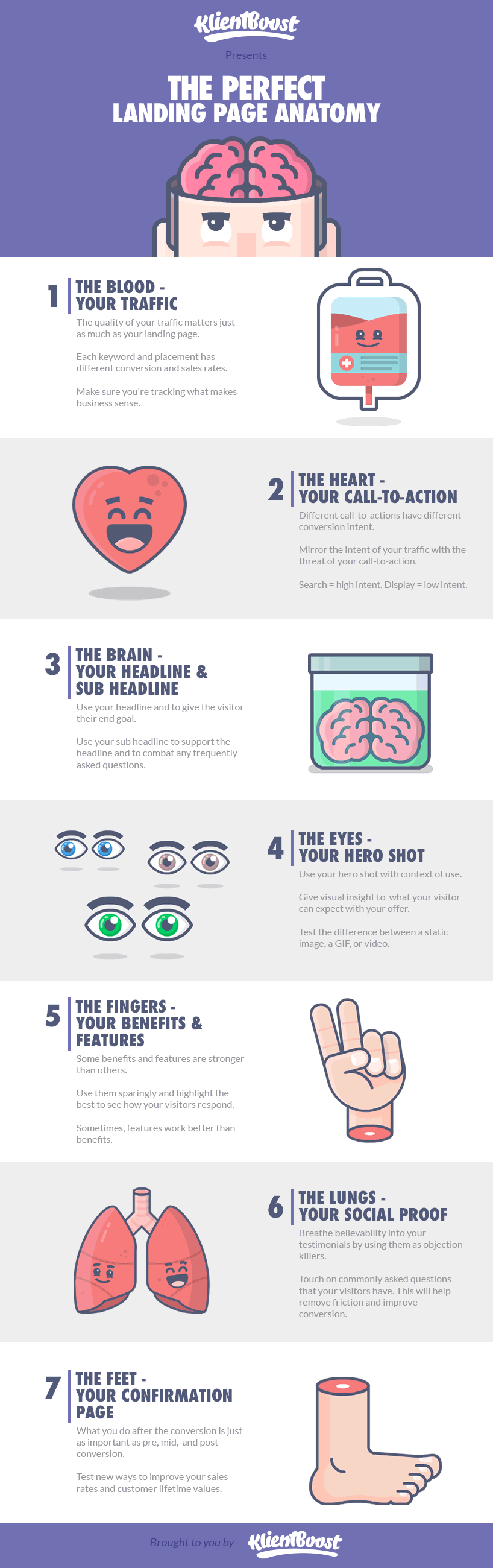
Bonus: Check out this infographic on landing page anatomy.
💡 Further reading: 11 Go-To Strategies for A High Converting Landing Page.
Landing page examples
Whether a lead generation lander or a click-through lander, depending on the industry or goal, landing page design varies dramatically.
Good news: we wrote individual articles exploring a few different categories of landing pages, complete with detailed descriptions and examples.
- Startup landing pages
- eCommerce landing pages
- B2B landing pages
- PPC landing pages
- Mobile landing pages
- Mobile app landing pages
- SaaS landing pages
Let’s explore three of our favorite landing pages from 2021.
1. Gusto (HR software)
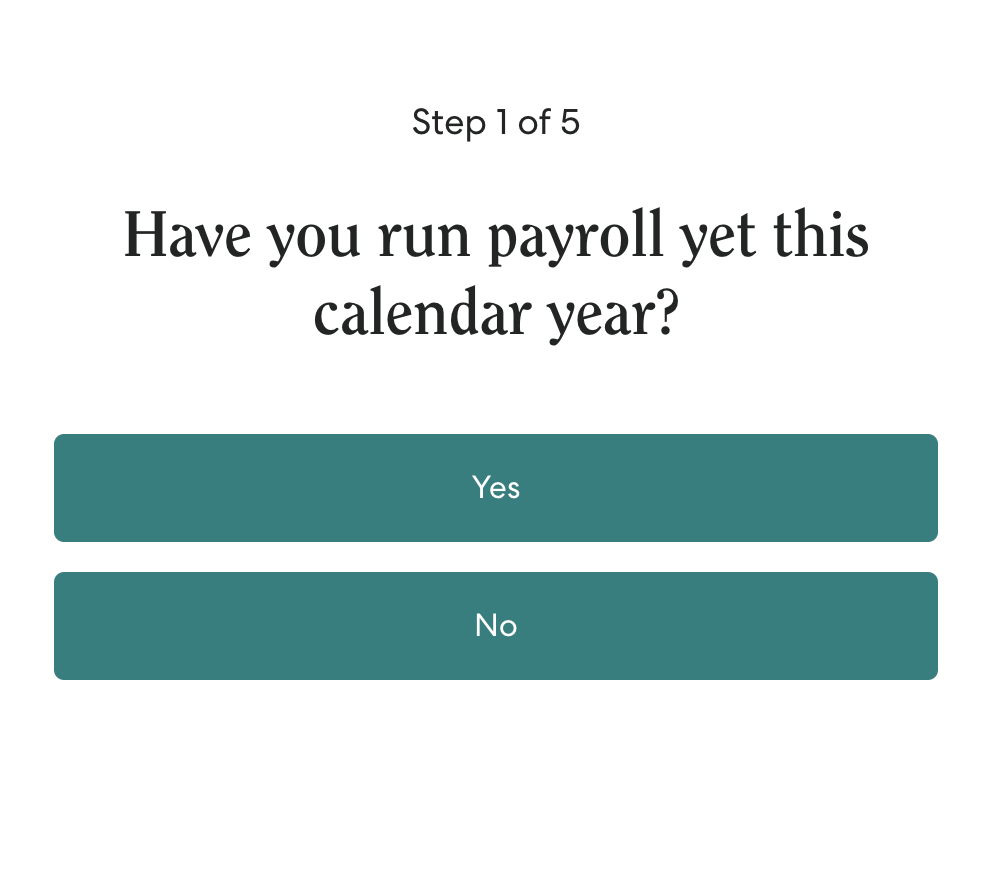
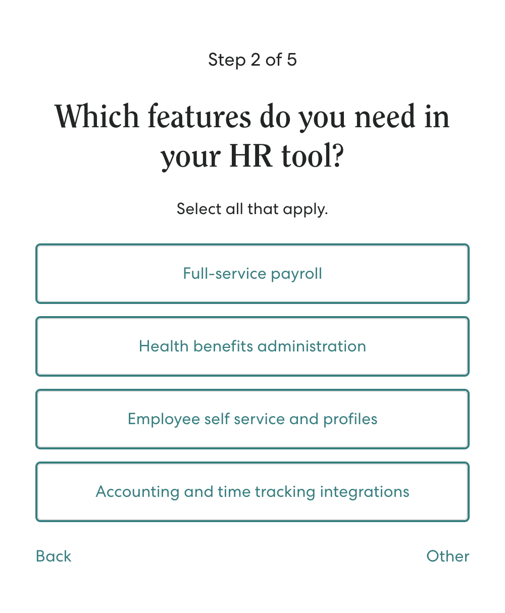
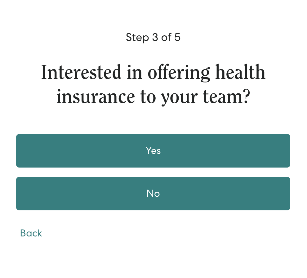
Gusto uses a standard lead capture landing page and form (with built-in logic) to qualify leads directly from the lander. How? By using the KlientBoost breadcrumb technique. The breadcrumb technique takes multiple form fields and breaks them up into smaller, less intimidating stages. It also follows a progressive sequence from least intimidating question (noncommittal question) to most intimidating ask (contact info) so visitors can micro-convert their way to a full conversion (at a much higher clip).
Favorite aspects:
- Breadcrumb technique
- No distracting navigation
- Features/benefits
- Design
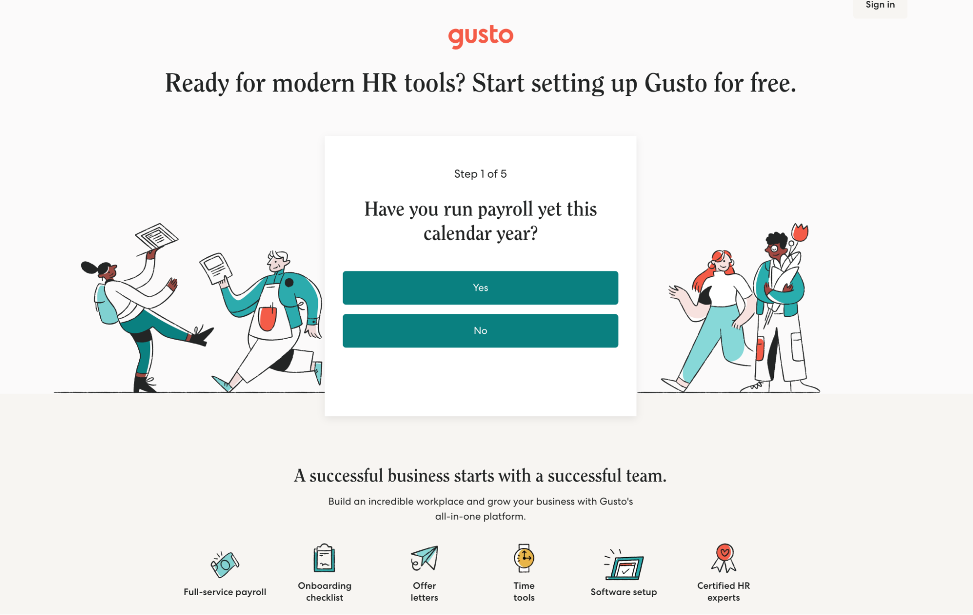
For example, here’s the hero section of the lander:
It includes five form steps:
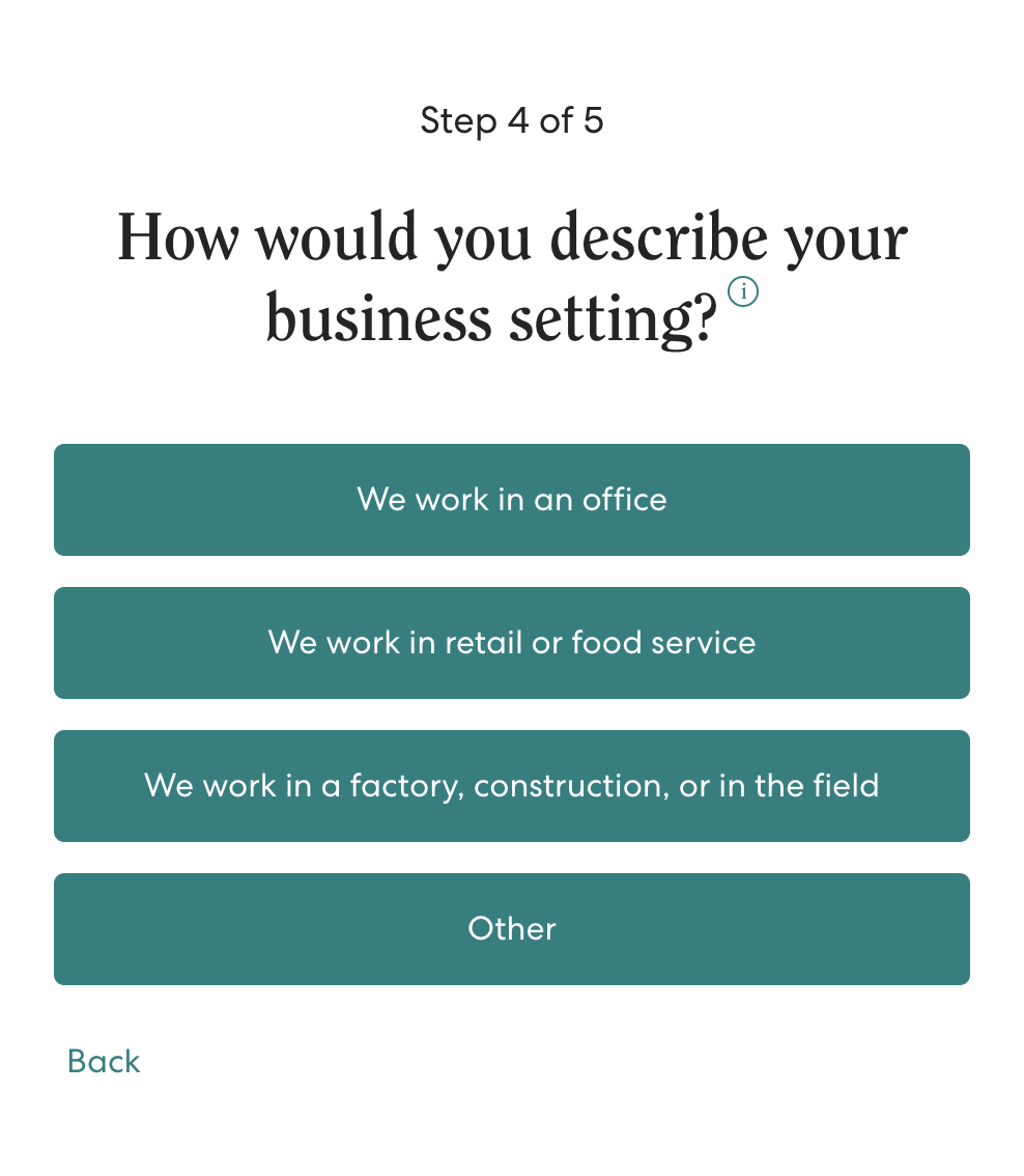
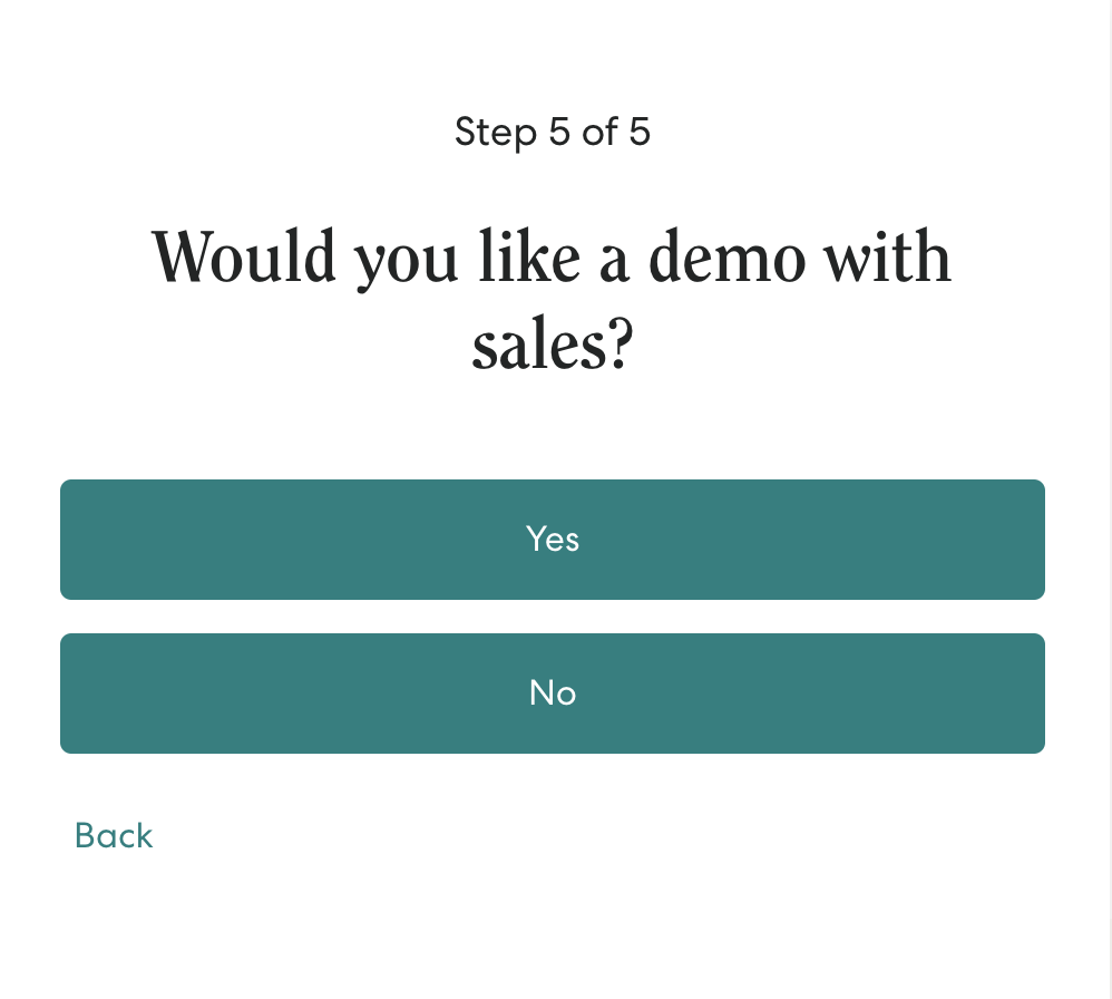
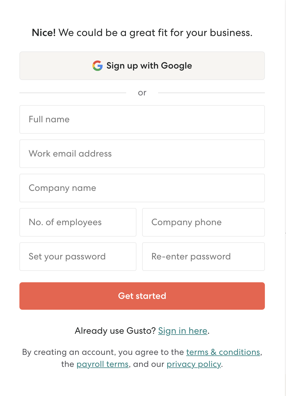
And last, no matter how you answer, you’ll hit the lead capture form, only by now, Gusto knows exactly what you’re looking for in an HR partner.
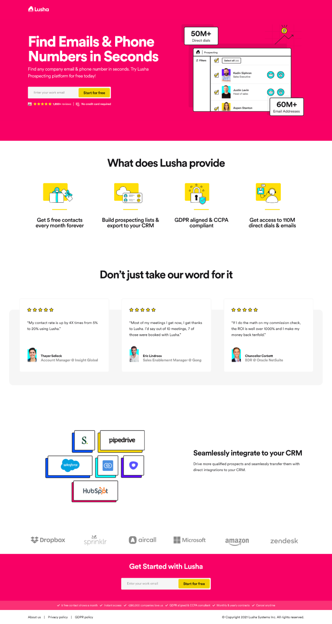
2. Lusha (email prospecting software)
This Lusha social media PPC landing page is a crash course in landing page design: clear and concise value proposition, mobile-optimized, social proof at every major friction point (star ratings, testimonials, client company names), single offer with call-to-action (“start free”), no distracting navigation.
Favorite aspects:
- Single offer + CTA
- Social proof
- Value prop
- Brevity
- No navigation/exit opportunity
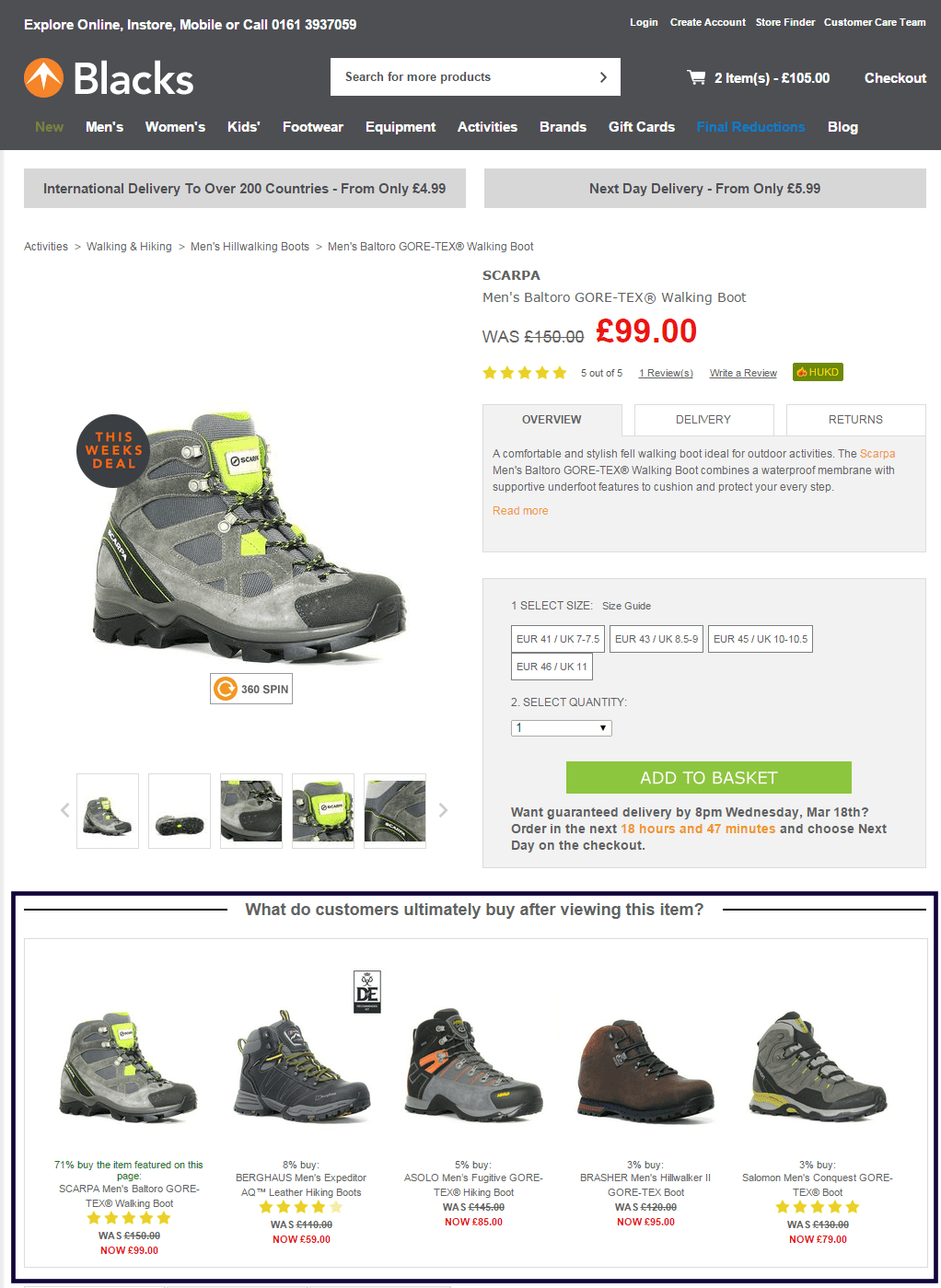
3. Blacks (ecommerce store)
Blacks product lander may not be the most beautifully designed product page, but it has one feature that makes up for it: product recommendations. Not only does Blacks tell visitors what people who viewed this item actually bought after, but they tell you what percent of visitors bought what product. Brilliant.
When it comes to eCommerce, personal recommendation widgets convert big. According to a study done by Barrilliance, an eCommerce SaaS company, 31% of websites’ revenue was attributed to the personalized product recommendations concept.
Favorite aspects:
- Personalized recommendation widget
- SmartInsights tested over 20 different headlines, and this one (“What do customers ultimately buy after viewing this item?”) won—that’s some smart conversion rate optimization (CRO) right there

Landing page software
Remember the landing page builders we mentioned earlier? Ya know, the ones that make landing page creation, testing, and measuring super easy?
Well, they’re everywhere.
Not only do landing page softwares exist, but most email marketing automation (e.g. MailChimp), webinar and event softwares (e.g. LiveStorm), online course builders (e.g. Kajabi) and marketing platforms (e.g. HubSpot) include landing page builders too.
We won’t list them all, but here’s a list of some of our favorites (each for a different purpose):
- Unbounce: Best all-around landing page builder
- LeadPages: Most affordable landing page builder
- Shogun: Shopify landing page builder
- ConverKit: Best landing page builder for creator businesses
- ClickFunnel: Best landing page builder for sales funnels
- WishPond: Most affordable marketing platform with page builder
💡 Further reading: 10 Best Landing Page Builders For Every Use Case
Bonus landing page tips
Congrats, you’re at the end of the beginning of a massive landing page rabbit hole.
To learn more about how landing pages can bolster your online marketing strategy, read the further reading suggestions mentioned earlier in the article, along with these three resources:
- 34 Common (& Uncommon) Landing Page Best Practices
- 41 Marketing Psychology Examples to Boost Landing Page Conversions
- 37-Point Landing Page Checklist
If you already have landing pages built but want to get some feedback, run your URLs through Unbounce’s free landing page analyzer tool.
Happy converting 😊


