


Get landing page copy right and you’ll turn the casual visitors who land there into loyal customers. The story you tell on your landing page is a pitch that works around the clock, speaking to thousands of potential customers while you sleep.
If you take nothing else away from this page, take this:
Tell that story from the point of view of your customers. Don’t talk about how great your product is. Talk about why your product is the perfect fit for them, how quickly it will solve their problems, and what that will fees like revenue-wise.
If your landing page copy doesn’t resonate with the person reading it, your conversion rates will plummet… fast. 😅
TL;DR
- Benefits of writing persuasive landing page copy
- How to write landing page copy that converts
- 1. Start with a single conversion goal
- 2. Align landing page copy with intent
- 3. Message match your ad and landing page copy
- 4. Communicate your unique value proposition with crisp copy
- 5. Infuse your landing page copywriting with your customers' words
- 7. Make eye contact when you speak (it’s a conversation)
- 8. Keep your landing page copywriting concrete
- 9. Emphasize benefits over features
- 10. Increase motivation with your CTA copy
- 11. Say it again, but differently in your final CTA
- 12. Format your landing page copy for web skimmers
- 13. A/B test your landing page copywriting
- Your 9-point landing page copy template
- What's the biggest mistake people make with landing page copy?
- Landing page copy speaks to prospects in a way they “get.”
- Frequently asked questions
Get brand new landing page strategies straight to your inbox every week. 23,739 people already are!
Benefits of writing persuasive landing page copy
Writing persuasive copy drives more landing page conversions (so you hit your business goals). A well-written landing page can help you
- Increase conversions across marketing campaigns including PPC campaigns
- Drive up qualified leads
- Build trust and credibility with potential customers
- Differentiate your business from its competitors
- Improve brand awareness and recognition
- Enhance the overall user experience
That’s just to name a few. Now, let’s dive into the how.
How to write landing page copy that converts
People say writing landing page copy that works is hard if you’re not a natural born wordsmith.
That is malarkey.
All you need is a guide that collects best practices into one spot. And that’s what you get right here. 😉
1. Start with a single conversion goal
What’s the one action you’re hoping your visitors take?
- Download a content resource
- Sign up for a free trial
- Book a demo with your sales team
- Register for a webinar
The more conversion goals you add to your landing page, the harder it gets to write compelling copy for each. What this all boils down to is that your conversion rates are now at risk of falling.
In fact, including more than one conversion goal (offer) on your landing page has shown to plummet conversion rates as much as 266%.
So before you sit down to write your landing page copy, define the single goal you want your visitors to accomplish after they land on your page. Then build your copy around that goal.
Whichever goal you choose becomes your call-to-action (CTA), and every word that follows should convince visitors to click on it.
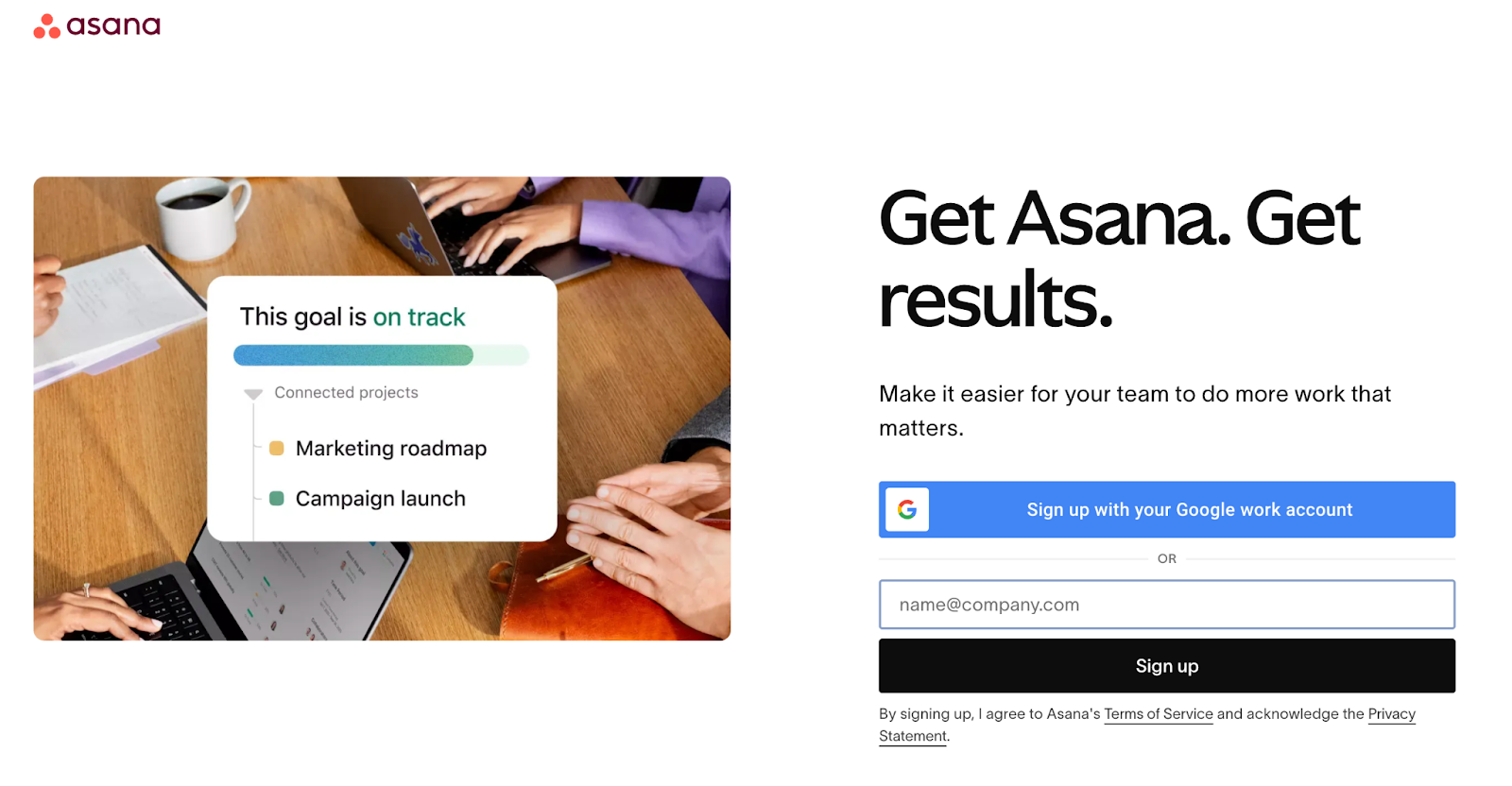
For example, Asana’s conversion goal is clear: get visitors to sign up for their product:
2. Align landing page copy with intent
Different channels have different purchase intents.
For example, people who enter your landing page through a Google PPC ad after clicking on a branded keyword are more likely to purchase than someone passively scrolling through Instagram.
That’s because people go to Google to find businesses to buy from—especially when they search for your brand. On Instagram, they’re there to socialize (and watch funny dog videos of course), not shop.
Typically, people who discover your landing page via a display ad have the lowest intent to buy. In contrast, people who find you via a purchase-intent keyword on Google or Bing have the highest intent to buy.
In other words?
People who aren't in-market for what you sell have a lower chance of buying, while people who are in-market investigating your solutions have a higher chance of buying.
So the bottom line?
Don't send cold social media visitors who haven't expressed intent to buy and who haven't heard of you before to a landing page that asks them to buy now.
That just doesn't make sense.
To avoid that, you must align your copy with the intent of your visitors.
3. Message match your ad and landing page copy
The last thing you want your landing page copy to communicate to potential customers is a different message than the ad creative that sent them there.
Enter: message match.
Message match means matching copy from your ad to landing page across your
- Headline
- Subheading
- CTAs
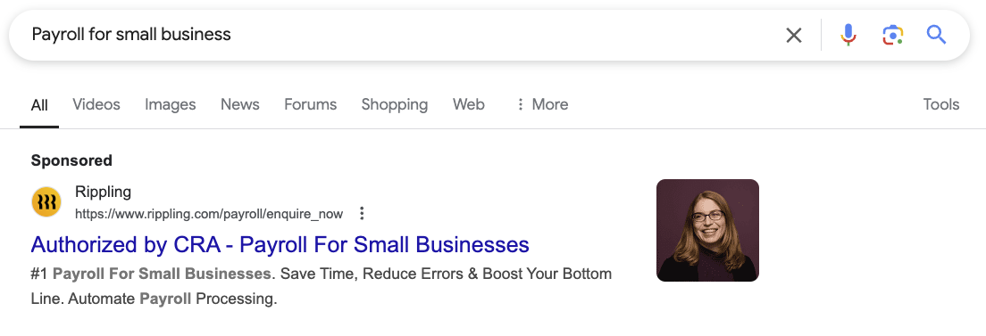
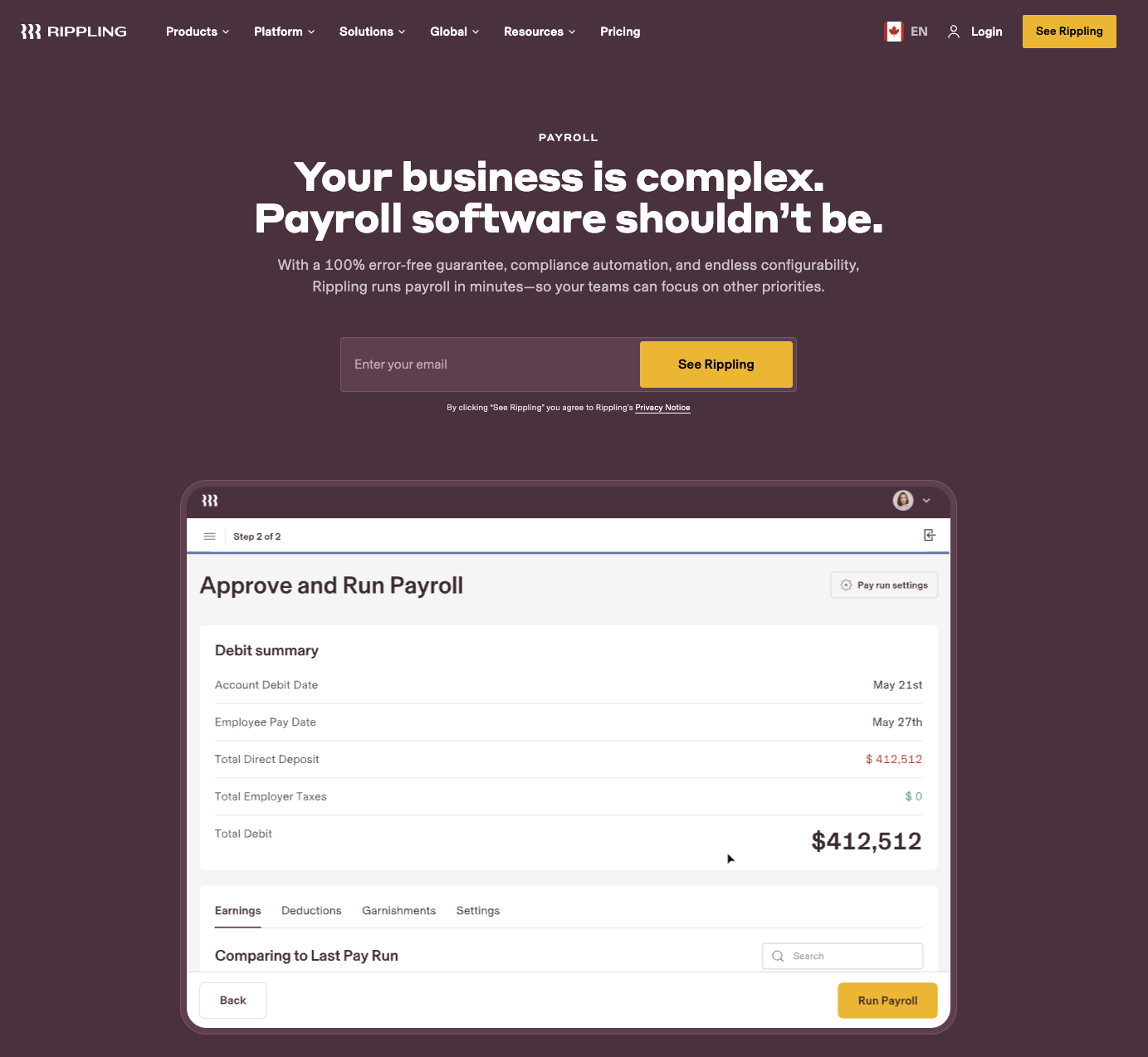
For example, notice how Rippling matches their PPC ad copy with their landing page copy:
Continuity between click and post-click copy can mean the difference between a bounce and a conversion.
So keep it consistent.
Message match your copy.
And get the conversion.
4. Communicate your unique value proposition with crisp copy
Your landing page value proposition refers to the primary benefit you promise to deliver (or problem you aim to solve) and why people should choose you over your competitors.
Think of your value proposition as the most important (and challenging) copy you will write.
Why?
Because it's the first group of words your visitors will read when they arrive on your landing page. And you don't have a lot of room to get it right.
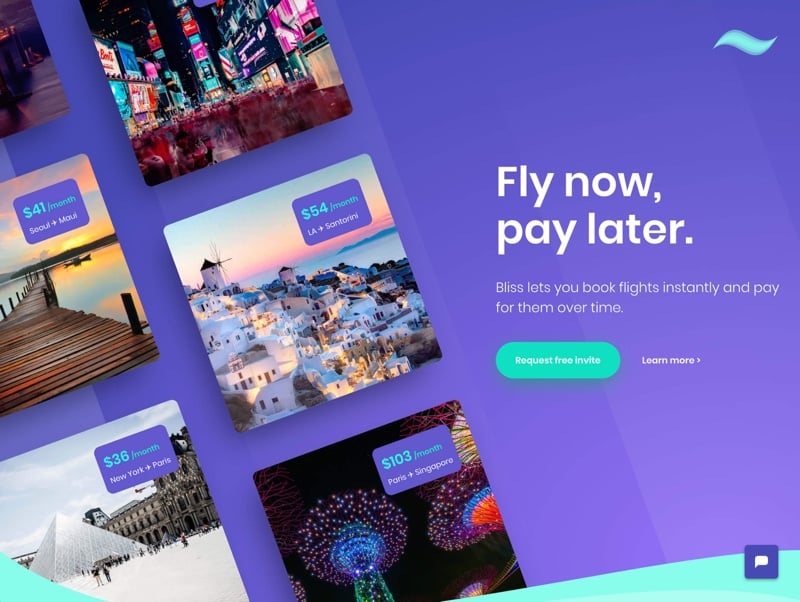
For example, Bliss succinctly delivers their value proposition in as few as 16 words:
The best landing page value propositions articulate three main things using a headline and a subheadline. It'll answer
- What value does your product or service promise to deliver?
- Who do you provide that value for?
- How do you plan on delivering said value?
If you truly offer a unique product or service (i.e., category creator or one of a kind), or if you've built a strong brand, sometimes all you need to do is tell people what you do.
Examples of the “what, who, and how” exercise
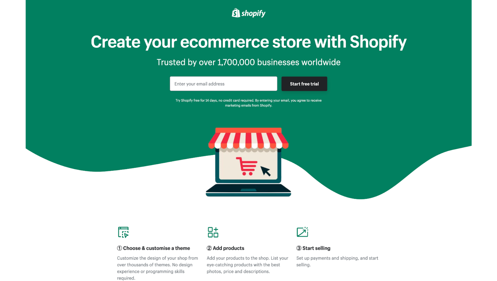
Shopify, a leading eCommerce brand, clearly states what they do without over-explaining the details—since most visitors already know:
For the rest of us, it's better to clarify who you sell to and how you plan on keeping your promise.
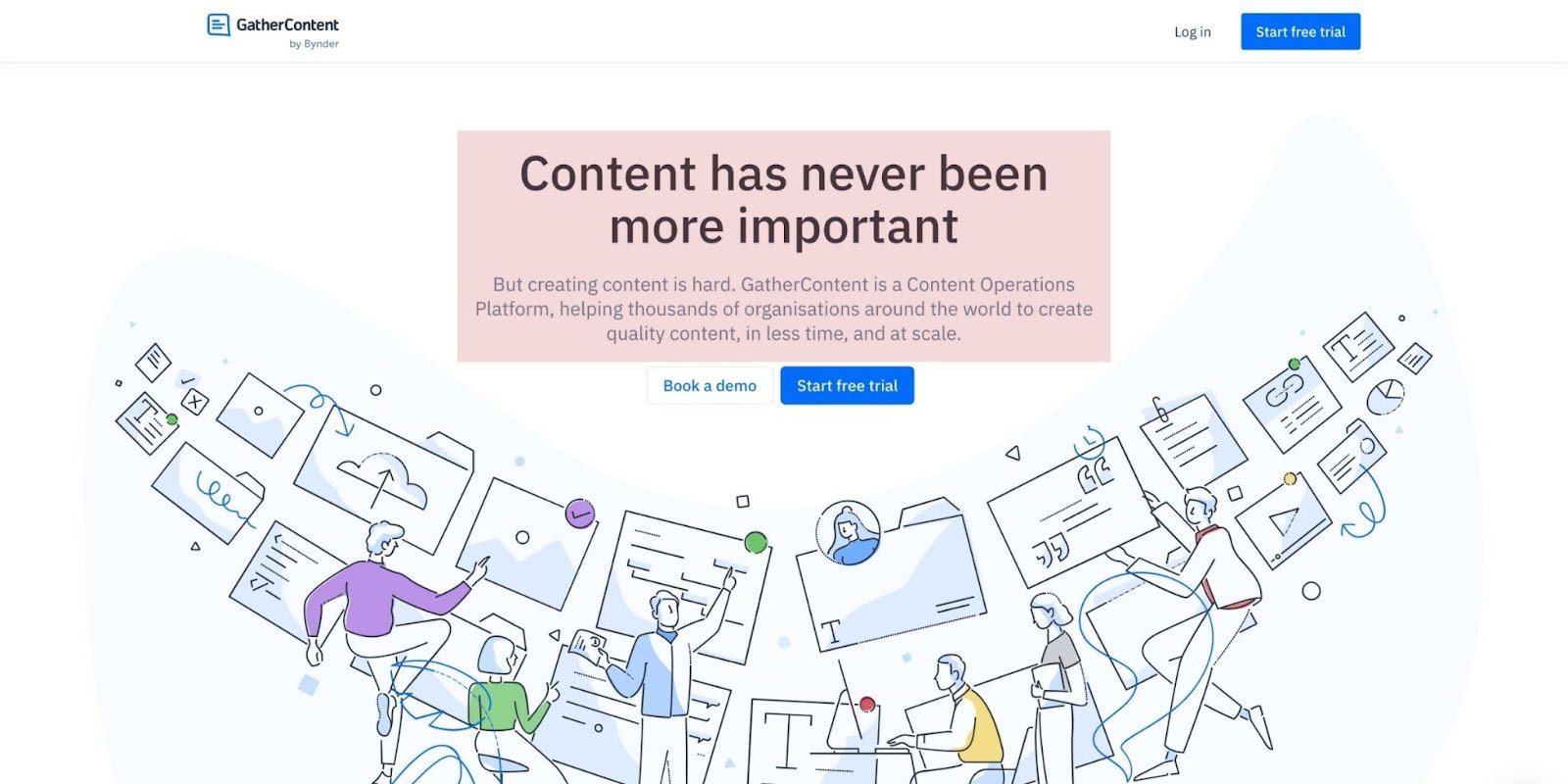
For example, GatherContent (a content operations platform) fails to articulate the what, who, or how in their headline and subheadline, and it's likely killing their conversions:
Now juxtapose that with a revised value proposition I drafted using what I know about their product and promise:
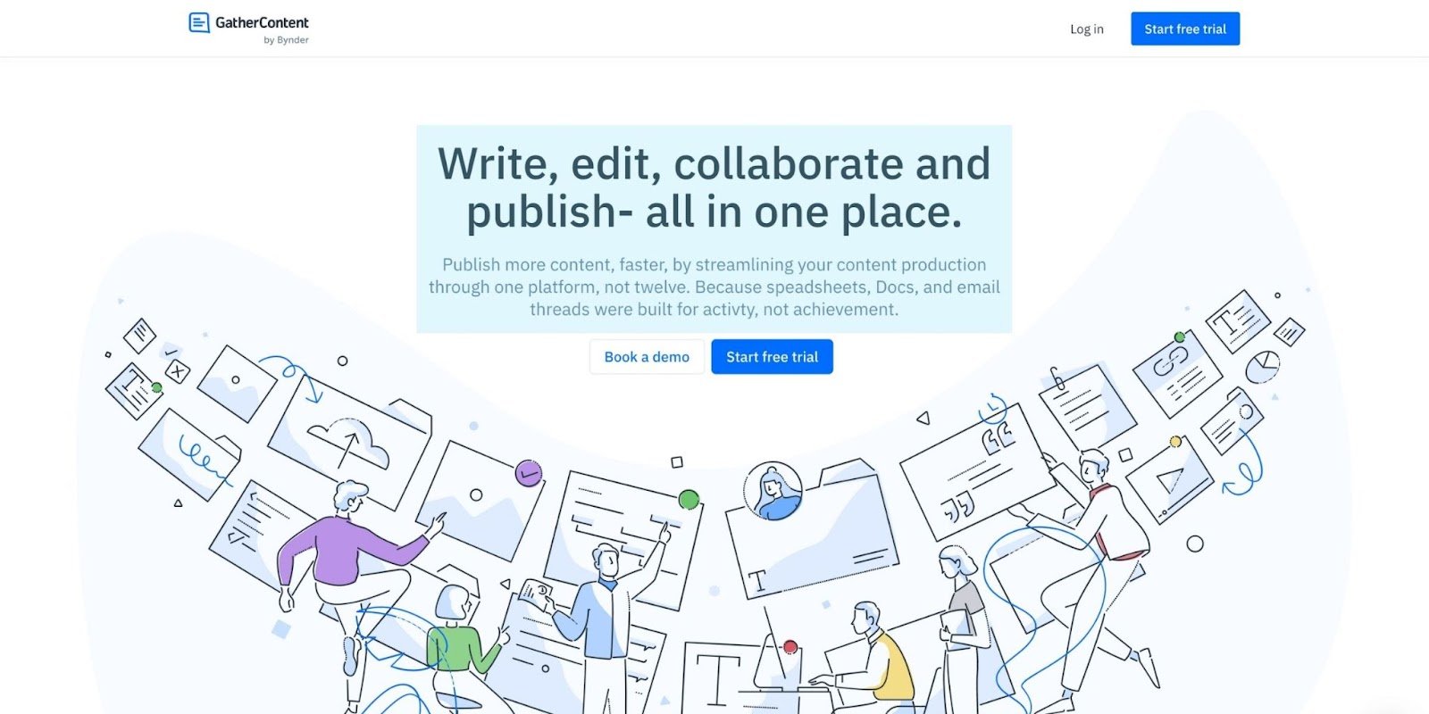
What: Write, edit, collaborate, and publish faster and all in one place
Who: Content publishers
How: Streamline content management through one platform, not twelve
Simple.
Let's look at one more example from Trainual, who hits a home run:
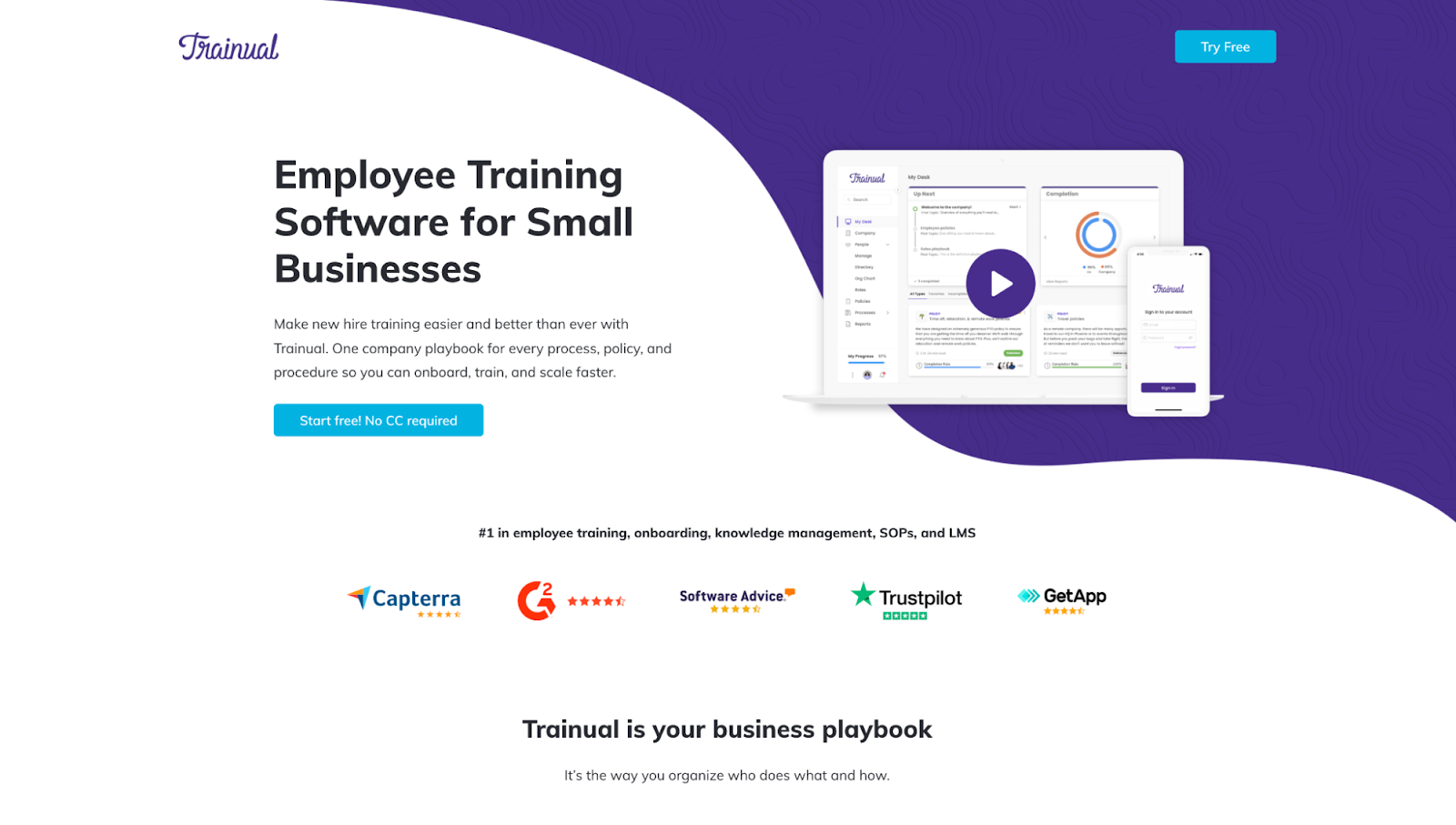
What: Faster and better employee training and onboarding software
Who: Small businesses
How: One platform for processes, policies, and procedures
Way to go, Trainual.
5. Infuse your landing page copywriting with your customers' words
Here's a copywriting hack: use the words your customers actually use, not the words your marketing department uses.
Why?
Because most of the time, the language isn’t the same.
To start understanding the language your customers use, follow these tips:
- Actually talk to them: Set up interviews with happy customers, unhappy customers, and lost leads to learn how your customers talk about the problems you solve and the products or services you offer.
- Scour online reviews: If you've been in business for a while, you've (hopefully) accumulated a fair amount of online reviews. Read through them, categorize them, and look for patterns in the way people talk about their pain points. This can be across review platforms like G2 and Capterra.
- Interview your employees: Talk to your sales team, customer service reps, account managers, support, etc. Interview your colleagues who interact daily with your customers—they're on the ground floor and know more than anyone.
- Get social: Hit up LinkedIn, Reddit, Quora, Instagram, TikTok, etc. Participate in the conversations your customers have about your industry, and identify the words and phrases they use most.
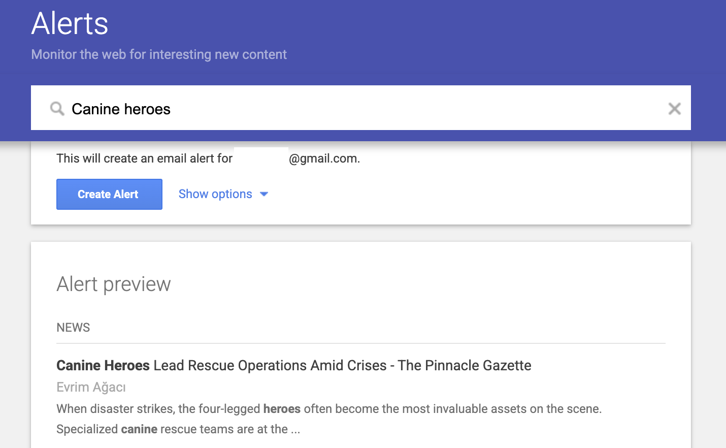
- Set up brand alerts: Another great way to gather information about what others are saying about your company is to set up Google Alerts for your brand.
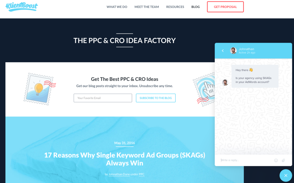
For example, when rewriting the copy for our KlientBoost website (landing pages included), most of our copy came directly from online reviews.
We discovered very specific things that our target market looked for in a marketing agency:
- Results
- Expertise
- Speed
- Communication
- Education
- Cost
Then we infused our copy with their language, not ours.
First, we categorized our online reviews
Bottom line: strong landing page copy ditches industry jargon and carries on a conversation with customers (so they get it). Period. We go deeper on this below.
Let’s look at another example, Jasper.
Could you imagine if they filled their landing page copy with impersonal industry jargon?
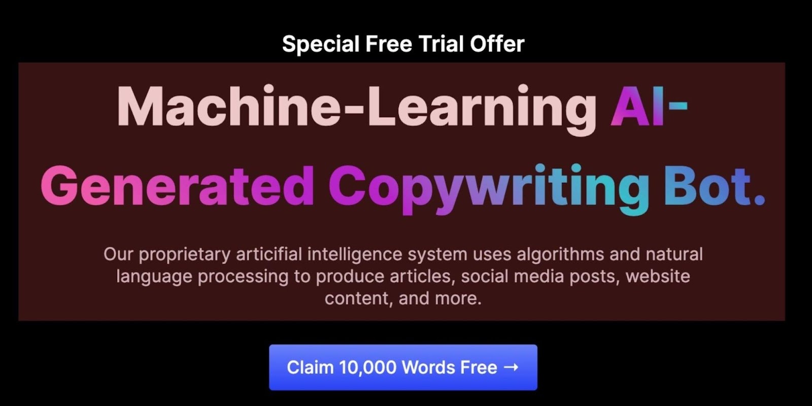
Stale. Impersonal. No clarity.
Now juxtapose that with their actual landing page copy:
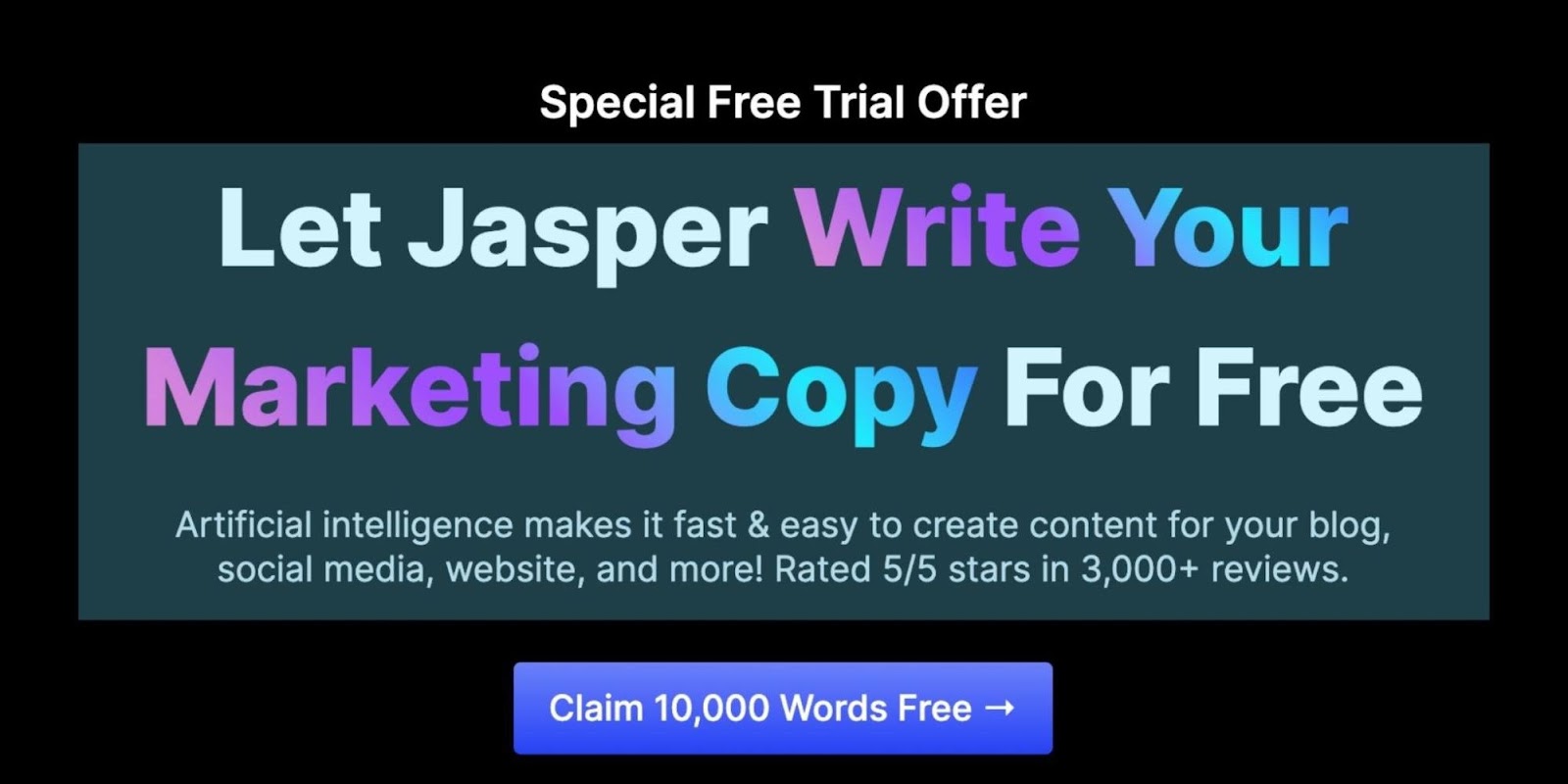
It's fresh, personable, and in the words of their customers. Which do you think performed better?
Use customer reviews as social proof
Landing page social proof refers to third-party validation in the form of
- Testimonials
- Star ratings
- Endorsements
- Case studies
- Media mentions
- Awards
- Badges
- Really anything that indicates to potential customers that similar people have had success with your product or service.
In a word: credibility.
Social proof communicates your value proposition in the words of real people and peppers your offer with credibility in a way you alone never could.
Let your customers do the talking for you.
Show the proof inside the pudding.
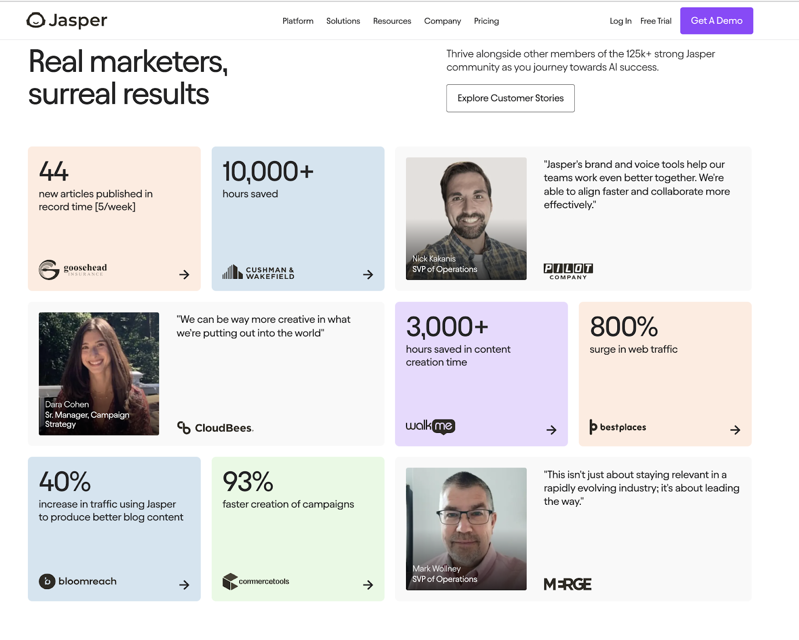
For example, Jasper’s focus is to market AI to marketers. In some industries, this can be an uphill battle because generative AI quality isn’t always up-to-snuff. Rather than beating them over the head with persuasive copy, they just soak their offer in social proof.
Seriously, Jasper's landing page is dripping in third-party validation. They boast
- Over 125k members in their community
- Multiple case studies—leading with precise numbers—on marketers succeeding with their platform
- Security badges later in the page
When it comes to social proof, place it everywhere, including
- Above the fold
- Near your call-to-action (CTA) buttons
- In its own section
- Near your benefits
- On your forms
- On your thank you pages
- On your checkout page
- On your sign-up page
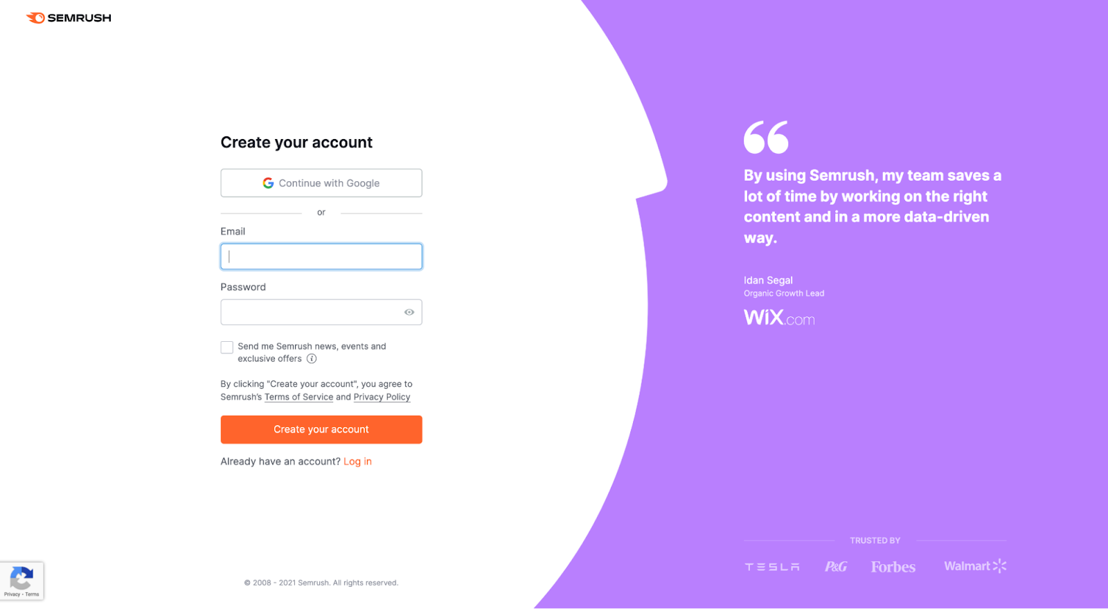
For example, Semrush features a testimonial from Wix on their sign-up form:
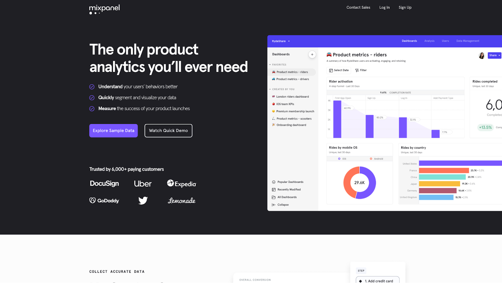
Mixpanel features social proof in the form of client logos and customer count in their hero section:
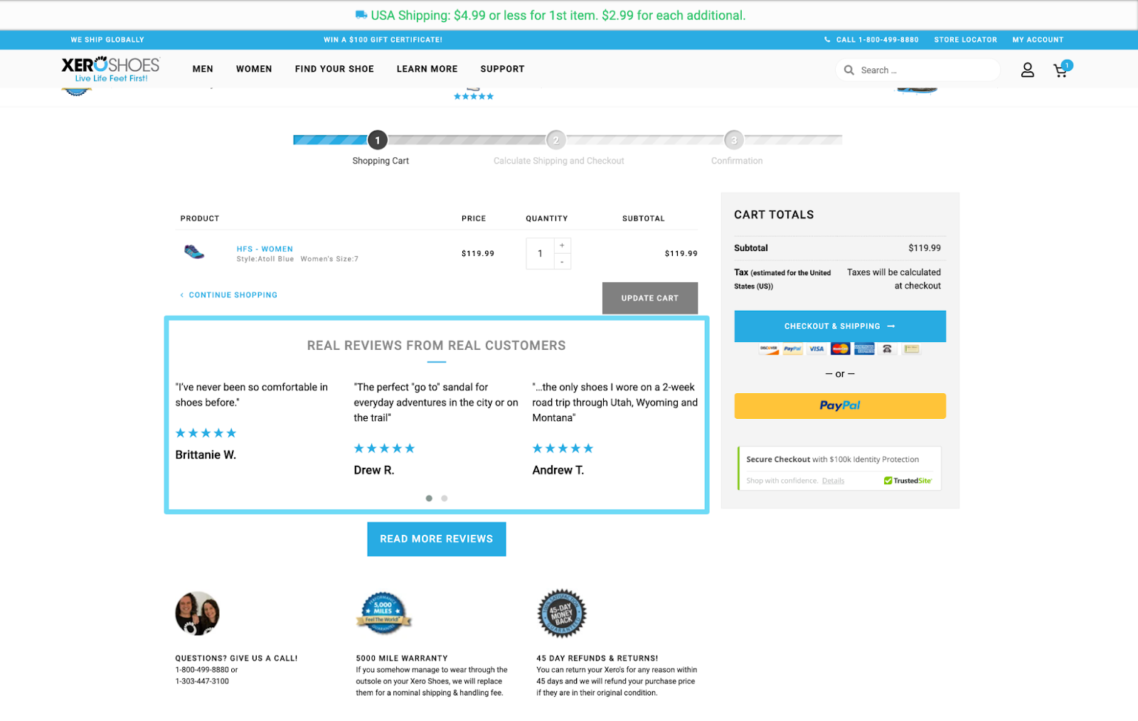
And Xero Shoes features customer testimonials on their checkout page:
7. Make eye contact when you speak (it’s a conversation)
When writing any content, it’s important to speak directly to the person you’re speaking to.
Think about it this way: when you’re scrolling the internet, it’s likely just you reading an article. Not you plus a bunch of people behind you. The same goes for your prospects.
Speak directly to them.
Make them feel like they're the only person in the room. Conversationalize your content.
Here's how to just that:
- Write in the 2nd-person: Write your copy in the second-person point of view. It uses the pronoun “You” to address the reader and implies that the events and story are about them.
- Avoid industry jargon: You don't want to drone on and on in a way your target audience doesn't care for. In fact, they've seen the industry jargon a thousand times before, and they're looking for the company that'll speak to them, not regurgitate the same stuff everyone else does.
- Don't be so formal: Use periods more than commas. Write short, choppy sentences. Use parentheses as asides. Use incomplete sentences. Heck, sprinkle in some one-word sentences.
- Use contractions: When you’re having a casual conversation with a friend, you’re likely not saying “I am so happy”. Instead, you’re speaking with contractions like “I’m”, “can’t”, or “won’t.” The same should go for your writing.
- Jazz it up with some personality: Add some creative flair and give your company a true voice. Use appropriate humor, puns, emojis, etc.
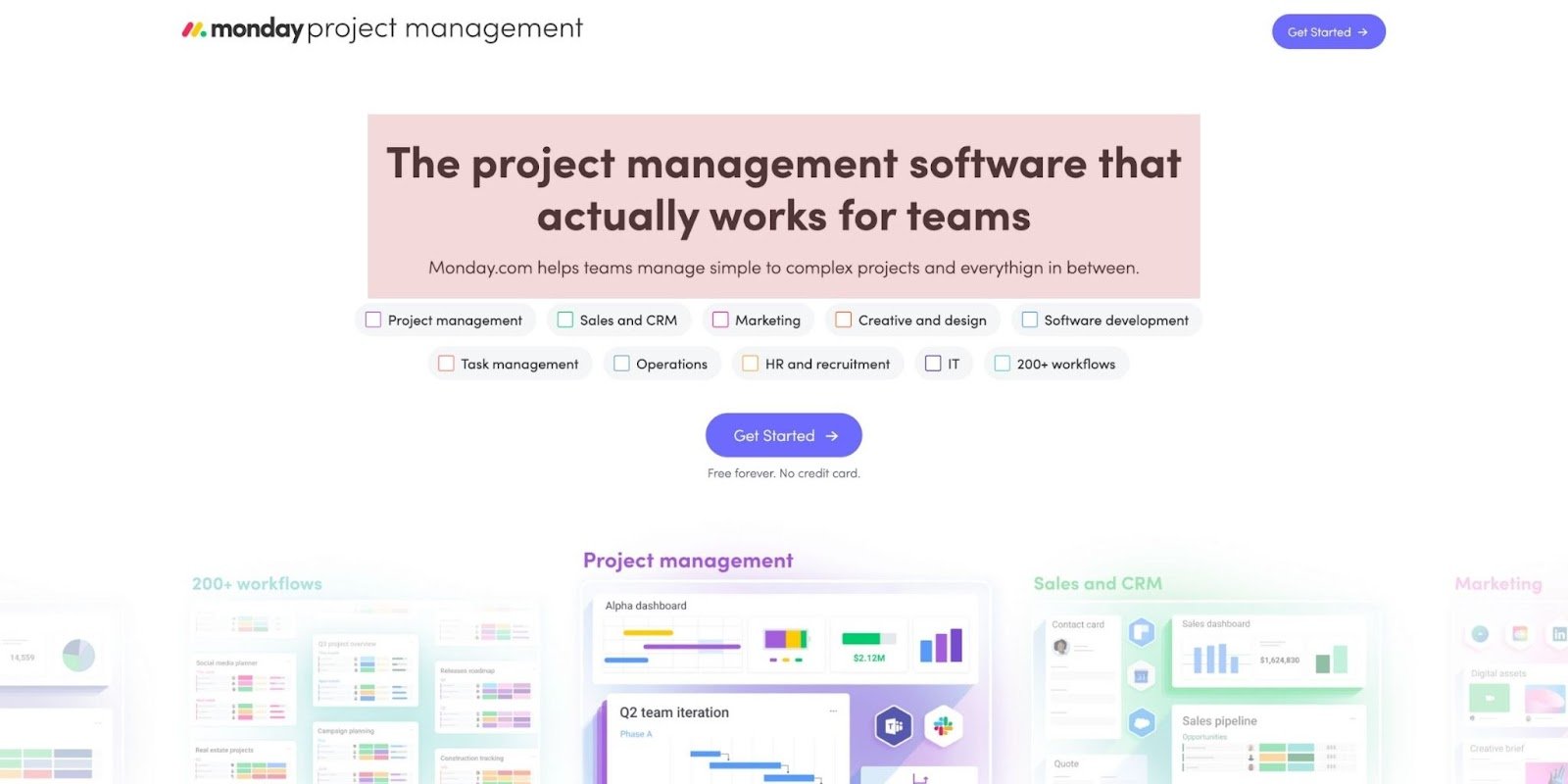
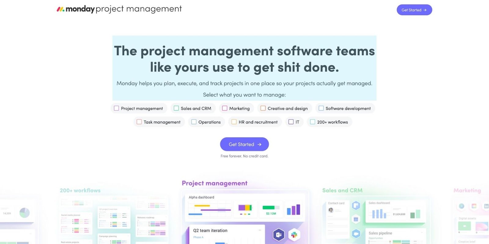
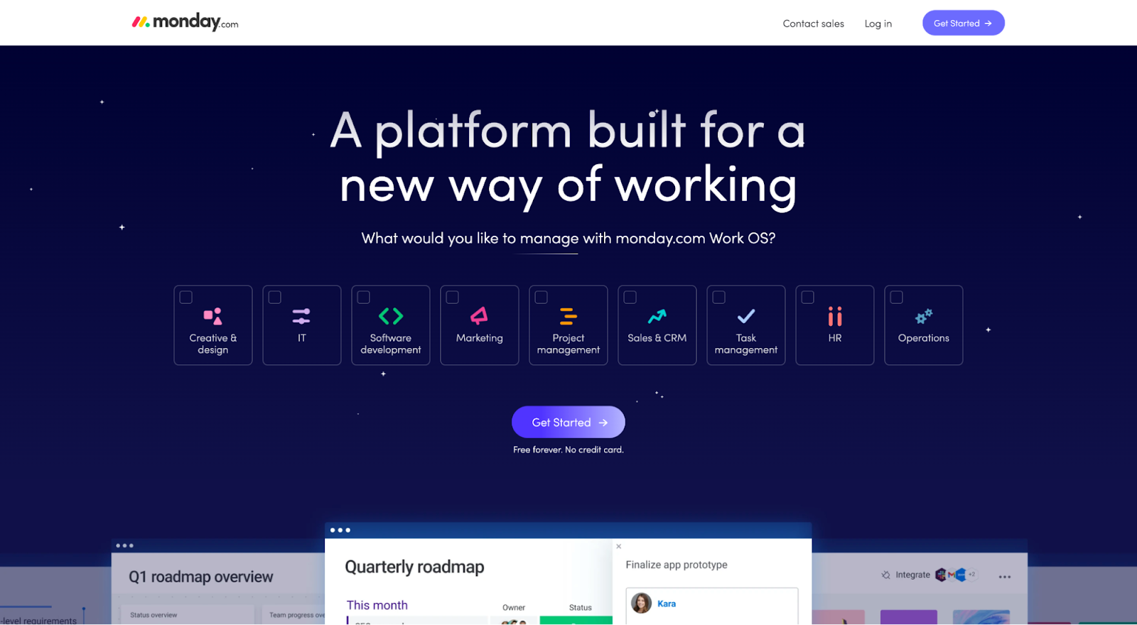
For example, let's look at Monday.com's existing value proposition vs. the one we rewrote for them.
Existing headline/subheadline: Monday's use of the third-person POV makes their copy sound too formal and impersonal.
Revised headline/subheadline: Monday can transform their copy into a 1-on-1 conversation with their prospects by using the second-person POV (and a little bit of added flair):
8. Keep your landing page copywriting concrete
Strong copywriting is clear and specific.
When landing page copy waxes abstract, it makes it difficult for visitors to pay attention.
For example, when Leadpages states, “Build a Landing Page That’s Unforgettable,” what does that mean to you?
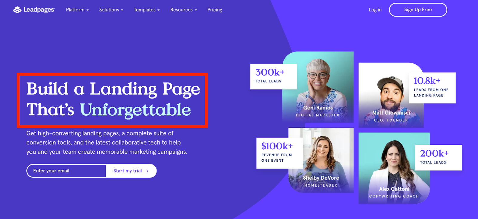
It’s too generic.
Unforgettable to whom? Customers? Your team? Is being memorable even a common goal for people creating landing pages?
The new landing page copy is way better:
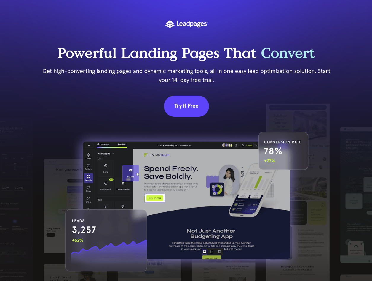
Who: Marketers
What: Drive more conversions from marketing campaigns
How: High-converting landing pages
Let's look at another example.
In this first example, can you even tell what Semrush does or how they do it?
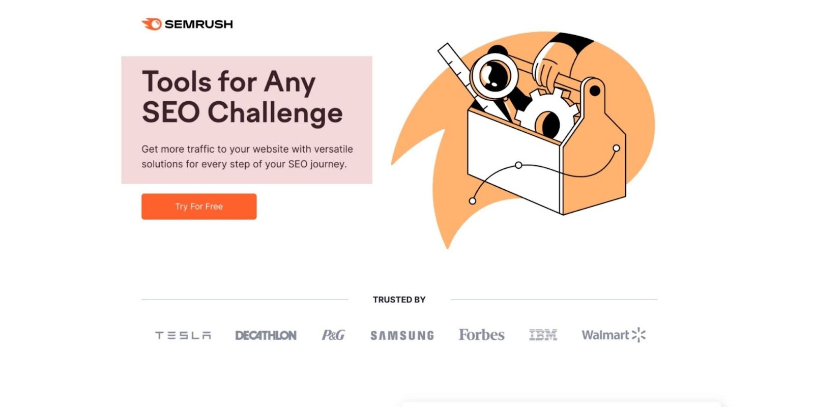
That's your unique selling proposition (USP)?
- “Tools for any SEO challenge”
- “Versatile solutions”
- “SEO journey”
Too vague. Too ambiguous. Too meaningless.
Their updated (and more concrete) headline:
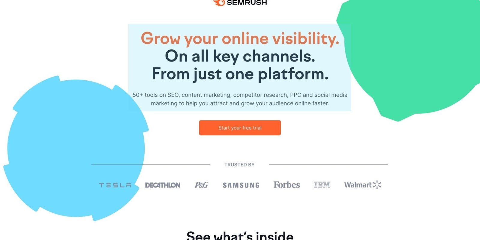
As a visitor, now I know what Semrush promises to deliver and how they plan on delivering it.
How to make your landing page copywriting more concrete
It's simple.
- Use numbers: This is one of the easiest ways to make your copy concrete. Say “Over 3.8M websites use Wix,” or “#1 Ranked PPC Agency by Clutch.” Don't just leave it up in the air.
- Avoid superlatives: You're not the “quickest,” you deliver “results in 48 hours.” You're not the “cheapest,” you cost “less than a cup of coffee.”
- Be specific: Instead of just saying you have “Versatile solutions,” say you have “50+ tools across SEO, content marketing, competitor research, PPC, and social media.”
- Stop using these words: “Leader,” “premier,” “solutions,” “synergy,” “all-in-one…” Your prospects have seen it all before, and these words carry little meaning.
9. Emphasize benefits over features
Your customers buy your products or services because of the outcomes, not the inputs that produce them.
This means your landing page copy should never emphasize features (inputs) over the benefits (outcomes).
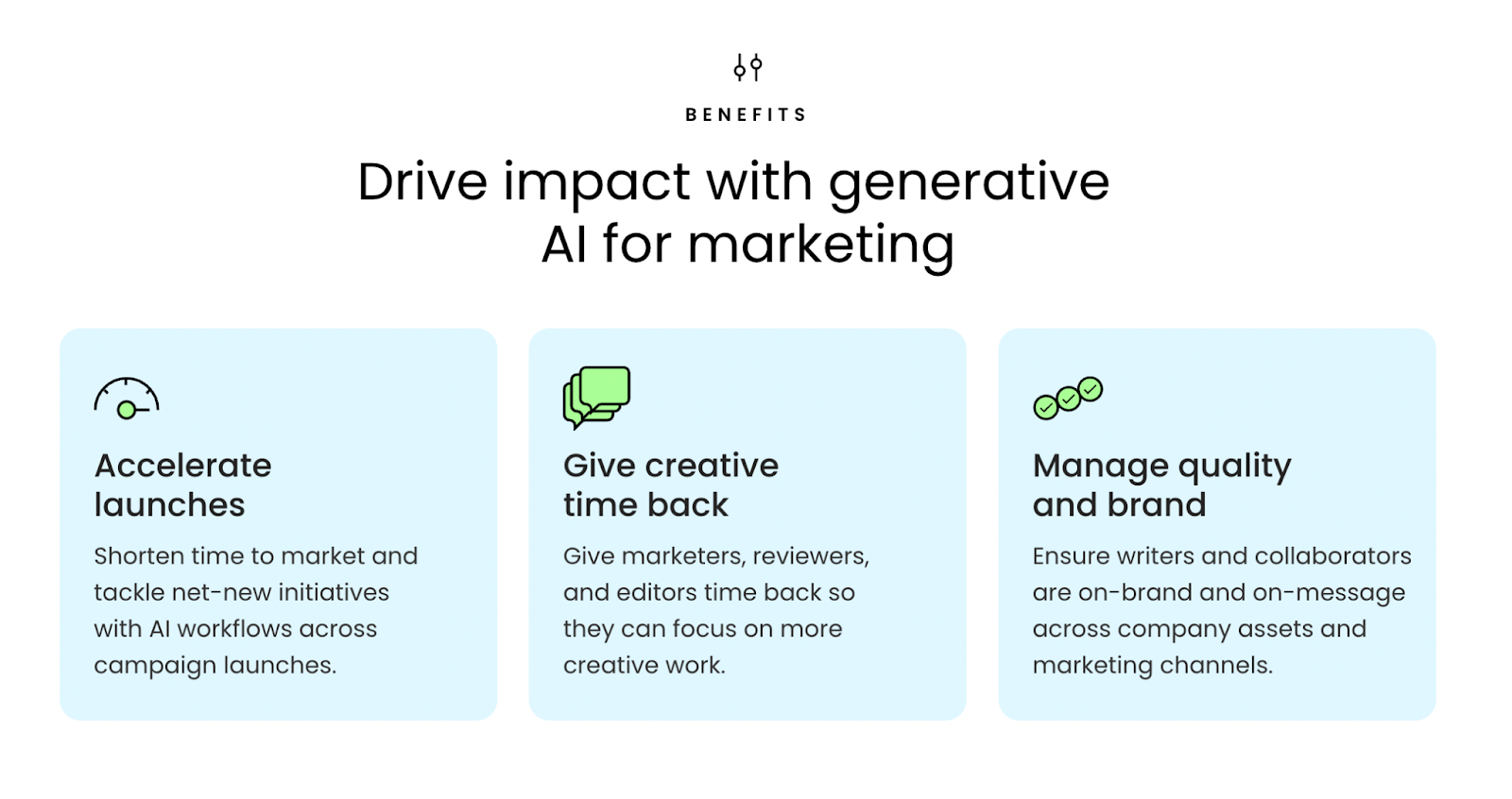
For example, Writer doesn't overstate their artificial intelligence, machine learning, or copy translator (all features). Instead, they handle objections by focusing on the outcomes those features produce. With Writer, you can
- Accelerate campaign launches
- Give marketers their creative time back
- Maintain your ideal level of quality and brand
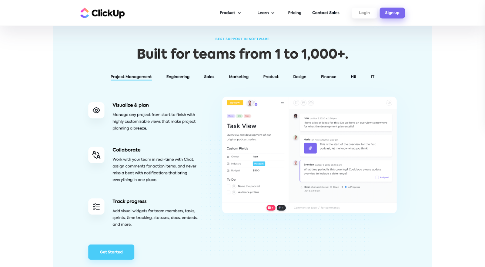
And ClickUp doesn't emphasize their visual planner, collaboration tool, or progress tracking (all features); they use them as subheadings to communicate the benefits those features provide:
10. Increase motivation with your CTA copy
The truth: low-motivating CTAs have become the status quo in marketing.
You know the usual suspects:
- “Try for free”
- “Get started”
- “Start free trial”
- “Watch demo”
- “Request demo”
- “Schedule a consultation”
- “Download now”
- “Book a meeting”
These are all missed opportunities.
Clicking on your CTA is the most threatening choice your landing page visitors will have to make, and everyone will read it.
So make it count.
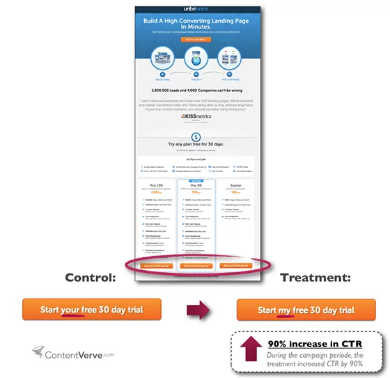
One word can make or break your campaign performance (just ask Unbounce):
The trick to writing high-converting CTA button copy boils down to
- Emphasizing value
- Handling objections
Let's take a look at both of these.
Emphasize value
We like to refer to CTAs as “calls to value.”
Action is great, but nothing motivates action quite like reminding your visitors of the value awaiting them on the other side of a click.
When it comes to your CTA button copy, do your best to communicate the value of your offer, not just the action someone needs to take to get there.
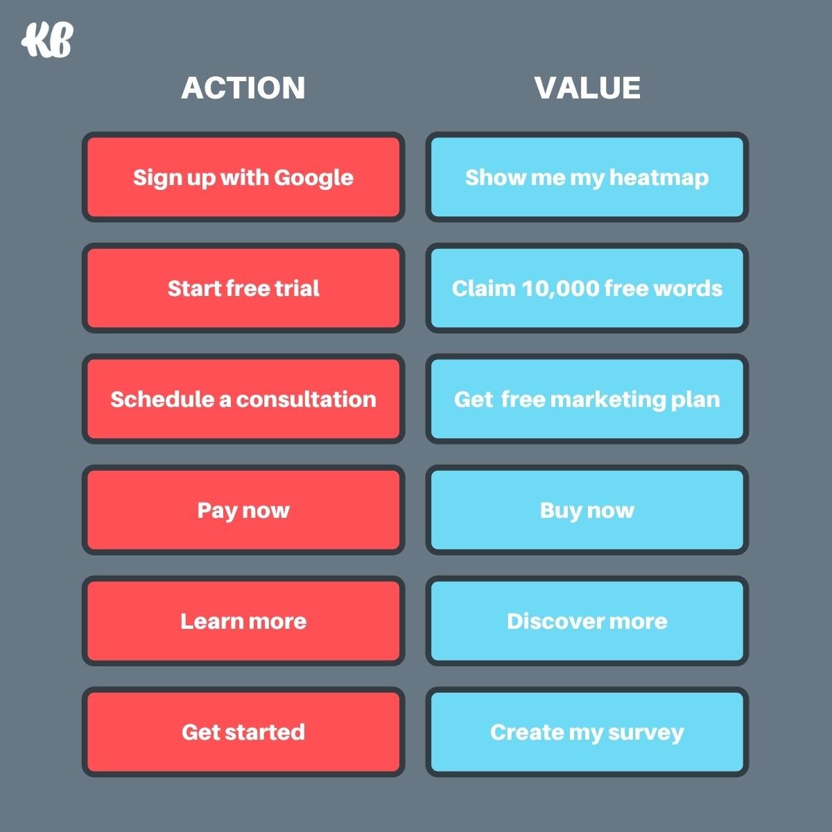
For example, compare the action CTAs vs. the value CTAs in the graphic below. Which is more motivating?
Handle objections
Second, a high-converting CTA handles objections about your offer directly within the copy.
You won't always have room, but when you do, think about the last-second objections your prospects might have about your offer, then handle them within the CTA copy.
For example, compare the standard CTAs (red) to the ones that handle objections (blue) in the chart below:
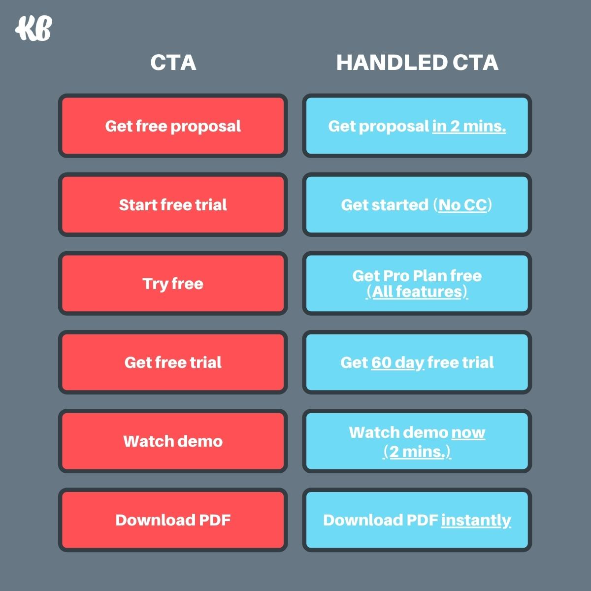
Let's break down one of these examples.
The CTA: “Get free proposal”
The prospect's objection: "That's great and all, but I don't think I'll have the time, and I don't know how big of a commitment this is going to be."
The CTA that handles the objection: “Get proposal in 2 mins.”
The prospect: “2 minutes? Let's do it.”
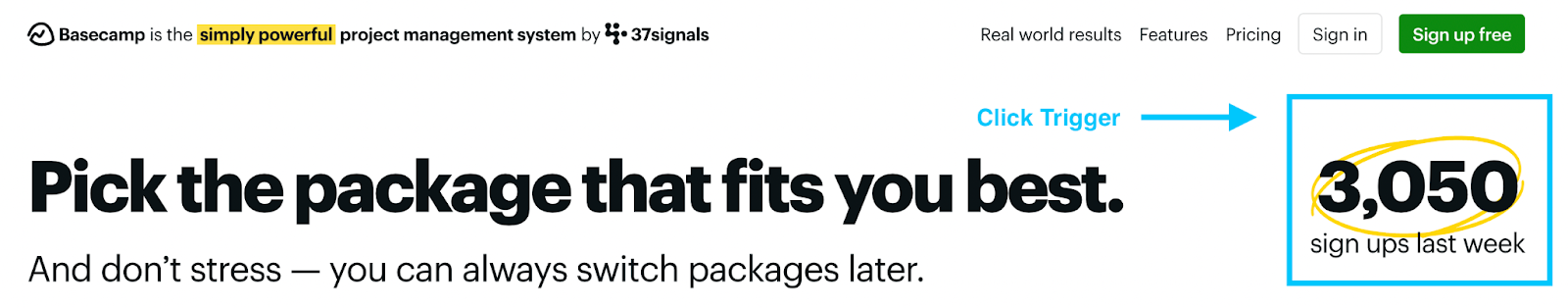
Consider a click trigger if you don't have room to handle objections in the button copy.
A click trigger refers to microcopy placed under or around your CTA; it's designed to entice clicks.
For example, Basecamp uses a click trigger in the form of how many people signed up for their platform the prior week:
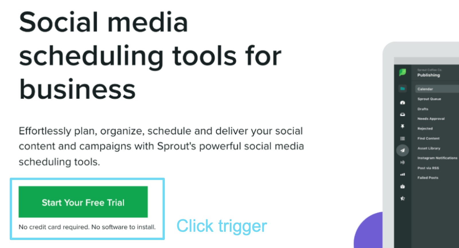
And SproutSocial uses a click trigger to handle objections about using a credit card or needing to install software:
11. Say it again, but differently in your final CTA
Your final CTA refers to the last section at the very bottom of your landing page.
Most landing pages use this space to repeat their value proposition in the exact same words as their first CTA.
Don't do that.
Instead, use this section to restate your value proposition with different words or to illuminate a different aspect of your promise.
For example, in Pipe's landing page headline and subheadline (above-the-fold), they emphasize getting paid upfront for recurring revenue:
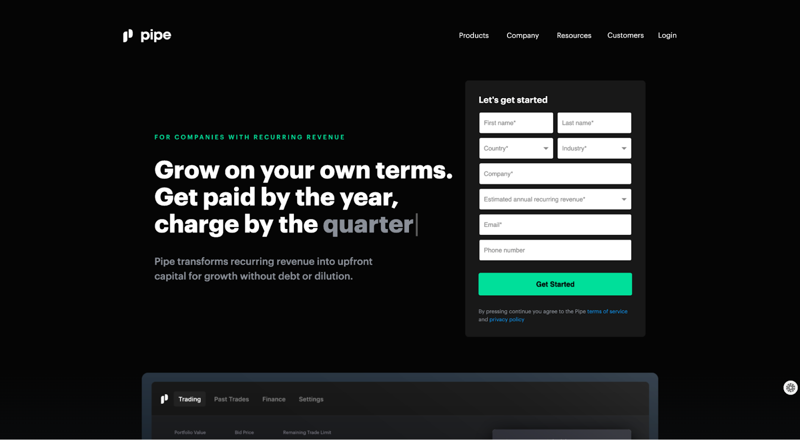
But in their final CTA, they tweak their value proposition a bit and present it in different words, this time emphasizing the “growth without debt or dilution” part:
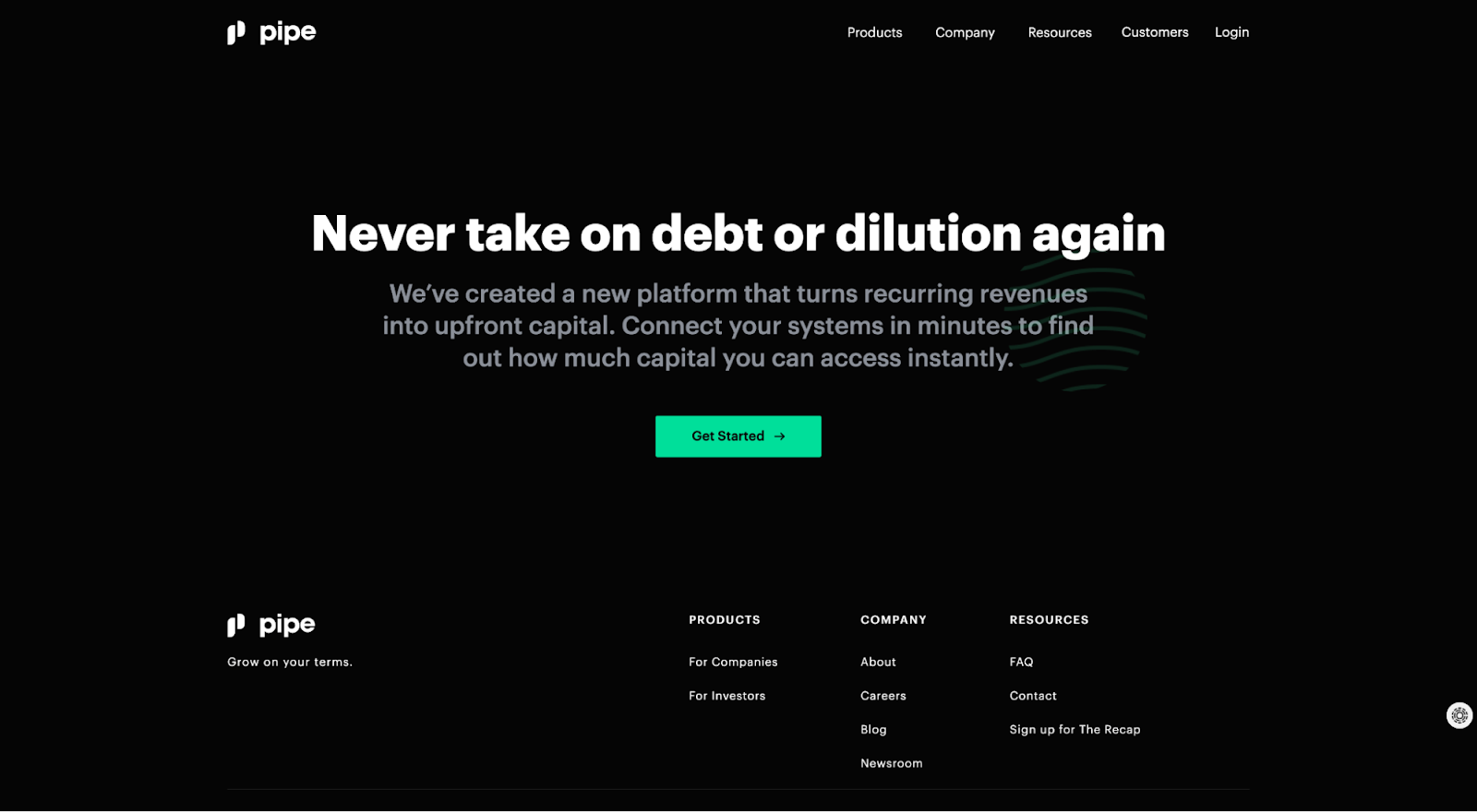
Same value proposition, different emphasis, more powerful effect.
12. Format your landing page copy for web skimmers
Over 20+ years of research keep telling us the same thing: most users will only skim the headlines of your landing page, nothing else.
That means what your copy looks like is just as important as what it says.
When formatting your landing page copy for skimmers, consider the following:
- Use one-sentence ideas: When sections of copy turn into 3-4 sentence paragraphs, your visitors likely aren't going to stick around for all of it. Instead, limit blocks of content to single ideas in as few words as possible.
- Leverage a visual hierarchy: Headlines, subheadlines, and paragraphs should have different font sizes, font weights, and colors. Without thinking, visitors should be able to tell the difference at a glance.
- Use bullet points: Let your copy breathe. Use bullet points with short sentences to make your content more skimmable.
- Be consistent: Make your landing page learnable by repeating styles over and over again. For example, if you typically use a bullet point section with headlines and paragraphs to explain details, repeat that copy style throughout your entire landing page.
13. A/B test your landing page copywriting
Last, but certainly not least, copywriting is never truly finished. It's just finished for now.
Over time, it's your job to test your messaging to keep growing conversions.
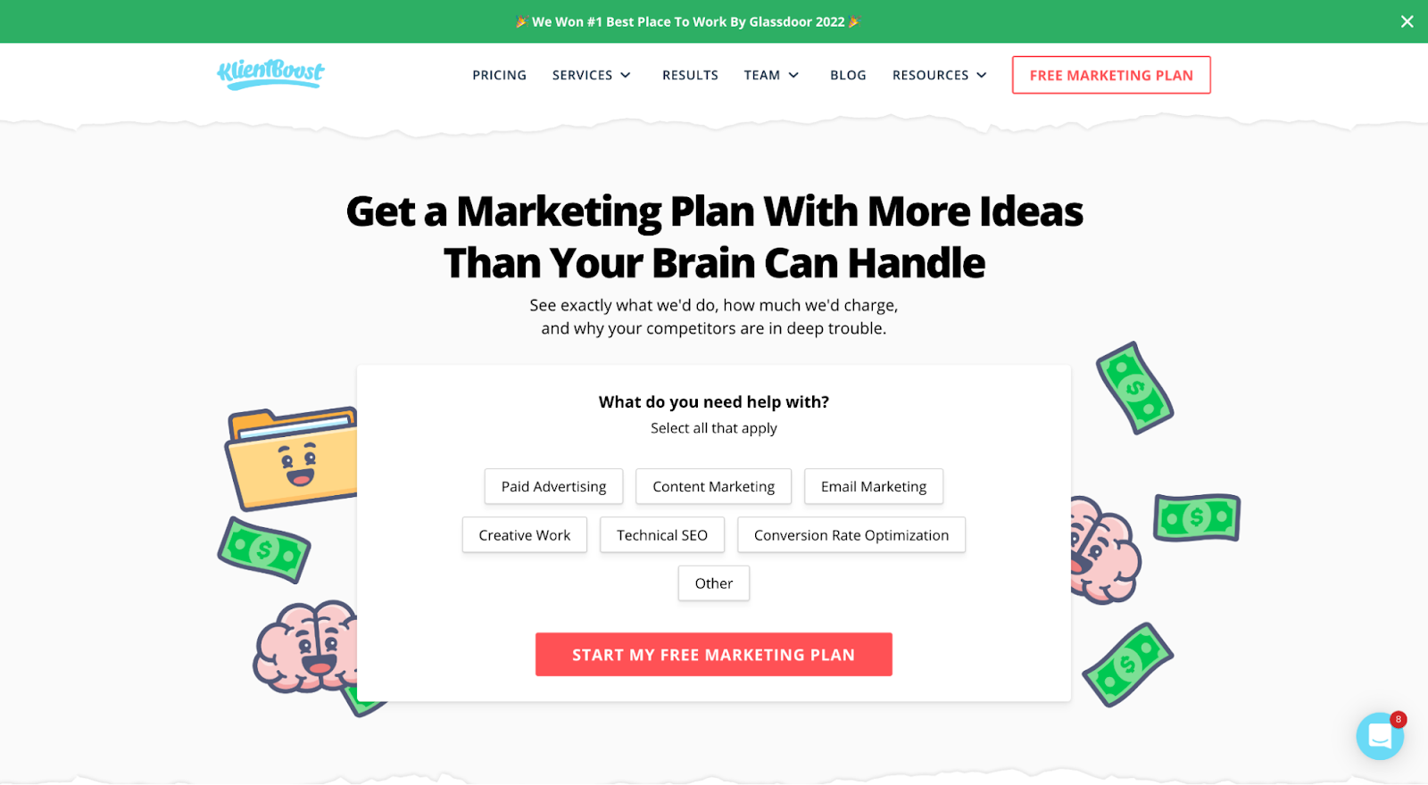
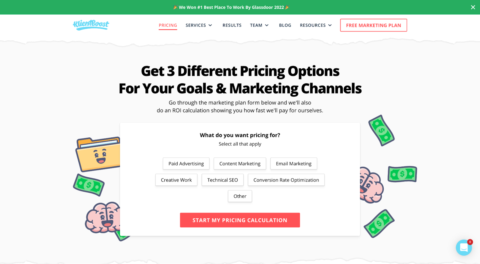
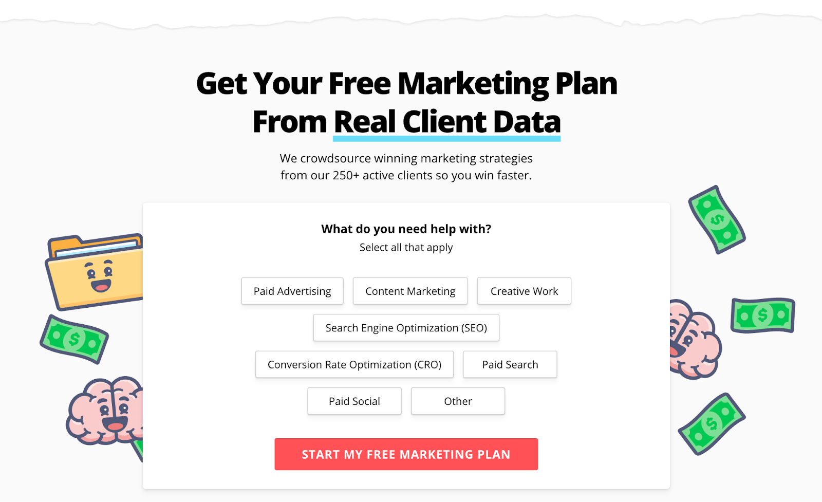
For example, over the last 6+ years, we've split tested our “free marketing plan” copy dozens of times, each time finding a variant that helped us increase conversions. Each time, we never changed the actual offer, only the copy we used to present it.
Version 1: 14-day free trial
Version 2: Get my free proposal

Version 3: Start my free marketing plan
Version 4: Start my pricing calculation
Version 5: Free marketing plan from real client data
How to start split testing
So, where do you start with split testing?
Customer feedback.
What better way to test out various versions of your landing page copy than to collect feedback from your actual users?
Installing landing page tools (such as chat boxes and online surveys) can help you gather ideas on your users' thoughts.
Here's an example of what our feedback tool looks like:
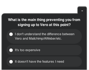
Here's another example of a customer satisfaction survey from Vero. These surveys can uncover insights on any bottlenecks or hang-ups your visitors may experience on your landing page:
Once you find the truth about your landing page user experience and messaging, you can tailor your landing page copy and design accordingly.
Then rinse and repeat.
Your 9-point landing page copy template
In a nutshell:
Your value proposition communicates
- What you do
- Who it’s for
- How you do it
Your landing page design reinforces that messaging. Think of each section as an opportunity to reiterate your
- What: What does the product or service promise to do?
- Who: Who is this product or service for?
- How: How does this product or service deliver upon its promise?
- Why: Why will it improve my life for the better?
Here is a landing page copy template to guide the perfect landing page copywriting every time:.
Using Monday.com as an example, we outlined nine primary sections:
- Headline + subheadline
- CTA copy + click trigger
- Three biggest pain points
- Features + benefits
- Who's it for
- How it works
- Social proof
- Final CTA
- Conversion page
1. Headline + subheadline
Yse your headline and subheadline (above-the-fold) to communicate your value proposition (the reason you exist) in as few words as possible. Make this clear, direct, and energetic.Add oomph.
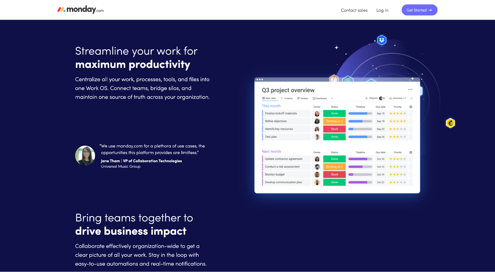
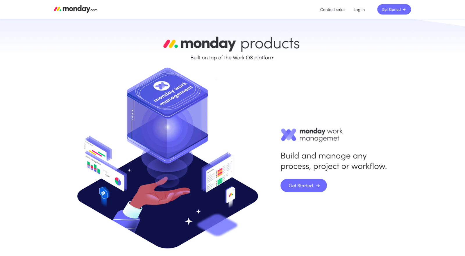
For example, Monday.com introduces their team management platform (what), built for different departments (who), deployed through a single platform (how).
2. CTA copy + click trigger
Remember, your CTA button copy should emphasize value and handle objections. Make exploring the “promised land” a no-brainer.
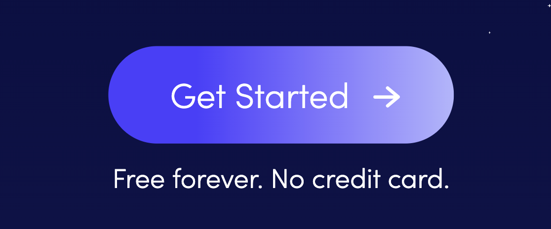
For example, Monday.com uses generic CTA copy, but they leverage their click trigger (microcopy below the CTA) to remind prospects that it's free forever with no credit card required. “What’s the harm in trying?”
3. Three biggest pain points
Don't make your prospects wait. Hit them with your core benefits as soon as possible by addressing their biggest pain points.
What are the three primary pain points your product or service can help your ideal customers overcome? Once you identify them, address them.
4. Features + benefits
For more complex products or services, it helps to feature a dedicated features and benefits section somewhere on the page. Reiterate your core benefits, this time attached to specific features so prospects can understand how the inputs relate to the outputs.
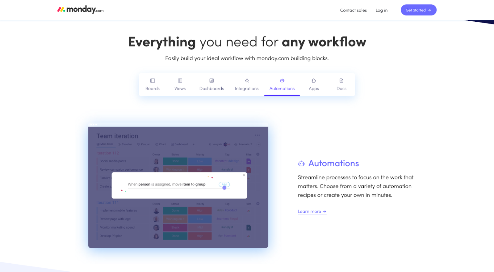
Monday.com masterfully does this using a tab feature within its own section:
5. Who it’s for
You may be able to spotlight your target market directly within your headline and subheadline. However, if you have a more complex solution, it helps to dedicate an entire section that clearly articulates the intended market your product or service addresses.
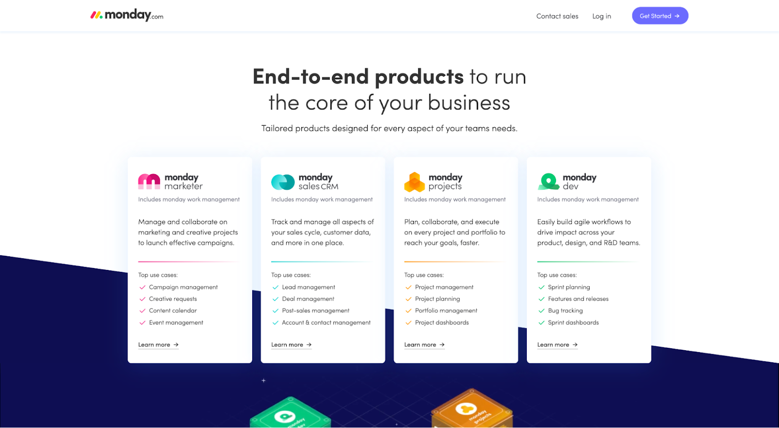
Monday.com dedicates a section to its four distinct target markets:
- Marketing
- Sales
- Project management
- Dev
6. How it works
Certain products or services are self-explanatory, either because they're everyday commodities or simple solutions.
But for new or complex products or services, your visitors will need a healthy dose of education on the mechanics of your offer.
A well-written “how it works” section synthesizes a complex process into 3-4 easy-to-understand steps.
Unfortunately, for Monday.com, this is the one section of their landing page that misses the mark a bit. They do include a “how it works” section (“Powered by Work OS”), but it's just too vague and meaningless.
How can Monday.com improve the “how it works” section?
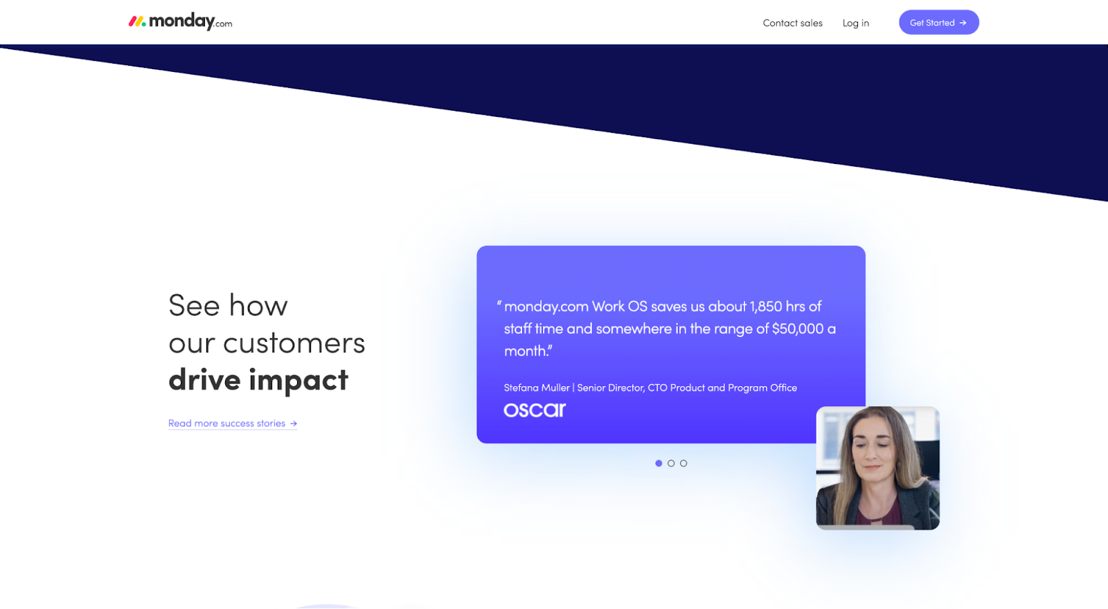
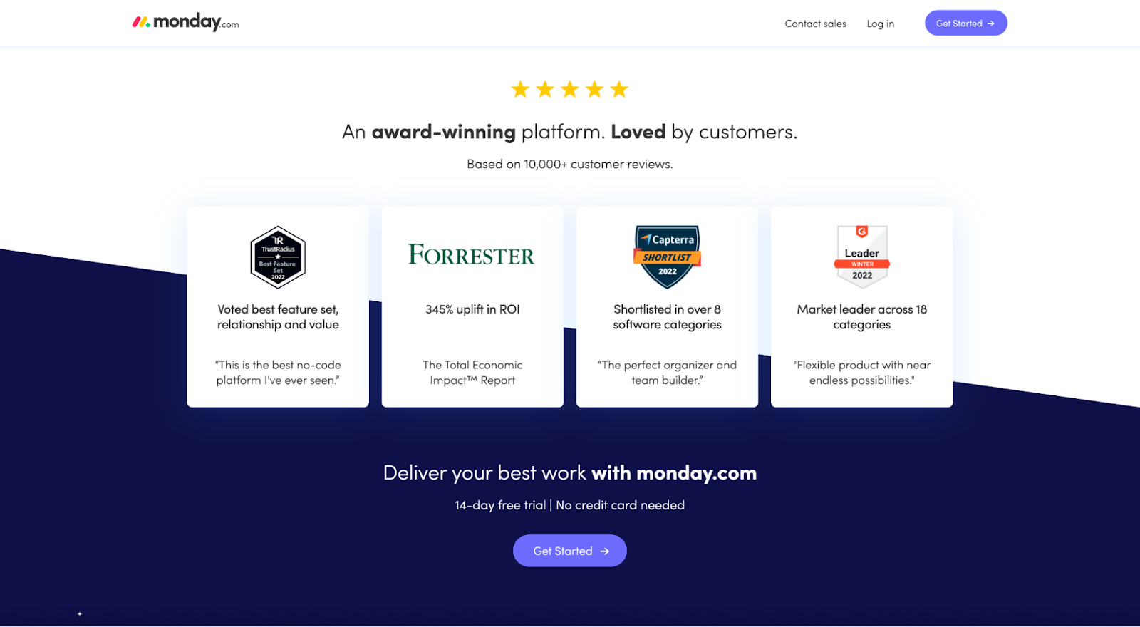
Social proof should go everywhere. But always ensure you create a dedicated section for it too.
Prospects will look for it.
Monday.com features social proof all over their page by sprinking
- Testimonials
- Client logos
- Industry awards
On top of that, they also include a dedicated social proof section.
8. Final CTA
Lastly, restate your value proposition, but in different words.
For example, Monday.com uses their final CTA to wrap their message with a bow: “Deliver your best work with Monday.com.”
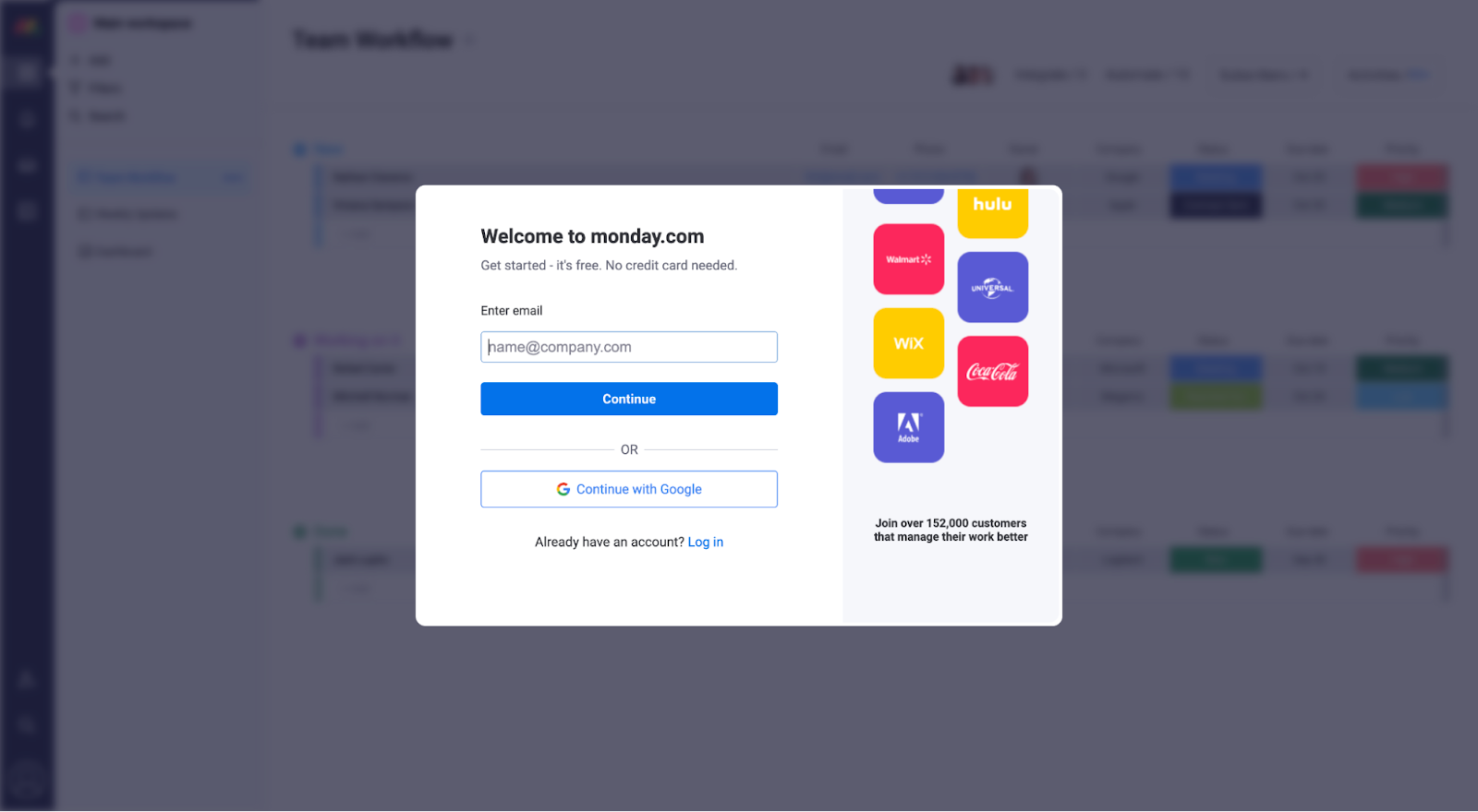
9. Conversion page
For lead capture landing pages or lead generation pages (i.e., landing pages with embedded forms), your landing page is the conversion page.
Visitors can arrive and convert from the same page.
But for click-through pages that take visitors to a conversion page (e.g., eCommerce checkout page, account creation page, etc.), just because a prospect has clicked your CTA button, it doesn't mean your job is done.
The copy on the page your CTA button takes them to is just as important as the landing page itself. Don't forget it.
For example, when you click on the Monday.com CTA, it takes you to an account creation page.
But instead of just providing a form, they provide social proof (client logos and customer count) and a click trigger (“Get started - it's free. No credit card required”) to nudge prospects over the finish line.
What's the biggest mistake people make with landing page copy?
Easy: Not clearly articulating your value proposition within the landing page hero section (above the fold).
It's not your job to write poetry about your products/services; it's your job to make the value you provide as crystal clear as possible. And to do it fast.
Use these six core ingredients as a shortcut for what to include:
1. Persona: Are you talking to all customer segments? A narrow product/service segment? Tell them in your headline or subheading. Let visitors know they've landed on a relevant destination.
2. Problem: What's the primary pain you solve for your visitors? For example, "Every hour that passes after a form submission, close rates decline by 20%."
3. Capability: What can they do with your product/service that they couldn't do before? For example, "increase speed from website submission to contact."
4. Feature: What feature unlocks the capability? For example, "automated lead scheduling."
5. Benefit: What's the primary outcome (usually a change in some important metric) that buyers get from your product or service? For example "Increase sales qualified lead volume by 40%."
6. Category: What category are you anchoring to so visitors understand your value relative to alternatives? For example, "automated inbound lead scheduling app."
Landing page copy speaks to prospects in a way they “get.”
Strong copy highlights problem customers want to solve, then presents an irresistible solution that prospects can't help but want.
Landing page copy that converts isn’t complicated.
Simply follow the 13 best practices we outlined in this article, then use the landing page copy template to construct your high-converting landing page. (Don't forget to design astellar hero shot).
And if you get stuck at all,each out to us to help you through the process. 😉
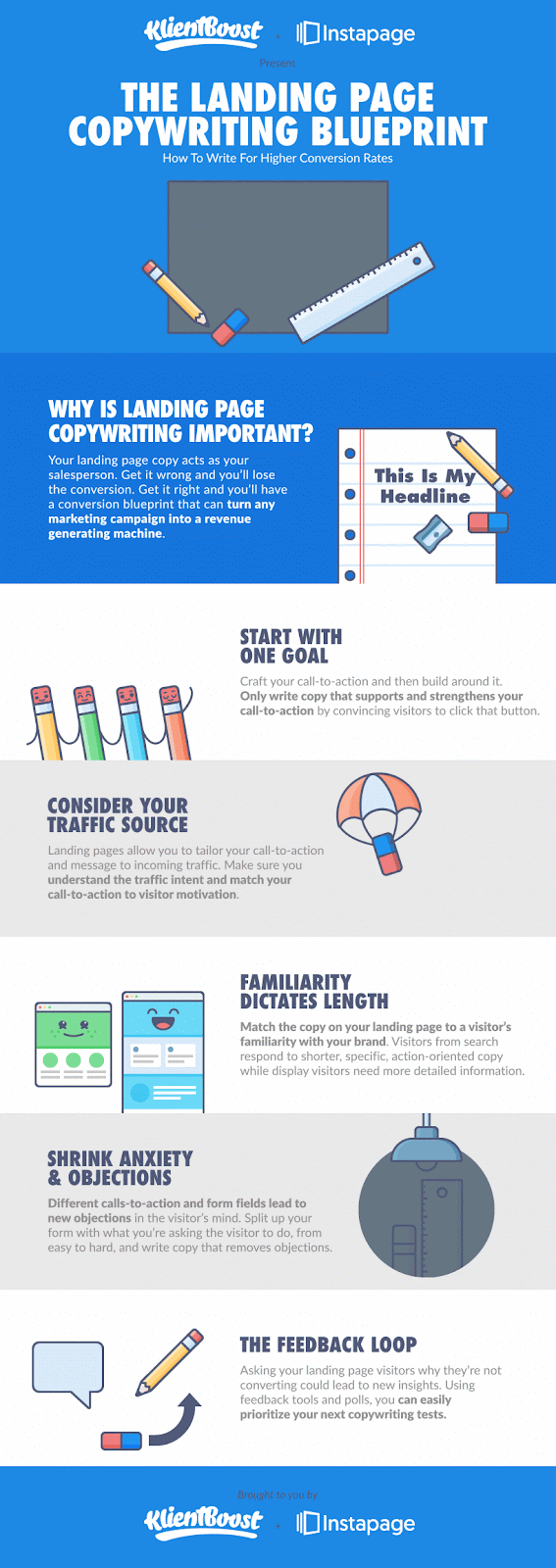
We'll leave you with an oldie but a goodie: years back, we partnered with Instapage to bring you a landing page copywriting blueprint gifographic (infographic but with gifs).
It’s still pretty cute—and super useful.
Frequently asked questions
How much copy should a landing page have?
The ideal amount of copy on a landing page depends on the goal, target audience, and offer complexity. But as a general rule:
Short Copy (50-200 words)
Best for: Simple, impulse-driven offers (free trials, email sign-ups, low-cost products).
Why?: People scan quickly, and a punchy headline + short value prop + CTA is enough to drive action.
Medium Copy (200-500 words)
Best for: Products/services that need a little more explanation (software, premium products, B2B services).
Why?: Gives space for testimonials, key benefits, and objections-handling while keeping things scannable.
Long Copy (500-2,000+ words)
Best for: High-ticket products, complex offerings, or skeptical audiences (Enterprise B2B SaaS, coaching programs, premium courses).
Why?: More copy helps answer objections, provide social proof, and justify the value.
What's the difference between a website page and a landing page?
Sometimes you need to pick between using a webpage or a landing page. And to do that, it helps to know the key differences:
Website page: A general page on your site (e.g., Home, About, Product pages) that provides information and helps visitors navigate. It may have multiple links and CTAs.
Landing page: A standalone page designed for a single goal, like getting sign-ups or sales. It’s often used in ads, has minimal navigation, and focuses on one clear CTA.


