


There are two types of salespeople.
The one who sends you a LinkedIn request then follows up with a cold email because their automation software and CRM told them that you visited their pricing page (I was only looking for design inspiration, Hubspot).
Or the one who can’t stop screaming at the marketing department to generate more qualified leads so they can meet their quota. I mean the team's quota 😉.
I love them both, honestly.
But just because I downloaded a free resource, visited your pricing page, or signed up for a webinar, it doesn’t make me a lead (still looking at you, Hubspot).
A lead is a qualified prospect who is in-market, actively seeking solutions you provide, and who has expressed interest in buying from you. You know this because they’ve submitted their contact information requesting more details.
We’re going to teach you how to capture more high-quality leads by using a lead capture landing page. When you’re finished, you’ll have the tools to keep your pipeline filled and Ms. Pricing Page and Mr. SQL satisfied.
Get brand new landing page strategies straight to your inbox every week. 23,739 people already are!
What is a lead capture page?
A lead capture page is a standalone landing page designed to generate and collect lead information from potential customers. You might know them best by their other name: lead generation pages.
The difference between a lead capture page and your homepage is that a lead capture page is laser-focused on capturing leads using a lead form embedded on the lander, and your homepage is more like a doorway to the rest of your website.
Keywords: lead form.
What separates a lead capture page from other types of landing pages is its distinct lead capture form.
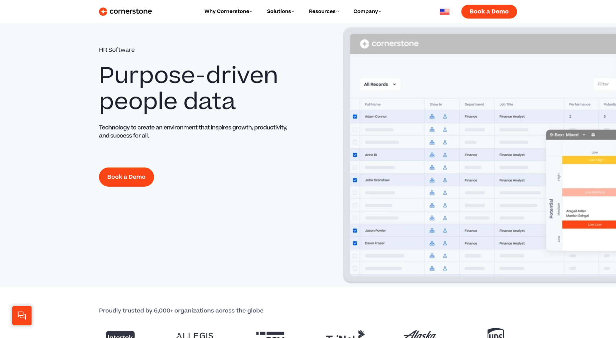
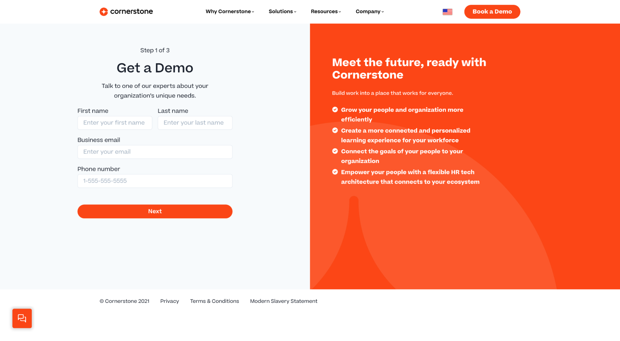
For example, Cornerstone HR software uses a “Book a demo” call-to-action (CTA) on their lead capture page to open up a lead capture form.
Why are lead capture pages important?
Because only 27% of leads are actually qualified, and every marketing department in the world wants to increase that number.
Plain and simple.
A lead capture page helps you convert more qualified leads at the point of entry so you can prevent your sales reps from chasing unqualified leads (and wasting time and money).
Lead capture page vs. click-through page
When it comes to landing pages, there are lead capture pages, click-through pages, splash pages, squeeze pages, referral pages, thank you pages, and so much more.
But in general, the two main broad categories of landing pages include lead capture pages and click-through pages.
You already know that the purpose of a lead capture page is to acquire leads. And what distinguishes a lead capture page from other pages is its lead capture form.
A click-through page, on the other hand, is a landing page without a lead form. Instead, a click-through page seeks to move visitors from the landing page to another page via a click.
An example of a click-through landing page is a landing page that sells a product. Instead of filling out a lead form, visitors can “click” the button to buy now, then get sent to a checkout page where they can fill in their card information and purchase the product immediately.
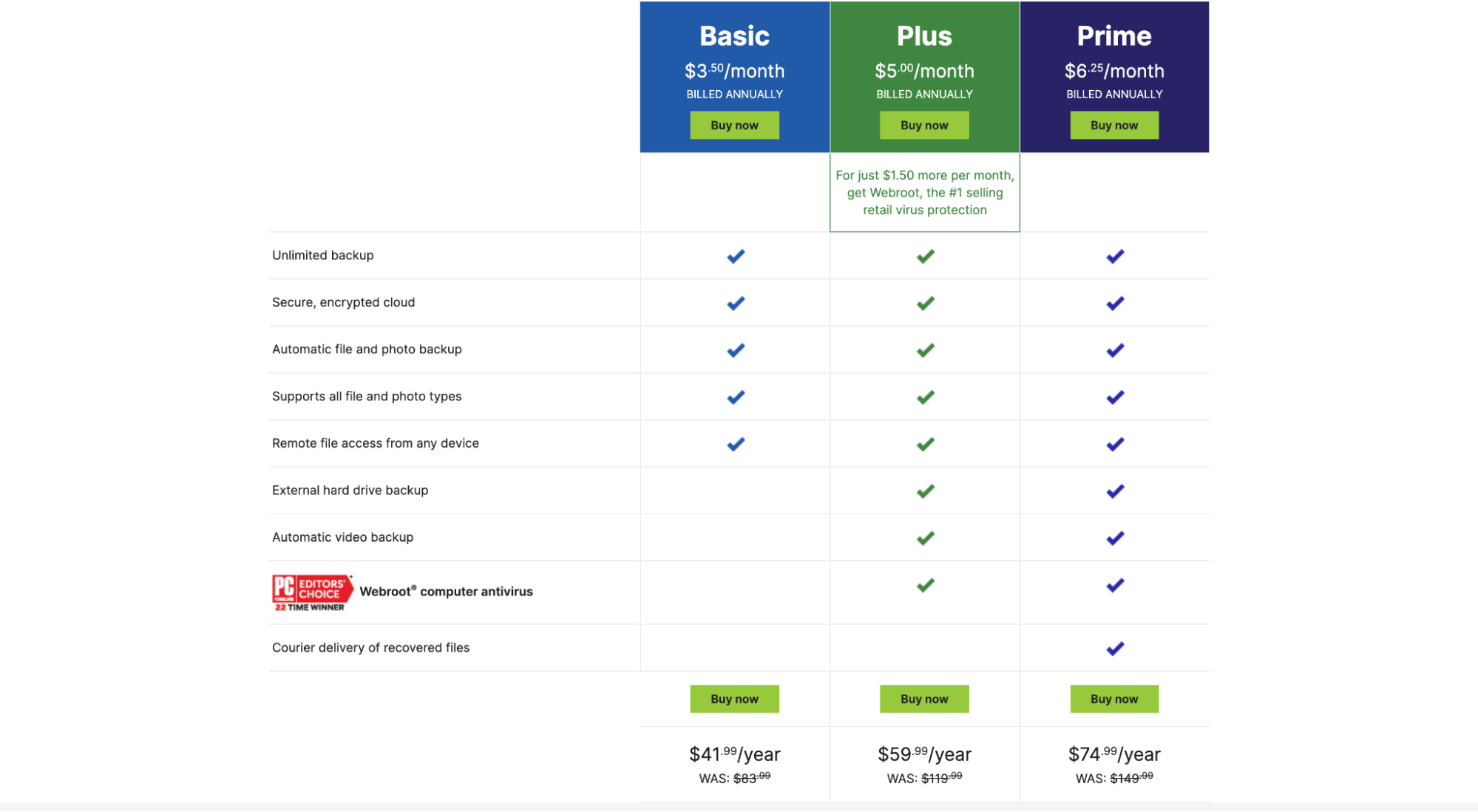
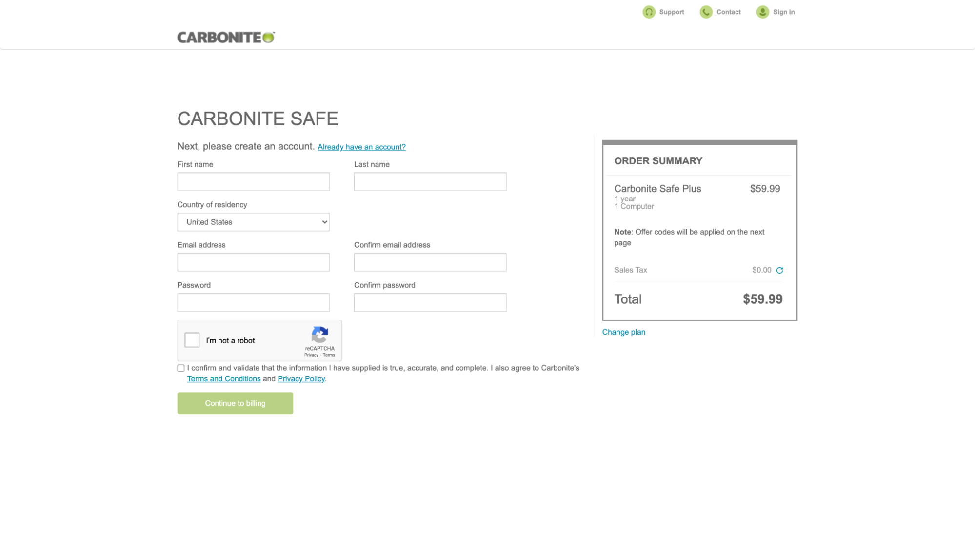
For example, this Carbonite cloud storage click-through lander includes “Buy now” call-to-action (CTA). When you click on it, it takes you to a checkout page to purchase immediately.
Creating a lead generation page
There’s no better way to learn about lead capture best practices than by analyzing the anatomy of a lead gen page that checks all the boxes.
So that’s exactly what we’re going to do.
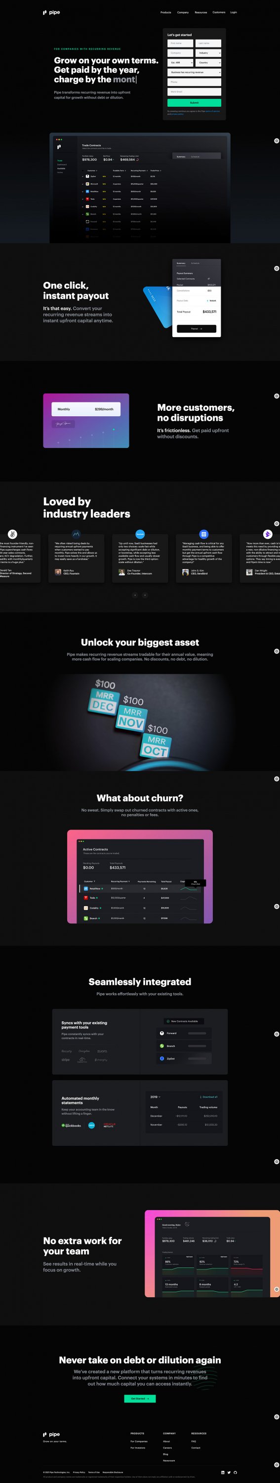
Enter: Pipe.
Pipe is an innovative tech company that lets businesses with recurring revenue trade their MRR for upfront capital. Their lead capture landing page hits a homerun.
- Headline ✅
- Subheading ✅
- Visuals ✅
- Features and benefits ✅
- Objection handling ✅
- Social proof ✅
- Call-to-action (CTA) ✅
- Value exchange✅
- Form ✅
Let’s explore each.
To view the full Pipe landing page, click here.
1. Headline
A great lead capture page delivers a compelling value proposition directly from the headline in as few words as possible.
Your headline should grab attention, empathize with your prospects’ pain points, and deliver a clear and concise benefit—all in plain English (no jargon). While this seems easy, it’s no small feat.
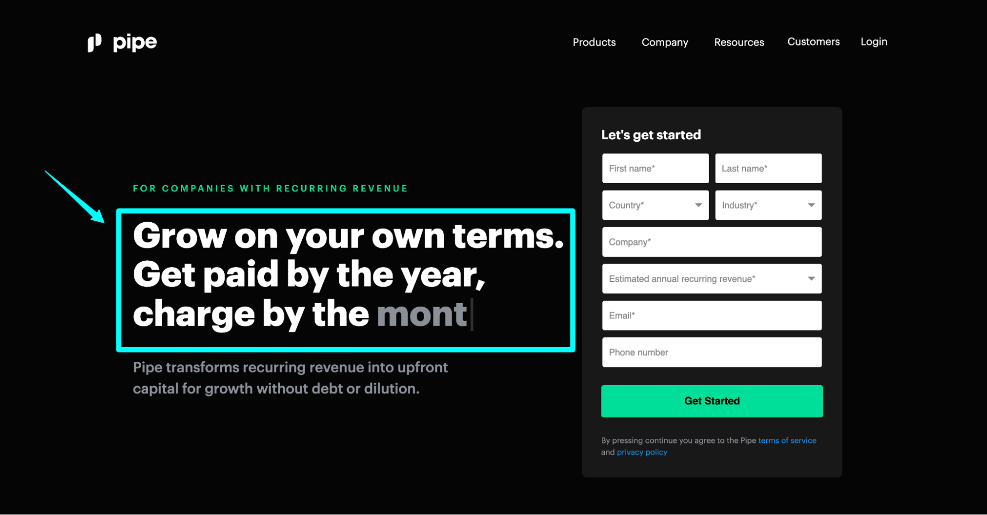
Pipe headline: “Grow on your own terms. Get paid by the year, charge by the month/quarter.”
- Clear benefit: “Get paid by the year, charge by the month.” Effortless value.
- Targeted: Pipe uses the preheader, “For companies with recurring revenue,” to tee up their headline.
- Conversational: No jargon; plain english.
- Concise: Masterful, though I might flip it like this: Get paid by the year. Charge by the month. Grow on your own terms.” 1.2.3.
Further reading: Landing Page Headlines: Everything You Need to Know
2. Subheading
Your subheading provides direct support to your headline.
Not only does a subheadline expand upon the value proposition by providing clarifying details, but it entices the visitor to keep scrolling. Together, the headline and subheading set the tone for what’s to follow.
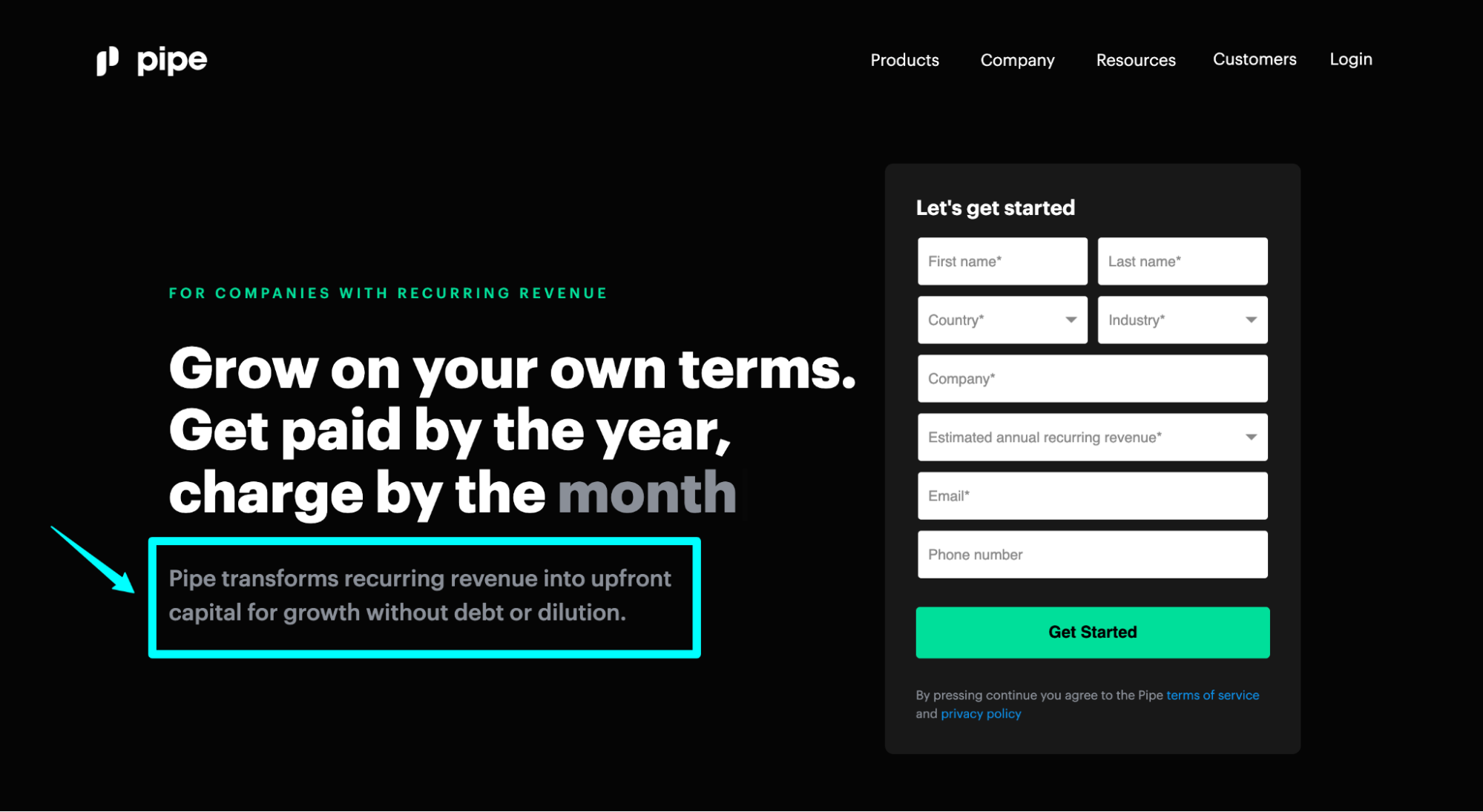
Pipe subheading: “Pipe transforms recurring revenue into upfront capital for growth without debt or dilution.”
- Supporting details: “Pipe transforms recurring revenue into upfront capital…” Got it.
- Enticing: “...growth without debt or dilution.” Sign me up.
- Clear and concise: Pretty good, but Pipe can make this subheading even clearer by slightly modifying it: “Pipe transforms recurring revenue into upfront capital so you can grow without debt or dilution.” There we go.
Further reading: How to Write Amazing Landing Page Copy (Plus Templates)
3. Visuals
Visual elements like background images, hero shots, and supporting graphics help add much-needed context to your offer. Without visuals, you’re selling the invisible; with visuals, nothing needs to be imagined. But not just any visuals; visuals that bring the words to life.
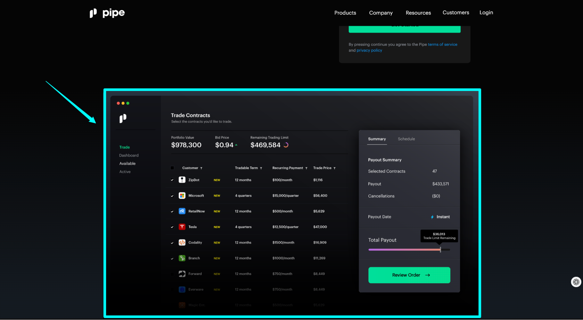
Pipe is a category creator. No previous demand existed—they created it. Which means prospects will have tons of questions. After all, they’ve never seen a product like this before.
To help sell the invisible (and leave nothing to the imagination), Pipe uses beautifully-designed screenshots from the dashboard of their product. Not only do these screenshots help visitors better understand how Pipe works, but they make the process seem quick and seamless.
Further reading: 3 Landing Page Design Tips to Increase Conversions
4. Features and benefits
Features are great, but unless they’re tied to meaningful benefits, they don’t matter to your prospects (as much as they matter to you).
Every great lead capture page spotlights the product’s or service’s top features but emphasizes the benefits more.
What makes a good benefit? It solves a critical job to be done.
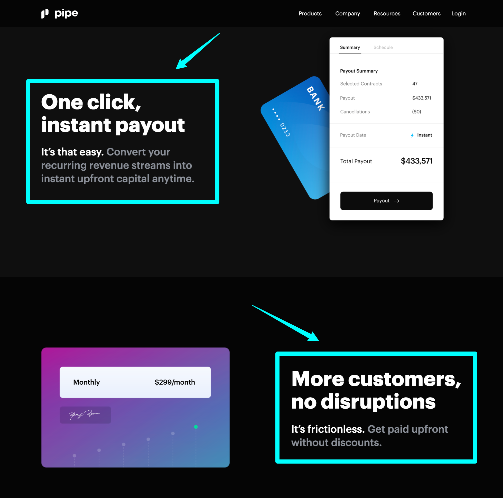
Pipe includes a handful of features/benefits on their lander (others not pictured), but no better than their first two: “One click, instant payout” and “More customers, no disruptions.”
- Job to be done: Upfront capital. Check.
- Job to be done: More customers. Check.
5. Objection handling
Strong copy handles objections as they arise.
You can do that with features and benefits, or you can do it with frequently asked questions.
Either way, every great lead capture page proves that the business knows its customers by answering the most pressing questions, rebuttals, and objections on their minds—all within the copy.
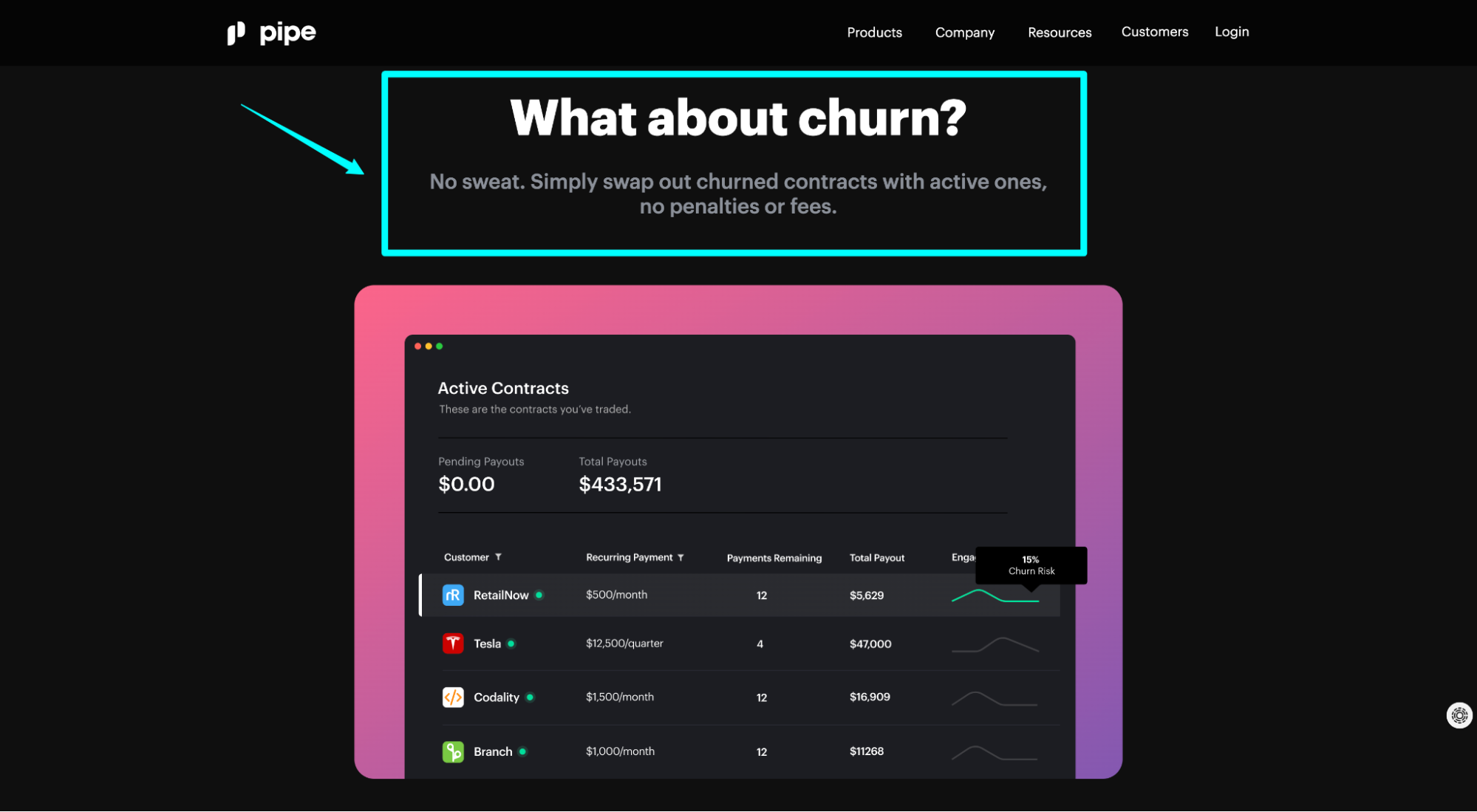
Pipeline objection handling: “What about churn? No sweat. Simply swap out churned contracts with active ones, no penalties or fees.”
Honestly, is there any question higher up on your mind than “What about churn?” after finding out that Pipe pays you upfront for your MRR client contracts? No chance.
6. Social proof
Social proof refers to third-party endorsements that vouch for the quality of your product or service. They come in the form of client logos, testimonials, case studies, star ratings, social media influence, awards, trust icons, customer activity, and much more.
Why does social proof matter? 92% of customers are more likely to trust non-paid recommendations than paid advertising. And 70% of people trust recommendations from people they don’t even know.
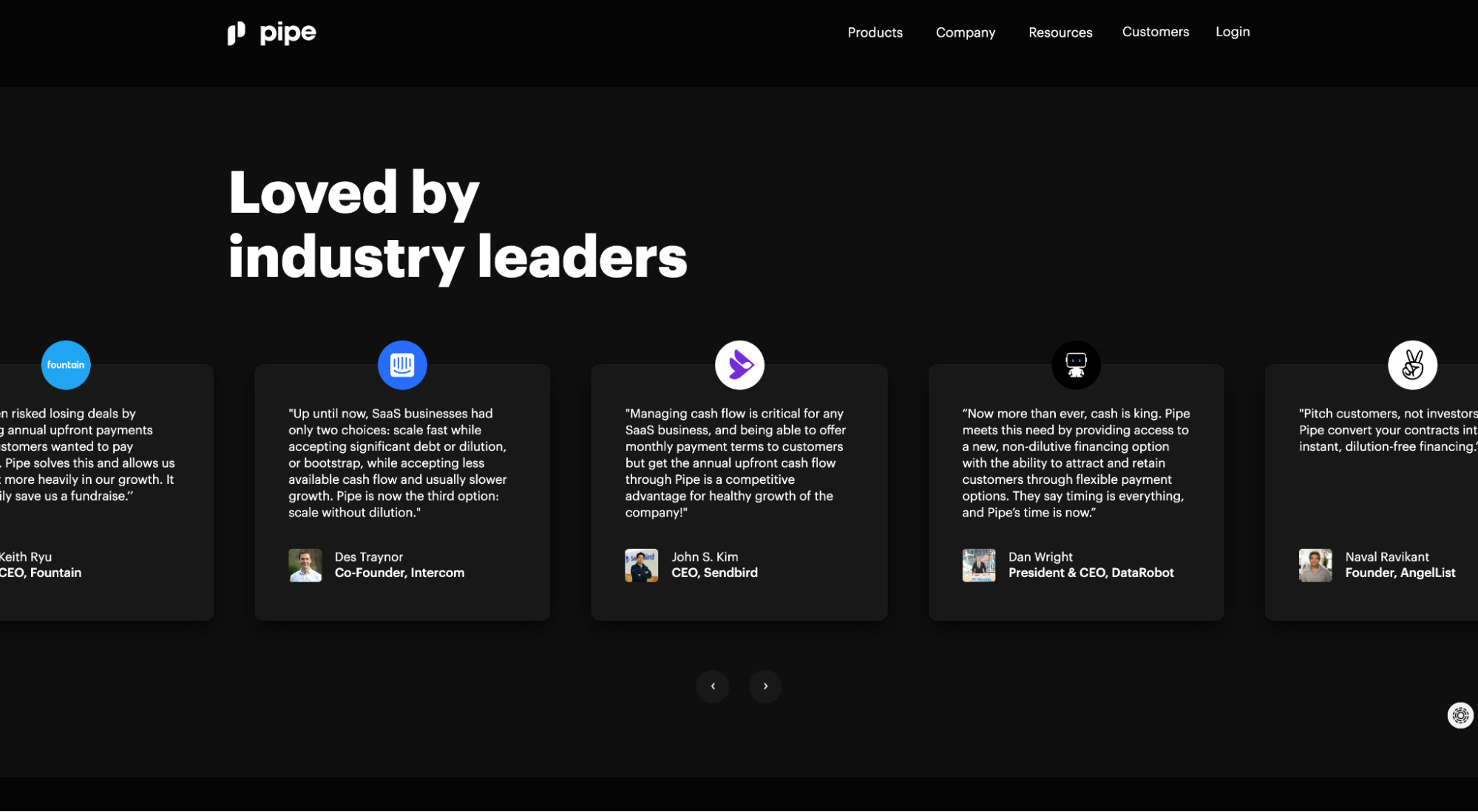
Pipe’s social proof includes testimonials from founders and executives at Intercom, AngelList, Sendbird, DataRobot, Fountain, and Second Measure.
You couldn’t put together a better lineup of testimonials for this product. All testimonials come from reputable authorities in the tech, startup, and VC space (i.e. people who understand the importance of upfront capital).
Further reading: 22 Ways to Use Landing Page Testimonials and Social Proof
7. Call-to-action (CTA)
An optimized lead gen page offers visitors two choices: to take the desired action, or to leave. That’s it.
When you offer too many CTAs (i.e. too many choices), conversions decline. In fact, 46% of landing pages contain more than one offer, but including more than one offer can decrease conversion rates by 266%.
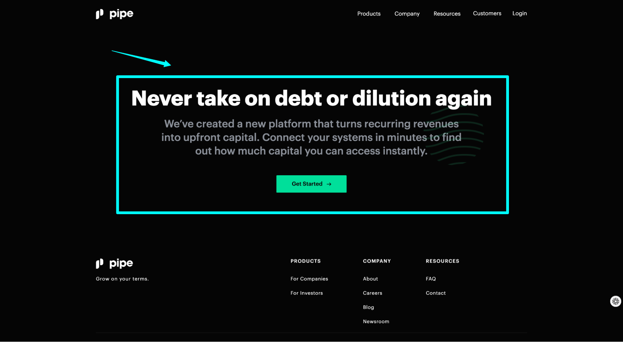
Pipe CTA: “Get started.”
- Above the fold: Though this screenshot is an example of the final CTA section, they include the same CTA and form above the fold too.
- Single CTA: “Get started.” That's the only action you can take, other than leaving.
- Noticeable button: Lime green contrasts with black background so it pops off the page and grabs attention.
- Clear benefit: “Get started.” Though I’m sure Pipe has experimented with other versions like “Get upfront capital now,” “Apply now,” or “Get pre-approved.”
Further reading: 38 Proven Ways to Create The Strongest Call-to-Action Copy
8. Value exchange
What’s on the other side of the form? In exchange for my personal information, what do I get in return?
Remember: Before you can capture the sale, first you need to capture the lead, which means you need to sell the next step, not the last step.
Depending on your goals, you might use any of the following to sweeten the deal and make visitors feel like the gift they’re receiving is better than the gift they’re giving (i.e. their contact information):
- Ebooks
- Whitepapers
- Webinar registration
- Demo
- Free trial
- Pre Approval
- Templates
- Course
- Checklist
- Tools
- Etc.
Like we mentioned in the intro, just because someone gives you their personal information in exchange for a piece of content, that doesn’t make them a lead.
Sure, depending on the content, and depending on how you score your leads, a certain piece of content might signal more purchase intent than another. But a webinar registration, free ebook download, or newsletter opt-in doesn’t necessarily mean they want the sales team to follow up.
If you want real leads (i.e prospects who are in-market actively investigating solutions you provide, and who have expressed interest in those solutions), tailor your marketing campaigns, lead pages, and CTAs to explicitly attract and convert those people. Which means a value exchange looks more like an offer than a lead magnet.
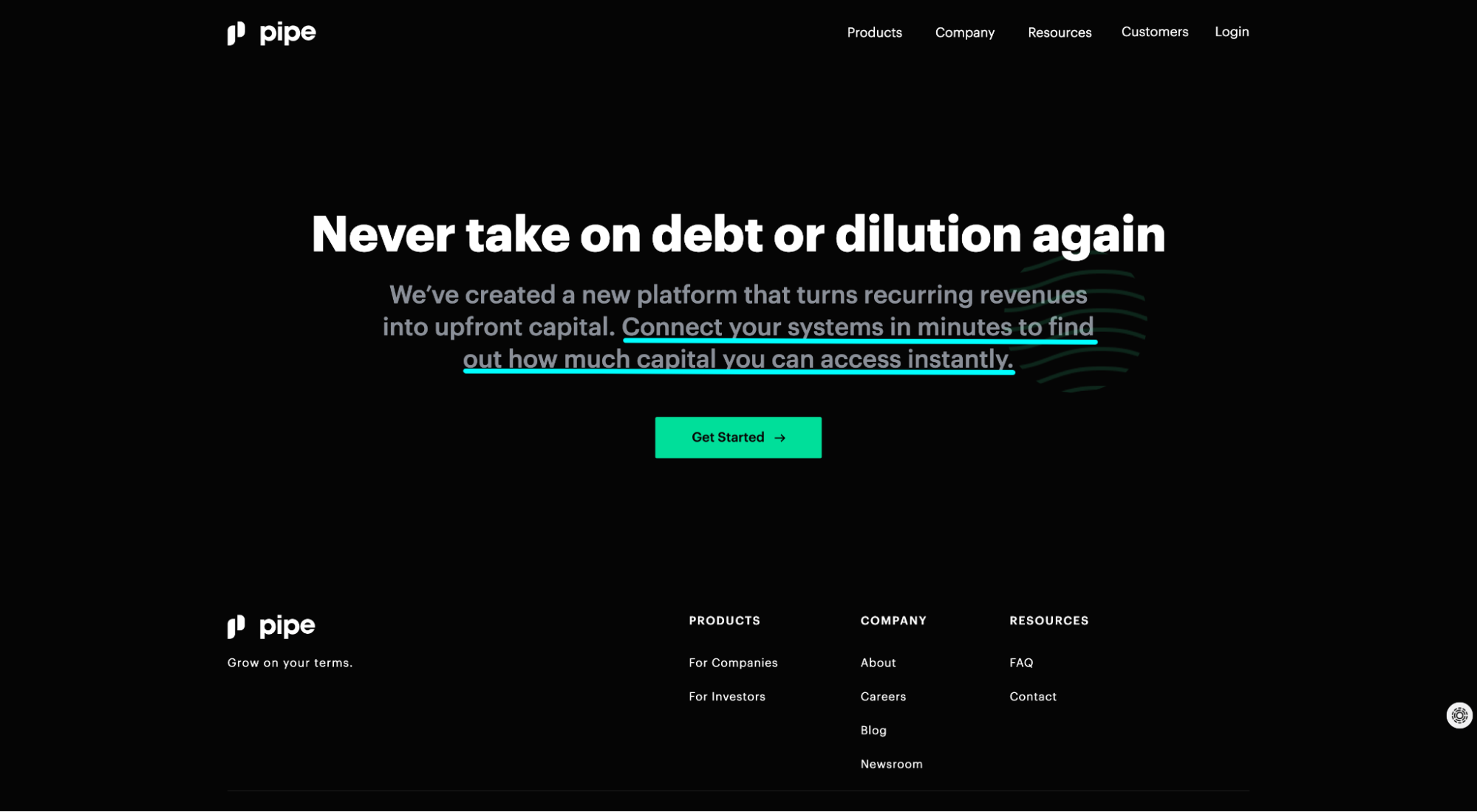
Pipe value exchange: “Connect your systems in minutes to find out how much capital you can access instantly.”
Flawless.
Further reading: 10 Lead Magnet Ideas For Conversion Domination
9. Form
Last, and certainly not least, your lead capture form.
This step is so important to lead generation that we dedicated an entire section to it below.
But let’s briefly explore why Pipe’s lead form works so well.
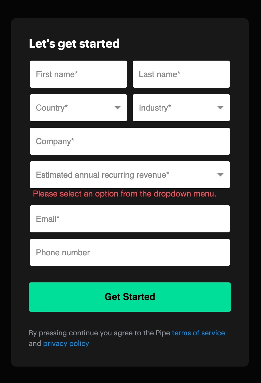
Why we love it:
- Autofill: Form fields auto populate for a frictionless experience.
- Dropdowns: With dropdowns, visitors don’t need to type in words, which makes the form easier to fill out.
- Format: They keep first name/last name and country/industry on the same line to make the form feel shorter and less daunting.
- Above the fold: Pipe embeds their lead form above the fold for everyone to see when they land on the page. No hiding.
Now let’s dig deeper into optimizing your lead forms below.
Optimizing your lead capture form
The question on everyone's mind: how many form fields is too many?
Short answer: it depends.
Always A/B test your lead form fields, no matter what anyone or any data says (including us).
Long answer: it depends. Again.
Forever, marketers championed fewer form fields for higher conversions. So much so that it became one of marketing's many truisms:
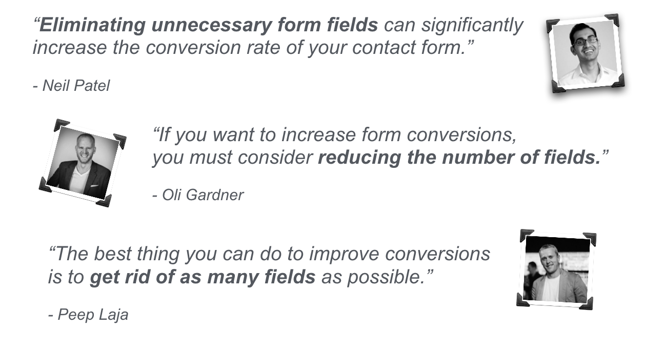
In many cases, that assumption still holds true.
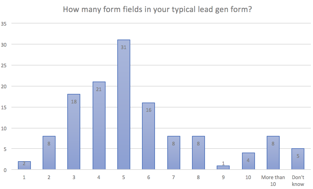
This is likely why the most common number of fields in a lead gen form sits at five, according to Hubspot.
However, over the years, sufficient evidence has emerged to prove that more fields can actually lead to more conversions, not fewer.
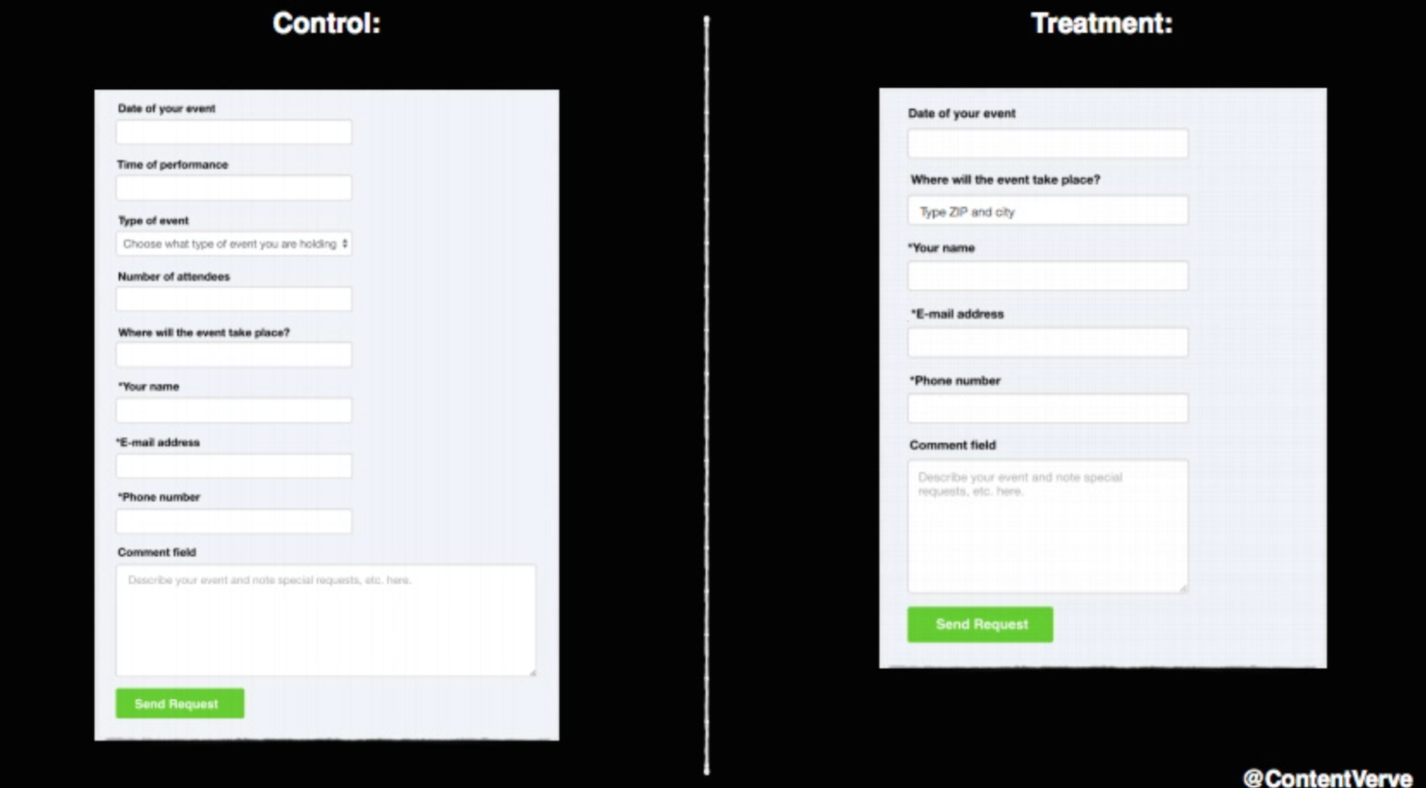
For example, in a now famous test, Micheal Aagaard (formerly of Unbounce), discovered that removing three fields from his form (from 9 to 6 fields) resulted in a 14% decrease in conversions.
What gives? Context.
A visitor is less likely to fill out 12 form fields in exchange for what they perceive as a low-value reward, like a webinar they have little interest in. But that same person might pleasantly fill out 12 form fields when applying for a license, filling out government papers, or receiving a reward they highly value.
In general, it’s a question of quality vs. quantity.
In most cases, when you use a long form with many form fields, the quality of your leads will go up, but the quantity of your leads will likely go down. Makes sense, considering that the people with the most interest also have the most urgency to share their information, however long it might take.
Conversely, when you use a shorter form with fewer form fields, though your lead volume is likely to rise, your lead quality is likely to decline, as more looky-loos will submit information with no real intention of becoming a customer.
Bottom line: Test your damn forms. Always.
Either way, long or short, follow these seven lead capture form best practices:
- Place it above the fold: Keep your form easily visible by placing it above the fold (the visible part of the page before a visitor scrolls). Visitors should never have to search for the form.
- Use the breadcrumb technique (multi-step form): The breadcrumb technique is a method we developed, inspired by the yes ladder, to reduce friction and increase conversions. Essentially, it uses a multi-step form to ask the least intimidating questions first and the most intimidating questions last (i.e. name, address, phone), and it never asks more than three questions in one stage. Recent research from Hubspot suggests that multi-step forms can convert 86% higher.
- Eliminate unnecessary fields: This takes experience and testing, but more often than not, your form will include 1-3 fields that just don’t need to be there because they're non-essential. Eliminate the fat.
- Consider a button instead: A long form looks daunting to visitors. Experiment using a CTA button to trigger a form popup instead. Leverage micro-conversions to increase form fills.
- Make the CTA compelling: “Submit,” “Send,” and other generic CTAs don’t make your offer more appealing. CTA button copy is a science, so we wrote an entire article on optimizing landing page CTAs here: 38 Proven Ways to Create the Strongest CTA Buttons.
- Remove friction with smart forms: Don’t make visitors work to fill out forms. Instead, leverage autofill, radio buttons, and dropdowns to help ease the process.
- Optimize for mobile: Seriously. I lost track of how many times I’ve discovered a mobile unfriendly form hemorrhaging leads. If mobile visitors (over 50% of web traffic, on average) can’t fill out a form with their thumb, it needs work.
Want to learn more about optimizing your lead capture forms so you can increase conversions? We wrote an entire article on the topic: 31 Ways Your Landing Page Forms are Bleeding Money.
Lead capture page examples (good and bad)
Now for the fun part.
We dove deep into the Pipe lead capture lander, but let’s explore seven more examples, good and bad (mostly good).
Why only seven? Because we’ve written dozens of landing page articles with hundreds of landing page examples in the past (check 'em out here). So instead of duplicating thoughts, we’re going to do something different.
Since one of the key ingredients of an effective B2B lead capture landing page is the lead capture form, we decided to provide full-length landers along with critiques of their CTAs and forms.
Examples include:
- Intercom
- Samsara
- Oscar
- AllHands
- HelloSign
- ADP
- KlientBoost
Let’s explore each.
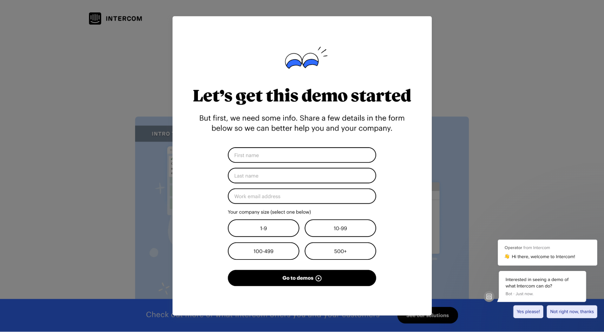
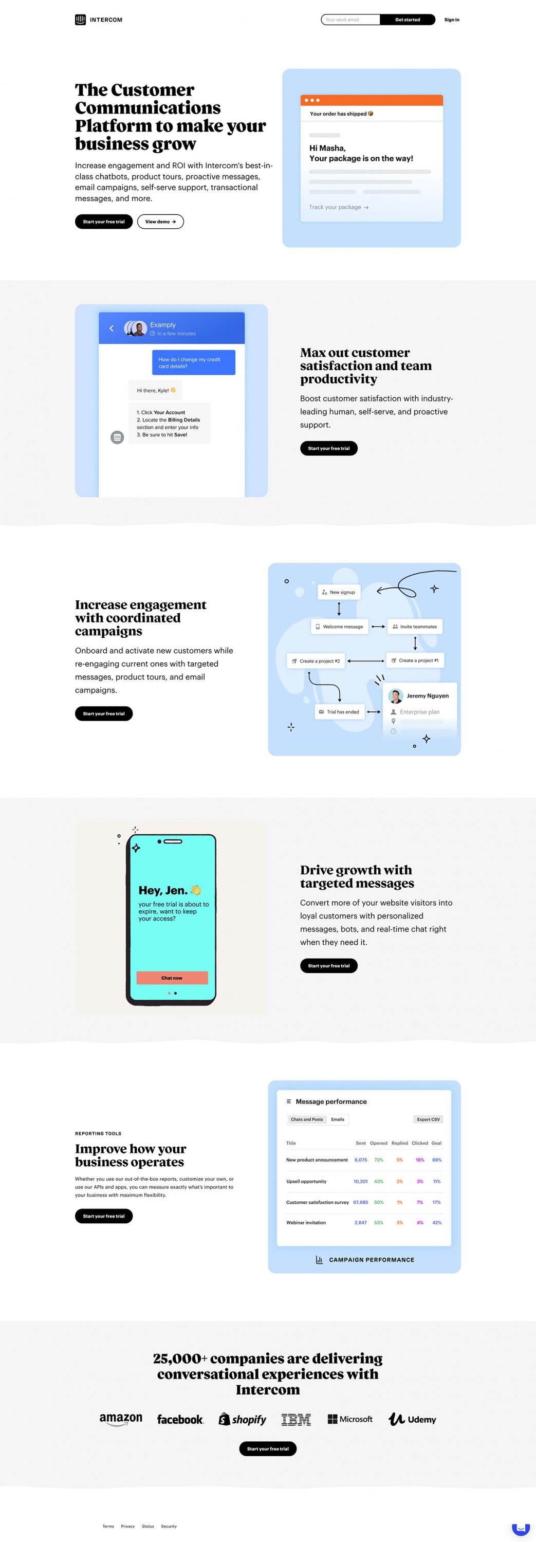
1. Intercom
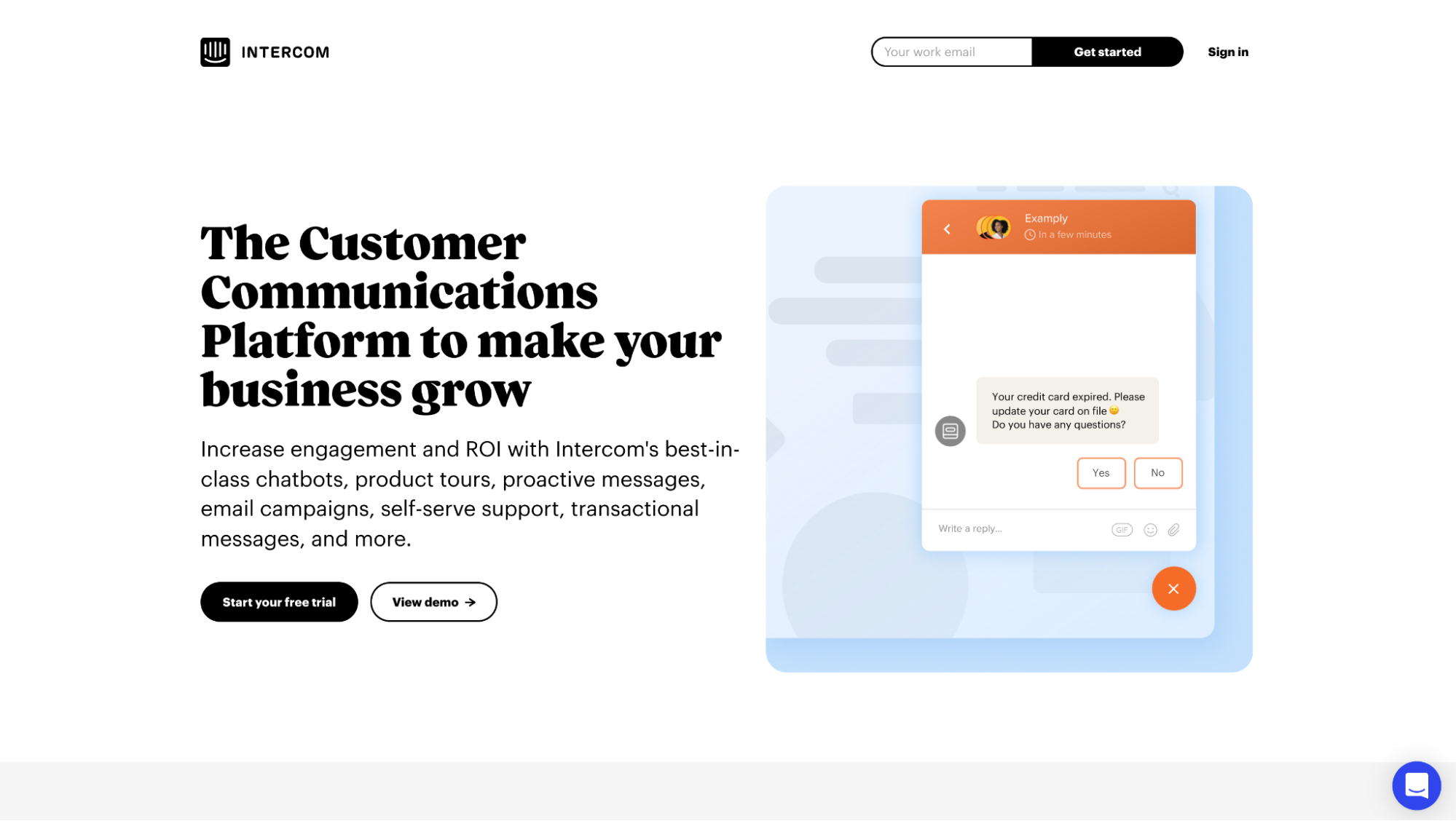
View full lander: Intercom lead capture page
Lead capture CTA: “View demo”
Lead capture form: Minimal form fields; instant gratification (“Go to demos”)
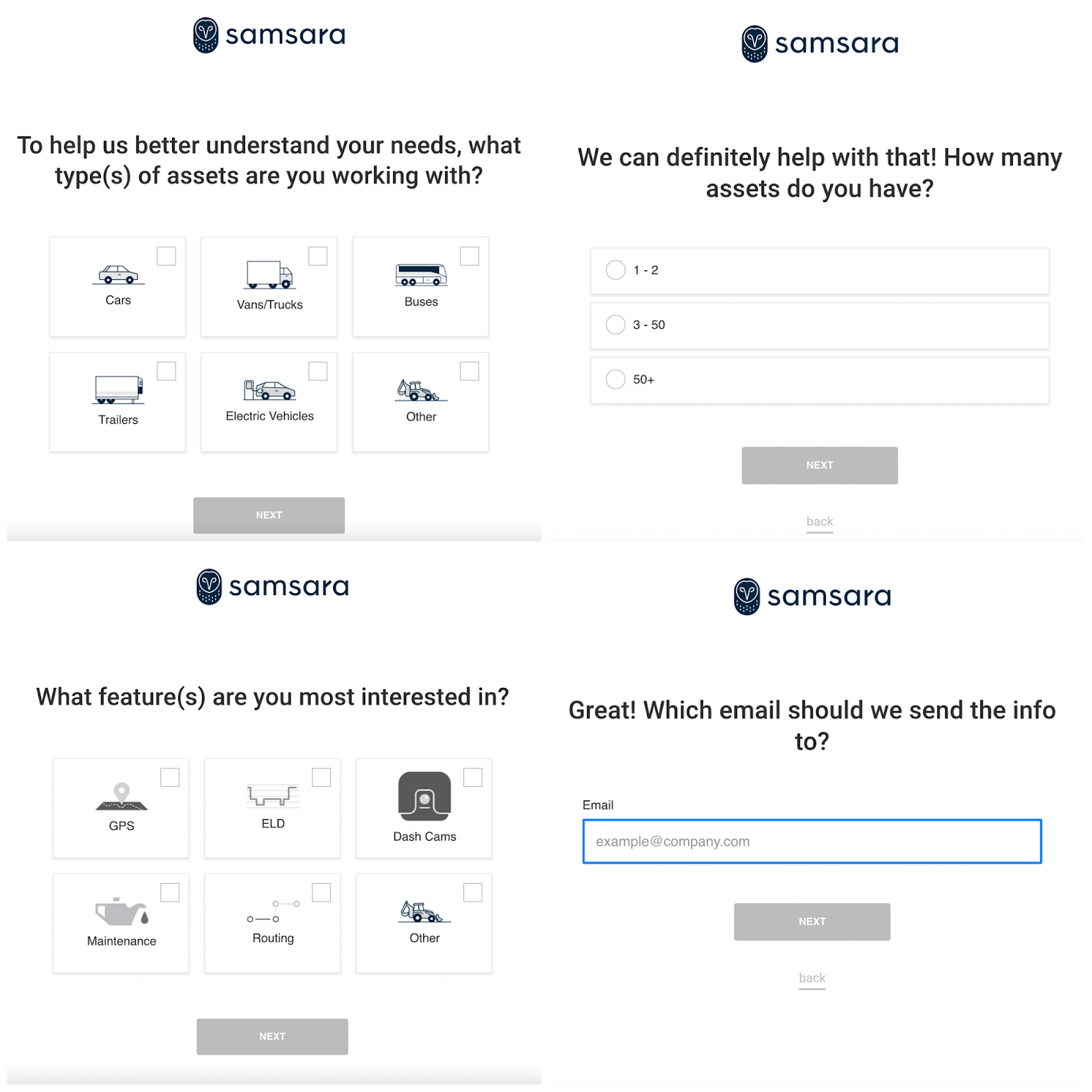
2. Samsara
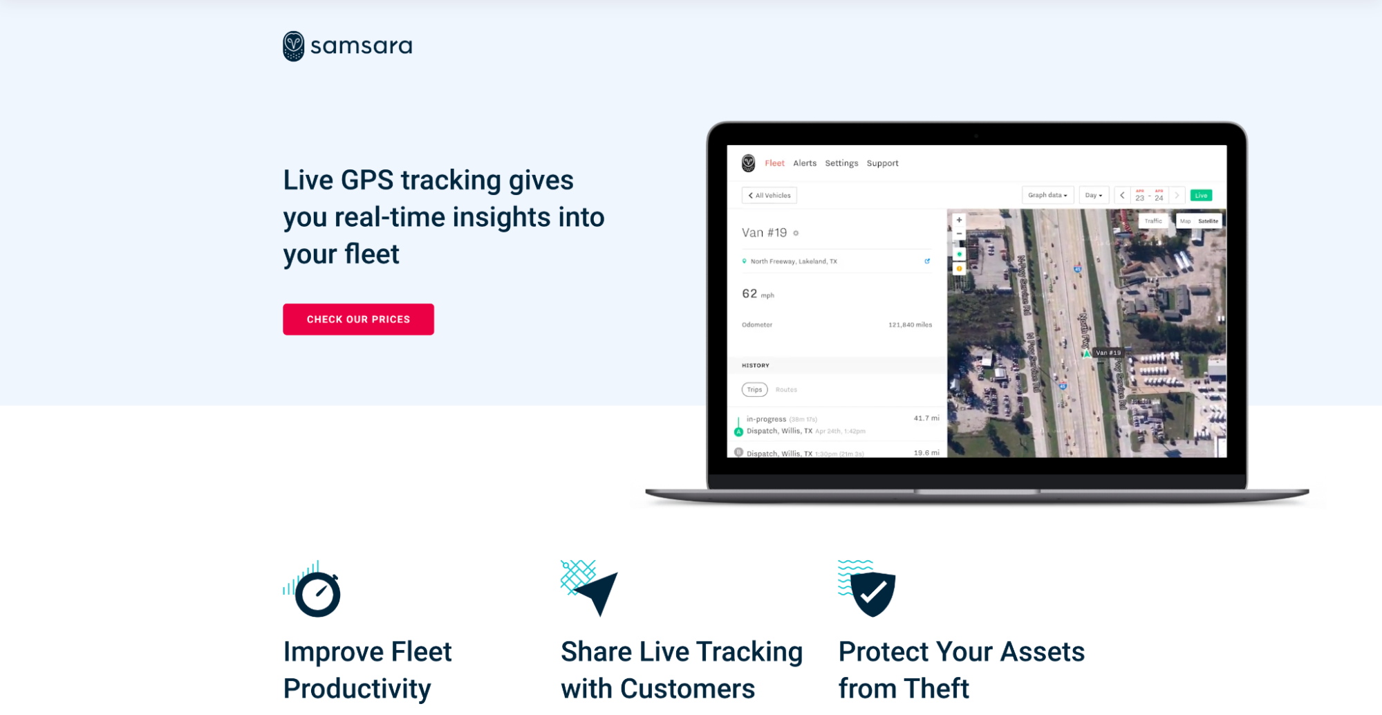
View full lander: Samsara lead capture page
Lead capture CTA: “Check our prices” (everyone wants pricing!)
Lead capture form: Samsara utilizes the breadcrumb technique to move visitors to leads, one micro-conversion at a time. Notice how they ask the most intimidating question (email) last?
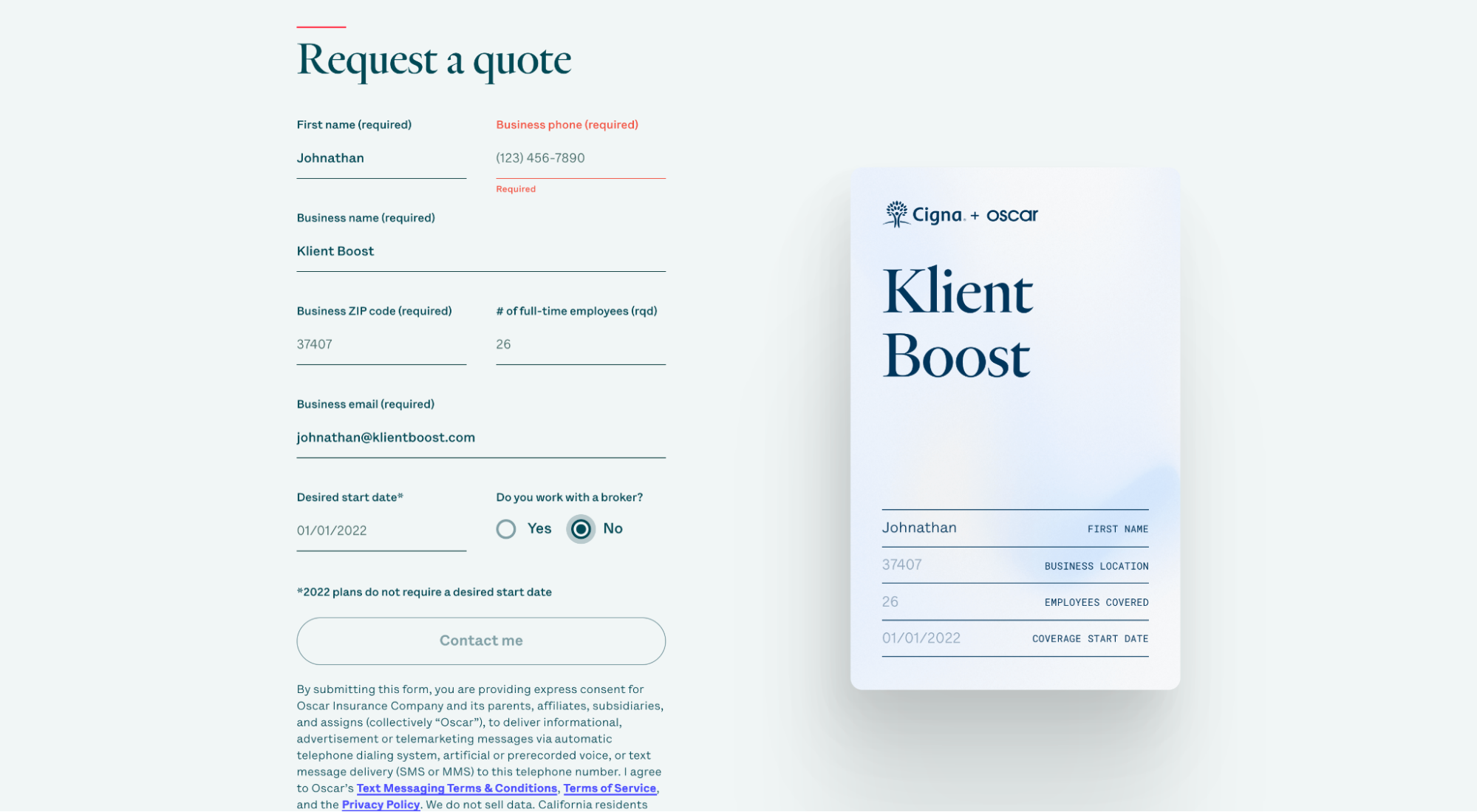
3. Oscar

View full lander: Oscar lead capture page
Lead capture CTA: “Get your personalized quote”
Lead capture form: Oscar’s lead capture form auto-populates a graphic of a health benefits card. Brillant. Why? It reminds leads in a visual and concrete way what they’re signing up for: not just benefits, but the peace of mind knowing you have that little card in your wallet when you need it.
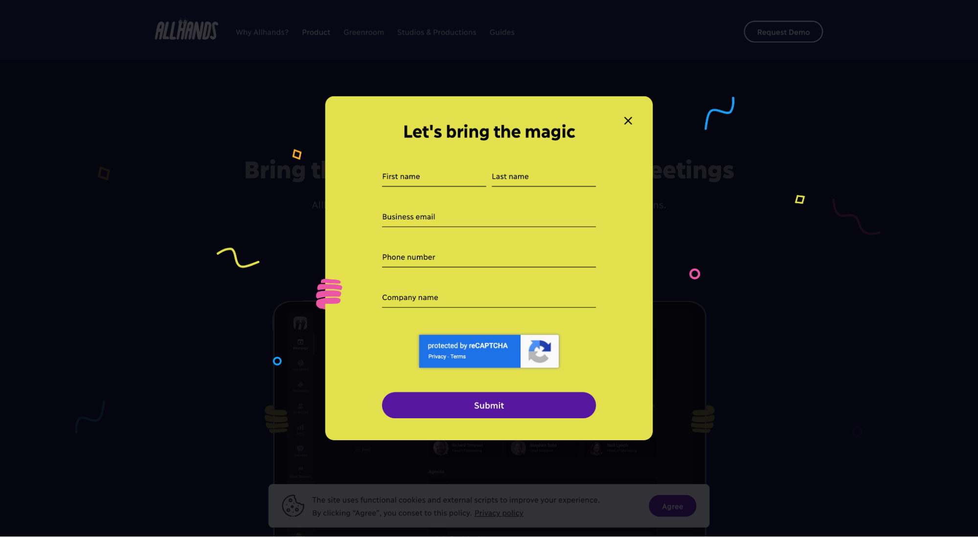
4. AllHands
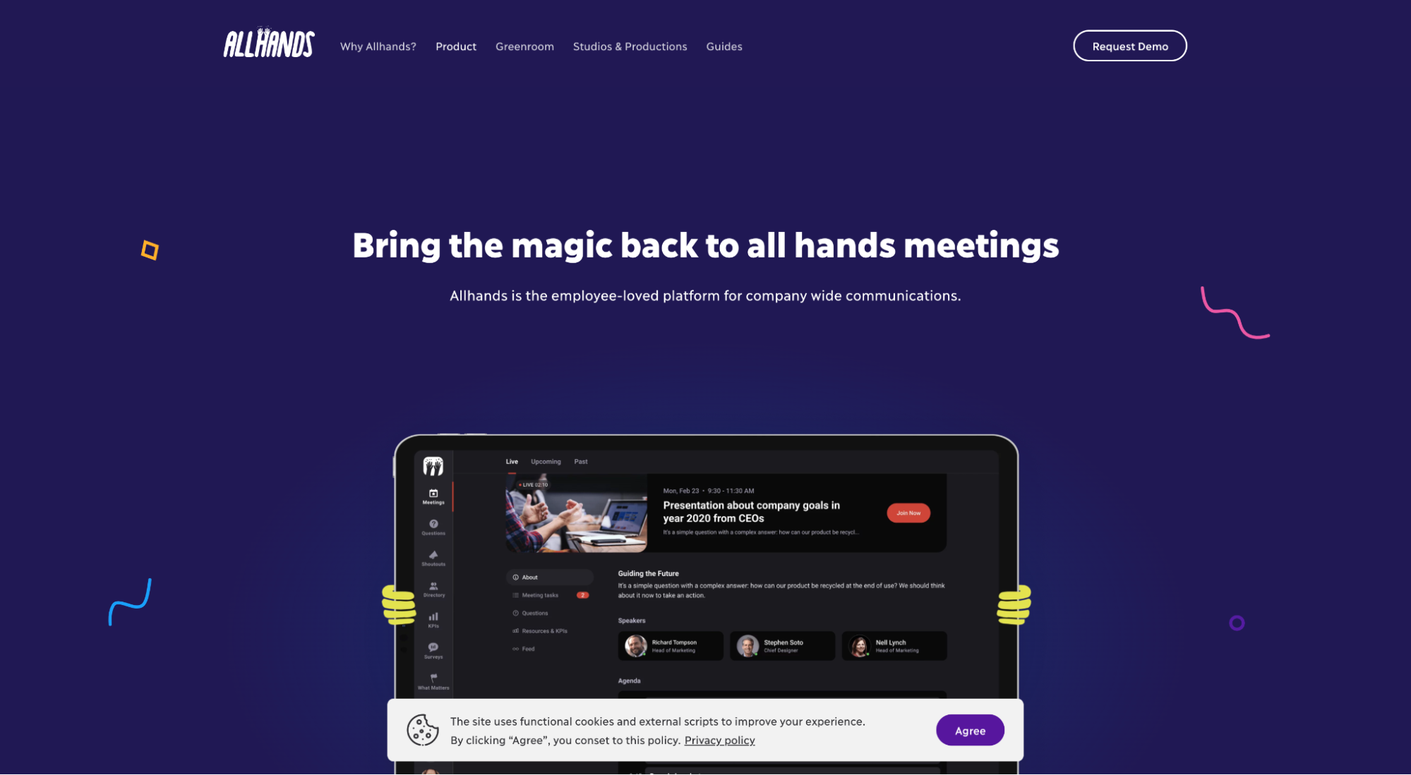
View full lander: AllHands lead capture page
Lead capture CTA: “Request a demo”
Lead capture form: Short, sweet and branded (“Let’s bring the magic”). Though AllHands would stand to benefit if they let me know what happens next (“submit” is vague). Do I schedule a meeting? View an on-demand demo? Wait for you to email me? Something else?
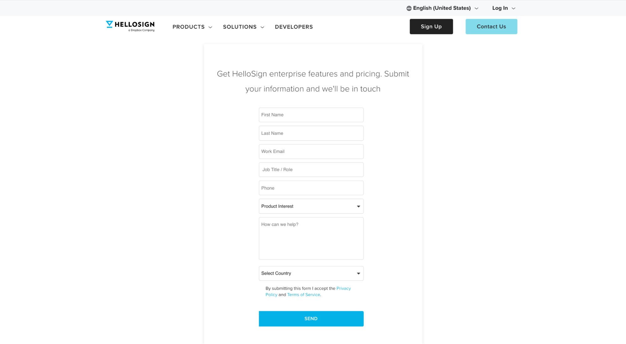
5. HelloSign
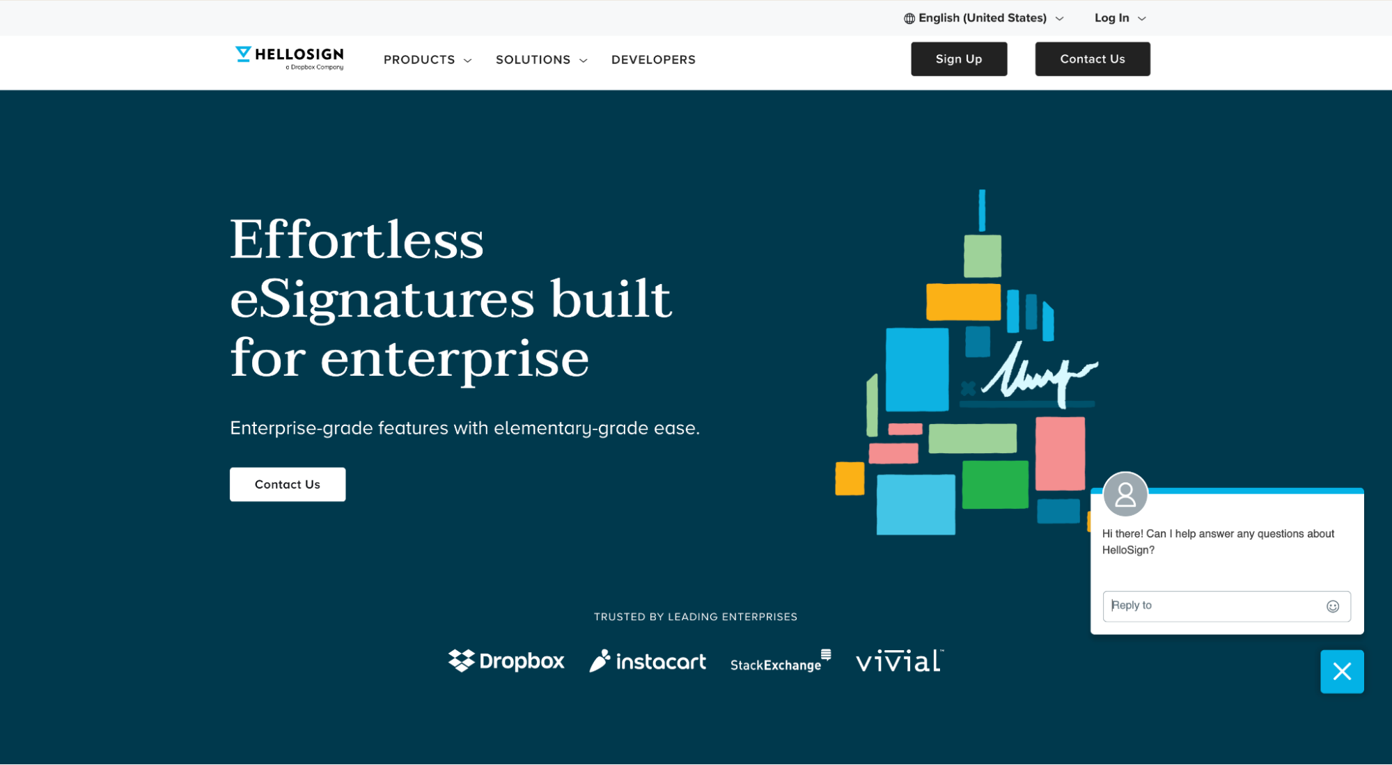
View full lander: HelloSign lead capture page
Lead capture CTA: “Contact Us.” Meh- not exactly a riveting CTA, mostly because I don’t know why I’m contacting you yet. What is the value exchange? Tell me.
Lead capture form: Am I contacting you for enterprise features? You mean, like the ones you talk about on the landing page? Or am I contacting you for pricing? Or am I contacting you with a message? No idea.
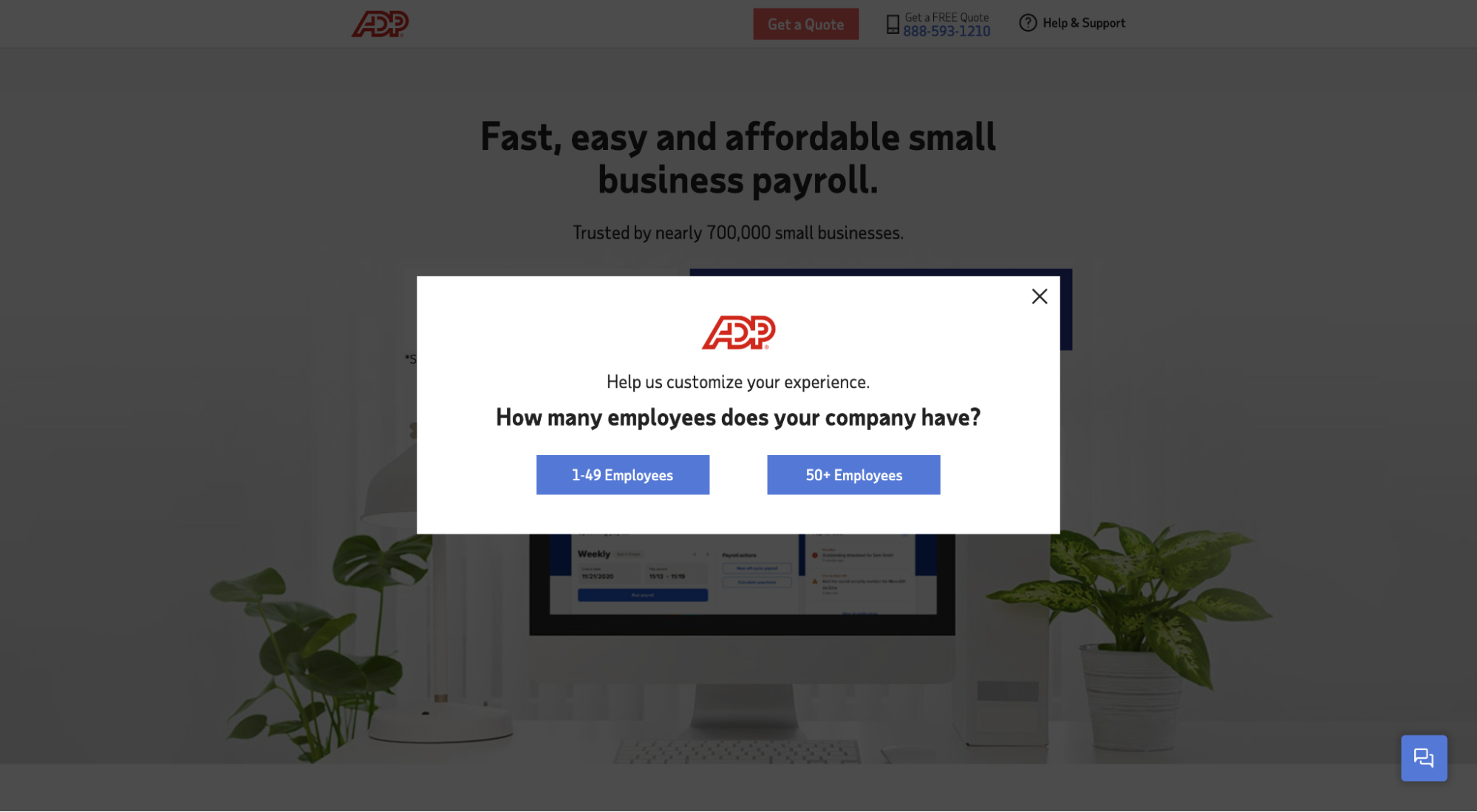
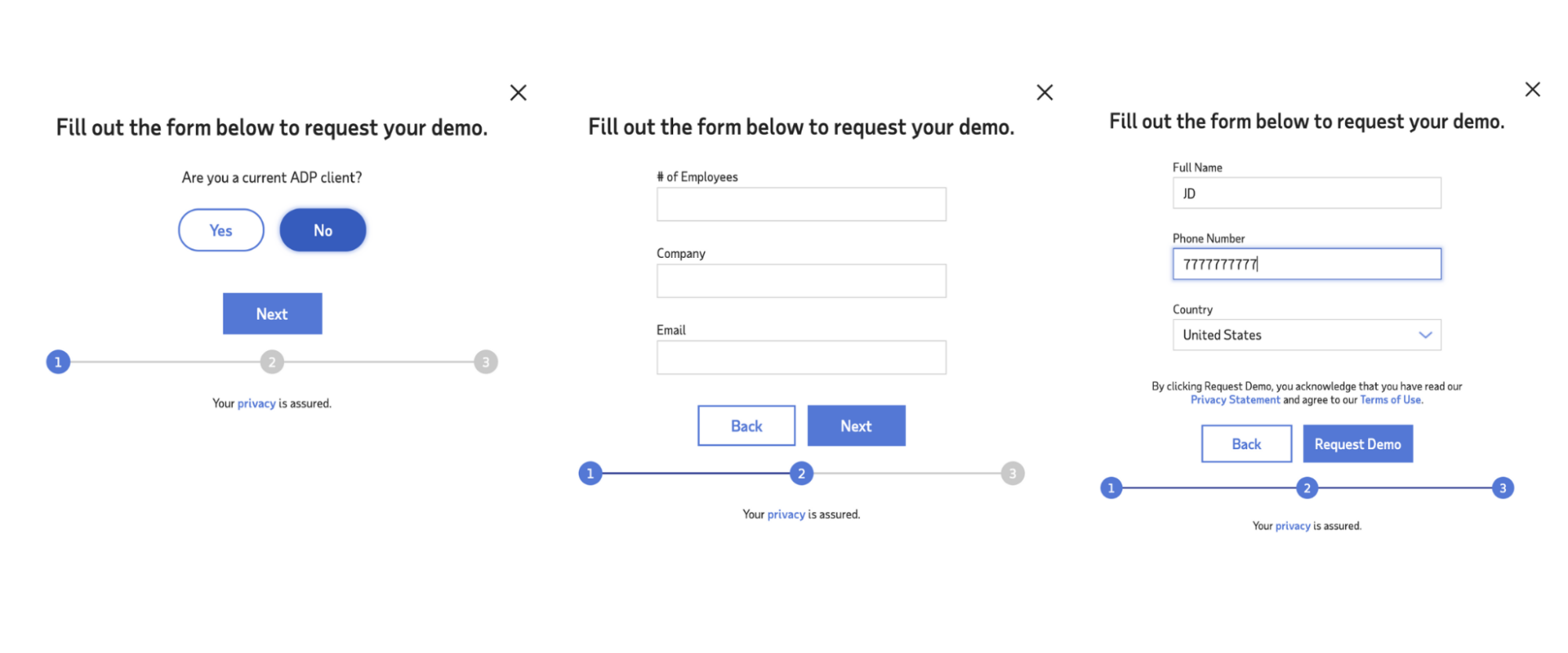
6. ADP
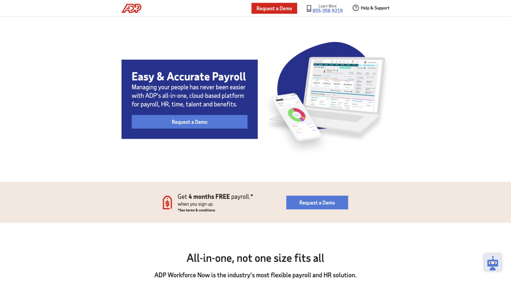
View full lander: ADP lead capture page
Lead capture CTA: “Request Quote”
Lead capture form: ADP does a few things well. First, when you land on the page, they show a splash page that directs you to one of two versions of the site depending on your company size. Second, when you request a demo, they use the breadcrumb technique to micro-convert visitors to leads.
7. KlientBoost (shameless self promotion 😜)
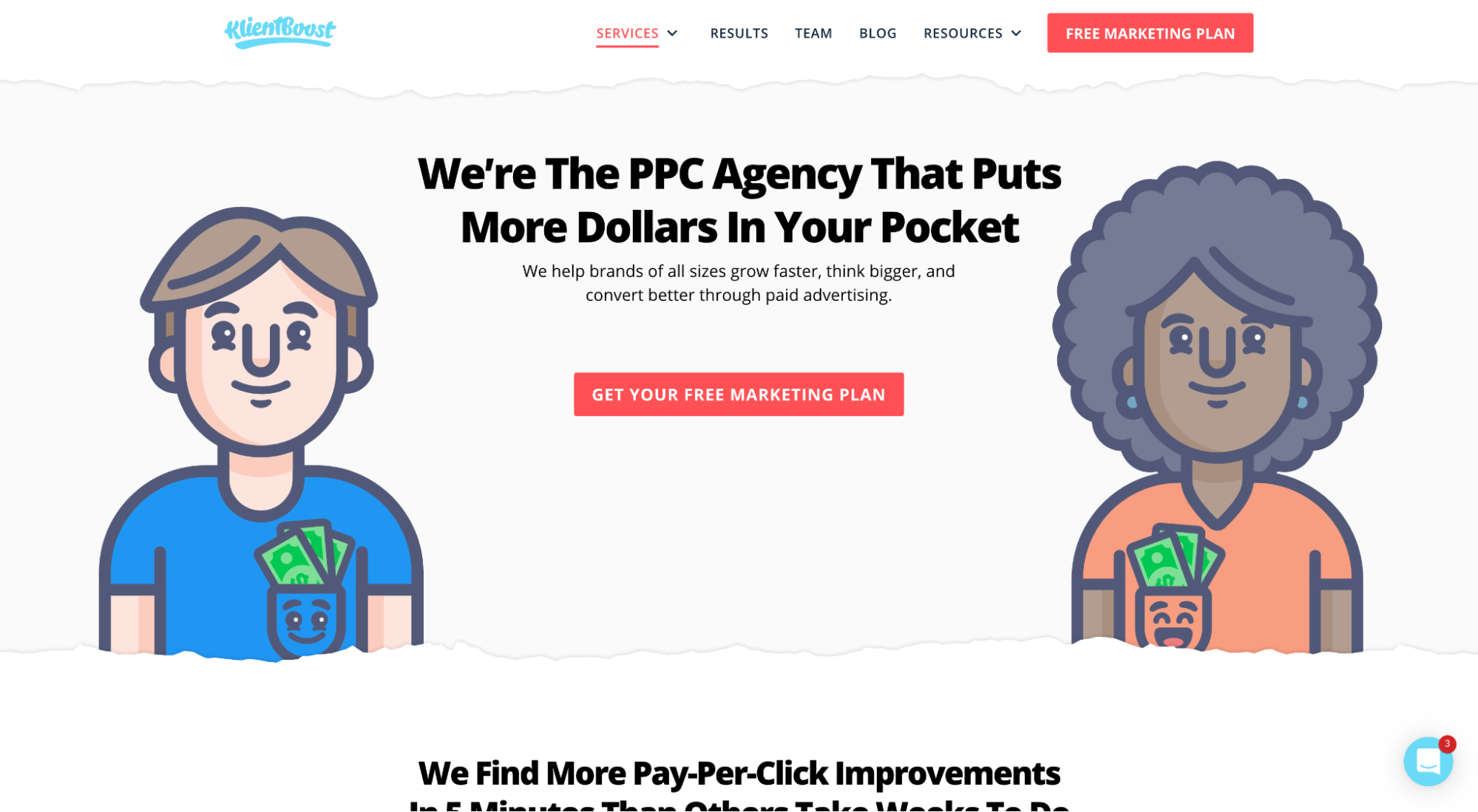
View full lander: KlientBoost lead capture page
Lead capture CTA: “Get your free marketing plan”
Lead capture form: Ok, ok—shameless self-promotion, but we A/B split tested the hell out of this CTA and offer, so we know it works. Plus, you might think it was the copy testing that led to more conversions (it was); but what led to even more conversions was the dedicated page we created just to sell the value of our offer (the marketing plan).
When we talk about communicating the value exchange, this is what we mean.
Too often marketers get so hellbent on selling the product that they forget to sell the next step in the buyer’s journey, which, in this case, is a free marketing plan and phone call, not PPC, SEO, or landing page design.
Capture the lead before you capture the sale.
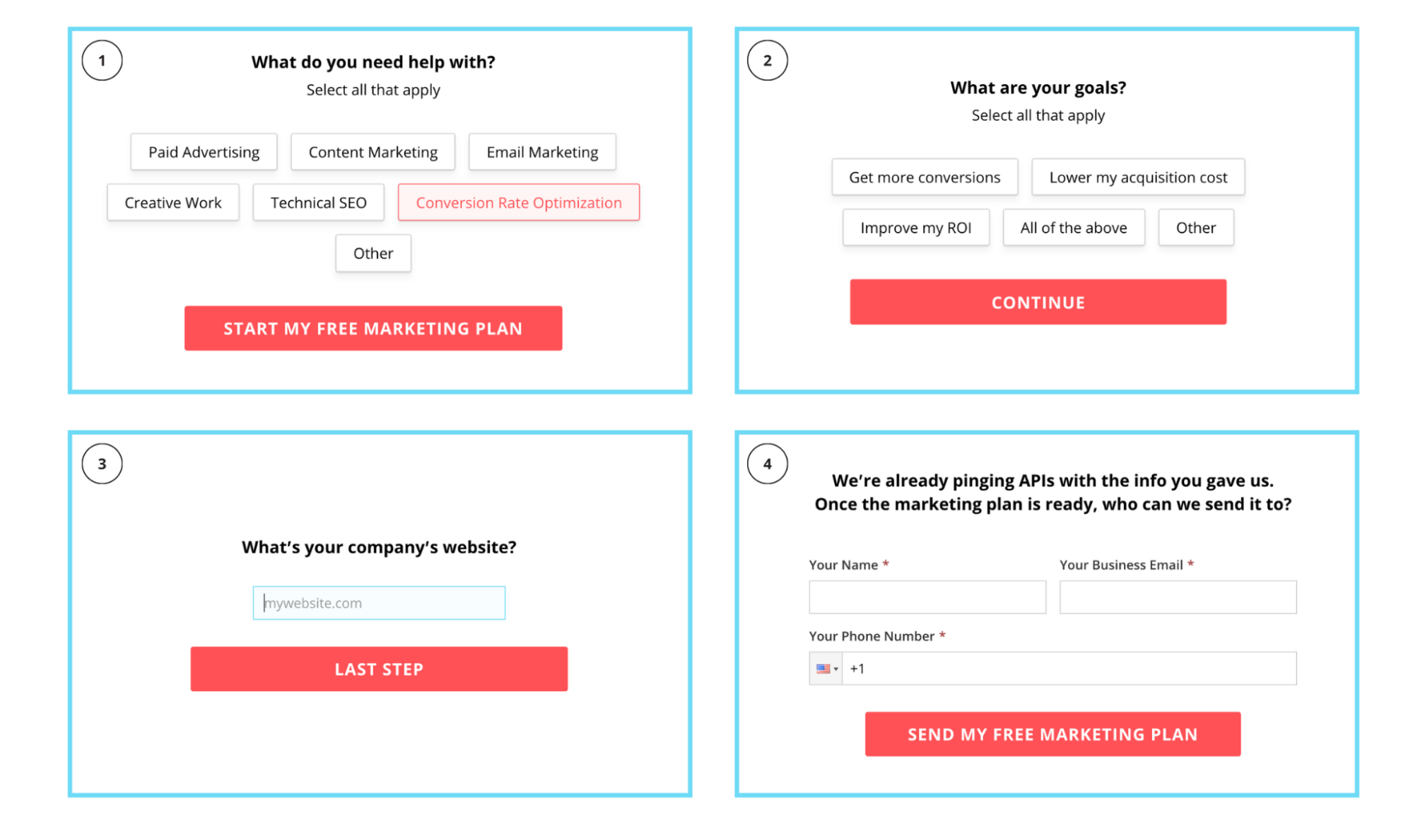
Ok, let’s first look at our form progression, inspired by the breadcrumb technique.
Four stages. Most intimidating request last (email and phone number):
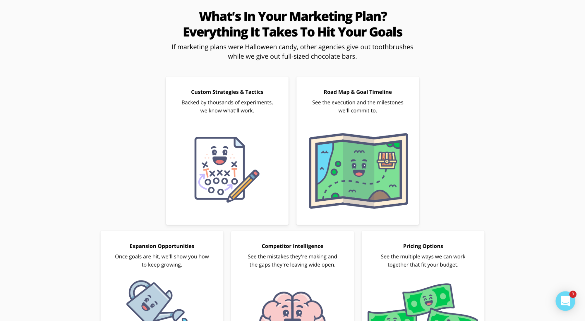
Next, let’s look at our dedicated marketing plan web page (view full page here):
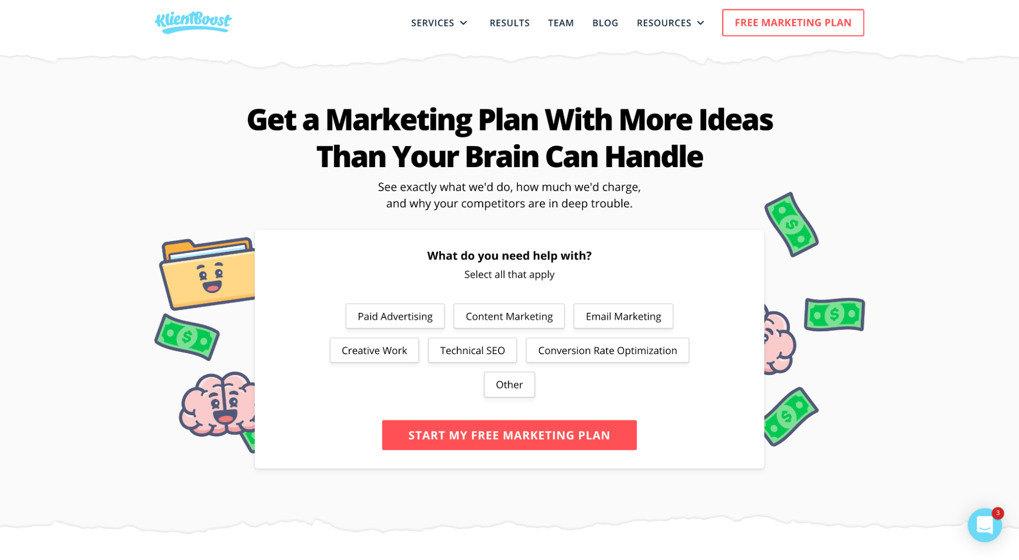
First and foremost, the form. Visitors will have clicked on the “Get my free marketing plan” button to get to this page, so let’s give them what they want above the fold.
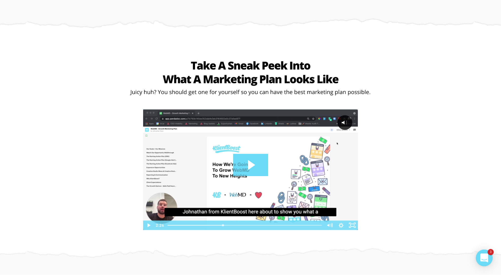
Second, sell the proposal.
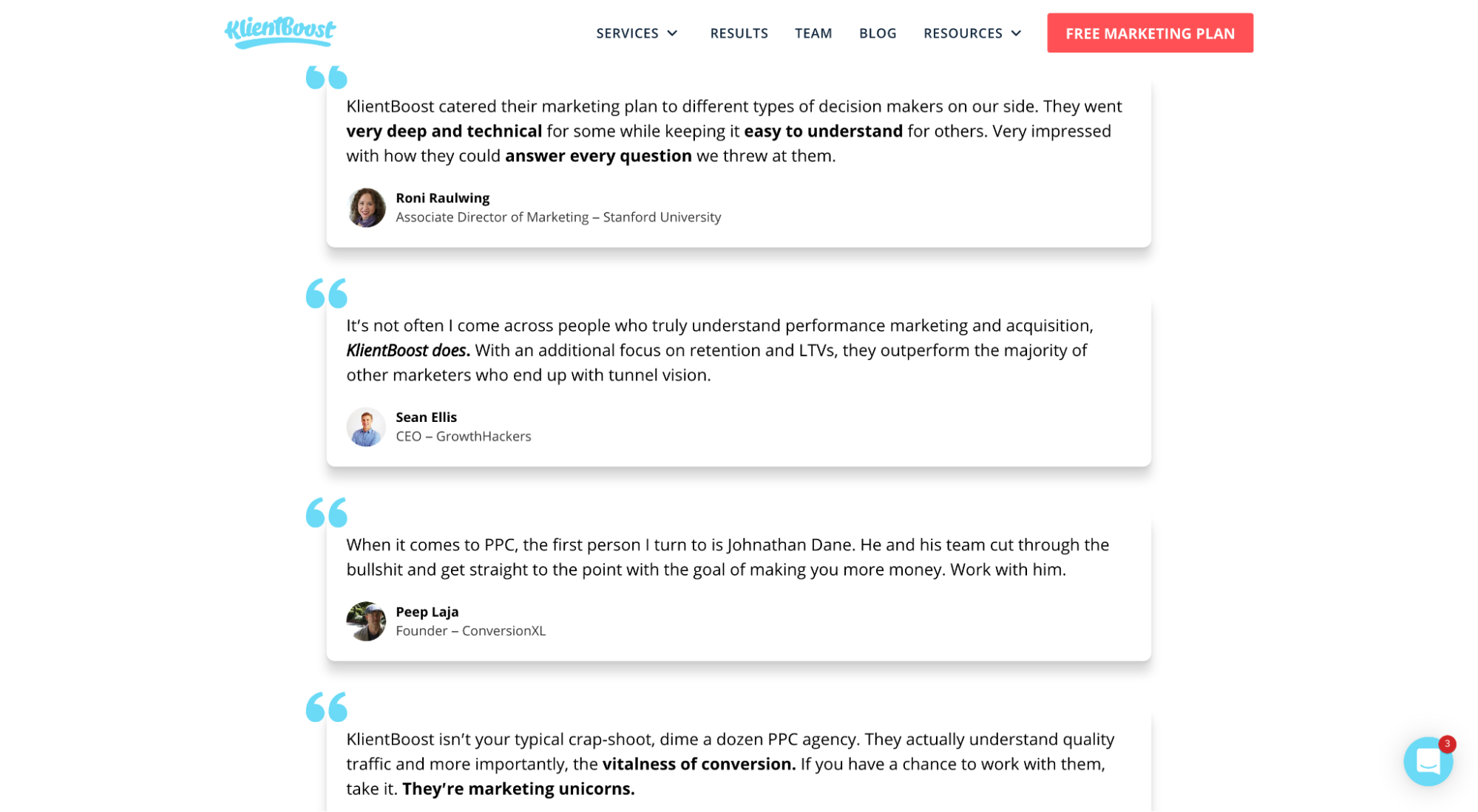
We played around with variations, but we ultimately discovered that a video demo of an actual marketing plan, along with the five value-based “gifts” you’ll receive for free and client testimonials converted the highest.
Tools and templates for building lead capture pages
Good news: Creating lead capture pages has never been easier.
Dozens (heck, hundreds) of landing page builders exist that include landing page templates, easy drag-and-drop design editors, A/B split testing, conversion tracking, and more. All for a low monthly cost.
Even better news: We wrote an entire article that reviews the nine best landing page builders, each perfect for creating lead capture pages for your business.
Wrapping up
I’ve never met a marketing department that didn’t want more qualified leads. Ever.
It just so happens that a fool-proof way to generate more leads is by incorporating lead capture landing pages into your performance marketing strategy.
Whatever you do, always remember that the purpose of a lead capture form is to sell the next step (demo, trial, meeting, marketing plan, guide, etc.), not the last step (the sale).
Capture the lead, then capture the sale.


