


The name splash page comes from the phrase “making a splash,” as in a web page that creates an indelible first impression or garners attention.
But since “make a splash” sounds like something my late grandmother would preach before my middle school plays (bless her soul), we’re actually not ever going to say “making a splash” again. Like, ever.
But we will dive (sorry, had to) into the most critical questions and answers regarding splash pages. When you’re finished, you’ll have answers to the following:
- Splash page definition
- How splash pages differ from landing pages
- Pros and cons of splash pages
- How Google views splash pages
- How to avoid SEO issues caused by splash pages
- Splash page examples
- Tools to create splash pages with ease
- Zero “making a splash” references (promise)
Stop wasting time, let’s get to it.
- What is a splash page?
- Splash page vs. landing page vs. squeeze page
- Is a splash page a popup?
- Benefits of splash pages
- Cons of splash pages
- How Google crawls splash pages (and how to avoid issues)
- Elements of a high-converting splash page
- 13 splash page examples for inspiration
- 1. H&M (country/language preference splash page)
- 2. White Claw (age verification splash page)
- 3. Facebook (login splash page)
- 4. Shiseido (promotional splash page)
- 5. Washington Post (paywall splash page)
- 6. DGMG (membership splash page)
- 7. Better Industries (coming soon splash page)
- 8. Resident Evil (announcement splash page)
- 9. Poolsuite.net (creative splash page)
- 10. Audi (website portal splash page)
- 11. Crazyegg (free trial splash page)
- 12. Coty (disclaimer splash page)
- 13. Drake Waterfowl Systems (newsletter splash page)
- How to create a splash page
- Wrapping up
Get brand new landing page strategies straight to your inbox every week. 23,739 people already are!
What is a splash page?
A splash page is a welcome screen that greets website visitors with a message, promotion, disclaimer, nudge, or announcement before entering the site.
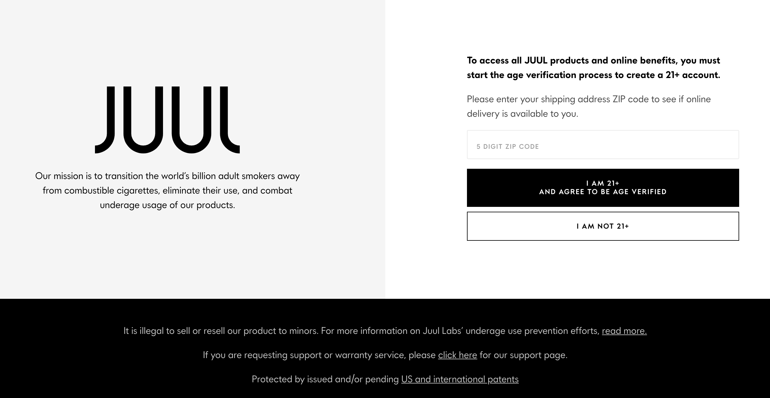
For example (and we’ll include many more later), below is a splash page from Juul tobacco products that requests age verification from visitors before entering their site:
Think of a splash page (or splash screen) like one of those welcome mats you place in front of your door (with a cheeky little message on it). It introduces site visitors to your website, makes the first impression, and may even ask for contact information before proceeding.
But after your visitors “clean their shoes” on it, they enter your house (i.e. your homepage) and never see it again (well, until they clear their cookies and return).
Splash page vs. landing page vs. squeeze page
We know, lots of “pages,” but there’s an important difference between all three.
Whereas a splash page is an introductory page that every visitor encounters before entering your website, a landing page is a standalone page designed to convert specific sources of traffic and/or campaigns faster (e.g. like social media or PPC campaigns). Consequently, a landing page is typically long, thorough, and persuasive, whereas a splash page is short and sweet.
A squeeze page, on the other hand, is a type of landing page designed solely to “squeeze’ emails out of visitors, like for a webinar, a newsletter or a download. That’s it.
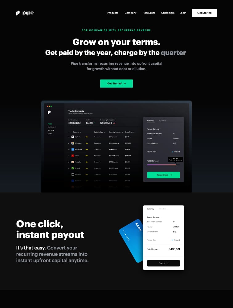
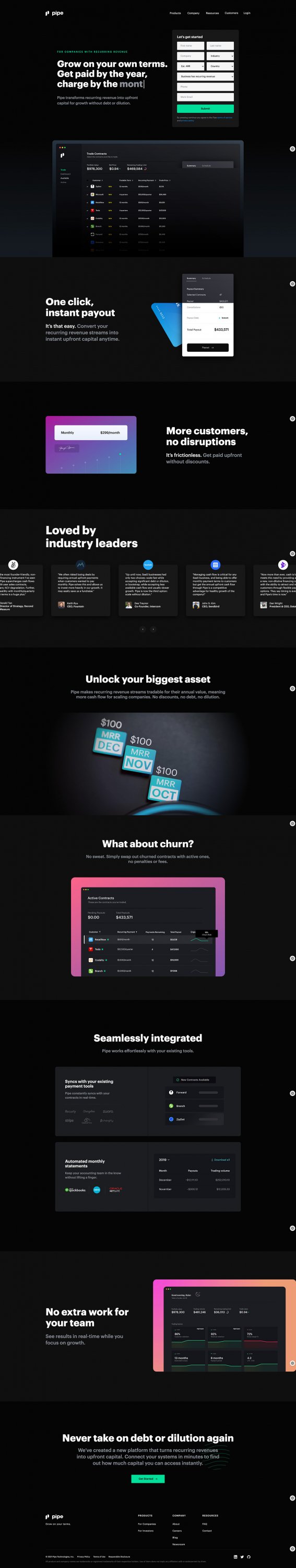
For example, this is a landing page from Pipe:
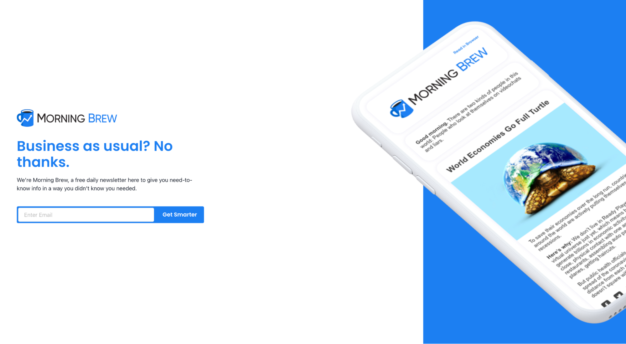
And this is a squeeze page from MorningBrew (newsletter):
Further reading:
Is a splash page a popup?
Splash pages have come a long way over the years.
In the beginning, most splash pages were real, hardcoded pages on your website that functioned as intermediaries (some still are).
Today, and with the advancement of landing page builders and popup software, most websites use full-screen popups as their splash pages.
It doesn’t matter what technology you use to execute your splash page, whether a popup builder or hardcoded page, but it’s worth noting that a splash page is not synonymous with a popup.
A popup is any lightbox that “pops up” when someone clicks a button, takes an action (e.g. like starting to exit the page), or triggers a timer (e.g. when someone spends over 30 seconds on your site).
A splash page is a welcome screen that doesn’t get “popped up;” it’s already there when you land on the page (it is the first page).
You can use popup software to achieve the same effect as a hardcoded splash page by setting the popup preferences to show immediately, but a splash page is not inherently a popup.
Benefits of splash pages
Splash pages serve various purposes, but their primary benefits include:
- Grab attention: Want to capture the attention of everyone who enters your website? Cool, just use a splash page. There’s no easier way to ensure everyone sees your message.
- Spotlight products: Running a promotion? Launching a new product? Splash pages function like billboards within your own website. Use them to promote new products and services.
- Nudge traffic: Want visitors to navigate to certain pages first? Use a splash page to direct traffic to your most important pages.
- Self-segmentation: Need more information before directing traffic to relevant web pages? Use splash pages to provide doorways to other pages so visitors can self-segment themselves before entering. For example, H&M (example below) uses their splash page to ask visitors what regional/language version of the website they want to enter. Or WhiteClaw (example below) uses their splash page to ask visitors how old they are before entering.
- Restrict access: Want to prevent certain types of traffic from entering your website altogether? Use a splash page to ask a qualifying question, like a visitor’s age, affiliation, or for their login credentials.
Cons of splash pages
With the good comes the bad. Like everything else, splash pages also include a few downsides worth considering before incorporating one into your digital marketing strategy:
- Usability: When was the last time you visited a website and expected to encounter a splash page? Probably never. When done wrong, a splash page can create a poor or annoying user experience, misaligned with user expectations and goals. No bueno.
- SEO: If you hide your website behind a splash page, how will Google crawl and index it? They may not be able to (more on this next). Not to mention Google frowns upon full screen interstitials that make content hard to access on mobile.
- Bounce rates: When greeted with a splash page, some visitors may exit immediately and never enter your site, especially if your splash page takes too long to load or makes an irrelevant offer.
How Google crawls splash pages (and how to avoid issues)
For search engines to crawl and index your website, they need to be able to access the content. Period. If your splash page prevents search engines from accessing your site, you have a problem.
When Google encounters a splash page, they crawl it like any other page: by parsing the content and following links. If you’re using a splash page before your homepage, and that splash page incorporates very few keywords, content, links, or relevant information about your website, there’s a good chance it’s going to hurt your rankings.
As for full-page popups, Google’s John Mueller has already stated that Googlebot can’t crawl and index the content beneath it unless it's served with javascript. Instead, they’ll try to crawl and index the interstitial.
To avoid SEO issues caused by splash pages, we recommend the following:
- Use HTML overlays or javascript. It’s best to use an HTML div overlay or javascript to load your splash pages or interstitials so Google can still crawl and index the content beneath it.
- Use flexible sampling (previously “first click free”). For single sign-on or paywall splash pages, use Google’s flexible sampling to avoid crawling issues or redirect loops.
- Follow Google’s popup guidelines. If you’re using a full-page popup as your splash page on mobile, follow Google’s quality guidelines regarding mobile popups here. Also, note that Google has stated that even delayed popups can still incur a penalty if they don’t follow their guidelines.
Elements of a high-converting splash page
Depending on your conversion goal, your splash page design and setup will vary, but the best splash pages consider the following best practices:
- Short and sweet: A splash page offers a preview or nudge, not a sales pitch. Because they function as an interstitial before entering your site, keep them concise so you don’t distract or annoy visitors. Get in and get out—minimal copy, brief overview, quick links.
- Exit link: In most cases (not all), like when you don’t need to restrict access or provide a gateway, there should be an easy and quick way to exit the splash page immediately. If your splash page is optional (i.e. visitors don’t need to click on a CTA button), make sure your visitors know it. Use an “X” in the top right corner or provide clear instructions on how to exit.
- Visuals or background images: Not necessary, but for landing pages that promote offers, upcoming events, products or specials, include a captivating visual that adds context to the offer and entices a click.
- Call-to-action (CTA): Not every splash page needs a CTA. For example, if you just need to show quick links to different regional/language versions of your site, you won’t need a compelling CTA. However, if you’re using your splash page to promote an offer, advertise a product, or nudge traffic to a certain page, make a clear call-to-action.
- Mobile optimized: Like any page, you should optimize your splash page for mobile users on smaller screens too. Also, to avoid any issues with Google (especially if you’re using a pop up), ensure you follow their guidelines on mobile interstitials.
- SEO-friendly: A good splash page doesn’t prevent you from ranking. Follow the best practices we outlined earlier.
- Fast load time: Like any page, your splash page should load within 1-2 seconds. No lagging, otherwise you’ll lose visitors.
13 splash page examples for inspiration
Though use cases for splash pages have narrowed over the years, primarily because websites don’t want to run into any issues with Google, there are still a handful of perfectly good reasons to use a splash page.
So we curated 13 splash pages, all for different use cases (in no particular order):
- H&M (country/language preference splash page)
- White Claw (age verification splash page)
- Facebook (login splash page)
- Shiseido (promotion splash page)
- DGMG (membership splash page)
- The Washington Post (paywall splash page)
- Better Industries (coming soon splash page)
- Resident Evil (announcement splash page)
- Poolsuite (creative splash page)
- Audi (website portal splash page)
- Crazyegg (free trial splash page)
- Cody (disclaimer splash page)
- Drake Waterfowl Systems (newsletter splash page)
1. H&M (country/language preference splash page)
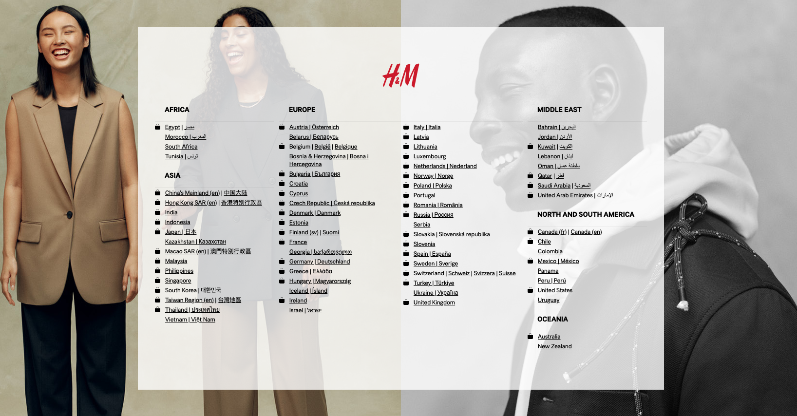
View splash page: H&M entrance
Most global retailers enlist a splash page to present language preferences to their visitors (since visitors come from all over the world). H&M uses a simple splash page that provides visitors with the option to select their country of origin. From there, they can tailor the website experience to the visitor's native language.
2. White Claw (age verification splash page)
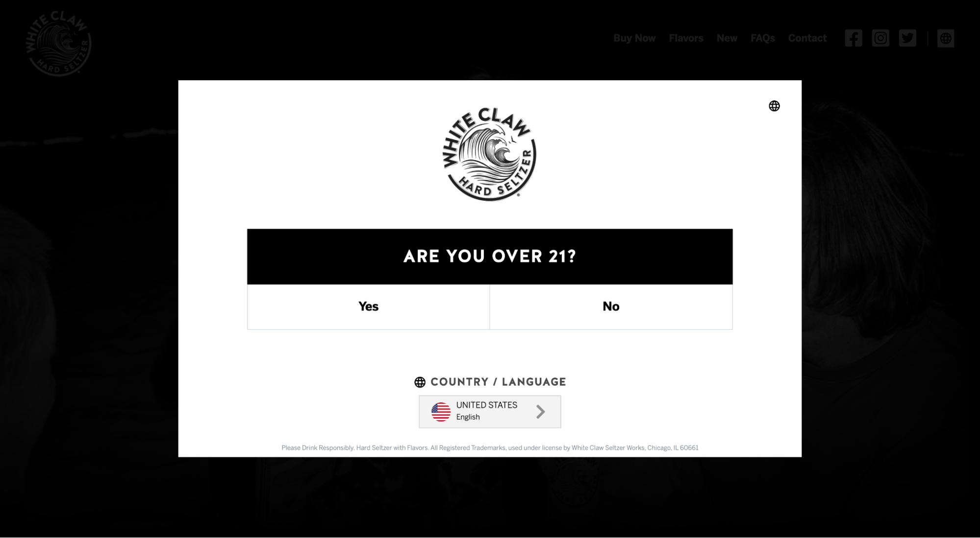
View splash page: White Claw age requirement
You can use a splash page to warn certain types of traffic before entering your site or to prevent certain types of traffic from entering altogether. For example, White Claw uses a splash page to request the age of its visitors. If you’re not 21, you don’t get to enter the site (well, if you “click” on 21, you don’t get to enter the site).
Many alcohol, tobacco, and gambling websites enlist a similar type of splash page to present their visitors with a disclaimer.
3. Facebook (login splash page)
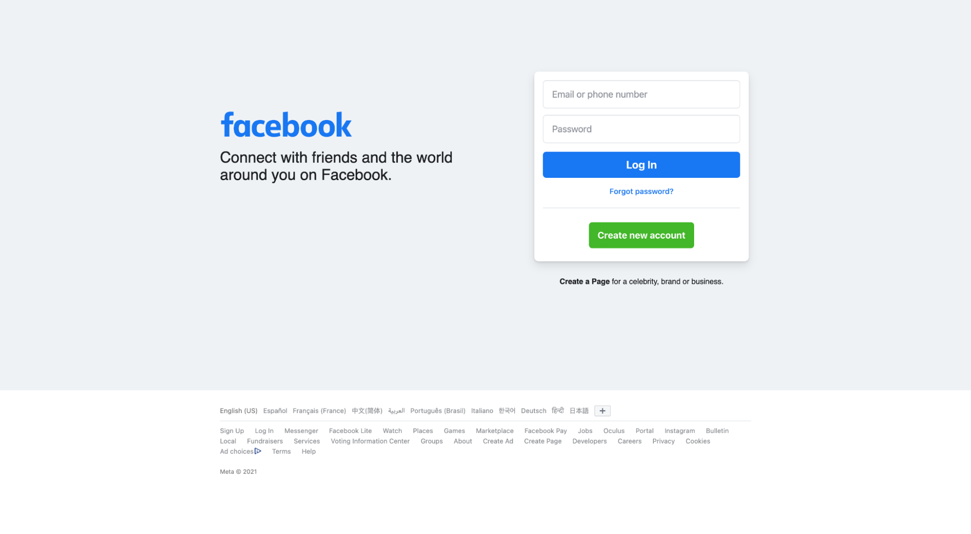
View splash page: Facebook login page
If you’re logged in to Facebook, then Facebook.com becomes your newsfeed. If you’re not logged in yet, then Facebook.com becomes the login splash page.
Facebook keeps it minimal with a logo, headline, and login form (because their brand is so ubiquitous). But a log-in splash page offers precious real estate—not only is it the portal to your website, but every registered member will encounter it frequently. Use a login splash page to promote, announce, and entice.
4. Shiseido (promotional splash page)
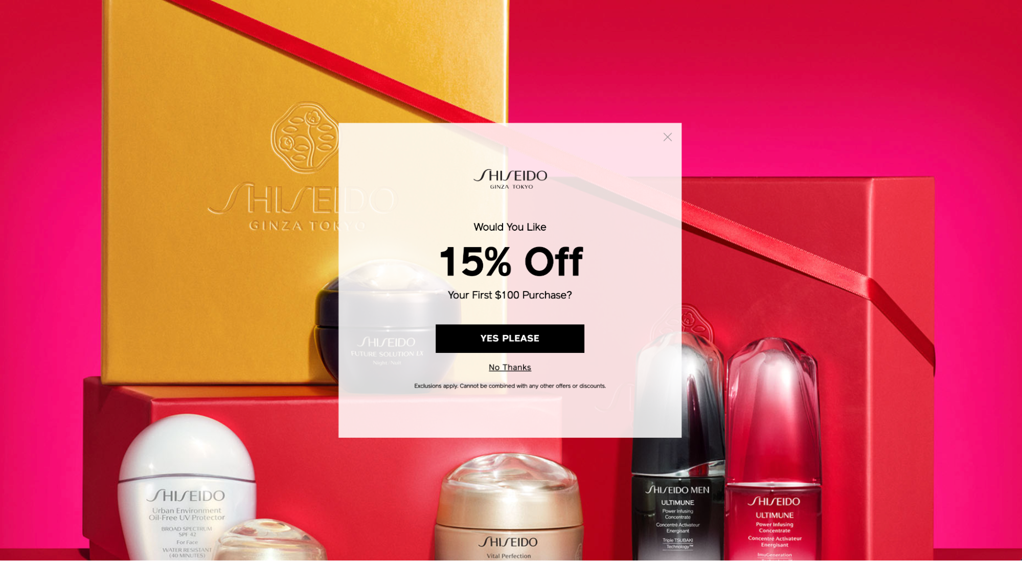
View splash page: Shiseido homepage
One of the most common types of splash pages is the promotional splash page.
Simply create an irresistible offer that’s easy to redeem, then put it front and center (where everyone can see it) using a splash page. In this example, Shiseido greets all website visitors with a 15% off coupon (thanks!).
5. Washington Post (paywall splash page)
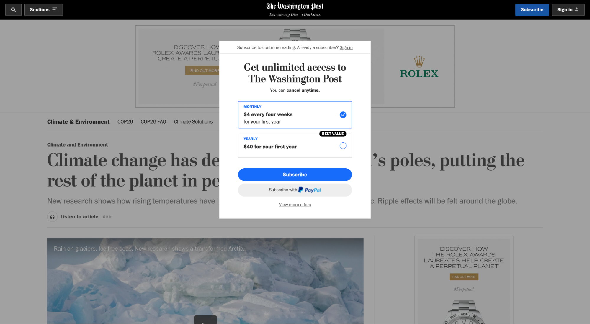
View splash page: The Washington Post paywall
The Washington Post not only makes you log in, but they also make you pay before reading their articles. Using a paywall splash page forces readers to ante up or move along.
6. DGMG (membership splash page)
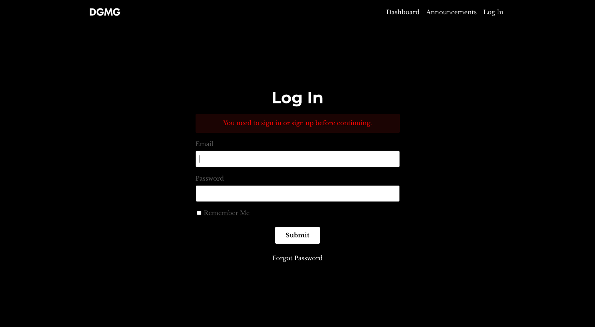
View splash page: DGMG gated content splash page
We’re in web 3.0, which means content creators are getting paid (finally).
Dave Gerhardt (marketing extraordinaire and former Chief of Brand at Drift) launched his own membership community back in 2020. If you want access to DGMG content (Dave Gerhardt Marketing Group), you need to have a membership. You can click on any blog or podcast link, but it will take you to the login page first.
Like a credentials splash page (Facebook) or paywall splash page (Washington Post), a membership splash page gates content and prevents non-members from entering the site at all.
7. Better Industries (coming soon splash page)
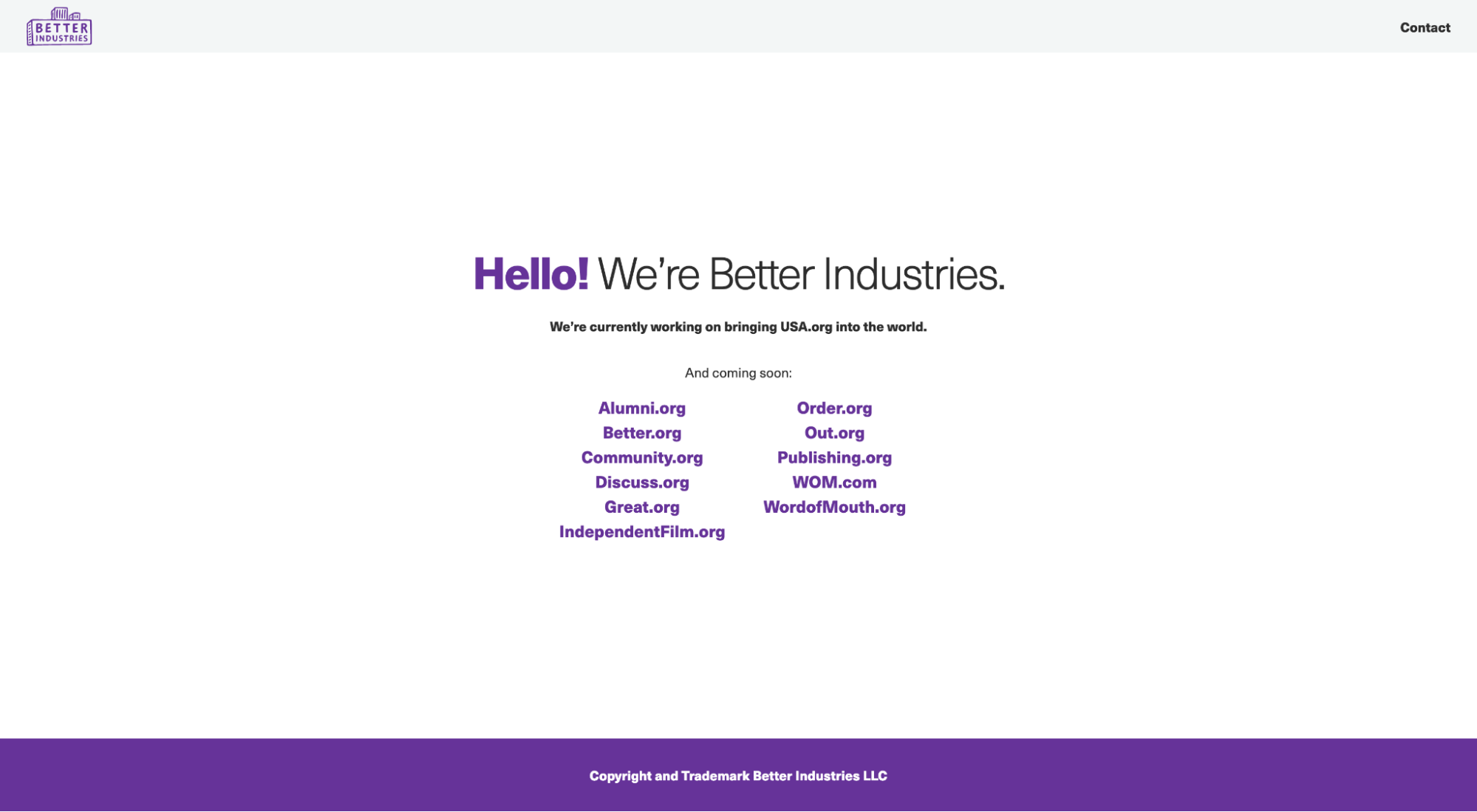
View splash page: Better Industries coming soon
Another popular splash page is the “coming soon” splash page.
In this example, Better Industries uses their coming soon page to make a short announcement about updating their website, but they also provide quick links to the other brands in their portfolio.
8. Resident Evil (announcement splash page)
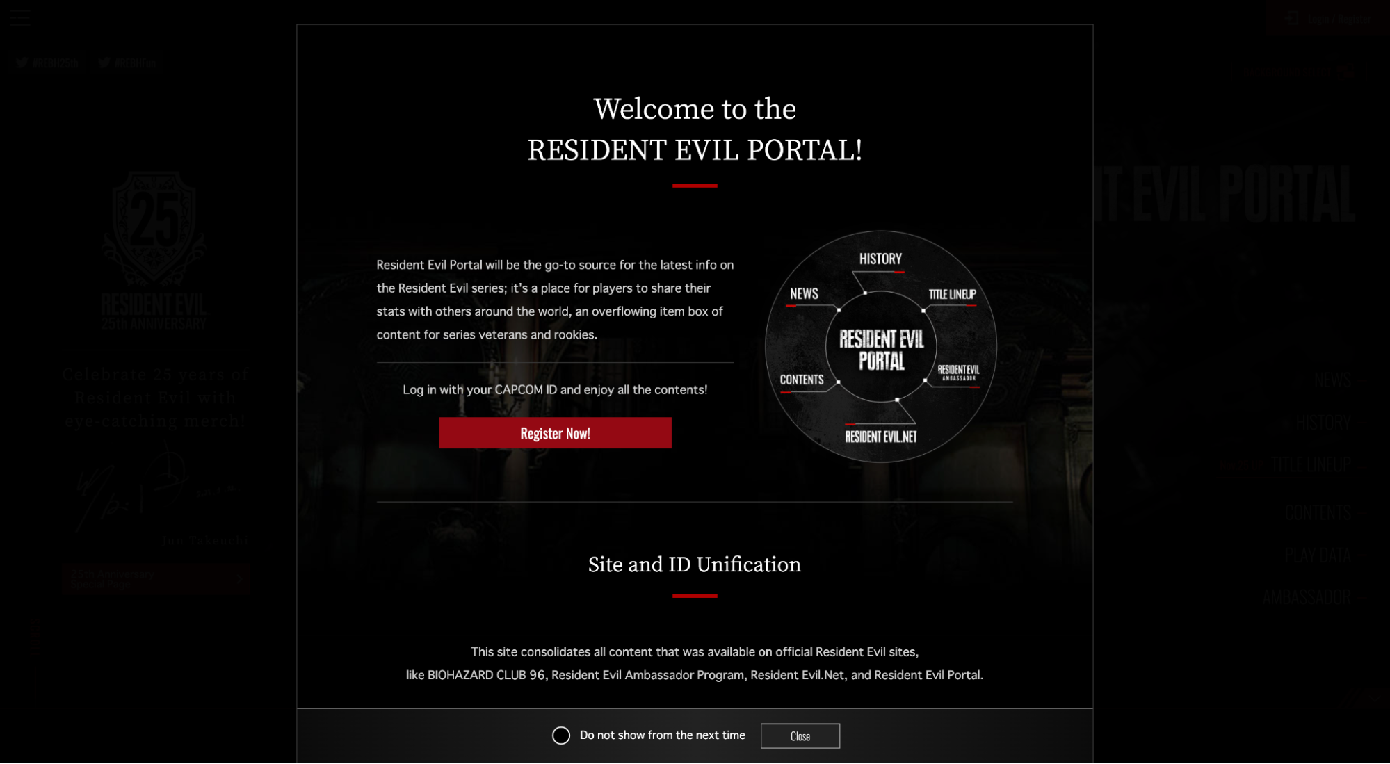
View splash page: Resident Evil announcement
Another common use for a splash page is to make an important announcement.
In this example, Resident Evil (the video game) uses a splash page to tell visitors that they’ll be migrating all of the different Resident Evil subbrands over to a single Resident Evil website in a few months.
9. Poolsuite.net (creative splash page)
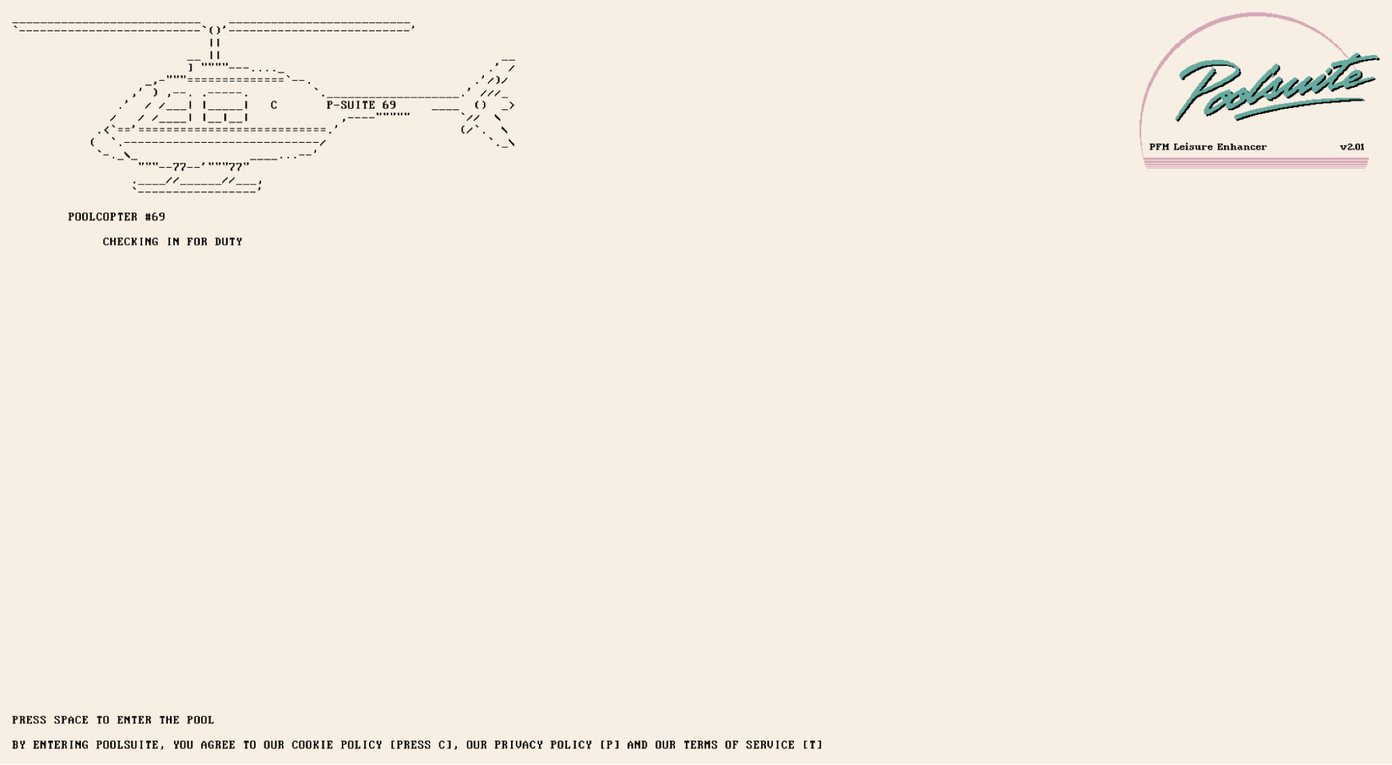
View splash page: Poolsuite
Poolsuite proves that you can do anything with a splash page. No limits.
Poolsuite is a throwback, 90s-era-inspired mock radio station that plays beachy, disco, and dance tracks.
One catch: the entire website is designed like it’s an early MacOS desktop homepage with touches of early Windows aesthetics.
When you enter the website, you’re greeted with a splash page video that looks and feels like a 90s-era desktop computer is booting, complete with GIF, animation, and unique fonts.
10. Audi (website portal splash page)
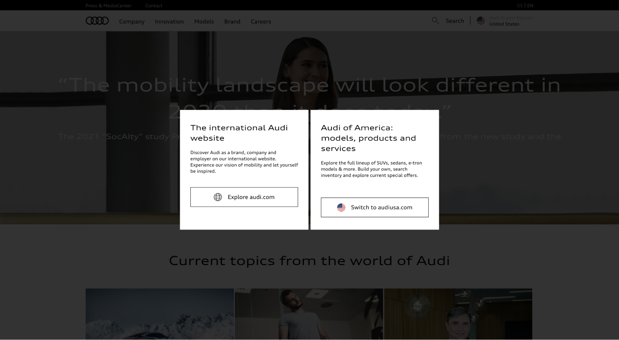
View splash page: Audi website portal
Audi, the world-famous car manufacturer, uses a splash page to direct visitors to two different websites: Audi of America or International Audi.
This splash page differs from a country/language splash page in that both of the websites they link to are in English, only the international website talks more about the brand and their mission, and the US website talks more about car models and sales.
11. Crazyegg (free trial splash page)
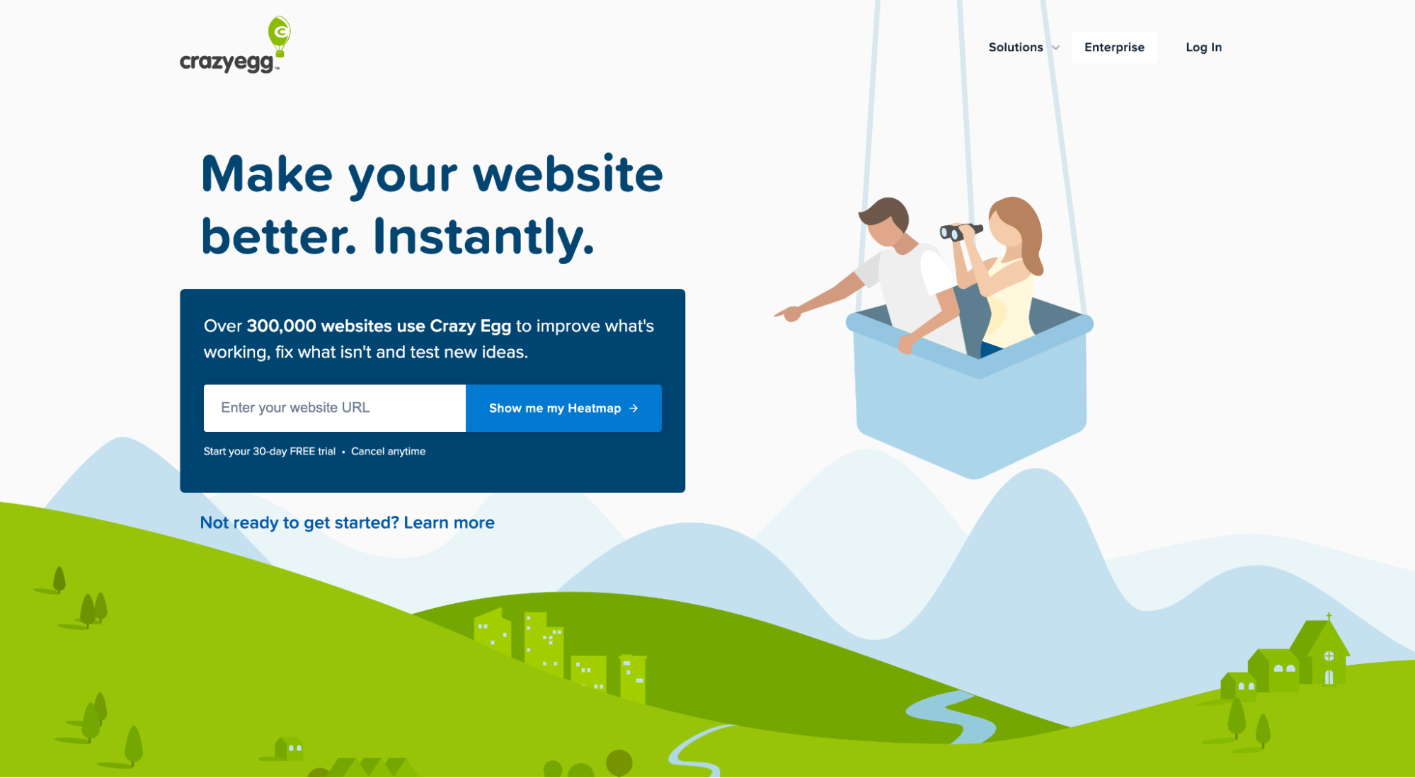
View splash page: CrazyEgg free trial splash page
CrazyEgg was one of the first heat mapping software ever.
When you visit their homepage, they greet you with a splash page that offers a free heatmap (it’s actually a tripwire for their free trial).
Once you enter your URL, then create a profile, CrazyEgg forwards you to their free trial setup to receive your free heatmap.
If you don’t want a free heatmap, you can exit out of the splash page by clicking on the “Not ready to get started? Learn more” copy below the form.
12. Coty (disclaimer splash page)
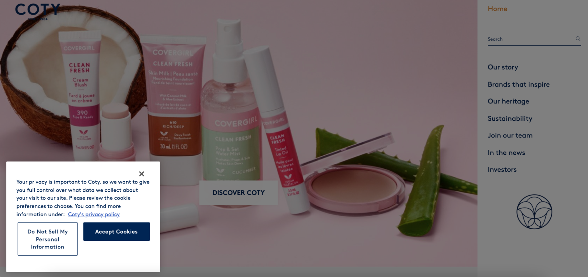
View splash page: Coty cookie policy
With the onset of GDPR and the rising concern over privacy, the cookie policy splash page is everywhere now.
Though some websites offer a popup disclaimer for their cookie consent, Coty (an international luxury retail brand conglomerate) uses a splash page (you can’t enter the site without first checking a box).
13. Drake Waterfowl Systems (newsletter splash page)
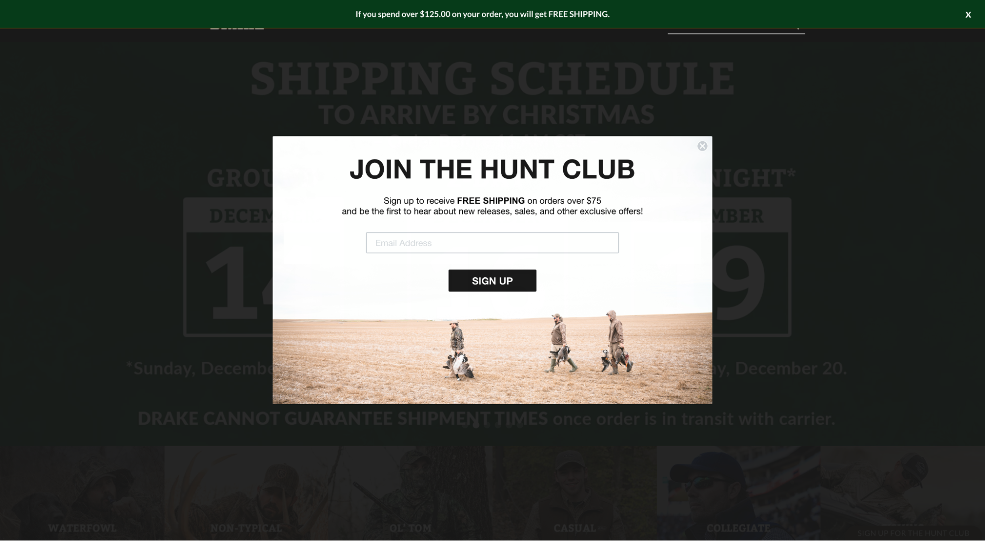
View splash page: Drake newsletter
Last, and perhaps most common, is the newsletter splash page.
Like a squeeze page, the newsletter splash page greets visitors with a CTA to opt-in and become a subscriber, usually to receive a discount. The goal? To grow an email list. Plain and simple.
How to create a splash page
Good news: creating a splash page isn’t hard. Not anymore.
You have two options:
- Do it yourself (using a designer and developer)
- Use a tool
First, you can get a web designer and developer to design and install a splash page using an HTML div overlay or piece of javascript (minimal time and cost).
Or you can use a paid tool that uses full-screen popups as splash pages.
For example, many landing page builders, website builders (e.g. Wix or Squarespace), and popup plugins make designing and publishing splash pages flexible and easy—they even include templates.
Just make sure whichever tool you use loads splash pages with javascript or HTML overlays (and doesn’t slow down your page load speed).
Here’s a list of our favorite splash page tools:
- OptinMonster (called “fullscreen welcome mats”)
- SumoMe (for WordPress, Shopify, Google Tag Manager)
- WelcomeMat (called… yup, welcome mats)
- Unbounce (called popups)
Caveat: To use a splash page tool, you’ll also need to pay and the pricing varies.
Further reading: A Landing Page Builder for Every Occasion (Plus 9 Best Reviewed)
Wrapping up
Though splash pages are less common today than they were a decade ago, with the onset of drag-and-drop splash page tools, we’re witnessing a reemergence of sorts.
When considering a splash page for your website, remember the following:
- Have a need: Don’t manufacture a need. Instead, use a splash page to help you accomplish a real, concrete goal.
- Keep it short: Your splash page is a welcome mat, not a tour of your crib.
- Mind the Googs: Any time you hide content behind a screen, popup or interstitial, Google may not be able to crawl and index it. Tread lightly.
- Measure: Track the data. If it doesn’t work, pull it.
And whatever you do, MAKE A SPLASH 💦


