


Shopify’s 2022 Future of eCommerce report revealed some not-so-shocking truths:
- Direct to consumer costs are rising.
- Ad costs are skyrocketing across platforms.
- Global eCommerce sales are expected to reach $6 trillion by 2024.
- Competition is the biggest obstacle to achieving growth in 2022.
Not only are consumers lining up to do more online shopping, but the competition has never been more fierce. And it’s costing everyone.
This means that now, more than ever, maximizing eCommerce campaign effectiveness should sit at the top of your list.
The good news?
There’s no better way to reduce ad spend, grow sales, beat competitors, or lower cost per acquisition (CPA) than by squeezing more performance out of your eCommerce landing pages. And that’s exactly what we’re going to show you how to do today.
In this article, we’re going to explore 15 of the best eCommerce landing page examples (each that represents a different feature necessary for conversions).
- 1. eCommerce landing page example(s) with high-quality product images
- 2. eCommerce landing page example(s) with a 1:1 attention ratio
- 3. eCommerce landing page example(s) with social proof
- 4. eCommerce landing page example(s) with discount offers
- 5. eCommerce landing page example(s) with tested CTA button copy
- 6. eCommerce landing page example(s) with zoomable product images
- 7. eCommerce landing page example(s) with with live chat
- 8. eCommerce landing page example(s) with a sense of scarcity and urgency
- 9. eCommerce landing page example(s) with free shipping offers
- 10. eCommerce landing page example(s) that are all on a single page
- 11. eCommerce landing page example(s) with great design and UX
- 12. eCommerce landing page example(s) with product videos
- 13. eCommerce landing page example(s) with white space
- 14. eCommerce landing page example(s) with unique value propositions (UVP)
- 15. eCommerce landing page example(s) with visual hierarchy concepts
- Closing thoughts on eCommerce landing pages
Get brand new landing page strategies straight to your inbox every week. 23,739 people already are!
1. eCommerce landing page example(s) with high-quality product images
Often, eCommerce landing page designers will use images to fill space. But a high-quality product image can make or break conversions.
Instead of just filling space, showcase your products in real life, as if they were captured by a fly on the wall of your ideal customer.
The more vibrant, detailed, and high-quality, the better.
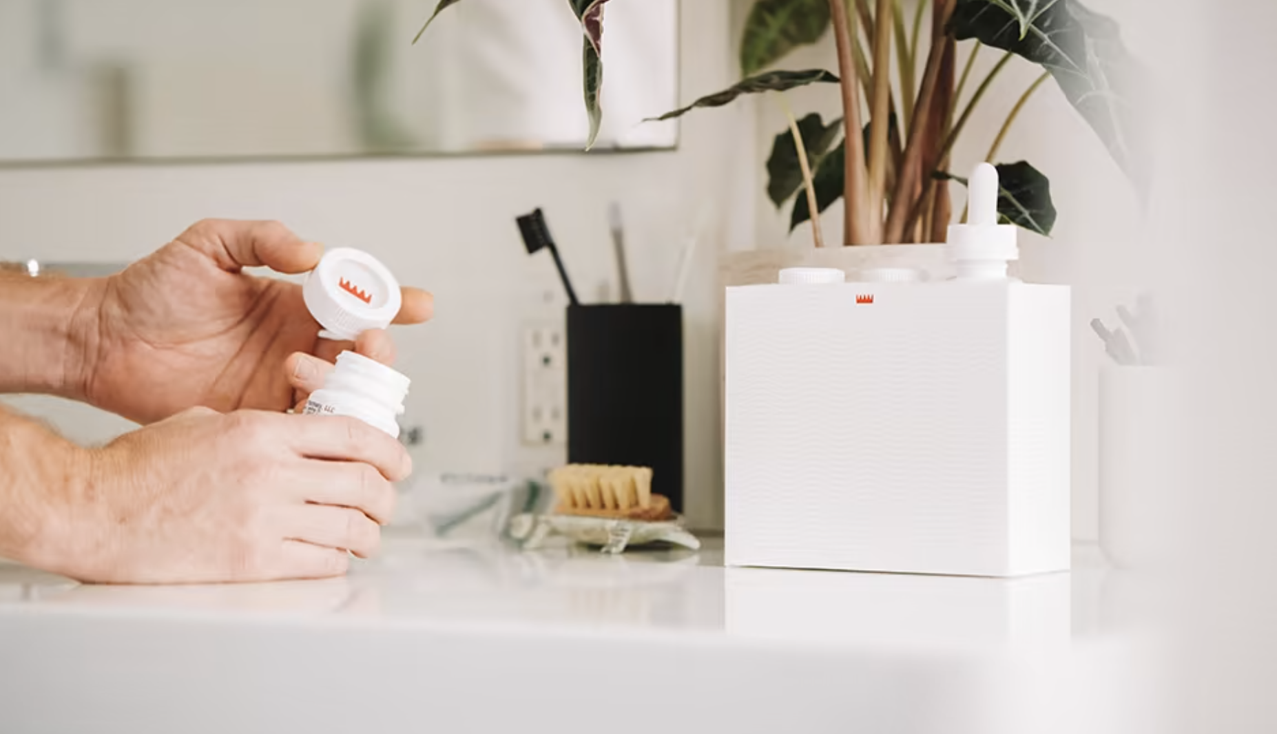
For example, notice how Keeps not only uses custom photography of the highest quality, but they also put their products in the real world. They make their products feel real, tangible, and integratable with someone’s everyday life.
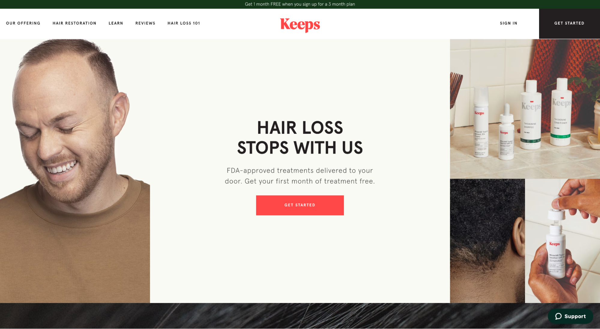

Remember that your customer is the hero; your product is the magic sword that helps them on their journey. But make no mistake, it’s their journey, not yours. So bring their journey to life in your landing page images.
2. eCommerce landing page example(s) with a 1:1 attention ratio
Landing pages differ from other pages on your website or even product pages in your eCommerce store.
While your website pages need to accommodate the needs of everyone who visits, your landing pages only need to accommodate the needs of specific campaign visitors. This means landing pages are most effective when they stay focused on one clear call-to-action (CTA), not many.
Too many offers and options on your landing page can lead to analysis paralysis or what psychologist Barry Schwartz calls the “Paradox of Choice.” This just makes your visitors feel overwhelmed and indecisive.
To combat this, you need to hone in on a single CTA.
We call this landing page best practice a 1:1 attention ratio. One goal, one CTA.
That’s it.
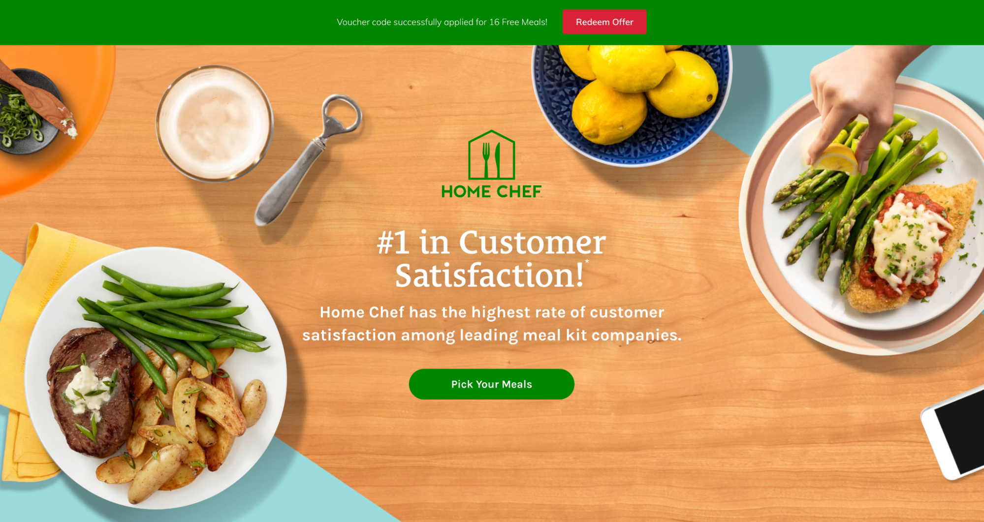
For example, notice how Home Chef only features a single link on their entire landing page (the green button to pick your meals). Even the red “Redeem Offer” sticky bar leads to the same conversion goal, only worded differently.
Now juxtapose that with Thistle’s landing page:
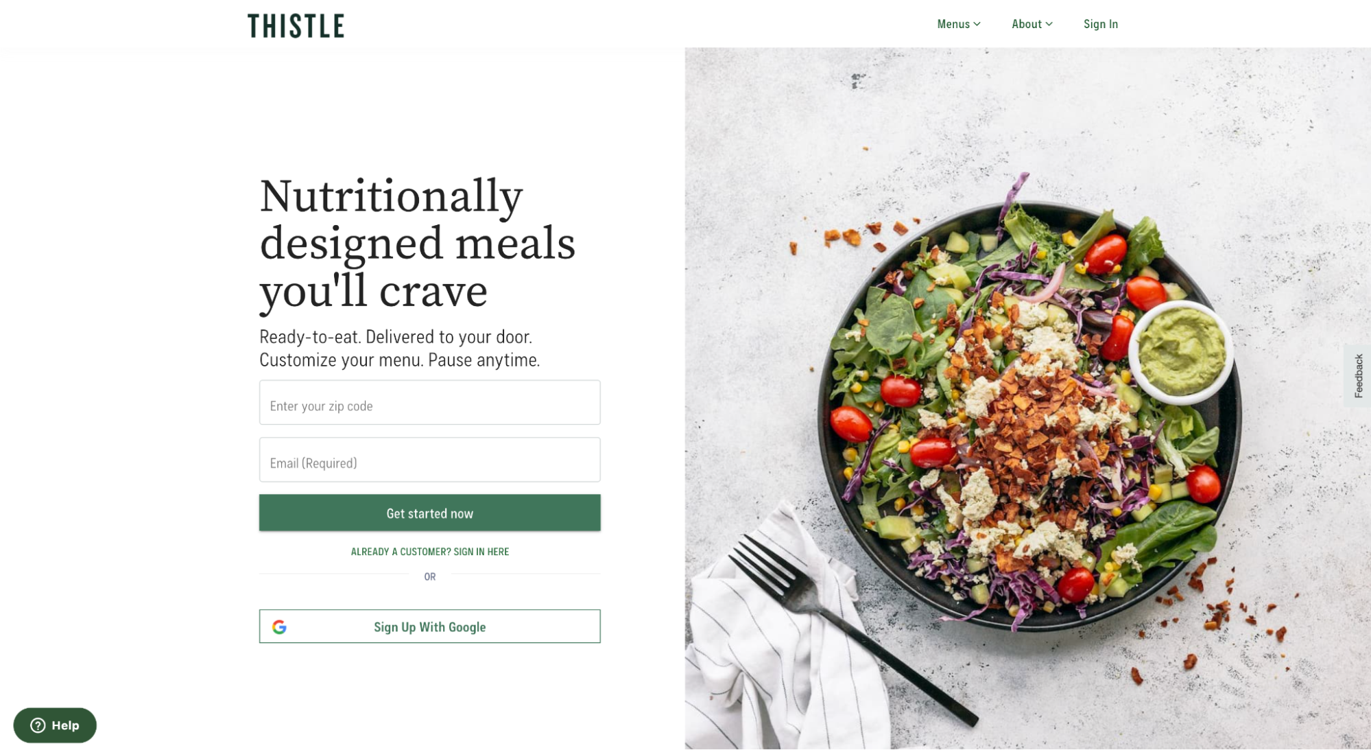
Thistle’s full landing page features nearly 20 links. That’s a lot of distraction and even more room for indecision.
3. eCommerce landing page example(s) with social proof
Social proof refers to the phenomenon wherein people routinely copy their peers’ choices and seek other opinions when making their purchase decisions.
So, the more proof you have that other people like them took the plunge and had success, the more visitors you’ll convert. Simple.
Landing page social proof builds trust and comes in the form of customer testimonials, star ratings, trust badges, awards, media mentions, case studies, and more.
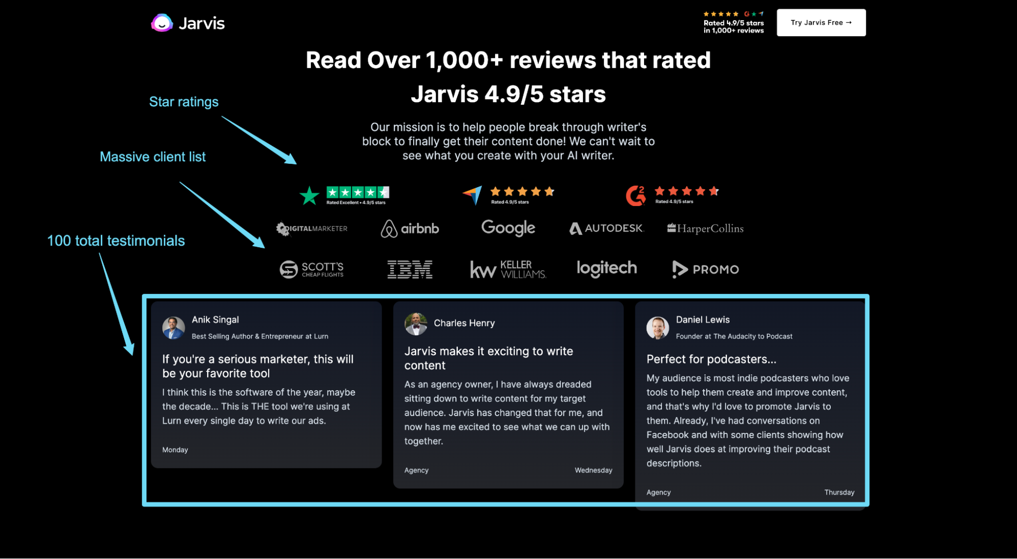
For example, Jasper (formally Jarvis) features social proof on their landing page in the form of star ratings, customer reviews, and a client list with logos.
When it comes to social proof, heed the following:
- Create a process: Make testimonials a part of your sales process by automating retrieval via email.
- Pick for fit: Look for testimonials that align with your value proposition.
- Place it everywhere: Place social proof wherever you can. Give it its own section, place it near benefits, next to product description, next to CTA buttons, at the checkout/cart page, and so on.
- Keep it diverse: Use testimonials, star ratings, awards, featured publications… the list of social proof examples goes on and on. (In fact, we wrote an entire blog that covers the many types; check it out here.)
- Be honest: No one is expecting a perfect reputation. Actually, all too perfectly-curated social proof may have your customers questioning its legitimacy and honesty.
4. eCommerce landing page example(s) with discount offers
Here’s a little economics 101: the lower the price, the more demand.
Adding a discount to your eCommerce landing page is a strategy that can increase conversions. We know this.
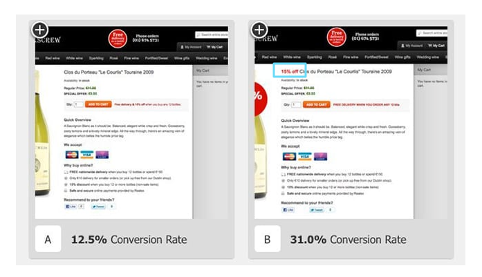
So it should come as no surprise that Corkscrew Wine Merchants increased conversions by 148% when they added a 15% discount label to their product landing page.
Similarly, one of our own clients, MyClean, had success after split testing discounts in their copy. With discounts as part of their strategy, they saw a 31% increase in conversions and a 20% decrease in CPA. (You can read more about their success in our case study.)
But you might be wondering, at what point do you risk cheapening your brand? And how many more sales do you need to make in order to make up for the lost profit?
In Corkscrew's case, an 18.5% increase in new purchases at a cost of $45/bottle no doubt made up for any profit lost from the discount.
But had that conversion rate lifted only, say, by 2%, it would have been harder to justify.
So while discounts can help create an irresistible special offer with added urgency, just make sure to do so with caution or do it in the best interest of your brand.
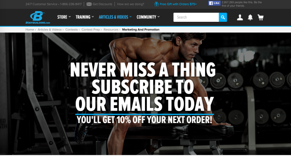
For example, this brand offers a discount, but only if you sign up for their emails.
5. eCommerce landing page example(s) with tested CTA button copy
One of the easiest and quickest ways to increase eCommerce landing page conversions is to test your CTA button copy.
Not only is button copy easy to test, but in our experience, it’s one of the top three contributors to conversions. In other words: it’s low effort but high impact.
The trick with CTA copy is to increase motivation without changing your offer.
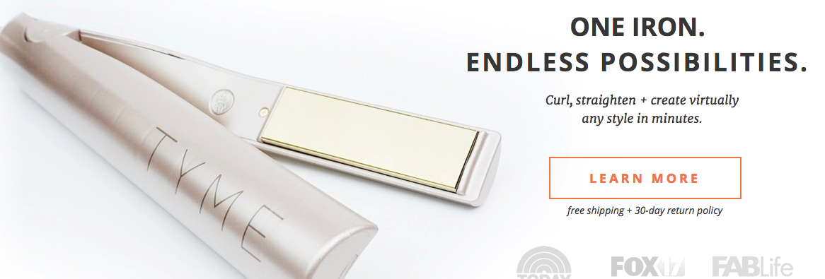
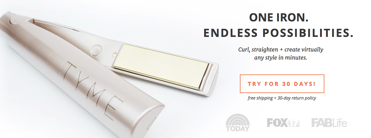
For example, with our client TYME, we tested three different CTA buttons to see which converted best.
First, we tested a low threat:
Then we tested a medium threat:
Finally, we tested a high threat:
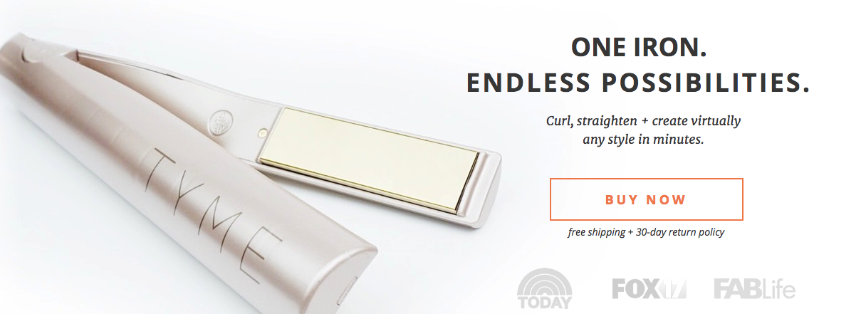
The results?
“Try for 30 days!” increase conversions by 18% compared to “Learn more.”
“Buy now” increased conversions by 2% compared to “Learn more.”
The offer never really changed—you could always return the iron within 30 days. But by changing the CTA copy to a less threatening version of “Buy now,” we increased the motivation of the buyer.
6. eCommerce landing page example(s) with zoomable product images
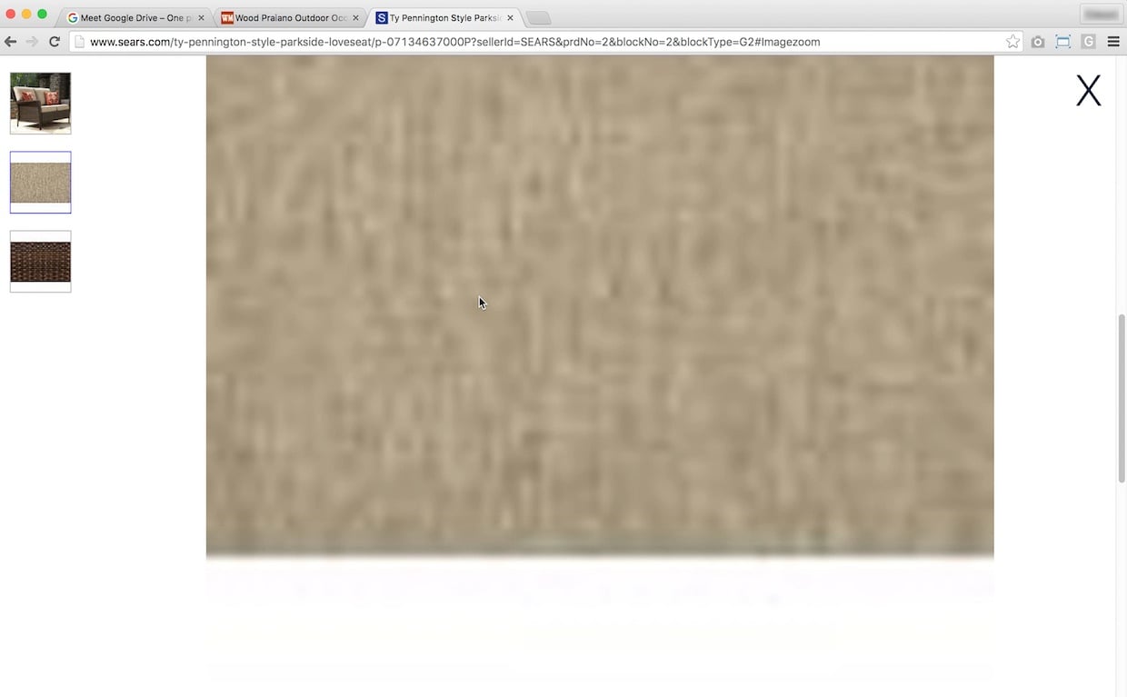
According to Baymard, 25% of eCommerce websites don’t have sufficient product image resolution or level of zoom. Not good, considering that the first action of 56% of eCommerce visitors is to explore product images.
Like we said, product image quality is crucial to conversions. But you need to go the extra mile and ensure high-resolution photos even when they’ve been zoomed in on desktop or pinched to zoom on mobile.
For example, notice how pixelated this Sears couch is when zoomed in on:
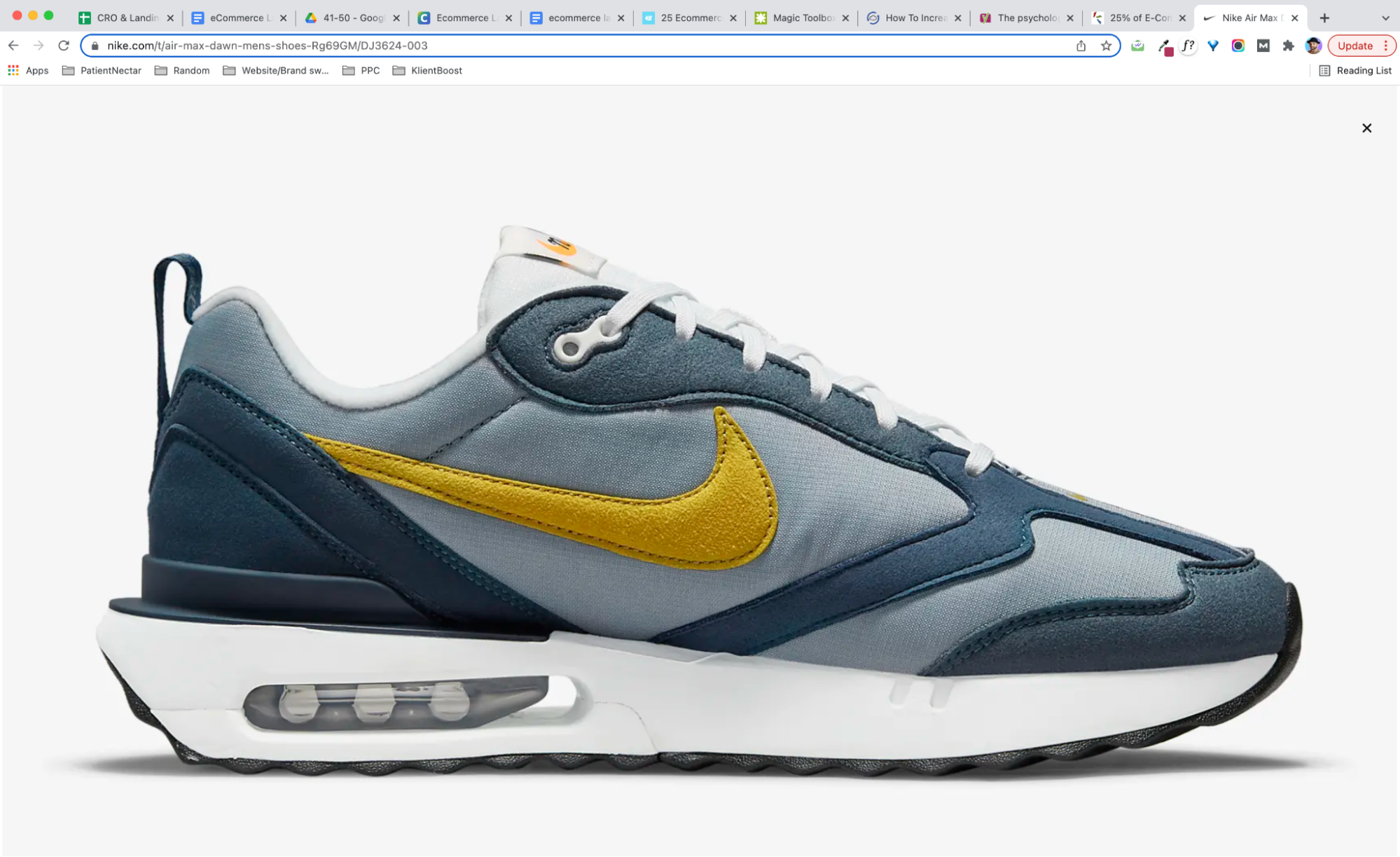
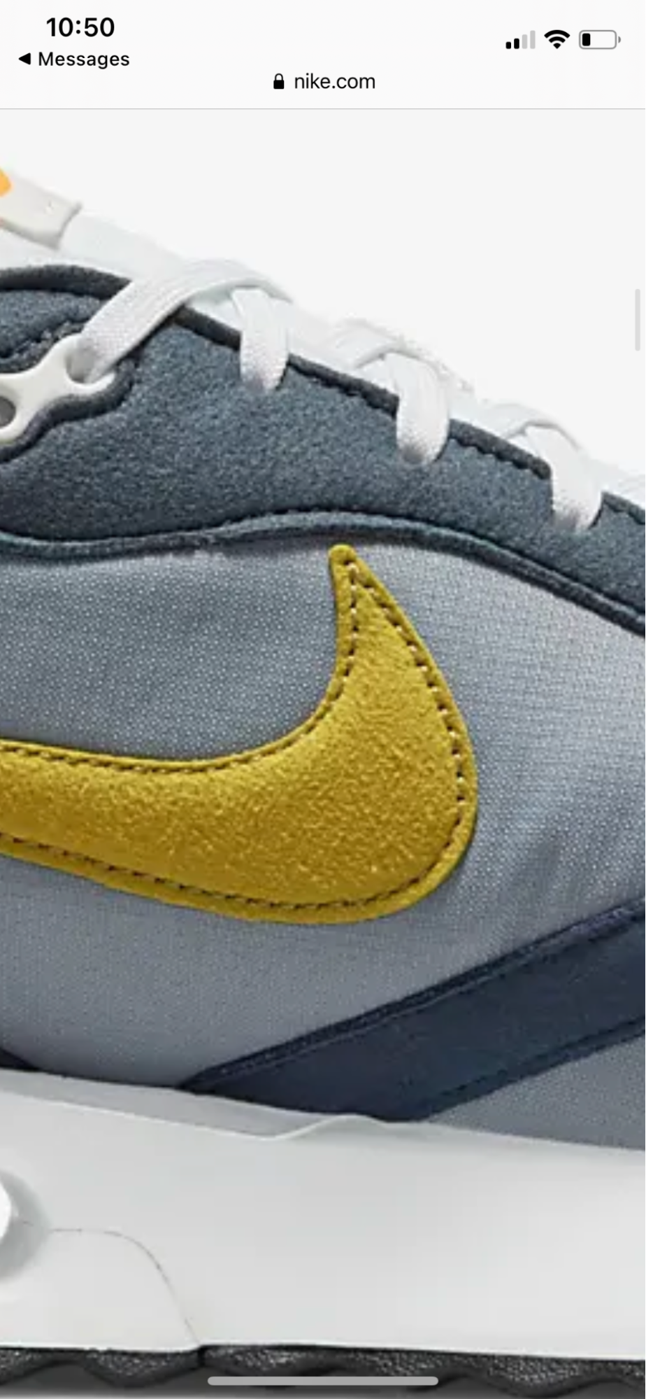
Now juxtapose that with an example from Nike:
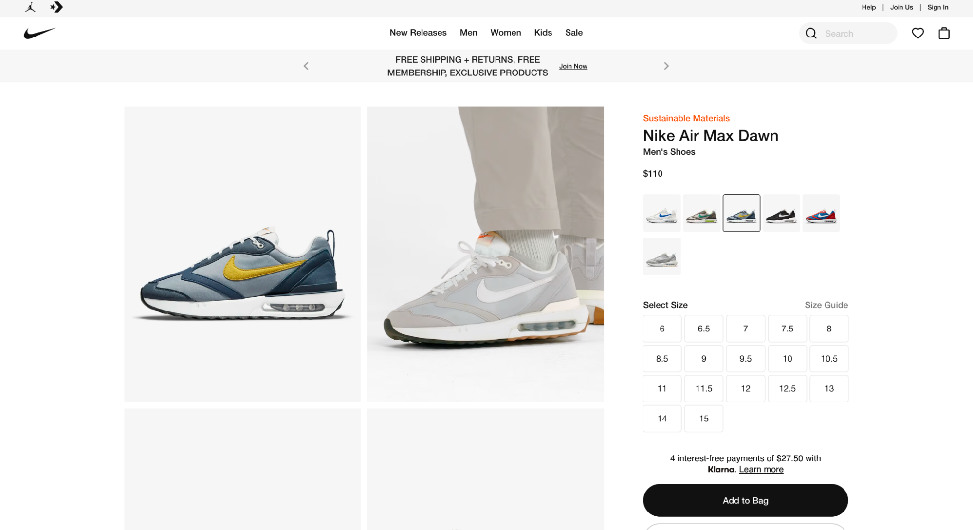
When you click to zoom on desktop, it opens a full-screen image with high resolution:
What if we pinch to zoom on mobile?
Most eCommerce platforms like Shopify, Magento, BigCommerce, and WooCommerce provide apps or functionality for zoomable product images. It’s up to you to ensure your images are high-resolution enough.
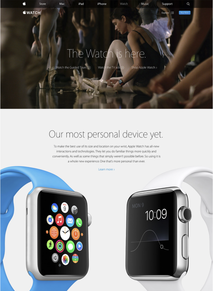
Another way you can go about this is to include a zoomed-up picture of the product itself on your landing page. That’s how the folks at Apple do it:
7. eCommerce landing page example(s) with with live chat
The results are in: people love live chat. Live chat has a 92% consumer satisfaction rate, and up to 41% of shoppers prefer live chat as their customer support channel.
Not only does live chat provide a real-time customer service channel that’s efficient, but it also creates a frictionless path to conversion.
In fact, Kayako found that 79% of businesses it surveyed said that live chat resulted in increased customer loyalty, sales, and revenue.
All this to say: why not include live chat on your landing pages?
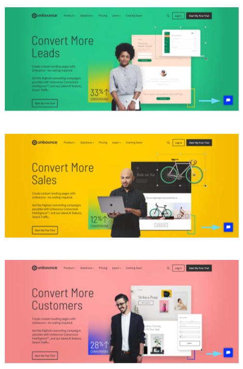
Unbounce certainly knows the benefits:
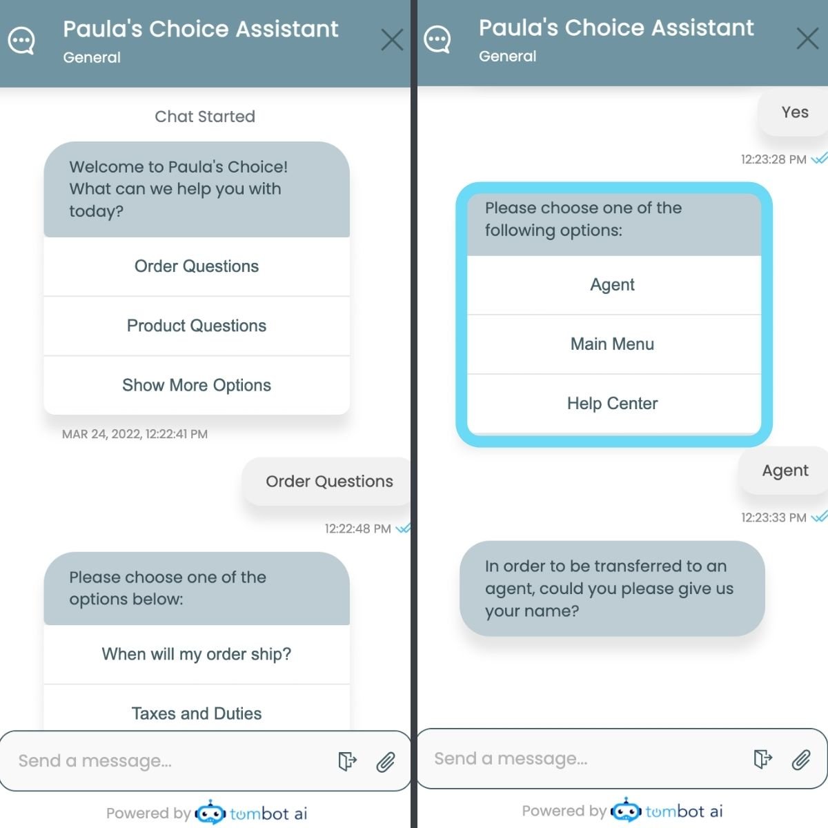
You can even use a chatbot to automate and scale up your eCommerce customer service. Just make sure you provide an option to talk to a real person, too.
For example, notice how Paula’s Choice (a skincare shop) uses a chatbot to field initial questions but then provides the option to speak with a real person after.
8. eCommerce landing page example(s) with a sense of scarcity and urgency
Sometimes the easiest way to increase eCommerce landing page conversions is to add a sprinkle of scarcity and urgency to it. This simply makes your offer more irresistible.
Urgency taps into a fundamental principle of behavioral psychology: loss-aversion.
Loss aversion really boils down to one thing: the fear of missing out is stronger than the desire to gain. This is why when you build a sense of exclusivity around your products, it leads to more conversions.
Take a look at this landing page example that combines scarcity and urgency on their landing page:
So how can you add urgency to your regular and product landing pages?
- Display inventory levels: Only two left? Let your visitors know.
- Run a limited-time offer: Manufacture urgency by limiting a sale, discount, or price to a limited time only.
- Feature a countdown timer: Make your limited offer visual with a countdown timer front and center.
- Show total purchases: Let your potential customers know how many buyers have already purchased (see: social proof).
- Run a preorder campaign: Run a special sale just for early-bird buyers, and sweeten the deal with preferred pricing and early-access bonuses.
- Offer exclusive bonuses: Bundle limited edition add-ons for customers who buy now.
- Keep out-of-stock notices visible: There’s no better way to build a sense of urgency than by letting visitors know different sizes, colors, or fits have already sold out.
9. eCommerce landing page example(s) with free shipping offers
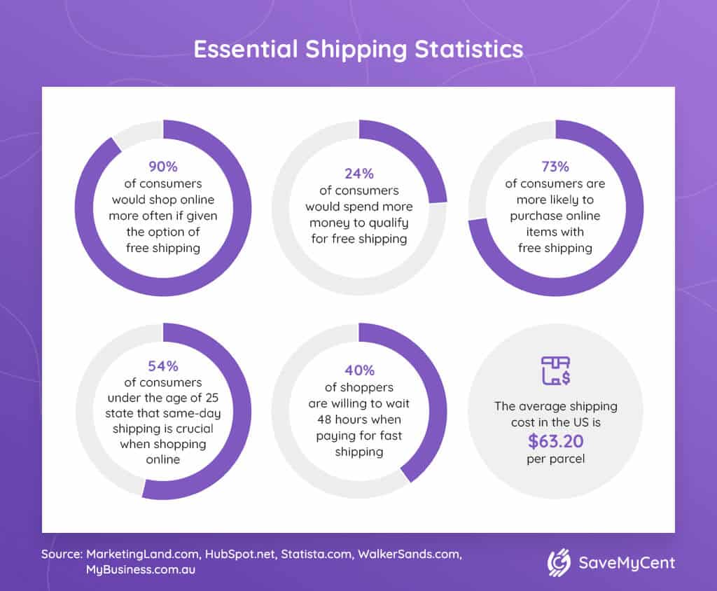
Today’s consumers want and expect free shipping. In fact…
- 80% of consumers expect free shipping when ordering over a specific dollar amount.
- 60% of shoppers abandon carts because of extra costs, including shipping costs.
- 58% of customers add products to their cart to get free shipping.
Here are just a few more of the hard-hitting figures on free shipping:
So, lucky for eCommerce brands, free shipping makes your customers happy and can lead to more conversions and larger orders.
You can choose to offer free shipping sitewide, landing page offers included. Or you can get creative with free shipping.
For example, you can offer
- free shipping with a minimum order value
- free shipping limited-time only
- free shipping on select products
- free shipping locally
- free shipping to in-store pick-up
- free shipping for members (e.g., Amazon Prime)
- free 7-day shipping only
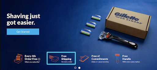
This Gillette landing page offers free shipping on every order:
While free shipping is a great way to entice customers and get more conversions, free shipping is anything but free for you.
So think strategically.
The best eCommerce shops bake free shipping into their offer by increasing total price, not by taking a hit on their margins.
10. eCommerce landing page example(s) that are all on a single page
By definition, a landing page is a dedicated webpage. But most eCommerce landing pages are “click-through pages,” which means they still click through to a checkout page once a visitor hits the “Buy now” button.
However, unlike most, FabFitFun features their subscription offer, pricing, and checkout all within a single landing page. Visitors never have to leave the landing page to complete their purchase.
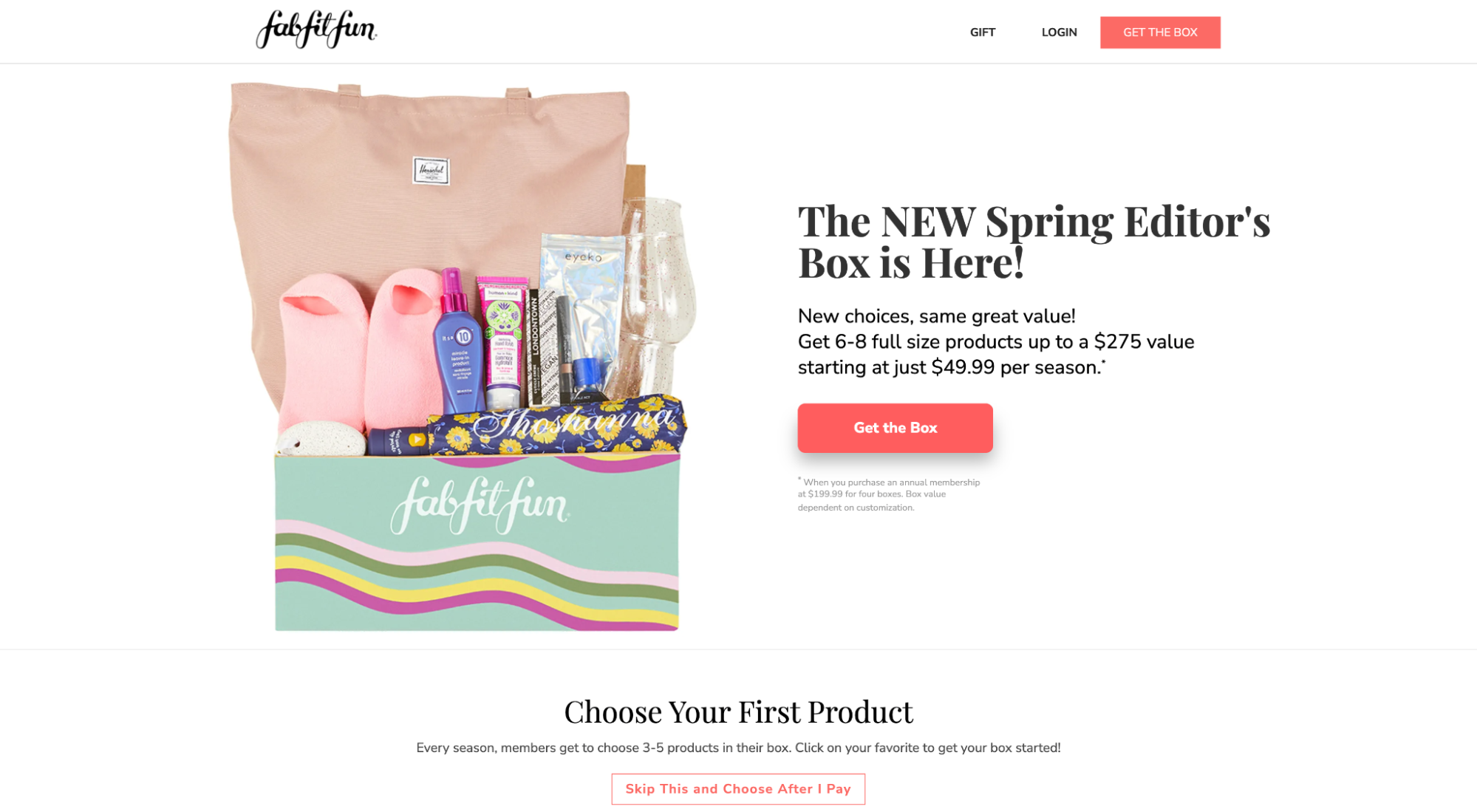
Why does this work? The more steps in your conversion funnel, the more chances something could go wrong. By keeping everything contained within one page, you leave little room for error and a shorter distance to the finish line.
11. eCommerce landing page example(s) with great design and UX
Jakob’s Law states that since most people spend most of their time on other websites, they expect your website to perform the same way as all the other sites they’re already familiar with.
When it comes to designing your eCommerce landing page, don’t get cute.
Landing page layout, functionality, performance, and user experience shouldn’t make your visitors think; it should feel and function seamlessly, predictably, and without conscious effort.
Drunk Elephant recently redesigned their product pages (as of early 2022). They’re not true landing pages, but they use them often for ad campaigns. One problem: they got too cute with it.
Now, visitors
- experience parallax scrolling with sideways movement
- can’t scroll up and down with ease
- can’t see certain sections without first scrolling through previous ones
- aren’t able to tell where they’re at on the page
- don’t recognize any consistency in design or layout (every section feels different)
Too much cognitive load is required to view their product pages, which makes visitors feel out of control.
And after years and years of navigating websites for a living, if I’m having trouble navigating the site, you can bet everyone else is, too.
So don’t be like Drunk Elephant. Remember that your users expect your landing pages to function like everyone else's.
Do it like this landing page example, where it easily guides you through their process and the experience is seamless.
12. eCommerce landing page example(s) with product videos
Video. Video. Video.
We know—no one can stop talking about video these days.
But the truth remains. When it comes to communicating the value of your products, nothing does a better job than a well-produced landing page video.
A consumer who watches a product video is up to 144% more likely to add that product to their cart. And in a study that surveyed over 1,000 people, 96% of respondents said they found watching a video helpful in their decision-making process.
Why?
Well, if a picture says a thousand words, then a video says a million… only in a matter of seconds.
That’s why the example below hardly needs any words; the video speaks for itself.
Of course, that doesn’t mean you can’t add a little more information. Feel free to add what’s necessary, like the example below.
As you can see, product videos can come in various forms, such as
- product explainer
- how-to
- story
- unboxing
- product comparison
- + so much more
13. eCommerce landing page example(s) with white space
Research shows that the use of white space increases comprehension by almost 20%.
White space also creates balance, increases legibility, acts as a separator, and makes your eCommerce landing page breathable.
Use white space around your landing page's most important features, like your headlines, benefits, and CTAs, to draw the gaze of your visitors and add visual emphasis.
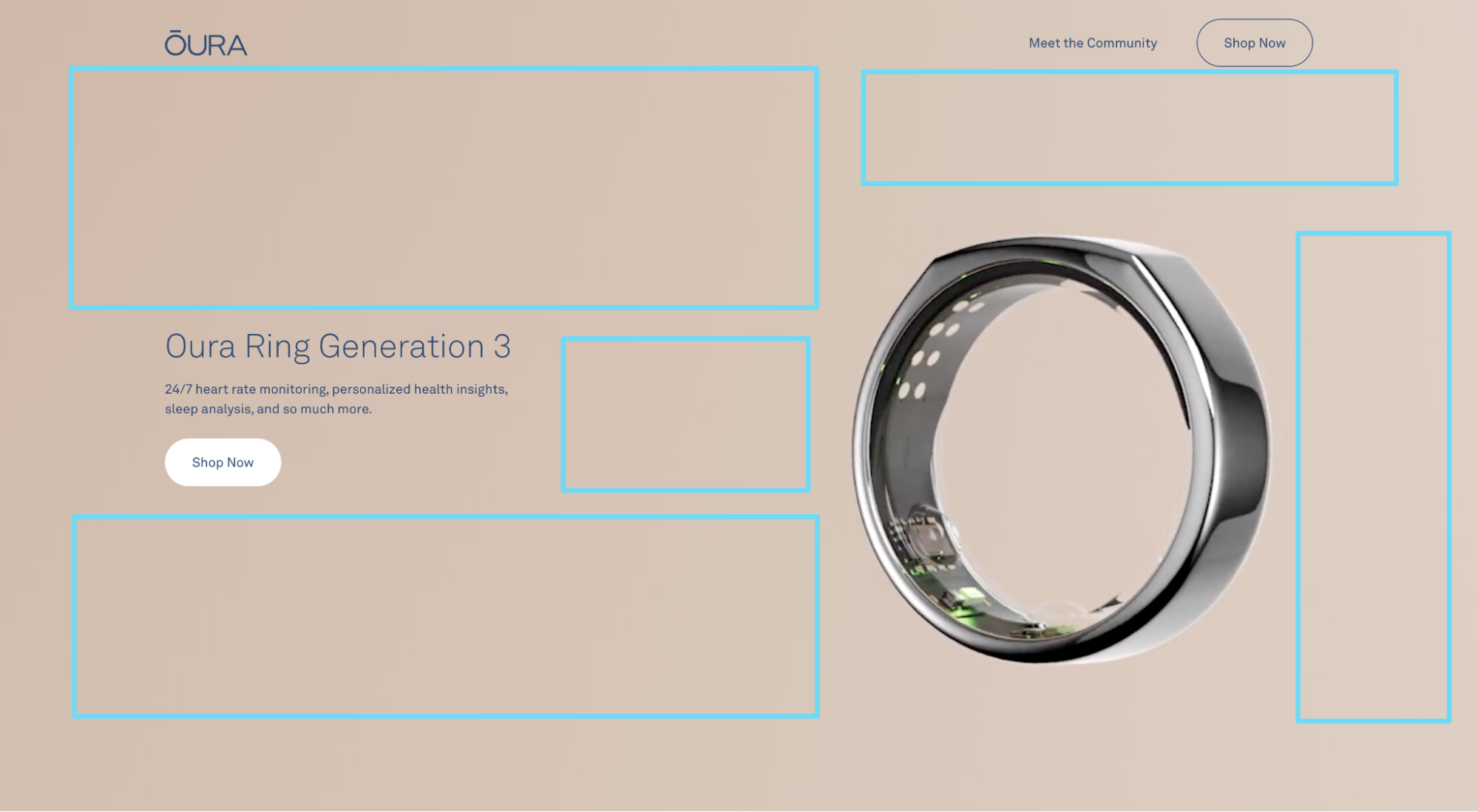
For example, notice how Oura Ring uses white space around their hero section CTA to seduce your gaze:
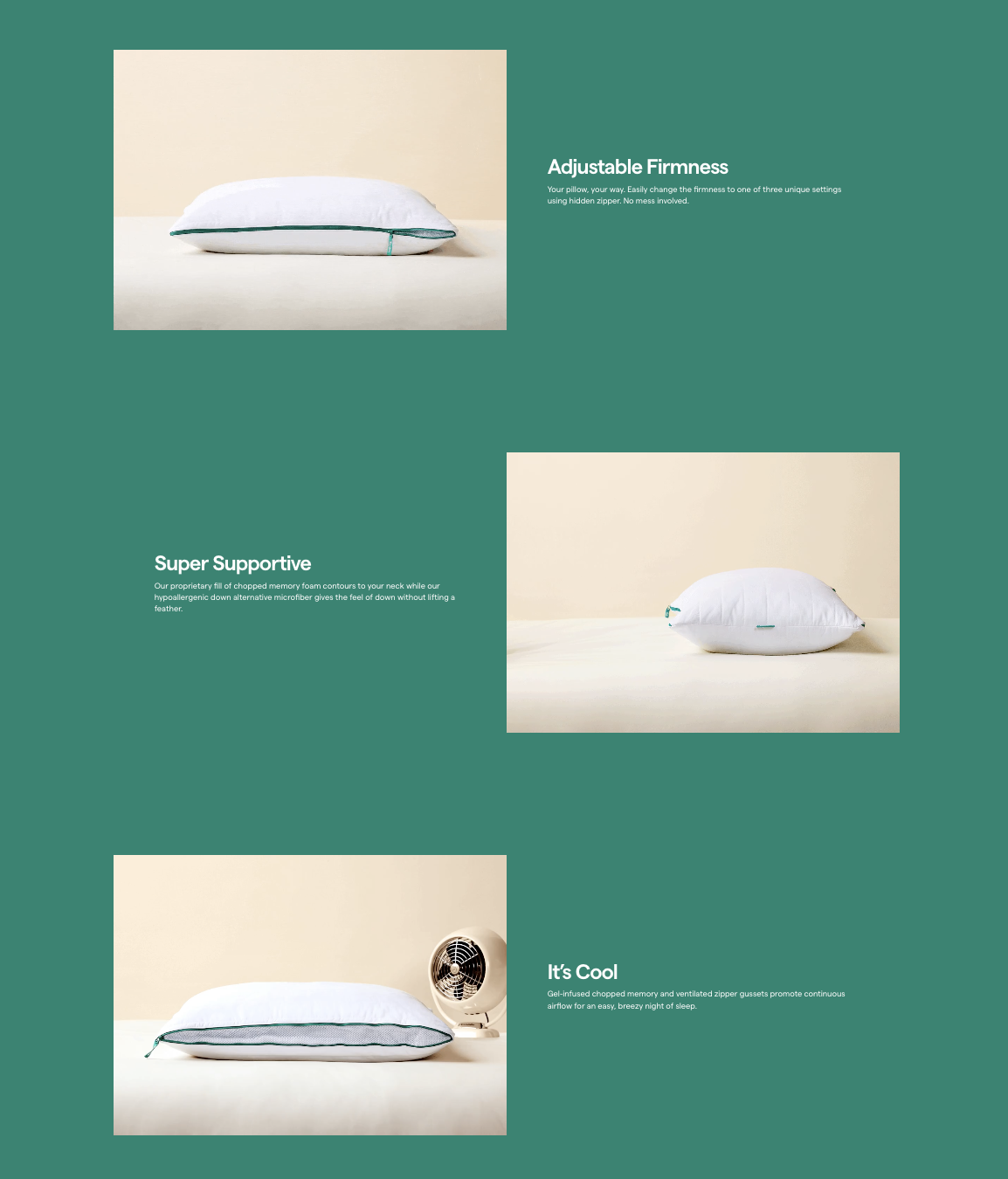
Or notice how the white space between sections on Marlow Pillow’s landing page creates an information architecture that guides your eye down the page, from one benefit to the next.
14. eCommerce landing page example(s) with unique value propositions (UVP)
Your landing page value proposition is a statement that informs your potential customers of why you’re superior to your competitors.
The truth? In our hyper-competitive world, there’s a good chance your products aren’t 100% unique.
And that’s okay. Not to worry.
What matters most is that you hang your hat on something and commit to it.
When it comes to crafting a perfect eCommerce landing page value proposition, follow these three guiding principles:
- Explain what you do: If you offer a truly unique product, sometimes all you need to do is simply tell people what it is.
- Communicate your niche: Other times, it helps to communicate your specialization. Let buyers know you are the choice for certain people but not for others. Own your niche.
- Handle biggest objections: For most eCommerce brands (especially those without unique products), communicating the primary benefit while handling the primary objection will prove most effective.
Let’s look at examples for all three.
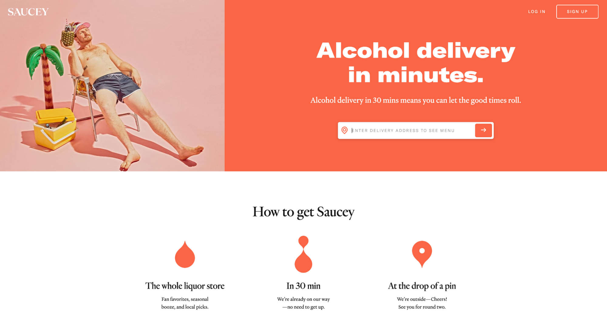
Saucey competes in its own niche: alcohol delivery. Nothing more. Nothing less.
All they need to do is state their offer and support it with a benefit. In this case, they handle any objections about wait times by stating, “Alcohol delivery in minutes.”
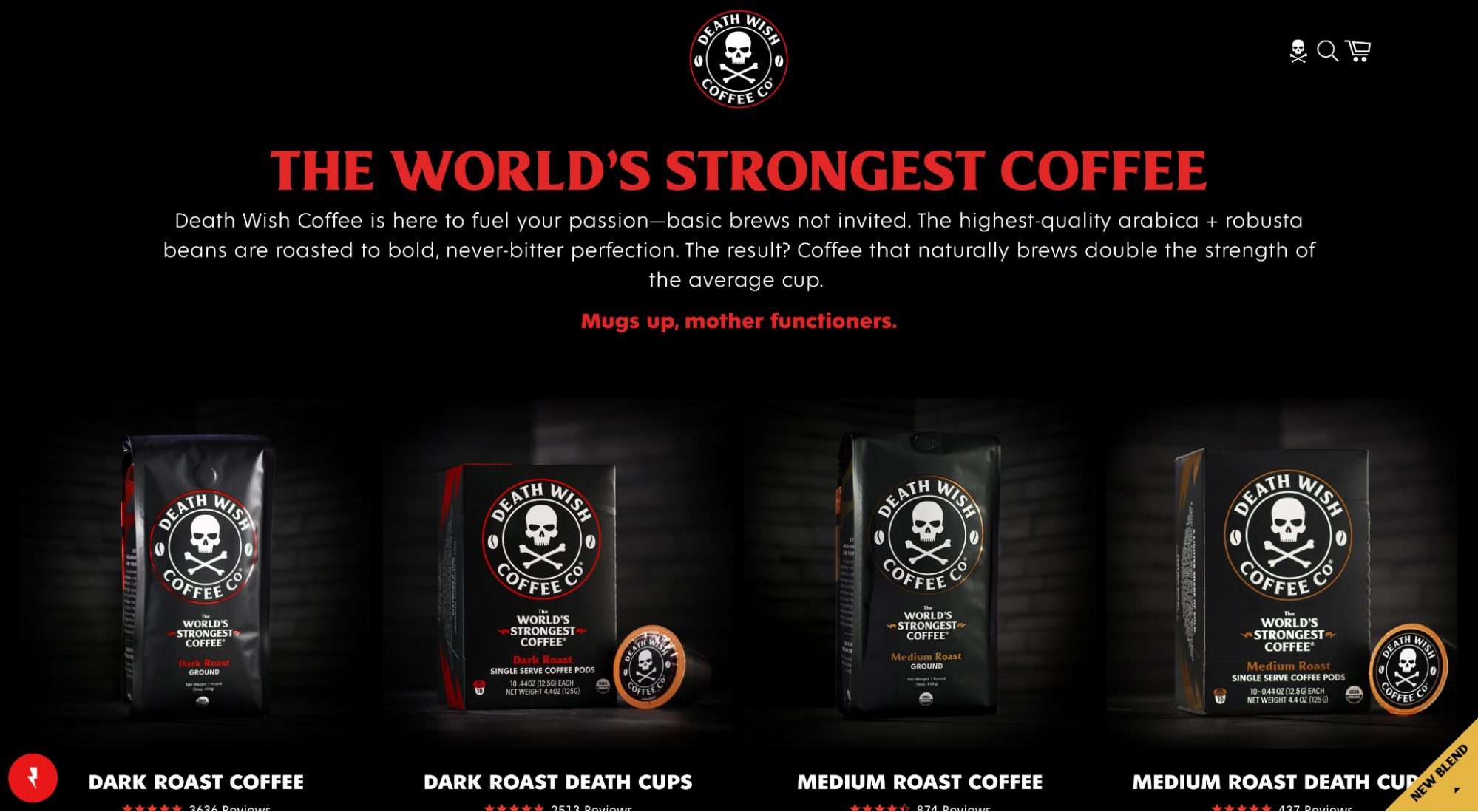
Death Wish Coffee Co. sells coffee (surprise).
Not exactly an original product.
However, Death Wish hangs their hat on providing the “world’s strongest coffee.” They masterfully state their value in bold, red letters, then support their claim by providing details on exactly how they deliver the world’s strongest coffee.
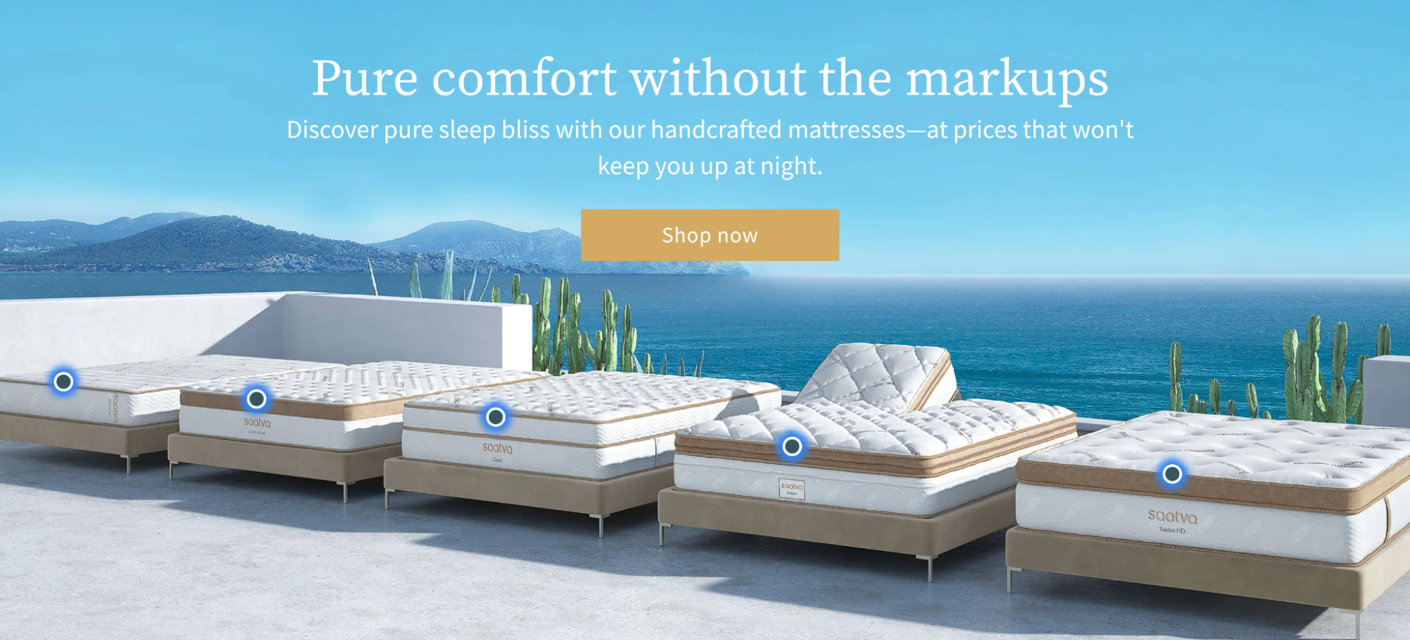
Saatva communicates their primary benefit (comfort) while handling their biggest objection (high prices). Simple yet effective.
15. eCommerce landing page example(s) with visual hierarchy concepts
When it comes to visual hierarchy, making the most important parts of your landing page stand out from the rest will help keep your page goal-focused.
Let’s look at some visual hierarchy concepts to help your most important stuff pop. (If you want a whole lesson, we got you covered in our blog all about landing page layouts.)
Consider size
Typically, the largest item stands out the most. Here’s what we mean:
Create a clear hierarchy between headlines, subheadings, lists, and paragraphs by using different sizes for each. And not necessarily just pixels; think about font width as well (e.g., thin, regular, semi-bold, bold, extra bold).
Consider the F-pattern
A Nielsen Norman Group study found that most people read on the web in an F-shaped pattern. Here’s a heatmap that shows the hierarchy of the eye’s gaze:
Consider the Z-pattern
For pages that are less dense with info (and heavier with images), online readers tend to scan in a Z-shaped pattern.
Want a tip? Have the final point of the Z land on your CTA.
Consider color contrast
The color of your CTA buttons doesn’t matter as much as the color contrast of your buttons and the background. Make them pop. Period.
In addition, your headlines, subheading, and paragraph copy should all use different hues or different colors. Instantly, your visitors should be able to tell by size and color that headlines differ from subheadings, CTAs, and paragraph text.
Closing thoughts on eCommerce landing pages
After almost a decade of eCommerce landing page design, we can confidently say that if you follow the 15 examples outlined in this article, you’ll be well on your way to crafting a high-converting eCommerce landing page.
In general, when it comes to optimizing for conversions, it’s a good idea to approach everything with a healthy dose of skepticism.
Good news? We wrote an entire article on split testing landing pages so you can learn exactly what works for you. Check it out and convert away.


