


Creating a high-converting landing page can be straight-up HARD. But when it comes to conversion rate optimization (CRO), it is an absolute must.
The good news?
You're in good company with a landing page agency (us, wink wink) that has a TON of data of what works and what doesn't.
It can be so difficult to know what your potential buyers might engage with and which landing page copy might get them to actually convert🤞🏻
Then there is the other issue…where does your inspiration come from?
The internet is chock-full of conflicting advice when it comes to landing pages. And there are many “successful” landing page examples that look nothing alike.
So what’s the formula?
Short answer: There isn’t one perfect formula.
But there are certain elements you check off every time ✅
AND we promise that these 40 great landing page examples will get your creative juices flowing and inspire your copy, design, and imagery needs.
So look no further, because the best of the best is waiting for you.
Get brand new landing page strategies straight to your inbox every week. 23,739 people already are!
Best landing page examples, part 1: Homepages
A landing page is any page someone lands on.
Typically, you direct people to your landing pages from search ads, display ads, social media ads, or email marketing campaigns.
Landing pages usually don’t have a main menu bar at the top of the page because they are designed to take away choice on purpose. That’s why landing pages also only use a single CTA (call-to-action) button in the hero section (top of the page).
But a homepage is one landing page exception.
Using a homepage as a landing page is highly debated. It can be distracting and hard to personalize—but sometimes, it works. Here's our full stance on the topic.
Here are exceptional examples of homepages that serve as landing pages and do a pretty dang good job of it.
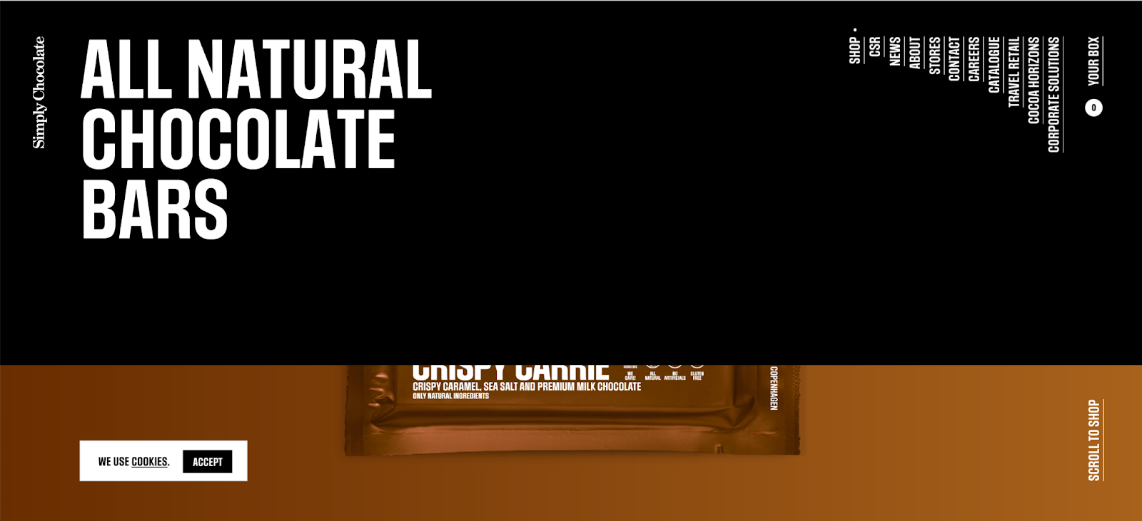
1. Simply Chocolate is an all-round winner
Blows me away. The landing page design is top-notch.
The wow factor of this page had me clicking and scrolling the second it loaded.
What I love about it:
The navigation bar
The navbar is big, unique, and eye-catching. There are millions of menus on the internet but not many like this. I like the vertical options. When you hover your mouse on the navbar, the Simply Chocolate story plays in the background—and it’s a feel-good story about sustainability. I’m all in.
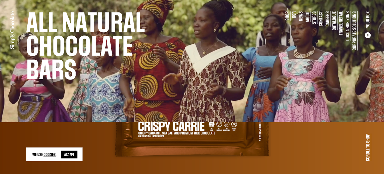
My limited choice
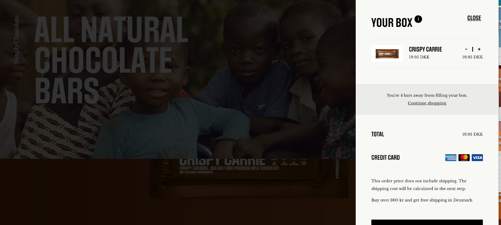
My only choices are to click the unwrapping arrow to see my chocolate bar unwrap, scroll down to see the other chocolate bar options, or click the YOUR BOX link in the top right to see what’s in my box (my cart).
The teaser
I love that the menu bar hides the star of the stage: the main product—it’s a brilliant teaser. In order to see the chocolate bar, I have to scroll down (where the menu slides up and away).
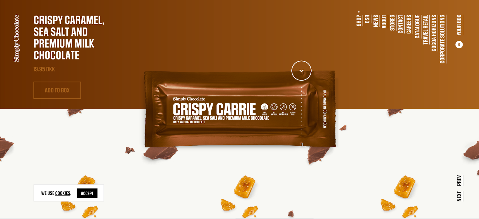
The click animation
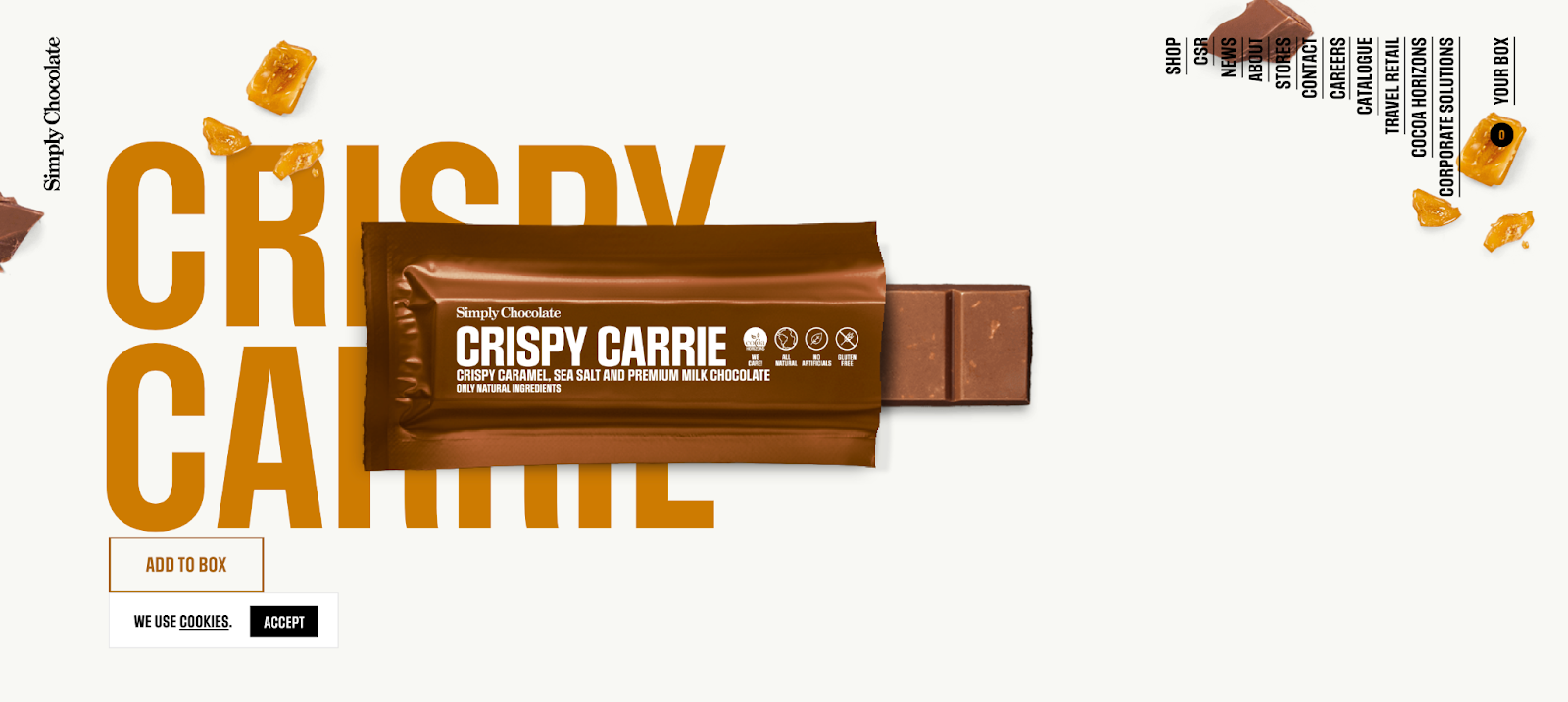
The animation continues when you click the down arrow on the package until the bar is completely out of the wrapper (and in my cart). Underneath you get a sneak peek at the next product which invites me to keep exploring.
The featured product scroll
Scrolling down showcases all the other chocolate bars you can choose from and they all have the same unwrapping effect—which I love.
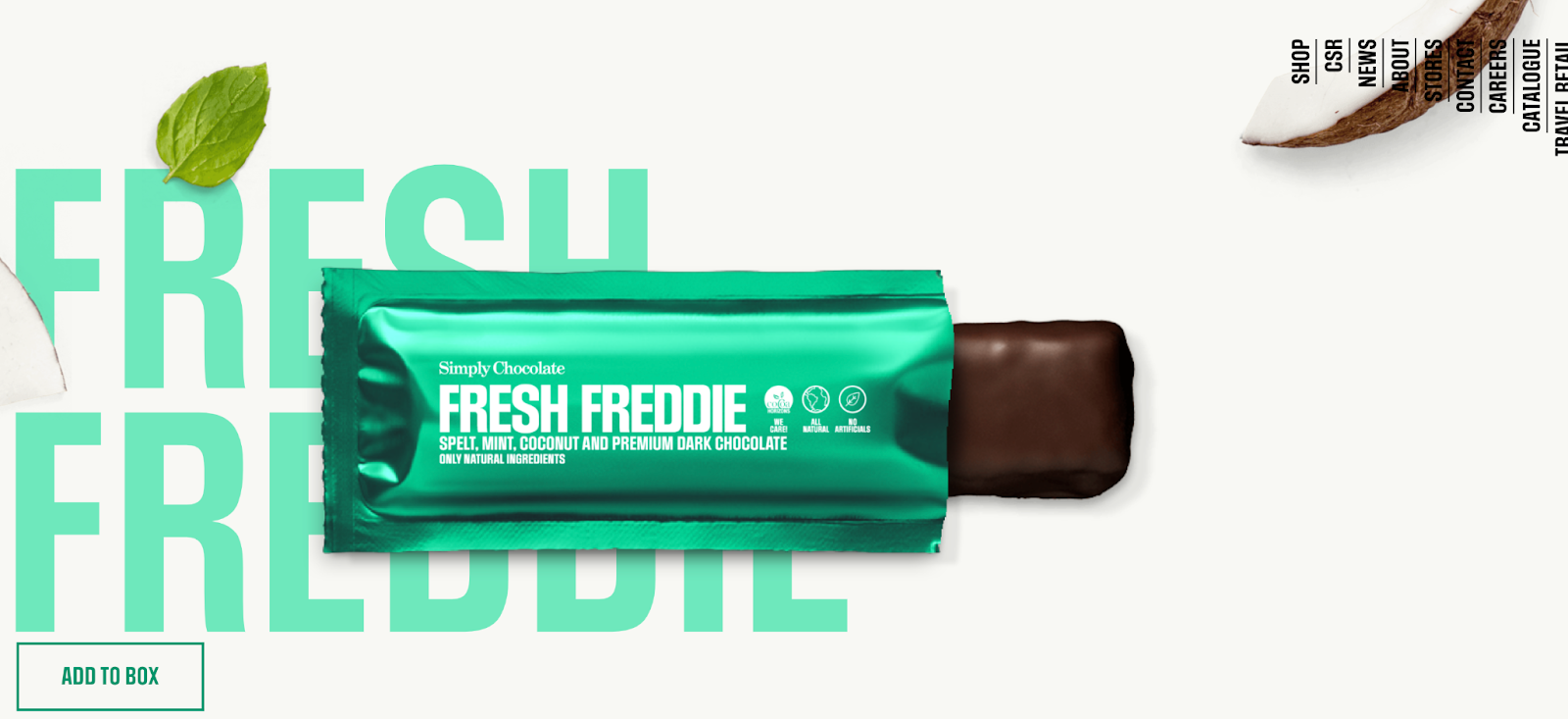
The page is short and sweet. The time and effort went into featuring all of the products right on the homepage and adding in a virtual unwrapping animation.
I can almost taste these chocolate bars.
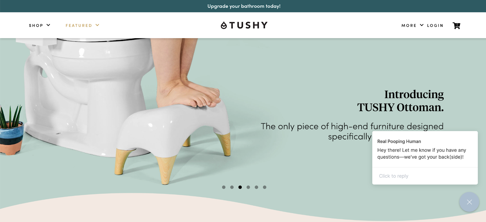
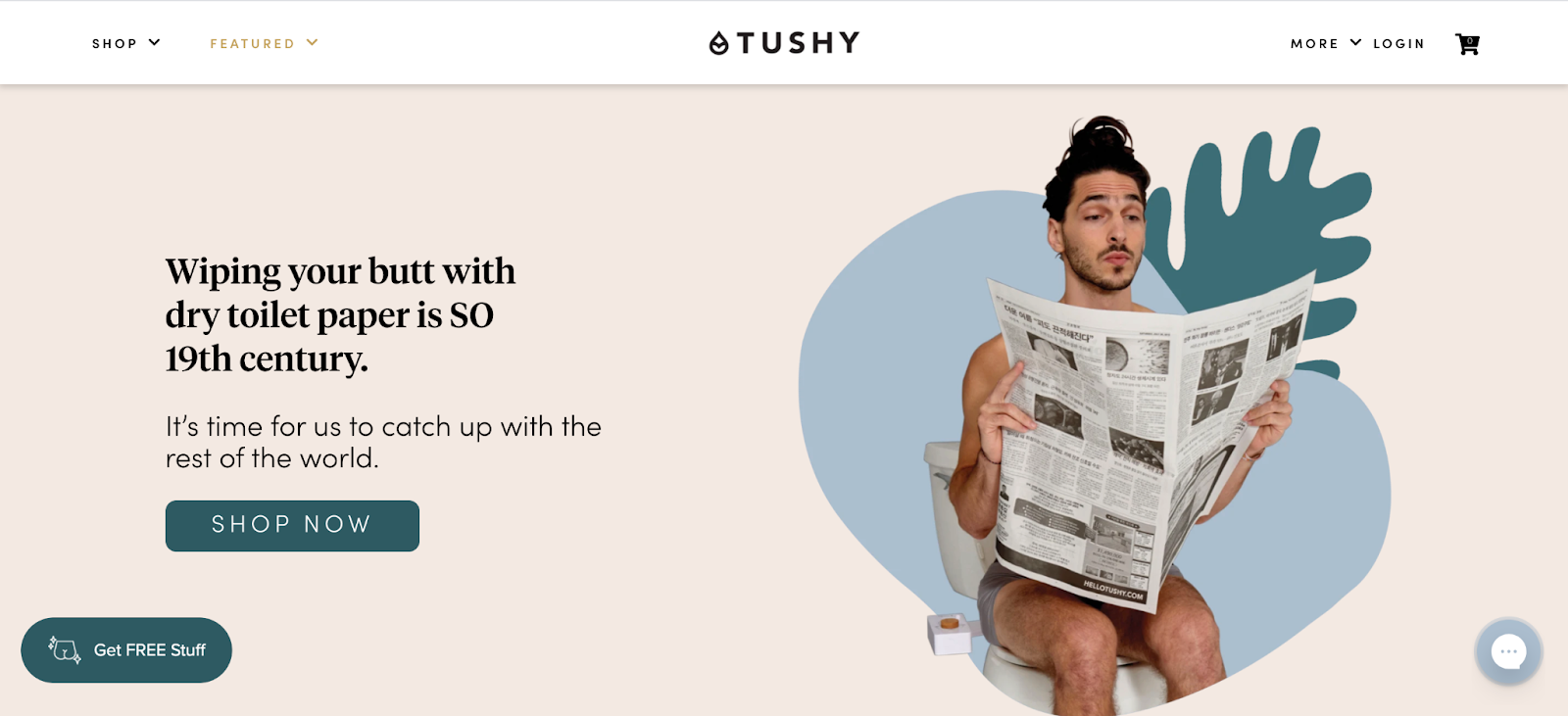
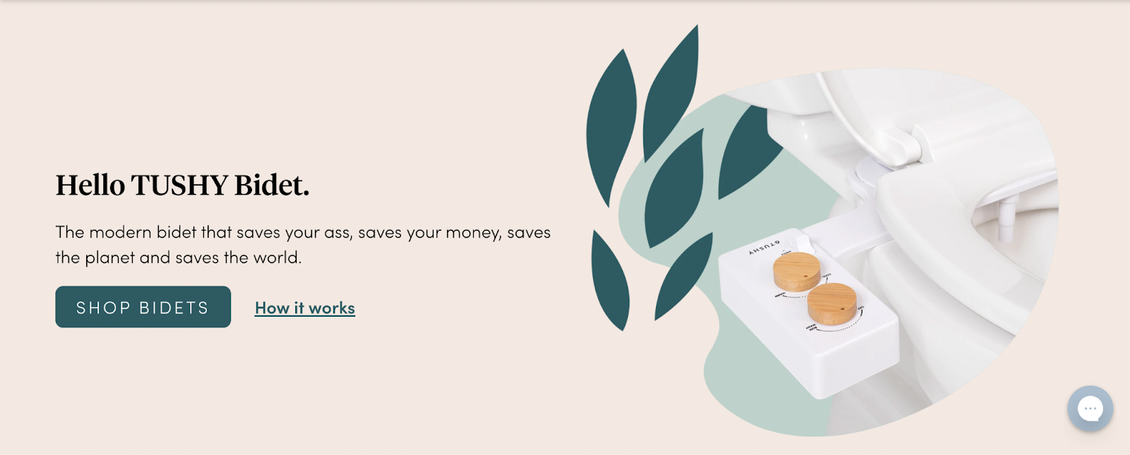
2. Tushy is cheeky
This landing page example does everything right. From the humorous copywriting to its pastel colors and découpage design, to the navbar and call to action buttons, to the full-page popup and chatbot, I’m seriously thinking of not wiping my butt anymore (but washing it instead).
Take a look at this homepage:
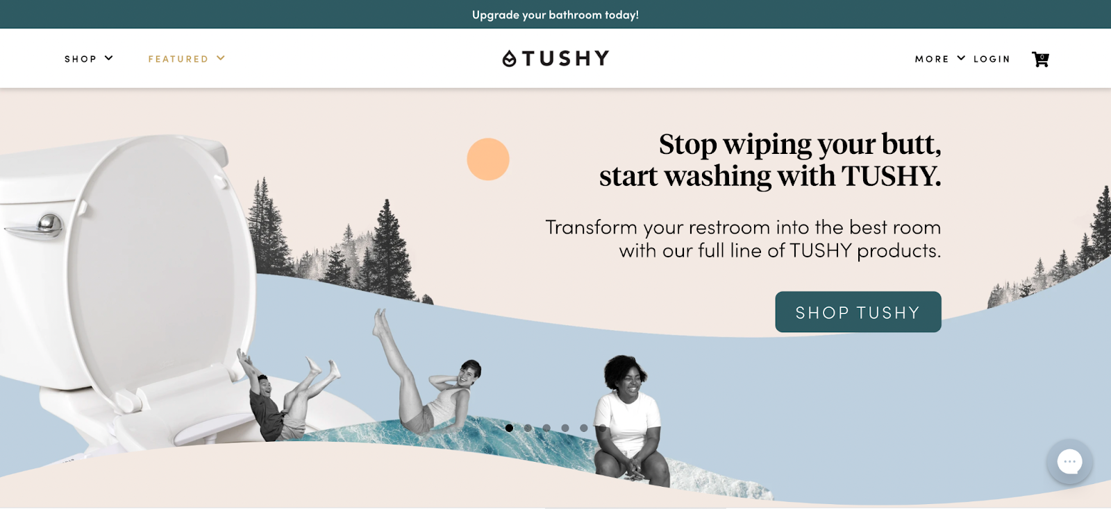
The value proposition is clear: it’s time to stop wiping your butt (you savage) and start washing it with an affordable bidet.
But who are they targeting?
Everybody who poops.
That’s a broad target market. I’d love to see their PPC strategy.
Enter full-page brilliant pop up and chatbot:
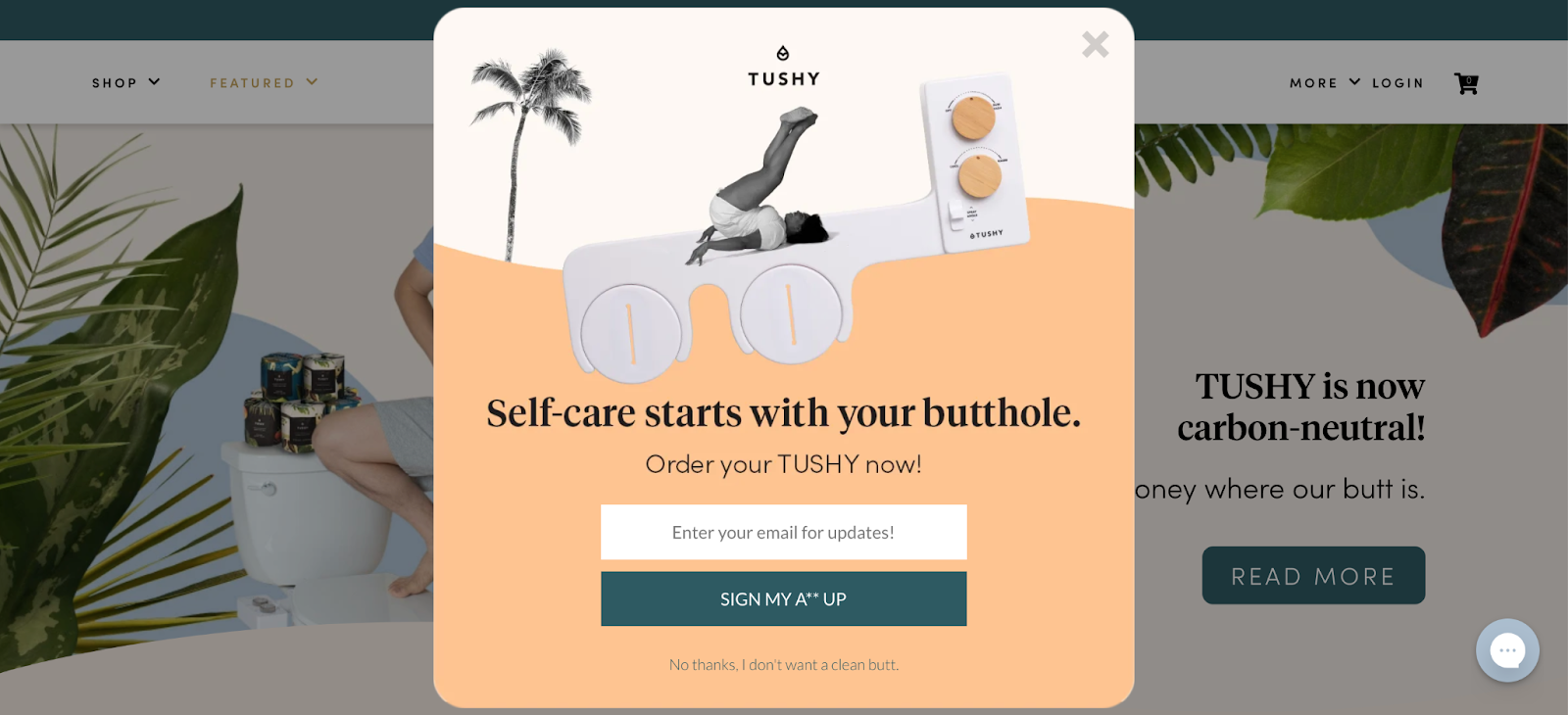
The copywriting wins big time.
See that CTA? Sign my A** up. And the click-through trigger underneath reads “No thanks, I don’t want a clean butt.” Shame.
I have to ask myself, “what don’t I know about keeping my a** clean?” I’m giving up my email address. I have to find out.
On a scale of leaves in the woods to someone spritzing my butt crack for me with mineral water, the Tushy bidet is gaining some serious opulent traction with me as an upper-tier hygiene option.
Toilet paper hoarding during the pandemic? Pfffft.
You can have my toilet paper, proletariat poopers. My bathroom’s going bourgeoisie.
This is the sh*t.
Buying a bidet… check.
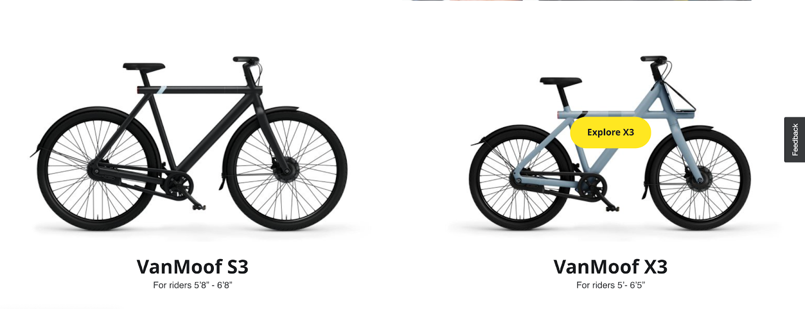
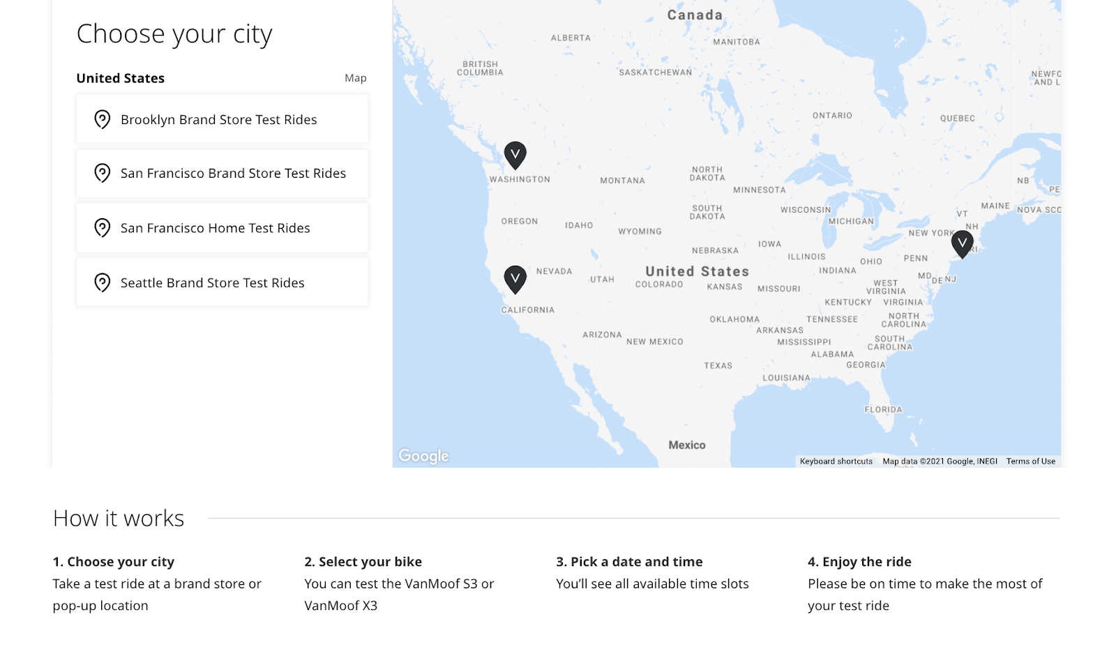
3. VanMoof is minimalism
Next-gen electronic bikes get a futuristic homepage treatment at VanMoof. Super-fast loading, the looping animation is pretty cool. And that’s almost all there is to this page.
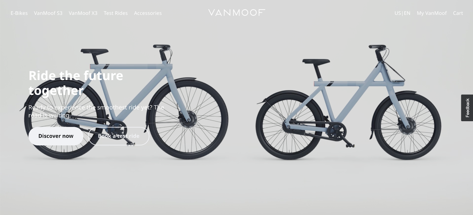
The photography is gorgeous and the color scheme is ultra-minimalist. But the thing I love most about this page is the very limited choice (discover, book a test ride, or scroll).
Even the navbar is simple: I can learn about e-bikes, check out the only two colors available (dark for tall people and light for short people), book a test ride, or buy accessories.
BAM. Zero clutter.
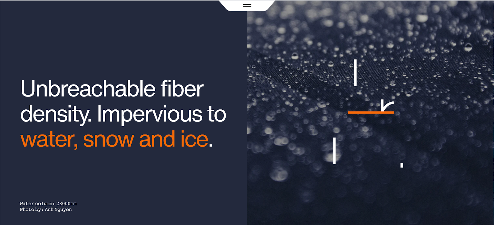
4. Eiger Extreme by Mammut is inspiration in motion
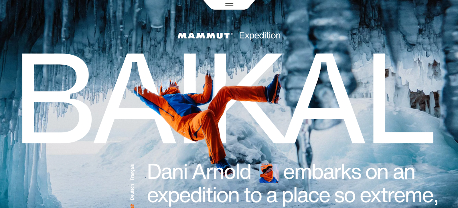
Before I dive into all of the great things this page has going for it, can I point out the font? This font kicks. The treatment in the A looks like a science lab beaker… and that’s when it hits me; the Eiger Extreme is about cold-gear technology.
This is genius. This is landing page design at it's finest.
This page takes color and motion to an amazing level.
There is so much going on here and, yet, it isn’t overwhelming. This is the opposite of a simple page, but it’s not junky—it’s exciting. Why? Because half a dozen different scroll effects combine with bright colors and a journalistic copy treatment.
It works.
Ken Burns’ effect backgrounds that darken as text appears and high-contrast colors against those muted backdrops get my full attention.
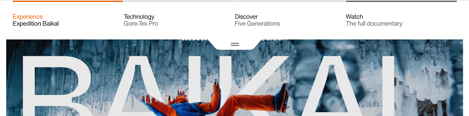
The navbar is a tab that sticks to the top of the screen, clickable from anywhere. It drops down to highlight the four key elements of Mammut’s value proposition for this product, including a video documentary that makes me want to learn how to scale an ice wall and add near-death experiences to my bucket list.


This page wins because it tells a fascinating, adventurous story.
Sure, I’m there to shop for winter snow gear, but this page inspires me to get outside. I want to come back and read more about the team who tested this product in harsh climates.
So I bookmarked it.
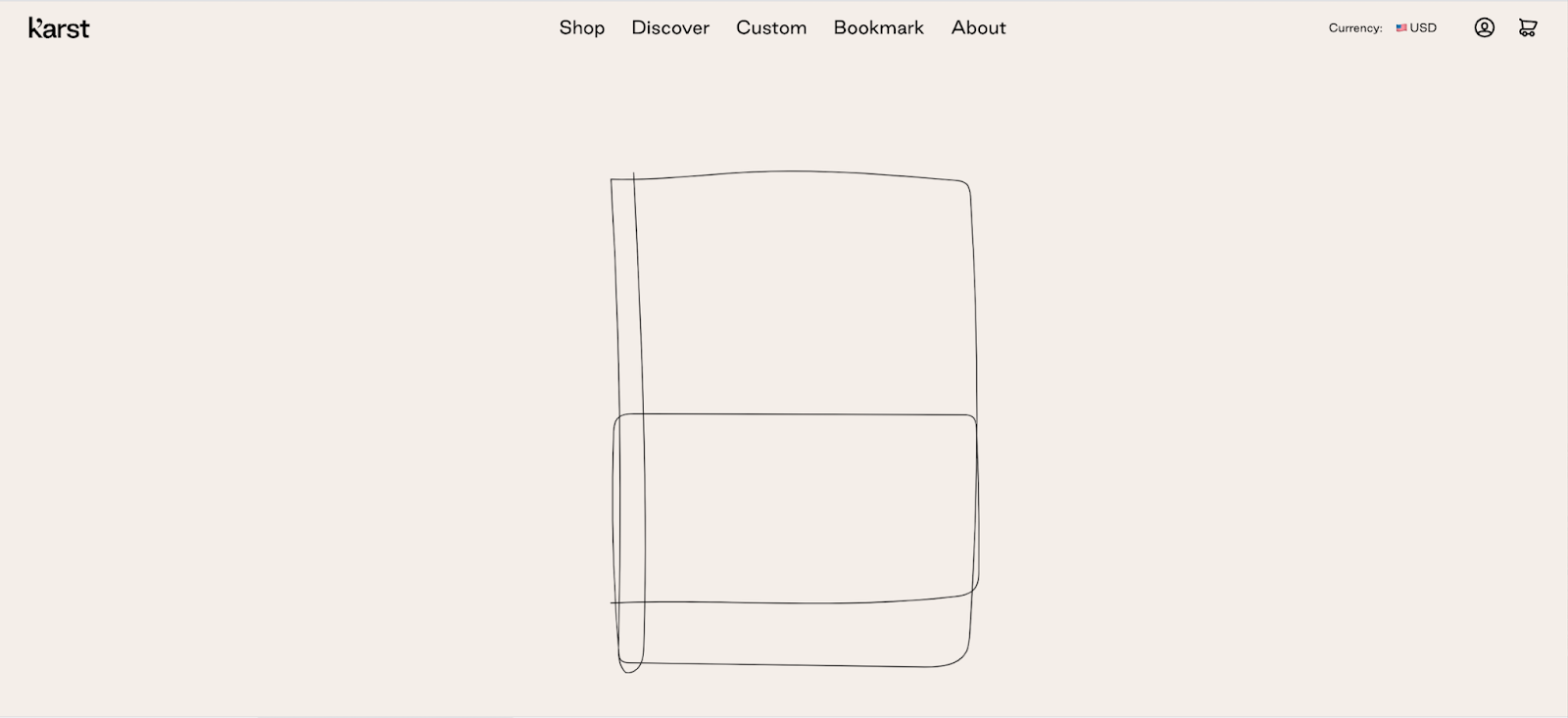
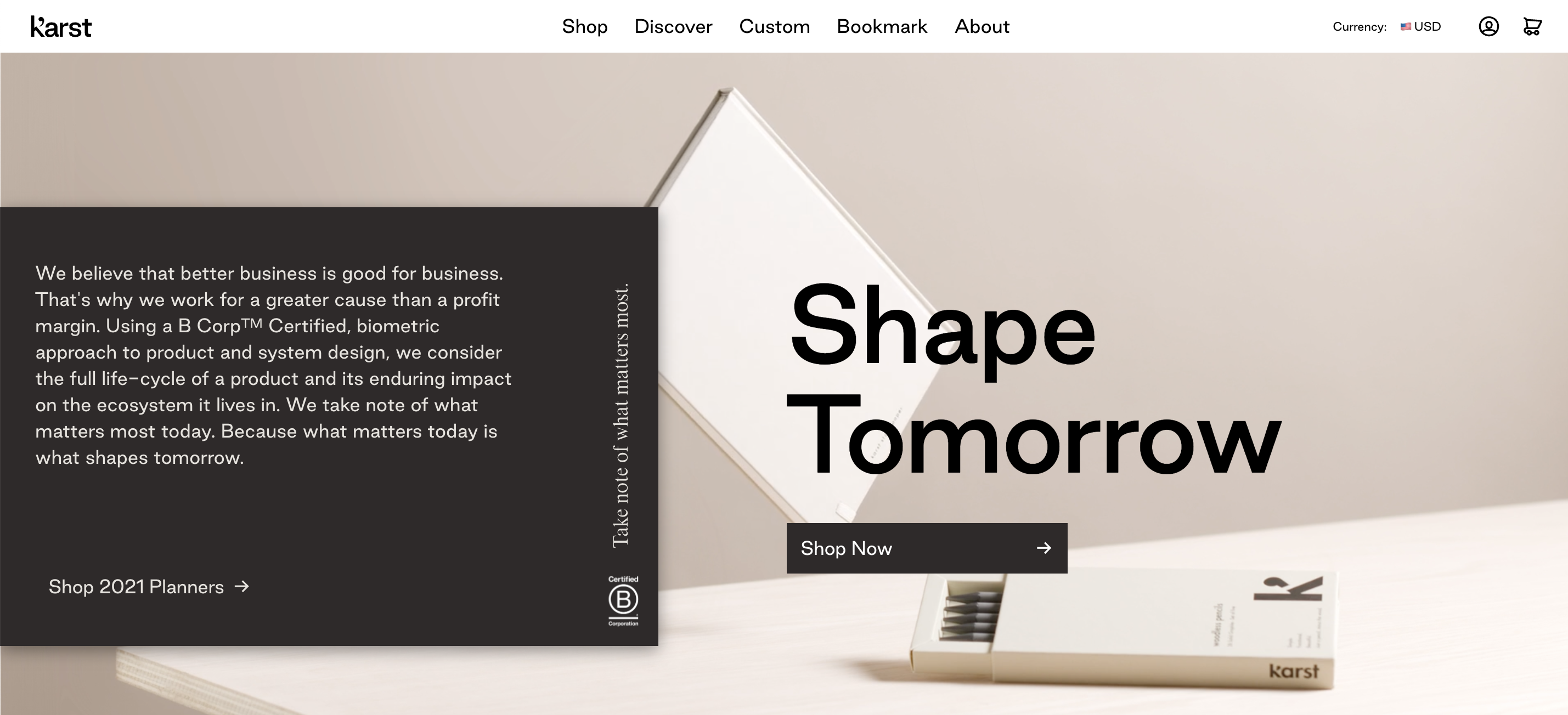
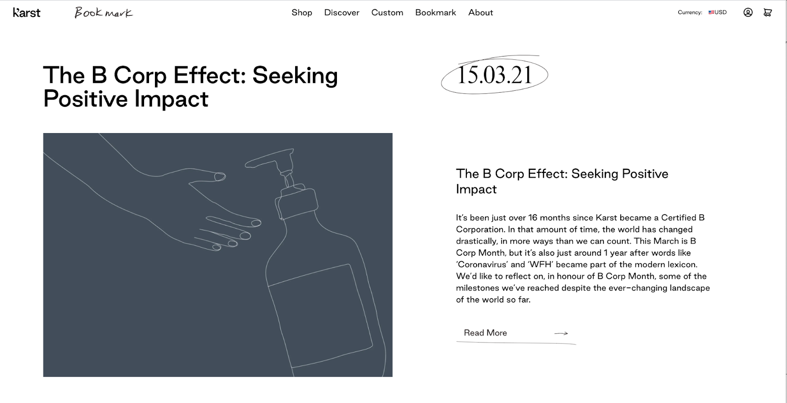
5. Karst Stone Paper is simple sustainability
This product is awesome and so is the simple homepage. Landing page design doesn't need to be complicated.
Line art simplicity, short animations, neutral colors, and a strong sustainability message supports the value proposition of this product: paper that isn’t made from trees.
That’s right. This paper is made from crushed stone and resin.
That 👏 is 👏 so 👏 cool 👏.
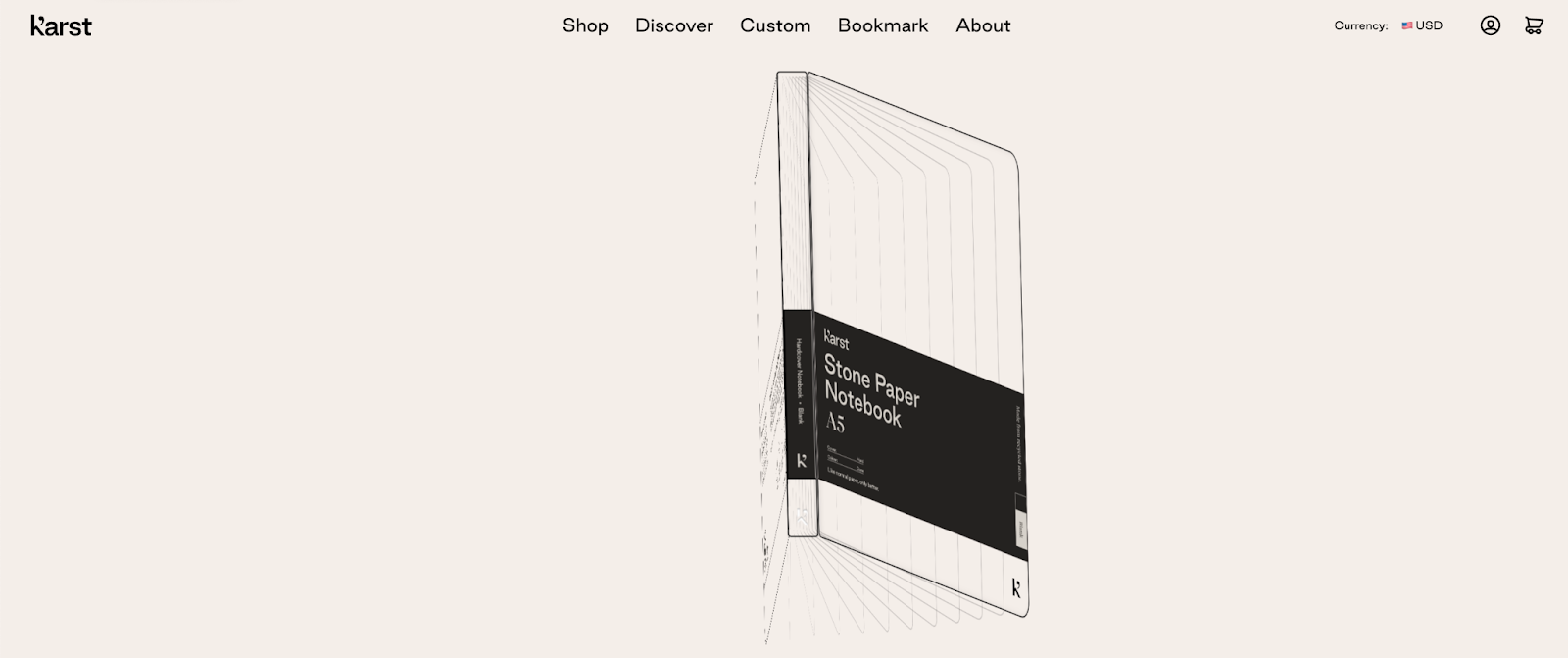
When the animation ends, a black tab appears with messaging that says “Take note of what matters most.” Clicking on it (how could you not?) underscores the purpose of this product: to save the environment.
My options are to shop the handful of products, learn about the product, customize my product, or read their blog (aptly named Bookmark).
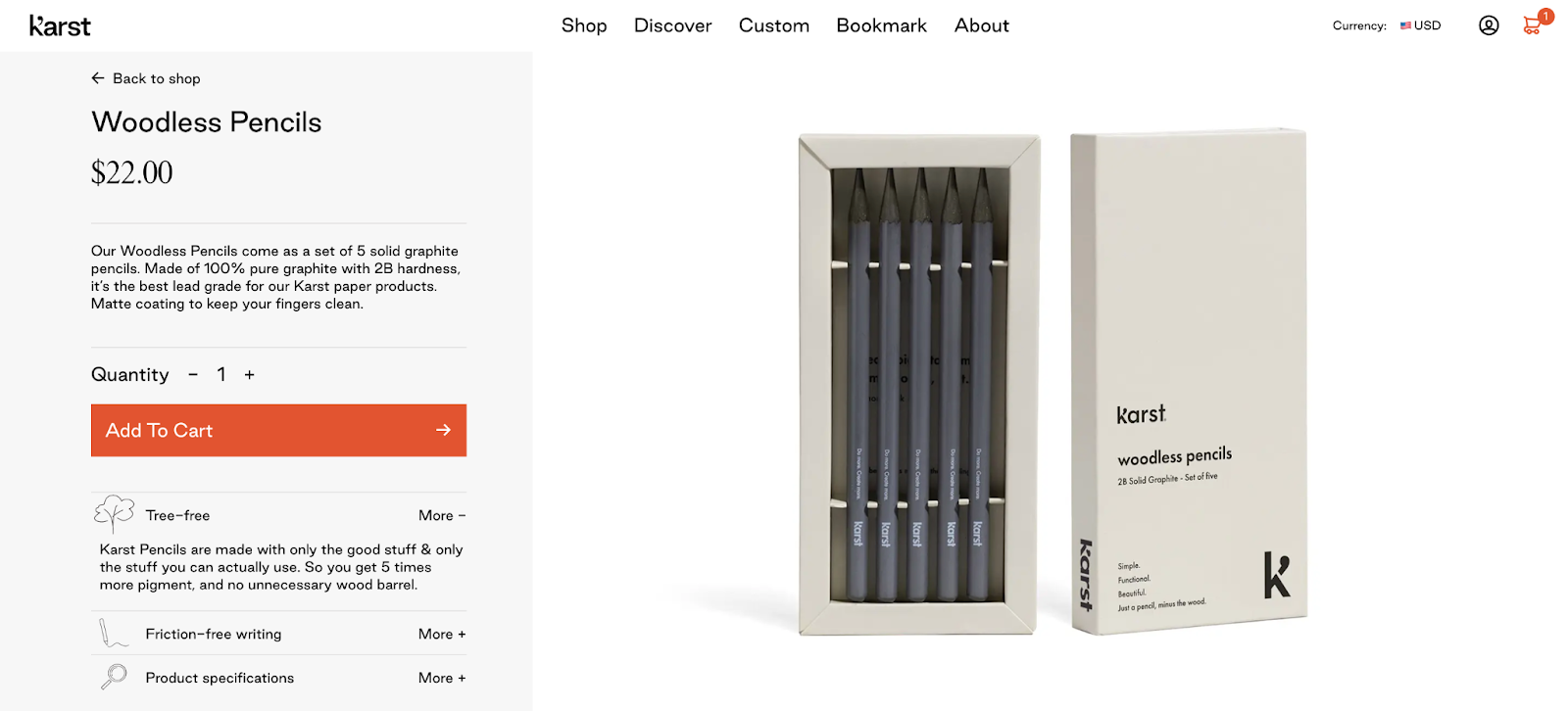
I add one of the notebooks to my cart where I’m told I’m buying something that is waterproof and more durable than paper, not to mention smoother and brighter. I’m also advised I can get free shipping if I buy another product.
I guess I’ll buy the wood-free pencils since that is also crazy cool.
The line-art minimalist theme continues on their blog page
Did you know that we can make paper out of 100% sustainably recycled stone that doesn’t need trees, water, bleach, acids, or toxic chemicals?
Me neither. But, because this site is so amazing, I surf around and learn all about it (and buy a notebook and some woodless pencils).
6. Lucciano’s is video
How does this page load so quickly? Every aspect of it is motionized.
Every. Single. Delicious. Second of it.
The home page kicks off a video that steps through Lucciano's process for several of their gelatos and ice pops.
It is so beautifully produced, I watched it three times.
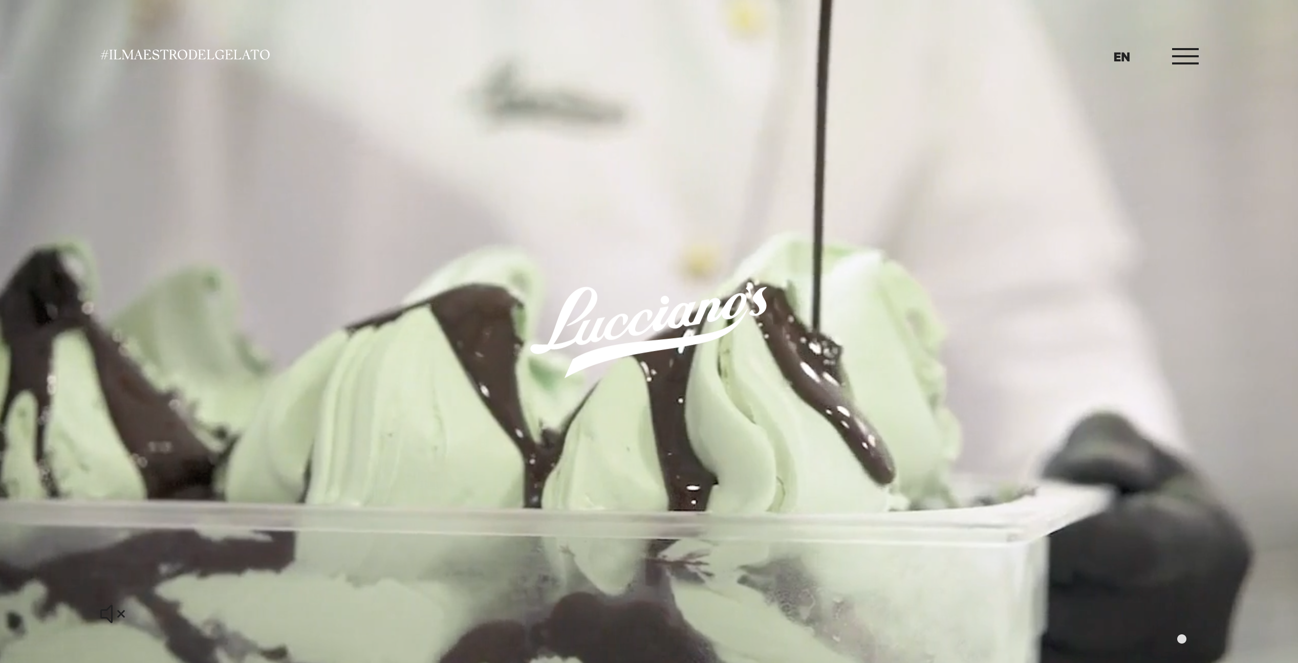


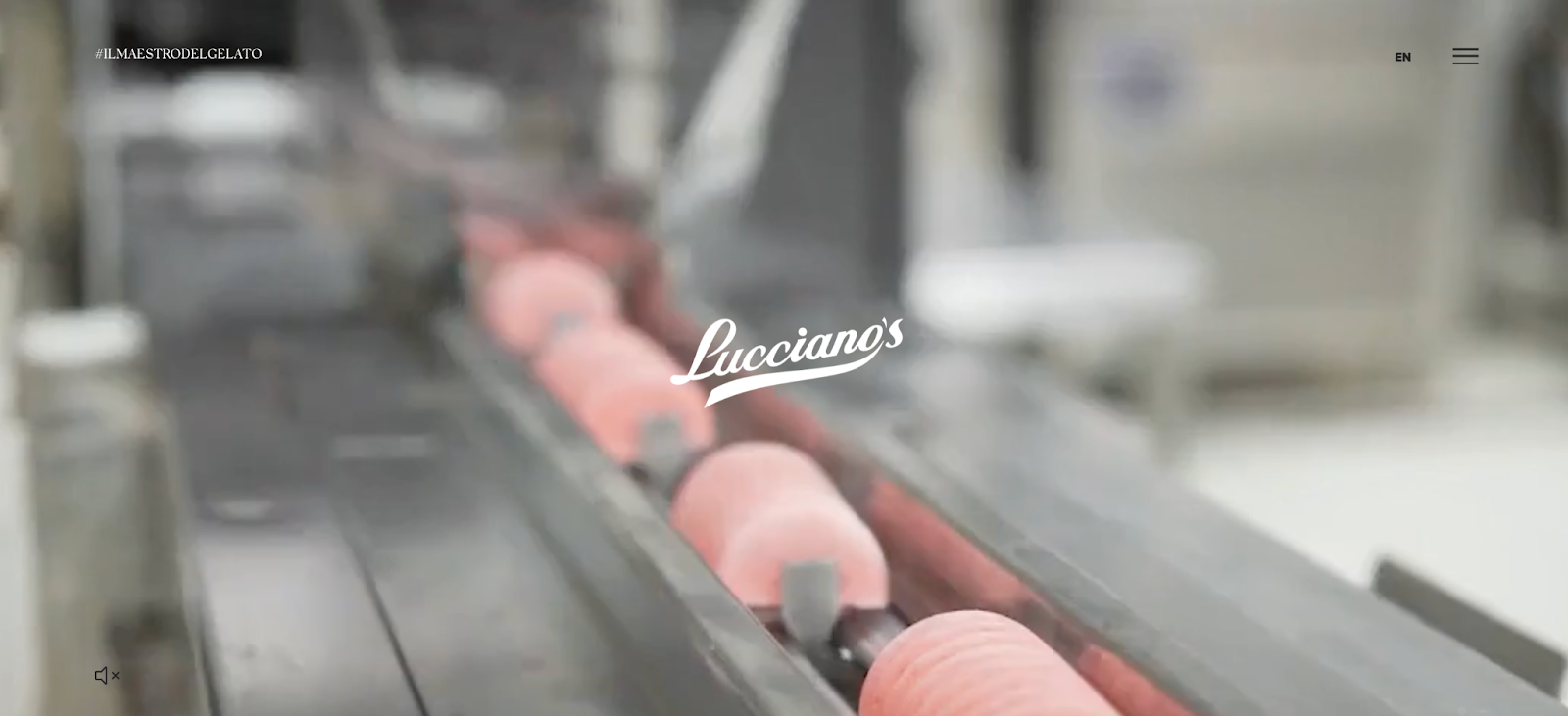
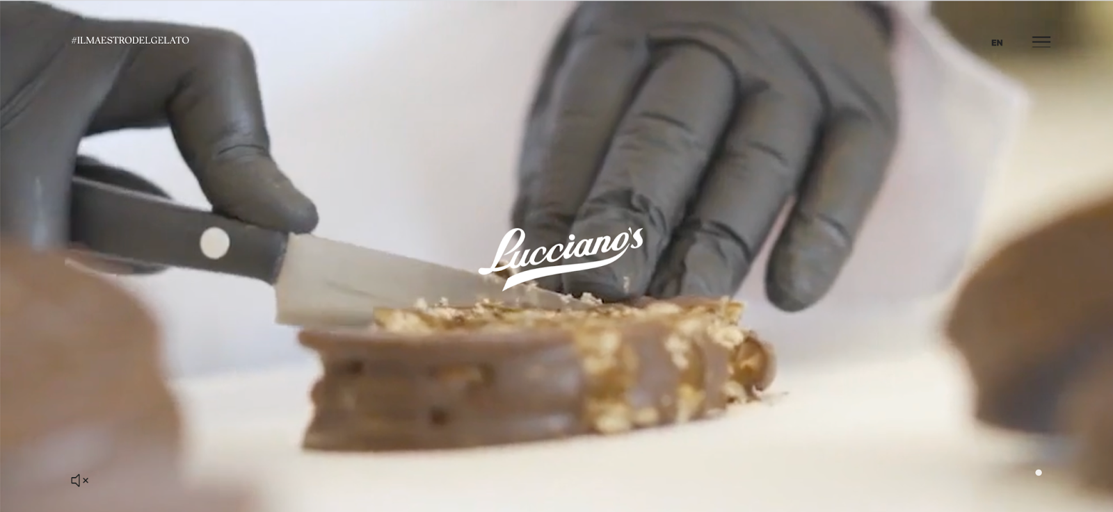

Those screenshots don’t do the video justice. Go check it out.
Just under the fold, all products are displayed in a scrolling slider. When you hover your mouse, a simple, color-matched highlight appears giving you a snapshot of more info.
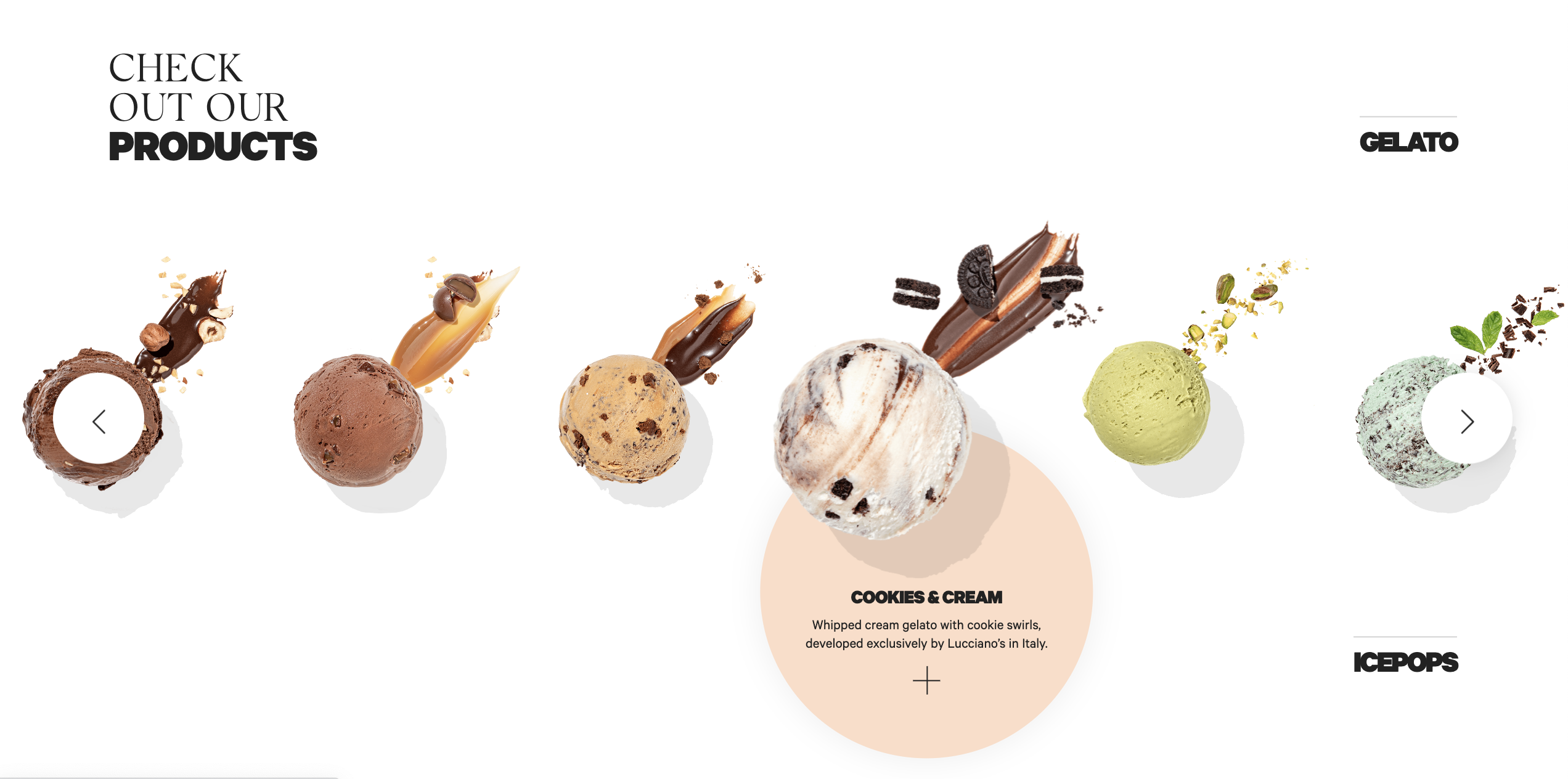
The hamburger menu opens a full-page navbar where more videos play. Scroll over the options, from history to news, and every hover pulls up a scrolling extravaganza that keeps me rapt.
I am salivating.
On top of all that yummy motion, the background anchors all that colorful product photography with lots of whitespace to keep things clean.
Lucciano’s markets gelato right with an exceptional homepage.
7. Gumroad is ugly, and I like it
Somehow, Gumroad manages to be a prototype of a landing page despite the ugly design (but that’s subjective, right?).
I don’t get the high-contrast globe thing with the scattered balls. Are those planets? Gumballs? Is this what a Gumroad is? I’m staring at the slight rotation of the skyscraper-lined earth in the upper left—is that a bomb tucked in beside those buildings?—and that draws my attention away from the value proposition in the middle of the hero section.
All of this is wrong.
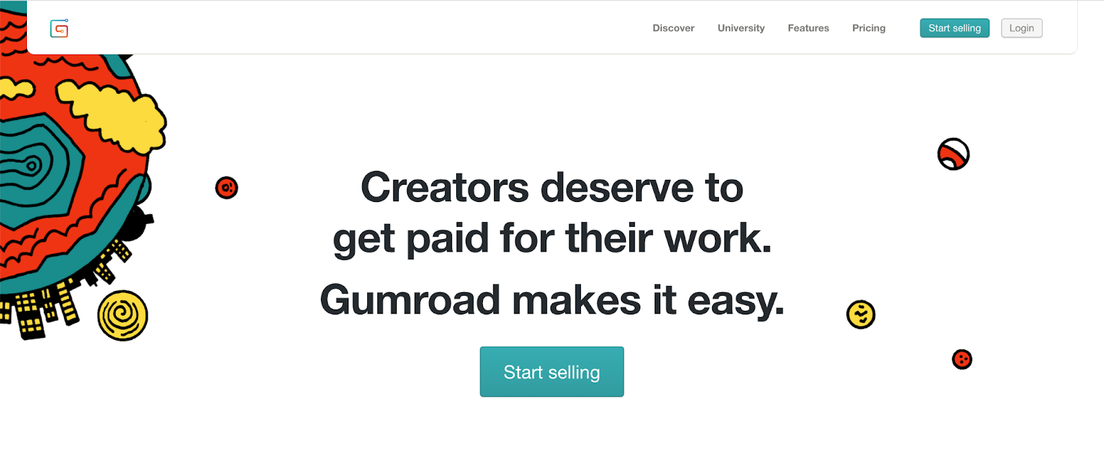
And I love it.
As it turns out, a lot of ugly sites are kicking butt online.
Gumroad’s homepage is a case study of why great design is overrated.
They accomplish exactly what they need to within the hero shot.
What GumRoad gets right
- The initial value proposition is laser-focused, identifying exactly who the target audience is (creators) and underlining the benefit (making it easy to get paid). They haven’t even explained the “how” yet.
- Scroll down slightly and the benefit is refined further along with a boatload of social proof: Since 2011, our 89,432 creators have earned over $461,871,955. Just last week 8,870 creators from 127 different countries got paid $2,844,134.
- There is a second value proposition: “The creator economy is just getting started. Say this aloud: I deserve to make a living doing what I love.” The CTA is Start Selling (this is the how).
- Moving down the page, Gumroad shows us a metric that inspires. They really go all-in on their target market: creators.
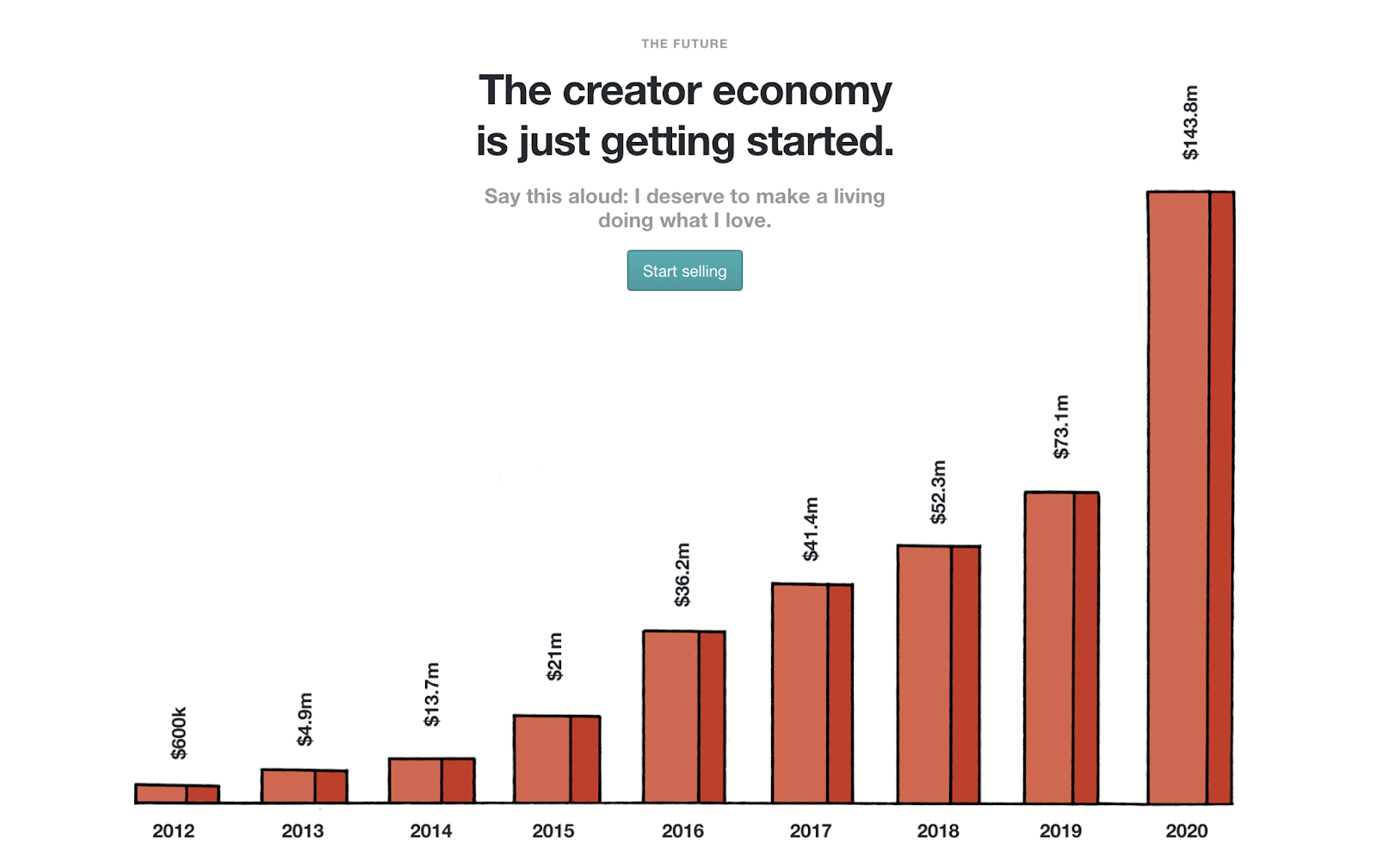
Gumroad’s payment processing could work for many types of online business, and yet they have chosen to zero in on solo or small-team creators. This focus is clear in every element of the page copy, and it has paid off massively for them.
8. SquareSpace
In stark contrast to Gumroad’s ugly brilliance, we have SquareSpace, a tool to create websites, standing head and shoulders above the crowd.
Not everyone is a designer. But Squarespace pushes the idea that with their immaculate templates, you can turn any idea into reality. That’s the pitch, and they have the landing page to back it up.
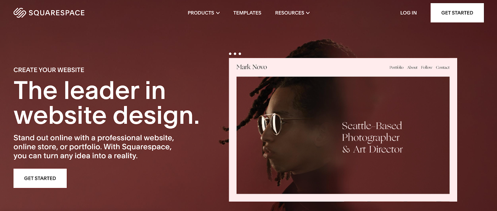
The value proposition is clear: Create your own website with a beautiful design.
That box on the left is a slider that shows three impressive portfolio-type designs that show off the variety of their templates.
Moving down the page, we see a number of key elements:
- Show, don’t tell: Squarespace demos website features that you can use on your page, rather than simply talking about them. Want sliders? Here’s a slider talking about our sliders.
- Clean, clean, clean: Everything about this landing page is clean, modern, and speaks to the “high-end” design Squarespace promises to deliver. While ugly is great for Gumroad, it doesn’t work for a web design agency.
- Easily viewable portfolio: I can’t tell you how many creative sites have their portfolios buried or only viewable via a hopelessly buggy interface. Squarespace displays their example templates loud and proud and makes it all incredibly easy to view and appreciate.
As a CRO specialist and copywriter, what amazes me most about Squarespace is that they deliver exactly what they promise — beautiful yet results-driven web design.
Finding designers who understand marketing can be challenging, which is why Squarespace’s spot-on copy and focus on benefits are so … *cough* … impressive.
9. Groove is simple & effective, just like their product
I’m all about getting right to the point. That’s why I love Groove’s homepage. After achieving $50,000 monthly revenue, their redesign increased conversions by 100%.
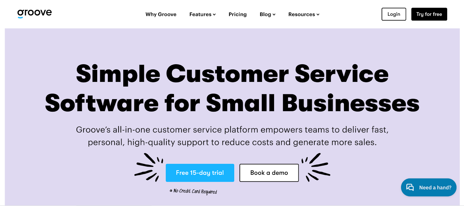
Just like their product, Groove’s home landing page is designed to concisely accomplish a simple purpose. The header alone is selling. It might be the best value proposition I’ve read (which answers the journalistic 5 Ws and the 1 H):
What: Customer Service Software
Why: Reduce costs and generate more sales
How: Simple, fast, all-in-one, high-quality support
Who: Small businesses
When: Right now. Start a free trial (no credit card required)
Where: This free demo right here.
Groove does some amazing things with this page:
- Groove's messaging communicates the benefits potential customers are looking for: easy-to-use software that helps them make their customers happy.
- Scroll just below the fold and you see a full-width screenshot of their software so you know exactly what it will look like and what it can do.
- Tons of social proof with “trusted by” logos and this big stat next to a playful company snapshot: With Groove's help, we've seen a 20% decrease in support volume, a 46-minute faster response time and our happiness score is up to 89%.
As you’ll notice throughout these landing page examples, it’s crucial to give website visitors an immediate option for conversion at all times. Groove does a good job of this, although I’d probably recommend locking the top navigation menu in place so the “Try for Free” CTA is visible 100% of the time.
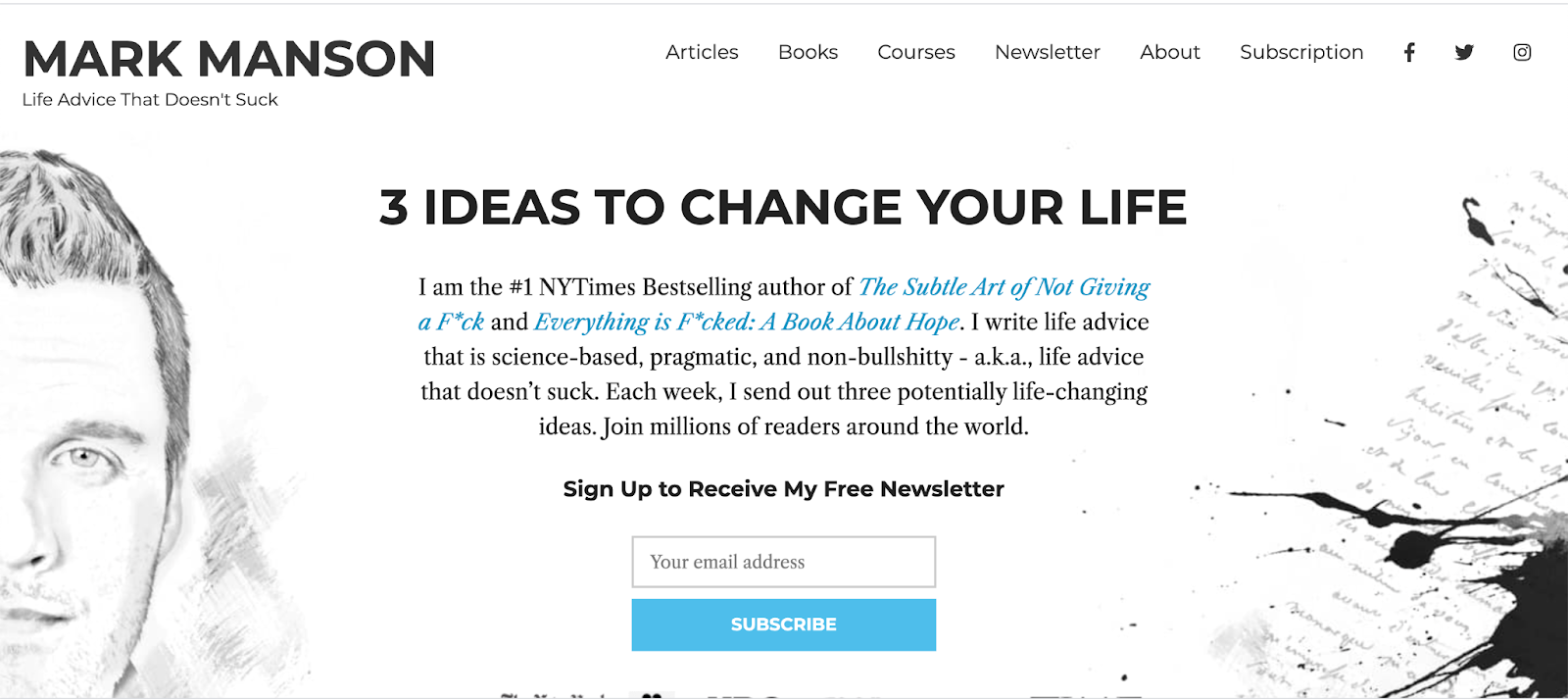
10. Mark Manson “doesn’t suck”
Here’s the thing about personal development advice online.
It sucks.
Why? Because for every one good article, there are at least 19 watered down and recycled versions of articles that were interesting a long time ago but have since been beaten into a squishy, over-generalized pulp.
And so, here comes Mark Manson. Mark says he gives life advice that “doesn’t suck”. And you know what? He’s right.
Let me start with a disclaimer: Mark and I have similar design tastes.
So when I say this landing page is the best landing page I’ve ever seen, I’m a bit biased.
But biased or not, Mark does some brilliant things on his landing page that all of us should learn from.
5 brilliant components of a landing page that doesn't suck
- He tells you that his writing “doesn’t suck” and that he will change your life in a non-bullshitty way. That speaks to me in real language. I like this guy right away. I might trust the advice he’s going to send me.
- He creates a compelling curiosity gap with this line – “Each week, I send out three potentially life-changing ideas.” Potentially, huh? Now I really want to know whether he’s worth his salt.
- He gives visitors an option to subscribe immediately above the fold. This is important because even if users don’t immediately subscribe, giving them the option to subscribe at the beginning makes them more likely to subscribe later on, possibly via a popup or opt-in offer.
- For those who aren’t ready to immediately begin reading, this landing page follows up the hero shot by breaking things down into four topical eBooks. This gives readers an opportunity to combine an interest in Mark with interest in a specific topic that appeals to them and is the perfect follow-up.
- Finally, the page finishes with a feed of the most recent articles and a final CTA inviting visitors to see all Mark’s posts: Subscribe to the Site and Get Access to More Amazing Shit. Like, okay. I want to see that amazing shit.
Each step down the page is a prime opportunity for visitors to move forward, and getting people to move forward is what a great landing page is all about.
11. Unbounce knows about landing pages
If there’s one company that should have the best landing page examples ever, it’s Unbounce. Their business is software that builds landing pages, after all.
And just as you’d expect, their homepage nails it on all counts—from header to message to design.
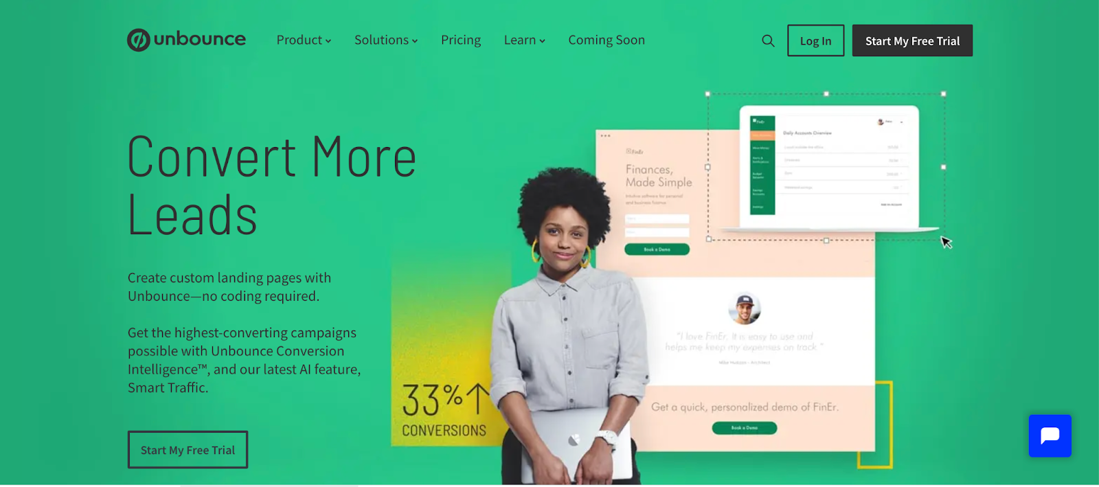
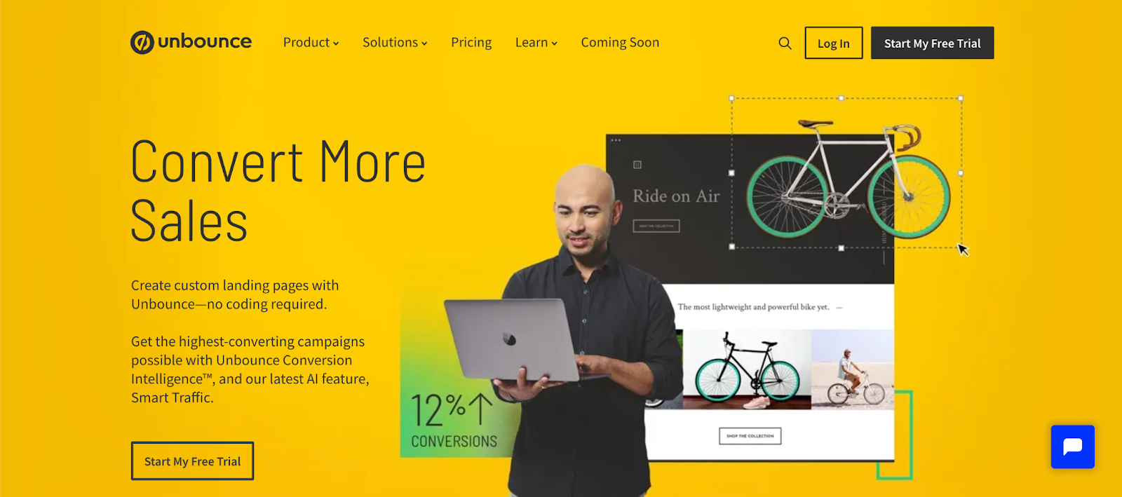
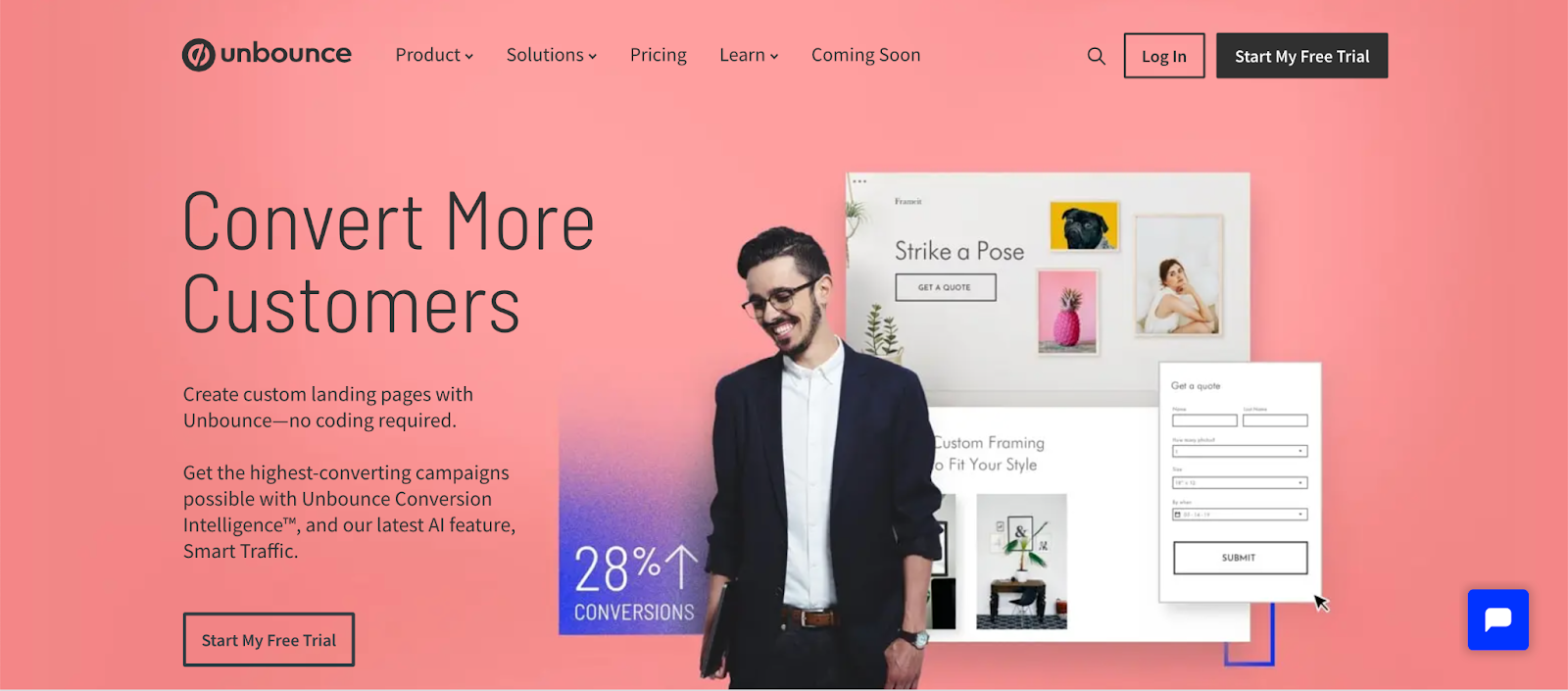
Stating a benefit makes for a great headline. Unbounce offers three benefits in three 3-second sliders: Convert more leads, sales, and customers.
5 Takeaways From Unbounce’s Landing Page
- Get this benefit without this problem. Create custom landing pages with Unbounce—no coding required.
- Notice the high contrast between the background and the example pages on the right. Higher contrast increases conversions.
- They simplify conversions with two features: Get the highest-converting campaigns possible with Unbounce Conversion Intelligence™, and our latest AI feature, Smart Traffic. The more you can help readers grasp exactly what you’re offering, the better your page will convert.
- Unbounce immediately follows up its value proposition with social proof. They highlight well-known brands they’ve worked with and display a glowing testimonial detailing an account, complete with hard numbers, on how effective Unbounce was at increasing conversions for the client.
- Showing is far more effective than telling, and Unbounce has been doing this long enough to understand exactly what converts. Who is Unbounce for?
12. Gravity Payments is trustworthy & focused on you
Different strategies work for different audiences. The key to success isn’t necessarily emulating a template formula.
Gravity Payments homepage subtly accomplishes two things:
- It speaks clearly and directly to the target audience.
- It builds a meaningful sense of trust, which can increase conversions.
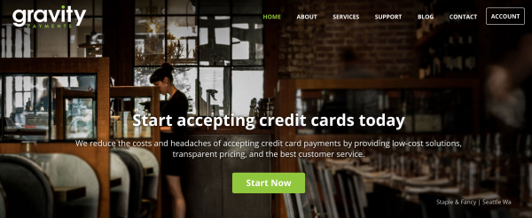
Imagine you’re a small, brick & mortar business owner. You deal with a high volume of low-margin transactions, you get gutted by credit card companies, and you think you’re too small to be heard.
Gravity Payments is targeting you. Specifically you. They started their business with you in mind, and despite the wide range of people who need processing services, they are only talking to you.
“We reduce the costs and headaches of accepting credit card payments by providing low-cost solutions, transparent pricing, and the best customer service.”
They are the “Credit Card Processing Trusted Most by Community Businesses.”
Exclusivity builds trust.
When you address a specific and unique group of people like Gravity Payments does with small business owners, the exclusive nature of your words builds trust. Gravity Payments does a truly exceptional job at this, coordinating laser-targeted copy with relevant images.
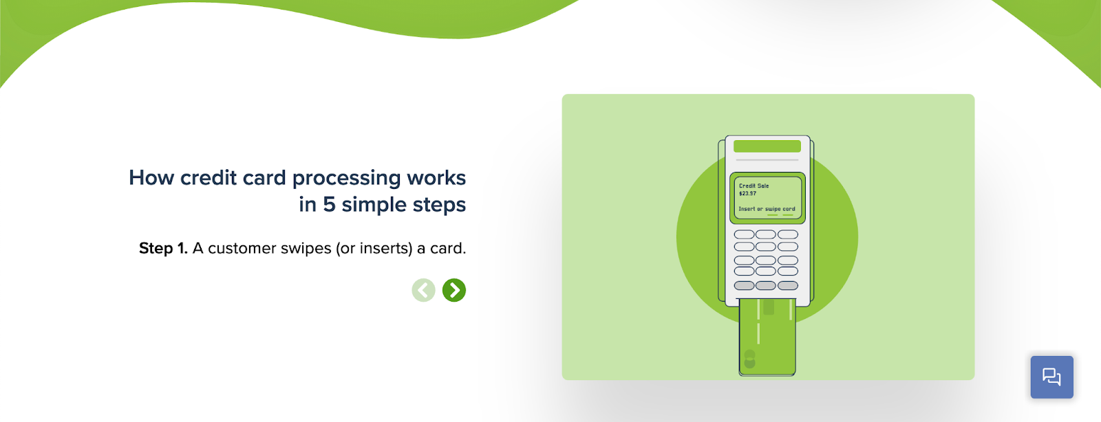
The hero shot follow-up section is super clear with a five-step animated walk-thru that really drives home the value in a few clicks.
This section is followed up by a ton of down-to-earth social proof that makes me feel like this is going to be the best way for my business to take payments. Sold.
13. KlientBoost talks to you
Sounding off for the home team, I want to mention KlientBoost’s homepage because it does a few things exceptionally well.
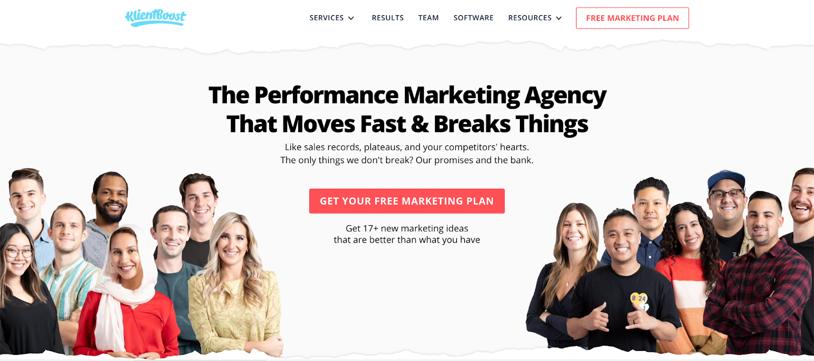
There are a number of great elements here.
- First, for a digital marketing agency, the hero section focuses on the people who run this high-performing joint. The hero image grabs attention because I feel I already know who I’m going to connect with to solve my problems.
- Second, the headline: The Performance Marketing Agency That Moves Fast & Breaks Things. Wait, wha? What kind of things get broken? That sounds bad, doesn’t it? Ohhh, those cheeky marketers. There it is in the fine print: Like sales records, plateaus, and your competitors' hearts. The only things we don't break? Our promises and the bank.
Low-grade chuckle, amiright?
- Third, and most importantly, we talk to you and tell you what you’ll get right there at the top of the page: A free marketing plan and 17+ new marketing ideas. BAM. Freebies.
- Gloating-grade social proof. If you’re going to show how good you are and how many companies trust you, go big or go home.
- Here are all the reasons why you should pick us :
→ Your PPC performance is will get a serious lift
→ You’ll make more money
→ You’ll grow very fast
→ We’re obviously personable
The copywriting is bang-on. The words put the focus on the client, and that’s the most important thing your copy can do.
Plus, humor is always a win in our books.
14. ConvertKit is niche focused
You may have noticed that I’ve focused repeatedly on landing page examples that zero in on a specific audience.
This is what a great landing page is all about. Focus.
And this is why ConvertKit has been gaining so much traction. They focus on professional bloggers who need their software.
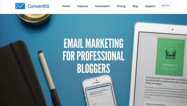
What I love about ConvertKit’s homepage:
- It states who it’s for right away and then immediately shows a brief video taking readers through the highlights. Videos are extremely effective, but you need to give viewers a reason to watch. ConvertKit does this by isolating their audience of “professional bloggers.”
- ConvertKit delivers on its promise with a range of blogger-focused features other email service providers don’t offer.
15. SumoMe addresses your objections
There will always be people who object to your sales pitch. There are always reasons “why not.”
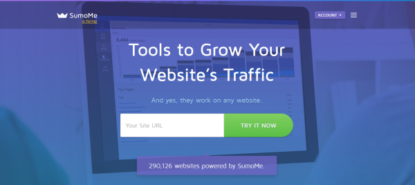
Tools to Grow Your Website’s Traffic (and, yes, they work on any website)
Clever that the subheading speaks so loudly.
This is a classic sales technique — address and dismiss objections BEFORE the customer brings them up or even thinks about them.
If the customer brings up an objection first, anything you say will be unconvincing. If you bring it up first, however, it’s another problem your fantastic product solves.
SumoMe is a suite of traffic-generating tools that quickly and easily install on any website. And before you ask, yes, they work on any website.
You don’t see many landing page examples covering objections in the hero shot. This puts visitors at ease, giving them confidence that whatever they spend their time reading over the next few minutes will be applicable to them.
Best landing page examples part 2: Lead magnets, guides, eBooks, and more
Squeeze (opt-in) pages are designed to get email addresses.
Why get email addresses?
Because email converts higher than any other channel, with an average ROI of $42 per dollar spent.
Capture email subscribers first and then convert those subscribers to customers with email marketing.
The following landing page examples show effective ways to grab those emails.
16. Social Triggers is Derek Halpern
Derek Halpern is a fairly well-known name in the online marketing world. But unlike most “gurus,” a large part of his success comes from his personality and sense of humor.
He’s the successful guy that doesn’t take himself too seriously. And his homepage is basically a lead magnet buffet.
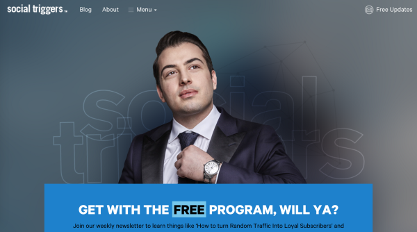
What we see on this landing page is that Social Triggers is Derek Halpern. In all honesty, “social triggers” is a mostly meaningless blog name.
The site, the brand, the marketing, and the product all revolve around Derek’s personality. And this isn’t an accident.
- Personalities sell better than companies. People follow people — thought leaders, dynamic communicators, insightful experts, etc. And Derek’s landing page builds on this by depicting a larger-than-life personality who doesn’t take himself too seriously.
- Derek’s page doesn’t only showcase the personality that made him successful; It gets right to brass tacks with four free opt-in offers, each appealing to a different segment of Derek’s target readership.
- By following these offers with relevant articles and social proof, Derek hits all the right notes of an effective landing page.
This page is a fantastic case study in communicating personality, and every business should be tapping into the power of personality.
17. Noah Kagan is successful, and you can be too
In my opinion, Noah Kagan has one of the most iconic squeeze pages on the web. This is in part because he’s one of the few guys who doesn’t redo his web design every year. But it’s also because he’s a master at email list building.
Noah’s opt-in page promises to deliver his best updates and a list of 10 things thousands of marketers use for their business in exchange for your email address.
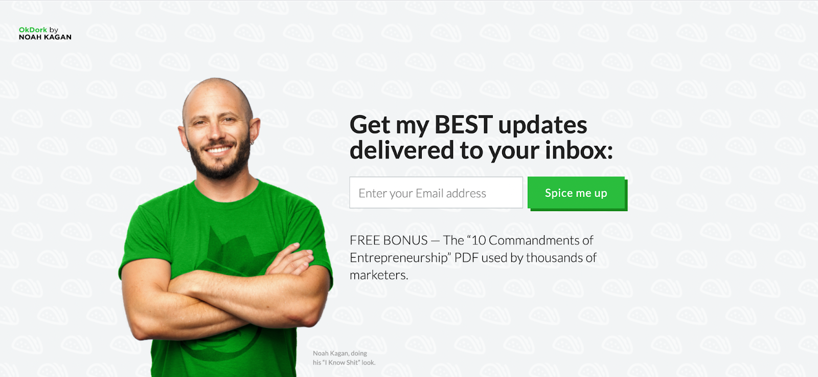
It’s a simple layout. Headline. Email collection. Description (and a little humor in the bottom right corner: Noah Kagan doing his “I know shit” look).
He follows it up with a testimonial that establishes him as the type of guy you’d like to chill with and hire to build your business at the same time. Then he presents an invitation to read the blog.
There’s not a lot to this page, and that’s precisely the point. And if simplicity works for Noah Kagan, it can work for you too.
Noah’s company, SumoMe, makes it possible to replicate this exact look via Welcome Mat. Teachable used Welcome Mat to increase signups by 70%.
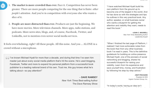
18. Michael Hyatt wants to show you his popup
Many landing page examples, especially opt-in pages, use popups to influence visitors into becoming subscribers.
Popups bring readers to an immediate point of action. Either opt-in or opt-out.
While most pages are courteous, letting you browse for several minutes before calling in the popups, Michael Hyatt whacks you over the head with his popup within seconds of arriving on his page.
He really wants you to see his popup.
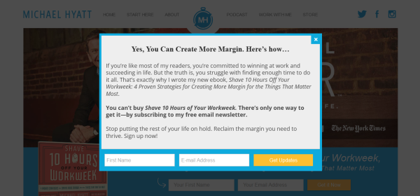
Why would he use this popup technique? Here are a couple of reasons:
- Michael’s popup focuses heavily on the benefits he’s offering and increases the perceived value by claiming these materials cannot be purchased because they are ONLY offered to email subscribers. People love exclusive offers.
- The final sentence is a very personal and direct appeal to the reader: “Stop putting the rest of your life on hold. Reclaim the margin you need to thrive. Sign up now.”
Popups increase signups in nearly every case study because they put your message directly in front of the reader.
“Using exit-intent popups on only single posts and not sitewide on every page they saw an increase of sign-ups by 600%.”
There is zero chance to miss the popup, since it appears right in their line of sight.
If you think your audience will respond to an in-your-face approach, popups are a great way to increase conversions on an opt-in page.
To quickly install your own pop-ups at no charge, use SumoMe’s Listbuilder plugin.
19. Bryan Harris is just like you
Bryan Harris has become one of the web’s premier thought-leaders on the subject of email list building.
Accordingly, you’d expect his email opt-in page to be fantastic, and it really is:
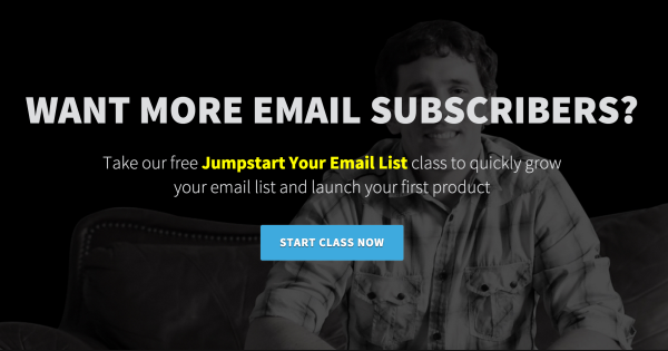
“Want More Email Subscribers?” Great, sign up here.
Notice that if you don’t subscribe, you are immediately shown social proof and then given the option to make a more specific selection on what you need help with.
If this basic, straightforward intro doesn’t do it for you, Bryan then goes more in-depth, discussing his personal frustrations, talking about how he was able to overcome common problems, and then inviting you to join him on the journey.
20. Jon Morrow will help you write for HuffPost
Jon Morrow is one of the most successful bloggers in existence. His networks of blogs command millions of readers, hundreds of thousands of subscribers, and millions in sales.
Here’s one of his favorite opt-in pages:
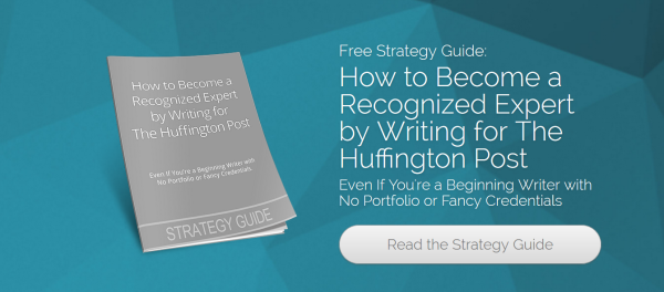
That’s it. That’s the whole thing. Either you want to read this guide on writing for HuffPost… or you don’t.
This type of page works because it has a compelling offer. Most people have heard of HuffPost, and many think of it as a magical standard for becoming a recognized writer (even though that’s bull****).
The key here is that, to continue, you have to subscribe.
There is no other option. And with a compelling offer like this, Jon is getting around a 50% conversion rate.
Check out this list of great lead magnets for your squeeze pages.
Best landing page examples part 3: Lead generation + lead capture
Lead capture pages are designed with one goal in mind: the get the website visitors' information. An email. A phone number. It's designed to get them from top of funnel, to the middle (or bottom) by filling out form fields.
21. CXL does webinars right
For several years, CXL has generated insane amounts of great marketing content. That’s because Peep Laja, CXL’s founder, has churned out advanced-level high-quality marketing training for years.
When you’re the best at something, you build your list by offering free webinars you sign up for.
But how does that make money?
With the upsells and cross-sells that spin-off from those.
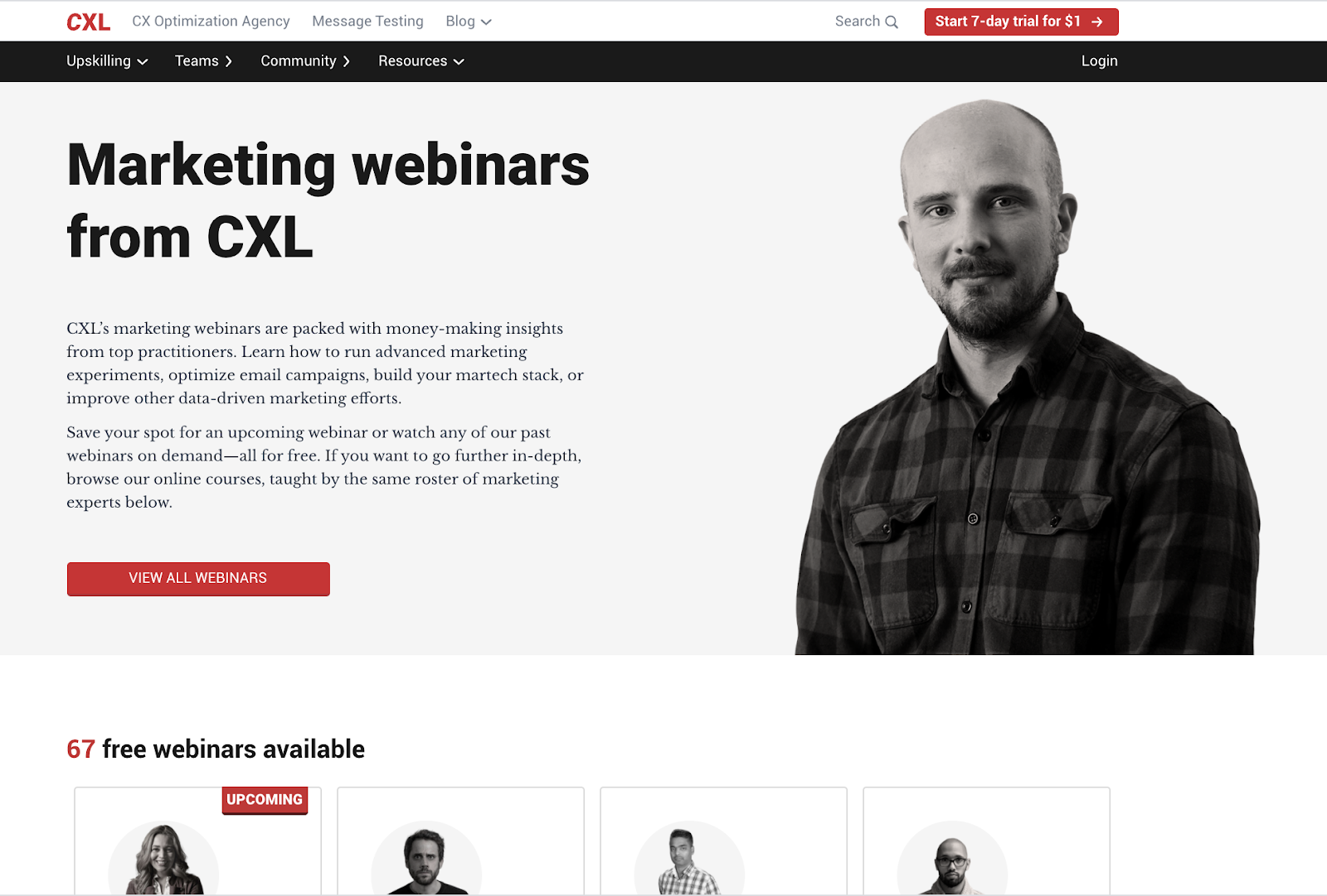
CXL’s marketing webinars are packed with money-making insights from the industry’s best. You can learn everything from how to run advanced marketing experiments to optimizing email campaigns, build your tool stack, to improve how you approach marketing (backed by data).
Chances are when you come here, you’ll save your spot for an upcoming webinar or watch any of the many past webinars or…. you can browse paid online courses (and you’ll likely opt-in for those too).
So much free content builds CXL’s authority. When they do sell something, you know it is super valuable.
This is an easy model to copy—but you’ll have to focus on producing high-quality webinars.
You’ll also want to go heavy on the social proof and use data to establish expertise (because you’re not mega huge CXL).
22. KISSmetrics gets your eyes on their webinars
KISSmetrics made webinars a massive part of their content marketing strategy for years. It seemed like there was a new webinar pitched in their sidebar every week or so.
Webinars are a great way to collect targeted leads on specific topics of interest.
And signing up for those webinars looks like this:
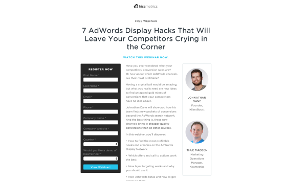
There are a few reasons I love this page, even though at first glance it might seem rather generic.
- While it’s not formatted very differently than other webinar squeeze pages, it is far cleaner and sleeker than the typical webinar registration page. There’s no clutter. You have your signup form. Your description. Your experts. There are no extra colors, little text boxes, dropdowns, random text, etc. It’s just the information you need.
- The colors are vivid and high contrast and the images are vibrant.
- The copy is prominent and focused on the user benefits.
23. Brian Dean makes every post a lead page
You can’t get everyone interested in clicking through to your lead capture page. It’s much easier to get them to a blog post, especially when that blog post offers exceptional content.
That’s why Brian Dean creates massive guides and how-tos instead of regular blog posts. He turns each one into a subtle lead capture page by pitching strategically placed downloads and offers throughout the page.
This is typically referred to as a “content upgrade” and it’s a standard in content marketing and lead capture.
24. Buffer runs a giveaway
Giveaways are a fantastic strategy to increase your subscriber list. Buffer is one of many companies to use this optimized squeeze page for their giveaway.
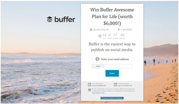
Offering a great incentive is always a solid strategy for getting subscribers, but it’s also important to make sweepstakes entry easy. This page
- makes signing up simple
- clearly displays the prize
- puts everything above the fold
- has a countdown to inspire action now
- rewards users for sharing the contest
Buffer is using KingSumo Giveaways, which you can also use to create a giveaway squeeze page.
25. Quicken Loans gets straight to the point
This two-step landing page allows Quicken Loans’ visitors to get exactly what they need in a hurry.
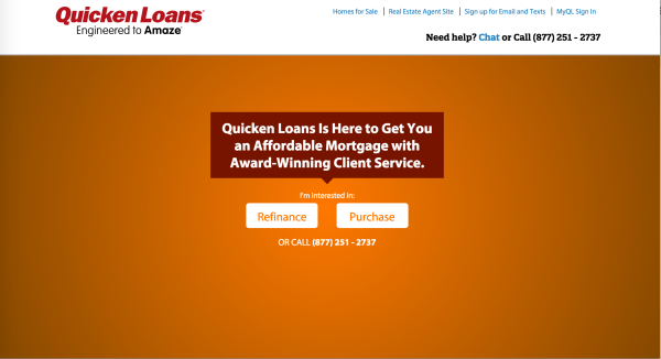
You can go through the multi-step landing page to get very specific or you can call immediately.
Also, notice the contrasting CTA buttons with simple copy that directs visitors through the right funnel.
26. BodyBuilding will give you 10% off
Discounts aren’t as effective on their own as they are when combined with a subscription, especially in a commodities market where prices are relatively fixed.
BodyBuilding.com has become the online leader in fitness information and supplement sales. And it’s in large part because of their highly effective email marketing campaigns.
They get subscribers into that list using pages like the following:
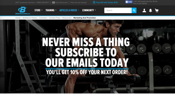
While this page offers a good deal, there is more visual clutter than I typically prefer. Its copy is spot-on, meshing the audience’s desire to transform with the tools needed to do so.
Best landing page examples part 4: Product sales
What’s the point of all those emails if you can’t sell a product, right? Well, here are 10 outstanding examples of product sales landing pages.
27. Michael Hyatt sells a lot of books
We showed you how Michael Hyatt uses popups earlier, but I wanted to show you one of his landing pages too.
It doesn’t use a special design of any sort. In fact, it is pretty unspecial in the UX department.
He uses a standard WordPress page with the main message and a ton of social proof. And he does very well with it.
Michael does a few things really well on this page.
- For starters, he focuses on the problem first. You want to get your voice heard, but there’s too much noise. That frustration resonates with a lot of people. When you’re selling a product, you aren’t trying to add a function; you are trying to solve an existing problem.
- Another major point is the sidebar. Do you see that? He has 27 testimonials in the sidebar. That means every time you glance right while you read through the sales pitch, you’re seeing a new comment on how great that product is.
Adding social proof increases your conversions.
Now he only needs to add in more white space so it looks nicer.
28. Freshbooks Personalizes Referral Sales
Much of today’s selling is done via email rather than directly through a product sales landing page.
But a strategy that is even more effective than email is referrals. Freshbooks uses a custom landing page generator to personalize the landing page based on who is referring them.
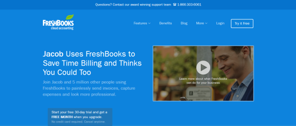
Referrals establish major trust. Including the referrer’s name taps into that trust immediately, which is why this is such an effective landing page.
29. StudioPress gives you all the themes
Just like referrals are a fantastic way to increase sales, selling to your existing customers is another great way to increase sales. They already went through your funnel and trust you.
By offering an “Everything We’ll Ever Make” package to existing customers, StudioPress capitalizes on this concept at every turn.
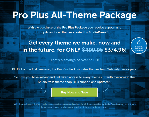
Bundling is a powerful way to increase sales. Notice how the normal price is very clearly displayed and marked out in favor of the discounted rate?
30. Tony Robbins wants you at his conference
I wanted to point out Tony Robbins page as a great example of effective progression (down the page).
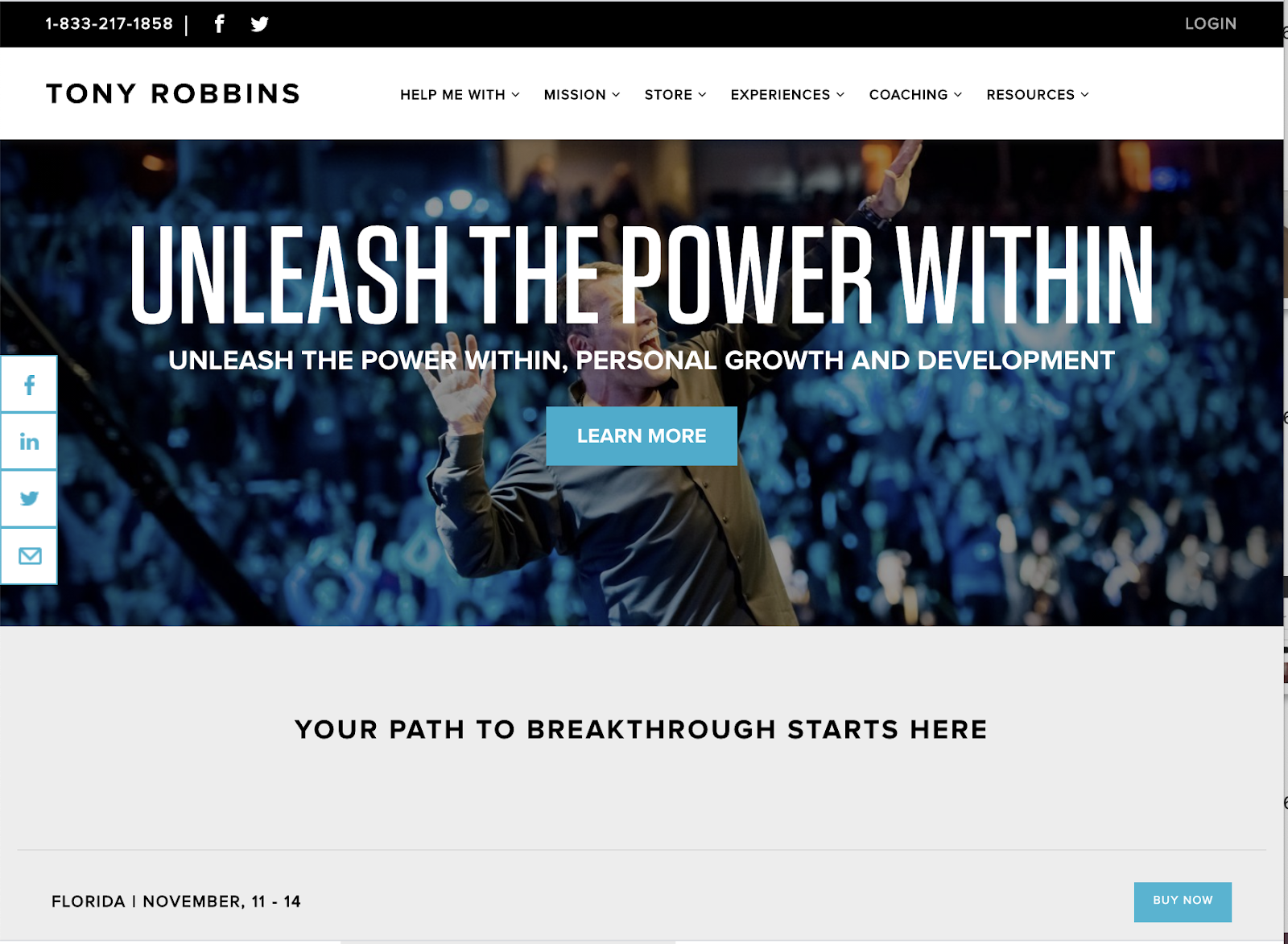
Let’s look at the progression.
- “YOUR” path to breakthrough
- Engaging video
- Testimonials from famous people
- Pricing options
- Over-the-top Satisfaction/Refund guarantee
Nothing is left to chance here. Tony Robbins’ team removes any risk involved in attending his event, and bolsters it with repeated testimonials and promises of a “life changing” experience.
31. MacBook Pros Are Pretty
I’ve mentioned “focus” many times in this article, and while it usually applies to the customer you are targeting, it can also apply to your own strengths and weaknesses.
Let’s take the Apple MacBook, for example.
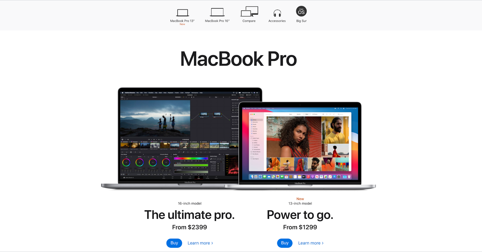
People love Apple products because they look amazing. That is what sets them apart from the competition.
So when we look at this landing page, design and beauty are what we see and what we read about.
Apple lists the specifications and performance details as well as that discouraging price tag. Apple doesn’t have to compete on price because Apple knows its buyer persona.
They sell beautiful hardware.
32. John McIntyre uses long-form sales pages
Sales pages have mostly moved away from the long-form sales pitch. But that doesn’t mean a longer page can’t be effective.
John McIntyre has created a great long-form sales page for his Mastermind group.
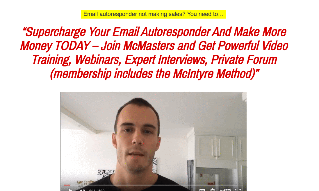
This page has some great elements to it.
- It starts with an autoplay video of John explaining the product. While this tactic can be hit or miss, John does a good job of getting right to business. (Plus it only takes one click to pause the video.)
- Next, the page goes through a whole host of benefits, focusing on the most important motivation for email marketing: increasing revenue.
- Finally, it finishes with video testimonials. They communicate that people like this product so much, they were willing to record a video of themselves talking about it. That’s powerful.
33. “Serious Bloggers Only”
Are you a serious blogger?
That’s such a loaded question. It’s such a loaded phrase. Serious Bloggers Only. Yeesh.
And in staying with the theme of the long-form sales page, Jon Morrow takes us on a solid 10 minute read in this landing page.
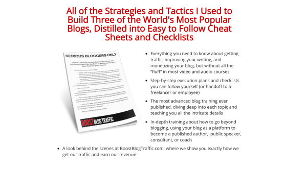
It’s all there. Benefits. Social proof. Frustrations. Promises. Etc.
Jon’s opt-in pages average conversion rates as high as 50%. He knows what he’s doing.
34. Dollar Shave Club just took your money
On top of creating one of the greatest Super Bowl commercials of all time, Dollar Shave Club’s landing page combines fantastic design with humorous copy.
They even provide a visual of the exact product you’ll receive in the mail.
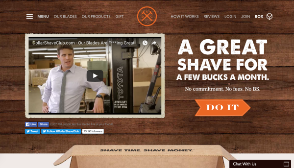
It’s not long, but it’s effective. If you can create a great video to kick off your landing page, you’re already halfway there.
Unbounce found that on average, great explainer videos increase conversions by 20%.
35. Craft Coffee won’t break your bank
There are a lot of coffee drinkers around.
In fact, more than half of you reading this have a cup of coffee on your desk right now.
In this competitive (and caffeinated) marketplace, Craft Coffee’s subscription sales page hits all the right notes.
They start with a perfectly descriptive headline:
“Brew Better Coffee. Pay Grocery Store Prices.”
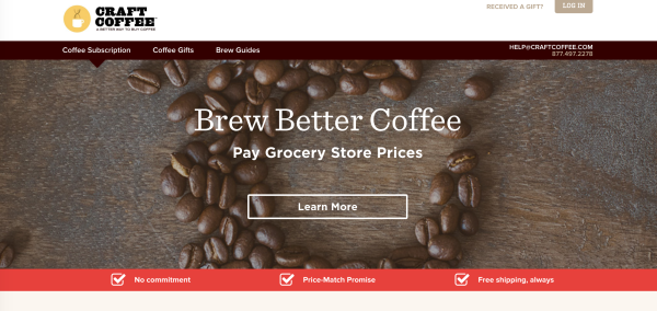
This is followed up with a visual “How It Works” and a prominent “Satisfaction Guarantee.”
Guarantees have a major impact on your conversion rate. One online watch seller improved conversions by 41% simply by adding a guarantee.
I’d recommend including some extra testimonials early on the page, but there are some fantastic ones included further down on the landing page.
Overall, this is a great example of a sales landing page.
36. Etsy has something you can’t find anywhere else
Most of our examples focus on a single product, which is the most effective way to use a landing page. Fewer options convert better.
That said, let’s look at how a landing page can influence an eCommerce platform.
Etsy does a great job with this:
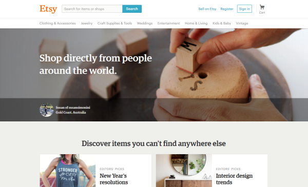
When you land on the homepage, you are told immediately what Etsy is all about and what its customers are all about.
“Shop directly from people around the world. Discover items you can’t find anywhere else.”
This sets the tone for the products being presented below. This isn’t a corporate brand or a person attempting to build an empire. This is a shop for people with a value for the unique.
37. GetResponse integrates with stuff you’re already using
Some of the fastest-growing businesses are the ones that hitch their ride to a fast-moving train. If you offer a supplemental service to something that tons of people are using, you can piggyback on their success.
In the crowded landing page designer market, GetResponse boldly connects the product to four platforms virtually everyone is using already.
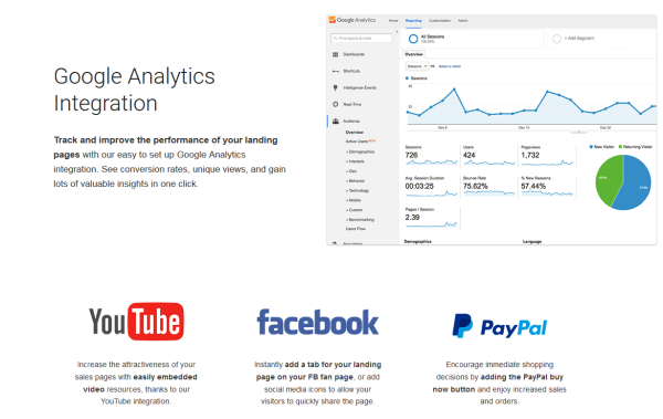
Integration with these platforms isn’t challenging. Many services offer it, but few tell you about it. When a potential customer sees that your product is designed to work with the tools they’re already using, you’ve just taken a big leap forward toward conversion.
38. Lyft highlights direct value
When you arrive at Lyft’s Become a Driver landing page, there are two things you can do quickly and easily: (1) create your driving profile and (2) calculate how much you can make.
From the start, they emphasize the audience that has already made a decision to apply, without ignoring those who simply want more information about how Lyft works for drivers.
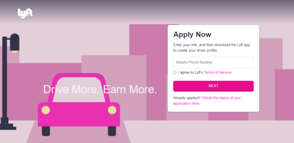
The copy is short enough that everyone will read it, but it also leaves out enough to make you want to learn more. The bottom of the page includes FAQs, just in case the user is still unsure.
You understand exactly what the service offers without needing to visit another page. Lyft also includes insurance protection to reassure potential drivers that they’ll be covered.
The landing page has everything you need to know about the service and how to sign up, but my favorite part is by far the calculator. You can enter how many hours you want to drive and your city, and it estimates how much you can make a week.
Showing people the money they can make from driving is a strategic way to draw them in for more information.
39. TextMagic shows exactly what you’ll get
There are few things that people like as much as “free.” TextMagic knows that and doesn’t make you hunt around for their offer.
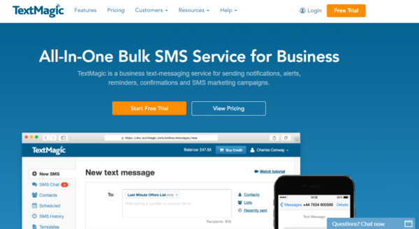
- Examples: A picture is worth 1,000 words, and TextMagic puts this concept into practice on their landing page. A large image right under their free trial offer shows exactly the type of service their company provides. You don’t have to guess about what they do or what their solution’s interface looks like, because you see it right away.
- Contrasting Colors: To draw attention to their free offer, they use an orange button, which is a nice contrasting color to the blue background and white fields throughout the page.
- Simple Statistics: It’s hard to argue with “50,000+ happy users.” Not only does TextMagic include the stat, but then they include several positive reviews with links to the respective case studies from their clients.
- Clear Directions: If you want to get started it’s as easy as 1, 2, 3. The simple steps are included at the bottom of the page, followed only by another offer for the free trial.
It’s important for a business to clearly communicate what they do and why their potential customer should care.
40. Final uses video to engage
For our final landing page example, Final uses a short video on their landing page to tell you everything you need to know.
For those who aren’t fans of reading a bunch of text to understand what the offer is, a video is a perfect match. It’s hard not to enjoy the dry sarcastic humor as you watch.
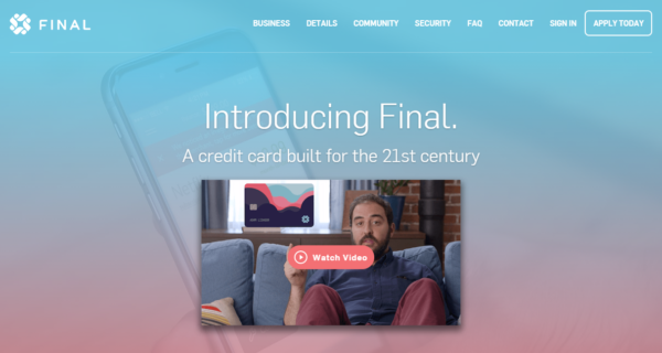
But, since some people automatically skip over videos, Final breaks it down into bite-size pieces of text throughout the rest of the page.
The landing page isn’t inundated with graphics and information.
Instead, the page uses a nice balance of text, image, and white space to keep your eyes moving along. You can tell that everything was strategically chosen to be part of the page and serves a purpose.
Under the video, they include the logos of new stations and other sites that they have been featured on. This builds credibility with the reader before they get too far into the page.
Then, they follow this up with reviews at the bottom of the page, so landing page visitors are getting word-of-mouth recommendations from Final’s customer base.
The landing page isn’t overly fancy, but it has exactly what it needs. Final communicates their message clearly through both text and video.
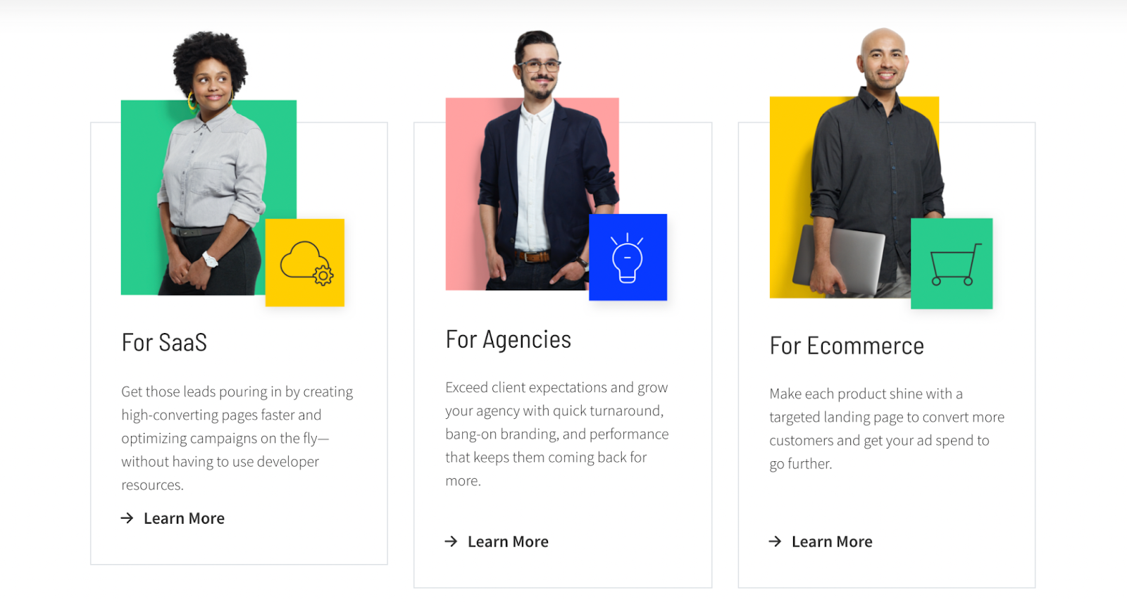
Up next: landing page examples by industry and type
Take this treasure trove of ideas and make a high-converting landing page of your own.
And don’t just pick one. Pick many so you have an arsenal to test.
Landing pages evolve. Keep an eye out for landing pages you love (like we did here) and tap into their magic.
Looking for more specific examples? We've got deep-dive articles on different landing page examples by industry and type.
- SaaS Landing Page Examples
- Startup Landing Page Examples
- eCommerce Landing Page Examples
- B2B Landing Page Examples
- PPC Landing Page Examples
- Mobile Landing Page Examples
- App Landing Page Examples
- Splash Page Examples
- Squeeze Page Examples
- Lead Capture Page Examples
- Referral Page Examples
- Click-Through Landing Pages Examples
- Thank You Page Examples


