A marathon is 26.2 miles long. Most people train for months to be able to run that distance.
It takes practice to build up the stamina and rhythm of pacing yourself throughout the run. A lot of people end up getting an adrenaline rush on race day and something bad happens...
They come out of the gate hot, with all the cheers and signs, it’s really easy to start off with a pace faster than they’re used to.
Then they’re 20 miles in, the crowd has all moved to the finish line and they feel a side ache coming on. The run turns to a jog and slowly to a walk.
They trained for months, only to lose steam at the end.
Conversion Rate Optimization is the last 6.2 miles of your marketing marathon. It’s making sure that all your hard-earned marketing strategies from SEO to social media, which initially got the attention of your audience, doesn’t flop. It’s making sure that you’re finishing strong.
In this article, we’re going to walk you through the Conversion Rate Optimization trends that will make you feel like you’re sprinting through the finish line with the highest rates you’ve seen yet.
Get brand new conversion strategies straight to your inbox every week. 23,739 people already are!
Why You Need to Know The Latest CRO Trends
Conversion rate optimization trends change every year to adapt to new users. These days, search users are becoming harder and harder to impress. The more immersive digital media becomes, the more sophisticated users grow, the harder it is to nail down that desired action.
More savvy users means your CRO strategy needs to be more nuanced, well-timed within your customer journey, and unique. If not, you may fall by the wayside of PPC abandoners.
In their marketing study, HubSpot polled a number of companies on their satisfaction with their digital marketing efforts. The results were not what you would call thrilling:
- 68% of marketers believe their strategy is ineffective
- 40% are struggling to prove ROI for their digital marketing
- 63% of companies claim generating leads is their top challenge
- 28% complain that securing enough budget is a top challenge
Quite a few of the complaints noted in the study could be alleviated by solid CRO — so long as they remember that truly effective CRO is a bottom-up process. Optimizing your landing pages and your ad copy without sales optimization, etc. isn’t going to cut it.
The more digital users enter the market, the more traffic you’re dealing with on a daily basis. This means more potential customers clicking through to your ads. And, in the PPC world, that means you’re paying, even if it’s for irrelevant traffic.
10 Conversion Rate Optimization Trends of 2021
1. Use Machine Learning To Improve Personalization
The personalization trend has been around for a while, but only recently have machines and AI given us the ability to automate and streamline our personalization efforts.
The more targeted and relevant your message is to the user who lands on it, the more conversions it should generate. Nowadays, marketers have a host of machine-learning tools to assist in analyzing, and optimizing their personalization efforts.
Beyond simply segmenting your ad groups and respective landing pages into Single Keyword Ad Groups (SKAGs) to target singular search terms, machine learning for personalization is ramping up. Customizing your user’s page experience based on the classic user segmentations like the below won’t cut it anymore:
- Demographics
- Geographics
- Active time
- Device and browser
- Keyword VS search term
These days, you’ll have to employ a far more aggressive form of personalized experience to get better results to impress your users. This will include customizing your offers based on your user’s personal purchase history, previous conversions, and desired pricing/deals.
Thankfully, there are quite a few machine learning tools that will help automate your optimization efforts:
- Recommendation Engines — Especially if you’re an eCommerce store, you may be losing conversions simply because you aren’t showing the right product at the right time. Recommendation engines like Apptus or Dynamic Yield comb through your product pages to see which is the most relevant to the user’s current session. This way, even if they’re already filling their cart, you can add a little more value to their experience with a personal touch.
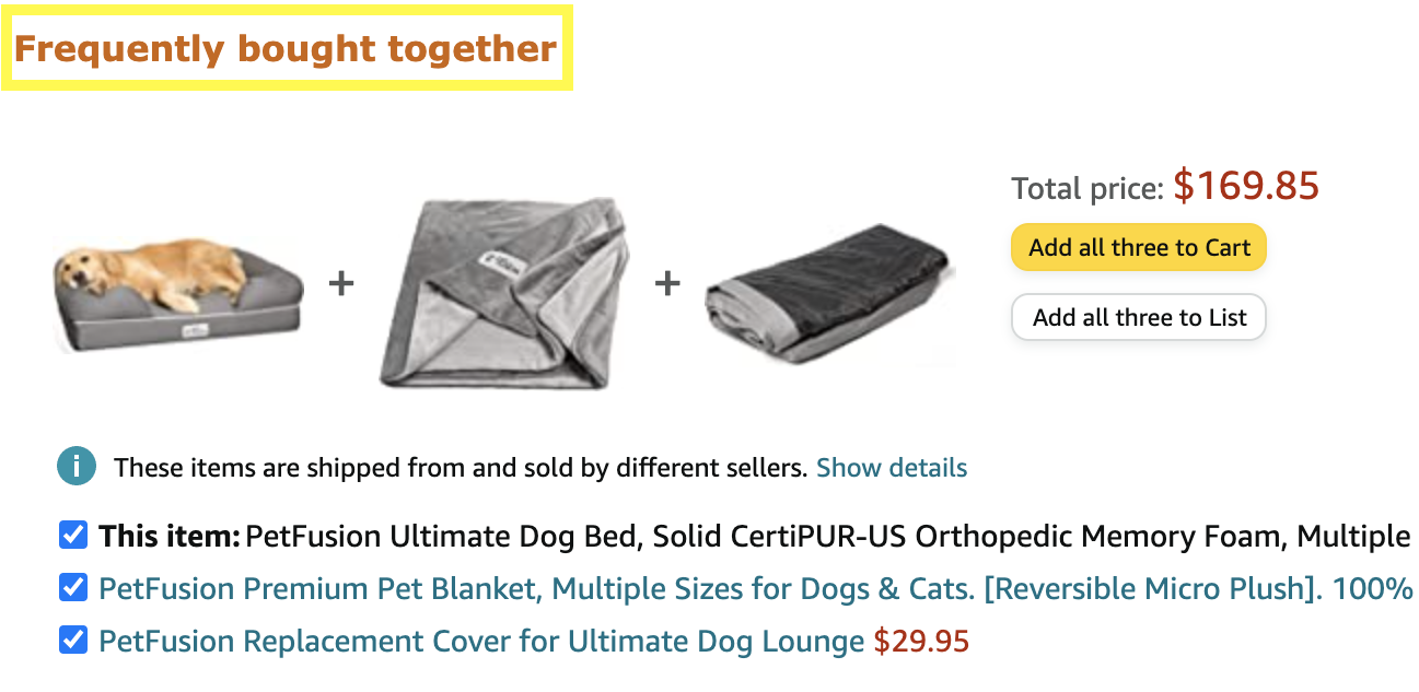

- Auto-Adjustable Pricing — Even if you’re optimizing what products you show users, you may still be losing conversions from your pricing. Tools like Boostmyshop use AI to help you show special offers to users who show a conversion preference for discounts.
You should be using machine learning to fix any glitches that may be causing you serious conversion friction as well.
For example, glitchy or lagging mobile experiences have been shown to lower users’ likelihood to return to purchase on that site ever again. In fact, 60% of users who have a negative mobile experience won’t buy from that brand again. And when you consider that mobile usage in the US accelerated from 45 min in 2011 to 252 min in 2021 (with no sign of slowing down), that’s a big deal.
Small personalization efforts such as having a repeat customer’s information pre-loaded in their checkout form will go a long way. Don’t make them enter their phone number, address, and email again.
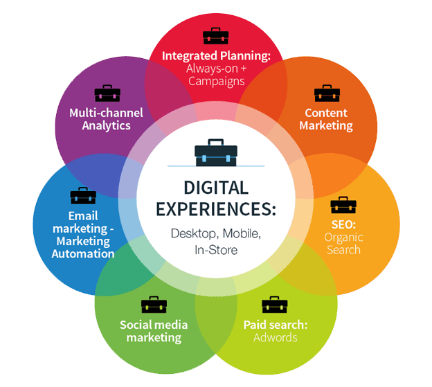
Certain tools such as HotJar or SessionCam help with this by giving your mobile experience a “customer struggle score,” which you obviously want as low as possible.
The key to your optimization strategy here, regardless of device, is to make converting as easy as possible.
So, use all the tools at your disposal to increase your mobile optimization.
Maybe personalization has always been a CRO best practice, but moving into 2021, the necessity of personalizing your landing page experience is more vital than ever:
- 75% of companies last year said their top objective was to improve customer experience
- 86% of consumers prefer a more authentic and personal brand personality.
Just keep in mind that you should be targeting your offer to where your user is in the conversion funnel just as much as you’re tailoring the imagery, design, and copy of your page to their personal preferences.
Keeping a close eye on lead temperature will also help give your conversion rates a nice kick in the pants going into 2021.
2. Personalized Greetings & CTAs On Money Page
Greeting a user by name or by company or simply welcoming them back to your site on the homepage can be icing on the cake that sets your brand apart from the competition.
Tools like Clearbit and Proof can help you personalize your CTAs and landing pages to your visitor. With this you can bring a little bit of delight to every interaction on your webpage from the get-go.
Here’s an example of how Gusto’s homepage looks for a new visitor vs a returning visitor:
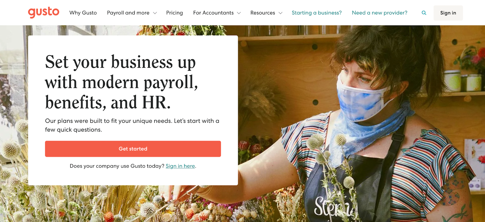
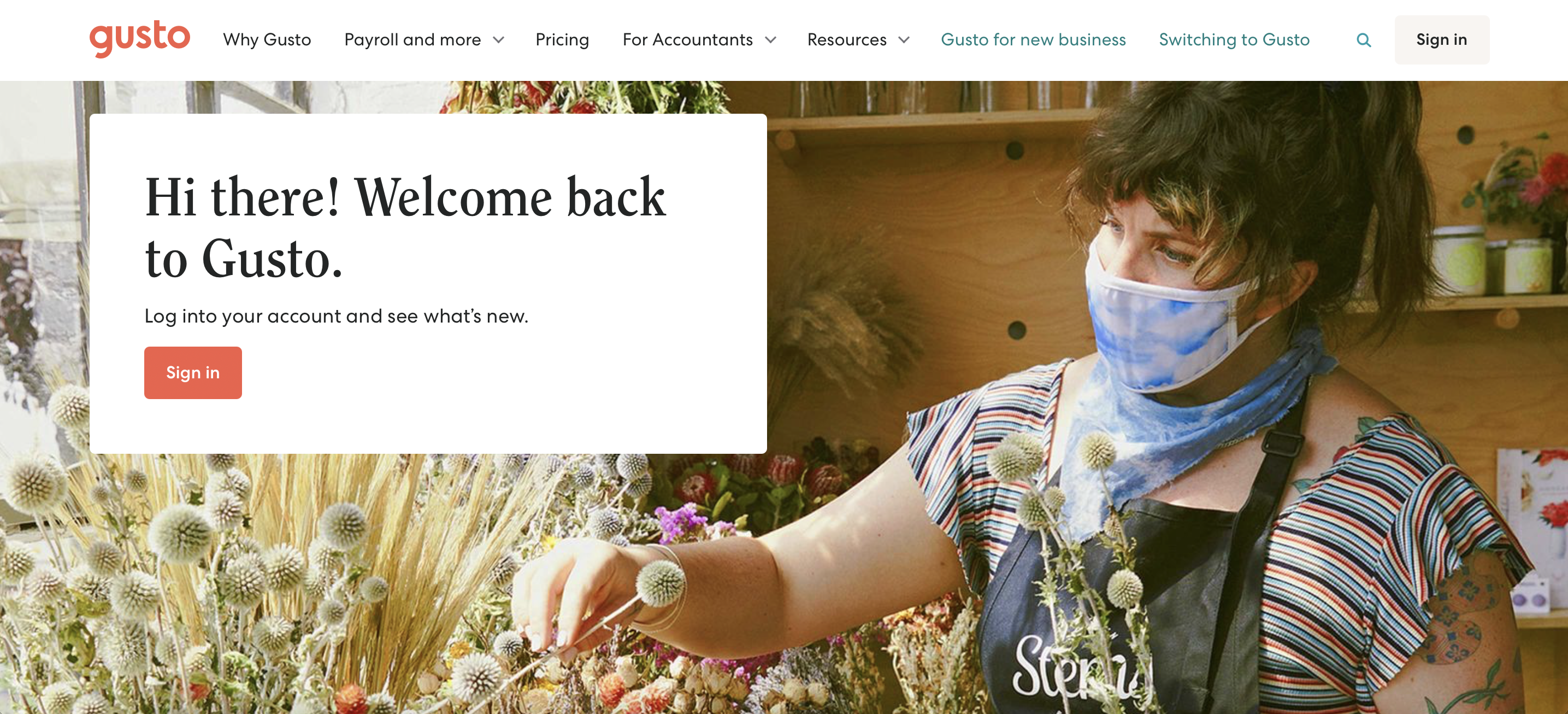
Customer experience is everything, so we’re tossing out robotic responses and bringing ‘human’ back—from chat bots to forms. Automation options are so detailed now that visitors should have the most relevant CTA showing when they visit a page.
3. Chatbots: Give Users The Answer They Want, How They Want
One of the biggest mistakes digital marketers make these days is a simple failure to answer the user’s questions. This starts with the PPC ad itself and is a pervasive problem throughout the entire conversion experience.
And if you can’t give the answer to what they’re looking for, why would they bother converting?

Don’t waste time repeating the search query in your ads. Start answering the questions behind the term the user is punching into their search engine.
You should also consider where they are in the funnel and how they’d like to digest that answer. For example, someone with an early stage question isn’t going to download an FAQ to find the answer. You want to provide users with the answers they’re looking for without increasing friction rates. Otherwise, you might as well bounce them off your page yourself and watch them float away.
A great solution for this issue is using chatbots to answer questions about your service/offer in real time. This functionality does a few things to improve a user’s on-page experience:
- lower friction rate by providing answers without needed action
- shows personal interest in unique customer needs/concerns
- displays expertise on product/service
- gives the user a direct answer/solution instead of wandering around
4. Take Control of The Conversation
Beyond these basic benefits, you can use chatbots to further direct the customer’s journey through your website. Depending on what page they’re on and what page/ad they came from, you can customize your messaging to promote certain actions.
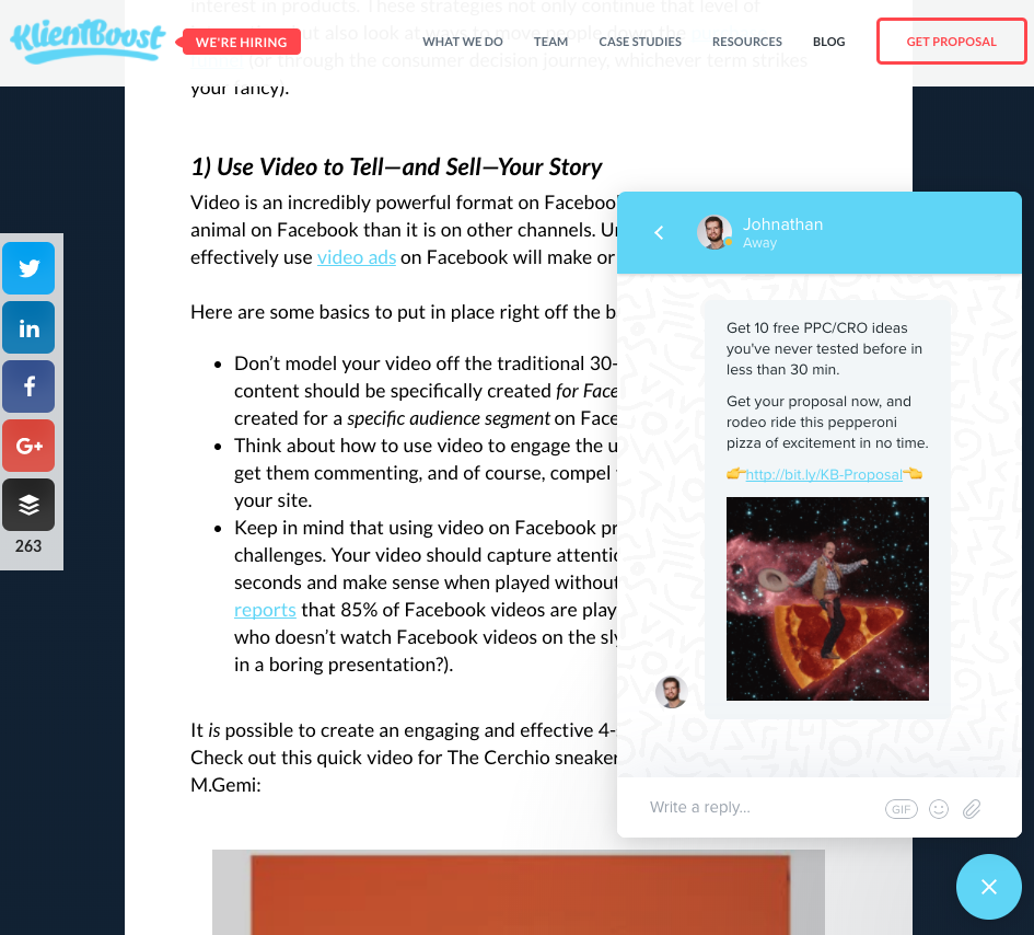
You can vary the level of your CTAs in these chat bot auto-messages just as you would for a landing page. Some may promote other blog posts that are relevant to what the user is currently reading, and others may suggest getting a proposal right away.
Regardless, you get the power and opportunity to draw attention to the content you want each person to see in a really easy way for both you and the visitor.
5. Interactive Bots: The Conversational Form
The more advanced and interactive chatbot technology grows, the more versatile it’s uses become.
In today’s overly saturated digital world of content, ads, pop-ups, autoplay videos, and form submissions, introducing a human element back into converting can make a huge difference.
A large amount of conversion issues stem from the forms marketers use to collect user data. More often than not they ask for too much personal information (or, at best, do not match the right ratio between info given and value received).
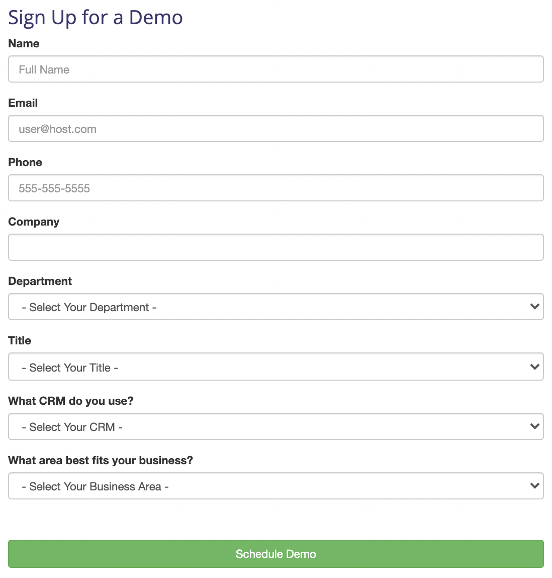
This is where the new interactive chatbot automation can become a powerful asset in conversion optimization. Space10 and other brands like them have worked to create customizable chatbots that can interact with users.
The best part? These chatbots work on mobile devices as well.
By creating multiple choice answers for users to choose from, these chatbots can ask questions about the user’s specific needs. This way, you filter your incoming traffic based on how they interact.
On top of that, you can leverage these chat integrations as form submissions themselves.
Believe it. Automated conversational chatbots are a soon-to-be reality going into 2021. If you’ve seen some trouble with your form submissions, it may be time for you to take the personal approach when it comes to data collection.
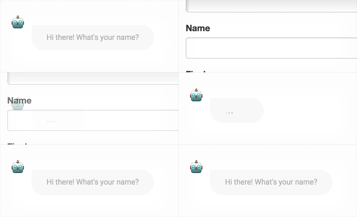
Chatbots aren’t only for promoting certain content or providing a facade of an always-present customer service rep. It’s time we start leveraging chatbots for the value-communicating assets they are. And, on top of that, start collecting the data we need by actually communicating with users (instead of just asking “gimme”).
6. Enhance Social Proof With User Generated Content (UGC)
Communicating the value of converting can come in many shapes and forms. One of the most effective ways is showing your potential customer how many others are happy with your product/service. After all, P.T. Barnum said it best:
Nothing draws a crowd like a crowd.
Social proof is a huge conversion booster in the CRO world. In fact, using social proof on your landing page can improve conversions up to 34%. There are a variety of places to add it to your landing pages.
But you can be more creative with social proof than just quoting reviews on your page. If you really have a happy customer base, have them create your content for you. User generated content (UGC) is a great way to have your target audience speak for themselves about why they love you. As digital marketing and marketing automation grow into a more humanized practice, UGC is making our campaigns more authentic and human as well.
This will stop you from overcomplicating your value statements with jargon that laymen might not understand. It’s one thing to hear a brand brag about how delicious their candy is. It’s another to see another customer vouching for your product or service.
Instead of bragging about yourself, get your customers bragging for you. You can ask users to submit images, quotes, reviews, surveys, or even video content. Each type of UGC is leveraged differently, and some are more popular than others. A study on consumer trust found that users often preferred certain types of UGC:
- 52% of UGC consists of submitted photos
- 27% of UGC consists of video submissions
- 12% of UGC consists of quotes or customer surveys
- 9% of remaining UGC is self-written posts or reviews
UGC is no joke. Keep in mind that 56% of users are more likely to buy after seeing a product in a form of UGC.
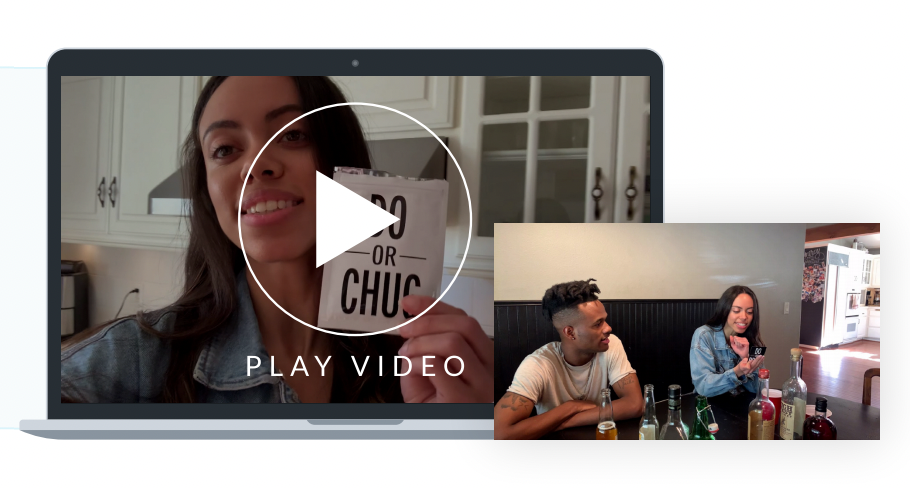
Through the use of UGC videos we were able to help Do or Drink increase their revenue by 24% and their conversions by 37% as well as their ROAS by 10%.
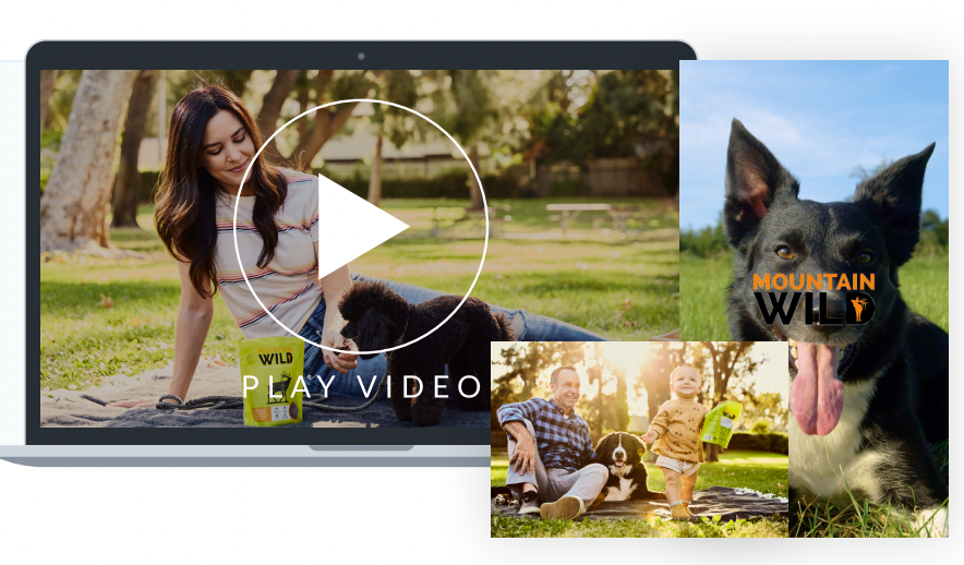
Similarly, using 4 different UGC video ads, we helped Mountain Wild Pet Food increase their traffic by 559%, and increase their ROAS by 32% while increasing their outbound CTR by 110%.
You can see some more examples of how other brands are using photo based UGC below.
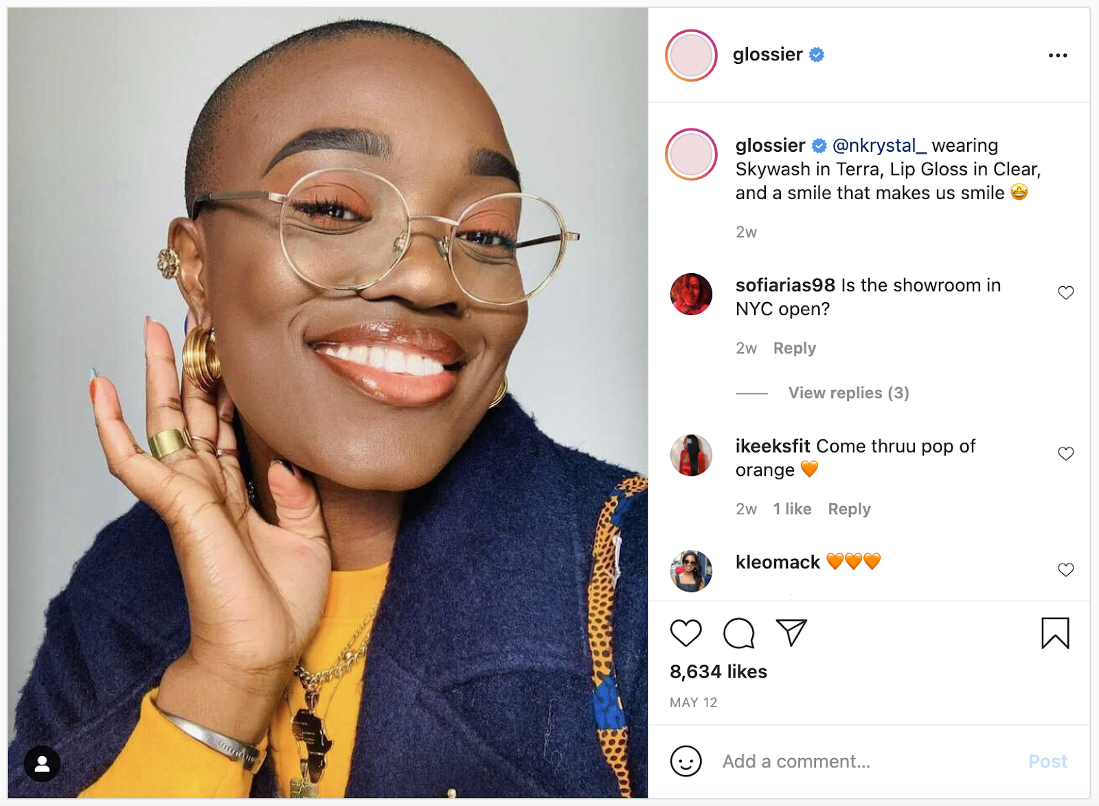
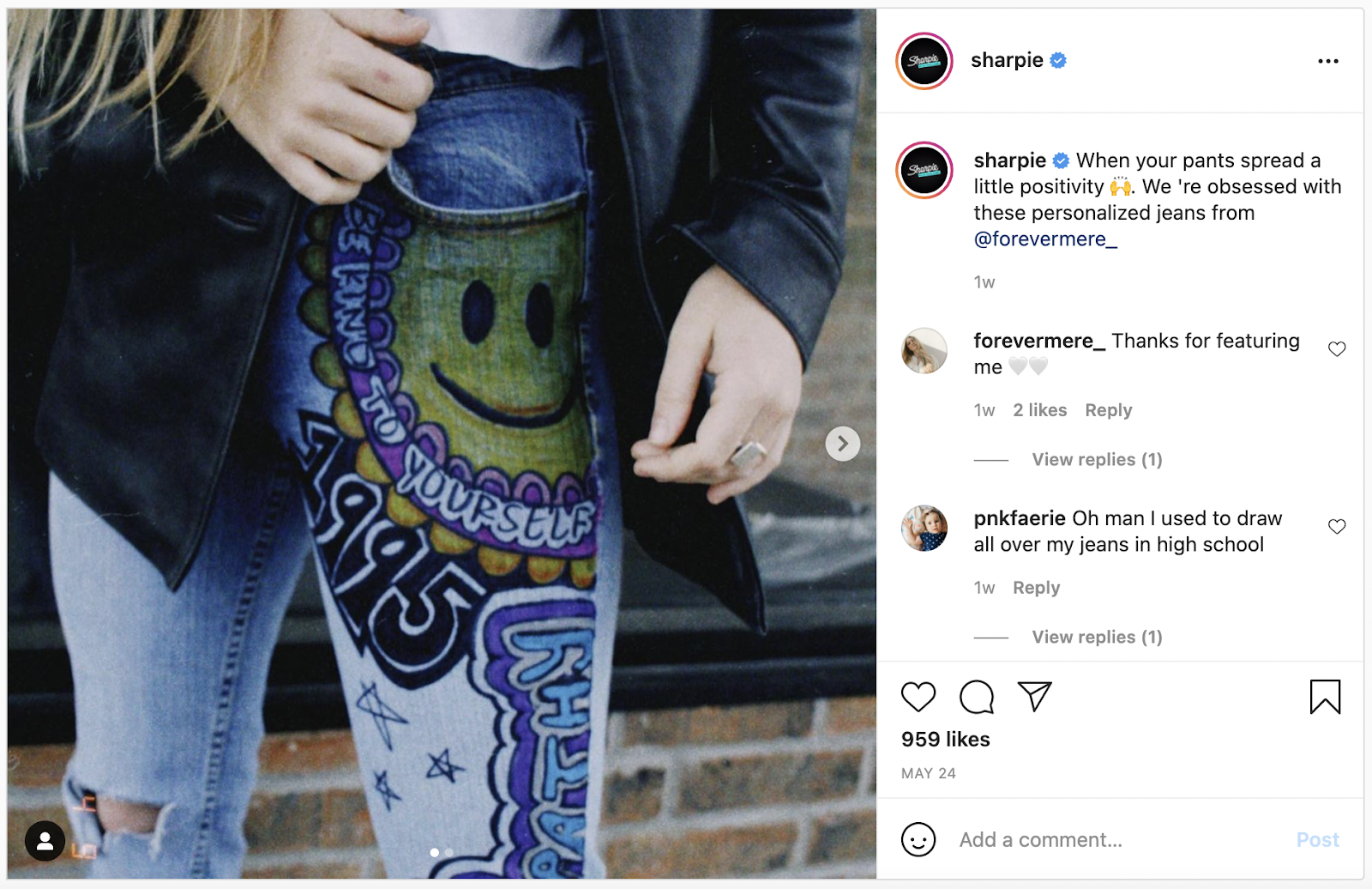
Feeling inspired? Here are 21 Social Proof examples that will help you get more conversion.
If you can get actual footage of your product in use, that’s going to make for a real powerful asset.
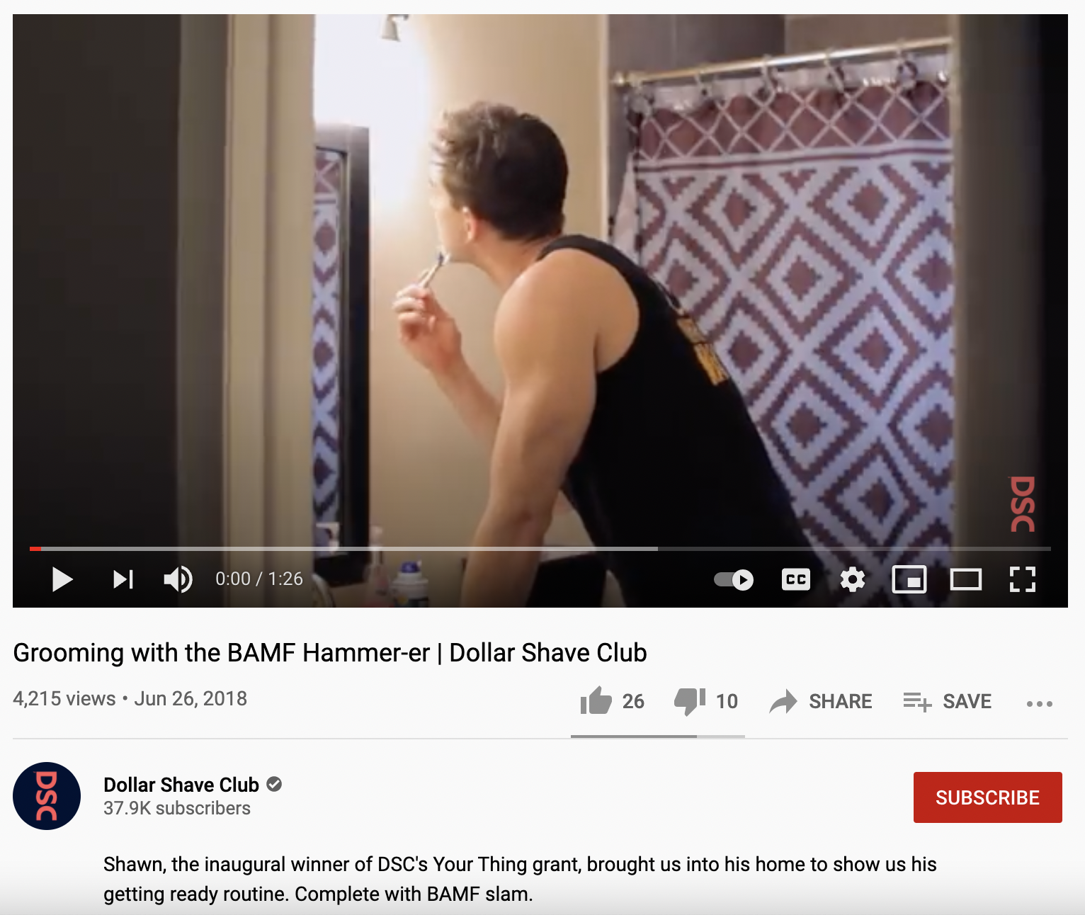
This way users aren’t watching “explainer” videos on your landing page. They’re watching an actual customer use your product as they would — seeing the real-life value right away encouraging them to convert.
Remember that if you’re trying to collect UGC, you’ll need to be patient. Digital consumers aren’t known for their long attention spans–and especially because you’re asking for something for them to fill out or create, you may deal with some heavy lag time.
To avoid this, you should offer incentives when asking for submissions like coupons or discounts (or golden tickets). This should encourage users to actually submit their UGC and you should be able to stockpile some helpful social proof faster.
7. Join In On The (High Quality) Video Bandwagon
These days, video is everywhere. From social media to Google itself (YouTube being a huge source of video advertising now), users are constantly berated by video content.
Landing pages are no different. In fact, using videos on landing pages has been seen to improve conversions by up to 80%. This makes investing in video an absolute must for CRO in 2021.
But, when it comes to video, how do you know which type to use and when/where/how to leverage it?
There are actually a few different types of videos you could make depending on what type of campaign you’re running for your landing pages.
If you’re looking to hire new employees and are running ads for them, a personnel video may be what you’re looking for. Something that shows how happy your employees are and how they spend their days would surely boost applications through your landing page.
If you’re offering a new product or tool on your landing page, an explainer video or tutorial is ideal. You don’t want to confuse your users with your new product or bore them with a lengthy text explanation. A concise but helpful video will help cut through the noise of landing page filler text, which should boost conversions.
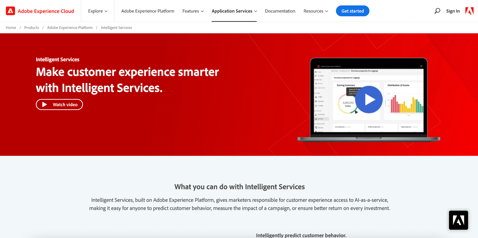
Testimonial videos are a great combination of social proof and video (and UGC, if you can get clients to submit videos). This is where you can put some meat behind the reviews that you’re constantly quoting. Putting a face to the reviews adds a level of authenticity and authority to your social proof.
Just keep in mind that, as is the case with all content, quality matters with videos. You won’t see any boost in conversions by publishing some lazily shot and poorly edited video of you explaining your new offer to the camera like an emotionless news anchor. Be sure to learn the 9 Commandments of Landing Page Videos.
8. Optimize Your Videos, Too
There are still some best practices for video that you’ll need to follow if you want success for your CRO efforts in 2021 — best practices such as:
- Avoid autoplay — more often than not this just annoys users, so let them choose to watch your content of their own volition
- Show video timer — make sure that the viewers can see just how long they have left of the video, so they don’t get scared off
- Keep CTA visible — use sticky elements to make sure your CTA is visible outside the video while it plays. This should help keep your viewers focused on what really matters to you: the conversion.
- Use graphics & animation — As pretty as your gumdrop face is, I’m sure that your user doesn’t want to stare at nothing but you talking throughout the video. Use graphics to help explain your points whenever possible. If possible, use animated graphics to help liven up your video and keep your viewer’s attention.

You might want to consider making your entire video pure animation. This will give you 100% control over your video as opposed to an awkward screen actor. We aren’t all meant for the big screen, after all.
9. Optimize Your Checkouts to Catch Loose Shoppers
This trend is primarily for eCommerce brands but optimizing your checkouts isn’t exactly a new CRO practice. Working to lower your cart abandonments is almost the same as working to lower your bounce rate, and equally important. The frustration of seeing a cart full of items abandoned is just as frustrating as watching a user read through your landing page for over 2 minutes only to exit without converting.
An eCommerce study reported that 69% of carts are left abandoned. This can be caused by a few different factors, such as
- last minute price changes (shipping not included)
- engthy and confusing checkout process
- having to create a new account to buy
- lack of payment options (or lack of payment security)
- lack of info on products (further research necessary)
If you have users filling up their carts to buy from you, the last thing you want is your actual checkout process to cost you conversions (and revenue). So, make sure that you’re optimizing your checkout to catch any shoppers who abandon their carts.
Think of Amazon as one of the best in the business when it comes to checkout optimization. Users are constantly shown how much they’re saving as their cart builds. Not only that, Amazon makes sure to display savings in dollar amounts to really show value.
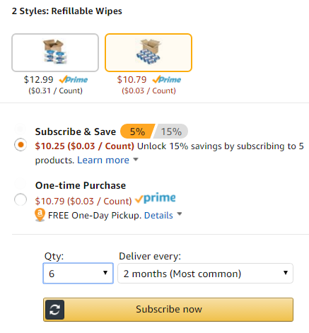
You want to keep the costs and friction as low as possible once the user starts his/her checkout process. This means ensuring all costs are shown from the get go, so there are no surprises as well as emphasizing any deals you’re offering. Also, in case your user wants to research your products further, you should have any info they may need to be ready and waiting.
Just be sure that if your user has to travel to another page of your site for research, you remind them to complete their checkout. You can do this with reminder pop-ups or exit pop-ups that redirect them to the checkout page.
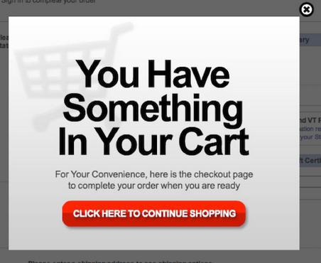
Lastly, just to re-emphasize its grave importance, make sure that you’re tracking your cart abandonment to see where users are leaving your site. There may be some valuable insights into how you’ve organized your product pages or checkouts based on where the bulk of your abandonments occur.
10. Apply CRO Beyond The WebPage
The darkhorse conversion rate optimization trend for 2021 is taking CRO and applying it to your entire business.
Most marketers will perform their CRO like a segmented part of their digital campaigns. First, they setup up their PPC campaigns. Then, they build their landing pages. Lastly, they optimize their CTAs/design and bids/ad copy. For some, this is a completed CRO job.
But for marketers looking to truly grow conversions and revenue on a significant scale, this isn’t going to cut it. The truth is that CRO can go so much further than just optimizing your pages.
Too many PPC specialists focus on the wrong metrics when performing CRO. They work to optimize their bid strategies on their top keywords in Google Ads and perform landing page optimization hoping to boost conversions. For some reason, they cut off the sales team from their PPC efforts, which makes no sense. After all, cost per acquisition (CPA) is a trackable metric in Google Ads — one of the most important ones at that.
CPA goes beyond just CPC (cost per conversion) and takes into account how much of your conversions are turning into actual sales (and how much it costs you to close that sale). You want this number as low as possible, so you can generate a high ROAS (return on ad spend). This is the metric you should optimize around, not clicks or conversions alone.

Instead of going from Google Ads to landing page to sales, you should be optimizing in the opposite direction. This form of bottom-up CRO will make for longer-lasting wins and a more efficient funnel altogether. Let me explain.
Let’s make believe that you’re running a PPC campaign selling a car washing service.
You first optimize your Google Ad bids to get more clicks on your ads and more traffic to your landing pages. This works and you end up increasing your landing page traffic by 150%. But now you’re paying for all those excess clicks, but the conversion rate isn't getting better. So, you rush through your landing page CRO to improve your CR%. Now your conversions have improved, but you notice your sales team isn’t able to close nearly enough to justify your new ad budget. So, you have to meet with your internal sales team to adjust the selling strategy to match the messaging after fixing all your PPC campaigns.
By this point, you’ve thrown quite a bit of cash on the inefficiency fire — a bit of a disappointment.
Employing some bottom-up CRO will optimize and integrate your paid campaigns and sales force in a much more efficient way.
Start by fixing your sales process, so you close more of your conversions. From the, let’s say, 30 conversions you get — you now close 50% as opposed to 25%. Now that you’re closing more sales, you can optimize your landing pages using CRO to get more converted leads into your sales team’s hands. Now you’re closing sales at a higher percentage and a higher frequency. Lastly, you can dive into your Google Ads account to optimize your ads and get more traffic to your landing pages.
This effectively gives you more volume to close sales at a higher percentage and higher frequency. And, since you’re already making more money, you can afford to increase your budget and pay for more traffic. That’s the right way to perform CRO, which will lead to some deliciously sweet results.
Putting The Trends Into Action and A/B Testing
Now that you have an idea of what new trends you could be using to up your conversion rate optimization, it’s time to try them out.
But remember, this is a marathon, not a sprint. It’s easy to read through these trends and want to implement them all right now. Go ahead and keep your pace up, but be smart with your efforts.
When implementing the trends there’s so many little details that can help or hurt the effectiveness. As you try them, be sure to implement A/B testing with everything from copy to video placement to pop up frequency.
This will allow you to nail down the headlines that work best or the customer testimonial that captures conversions. By consistently testing CRO we were able to increase conversions by 62%, conversion value by 10% and ROAS by 14% for Best Online Traffic School.
To test other important factors such as the user experience, site speed, eye tracking, or heat mapping check out these 77 Usability Testing Tools.
For some inspiration to keep going, view these 41 landing pages that are effectively using CRO.
If your energy levels are still high and there’s no sign of a side ache, I’d say you’re ready to sprint the last mile in this CRO Journey. Get into the nitty gritty details of optimizing your forms, learning the CRO tricks and secrets, getting CRO tools to start optimizing such as Optimizely and Unbounce, or even take our Mastery course on CRO.