


Why does your conversion rate suck after spending hundreds of hours and dollars on a brand new landing page design?
Meanwhile, your competitor has an eyesore for a landing page and seems to be able to afford to pay more for advertising and other marketing - which means they probably have a better conversion rate.
It’s this exact scenario that drives conversion designers nuts.
They make a beautiful landing page from a creativity point of view, but it doesn’t perform well when put to the test.
I want to show you why many people in the internet marketing community are under the impression that “ugly landing page design converts best.”
I’m also going to show you why they’re wrong...even if they’re close.
Get brand new landing page strategies straight to your inbox every week. 23,739 people already are!
Some Ugly Designs That Convert Amazingly
Who doesn’t want 6 pack abs?
Despite having a website design that looks like it’s from about 10 years ago, Truthaboutabs.com is killing it.
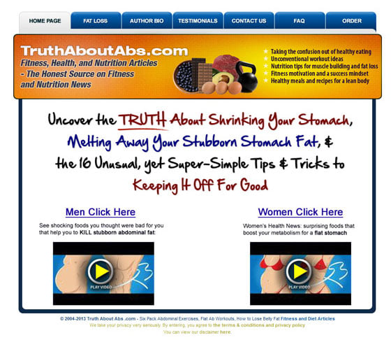
Despite the fact that the product is essentially B.S. (have your own moral debate about that), it still converts at about 54%.
It’s one thing to sell a great product, but selling a low value product at that conversion rate means that they are doing something right.
Ugly site -> high conversion rate.
This is far from the only case of this phenomenon, which is why so many smart business owners and marketers think that ugly converts the best.
Here’s another example: the Google Sniper.
It has a gravity of 206 currently on ClickBank.
Basically, the gravity of a product indicates how often it’s been sold in the last 12 weeks, which typically correlates to a strong conversion rate.
A gravity of 100 is great, but a gravity of over 200 is about as good as you can get.
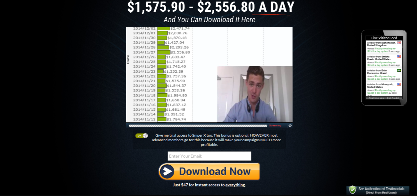
It’s extremely plain, and not particularly well-laid out.
It also limits visitors to video only, and the call-to-action (CTA) doesn’t stand out much.
Ugly, plain...but a monster converter.
If you fall under the camp who thinks ugly design can convert well - you’re not crazy.
The main reason that on average, we see ugly landing page designs convert better than “pretty” pages is because it’s a heck of a lot easier to make a high converting ugly page than a high converting pretty page.
Let me explain...
5 Reasons Why Pretty Pages Usually Suck
Great designers have a ton of knowledge and pent up creativity.
Some, when they get the chance, tend to show off, rather than do what’s best for the client (which is probably you).
If I own a business, I don’t really care about how pretty or innovative my landing page is. Bottom line: it has to convert.
It’s not just small companies who over-design landing page.
Take a look at an older version of the Frontier Communications website:
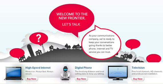
It’s pretty, but it’s a usability nightmare.
Those speech bubbles were all red to begin with.
When you hovered over one, you’d get a question mark, and then if you clicked that, you’d get a message.
This is some advanced design, and it looks great, but 90% of visitors will stare with a blank face and never even see one of the messages.
There’s no clear direction on the page, very little useful information for potential customers, and the CTAs (“Buy Now”) aren't standing out.
This example page did many things wrong from a conversion rate optimization agency perspective. Most of them are repeated over and over among other pretty designs.
Good looking designs make 5 common conversion mistakes:
1) They don’t consider the demographic
Every Internet audience contains a unique blend of visitors. However, one dominant reader persona will make up the bulk of your visitors.
Your website needs to be optimized for that specific reader persona.
For example, if your audience is mainly composed of digital marketing professionals, then incorporating the latest design techniques and technology (e.g. embedded social media) isn’t necessarily a bad thing.
But on the other hand, if your audience is mainly people over 60, they aren’t going to understand how to use even the most basic design elements, like clicking on a button to expand a section. In this case, you need the simplest page possible.
Always start any conversion optimization by returning to your reader persona. (Here’s how to make one).
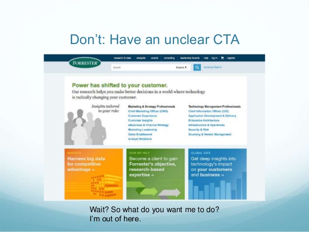
2) The CTA isn’t clear
Don’t get cute.
Even experienced copywriters make the mistake of being too clever from time to time. Both in their landing page copy, and also in their CTAs.
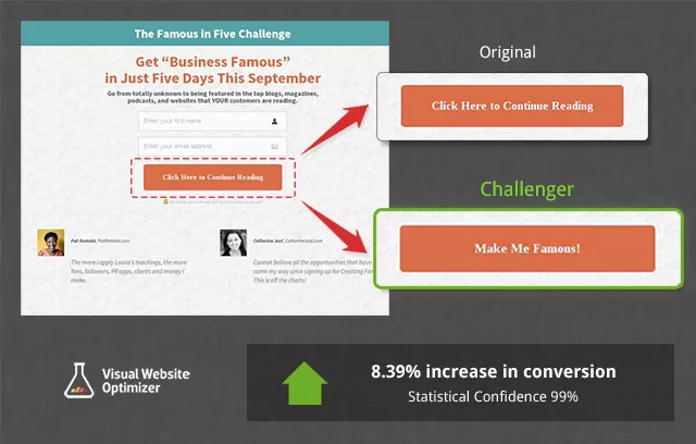
It’s been proven that having pretty much any CTA other than “learn more” or “buy now” will increase your conversion rate by at least 8.39%.
However, that doesn’t mean that you should write anything as your CTA.
Ideally, create a CTA that incorporates a benefit. Check the KlientBoost homepage for an example:

Here’s the problem: In general, landing page owners and designers who want to express their creativity in the form of design, also want to do so in their writing.
A little bit is fine, but they often get too creative with their button CTA - to the point that it’s not clear.
Alternatively, they don’t make the CTA standout because it’s uglier, which also has a huge detrimental effect on your conversion rate.
Take a look at this page, it takes you a little while to figure out where they probably want you to click.
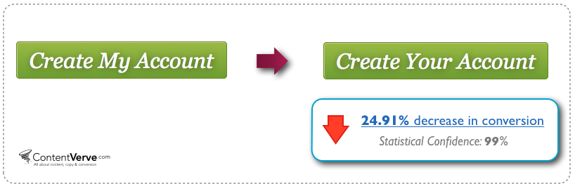
Bonus: If you really want to crank up your conversion rate, change it to first person. Use words like “your”, “my” and “I”:
3) The value proposition isn’t clear
The Frontier Communications example I showed you earlier is the perfect example of this.
When you use fancy elements and possibly confusing layouts and colors, a large portion of your audience is going to miss an important part of your value proposition message.
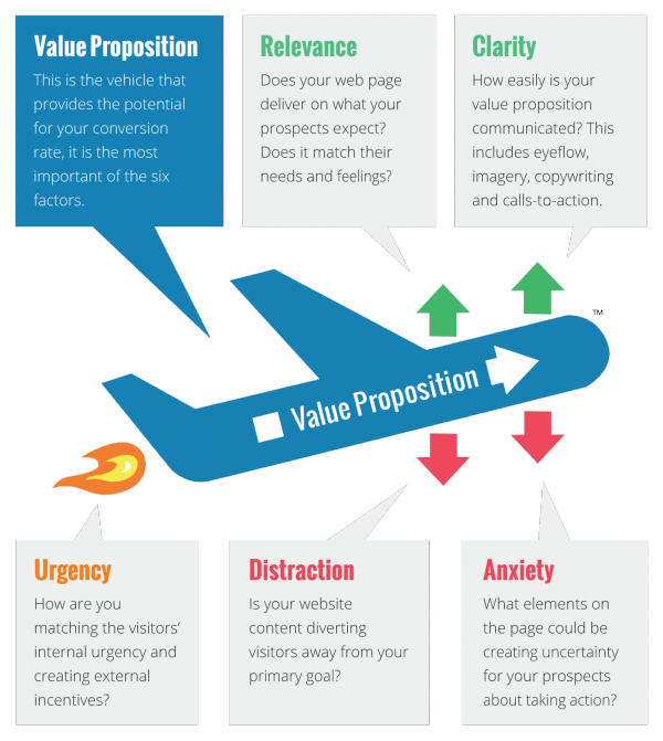
According to the LIFT model of conversion, your value proposition is the key component to driving any conversion.
If you hide it or make it at all difficult to see, your conversion is going to stink.
4) They ignore the product and brand
If you saw a slick landing page for a company selling cheap plastic spatulas, alarm bells would be going off.
People instinctively recognize when something doesn’t match, and it will make your landing page seem like a possible scam.
Similarly, a beautiful SaaS application should also have a beautiful landing page to match. This ties in with what your average reader expects.
In addition to the product, your design should match your brand.
Do you think that a modern, leading brand like Apple would have an ugly landing page or website? No chance.
So some landing pages should be pretty.
Just be careful that your pretty landing page matches what people expect from landing pages selling your product or services, and your brand.
5) They have too many elements (slideshows, animations, etc.)
Here’s the big one: Most pretty landing pages will use fancy design elements like sliders, tons of images, and animations.
The first problem with these are that they often aren’t compatible with older browsers.
Unless you have a very tech-savvy audience, you’re automatically cutting out a big chunk of potential conversions. Even if they are, that doesn’t mean that the browser they have access to (say at the office) is up to date.
Secondly, any extra element serves as a distraction.
Referring back to the LIFT model of conversion, distractions are one of the main factors that pull down a conversion rate. They distract users from seeing your value proposition and CTA.
Finally, they aren’t especially usable.
Any moving parts can confuse visitors (both young and old). In addition, it’s not always obvious how to use them (like those red speech bubbles).
BUT...Not All Pretty Landing Pages Suck
There are tons of brilliantly designed landing pages that look great and convert well too.
As I mentioned, some products actually need a good looking page in order to achieve a good conversion rate. The key is to avoid those other mistakes at the same time.
Take a look at the Mint homepage for example.
The personal finance app needs access to your bank accounts and credit card information. If I’m a visitor, I expect them to have the best developers out there, and a great looking website to prove it.
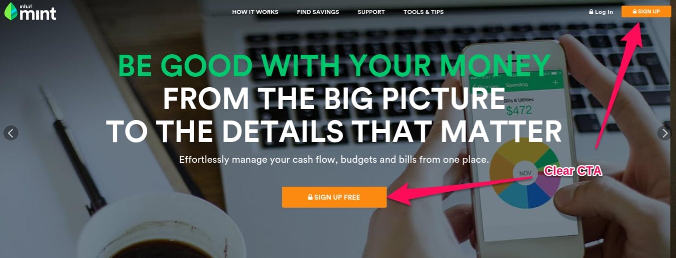
Beautiful, right?
In addition, they nail it from a conversion rate optimization perspective.
The value proposition is in large letters, center-of-the-page, and stand out. In addition, the CTAs in bright orange also stand out.
You might have noticed the arrows on both sides of the page.
This is in fact a slider, but it’s not one of those automatic ones.
The screen will not change unless you click the arrows. Also, you’re not missing out on the value proposition, because it’s simply restated in a different way on the other slides.
Another good example is Beardbrand, which is a relatively new, but rapidly growing company that sells beard supplies (razors, oil, soap, etc.).
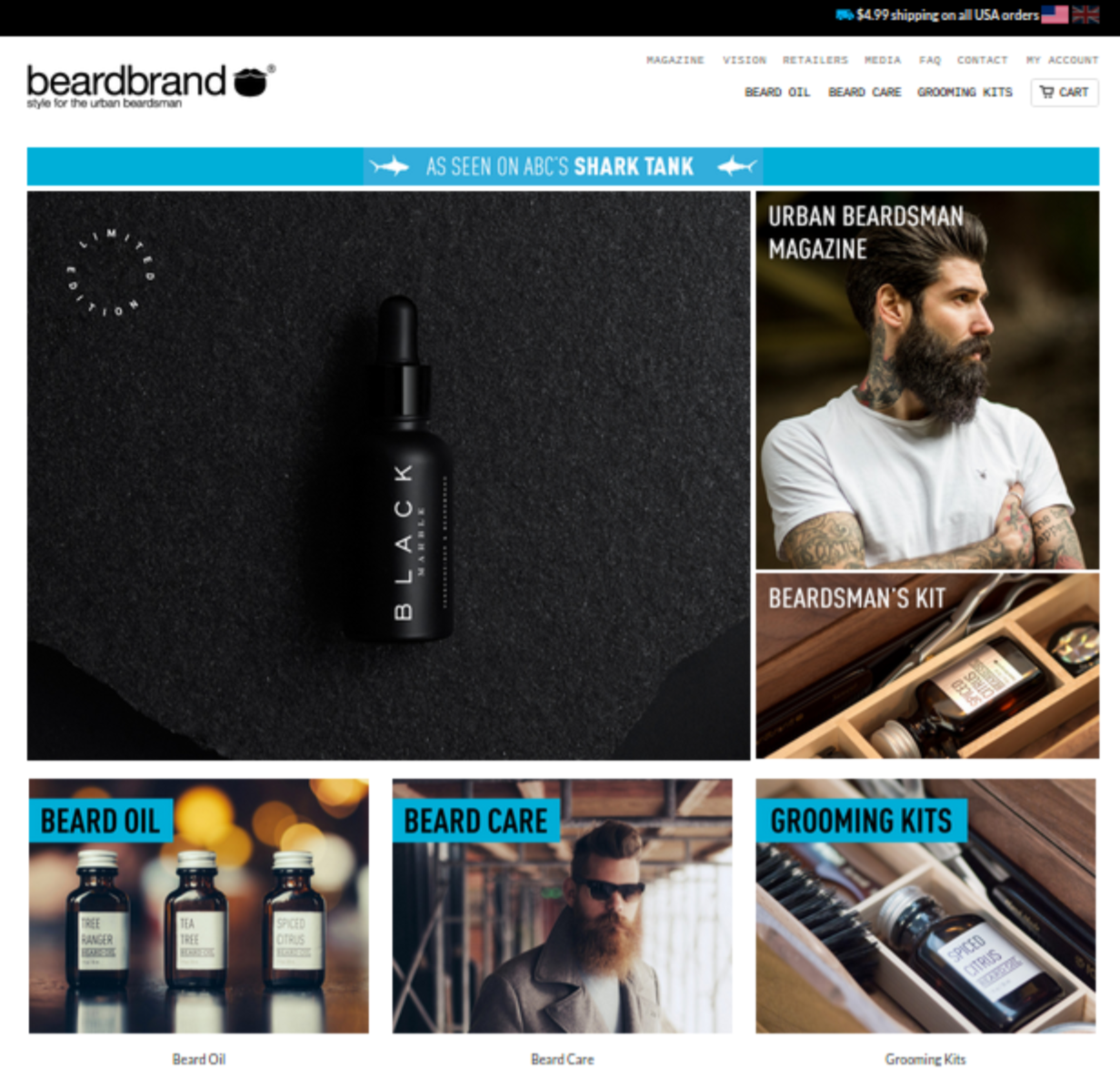
It’s a great looking homepage, but it’s also simple. The three main categories are clearly labeled in blue banners that stand out.
However, I think they are missing out on a higher conversion rate by having the large image of a beard oil, without any CTA or explanation.
Forget Ugly and Pretty, Think This Instead
If I had to sum up what makes a great converting landing page in one word, it would be usability.
Usability encompasses a few different things:
- Clear value proposition and CTA
- Easy-to-navigate
- A landing page that matches the product and brand
When people say that ugly landing page design converts best, they’re wrong.
If they say they convert best on average, they’re probably right, just because it’s harder to screw up an ugly landing page compared to a pretty one.
That being said, if you already have a beautiful landing page that just isn’t converting well, that doesn’t mean that you necessarily have to tear it down and rebuild it ugly.
Find some fresh visitors and have them give feedback on the usability of it from a first-time visitor perspective, or hire a conversion rate optimization expert to re-design your page.
Chances are, you can achieve just as good of a conversion rate with a pretty page as an ugly page.
Back to the original question: Do ugly landing page designs convert better?
No, they do not convert better.
Well-built landing pages convert better, regardless of being pretty or ugly.
P.S. Were you entertained and did you learn something new? Then please share this post!