


There are many spokes on the conversion rate optimization wheel. The most underrated spoke—no question—is landing page and website fonts.
But who the heck cares about fonts, really?
The people looking to buy your stuff, that’s who.
They may not even realize it, but the fonts you choose (in combination with whitespace and imagery) impact user experience (UX).
To put it plainly, if your site looks sh*tty it corrodes your credibility.
An ugly site pushes people to leave as soon as they land. Google calls that a bounce, and it’s bad for your rank.
If a website or landing page is your company’s book cover, fonts are the vital first impression when a user opens the book.
Landing page and website fonts make your headline look good, and your headline is the hook that convinces a user to scroll down the page.
Don’t 👏 ignore 👏 your 👏 fonts.
Don’t believe me? Here’s proof:
Click Laboratory was ecstatic when a new software company hired them to improve their conversion rates. Instead of focusing on the checkout process, the button colors, or the value propositions, Click Lab decided to start with the fonts.
The results?
- Exit rate decreased by 19% (that’s good)
- Bounce rate decreased by 10% (that’s great)
- Conversion rates increased by 133% (that’s WTF awesome)
Remember when Steve Jobs talked about how he dropped out of school and learned about typography?
“Because I had dropped out and didn’t have to take the normal classes, I decided to take a calligraphy class to learn how to do this. I learned about serif and sans serif typefaces, about varying the amount of space between different letter combinations, about what makes great typography great. It was beautiful, historical, artistically subtle in a way that science can’t capture, and I found it fascinating.
None of this had even a hope of any practical application in my life. But ten years later, when we were designing the first Macintosh computer, it all came back to me. And we designed it all into the Mac. It was the first computer with beautiful typography.”
They go unnoticed by most but, overall, a focus on web design will improve your conversion rates.
The fonts you use are the conversion rate details that matter.
A day in the life of a font begins now.
By the end of this post, you’ll know
- when to use curly fonts over fonts without feet
- how that differentiator affects your conversion rate
- where to find high-converting fonts
- how to install them on your site
- how the schematics of a font can be the difference between a browser turning into a buyer or a bouncer.
What the font, heh? Who knew.
Get brand new landing page strategies straight to your inbox every week. 23,739 people already are!
Fonts vs. Typography vs. Typeface
Someone should make a folksong about the difference between typefaces, fonts, and typography. These things are different, and they aren’t interchangeable (even though the lines blur).
But I’m not a folk songwriter, so I’ll plot out the descriptions in words.
Typefaces
You’ve been calling typefaces “fonts” for years.
It’s okay. You didn’t know you were confused (neither did I).
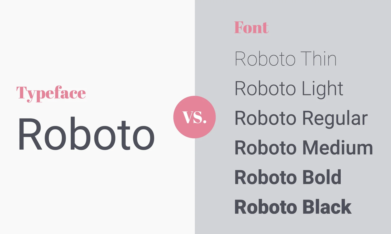
To clear things up, a typeface (also called a type family) is the name of a collection of fonts.
Typeface example: Roboto.
A typeface is the base style—it’s how a font looks without styling applied to it.
Fonts
Fonts are characteristics of a typeface. There are several font variations for a single typeface. Fonts describe the weight, width, and style of a collection of characters within one typeface.
For example, these are Roboto fonts:
Roboto normal
Roboto thin/italics
Roboto light/italics
Roboto medium/italics
Roboto bold/italics
Roboto black/italics
Fonts take us back to the 15th century, long before computers (or even typewriters) were invented. In printing, setting type meant arranging a collection of metal fonts on a plate.
Today, fonts are codes you install on your website’s back end so you can display a typeface. And that’s why the word “font” has blurred into the typeface realm to mean “the style of letters.”
We use CSS (cascading style sheets) code to style our web typefaces.
font-family: Roboto; (setting the typeface)
font-weight: bold; (setting the typeface style)
font-size: 32px; (setting the typeface size)
The fonts you choose affect the readability of your landing page or website design and make a vital first impression on your visitors.
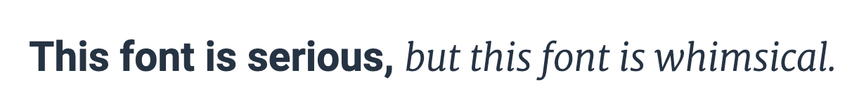
Fonts communicate tone and mood.
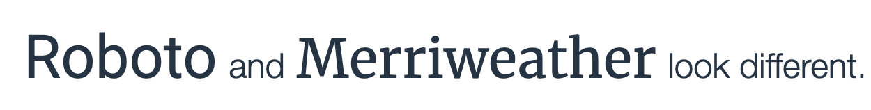
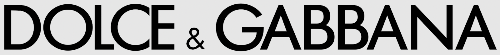
A sans serif Roboto typeface set in a bold font is more serious in tone than a serif font like Merriweather set in light italics.
Typefaces fall into one of five font families.
- Serif (decorative ends)
- Sans serif (plain ends)
- Cursive (looks like handwriting)
- Fantasy (very decorative)
- Monospace (fixed-width fonts like Courier, used for coding)
Cursive and fantasy fonts don’t make good web fonts, and monospace fonts are a niche font style leaning more toward typography (or coding) than common use.
We’ll focus on serif fonts and sans serif fonts.
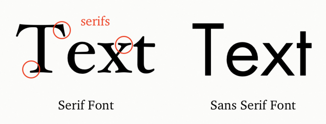
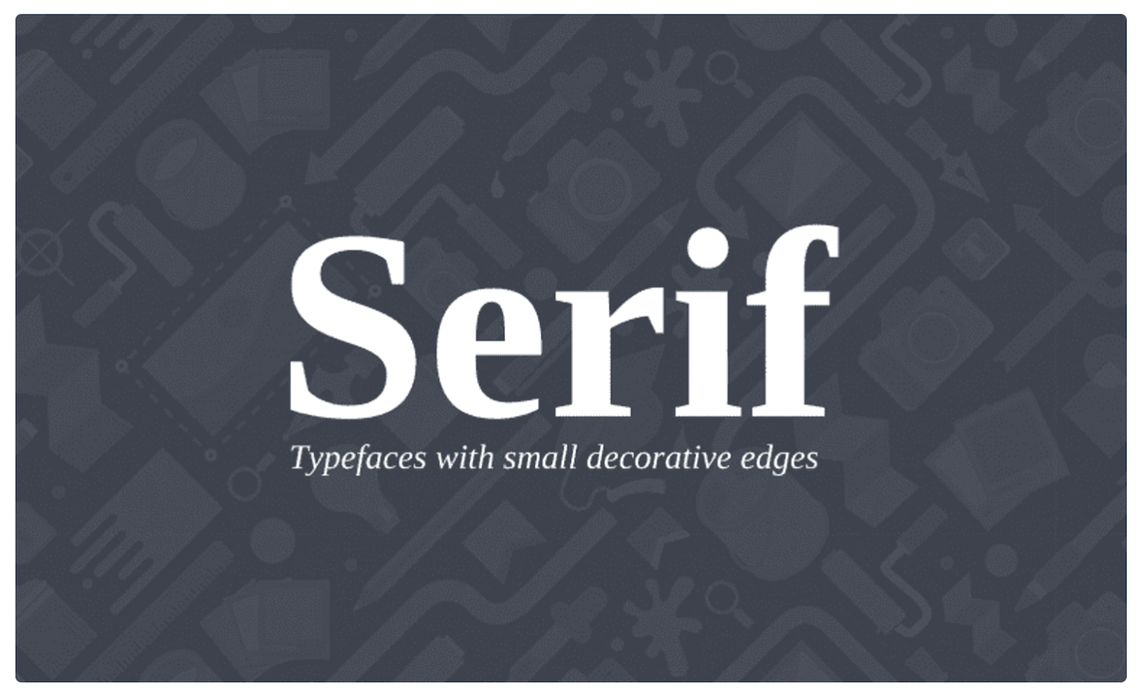
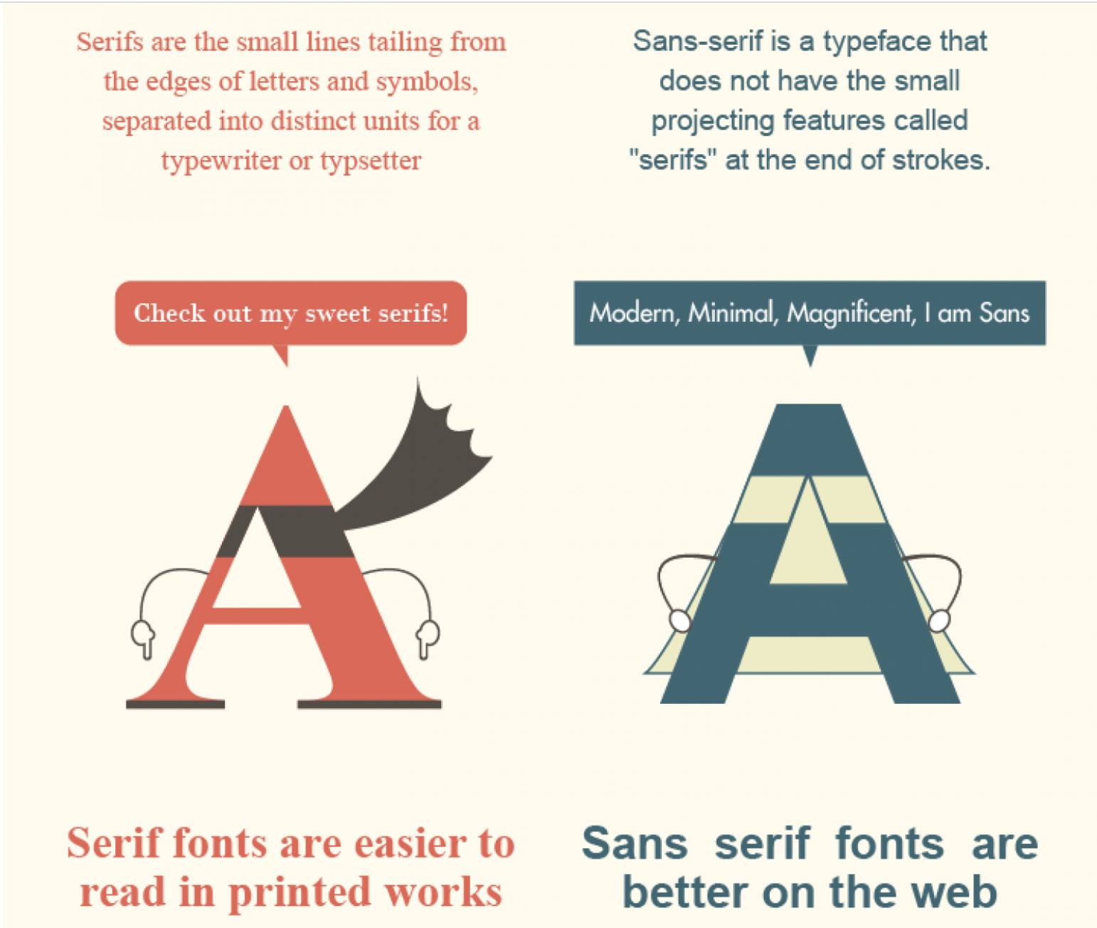
Serif fonts
Serif fonts have decorative ends called finishing strokes, tails, feet, slabs, or glyphs. Thick and thin fonts in a serif typeface vary quite a bit. Serif fonts are used in books, newspapers, and magazines. They create a more classical, formal look.
What does a serif font say about your brand?
Serif fonts are seen as trustworthy and established because they have been around for hundreds of years. They imply a seriousness and can lend an automatic loyalty. Think law, finance, or insurance industries.
Common serif fonts:
- Garamond
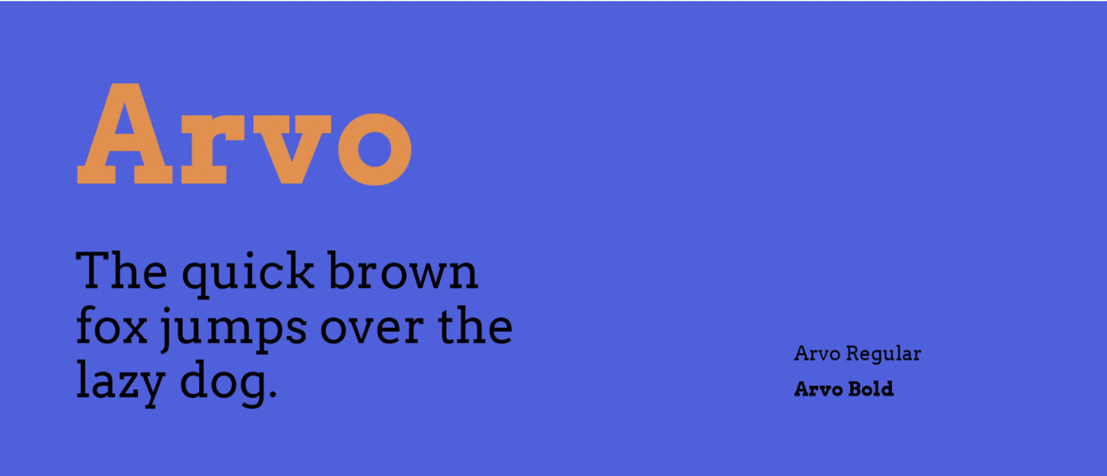
- Arvo
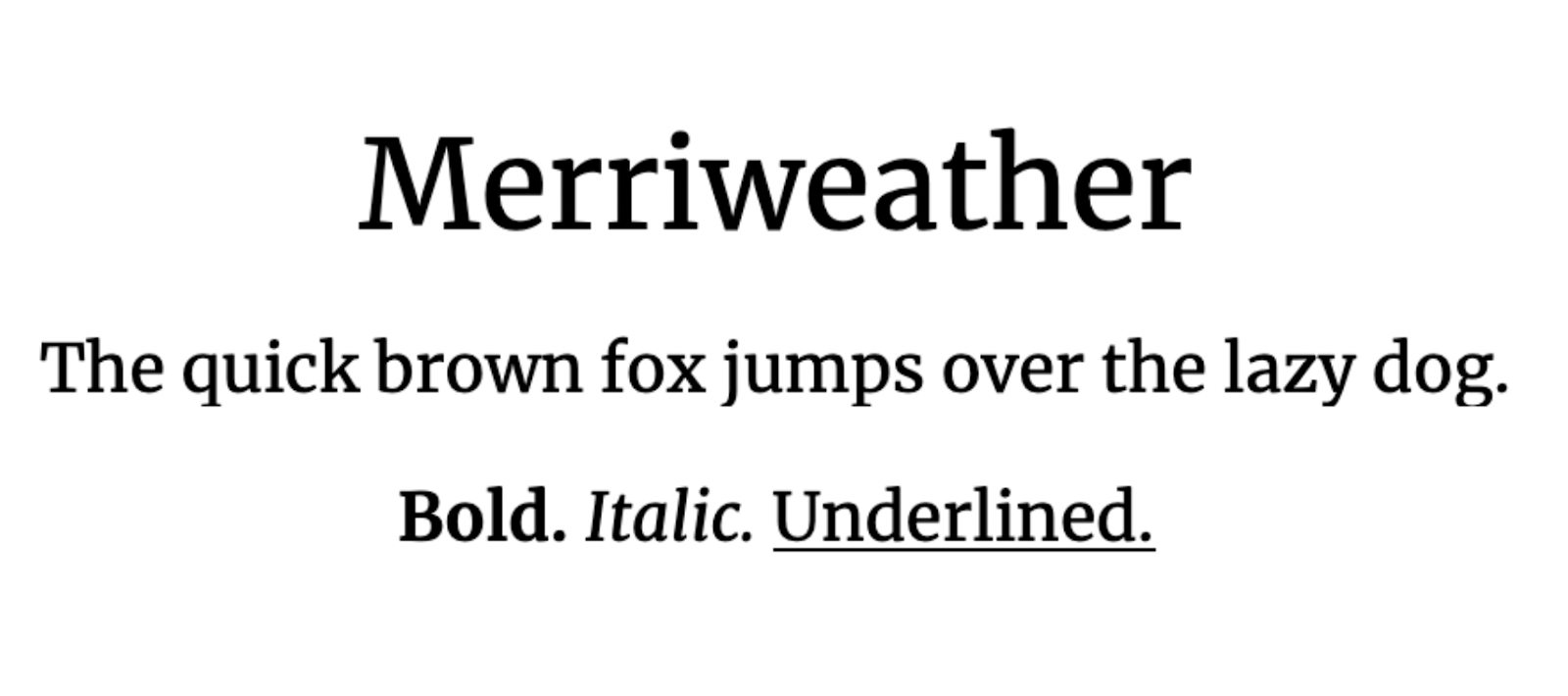
- Merriweather
- Bitter
- Goudy old style
- Playfair
- Baskerville
- Didot
- Lora
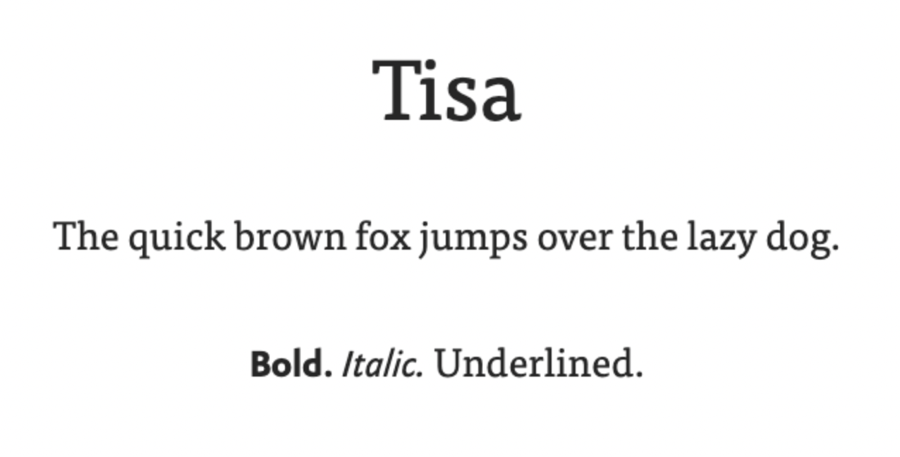
- Tisa
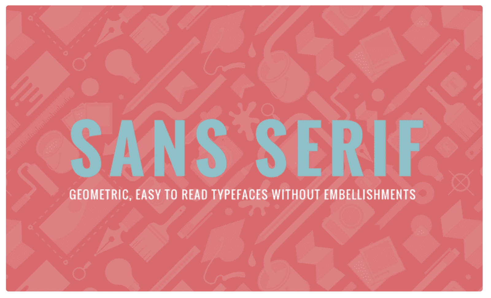
Sans serif fonts
Sans serif fonts don’t have decorative ends (hence the “sans” part that means “without”). There is no ornamentation, and there isn’t a lot of variation between thin and thick strokes. Sans serif fonts are used more in the digital world on websites and apps.
What does a sans serif font say about your brand?
Sans serif is considered more modern, minimal, youthful, and less stuffy. Think tech startups, clothiers, and branding or design companies.
Common sans-serif examples:
- Arial
- Karla
- Helvetica
- Lucida Sans
- Raleway
- Montserrat
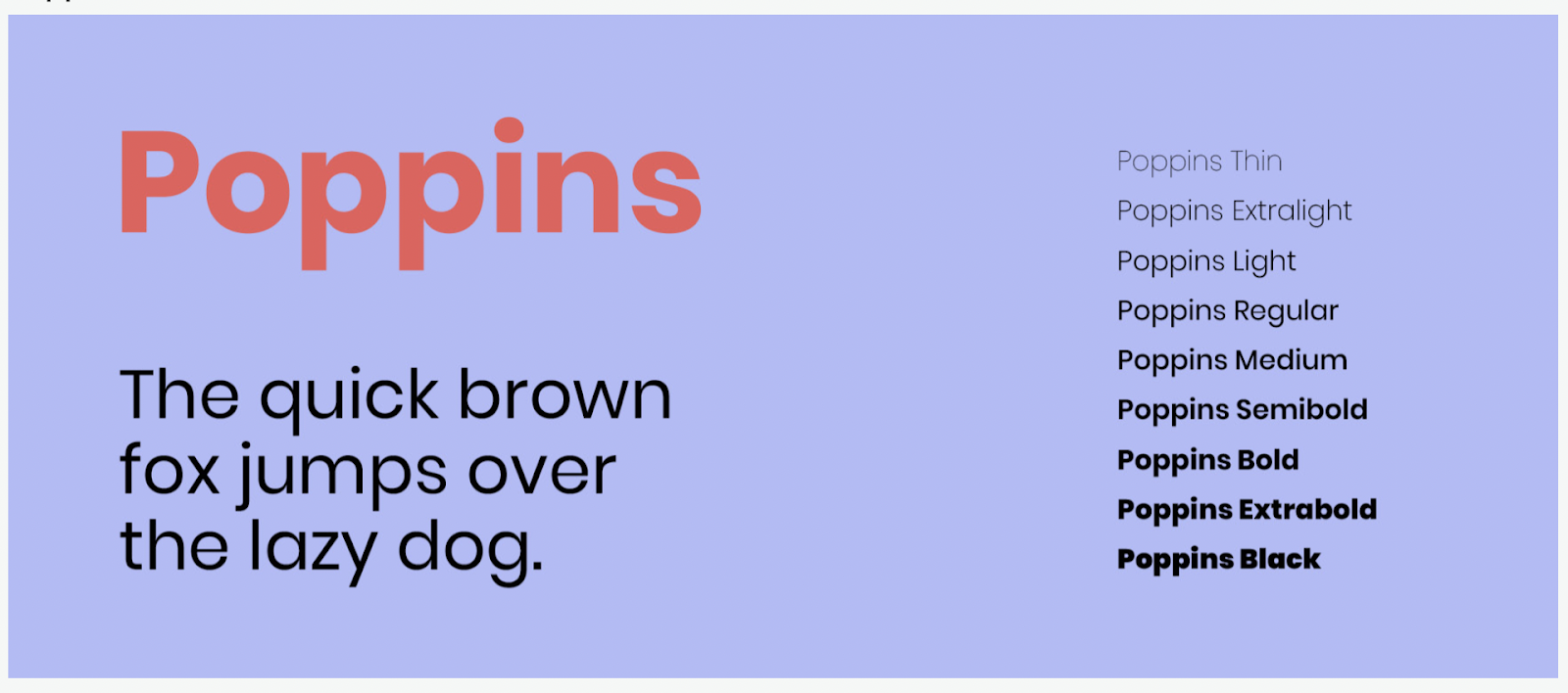
- Poppins
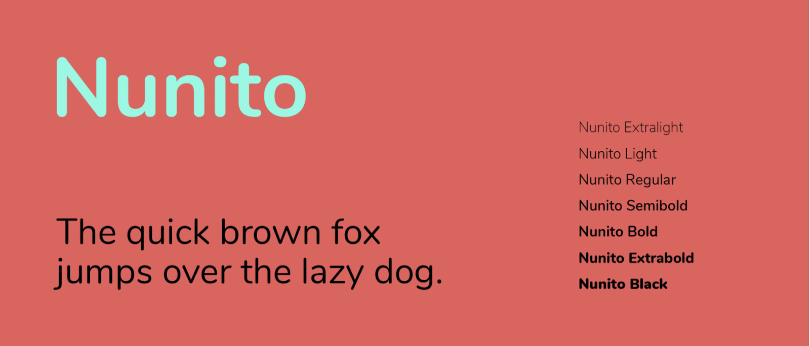
- Nunito
Typography
Typography is a different world than typefaces and fonts.
It is an artform where typefaces and fonts are used artistically as design elements. Typography is used to enhance the reading experience.
What does typography say about your brand?
Typography can change the perception of a brand. It creates feeling. It’s cool. It works its way more into the design aspect of a site, contributing to a pleasing UX more than it stands as an actual font.
If typeface and fonts work to display language in a pleasing way, think of typography as more of a body language.
Landing page and website fonts matter for conversions
Landing pages and websites are built for one reason: to convert a target audience. When you design your landing page or website, you design it for that target audience.
To be clear: You don’t pick a typeface and font style for your website or landing page to evoke deep-rooted emotions or trigger some neurological rainbow of happiness in your visitors’ brains (although that would be sweet).
The goal of your website font is simply to be read.
But isn’t that the goal of the landing page or website headline?
Yes. Your headline and font work together.
If a headline (and the subsequent copy) gets read, it’s partly because it was easy to read.
There have been plenty of studies (like this one, and this one, and this one) that show that some fonts are easier to read and promote better reading comprehension than others.
That’s what you’re going for.
Let’s say you make skateboards. Your target audience is younger, you’re in the B2C marketing space, and you sell a “fun” product. You can use a more liberal typeface.
By comparison, say you sell CMS web builder software. Your target audience is likely older, and you’re in the B2B marketing space. You sell a useful subscription product. Your typeface and font choice may be more serious and conservative than the skateboard company.
If you’re not sure what typeface or font variation you should use, pick two. Then A/B test the winner.
The perception of landing page and website fonts affect readability
Believe it or not, serif fonts are easier to read on printed material, while sans serif fonts are easier to read on the web.
Sans serif fonts are used by modern companies and brands that attract a younger audience, while serif fonts are geared toward the newspaper generation of older web surfers.
This is not carved in stone and, sometimes, going against the grain is the differentiator that wins.
But what’s even more confusing is that a study showed that people who read serif fonts on a website perceived that they understood and comprehended what they read quicker compared to sans serif fonts (even though serif fonts are more difficult to read online).
The crazy thing?
The study proved that people who read sans serif text scored higher in comprehension and reading speed.
So what’s more important? The perception of valuable site content by your website visitors or actual conversion rates?
I’ll take actual conversion rates all day long.
But landing pages and websites aren’t the only places where typeface and font selection makes a huge impact.
Restaurants are a perfect example of how font manipulation can make you hungrier, improve perceived value, and, most importantly, get you to spend more when dining.
A restaurant menu study showed that simply using a fancier font increased the chance of people ordering certain items that made the restaurants the most profit.
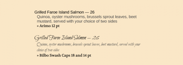
Now, I don’t recommend using any type of cursive font for your landing page or website, even if you’re a luxurious high-end private jet company.
People who sit down at a restaurant aren’t about to leave. They’ll take their time to read and understand a menu.
Your website visitor on the other hand? They’re one click away from checking out your competition.
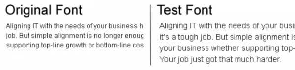
Tommy Walker, former editor at Conversion XL, put together a fantastic in-depth article about typography and conversion rates. In it, he shares a conversion rate test created on the New York Times website.
The 45,000 participants thought the quiz was about their take on a catastrophic event but, in reality, it was a font test.
Here were the test fonts:
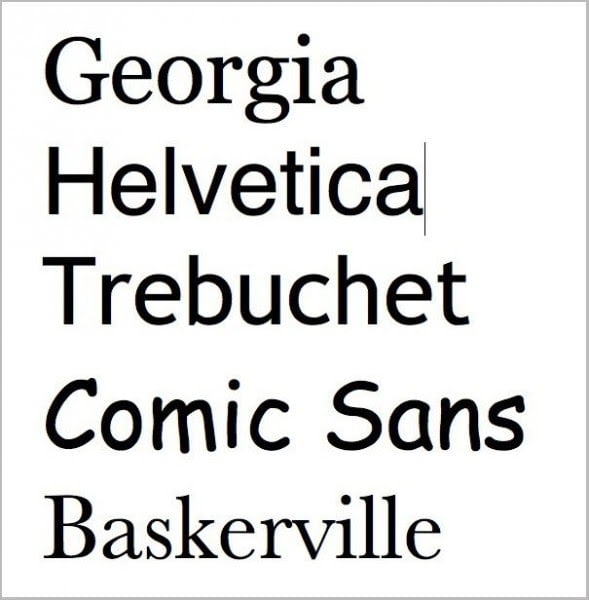
When Baskerville was used, there was a 1.5% increase in agreement to the deciding statement compared to the other fonts.
1.5% might not seem like much, but if you’re getting traffic volumes like the New York Times, then that’s worthy of serious celebration.
Moral of the story?
Choose fonts that are easy and quick to read.
Done.
So...what are the most legible fonts?
We made a top 20 list below.
The factors that answer that question have to do with serifs, size, weight, and spacing. Font color (in relation to the background color) also comes into play.
Thanks to the 1990s, studies definitively show that light-colored fonts on dark backgrounds are universally more challenging to read. So don’t choose a dark background and put white—or neon (GAWD NO)—text on it.
Top 20 web-safe best fonts for digital readers
A web-safe font looks good across all devices. That’s because it’s universally installed to be compatible. Since web fonts aren’t locally stored, your website loads faster when you use a web-safe font. This is good UX and good for SEO ranking.
Google fonts are widely accepted because they’re open source for commercial and personal use, and come in a high-quality selection of web and mobile fonts that work well for readability.
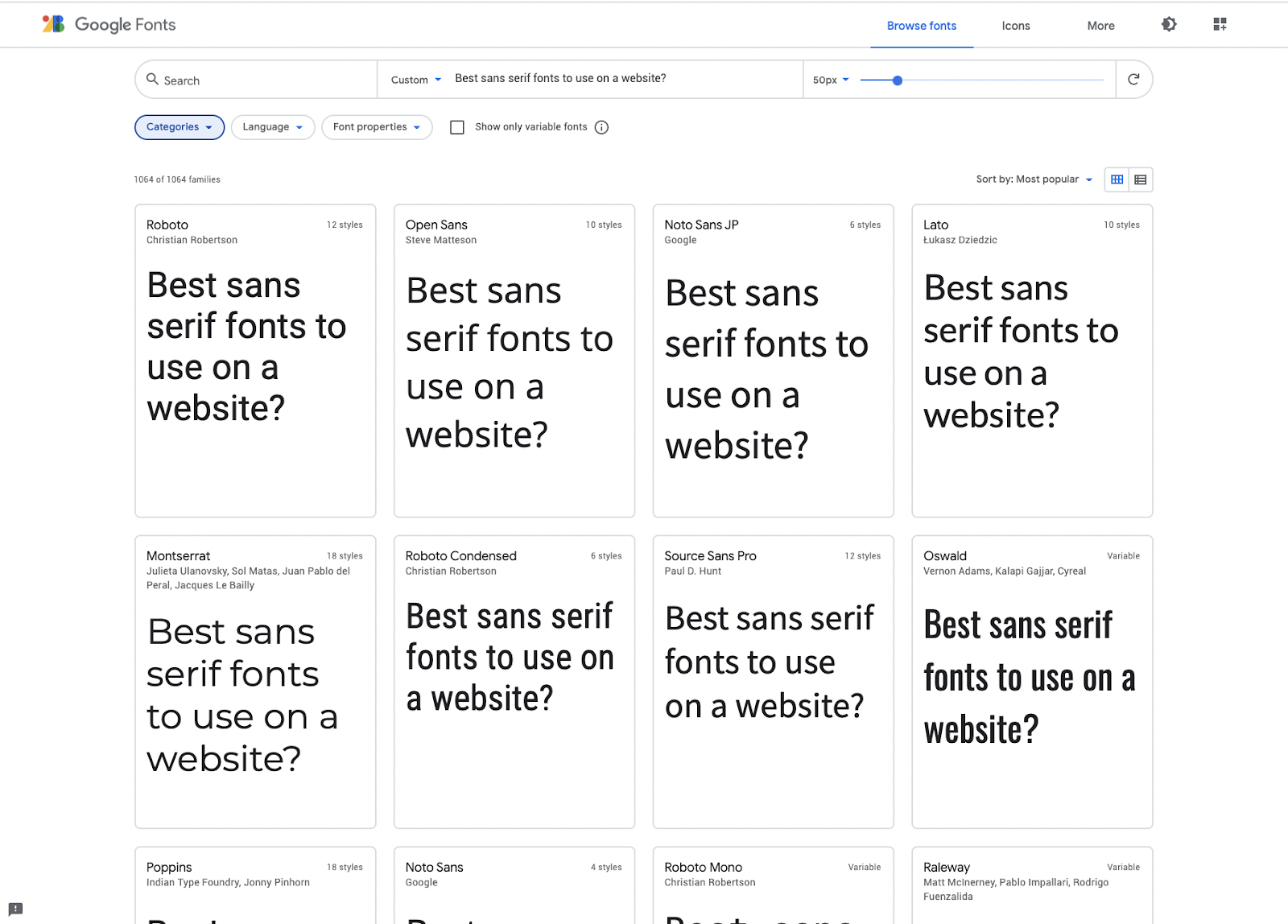
Picking a web-safe font as your first consideration.
But which one? That’s where your company’s personality comes into play (tone).
Here are our favorite Google fonts:
- Arvo (slab serif with only two font options that adds a western feel)
- Playfair display (a modern take on the classic serifs)
- Muli (sans)
- Titillium (playful sans)
- Nunito (a sans serif font that rounds the ends, making it fun)
- Volkorn (modern serif)
- Karla (sans serif—only regular and bold fonts, but it works well online in all sizes)
- Lora (modern serif)
- Merriweather (a favorite, modern, fun serif font)
- Archivo (a modern and somewhat fancy sans serif font)
- Fjalla One (a clean, condensed sans serif font)
- Roboto (a popular sans serif font)
- Montserrat (a wide and playful sans serif typeface that comes in many font styles)
- Poppins (similar to Montserrat, a fun sans serif font in many font styles)
- Source sans (sans serif)
- Lato (a cute sans serif font that almost looks like a serif font)
- Open Sans (modern sans serif with many font choices—one of the most-used fonts on the web)
- Tisa (the best web-safe Helvetica font replacement with a tidge more whimsy than sans-serif fonts but not as forward as Georgia or Merriweather.)
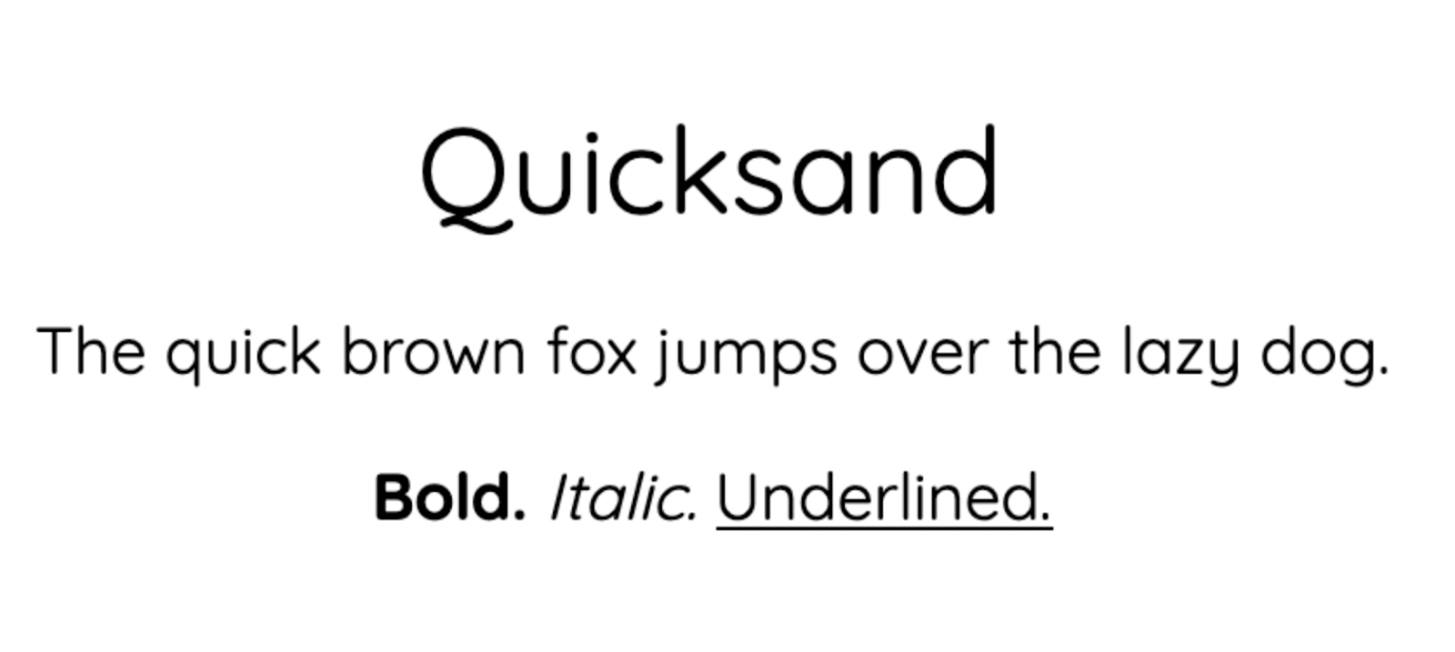
- Quicksand (a quirky sans serif font for mobile)
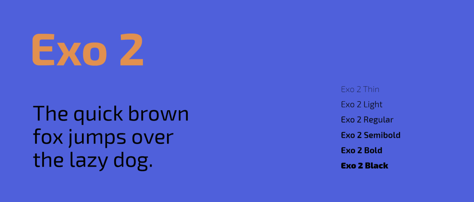
- Exo 2 (sans serif font with flair)
In the same way that simple font changes on a restaurant menu or newspaper increase the perception of value and legibility, so can font changes on your landing page or website.
Are you asking why Times New Roman didn’t make the list? Because we’re tired of it. It’s dated. Use something else.
Choose one of the fonts above. Or two of them—and test them out.
How to figure out a font
Sometimes you see a font on a webpage when you’re surfing around, and you love it. But how do you know what that font is so you can use it on your own site?
Easy.
Install WhatFont Chrome extension. Used by over 1 million happy customers, you simply click on f? Symbol on your Chrome bar and then click on the font in question.
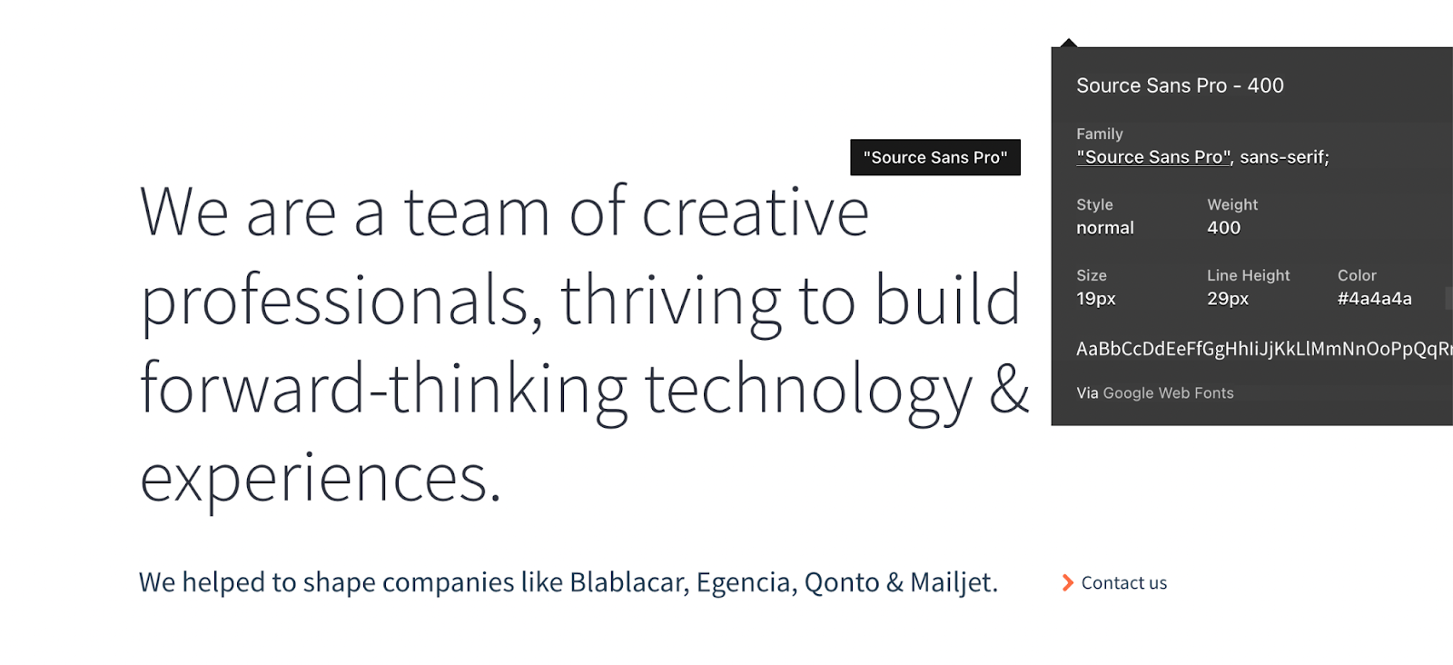
If you’re lucky, it will be a Google Font, and you can rest assured it will look nice on your website when you install it and use it.
Seven more in-depth tips on landing page and website fonts
You get it. Landing page and website fonts are essential.
But we’re going to dissect the different font elements you can test in your headlines and copy to improve conversion rates.
Font color
Just like button colors affect conversion rates, so do font colors.
Years ago, the Gmail team tested 40 different shades of blue to measure click-through rates on Gmail buttons. Bing ran a similar blue font color test on their search results page.
The result was an astounding $80 million in additional annual revenue.
For the test, it turned out that font contrast and color contributed more to reading performance than the typeface.
Bing switched from Arial to Verdana, but ultimately switched back to Arial because it performed better.
Font size
Readability and legibility depend largely on font size.
What font size is best for online readers?
There is some debate here, but 16px is a winner for body copy for both mobile and desktop.
Different screen sizes have different resolutions. Your headline (H1) should be several sizes bigger than your subheadlines (H2, H3, H4, etc.), and your subheadlines should be several sizes bigger than supporting copy.
But bigger isn’t always better.
Overdo it, and you end up shouting at your customers and pulling circus more than serious.
Here’s what we use for KlientBoost blog articles:
- H1: 50px
- H2: 32px
- H3: 25px
- P: 18px
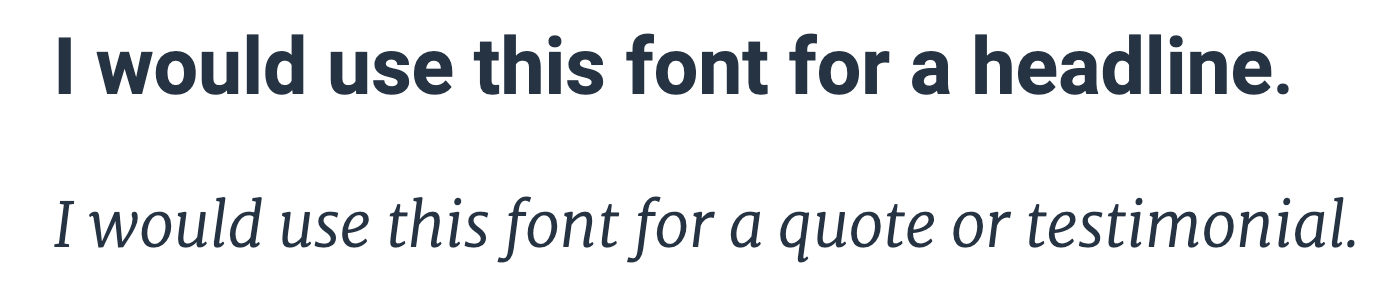
Font type
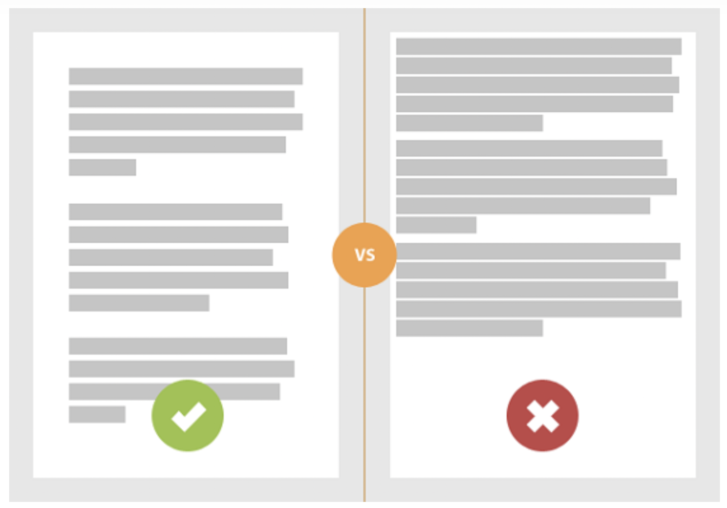
The type of fonts makes dramatic importance on how easily someone skims your landing page or website. A Microsoft and an MIT student tested typography on mood and cognitive performance (the ability to process and understand information).
They decided to split up the participants between bad and good typography.
The good typography had a large font for the heading and white space in the margins. The document was left justified and there was proper font and line spacing. The bad typography didn’t; the title was only a couple of sizes bigger than the body copy and it was underlined. There was minimal space between the heading and the body copy, and there was hardly any line-height (the amount of space between the lines). The entire document was full-width justified leaving awkward spaces between some words.
The results? The good typography group finished 52% of the task, while the bad typography group could only finish 48% of the task.
Font weight
You should be a freaking pro when it comes to landing page and website fonts, typefaces, and typography by now.
But here’s another one I’ll throw at you: font-weight.
The width and relative “thickness” (medium or bold) of your main header (H1) and subheaders (H2, H3, etc.) should be bigger than your body copy.
How much bigger?
A quick rule of thumb is to multiply by 2. Choose your body copy font size first (say, 18px) and multiply by 2 for your heading (36px).
Grain of salt; overall size depends on the fonts used.
Another guideline is to use the Fibonacci sequence (e.g. 16 – 24 – 40 – 64 – 104) to produce a natural progression of headlines and pleasing typographic results. Using the Fibonacci sequence, your body copy would be 16px, your H3s would be 24px, your H2s would be 40px, and your H1 would be 64px. If that works for the font you chose, use it.
At KlientBoost, we use Open Sans typeface for our blog articles. For the H1, we use Open Sans Bold with a size of 50px. Our body copy is Open Sans Regular with a size of 18px.
Why did we make our H1 so much bigger than our body copy? If the rule is to multiply by 2, our H1 should be 36px in size.
Two reasons:
- We use the gambit of SEO hierarchies to give Google a good understanding of our copy structure—right down to the H5 heading. Because we use six hierarchies (H1-H5 and the body copy, P), we differentiate those headings with an appreciable size difference. To do that, our H1 ended up being bigger than the rule of thumb multiplier.
- It looks good. Rule of thumbs are general rules. Use them to get in the ballpark. Then break them for home runs.
Last font-weight point: use bold body copy throughout your document to emphasize specific heavyweight points.
Line spacing
Remember that time in college when your paper had to be 24 pages, but you couldn’t squeeze out more than 20?
Line space to the rescue!
But seriously, line spacing makes lines of copy easier to read. It creates white space, a best practices UX law, chunking your copywriting into more easily digestible blocks.
To increase your conversion rates, play around with line spacing.
A line-height somewhere between 1.5em to 1.8em works well for regular body copy. The em demarcation is a CSS element that denotes the relationship between font size and the space between the lines.
If a paragraph has a font size of 18px, using a common line-height of 1.5 means there is about 27px of space between the lines (18px x 1.5 = 27px). This ratio improves readability.
We use a font size of 18px and a line-height of 32px. Does that follow the rule? Pretty much. We add in a few more pixel points of space.
Line height makes paragraphs easier to read. But your copywriting skills decide whether the visitor likes what they’re reading.
Line width
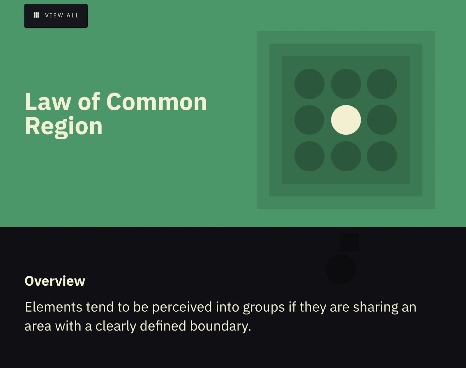
According to the UX law of common region, always leave a border around an element or group of elements to help readers’ brains associate commonality between those items.
In other words, leave a white border around your copy and whitespace between paragraphs to separate thoughts into readable chunks for better comprehension.
Don’t run copy from the left edge of the page, across the page, to the right edge. Eyes and brains don’t like that.
If you go too wide, then people will have a hard time focusing on the text. If you go too narrow, then you may break the readers’ rhythm.
The science goes like this: Gestalt laws of grouping observe that humans naturally perceive objects in organized patterns (this is called Prägnanz). The mind is disposed to make groups out of chaos based on proximity, similarity, continuity, closure, and connectedness.
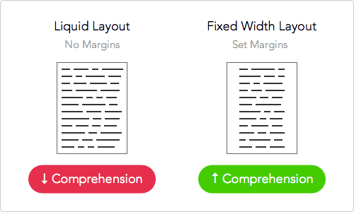
Optimal line width for your landing page or website copy should be about 50-60 characters per line.
Test out any long copy you have by messing around with the widths, and use a tool like CrazyEgg to measure how far down visitors scroll before and after your changes.
Line breaks
Line breaks are similar to line widths. They also make it easier and quicker for your visitors to read and understand your copy when used correctly.
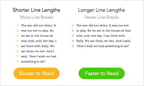
Give your sentences breathing room to give your conversions the best chances of happening.
We do this a lot in our KlientBoost articles. You’ve probably noticed that we use a lot of one-line paragraphs in our writing. That’s not what we are taught in school, but it’s what we have tested works best.
The secret CRO ingredients
Wow! Quite the rundown on fonts and their psychological impacts, huh?
Don’t sweat the small stuff doesn’t apply to landing page and webite fonts. Sweating the basic rules of typefaces, fonts, and typography makes a big performance impact when it comes to conversions.
There is no right or wrong font if you choose from the Google Font list we provided above—all of those work great for web applications. But whatever you pick, be sure to test the result.
As you go through this and start testing fonts, remember that the best landing page or website font choices are ones where visitors don’t notice the font but do understand the message.
What landing page fonts have you used to improve performance?
Now that you have fonts down, check out these 34 landing page best practices to lift your conversions.


