


Do you want to crack the code on how your landing page visitors make decisions?
It’s not always easy. Understanding the psychology that triggers human perception and reactive behaviors can be a mystery.
The science behind buyer behavior, persuasive marketing, and paid ads can go pretty deep into subliminal territory, and can make us feel like we’re lost in the Matrix.

To crack the code, we’ve collected 41 psychology concepts and grouped them into seven topics, each tied to convincing your visitors to convert on your landing pages:
- Identity
- Needs
- Motivation
- Control
- Stimulation
- Socialization
- Design
Let’s start with a topic and collection of marketing psychology concepts worthy of the Matrix itself.
Get brand new landing page strategies straight to your inbox every week. 23,739 people already are!
Marketing Psychology Topic #1: Identity
As soon as someone arrives at your landing page, it’s important they feel a sense of self and belonging.
There’s nothing worse for conversions than scaring people off as soon as they land on your page. This can happen because the ad they clicked brings them to a page that makes them feel like a lost stranger.
When weaving principles of Identity into your landing pages, consider what it is you want your visitors to identify with. Your visitors need to identify with your landing page, which means your page’s emotion, offer, message, tone… the whole shebang.
Psychology Concept #1: Theory of Self-Interest
First and foremost, people care about themselves, so be sure to focus your entire landing page on your visitor.
The clearest way to make your page all about the visitor: be explicit in showing how your offer will improve your visitors’ lives.
Everything on your landing page should be about the visitor. Give them something for free, fix their problems, speak in their language, focus on their mood… make it all about your visitor.
Psychology Concept #2: Emotion
To help persuade their buyer behavior, try to evoke a relevant emotion that your visitors can easily identify with. We typically make buying decisions based on our emotions.
USC neuroscience professor, Antonio Damasio, wrote a book called Descartes Error, which argues that emotion is a necessary ingredient to almost all decisions.
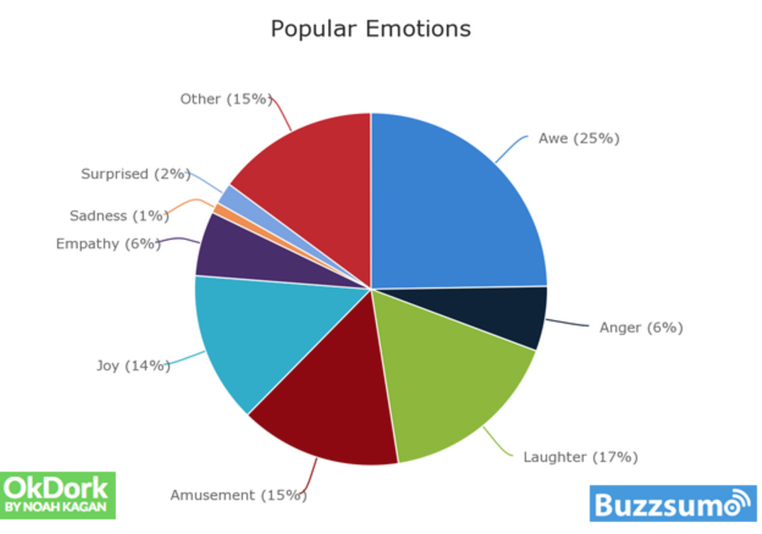
OkDork and Buzzsumo analyzed the top 10,000 most shared articles across the web and summed up the most popular emotions:
Psychology Concept #3: Storytelling
There’s all this hype lately about storytelling your brand. Companies have even hired Chief Storytelling Officers (CSO). Here’s a list of current top CSOs on LinkedIn.
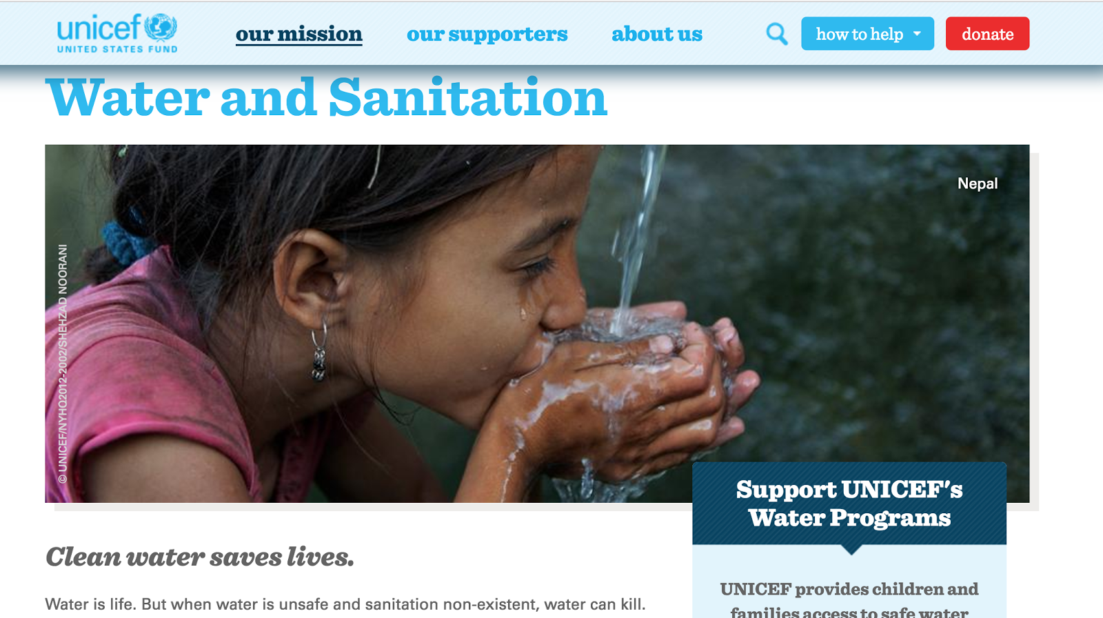
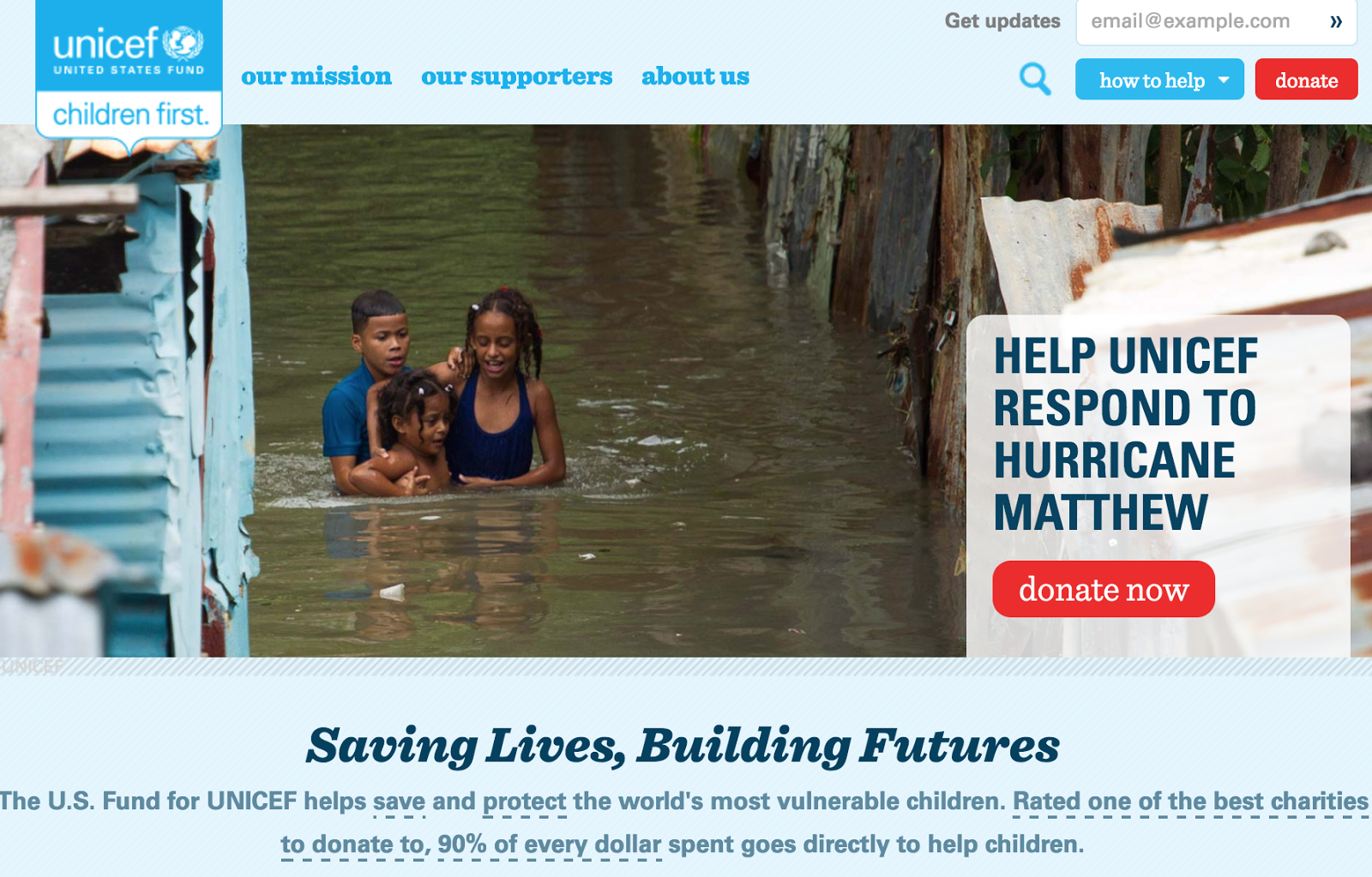
Fad or not, the trend makes sense because storytelling helps us relate to things. The quickest way to get your visitors to identify with your offer is through compelling storytelling. Better yet, use visuals.
Research has shown that we remember visual images much easier and better than words, so show your visitors how your offer works. Your copy and wording can act as reinforcement.
UNICEF provides immediate storytelling through compelling visuals:
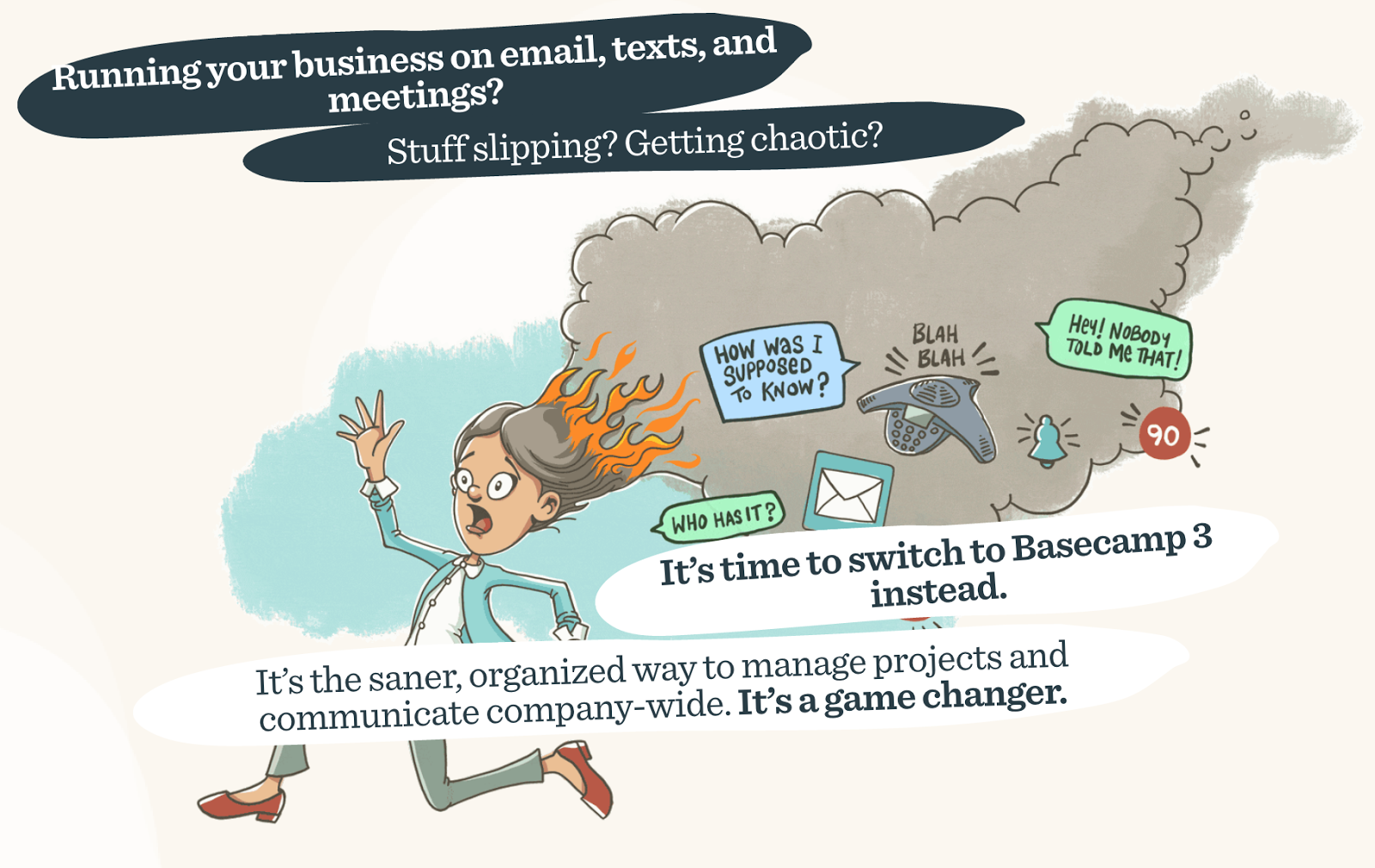
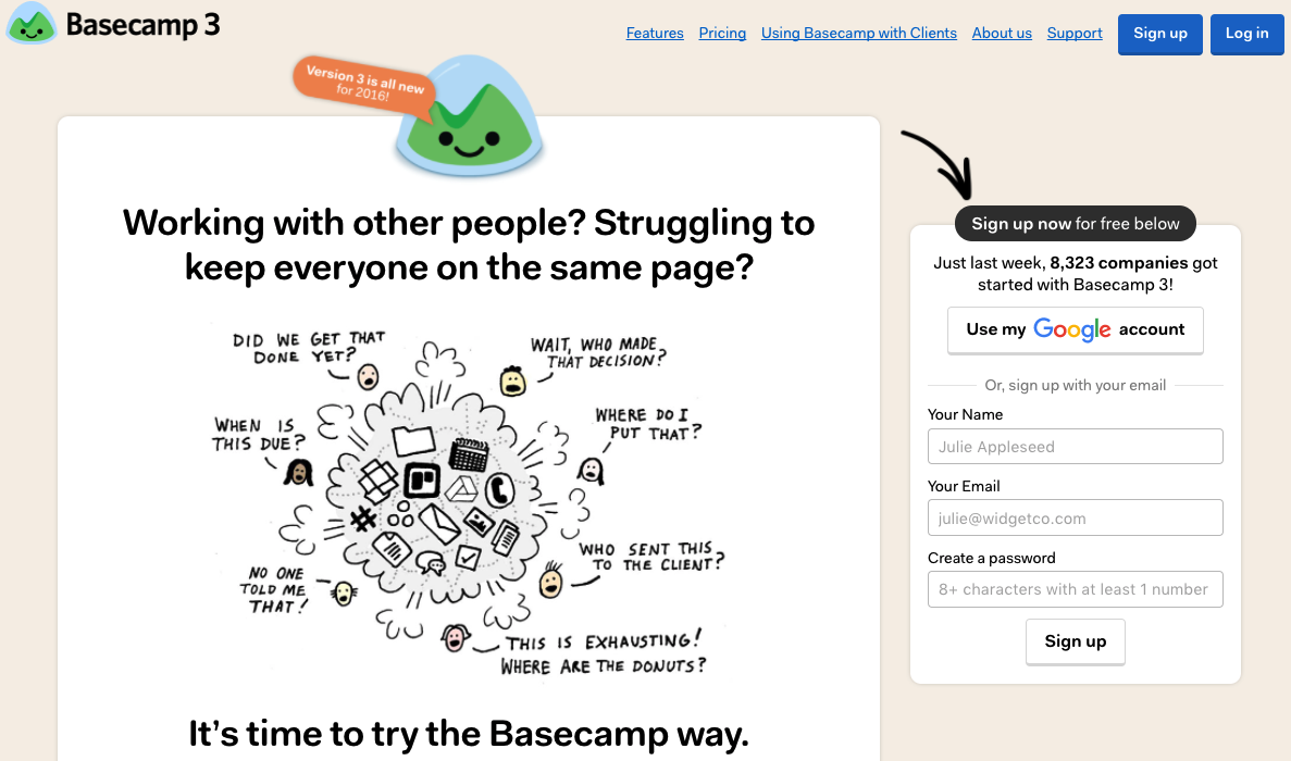
Psychology Concept #4: Copy and Tone
Speak to your visitors conversationally on your landing pages and be intentional with your wording and tone. Your landing page copy is yet another opportunity to elicit the response you want, so take advantage.
Here’s how Basecamp humanizes their landing page with copy and wording tone:
Psychology Concept #5: Style
We hear about how important “look and feel” are to defining your brand identity. Everything you put out there representing your company should have an intentional branded style to it.
The concept stands the test of time and to this day helps your audience identify and trust your brand’s personality.
There’s a psychological consistency in style that you want to capture, so your visitors feel like they’re in a familiar place when arriving at your landing page.
Coca-Cola’s style is an iconic example that aces consistent style across multiple campaigns:

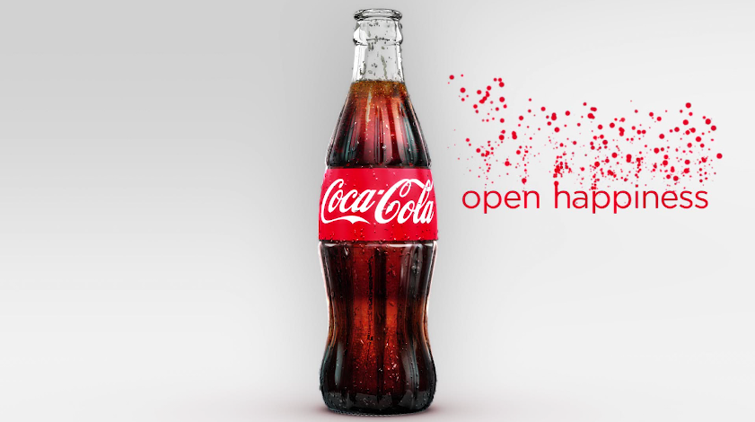
The more someone experiences consistency with your style, the larger the role of brand equity becomes, where people will continue to recognize and identify with your brand.
It becomes a reliable, consistent and trustworthy thing for them, where they have to think less and less about decision making each time they encounter your brand.
Marketing Psychology Topic #2: Needs
When it comes to needs and evaluating options, there are several things we consider when spending money that have to do with basic survival needs.
Things that run through our head when considering cost: Do I really need this? How much do I have to give up for it?
We consider cost in terms of what we have to give up in order to gain something in return so that offer better be worth it. Know your visitors, where they came from and what their needs are.
Psychology Concept #6: Action Cycle
HubSpot found that 96% of visitors to your landing pages are not ready to buy.
That’s pretty staggering.
The key is to know all about your visitors, like where the heck they came from and which stage of the action cycle they’re in, before pushing hard for the conversion.
Knowing what your visitors need allows you to address where they are in the action cycle.
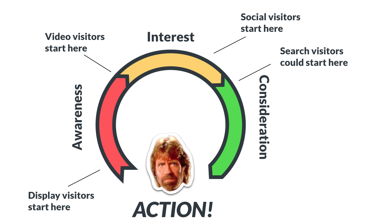
A reminder of what our Chuck Norris-ized action cycle looks like (in case you’re not familiar):
Which stage of the action cycle are your visitors in and where did they come from?
Not everyone has the same level of urgency and readiness to convert, so be sure to address that. Ask yourself:
Are people landing on your page because they randomly saw your display ad and got distracted and pulled in by your super interesting ad and stellar copywriting?
Or did they go looking for you after weeks of competitive analysis and previously visiting your page, and are now ready to convert?
Psychology Concept #7: CTA Threat Levels
Understanding threat levels this is especially important when designing your call-to-action (CTA). You want to be sure to design and test for the right threat level.
Threat levels should be different for your different audiences, since we now understand they come from different places on the internet and your visitors are in different stages of the Chuck Norris action cycle.
The more primed and ready your visitor is to convert, the higher your CTA threat level can be.
KlientBoost’s Johnathan Dane claims:
“The hotter CTAs won’t work for colder traffic, but colder CTAs will work for hotter traffic.”
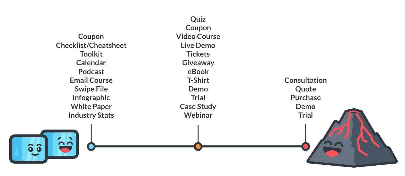
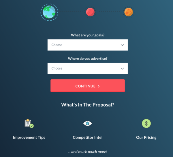
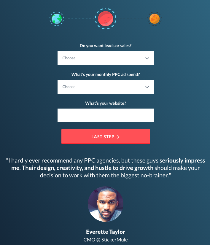
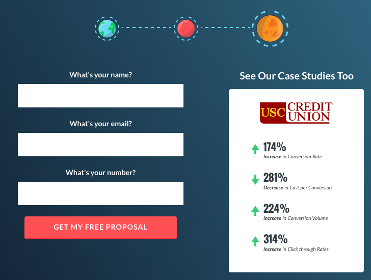
Psychology Concept #8: Gradual Commitment
A small commitment can be used to propel your visitors toward making increasingly larger commitments.
Robert Cialdini’s thoughts on commitment and consistency:
“People commit, orally or in writing, to an idea or goal, they are more likely to honor that commitment because of establishing that idea or goal as being congruent with their self-image.”
How do you get people to make small commitments on your landing pages? Add more fields to your forms and use multi-step forms.
Make the easiest no-brainer low-threat fields the first on your form. The commitment should grow from there.
Here’s our version of a multi-step landing page:
Psychology Concept #9: Explain “Why” First
Before you go into the “what” and “how” of your offer, explain the “why.” Think of it as a need to know basis, where only people who are relevant and can benefit from knowing something are the ones clued in.
If it’s not immediately relevant to your visitor, you run the risk of them ditching your page.
Basecamp tells you why it’s time to try “the Basecamp way” before explaining anything else:
Psychology Concept #10: Sobering-Up Effect
The sobering-up effect is the moment riiight before your visitors convert (or change their minds). It’s that moment your visitors think they’re done weighing their options and are about to click your CTA or make a purchase...
Then the reality of giving something up (aka the cost) hits them. They ask themselves again -- how badly do I need this?
Marketing psychology can counter this effect by making sure the area around your CTA is free of any conversion friction, which can reinforce your visitors’ decision to move forward with your offer.
Here are four CTA design tips (and a couple of examples):
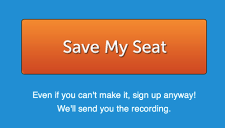
1. Avoid Inviting Negative Thinking
Refrain from using scary words near your CTA, like spam or sell your email address, even if you mean to do the opposite.
2. Sales Closers
Use sales closers - include supporting language near your CTA, like in this example:
3. Action Words & Directional Cues
Use action words and directional cues in your CTA. Avoid any sources of friction that can give your visitor a subliminal pushback at the end of their decision-making process.
4. Avoid Sign Up Forms
Sign up forms are an extra step that may discourage your visitors to continue on. This is especially true for e-commerce sites. Try to avoid making your visitors sign up for something just to make a purchase.
Marketing Psychology Topic #3: Motivation
Motivation is an internal process that makes us move toward a goal. Here are some concepts to consider that may trigger our visitor’s movement forward, toward that CTA conversion:
Psychology Concept #11: Problem Solving
Resolving an issue, finding a solution, and solving a problem all appeal to our natural desire to fix things. As kids, we take things apart so we can put them back together. We piece together puzzles for fun and to exercise the brain.
Tap into this natural inclination and solve a problem for your visitors. Show them how you’ll do all the work for them, and make this clear in your unique value proposition.
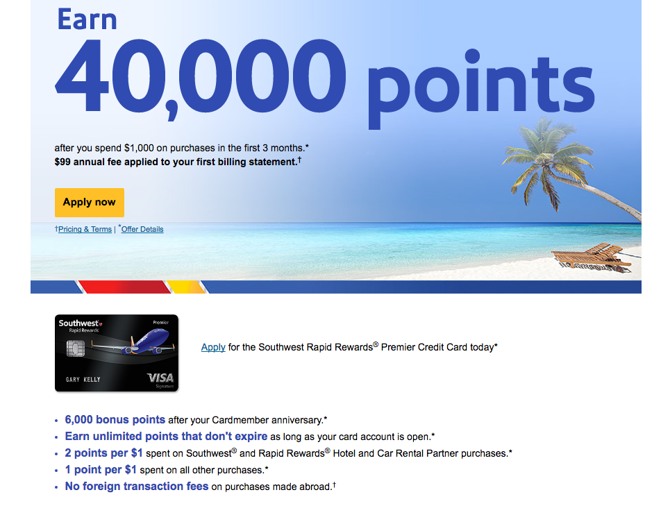
Psychology Concept #12: Price Point Savings
Savings and adding value to certain price points can help persuade someone’s decision making process.
Here’s an irresistible offer for someone looking to book a flight with Southwest. The visitor may have initially wanted a flight vs. a new credit card, but laid out in terms of savings and earnings for future flights, the offer suddenly seems like something the visitor needs.
Psychology Concept #13: Framing
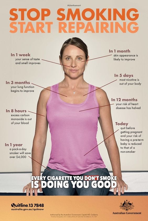
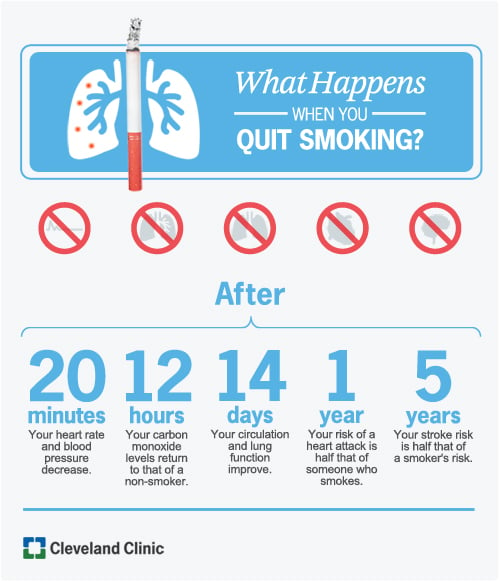
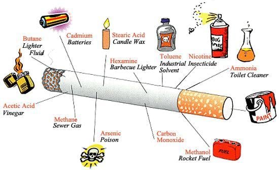
Framing effect is the way you present your information and the context you place it in. It’s a way to play into cognitive biases and spin perception, either in a positive or negative light.
There’s four main types of framing that you can use while creating content for your landing pages. I’ve included examples in the context of quitting smoking:
1. Loss framing: appeal to your visitor’s fears. This is where you show your visitors what would happen if they didn’t use your offer.

2. Gain framing: show your visitors how their life will improve with your offer.
3. Statistical framing: use stats to trigger desired emotions.
4. Language framing: use your copy to encourage visitors to feel a certain sensation.
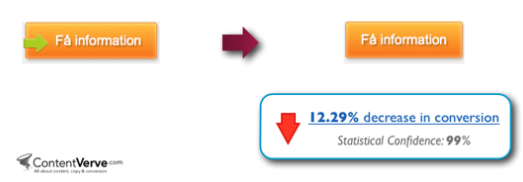
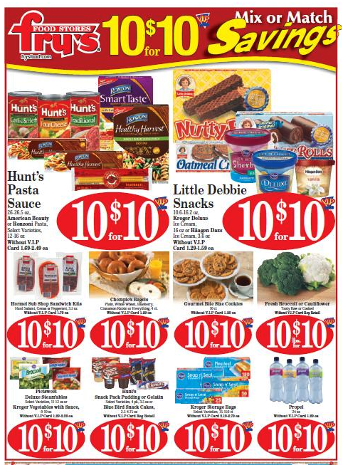
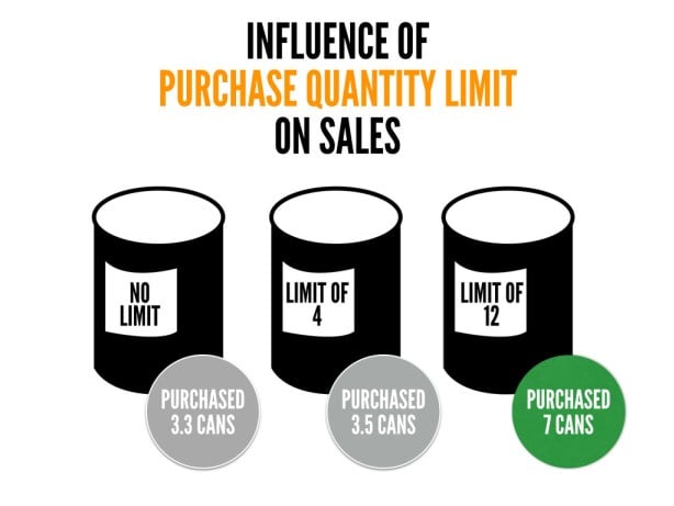
Psychology Concept #14: Anchoring
Anchoring is especially useful when listing prices. The “anchoring heuristic” is basically a mental rule of thumb that your brain uses to simplify complex problems to make decisions.
You typically see anchoring used in one of three ways:
1. Multiple unit pricing: The easier the math, the better. Here’s an example where “10 for $10” is more effective than “$1 each”:
2. Purchase limit quantity pricing: The limits on sale items at the grocery store are an example of this pricing mehtod.
3. Initial price setting: The sticker price at the car dealership, for example, immediately becomes your starting point for negotiating. You see that number as soon as you set foot on the lot.

Psychology Concept #15: Priming
Priming is an implicit memory effect where exposure to one stimulus influences your response to a later stimulus. It’s where your memory associates one thing with another.
A study tracking music and wine purchases at a grocery store illustrates this beautiffuly. Researchers played both French and German background music for shoppers on different days. The days that French music was playing, more French wine was sold, and vice versa.
How do you apply this to your landing pages? Try to link memory associations for your visitors. Here’s two examples of priming in action (well, one of them successfully primes, the other fails):
Marketing Psychology Topic #4: Control
The main reason to dig into marketing psychology is to understand what goes through your visitors' heads, so you can help guide their decision-making process.
Grasping elements of our natural inclination to control should help you better persuade on your landing pages.
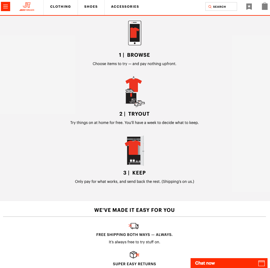
Psychology Concept #16: Try Before You Buy
Since most your visitors will not be ready to convert upon arrival at your site, it’s important to give them non-threatening options so they don’t feel pushed to take action.
Try Before You Buy is a way to reach your visitors by allowing your offer to speak for itself.
Warby Parker does a great job of relieving anxiety by offering a Try Before You Buy option with their Home Try-On option.

Here’s another example by Jack Threads:
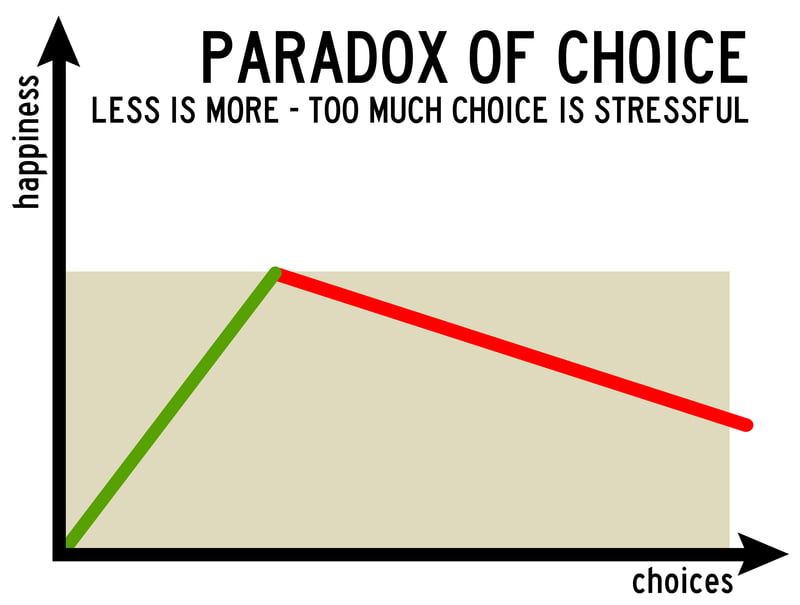
Psychology Concept #17: Evaluating Alternatives
According to Boundless:
“During the evaluation of alternatives stage, the consumer evaluates all the products available on a scale of particular attributes.”
This happens in the third stage of the consumer decision process (after identify decision and gather relevant info stages).
You can use this to your advantage by speeding up the evaluating process and giving people fewer alternatives. The fewer the options, the easier the decision-making process.
You can also avoid the paradox of choice by offering fewer options.
Psychology Concept #18: Cognitive Biases
There are several biases that affect our decision making. Mental Floss cites 20 that can screw up our decision-making.
In addition to Anchoring (psychology concept #17) and Availability Heuristic (more on that later), check out the other 18 biases:
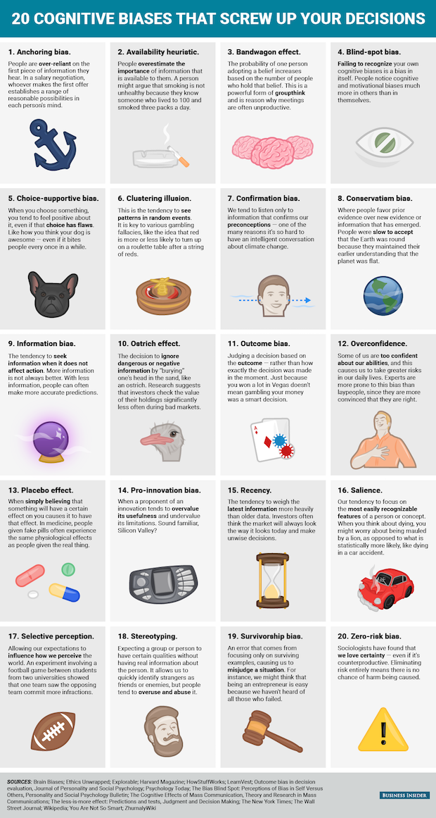
When designing your landing pages, just be aware that your visitors are susceptible to all of these biases, which could detract them from your CTA and landing page goal.
To help avoid these biases, make all the elements of your page exceptionally clear and focused on a single goal.
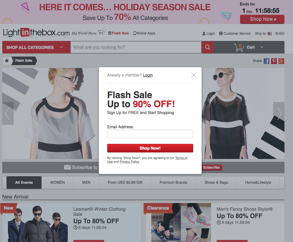
Psychology Concept #19: Loss Aversion
First successfully demonstrated by Amos Tversky and Daniel Kahneman, loss aversion is when people strongly prefer to avoid a loss than acquire something new. Some studies show that losses are sometimes twice as psychologically powerful as gains.
So how does this apply to landing page psychology? It allows you to tap into the Fear Of Missing Out (FOMO).
Here’s how Light In The Box creates FOMO with a limited-time flash sale:
Psychology Concept #20: Urgency
Similar to loss aversion, urgency also triggers FOMO. This one’s more time-oriented. A solid way to conquer urgency is through limited time offerings, or an obvious countdown.
Psychology Concept #21: Scarcity
When there’s hardly anything left of something, people naturally want it more. In a nutshell, the thought that fuels scarcity is that the offer must’ve been so good everyone wanted in on it.
Expedia taps into scarcity-based FOMO by showing the number of flights left:
Marketing Psychology Topic #5: Stimulation
To keep your visitors’ attention focused on your landing pages, and better yet, your CTA, keep them stimulated.
There’s a number of psychology concepts that we can work into our landing page designs to that end.
The ancient Greek philosopher Epicurus spearheaded a whole wave of philosophy based on pleasure psychology. Naturally dubbed Epicureanism, the purpose of the philosophy was to attain the happy life, free of pain.
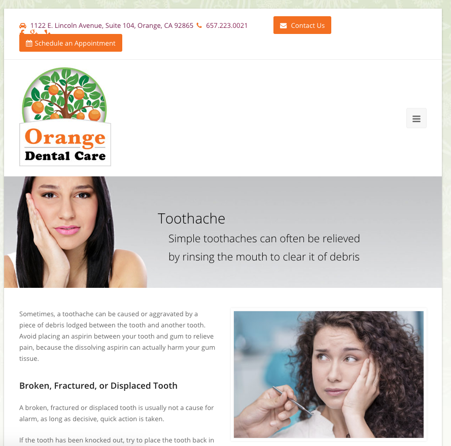
Psychology Concept #22: Feeling Pain
The psychology of avoiding pain goes back to the philosophy of Epicureanism. People have a basic desire and need to avoid feeling pain, so speak to this on your landing pages.
What do your visitors want to avoid? Evoke that pain, and then be the hero with the solution to save your visitors from it.
Here’s an example of Orange Dental Care’s website showing pain:
Psychology Concept #23: Feeling Pleasure
Epicurus found that pleasure and pain are measures of good and evil, or life and death, which means people tend to make choices based on what makes them happy.
Therefore, show happy people on your landing page, use happy words, and make this messaging very clear.
Here’s how 1-800-Dentist shows pleasure:

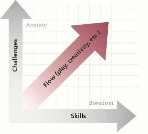
Psychology Concept #24: Cognitive Flow
People also feel happy when they have a clear understanding of what’s going on, so aim for a clear cognitive flow on your landing pages.
Game-makers, for example, spend a lot of time crafting a pathway that flows equally between challenges and skills. Your landing page should be thought out in a similar manner.
Psychology Concept #25: Create Curiosity with Stimulation
According to Changing Minds, you can use Stimulation and Partiality principles to create curiosity.
In addition to Epicurus’ pleasure and pain concepts, you can accomplish stimulation on your landing pages using:
- Novelty - include something new with buzz that makes us want to learn more
- Losing out (more on Loss Aversion later)
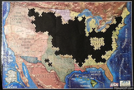
- Puzzles - use puzzles and mystery to make people want to finish exploring and solve problems
- Words (more on Copy and Tone later)
Psychology Concept #26: Create Curiosity with Partiality
Changing Minds describes the Partiality principle as one of two ways to create curiosity:
“Curiosity comes from partial knowledge which promises benefit. Telling them everything satisfies curiosity. To get them going, give them a taste, not the whole meal.”
Changing Minds suggests using Partiality in four different ways:
- Hinting: Spark interest by dropping a hint and nudge people to want know more
- Promising Benefits: If your benefits are communicated properly, your visitors will be curious about learning more
- Partial Images: When you see a part of something, you naturally want to see the rest of it
- Slow Reveal: Create anticipation to see whether or not our predictions are right
Psychology Concept #27: Reciprocity
Reciprocity satisfies the sense of reward and good karma that people crave.
It’s a natural human instinct to want to return a favor. So why not proactively offer your visitor something free and useful on your landing page? This will help you earn their reciprocity (aka conversion) later.
Trulia offers a free interactive mortgage calculator on their site. Visitors in the market for buying a home can use this free feature time and time again:
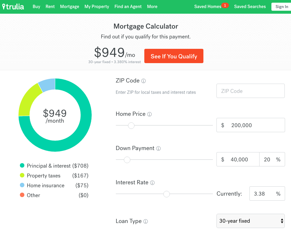
If you made a bunch of useful mortgage calculations for free, wouldn’t you think of Trulia first when you were ready to buy?
Psychology Concept #28: Visual and Auditory Connectivity
This connectivity principle has to do with appealing to more of your audience’s senses to capture their attention. To connect the visual and auditory senses, use GIFs, animations, and videos. If sound will help tell your story, even better.
Here are three reasons, according to Unbounce, that videos can increase landing page conversions:
- Videos increase the length of time people stay on your page, giving your brand message longer to sink in.
- If you feature yourself or company employees in the video, the trust factor is raised significantly.
- People are lazy and would rather watch something than read.
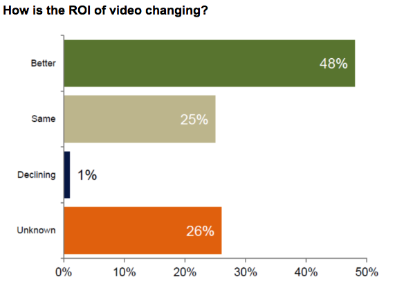
Also, 71% of respondents to a MarketingLand survey said that video conversion rates outperform other marketing content.
This is how the respondents viewed the impact of video on ROI:
Marketing Psychology Topic #6: Socialization
There’s something about the Bandwagon Effect that makes people want to follow the masses. This mentality can be summed up as ”If everyone is doing it, I should be doing it too.”
With that in mind, consider Robert Cialdini‘s quote about the Liking Principle:
“People are easily persuaded by other people that they like.”
Sometimes the thing that everyone’s doing doesn’t even have to make logical sense. (Are most of us just sheeple?)
Regardless of the sheeple issue, socialization can build trust and credibility on your landing page.
Psychology Concept #29: Social Influence
Another way to use marketing psychology to persuade buyer behavior is to use social proof so people feel like other credible people, just like them, have benefited from your offer.
This refers to all types of social proof: ratings, reviews, social shares, number of other users, logos of other users, media badges, testimonials, subscriber counts, social connections, test results, etc.
The key is to make your social proof appear realistic, so your visitors can identify with other users.
Here’s how 1-800-Dentist does it:

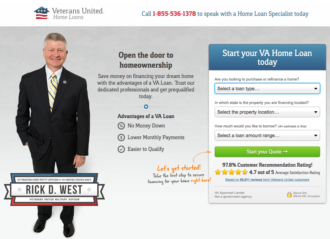
Psychology Concept #30: Power of Authority
Look for those valuable micro-influencers in your industry. These influencers are seen as trusted sources and have more effect on buyer behavior than a paid celebrity or ad.
According to one survey, micro-influencers had up to 22.2 times more conversations each week about recommendations on what to buy vs. an average consumer.
But influencers aren't just generating conversations, they're impacting conversions too:
“82% of consumers surveyed said they were highly likely to follow a recommendation made by a micro-influencer.”
What does this mean for you? For starters, don’t pay Kim Kardashian $1M to endorse your landing page offer.

Instead, feature micro-influencers and successful smaller-scale companies and awards that your users can relate to. Here’s how Veterans United does it:
Psychology Concept #31: Availability Heuristic
Very Well defines the availability heuristic as “a mental shortcut that relies on immediate examples that come to mind.”
As Kendra Cherry explains in more detail:
“When you are trying to make a decision, a number of related events or situations might immediately spring to the forefront of your thoughts. As a result, you might judge that those events are more frequent and possible than others.”
Applied to your landing page, this can mean including real-life examples, case studies, relatable statistics, testimonials, and real people that have benefited from your offer.
A real-world example can act as immediately available proof of your offer, knocking out any other examples your visitors might associate with your offer.
Psychology Concept #32: Commitment
People are more likely to be loyal to your company if they feel they are involved and part of the community.
When your visitors commit to engaging and providing input, you can build an authentic, loyalty-based relationship.
How can you do this on a landing page? Ask for feedback. Ask for opinions. Find out what your visitor’s pain points and needs are, or engage them with a free useful tool, like an interactive calculator.
Marketing Psychology Topic #7: Design
I know what you’re thinking -- everything we’ve talked about so far has to do with landing page design, right?
So how could there be another section just for that?
Well, these last few concepts look at specific design tweaks that you can make to push users a little bit further toward conversion -- or even all the way over the edge.
Psychology Concept #33: Primacy Effect
Our brains are hardwired to remember the first few things we ingest versus the things we encounter later.
Why? Perhaps our cognitive load runs out of space, or we get bored.
In any case, this means that if you’re making a list on your landing page, put the most important content at the top, the second most important at the bottom of the list, and the least important stuff in the middle.
Psychology Concept #34: Von Restorff Effect
The Von Restorff Effect is the idea that people are also most likely to remember things that stand out from the rest, like this:

Try to create contrast and isolate things on your landing page that you want to draw attention to.
Psychology Concept #35: Deictic Gaze
Deictic Gaze, which is also known as joint visual attention, explains why people instinctively look to where their attention is drawn. Here’s what I mean:
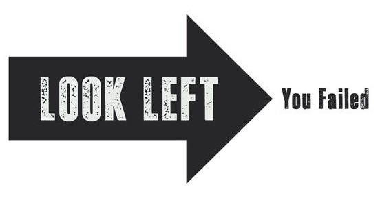
Here’s another example from Fetch Rate:
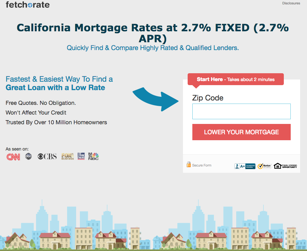
Take advantage of the herd mentality by using directional cues in your landing page design for that extra oomph in converting.
Psychology Concept #36: White Space
White space can organize your landing page content cleanly and emphasize your CTA by making it a visual focal point.
HubSpot calls the white space around your CTA “breathing space” that “produces a calming effect, allowing your CTA to stand out from the rest of your design.”
Finally, as Oli Gardner said:
“The reason we say blank space is because the color of the space isn’t important. The purpose is to use simple spatial positioning to allow your call-to-action to stand out from its surroundings and give your eye only one thing to focus on.”
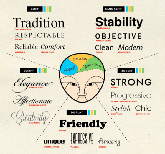
Psychology Concept #37: Typography
The typefaces you choose for your landing page send subliminial messages. It’s your job to make sure that the emotion your fonts produce aligns with the content and overall "vibe" you’re trying to create.
Here’s a quick summary of five typography categories:
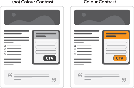
Psychology Concept #38: Color and Contrast
Contrast helps to make your important info, like your CTA, stand out. Draw your visitors’ attention toward your CTA by saving a specific color for your CTA and offer headline.
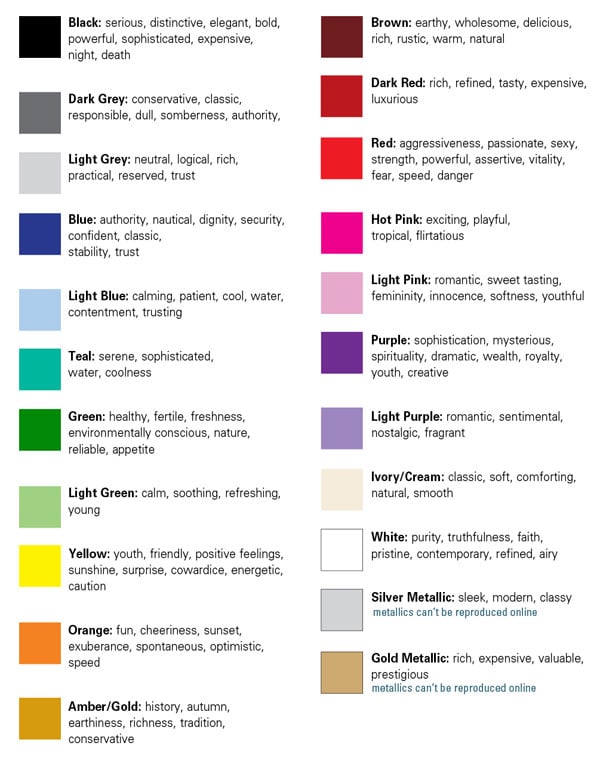
Which color should that be? There are lots of charts and descriptions out there that explain which emotions are evoked by each color.
Here’s a simple version:
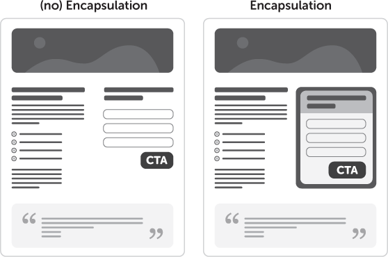
Psychology Concept #39: Encapsulation
Encapsulation, or using a container to frame and highlight content, helps with contrast, white space, and increasing the Von Restorff Effect.
Psychology Concept #40: Formatting
Formatting is a big deal when it comes to ingesting your landing page info.
If you categorize your content into clean and organized buckets of info for your visitors, they’re more likely to latch onto your CTA messaging easily.
Format your info with simplicity in mind.
You can follow Oli Gardner’s five Information of Hierarchy questions to lay out copy on your landing pages:
- What is the pain or problem your customer feels?
- What’s the solution?
- How does it work?
- Who does it for you?
- Who says it’s good?
Design-wise, keep the White Space and Encapsulation principles in mind, and make sure your landing page is easy to read.
Psychology Concept #41: Imagery
As mentioned in the storytelling topic (psychology concept #3), there’s a lot you can do with imagery to tap into your visitor’s subconscious. Use your hero shot strategically to help your visitors move through your decision funnel.
Here are some imagery ideas and options for you to test:
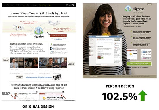
Show happy people using your offer. In this example, Highrise redesigned their landing page to include imagery of a happy user:
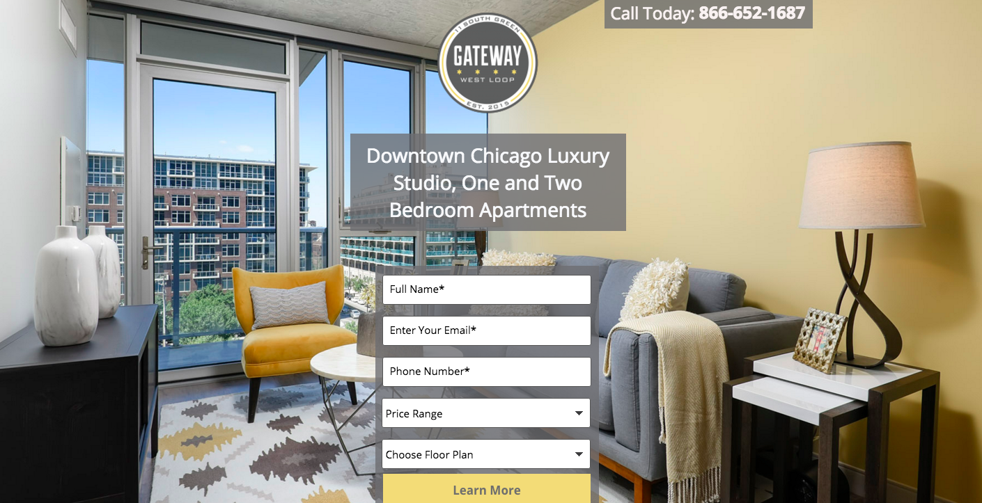
Use a visual that makes your audience feel like they’re actually there. Gateway West Loop features image shots directly from their apartment living rooms.
Pro Tip: If you want to go deeper into landing page imagery, check out Nicole Dieker's 41 hero shot secrets.
Closing Thoughts
If we could unlock all the secrets to the brain's operations and apply them to our landing pages, cracking the conversion rate code would be like:

Like most good things, however, slow and steady does the trick.
By incorporating these
marketing psychology concepts into your designs, you’ll tap into your visitors’ buyer behavior more easily, and urge them to convert more effectively.Let us know if you’re testing any of these tactics on your own landing pages in the comments below!


