


All startups, entrepreneurs, or agencies with startup clients have one thing in common: They need results and they need them yesterday.
In the spirit of entrepreneurship, let’s move fast, get to the point, and hopefully not break too many things.
You wanted the secret to high-converting startup landing pages with examples, so that’s what we’re going to give you in this article. The best of the best.
Get brand new landing page strategies straight to your inbox every week. 23,739 people already are!
What is a startup landing page?
A startup landing page is like any other landing page: a dedicated, standalone web page built for specific campaigns and target audiences.
However, for early-stage startups with limited budgets and resources, oftentimes a landing page doubles as their homepage too. After all, it’s much easier and faster to launch a landing page than it is to launch a website.
Startup landers come in two types:
- Lead capture page (lead generation): a landing page designed to generate leads using an embedded lead capture form. Once leads get generated, a sales rep will follow up.
- Click-through page: a landing page designed to warm an audience and entice them to click through to a conversion page, like a checkout page, account creation page, or download page. Unlike a lead capture page, a click-through page allows prospects to complete their conversion journey immediately (i.e. no need for sales to follow up).
Further reading: 31 Landing Page Best Practices Experts Never Ignore
The benefits of landing pages for startups
For many startups, their landing page functions as their proof of concept, as a way to validate their business model without spending money they don’t have on a website they might not even need.
With a landing page, startups can put their concept, MVP, or offer in front of target customers in literal hours for literal dollars (as opposed to other channels like, say, search engine optimization (SEO), that take a long time and cost a lot of money).
Just subscribe to a landing page builder, download a template, fill in the blanks with your messaging, and run a smoke test to determine whether or not there is sufficient customer demand to justify building a business.
For example, take Slack.
When then startup Slack first launched back in 2013, they only had a landing page:
Slack V1:
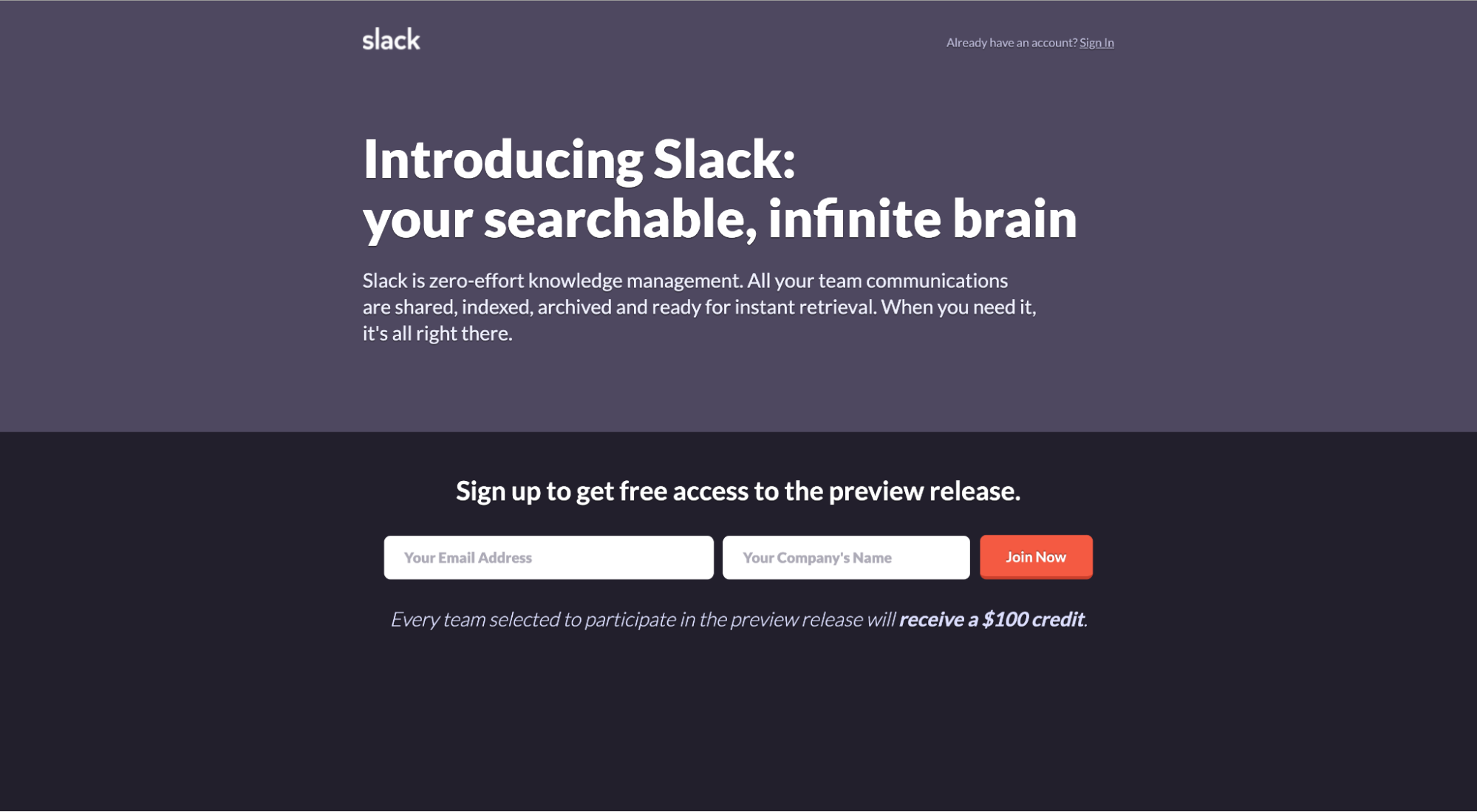
In the beginning, Slack wasn’t slack. They were Tiny Speck, a gaming company.
The SaaS product that would become Slack started as an internal communication app developed for their team by their team, but they never intended on selling it.
When they realized the product had potential, they decided to test the market.
Enter the landing page.
Without any paying customers, market validation, or the brand identity we’ve come to know today, Slack used its landing page to test its messaging, assess market demand, and recruit beta users.
Only after market validation did they spend money on a full-fledged website.
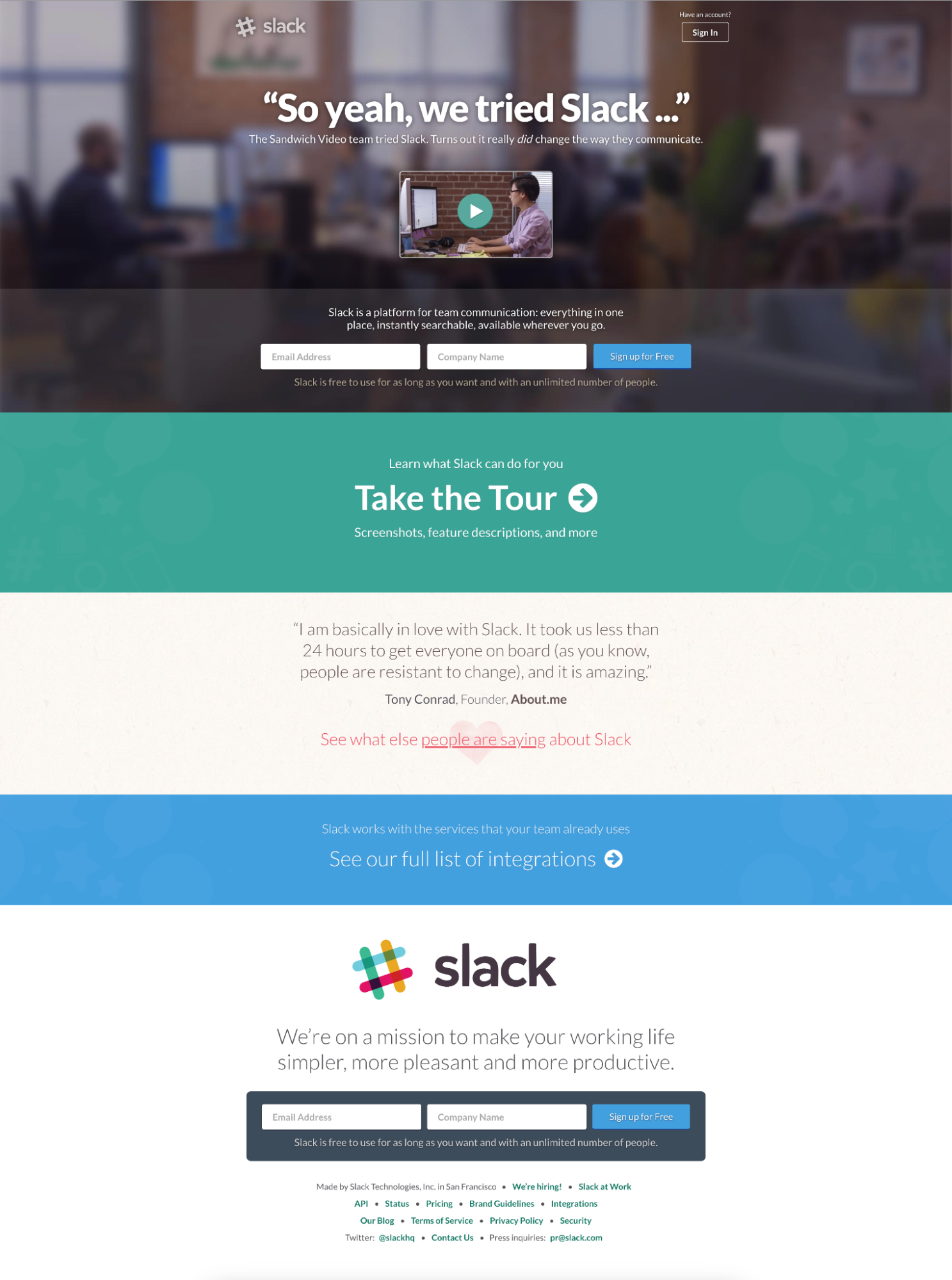
Slack V2:
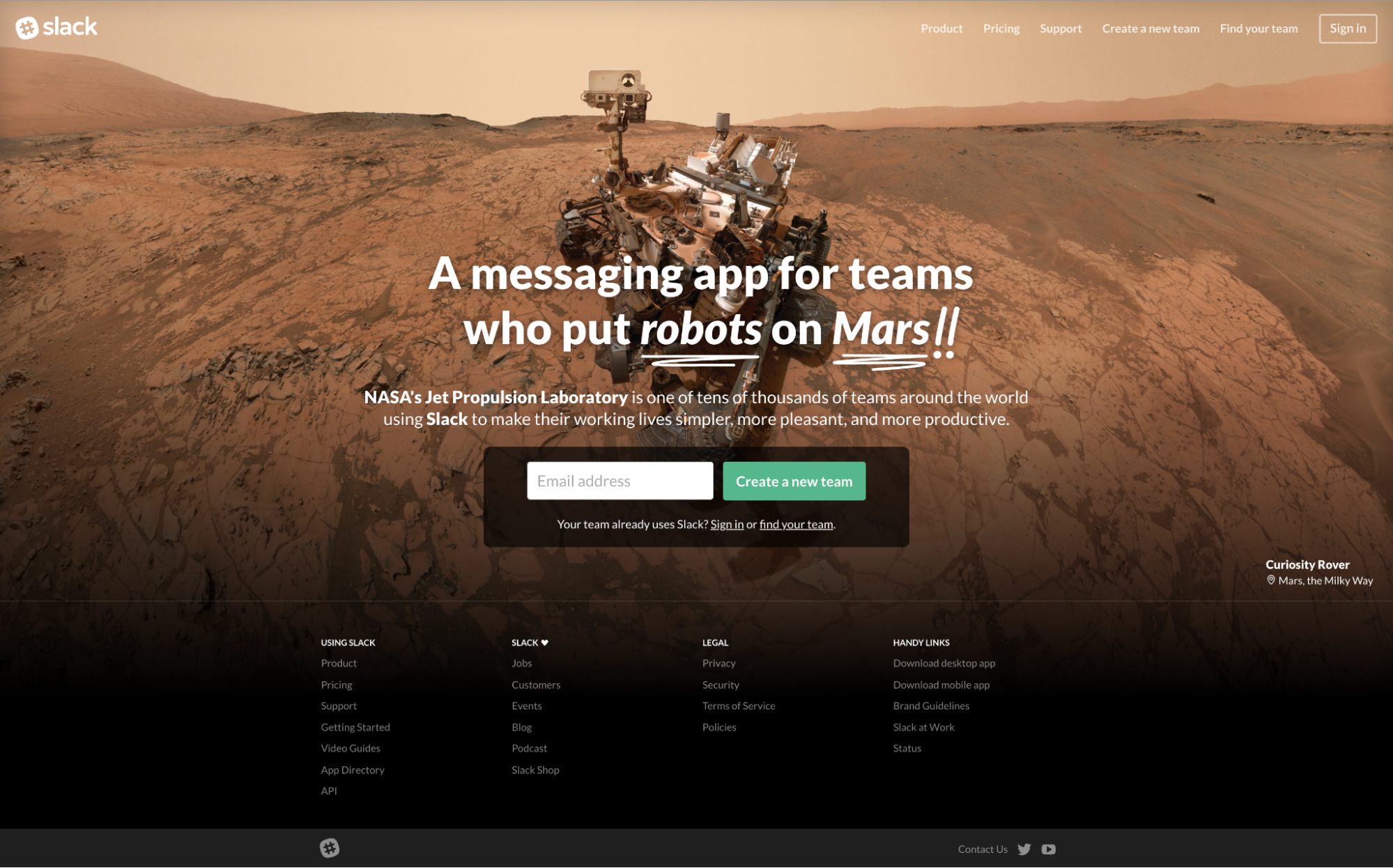
Slack V3:
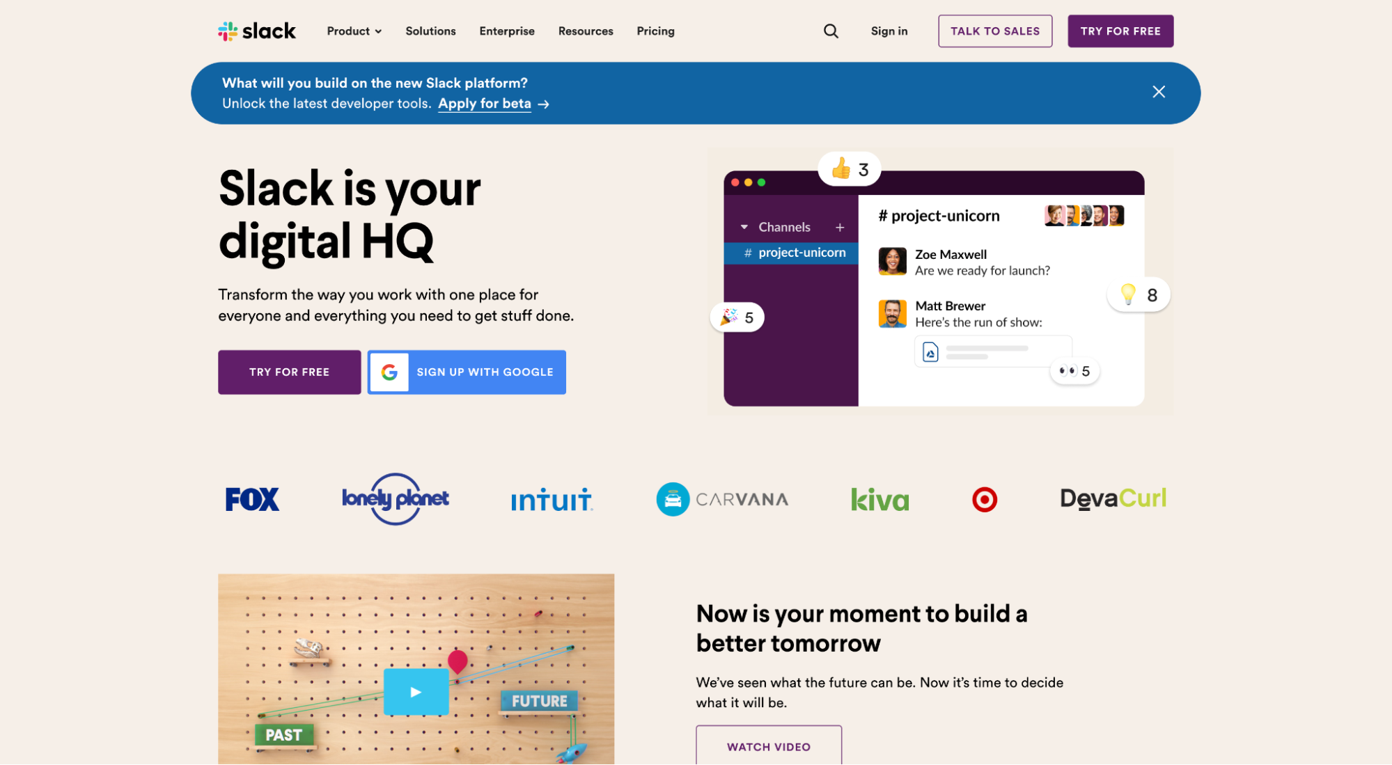
Slack V4: The Slack we know today
Bottom line: Landing pages offer the perfect lean launch platform for a lean startup.
Low-time investment. Low resource allocation. Low cost. Low risk.
With landing pages, a startup can validate its business model, generate demand, split test messaging and offers, and activate sales in a tightly controlled, low-cost ecosystem that doesn’t require developer skills, cash flow, or upfront capital.
How to build a startup landing page
No matter the industry, whether eCommerce, B2B, SaaS, or B2C every startup shares one thing in common: tight budgets.
Some have deeper pockets than others, but even still, finding low-cost solutions without sacrificing quality or effectiveness reigns supreme.
When it comes to building landing pages, no better solution exists for a startup than a landing page builder.
A page builder is a landing page tool made specifically for creating, publishing, and A/B testing landing pages with ease.
Good news: We wrote an entire article on landing page builders, so we won’t belabor the point here. Just know that without a landing page builder, deploying landing pages cost-effectively gets much harder. With a landing page builder, however, and your lean team (maybe even solopreneur or startup founder) can move fast and effectively deploy landing pages with little technical skills required.
Page builder benefits include:
- Landing page templates: Yup, choose from hundreds of free templates you can edit—no design skills needed
- A/B testing: Run effective split tests with zero technical background
- Drag-and-drop editor: Design and publish landing pages in literal hours (not weeks) even if you don’t have a developer
- Conversion tracking: Measure conversions to see which page performs best
- Integrations: Integrate your landers with your email marketing software, CRM, analytics, and conversion tools
- Customizable: Feel like getting advanced with HTML or CSS? No problem
- Friendly pricing: Get up and running for as low as $49/month
Anatomy of a high-converting startup landing page
Startup landing pages don’t need the best layouts, graphics, copy, or colors; they need “good enough” with the ability to move fast, test fast, and learn fast.
In other words, keep it simple. Don’t let perfection get in the way of cash flow.
Thanks to years of split testing landing pages, we’ve distilled landing page design down to 11-steps:
- Conversion intent: Make an offer people will actually convert on. E.g. Top of the funnel vs. bottom of the funnel visitors need different CTAs
- Single conversion goal: Your landing page offers a clear path to conversion. Just one, not many
- Message match: Ad copy, message, offer, and tone match landing page copy, message, offer, and tone
- Headline/subheadline: Your headline explains the value you’ll provide, the promise you’ll make; your subheadline introduces your product or service and explains how you’ll create value and deliver your promise
- Visuals: Images, graphics, and video make the invisible visible and provide context to your value proposition
- Features/benefits: Not just how you’ll do it, but why it matters
- Social proof: Shows that other people in the same situation chose you, and makes your offer believable
- Form: For lead gen startup pages, your form captures critical lead info so sales can follow up
- Call-to-action: Nudges prospects toward the next step in your conversion path
- 1:1 Attention ratio: Visitors get distracted easily. Limit the number of links on your landing page to as close as one as possible.
- Irresistible offer: Without an irresistible offer, nothing else matters. Make it matter.
Further reading: 39-Point Landing Page Checklist + Our always-updated guide to build and improve every aspect of your landing page
11 Startup landing page examples
Without further ado, let’s dive into the best 11 startup landing page examples.
Why 11? One example that best typifies each of the respective elements of a high-converting landing page mentioned above.
- Daily Harvest (Visuals)
- Intercom (Attention ratio)
- Roman (Irresistible offer)
- Mural (CTA)
- Airtable (Form)
- Divvy (Single conversion goal)
- Keeps (Message match)
- Jasper (Social proof)
- ClickUp (Features/benefits)
- Apostrophe (Headline/subheadline)
- Rubrik (Conversion intent)
Together, you’ll have practical and well-intentioned examples to inspire your own startup landers.
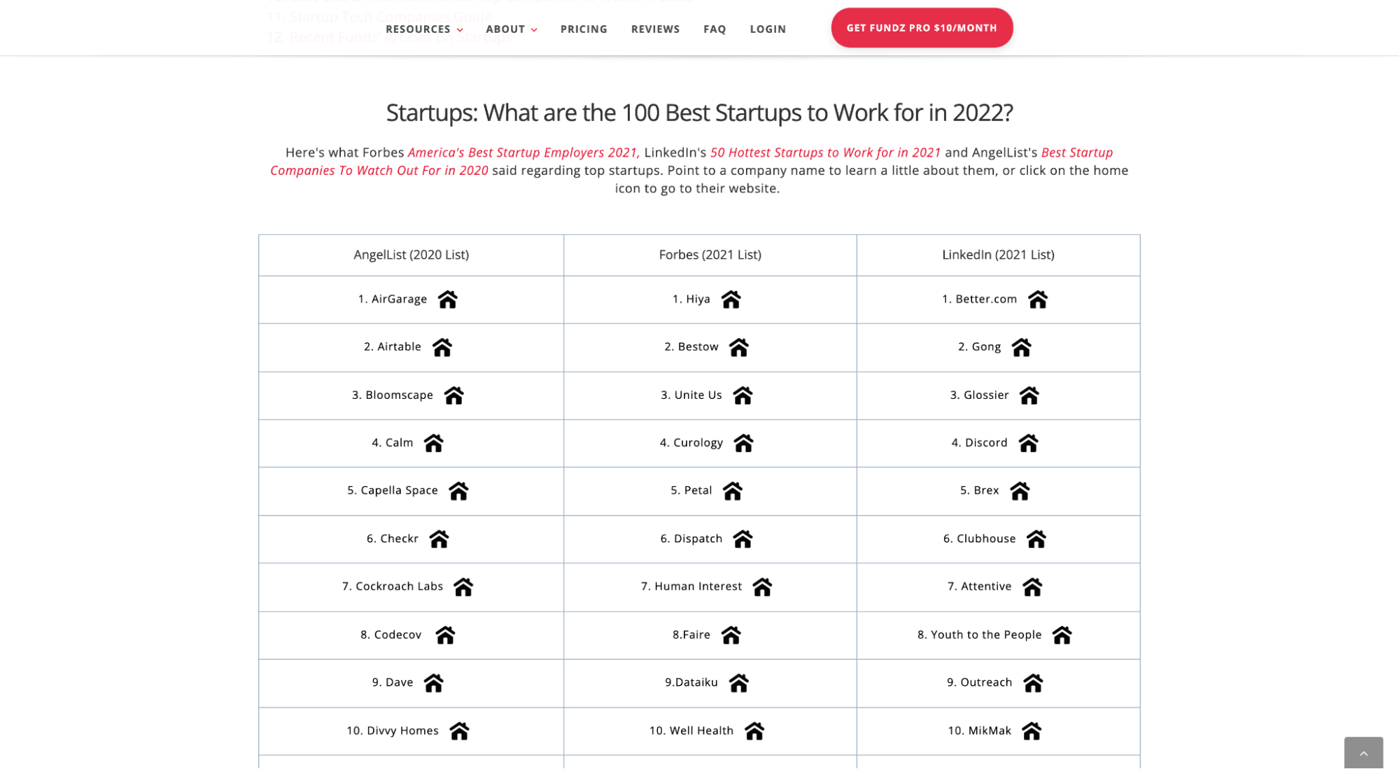
How did we choose startups? From Funz.net’s list of top startups to work for in 2022.
Last, we only chose examples from startup PPC ads (Google) that went to actual landing pages, not homepages or product pages.
Let’s jump in.
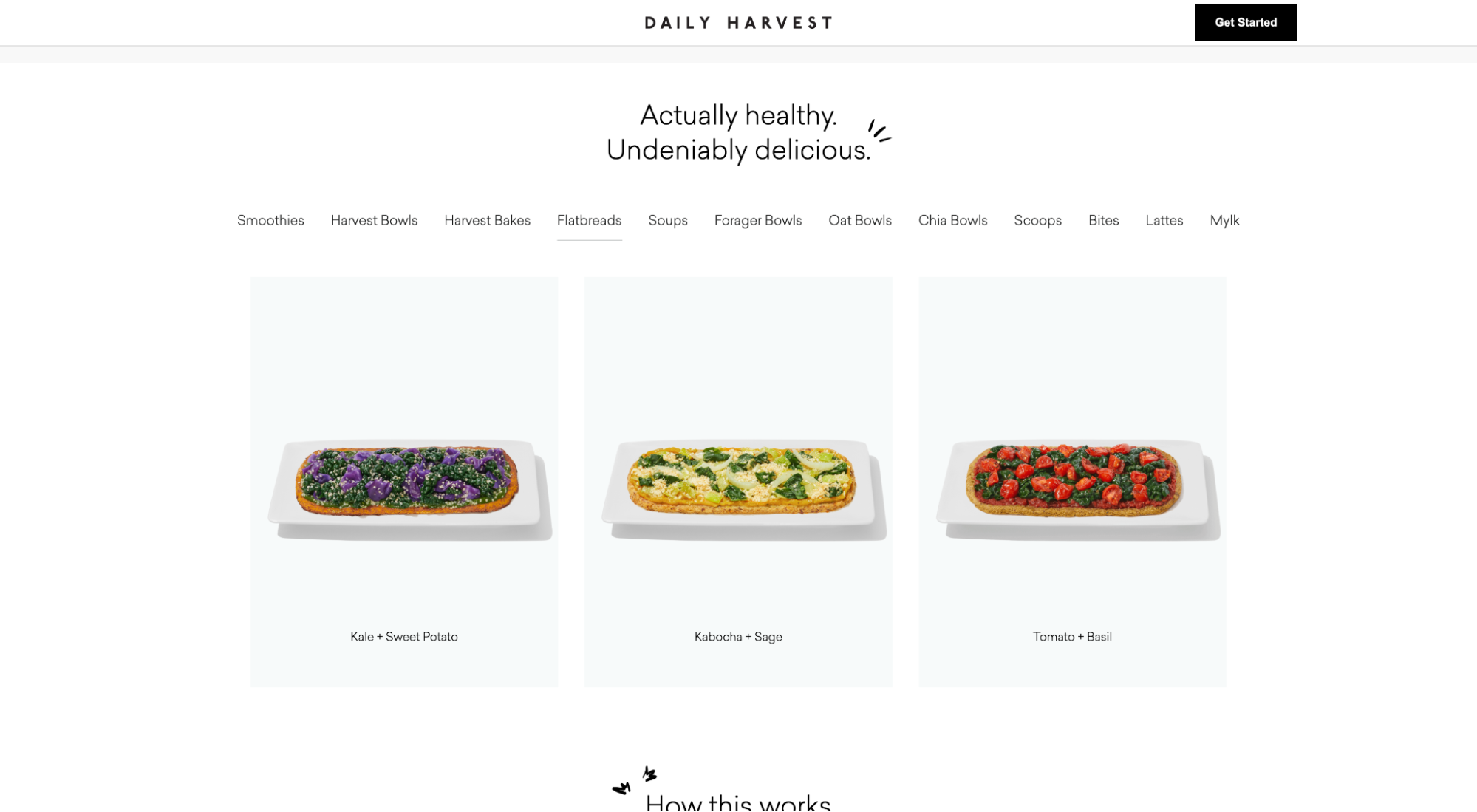
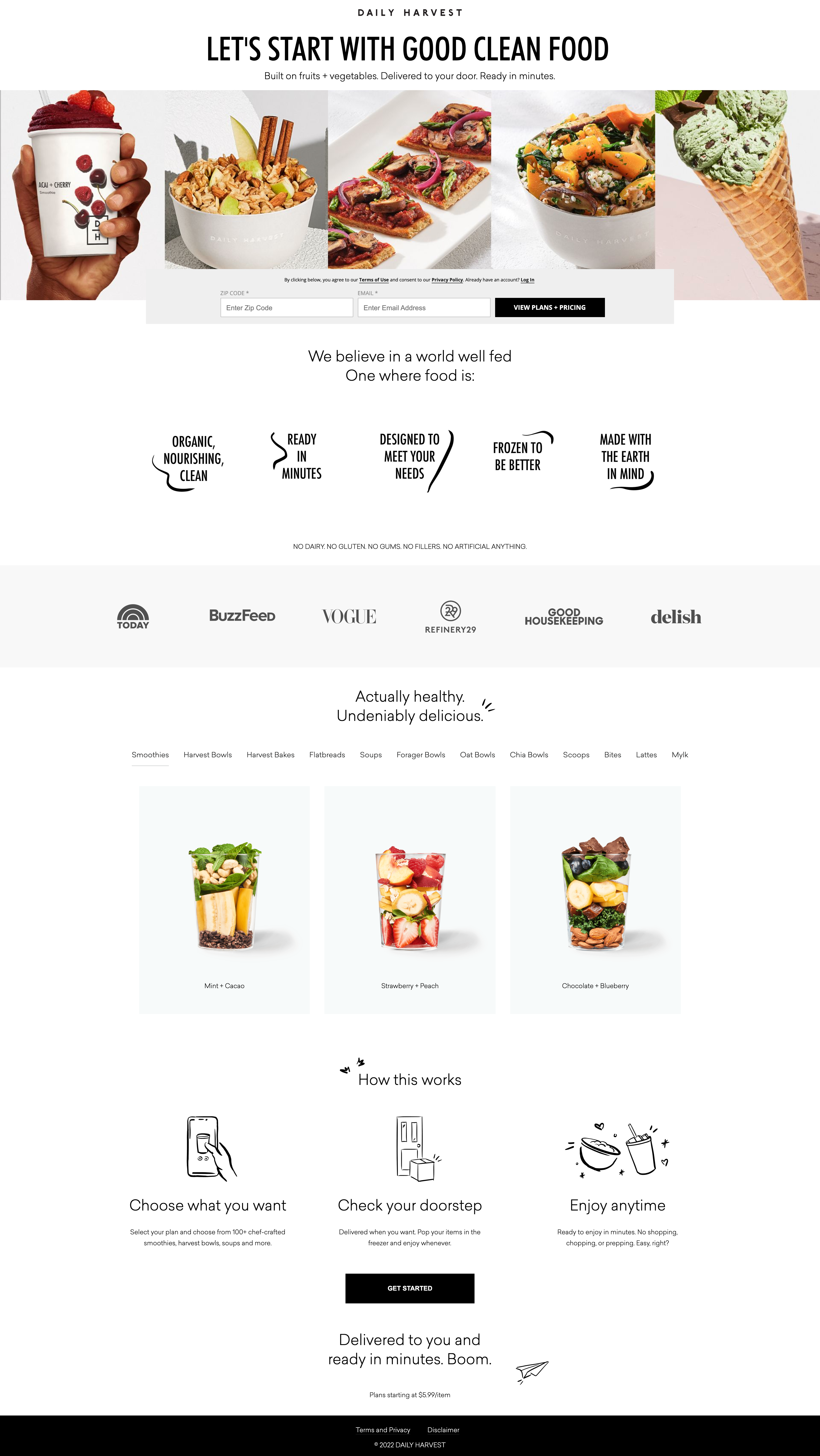
1. Daily Harvest
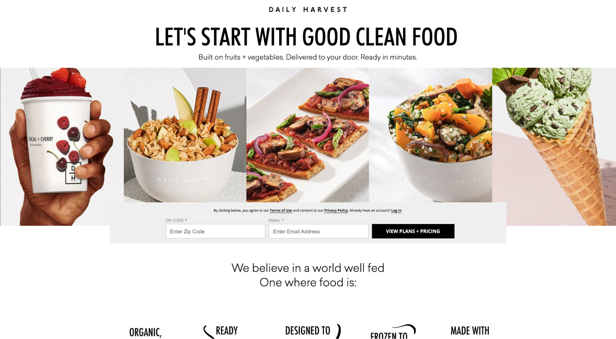
❤️ What we love: Visuals
People want to see your product or service in real life, not imagined as a graphic. Daily Harvest features mouthwatering photos of real-life meals you can purchase through their platform. No better way to sell your product than by showing it.
Further reading: Landing Page Hero Shots: Everything You Need To Know
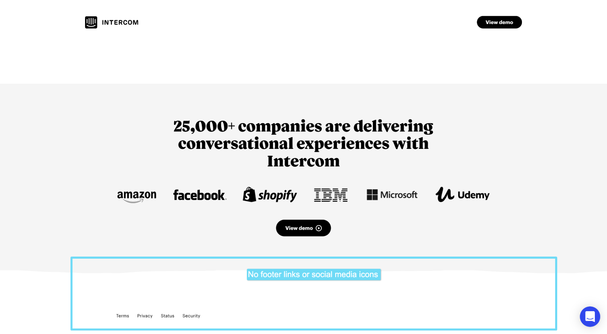
2. Intercom
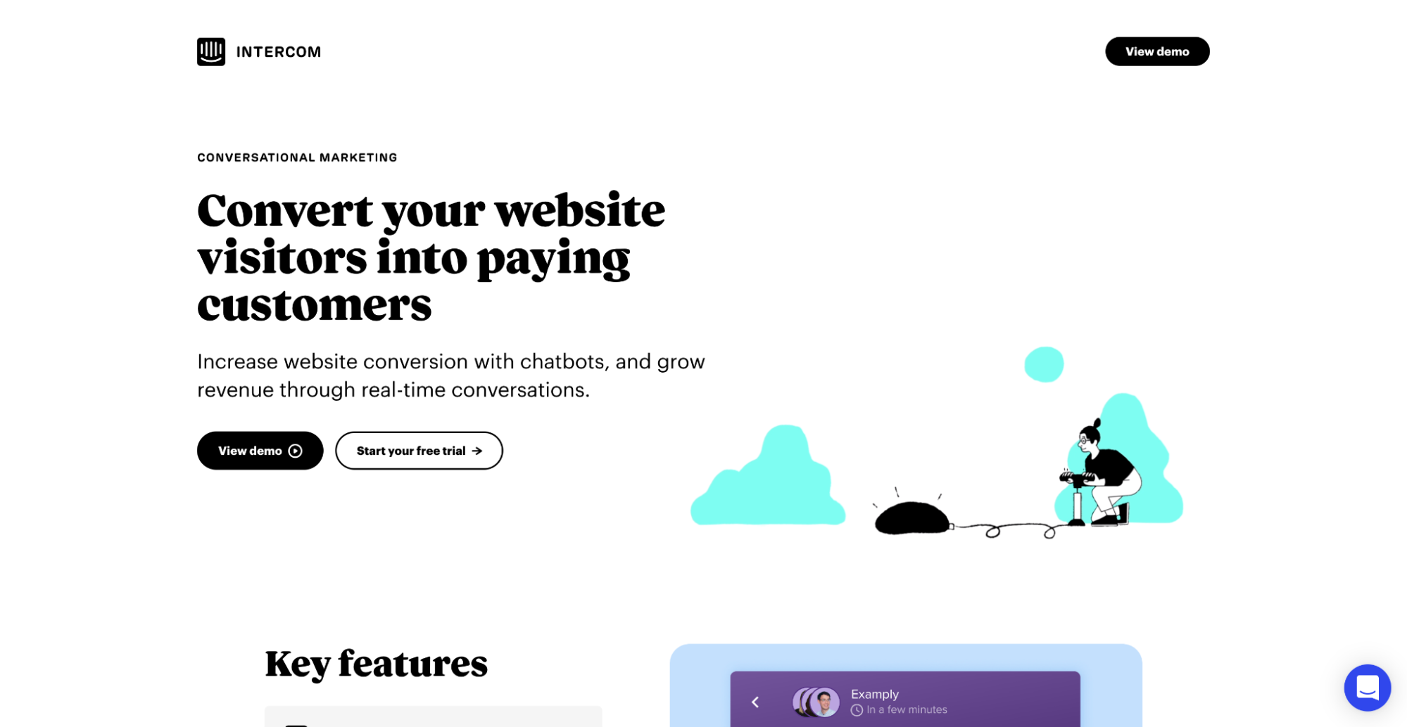
❤️ What we love: 1:1 Attention ratio
Attention ratio refers to the number of links on the landing page compared to the number of conversion goals. 1:1 means the landing page only features one conversion goal and one link (the CTA button link to complete said conversion goal).
That means no navigation links in the header, no social media profile links, and no footer links (with the exception of the privacy policy or terms and service links).
Intercom technically features two CTAs: “View demo” and “Start your free trial.” Though their primary CTA is “View demo.” Makes sense, considering this landing page targets brand queries (e.g. “Intercom chat”), and even if they determined a demo is the most common need at this stage, they still want to provide a path to purchase.
When it comes to links, keep them sparse. Ideally, your startup landing page should only include required legalese links in the footer, a link to your homepage via your logo (if applicable), and your CTA button link. That’s it. Any more links might divert audience attention away from completing your conversion goal. No bueno.

3. Roman
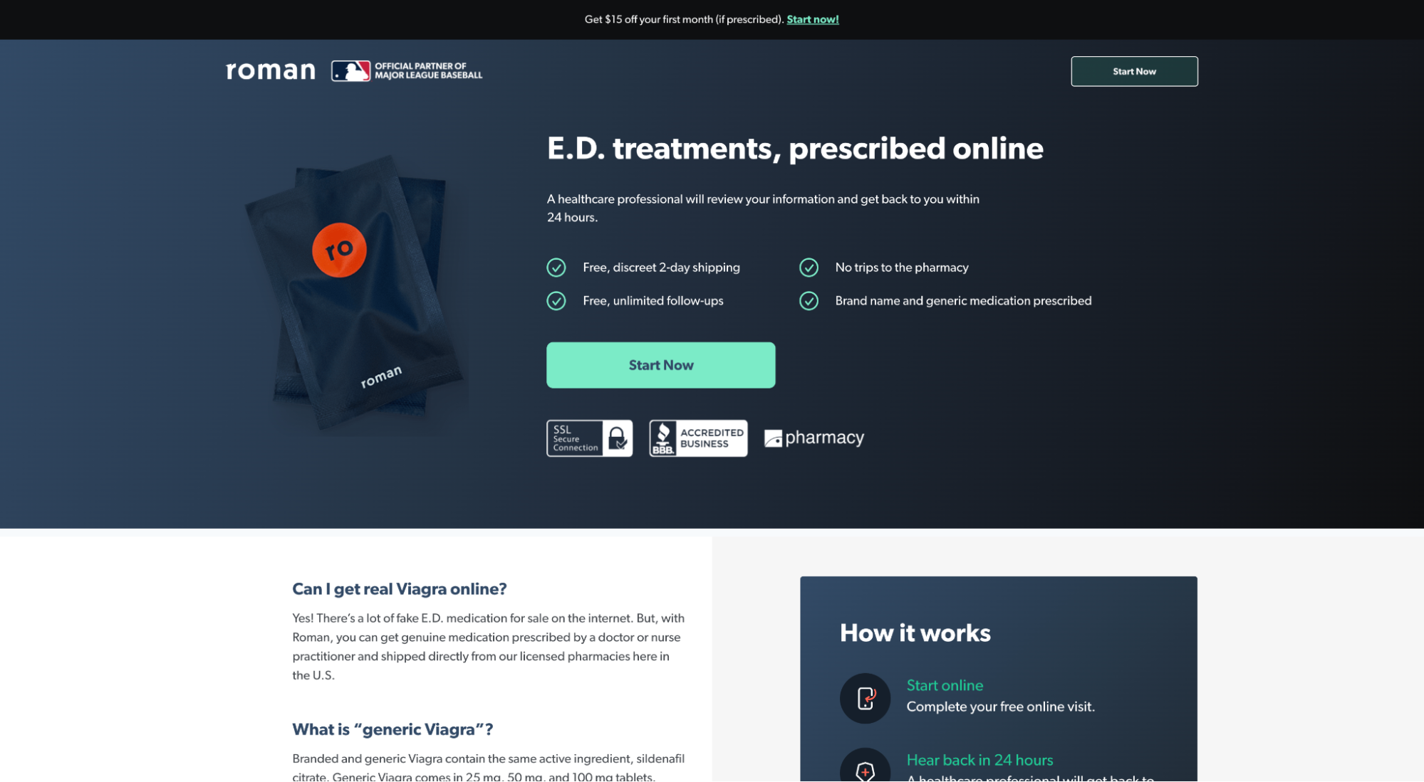
❤️ What we love: Irresistible offer
No, we’re not talking about the actual E.D. pills (though let’s get a collective high-five for easily prescribed, low-cost generic meds); we’re talking about how Roman successfully incentivizes their offer with a sense of urgency.
Conversions live and die with your offer.
Bad offers = bad conversion rates. Period.
Roman ups the ante on their offer by including free 2-day shipping (free shipping increases conversions), free, unlimited follow-ups (tempers anxiety), and $15 off the first month of treatment.
Strip those incentives away and all you get is “Start now.” Thanks but no thanks.
Further reading: 10 Lead Magnet Ideas For Conversion Domination
4. Mural
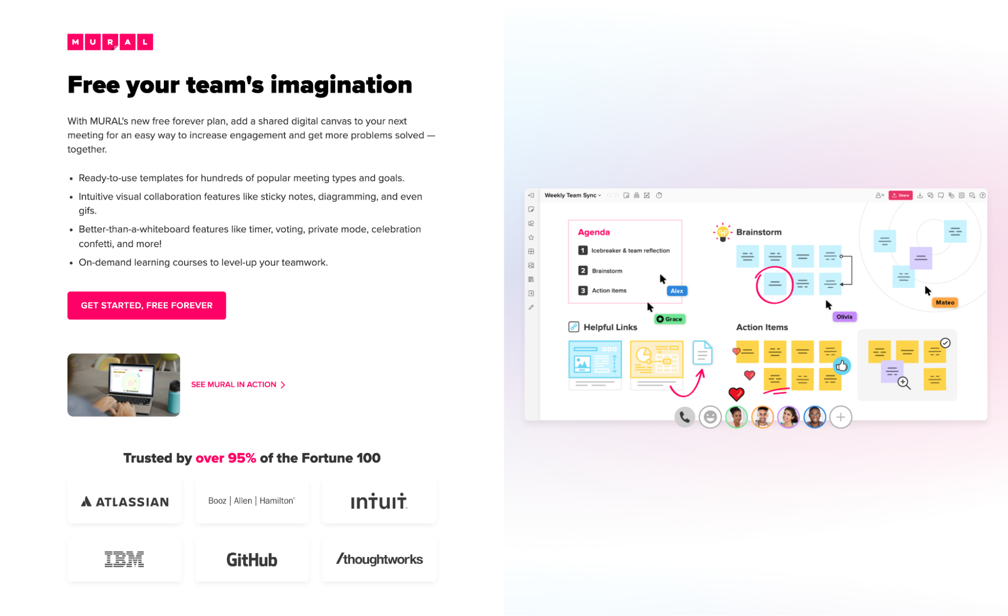
❤️ What we love: CTA
A good landing page CTA emphasizes the value and handles objections about your offer. And that’s exactly what Mural does by adding “Free forever” to their CTA copy. Instead of doing what most landing pages do and using “Get started,” Murad adds “Free forever” to emphasize value and handle the objection, “But how much will it cost?” Two words, big impact.
Further reading: Write Clickworthy Call-to-Action Copy in 8 Steps (20+ Examples)
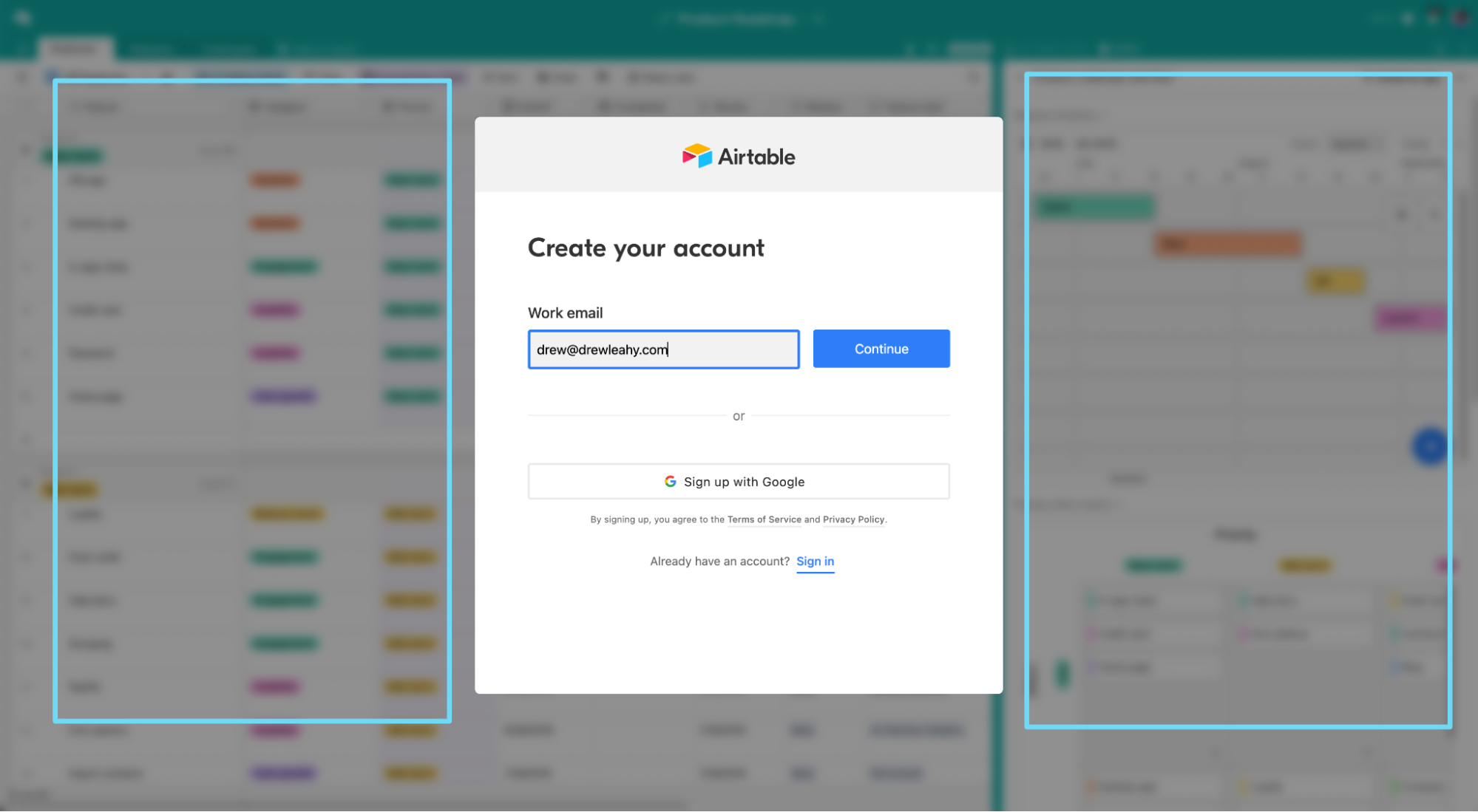
5. Airtable
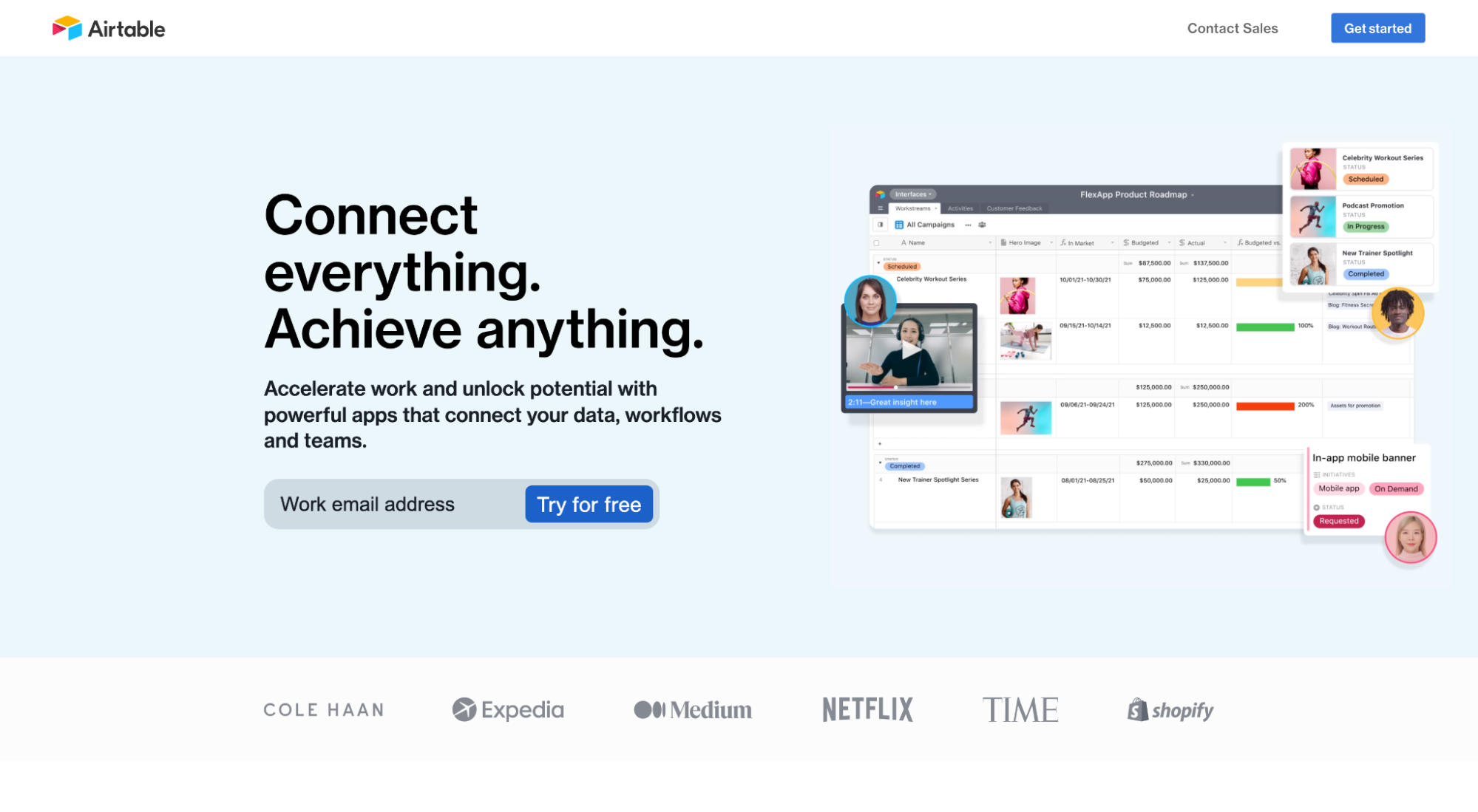
❤️ What we love: Form
Forms rank as one of the most tested landing page elements of all time.
Like, literally, more data exists exploring form layout, design and conversions than anything else.
When it comes to forms, always test them. That’s about all we can say definitively. Though most forms follow similar patterns (ie. most shorter forms convert higher than longer forms), it’s not always the case. For example, sometimes longer forms convert better than shorter forms.
Good news: We wrote an entire article exploring 17 key elements of high-converting landing page forms (along with data and examples).
But for now, let’s spotlight what Airtable does so well with its form.
The best landing page forms only include necessary fields and leave everything else out.
Like Airtable, who makes their free trial offer frictionless by only asking for an email address.
But the best forms also remember that potential customers are filled with uncertainty, even after they start filling out the form. So they provide something (usually social proof) within the form layout to temper anxiety.
Airtable does something unique: They provide a blurred-out view of their product dashboard below the form. How can you not commit to finishing the form after seeing it? Curiosity alone will compel you.
6. Divvy
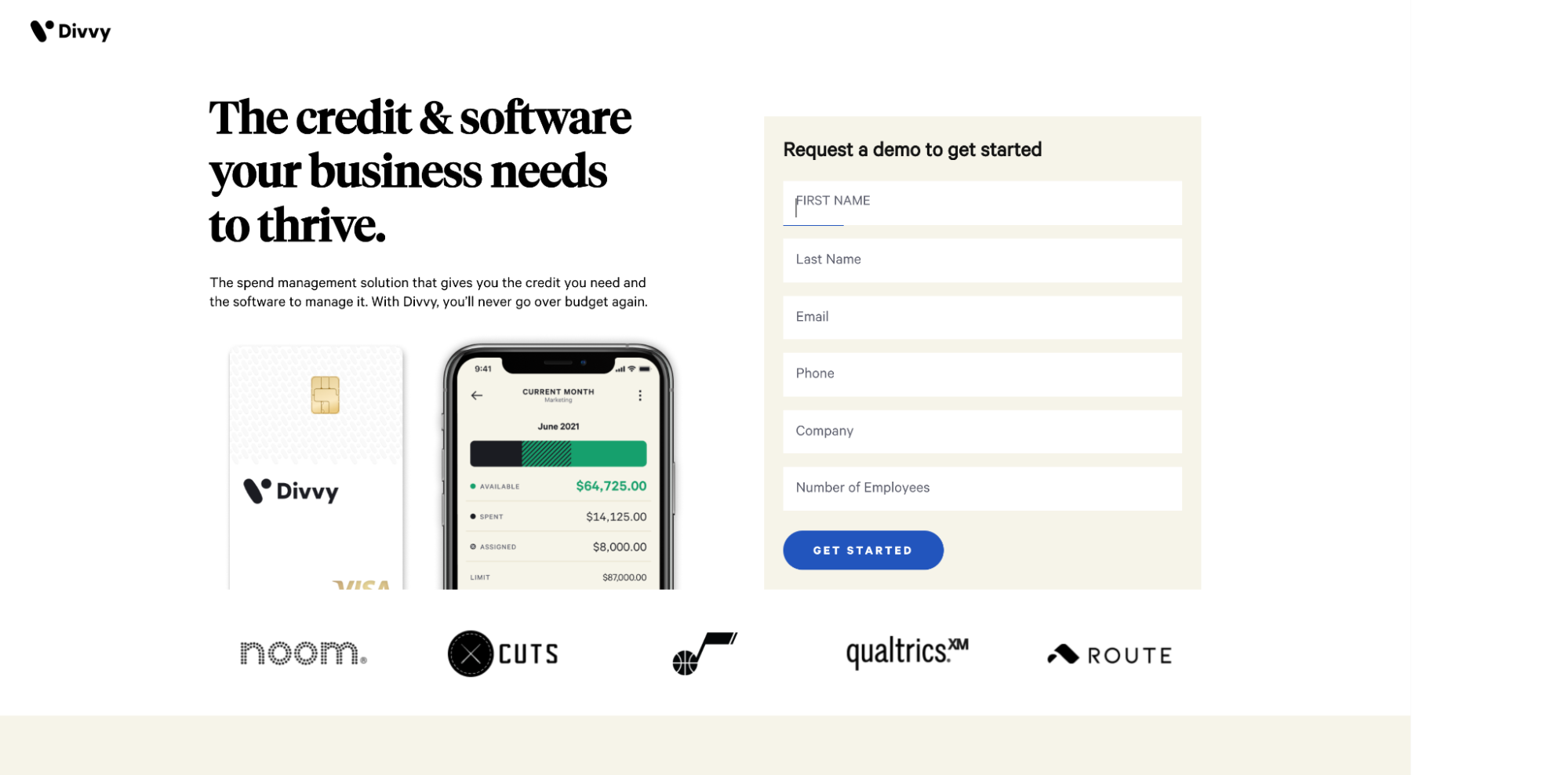
❤️ What we love: Single conversion goal
Thankfully, most marketers have grown privy to the idea that fewer conversion goals lead to more conversions. Because it’s true. Adding a second conversion goal can decrease conversions by 266%.
Divvy nails their single conversion goal. Not only do they stick to a 1:1 attention ratio by eliminating unnecessary navigation links and footer links, but they stay laser-focused on a single conversion goal and CTA: “Get started.” That’s it. Discipline wins when it comes to landing page conversions.
7. Keeps
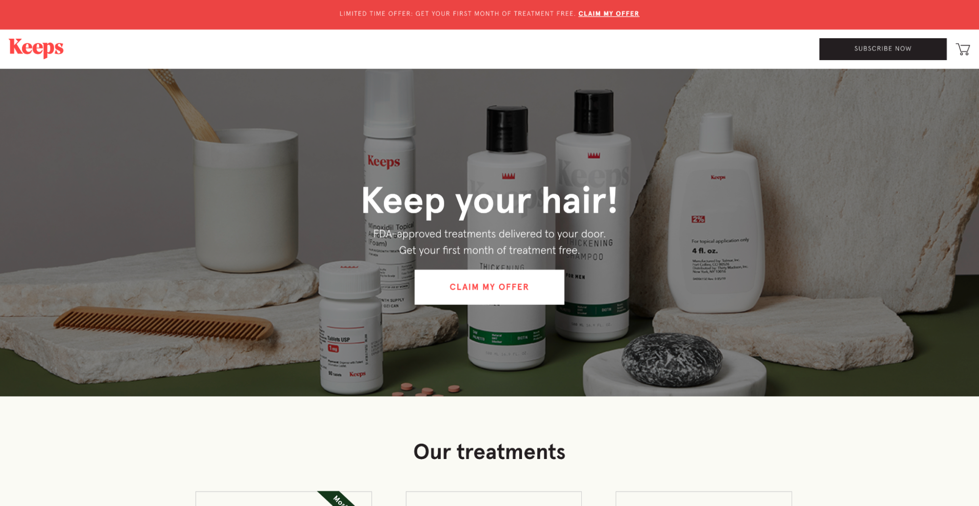
❤️ What we love: Message match
Message matching is when you match the ad or campaign copy and offer with the landing page copy and offer.
Matching your message creates a seamless experience from click to conversion. After all, your ad makes a promise, and it’s up to your landing page to fulfill it. If it doesn’t, say goodbye to conversions.
Keeps matches their ad headline and subheadline with their landing page headlines and subheadline perfectly.
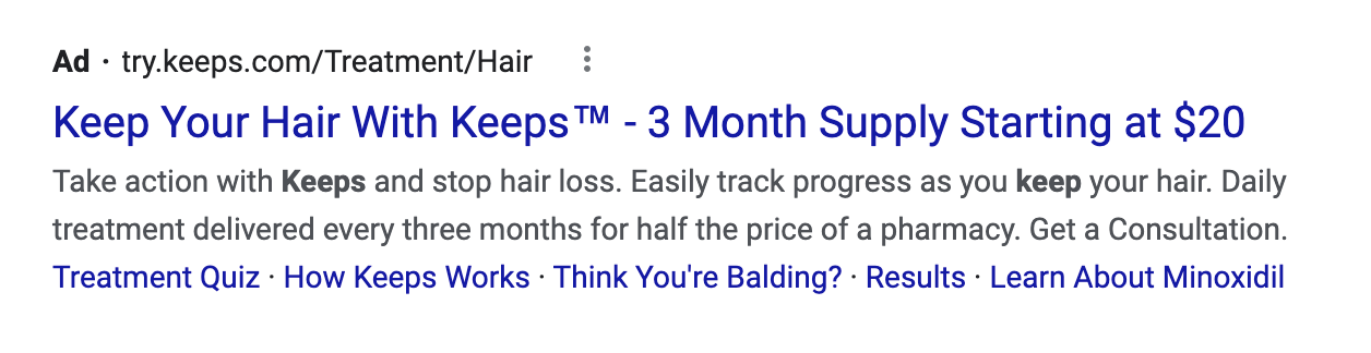
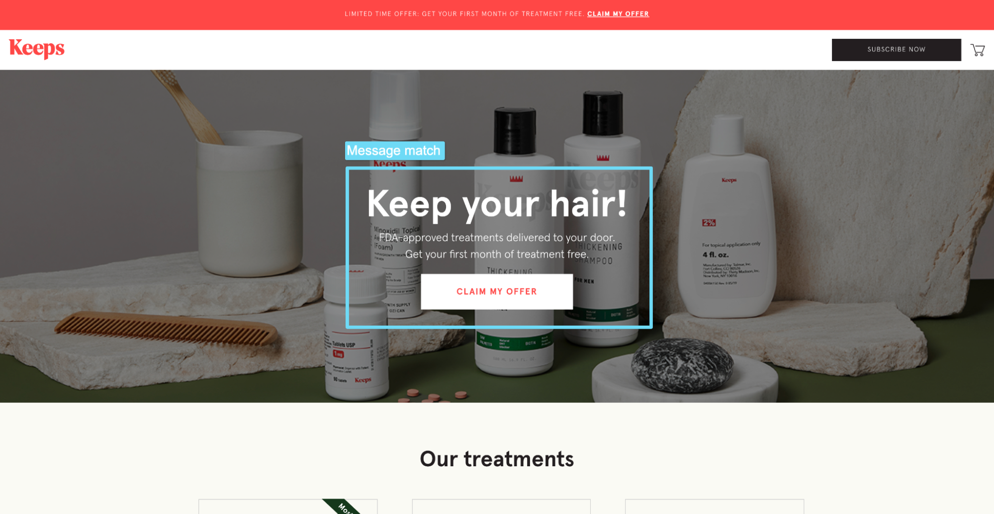
They also support their ad copy with additional details about how it works:
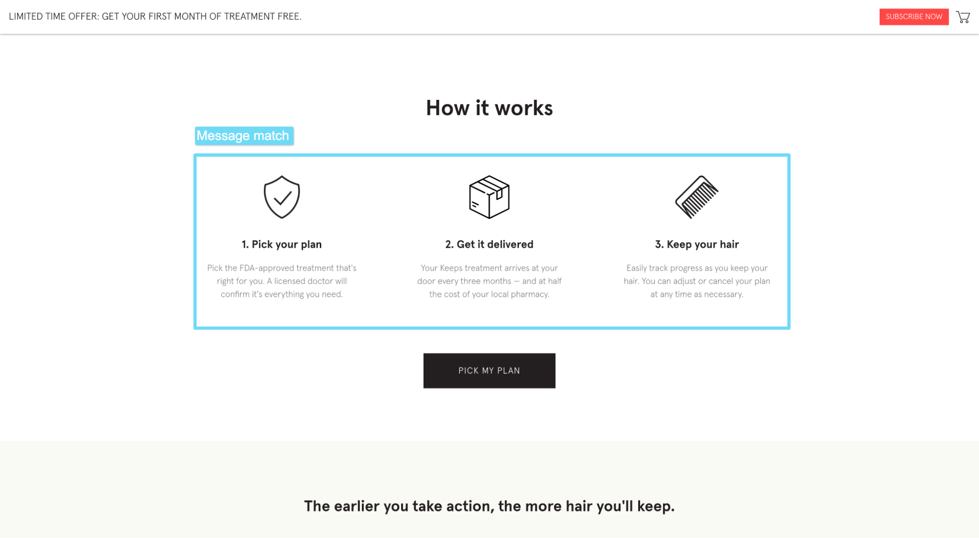
When it comes to messaging, like Keeps, ensure consistency from ad to landing page: The ad that sends traffic to your startup lander should share the same message, offer, and tone as the landing page it points to.
Further Reading: The Critical Component For Successful Ads: Message Match [Tested]
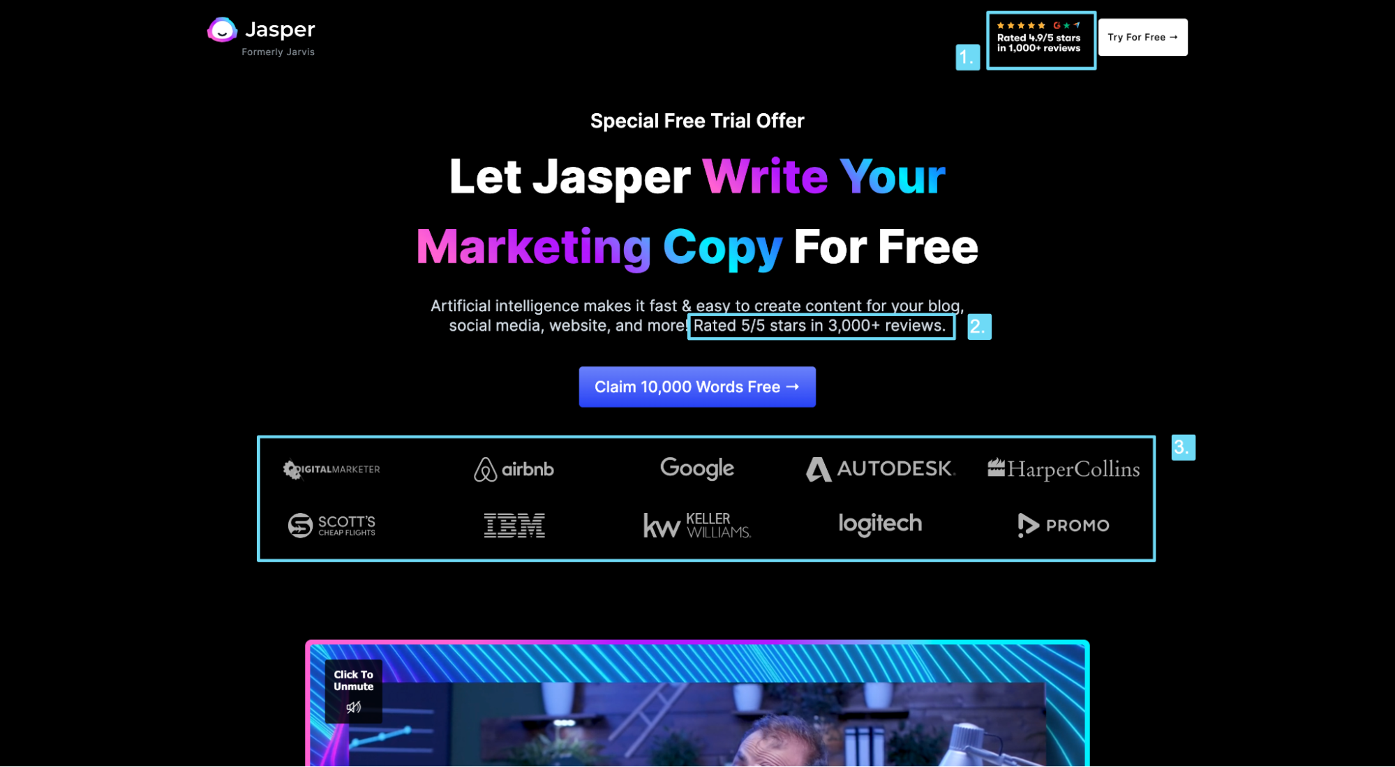
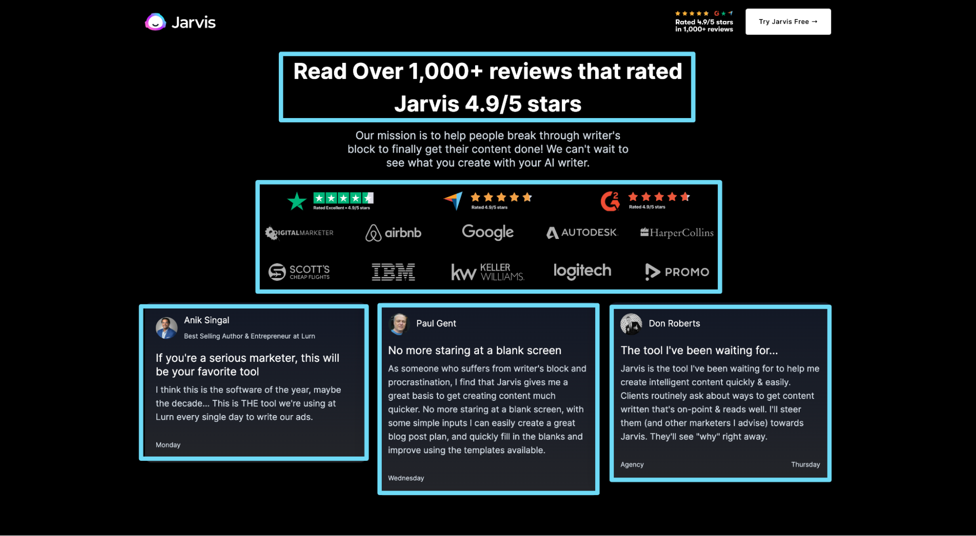
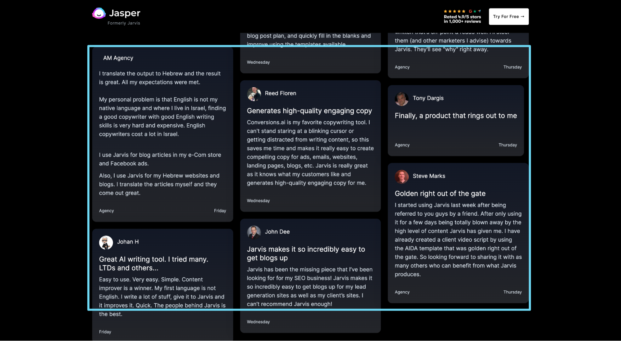
8. Jasper (formerly Jarvis)
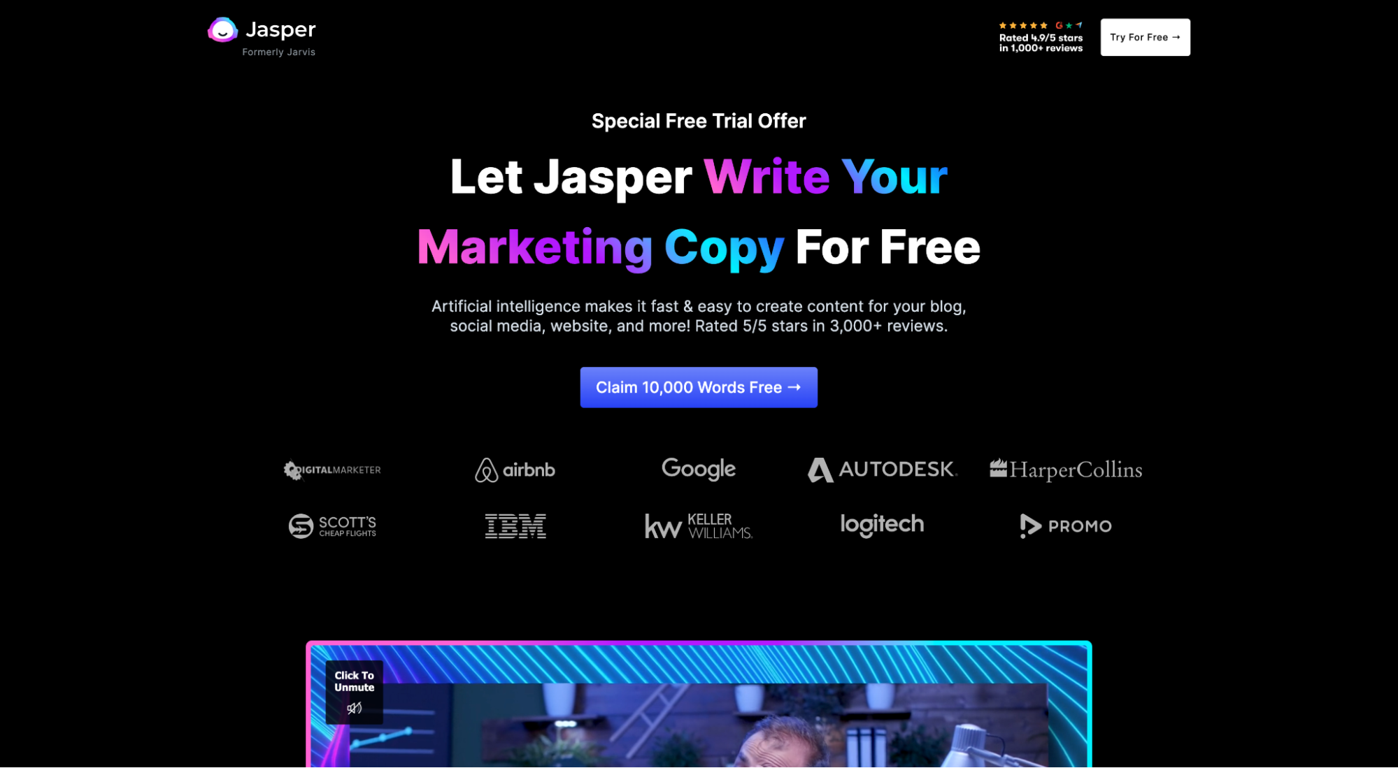
❤️ What we love: Social proof
Social proof makes your offer sound believable. It peppers your message with credibility. And, most importantly, it leads to more conversions (turns out people like to make safe bets, so they emulate the bets of people who came before them).
Jasper features social proof everywhere and in every form: above the fold, next to their CTA (AKA “click trigger”), in its own section, and in the form of reviews, star ratings, client logos, testimonials, badges, and user stats.
For early-stage startups, social proof may prove difficult to come by. But considering that 93% of consumers rely on reviews when shopping a business they aren’t familiar with, it’s in your best interest to find some (even if that means free beta users).
Further reading: 18 Ways to Use Landing Page Social Proof To Convert Visitors
9. Clickup
❤️ What we love: Features/benefits
Features represent what you do. Benefits represent why it matters. The best startup landing pages go heavy on the latter, light on the former. ClickUp executes both masterfully with a tabbed features/benefits section: When you click on any of the 10 features listed to the left, an accompanying graphic with benefit statement appears to the right.
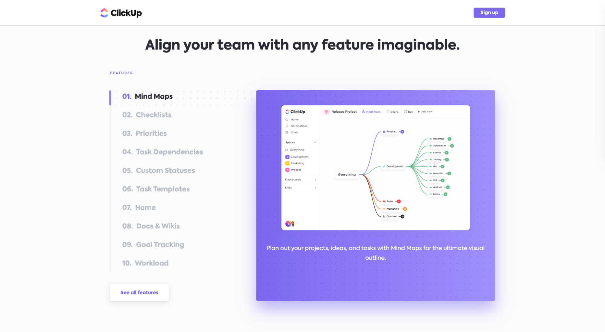
ClickUp also features three core benefits in a traditional Z-shaped structure (zig-zagging from left to right):
Further reading: Landing Page Copywriting That Engages And Converts
10. Apostrophe
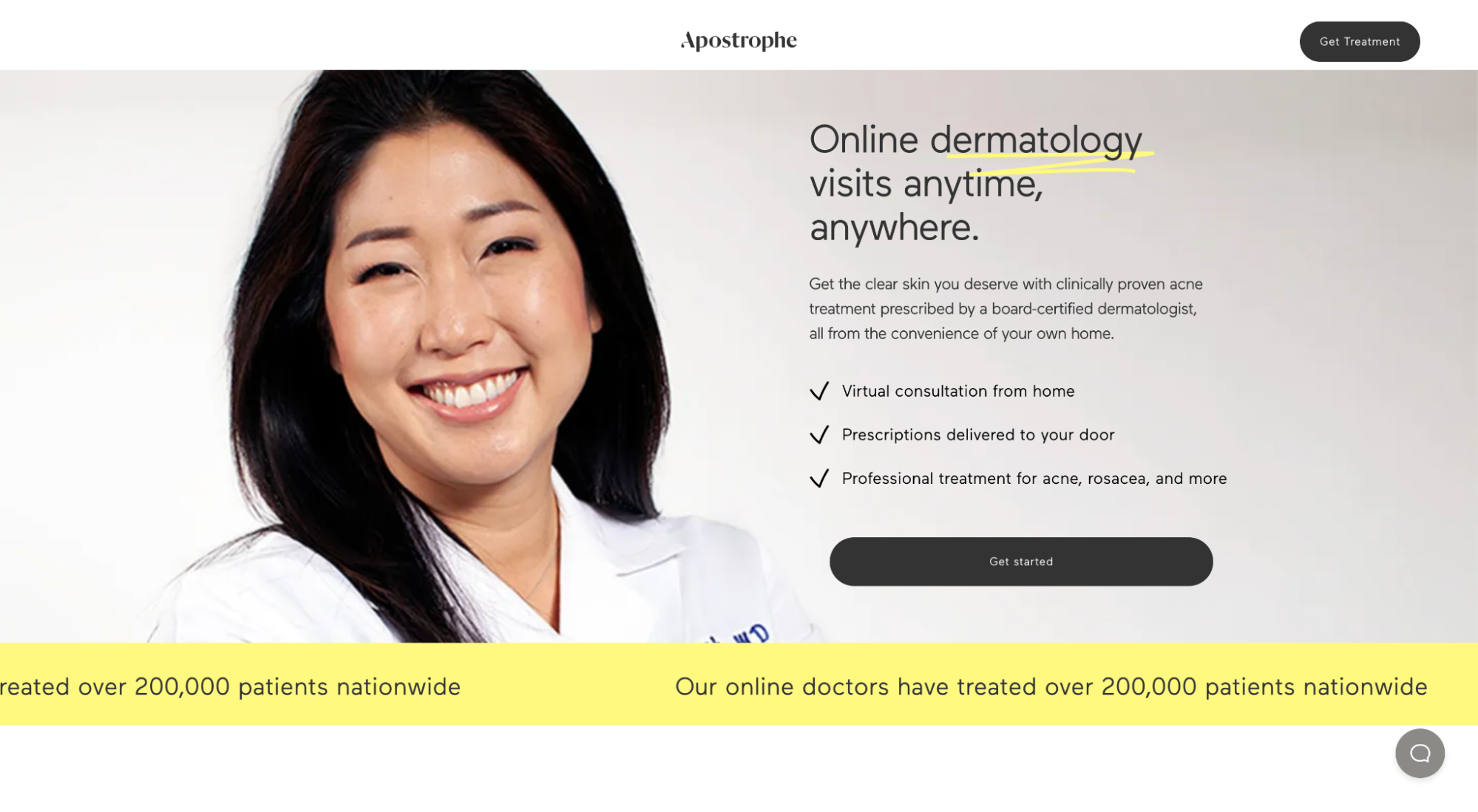
❤️ What we love: Headline/subheadline
Your headline and subheadline work in harmony to deliver your value proposition in a compelling and concrete manner.
Whereas your headline grabs attention and explains the value you promise to provide, your subheadline motivates action and explains how you’ll keep your promise.
Apostrophe delivers a masterclass in writing compelling headlines and subheadlines:
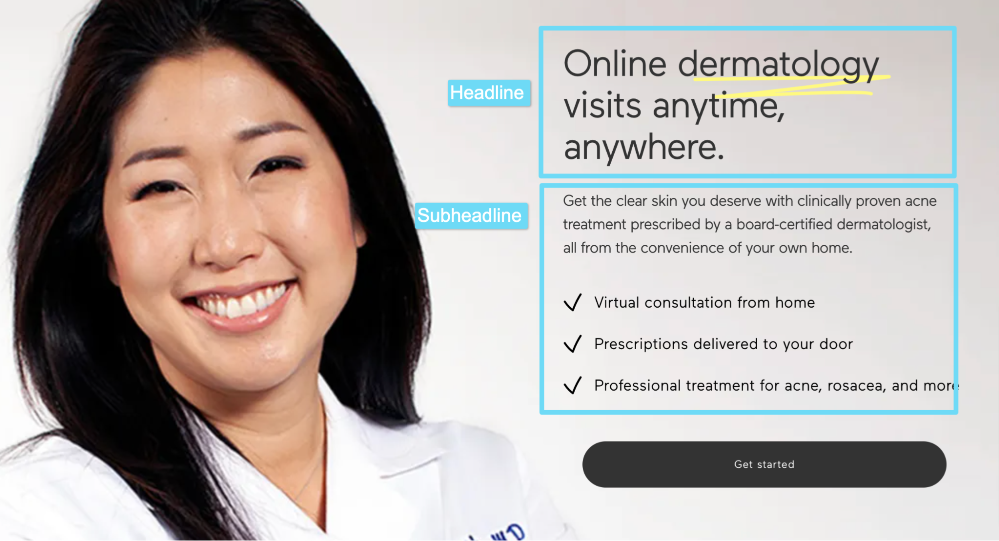
If you have a truly unique product, or if you’ve defined your own category, sometimes all you need to do is explain what you do in your headline (like Apostrophe).
But since most products aren’t truly unique (and that’s ok), your headline should also address your prospects’ biggest objections.
So how does Apostrophe deliver the promise they offer in their headline?
With the perfect subheadline: “Get the clear skin you deserve with clinically proven acne treatment prescribed by a board-certified dermatologist, all from the convenience of your own home.”
Further reading: Landing Page Headlines That Convert Up To 67.8% Better
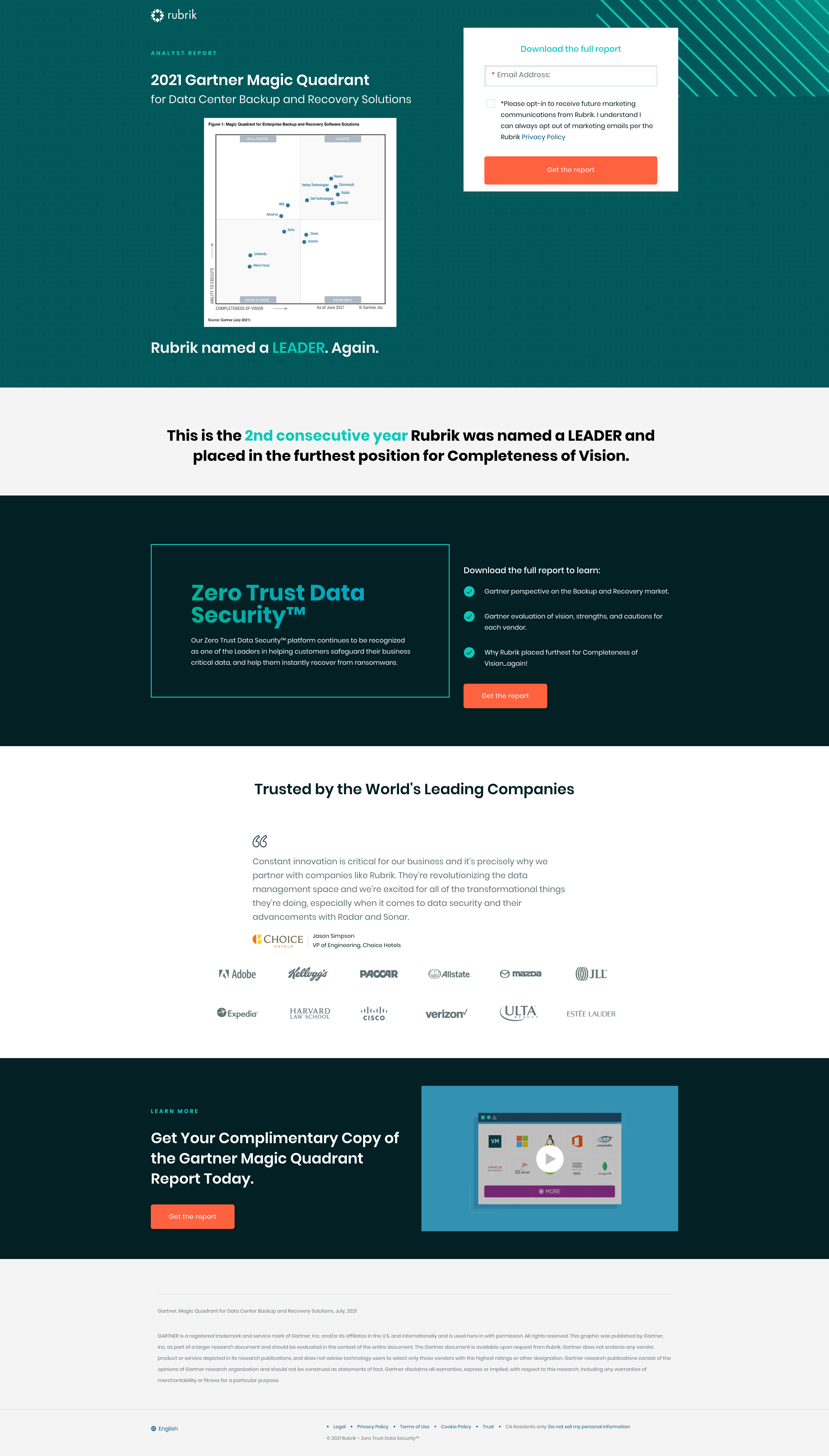
11. Rubrik
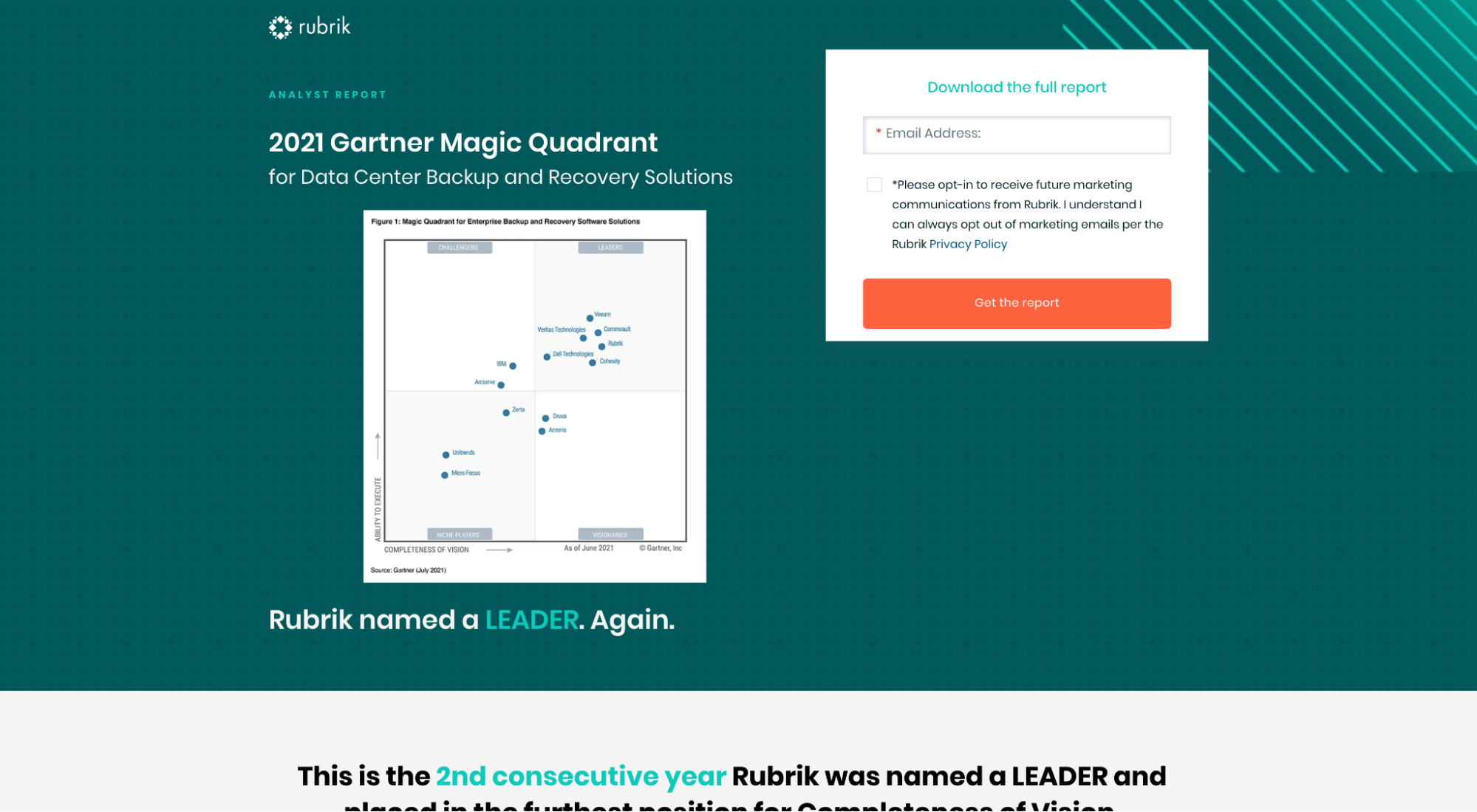
❤️ What we love: Conversion intent
Different stages of the funnel have different conversion intents. So do different channels.
For example, bottom of the funnel traffic (i.e. close to purchase) come through Google PPC ads, so PPC landers should target offers with high conversion intent.
Social media, on the other hand, is a group of low-intent channels (people aren’t explicitly shopping on Instagram like they are on Google). Therefore, you wouldn’t want to target cold social traffic with bottom of funnel offers- they won’t convert.
Rubrik has conversion intent down pat, as proven by their free download landing page.
This landing page is one giant piece of social proof in the form of Gartner’s 2021 Magic Quadrant report that puts Rubrik in the top right (industry leader and visionary).
Rubrik uses this landing page for branded search queries on Google and social media ads (i.e. traffic that hasn’t expressed interest in converting on their product yet).
When it comes to your startup landers, like Rubrik, ensure you drive the right traffic to the right offer.
Takeaways
Startups need all the help they can get, period.
Help to validate ideas, test market demand, get to cash flow positive, and scale marketing campaigns without scaling resources.
Landing pages offer the perfect solace for ambitious but resource-strapped entrepreneurs.
Use them generously.
They’re cheap, fast, testable, and replicable.
Just remember: Keep it simple.
High-quality landing pages don’t need the best and brightest stars in marketing; they need the 11 elements we outlined in this article.
And if you need more help, we literally design landing pages for a living 👋


