


How much can landing page forms impact your bottom line?
Let’s look at Expedia: Back in 2010, Expedia discovered that an optional form field titled “Company” was costing them $12 million dollars a year.
What?!
Yup.
Visitors who hit the “Book now” button were filling out an optional “Company” field with their bank name, then adding their bank’s address instead of their home address, thus leading to hundreds of failed transactions.
After they removed the extra form field, sales skyrocketed overnight.
Yikes.
When it comes to landing page forms, small accidents contribute to massive conversion hits all the time.
Which is one of the reasons why landing page forms are one of the most studied elements in all of marketing.
Good news: After years of landing page design and conversion optimization, we’ve distilled the perfect landing page form down to 17 data-backed elements. In this article, we’re going to break down how to optimize each one (with examples).
Get them right and you have conversion gold.
Get them wrong and you might find yourself hemorrhaging conversions like Expedia.
Get brand new landing page strategies straight to your inbox every week. 23,739 people already are!
Should all landing pages have forms?
First, before we jump into best practices and examples, let’s clear up any confusion about whether or not all landing pages need forms.
Short answer: Yes and no.
Let me explain…
Two types of landing pages exist: Lead capture pages and click-through pages.
Lead capture pages (AKA lead generation pages) include forms directly on the landing page. After all, without a form, how will you capture lead information so sales can follow up?
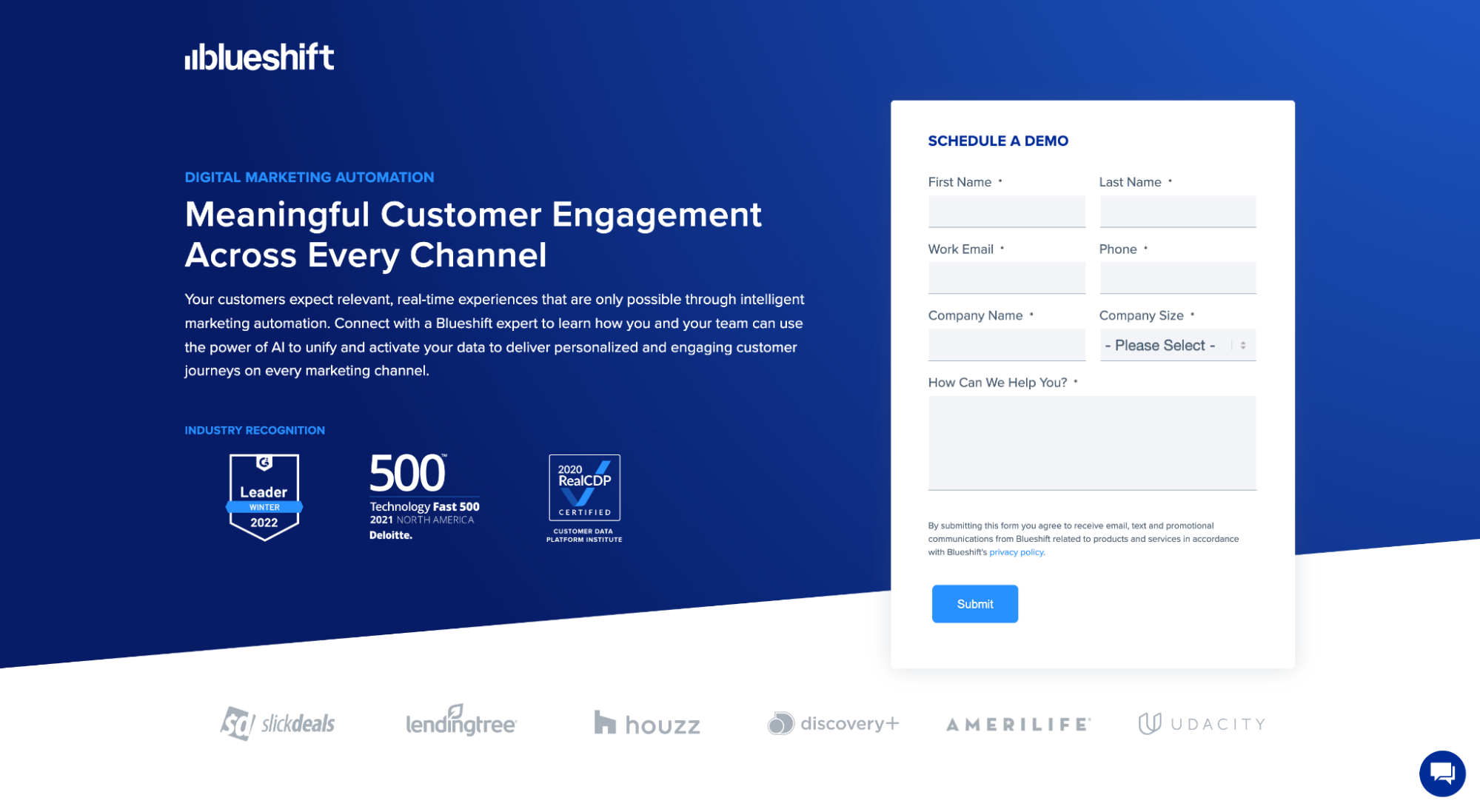
For example, Blueshift’s marketing automation landing page features a lead form asking for contact information. Once prospects submit their contact information, Blueshift’s sales team will follow up with the lead to schedule a demo. Simple.
Click-through pages, on the other hand, don’t include forms on the landing page. Instead, when you click on a call-to-action (CTA) button, it opens up (or clicks through to) a conversion page where prospects can complete your conversion goal immediately (i.e. no lead information necessary).
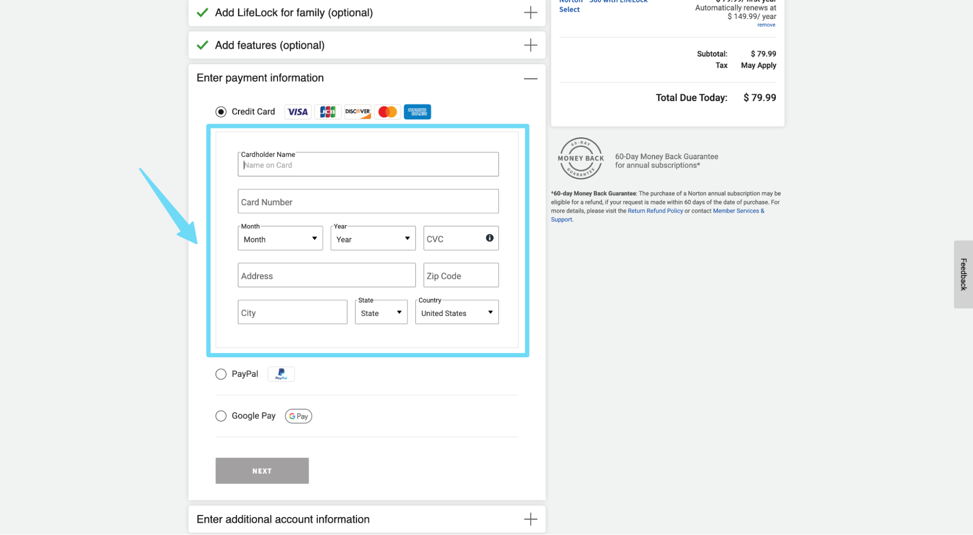
For example, Norton uses a click-through landing page to warm up prospects before selling their antivirus software. Since prospects can purchase directly from the website (no sales team needed), they don’t need a lead form.

So when it comes to forms on landing pages, technically, only lead capture pages include forms.
However, even if a click-through page doesn’t include a form on the landing page, there’s a high likelihood that it clicks through to a page that does, like an account creation page, registration page, or checkout page.
For example, even Norton’s click-through page includes a payment form eventually:
Takeaway: Not all landing pages include forms on them, but at some point, every path to conversion passes through a form. You can’t avoid them. And at the very least, every website needs a contact form. So listen up!
Elements of a high-converting landing page form
Without further ado, let’s explore the 17 elements of a high-converting landing page form design (in no particular order):
1. Form layout
When it comes to forms, you have three layout options: single column, double column, or hybrid.
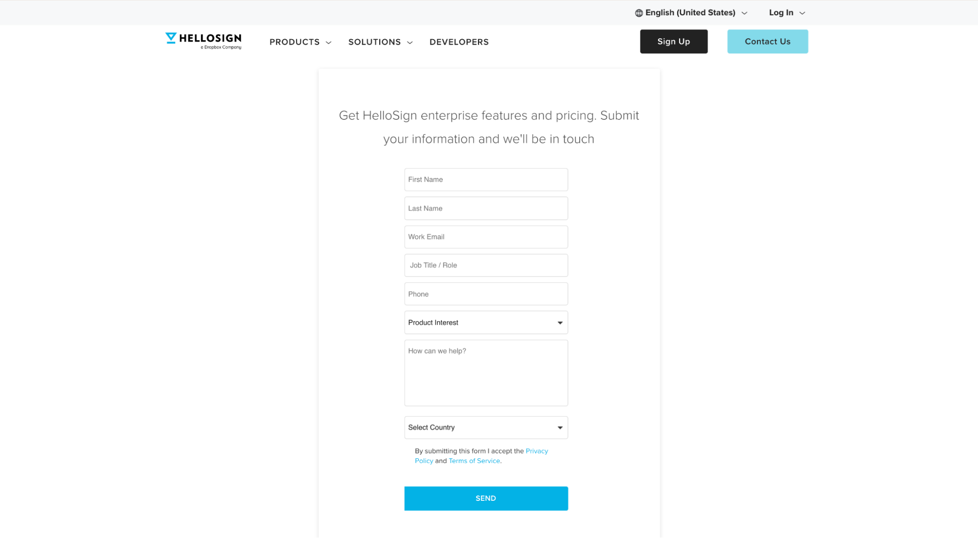
A single-column form is a linear form with form fields organized in a straight line from top to bottom. For example, this lead form from Hellosign features a single-column layout:
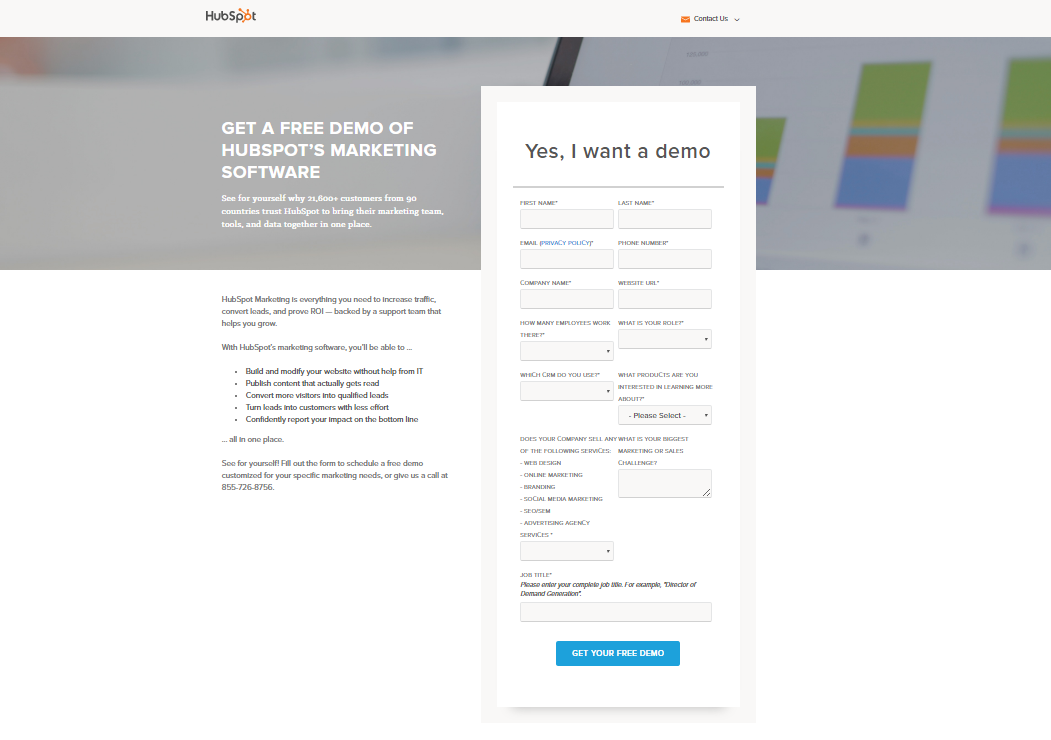
A double-column form, on the other hand, features two columns of form fields organized in rows from top to bottom. For example, this lead form from Hubspot features a double-column layout:
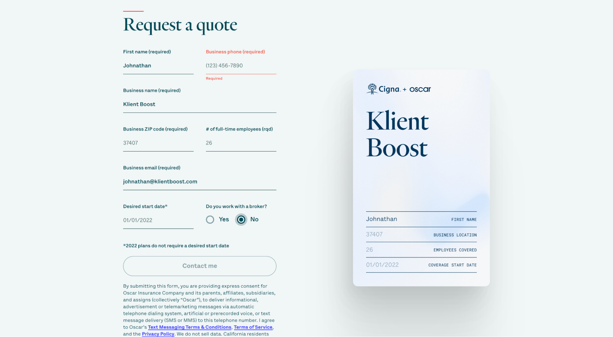
And last, a hybrid form is a form with both single columns and double columns. For example, this Oscar form features a hybrid layout:
For years, single-column forms were thought to be the best form layout for higher conversions.
For example, Peep from CXL has stated in the past that single-column forms perform better than double-column forms. Ben Labay (UX designer and marketing director of Speero) even published a study that declared linear forms faster and, thus, better.
But not everyone agrees.
For example, Hubspot put the single-column form to the test and discovered that their double-column form outperformed their single-column form by 57%.
Why? More form fields.
Hubspot’s form has 13 form fields; a single-column layout looked and felt daunting. It’s likely why the shorter, double-column form converted higher.
Takeaway: When it comes to form layout, consider the number of form fields before choosing an option.
If you have eight or fewer form fields, a single-column form might work best. A ton of evidence exists that proves shorter, single-column forms are easier and faster to fill out since they don’t disrupt vertical momentum from top to bottom.
If you have 10+ form fields like Hubspot, a double-column form will likely perform better. In this case, the double-column form makes the form length feel shorter and less overwhelming.
To get the best of both worlds, experiment with a hybrid form: use a few double-column rows to shorten the form, but a few single-column rows to keep the momentum going.
And if you really want to increase form conversions, consider a single-column form broken up into multiple steps. This brings us to our next point…
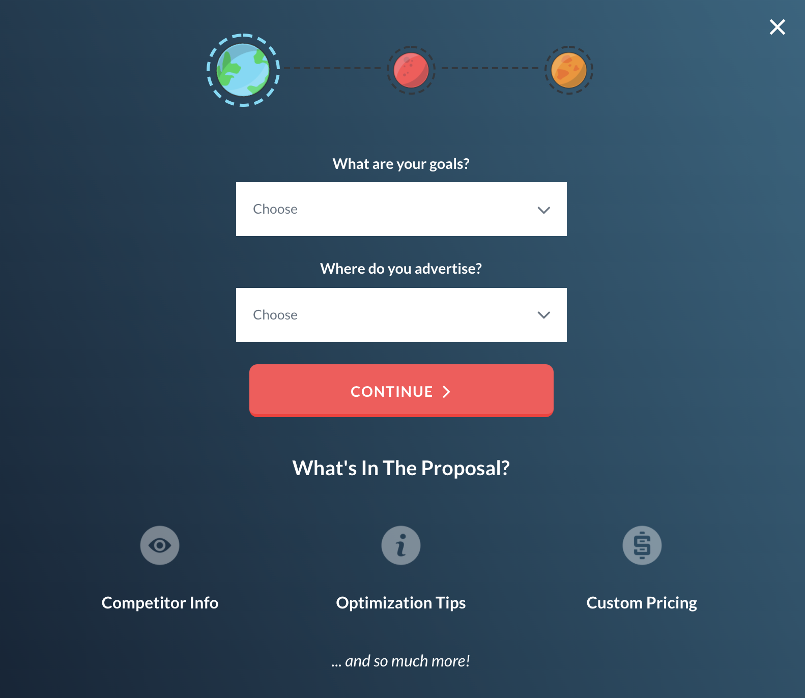
2. Breadcrumb technique (multi-step form)
A multi-step form (AKA The Breadcrumb Technique) breaks up long forms into multiple steps, each step with no more than 3-4 form fields (preferably in a single column).
But that’s not all.
Multi-step forms use behavioral psychology to micro-convert prospects from one stage to the next by asking easy questions first, saving the intimidating questions for last.
Huh?
Behavioral psychology tells us that people like to finish things they started. The magic of The Breadcrumb Technique is getting them to start by asking softball questions first.
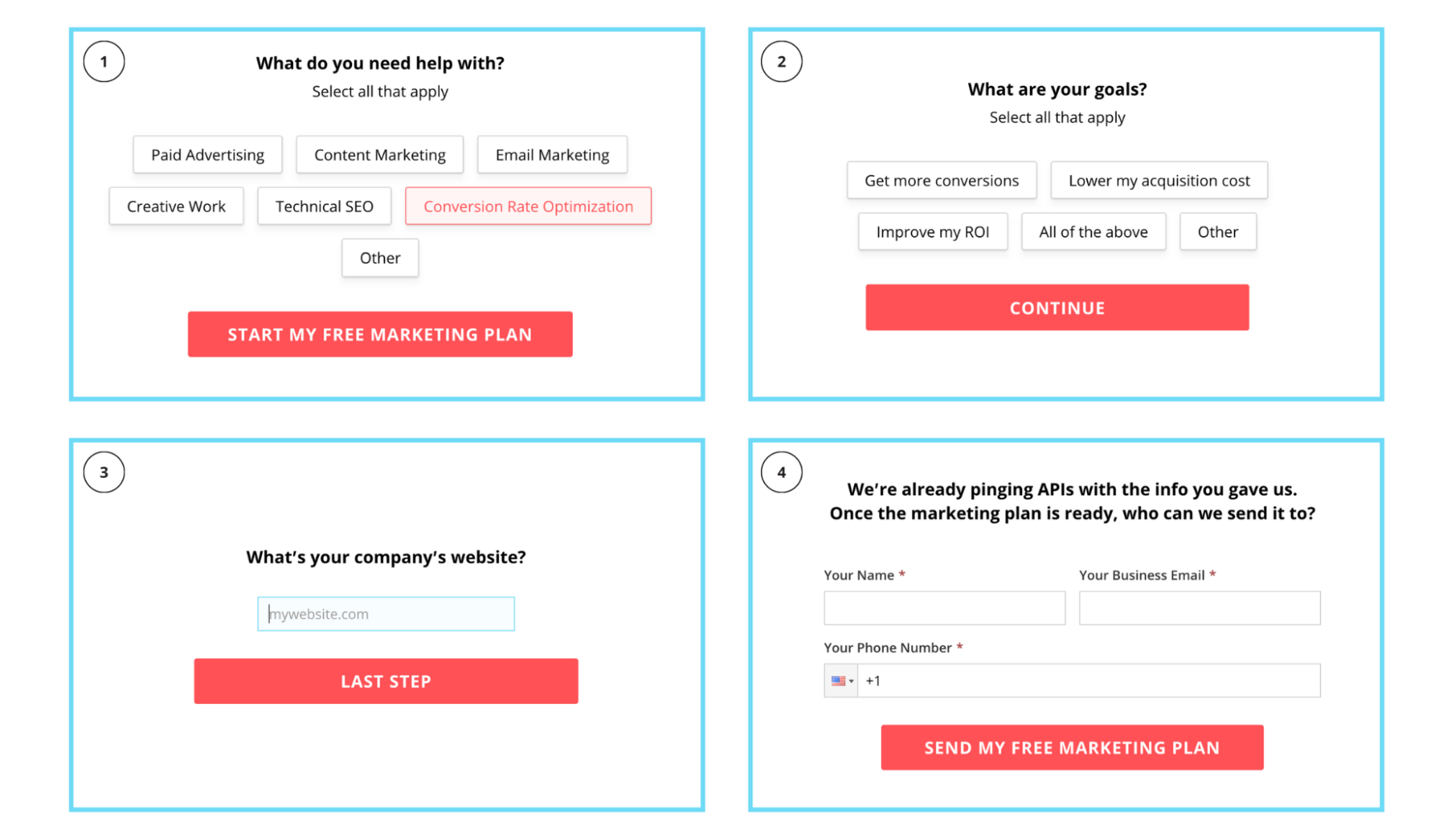
For example, our very own lead form uses a multi-step form broken up into four steps. But instead of asking for an email address and phone number first (highly intimidating), we ask for it last. Actually, the first three steps ask non-threatening questions:
Results? More conversions.
Let’s look at the data…
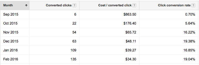
We converted the form for a client of our’s into two steps (and asked for name, phone, email last). By doing so we achieved:
- A CPA decrease from $800+ to $35
- A conversion volume increase from 6 to 135/mo
- A conversion rate increase from 1% to almost 20%
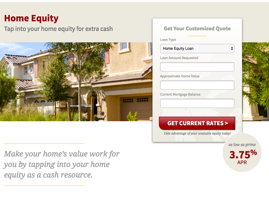
Here’s the form:
And here are the results:
We did the same with another client and achieved a 74% increase in conversions as well as a 51% drop in CPA.

But we’re not the only ones using multi-step forms. The best lead generation and SaaS landing pages all use multi-step forms too.
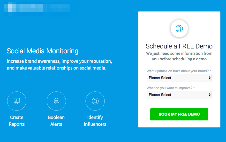
For example, Lytx vehicle tracking uses a multi-step form on their landing page:
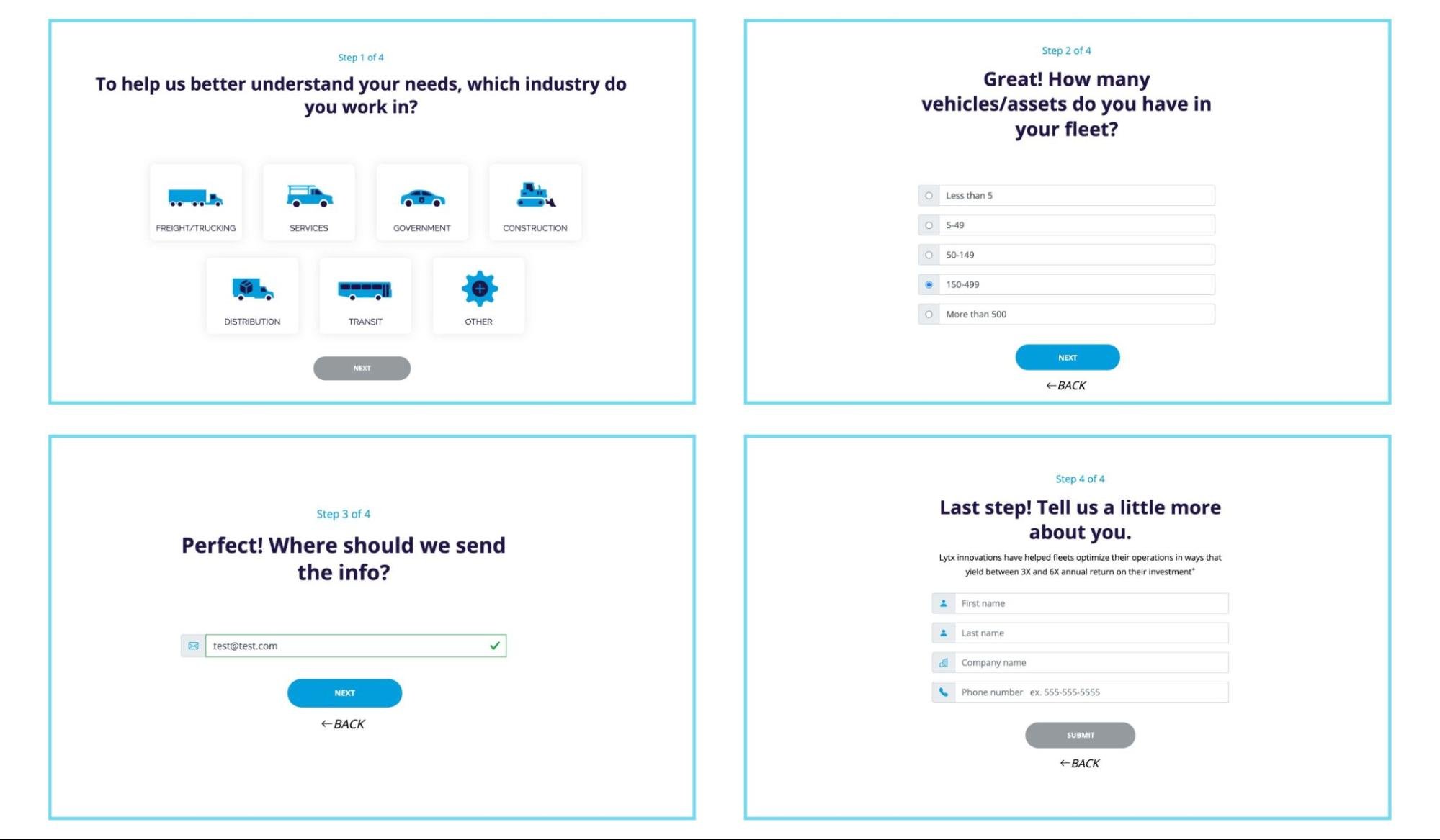
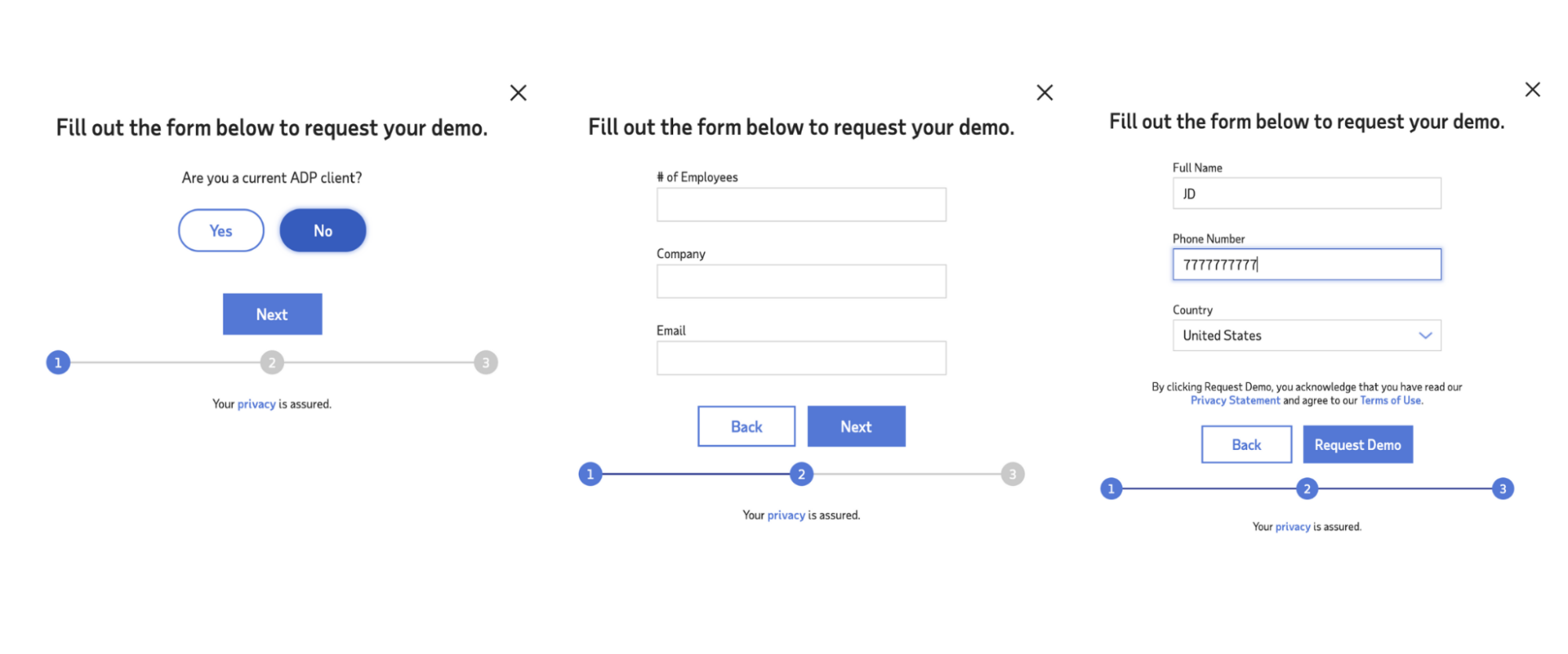
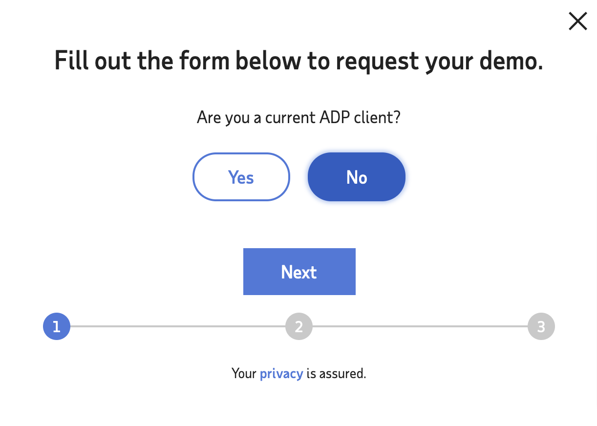
And ADP uses a multi-step form on their landing page:
Takeaway: The only instances in which multi-step forms didn’t convert higher than single-step forms was for low-value, low ask offers like guides, whitepapers or ebooks. For every other standard lead generation landing page (i.e. request a demo or free consultation), multi-step forms convert higher than single-step forms.
3. Progress indicators
If you do opt for multi-step forms, don’t forget progress indicators (especially for longer forms).
Progress indicators (or progress bars), as the name suggests, use visual markers to indicate to visitors where they are in the form and how much longer they have until completion.
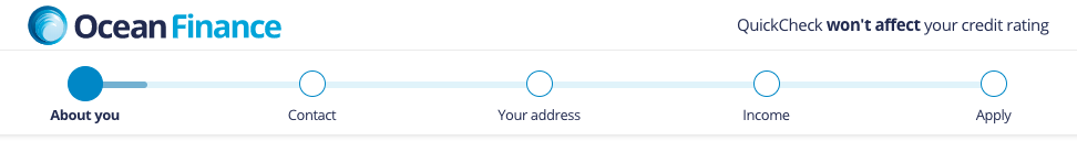
For example, ADP indicates progress by numbering each step of their form and highlighting the current step in blue:
Two other types of progress bars include percentage complete and labeled steps (without numbers):
Percentage complete

Steps left (no numbers)
Takeaway: When it comes to progress indicators, use them generously. Studies have shown that visualizing a clear path to completion can increase form conversions and reduce cart abandonment. Last, don’t forget to make toggling back and forth between steps easy.
4. Number of form fields
The million-dollar question: how many form fields should I include on my landing page forms?
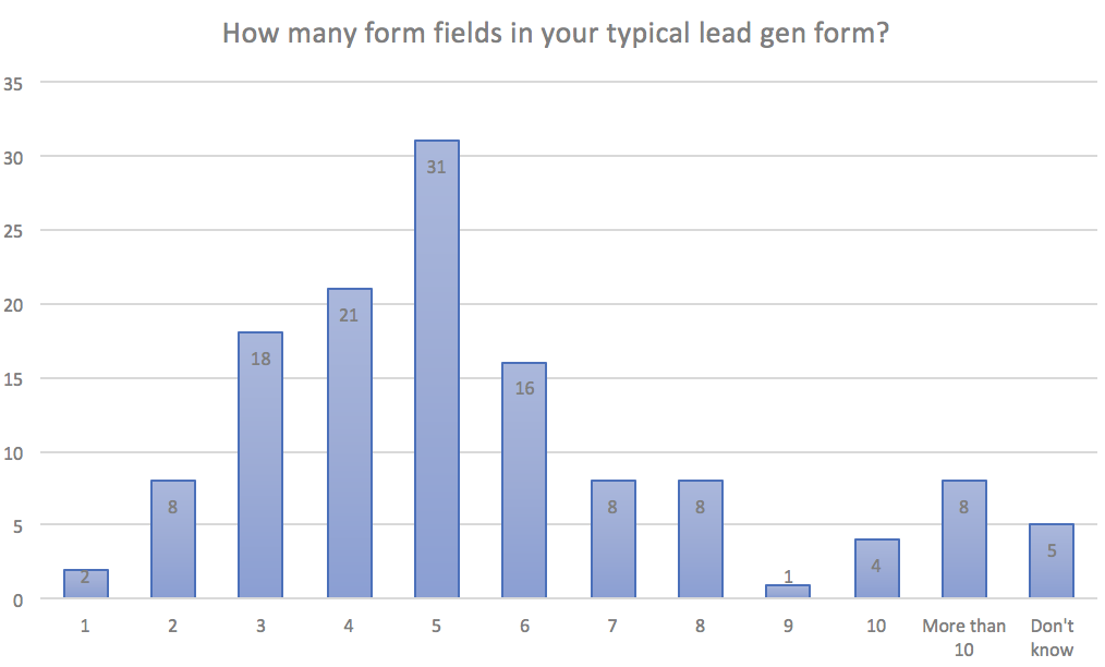
According to Hubspot, the typical lead gen form consists of five form fields:
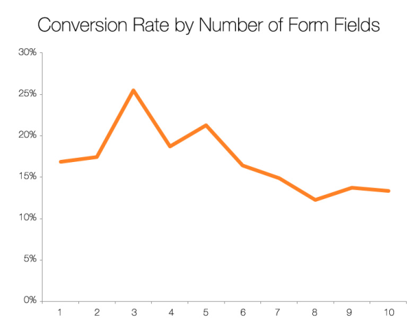
And according to Hubspot again, the longer the form, the lower the conversions:
Seems logical, right?
Not so fast.
Yes, it’s true that shorter form fields typically lead to higher conversions—but not always.
For example, in a famous experiment from Michael Aagaard (formerly of Unbounce), he discovered that removing three form fields (from 9 to 6) actually reduced conversions by 14%.
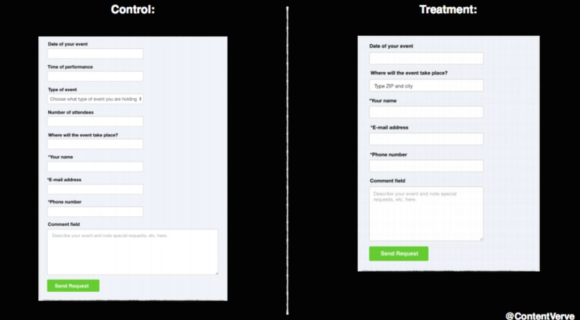
What happened? Michael concluded that the three fields he eliminated were actually the three fields prospects engaged with the most. So he added them back, and updated the copy to limit friction instead, and experienced an increase in conversions by 19% on top of the original.
In another example, CXL discovered that by just asking for an email, conversions were 13.56% lower than when they also asked for name, state, and driving experience:

When it comes to lead generation, if all you do is eliminate form fields, what’s left for your prospects?
Either nothing but intimidating questions like name, phone number, and email. In which case, fear alone can lose you conversions.
Or not enough questions to make prospects feel like you’re going to answer their questions properly.
Furthermore, shorter forms may increase conversions by reducing form fields but decrease lead quality at the same time. No bueno.
Takeaway: Everybody agrees that you should eliminate unnecessary form fields (i.e. questions that you don’t need answers to). Whether or not you should add more fields or eliminate fields comes down to context.
- Motivation: Hotter leads closer to purchase have a higher proclivity for filling out longer forms because they have a high motivation to buy (i.e. nothing will get in their way). For example, if I want a mortgage loan estimate, I’ll fill out 20 form fields to receive it. Not so much for a free ebook.
- Conversion goal: An email subscription or on-demand webinar registration requires much fewer fields than a lead generation form. Two different goals, two different form sizes. No need to multi-step a simple email opt-in.
- Lead quality: If the lead quality matters more than lead volume, add more form fields and collect more information. But if the lead quality doesn’t matter more than lead volume (i.e. you’re collecting first-party data to build a custom ad audience), then fewer form fields for the win.
- Structure: If you’re making a serious request, like to schedule a demo or meet with a sales rep, a multi-step form is like a cheat code. You can get away with asking more questions simply by breaking them up into smaller steps.
Last, we reached out to Oli Gardner, CEO and founder of Unbounce, to get his feedback on form length. Here’s what he said:
“I started with the same mentality that most people have, that fewer form fields perform better.
From a conversion standpoint, this is still true. But you'd be surprised at how adding a few more fields can impact results.
Sometimes form length doesn't make much difference, and if you're interested in quality over quantity, the extra friction can be a good thing.
But choose those fields carefully, or the friction will create false data.
For example, I saw a form that offered a report about a new chip and pin payment technology. The form included a radio button field next to the call to action that asked if I was an employer or job seeker, neither of which held any relevance to the offer—and it was a required field!
Unnecessary questions will make some people run away, and the rest will simply click randomly to bypass the question, polluting the data and rendering it worthless.”
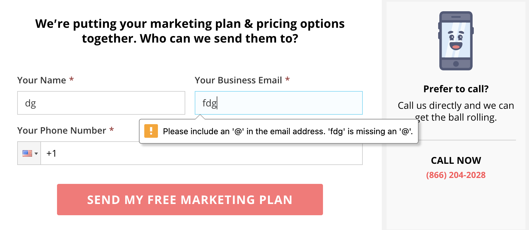
5. Field label placement
Field labels refer to the microcopy above, to the side, or within the form field that indicates the name of each respective form field.
For example, in the below form, the two field labels read “Email” and “Password” (placed on top of the form fields):
When it comes to label placement, you have three main options:
- On top (left-aligned)
- Inline (left-aligned)
- Left of field (right-aligned)
Let’s review each.
On top (left-aligned)
The label is placed above the form field box and pushed flush left.
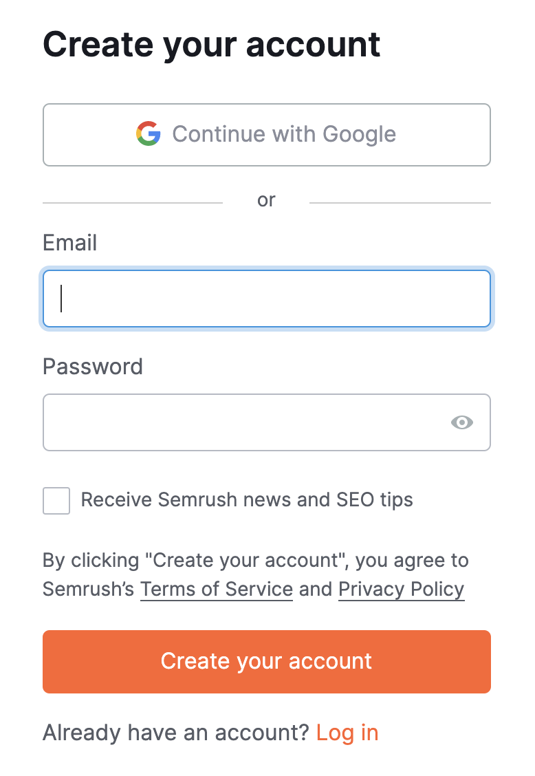
For example, the SEMRush account creation form we just showed (above) places the form labels on top of the fields, aligned to the left.
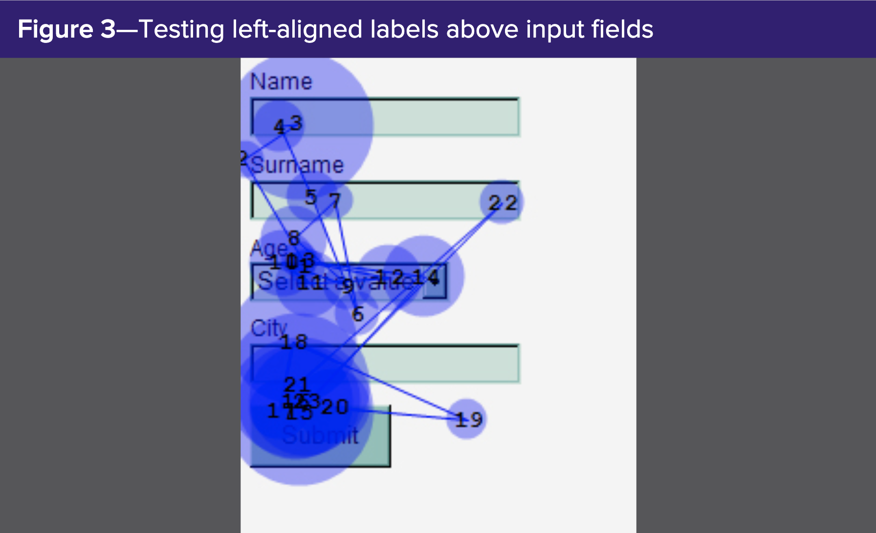
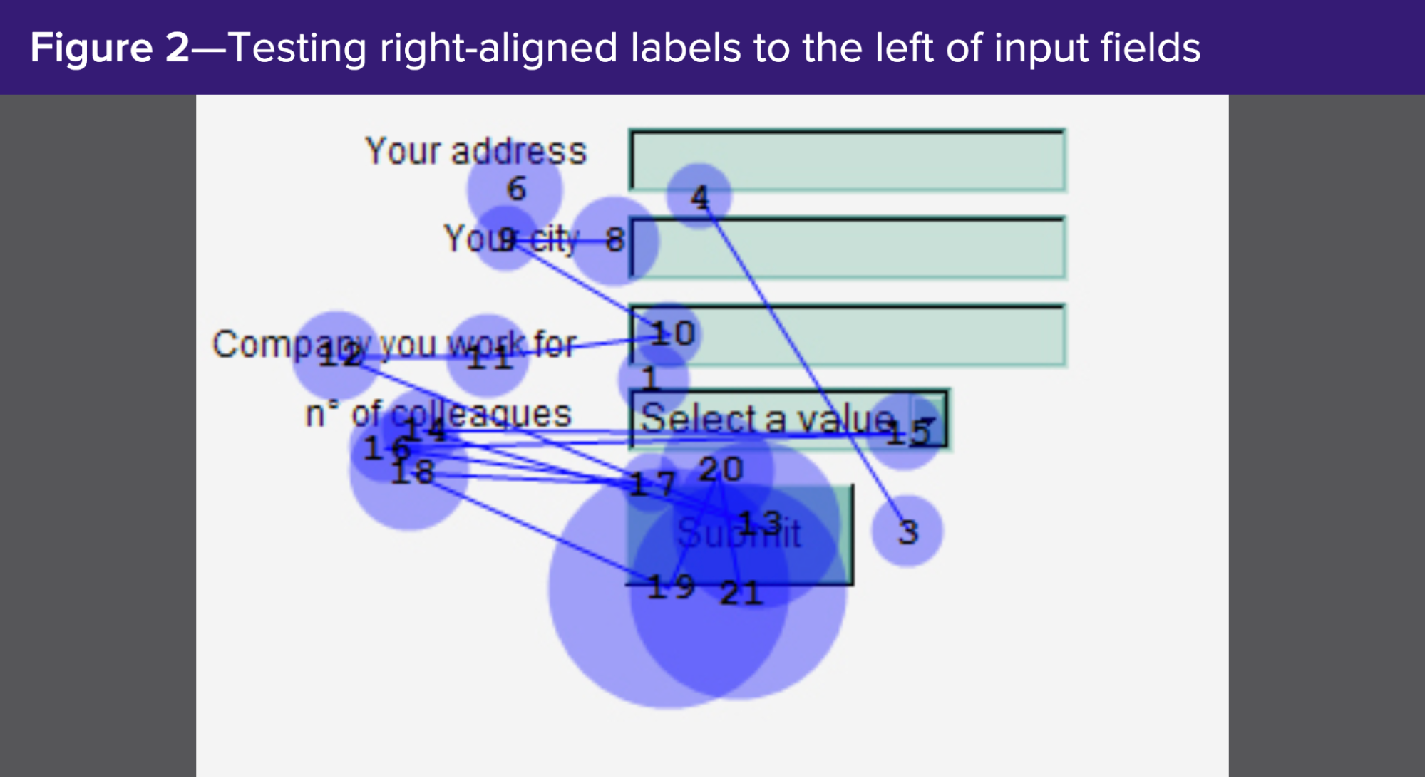
When it comes to conversions, research shows that left-aligned labels on top of the form field convert the highest. Why? Because they’re the easiest and quickest to fill out.
For example, using eye-tracking software, you can see that left-aligned labels on top of the form field keep the visitor’s eyes focused on the form fields and labels with limited cognitive load:
Inline or “infield” (left-aligned)
The label is placed within the form field box and pushed flush left.
For example, the Bob HR form below places field labels inside the field box:
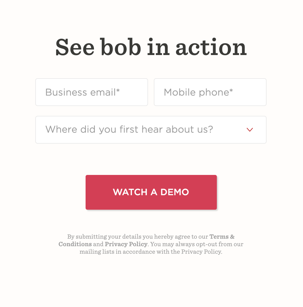
Inline field labels work fine for short forms like this, especially if you’re only asking for basic information like name or phone number.
But for longer forms with more complex form fields, inline forms create a user experience nightmare, especially on mobile.
Why?
Once you click on a box, the label disappears. If you forget what the label said, the only way to find out again is to delete your entire entry and start over. Yikes.
Left of field (right-aligned)
The label is placed to the left of the field box (outside of it).
Though not as efficient as labels placed on top of form fields (because visitors need to shift their eyes from left to right, up and down), labels placed to the left of form fields required limited cognitive load too.
Takeaway: Place field labels on top of the form fields (aligned left) for best results. And if you want the best of both worlds, try inline form labels that move to the top of the form field once someone starts typing, like this:

No matter which option you choose, heed the following:
- Use plain text labels: Bold labels might sound enticing, but they’re harder to read
- White space: Make sure your form fields and labels have adequate white space between them
- Text alignment: To reduce cognitive load, right align text when you place field labels to the left of fields, and left align text when you place field labels on top or inline
- Proximity: Whatever you do, keep labels close to their form fields
6. Placeholder text
Placeholder text is a hint, description, or example placed within the form field (usually in light grey) that disappears once someone starts typing. Placeholder text is just like an inline label, only instead of a label name, it's an example of an actual submission.
For example, Oscar uses placeholder text within each of its lead capture form fields:
Study after study confirms that using inline placeholder text creates a poor user experience and reduces form conversions.
Why? It’s an unnecessary burden, really.
- Like inline labels, placeholder text disappears once you start typing, forcing visitors to delete their entry if they forget the placeholder hint text
- If an error message appears, visitors don’t know how to fix the issue
- Inline placeholders make empty fields less noticeable. Eye-tracking software has shown that people’s eyes are attracted to empty boxes, not filled ones
- Poor color contrast makes them difficult to read, especially for visually impaired
What to do instead?
If you feel the need to provide instructions for each form (which might make perfect sense), place the instructions below the field labels but on top of the form field. For example:

7. Click triggers
A click trigger is a short piece of enticing copy placed under or around a form CTA or submission button designed to eliminate doubt and nudge visitors to a conversion.
For example, this Lusha landing page uses its star rating and a total number of reviews, along with “No credit card required,” to remind visitors why they should hit the “Start for free” button.

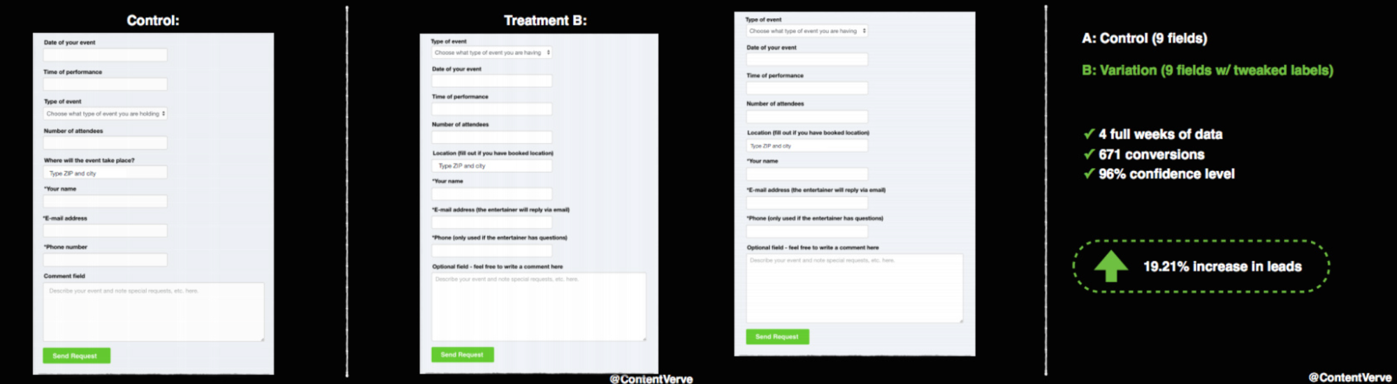
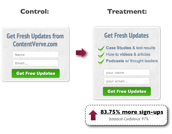
Or this older example from ContentVerve saw an 87% increase in email newsletter subscriptions by adding a few benefit-related bullet points to their opt-in form:
Takeaway: Use click triggers to anticipate and handle your prospect’s objections about what’s on the other side of your form.
8. Microcopy
Microcopy is a broad term that refers to the small snippets of copy within your form used to instruct or inform visitors.
Technically, click triggers, field labels, and placeholders are all examples of form microcopy, but in this case, we’re specifically talking about microcopy that helps reduce friction by telling visitors why you need certain pieces of information or how you’re going to use it.
While tiny in presence, microcopy can have a huge impact on form conversions.
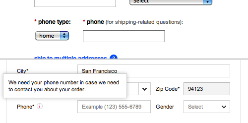
For instance, below is an example of a form microcopy that tells visitors why they need a phone number to complete their eCommerce purchase (since many might find this information unnecessary and abandon):
Another common type of microcopy consists of error messages like the one below:
Does microcopy convert? You bet.
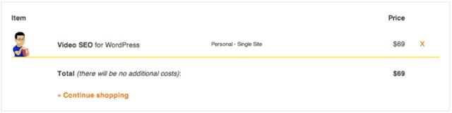
For example, since cost is the #1 reason why people abandon carts, Yoast added the phrase “there will be no additional costs” to their checkout form and increased conversions by 11.30%.
Or this example from an ex-Hubspot’s UX designer who discovered that transactions weren’t getting completed because people were entering the wrong addresses. By adding one line of microcopy, he significantly increased form conversions (and reduced customer support costs).

Takeaway: Visitors don’t always know why you need information, how you’ll use information, or the significance of entering the right information unless you tell them. Introduce microcopy as part of the form interface to hedge against bewildered or apprehensive prospects.
9. Call to action (CTA)
No form is complete without a compelling and enticing CTA that motivates action.
When it comes to form call-to-action buttons, two things matter over everything else: copy and contrast.
First, generic CTAs like send, submit, start, pay, or activate are what we call “effort buttons;” they make visitors feel like something laborious lies ahead. Avoid at all costs.
Instead, opt for value-based buttons like receive, get, enjoy, view, or discover, all of which make visitors feel like a reward (not an effort) waits on the other side of the form.
For example, Jarvis delivers a clear, compelling, action-oriented CTA you can’t help but click:
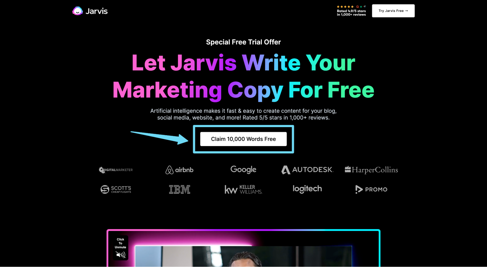
Interested in more? We’ve got 61 additional ideas for value-based buttons.
And second, increasing form conversions has less to do with the color of the button and more to do with the color contrast of the button and the background.
For example, in this case study from our client, Darwin Homes, A/B testing the CTA button color helped reduce CPA by 45% and increase their conversion rate by 22%.


Takeaway: Add a clear benefit to your form button CTA copy (and avoid generic CTAs altogether), and make sure your button draws attention by contrasting it with the background.
10. Form popup vs. embed
Remember when we talked about multi-step forms and how they micro-convert visitors from one stage to the next by making the form easier to start?
The same applies to your form button.
Instead of embedding a form within your landing page, experiment with placing a CTA button in its place, then opening the form in a popup lightbox or sending traffic to a conversion page once clicked on.
In an Aweber study, they discovered that putting their form behind a popup button instead of embedding it on the landing page increased conversions by a whopping 1,375%.
In a Hubspot study, they discovered that replacing their form with a CTA button that led to a dedicated opt-in page increased conversion rates by 0.4% (from 2.4% to 2.8%). That may not sound like a lot, but over the course of thousands of visits, that amounts to hundreds more conversions.
For example, both Intercom and AllHands (below) place their landing page form behind a popup button:
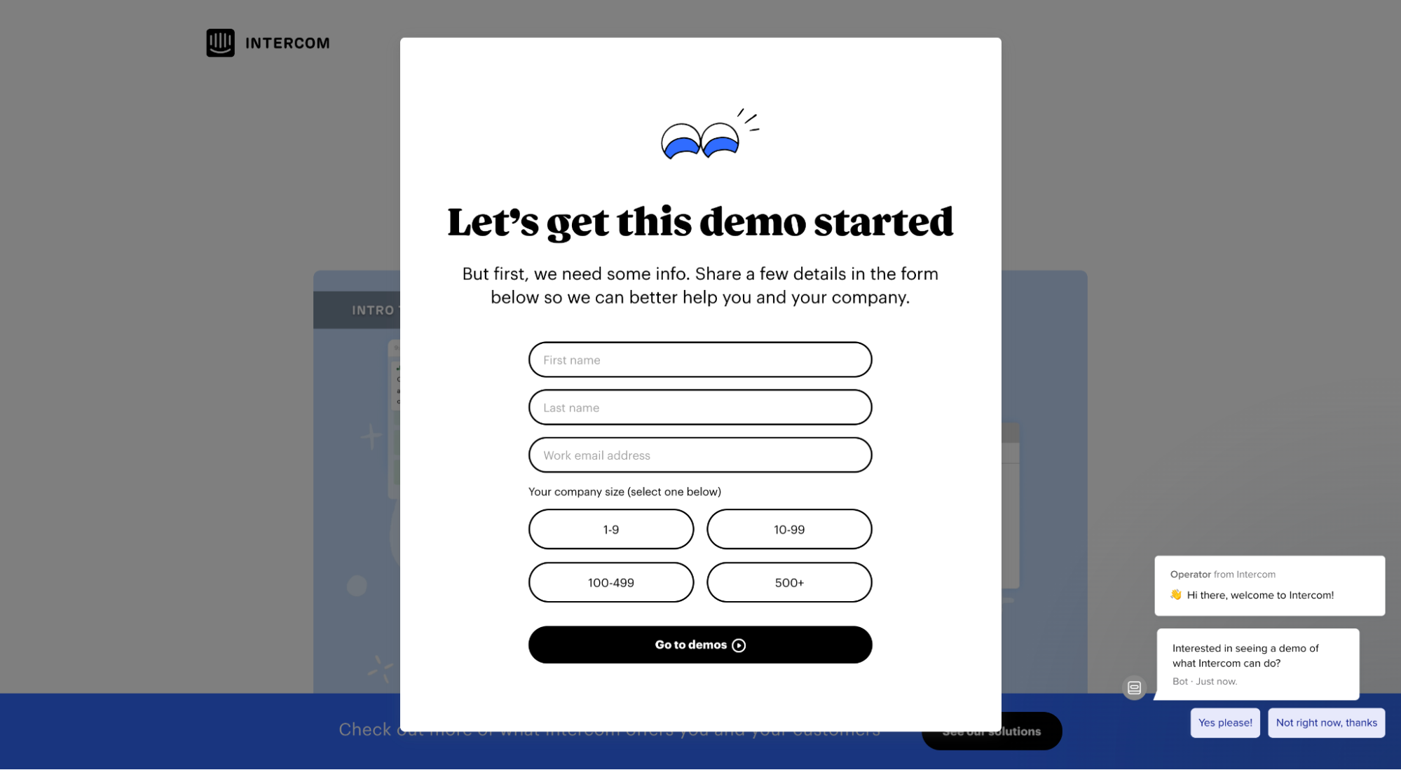

Takeaway: As always, test everything. But hiding an intimidating form behind a button will make it easier for visitors to take the first step. And once we take the first step, we have a higher proclivity for taking the next step.
11. Autofill
Autofill forms refer to forms that use your visitors’ browser data to autofill (or autocomplete) fields like name, phone number, credit card info, and address, rather than forcing visitors to fill them in on their own.
According to Google, autofill can make filling out your forms up to 30% faster, thus increasing conversions along the way.
Takeaway: Nobody likes filling out a web form, especially on mobile devices. Use autofill to reduce friction and increase conversions.
12. Autoformat
Have you ever filled out a form only to discover that you forgot to put parentheses around your area code or that you added too many spaces in between credit card numbers—then you had to start over?
Same.
To make your forms easier to fill out (and to reduce cognitive load and limit format errors), don’t make your prospects guess whether or not they need to add a dash, parentheses, comma, slash or neither: autoformat your fields so no matter how visitors type in information, the format corrects itself on its own.
For example, this form field automatically formats dollar value as you add more numbers:

Better yet, you can use a feature called “text masking” that will not only autoformat values correctly but will also provide inline placeholders that tell you how much more you need to input.
Takeaway: Use autoformat for dates, phone numbers, credit card numbers, or any other numerical value (e.g. price, income) that might require specific formatting. Not only will it reduce formatting errors and increase conversions, but it will also ensure that the form submission data will all look the same.
13. Social proof
Social proof refers to third-party reviews, testimonials, star ratings, or any other credible badge that indicates other people have had success with your products or services.
Why is social proof important? 66% of customers say the presence of social proof increased their likelihood to buy.
Why does social proof work so well? Because when people have doubts about committing or uncertainty about choice, they look for inspiration from people who have already made the same choice. And more often than not, they choose what others choose.
If you thought you only needed social proof on your actual landing page, think again.
Place social proof like star ratings, testimonials, or client logos near or around your forms to remind people that they’re making the right decision.
For click-through pages especially (i.e. landing pages that click-through to a conversion page like a checkout page or an account creation page), place social proof next to your form too.
For example, Jarvis places client count and client logos next to their account creation form:

InvisionApp also features social proof next to their form, this time in the form of a testimonial from one of their clients (Uber):
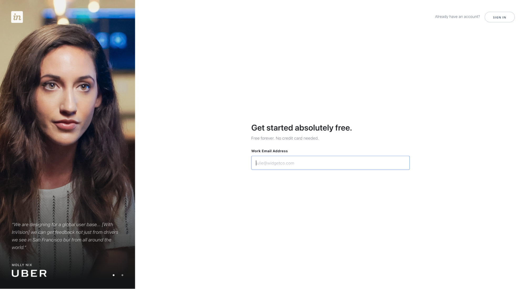
Takeaway: Pepper social proof around or near your form to remind visitors why they should keep going.
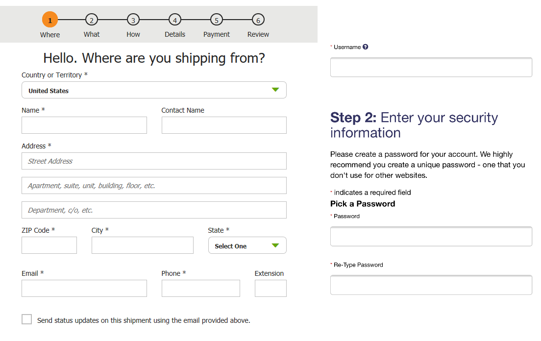
14. Required vs. optional fields
If a form field isn’t required, ask yourself whether or not you actually need it, to begin with. If you don’t, eliminate unnecessary fields altogether.
However, if you deem the optional field necessary and need to juxtapose it from required fields, follow these best practices:
- Label required fields with a red asterisk: Does it need to be a red asterisk? No. But a red asterisk is the standard for required fields, and your users will expect it.
- Place asterisks to the left of labels: By placing asterisks before the labels, it makes it easy for visitors to scan the left side of the form, top to bottom, for required fields.
- Consider a “required” label: If you want to add a “required” label in addition to the asterisk, best to place the text outside of the field (i.e. on top of the form field) rather than inline.
- Label optional fields too: Labeling optional fields can also help reduce cognitive load since visitors won’t need to infer optionality; instead, the form will tell them explicitly. Not necessary, but a nice bonus.
- Avoid not labeling required fields: In certain instances, you might think it unnecessary to label required fields. Don’t do it. Always label required fields.
Takeaway: There’s nothing sexy about required field labels—and that’s precisely why you shouldn’t get cute with them. According to Jakob’s Law, since your website visitors spend most of their time on other websites, they expect your website to follow the same basic principles of user experience as everyone else. Any deviation and you throw a wrench in their mental model.
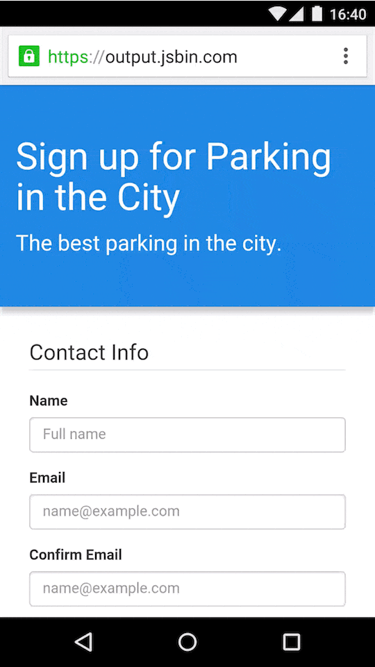
15. Mobile responsiveness
This should go without saying, but since over 50% of internet traffic now happens from a mobile device, if your form isn’t optimized for a smaller screen (mobile responsive), you’re likely hemorrhaging conversions.
What does a mobile-optimized form look like? How about four taps and a swipe to book a hotel?

When it comes to optimizing forms for mobile, the same rules apply that we just outlined in this article, only their impact is more magnified.
For example, people have little patience for poorly placed field labels on a desktop, but they’ll cut you a break because it's easy to figure out and navigate on a bigger screen.
However, when it comes to a mobile device, people have much less tolerance for usability friction since an awkward thumb and a tiny form already make for an unpleasant experience.
When designing your forms for mobile, apply the same best practices we already outlined in this article, along with the following:
- Bigger text
- Bigger CTA button
- More white space between fields and around buttons (so they’re easy to touch)
- No dropdowns, opt for radio buttons instead (dropdowns take the longest to fill out on mobile)
- Opt for an embedded form or separate form page over a popup
Takeaway: Single-column layouts, multi-steps, progress bars, autofill, field labels… it all applies to mobile too, only on a smaller screen.
16. Conditional logic
Conditional logic allows you to dynamically customize your form experience based on your visitors’ answers.
Though everyone will start the form on the same question, depending on how they answer, they may end at two very different spots.
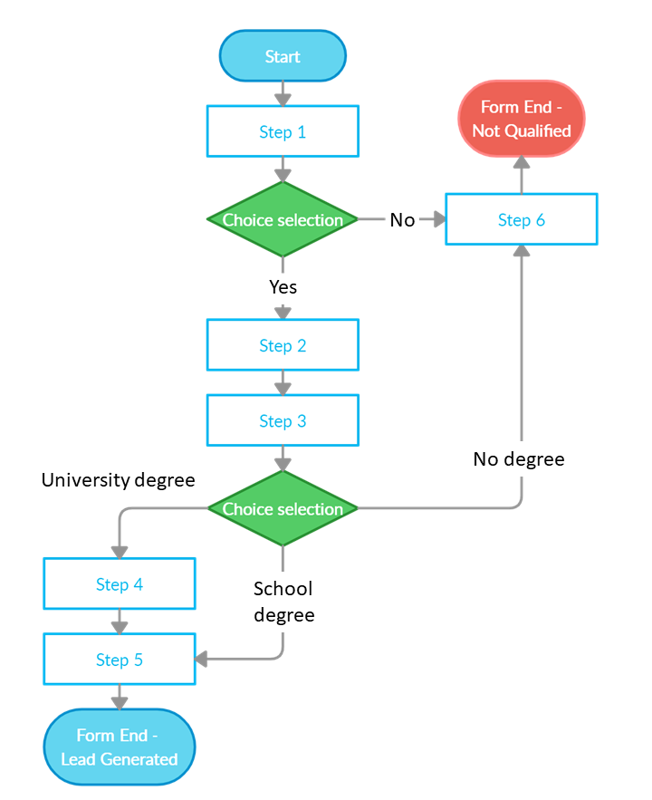
Conditional logic increases conversions by shortening forms, reducing the number of choices per question (i.e. eliminating unnecessary steps), and creating a more personalized form experience.
Takeaway: A basic lead gen form won’t benefit from conditional logic since it won’t require enough personalized information. But for longer forms, application forms, or lead qualifying forms, conditional logic can turn an otherwise nightmare of a form into a pleasant experience.
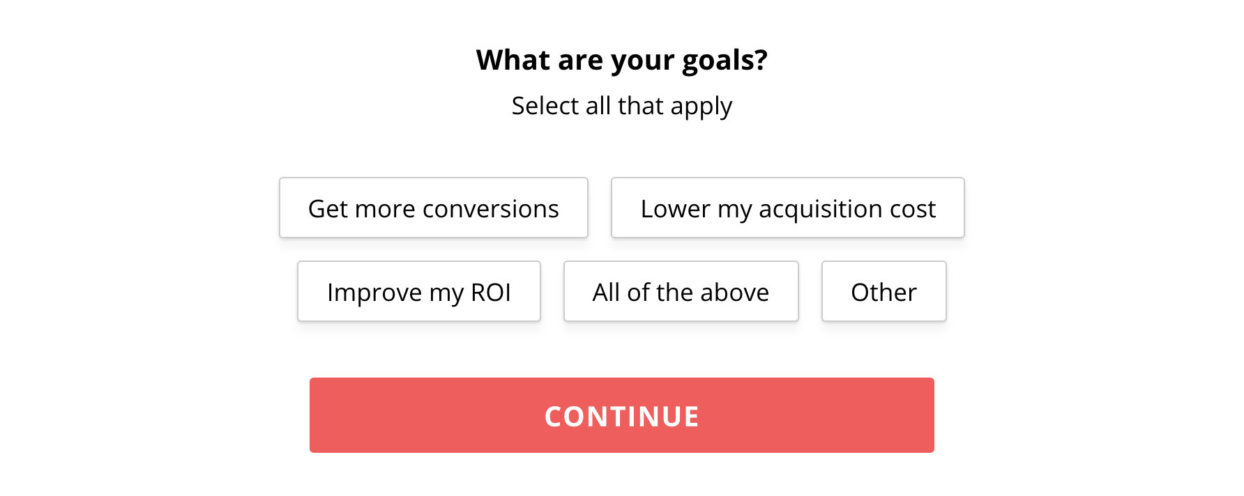
17. Radio buttons vs. dropdowns
The less your visitors need to work to fill out your form, the higher likelihood more of them will fill it out. Period.
According to CXL, after running a test to see whether or not radio buttons or dropdowns were easier to fill out, they discovered that respondents filled out radio buttons 2.5 seconds faster than dropdowns.
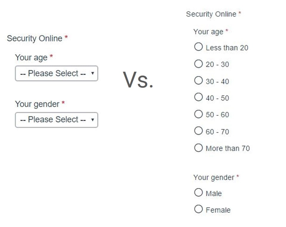
Like radio buttons, checkboxes are also easier to fill out.
What’s the difference? Radio buttons are for when multiple options are mutually exclusive (i.e. you can only select one choice), checkboxes are for when you can select more than one option.
We used to use dropdowns on our multi-step form too, then swapped em’ out for checkboxes. Now, not only is it easier and faster to fill out our form (especially on mobile), but we also get more conversions.
Takeaway: In most cases, opt for radio buttons or checkboxes over dropdowns. However, exercise common sense. If you have dozens of options, like, say, selecting a state or country, it doesn’t make sense to include 50+ radio buttons (that’s not reducing anyone’s cognitive load). Instead, opt for a dropdown.
A/B testing for the win
Despite the troves of evidence supporting the aforementioned elements of a high-converting landing page form, you should still A/B test them for yourself.
To make life easier, it helps to form analytics too.
That’s right, actual analytics that can measure user behavior as they traverse your multi-step form.
Some of our favorite form analytics tools:
- MouseFlow
- Zuko
- Hotjar
- MonsterInsights (WP plugin)
Build your landing page form template using the best practices we outlined in this article. Then rely on your form analytics to expose any leaks. Then test different patches. Voìla.
And whatever you do, keep those optional fields off your form unless you really need them (looking at you, Expedia).


