


So you’ve just finished creating a monumentally good piece of content.
It’s factual, well-researched, engaging and informative.
And, as is often the case when researching case studies, new findings and other discoveries for your content, you’ve stumbled upon other ideas that you could formulate into other content pieces at some point in the future to drive more conversions.
But for whatever reason, maybe those studies or statistics didn’t fit the overall arc of your current piece.
So you dump them in an Evernote folder, relegate them to your Bookmarks, scribble them and toss them in a shoebox, or simply promise yourself you’ll remember the URL or the topic in the future.
Except it rarely ever works out that way, and you end up with lots of little pieces of potential.
I call these, Content Leftovers.
Content Leftovers don’t have to be treated like leftovers -- they can grow into their own unique materials, and some even do far better than originally intended! So what should you do when you want to repurpose content?
Rather than just periodically purging your bookmarks, tidying up your folders or slogging through that shoebox of snippets, you can put your content leftovers to good use with other marketing channels.
What may not be relevant enough for a webinar topic or a white-paper may be the perfect foundation for a slideshow or an infographic to drive more conversions.
What’s more, repurposing your content may reach your current audience or intrigue new customers in ways you may never have imagined, leading to a greater increase in overall traffic, as well as a marked improvement in conversion rates.
For example, a slideshow may be too long for busy potential customers to click through, but an infographic that distills and segments that same information into visual bite-size notes, or a white paper that showcases your company’s values along with your proposed solution may be the perfect way to reach them.
With that being said, let’s take a closer look at how to repurpose content and put those leftovers to good use:
Get brand new marketing strategies straight to your inbox. 23,739 people already are!
Your Content Leftover: Outdated Studies
Best If Used For: Charts and Graphs
Why it Converts Well:
- Charts and graphs often show up in Google images when people are searching for or referencing case studies
- Bloggers often use charts and graphs to break up the monotony of text and give their users a visual overview, which in turn provides valuable backlinks to your site.
Picture this:
You find a great study on the web that would be perfect for your new article or blog post -- but it’s from 2012.
“I can’t use this!” you think to yourself.
“People will think our blog is behind the times and old fashioned!”
And while it’s true that you probably shouldn’t embed a link on your post pointing to www.example.com/posts/2012/new-stuff/, you can still repurpose this content into a more easily scannable chart or graph.
As one example, usability and web optimization experts (myself included) love to cite Jakob Nielsen’s eye tracking usability study from -- wait for it -- 1997.
The web has (thankfully) come a long way since then, but there’s no shortage of companies, individuals and organizations still citing the study nearly 20 years later.
For its time, it was a revolutionary glimpse into how people used the web, and despite years of advances now seeping over into tablets and smart phones, a formerly ground-breaking study like this can be the perfect foundation for learning more about how we interact with the internet.
Even more modern sites like Healthcare.gov are still citing the Neilsen study:
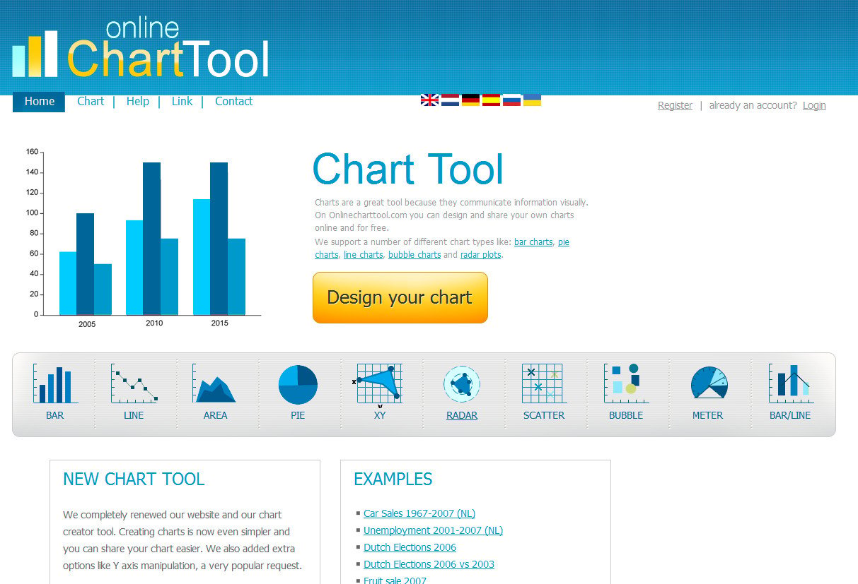
There are plenty of online sites and tools that make it easy to design a variety of beautiful charts -- no graphics knowledge necessary.
Tools like Online Chart Tool let you create a wide range of charts, while more specific drawing tools like Draw.io let you save the finished diagram to your Dropbox, Google Drive or other location.
Of course, it’s good "netiquette" to reference and link to the original source of the study in your finished work.
Let’s say you’ve done a thorough Q&A via Twitter chat or a webinar, and your attendees came away with lots of solid, actionable info.
But what about those who didn’t, or couldn’t attend?
Sure, you could toss a PDF transcript their way, but to make it even more valuable...
Your Content Leftover:Webinar Q&A
Best If Used For:FAQs or White Papers
Why it Converts Well:
- White-papers help key decision makers understand the core features and benefits of your offer without slogging through your sales copy.
- FAQs answer crucial questions for customer objections who may still be “on the fence” about buying from you.
Oftentimes, folks who simply want an answer to a particular question won’t go digging through the rest of a webinar (or a large PDF transcript file) to find it.
Compound that by the number of webinars you've hosted, and it’s easy to see why people get lost and frustrated trying to find a solution.
Why not turn those questions into their own FAQ?
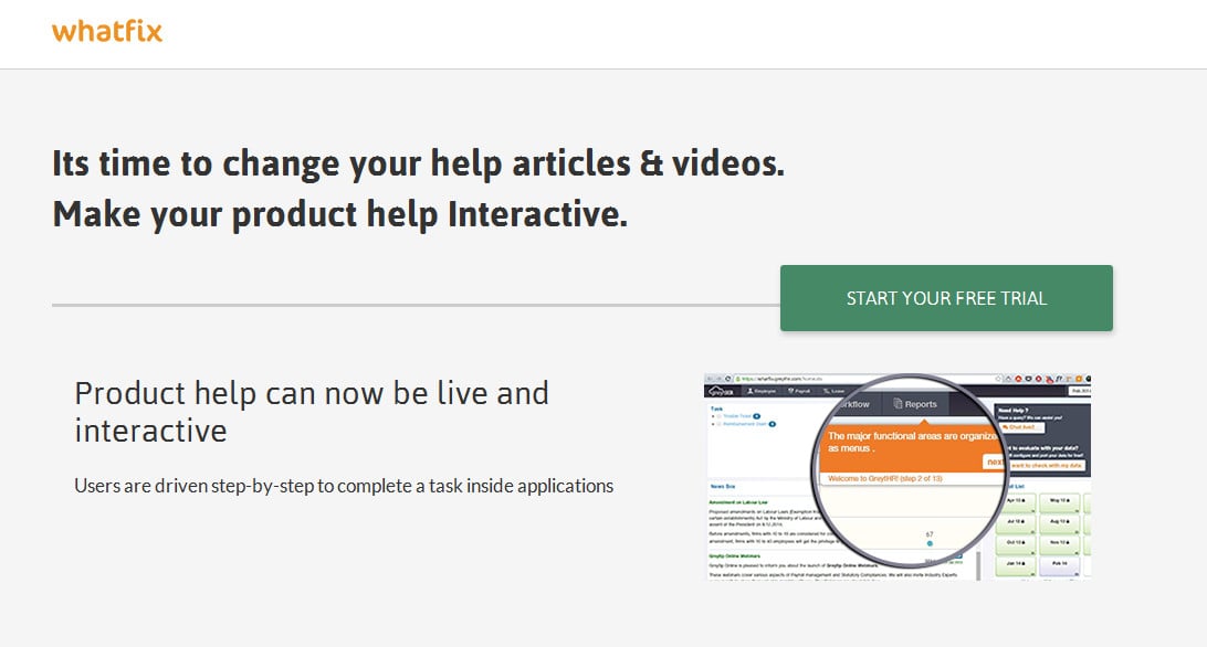
Even better, you can use a service like WhatFix to create a sort of “interactive FAQ” that turns your questions and answers into everything from slides to in-app widgets to engage the user and spur them to complete the task they’re struggling with.
Not only does this empower customers to find a solution, but actually motivates them to work through the issue along with guided support when they need it.
What kind of impression would that make on your company when the prospect has that “light bulb moment” of finally understanding?
Another option is to repurpose that content into a white paper.
A white paper takes a complex issue or problem and presents a solution, while giving valuable information about the mission and philosophy of the company behind it.
At this point you may be asking yourself “people want to know how to use their new widget! Not how I feel about widgets!” but you’d be surprised.
If someone is unfamiliar with you as a speaker or webinar producer, knowing your background and experience, as well as the quality that goes into your widget can help them make a much more informed decision about it.
To put it simply - they’re more likely to buy your widgets because you’ve not only presented them in a way that makes going anywhere else seem crazy, but you’ve also shown that you have the same values as the decision maker -- quality widgets at an affordable price, for instance.
Your Content Leftover:Blog Posts
Best If Used For:Podcasts or Whiteboards
Why it Converts Well:
- Different people learn in different ways -- some by reading, others by listening, and still others by following along and learning from example. These methods help you reach the latter two.
- Users may not have time to read a blog post, but will gladly listen to a podcast during their morning walk or their evening commute.
In the course of your blogging, you’ve likely got more than a handful of posts perpetually sitting in “Draft” mode, just waiting for some fresh air.
Why not repurpose them into podcasts or whiteboard “explainer videos”?
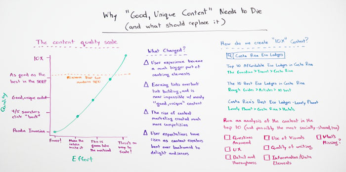
You don’t have to do every post this way - for instance, Moz has “Whiteboard Fridays” where they distill what would ordinarily be enough content for a blog post, into a more visual medium.
To create this kind of design, you can either use a digital whiteboard creation software, such as VideoScribe or do it the old fashioned way like Moz founder Rand Fishkin and write on an actual whiteboard:
Of course, you don’t have to get quite this detailed - but if you have something to share that would be better explained visually than written, a whiteboard or animation may be the perfect ticket to increase your conversion volume.
Your Content Leftover:Miscellaneous Statistics
Best If Used For:Infographics or Slideshows
Why They Convert Well:
- Forces you to distill large, seemingly-overwhelming information into visually bite-size pieces.
- Infographics are often shared on Facebook and Pinterest.
- Graphics often bring important statistics to light in ways that text simply cannot.
Finally, there’s the grab-bag of miscellaneous statistics.
These can be little factoids and other pieces you’ve picked up along the way. Not enough meat for a blog post, but perfect for a slideshow or infographic.
Slideshare is a great way to share your finished slideshows with a wider audience.
Despite its ease of use and simplicity, many marketers overlook this content marketing opportunity as they chase down bigger game like Facebook and Twitter.
But slideshows are great for how-to information, getting started guides, tutorials and much more.
[slideshare id=33946143&doc=setyourmantabusinessprofilefinal-140425104247-phpapp01]
In the Slideshare above, FitSmallBusiness shows business owners how to set up a profile page on Manta.
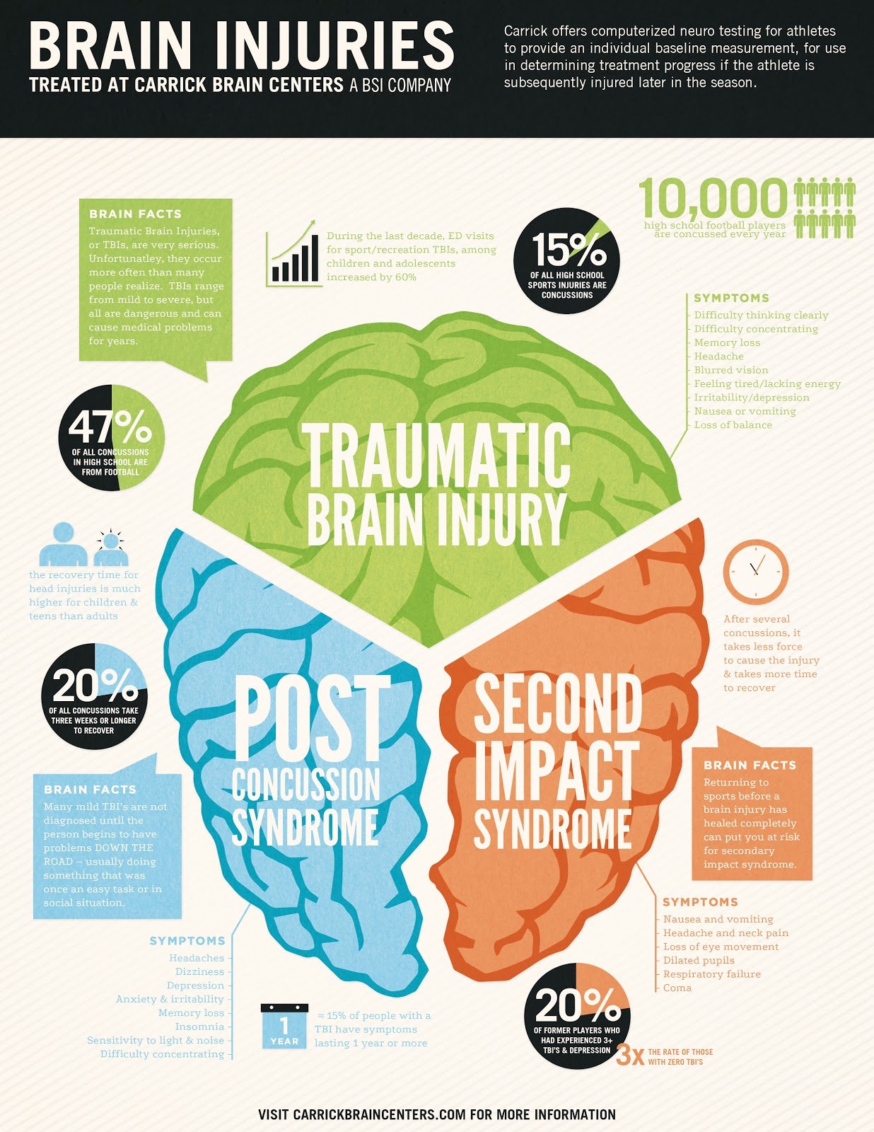
And if you want your audience to click less and scroll more, consider using an infographic, which will make great use of those snippets, facts and statistics you’ve been squirreling away in your desk drawer, just waiting for an opportunity to use them.
Take a look at this example which illustrates the three major types of brain injuries.
You don’t have to be a surgeon or a specialist to be able to understand the chart -- it’s simply four numbers, some facts and common symptoms.
And creating such an infographic isn’t “rocket surgery” either.
You can use an online service like Piktochart to drag and drop existing graphic elements into a template, and there are a wide range of templates to choose from.
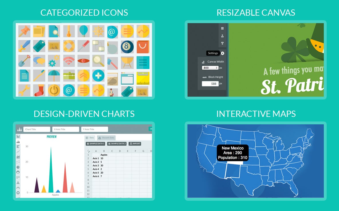
Piktochart is also a great way to create those aforementioned maps and charts from the first content leftover.
You simply plug in your data, choose your design, and the computer does all the heavy lifting -- crunching numbers and making the end result completely share-worthy and attractive to, you guessed it, conversions.
Now It’s Your Turn…
Time to unearth those content snippets and turn them into real, workable and easily scannable images, audio and video -- the kind of leftovers that your audience will happily munch on, and ask for seconds!
Have you repurposed your own content using one of these methods or something completely different?
Tell me about it in the comments below!
P.S. Learned something new? Share the knowledge with your fans so you can look even smarter!