When it comes to Facebook banner sizes it's important to remember all the different types of images you're dealing with. When you're asking about Facebook banners there are quite a few options to consider.
In this post, we'll run you through all the Facebook designated sizes and specs for all Facebook image types.
Not only that. But we'll also be covering some tips and tactics for each image ad type to best optimize your social advertising performance.
When it comes to Facebook Banner Ads and any image size on Social Network, it's safe to say you've come to the right place.
But for starters, let's talk about what exactly falls under the massive term of "Facebook Banners"
Get brand new Facebook ad strategies straight to your inbox every week. 23,739 people already are!
Image Types Under The Facebook Banner Umbrella
Let's start with the basics. When I say "Facebook Banner" what exactly am I referring to?
Banner ads? Facebook Page Banners? Your Cover Photo? You wouldn't be wrong in conversation if you answered yes to any of those. But it's important we distinguish the technical differences for the sake of this post and for the sake of clarity throughout your time advertising on Facebook.
So we'll start by defining and giving you examples on all the types of Facebook images at your disposal.
First, you have your Facebook Banner, aka: your cover photo.
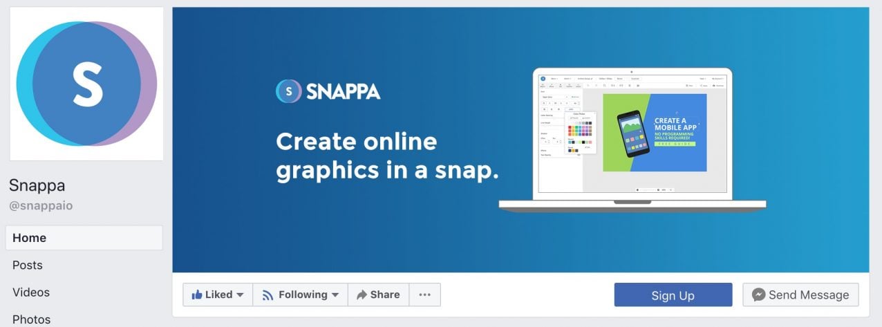
This is an example of your Facebook Banner - image source
After your cover photo and any other branded images you may want to supply (which I won't cover here because this is an advertising post), you can start looking at your Facebook ad image assets.
Starting alphabetically, Facebook banner ads are the first type of image you'll have to consider.
Facebook banner ads are, ironically enough, not a part of the Facebook platform themselves. They are Facebook ads that are shown on other platforms via the Facebook Audience Network. You can read all about the F.A.N. in our post on it in the previous link.
Either way, here's an example of a banner ad just for reference.
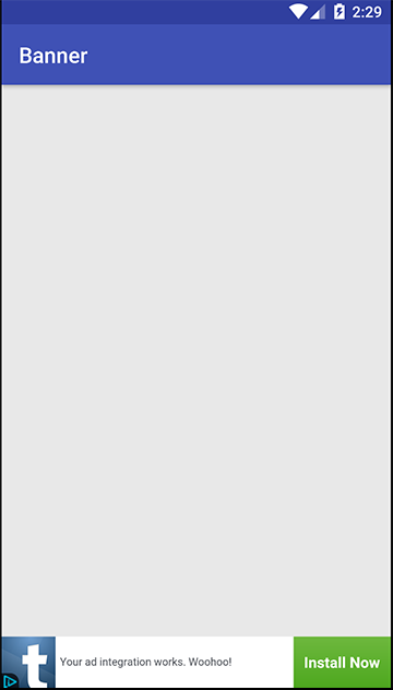
The banner ad is the bar at the top - image source
Next are classical Facebook Canvas ads. These are the ads that you can actually scroll around an image that is larger than the screen itself.
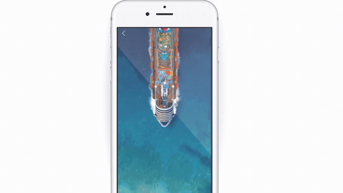
Canvas ads can really bring a dynamic element to your ad - image source
Then, there's everyone's eCommerce favorite: the Carousel ad.
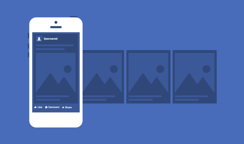
These are great for displaying multiple products - image source
As the image above shows, Carousel ads are great for displaying multiple products but because you're using multiple images in your ad, it's all the more important you nail down the specs and sizes.
Next on the list is the simple, single image ad. This is pretty much a simpler version of the canvas ad where the asset you use simply fits a bit more seamlessly into the newsfeed.
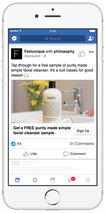
You can see this is a bit less jarring than the canvas ad above - image source
Then you have your slideshow ads. These can be a bit complicated as they either tend to deal with a lot of text within the slides or they try to replicate the canvas ad affect through multiple slices of a single image ad.
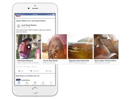
Be careful with slideshow ads, but don't be afraid to test them out either - image source
And, finally, you have your Facebook video ads.
In terms of facebook banner sizes you might not think that these make it onto the list. But Facebook has strict rules when it comes to uploading and distributing of any multimedia content.
So, just as images are going to have a preferred size/specs, videos will also have an ideal aspect ratio and file size that Facebook will be looking for. And these too fall under the Facebook Banner size umbrella.
Why Facebook Banner Size Matters
Now Facebook didn't just arbitrarily assign these image sizes and ad specs just because old Zuckerberg had another power trip.
Facebook chose these image sizes for a singular reason: user experience.
According to Facebook these ad specs, image sizes, and aspect ratios are the sizes at which the content loads fastest to the Facebook server and up to your Facebook page (or your user's view of your Facebook ads).
So, by optimizing your image assets' load time, you can improve your Facebook audience's user experience.
And the happier your users are, the more time they'll spend on Facebook.
And that, in turn, makes Facebook happy.
So the real reason that Facebook banner size matters is because it optimizes the load speed of your page's assets thus improving your branded user experience.
This should in turn boost your engagement across all your Facebook advertising campaigns.
And if that weren't reason enough, just think of this:
In today's world, having a nice, clean, fast-loading site isn't an impressive quality in a site...it's a prerequisite. Optimizing your images, load speed, and UX is necessary just to stay competitive nowadays – you need to take it one step further to distinguish yourself from the crowd.
In today's post-digital marketing world, you can't afford to let the little things drag you down.
All Facebook Banner Sizes
Now let's get into the meat of this post: what are Facebook's preferred banner sizes for all the image types we've listed above?
Cover Photo
For facebook banner sizes (cover photo) the preferred specs and sizes are as listed below:
- Images:
- Size - 820 x 312 pixels desktop
- Size - 640x360 pixels mobile
- Description: (not necessary, but we've seen certain cases where a link to a focused Landing Page has worked well)

Here's an example of an average cover photo - image source
Canvas Ads
For canvas ads the preferred specs and sizes are as listed below:
- Headline – 45 characters
- Text – 90 characters
- Description – 30 characters
- Image: 1,200 x 628, 1.9:1 ratio
- Video: .MOV or .MP4, 16:9 or 1:1 ratio
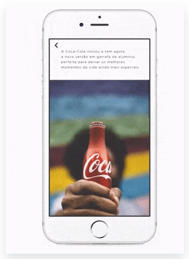
Here's an example of a canvas ad - image source
Carousel Ads
For carousel ads the preferred specs and sizes are as listed below:
- Images:
- Size – 1,080 x 1,080 pixels
- Ratio – 1:1 square
- Other Recommendations: Minimal or no text on the image
- Videos:
- Format – .MOV or .MP4
- Aspect Ratio – 1:1 square
- Resolution – 720p at minimum
- File Size – 2.3 GB maximum
- Length – 60 minutes (Facebook), 60 seconds (Instagram)
- Thumbnail – 1,080 x 1,080 pixels, 1:1 ratio
- Copy:
- Text – 90 characters
- Headline – 40 characters
- Description – 20 characters
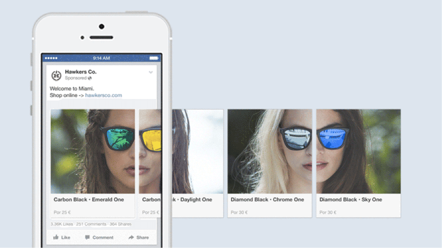
Here's an example of a carousel ad - image source
Image Ads
For single image ads the preferred specs and sizes can are as listed below:
- Images:
- Size – 1,200 x 628 pixel
- Ratio – 1.91:1
- Other Recommendations – Minimal or no text on the image
- Copy:
- Text – 90 characters
- Headline – 25 characters
- Link Description – 30 characters
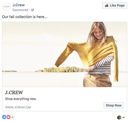
Here's an example of a single image ad - image source
Slideshow Ads
For slideshow ads the preferred specs and sizes are as listed below:
- Images:
- Size – 1,280 x 720 pixels
- Ratio – 16:9, 1:1 or 2:3
- Format — .MOV or .MP4
- Other Recommendations – Choose images with a consistent ratio. Using different sizes will lead to cropping.
- Copy:
- Text – 90 characters
- Headline – 25 characters
- Link Description – 30 characters
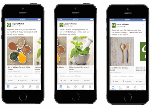
Here's an example of a slideshow ad - image source
Video Ads
For single video ads the preferred specs and aspect ratios are as listed below:
- Videos:
- Format – .MOV or .MP4
- Aspect Ratio — 16:9
- Resolution – 720p at minimum
- File Size – 2.3 GB maximum
- Length – 120 minutes (Facebook), 60 seconds (Instagram)
- Thumbnail Image – 1,200 x 675 pixels, 16.9 ratio
- Caption – 2,200 characters maximum
- Copy:
- Text – 90 characters
- Headline – 25 characters
- Link Description – 30 characters
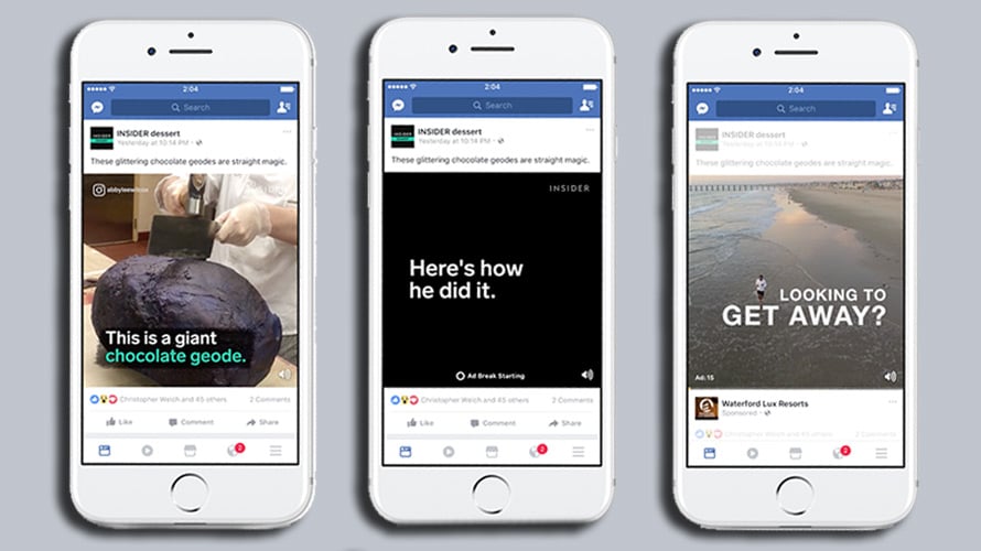
Here's an example of a single video ad - image source
Those are just the easy notes to remember.
Now, it's time to actually get into what you can do with these different assets.
Facebook Image Guidelines
Keep in mind that Facebook has image guidelines beyond just the size and dimensions of your assets. You can give the official Facebook image guidelines a quick read by clicking the link if you want.
But, what I want to take time to specify is that Facebook will reformat your images if they aren't preemptively and properly sized before hand.
So, if you don't use the right sizes and dimensions from the beginning, Facebook will automatically adjust your assets to make them work best (which may not leave you with a great final product).
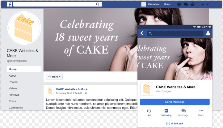
Facebook's job isn't to make you (as the advertiser) happy, after all
- image source
Just consider this a cautionary tale to serve as one more warning about the importance of Facebook banner size.
Now let's get started about how to make the most of these different image assets so you can start dominating your Facebook campaigns.
Leveraging Your Facebook Banner (Cover Photo)
Now that we've covered the preferred Facebook banner sizes, we can get talking about how best to leverage your facebook images – starting with your Facebook banner itself.
Depending on what type of campaign you're running and what type of audience you're targeting, your Facebook banner is a strong first impression you don't want to waste.
There's (at least) 3 basic ways you can leverage your facebook cover photo:
- Demand Generation (pain point/value prop)
- Brand Evangelism (authority/social proof)
- Lead Generation (call to action/urgency)
I'll cover the parenthetical bits in each subsection below. Let's keep going.
Demand Generation
If you are a new business or are selling a less-than-household-name product/service, you may be struggling just to generate demand for your service at all. Let alone your brand itself.
If this is the case, you can use your Facebook banner to make a strong and lasting first impression on any users who are brought to your page.
By targeting the actual pain points you're trying to solve with your product/service you can highlight the user's unknown need for your help.
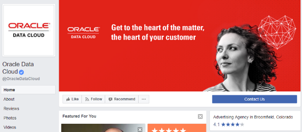
My father always told me "It's what you don't know you don't know that you need to know" - image source
This can hopefully bring a nice organic boost to the search volume of your primary keywords (at least on a micro level) that can help focus your more bottom funnel campaigns.
Brand Evangelism
If you already have your foot in the door in terms of an actual product or service but are struggling to distinguish your brand, then this type of Facebook banner might be for you.

The art of the humble brag is just that...an art - image source
Facebook cover photos that focus on brand evangelism will rely on building the authority of your brand. This is where you distinguish yourself with that "little thing" that sticks you out from the crowd.
This can come in many ways/shapes/forms, but for the most part it's about expressing your expertise, your trust worthiness, or your value.
Below are a few great ways to build your authority:
- Social Proof (either in reviews, testimonials, etc)
- Big Name Endorsement (celebrities, influencers, experts, etc)
- User Generated Content (real life proof of your product/service working and excelling in the real world)
And then, of course, there's going for the conversion itself.
Lead Generation
This is every marketer's favorite part of the funnel – that critical point where you get to go for the jugular.
If you're leveraging your brand's Facebook page for BoFu (Bottom of Funnel) lead gen campaigns than you ought to keep your messaging strong and consistent throughout your page. And this includes your cover photo.
An example of a strong lead generating cover photo could be anything that generates a strong sense of urgency and communicates a clear and actionable call to action.
Maybe a little something like this?
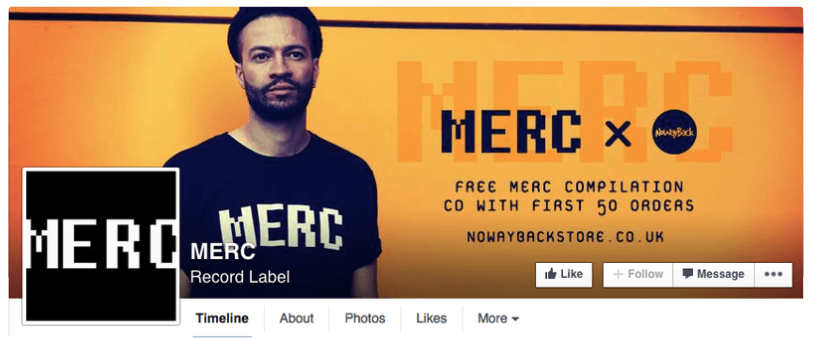
I'd say that's a very clear CTA right there - image source
You can also vary your lead gen cover photos depending on what tactics you're employing. Maybe you have a seasonal deal you want to emphasize during the holiday season. Or maybe you have a limited time offer that you want to emphasize up until that very last second.
Regardless of the specific tactic at play, simply don't forget to include your cover photo in your lead gen design.
Tips For Facebook Image Ads
Now, as you've probably guessed by now, there's plenty of types of image ads to choose from within Facebook's advertising platform. So, in this section we'll go over some tips on how to optimize Canvas ads, Carousel ads, single Image ads, and Slideshow ads.
For starters, the single Image ad is the most straight forward ad you're going to deal with.
What's important with image ads is that you recognize that you're ad is going to be disrupting the user's newsfeed experience, and thus you need to lead as heavily towards native advertising as you can.
Why lean towards native advertising? Because ads that can seamlessly blend into the natural user experience of the platform will be less intrusive and generate a higher, more positive engagement.
Beyond simply following the general principle of native advertising, there's some tangible takeaways that can help you optimize your image ads as well.
For starters, make sure that you keep your value proposition clear.
Don't let the fact that you're advertising on the social network or via imagery distract you – you're advertising a product/service.
Make sure your audience knows that as well. Be clear with your value prop as well as your CTAs to keep users focused on your key conversions.
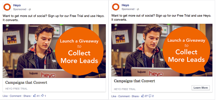
A clear CTA plus a nice quality action image can do wonders - image source
Showing off the human element to your product/service has also been known to be a solid image ad tactic. Including real people's faces and images of your product being used by real people can authenticate your ads a great deal.
But single image ads are just the tip of the iceberg...let's keep chipping away.
Tips For Facebook Canvas Ads
Facebook Canvas ads are great for mobile ad campaigns. This is because the play off the gamification of scrolling through the image asset.
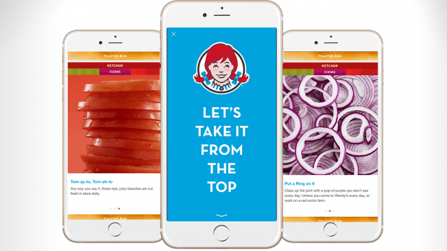
Here's a great example courtesy of Wendy's - image source
Whether you use the "canvas" to display different cuts of a burger or a more informative version of a shoe advertisement like the example below, these ads give you far more flexibility than ordinary image ads.
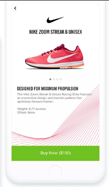
This canvas ad almost feels like an in store purchase with all this info
- image source
This is also why you should probably save these Canvas ad campaigns for mobile, however. The scrollability and gamification of the canvas might not translate to desktop as well as it does in our hands.
Tips For Facebook Carousel Ads
Carousel ads feature multiple images that users are shown that they can scroll through with the same CTA and ad copy. Like I mentioned earlier, these are great for display related products for eCommerce campaigns.
But that's not the only option you have at your disposal.
Facebook themselves have a few great tips on how to make the most of your Carousel ads. Some tried-and-true tactics are listed below:
- imply continuation (encourage your audience to continue scrolling through your image assets to complete the experience)
- tell a story (this is a great way to motivate users to do the former)
- create a progressive theme (this can grow/develop across the ad)
- have an end goal in mind (keep your primary CTA as your north star)
And now we have the final form of image ads to address.
Tips For Facebook Slideshow Ads
Slideshow ads are a cool intersection of all the other Facebook ad types.
You can blend any type of image or video assets together in a multimedia slideshow ad and have targeted copy that helps tell your story along the way.

Here's a really great example of a multimedia ad - image source
You can even include music with your slideshow to give it a more "singular video" feel. This way it might seem less like a presentation and more like a streamlined experience.
And before you ask, yes, you choose the automated duration of each slide so be sure not to doddle on any non-critical slides.
You want to make sure the maximum number of users possible is reaching the end of the slide (where your CTA is).
Tips For Facebook Video Ads
Here's where things can get a little more segmented within the Facebook video marketing world. There's actually more than just single video ads on Facebook.
You can also advertising using interstitial video (shown when crossing in between apps and/ore levels) ads and in-stream video ads (video ads running within other videos).
But for the most part these tips will be applicable regardless of the situation you leverage videos in your ad campaign.
Beyond ensuring that your video is formatted correctly and is the right file size and using the right aspect ratio, video does give you the most free reign over the creativity of your ad. However it's still important that you catch the user's attention within the first 3 seconds of the video.
And, because these are still short form video assets being used, you should probably consider combining both animation and live-action video to help with data visualization while maintaining a human connection.
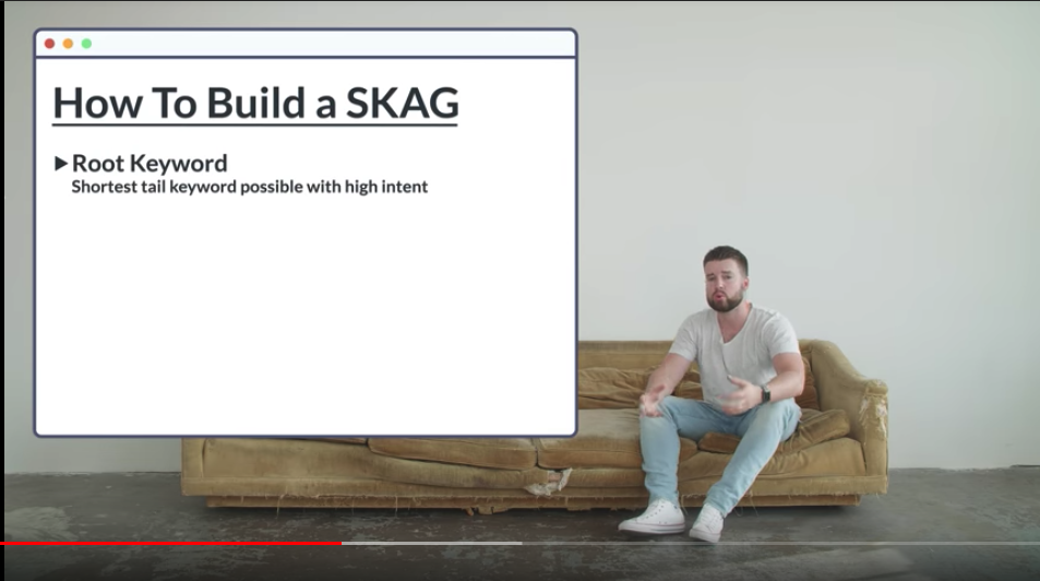
Here's a strong example of the combination mentioned above
- image source
TakeAways – Make A Strong First Impression
The takeaways here should be quite clear: Facebook is serious about it's images. When it comes to formatting, facebook banner size, cover photos, image guidelines, and more, it's more than worth the time to make sure your images are properly optimized.
Knowing how to make a strong first impression on your branded page can make all the difference for your social ad campaigns.
So, take the time to craft yours carefully.