


Google Analytics reporting is an undervalued analytics skill set. We spend our time buried in rows of data, looking for insights and quirks, or analyzing A/B or multivariate test results, that we forget the real power of analytics: catalyzing positive action in a business.
To produce action, one must be able to accurately communicate (aka report) data -- and frequently, this is the weakest skill of an analyst.
Google Analytics reporting is quite simple, though, and there are many ways to accomplish it in an effective way. With custom reports, the default Google Analytics dashboard, and custom and flexible solutions like the Google Analytics API and Data Studio, there’s no reason to ignore effective reporting and communication.
I’ve always been fascinated by beautiful data visualization and storytelling--and especially as a growth and product marketer, I’ve had some cool opportunities to learn the best formats for data communication.
In this article, I’ll show you some things I picked up in our Intermediate Google Analytics course as well as just from playing around in GA, Excel, and Data Studio.
Get brand new analytics strategies straight to your inbox every week. 23,739 people already are!
Google Analytics Reporting Out-of-the-Box
There are many ways you can report insights, from spreadsheets to interactive Shiny Apps for R scripts, but this article will mainly focus on out-of-the-box ways that you can use Google Analytics to create dashboards.
Google Analytics has some native functions, but often to get the most out of your reporting, you need to bring it to another solution, namely either Google Sheets or Data Studio (their new visualization product).
Let’s start with the default Google Analytics reporting and dashboard sections.
Custom Google Analytics Reports
Google Analytics allows you to create reports and dashboards directly in their interface. As of this time, you’ll find this in the Customization section under “Custom Reports.”
There are three types of reports:
- Explore
- Flat Table
- Map Overlay
ExploreReports
Think of “Explore” reports as a way to drill down on dimensions. You start by analyzing your data from a high level dimension like Medium and then can further view things like Session Duration and Browser as a function of each Medium type.
As an example report, let’s add “Users” and “Average Session Duration” as metrics for our report.
Then, you can add dimensions. From here, let’s select “Channel.” It’s optional, but you can also include additional dimensions to your report to drill down on. Let’s add “Device Category” and “Country.”

These custom reports let us see things that normal Google Analytics reports wouldn’t let us see. For example, nowhere else in the interface can you view Medium by Users. But by making a custom report, you can do so with ease.
Now, when we hit the button to create our report, here’s what we see:
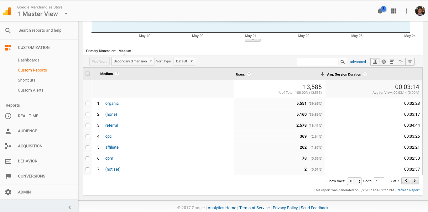
This table shows us our Medium right along side Users and Average Session Duration. But, remember, we added some dimensions to drill down up. So, to access that information, you can simply click on the specific Medium you’d like to learn more about. Here, we’ll click on “Organic”:
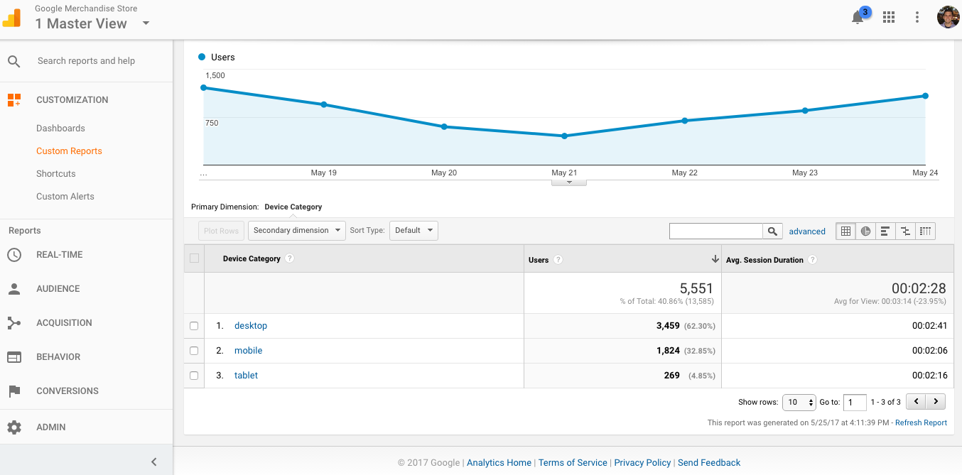
This allows us to see what the makeup of our Organic Users is, broken down by their Average Session Duration as well as the device they’re using. Knowing that you can customize this report in so many ways is quite powerful. It allows you to access insights a novice Google Analytics users wouldn’t think about.
Some best practices for custom Google Analytics reporting:
- Give the report a meaningful name.
- If you’re adding more than one report tab, name each report.
- If you’d like to only view specific users, you can use the filter feature.
Flat Table Reports
The next custom report Google Analytics allows us to create is a flat table. This is perfect for creating data sets you can pull into Excel and eventually explore with Pivot tables. In fact, in a previous article for KlientBoost, I showed how you can use flat tables to create a cool heat map of your traffic or conversion data in Excel.
The basics of creating this type of report are the same. You add dimensions and metrics, but in this report they’re all created side-by-side as opposed to the drill down fashion above.
So, let’s add “Hour,” “Day of Week Name,” “Medium,” and “Device Category” to our dimensions, and let’s add “Sessions,” “Transactions,” and “Pageviews” to our metrics.
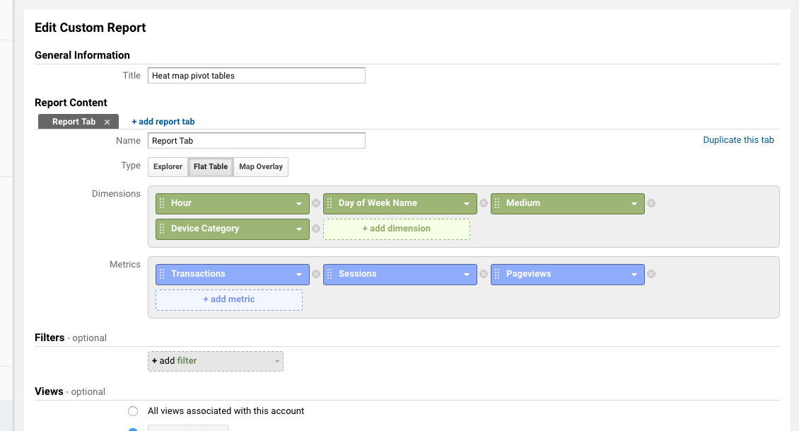
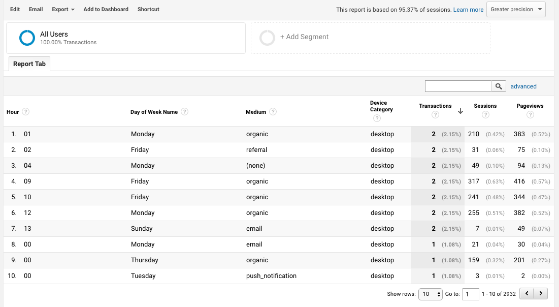
Here’s what we get when we create this Google Analytics report:
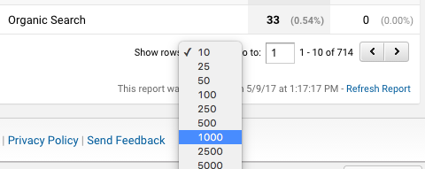
As I mentioned, the real value in a flat table comes from the ability to export it to Excel and explore it with more flexibility. To do that, make sure you’re showing all of your rows and then click Export.
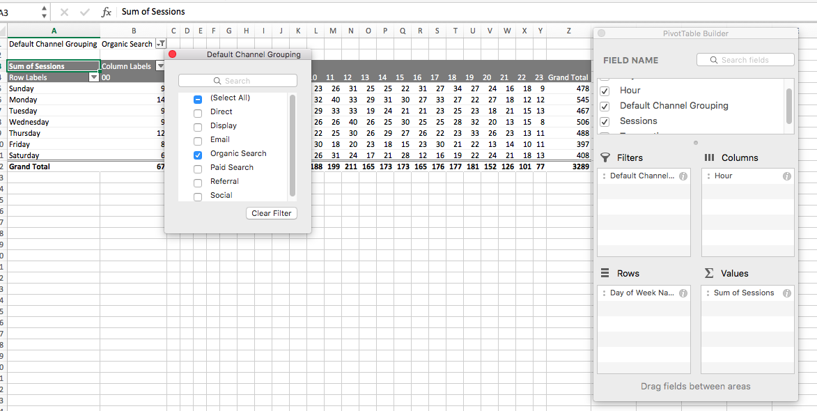
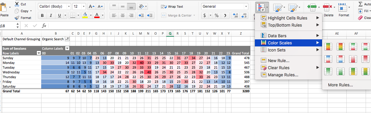
Open the file with Excel and create a pivot table, so that your rows and columns contain Day of Week and Hour (doesn’t matter which is row or column) as well as whatever metric you’d like to analyze is in “values.” If you want to filter by traffic source, add that as a “filter,” as shown here:
Then, apply conditional formatting to create a pretty looking heat map.
That’s just one example of how you can use flat table customer Google Analytics reports to generate business insights. The possibilities are endless and are worth exploring.
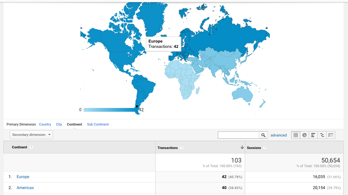
Map Overlay Reports
A Map Overlay report is quite simply a map you can generate with GA data on top. Just add the metrics you’d like to view from a geographical standpoint and you’re good to go.

You can also select different Zoom Levels depending on how close you’d like to view your data: World, Continent, Subcontinent, and Country.
In addition, you can select different geographical dimensions, including Continent, Subcontinent, Country, and City.
Finally, all the same filter and view functions apply with this report as well (i.e. if you want to only view metrics from those on mobile devices, you can create a filter for that).
When we create this report, here’s what it looks like:
If you want to skip all the thinking work (or you just want some inspiration as to what’s possible with custom reports), check out these pre-made custom reports for Google Analytics.
Google Analytics Dashboard
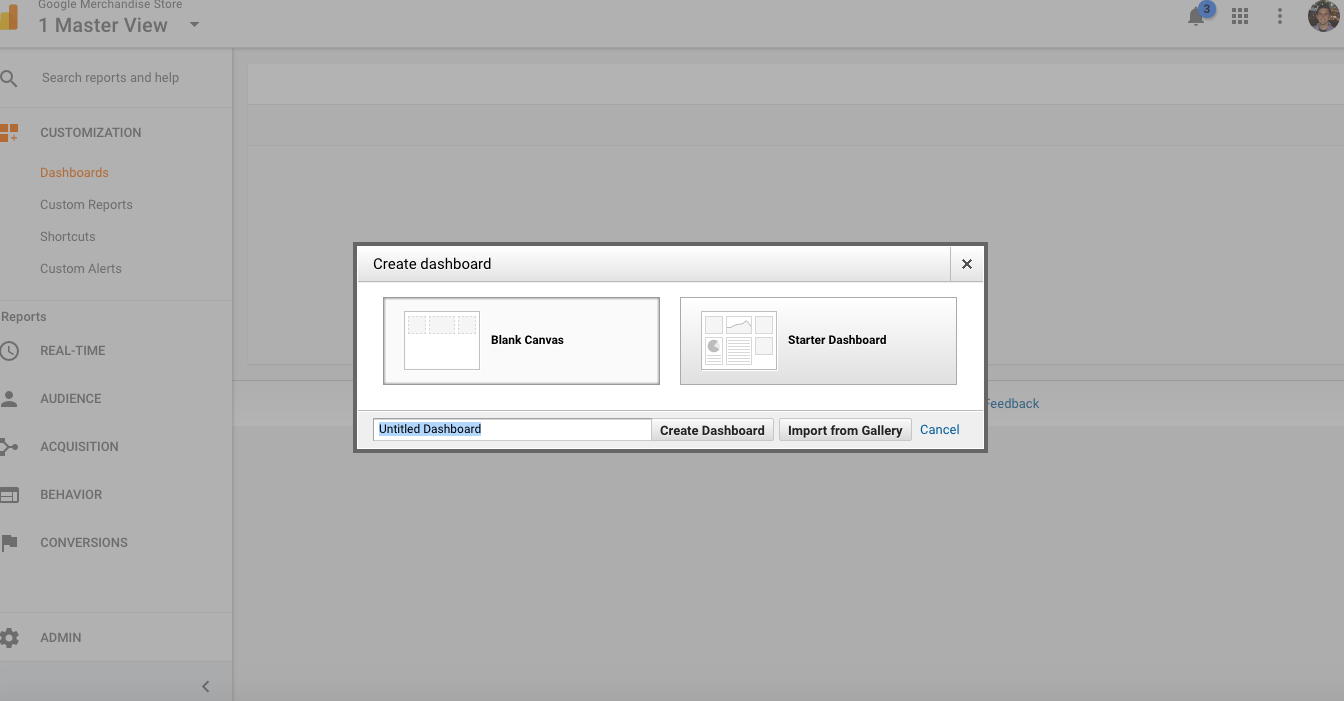
Next, let’s dive into the native Google Analytics reporting and dashboard capabilities. You’ll also find this feature in Customization.
Just choose “dashboards,” and there you can create new dashboards. When you create one, you can choose to do so from scratch or you can choose a starter dashboard. You can also use dashboard templates from the Google Analytics Solutions gallery.
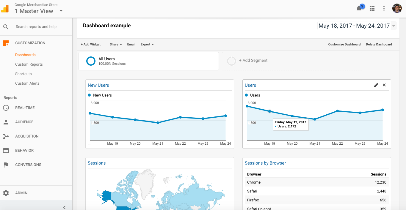
For our use case, let’s just go with a Starter Dashboard. This will give us some very basic information such as Users, New Users, Bounce Rate, and Revenue. In addition, you can always customize the date range and add segments.
There are two ways to interact with these dashboards. First, you can click on the “Customize Dashboard” button on the upper right hand side of the screen. From there, you change the layout and appearance of your dashboard.
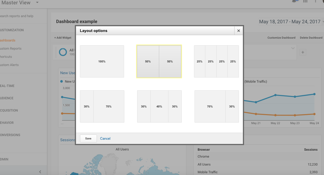
From there, you can simple drag and drop these “widgets” around to whichever place you’d like them.
Next, you can click the “Add Widget” button on the upper left hand side of the screen to add more graphs to your dashboard. Here, you have two choices for chart types: standard or real-time. You can pick from a few different types of visualizations depending on the chart type, including pie charts, bar charts, timelines, etc.
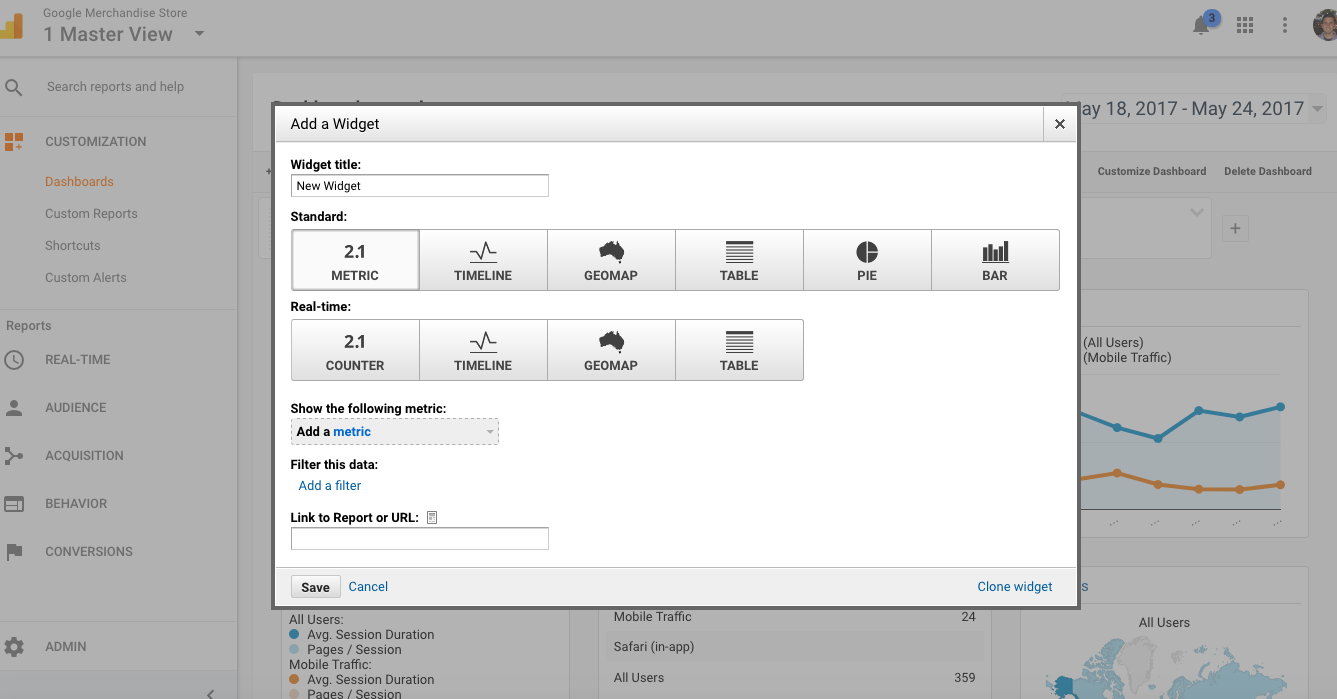
Of course, you’ll need to choose which metric you’d like to visualize. Let’s go with a random example and say we’d like to visualize Product Revenue and Sessions by User Type. When we put that data into a “Table” chart, we get the following output:
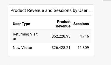
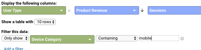
As with custom reports, you can filter the data here in any way you’d like as well. For instance, we can choose only to show mobile in this widget:
As you can see, there are quite a bit of native visualization capabilities here. That being said, I prefer Data Studio to the native GA feature, for many reasons. It’s easier to share, it’s more customizable, and it’s better looking. You can bring in other types of data. There are simply too many limitations, in my opinion, for the native GA dashboards.
Still, though, it’s valuable to learn about this feature as some managers will prefer to view their dashboards within the Google Analytics interface.
We’ll get to Data Studio later in this article.
Automated Google Analytics Reporting with Google Sheets
Here’s a fun one. Using the Google Analytics API, you can send you analytics data to external sources such as Google Sheets or R. For this article, we won’t dive into R and we’ll maintain focus on Google Sheets (much easier to understand and learn). If you’re interested in Google Analytics + R dashboard capabilities, start here.
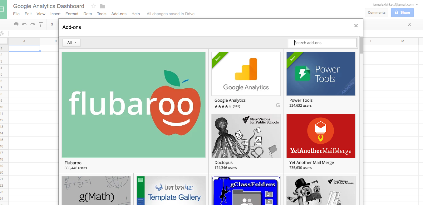
For the Google Sheets option, you start simply: create a blank spreadsheet. Then, click on the add-ons menu button and click “get add-ons.” In this window, search for Google Analytics and install it:
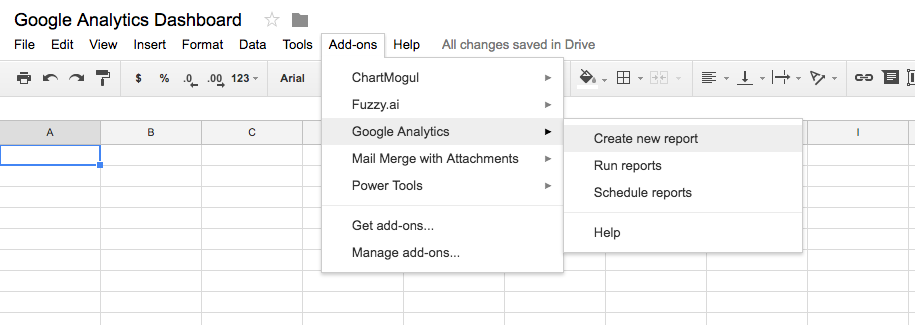
You may have to refresh your worksheet--but after that, go to the add-ons menu and click “Create New Report.”
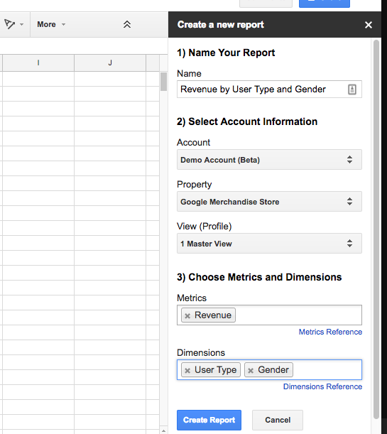
That will bring up a fancy form on the right hand side of the screen that you need to fill out. Let’s make a report on revenue by user type and gender. You’ll name your report, fill in the account information, and pick your metrics and dimensions.
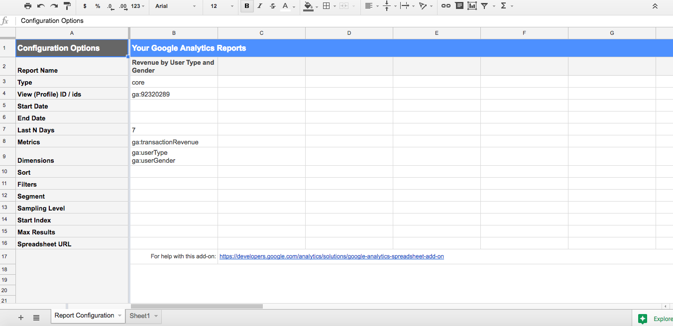
When you press “Create Report,” this is what it spits out:
Because you’re calling the Google Analytics API, you can actually combine data sources. For instance, I could run another report from a different Google Analytics view and use that in my dashboard as well. To do that, you just go to the add-ons menu and click “Create a new report” again, and follow the same steps as above with whatever information you’d like.
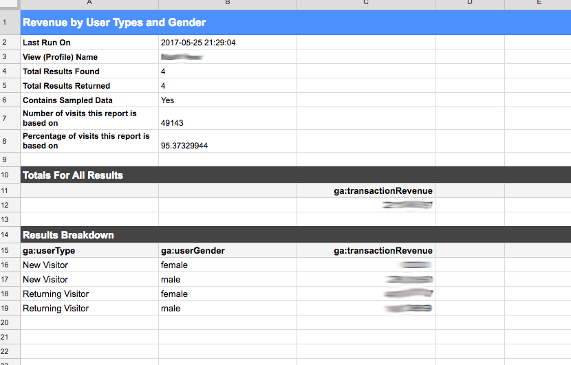
When you’re ready, return to the add-ons menu and click “Run reports.” Here’s what you’ll get:
The benefit of using the Google Sheets API for your reporting, other than the ability to combine data, is that you get all the functionality of Excel with your Google Analytics data. Essentially, this means you can build visualizations, run pivot tables, and analyze in any way you normally would given your skills in a spreadsheet.
You can even schedule reports to run to automate the process. This automation eliminates a lot of busy work and keeps everyone up to date on key metrics.
Data Studio: Powerful and Easy Google Analytics Reporting
Finally, we move on to my favorite Google Analytics reporting solution: Data Studio.
Data Studio is essentially Google’s free version of Tableau. It’s super easy to use and it’s more flexible than the default Google Analytics reporting and dashboard tools. In addition, it’s very easy to share these with the team and they’re interactive, so you can customize them to pull unique insights.
If you want to see the power of Data Studio reports, just flip through this gallery of example reports.
Similar to the native GA dashboards, you can start from scratch or using a template.
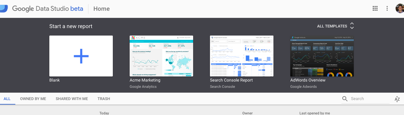
I actually like starting with a template when you’re first learning Data Studio. It can give you tons of inspiration as well as a good starting point.
When you first create a report, you’ll notice that you need to add a “Data Source.” This is simply the source from which Data Studio pulls information to create reports.
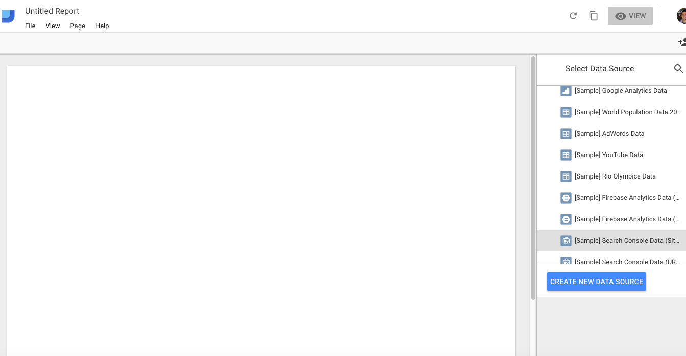
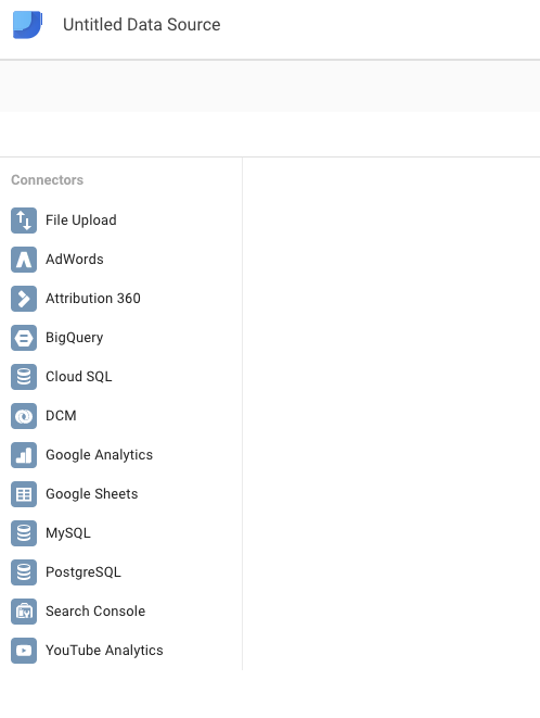
You’ll also notice that, when you click “Create a New Data Source,” there are many different types available. These out-of-the-box integrations include Google Sheets, AdWords, BigQuery, your web analytics data, and many more. For this reason, Data Studio has much more flexibility and capability than other reporting options.
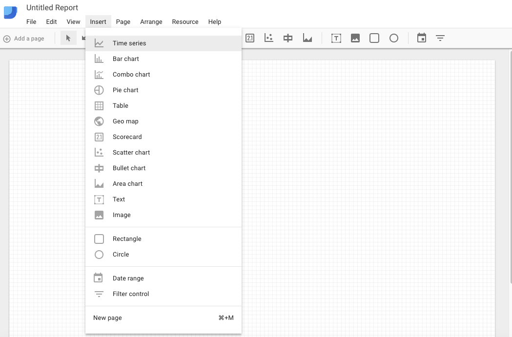
Once you’ve connected a Data Source, you can begin creating. The interface of Data Studio, while intimidating at first, is actually very friendly. The top horizontal bar under the menu contains icons of select charts you can add, and you can also access these options from the “Insert” menu:
There are so many permutations of a Data Studio report that I won’t dive too deeply into setting them up. But to show you a quick one, I’ll choose a time series and visualize Sessions by User Type.

Basically, you choose all your inputs within the form on the right hand side. You can filter your data, add segments, choose the data range - anything. You can also add styling to the cart. Your options are (almost) endless.
If you really want to master Data Studio, there’s a bit more advanced functionality where the magic really kicks in. I’m probably not there yet, but I’m excited for a Data Studio course we have coming up through CXL Institute.
Wrap Up on Google Analytics Reporting
Communicating data is important. Google Analytics reporting is flexible and there are many ways you can do it. It just depends how customizable your reports need to be and what type of information you need to communicate.
This article went over a few of the simplest ways from custom reports to the native Google Analytics dashboard feature. We also covered how you can scale reporting with solutions like using the Google Analytics API and using Google’s new data visualization product, Data Studio.
If you’re looking to become better at reporting, you should have enough information to get a start. Be warned though, once you dive into the world of data visualization, storytelling, and communication, it’s a bit of a rabbit hole. It’s a lot of fun, and there’s always more you can learn.