By now, you most likely know that Google doesn’t allow the traditional Google Ads exit popup.
According to their policies, Google Ads exit popups are banned because they can hinder a visitor from leaving your site and/or landing page.
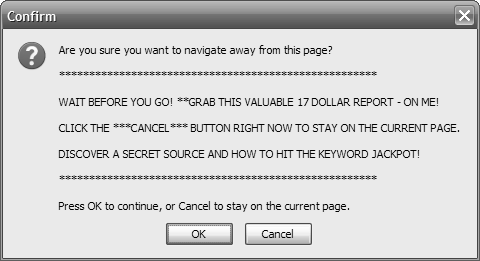
You know, that lovely Google Ads exit popup that looks like this - image source
Luckily, however, there are some great workarounds you can use so that you’re 100% in compliance with Google policies.
Best of all? You can continue capturing leads and sales on an ongoing basis, even if those visitors are about to exit.
Popups have been shown to improve conversion rates by more than 50% while still giving great value to your visitors. You just have to do it the right way.
On top of that, you can essentially use your popups everywhere on your site, not just where you send your Google Ads traffic. Your blog or About Us page probably gets a lot of traffic where a popup could be extremely valuable.
So because of that, I’ve outlined some crucial reasons for what you shouldn’t do and what you should do when using a Google Ads exit popup.
Please pay close attention to the “Do Not Do” part, as this could suspend your Google Ads account if not taken seriously.
Hate ‘em or love ‘em, exit popups get serious results when done right.
Get brand new Google ad strategies straight to your inbox every week. 23,739 people already are!
First Off, What Is an Google Ads Exit Popup?
If you’ve been living in a cave for the last few years (which is entirely possible) or just haven’t been online much, then you’ve probably never seen an exit popup.
In its simplest form, an Google Ads exit popup is a smaller rectangular/square box that appears on a site when a visitor has tried to exit your site.
Imagine a pixelated Billy Mays slowly whispering into your ear as you’ve tried to escape...
I wish all sites were like infomercials. Okay, maybe not. - image source
The goal of an Google Ads exit popup is to re-spark an interest that was lost by the Google Ads visitor to keep them around and potentially promote a new offer to get them to perform a certain action.
As an advertiser, you’ve paid for the click, so the objective is to squeeze whatever value you can from that.
[Tweet "Are you using #GoogleAds exit popups to re-spark interest in your visitors? Try a less threatening offer"]
Most of the time, a traditional Google Ads exit popup is to prevent you from leaving. This is what Google hates.
What You Shouldn't Do
1. If a visitor clicks on the exit button/tab to get away from your site or landing page, then never prevent that from happening. Allow them to leave.
This is the #1 reason Google Ads exit popups are banned in the first place. It prevents the visitor from doing what they want to do, leave your page.
And if a lot of your visitors are trying to leave, then using a popup to fix the issue is like putting lipstick on a pig.
You’re not trying to solve the actual problem - image source
Your landing page is still ugly, and you should focus on improving the experience of that landing page design before toying with the idea of using a popup.
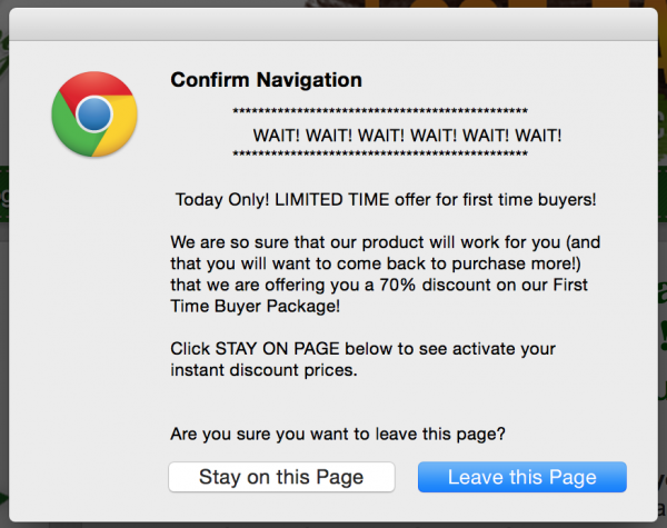
A traditional Google Ads exit popup looks like this. Please note that this is my first attempt to leave this specific site.
If I choose to “Stay on this Page”, I may get lucky to get another Google Ads exit popup with an even “better offer”.
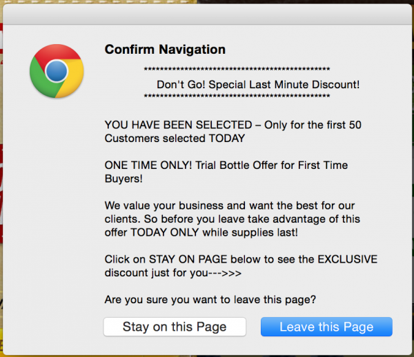
SCORE! That is exactly what I got when I tried to leave the second time.
A “better offer”. Emphasis on the quotation marks.
2. Don’t use a pop-under, which opens up another window underneath your current browser. This also comes across as deceiving, as a visitor doesn’t know it’s there until they clear all their windows.
3. Don’t automatically open a new tab in your visitor's browser.
4. Don’t make outrageous claims like “Lose 50 lbs In One Week!” or “Make Your First Million by Getting This FREE Guide!”. These are the same policies regular websites and landing pages are regulated through and it falls under Google's misleading or unrealistic promotions policy.
Also, if you have this many trust indicators on your page, then it’s probably because you’re not trustworthy.
This is from an actual Google Ads advertiser selling diet products.
So what are you supposed to do if you can’t use popups? Let me introduce you to something called overlays.
Nine Google Ads Exit Popup Strategies You Can Use To Increase Conversions
As with most humans, if we’re told that we can’t do something, then we’ll probably want to do it.
The good thing is that there are a few ways you can use a Google Ads exit popup without having to worry about a Google Ads suspension.
With overlays, you’ll quickly find that your first go around with one won’t do that great, and that’s okay.
You want to use an overlay solution that allows you to easily split test different ideas without the need for code or programming (we’ll talk about solutions at the end of this post).
Once you’ve decided on the popup solution you want to use, the last thing you want to do is annoy your visitors with stuff they don’t care about.
You'll need to make your offer different than the current one or one in relation to it, but with less friction (there’s a reason to why they didn’t convert in the first place)
With overlays, always think of ways to make them less demanding and less threatening.
Here are nine of my favorite Google Ads exit popup workarounds with real use cases that you can use to increase your conversion rates:
1. Time Delayed Overlay
This overlay is pretty straightforward as the name implies. The time-delayed overlay works with what time frame you set it to. You can have it appear after a visitor has been on a certain page for five seconds, or 10, or three - you get the idea.
I recommend giving your visitors enough time to see who you are and what you’re all about before serving the overlay.
A good rule of thumb would be to look at your Google Analytics and see what the average time on site is, then set the popup to serve about 10 seconds before that.
[Tweet "Use your average time on site to set your time delayed overlays for the perfect #conversion moment"]
Why not show your overlay right away?
If you do, there’s a good chance you’ll piss off your visitors. You need to give them a chance to read what they wanted to in the first place. Kinda like what happened to CopyBlogger and their readers, which actually led to hate mail.
Make sure your overlay doesn’t distract. Instead, have it give value to the visitor.
2. Scroll Overlays
If you're looking to boost your long landing pages or blog posts with popups, scroll overlays will be a great tool for you.
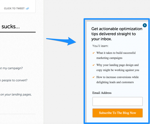
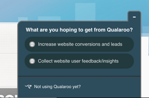
Scroll overlays are not like regular Google Ads exit popups. They only appear in the footer (usually on the right-hand side) after a certain percentage of the page has been scrolled through.
Here’s an example fromUnbounce’s blog. Notice the value and call to action.
Qualaroo is another great tool I can recommend for scroll overlays.
You can use Qualaroo's smart, quick surveys to collect feedback from your visitors to improve your site or content. You can generate leads from the tool too.
Finally, they offer a free trial and a lot of juicy case studies on how they’ve dramatically helped their customers grow.
Think of all the questions you could ask, and the answers you could get!
In one case study, Qualaroo helped increase leads by 300%. Yes, you read that right. Leads. Not just newsletter subscriptions, but actual leads.
3. Exit Intent Overlay
WPBeginner has a great case study in which they were able to increase email subscribers by 600% with exit intent overlays.
Exit intent overlays work by measuring your mouse rate and the sensitivity that comes from the speed of movement.
If a visitor rapidly moves their mouse towards the top of the page (which is usually to exit), then the popup is activated and shown.
Make your offer irresistible. Give them something they’d be interested in.
4. Hover Overlays
Hover overlays are like the name implies. You hover over a certain item of interest that then gives you more information about the topic.
Most of the time these types of overlays aren’t created with the intent of immediately capturing a conversion. But instead, they’re there to give the visitor more information.
Testing this isn't always necessary, since you have other overlay options.
But if you think you have too many distractions on your landing page or site for the visitor to take action, then using these type of hover overlays can remove a lot of clutter and give a more pleasant experience to the visitor.
You may be so fortunate to improve your user experience (UX) that your conversion rates also grow as a result.
You can also use hover overlays to capture email info and then market to your visitors down the road if they might not be ready to sign up for your services today.
5. Click Overlays
A click overlay is not as intrusive as the other popups. This kind of overlay appears when someone has clicked on a certain part of your site or landing page.
It’s what we use on all of our “Get Proposal” buttons on this site.
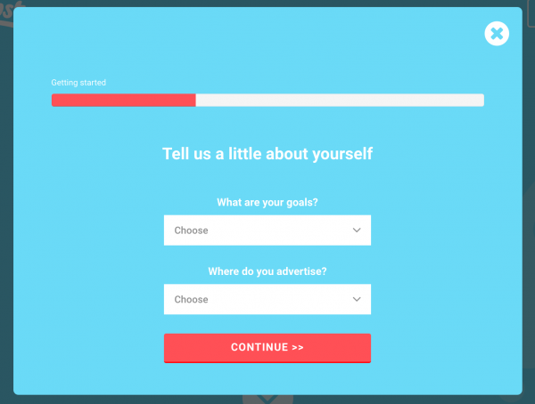
Instead of taking the visitor to another landing page after they’ve clicked your button, keep them where they are and use a click overlay instead to finish the conversion.
Visual Website Optimizer did this with their sign up forms and saw a 50% increase in conversion rates compared to taking the visitor to a different page after the button click.
You often see this with videos that are opened up and expanded on your click or with lead generation landing pages that don’t want your browser to take you away from the original page, so a click overlay is served to capture your info.
6. Gate Overlay
Also known as entry overlays, these suckers can be annoying... and incredibly effective for you.
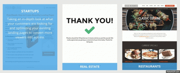
They work by blurring or blacking out the background and forcing someone to finish the goal before they can continue with what they were doing.
If you’ve ever gone to Quora without signing up, you’ll know what I’m talking about.
Wishpond toutes that their entry overlay has increased conversion rates by 200%, while they still allow visitors to continue to browse the site without performing the conversion.
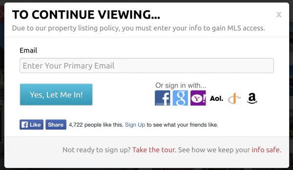
You often see these types of Google Ads overlays on real estate sites. They allow you to look briefly at some properties but then block you from looking at all of their listings until you give them your information.
(Giving too many options to convert can hurt your conversion rates)
7. Coupon Overlay
Coupon overlays are pretty amazing.
Imagine that you’ve stocked an online shopping cart full of fresh attire and you’re about to buy it all.
But then something distracts you. Maybe it’s that little voice inside your head telling you to do what all online marketers despise.
Wait.
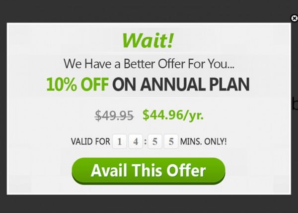
You decide to hold off and move your mouse cursor to the exit. But then, to your amazement, you see a coupon overlay that’ll give you 10% off if you finish your purchase.
“Hot dang!” you think. “I’m about to get an amazing deal + look fresh to death in my new threads! I’ll take it!”
Before you know it, you now have a 13% conversion rate bonus and an extra 2,423 conversions that month.
Not too shabby.
8. Urgency Overlay
Very similar to the coupon overlay above, an urgency overlay can be used for ecommerce and lead-based goals.
Simply give your visitors some irresistible value and add a countdown timer that actually counts down.
Not only will this make them hyperventilate, but it’ll also force them to take action as the FOMO kicks in and creates a response.
Traditional and digital marketing has proved again and again that the fear of missing out works wonders for conversion rates.
9. Giveaway Overlay
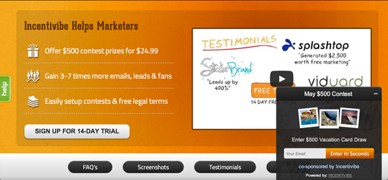
In a very cool Unbounce post, Incentivibe showed how giveaways increased conversions by over 700%.
Yes, you read that right. Seven. Hundred. Percent.
How did they do it? They used overlays to funnel visitors into certain groups that were then marketed to later.
You can say that this isn’t really relevant to your business and you’d be absolutely right. But how could you make it relevant to your business?
An ecommerce store will never be able to turn all abandoned cart visitors into shoppers, but they can turn them into email subscribers that will hopefully by later.
Since many visitors are used to free PDFs, white papers, courses, etc. There’s a good chance you can spark their interest by offering something of physical value.
With more than enough ideas to dominate your popup/overlay testing, how do you decide where to begin?
Here’s How To Get Started
With tons of popup tools on the market that automatically create the JavaScript code you need to paste on your site, it’s easy to find a solution that works for you.
And with different budget options and free trials, I recommend you research these companies below to find the fit that works best for you:
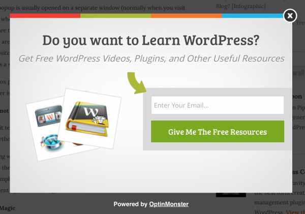
If you’re like everyone else, you probably use a WordPress site. A great WP tool I recommend is OptinMonster.
OptinMonster allows you to measure mouse sensitivity through exit intent and showcase your popup before a visitor reaches the dreaded X.
You can also time release your popup to show after a visitor has been on your site for a fixed amount of seconds and/or on specific blog posts so you can make your popup relevant to the category of what the visitor is already reading.
So the next time you opt in for the easy route that could get your Google Ads account suspended, remember to go the Billy Mays route: Give people more value than they expect and sell it to them for $19.95.
Okay, maybe not $19.95. But definitely stick to the value part.
And make sure you focus on split testing different overlays to see which have the highest conversion rates and track the ultimate revenue from those conversions.
What Google Ads exit popup strategies have you used to your advantage? What were the results and how’d you do it?

