If you’re here, it’s because you’re a digital marketer and you’re in charge of your company’s paid online advertising (PPC) strategy.
You’ve probably already invested in Search ads to get some instant visibility until your SEO efforts lift the needle in a few months (to a year).
Now you’re venturing into the realm of Display advertising on the Google Display Network (GDN) because you’re looking to get in front of a larger audience and spend less than what you’re doling out on your search campaigns.
Bravo. Good call.

You’re sold on the benefits of Display advertising, but then you see dozens of different ad size options and you’re a little intimidated by all that choice.
Don’t be. It’s easier than you think.

In this post, we’ll talk about responsive ads that ask little of you design-wise, but deliver a lot—and perform better than image ads.
But we’ll also talk about common ad sizes across the GDN.
In fact, we’ll start there.
Get brand new Google ad strategies straight to your inbox every week. 23,739 people already are!
What are standard Google Display ad sizes?
Come now, that’s not the best question to ask.
There are twenty standard Google ad sizes, but some perform better than others, and it would be a giant waste of your time to make ads in underperforming ad sizes.
But we get it; sometimes you like to see all of the ingredients before wrapping the enchilada.
So here’s the whole enchilada:
*All sizes are in pixels and include animated and non-animated image sizes.
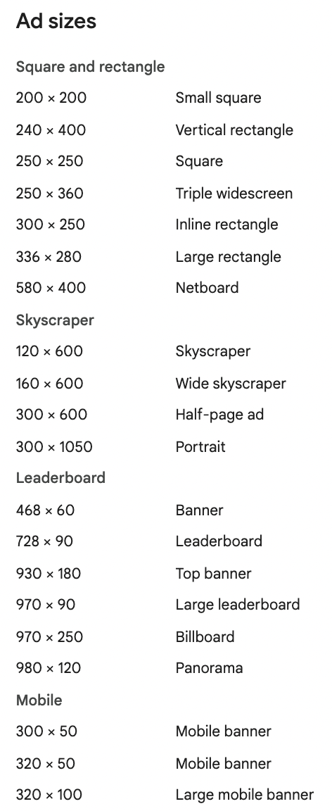
Mobile device ad sizes
300 × 50 Mobile banner
320 × 50 Mobile leaderboard (Smartphone leaderboard)
320 × 100 Large mobile ad banner
Square and rectangle
200 × 200 Small square
240 × 400 Vertical rectangle
250 × 250 Square
250 × 360 Triple widescreen
300 × 250 Inline rectangle (medium rectangle ad)
336 × 280 Large rectangle
580 × 400 Netboard
Skyscraper (tall, thin ads)
120 × 600 Skyscraper
160 × 600 Wide skyscraper
300 × 600 Half-page ad
300 × 1050 Portrait
Leaderboard (wide banner ads)
468 × 60 Banner ad size
728 × 90 Leaderboard ad
930 × 180 Top banner
970 × 90 Large leaderboard
970 × 250 Billboard
980 × 120 Panorama
*Animated ads (GIF) length and speed
- Animation length must be 30 seconds or shorter
- Animations can loop, but they must stop after 30 seconds
- Animated GIF ads must be slower than 5 FPS
Those are all of the ad sizes available to make image Display ads but, in case you’re unclear, there are two Display ad types:
- Static image ads: These ads are fixed and appear only in the size they were designed. They don’t adapt to ad slots and don’t evolve based on performance. They show only as you originally uploaded them.
- Responsive display ads: This is the default ad type for the Display Network. Responsive Diaplay ads auto-adjust (size, appearance, and ad format) to fit any available ad space on the GDN. Over time, they adapt, picking your best assets (that you upload when making a responsive ad) to maximize performance.
Here’s the truth: Responsive ads perform better than image ads.
Image ads vs. Responsive ads
Here are the two questions you really want to ask:
- Should I use image ads or responsive ads?
- What are the best Display ad sizes?
Should you use Image ads or Responsive ads?
As with many things in life, covering the bases is a bright idea.
Image ads
If you want to have more control over the creative for your Display campaigns (because your graphic abilities impress Warhol and your copywriting skillz get a post-mortem thumbs up from Hemingway), then go ahead and build your own image ads outside of Google Ads (in Google Web Designer, Creatopy, or Bannerflow for example). Then upload them as a .zip file into Google Ads.
But if you trust Google to assemble a top-notch ad from the smorgasbord of assets you provide in your Google Ads account, stick with Responsive ads.
There’s a reason they’re the default option for ad creation: Responsive ads are the shiz.
Responsive ads
The benefits of Responsive ads are that they’re simpler and quicker to create, not to mention that they perform better because Google optimizes when and where they show.
You simply upload your logo, some ad images in a few different sizes, some video clips, a few headline variations, and a few descriptions. Google treats those things like a buffet and makes a different plate to serve your ads to potential customers (using machine learning predictions to figure out the best combo of elements based on your performance history).
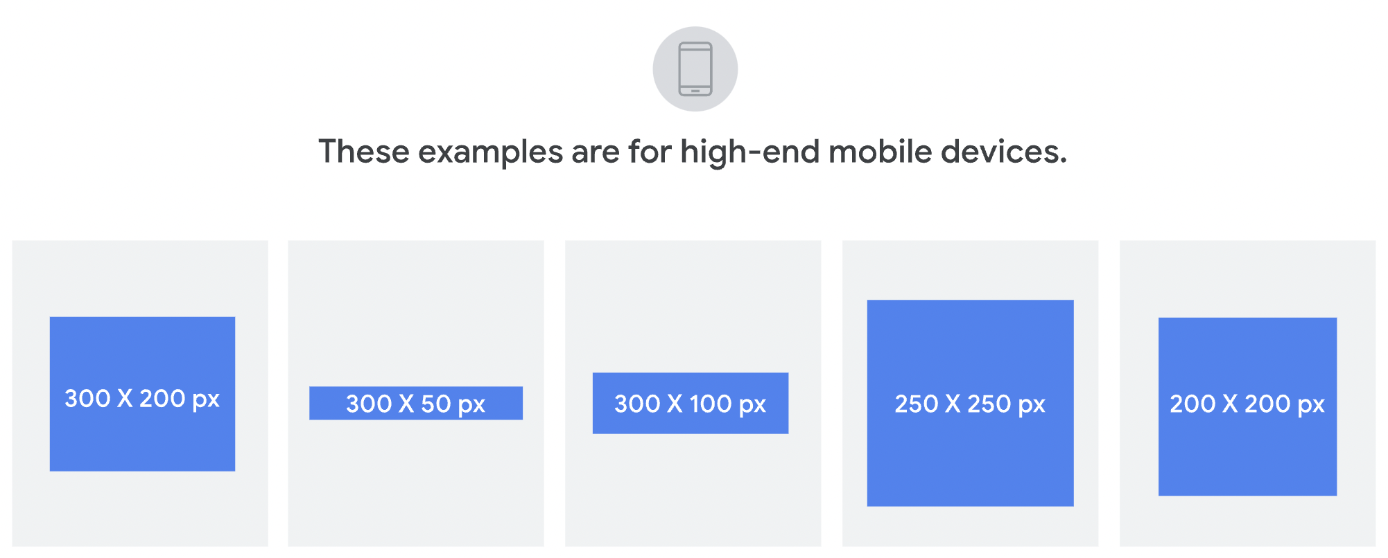
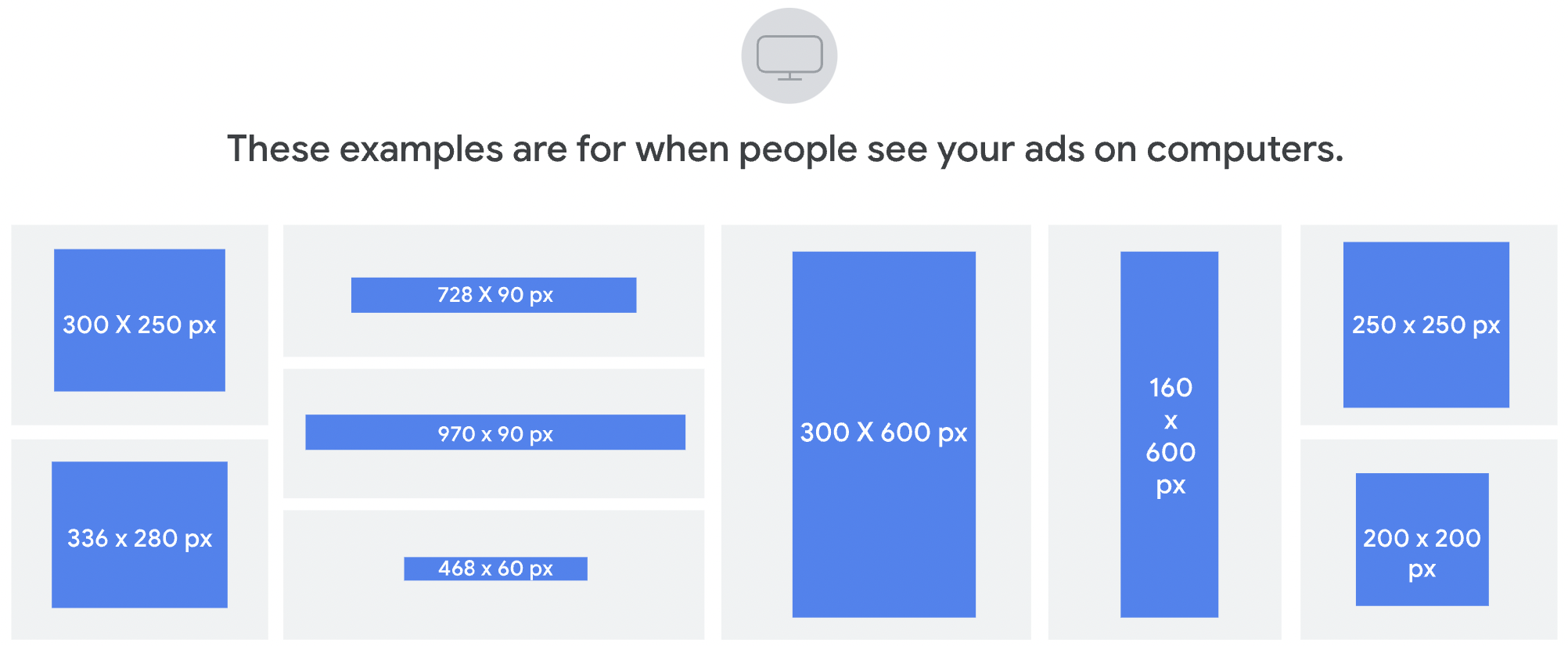
Sometimes your Responsive ads will come together as a banner ad, and other times they'll show as a skyscraper ad, square ad, or a leaderboard ad for mobile. Sometimes Google will sub in a video whenever the prediction is that a video might drive better performance for you.
There’s no ad portfolio to manage, which means you can focus on improving other areas of your overall marketing strategy.
And let’s be honest:
Are you the world’s best ad designer? Do you want to pay to have one of those in-house? Will you spend time tinkering with your ads in an external designer only to create a small vault of lackluster ads that look like shite and underperform?
Heart talk that one.
And then know this: Not all Display ad sizes are created equal.
What are the best Google Display ad sizes?
Some perform better than others:
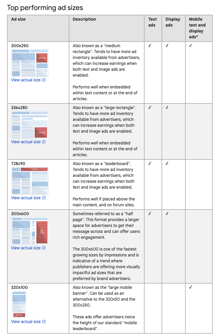
If you leave it up to Google to choose your ad sizes responsively, Google will max out your impressions in the best-performing ad sizes.
But the truth is, no ad size is the best ad size.
There is no best Google Ad Size
If a site on the Google Display Network is a great one, content-wise, to display your ad, it might only allow smaller images. In that case, the small ad size is the best one.
But another site that Google picked to show your ad (because it was specified as a targeted placement) might ask for a larger size format. In that case, your larger ad size is the best one.
Some adblockers will block banner-size ads but won’t block other ads (larger or smaller). In that case, any size but a banner size is the best one.
Some ad sizes perform better by region, so one ad size will work better in Norway and another in the USA.
That’s why Responsive ads are the way to go. They debuted in 2016, and they made so much sense that they became the default option by the summer of 2018. And the reason why is because Responsive ads work best—and they can be any size.
That doesn’t mean you can’t upload image ads, but if you do, understand that no one size is better than any other.
What is the maximum file size for a Google Display Ad?
This one’s easy: The size limit for all image ads is 150 kilobytes.
Don’t upload assets that are too small, or your ad will look like fuzzy garbage. And keep it under 150kB so Google doesn’t slap you for trying to bloat the internet.
Formats: GIF, JPG, PNG
Focus on design elements
You’re getting cozy with the idea that Google has your back and will do a good job of showing your ad assets in a package that appeals to your users.
But there’s something that’s entirely within your control when it comes to Display ads, and that’s saying the right things, using the right images, and including the right action:
- Text – Less is more here because space is limited. You lean on your graphic assets to pull eyeballs onto your ad, then you’ve got a second or two to engage the reader with your copy and encourage a click. When it comes to your copywriting, chop, chop, and chop some more. Remember that your ads will show on smartphones, so keep the message tight.
- Image and video – This is what’s going to capture the attention of your audience. While design is subjective, make sure that your image and video assets will get noticed.
- Logo – Don’t forget this. Your brand is essential, and Google will disapprove your ad without it. Take this opportunity to show off your label here.
- CTA – People must know why they’re clicking on your Display ad. A strong CTA makes a difference in the conversion rate.
One of the greatest things about working at KlientBoost is our super skilled design team. If you’re lucky enough to have a designer, they can create your ad assets for you to use in your ad campaigns. If not, we can (and you should ask us about doing that for you) 👆
Parting shot: test your ads in all sizes
As you’ve just learned, responsive ads will show different ad sizes across the GDN based on your targeting criteria (audiences, keywords, placements, etc.). And while Google claims that certain ad sizes perform better, we like to let the data do the talking.
From one of our accounts, where our focus was to increase conversions and lower CPA, we looked at all the sizes of image ads across different audiences, with different offers and CTAs.
When we filtered by one of the popular sizes, 300×600, the data showed that CPA was way higher than the other ads in this campaign, and the conversion rate was much lower.
But we had much better success with the 728×90 size, which had the most clicks of any ad size as well as the highest number of conversions & lowest CPA.
It’s good to be aware of the top-performing ad sizes, but the elements of your ad are more important than the size at which they end up showing. So don’t focus on Display Ads Sizes. Take a look at your ad inventory and see what you should update to improve ad performance.
Are the images awesome? Is the message amazing? Do you have a great CTA?
It’s all about testing and figuring out what works for you.
So, while size does matter 😏 (there’s more real estate for certain sizes than others), keep in mind that design matters too. Your ads should capture the visitor’s attention and offer an enticing reason to click on the ad (no matter the size).
What else?
If ad sizes are the how of Google Display Ads, then targeting is the who, what, and where. That’s next. Learn how to steer Google to show your ads (in all of their sizes) to the right audience in the best places with Display targeting.