Is your hero shot performing as well as it could? Is it driving conversions?
You might think that your hero shot is already pretty strong. You’re getting conversions after all, but you always want to keep looking for new ways to improve.
If you think your hero shot is pretty great, there are probably a few more tests you can run to improve your overall conversion rates.
We’ve got a list of 41 ways to improve your hero shot to grow those conversions.
Get brand new landing page strategies straight to your inbox every week. 23,739 people already are!
The Copy Around Your Hero Shot
1) If you’re not using an oversized hero shot—that is, if your hero shot takes up only part of your landing page design —give it a caption (or copy around your hero shot). Design Shack explains why:
Always, always use a caption. Captions get read 200% more than body copy so you
want to make the most of them.
Kissmetrics backs this up as well:
Maximize the impact of your images by adding captions below them. International eye tracking studies have shown that readers will recall the caption text nearly 100% of the time.
2) If your hero shot fulfills most of the items on this list but still isn’t converting, you might have a copy problem instead of a hero shot problem.
Run some A/B tests on different copy to see if you can improve conversion rates that way.
VenueSphere in which changing the sub-headline that ran over the hero shot increased leads by 69%.
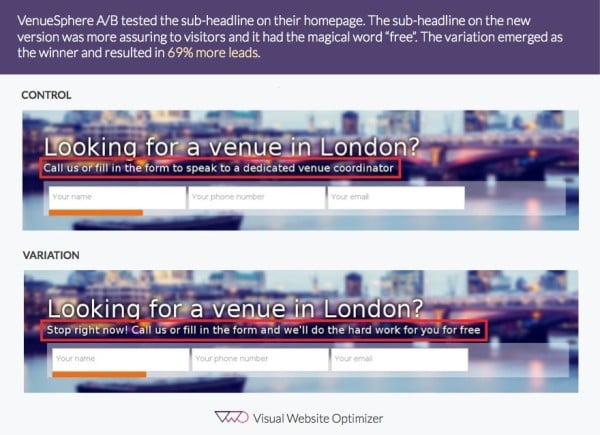
Visual
3) Use a real person as your hero—a satisfied customer or client, or a team member.
Marketing Experiments shows that using a real person associated with your product instead of a stock photo increases conversion by 35%.
4) If you’re doing a photo session for your hero shot, take A LOT of photos. Go after the angles and expressions you’re looking for, but don’t be afraid to experiment. You never know what the camera might discover. To quote Benchmark:
"Just because you composed the shot in your head as being 'just so'
doesn’t mean that another perspective from a completely different angle isn’t going to be preferable. Electrons are cheap, so shoot lots!"
5) On the subject of photography: pay for the professional photographer or videographer. You get what you pay for, so don’t skimp here—and don’t shoot your hero shot on your iPhone.
Talk to your photographer/videographer about what you want in your images (eye direction, micro-emotions, etc.) so that you can work together to get the perfect hero shot.
6) Keep your shot simple. Yes, you want to communicate a number of things with your hero shot—the problem you solve, the ideal customer, the subtle visual cues that drive people towards your CTA—but you aren’t going to do that by crowding the image. As KlientBoost explains:
Your landing page should be the entrance to a conversion funnel.
It’s #1 purpose is to get people into your funnel.
Your design should facilitate this goal. It shouldn’t be distracting or cluttered. It shouldn’t overwhelm new visitors.
It should, very simply, take them by the hand and lead them straight towards conversion.
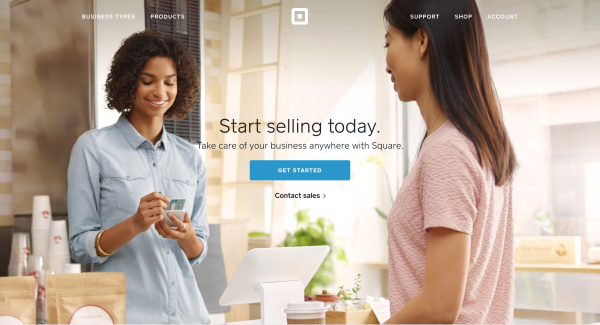
Want to know if your shot is simple enough? Ask people to identify what part of the shot they are supposed to look at, and make sure they get the answer right.
7) Make sure your hero shot contextualizes what you sell.
Visitors don’t just want to see the product; they want to see a person using the product. Put your product in a real-world context (this tip, like a few other tips on our list, comes from the amazing Angie Schottmuller).
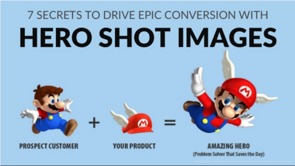
8) Male or female hero shot? It depends. Use whatever resonates with your target audience. As Unbounce suggests:
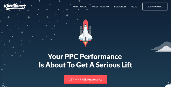
"If you’ve decided on using a person or people for your hero shot,
you can test whether a male of female best resonates with your target audience."
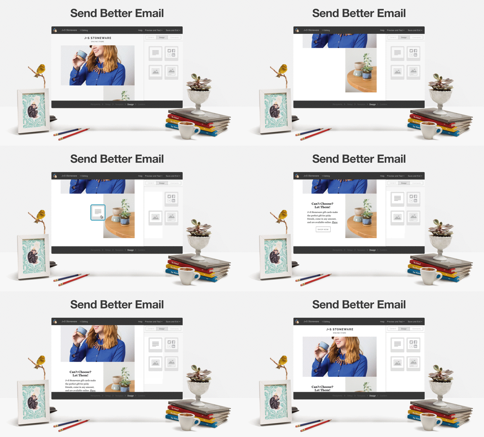
9) Consider thinking of geographic locations and the race geography there. As sad as it sounds, certain demographics respond better to hero shots with humans of a certain race.
10) Use your hero shot to give a visual solution to your customer’s problem.
Think of car commercials: we see a guy driving super-fast with a gorgeous woman in the passenger seat, and we know what two problems this car solves. As Websites 360 puts it:
"An effective hero shot will get people to visualize themselves experiencing the benefit of the service.
It’s where they want to be. And they’ll pay you to help them get there."
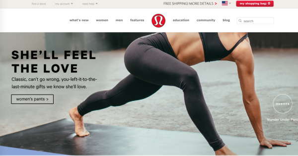
11) Use your hero shot to attract the right people and push away the rest. You should know whether to show an image of a guy driving the car with a gorgeous woman next to him, or an independent woman driving the car on her own.
Both of those images attract different customers and push away others. CrazyEgg reminds us that a good hero shot gets the right people—and only the right people—into the conversion funnel.
12) Unbounce also suggests giving your CTA its own visual space.
If you’re using an oversized hero shot, for example, make sure part of the image is compositionally minimal—an open sky, an empty wall, and so on. That’s where your CTA goes.
13) Impact suggests: make sure your words and images are saying the same thing. If your copy uses words like “the future” but you have an image of a person standing in front of a Victorian house, your messages are conflicted. (Unless, of course, that person is wearing a jetpack.)
Design/Placement
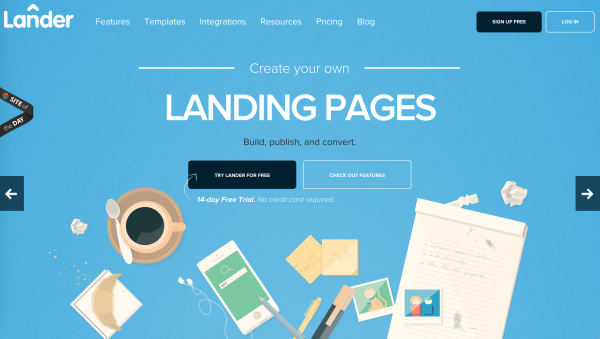
14) Consider doing a first-person-shooter style hero shot that puts your customer directly in the role of the hero. Lander’s hero shot, for example, is a top-down view of a desk that might resemble yours.
15) Make sure the people in your hero shot are looking towards your most important part. As Kissmetrics puts it:
“When the person in the “hero shot” is looking at the call to action, we subconsciously turn our attention to it as well.”
16) While we’re on the subject of eye contact: test your images with eye tracking to see where your users are looking. This tip is from GetElastic, and it makes sense:
"If your users aren’t starting on the most important part of the hero shot,
following the hero’s eyes to important text then you don’t have the right hero shot yet."
17) If your users still aren’t looking in the right place, consider using an explicit directional cue, such as an arrow, to point them in the right direction.
Unbounce recommends using these types of literal pointers if your suggestive pointers aren’t getting the job done. Include the arrow in the actual composition of your hero shot, or place it outside of your hero shot to point the reader towards where they need to look next.
18) In addition to including directional cues like arrows in your hero shot composition, you can also use text-based clues. Is your hero holding a book? Looking at a webpage? Reading a sign? Treat any words in your hero shot as copy, and choose them deliberately.
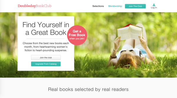
19) An Angie Schottmuller tip: Put a buffer of white space around your hero shot to prevent people from scrolling away too quickly. You’ve invested so much into your hero shot—give your customers the opportunity to fully absorb it.
20) If you haven’t already switched to an oversized hero shot (you know, the kind that takes up the entire width of your page) consider going big. CrazyEgg gives us some amazing statistics on a French website that expanded into an oversized hero shot:
"The new mega-background image made a huge difference.
This variation increased sales by French shoppers by 39.8% and sales by global shoppers by 29.7% both at a 99.9% confidence rate."
21) Should your call to action match the colors in your hero shot? You don’t want your CTA to clash, but you do want it to contrast. Here’s Unbounce’s suggestion:
Test using an impactful and contrasting photo as your hero shot, and mirror the palette choice and contrast levels on your CTA to draw a parallel and guide the visitor from the emotional element to the conversion goal.
22) A tip from GetElastic: If you sell more than one product, only include one product in the hero shot. People feel more comfortable when they don’t have to deal with choice or confusion.
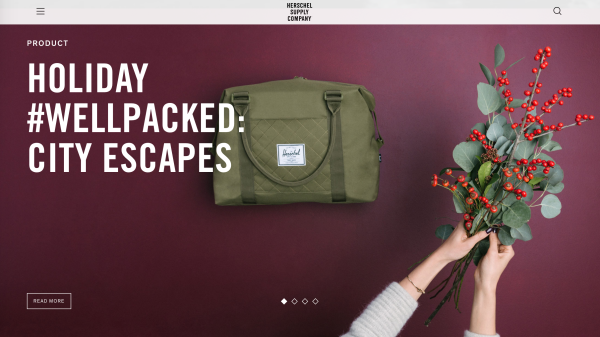
23) Where should you place your hero shot? Kissmetrics found what works best:
Place your “hero shot” to the center or left of your page. It requires too much
visual effort to direct the eye to a right-aligned image.
If your hero shot takes up the whole page, consider putting the most important part of the image in the center or to the left side.
24) Don't rotate your hero shot. Conversion XL wrote a great piece on why you shouldn't and a Notre Dame University study found that 84% of all clicks, clicked on the first hero shot compared with 4 others. The point being is to solely focus on one hero shot to create the best UX.
Emotion
25) Give your hero the same attributes as your target buyer persona. Let your customers look at your hero and see themselves. To quote Impact:
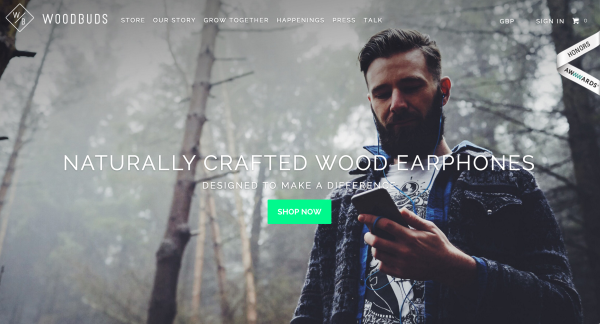
Woodbuds, makers of eco-conscious high-quality wood earbuds, does just that. Their hero depicts a stylish man in a wooded setting listening to music, suggesting both a love of nature and music.
This paints a realistic and relatable picture of how their ideal persona would most likely interact with their product. This not only resonates with their persona, but it helps them envision themselves actually using Woodbuds.
26) Think about your favorite brands or companies. You can picture their hero shot, right? That’s because a good hero shot is memorable. AgencyAccess puts it this way:
Your hero shots need to be the kinds of images that have the power to ingrain
themselves into someone’s memory.
27) Here’s a tip from Instapage:
Use the hero shot to evoke positive emotion in the minds of the user. This helps establish trust.
Keep in mind that creating a positive image isn’t just about putting smiling people in your hero shot. Bad lighting or poor composition, for example, can make an otherwise positive image look tense.
If you don’t know whether your image is positive or negative, ask your users. They’ll tell you exactly how your hero shot makes them feel.
28) Study body language to make sure the people in your hero shot aren’t communicating microemotions that get in the way of your message.
Angie Schottmuller reminds us that common body positions, such as crossing arms, have negative connotations. Learn about body language so you know exactly what your hero shot is communicating.
29) Here’s a great hero shot quote from Core77:
A great hero shot is also like the opening sentence in a good story: it grabs
my attention, clears other thoughts from my mind, and convinces me that what I'm about to experience is powerful and important.
Make sure your hero shot starts your story and your landing page continues that story.
30) EWebResults calls your hero shot “basically a picture of the unique value proposition (UVP).”
Is your hero shot clear? Does your hero shot communicate results a customer will receive after purchasing/using your product?
Does your hero shot depict how your offer is better than your competitors? Does your hero shot steer clear of hype? Can your hero shot be understood immediately?
Did you include your UVP in the shot? If not, you're wasting your time.
Types Of Hero Shots
31) On the subject of storytelling: yes, it is possible to make your hero shot a metaphor instead of a literal presentation of your product. There’s a reason why KlientBoost’s hero shot is a rocket, after all. (Note that KlientBoost’s hero shot still focuses on a visual solution to the customer’s problem: we’re going to make PPC management performance take off like a rocket.)
32) It’s also possible to make your hero shot a video. In this case, as Angie Schottmuller explains, you want the starting image or thumbnail image to be the actual hero shot. Don’t leave this to chance—make sure your customers see exactly what you want them to see.
33) If you don’t want to go full video, you can animate part of your hero shot to show how your product can benefit the customer. KlientBoost has written about this before:
In MailChimp’s hero image, the desktop part is animated to show how easy their drag-and-drop email builder is to use, giving real-life ‘proof’ that it’s something their visitor would enjoy using.
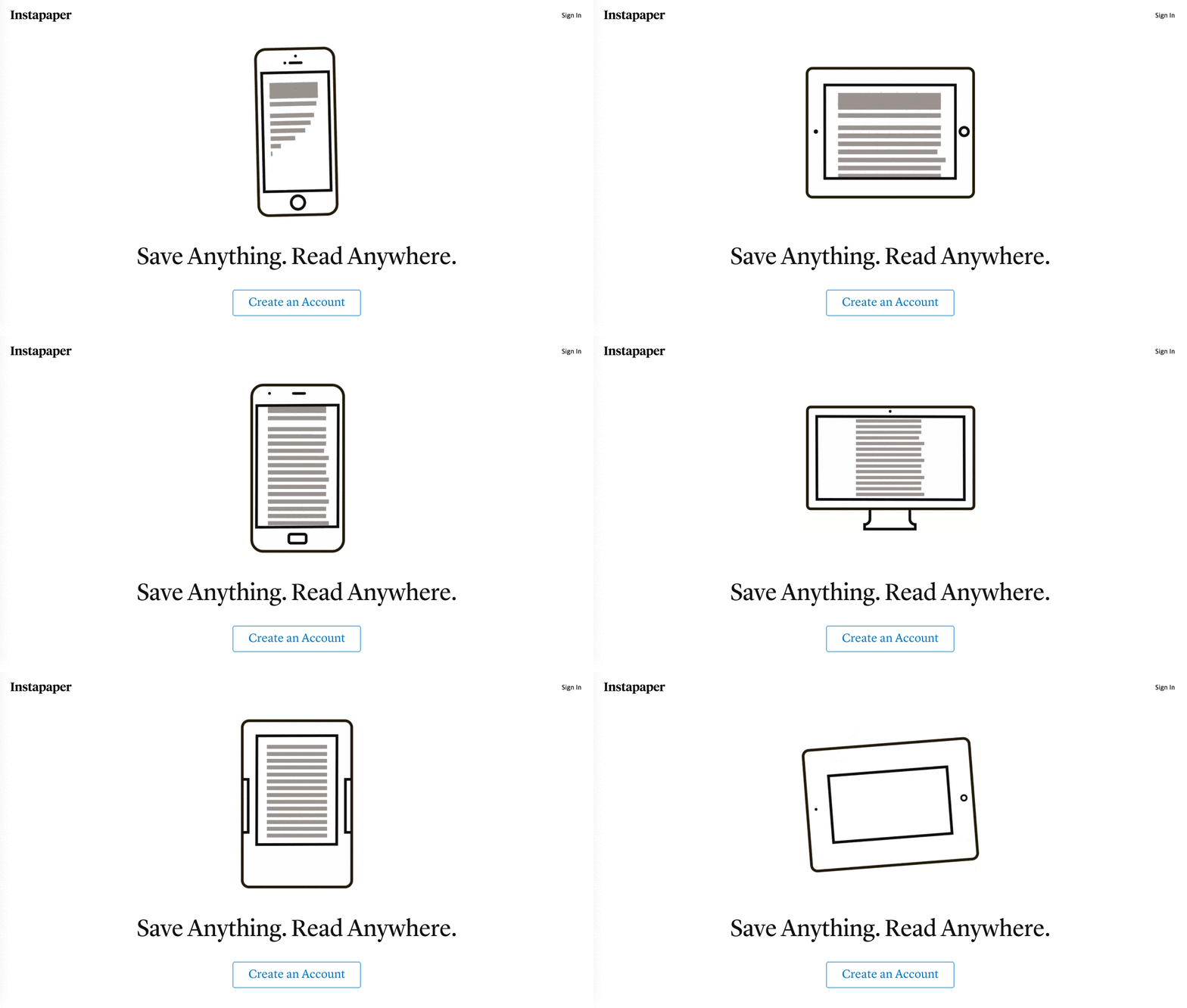
34) You can also make your hero shot an illustration. A drawing can often say what a photograph cannot, so figure out what is best for communicating the most important part of the hero shot: how your product will solve a user’s problem. There are a few other benefits to using illustrations, as Impact explains:
In the sea of beautiful, artistic hero images, illustrations are surprisingly rare so using one could be just the thing your brand needs to set you apart from your competition.
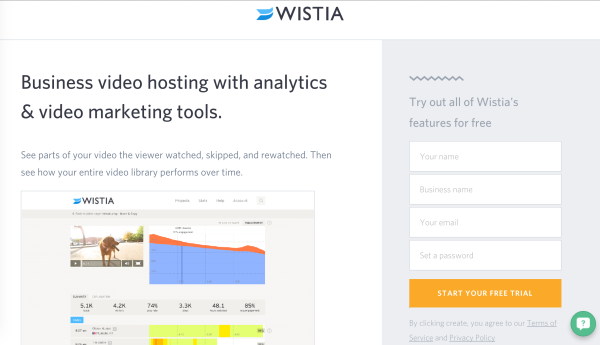
35) Your hero shot can be a clean explanation of your product. Like Wistia, your hero shot can simply look like your service:
Tests You Can Implement Right Now
36) Be ready to invest a lot of time into brainstorming, planning, shooting, choosing, and testing your hero shot. After all, this is the online face of your company and the first impression a visitor gets. Make sure it’s doing the work you hired it to do, or find a different hero.
37) Of course, you know that one hero shot isn’t enough. You’re going to have to create two highly compelling hero shots—otherwise, how are you going to A/B test them?
38) CrazyEgg advises to try the one-sentence description test. Here's what they said:
The best way to test your hero shot is to have a 3rd party evaluate it for you. Give them 10 seconds on your landing page and then quiz them on your business.
If the tester can’t give you a semi-accurate, one-sentence description of your business, you are doing something wrong.
39) "Be prepared to update your hero shot regularly. If you have people in your hero shot, their clothing and hair will start to look out of date after a while." -Angie Schmottmuller
40) Show users your hero shot for 5 seconds, then ask them to describe it. Have them perform an unrelated task for a while—or check back in with them after a few days have passed—and see if they still remember your hero shot. If they do, you know you have a winning hero shot.
41) If all of this sounds overwhelming, don’t be afraid to bring in a consultant. Even heroes need a good sidekick now and then—or a trainer ready to push them to be the very best.
Well, there you have it. These 41 secrets to the most powerful hero shot will get you even more conversions in no time.
What do you think you'll implement right away? We'd love to hear your takeaways from this post.
