


Updated March 2025
Too much work goes into earning eyeballs (with organic SEO) and paying for eyeballs (with ads) to lose hard-won traffic at your button.
When that happens, your CTA looks at you with sadness in its eyes 🥹 and your ad budget scoffs at you 😡
The bar is so low when it comes to clever super-clickable call-to-action examples—I promise you’ll have fun with this page 😉
To start… SUBMIT is the hellspawn of terrible CTAs across the universe.
If “Submit” is your primary call-to-action button, your conversion rates feel sad and poor 😕
You're here because you want to do better than boring CTA buttons like these:
- Submit
- Sign Up
- Call now
Okay! We've got scads of new CTA ideas for you that will get more attention than ever before. This is the same stash of creative, high-converting call-to-action examples we brainstorm, test, and use for our clients. We poured hours into brainstorming and testing action buttons, and we’ve packed this page with CTA examples to boost your click rates on your
- Landing pages
- Nav bar and footer
- Blog posts
- Facebook Ads
- Google Ads
Before we roll out 58 amazing call-to-action examples, we start with CTA basics, walk through what not to do, help you set your baseline to measure CTA impact, and give you 5 fresh takeaways to snack on. But if you want to skip over the education and get right to the examples, that’s cool.
Click the CTA 👇
TL;DR
- What Is A Call To Action?
- What Makes A Great CTA Button?
- What not to do in your CTA
- What success looks like: How to measure your CTAs
- Secondary CTAs
- How To Use A Call To Action
- Call To Action Examples: Landing Pages and Websites
- E-commerce Call to Action Examples
- Facebook & Instagram Call to Action Examples
- Google Ads Call to Action Examples
- Display Ads Call to Action Examples
- YouTube Call to Action Example
- Use Original Call to Action Examples on your website
- Outtakes
- FAQs
Get brand new marketing strategies straight to your inbox. 23,739 people already are!
What Is A Call To Action?
A call-to-action, or CTA, is a visual queue (a clickable button or link) that uses action language to get someone to do something specific (immediately).
Common CTA buttons look like this:
- Download
- Shop Now
- Subscribe
- Book a demo
Conversational CTAs look like this:
- Want to learn more? Click here.
- Never want to miss an update? Subscribe today.
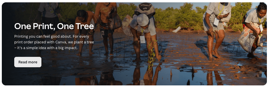
And dressed up CTAs go on graphic CTA boxes or banners like this:
But you’ve seen these CTAs hundreds of times before. Thousands probably.
Most don’t make you want to peek behind the curtain. Standard CTAs don’t do it like they did it 10 years ago.
Because they’re old, boring, and overdone.
What Makes A Great CTA Button?
Button-based CTAs increase click-through rates by around 30% (give or take based on a bunch of variables) over non-styled, generic text-based CTAs.
So use a button.
The best call-to-actions are simple but loaded with sparkle. There’s a little sum’n about them that convinces a user to click. They have branded button bling, if you will.
Working that magic is worthy of your time because button clickers pump up your lead metrics and get things happening in your marketing funnel.
Your call-to-action effort is a powerful pipeline contributor.
Here’s what to consider:
- Psychology
- Specificity
- Positivity
- Creativity
- Language
- Audience
Psychology of a call-to-action button
There is a TON of psychology behind CTA buttons.
I know this because I asked ChatGPT to search for really cool, authentic, highly-clickable CTA examples.
Instead, I got a list of 20 psychology-backed triggers that made me feel gross.
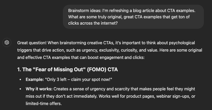
This says a lot about the quality of CTAs across the internet, since ChatGPT taps into its giant database (the learning model) to retrieve information and generate responses.
Based on the examples I was given, popular CTAs
- Tease (exclusivity) ❌
- create unease (scarcity) ❌
- and cause anxiety at the button (urgency) ❌
ChatGPT, we don’t play that way. Sure, these principles probably work, but they’re like bullying in button form.
Outtakes
We want people to see the value in something and take the desired action to get that value. We don’t want them to dive in because they feel time-pressured (urgency) or uncool (exclusivity). We don’t want to trick anyone. We want to help people by removing friction on the way to a solution.
Instead of immediate lackluster AI CTA examples, we went with real-life observation. Over a few weeks, the best CTAs we came across made it onto this list.
Superstar CTA qualities
Here’s what makes a great CTA:
- They’re super specific
- They spark positive feelings
And, when there’s room—because it suits the brand—great CTAs also
3. Get creative, using language that aligns with the brand
1. Specificity:
It's obvious what you’re asking someone to do, which lowers decision anxiety. Don’t overcomplicate it. Keep it super short and simple.
Get Started ❌ (get started doing what, exactly?)
Get the plan ✅
2. A good feeling
Everybody likes to feel included and inspired. So if it works, use CTAs that pull a reader in and make them feel a part of something. Use exclusivity in a feel-good way. Encourage them to try something new, and play into aspiration.
- Join the club
- Be the best X
- Find your flavor
Positivity for the win.
3. Creativity:
Your human readers appreciate personalized "oomph"—AI engines can't beat your imagination. Wear your creativity like a badge of differentiating human honor and create unique CTAs.
Extend this creativity to a click trigger. A click trigger is a one-line sentence (usually below the button) that encourages the click.
For example:
Ready to eat better with a free 7-day meal plan?
CTA button: I so am!
Click trigger: Feel great in a week!
Brand language:
Your CTAs speak from your company's heart, so make sure your buttons match the tone (the vibe) of your website.
If you’re a new startup with a playful presence, your CTA language should sound far different from a long-established luxury brand.
Here are some examples:
Fun/cheeky brand:
If your brand is fun and playful, use CTAs that are lighthearted, quirky, and lean into humor.
- Let's get it
- Heck yes!
- Gimme the goods
- Dude, get inside!
- Join the fun
Luxurious/sophisticated brand:
Your CTAs should be polished and exclusive.
- Find your X
- Shop the Collection
Bold:

Your CTAs should be straightforward and provocative.
- Explore our footprint
- Get Yours
- Why not!
- Ditch Milk
See the difference? That’s called nuance.
Understand Your Target Audience
Who looks at your stuff?
What are they there for?
What motivates them to click on your button?
Tailor CTAs to your customer
Your audience has a problem to solve and, when they get to your page, they are somewhere on a timeline between mildly curious and super click-ready.
Different customers. Different journeys. Different temperatures. Different outcome.
Know their troubles and create CTAs to fix that trouble (address their needs). When you do this well, you take the stress off their eyebrows and they’re happy to do the action you put in front of them.
Add to Cart and Order Now solves an ecommerce kind of problem with hot intent (purchase).
Start a Free Trial and Book a Demo solves a SaaS kind of problem with warm intent (comparative).
Learn more solves an awareness problem with cold intent (top of funnel).
What not to do in your CTA
Opinions divide on this point, but get rid of urgency.
Some say a great CTA button needs to have a sense of urgency (or scarcity), to entice a click before leaving the page (where they might never come back).
But can we please see through that now?
- Do this TODAY
- Click this NOW
- Get it before it’s gone.
- Limited time offer
Guess what? You’re not peddling a Shamwow Rag.
People know you’ll still take their money if you do it tomorrow or click it later. And that countdown timer? Brutha, please 😆
Let’s not offer INSTANT ACCESS either.
Sure, that plays into a sense of belonging, but that’s the whole point of that CTA button. We click it, and we see what’s behind door number three. Instantly.
If you have a great product, it’ll sell itself. The button simply removes friction when they’re ready.
Your CTA isn’t its best self if you use it to create negative fear of missing out (FOMO).
Language like that feels inauthentic and false. Let’s stay positive and steer clear of spammy CTAs.
Moving on.
What success looks like: How to measure your CTAs
If you do a good job with your CTAs, you’ll win the click.
But when will your CTA genius turn into dollar bills?
Here’s how to estimate that:
- Note baseline performance of past CTAs and set a reasonable better goal
- Tweak
- Test
Baseline: Your goal is to win clicks. But how many clicks?
This depends on your past results and current goals.
What is your current conversion rate (CVR)?
- Go to GA4 > Leads > landing page
- Set a timeframe of the Last 90 days
- Look at the CVR of that page
Use that as your baseline. (You can also find CVR within the Google Ads platform or, more broadly (and less accurately) by finding industry CVR averages.
Whatever you use, jot down your starting CVR.
Now set a reasonable better goal than that.
If you increase your CVR by 10%, how many more qualified leads does that win? And how do those leads translate through the sales cycle to your resulting revenue?
Play with the numbers.
What does a 20% increase in button clicks mean to your pipeline?
Set the bar at something achievable—high enough that hitting that goal will feel great (for both your effort vs impact analysis and your piggybank).
Not quite hitting your goal?
Modify your CTA and test the result.
Tweak: Modify your CTA with Action Words and Verbs
Use verbs (action words) on your button.
Not your forté? We’ve got you.
We wrote about 3,000 words on how to write CTAs that win enthusiastic clicks.
The world is your oyster when it comes to CTA creativity—if your options aren’t pre-set on a social marketing platform like LinkedIn.
So go for originality. Have fun with it!
Try these on for size:
- Click me
- I'm in!
- Can't wait
- Heck yes
- Whoop!
Test: Split test different CTAs (A/B test)
Trying something is important.
But figuring out what worked is more important. It’s importanter 😉
Some of your buttons will flop and others will get tons of clicks. But you won’t know blah 🫤 from blazing 🔥 unless you make two or more versions.
Then you test which one does better. A/B testing refines your marketing and gives you something to show your boss in graph form.
Plug in a few CTAs, then measure them against your goal.
Secondary CTAs
A secondary CTA is a button beside your primary CTA.
The going opinion is that you should minimize confusion (friction on the page) by only asking someone to take ONE action.
But if the primary action won’t capture most of your leads because the temperature is too hot, a secondary CTA might drop their shoulders from their ears.
A secondary CTA might capture more clicks than the primary CTA.
This alternative action works for users who may not be ready to take the primary action.
For instance, if your primary CTA is “Buy Now,” a secondary CTA could be “Learn More” or “Download a Free Guide.” This way, you cater to users at different stages of the customer journey. Those who are ready to make a purchase can do so immediately, while those who need more information can take a less committed step that still keeps them engaged with your brand.
Using multiple CTA buttons strategically can help capture a wider audience and guide them through the conversion funnel at their own pace. Just remember to keep the other click options less prominent than the primary one to avoid overwhelming your visitors with too many choices.
What will work best for you?
You’ll only know if you test it.
How To Use A Call To Action
Every call-to-action tries to get a click, so knowing what works will change how you design your ads, landing pages, and marketing campaigns.
When we analyzed hundreds of call-to-action examples, we noticed a pattern.
Here are five key takeaways:
Key CTA takeaway #1: be singular
Only use a single call-to-action per page, form, email, etc. As soon as you introduce a second CTA, you worsen your visitors' attention ratio and lessen your chance of them converting how you want them to.
That doesn’t mean a secondary CTA won’t work. And it doesn't mean using three CTAs at the top of your page won't work either—a growing trend—it just means single CTAs might work better. That's what the data said.
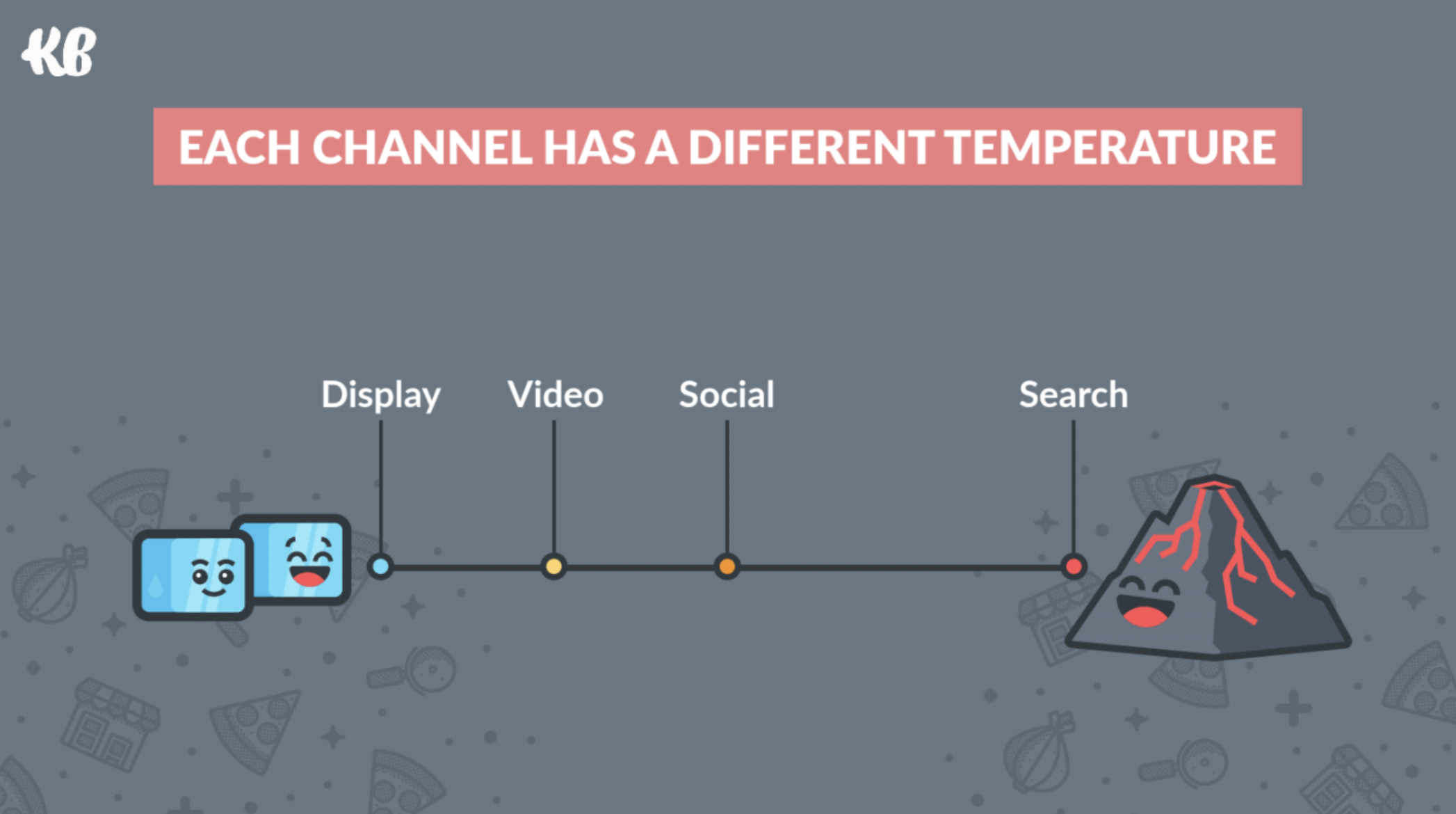
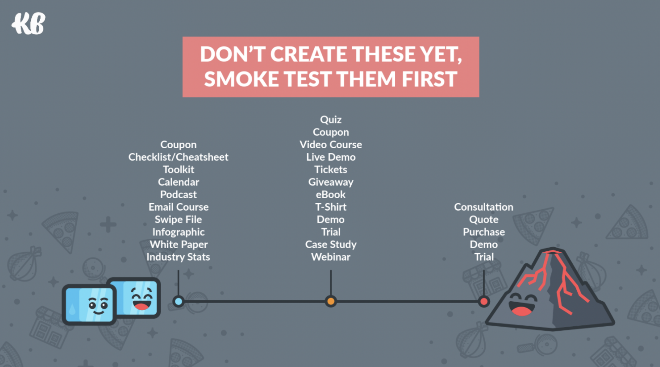
Key CTA takeaway #2: test the temperature
Your CTA should mirror the conversion temperature of your traffic.
For example, if you're a lawyer and your CTA is a “Book a Free Consultation” but your visitor got there from a direct Display ad (cold lead), you'll find that you won't get conversions on a highly-demanding CTA like that.
We did this research and shared it on stage at Unbounce's Call To Action (CTA) Conference.
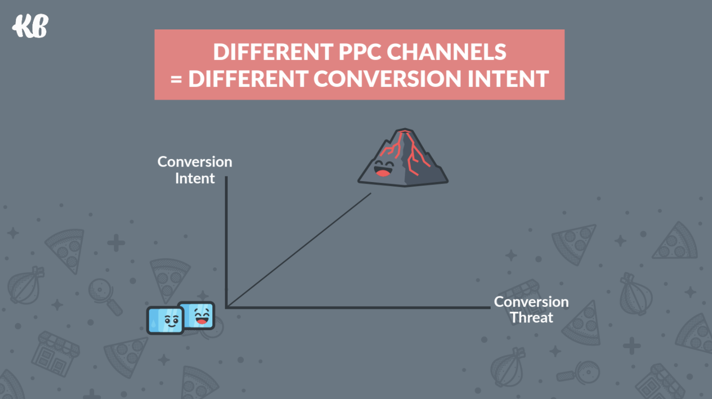
Cold traffic doesn't convert well with hot (threatening) CTA language, but hot traffic CAN easily convert on a cold CTA. For optimal performance, you need both to match in temperature.
Consider your CTA copy.
Take the “Free Consultation” CTA example.
Almost every lawyer offers a “Free Consultation.” But that doesn't tell a potential client what happens if they do that.
It's better to dial in to what the visitor cares about.
You still offer a free consultation, but you qualify that with an outcome.
Something like this:
Injury Lawyer: See What Your Case Is Worth > Book a Free Consultation
Divorce Lawyer: Learn Your Divorce Rights or Get Confidential Help > Book a Free Consultation
Business Lawyer: All Your Questions Answered Now > Book a Free Consultation
Better, huh?
Key CTA takeaway #3: breadcrumb your forms

When your CTA is a button on a landing page form, the form is more threatening than the button—because forms usually suck so bad people don't like them.
So turn your form into a good one.
Your landing page tries to make someone want your stuff. But even if they do, a single form with many fields in the way of getting that stuff is a barrier.
Does this look familiar?
- First name
- Last name
- Job title
- Industry
- Phone number
That's too big of an ask 🥺
You might as well ask for their middle name, social security number, the name of their first pet, their entry door code, and their bank password.
Form fields create something called cognitive load, which causes brains to not like what's happening so they click away.
They don't trust you yet, and they aren't ready to hand over their personal contact information.
Especially when they know giving you that information means putting up with an annoying sales call or pushy email.
There is a much better way to rock a CTA on a form: by improving the form.
Here's a 3:43 Boost Bit video that walks through how this awesome technique works.
In a nutshell (if you hate fun videos), it's as simple as breaking up your form into progressive increments of heat/threat and adapting your CTA to the form process.
It's called breadcrumbing because you lead your visitor along a trail of goodies to a big goody at the end.
It's a hand-holding technique where you take away objections by breaking down the decision-making process into multiple non-threatening steps:
- You remove any objections from step one by asking a question the visitor doesn't mind answering. They follow the first crumb.
- You ask them a few more simple questions after that. Now they're engaged. They're a few crumbs farther along the conversion path.
- Once they've answered easy-to-answer questions, they are cozier with answering the big question. They've warmed up to things now and they're closer to committing.
- Ask the big question. They've already followed your bread crumbs to the end of the path and they're at the door. Now they want to see what's behind the door.
In Hansel and Gretel folklore, those breadcrumbs lead to a candy-coated door with a lot of death inside (the conversion).
But for you, the breadcrumbs lead to a form fill and a beautiful click.
Back to the Hansel and Gretel analogy:
Without the breadcrumb technique, the witch leaps out of the bushes with skin-flaying knives and asks the scared siblings if she can eat them whole.
They run away.
Because: poorly-planned execution.
Instead, in the story, the clever witch puts down a path of candies that leads to her candy house. Hansel and Gretel feel it's worth a peek inside. They open the door, and the witch gets her morbid conversion.
Marketing versions of the breadcrumb analogy serve up a happier ending. Click the button, get a helpful goodie. Visitors will click that breadcrumbed button because they've already put in effort and now they're not willing to back out.
They've worked for that goody.
It's psychologery 🤩
Key CTA takeaway #4: contrast your buttons
Make sure your CTA button color pops against other elements on the page.
Make the button color the opposite of the background color. This is also known as complementary colors (opposites on the color wheel).
Got a bright blue background or, more likely, a bright blue gradient (hello, 2020)? Plaster a bright orange-yellow button on it.

Check out the Canva Color Wheel. Click anywhere on the wheel (or select your background color) and choose the complementary color. Grab the hex code. That's the color your button should be.
It's addicting.
Key CTA takeaway #5: don't submit (don't do it)
Submit is a poor use of good real estate.
Try anything else.
Personalized CTAs perform 202% better than generic CTAs. So vary the level of creativity across at least two CTAs and A/B test which level resonates with your audience—both the words and visuals. Take a queue from these tests and do more of the same.
Now, let’s look at different types of CTA examples.
It’s spotlight time.
Call To Action Examples: Landing Pages and Websites
1. Wise
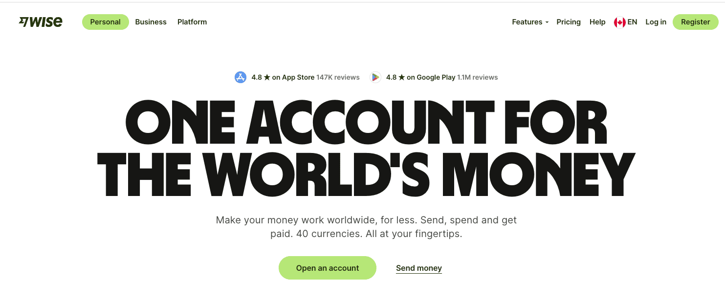
CTA: Open an account (hot)
Secondary CTA: Send money (hot)
Nav CTA: Register (hot)
Kicking things off, Wise comes in on fire with three hot buttons—which isn’t the marketing norm.
Wise doesn’t believe in a single CTA (a technique that minimizes anxiety by pushing customers toward one action).
Nor does Wise think you need a cold-temperature CTA next to a warm CTA (another common practice to capture top and bottom funnel browsers).
Wise goes all out guns blazing with three bottom-of-funnel buttons. You can either
- Open an Account
- Register (this is the same as Open an Account but said differently—which we talk about here)
- Send money (which requires opening an account)
This might go against convention, but we like it.
Here’s why:
If you go to Wise, you’re more than curious about sending or receiving money internationally: you’re fed up that your bank adds a sneaky hidden margin on top of the mid-market rate, and you’re looking for an account that doesn’t unfairly overcharge you (don’t get me started).
Wise removes all friction to making that happen in the hero section with three buttons that get you exactly where you want to go. Whether you open an account, register, or send money, you’re a click away from keeping more of your hard-earned international cash.
You’re a prequalified hot lead, so there’s no need to add cold CTAs to the mix.
2. Toggl
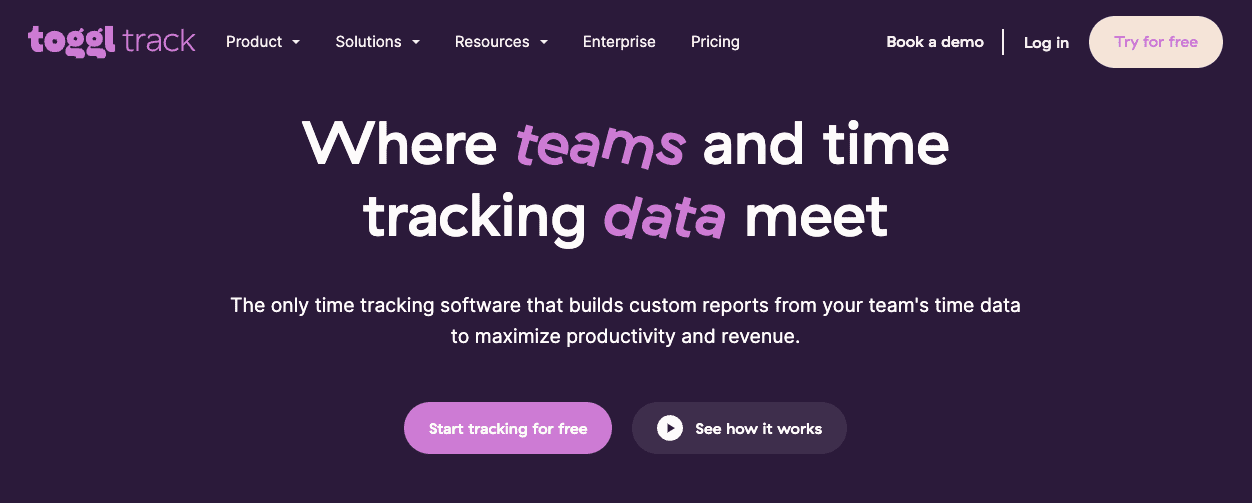
CTA: Start tracking for free (warm)
Secondary CTA: See how it works (cooler)
Tertiary CTA: Try for free (warm)
Do we see a new trend here for 2025?
Here’s another triple-button scenario where the two warm CTAs are the same, but worded differently. And Toggle tries to capture colder traffic (those at the top of the funnel still doing research) by giving them an instant video demo to warm them up.
The high contrast buttons work for the hot CTAs, and the low contrast for the colder CTA identifies it as the less-important action.
3. Figma
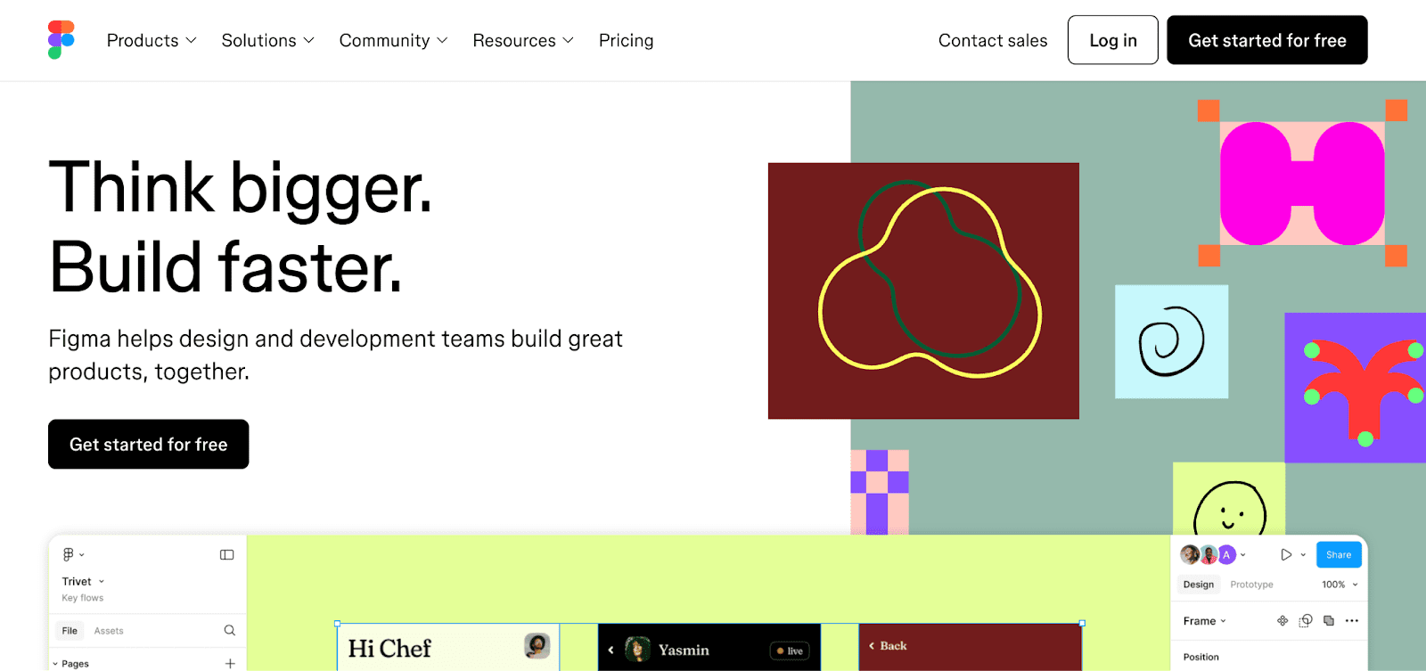
CTA: Get started for free
Secondary CTA: Log in
- A super simple H1 statement: Build Faster. (Love it)
- A qualifying H2: Figma helps design and dev teams build great products
- And a button that’s a door to the design room
In case you were wondering—you weren’t because it says so on the button—you get access to that wonderful room for free.
Already a member of Figma’s design world? Log in.
4. Oura Ring
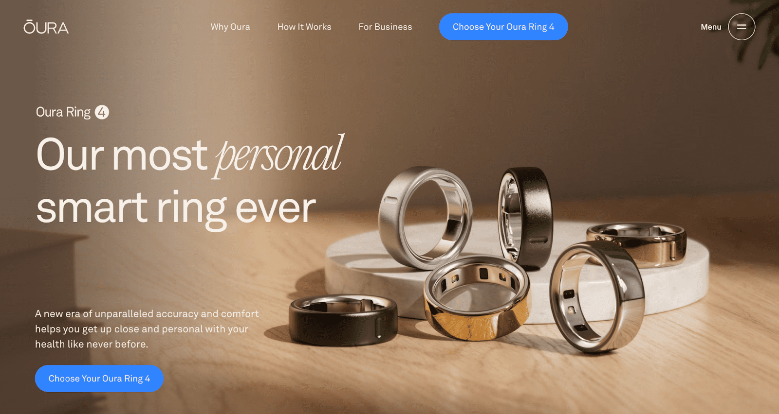
CTA: Choose your Oura Ring 4
No confusion here: the only thing Oura wants you to do when you land is start your order by picking the color of the Gen 4 ring you know you want.
Next, you’ll pick the size.
Then, you’ll add the annual subscription.
Then, you'll find yourself on the checkout page with the ring in your size and finish, ready to ship to your doorstep as soon as you pay. It’s a painless way to get from not having an Oura ring to tracking every detail of your health.
5. Wealthsimple
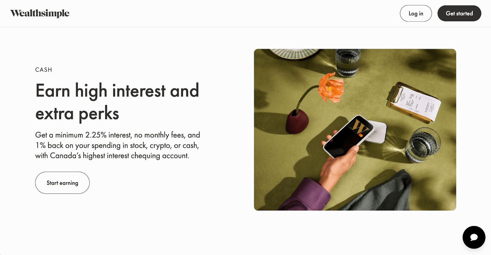
CTA: Start earning
See what they did there?
Wealthsimple speaks to the value I want, not the action I need to take to get that value.
A common CTA would be to open an account or register (the way Wise did it in the first example).
Instead, Wealthsimple tells me that if I click that button, I’ll start earning money (but I can also do the expected things, too, like Get started and Log in from the nav bar).
That benefit-to-me theme continues across the site:

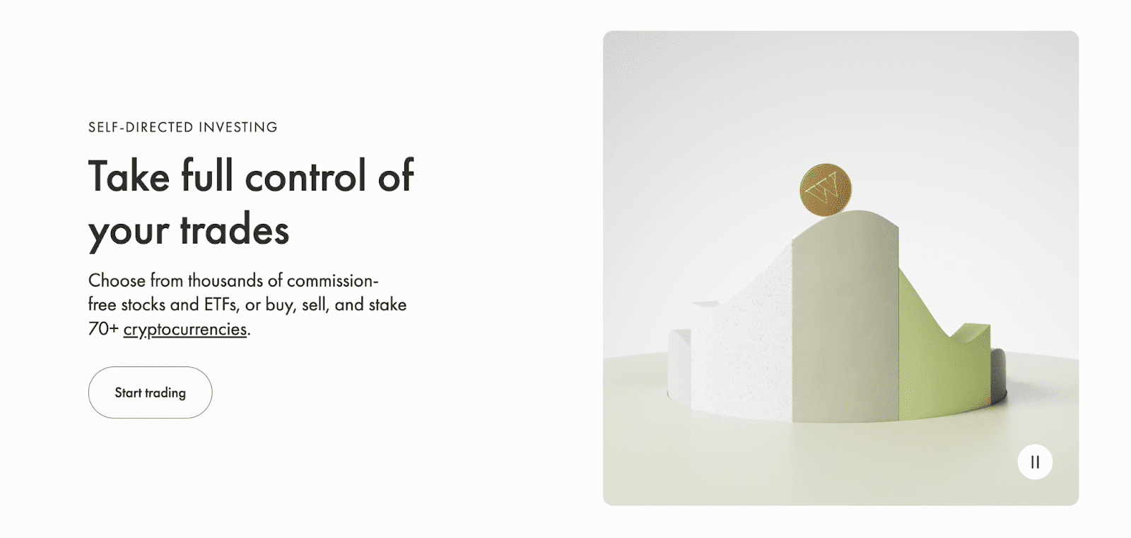
So if I want to start earning from self-directed investing, or if I want to pay a management fee and have Wealthsimple make my portfolio, or if I can’t wait to start trading crypto without commissions, Wealthsimple makes that pretty easy.
6. KlientBoost

CTA: Free marketing plan
The same button (essentially) in the hero and nav bar.
The hero CTA has a click trigger to encourage the click: in case I had any doubt, the free marketing plan has already worked for hundreds of active, happy clients.
The CTA supports the H1, which tells you the benefit of clicking that button: doubling your revenue.
You can take that plan for free and run with it if you have the moxie and savvy to make it fly. Or you can ask the most goal-driven, proactive, financially acumened, award-heavy marketing agency on the planet to take that same plan and build it out for you all the way to money town 🤑
7. LMNT

CTA: Get Yours
The brand tone shining through this button makes me cheer.
And that qualifier? Man, I want to put myself in the same league as athletes and intermittent fasters and the low-carb, whole-food-eating elite.
That button could have said Try LMNT or Free Sample. Instead, LMNT appeals to your emotions by making you feel special with a little inclusivity. Want to be part of the LMNT tribe endorsed across the Podcastverse from Tim Ferriss to Andrew Huberman?
Get yours (electrolyte elitist).
It worked. I got mine.
8. Airbnb

CTA: — (no CTA!)
Okay, this is a cool approach. There is no glowing CTA.
The only thing Airbnb wants you to do when you land on the site is look at the Guest Favorites and start clicking any that might appeal.
Love this.
There is a menu bar running along the top that gets me wherever I want to go on this site. But if you click a guest favorite…
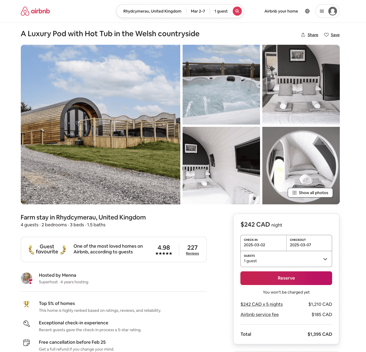
Airbnb’s uses one simple CTA: Reserve.
Make it easy. Get customers to the cart and make the cart that simple.
Bravo, Airbnb.
Now let’s see what your competitor, VRBO, did with its CTA.
VRBO
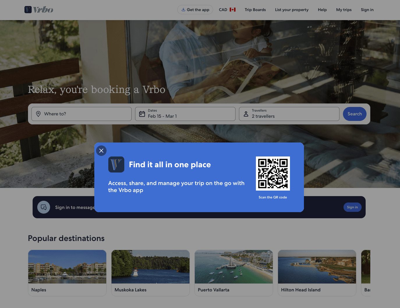
CTA: Scan the QR code
Secondary CTA: Search
Tertiary CTA: Sign in
Same as Airbnb but entirely different, VRBO doesn’t have a hot button to click in the hero either. It has a QR code to scan, though. The first thing VRBO wants its fans to do is download the VRBO app.
X out of there or get the app.
Then…
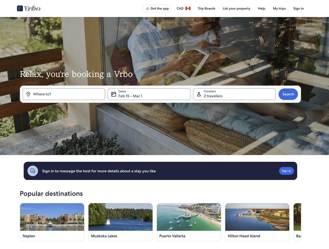
VRBO takes a filter approach to help you find where you want to relax with a search bar and sign-in bar "under the fold."
The top nav also has CTAs to Get the app and Sign in, reinforcing those actions.
This works.
10. Hydro Flask
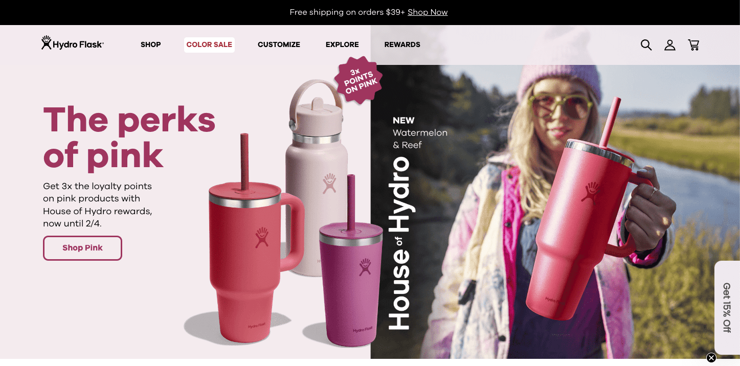
CTA: Shop Pink
Secondary CTA: Get 15% off
Valentine's Day was on the horizon when I found this CTA. And it makes sense. Once your brand is established, you don’t have to designate the hero section of your home page to tell people who you are and what you do.
Because they know that already.
Anyone who goes to Hydro Flask is looking to buy Hydro Flask. So Hydro Flask makes that easy by serving up the promotion they’re running that day.
But I was curious…. What are their competitors doing over at Takeya and Yeti?
11. Takeya

CTA: Shop Valentines Bottles
No coupon incentive, but same idea. Takeya uses its brand power to assume you know why they exist: to replace single-use plastics with sustainable—super pretty—reusable water bottles. And in February, they do up pretty in pink. Go right to the collection, put one in your cart, and check out. Easy.
Now Yeti…
12. Yeti
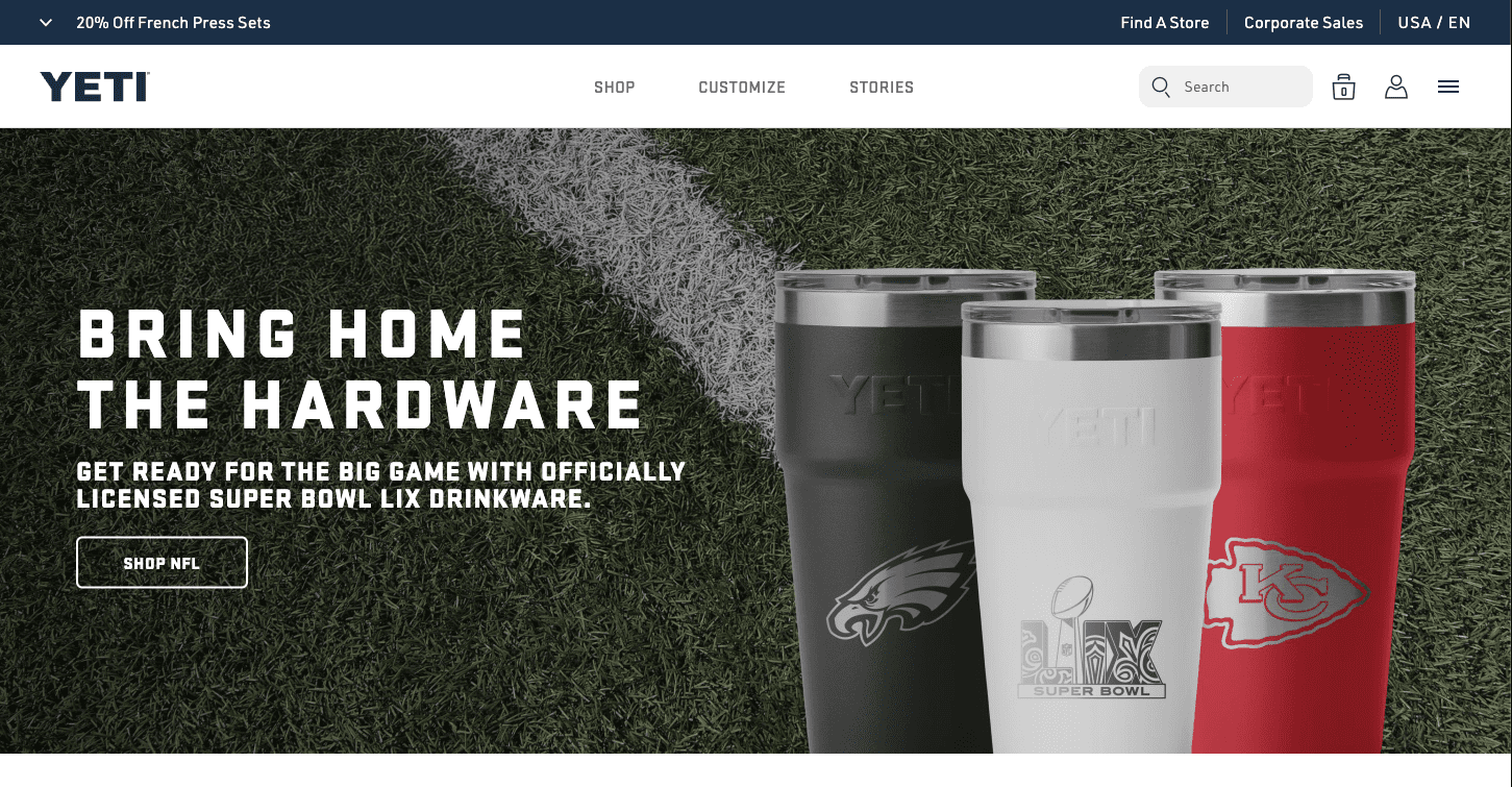
CTA: Create an account
Secondary CTA: Shop NFL
Oh, Yeti! How on-brand 😉
While your competitors swoon over pink things, you sport an NFL collection just in time for something else that happens every February: Super Bowl 🏈
So whether you love the Eagles’ massive defensive line or The Kansas City Swift's Tight end, Yeti has the hardware you need for the game in red, white, and blue.
(But first, Yeti wants you to create an account so you get free shipping today and hot drops tomorrow). Done.
13. Hotjar

CTA: Get started
Secondary CTA: Book a demo
Tertiary CTA: Sign in… with Google or SAML SSO
Hotjar, an expert in conversion rate optimization, gracefully sports the popular Get started / Book a demo / Sign in trifecta.
After clicking those buttons, prospective customers complete their intended action seamlessly thanks to a direct integration with Gmail—sign up in one click (if you have a Google account).
Making the signup stage easy reduces friction at the conversion stage—which is important for conversion rate experts.
14. Chipotle

CTA: Order now
A good call-to-action tells a user exactly what to do. While the headline and images on a web page compel the user to convert, a good call-to-action should tell them how. Chipotle executes this concept beautifully with its “Order Now” button.
15. Teamzy
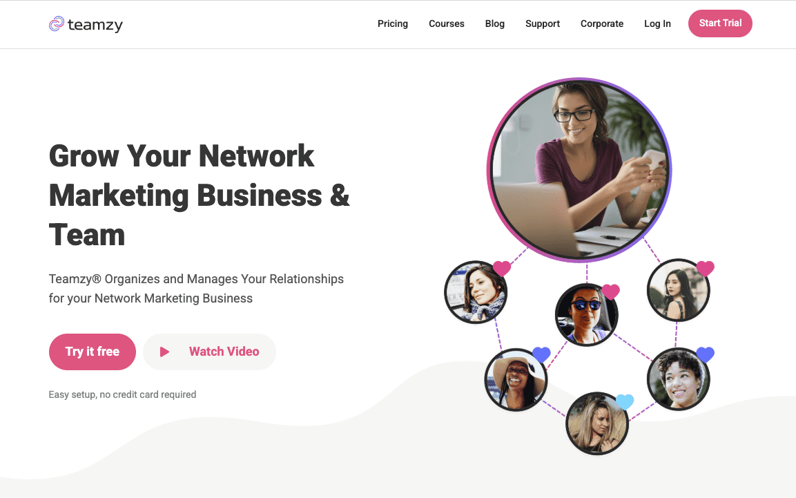
CTA: Try it free
Secondary CTA: Watch Video
Nav CTA: Start trial (same as Try is free)
Teamzy's landing page doesn’t restrict advertisers to one action. You have several CTA buttons, but two are the same.
The two pink Try it free and “Start Trial” buttons give users more clickable options to start a free trial.
Not more choice—more click opportunities.
16. Zara

CTA: New Collection (the image or unadorned copy is the button)
Zara's homepage takes a more fashion-savvy approach to your typical eCommerce call-to-action. Instead of coaxing users to buy right away, Zara's homepage features a large image with “New collection” copy underneath that directs users to Zara's newest clothing lines. Instead of going bold with a jazzy button, they keep things minimal and couture. This works because anywhere the user clicks takes them to the new collection.
This nurturing approach takes top of funnel (TOFU) users from the home page to a more bottom of the funnel (BOFU) product page where a customer will choose their size, and then move on to check out.
17. Billshark

CTA: Save Now!
Billshark's homepage used to have a “Get Estimate” CTA on their savings calculator. But that didn’t clearly tell people why they should care. Now, the CTA is Save Now! That conveys the benefit of getting an estimate.
18. Yoga International

CTA: Start a 7 Day Free Trial
People love free things, so it's not surprising that adding “free” to your call-to-action impacts conversion rates. In this example, Yoga International adds “Free Trial” to stretch and lift their conversion rates.
The Yoga Sale "Let's Go!" CTA also works because yoga is about movement.
But that countdown timer doesn't, because yoga is also about calm. So ditch the negative stress timer and channel positive zen, Yoga International 😉
19. Netflix
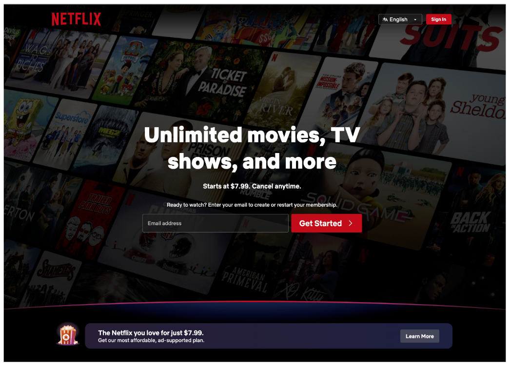
CTA: Get Started
Secondary CTA: Learn more (about the $7.99 per month version with ads)
Netflix used to offer a free trial when it was still new enough that it needed users and reviews. But now it's a TV staple for households across the continent so it's in a position to introduce ads for the base subscription, gating the no-ads version at $18–$23 per month based on users.
But you can still get Netflix for only $8 with ads.
As a footnote, QuickSprout found that Red CTAs boost conversion rates by 21%.
20. Sticker Mule

CTA: Shop now
CTA: Get samples
CTA: Make money with Sticker Mule Stores
A lot is going on here. Shop Now is straightforward, but Get samples stands out to me—even though it blends in because it's the second action Sticker Mule pushes. I'm going to click the secondary CTA first. But I can also click on any of the four options "under the fold" if I know what I want. And that tertiary CTA to make money somehow with Sticker Mule... I'm curious about that.
This page has two personalized CTAs I like. According to Hubspot, personalized CTA's perform 42% better than standard CTA's.
21. Etsy
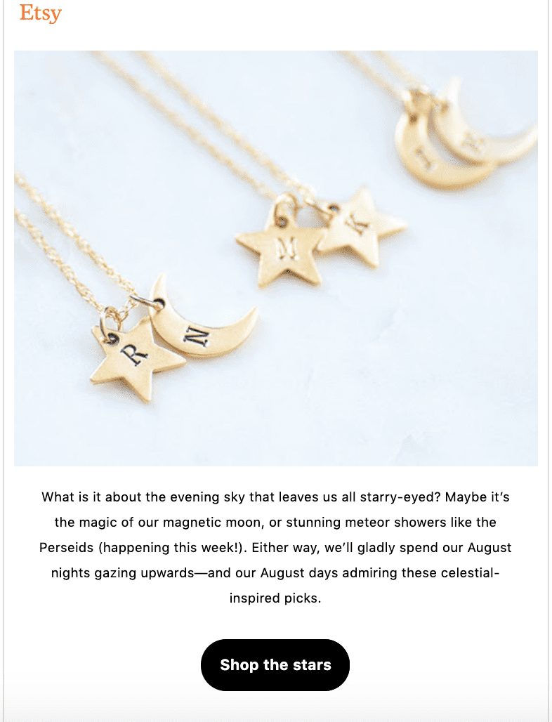
CTA: Shop the stars
There we go. Good on you, Etsy. Etsy isn't afraid to get creative.
Take a queue from this handmade/vintage/craft eCommerce giant.
Feel free to flex your copywriting skills in your call-to-action.
In this example, Etsy uses “Shop the stars” to entice people to buy “the best” (jewelry) from their platform.
And Etsy took a moment to butter us up with some poetic imagery. Get your coin purse out.
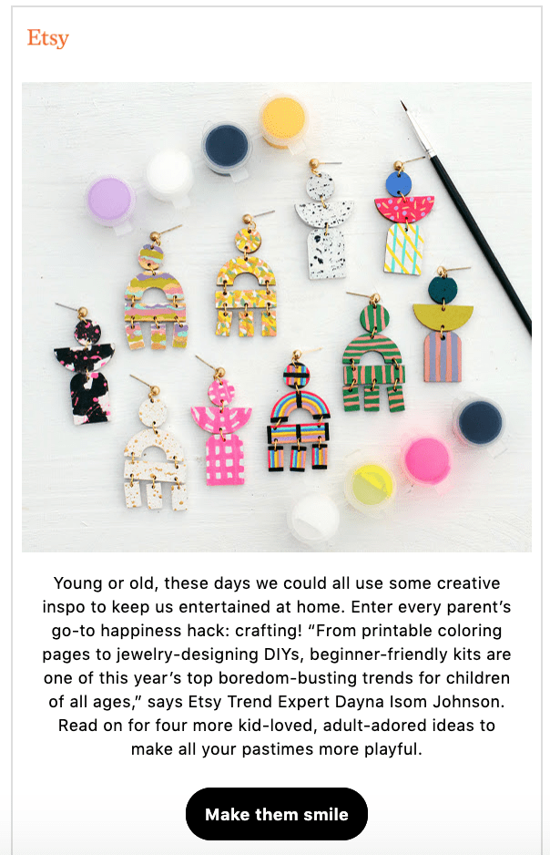
CTA: Make them smile
Make them smile might just be the nicest call-to-action you've ever heard. When customizing and tailoring your CTA button add an emotional pull to your copywriting. This one speaks right to parents about their kids' happiness.
E-commerce Call to Action Examples
22. Juneshine


CTA: I'm over 21 (or not)
CTA: Learn more
CTA: View flavors
YAY!
There's nary a Shop Now ecommerce call-to-action to be found here (even though Shop Now is a direct route to purchase). What I love about this page is that, after declaring I'm old enough to be there, Juneshine puts the reason why you should love their product ahead of the purchase button. Learn more works here as an unpopular button in ecomm because it shows how much Juneshine values their... value.
And then, instead of the classic buy button, they went for View Flavors.
Sold!
23. Steve Madden

CTA: Add to cart
No product page would be complete without an add to cart call-to-action like in this example from Steve Madden. The add to cart is a pivot moment in the e-commerce sales funnel when the prospective customer shows intent to buy.
24. Banana Republic

CTA: Keep shopping
Increasing Average order value is a key component to marketing success. A larger average order value improves return on ad spend and grows revenue. Banana Republic uses a “Keep Shopping” call-to-action after adding an item to the shopping cart to encourage customers to buy more—the upsell!
25. Manscaped

CTA: Get limited time offer
When promoting a sale, make sure you have a call-to-action highlighting the sale's value proposition. Like in this example from Manscaped where they execute a “Get Limited Time Offer.” The special offer lists all the goodies and the CTA conveys the urgency of getting those goodies.
So, in one banner bar, I know that Manscaped
- has a special offer
- what that special offer is
- it won't stick around for long.
26. Hello Fresh

CTA: Claim offer
Hello Fresh uses a countdown timer to add urgency to their “Claim Offer” call-to-action. Applying urgency on a landing page helped one marketer increase sales by 332%.
Where it's appropriate, best practices call for elements of urgency, scarcity, or exclusivity.
All of these marketing tools are persuasive hooks. They are loaded with value.
Why?
Because everyone wants access to special things (scarcity), and everyone likes to be part of special things (exclusivity), and nothing motivates a click more than the click option going away shortly (urgency).
27. Forever 21
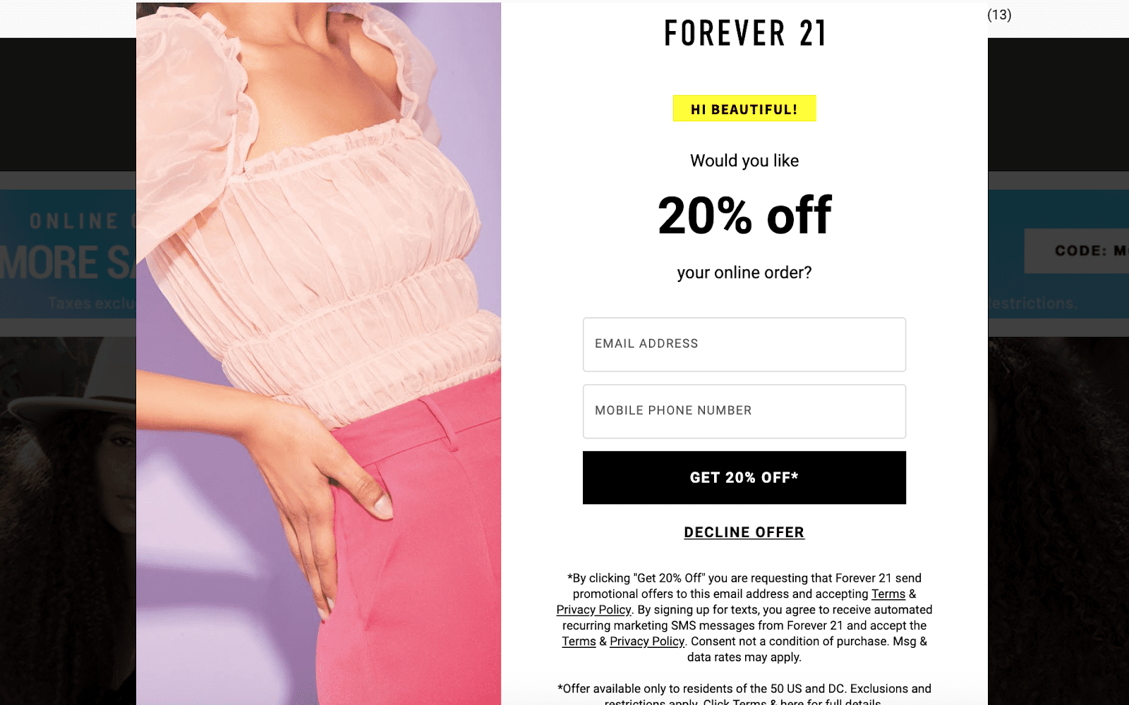
CTA: Get 20% off
Forever 21 uses “Get 20% Off” to drive users to sign up for their mailing list and then receive the 20% off coupon in the form of an email follow up.
This call-to-action highlights the offer, bringing the discount to the forefront of the customer's mind. By using the word “Get” Forever 21 implies that they are giving the customer a gift or something of value.
Using a discount is a great way to increase conversion rates!
28. Point Blank SEO
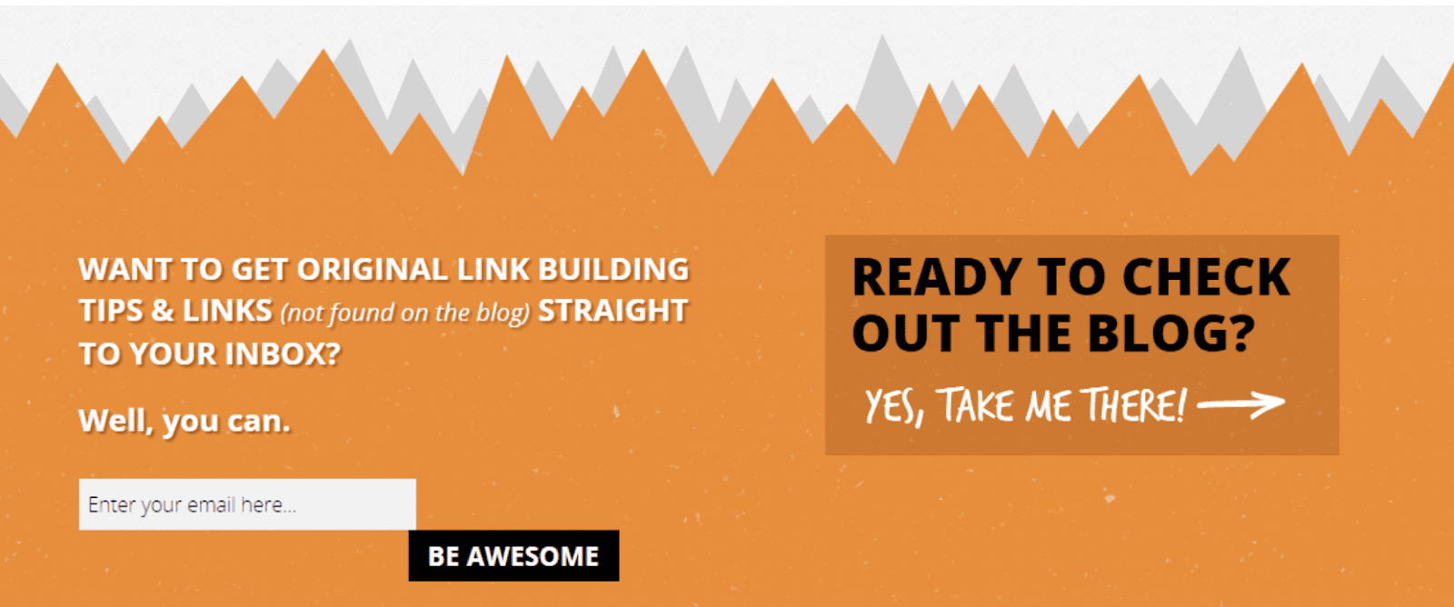
CTA: Be awesome
The buying process happens 3 times faster from emails than on social media. That's why it is so important to have a strong, direct call-to-action to build your email marketing list.
In this example from Point Blank SEO, they play to your ego by asking you to sign up for link-building tips with a CTA that conveys you will be awesome for doing so. They also use exclusivity as a hook by telling you that only you will see these special tips because they are “not found on the blog.”
29. Levi's
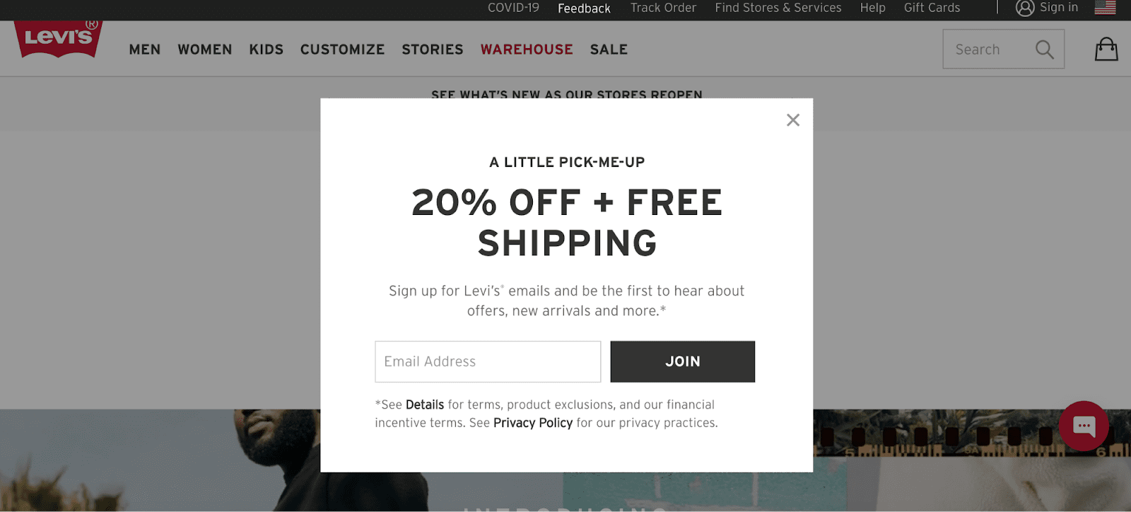
CTA: Join
Levi's uses inclusive language to get website visitors to join their email list with their “Join” CTA button. Plus, they added in a 20% Off + Free Shipping offer to wrangle customers in. A “join” or join now CTA is a simple and friendly way to ask for email sign-ups that adds an exclusive touch to the button, elevating it above “sign up.”
30. Fashionphile
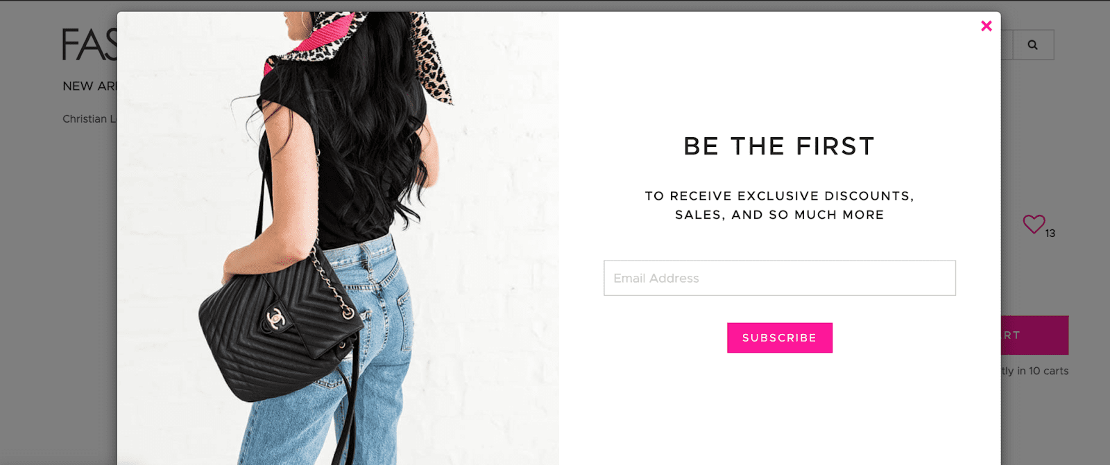
CTA: subscribe
Fashionphile uses the popular “subscribe” to drive new email subscribers. It's popular because it's universal for “sign up” without saying “sign up.” Subscribe conveys the promise of something. In this example, the pink button on the white background really makes the call-to-action pop while keeping a consistent, clean design.
31. Nike

CTA: Shop
It's important to include action phrases in your marketing emails. Call-to-actions in email campaigns are imperative to drive results. In this example, Nike uses a product-focused image as the bulk of their email, with a concise “Shop” button that truly pops.
Nike: Shop
32. Zennis

CTA: Shop new arrivals
You could shop for eyeglasses, sunglasses, lenses, sporty glasses, or by collection. But Zenni wants you to shop new arrivals because that’s fun. You get the newest styles if you click the hero CTA. Sounds good to me.
33. Adobe Creative Cloud
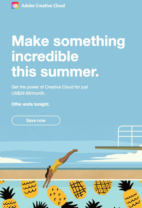
CTA: Save now
In this example, AdobeCloud encourages you to make something incredible. And not only that, but they also use a clickable button directing you to Save Now. So, not only are you going to make something incredible this summer but you're also going to save along the way! This example demonstrates both intrinsic motivation and incentive.
Facebook & Instagram Call to Action Examples
1.86 billion people worldwide are connected to a small business on Facebook making advertising on Facebook a key component to many brands strategies.
Facebook Ads are a great way to reach your target audience. Facebook Ads come with 17 predetermined call-to-action options that are sure to make you take the next step.
34. Zaful
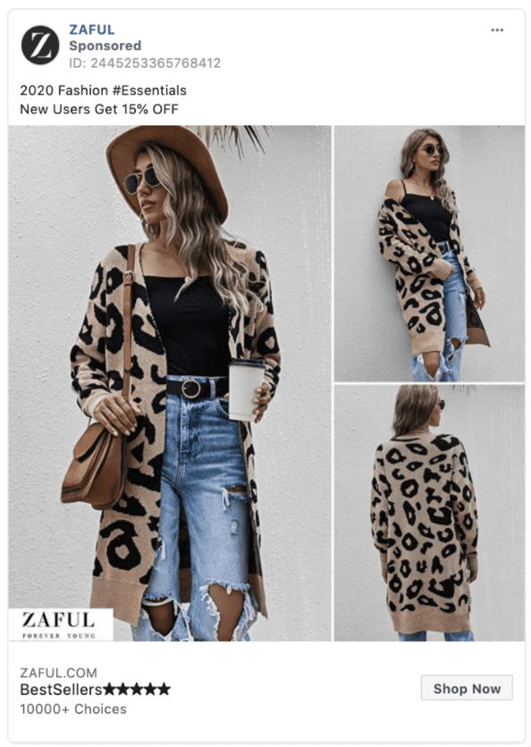
CTA: Shop now
For eCommerce brands, “Shop Now” is the recommended CTA button for your Facebook advertisements. Brands like Zaful have built their entire business by acquiring customers through Facebook.
35. MVMT
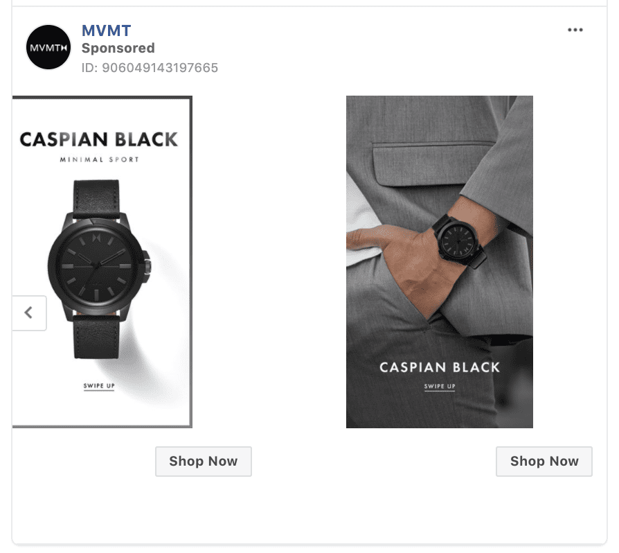
CTA: Shop Now
The Shop Now button is usually favored by brands looking for a direct eCommerce response. MVMT illustrates how the “Shop Now” Button can enhance your Facebook carousel ad. Pro Tip: You can point the “Shop Now” button to a different landing page for each card in your carousel.
36. Coleman
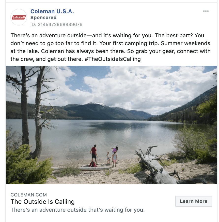
CTA: Learn more
“Learn More” is Facebook's default call-to-action button, but that doesn't mean it doesn't work. “Learn More” requires little commitment from the ad viewer, and is a great way to nurture prospective customers by getting them engaged with your brand.
“Learn More” tends to see solid click-through rates and is used by large consumer brands like in this example from Coleman.
37. Facebook
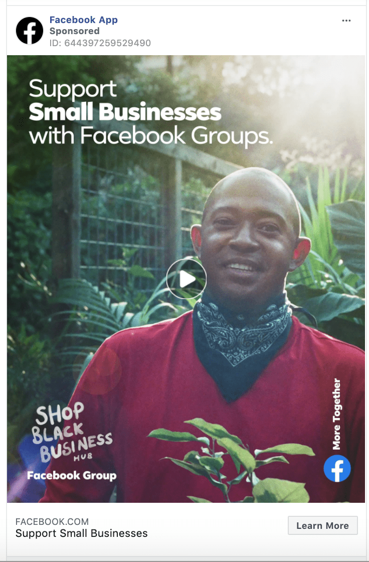
CTA: Learn more
In this example, we check in on Facebook themselves to see what they are doing in their own ads. Here, you can see that Facebook uses the “Learn More” button to educate people about Facebook Groups for small businesses.
38. Billshark
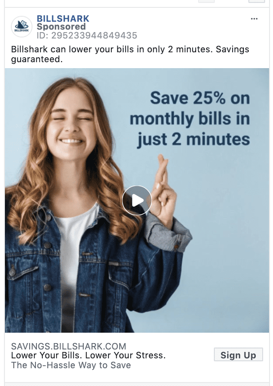
CTA: Sign up
Hey, we're working with preset options here. And “Sign Up” is a straightforward call-to-action for any advertiser looking to drive leads for a service. In this case, Billshark uses “Sign Up” to drive lead acquisitions.
39. Winc
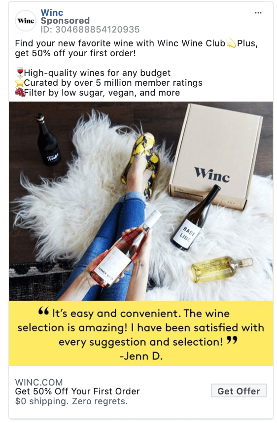
CTA: Get offer
Winc shows how to promote an offer with both the ad copy and the “Get Offer” CTA button. Promoting a discount on your first order is a great way to grow your customer base!
40. Postmates
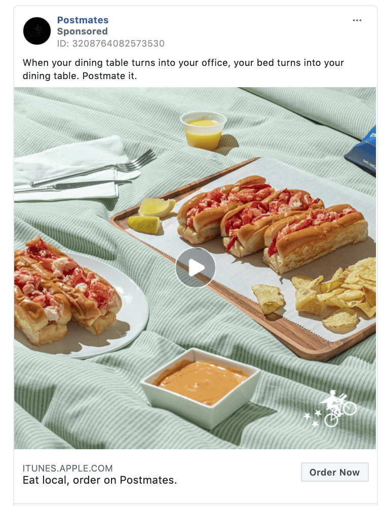
CTA: Order now
The “Order Now” CTA button might just be the best thing since sliced bread. Order Postmates while scrolling Instagram? Yes, please.
Postmates CTA – Order Now41. Bloomberg

CTA: Subscribe
“Subscribe” is popular among news sources, magazines, and subscription boxes. This example from Bloomberg illustrates the “Subscribe” to drive subscriptions to The Athletic.
42. Sprout Social

CTA: Download
The “Download” clickable button is direct and straight to the point.
In July 2020, over 98% of active user accounts worldwide accessed their social networks via their mobile phones.
So the download call-to-action is a great way to reach people when they are on their mobile device.
43. NoiseAware
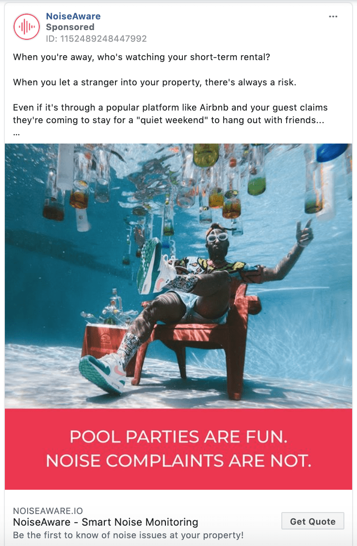
CTA: Get quote
I'm sorry, what do you mean? This isn't clear.
Kidding.
Offering a quote is a great way to get customers in the door. It's a zero-commitment call-to-action that is easier to get users to click compared to “Buy Now.”
44. AMC Theatres
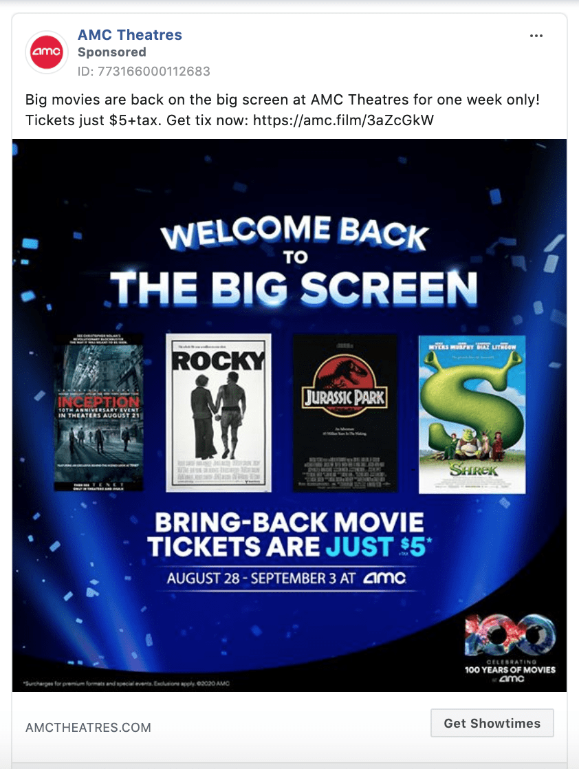
CTA: Get showtimes
“Get Showtimes” is recommended for movie theatres, plays, and concerts. AMC Theatres uses “Get Showtimes” in this example below.
45. Spotify
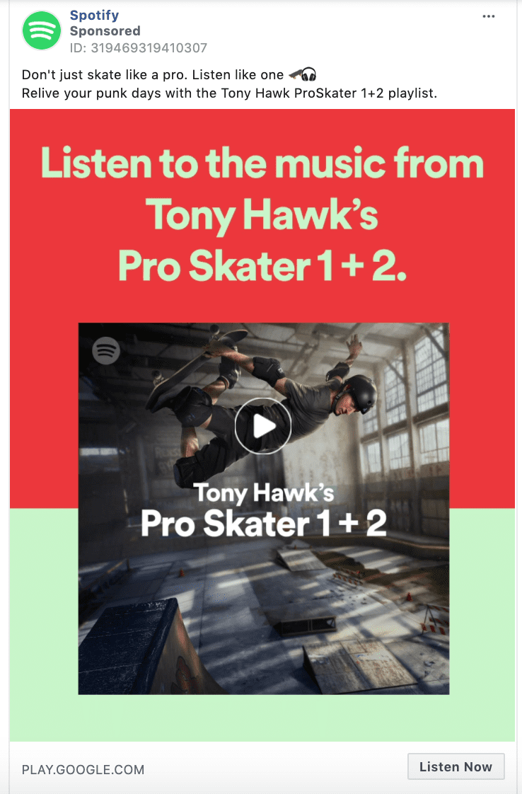
CTA: Listen now
Love this one.
“Listen Now” is a favorite of industry giants like Spotify, Apple, and Pandora. If you are promoting music, a podcast, webinar, seminar, or audiobook definitely use the “Listen Now” call-to-action.
46. Angry Birds
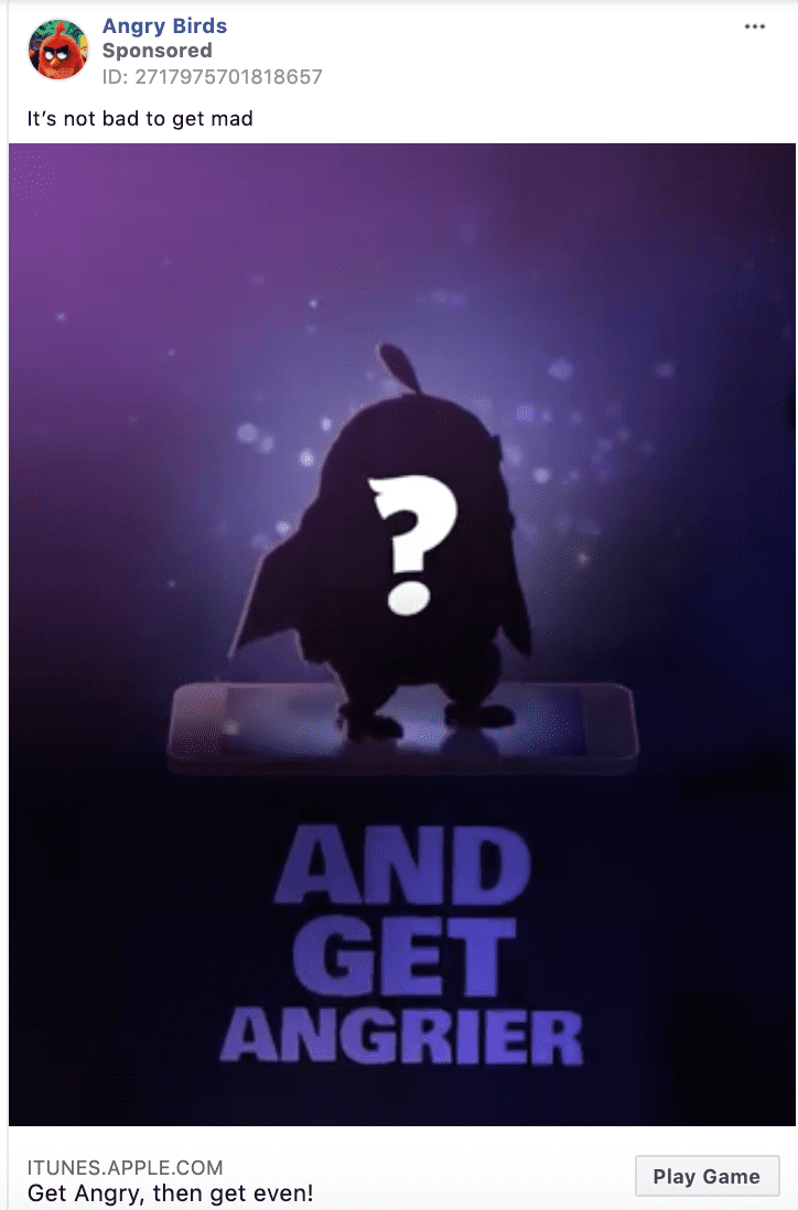
CTA: Play game
A less common pre-set CTA button when you are creating an ad in Facebook's Business Manager is “Play Game.” If you are promoting a game or an app convince your ad viewers to have some fun, and use “Play Game.”
47. Pizza Hut
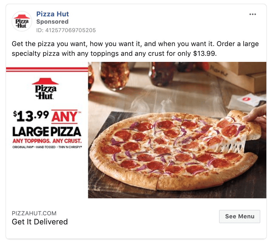
CTA: See Menu
Promote your restaurant with the “See Menu” call-to-action like Pizza Hut does in this example. This is a top of funnel way to drive take out orders or customers to your restaurant.
48. Peacock TV
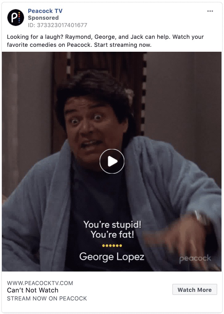
CTA: Watch more
As streaming platforms like Peacock TV grow, the “Watch More” call-to-action is becoming increasingly popular. If you promote television, movies, or even just want people to watch your entire promotional video, use “Watch More.”
49. University of Phoenix

CTA: Apply now
This is an exciting CTA that no doubt causes a mild adrenaline spike that sends positive energy through the body of your button clicker.
Use “Apply now” if your digital marketing goal is to drive job applicants, apartment rentals, or if you are a higher education institution like the University of Phoenix in this example.
50. Southwest Airlines

CTA: Book now
Airlines and hotels are big fans of the simple CTA “Book Now.” Southwest Airlines uses the action words “Book Now” in their ad to direct its users towards the next steps of booking a flight.
Southwest Airlines: Book Now
51. Wolf & Brown Law Offices

CTA: Contact us
“Contact Us” is compelling and can be used in many cases. In this example, we highlight a law firm using the “Contact Us” call-to-action clickable button. If you are looking to drive phone calls to your business “Contact Us” is effective.
52. World Food Program USA

CTA: Donate now
Many non-profit organizations use Facebook ads as a way to build donations toward their cause. In this example, the World Food Program USA shows how to use the “Donate Now” call to action.
World Food Program USA: Donate Now
Google Ads Call to Action Examples
Google Ads are often overlooked in conversations around call-to-actions. But here at Klientboost, we are obsessed with Google Ads
There is no reason you shouldn't incorporate a call-to-action in your Google ad copy to increase your click-through rates.
You can even use A/B testing to determine which call-to-action drives the best click-through rates. These examples below will inspire you to spruce up your Google ad copy.
53. Adidas

CTA: Shop the official site
Many brands that have an eCommerce faucet use a “Shop” in their Google search ad copy. For established brands like Adidas, “Shop The Official Site” is a great call-to-action that not only encourages the user to take action, but also adds an element of authenticity to the ad.
54. Geico

CTA: Get a free quote 24/7
Geico uses a “Get a Free Quote 24/7” in their Google ads headline. It's important to work in an action verb to entice people to click on your ad. When writing your call-to-action remember that Google ad headlines have a character limit of 30.
55. Upside Avenue

CTA: Download our investment guide
In this example, Upside Avenue uses “Download Our Investment Guide” as a compelling call-to-action to drive clicks to their site and generate interest from potential investors.
56. Wrike

CTA: Wrike Trumps Asana, Hands Down
Hmmm... I wonder if Wrike is an Asana competitor? 😂
How many ways can Wrike say that?
- Title: Better Than Asana? You Bet
- CTA: Wrike Trumps Asana, Hands Down
- Meta Description: Stop working in silos with Asana (use Wrike instead)
- Extensions: Wrike vs Asana
- Slug: trial/wrike.com/not-asana/wrike-asana
Hard not to click on this sponsored link. They really went for that competitor bid.
Display Ads Call to Action Examples
One of our last examples highlights responsive display ads on the Google Ads interface.
Display advertising reaches your target audience through visuals like images and videos on networks of publisher websites like the Google Display Network.
When creating a display ad, Google allows you to customize your call-to-action with the options below.

Google Responsive Ads call-to-action text options:
- Automated
- Apply Now
- Book Now
- Contact Us
- Download
- Learn More
- Install
- Visit Site
- Shop Now
- Sign Up
- Get Quote
- Subscribe
- See more
57. Crystal Gemstone Shop

CTA: Shop now
In this example, Crystal Gemstone Shop uses a “Shop Now” CTA to drive direct sales from their display ad. If you are looking to drive sales from your Display ads, try using a remarketing audience for the best results.
According to Kenshoo, consumers are 70% more likely to convert with retargeting.
YouTube Call to Action Example
Youtube has dedicated an entire ad overlay to call-to-action.
A call-to-action (CTA) overlay is an interactive element that appears over an ad that drives clicks to your website. An overlay appears when the video starts and collapses into a thumbnail image after 15 seconds.
58. Felix Grey
CTA: Shop now
Felix Grey uses the “Shop now” call-to-action overlay in its Youtube TrueView in-stream ad. The Shop Now CTA gives users a way to take direct action from the Youtube ad.
This option, as well as advanced targeting methods, is another reason advertising on YouTube may work better for your brand compared to a more traditional approach.
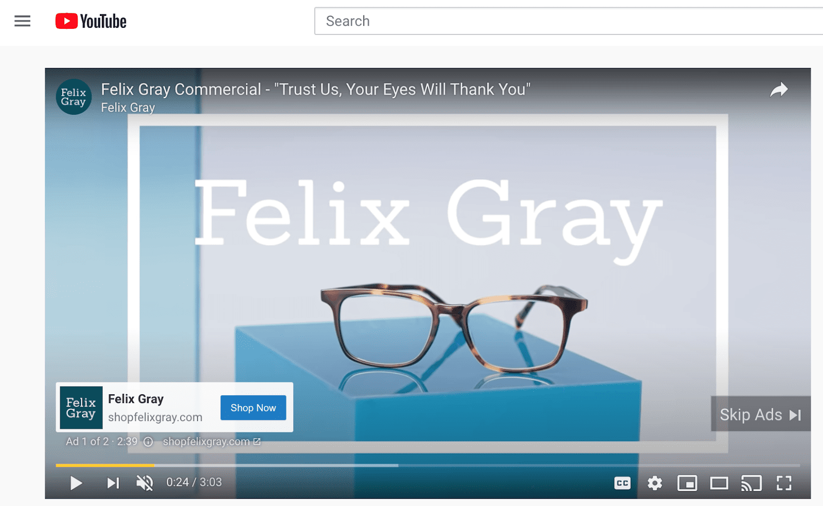
Felix Grey CTA: Shop Now
Use Original Call to Action Examples on your website
Phewf! We made it through that beautiful list. Take whatever inspired you and change it to match your brand tone. Speak to your audience in a way they're excited to click your buttons.
The conversion is what we do this for, so give your CTAs the attention they deserve. Good luck!
Outtakes
As promised, here are CTA examples you shouldn't use because they play to the dark side of conversion. Keep things positive, and don't manipulate human psychology—no need to paint nefarious tones all over our buttons. 👏
(The No excuses CTA made me snort) 😂


FAQs
What is the click rate of a CTA?
Click rate: the percentage of views that lead to button or link clicks on the CTA. The click rate is the percentage of people who viewed and then clicked the CTA.
Calculate CTR: To calculate the CTR, divide the number of clicks on the CTA button by the total number of visitors or sessions on the page. CTR = (Clicks on CTA / Total Visitors) * 100
What is the difference between a button and a CTA?
A button is one example of a CTA, but not all call-to-action examples are buttons. A CTA could be a text link or a clickable image, for example.
What color button gets the most clicks?
Some say red works best for buttons like “Buy Now” or “Limited Time Offers” because it is associated with a sense of urgency that increases impulse purchase conversion rates. But the most effective CTA is one that contrasts nicely or stands out in some way, either by color or by copy or placement.