It’s a tale as old as time.
You get a ton of potential customers to visit your eCommerce site. They browse your inventory and add a bunch of items to cart, but only a small percentage of them actually buy.
Isn’t that the actual worst?
For many eCommerce businesses across industries, nearly 70% of online shopping carts are abandoned. That equals a lot of lost sales and revenue.
Luckily, in many cases, you don’t have to say goodbye to those sales forever.
Instead, an abandoned cart email can be a lifesaver. These automated emails land in customers’ inboxes at the perfect time to get them across the finish line, recover sales, and boost your conversion rate.
In this article, we’ll walk you through setting up an abandoned cart email, cover some best practices, and show you 20+ examples to guide your abandoned cart email marketing strategy.
By the end, you should have the best ideas on how to craft your own abandoned cart emails and save those sales.
Ready to roll?
Subscribe to our weekly newsletter for tips so good that we might put ourselves out of business.
What is an abandoned cart email?
Abandoned shopping cart emails are automated messages you can send to customers who shopped your online store, put items in their cart, but never finished checking out.
These emails are designed to remind customers about the items they considered and prompt them to go back and make a purchase.
Usually, they’re pretty simple messages—short, sweet, and to the point.
But don’t let the simplicity deceive you. They can be incredibly effective at driving sales.
In fact, over 40% of abandoned cart emails are opened, and on average, nearly 10% of those get clicks. According to Klaviyo, those recovered sales equal $5.81 per recipient.
Given the average 70% cart abandonment rate, that recovered revenue could add up and add up quickly.
So don’t dismiss it. 😉
How do abandoned cart emails work?
Setting up and using abandoned cart emails is a pretty straightforward process.
Start by choosing an email marketing service that can connect to your eCommerce site.
You’ll then create an automated abandoned cart email that gets triggered whenever a customer abandons their online cart. (You can use the template below as a guide for your abandoned cart email design.)
Most email marketing services can display the specific products each customer was browsing and include a link they can use to resume shopping. That means customers can pick up right where they left off through a simple click.
Finally, decide on the timing. You can set this email to send anywhere from an hour to a day after the customer leaves their cart.
Then, turn on the automation and start sending when carts get abandoned.
Customers will receive an abandoned cart email encouraging them to complete their purchase. If successful, they’ll return to cross that finish line (AKA checkout).
The optimal abandoned cart email template
We got’chu. 😎
If you want an abandoned cart email that's going to win people back, you must have:
- A catchy subject line
- A personalized intro
- A reminder of what was in the cart
- An irresistible incentive
- A CTA to checkout
Let's break it down further 👇
Subject line
The subject line is the best chance to grab your customers’ attention, so choose something that’s likely to stand out, boost open rates, and get clicks. You can try to
- make it sound like a personal reminder for customers to pick up where they left off (e.g., “Oops, you forgot something cool in your cart!”)
- use a discount as an incentive, and make it crystal clear in the subject line (e.g., “25% off just for you!”)
- create a sense of urgency to inspire action (e.g., “Something you want is almost out of stock!”)
More reading: Check out our blog on the best email subject lines for more ideas and inspiration.
Intro text
In the intro, quickly explain to customers that you saved their shopping cart and prompt them to check out. Maybe complement their style, reinforce product benefits, ensure a return policy, or tell them how many other people loved what they almost bought.
This is the part where you should directly address any reasons they might be holding out.
Items left in the cart
Then get right to the point.
List each item left in the cart so customers can easily resume shopping. Include the product images, descriptions, what size/color they chose, etc.
Any email marketing service you choose should be able to add this dynamic content automatically.
Irresistible incentive
If customers didn’t complete their purchase the first time, there’s probably a good reason.
Fortunately, you have plenty of options for encouraging them to convert. Use an abandoned cart email to offer them a deal they can't refuse such as:
- offering a discount to customers seeking a price break
- providing free shipping to help customers cut costs
- extending a return policy to customers hesitant about size or fit
- including a small added gift for customers that just need a little something extra
To put it simply, make it worth their second thought.
Checkout button
This is what you want them to do, right? Ensure your abandoned cart email has a checkout button that’s impossible to miss. If your customers can’t find or quickly navigate to this CTA, you’ve missed the opportunity again.
So make it stand out by using a bold color that aligns with your branding and ensure it’s easily seen.
And don’t hesitate to get creative with the copy. Try call-to-action (CTA) copy like
- “Keep Shopping”
- “Get It Now”
- “Save 25%”
- “View My Cart”
- “Take Me Back”
Abandoned cart email best practices
These automated emails are much more than friendly reminders. They’re your opportunity to recover sales.
So how can you make sure these emails do their job? Keep these best practices in mind.
Be timely
Timing is critical for any marketing email, especially when you’re reaching out to warm leads.
If you send it too soon, customers may see your email as pushy or invasive. If you wait too long, you may find that they’ve already bought from another company and miss the boat…again.
It’s suggested that the first reminder email should be sent within 1-3 hours after a customer leaves their cart.
If you feel like that’s too aggressive for your audience, try emailing within 24 hours after customers click away from their shopping cart. 24 hours is pretty safe, and you can reach customers while your brand is still top-of-mind while avoiding being too pushy.
Send multiple abandoned cart emails in a sequence
You can opt to send a single abandoned cart email to your customers. But in many cases, a single cart reminder won’t secure all possible conversions.
That’s why many eCommerce brands send an abandoned cart email sequence that includes a second email—or even a third.
Each subsequent email can create a greater sense of urgency or offer a more tempting incentive.
If you’re not sure how many messages to include in your email campaign, test it out.
Test out one, two, or three. Then review the results to confirm which combination drives the most sales.
Incentivize the sale
We covered this a bit earlier, but we want to drive this point home.
Make it worth their reconsideration.
In some cases, customers may have left items in their cart because they got busy or even because of internet connection issues. But in other cases, they may have been shopping around for a better deal.
When you make your way to them again, offer a great incentive that’s worth their while. This is how you increase the chance of recovering the sale. Try A/B testing to see which offers work best for your audience.
Cross-sell and upsell at this time
Sure, your customers already had an idea of what they wanted to purchase. Buuuut, that doesn’t mean that they aren’t open to other suggestions.
In addition to reminding customers about the items they considered, abandoned shopping cart emails are great opportunities for cross-selling and upselling. That means you can increase order value by
- promoting more expensive versions of the products they browsed (e.g., a pro version of a gadget or a bigger package of a consumable item)
- encouraging customers to buy a related item that completes or enhances the package (e.g., a case for the phone they considered or a chew toy to go with the leash they browsed)
21 best abandoned cart email examples to inspire you
Wondering what makes an abandoned cart email amazing instead of just…okay? Get inspired by the abandoned cart email marketing examples below.
1. ASICS
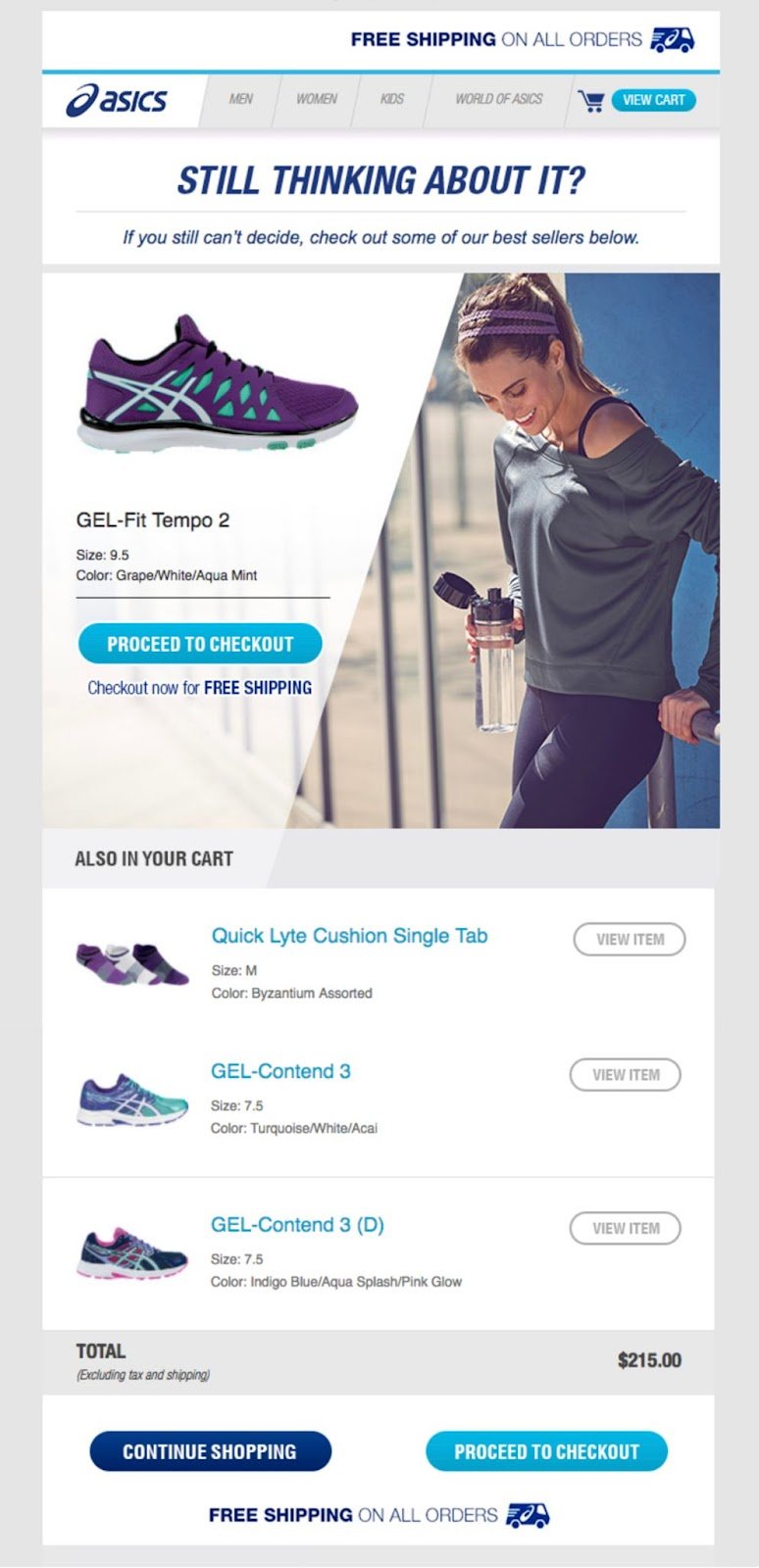
What we love: Free shipping incentive
ASICS’ abandoned cart email uses a subject line that’s sure to capture runners’ attention: “Don’t get left in the dust.”
Rather than pushing customers to purchase right away, ASICS offers two options: customers can either continue shopping or proceed to checkout. With the free shipping incentive, however, customers probably won’t be able to resist the latter. 😉
2. Bonobos
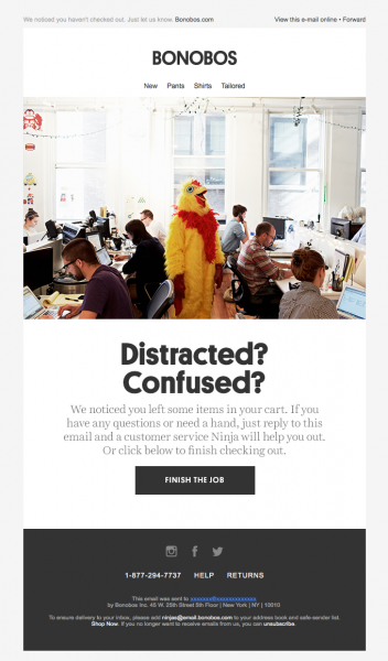
What we love: On-brand humor
Bonobos makes sure its abandoned cart email won’t get lost in inboxes. The clothing company uses humor to grab attention with the casual subject line, “Everything cool with your transaction?”
The brand continues its lighthearted approach with a humorous image and the headline, “Distracted? Confused?”
I mean… yes, and yes, but I’m also pretty hooked.
Even the button copy reads, “Finish the job,” a CTA that’s likely to resonate with the brand’s target audience and get them to do just that.
3. Brooklinen
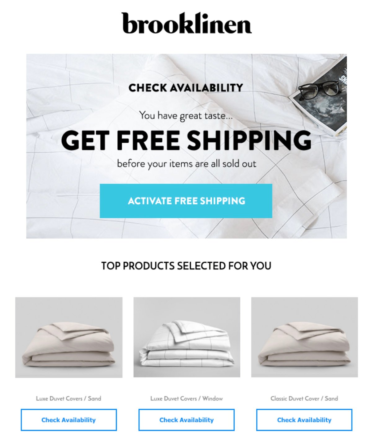
What we love: Effective sense of FOMO and free shipping incentive
Brooklinen’s abandoned cart email amps up the sense of urgency and FOMO to get customers to convert before it’s too late.
Notice how they subtly add “before your items are all sold out” to create that ticking clock? What about the way Brooklinen ups the ante every time they provide a “Check Availability” button on the customer’s top products?
Well done, Brooklinen.
But that’s not all.
In case customers weren’t already convinced, the bedding company offers a little extra incentive. Eliminating shipping costs is great for converting those who were on the fence due to cost concerns.
After all, an unexpected/high shipping cost is one of the top reasons why people bail on their carts in the first place.
4. Chewy
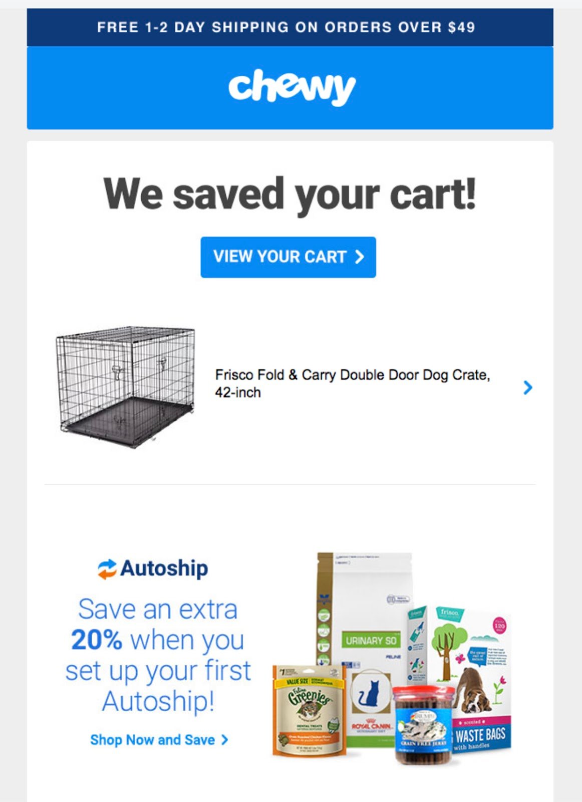
What we love: Packs a short and sweet punch
Chewy’s abandoned cart email doesn’t mince words. They get right down to it. It efficiently announces “We saved your cart!” before sharing a CTA button, the product image, and a link to the item.
But just because the email is short and sweet, it doesn’t mean it’s lacking in any way.
The pet goods company also fits in a timely upsell. The email pitches Chewy’s Autoship service, which also offers a discount for subscribing to a recurring purchase.
For such a simple abandoned cart email, this guy sure does pack a punch.
5. Cocokind
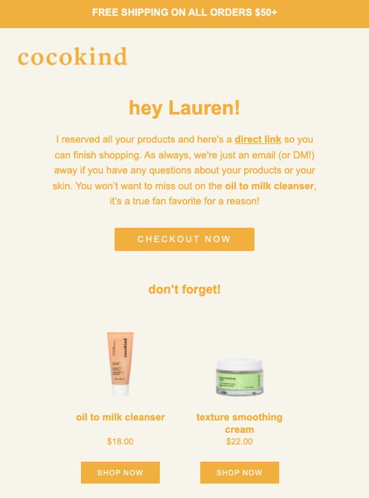
What we love: Personalization
Cocokind’s automated emails use customers’ first names and a first-person viewpoint to make the messaging feel much more personal. They greet the customer right away and talk directly to them—but that’s not all they do.
They take it a step further by providing a sweet touch of some added customer support: “As always, we’re just an email [...] away if you have any questions about your products or your skin.”
This level of care and attention can be just the thing that helps customers feel valued and want to return to that cart of theirs.
The skincare brand also takes the opportunity to create major FOMO. “You won’t want to miss out on the oil to milk cleanser, it’s a true fan favorite for a reason!”
Who could resist?
6. Everlane

What we love: Cross-selling, simply
With its simple, sophisticated approach, Everlane keeps its email beautifully on-brand. Rather than highlighting all the abandoned items, Everlane’s email simply lets you know that you’ve got a cart waiting for you.
Then, they use this opportunity to focus on cross-selling. It lists several recommended products to entice customers to keep on shoppin’.
7. The Farmer’s Dog
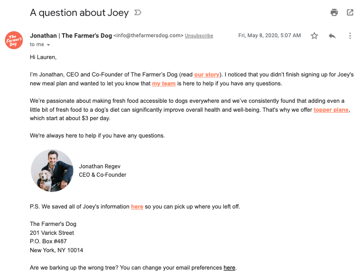
What we love: Super personal touch that’s text-based
While most abandoned cart emails use image-heavy templates and some ornate email design, this one from The Farmer’s Dog is a little different.
It takes a chance and strips itself of any distractions to connect directly with the customer. The text-based format makes it seem more like a personal email and less like a marketing message.
Plus, it features tons of personal touches. The subject line and the email body both mention the customer’s dog by name. The postscript also provides a direct link to the dog’s profile, making it easy to resume shopping.
We also love the CEO’s image in his signature, which features himself and his pup.
The Farmer’s Dog takes a chance and hits a home run.
8. Headspace
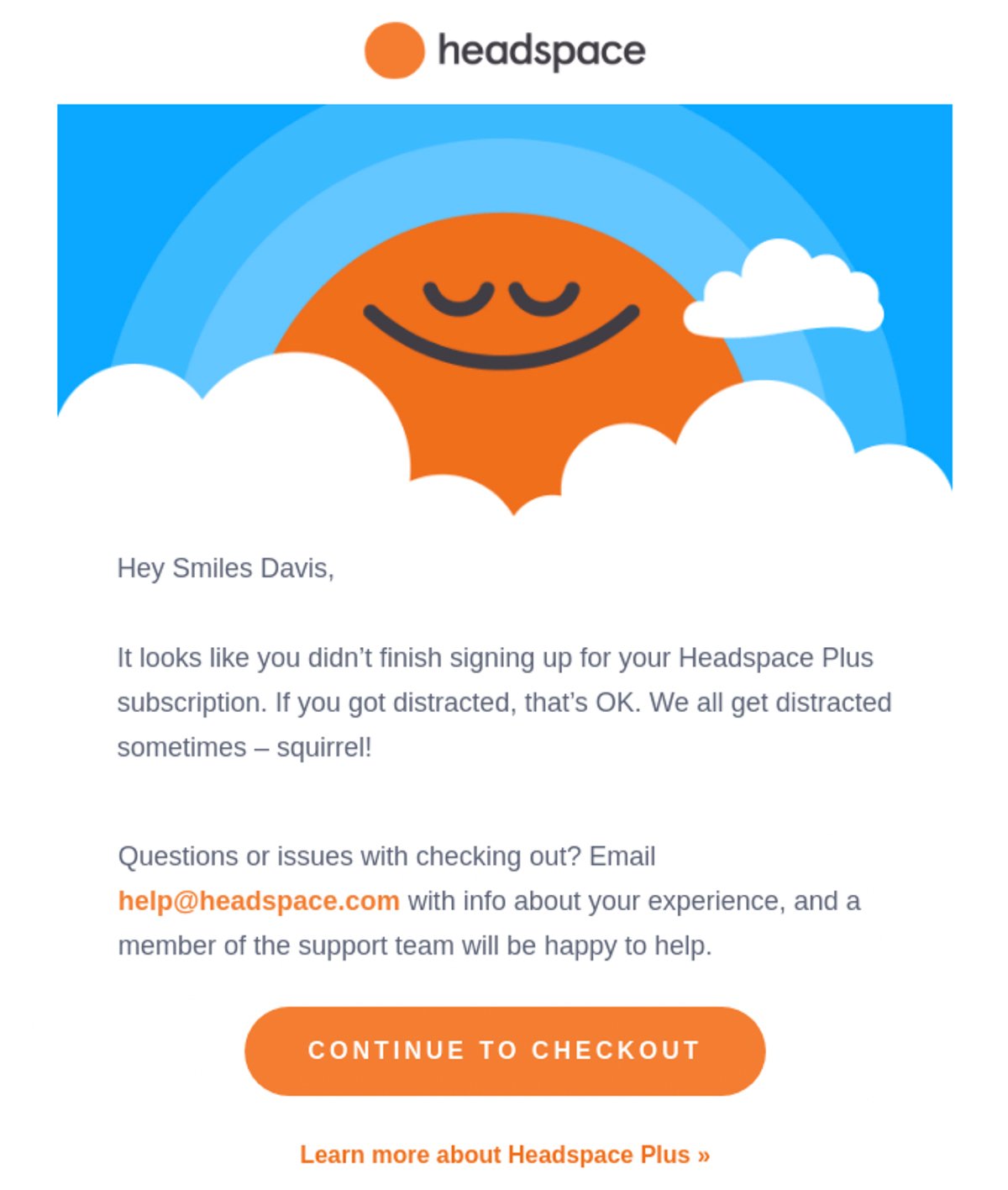
What we love: An understanding approach that empathizes with their audience
Headspace’s email takes a friendly, understanding approach to get customers to resume their shopping journey. What we love about it, though, is its deep understanding of their audience and, well, the headspace they might be in. This email empathizes and relates to its recipient.
It also devotes a decent amount of copy to offering help with checkout issues, which may help customers resolve any difficulties they experience.
9. Jack Willis
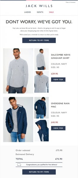
What we love: Great product images
Jack Willis does a great job of providing several product images of the items left in the customer’s cart. We love the added images that show the product(s) from different angles; it’s like shopping once again but in the email.
To recover the sale, it also offers free delivery as an added incentive. (Have we driven that point home yet?)
10. J.Crew Factory
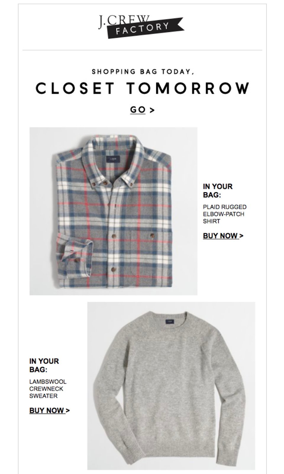
What we love: Visualization
Rather than using a reminder-focused approach, J.Crew Factory takes a different track. The clothing company’s email encourages customers to visualize owning the items they browsed.
The intro copy, “Shopping bag today, closet tomorrow,” makes customers think about how the items would fit with their wardrobe—prompting them to envision themselves in the clothing and, most importantly, prompting them to purchase.
11. Lego
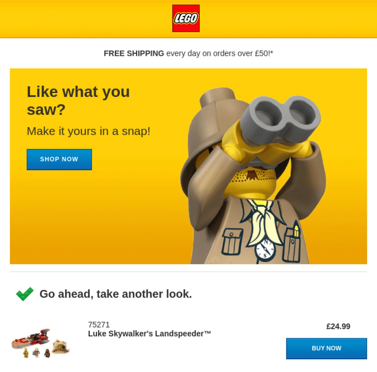
What we love: Fun design
Lego takes a design-focused approach to recovering sales. Who can resist that fun image of a Lego looking through a pair of binoculars? This design also matches perfectly the intro text, “Like what you saw? Make it yours in a snap!” and the subtext, “Go ahead, take another look.”
Way to build an abandoned cart email, Lego. 😉
12. Lending Tree
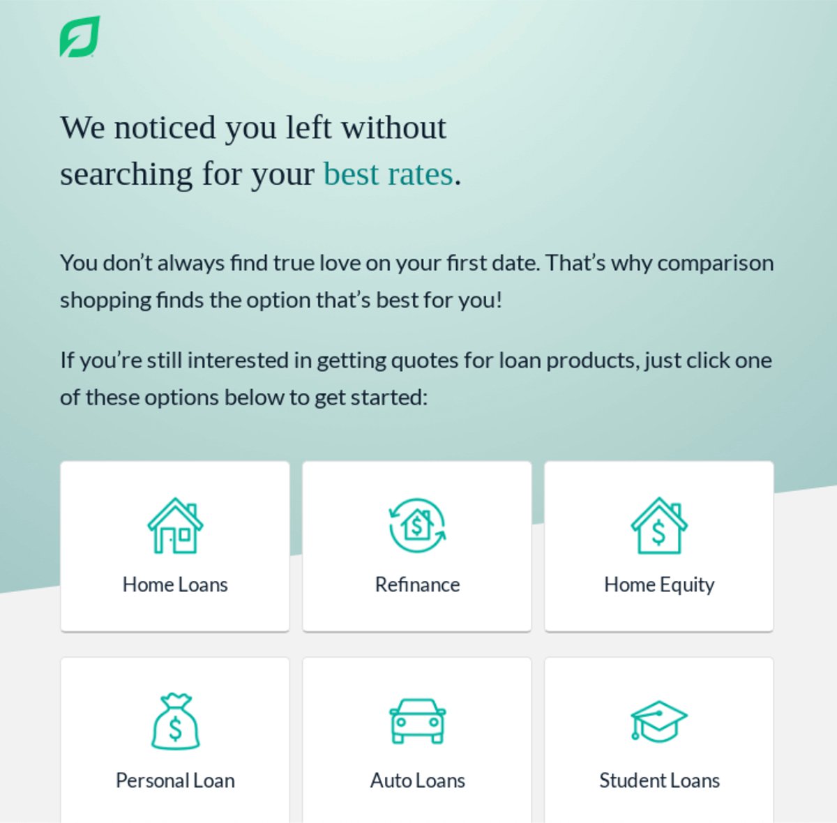
What we love: Options, options, options
Financial products have some of the highest abandoned shopping cart rates at 83.6%. That means for the financial industry, sending a strong abandoned cart email is critical.
Products and services related to one’s finances, naturally, take lots of consideration and thorough research; the plenty of options provided here understands just that.
Lending Tree’s message encourages prospects to continue browsing rates and conduct comparison shopping. To help customers find what they need, the email includes links to several financial products and options to entice customers back.
13. London North Eastern Railway
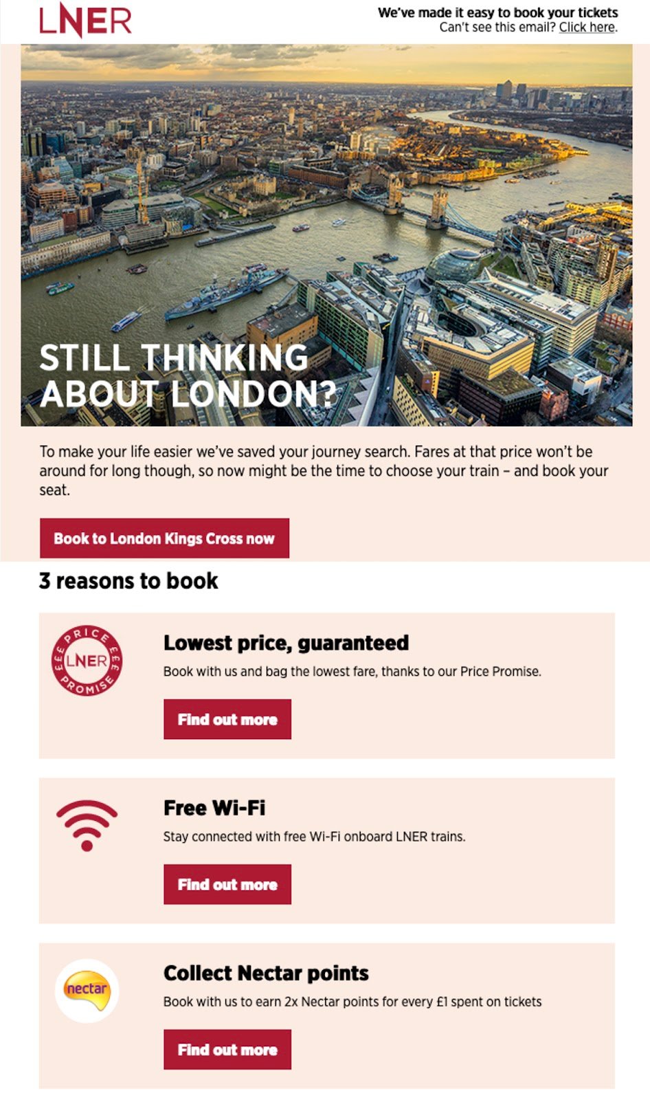
What we love: Irresistible reasons to book
For customers still on the fence, the email lists several great reasons to book—from securing the lowest price to collecting loyalty points.
This is a great tactic to address any objections the customers might have had that caused them to abandon their cart in the first place.
14. Madewell
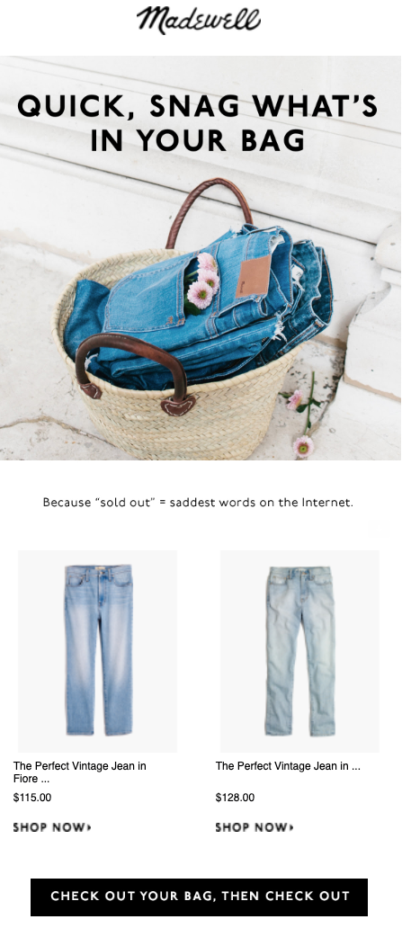
What we love: Excellent copywriting
Madewell uses wordplay to engage customers with the (urgency-generating) intro text “Quick, snag what’s in your bag.” They do it rhymes and all.
The clothing company also injects a sense of FOMO into the email, stating, “Because ‘sold out’ = saddest words on the internet.”
Truer copy has never been written. 😔
15. Nordstrom
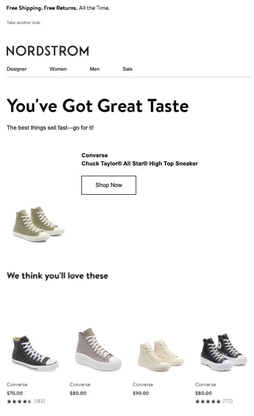
What we love: Complimenting the customer
A compliment sure does go a long way. Nordstrom takes a complimentary route with its intro copy, “You’ve Got Great Taste.”
What better way to start an email than directly addressing and hyping up the customer? This not only makes the customer feel good about themselves, it might just reconfirm and solidify their choices.
The department store also recognizes that the customer may still be shopping for the perfect item. As a result, the email features a handful of related product images, encouraging customers to keep browsing if they wish.
16. Outdoor Voices
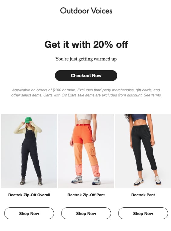
What we love: That discount tho 😏
Keeping its email copy on brand, Outdoor Voices uses lines like “You’re just getting warmed up” to engage customers to shop. This abandoned cart email then positions a generous 20% discount front and center to seal the deal.
That’s pretty hard to ignore.
Back to my shopping cart I go.
17. Reformation
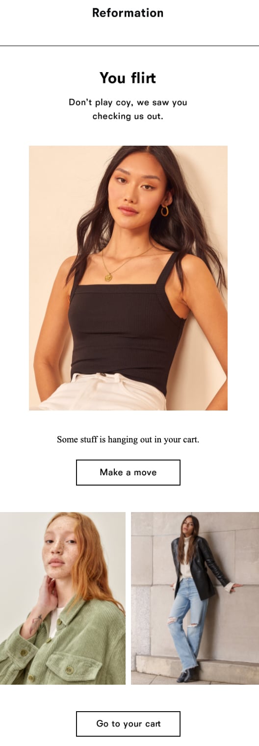
What we love: Playful, bold copywriting
With its flirty approach, Reformation’s email easily stands out in the inbox. Copywriting like “We saw you checking us out” and “Make a move” creates fun wordplay that references the shopping process while enticing customers to act—all in an incredibly effective and lighthearted way.
18. Slowtide
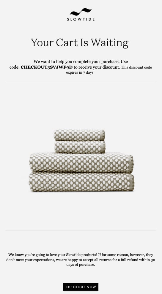
What we love: Element of mystery
This automated email from Slowtide offers a discount with a unique coupon code. Since the email doesn’t specify the discount amount, customers have to revisit their shopping carts to get the details.
Is it 10% off? A BOGO? Half-off?
We’ve just got to know.
And because the discount code does have a clear expiration date, customers are likely to want to take advantage right away—which may drive more sales.
We also love the last detail of including their return policy at the end. It’s a great way of addressing some objections the customer might have without it being the focus of the email.
19. Target
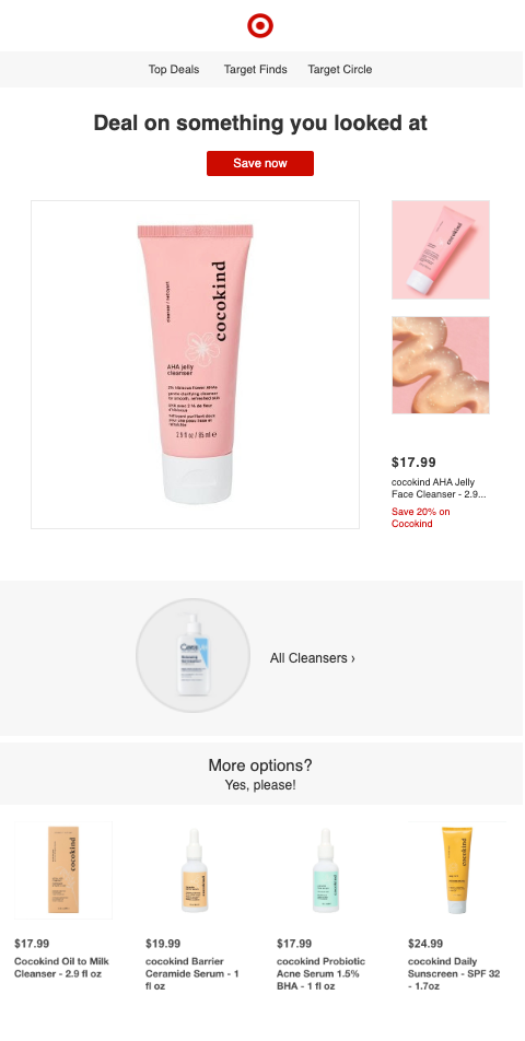
What we love: The more, the merrier
When the initial price isn’t quite right, a well-timed discount can make all the difference. This Target shopping cart recovery email offers a great deal on items that customers recently browsed.
To make the shopping process a little easier, Target also includes links to related products for a chance to cross-sell. That way, customers still have plenty to browse and buy, even if they changed their minds.
20. Winc
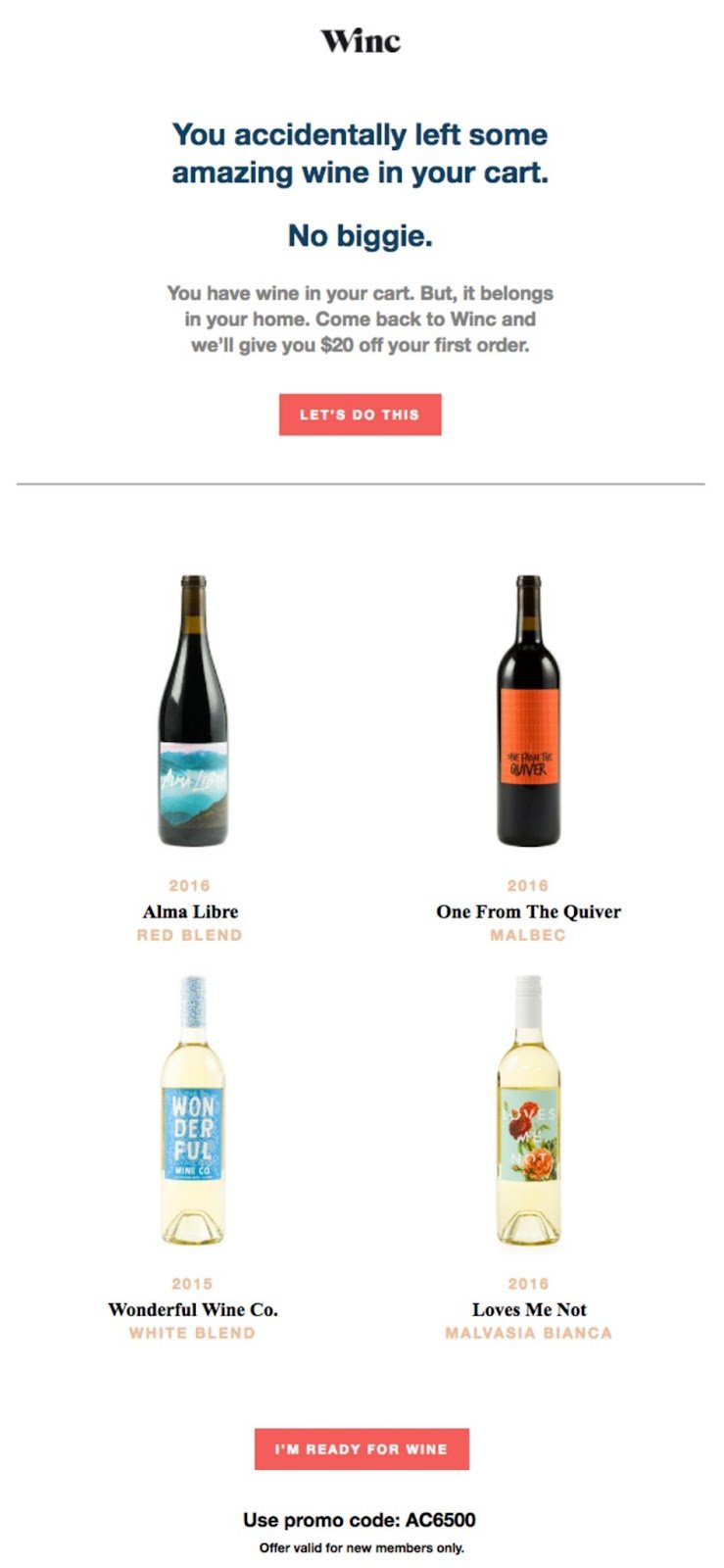
What we love: Conversational copy + drool-worthy images
We love this abandoned cart email from Winc. It does such a good job of playfully and conversationally connecting with its recipient. With forgiving lines like, “No biggie,” and a bright red CTA button that reads, “Let’s do this,” this email comes off more like an old buddy chatting with us.
Plus, those beautiful product images of the wine bottles enhance and reinforce the above copy.
Oh, and it’s giving $20 off a first order.
21. World Market
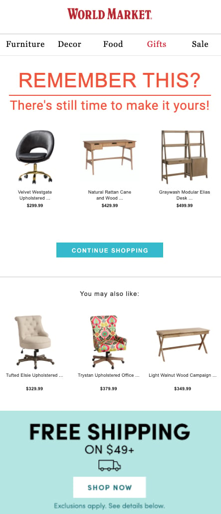
What we love: Bold reminder
World Market’s email starts off with a bang. Check out the big, bold, red copy at the very top of the email reading, “Remember this? There’s still time to make it yours!”
It’s a great way to stand out while simultaneously creating that sense of urgency.
World Market also takes full advantage of the company’s product recommendation engine. In addition to prompting shoppers to finish their original purchase, the email suggests several complementary products that match the style of the items in the cart, making for a great cross-selling opportunity.
Start recovering sales with abandoned shopping cart emails
Ready to tackle shopping cart abandonment for good?
With an automated email or drip sequence, you can recover sales, boost conversion rates, and drive more revenue.
You’ve got all you need to know for a great abandoned cart email strategy. Take our template, best practices, and inspirational examples to start off on the right foot.
And if you need some support along the way, you know what to do.
