Email is one of the most powerful marketing options that most brands leverage. Once users sign up for your list, you have a direct lifeline that allows you to keep in touch to build relationships and drive conversions.
This is especially true when you’re using a strategic email design strategy. 😉
Considering that emails can deliver a high ROI—every $1 spent on email marketing drives an average return of $42—investing the time and energy into utilizing email design best practices can help you maximize these clicks and conversions.
In this post, we’ll look at how to create strong email marketing designs that work for your business and audience so you can take advantage of all the benefits the channel has to offer.
Let’s get started.
Subscribe to our weekly newsletter for tips so good that we might put ourselves out of business.
What is email design?
Email design is the process of crafting and creating marketing emails that are persuasive, visually appealing, and connect with your audience. With effective email design, you ensure that the necessary information is readily available to users and that it’s easy for them to take the desired action quickly—all while looking good.
Email design takes the following into account:
- typography
- patterns
- colors
- layouts/templates
- length of email and headlines
- copy/messaging used
- visuals like images or gifs
- personalization options
- calls-to-action (CTAs)
- clickable link placements
The design of the email is essential.
Why?
A visually stunning email with short headlines, great descriptions, and a few attention-grabbing visuals is typically going to catch a user’s interest more than a giant block of text—even if you’re presenting the same offer.
On average, there are over 200 emails sitting in your customers’ inboxes right now (with approximately 120 more coming in daily). This is why it’s crucial to ensure that your message stands out and convinces users to act now through effective email design.
Email design types: HTML vs. plain-text
HTML
HTML stands for “HyperText Markup Language,” and it’s used to create and format most websites and emails today.
HTML emails allow brands to create engaging emails with complex layouts, CTA buttons, and text that’s formatted with custom font options.
Here’s an example:

Most email templates today use HTML as it allows for more visually-appealing designs and more customization than plain-text emails.
Depending on the coding and/or template, HTML can also mean responsive emails, meaning that it will automatically be sized to fit the user’s device (including mobile devices).
Plain-text
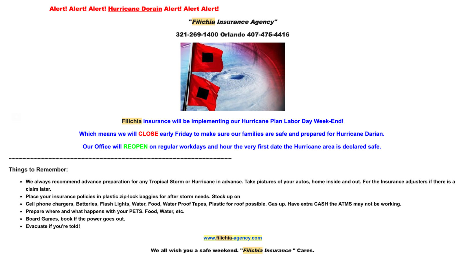
Plain-text emails are exactly what they sound like—they’re plain ol’ text.
They might sometimes include an image or two and have some basic formatting like centered text or bullet points, but there usually isn’t the option to create an infographic-style email design as you can with HTML.
These emails aren’t automatically responsive, and they may not be engaging for users. They may also be more difficult to track, so you might not be able to retrieve high-quality data about performance.
They are, however, easy to create, which is one of the main appeals of plain-text emails.
Here’s an example of what a plain-text email may look like:
How to create a strong email design that works for you
When you’re working on an email marketing campaign and coming up with the email design, an important part is understanding what you want to accomplish and how you plan to do so.
The following process can help you develop the best email design for your business:
- Consider your objective. What is this email being sent for? Are you promoting products, pushing users to beta test a new product line, or want them to sign up for your webinar?
- Decide what actions users need to take. Do you want them to click to a landing page? Purchase an item? Book an appointment? Or are you looking just to keep them informed about industry news in a content marketing approach? This will influence the design.
- Choose the email template that is as simple as possible while getting the job done. You don’t need an email that shows 15 images if you really only need to show users two; start with the basic layout that will accommodate the messaging.
- Prioritize your CTA. Ensure that your clickable CTA is front and center, placed in a visible location so that users can convert easier.
- Simplify your message. Give as much information as needed to get users to click, and make sure that it’s organized in a scannable, straightforward way. Then, hack away at what’s distracting and intimidating to a reader.
- Include branded colors and any needed visuals. Once the messaging is in place, fine-tune the look of the email by incorporating your brand’s colors and adding relevant visuals as needed.
10 email design best practices to create a strong marketing email
Want to create functional and beautiful email designs for your brand? These 10 email design practices can help.
1. Choose your colors carefully
The colors you choose for your email designs can greatly impact their success.
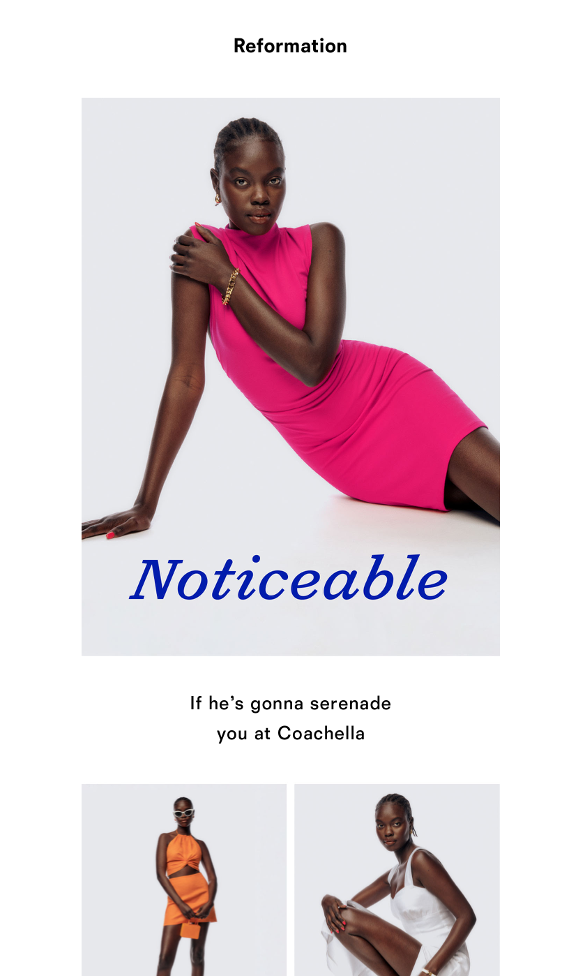
Some colors are automatically going to stand out more (e.g., reds and yellows). Neons are also immediately attention-grabbing, as you can see here:
Keep in mind the emotion you want to evoke in your audience.
Brooklinen, which sells products like luxury sheets and pillows, utilizes its brand color of navy in many of its email designs. This promotes brand identity and awareness, but it’s also a soothing color appropriate for what they’re selling.
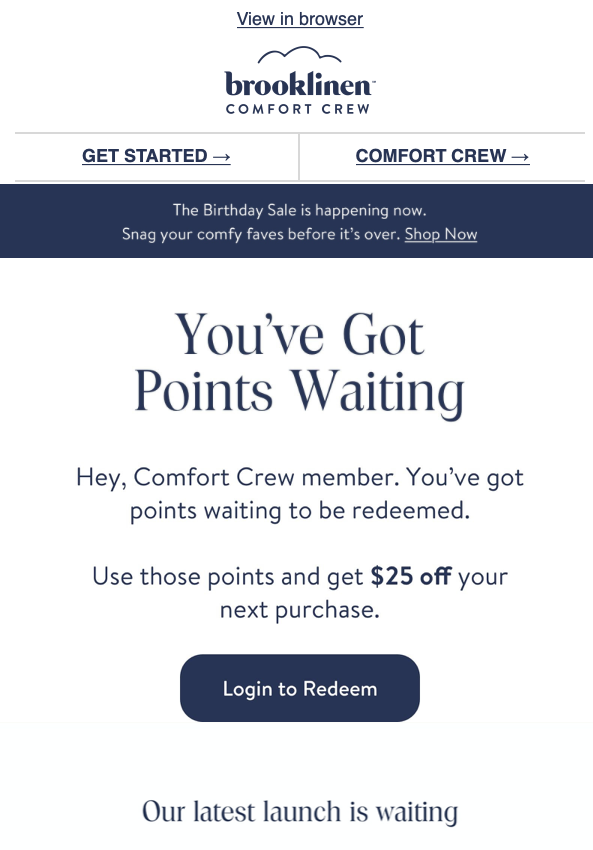
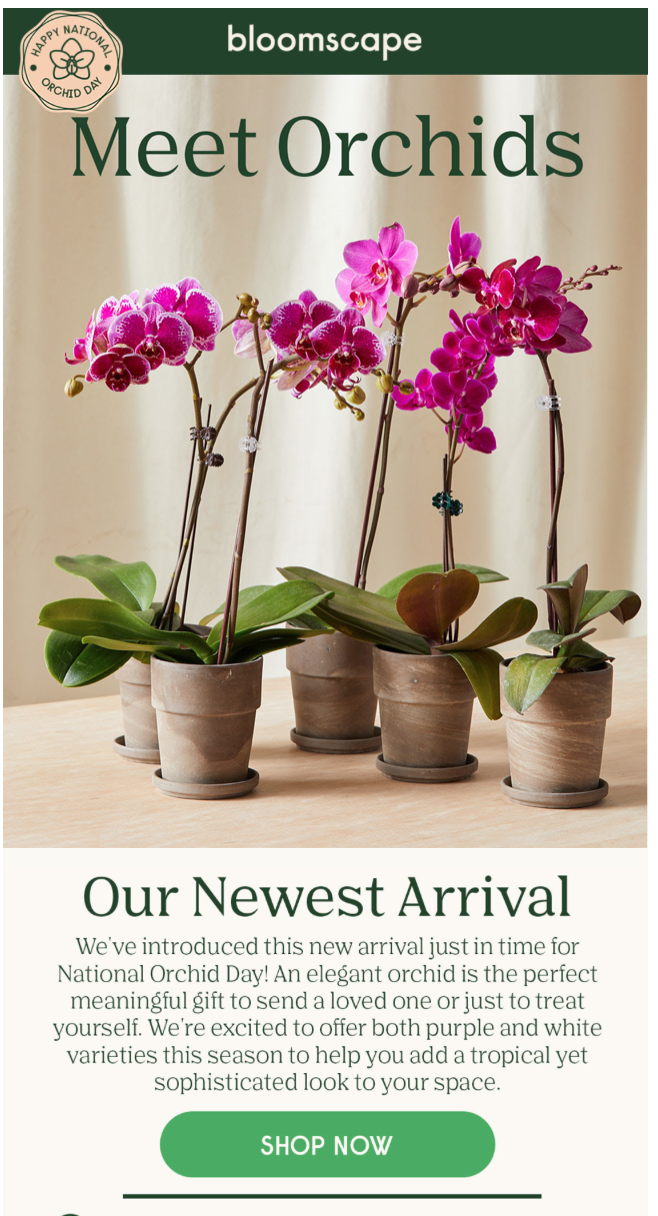
Contrasting colors can also be one of your best friends with email designs.
It’s common to include a CTA button that contrasts with the rest of your color scheme in order to draw attention to it and increase clicks.
Looking for more inspiration? Check out some of these email marketing examples.
2. Include clickable CTAs
Clickable call-to-action (CTA) buttons should be a go-to component of every email design (especially if you’re using HTML email templates).
These buttons tell the user exactly what they should do (“Read More,” “Donate Here,” “Shop Now,” etc.). When users click, it takes them directly to a landing page where they can take even further action. It’s about as easy as you can make it for users to convert.
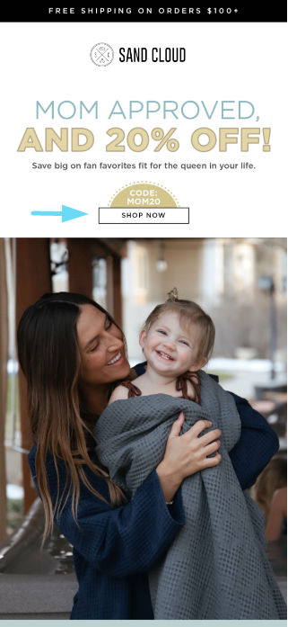
Ideally, your clickable CTA should be above-the-fold (meaning, it should be above the point where users need to scroll to see it).
Plenty of white space will also help it jump out at users, but those contrasting color palettes can help, too.
3. Use headings to make it scannable
Whether you’re crafting an eCommerce email designed to promote multiple products or sending a changelog of your product or service to existing customers, in-email headings can help break up information to make it more digestible and scannable.
You can create headers of different sizes, formats, or text styles to make it easy for users to find the information they’re looking for quickly.
Think of them as mini subject lines designed to keep users engaged and reading.
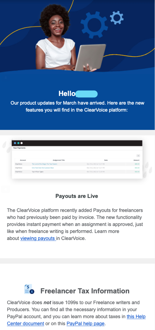
Here’s a great example from ClearVoice, which updates freelance writers on their platform about what’s changing, along with links for where they can get more information.
4. Include images and gifs
Relevant visuals are a best practice in email marketing, so your email design should incorporate them whenever possible.
One study found that ⅔ of users surveyed said they preferred HTML emails that consisted mostly of images compared to emails consisting of mostly text.
Another found that emails with graphics have a higher open rate at 24% than text-based emails (15%) and a higher CTR (3.28% to 1.3%, respectively).
So visuals are kind of a big deal. They get your point across quickly and can also help break up the body text of your messaging.
You can use high-quality images that showcase or represent your product or service. Some brands include infographics in emails as resources for a content marketing approach.
There’s also the option to add gifs to your email designs, which are a type of dynamic content (and a pretty popular email design trend these days).
You can get creative with this, too.
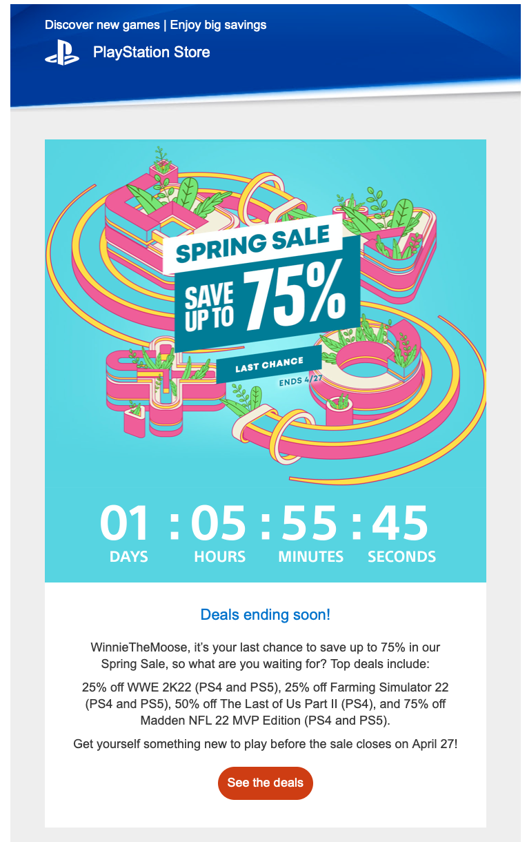
For example, PlayStation recently sent out an email promoting a current sale that counted down the time users had left to “Save up to 75%” through their online store.
It immediately drew my attention and created a sense of urgency (and I don’t even have a PlayStation).
And even small visuals can make a difference—a few emojis can add some color to the email and help it to resonate with your readers. 😊
5. Choose typography carefully
The typography for your email design will determine the fonts used and help create the overall look. And while it seems like a minor detail, it’s something to pay attention to.
Typography can
- build brand awareness
- set your email design apart
- create a more distinct aesthetic
- aid the email’s readability
- set the tone for the message
Consider using your branded font with your logo somewhere in the email, but keep in mind that your typography must be easy to read on both desktop and mobile. You’ll want to avoid anything too blocky, wide, or stylized for your main text.
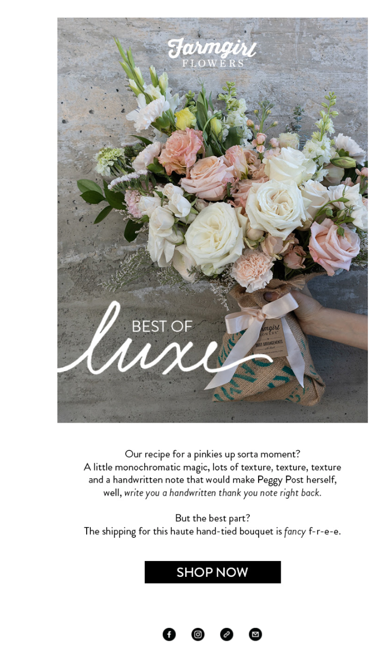
The email below is a great example of how to introduce some stylized typography for a strong aesthetic while still using a predominantly simple font like sans serif for the core message:
6. Personalize emails when possible
Segmentation is a core strategy that you should already be factoring into your email marketing.
You can go for hyper-segmentation by adding a personalization element to some of your emails. This may include having images that dynamically reflect items that customers are most likely to be interested in based on their past purchases.
You can also include the user’s name at the top of the email to reel them in early or other information you collected when building your email list.
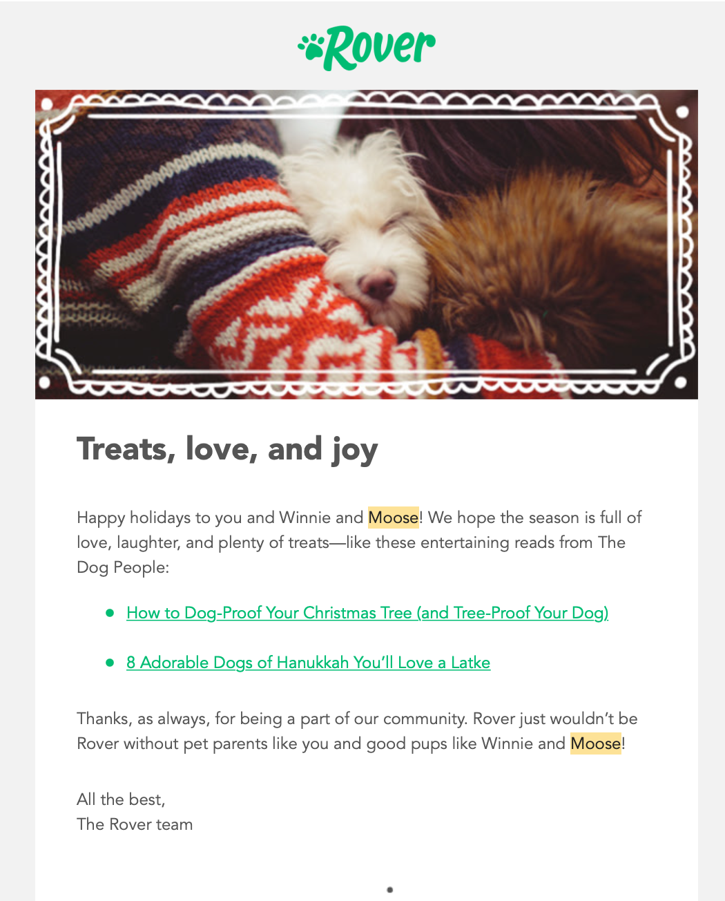
You can see a simple example of this from Rover below, which includes two of my dogs’ names that they had stored in the system (“Winnie” and “Moose”) to build rapport:
7. Prioritize your layout
The layout of your email design matters a great deal.
As we’ve seen through various examples, there’s no one correct layout here. You’ll have to AB test your way to the winning layout for your brand.
In some cases, eCommerce brands might choose to put a product image at the very center of their emails because it’s what users are most likely to be interested in seeing.
In other cases, quick blurbs are followed by a CTA and then the image.
At the very least, you should always put the most important and persuasive information up at the very top of the email.
Then, consider how the entire message is broken down.
Sometimes, what works may surprise you.
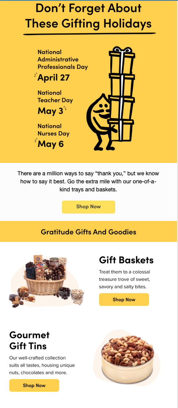
In the example below, an email starts with an infographic listing different “gift” days with an urgency-centered headline. Underneath this are the product images and links, presenting the items almost like a solution.
8. Consider using email design tools
There are plenty of email design tools on the market, and many come with high-quality, responsive designs and fully customizable email templates that can make your job a bit easier.
Today, most email marketing platforms allow you to browse email templates based on their purpose, with options for designated purposes like “welcome email templates” or “email newsletter templates.”
They typically utilize drag-and-drop features so you can place components like images or copy wherever you need them.
There are plenty of great email builder tools on the market, but these are a few good ones to check out:
9. Always have an unsubscribe option
It’s important to abide by privacy laws that impact email marketing. You want to play fair and ensure you don’t compromise your deliverability or tank your subscriptions.
Good emails give your recipients the option to opt out at any point. Not only is this a best practice, but it’s also an email marketing law we all should follow.
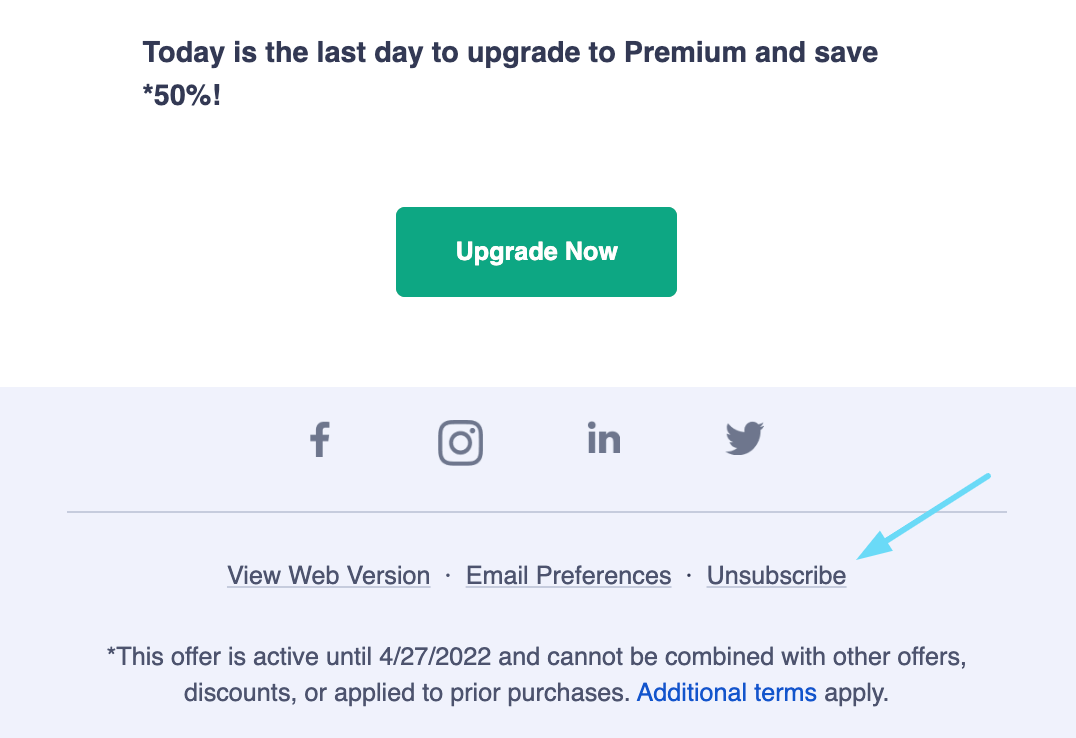
For this reason, an “unsubscribe” option should automatically be available at the bottom of every marketing email you send.
This is a simple tip but an important one: just make sure that this option is available in every email design you create.
10. Test your email designs
Last but not least, our last email design tip: always test the designs that you create.
You’ll never know which designs work best for you until you put them to the test. And since each brand and each audience is different, this is imperative.
Many email marketing software tools make this easy with A/B testing options.
They’ll allow you to send two or more versions of the same email to an equal number of subscribers in the same target audience. You can see which receive more opens and clicks so that you can optimize your campaigns further in the future.
Craft the best email design and go reach your audience
There you have it—the ultimate guide to email design.
Email design is just as important as the copy you include within the message itself. It can directly impact how users perceive the message or even whether they read it at all.
It should be considered a cornerstone of your digital marketing campaign, as it can directly impact the user experience.
Email marketing templates can help, but sticking to these best practices and the strategic creation process discussed above will go a long way.
Really good email design can be subjective, but these tips and best practices will help you create strategic, functional, and beautiful email designs every time that increase your brand's conversions.
So get to designing, and if you need an extra hand, you know what to do. 😉