You don’t need a Ph.D. in neuroscience to understand your landing page visitors.
But you do need to be able to play Operation like a boss.

If you’ve played the game of Operation, then you know how precise you have to be.
Get it wrong, and you lose.
The same thing goes with your landing page visitors.
You have to know exactly what your patients visitors want and what makes them trust you.
Just like you take painkillers for your headache, it's important to know what to do on your landing page to make it healthier, stronger, and more importantly, convert at a higher rate.
That's why we put together some rather uncommon remedies that you can take to improve your landing page conversion rates and grow your business, all based around experience and testing we’ve done ourselves.
We've even made the easy-to-use gifographic below, so that you can always refer to it before running your next landing page test.
You'll also find more in-depth tips and tricks after the gifographic.
Enjoy :)

Get brand new landing page strategies straight to your inbox every week. 23,739 people already are!
1) The Blood - Your Traffic
The traffic you send to your landing page is just as important as the landing page itself.
And as you know, your landing pages and business will eventually suffocate without quality blood traffic.
But all traffic isn’t identical in quality.
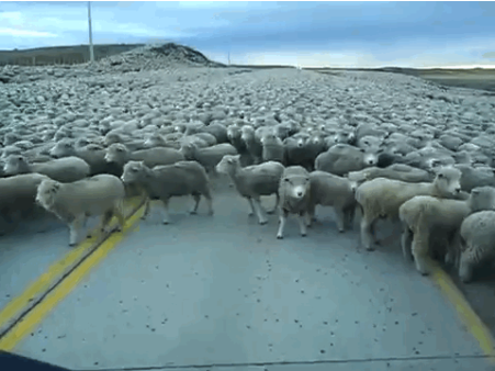
What I’m trying to say is that high-intent traffic (people that are proactively looking for what you offer) is always better than low-intent traffic, but it's also much more expensive to acquire.
Low-intent traffic (traffic that sees your banner ad or on social platforms) is usually not as good to convert, and therefore cheaper to acquire.
So how do you improve the quality of your traffic?
The first thing you do is examine how your Google Ads are structured and how your other PPC agency accounts are set up.
The last thing you want to happen is The Iceberg Effect.
Once you control your Search terms and targeting criteria, you can start to match your traffic to your landing page's call-to-action, which is The Heart of your offer...
2) The Heart - Your Call-To-Action
Your call-to-action (CTA) is the heart of any landing page anatomy, and it will make or break your landing page performance in a... wait for it... heart beat.
What most people don’t know is that your landing page’s CTA can be either an engine driving your conversion rates up, or an anchor dragging them down.

And more importantly, your CTA has to match the intent and temperature of the traffic being sent to it.
Let me state that in another way:
Your CTA can’t be threatening to the visitor if they weren’t looking for your offer in the first place.
If your landing page is getting visitors from the Search network who are looking for what you have to offer, then your CTA can be high-threat, like a free consultation or a free demo.
If your landing page is getting visitors from the Display network or from Social PPC management, then your CTA should be low-threat, like a free eBook or other types of gated content.
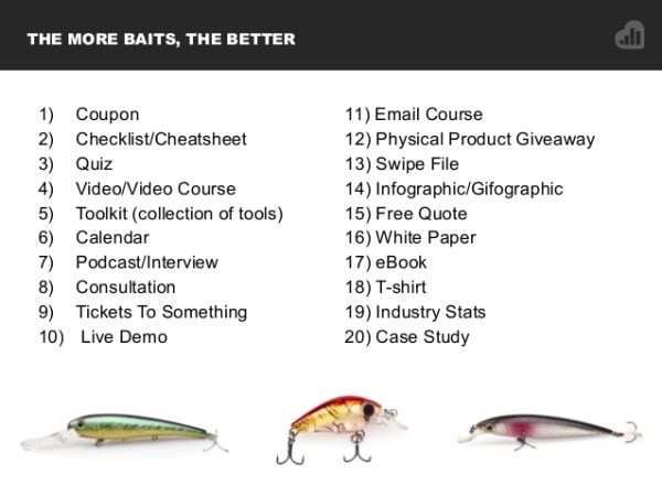
The stronger the intent of your visitors and the “hotter” they are, the more you can ask of them.
The colder they are (non-search intent), the less you’ll get away with when it comes to a “high-ask” CTA.

Think of how your CTA might be asking too much or too little from your visitors. And also be okay that different types of traffic enter your conversion funnel at different locations.
Your call-to-action is often the fastest thing you can test to dramatically improve your conversion rates.
3) The Brain - Your Headline & Sub Headline
Your brain tells the rest of your body what to do, much like your landing page headline tell your visitors what they should expect.
One of the common and unknown remedies for writing headlines is to use them to mirror your visitors’ end goal.

(Another weird example, I know).
Often you don’t have to come up with a unique value proposition since what you do is exactly what many of your competitors do too (hence, making you non-unique).
But, you can do a much better job having your landing page headline give a glimpse into what your visitor wants to accomplish.
Industry-Specific Goal-Highlighting Headlines
If you’re a bankruptcy lawyer, your headline could be something as simple as:
Get Back On Your Feet And Leave Your Bankruptcy Behind
If you’re an orthodontist, your headline could be something as simple as:
Give Your Child The Smile and Confidence They Deserve
If you buy cars from the public, your headline could be something as simple as:
We’ll Buy Your Car and Pay You Today
You can read more about writing headlines and ads that mirror visitors’ end goal from my Unbounce article here.
Once you have the idea for testing your headline, you should use your sub headline to support your headline.
This is where you get to use other examples, like frequently asked questions from your visitors to be objection crushers. Let’s use the three headlines before as examples.
Headline: Get Back On Your Feet And Leave Your Bankruptcy Behind
Sub Headline: And learn what happens afterwards too
Headline: Give Your Child The Smile and Confidence They Deserve
Sub Headline: Set them up for success without breaking the bank
Headline: We’ll Buy Your Car and Pay You Today
Sub Headline: We’ll take care of the paperwork and do the paperwork too
Just like your brain assures you that things in life will be okay, so should your headline and sub headline to the visitors that visit your landing page.

4) The Eyes - Your Hero Shot
Your landing page hero shot is best used when it’s paired with context of use.
This means that if your landing page tries to sell a broom, then you could use a hero shot that shows someone cleaning his floors with that broom.
If you sell pay-per-click management services (like we do), then you can use a rocket/red dildo that signifies business growth (and pleasure?).
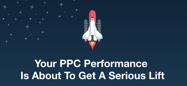
See, when it comes to your hero shot, you have a few options with how you choose to visually display it.
Static Image: This is where you may be most limited, but can obviously get the job done.
GIF: This could perfect for SaaS landing pages that want to showcase how their interface works and how easy it is.
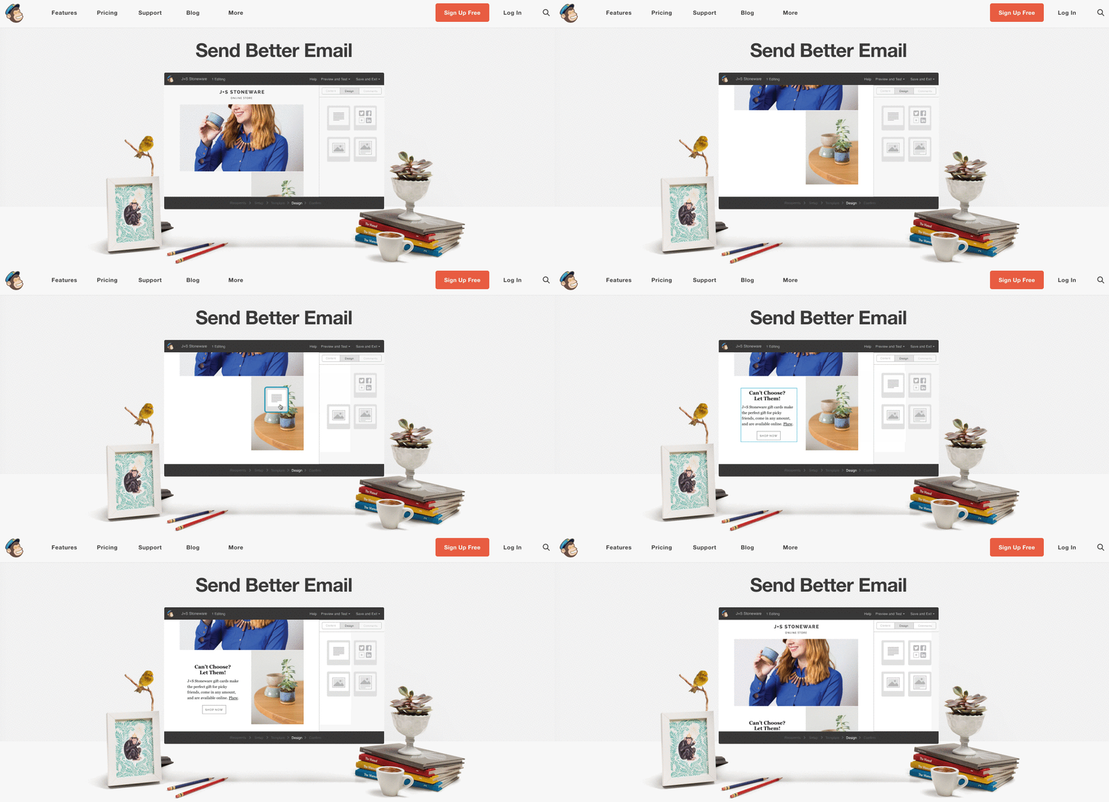
Video (click to play): This is more for complex explanations of how things might work, where a video gives better context than a static image or GIF.
Video Background: This is more of a craze, rather than hardcore proof that autoplaying video backgrounds help improve conversion rates. But many of the cool companies are doing it, like Airbnb.
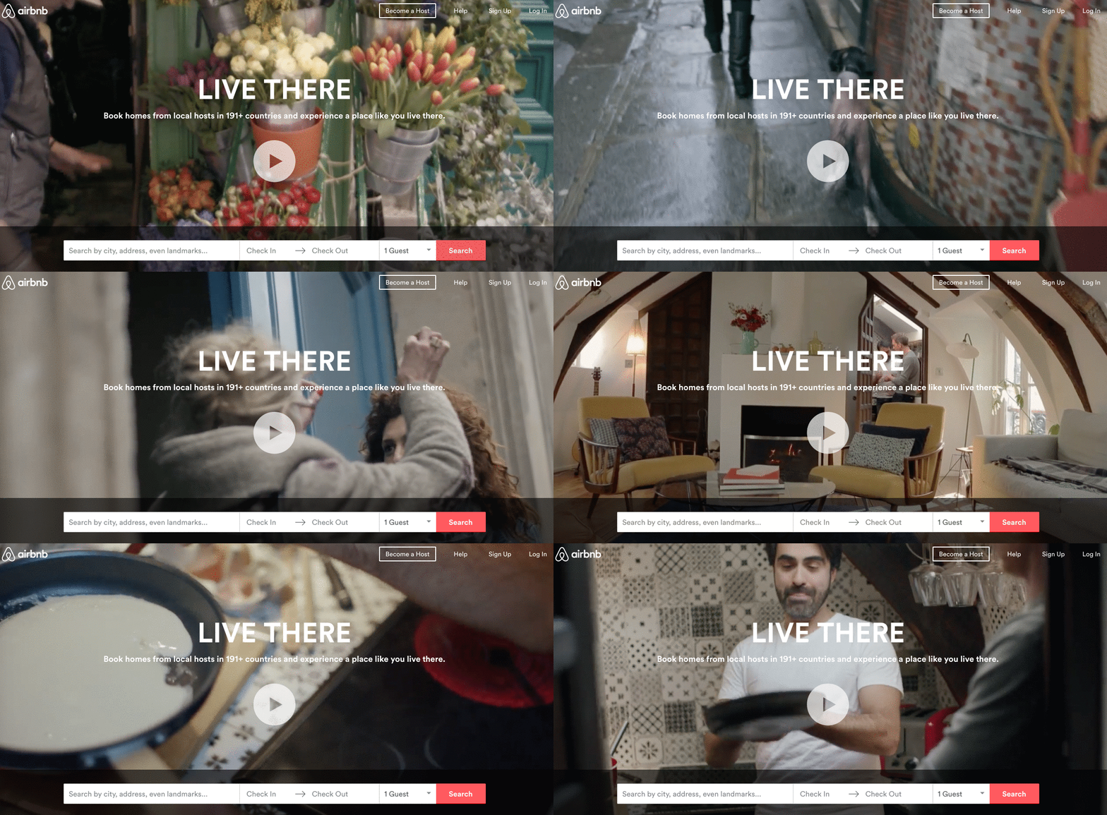
For much more insight on how to choose and make your landing page hero shot convert better, check out this guide we created, which breaks down the components of high-performing hero shots.
5) The Fingers - Your Benefits & Features
You have as many benefits and features as you do fingers and toes. (Hopefully you have 10 of each, but we're not here to judge.)
And while your fingers are vital for pointing out (see what I did there?) why your visitors should convert on your landing page, your benefits and features help with the convincing.
If you’re not sure about the difference between benefits & features, read this ancient article published by Entrepreneur magazine in the year 2000, which is still relevant today.
This doesn’t mean that you should mention all of your benefits and features on the landing page, but you should focus on highlighting the best.

See how some hands and fingers in the above picture are blurry, but others are clear?
The clear hands and fingers are the best benefits and features. Which are the ones you should highlight on your landing page.
6) The Lungs - Your Social Proof
Have you ever read a testimonial or case study that spoke directly to you?
As if that testimonial was written to obliterate any and all objections or friction you might have from converting?
Never, right?
That’s because many people never consider their social proof to be used as “objection killers”. And because of that, they’re leaving A LOT of lost conversions on the table.
Consider this:
What if you have three testimonials on your landing page, and each testimonial spoke to an objection that your sales team frequently gets asked on their sales calls?
I wish I had come up with the idea, but it was the genius of Michael Aagaard who talked about this qualitative data gold digging during the Unbounce Conversion Road Trip in NYC, that your salespeople already know all about.
And while there are many types of social proof and also negative social proof, it’s vital you use precious text on your landing page, as strategically as possible.
Talk about letting more air (and conversion opportunity) to your landing page so it can kick more butt.
7) The Feet - Your Confirmation Page & What Happens After
Okay, so you actually got the conversion. Congrats!
Now what?!
Is the money in your bank account? Good, you can stop reading.
If it isn’t, then you’ll want to read this:
The confirmation page (also known as the “Thank You” page), is the prime opportunity to let your visitor know what will happen next.

And even more importantly, for you to improve your SaaS onboarding process or your lead gen sales strategy.
Because just like the quality of traffic is vital to your landing page performance, so is your ability to make money AFTER the conversion happens.
A few questions to ask yourself:
- Are you increasing the lifetime value of your conversions?
- How are you increasing the speed from conversion to money made?
- Is your CRM helping you discover which keywords and placements are making you the most money?
- How are you using retargeting tactics to up-sell or cross-sell your converters?
Now It’s Your Turn
If you’re using landing pages (which, if you've read this far, I hope you do), then our last recommendation is to maintain perspective. Landing page improvements are never a siloed effort.
There are three steps to all successful landing page tests:
- Traffic
- Landing page
- Sale
Each of these three steps needs to be tested continually so you can make improvements and grow your business faster and faster.
Any body parts we missed from this landing page anatomy? Let me know with a quick comment :)
