Is your landing page value proposition clear and conveyed upfront?
With countless competitors presenting the same product or service you’re offering, your value proposition should tell potential buyers why they should choose you (and your services / products) over everyone else.
Above all, your landing page value proposition should answer three important questions:
- How can your product or service solve or improve my problems?
- Why should I buy from you over your competitors?
- What benefits can I expect?
There are many best practices to observe when optimizing a landing page, and properly presenting your value proposition is arguably one of the most important to note.
Categorized into six topics, we’re about to dive into 17 great examples of landing page value proposition that do the following:
- Provide a solution to a problem
- Show why customers should choose you over your competitors
- Show what benefits customers can expect (above the fold)
- Create credibility, trust, and liking
- Give power in numbers
- Make it about your audience
Some of these examples are our own, backed up by our findings and results. Take what’s applicable for your landing page and let’s skyrocket those conversions with your value propositions. Here are 17 great examples to get you started.
Get brand new landing page strategies straight to your inbox every week. 23,739 people already are!
Providea Solution to a Problem
As mentioned in a landing page related post, every visitor comes into your page with different pain points. One of the main goals of your value proposition is to address them and provide a reason as to why your product or service is the best solution to their problem.
Landing Page Value Proposition Example #1: Bliss
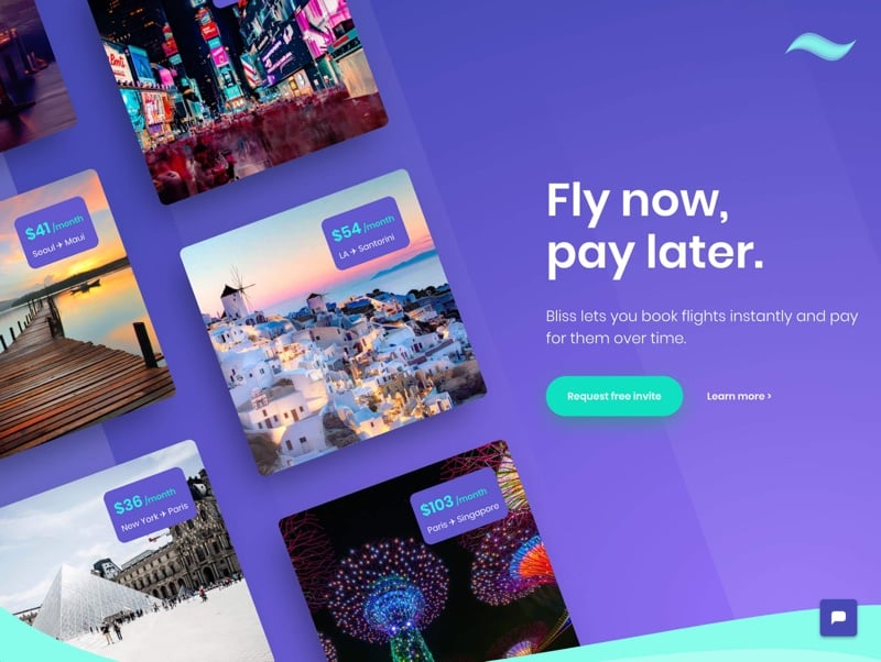
Bliss clearly address the issue of paying a large sum of money upfront for a flight and provides a solution for its traveling audience.
“Fly now, pay later” is a clear and concise headline that offers a financial alternative to traveling as its value proposition.
If that isn’t clear enough, the subheader describes further in details, “Bliss lets you book flights instantly and pay for them over time.”
Landing Page Value Proposition Example #2: Safr
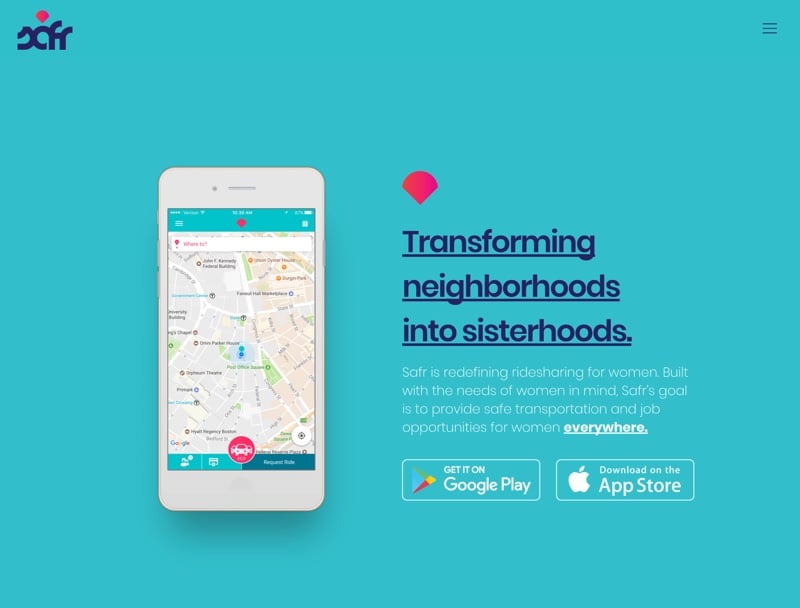
With the growing popularity of rideshare apps sweeping the taxi market, one thing is for certain—safety concerns are also on the rise.
Safr provides a solution to that problem with its compelling value proposition to “provide safe transportation and job opportunities for women everywhere.”
Because Safr clearly knows who they’re targeting, their value proposition is unique and specific to that audience.
Landing Page Value Proposition Example#3: KB Medical Client
Using one of our own landing pages as an example, we saw a 93% lift in conversion rate when we added the word “affordable” as part of the value proposition.
Because we’ve identified the real problem that the company is trying to solve, tweaking the headline to address the issue worked to our advantage. Prospects don’t want to just compare any medicare insurance plans, they want to know what they can or can’t afford.
Show WhyCustomers Should Choose You Over Competitors
If you somehow managed to tap into a market that hasn’t been ventured into yet, you know that competition is just around the corner. Your landing page should explore the unique value proposition that sets you apart from the rest to give you that competitive edge.
Landing Page Value Proposition Example #4: WeWork
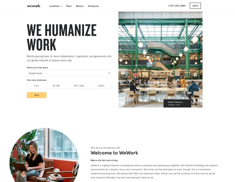
With more and more co-working office spaces popping up, WeWork capitalize on its open-space collaborative environment as its differentiating factor.
With a bold headline that screams “We Humanize Work”, they’re setting themselves apart from other coworking spaces that might conjure the mundane thoughts of private cubicles and silent privacy.
Focus on an aspect of your business that differentiates you and capitalize on that factor. The important thing is that you’re offering a useful feature that your competition isn’t highlighting.
Not everyone may be keen to an open-space environment, but WeWork zones in on what makes them different and shows their audience why they’re a cut above everyone else in the market.
The extra effort of finding that x-factor is sure to set an impact on the audience you’re bringing in.
Landing Page Value Proposition Example #5: DuckDuckGo
We all know that when it comes to search engines, Google is the unstoppable giant that can’t be slayed. In fact, we even wrote about their search and display networks.
So, how do you go up against a giant like that?
DuckDuckGo may be the small duckling in the pond, but it sure knows how to differentiate itself from the rest.
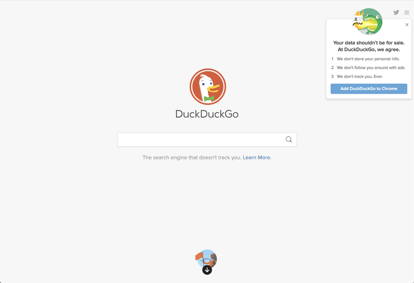
Unlike most search engines, DuckDuckGo capitalize on its privacy feature as value proposition and promises three things to their potential users:
- We don’t follow you around with ads.
- We don’t track you, ever.
In fact, their subtle headline states “The search engine that doesn’t track you.”
Notice how they don’t focus on features outside of their main value proposition?
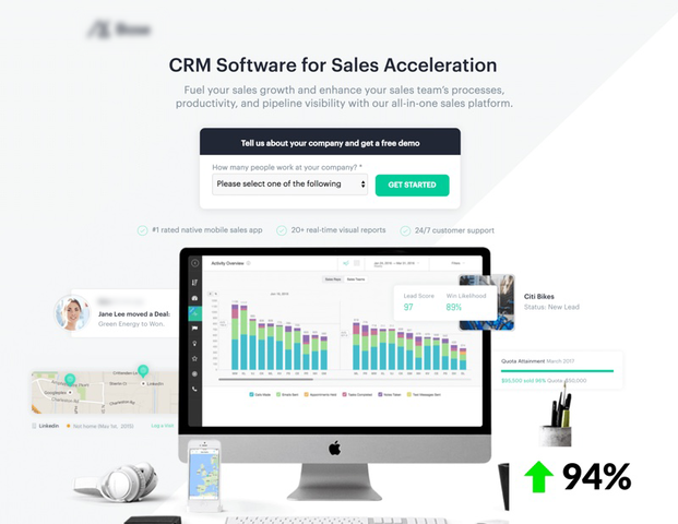
Landing Page Value Proposition Example#6: KB SaaS Client
In our own study of landing page optimization, we found recent success with modifying a headline to state a more specific value proposition.
The previous headline for this specific landing page was “All-In-One Sales Platform”.
The problem?
Every other CRM softwares proudly deem themselves as an “all-in-one sales platform”.
With this in mind, we quickly changed the headline to shine a light on the real solution at hand—sales acceleration. The result was a whopping 94% increase in conversion rate.
This goes to show that there’s always a differentiating factor that sets your business apart from your competition. Find out what that is and create an impactful value proposition to offer your visitors.
Show What Benefits CustomersCan Expect (Above the Fold)
Keep in mind that your landing page value proposition doesn’t always need to be constrained within a headline or a subheader. A great alternative is to split them up into multiple benefit points.
If you’re puzzled by what your value proposition should be, look into your Frequently Asked Questions (FAQ’s) and address them in your benefit points. We recommend splitting up your points in 3’s, but that’s entirely up to your best judgment.
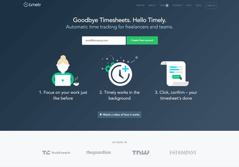
Landing Page Value Proposition Example #7: Timely
Timely communicates ease and convenience by conveying their value proposition in a 1-2-3 step format above the fold.
By laying out the benefits into sequential points, Timely makes it easy for visitors to process necessary information in an efficient manner:
- Focus on your work just like before.
- Timely works in the background.
- Click, confirm – your timesheet is done.
It’s really that simple.
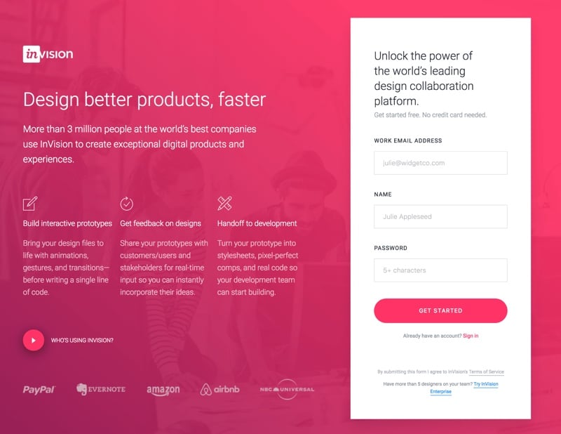
Landing Page Value Proposition Example #8: Invision
Like Timely, Invision effectively lays out their value proposition into benefit points.
Although this particular landing page already communicates what Invision does in their headline, their benefit points help to answer how:
- Build interactive prototypes
- Get feedback on designs
- Handoff to development
By displaying their top features, Invision is able to relay what benefits customers can expect.
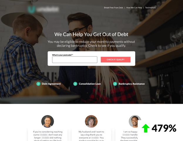
Landing Page Value Proposition Example #9: KB Debt Relief Client
While optimizing for conversions on one of our own landing pages, we found a significant increase in performance simply by moving benefit points above the fold.
Sometimes, a vague headline like “We Can Help You Get Out of Debt” just isn’t enough.
In fact, the real value proposition for this debt assistance company lies in the benefit points, because it conveys what customers can expect to receive:
- Debt Agreement
- Consolidation Loan
- Bankruptcy Assistance
These are the points that clearly state the benefits a prospect is looking for when seeking debt assistance.
Create Credibility, Trust, & Liking
A great way to gain the competitive edge is by creating credibility, trust, and liking in your value proposition. Social proof can help greatly with this.
Landing Page Value Proposition Example #10: WordPress
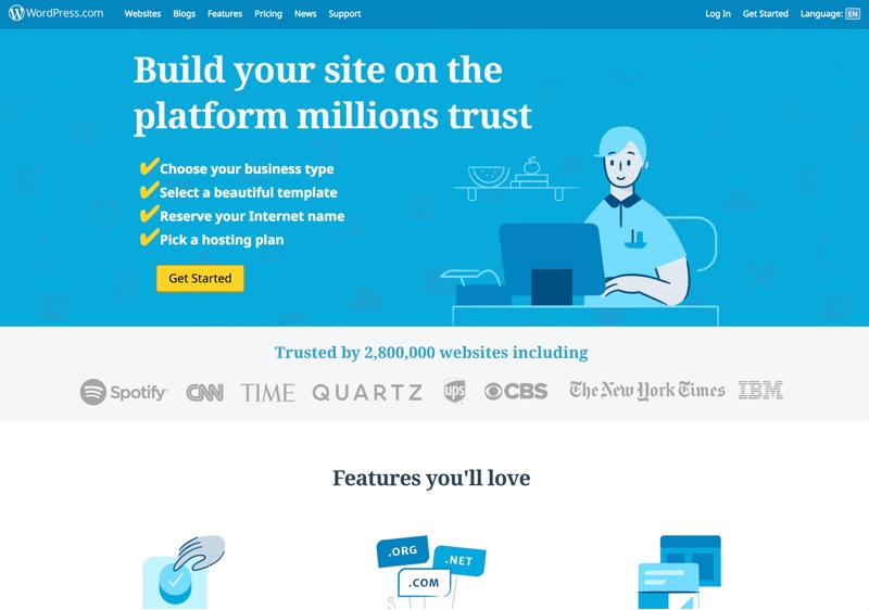
WordPress does this effectively with the headline of their landing page.
Not only do they claim that they’re a “platform millions trust”, they back it up by including social proof above the fold. Starting with “Trusted by 2,800,000 websites…”, WordPress displays some top credible clients that uses the platform, including Spotify, CNN, and Time Magazine.
Landing Page Value Proposition Example #11: BigCommerce
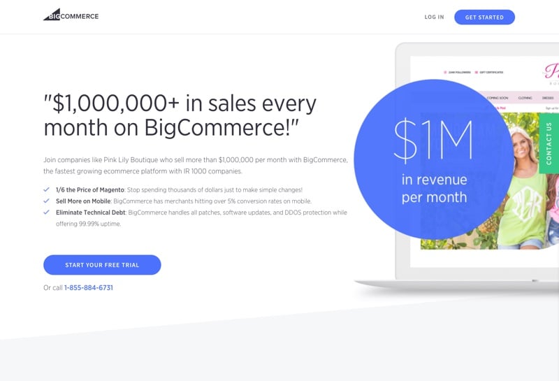
Directly in competition with WordPress, BigCommerce also communicates credibility, trust, and liking as their value proposition.
By highlighting a case study on their headline, BigCommerce is able to translate their value proposition as an optimistic claim that states “you can do it too!”
Relatability is suggested in their subheader that states “Join companies like Pink Lily Boutique who sell more than $1,000,000 per month with BigCommerce…” In doing so, BigCommerce effectively conveys credibility, trust, and liking as part of their value proposition.
Power inNumbers
Sometimes, people speak in numbers. Sometimes, that’s exactly what we have to give them.
Include pricing, response time, or stats applicable to your business in your value proposition.
Landing Page Value Proposition Example #12: MoviePass
MoviePass claims that anyone can watch any movie at any theater any day for only $9.95 per month.
Displaying the cost of $9.95 per month not only addresses the issue of increasing ticket costs for moviegoers, but also provides a much cheaper solution to the problem.
Remember when movie tickets cost $6.50?!
If your business can benefit from showing pricing, time, or stats upfront, take a page out of MoviePass’ book and display power in numbers as your value proposition.
Landing Page Value Proposition Example #13: Crew
Pricing aside, there are other ways to use numbers to your advantage.
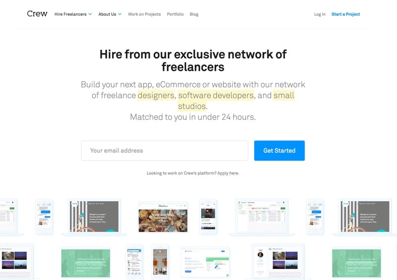
Crew communicates timeliness and efficiency by letting their prospects know that they can be connected with a dedicated designer, software developer, or small studio in under 24 hours.
If speedy response time is your company’s forte, state it in numbers as a value proposition.
Landing Page Value Proposition Example #14: KB Law Firm Client
You didn’t think we would make bold claims without backing them up, did you?
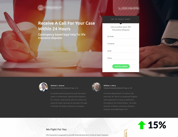
In a recent A/B testing we’ve conducted, we saw a 15% increase in conversion rate when adding a response time of 24 hours in the headline.
By changing the headline from “Get Legal Help With Your Life Insurance Claim” to “Receive A Call For Your Case Within 24 Hours,” the odds worked in our favors.
Make It About Your Audience
When it comes to crafting your value proposition, write in second person to make it about your potential buyers. Using the pronouns “you”, “your”, and “yours” addresses the audience and helps nudge them in the direction you want them to take.
You might be tempted to write about your business’ accolades as the first thing people sees on your landing page. Peter Boyle wrote in a landing page related post:
“But high converting copy is never about you; it’s always about the audience.”
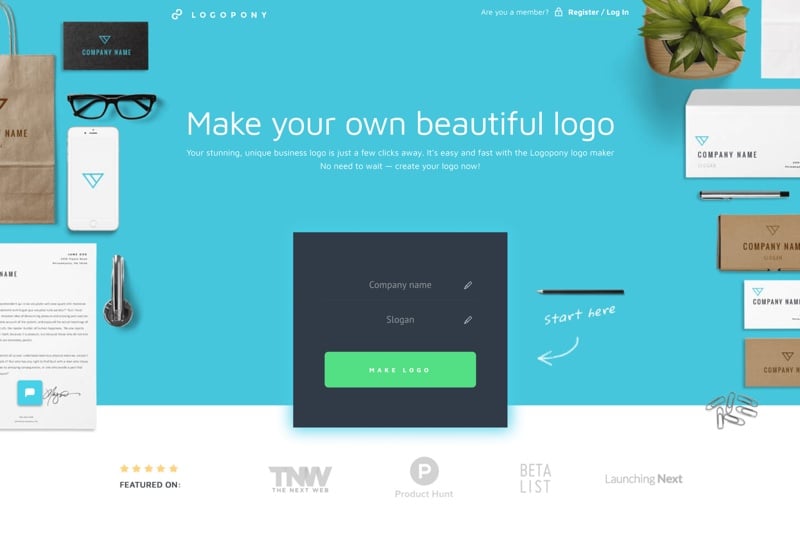
Landing Page Value Proposition Example #15: Logopony
Logopony illustrates this beautifully in their value proposition.
They could’ve phrased their headline as “We make beautiful logos,” but by speaking to you, the visitor, a sense of ownership is expressed.
From the headline “Make your own beautiful logo” to the subheader “Your stunning, unique business logo is just a few clicks away…”, Logopony revolves all the features around the audience and how they can benefit from them.
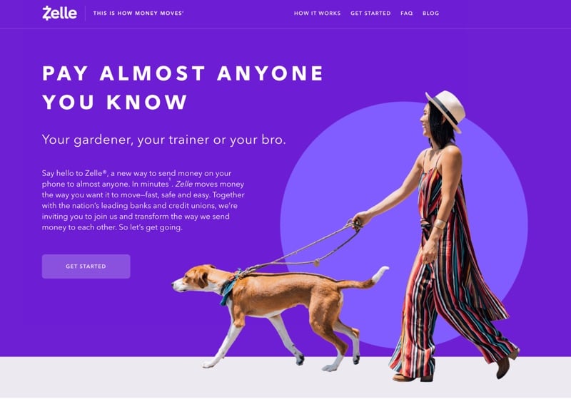
Landing Page Value Proposition Example #16: Zelle
Zelle also turns the table to the audience by speaking in second person.
With a side of humor, Zelle allows the audience to be the main character in their landing page value proposition.
Their copywriting is relatable, inviting, and most of all, about YOU.
Landing Page Value Proposition Example #17: KlientBoost
Yes, we too firmly believe in writing in second person.
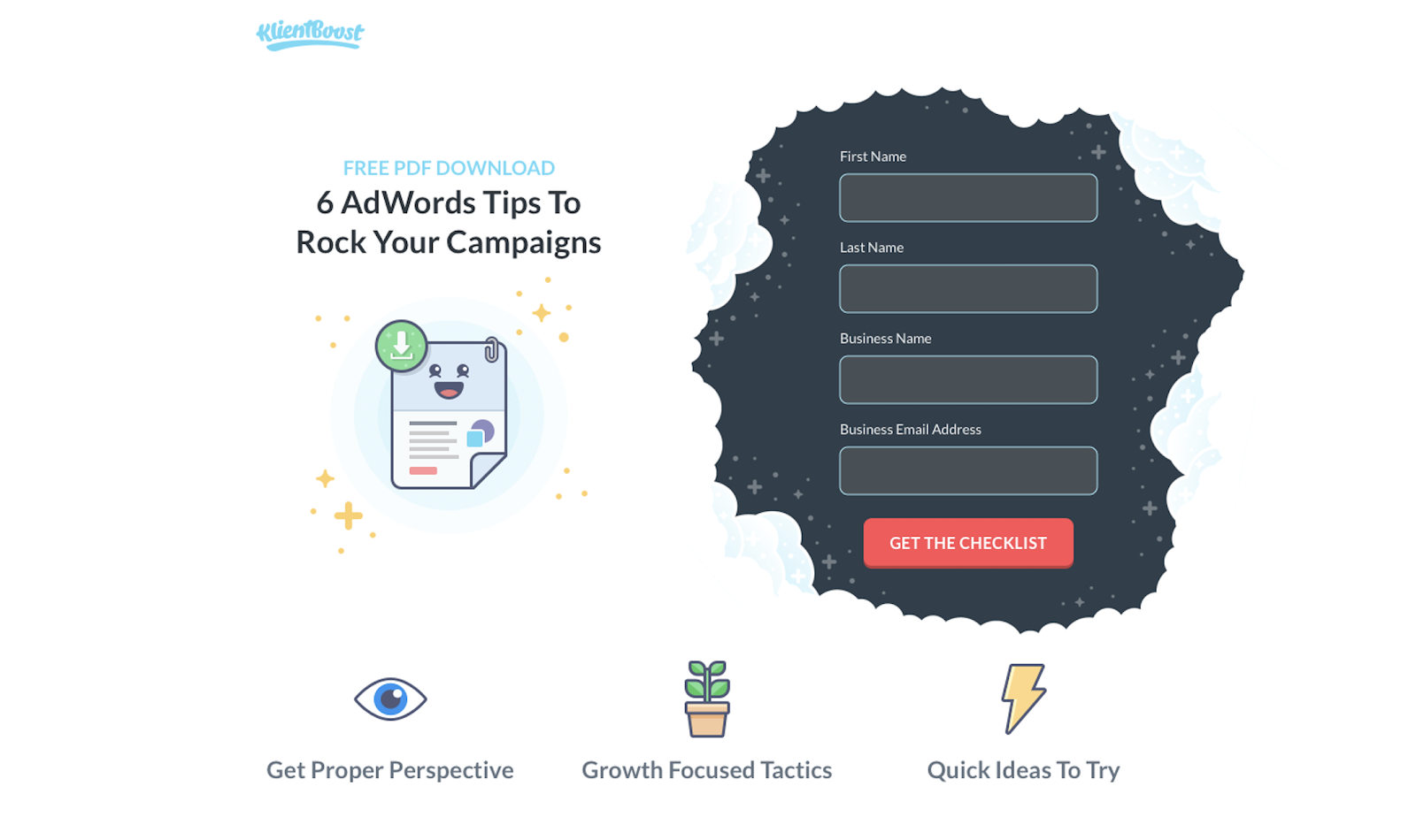
Across our online presence and marketing campaigns, we make contents that are for you, the readers. It only make sense that we center everything around you.
Closing Thoughts on Landing Page Value Proposition
Did you find any of these examples useful for your own landing page? Either way, please leave me a comment below.
As you know by now, an effective value proposition communicates how your service or products will solve your prospect’s problem, explain why you’re a better option over your competitor, and relay the types of benefits your business offers.
Moreover, creating credibility, trust, and liking, incorporating numbers such as pricing or time, and making it about your visitors are all effective ways to improve your landing page value proposition.

