If there’s one thing I love, it’s discovering new marketing methods that can do two things:
- Stand the test of time.
- Function effectively across different industries.
Get brand new conversion strategies straight to your inbox every week. 23,739 people already are!
We saw it when we revealed our Single Keyword Ad Groups technique. We saw it again with The Iceberg Effect.
But in spite of these advances, the rate of innovations for real-life inventions—and even brilliant new marketing tactics—is on the decline.
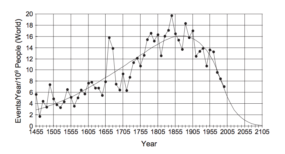
According to historical data, innovation peaked in the second half of the 17th century (when Isaac Newton developed calculus) and again during a peaceful decade in 1840. #WaterCoolerTalk
But we say 'phooey' to all that. We have an innovation for your landing pages to improve your conversion rates and other results-based metrics. (Will this be the innovation that sparks a new revolution and reverses the declining tide of development? Could we be changing history? Check back here in 150 years to find out for sure...)
Anyway, we call it “The Breadcrumb Technique,” a name we borrowed from the adventures of Hansel and Gretel. And it’s the most effective landing page tactic we’ve found for lead gen or SaaS marketing.
The best part?
It’s super easy to understand and implement.
How the Breadcrumb Technique works
The Breadcrumb Technique is literally the landing page version of the “Yes Ladder”.
It’s the art of eventually getting to what you want (the conversion) as a marketer by getting visitors to say yes to a much smaller request first.
Scott Fraser and Jonathan Freedman conducted some interesting research on how to get people to say yes to something they normally would say no to.
Their goal was to go door-to-door in a local neighborhood and get people to put “Drive Carefully” signs up in their front yard. But the first time they tried, only 20% of people said yes.
They then did the exact same experiment again, but instead of asking people to put up the original signs, they asked them to put up much smaller signs. That request created an opportunity to get them to eventually say yes to displaying the original sign, which was the original goal.
Guess how many people said yes this time?
76 percent.
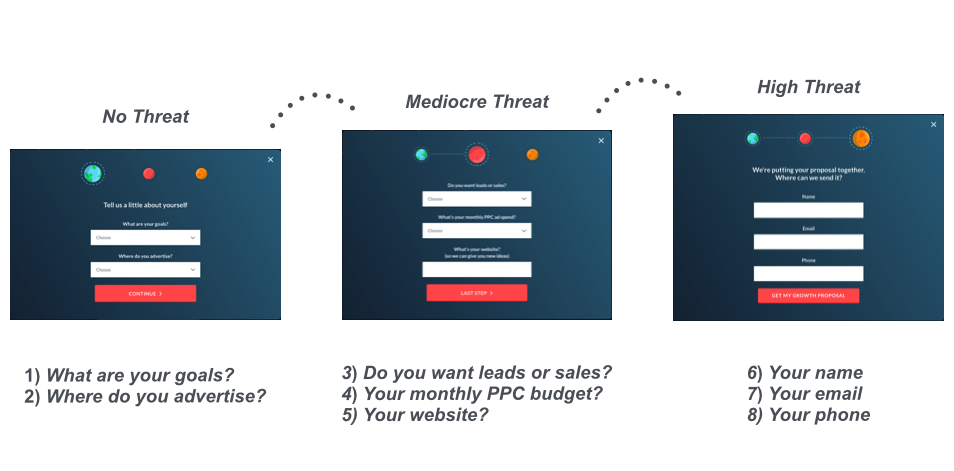
The takeaway is to work backward from the big ask (your call to action) on your landing page by finding a low-stakes first step.
- Are you a divorce lawyer who wants to drive free consultations? Ask your visitors how long they’ve been married and how many kids they have.
- Are you an online university who wants to drive applications? Ask your visitors when they graduated high school and how many hours they’d like to be in school.
- Are you an interior decorator who wants to drive quote requests? Ask your visitors how many square feet your home is or how many rooms they have.
You get the point.
By starting with questions that are easy to answer and allowing your visitors to stay anonymous, you’ll give yourself a better chance of guiding them through the entire conversion process.
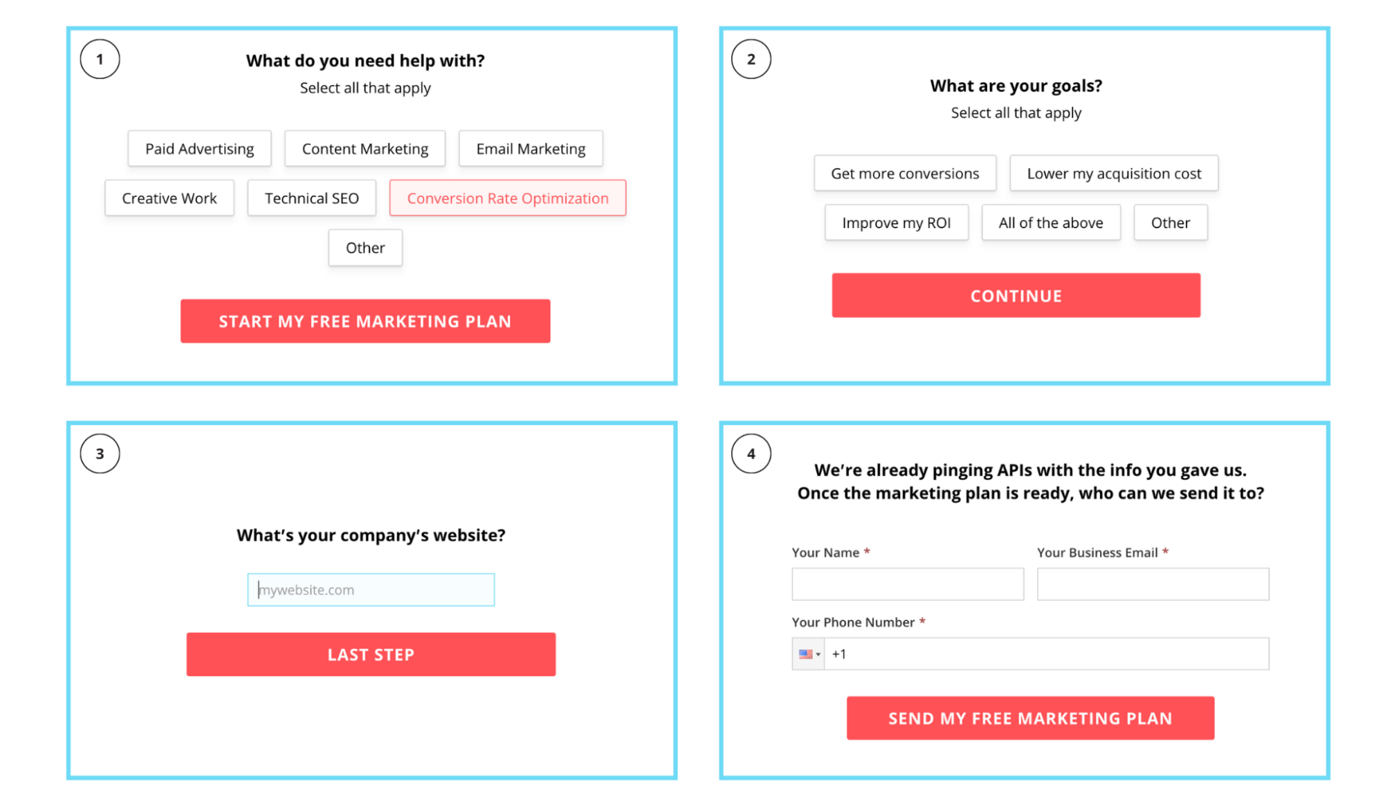
We even use it on our own contact forms:
Why is the Breadcrumb Technique effective?
Now that you understand the general idea behind the technique, let's unpack why it works.
But even before we do that, we have to look at the why of one of the most common conversion rate optimization tactics that often falls flat on its face.
You’ve heard the idea of lessening the number of form fields to increase conversion rates, right?
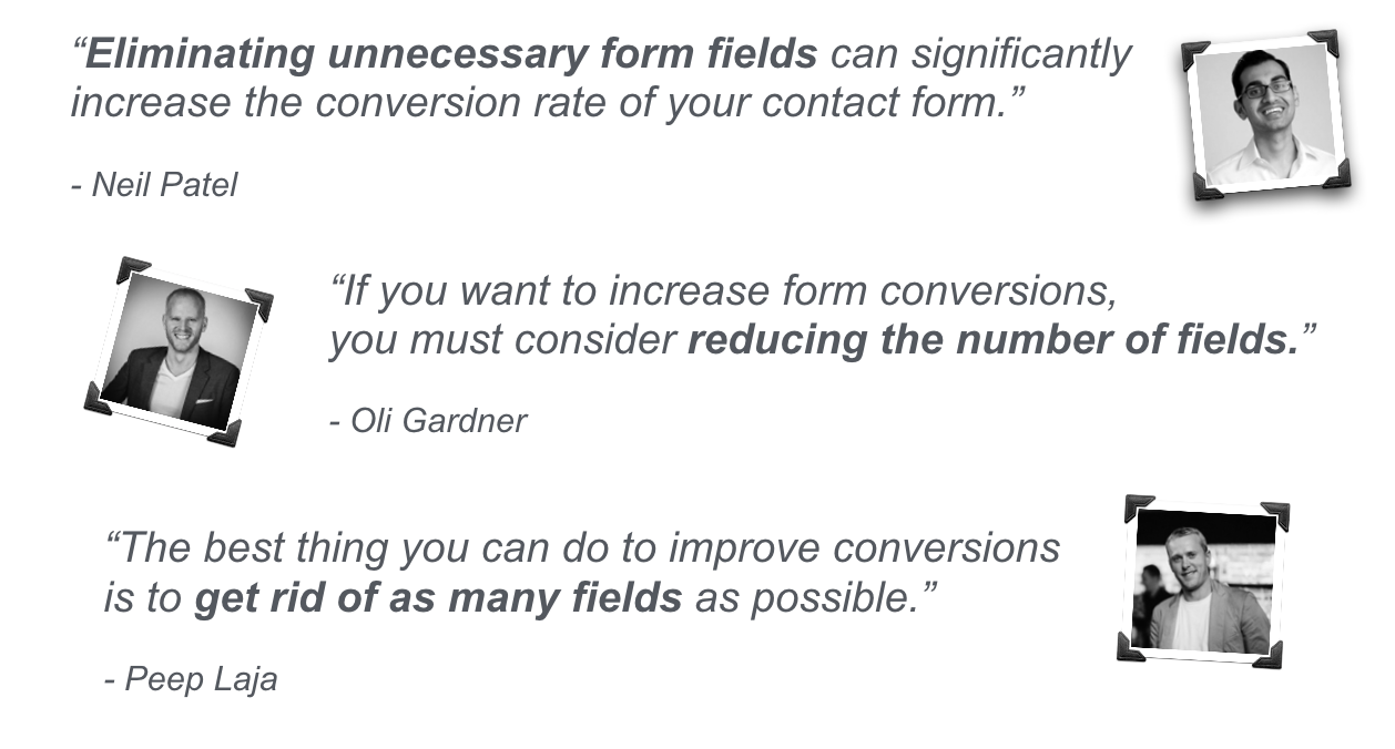
You can find the sources of this advice here, here, and here.
And it makes sense... until you think about it.
When you’re trying to generate leads, trials, or demos, if you keep taking fields away, you’re left with the fields that visitors find the most intimidating:
😰 Name
😰 Email
😰 Phone Number
Now you're ONLY asking for their personal information. The information that they hold most precious and would rather NOT give out if they can help it.
Further, giving you this information means your visitor is no longer anonymous, which can freak people out.
So how do you get that information from them willingly, and in a way that also generates higher conversion rates?
It's simple: add more fields and more steps. The exact opposite of what everyone else is saying.
But there’s a catch.
The order of your fields and steps are extremely important. ⚠️
Your goal is to get the visitor to micro-convert on a step with questions that are easy to answer, preferably with as little "work" as possible. Once your visitor does that, they're committed to your conversion path, and you unlock some pretty crazy conversion potential:

Why you can’t reduce the number of form fields
Since we’re a PPC agency that uses platforms like Facebook and Google Ads to drive traffic and conversions, we’ve been able to test The Breadcrumb Technique across hundreds of various industry landing pages.
The more we use it, the more it affirms the reality that fewer fields don’t always generate more conversions.
We can't scientifically prove why multi-step landing pages work so well, but we have a few educated guesses:
- People are cautious. Only asking for names, emails, and phone numbers make the visitor believe that they won’t get an answer to their question without speaking with someone first. This defeats their goal to anonymously compare you and your competitors. (Multiple Hotjar polls actually prove this.)
- People are busy. If they find your landing page via a Google ad click, they won’t want to fill out seven different lead gen forms and have seven different companies call them back.
- People are lazy. They want quick answers, and most of their questions revolve around cost. They know they won’t get a quick answer if they have to wait for you to reach out to them.
Does the Breadcrumb Technique always work?
Some types of landing pages don’t perform as well with The Breadcrumb Technique. Usually landing page forms for eBooks, guides, and whitepapers aren't as effective with multiple steps.
The substance of your call to action can affect The Breadcrumb Technique's success on your landing page.
If you’re asking for someone to request a free consultation or get a quote (a big ask), then the technique can work. If you’re promoting a free eBook, a podcast, or a webinar (small ask), then the technique won’t work as well.
Breadcrumb Technique examples and results
Now that you know what the technique is all about, let’s take a look at it in action.
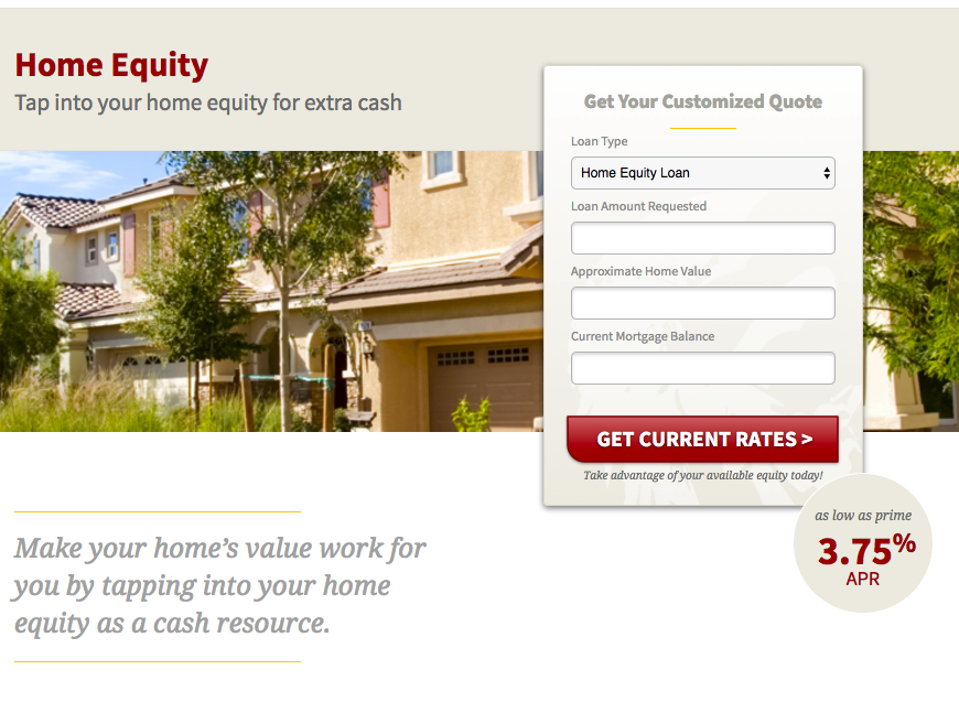
We’ve been working with a financial institution that was asking for all of their visitor's info on a single (long) landing page form. It combined the contact information with all the mortgage information fields necessary to create a quote.
We split up the fields and forms and here's what happened:
- CPA fell from $800+ to $35
- Conversion volume went from 6 to 135/mo
- Conversion rate went from 1% to almost 20%

Another example comes from a SaaS company that used a one-step pop-up form before working with us:
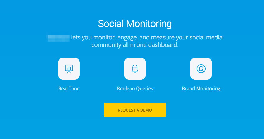
We switched things up and asked some preliminary questions to get the visitor to micro convert. The questions didn't even matter to the sales team, we just needed a "Yes" before asking for their contact information.
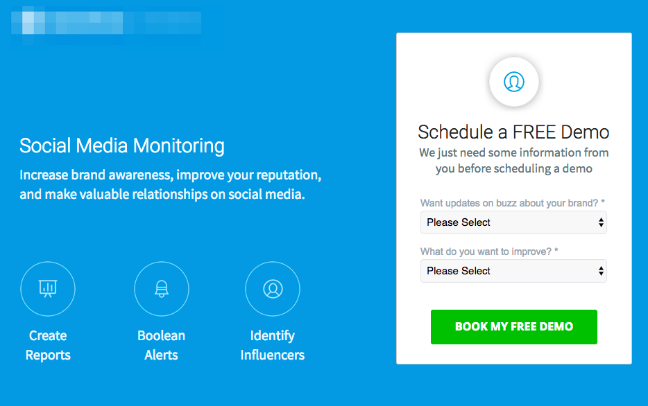
The results:
- Conversion rate rose 74%
- CPA dropped 51%
Here are two more examples.
This artificial grass installer saw a 214% increase in conversion rate by splitting their form into two steps:

And this promo company saw an even more dramatic lift with a four-step landing page:
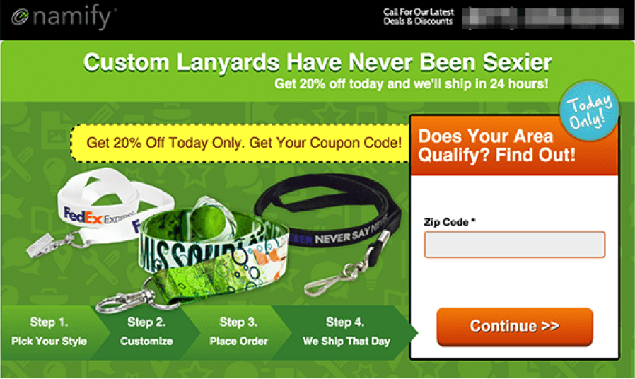
This technique just continues to perform regardless of the industry.
But be careful...
Your form field order can make or break you
The order of your fields can be much more important than the fields themselves.
That’s pretty crazy to think about.
You can actually ask questions that people normally wouldn’t convert on as long as you consider where the field is in your sequence.
It all comes back to the “Yes Ladder” and “Foot-In-The-Door” techniques.
If you go straight for the jugular, you’ll most likely lose. That’s why Scott and Jonathan from earlier in this post were able to increase their “yeses” from 20% to 76% when they asked for small favors first.
Think about the fields and steps in your form and how they can be rearranged. The least threatening fields and questions should be first, followed by contact information fields as the last step.
Even when you think you have the least threatening question first, be sure to test it out. You'd be surprised.
Take the test we ran for another SaaS company below as an example. We'd already used The Breadcrumb Technique but found out later that we asked the wrong questions on the first step.
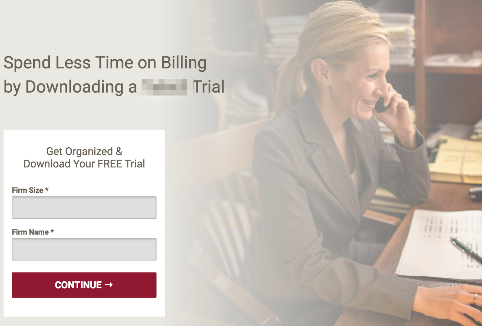
And here were the updated fields:

Here were the results between the two variants:

We found out that even “Company Name” was too threatening to the visitor on the first impression as a visitor might believe it de-anonymizes them.
Now it's your turn
It’s not often that you find a new landing page test that can make a conversion rate impact like the one here.
But we’re excited that this technique clearly functions effectively across different industries—now we'll just have to wait and see if it stands the test of time.
Once you see its success, you'll want to make sure your forms have these other super successful elements. Start preppin' your sales team now.
