Picture this. You’ve just found the perfect pair of shoes online. You’re stoked about the deal you found, add the shoes to your cart, and complete the order.
But…you never receive the confirmation email you’re waiting for. You’d probably freak out, right?
Questions like “Did I enter my payment details correctly? When will my order ship? How do I track my order?” would probably pop into your head.
We all rely on confirmation emails to provide us with info about recent purchases, bookings, registrations, appointments, and subscriptions. Out of all the emails you could send or receive, these guys are pretty essential.
To help you reassure customers and subscribers, we’re going to cover the best practices behind creating a clear confirmation email. What’s more, we’ll share our favorite confirmation email examples so you can get the ball rolling straight away.
Let’s jump in.
- What is a confirmation email?
- The 5 main types of confirmation emails
- How to write clear confirmation emails (5 best practices)
- 2. Include all the necessary information
- How to set up confirmation emails in 4 easy steps
- 9 confirmation email examples to fuel your next campaign
- Win over your audience with helpful confirmation emails
Subscribe to our weekly newsletter for tips so good that we might put ourselves out of business.
What is a confirmation email?
A confirmation email is a transactional email that people receive after completing certain actions. The main purpose of a confirmation email is to show that you acknowledge your customers or subscribers.
The next aim is to tell people what the next steps are. And finally, you’ll want to use confirmation emails to start building strong relationships.
The 5 main types of confirmation emails
1. Purchase or order confirmation email
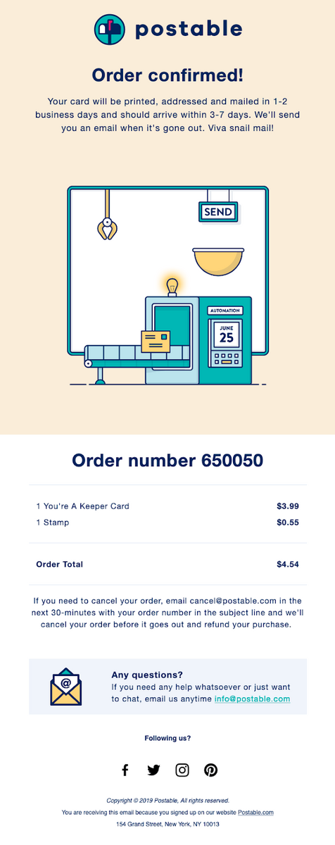
Customers want to receive a purchase confirmation email immediately after placing an order. These are usually simple emails from eCommerce brands that summarize customer order details. They can also act as shipping confirmation emails, too.
Businesses often include the following details in a purchase or order confirmation email:
- order number
- order subtotal
- payment details
- order summary (list of products or services the customer ordered)
- tracking information
- shipping information
- return/cancelation policy
- estimated delivery time
- contact information
Here’s a pretty neat example of this:
2. Booking confirmation email
A schedule or booking confirmation email again confirms a customer’s purchase or selection. These are often meant for when customers book or schedule the following:
- hotel rooms
- event or concert tickets
- restaurant tables
- reservations for group events
3. Appointment confirmation email
Have you ever booked a video call, only to never receive a confirmation email? It’s stressful, to say the least. It leaves you playing guessing games about the scheduled time of your appointment.
Give new connections or prospects peace of mind with a short email confirming your appointment. This is most typically seen in service-related industries.
4. Registration confirmation email
Send this automated email when someone registers for a product or a service. For example, if you’re holding a webinar or conference, send registrants a confirmation message with essential information like the
- date
- time
- location
- registration ID
- cost (if any)
- featured speakers
- link to join (if needed)
5. Subscription confirmation email
If someone takes the time to subscribe to your newsletter, send them a quick message to say thank you and to set expectations about the cadence of your newsletter.
Within your confirmation message, you might also consider sending new subscribers your most popular newsletter content or, if applicable, a special offer for joining.
How to write clear confirmation emails (5 best practices)
Confirmation emails don’t need to be complex. In fact, the simpler, the better. Stick to a few key principles to write clear confirmation emails that deliver all the necessary information.
Here are five email best practices to help you build stronger connections with your new customers and subscribers.
1. Keep it short and sweet
The best confirmation emails get down to business right away.
Respect your customer’s time by only including relevant information. Whether it’s payment confirmation or reservation details, put this information at the beginning of your email. That way, people can quickly get the essential information they need right away.
Simple doesn’t need to be boring, though. Show your brand’s personality by using a catchy subject line, writing engaging copy, and including high-quality graphics.
And if it works for your brand, consider adding emojis or GIFs to make your email more original.
More reading: Check out our blog on the best email subject lines for more ideas and inspiration.
2. Include all the necessary information
Confirmation emails have a specific purpose––to confirm subscriber or customer actions. So give recipients what they want to see and include all the right details.
Depending on the type of confirmation email, you may need to include
- descriptions of items/services purchased
- payment details (credit card info, billing address, amount billed)
- delivery address
- estimated arrival time
- shipping details
- event details
- customer support contact information
- subscription terms and conditions
- subscription cancellation details
3. Incorporate an appropriate amount of branding
You can choose between using customizable email templates or building your confirmation emails from scratch. No matter how creative you’re feeling, though, send a confirmation email that’s clearly sent from your brand and nowhere else.
Use your brand’s color scheme, include your logo, write copy in your voice, and include your contact details.
That way, people are less likely to mistake your email for something else.
4. Optimize for mobile
Nearly one in five email campaigns isn’t optimized for mobile devices––crazy when you consider our mobile-first world. Even crazier when almost 43% of people will delete an email if it’s clearly not optimized for mobile.
You have to account for this and improve the user experience by optimizing your emails for mobile devices.
Consider using a vertical format so your email fills smartphone screens. Or, use adaptive email templates that change to fit both desktop and mobile screens as needed.
5. Still include a CTA
Think about what you want recipients to do after opening your confirmation email.
Do you want them to double opt-in to your newsletter email list? Do you want them to browse and later purchase related products? Or do you want them to share their latest purchase on social media? To go one step further, you could even include referral codes or upsell a product to increase your click-through rates.
Whatever you decide, make it easy for people to take the next steps by including one or two extremely clear CTA buttons in your message.
Pro tip: Optimize your CTA button with continuous A/B testing to know what works well for your audience.
How to set up confirmation emails in 4 easy steps
Okay, so you know what a confirmation email is, the main types, and some best practices on how to craft them. Now, let’s look at four easy steps to get you started on sending them.
1. Build an opt-in email list
Confirmation emails are sent to contacts who complete a form.
This form could be
- a checkout payment form on your website
- a subscription form on your website
- a lead magnet form you’re promoting
Within your email software, you’ll need to automatically import these contacts. Then when you’ve synced your contacts, you can trigger your confirmation emails to new customers and subscribers.
2. Select your email triggers
So that the right people receive your confirmation email, you’ll need to set up an automated email trigger.
Triggers could be when someone
- fills out a form
- completes a purchase
- books a reservation
- joins an email list
- any other events important to your business
These triggers ensure you send out personalized and relevant confirmation emails at the right time.
3. Craft your confirmation emails
Once you’ve selected the right triggers for your confirmation emails, it’s time to get creative with your email content.
Write the copy you want your recipients to read, play with your email design, include on-brand imagery, and insert CTA buttons. Consider the other best practices we’ve covered above and create a great first impression with your email.
You likely won't be sending just one confirmation email, so make sure to create all the emails you’ll need for your workflow.
4. Automate and send
Remember those triggers you set up?
Based on those, you can now automate your sending. Of course, most platforms and email service providers will vary slightly, but these are the general steps.
With your confirmation emails set up for automation, you’ll always be top-of-mind to your customers and earn back some precious time for other email marketing strategies.
9 confirmation email examples to fuel your next campaign
A great confirmation email can take many different forms. At the very least, though, it should
- include all the relevant details
- be mobile-friendly
- include top email design
- contain a clear CTA
Here’s our pick of the best confirmation emails that combine all these elements.
1. Snack TBH
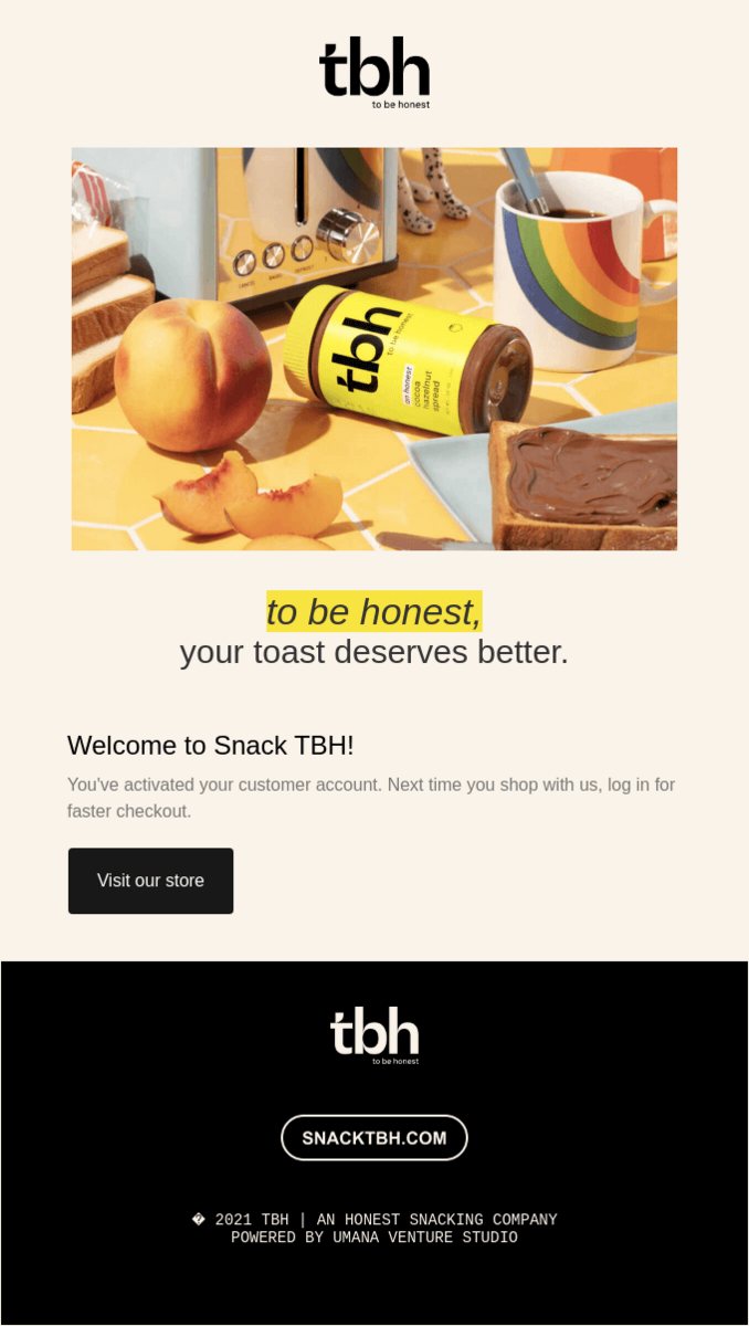
Why this confirmation email example works: Remember the expression, “A picture is worth a thousand words”?
Food company Snack TBH definitely does.
Instead of writing loads of copy recipients may not read, Snack TBH keeps it simple with an on-brand image that shows their main product offering—hazelnut cocoa spread.
They include their brand’s slogan, and this email also double-functions as a nice welcome email to their new members. Plus, there’s a clear CTA to “Visit our store.”
2. Native
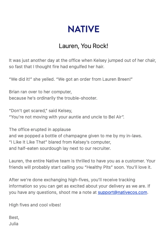
Why this confirmation email example works: Personalization goes a long way in building relationships with consumers. In fact, McKinsey tells us that 71% of consumers expect personalized interactions from companies.
Even a simple gesture like using a recipient’s name can help them feel valued by your business.
This confirmation email from Native doesn’t even have all the bells and whistles of some other email designs. Still, its personalization and story-telling are powerful enough to where it doesn’t need it.
Native is a perfect example of using personalization to show customers that they truly appreciate their business. And it’s truly one of my favorites that still stands out to me.
Pro tip: Email segmentation can help you personalize your emails to recipients just like Native does.
3. KonMari
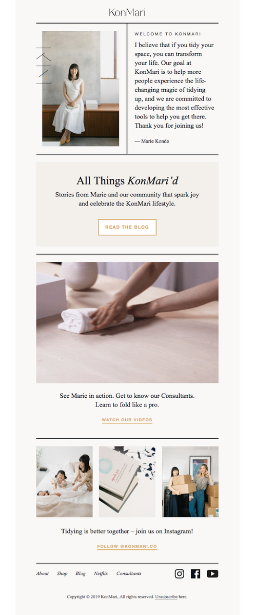
Why this confirmation email example works: Lifestyle brand KonMari chooses to inspire their email list through founder Marie Kondo sharing their goals and some of the story behind the brand. The email thanks recipients for joining, then invites them to learn more about the lifestyle through their blog, by watching Marie in action, and by connecting through social media.
They also include a lovely image of their founder, which humanizes the brand by giving it a face. This is a great way to connect with their readers. And it’s not a bad thing—in fact, 64% of consumers want brands to connect with them.
4. Fitbit
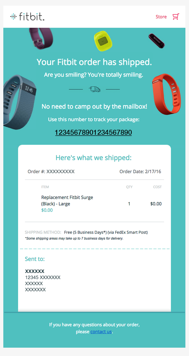
Why this confirmation email example works: Fitbit’s email confirmation is a great example of how to build your customers’ excitement for the arrival of their new product. They imagine that customers are already smiling and poke fun at the idea of them camping outside waiting for their order’s arrival.
Despite the light tone, Fitbit doesn’t skimp on the important stuff. They’ve clearly laid out all the relevant details like the order number and date, along with the shipping and address confirmation.
5. IPSY/Refreshments
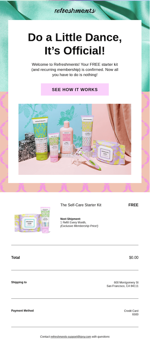
Why this confirmation email example works: IPSY’s (a beauty subscription service) colorful and energetic subscription confirmation email is in line with their informal brand that doesn’t take itself too seriously. The images are vibrant and eye-catching, and there’s an emphasis on having fun.
They use their message to send new subscribers a free starter kit, too.
And who doesn’t love a freebie?
6. Tradesy
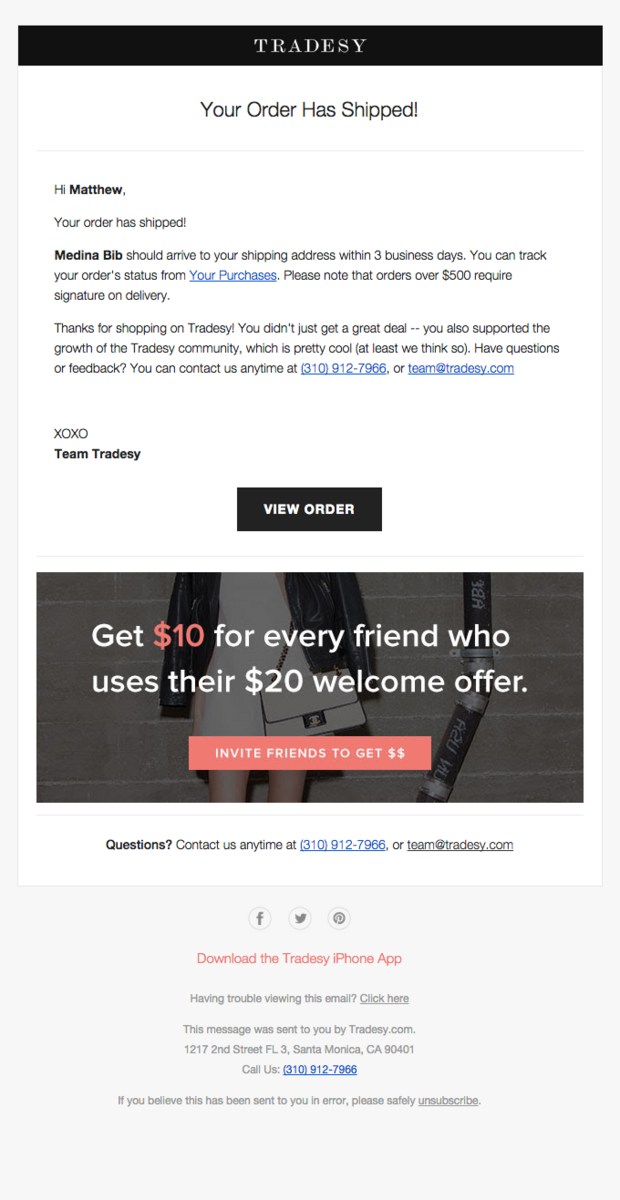
Why this confirmation email example works: eCommerce brand Tradesy’s confirmation email is an excellent example of how you can use order confirmations to encourage customers to do more shopping with you and invite their friends.
Just from this one email, you can view your order, contact the team, make a referral, download their app, and view their socials.
This last tactic isn’t a bad idea considering 90% of consumers buy from brands they follow on social.
We see you, Tradesy.
7. Publican Anker
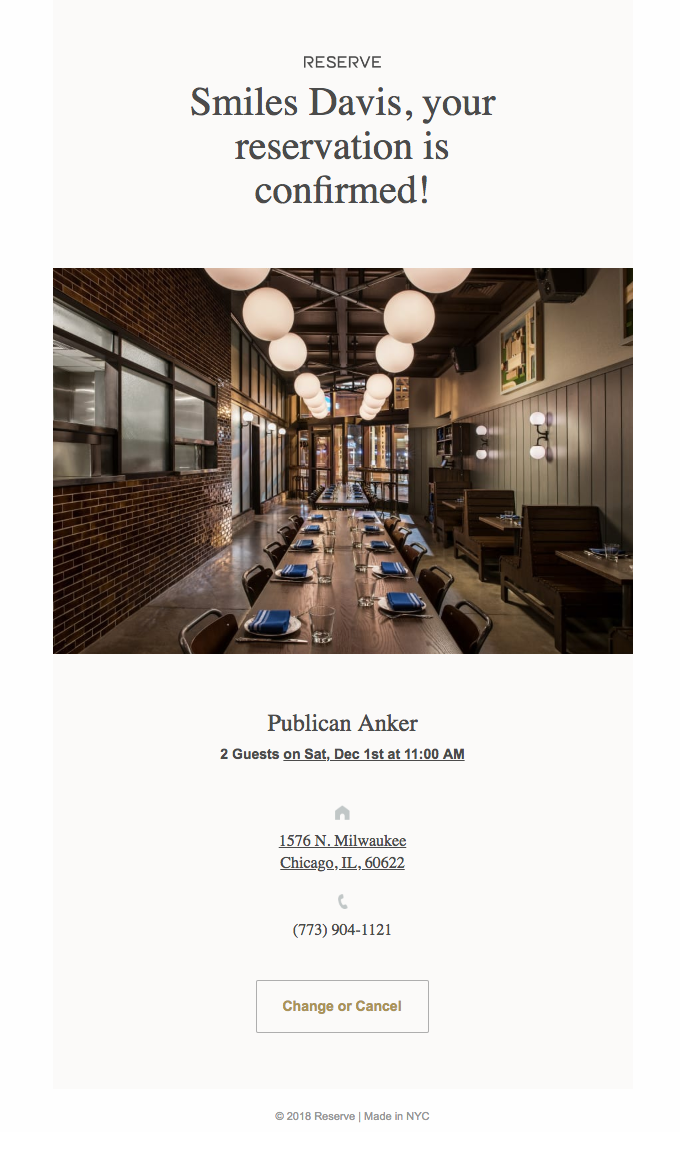
Why this confirmation email example works: Restaurant Publican Anker keeps things short and to the point in their email.
They confirm our reservation, provide the necessary details of when and where, and provide an option to change or cancel the reservation if needed.
8. The Aviary
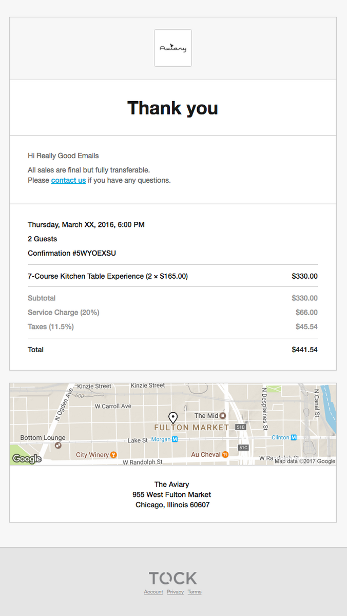
Why this confirmation email example works: This confirmation email hits us with only the necessary. You can easily view the time, confirmation number, items purchased, cost, and a handy-dandy map for customers who might not know their way around.
This just goes to show that you don’t always need to pull out all the stops in confirmation emails. You want to confirm, not send tons of other content. Your other marketing emails can do that for you.
9. Trade Coffee

Why this confirmation email example works: Trade Coffee’s confirmation email not only provides all the details of the sale but includes two helpful and relevant CTAs.
Customers can either explore more coffee options, or they can learn more in an FAQ. This is a great tactic for eCommerce brands that want to keep their customers engaged for a longer haul than just the purchase.
Win over your audience with helpful confirmation emails
Your confirmation email is a chance to celebrate new orders and subscribers. They’re also an opportunity to show recipients that they’ve made the right choice.
So don’t just write a boring confirmation email like everyone else. Use them as a chance to inspire, educate, and delight your recipients. Send them a discount code, share a helpful FAQ, or tell them a meaningful story.
Then, once they’re a regular customer or newsletter reader, don’t forget to find ways to make your email marketing campaigns more interesting. That way, you’ll maintain solid open rates no matter the campaign.
Not sure how to get started with email marketing?
Don’t worry, we’ve got you covered there as well.