When was the last time you absolutely loved the experience you had exploring a website?
If you’re like most, you probably can’t remember off the top of your head.
That’s because a great user experience (UX) isn’t noticed; it’s effortless and unforced.
A great user experience doesn't make you think about the user experience. You just glide, and consciousness of the experience remains suspended.
But when it comes to optimizing your website’s user experience, it’s everything but unconscious.
Actually, it’s about as involved and intentional as any process gets when it comes to your SEO strategy.
Good news: although UX is a broad field that can entail hundreds of tactics, in this article, we’re going to focus on the seven core tactics that Google has explicitly labeled as ranking factors in their algorithm.
Because when Google telegraphs their plays, we better listen and they’ve been telegraphing UX signals for over a decade.
- What does user experience (UX) refer to in SEO?
- How does UX affect SEO?
- How to improve SEO by improving UX
- 1. Satisfy search intent (relevance)
- 2. Make your website mobile responsive
- 3. Keep page load speed between 1-2 seconds
- 4. Eliminate intrusive interstitials (aka pop-ups)
- 5. Secure your website with a TLS or SSL certificate
- 6. Maintain a flat website hierarchy
- 7. Improve your Core Web Vitals
- How do you audit your user experience?
- Wrapping up
Get brand new SEO strategies straight to your inbox every week. 23,739 people already are!Sign Me Up
What does user experience (UX) refer to in SEO?
User experience (UX) refers to the overall experience a visitor has when exploring your website, good or bad.
Whereas user interface (UI) involves the experience you have interacting with computer interfaces and software programs, UX involves the experience you have navigating websites, like page speed, interactivity, website hierarchy, usability, and security.
When it comes to SEO, UX signals have grown in importance over the years. Today, not only does Google use UX signals to understand the relevance of a web page, but they also use them to rank websites.
How does UX affect SEO?
Does UX improve SEO? Yes with a capital Y.
Google has already stated explicitly that mobile friendliness (i.e. optimized UX for small screens), page load speed, satisfying search intent (i.e. providing the experience the user expects), secure browsing via SSL certificate, and no intrusive pop-ups influence rankings.
In fact, Google announced that in 2021 they’re rolling out a Page Experience Ranking update that will incorporate more user experience signals into their running algorithm, namely Core Web Vitals signals.
Why is user experience so important to SEO rankings? Because if Google users don’t like the experiences they encounter, that’s bad for business. Period. UX ranking signals provide an extra layer of oversight that ensure Google’s organic results (i.e. their primary product) keep improving.
How to improve SEO by improving UX
User experience encompasses a broad range of tactics.
But in this article, we’re going to focus on the seven core UX tasks that Google has explicitly stated contribute to rankings.
That’s right: the following list of UX improvements are actual ranking factors, which means websites that don’t adhere to them won’t rank as high as websites that do, all other things being equal.
- Search intent
- Mobile friendliness
- Page speed
- Pop-ups
- HTTPS (SSL security)
- Website hierarchy
- Core Web Vitals
Let’s go!
1. Satisfy search intent (relevance)
We’ve literally discussed search intent in almost every SEO article we’ve written: semantic SEO, schema markup, on-page optimization, keyword research, you name it…
That’s because search intent is at the top of Google’s ranking algorithm, and providing the right answer in the right format that the searcher intends on finding is the epitome of a great user experience.
Google’s search engine spiders think more and more like humans everyday. Not only do they understand the meaning and context of the content on your page, but they know whether or not your content fits the format a searcher expects to find (i.e. list, tool, long-form, video, etc.).
How significant is search intent to user experience?
In 2015, Google officially rolled out their RankBrain algorithm update and named RankBrain (their intent algorithm) and “content relevance” (how well your content matches search intent) two of their top three ranking factors.
RankBrain was an extension of the Hummingbird update, and it enhanced Google’s ability to use machine-learning to process natural language, location data, and personalization to provide answers users intended on finding, regardless of the keywords they used to type their question.
That means Google can provide answers to queries like this:
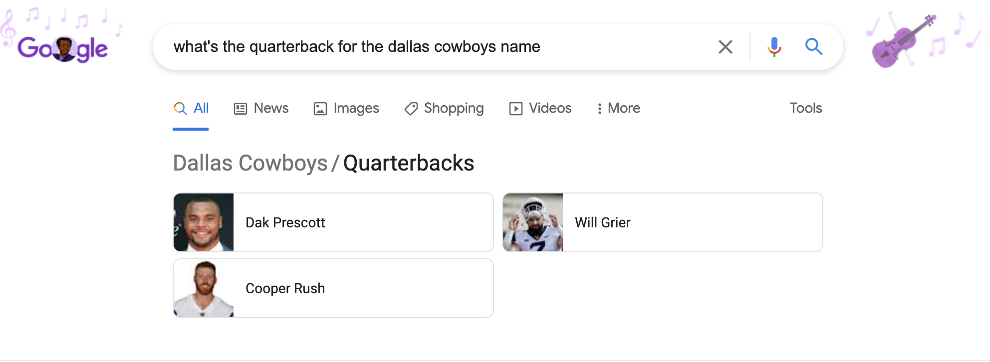
Google knows my search intent is to find Dak Prescott, even though I didn’t use his name once in the keyword phrase.
Bottom line: stop thinking about stuffing keywords (aka “keyword stuffing”) into your content because it doesn’t matter anymore. Instead, focus on understanding the true meaning of a search query and providing the best answer a visitor intended on finding, regardless of the words they typed into Google. That’s high-quality content.
The start of a great user experience starts with the visitor, not Google.
2. Make your website mobile responsive
A responsive website reorganizes content as the screen resolution goes from big to small, small to big. The goal? You guessed it: user experience.

In many countries (including the US), mobile web traffic now exceeds desktop traffic, which means that creating a mobile-friendly experience where visitors can easily navigate your website on a screen the size of their pocket is non-negotiable.
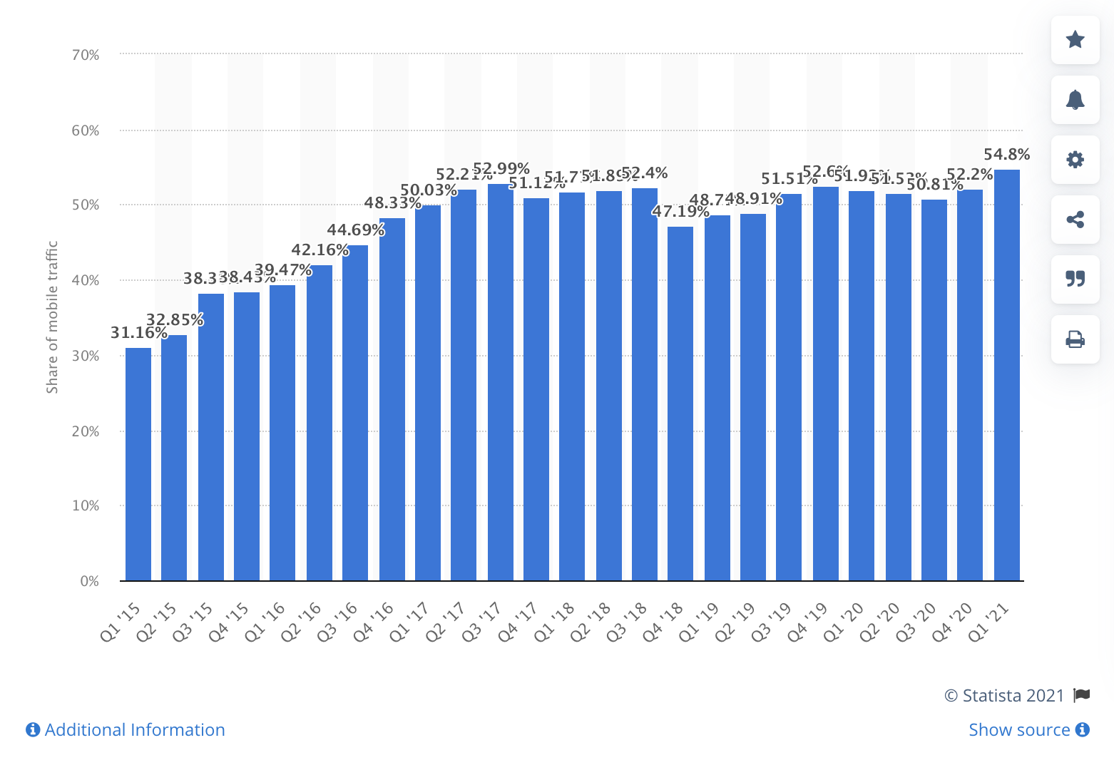
How non-negotiable?
In 2015, Google officially made mobile-friendliness a ranking factor. Websites that don’t provide a friendly user experience on a mobile device or tablet device will not rank as high as those that do, all other things being equal.
What does a mobile-friendly website look like? Like this:

A mobile-friendly website includes the following features:
- User-friendly buttons (i.e. big not small)
- Pinch to zoom
- Font no smaller than 16px
- Simple menus (not mega menus)
- Short forms
- Small blocks of text
- Clear CTAs
- No pop-ups
- Search box
- Fast-loading
Making a mobile site requires prioritization. What are the primary objectives that your visitors need to accomplish (which may differ on mobile vs. desktop)? How can you make it as easy as possible for them to accomplish those goals?
3. Keep page load speed between 1-2 seconds
Not only does page load speed directly correlate with bounce rate (the number of people who abandon your website), but it directly correlates with search rankings too.
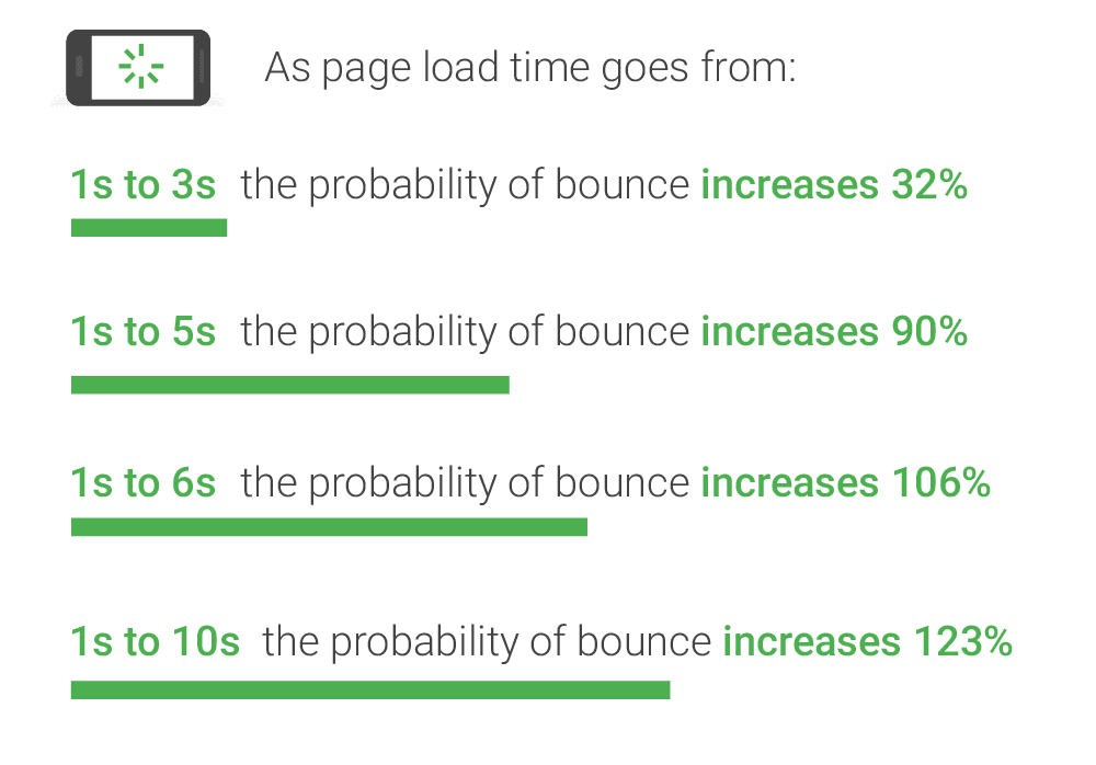
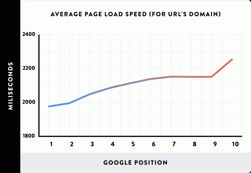
None of this should come as a surprise, considering that page speed is a primary ranking factor, according to Google.
In general, each page on your website should load between 1-2 seconds.
Though Google provides their PageSpeed Insights tool (powered by Lighthouse), they don’t actually tell you how fast a page loads; instead, they score your website on a scale from 0-100 based on dozens of performance-related criteria.
To find out exactly how long it takes for a page to load (in seconds), we like to use Pingdom’s free Website Speed Test tool:
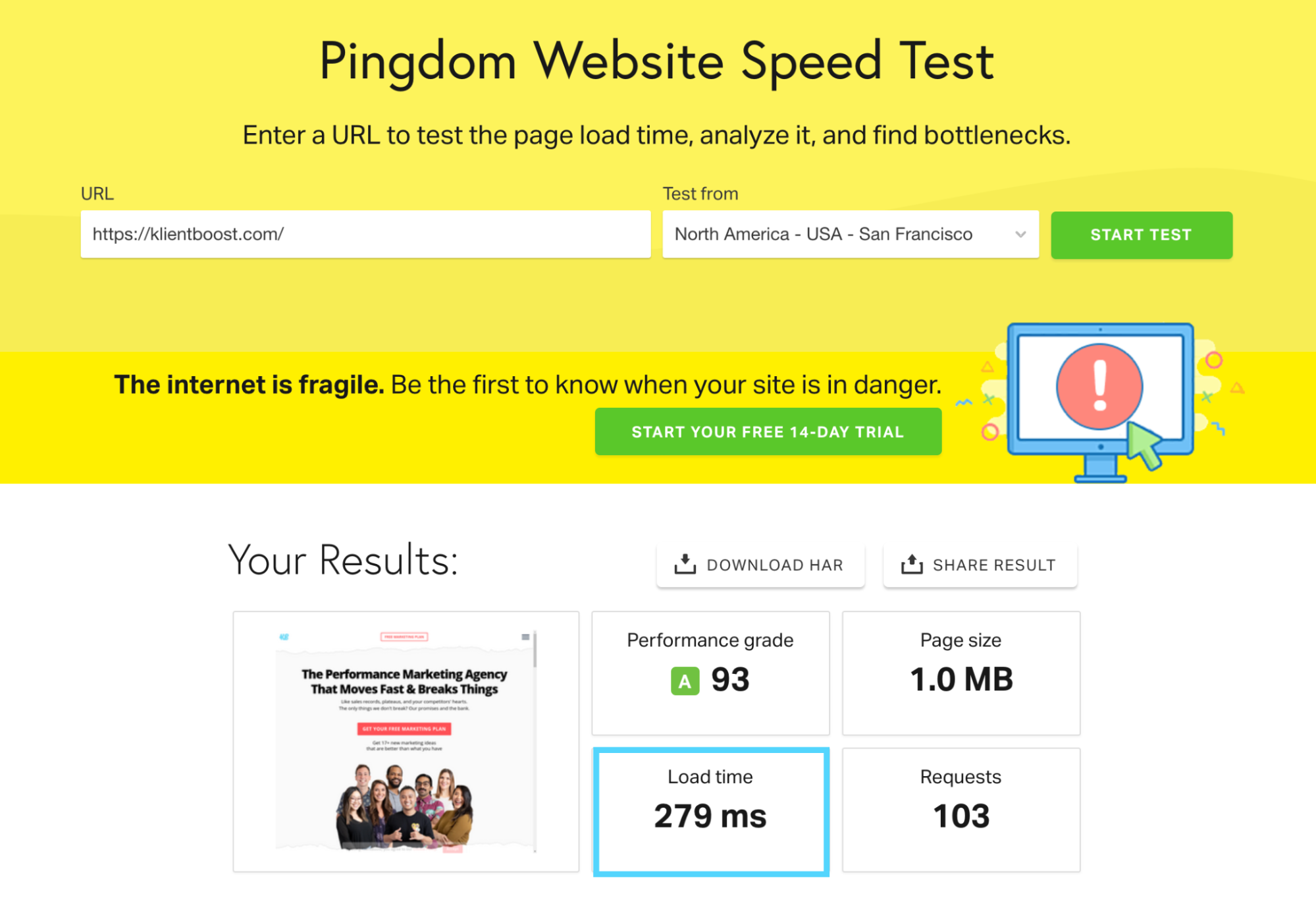
You can also explore individual page load speed inside Google Analytics (login > behavior > site speed > speed suggestions).
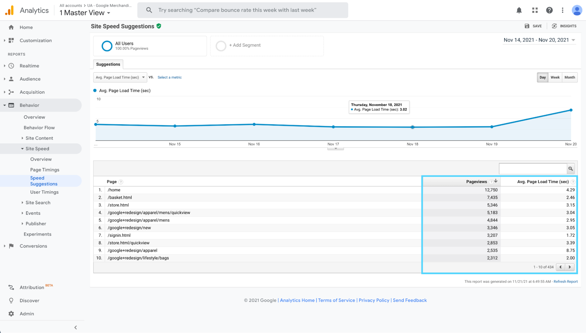
How do you make your website load faster?
Good news: we explore seven tips for improving page speed within our technical SEO article, including using CNS, embracing AMP, and optimizing images.
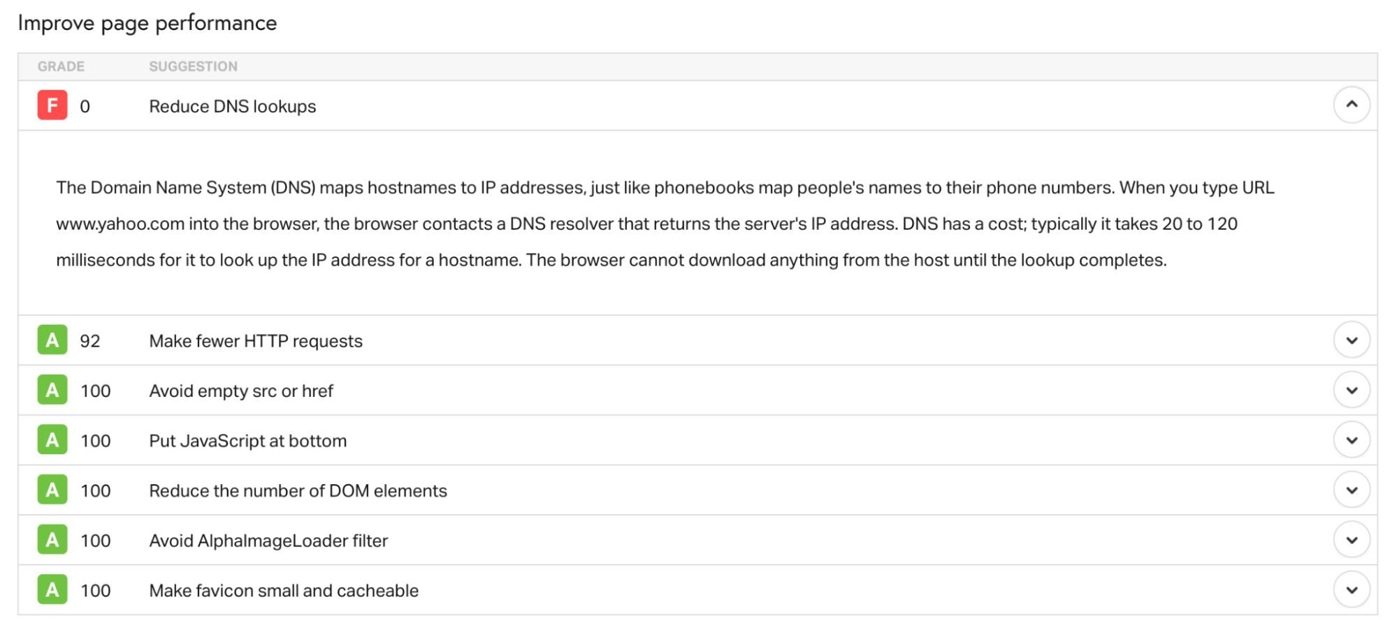
Good-er news: both Pingdom and Google’s PageSpeed Insights will give you specific instructions on what to fix and how to fix it based on your test results.
From Pingdom:
From PageSpeed Insights test:
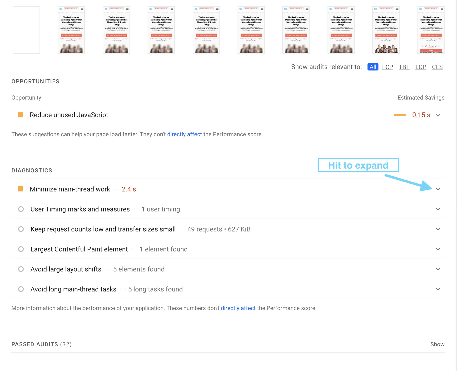
PageSpeed Insights provides tons of thorough instructions on how to fix issues they’ve uncovered.
Three sections to explore with the PageSpeed test results:
- Opportunities
- Diagnostics
- Passed audits
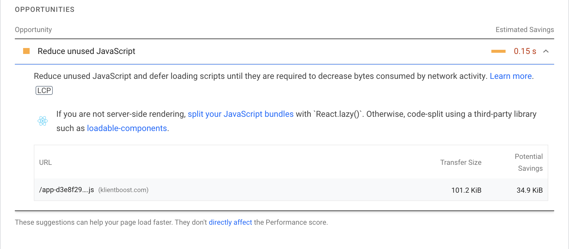
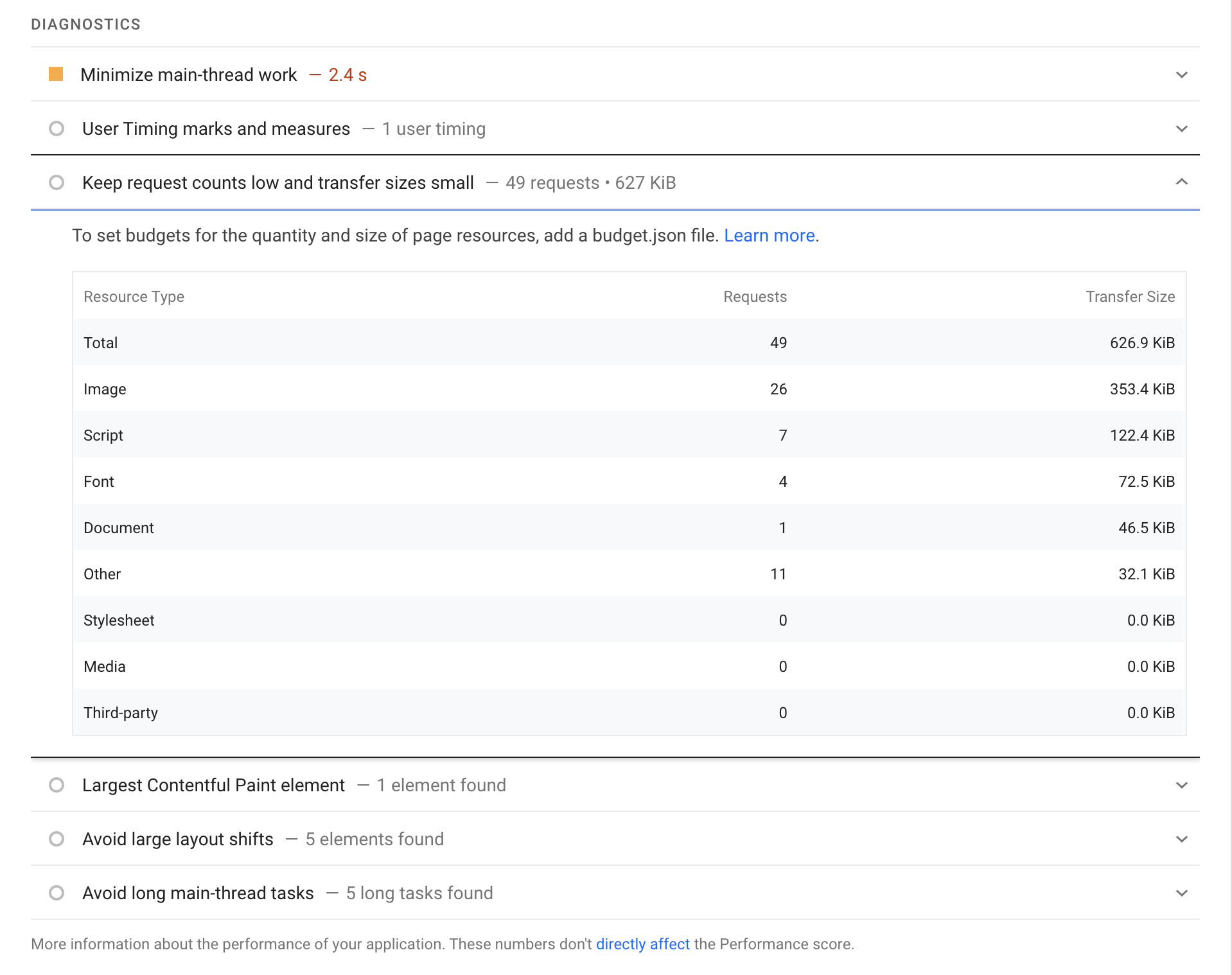
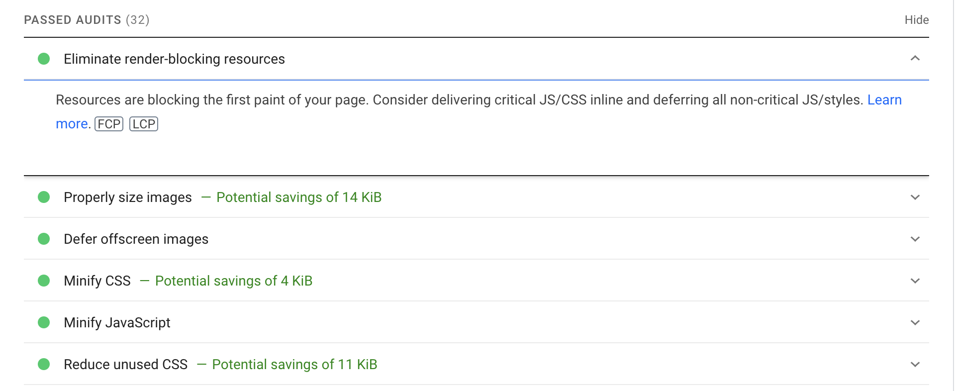
Last, Google recently announced that it’s making signed exchange (SXGs) available for all websites.
What’s an SXG? Basically, an SXG is a way to authenticate website files no matter where they’re served from, which means you can let Google serve your website files from their servers.
Why does this matter? Websites built using signed exchanges can let Google “prefetch” their website files, load them to one of their fast-cache servers around the world, and render your website almost instantly. Although SXGs aren’t a ranking factor, the prefetch process will skyrocket load speed which is a ranking factor.
For more info on building your site using SXGs, follow Google’s instructions here.
4. Eliminate intrusive interstitials (aka pop-ups)
Back in 2016, Google announced that mobile websites using interstitials (pop-ups) that make it hard to access content beneath it (and therefore ruin the user experience) won’t rank as high in search results.
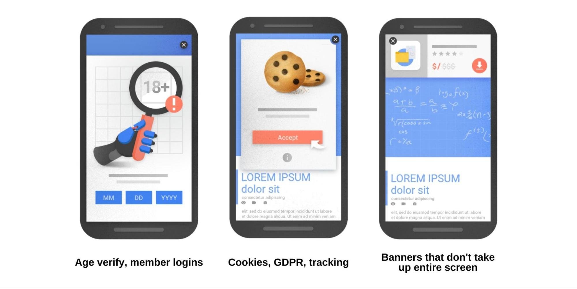
An interstitial, or pop-up, might make perfect sense in certain situations. Google isn’t saying you can’t use them at all, but if you do, follow Google’s guidelines below:
- Legal obligation: i.e. verifying cookies, GDPR acceptance, age verification
- Login dialogue: i.e. membership sites where the content behind the login isn’t publicly available
- Small banners: i.e. banners that use a reasonable amount of space, not the entire screen, and that can easily be exited out of
For example, below are three pop-ups Google considers poor user experience:

And these are three pop-ups that Google considers don’t alter the UX
5. Secure your website with a TLS or SSL certificate
No matter how effortlessly a visitor can navigate your website, if the personal information they share or submit through forms isn’t protected, then the user experience is compromised.
Which is why Google now uses HTTPS as a ranking factor.
What’s HTTPS?
It stands for Hypertext Transfer Protocol Secure.
In layman's terms, HTTPS just means your website uses an encryption protocol to encrypt information so hackers can’t easily scrape it.
Websites that use HTTPS not only get higher rankings, but they also get a secured lock icon next to their URL in the browser window.

And those that don’t use HTTPS (i.e. they still use HTTP), your web browser will show visitors a “not secure” warning:
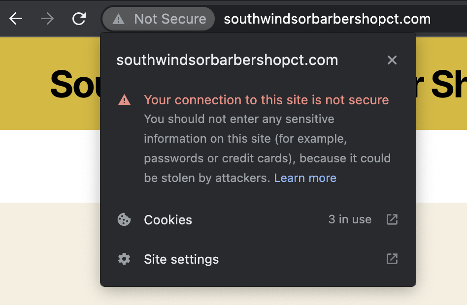
How do you convert your site to HTTPS? Using a TLS certificate or SSL certificate.
Both do the same thing, but TLS (Transport Layer Socket) is the more recent, evolved version.
Lucky for you, you can purchase either certificate from your web hosting company, and it only takes a few minutes to install it.
Warning: If you transfer your website from HTTP to HTTPS, just remember that Google will recognize those as two different versions of your website. To ensure you don’t run into any duplicate content issues, you’ll need to 301 redirect (“moved permanently”) your old protocol URL (HTTP) to your new one (HTTPS).
6. Maintain a flat website hierarchy
How you structure and organize your website may not be an explicit ranking factor, but proper hierarchy helps Google (and visitors) understand which pages are most important, how each page relates to another, and what your website’s topical domain authority incorporates.
Bottom line: proper hierarchy helps Google understand your content’s relevance, and relevant content is one of Google’s top three ranking factors.
When it comes to website structure, shoot for a flat hierarchy.
A flat website hierarchy means that no page is further than 3-4 clicks from the home page, and every page is discoverable through internal links (i.e. no page has zero internal links pointing to it).
For example, this is what a flat website structure looks like:
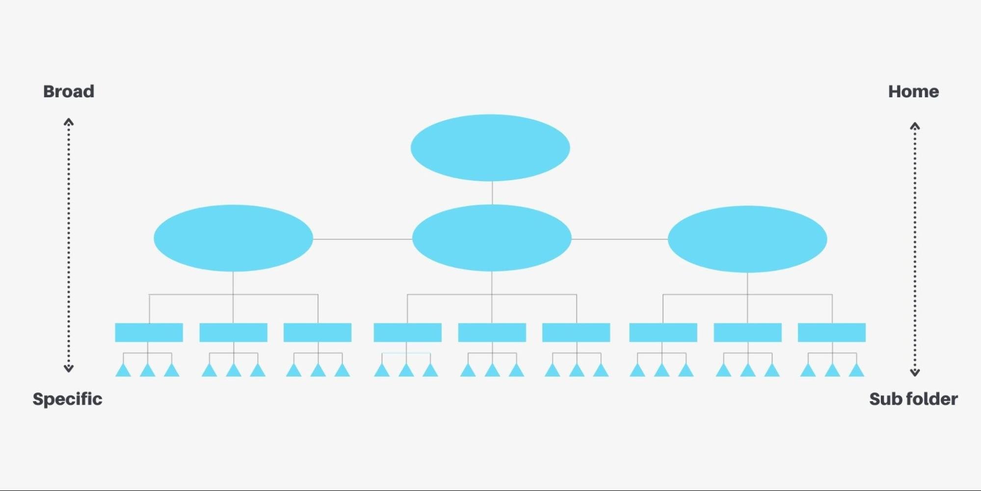
In the above example, no page is more than three clicks away from the homepage, and content is organized into “content pyramids” from broad to specific. Last, internal links make it easy to navigate from the top of the pyramid to the bottom.
Now let’s look at a poor website structure (i.e. not flat):
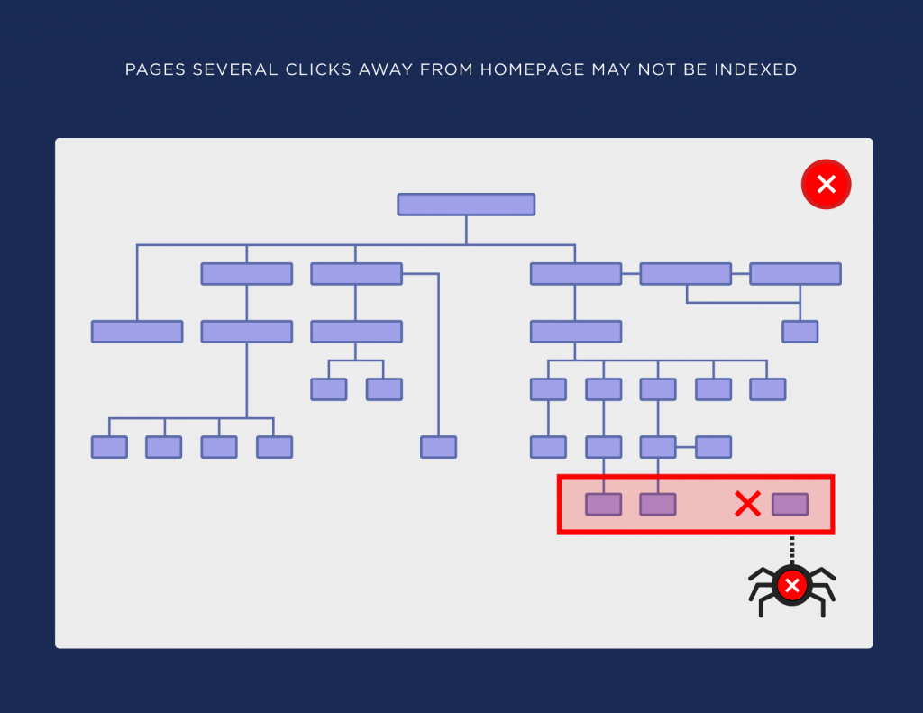
In this example, certain pages are five clicks from the home page (one too many), and other pages are orphaned (no internal links pointing to them).
This structure makes it impossible for Google to understand the relevance of your website or find all of its pages.
Not only does a flat architecture help users and Google identify the relevance of your website, but it also helps pass link authority from one page to another.
That’s right: internal links pass link authority to other pages on your website. Which means if page A has a ton of links and high page authority, it passes some of that equity to Page B through an internal link. Sometimes the right internal link is all you need to make it to the top of page one.
When optimizing your site structure for better UX, remember the following:
- Simple navigation: keep your website organized into as few topical buckets as possible
- Internal links: keep related pages close together with internal links
- Breadcrumbs: use breadcrumb nav on your blog post articles
- Clean URLs: use short, descriptive URLs that tell you where you are just by looking
- Keyword family tree: good site structure starts by using keyword research to create a keyword family tree.
7. Improve your Core Web Vitals
Core. Web. Vitals.
Most recently, Google announced their group of Page Experience Ranking Signals that include Core Web Vitals.
What are Core Web Vitals?
“Each of the Core Web Vitals represents a distinct facet of the user experience, is measurable in the field, and reflects the real-world experience of a critical user-centric outcome.”
As of 2021 (Google will evolve these in the coming years), Core Web Vitals include three user experience metrics that Google states “matter most”:
- Loading (Largest Contentful Paint)
- Interactivity (First Input Delay)
- Visual stability (Cumulative Layout Shift)

Let’s explore all three.
Loading
Loading (Largest Contentful Paint): how long does it take to load the largest element on a page? It shouldn’t take more than 2.5 seconds.
For example, if a blog post image is the largest block of content on the page, how long does it take to load?
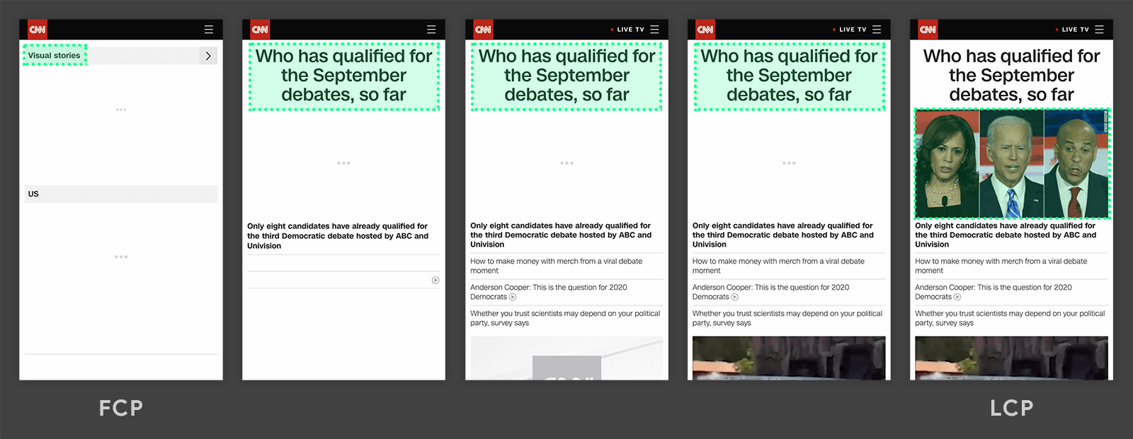
In the CNN example, the image of Biden and Harris is the “largest contentful paint.” If it takes longer than 2.5 seconds to load, it needs improvement.
In the Instagram example below, the Instagram logo (text logo) is the largest contentful paint.
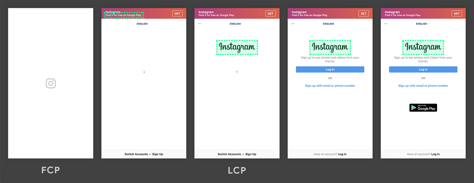
Loading first or last doesn’t matter, as long as the largest element load time is within 2.5 seconds.
Interactivity
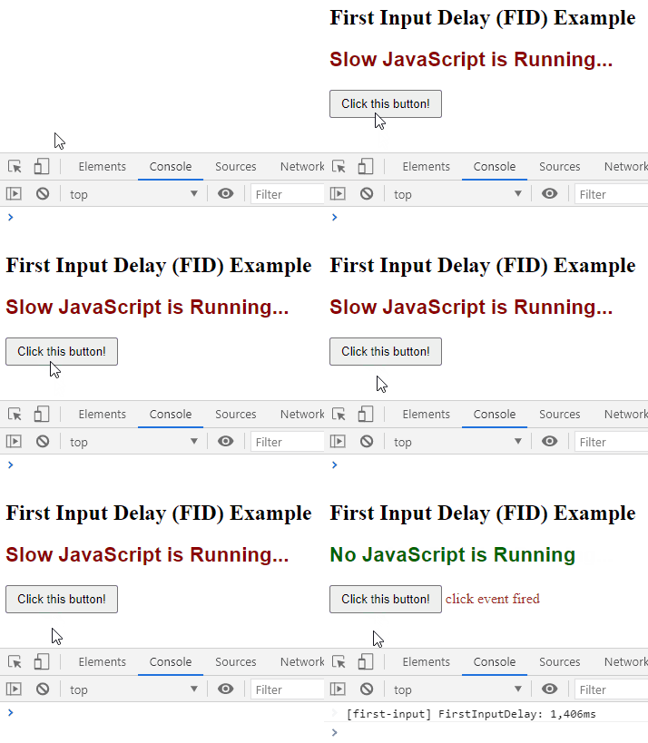
Interactivity (First Input Delay): how fast does the page respond after a user interacts with it by pushing a button or loading a piece of JavaScript? It shouldn’t take longer than 100ms.
It’s one thing for the elements of UX design to load quickly. But how fast is your website’s responsiveness when users try to interact with it?
According to Google, FID measures:
“...the time from when a user first interacts with a page (i.e. when they click a link, tap on a button, or use a custom, JavaScript-powered control) to the time when the browser is actually able to begin processing event handlers in response to that interaction.”
In the GIF below, when you click the button, it’s an example of a first input delay. Slow JavaScript evaluation actually delays the users click (the yellow represents the click, but the action doesn’t take place until a second later).
Visual stability
Visual stability (Cumulative Layout Shift): how often does the layout of your web page shift because different content blocks (like ads) get loaded later?
For example, have you ever read an article and gotten bombarded with a video ad in the corner, an above-the-fold ad at the top of the article, a sidebar ad, and a “opt in” box in the middle of the article all at the same time? With every new ad block loaded, the content shifts all over the place. The worst. Websites like LiveStrong and BuzzFeed are notorious for visual instability.
In general, you should avoid any large shifts as they disrupt the user experience.
Google scores CLS based on how much visible content shifted in the viewport as well as how far the elements shifted. They only measure shifts that take place after 500ms of loading (normal shifts when loading are ok).
Bonus: Check out Woorank’s article on CLS; tons of great examples.
How do you audit your user experience?
Simple: run a UX audit.
Two ways: First, you can use Google’s suite of tools that directly measure your UX performance. Second, you can monitor web-based analytics metrics and KPIs on your own.
Let’s start with Google’s suite of tools:
PageSpeed Insights: Use this tool to measure a page’s speed performance. This tool also shows Core Web Vitals results.
Mobile-Friendly Test Tool: Use this tool to measure mobile-friendliness of a single page on your website.
AMP Page Experience: If you’re using AMP pages to increase page load speed, you analyze the AMP experience with this tool.
Lighthouse: Lighthouse is the Google tool for web developers that includes a host of useful performance metrics.
Core Web Vitals: Like we mentioned, you can test Core Vitals using PageSpeed Insights, but you can also test them using Search Console’s Core Web Vitals report, Lighthouse, or the Chrome User Experience Report.
Search Console UX report (Coming Feb 2022): This tool will report on all your core UX metrics, all in one place, like mobile friendliness, page speed, core vitals, security issues, and HTTPS.
As for metrics you can monitor on your own using Google Analytics, look for the following:
Bounce rate: the % of people who enter a site and leave from the same page without clicking to any other pages. This doesn’t always need to be low: blog posts are notorious for high bounce rates since users find the info they need all in one article.
Time on page: the amount of time someone stays on any specific page. The best way to track time on a page is with event tracking (or Google Tag Manager) to trigger when someone scrolls, when they interact with a certain element on a page (video, button, link), or when they navigate to another page. Longer time on page indicates a better user experience.
Pages per visit: how many pages does someone visit when they arrive? More page views indicates a better user experience.
Dwell time: how long someone spends looking at a page after they clicked through on a SERP. The longer someone stays on a website after clicking from Google, the higher likelihood that it provides the answers users intended on finding. To track dwell time, look at average session duration within Google Analytics, filtered by organic traffic.
Organic click-through rate (CTR): what percentage of people who see your Google result click on it (i.e. conversion rate from SERPs). You can find this in Search Console’s performance report. The higher the CTR, the more likely your title tags and meta descriptions match the searcher’s intent.
Goal completion: how many people accomplish conversion goals in Google Analytics (downloads, subscribe, purchases, conversions). At the end of the day, a good user experience helps visitors accomplish their goals easily. Track those goals using Google Goals inside Google Analytics.
Wrapping up
If one thing is certain about the future of SEO, it’s that Google will continue to incorporate user experience signals into their ranking algorithm.
It started with page speed, then search intent, then mobile-friendliness, then intrusive pop-ups, then SSL security (HTTPS), then Core Web Vitals.
What’s next? More core vitals!
According to Google, they plan on evolving their UX web vitals in the near future:
“Web Vitals and Core Web Vitals represent the best available signals developers have today to measure quality of experience across the web, but these signals are not perfect and future improvements or additions should be expected.”
Use this list of SEO best practices to optimize your website’s UX based on the primary signals Google uses to measure it. Do it now (before Google rolls out even more UX signals as ranking factors).
