As a marketer, you’re tasked with maximizing return on investment (ROI). You know that email ROI averages $36 for every $1 spent, making email one of the most lucrative channels.
Sweet. You start emailing away.
But no matter what you do, you just can’t seem to achieve the ROI you’re aiming for.
What gives?
What’s missing from your email marketing strategy?
Maybe it’s time to throw in some compelling promotional emails to generate more opens, more conversions, and better ROI.
Subscribe to our weekly newsletter for tips so good that we might put ourselves out of business.
This article will show you the ins and outs of promotional emails, including what they are and how to write a promotional email that drives sales and conversions. I’ll also give you 34 of the best examples to inspire you and get you on your way to improving that ROI.
What is a promotional email?
A promotional email is any email message that markets your business, products, or services.
You can send these emails to anyone who opted in to receive your marketing materials, including newsletter subscribers, current customers, or prospects.
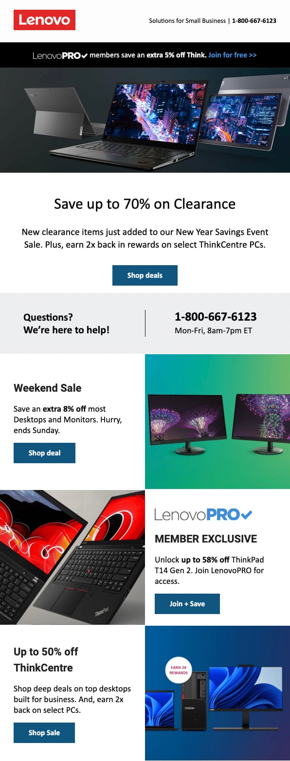
Promotional emails often aim to increase sales and conversions. For example, the Lenovo email below highlights a clearance sale that lasts for a limited time:
But revenue doesn’t always have to be the main goal. Promo emails can also seek to improve awareness or drive consideration.
Types of promotional emails
So, what type of promo email should you send? It depends on how well your subscribers know your brand and where they are in the customer journey.
Some of the most common promotional emails include
- welcome promos that offer a discount for joining an email list
- limited-time special offers that encourage people to buy before a deadline
- exclusive giveaways
- seasonal email campaigns that prompt sales or offer coupons during a timely event
- holiday promotions
- sales promos that invite customers to take advantage of a deep discount
- subscriber-only promos that offer exclusive savings
- new product arrivals that boost awareness and drive consideration around a launch
- content promos that send traffic to new blog posts or assets like reports and e-books
Promotional vs. informational vs. transactional emails
So what isn’t a promo email? Not every email type fits into this category.
For example, it doesn’t include informational emails. Informational emails simply aim to educate readers and share news rather than promote an offer or prompt action.
Transactional emails also fall into a separate category. These automated emails are designed to share account updates, order information, and shipping details.
Tips on how to write your promotional email
The design and copy for your promotion email will vary depending on your offer, your target audience, and your brand.
However, it should always include the key elements below.
Include the promo in the subject line
Start your email strong with a clear, compelling subject line that mentions the promo. Remember that a captivating email subject line is the key to a higher open rate.
In the preheader (small line of preview text), give customers additional details or reasons to open your email. However, avoid placing critical information here since not all email clients display the preheader.

Just be sure not to overdo it so you don’t land yourself in the spam folder.
Brand your header
When recipients open your company’s promo email, this visual can tell them who it’s from right away. Help them identify your brand immediately by placing your company name, logo, or other brand assets in the header.

In the email marketing example above, the 1-800-Flowers.com logo appears in the email header. It’s the first thing recipients see after opening the email, giving them critical context to consider the offer.
Focus on the benefits
Features and benefits can both help you sell products and services. But in promo emails, highlighting benefits tends to be more effective.
While features explain what your offer does, benefits clarify how it might impact a customer’s life and why it matters—and the “why” can be an incredibly effective selling point.
Create a sense of urgency
People are more likely to do something when it seems urgent.
Using the mere urgency effect, you can instill the fear of missing out (FOMO) in email recipients. This FOMO can then prompt them to click and convert rather than taking their time to think it over.
The 1-800-Flowers.com email above seamlessly creates a sense of urgency. By stating, “Time’s running out for guaranteed delivery,” the email urges customers to act now.
Never forget your CTA
Your promo email could offer a fantastic discount or a limited-time product launch. But if you don’t tell recipients exactly how to get your offer, your conversion rate may never see the leap you want.
In other words, you need a very clear call-to-action (CTA) that tells customers exactly what to do next. A compelling CTA can improve your click-through rate (CTR) and increase conversions more than any flashy design could.
34 promotional email examples
Ready to see promos you can use as email templates and inspo? Check out 34 great promotional email examples below. By the end, you should be brimming with ideas to take your promo emails to the next level.
1. 23andMe
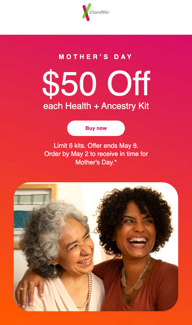
In the 23andMe promo email above, the biotechnology company places its offer front and center. “$50 Off” appears in the subject line and at the top of the holiday email, telling customers exactly how much they can save.
The email also does a great job of clearly stating essential dates. It tells us when exactly the offer ends and when to order by in order to redeem it.
2. 39DollarGlasses.com
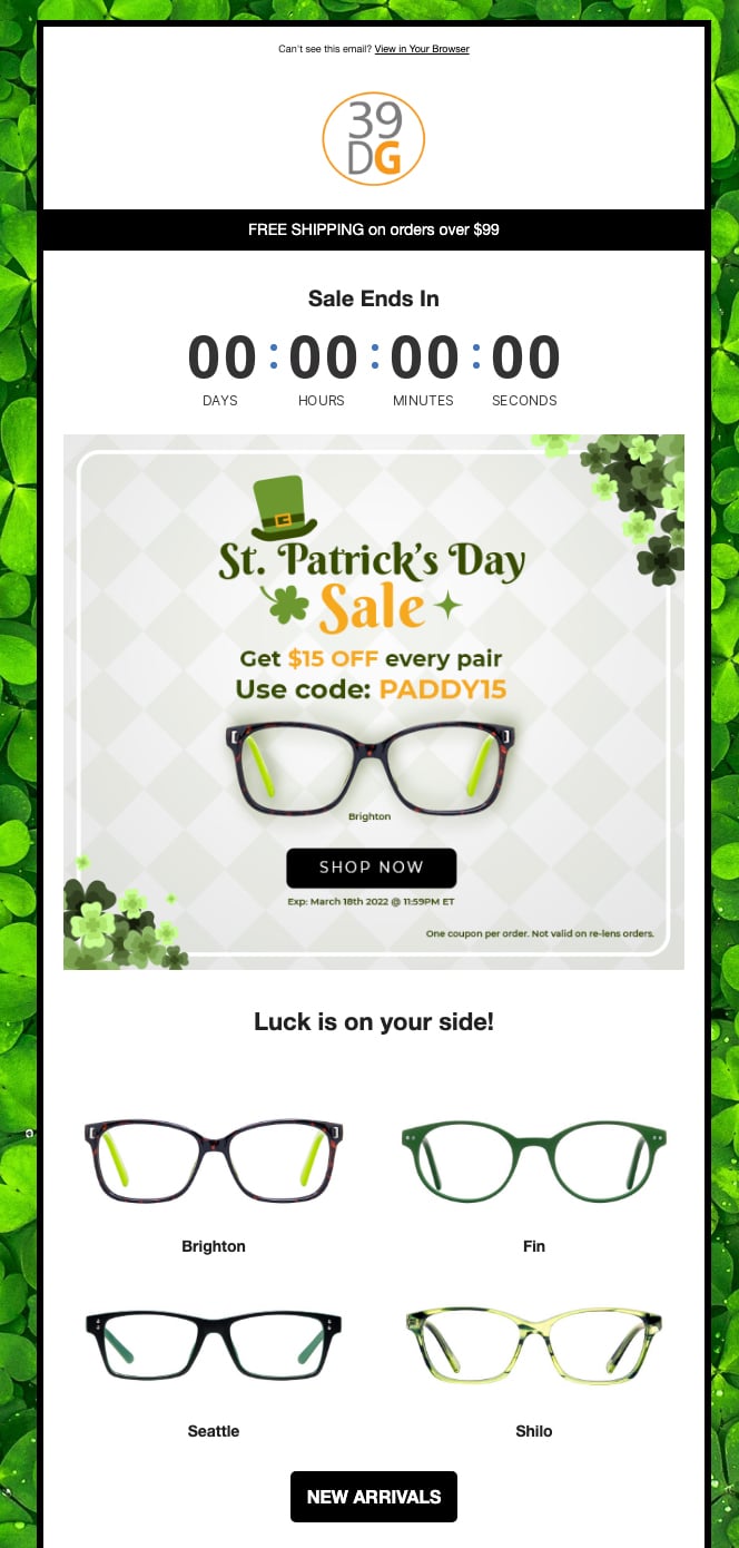
How’s a timer for a sense of urgency and FOMO? The brand jumpstarts customers into taking action by adding a live countdown timer at the very top of the email.
Because this is so front and center, it suggests that time is of the essence and creates a much more effective need for speed than a simple “Limited-time offer!” headline could do.
3. Alaska Airlines
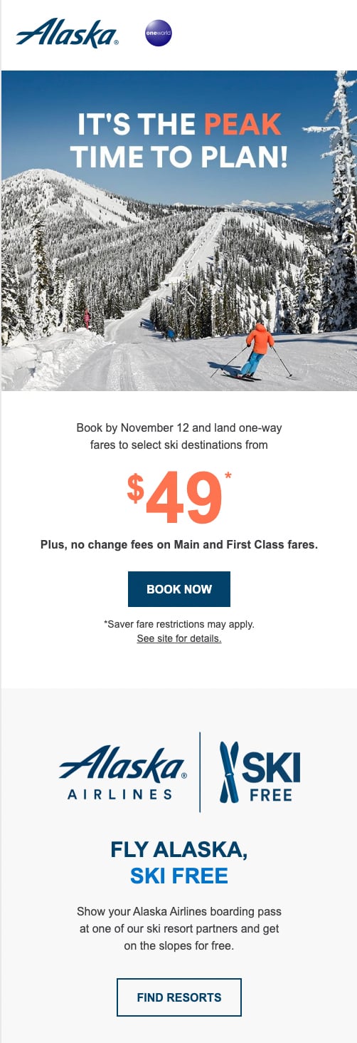
This Alaska Airlines email grabs customers’ attention right away with its beautiful, high-quality image, complete with a campaign-specific pun. The $49 sale price also appears prominently in the email, and the bold “Book Now” CTA button makes it easy for customers to convert.
4. AllTrails
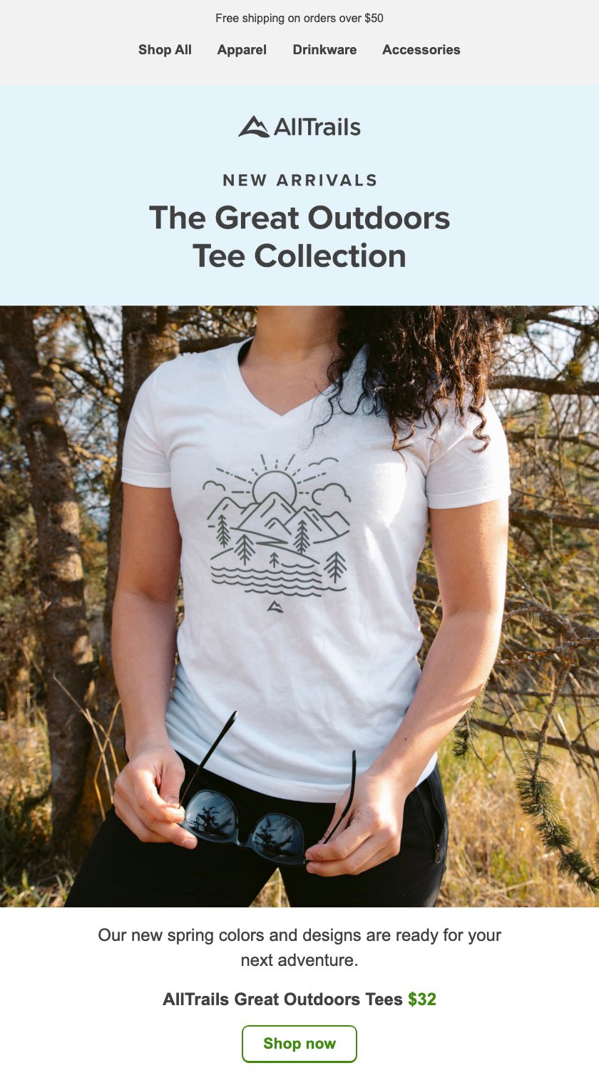
To promote its new products, this AllTrails email kicks things off with the subject line, “We just dropped a new t-shirt collection!” After a concise introduction and a high-quality product image, the email displays a “Shop now” CTA button to drive sales.
It’s sweet and the point, but sometimes, that’s all you really need.
5. Backcountry
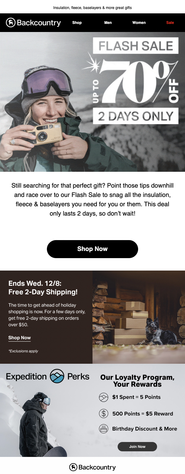
This Backcountry email promotes a flash sale, using a GIF to draw attention to the 70% discount. It also sets a two-day limit for the sale to encourage customers to act before it’s too late.
We also like the small summary of their loyalty program tagged onto the bottom of the email. Usually, we advocate including just one CTA, but this loyalty program CTA actually reinforces their main “Shop Now” CTA. Because customers can earn points on their purchases, these two CTAs go hand-in-hand.
It’s also not the focal point of the email; instead, we’re simply encouraged just to consider it alongside the promo.
Not a bad touch, Backcountry.
6. Bellhop
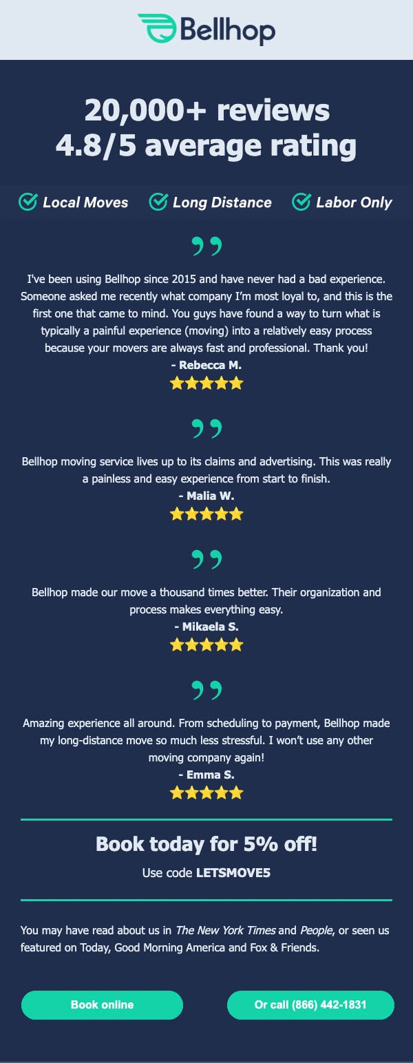
Social proof can be great for adding credibility and instilling trust, getting customers to convert. Before stating the offer (“Book today for 5% off!”), this Bellhop email provides tons of social proof, from the 20,000+ review statistic to the 4.8-star rating to the real-life rave reviews.
So by the time you get to the offer, you might already be convinced to take them up.
7. Bioclarity
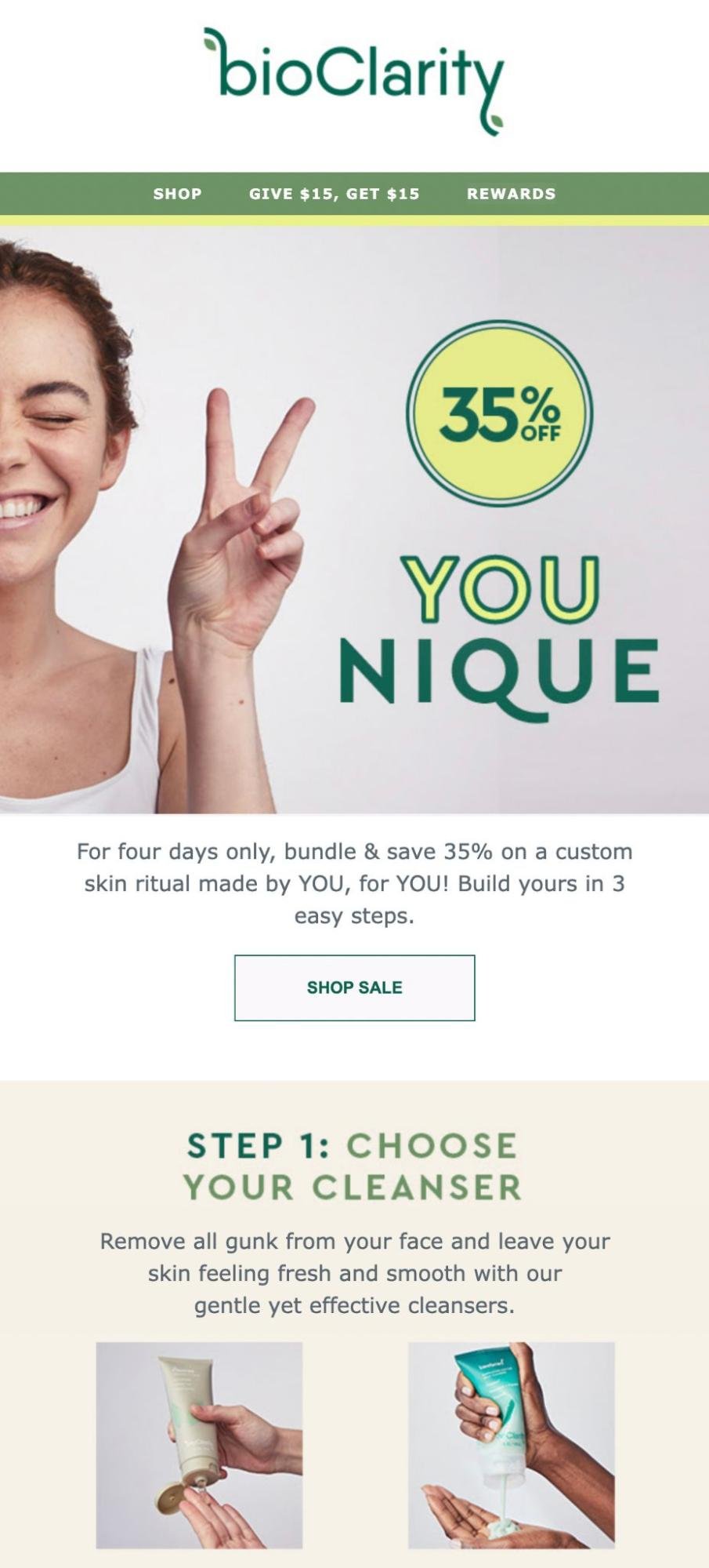
With its customized bundle promo, Bioclarity rewards customers for purchasing multiple items. The email above details the brand’s 35% off promo, which shows customers how to save on all three steps of their skincare routine.
We love a package deal.
8. Biossance
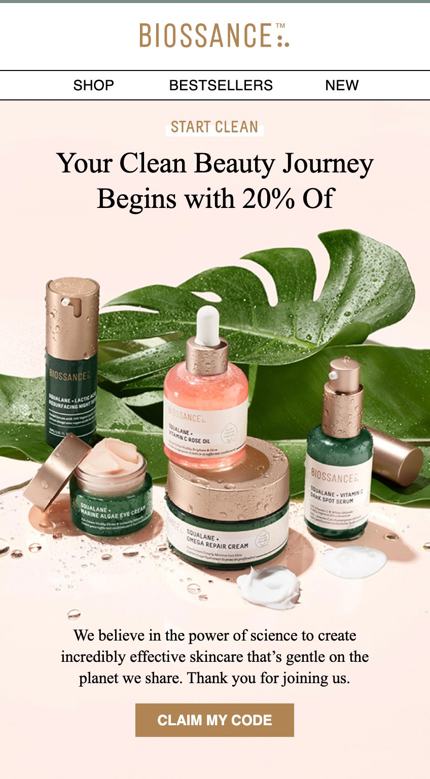
Welcome promos are great to use when you follow up with new subscribers. The Biossance email above features the skincare brand’s introductory 20% discount, using an action-oriented “Claim My Code” CTA to drive conversions among new customers.
Plus, have you ever seen a more delicious-looking email design? 😍
9. Chipotle
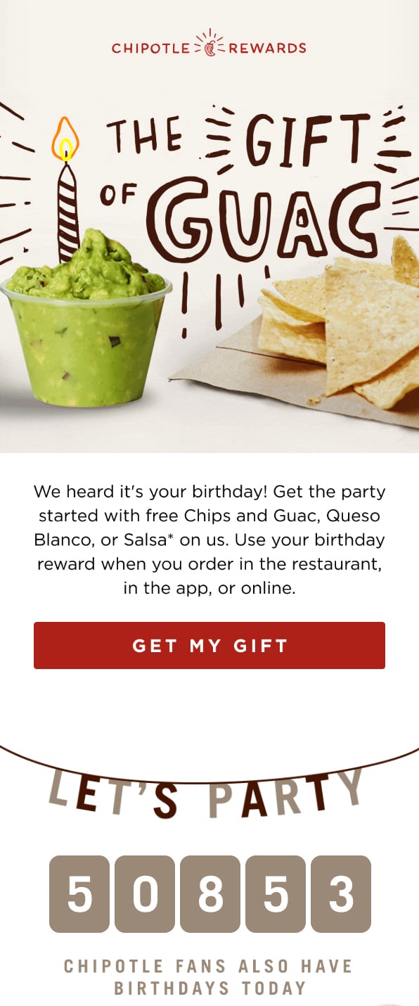
Chipotle really nailed this birthday promo email.
This promo email hits a home run from the on-brand design to the birthday-related CTA to the social proof counter at the bottom.
And it accomplishes this all without taking up a ton of time, space, or attention. This short and sweet email rewards loyal customers while using a loss leader (free guac) to get them in the door and incentivize them to purchase a meal.
10. ClickUp
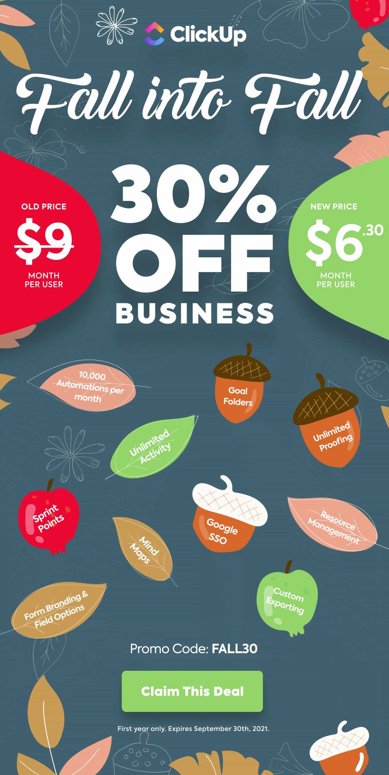
ClickUp’s seasonal promo email highlights an irresistible deal on the app’s business-level subscription. The email seamlessly compares old and new prices to make cost savings clear. To convert customers who have been comparison shopping, it also lists key features in a super creative way.
Plus, we’re a sucker for a fun email design. The leaves? The pun?
We’ve totally fallen for this email.
11. Costco
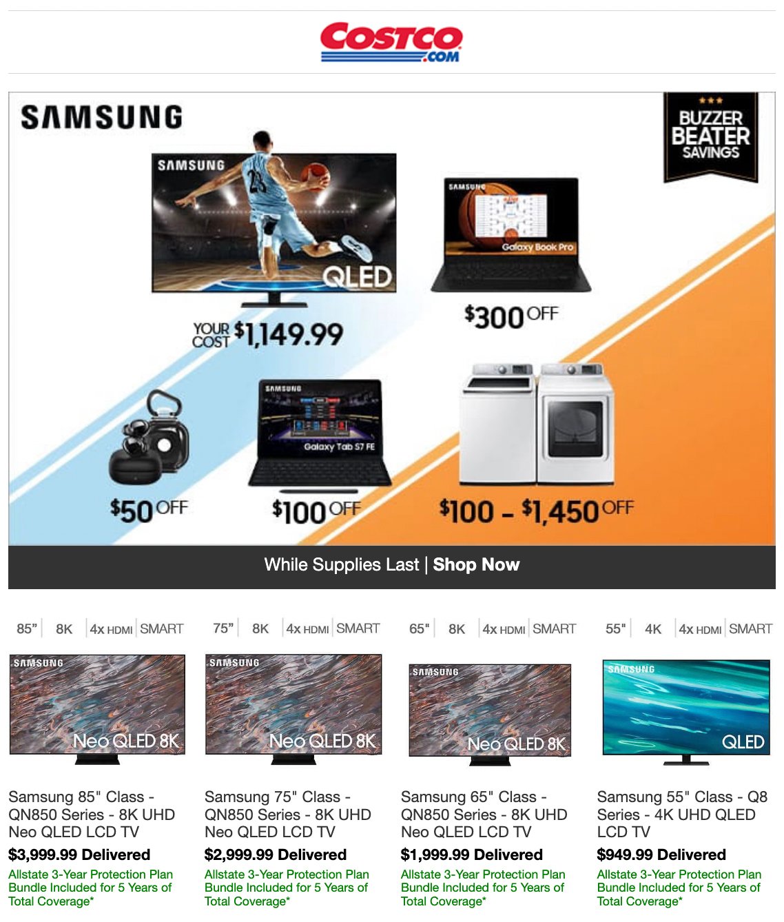
When purchasing high-ticket items, customers may need more time to decide and experience more objections. Costco gets that
Not only does this promo email announce attractive savings, but it also lists in green any warranty/protection policies for any customers who are still on the fence. This is a great way to address some last-minute objections that keep customers from purchasing.
12. Dell

Rather than offering a promo and special deal every other month, Dell clearly states that their special event only happens twice a year. This not only creates a sense of urgency but it also creates a sense of rarity that may prompt customers to jump now before they have to wait another six months for the chance.
13. EyeBuyDirect

In the email above, EyeBuyDirect introduces a special discount by playing with the idea of a forgotten anniversary. This type of promotional message is great for thanking loyal customers on their anniversary while encouraging them to spend more.
This email also does a great job of recommending products for this specific customer. This dash of personalization might prompt the customer to take them up on the offer. After all, 91% of consumers are more likely to shop with brands that provide personalized offers and relevant recommendations.
14. Fetch
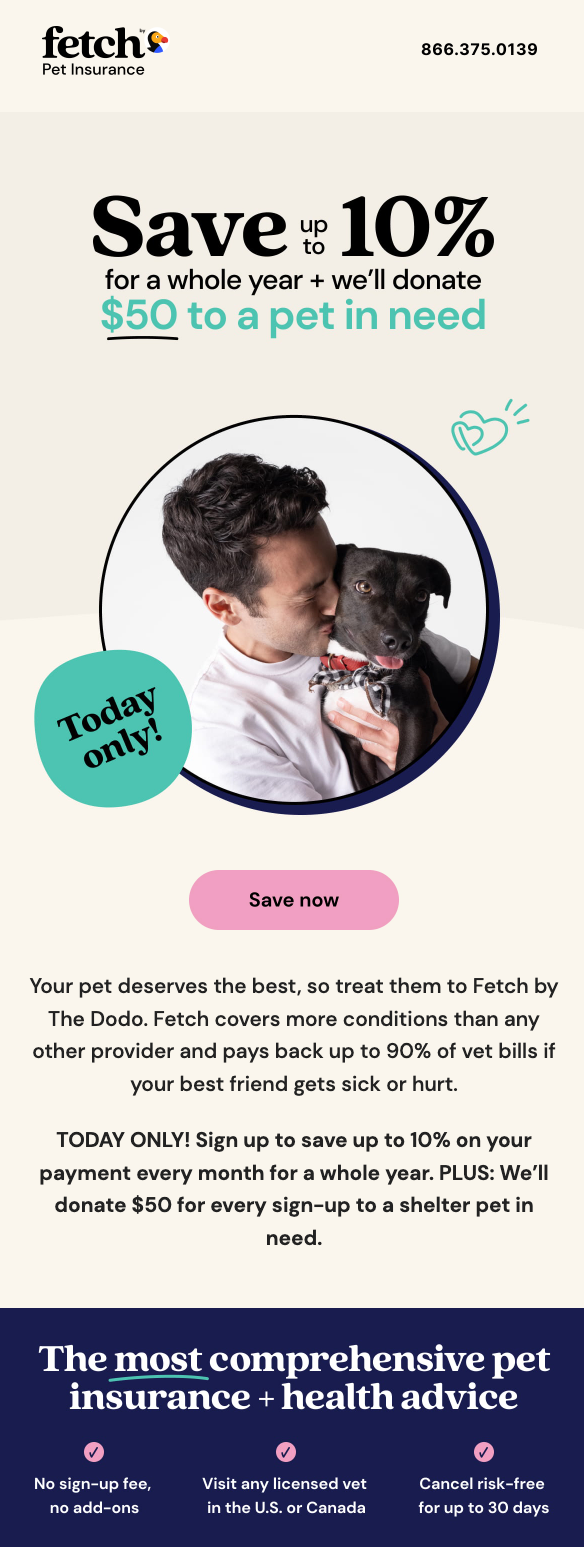
Sometimes, customers need more than just a great deal to convert. They need to feel compelled to act. In fact, one Harvard professor says 95% of purchase decisions are subconscious and fueled by emotion.
So this Fetch email does just that. It offers up to 10% off a subscription and an additional $50 donation to a pet in need. The email also includes an appropriate image that helps evoke a sense of emotion.
Fetch also refers to our pets as our best friends and includes wordplay in their CTA. “Save now” doesn’t just refer to cost savings but the potential pets that could be saved with the donations.
15. Grammarly
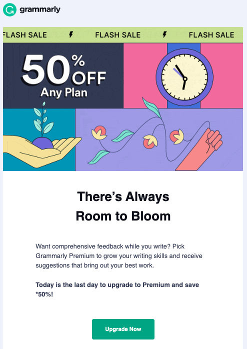
This Grammarly promo email perfectly balances wordplay with a clear CTA. The writing app outlines a compelling benefit (“grow your writing skills and receive suggestions that bring out your best work”) before urging customers to upgrade and save 50% before it’s too late.
16. Hilton
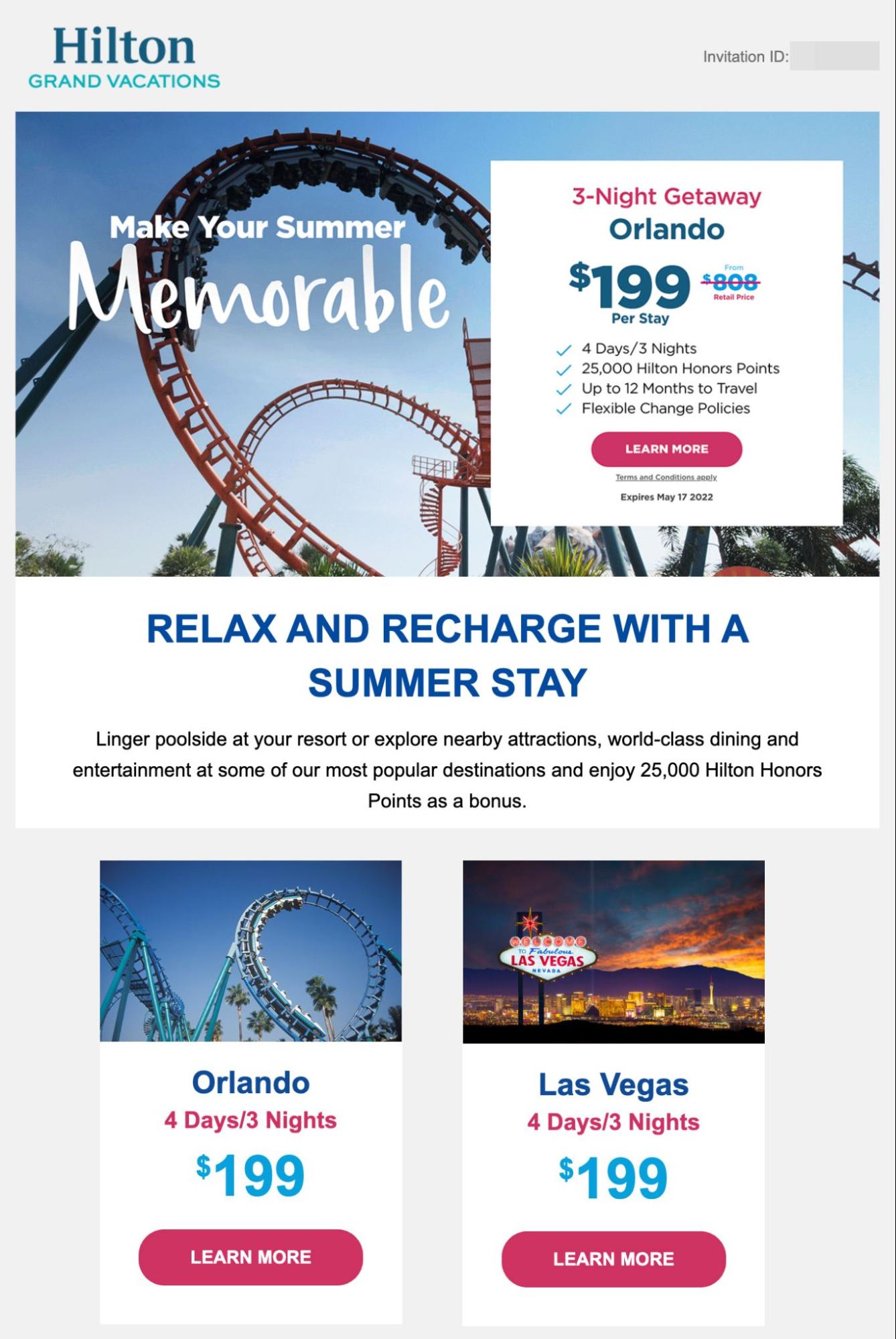
Hilton lists the sale price and the standard retail price in this promo email to show customers exactly how much they’d save with this vacation package deal. Then, to make the sale appear even more exclusive, Hilton includes a unique invitation ID in the top-righthand corner of the promo email.
17. IHG
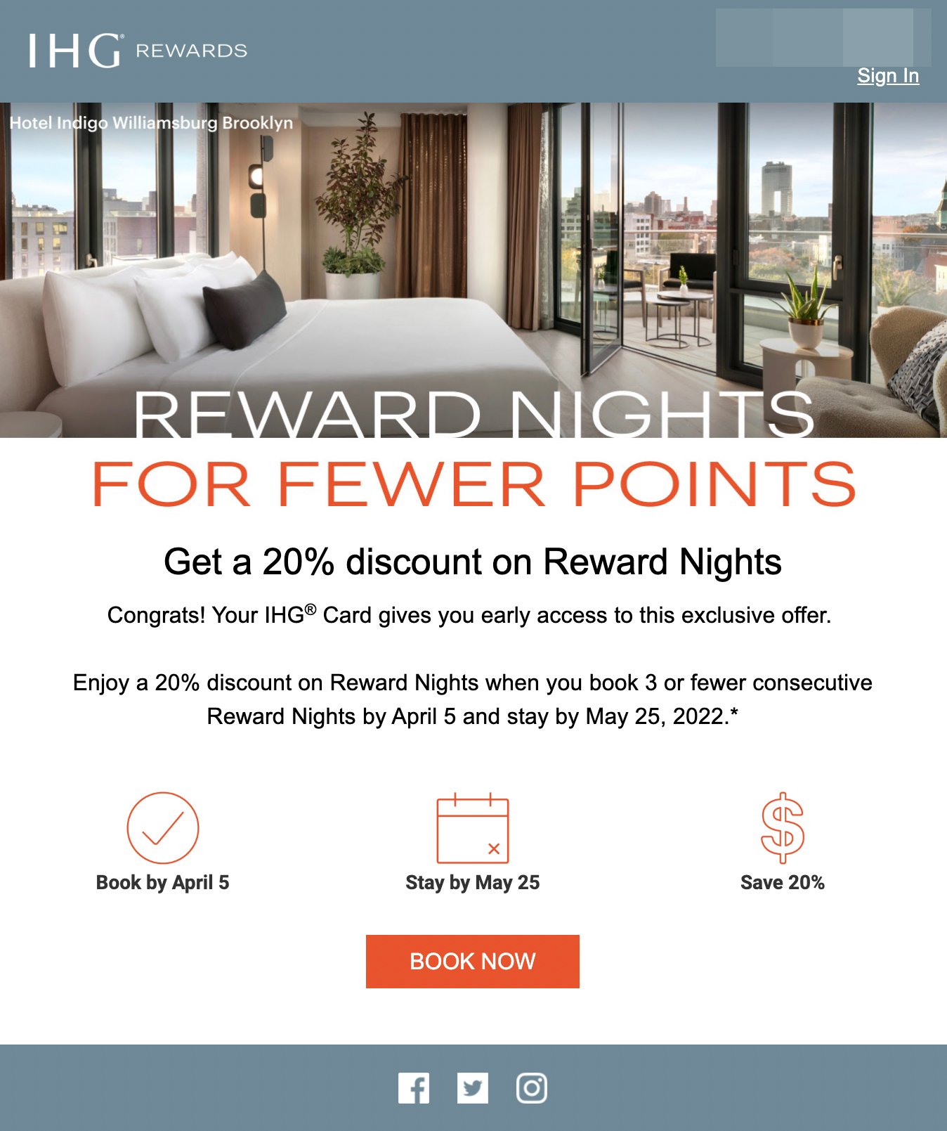
By offering early access for credit cardholders, IHG’s promo email makes a great deal even more irresistible. The three graphics make the deal's details easy to understand, while the hotel photo helps email subscribers visualize their travel experience.
18. Innisfree
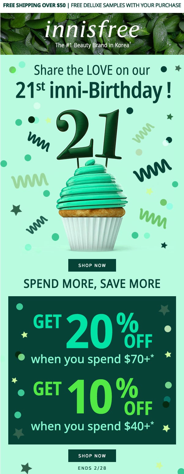
Innisfree makes its own anniversary a cause for celebration by offering special birthday pricing. The skincare brand provides a great incentive to buy more by extending extra savings for bigger shopping carts.
One note of constructive criticism: This email could benefit from a more prominent CTA button. A lot is going on in this promo email, and there’s a lot they do right. However, this is an example in which a CTA can be improved upon.
19. InsideTracker
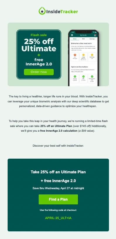
This InsideTracker promo email combines a discount with a freebie for a deal that subscribers won’t want to turn down. The email briefly outlines the subscription plan’s benefits before setting a deadline and dropping a bold CTA button.
20. LACMA
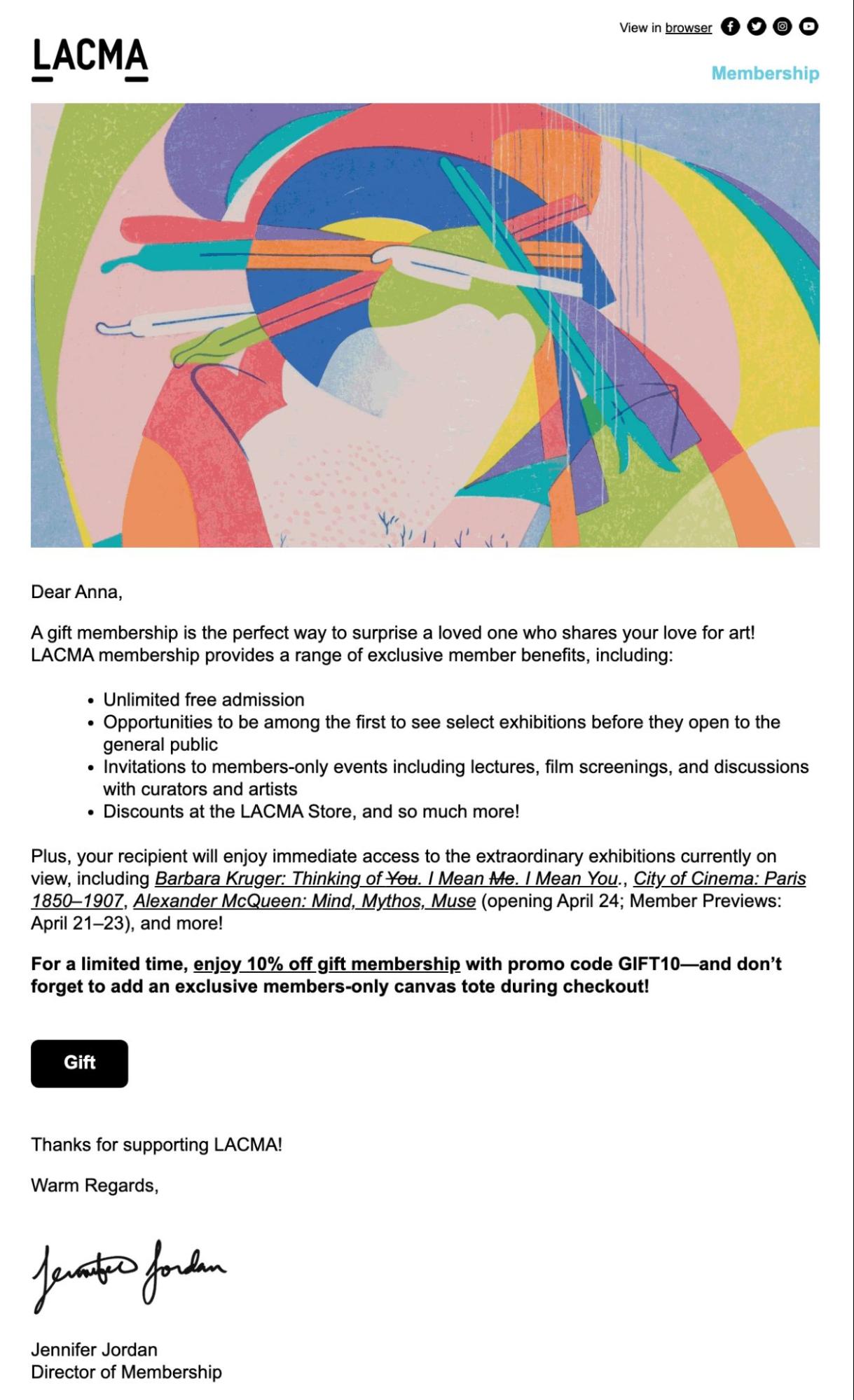
At first glance, this email design may look more like a personal message than most marketing campaigns. Yet it has all the critical components of an effective promo. LACMA’s handy bullet list highlights the benefits of museum membership, and the “Gift” button drives conversions.
21. Levi’s
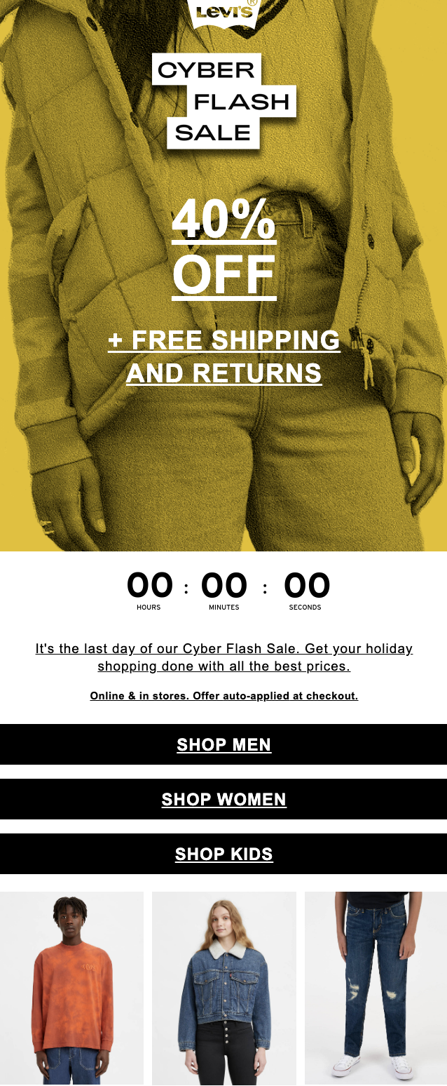
For Levi’s, urgency is the name of the game. The eCommerce email above places a countdown timer front and center to set expectations and mentions it’s the last day of the flash sale.
We also love the inclusion of three CTA buttons (all to shop and drive sales) for their broad audience segments (men, women, and kids).
This allows for a large email blast while still helping audiences shop for what’s relevant to them.
22. Madewell
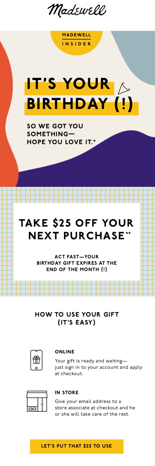
This Madewell promo email offers a fun way for recipients to celebrate their birthdays—by enjoying $25 off on their next purchase. Although the offer isn’t as time-sensitive as many promos, the email still clarifies an expiration date to encourage customers to act.
Plus, Madewell includes a very simple set of instructions on how to redeem the offer for any customers who need a little hand.
23. Moonbowls
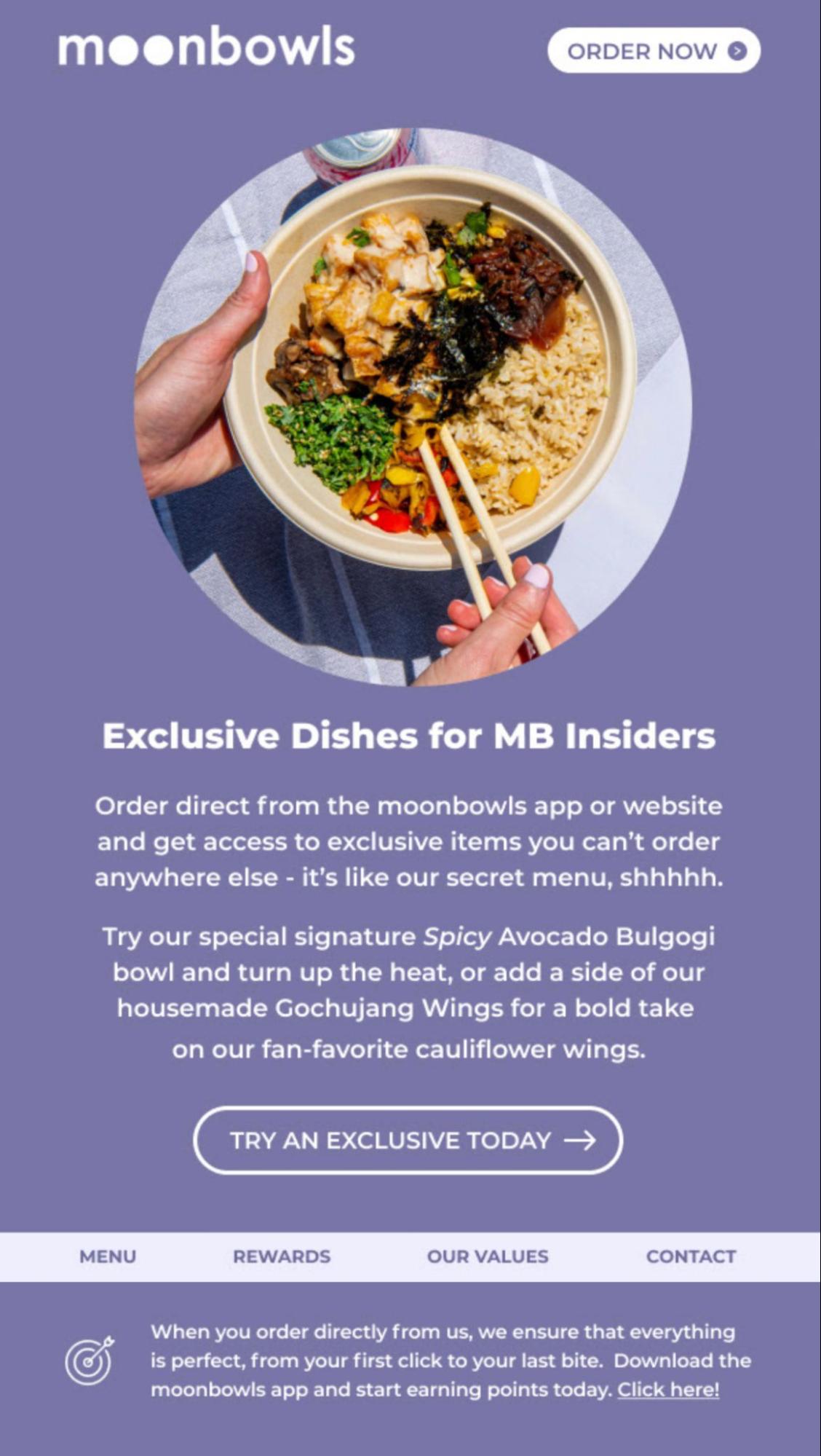
Who doesn’t love a secret menu? In the email above, Moonbowls teases “Exclusive Dishes for MB Insiders” before using the CTA “Try An Exclusive Today” to encourage customers to order.
This promo email is exclusive as all gets, and it’s an incredibly effective tactic.
24. REI Co-op
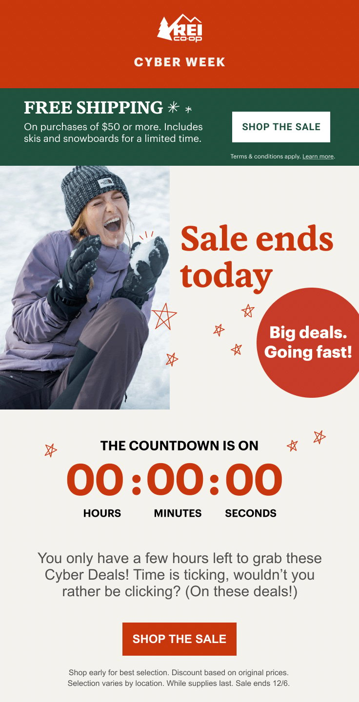
In its eye-catching holiday email design, REI Co-op combines limited quantity and limited-time tactics. This promo doubles down on these approaches with a countdown timer and email copy like, “Big deals. Going fast!”
25. Saks Fifth Avenue
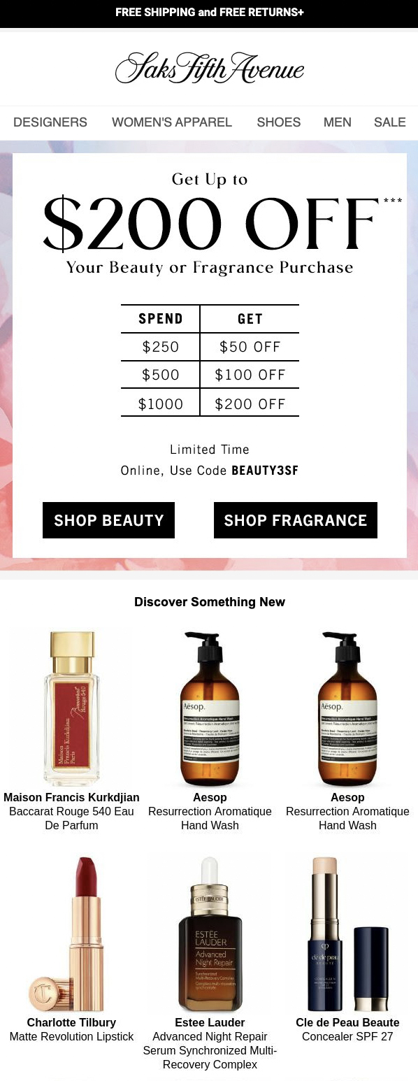
This Saks Fifth Avenue email easily captures attention with its “Get Up to $200 Off” promotion. The scaled savings incentivizes customers to spend more, but ultimately, this offer has an option for everyone.
We also love that the scaled savings are presented in an easy-to-read chart. It’s the little things like these that can often have a major impact.
Plus, this email takes the chance to cross-sell with its “Discover Something New” section at the bottom.
26. Tailwind

With its first-person CTAs, Tailwind’s promotional email campaign takes a slightly different approach. From “Get my discount!” to “I want all that for 50% off now!” these CTAs make the social media scheduling app’s discount sound much more personal.
27. TradingView
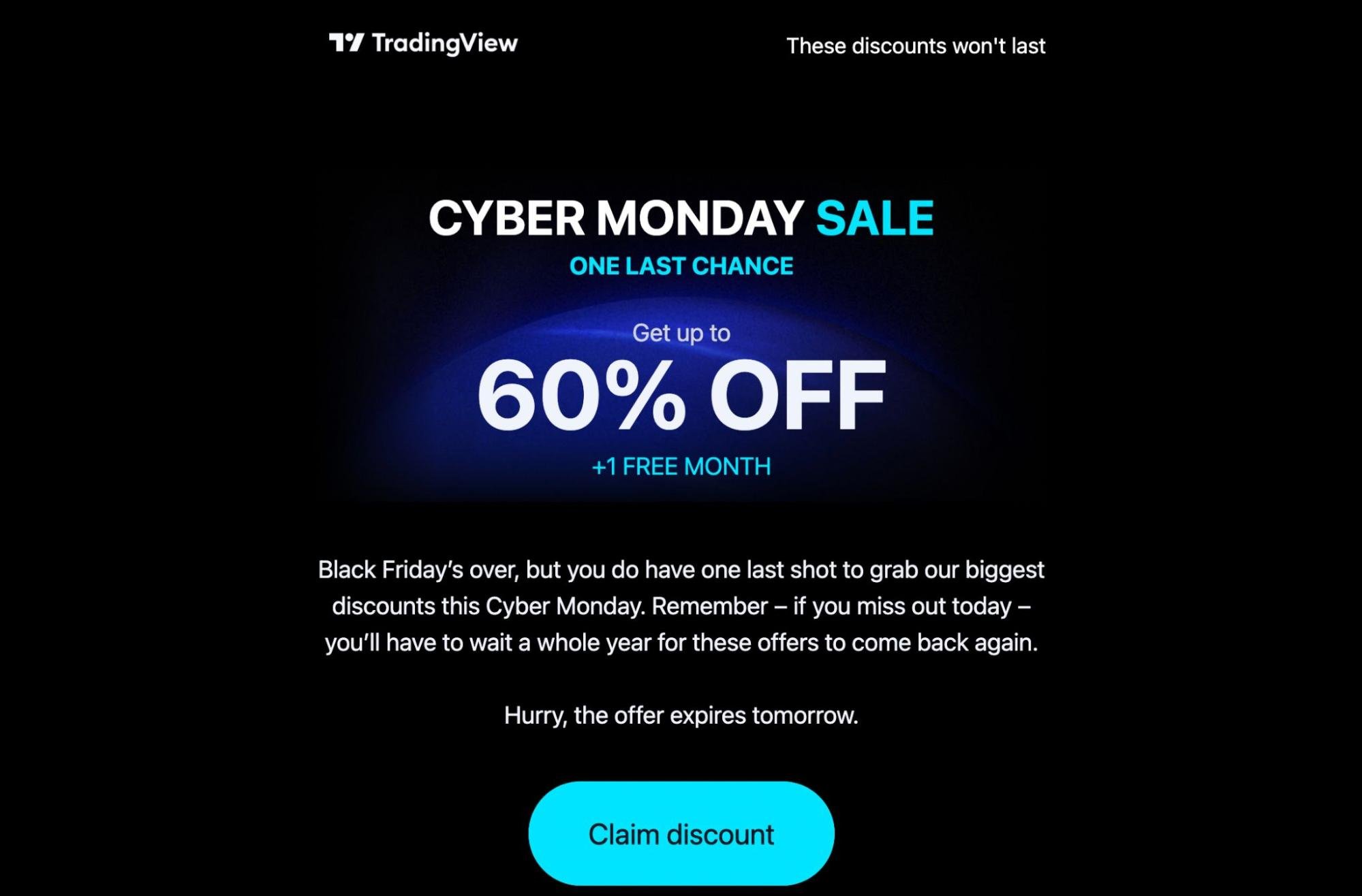
In many cases, it’s easy to assume that another sale is right around the corner. TradingView’s email clarifies that this promo is available for a limited time and that it won’t be available again for an entire year—prompting subscribers to take advantage of a rare opportunity.
28. U-Konserve
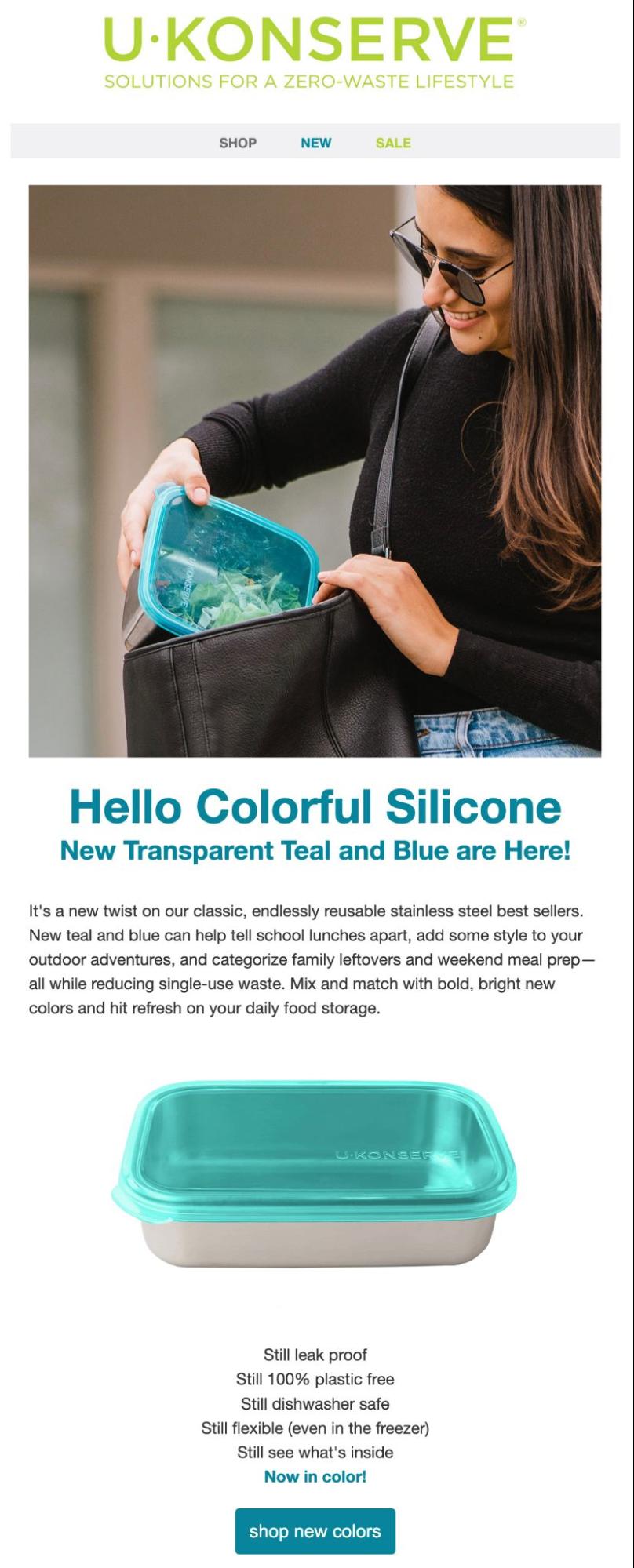
This U-Konserve email is packed with benefits. The email introduces the company’s new product line by explaining that it can help “tell school lunches apart” and organize “weekend meal prep” while still meeting customers’ primary goal: “reducing single-use waste.”
We also love the high-quality image of the product in use. This is an easy and excellent way of helping customers envision themselves using the new reusable food storage containers.
29. Uber One
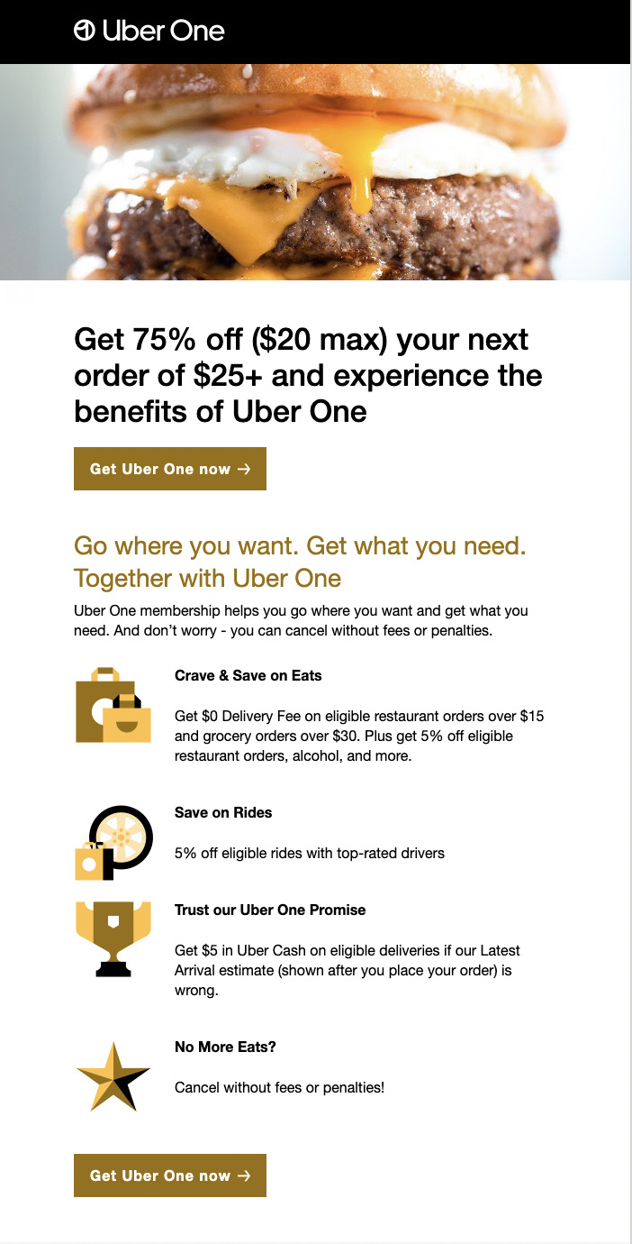
Selling a VIP program is a little easier when an incentive is involved. This Uber One promo invites customers to “experience the benefits of Uber One” while saving 75% off their next order. The email also includes multiple CTA buttons to maximize conversions.
Not to mention that drool-worthy image of the burger… Anyone else hungry?
30. Universal Yums

A 50% discount is a great deal, so it’s no surprise that this number gets premium real estate in the Universal Yums sale promo above. To boost sales, the email lists a few customer favorites right below the “Shop Now” CTA.
To sweeten up the deal even further, this promo email is jampacked with high-quality images of their delicious chocolate.
31. U.S. Small Business Administration (SBA)
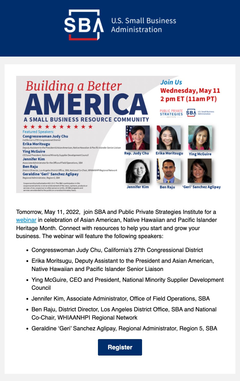
When you have an online or in-person event to promote, a well-timed email can help you reach your goals. This U.S. SBA email above highlights a webinar featuring an impressive speaker lineup, using a simple “Register” CTA to drive attendance.
Notice the use of real images of their featured speakers, too. This is a subtle touch and adds a layer of personability to the email.
32. WeWork
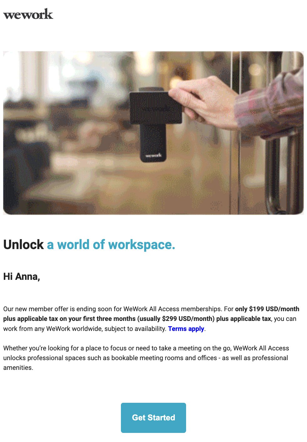
For cost-conscious customers, price comparison can make a huge difference. This WeWork email promotes a membership offer by highlighting the difference between the full price and the sale price. To encourage subscribers to act, the email cautions, “Our new member offer is ending soon.”
Take note of the subtle personalization, too. This email directly addresses the recipient by first name before detailing the offer.
33. Wild One

This promotional email from Wild One offers a flash sale with a coupon code. The brand seamlessly creates FOMO by making it clear that walk kits rarely go on sale—meaning customers should take advantage while they can.
This email also excellently leverages some of the cutest photos of their products in use. All in all, it’s pretty hard to say no to, isn’t it?
34. Zwilling
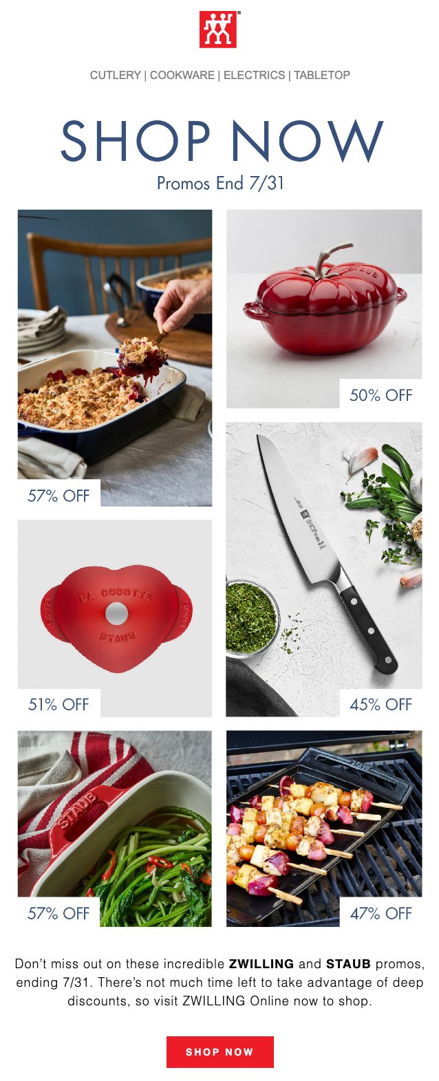
This Zwilling email cuts straight to the chase.
Things. Are. On. Sale.
It also uses all caps to grab attention and clearly states when exactly the sale ends. The unique savings on various items give customers plenty of options to consider, while the limited-time offer prompts them to act quickly.
Whoever said simple was a bad thing?
Start driving sales with promotional emails
Promotional emails are critical for generating conversions, securing sales, and increasing revenue. To optimize the value your business gets from promo emails, you need a strong email marketing strategy.
No time to manage it in-house? An experienced email marketing team can develop a winning strategy for your business.
Sigh, if only we knew of an experienced email marketing team…😉