There are a lot of things you can do to improve your landing page’s conversion rate.
Some of these strategies require a serious time, monetary investment, or maybe to hire a conversion rate optimization agency.
Others can be done quickly and painlessly while still achieving notable results.
Today, we are focusing on the latter.
Here are 11 painless strategies for increasing your landing page conversions.
Get brand new landing page strategies straight to your inbox every week. 23,739 people already are!
1) Improve PPC Targeting
The rest of this list will be devoted to on-page techniques, but I wanted to start off with a reminder that the best landing pages can’t do squat with low-quality traffic.
If someone offered to let me test-drive a 2015 Toyota Prius for a full month, I’d consider that a pretty sweet, even irresistible offer.
Make that same offer at a hardcore biker gang rally, however, and you probably won’t get the same conversion rate you could expect elsewhere.
Traffic quality is a big deal, and you should always be optimizing for quality over quantity, ESPECIALLY when using paid traffic acquisition channels like pay-per-click ads.
2) Simplify UX
Everyone knows user experience is important, but too often, “important” simply translates to, “are all the bugs fixed?”
Unfortunately, you can have a terrible UX setup without a single bug.
One of the biggest keys to conversion is simplicity.
Your goal is to take visitors from Point A to Point B, and that path should be as direct as possible.
One easy way to do this is to remove your navigation menu.
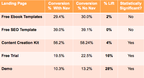
HubSpot tested this strategy out with 5 landing pages, and found that all 5 saw a CRO increase after removing navigation.
As you can see in the above table, the CRO increase was fairly slight for lead magnet pages, but was incredibly impactful for HubSpot’s “Middle Of The Funnel” offers, where customers were being sold on testing out a premium product.
Think simplicity with your UX.
3) Minimize Conversion Friction
In a similar vein to simplifying UX, it’s important to minimize friction within the conversion offer itself.
What does this mean?
For a higher CRO, you want to make the actual conversion process as simple, easy and straightforward as possible.
- If “conversion” means a purchase, you want to minimize the number of clicks required for a successful purchase.
- If “conversion” mean an email subscription, you want to make that process type, click, and done.
- If “conversion” is a phone call, you want someone waiting to answer that specific phone call. No transfers. No holds (if possible). Call. Speak. Done.
The simpler the conversion process is, the less users you will have bailing mid-conversion.
4) Include Credibility Signals
One of the potential shortcomings of direct-response marketing is that often, users reach your landing page without context for your offer or trust in your brand.
Good copy can quickly create the proper context, but there simply isn’t time to build trust in your brand.
While we can’t build trust ourselves, we CAN tap into the power of brands that already hold our audience’s trust.
We can also establish credibility by leveraging social proof or citing actual customer results, complete with testimonials from those customers.
All of these strategies are signals of credibility that serve to build trust with newcomers to our website.
You might not go on many blind dates, but if someone you really respect gives you a glowing recommendation, you might be willing to give it a shot.

The same is true for potential new customers viewing your brand for the first time.
5) Narrow Your Target Audience
Since I enjoy building on my own examples, let’s stay in the dating world for a second.
You see an intriguing woman and decide to ask her out.
How do you go about it?
Well that depends on what you know about the woman.
- Is she into games or does she prefer that you get to the point?
- Does she want to be surprised or does she want tradition?
- Is she looking for ambition or a care-free attitude?
The more you know about this woman, the better your chances are of approaching her in a way she will appreciate.
Let’s say this woman will only respond to a guy who is direct, traditional, and ambitious.
Even if you are the optimal traditionalist, that might not be enough to win her over.
You have your best chance of being successful if you are communicating exactly what she is looking for, which requires you to have a very specific, narrow approach.
The same is true of your landing page.
The more you know about your customers, the better, and the narrower your target segment, the more specific you can be.
Remember that despite the numbers game that is sales, you have to be able to close individual people.
You are aiming at percentages.
You are aiming at specific people with specific needs.
The more you narrow your audience, the more specific you can be.
6) Create Urgency
We are most likely to do something when it has to be done NOW.

Creating urgency is key to any landing page offer.
This is why you’ll often see timers counting down on a given landing page.
Come back tomorrow and the timer has simply reset.
It’s a form of manufactured scarcity, but in the end, it works.
Marcus Taylor offers one striking example via ConversionXL.
He A/B tested two different frames on his offer landing page.
The 1st version had no urgency “built in”.
The 2nd version had two urgency-inducing segments installed as well as a social proof segment indicating how many people had already purchased the offer.
The 2nd, urgency inducing version had an incredible 3x higher conversion rate than the first.
As Marcus is quick to point out, urgency ONLY works if all the components of a good landing page are in place.
If you do have a solid landing page, however, creating urgency is painless way to instantly increase your conversion rate.
7) Increase Clarity
Clarity is a mandatory attribute of any landing page.
Vague doesn’t sell.
Curiosity can create exposure but it won’t drive 99% of sales.
The simplest thing you can do to immediately increase conversions on your landing page is to go through your copy and increase the clarity.
The results speak for themselves.
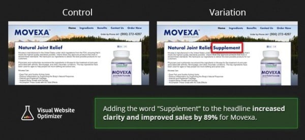
Clarifying that this product was a supplement increased sales by 89%.
Veeam Software increased their conversion rate by 161% by changing “Request a quote” to “Request pricing”.
A one word change for increased clarity more than doubled conversions.
Increase clarity. Increase conversions.
8) Eliminate Distractions
Nothing should be distracting users from YOUR goal.
If a feature of your site isn’t facilitating conversion, it probably shouldn’t be there.
These distractions can include internal links, needless applications, visual elements, extraneous copy, or even additional product offers.
Every page should be targeted at a single primary outcome.
As I mentioned in point #5, the narrower your audience, the more likely you are to reach them.
Go through your landing page and stop at each element, asking yourself, is this necessary?
Does this move my readers toward conversion?
If the answer is “No”, consider removing it.
If you feel the segment is essential to your page, ask yourself how you can reframe it to facilitate your ultimate conversion goals.
9) Increase Page Load Speed
Sometimes the simplest solutions are the best.
A slow loading site can single-handedly destroy your conversion rate:
- Nearly half of web users expect a site to load in 2 seconds or less.
- Nearly half of web users tend to abandon a site that isn’t loaded within 3 seconds.
- 79% of web shoppers who have trouble with website performance say they won’t return to the site to buy again.
- Around 44% of web shoppers would tell a friend if they had a poor experience shopping online.
Improve your site speed for increased conversions right now!
How do you do this? Here are some ways to improve:
- Caching
- Using compressed files
- Cleaning up CSS
- Optimizing images
If bounce rates weren’t significant enough for you, Google has announced that site load time actively affects your rating in its SERPS.
You can’t afford to leave this one out.
10) Think Mobile
Mobile traffic is at an all time high.
Time spent in the US on mobile media is now 21% higher than on desktop.
You may have optimized your landing page for desktop, but what good will that do when over half your readers are on their phones?
Mobile requires a different approach than desktop due to the significant size constriction.
You need to be thinking mobile.
Fortunately, mobile-optimized landing pages don’t have to be difficult.
Think shorter headlines and linear flow.
You can utilize the same basic segments used in your desktop version, but be sure to keep text even shorter and snappier than ever, or you’ll be disappointed with the results.
11) Add A Money-Back Guarantee
One of the biggest obstacles users face when evaluating a new purchase is “what if it doesn’t work?”
People aren’t typically afraid to invest in something that will solve their problems.
But we are all too often afraid that the products we invest in will prove incompetent in the end and we will have wasted our hard earned dollars.
By adding a money-back guarantee, you can assuage the fears of your more economical customers.
This guarantee does just that - it guarantees them that worst-case scenario, they will receive their money back having only wasted their time.
A guarantee also serves to increase credibility, as few businesses would offer a money-back guarantee if they didn’t firmly believe in their product.
A guarantee says, “I’m so sure you’ll love my product, I’m willing to bet the product itself that you’ll keep it."
I personally have bought several products online that I would not have bought without a guarantee.
Some were used. Some were returned.
But NONE would have been purchased without a money-back guarantee.
So, a landing page should take readers on a journey - from blind visitor to converted user.
If you make things too complicated along the way, you’ll lose people.
If you make things too distracting, you’ll lose people.
If you are targeting too broad an audience, you’ll be ineffective at reaching anyone at all.
The more simple, clear, and straightforward you can make your website or landing page, the better it will be at converting.
Follow these 11 tips to painlessly increase your landing page’s conversion rate:
- Improve PPC Management Targeting
- Simplify UX
- Minimize Conversion Friction
- Include Credibility Signals
- Narrow Your Target Audience
- Create Urgency
- Increase Clarity
- Eliminate Distractions
- Increase Page Load Speed
- Think Mobile
- Add a Money-Back Guarantee
Are you going to implement any of these strategies into your landing page? We wanna hear :) Let us know in the comments below!
P.S. Did you learn something new? Share it with your followers so you look even smarter ![]()


