You know that feeling when a Facebook ad campaign reaches your goals (barely), but you know that with a few tweaks, it could have delivered much better results?
From the creative to the copy to the targeting, it isn’t always easy to figure out which parts of your ads need work.
But with these Facebook ad tips, you’ll find out exactly where to focus your energy to get bigger wins.
Let’s dive in.
- 1. Lay the groundwork and find inspiration
- 2. Become a master A/B tester
- 3. Write an irresistible headline
- 4. Keep your ad headline short
- 5. Experiment with testimonials
- 6. Create a compelling value offer
- 7. Ask the right questions
- 8. Create a sense of urgency
- 9. Offer a prize, and make it a good one
- 10. Use a cliffhanger
- 11. Use numbers
- 12. Use power words
- 13. Address key objections
- 14. Use social proof
- 15. Show your expertise
- 16. Fall in love with FOMO
- 17. Give it away for FREE
- 18. Use clear calls-to-action (CTAs)
- 19. Play on people’s emotions
- 20. Use exclamation marks!!! (and emojis 🤩)
- 21. Keep it simple
- 22. Include a price point
- 23. Create seasonal campaigns
- 24. Keep your head (and ad quality) high
- 25. A/B test to find the perfect creative
- 26. Explore your audience insights
- 27. Tinker with custom audiences
- 28. Granulate your audiences over time
- 29. Experiment with different ad types
- 30. Use complementary colors
- 31. Master the psychology of color
- 32. Be careful with stock images
- 33. Start using carousel ads
- 34. Be consistent with your ad design
- 35. Use location-specific ads
- 36. Be the right amount of fun
- 37. Show your product in your ad
- 38. Use visual contrast
- 39. Let your ads tell a story
- 40. Use videos instead of images
- 41. Optimize video ads for sound-free viewing
- 42. Get to your point quickly
- 43. Surprise people
- 44. Test your ad placements
- 45. Find your core audience
- 46. Test new bidding strategies and methods
- 47. Never, EVER stop split testing
- 48. Master the anatomy of a Facebook ad
- 49. Leverage other platforms to compound your Facebook wins
- Put your Facebook advertising expertise to work
Get brand new Facebook ad strategies straight to your inbox every week. 23,739 people already are!
1. Lay the groundwork and find inspiration
After creating hundreds of Facebook ad campaigns, we’ve found that a brainstorming session can make all the difference between a successful ad and one that misses the mark.
When you set aside time for brainstorming and research, you get a chance to spy on the competition, gather inspiration, and add your organization’s unique touch.
My two favorite places to seek inspiration? Our roundup of 200+ Facebook ad examples and the Facebook (Meta) Ad Library.
If you're ready to start generating great Facebook ad ideas now, try answering these questions:
Five questions to inspire Facebook advertising creatives
- What UVP (unique value proposition) or offer are you promoting?
- What are the best examples of ads that have a similar message?
- Are other organizations doing something well that you might have overlooked?
- What are your competitors doing better than you in terms of marketing and design?
- What successful examples could you apply to your next ad campaign?
After your brainstorming session, highlight the best ideas and use them as a reference for developing your creatives and guiding your copywriting.
It’s also helpful to keep a running list of potential ideas. Later on, the ideas that didn’t initially make the cut can guide future A/B testing or help combat ad fatigue.
2. Become a master A/B tester
When testing Facebook ads, it pays to be patient.
Checking your Facebook A/B test results immediately after publishing, for example, is a recipe for disappointment. The more ad variations you have, the more impressions you need to gather for the results to be statistically significant.
Here’s a great article by ConversionXL explaining how to get statistically valid A/B testing results.
Facebook A/B testing best practices
- Get at least 10,000 impressions and 100 conversions per ad variation before drawing any conclusions.
- Don’t just go with your gut. Use this calculator to determine if your split test results are valid or not.
- Remember that a lower cost-per-click (CPC) does not automatically mean a lower cost-per-conversion.
- Evaluate your A/B tests by the final conversion in the funnel, and use cost-per-conversion as the key metric.
3. Write an irresistible headline
Many people will only see your headline and never bother to read the rest of your Facebook ad. Even still, a great headline can make a huge difference in your click-through rate (CTR) and conversion rate.
So how can you improve your headlines and get better results? With split tests, you can determine what kind of language and messaging gets people to click and convert.
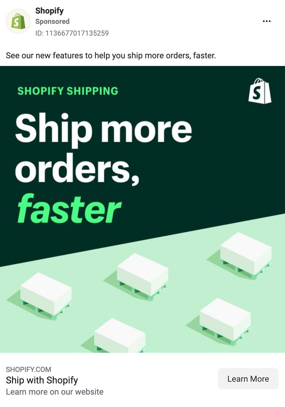
Here's a pattern we’ve noticed. The best results deliver the same message in the copy, creative, and headline text. Sometimes they even repeat the same things in different words.
Take a look at this Facebook ad example from Shopify. All three components repeat a similar message, effectively driving the point home:
4. Keep your ad headline short
According to Copyblogger, 80% of readers never make it past the headline.
The shorter and catchier you keep your Facebook ad headlines, the more likely people are to read them.
In fact, HubSpot recommends headlines with 25-40 characters to earn the highest click-through rates.
Short headlines work because they deliver a compelling message in a compressed format. To condense headlines, think about what really matters to your audience.
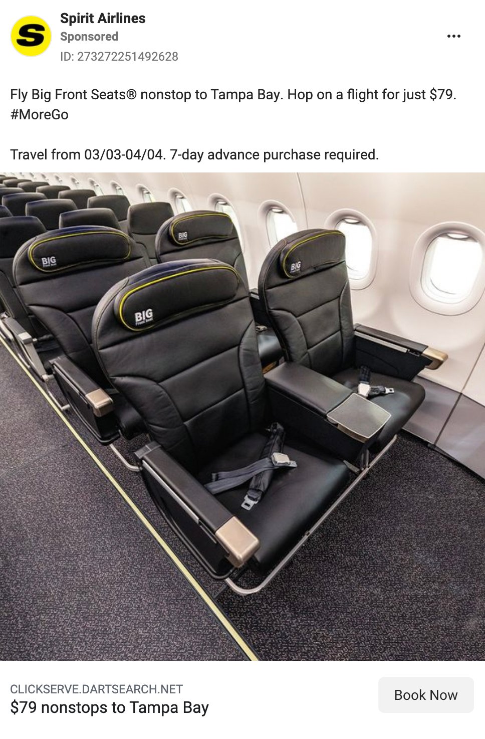
Here’s a good example by Spirit Airlines. The headline “$79 nonstops to Tampa Bay” is concise and includes a number to deliver key information efficiently.
5. Experiment with testimonials
According to Semrush, recommendations (even from a stranger) make 90% of people more likely to trust a brand.
A Qualtrics article also reveals that 93% of consumers read reviews before buying.
We’re going to really drive this point home: an A/B test from ConversionXL compared landing pages with and without testimonials and ultimately confirmed that the page with testimonials drove 34% more conversions.
It’s safe to say that client testimonials can bring a substantial increase in sales. Next time you’re brainstorming ad copy, it’s a good idea to include a client testimonial in the primary text.
6. Create a compelling value offer
A good value offer always boosts the CTR of your ads.
Of course, creating a compelling offer is easier said than done. To get people to click on your ads, you need to offer something awesome in exchange.
In other words, showcase the benefits of using your product.
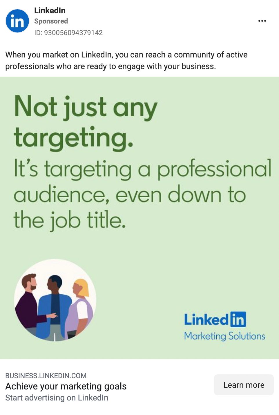
The LinkedIn ad above makes an irresistible offer. I can reach an engaged community, build the ideal target audience, and achieve my marketing goals? I’m in.
7. Ask the right questions
Humans are curious creatures.
And if you manage to ask them the right question, they’ll also be curious to learn more about your offer.
Check out this awesome example by Moz:
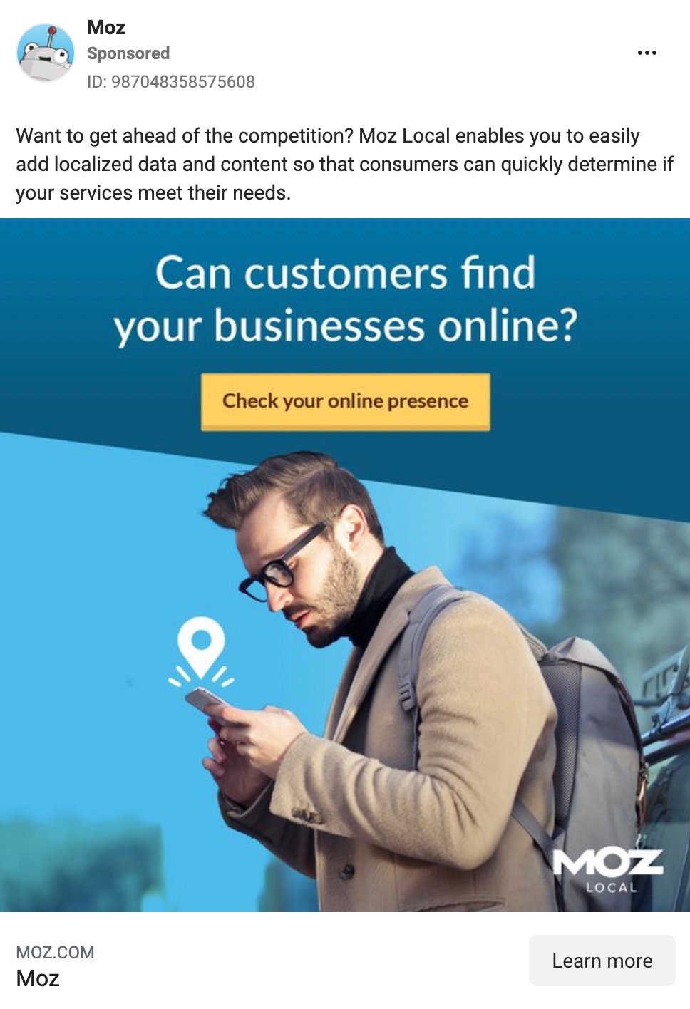
This ad is so good because it hooks business owners with a question they’ve likely asked themselves. It also offers a solution to a complex problem: improving visibility online.
Experiment with asking questions that your target audience wants answered. Don’t forget to provide the answer on your landing page.
8. Create a sense of urgency
If people have unlimited time to ponder a purchase, they’re likely to postpone the decision and potentially forget about it.
That’s why you need to create a sense of urgency.
If you doubt this method’s efficiency, read this. Using scarcity and urgency helped an entrepreneur increase sales by 332%.
Here’s an A/B test ConversionXL ran. Variation A included a discount offer and plain text, while Variation B showed a timer counting the time left until the end of the deal.


As the team gradually rolled out variation B to all users, the site’s conversion rate went from ~3.5% to ~10%.
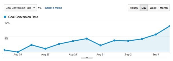
So what’s the lesson? People can’t resist a good offer when the time’s running out.
9. Offer a prize, and make it a good one
Someone who already likes your product but is hesitant to commit to a long-term relationship might need a tiny nudge.
A nudge helps your prospect take the next step you need them to make.
And often, the best nudge you can provide is a prize.
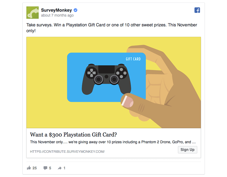
SurveyMonkey wants you to take their surveys. And in return, they’re offering a chance to win a $300 Playstation gift card.
That’s just a big enough nudge to engage people who were already interested in your offer in the first place.
Test prize offers in remarketing campaigns and ads with a low commitment barrier.
10. Use a cliffhanger
This hack works best in ads promoting your ebooks and blog content.
The cliffhanger.
A cliffhanger is an information gap that people can’t help but explore.
George Loewenstein's “information gap” theory suggests that
“[P]eople become curious upon realizing that they lack desired knowledge; this creates an aversive feeling of uncertainty, which compels them to uncover the missing information.”
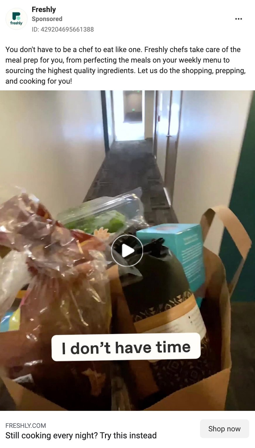
The recipe for an effective cliffhanger is simple: tell people an awesome story but leave the best part untold (until they can’t help but click on your ad to find out the rest).
11. Use numbers
You’ve probably heard that numbers work well in headlines.
But how big of an impact does using a number actually have?
After studying his articles’ engagement, one blogger found that posts with a number in the headline got 2.5 to 8 times more traffic (and more referrals from sites like Digg or Stumble).
This increased engagement could save you thousands of dollars in ad spend.
ConversionXL also pointed out that when given multiple options, 36% of people preferred a headline starting with a number.
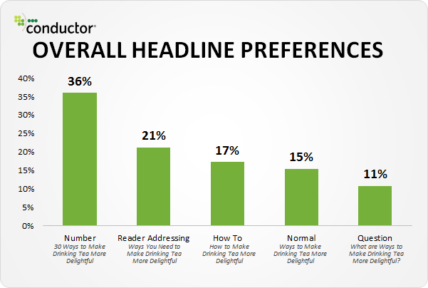
Numbers work best if they’re at the beginning of your ad headlines.
Some numbers to use in your Facebook ads include
- discount amount
- free trial length
- number of happy customers
- number of points in a list
12. Use power words
Using the right words in your ad copy is a great way to get people to act.
Your Facebook advertising can always benefit from a couple of power words.
David Ogilvy, the advertising Grand Master, curated a list of influential words that are still relevant today.
What are they? Glad you asked.
- suddenly
- now
- announcing
- introducing
- improvement
- amazing
- sensational
- remarkable
- revolutionary
- startling
- miracle
- magic
- offer
- quick
- easy
- wanted
- challenge
- compare
- bargain
- hurry
13. Address key objections
You know the feeling when you’re strongly considering a purchase, but you have some lingering doubts?
Maybe it’s because you’re unsure if the product will really address your problem. Or perhaps you aren’t sure it’s worth the investment.
These doubts are objections.
As a marketer, it’s your job to address them and help your target market overcome them.
Here’s an example of how Blue Apron addresses common customer objections:
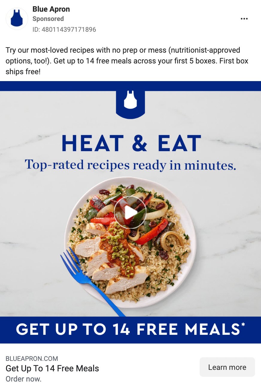
You can conquer three common objections with the right ad copy. For instance:
- "I don’t have the time right now." State how quickly users can convert (e.g., “Set up a trial account in 2 minutes.”).
- "I’m not sure whether it’s worth my money." Give something away for free (e.g., “Get your 14-day free trial.”).
- "I don’t know if I can trust you." Show social proof (e.g., “200 happy clients trust us with their PPC campaigns.”).
14. Use social proof
When your target customer sees a Facebook ad from your company, they may not know whether to trust your brand or your offer right away.
A straightforward way to convert doubtful customers is to use social proof.
Positive engagement—such as comments, reactions, and shares—all provide social proof and help your brand build credibility.
What’s one way you can capture all that social proof? Use Facebook dark posts to capture engagement and convince more customers.
Need some more great examples of social proof? Check out our blog to get the inspiration you need.
15. Show your expertise
If you’re in a competitive industry, your potential customers might also be seeing your competitors' ads.
That means that you need to convince people that you’re the best in the business.
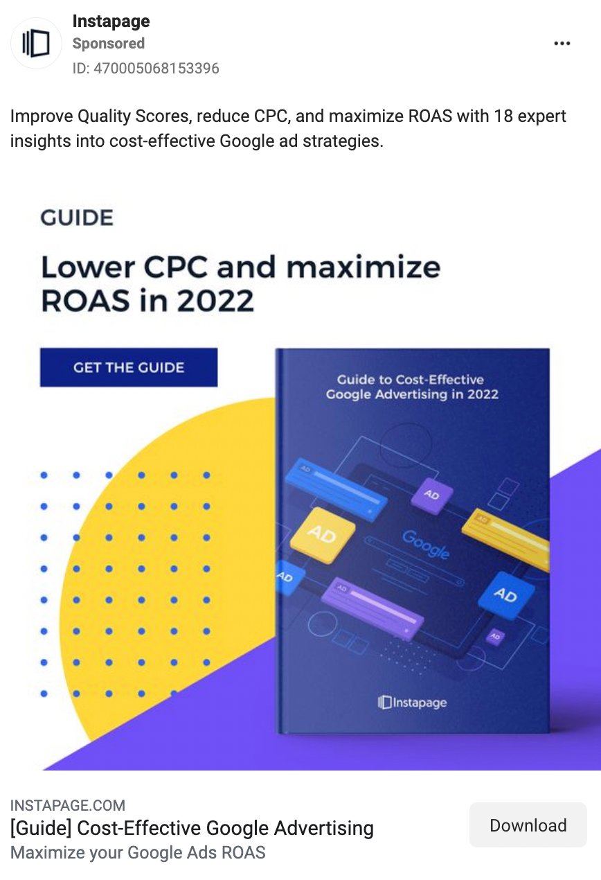
A great way to earn people’s trust is to show your expertise in your product-related field (think of it as content marketing in Facebook ads).
Here’s an interesting ad example by Instapage:
16. Fall in love with FOMO
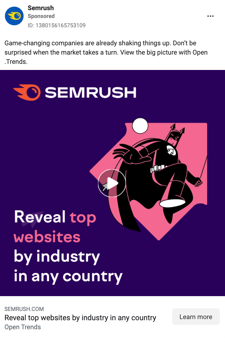
This hack rests on people’s “fear of missing out” on cool things, or FOMO.
To make FOMO work for you, write Facebook ad copy that makes your audience think everyone else is already using your product or service—and they’re the last ones to get on board.
You can easily play on people’s FOMO by using ad copy such as “20,000 teams across the world already use Slack” or “Only 300 pieces left.”
Nobody wants to be left out, and good marketers know how to play on this emotion. This Semrush ad does exactly that.
17. Give it away for FREE
“I hate free stuff.” (Said no one ever.)
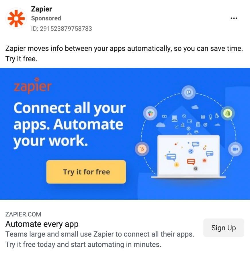
Free giveaways or a free trial period are great ways to get people to engage with your product.
Later, if they like what they saw, they’re more likely to switch to a paid version.
For example, Zapier makes it easy to get started with the automation app for free.
18. Use clear calls-to-action (CTAs)
According to Wingify and ConversionXL, almost 30% of all A/B tests marketers run are CTA button tests.
Only one in seven A/B test campaigns produces a statistically significant improvement. Those that do, however, generate a 49% increase on average.
That means choosing the right CTA can make a huge difference in your Facebook ad campaign results.
The best place to put your CTA is in the ad’s headline, as that’s where people are most likely to see it.
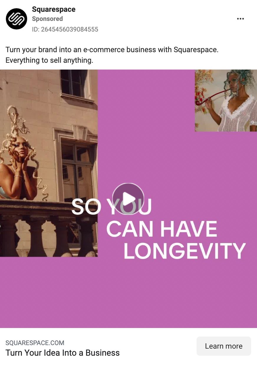
But it’s also helpful to reiterate the CTA at the beginning or end of your ad copy, just like Squarespace has done.
You can write effective call-to-action text if you
- use an action verb
- make it relevant to your offer and audience
- be specific about the benefits
19. Play on people’s emotions
Don’t get us wrong.
We’re not implying that you should become a master manipulator to create ads that convert.
But when neuroscientist Antonio Damasio studied people with damage in the part of the brain where emotions are generated, he made a fascinating discovery.
People who can’t feel emotions can’t make decisions.
Emotions are a crucial part of our decision-making process. And you’ll want to use this knowledge when creating Facebook ad campaigns.
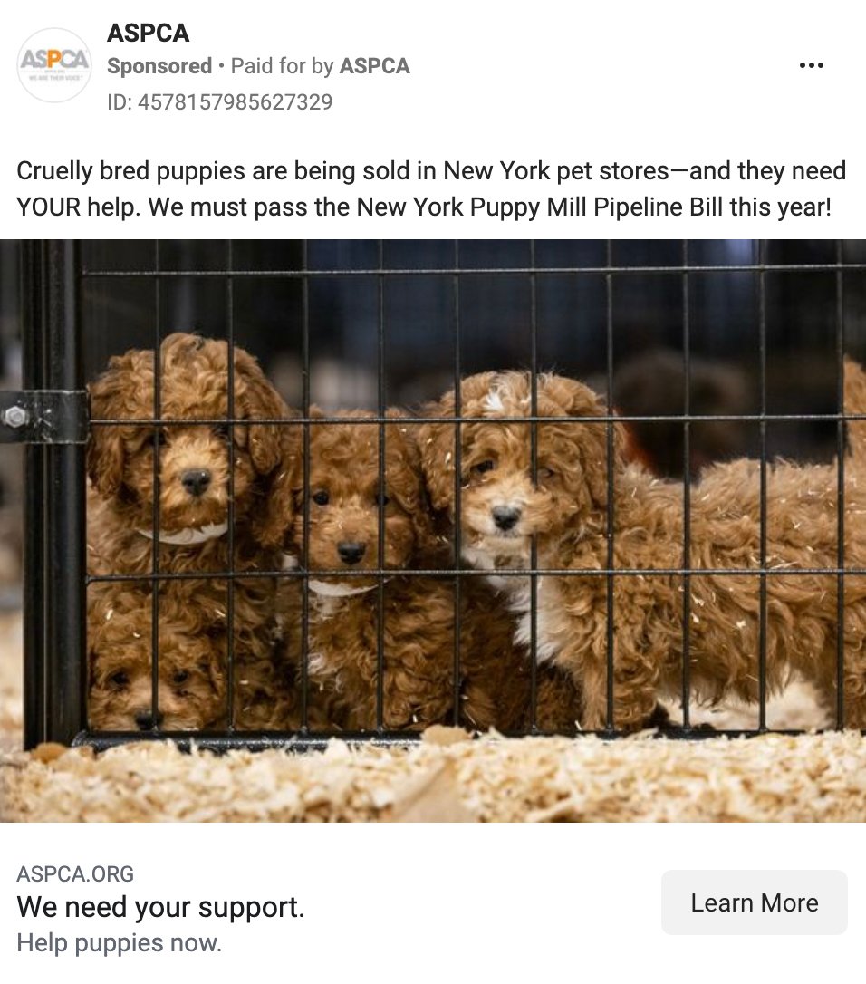
It’s suggested that humans only have four basic emotions: happy, sad, fear/surprise, and anger/disgust.
When writing ad copy, try to make people think they need what you’re advertising because it makes them feel a certain way.
20. Use exclamation marks!!! (and emojis 🤩)
Is your Facebook ad copy punctuated by periods? Using question and exclamation marks is more helpful than you might think.
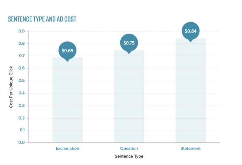
In fact, a Pressboard study found that ad copy ending with an exclamation point was the cheapest to promote, with a cost-per-unique-click (CPUC) of $0.69.
In comparison, copy ending with a question mark had a CPUC of $0.75, while copy ending with a period had a CPUC of $0.84.
And what about emojis? Curious whether you should use them in your Facebook ads?
We say (if it makes sense) go for it. Emojis can attract attention to important parts of your copy. They can also make big blocks of text easier to read and work around some language barriers.
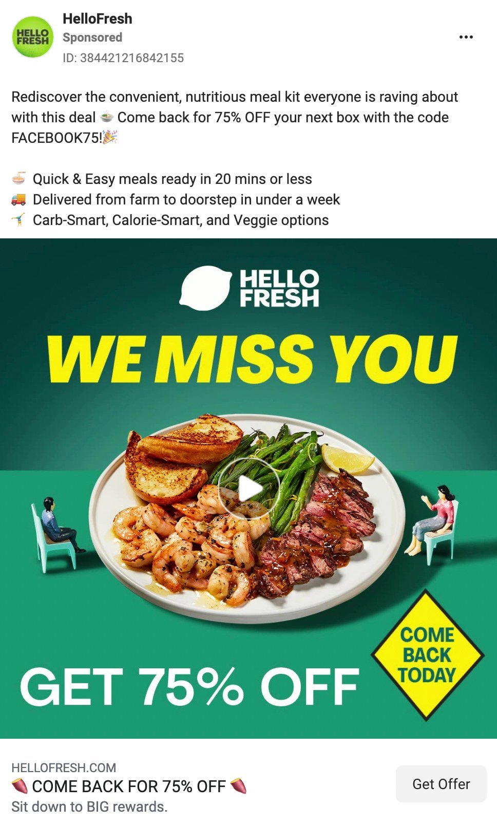
However, just keep in mind that there’s no clear benefit to using them as punctuation (as you might in an organic Facebook post).
21. Keep it simple
Sometimes, less is more.
The more text you include in your ad copy, the more likely people will skip it.
So if you want to get your message across to the maximum amount of ad viewers, keep your text short and sweet.
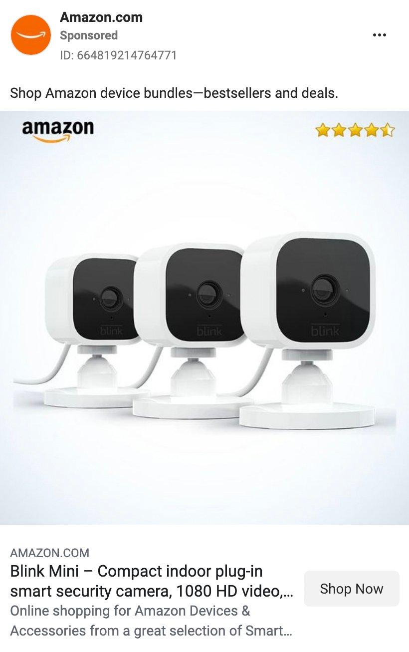
This Amazon ad is effective because
- the ad copy is short, clear, and easy to follow
- words like “bestsellers” and “deals” are great for inspiring action
- the 4.5-star rating in the image provides added information
- the headline and description provide much more detail—if you get that far before clicking
22. Include a price point
If you’re new to a crowded market and one of your key selling points is good pricing, don’t be shy about including it in your Facebook ads.
Including your product’s price in the ad copy or creative gives people a quick overview of what they’ll get.
Also, if your target audience is familiar with your well-known competitors' pricing, they’ll have a great comparison moment.
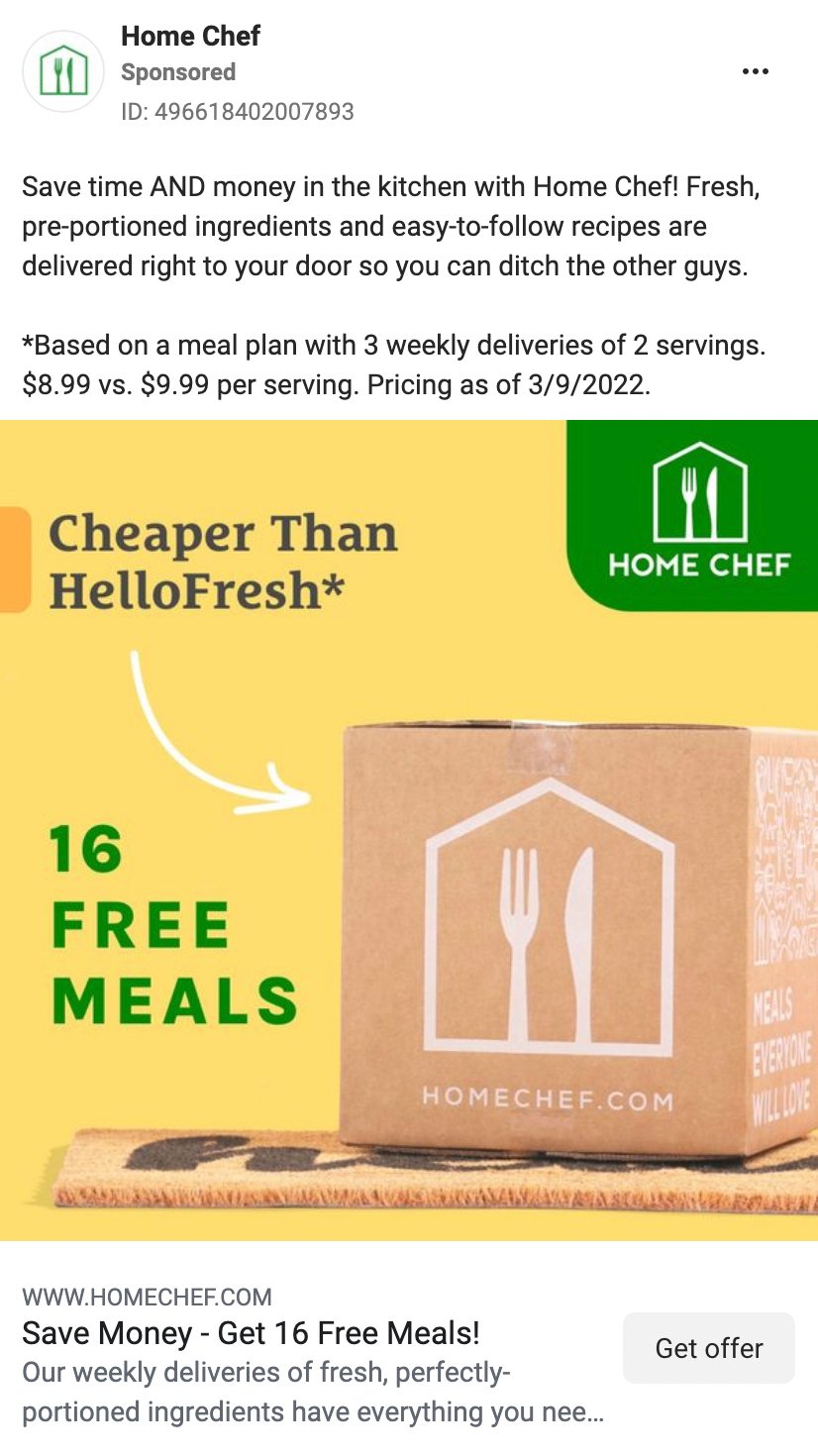
In the Home Chef ad below, the ad copy does your homework for you. It clearly compares the brand’s pricing to its closest competitor, HelloFresh, to help you make a decision quickly.
But what if your pricing is significantly higher than your competitors? Avoid discussing cost and focus on showing your product’s unique value instead.
23. Create seasonal campaigns
When you think of seasonal campaigns, you probably think of Christmas or Black Friday ads.
But end-of-year holidays are far from the only events you can build seasonal campaigns around.
Nemo Chu, formerly of Kissmetrics, came up with more than a dozen events that you can create a campaign or sale around.
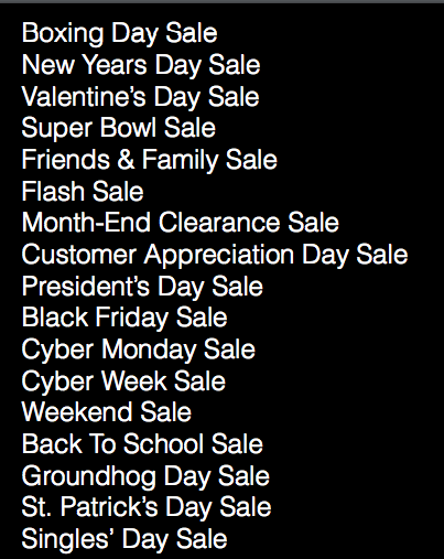
You can view the rest of his conference presentation deck here.
24. Keep your head (and ad quality) high
Every experienced marketer knows that trust is the foundation of successful long-term customer relationships.
Put plainly: if people trust you, they’ll buy from you.
But as you start advertising on Facebook, chances are people don’t know your brand yet.
So you don’t want to spoil the first impression with a low-quality ad image.
Make sure that your creative fits the size requirements for every placement where you want it to show.
25. A/B test to find the perfect creative
Your creative is the first touchpoint between your brand and your target customer.
After someone notices your ad in their news feed, you have a very limited time with their attention. You might only have 3-5 seconds to really bring ‘em in on a crowded feed.
So you want your ad image to be perfect.
The process starts with brainstorming and design. But Facebook ad testing is essential for comparing options and getting a definitive answer about what resonates with your audience.
For example, take one of our clients, who had a track record of difficulty with performance on social media channels. Over time, we worked in new creatives that were much more successful, but we didn’t stop there.
We introduced another new creative to split test with, which wound up bringing in 73.95% lower CPA. The existing creative already had an excellent CPA of $54.32. The new creative scored an outrageous CPA of $14.15.
Just goes to show what persistent creative testing can do. 😉
26. Explore your audience insights
A successful Facebook ad should appeal to your target audience. But what is your ideal audience like, and how can you target them?
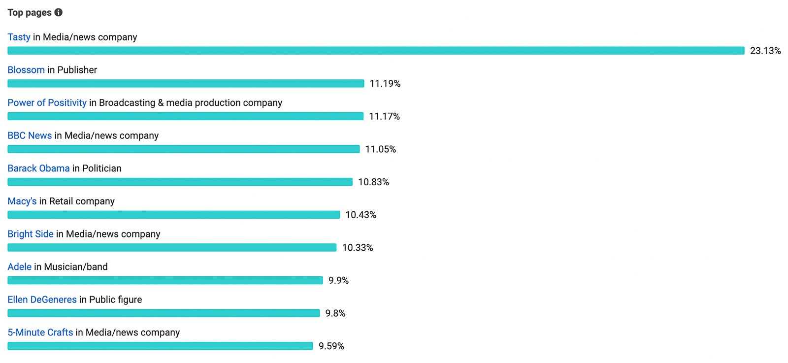
Facebook insights can help you clarify audience size and demographics. The platform’s audience insights tool breaks down your audience by age, gender, top country, and top city.
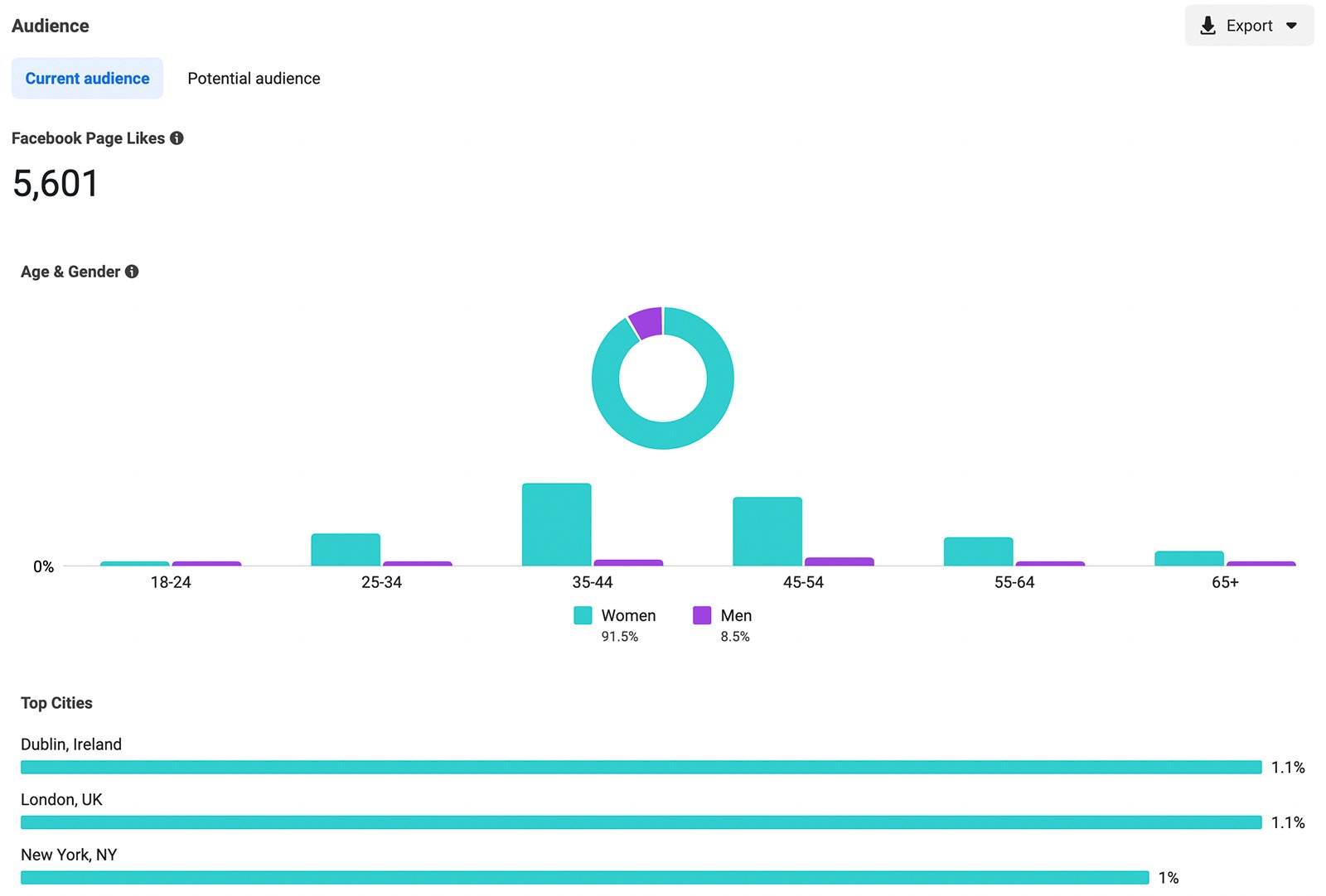
If you click the “Potential audience” tab, you can learn a bit more about your audience’s interests and behaviors.
Use the filters to input your audience demographics. Then enter an interest your audience shares.
Then you can see some of the top pages your target audience likes. When you create an ad, you can use these interests to shape your detailed targeting and reach your audience in new ways.
27. Tinker with custom audiences
In the words of KlientBoost’s own Johnathan Dane: “Custom audiences continually outperform regular Facebook ad targeting because the people you’re targeting have already shown an interest in what you have to offer.”
With Facebook custom audiences, you can use first- and third-party data to target your ideal customer. Because custom audiences include people who have already engaged with your business in some way, they’re ideal for targeting potential customers at the middle or bottom of the funnel.
To build custom audiences, you can use data sources like
- Facebook page engagement
- Instagram account engagement
- Facebook lead forms
- Facebook or Instagram shopping activity
- Instant Experience activity
- website activity
- customer relationship management (CRM) tool data
- app activity
And you can also upload your own data to identify prospects on Facebook’s Audience Network.
28. Granulate your audiences over time
Ever wonder if certain audience segments aren't performing that well?
Maybe some of your detailed targeting options or custom audiences aren't generating results. But you can’t tell because you can't break down that level of performance.
This is called the Iceberg Effect—what you see above the water in your advertising account doesn’t necessarily reflect what you can’t control below the surface.
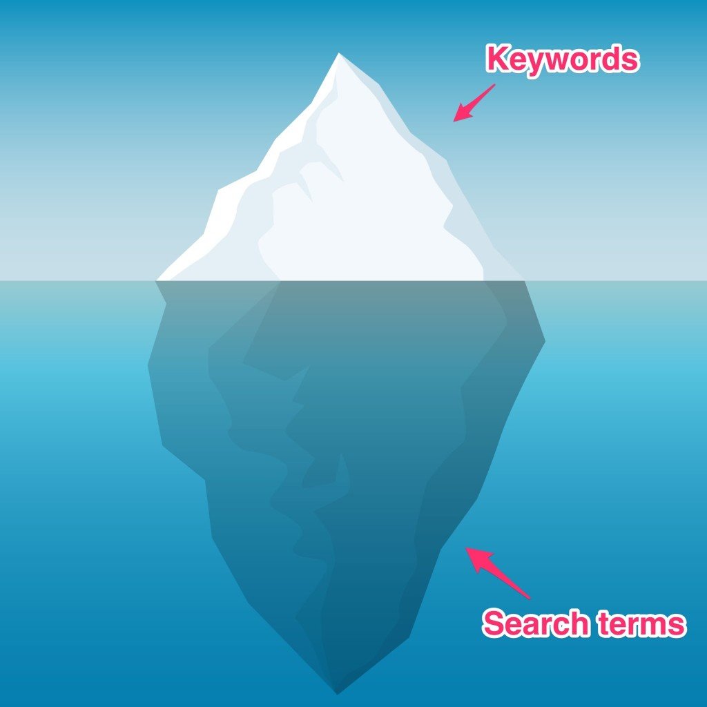
How does this translate to Facebook ads?
The idea is to break up and granulate your audiences over time so you can have more control over your Facebook campaigns. Ditch what’s not working, and increase ad spend on what is.
With granularity, you can pinpoint who you want to reach and who you don’t want to reach.
A word of warning?
Avoid getting so granular that you cause audience fragmentation or hinder Facebook’s learning phase, as both issues can compromise performance.
29. Experiment with different ad types
Test out different types of ads to find out what works best for your audience. Here are a few ad formats to experiment with
- feed ads
- right column ads
- lead ads
- carousel ads
- dynamic product ads
- app install ads
- Facebook and Instagram Story ads
- Facebook and Instagram Reels ads
- Instant Experience ads
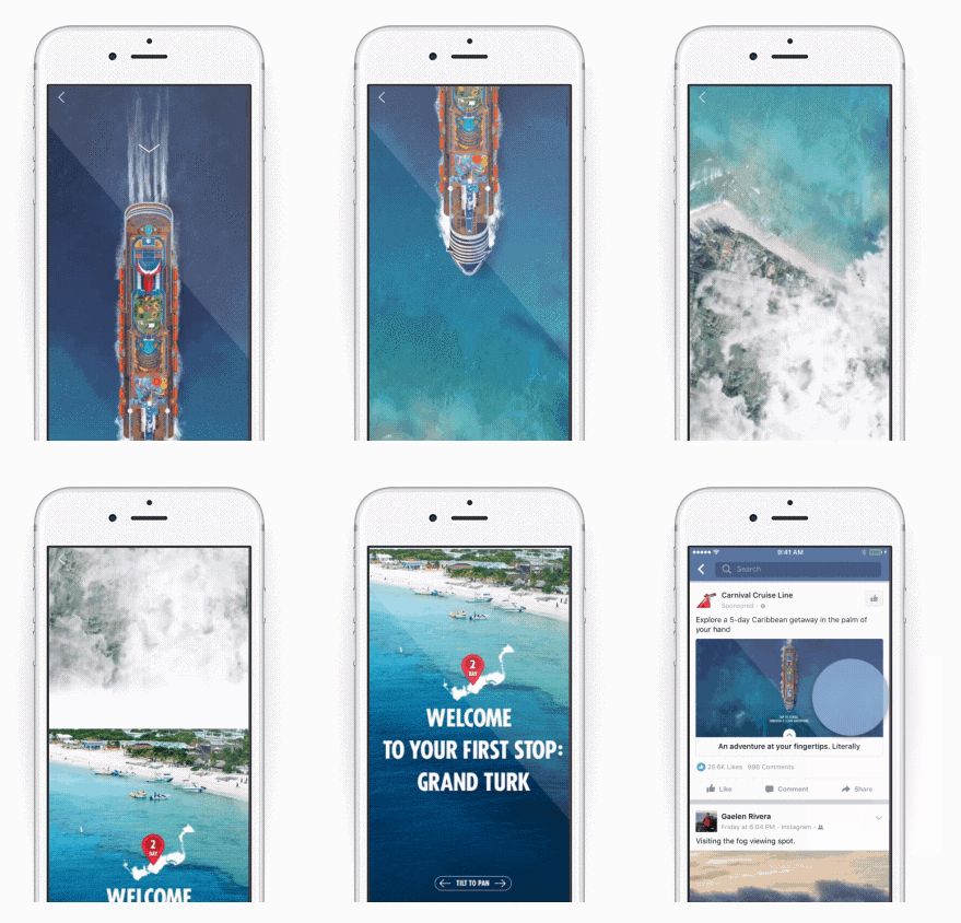
Depending on your campaign objective and your offer, some Facebook ad types may work better than others. For example, dynamic product ads and carousel ads often align best with the sales campaign objective.
30. Use complementary colors
While it’s important to use your brand colors in ads, there’s a simple hack to make your creatives more eye-catching.
Include both branded colors and their opposites—or their complements.
As Optimizely design manager Jeff Zych says:
“Use a bright color that contrasts from a muted background to highlight the element you want visitors to focus on. This might be your brand color, or a color that directly opposes your brand color on a color wheel.”
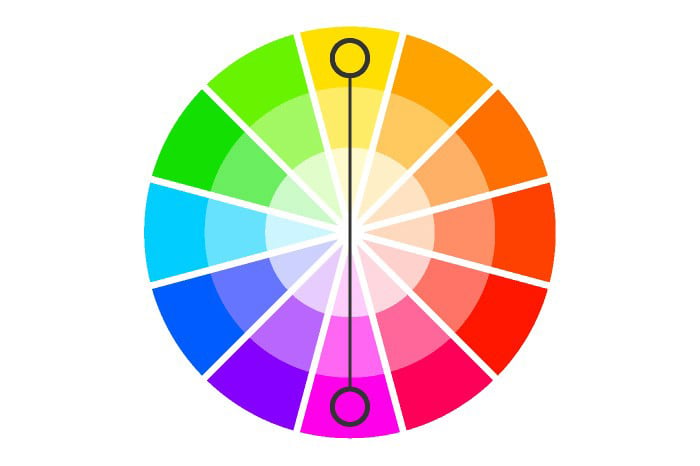
HubSpot ran an A/B test on two CTA button variations. The version with the complementary red button outperformed the green button by 21%.

When you test colors, wait until you have statistically significant proof before declaring a conclusive result.
31. Master the psychology of color
We’ve already discussed how emotions get people to buy. The same theory can be extended to colors.
Every color can evoke a distinct emotion—from excitement (red) to calm (gray). Take a look at the chart below to see how major brands use logo colors to convey meaning.
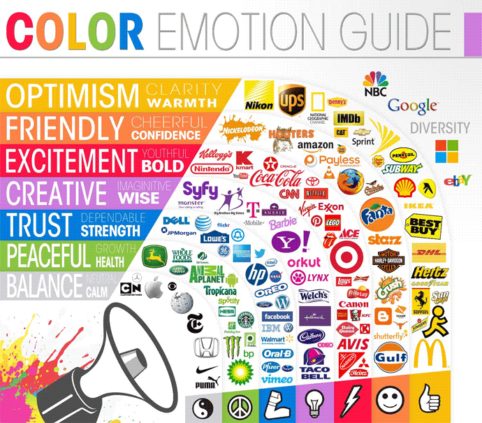
As you can see, it doesn’t always take words to elicit emotions.
If you want to master color psychology, here’s a guide by Help Scout to get you started.
Don’t forget to align your message with your color palette to evoke the right emotions.
32. Be careful with stock images
Stock photos are a marketer’s guilty pleasure.
They’re easy to obtain, and they look nice.
But after you’ve hit the publish button and feel that sense of victory, you realize that your ad’s engagement is surprisingly low. It might be because you’ve used a stock photo.
MarketingExperiments tested a real photo of their client against their top-performing stock photo.
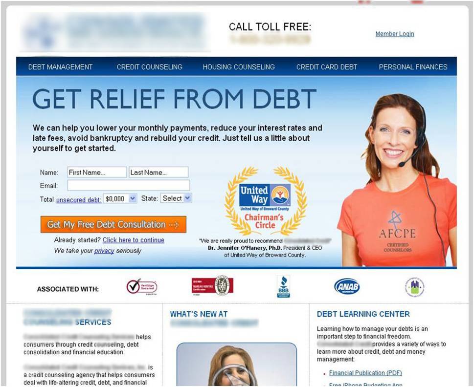
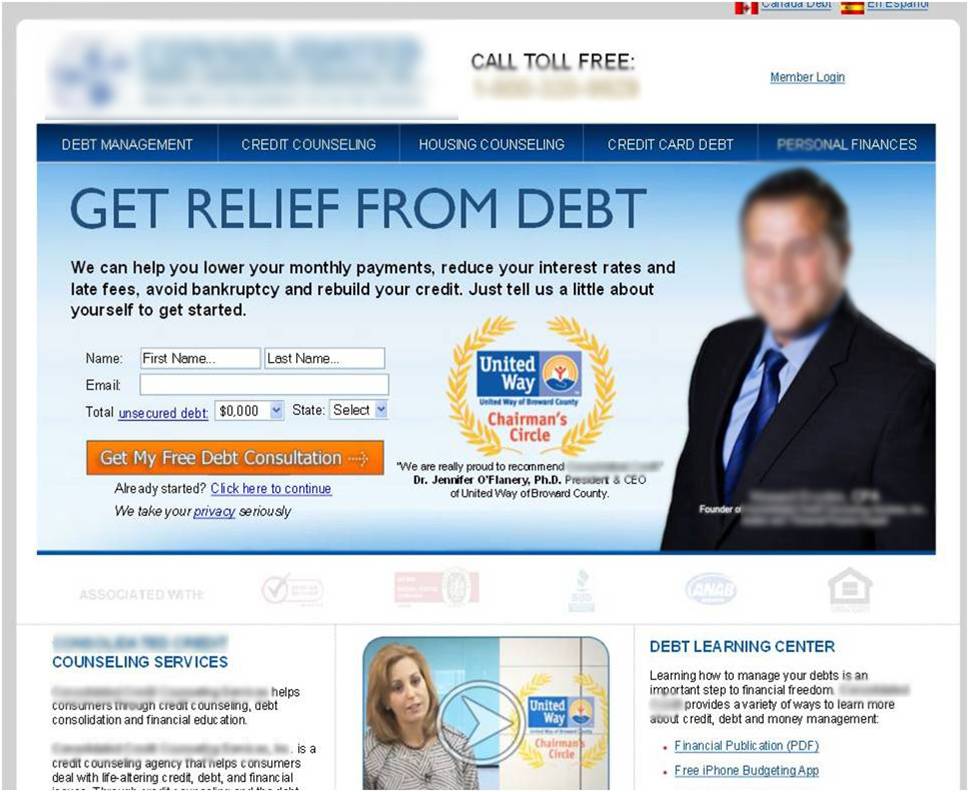
They found that nearly 35% of website visitors were more likely to sign up when they saw the real image.

Ultimately, any marketer can access stock images. This means many marketers may have already used the same image you added to your newest ad campaign on theirs.
To build trust and appear authentic, use original images whenever possible.
33. Start using carousel ads
Carousel ads often go unused.
They’re a hidden treasure waiting to be discovered.
Carousel ads are great for showcasing multiple products. They’re also ideal for telling a story in parts.
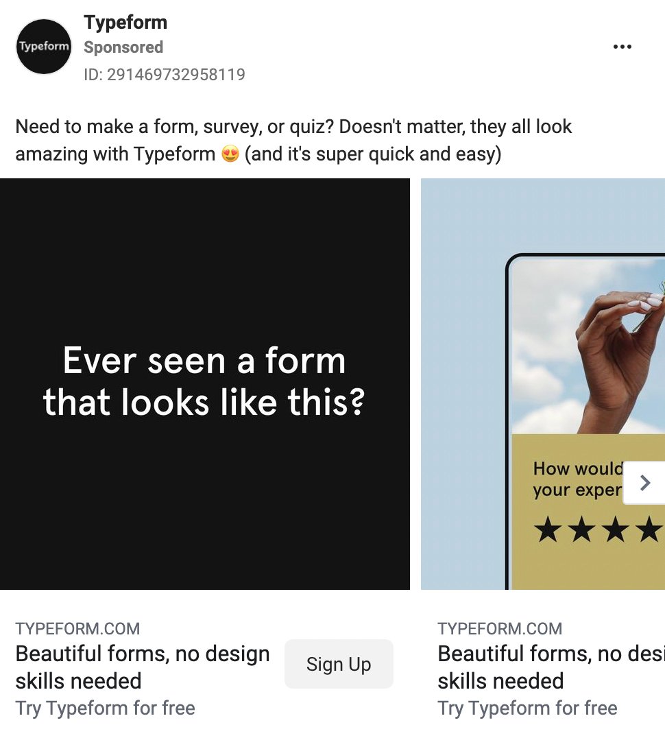
Before you start creating, here are a few Facebook carousel ad tips to follow:
- Tell a consistent story throughout the slides.
- Make the first slide so good that people want to see the rest.
- Include a clear call-to-action (remember to use power words like “get,” “try,” “learn,” and others).
34. Be consistent with your ad design
Think about a famous and successful brand.
With 99% certainty, you know what their logo and brand colors look like.
Would people recognize the logo and branded colors of your company?
Seth Godin—a successful entrepreneur, bestselling author, and marketing expert—sums it up perfectly: “If I can substitute one company for another and have the ad still make sense, it’s not a good ad.”
And that’s it.
All of your ads should speak the language of your company and use the same design guidelines as your website and print materials.
Otherwise, you’ll burn through your budget generating less-than-optimal brand recognition. And that’s a serious loss, isn’t it?
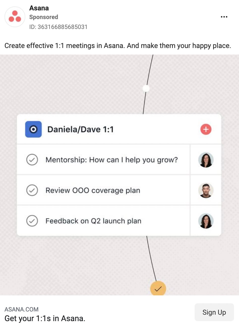
Always align your ad design with your brand’s design guidelines.
35. Use location-specific ads
You might be surprised at how effective location-specific ads can be.
Adidas ran a search campaign using location extensions to get people to click to the brand’s store locator page and encourage them to visit their nearest store.
The results were staggering. The campaign drove a 680% incremental lift in return on investment (ROI).
Here’s the verdict: location-specific ads work like crazy.
All you need to do is create ads that feature offers related to a specific location and target audiences living in or visiting the area.
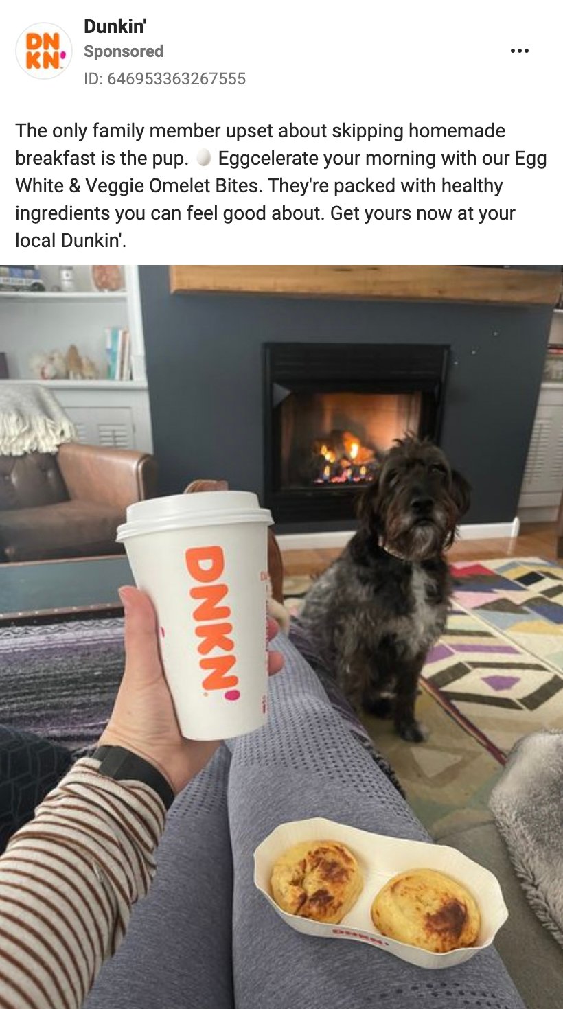
36. Be the right amount of fun
Do you remember the guy from college who everyone liked just because he was so good at cracking jokes?
Being just the right amount of funny can be the golden ticket to high CTRs. Humor and playfulness also humanize your brand a bit; these things will help give your brand a voice and personality that many audiences might gravitate toward.
Before you create a funny ad, test it on some people who don’t know your product or brand very well. That way, you can make sure the humor works for colder leads as well as high-intent audiences.
37. Show your product in your ad
There are at least four reasons why ads with product images work so well:
- If your product looks great, your ad looks great.
- Images help to increase brand awareness.
- People get an instant overview of what the ad’s about.
- Images establish expectations for what people will see on your landing page.
It doesn't matter if you work for a software-as-a-service (SaaS) company or a tea import business. Product-centered ads are great for generating a positive response.
And if you can make your product look especially tempting, that's even better.
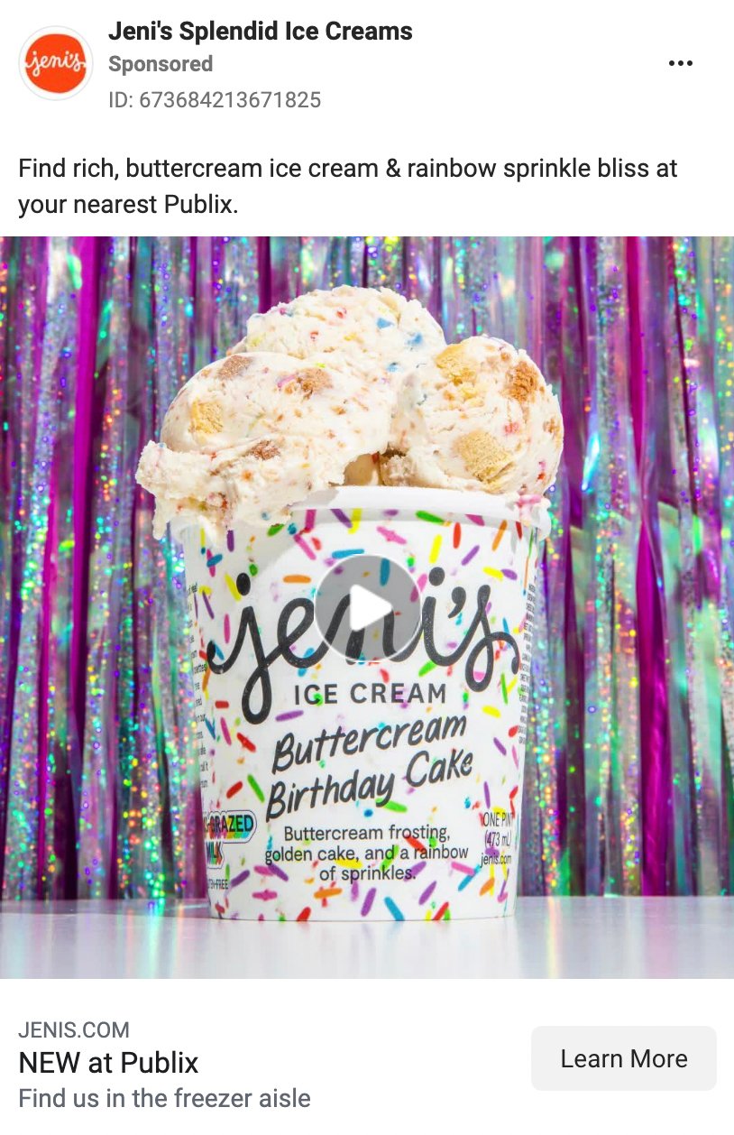
If you’re using product photos in your ads, keep in mind that it’s best to have the photos taken by a professional photographer or a member of your design team.
38. Use visual contrast
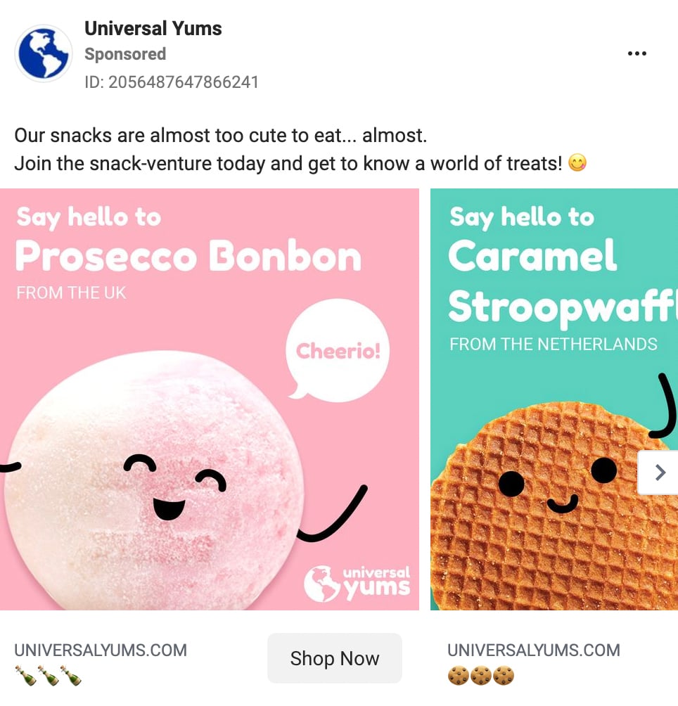
Being mainstream feels nice and safe, but it could lead to missing out on clicks and conversions.
That’s a problem if you want your sales to grow.
Using visual contrast is a great way to attract people’s attention to your ads. A high-contrast creative can easily stand out in the feed.
39. Let your ads tell a story
Storytelling is fundamental to digital marketing and advertising.
It allows you to connect with your target customer in a pretty fascinating and heartfelt way.
According to Uri Hasson from Princeton:
“A story is the only way to activate parts of the brain so that a listener turns the story into their own idea and experience.”
So basically, a good story can help people relate to your product and see themselves using it.
What’s a good way to include storytelling in Facebook ads? Carousel ads are ideal for telling stories in multiple parts.
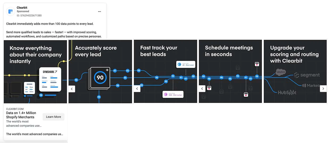
The Clearbit ad below tells a simple story about how people can send more qualified leads to sales teams with their solutions.
40. Use videos instead of images
If pictures are worth a thousand words, videos tell a novel-length story.
Adobe also tells us that shoppers who watch videos are 1.81 times more likely to purchase than non-video viewers.
That’s an almost 85% increase in your advertising ROI.
If you want to show a product in action, video ads are a great solution.
Plus, video ads are just as easy to create as regular image ads.
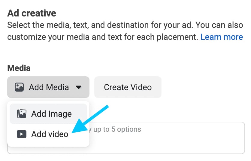
Open Facebook Ads Manager, create a new campaign, and upload a video instead of an image. Alternatively, click the “Create Video” button to make a simple video slideshow using images.
41. Optimize video ads for sound-free viewing
According to Facebook, video ad view times increase by an average of 12% when captions are included. In addition, Facebook research shows that
“In mobile-feed environments, people prefer having the choice to opt in to sound. When feed-based mobile video ads play loudly when people aren’t expecting it, 80% react negatively, both toward the platform and the advertiser.”
Imagine a potential new customer sees your video ad in their feed, but they have the volume turned down (and your messaging isn’t clear without sound).
If you don’t have captions, people may never click on your ad.
This scenario isn’t unusual. In one study of Facebook video ads, 41% of videos were essentially meaningless without sound.
So why risk losing potential customers or wasting money on ad placements? Always add a caption to your video ads or ensure they’re still sensible without sound.
42. Get to your point quickly
After analyzing 564,710 videos, Wistia discovered that engagement tends to be strong for up to 2 minutes.
But between 2 and 3 minutes, viewers drop off quickly.
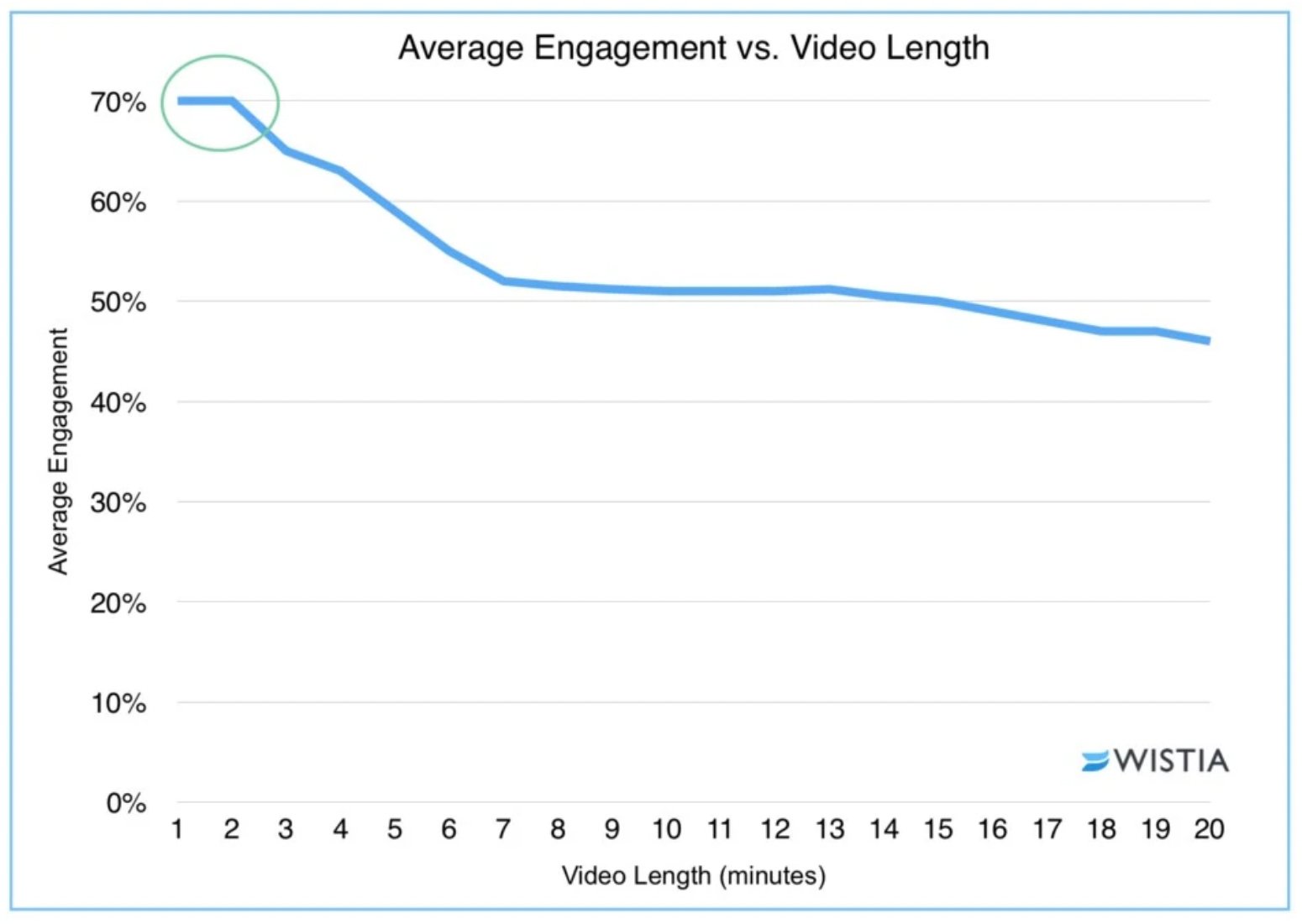
So what’s the takeaway? Keep your video ads to about 2 minutes, and make the first 30 seconds so engaging that people will watch the rest.
According to Social Media Examiner, the most common reasons for low video engagement are
- including an intro
- using logos or credits at the beginning
- trying to say too much in the video
- showing a person talking to the camera without context
43. Surprise people
Who doesn’t love surprises?
Sometimes, all it takes for high-conversion Facebook ads is the element of surprise.
Do something that nobody’s done before.
We know. Easier said than done. But totally worth it.
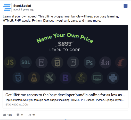
For example, StackSocial once ran a “Name your own price” offer. It seems unbelievable at first. Who would do that?
But it definitely attracts attention and makes people want to try it out.
Can I get it for $1?
So roll up your sleeves, grab another cup of coffee, and get those creative juices flowing.
44. Test your ad placements
Choosing between Facebook’s ad placement options is like being a kid in a candy shop.
There are so many options, and each one looks so good.
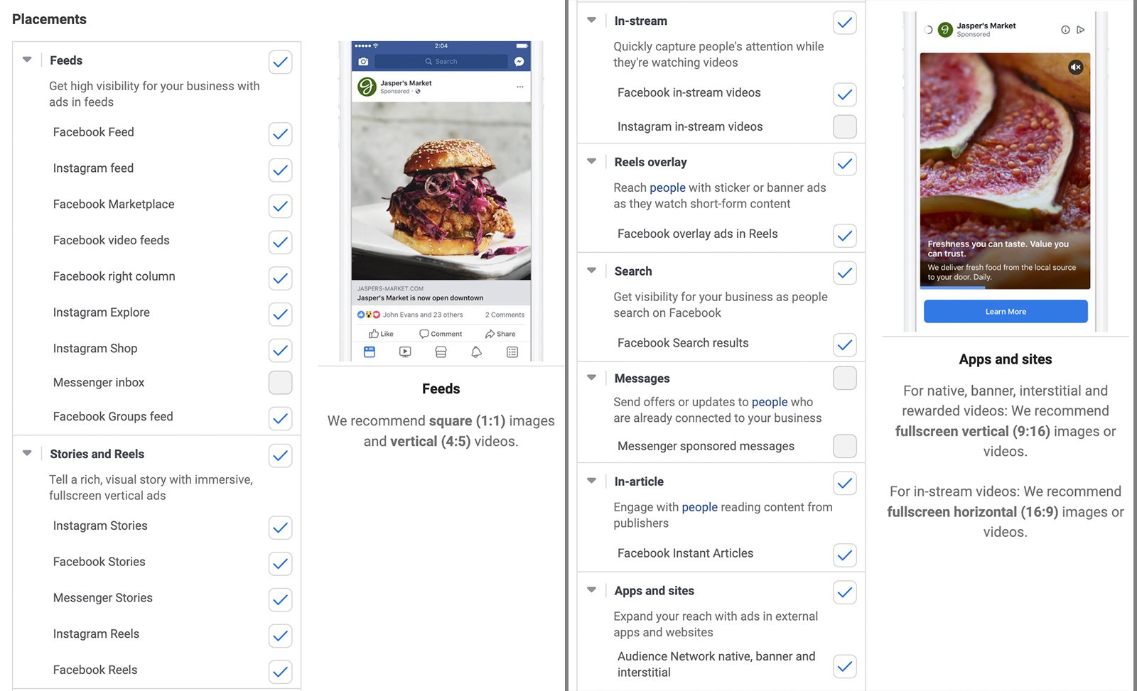
So which placements are best for your Facebook ads?
Facebook typically recommends automated placements. This option generally allows for more efficient delivery.
But in some cases, manual placements may be a better choice.
Use Ads Manager’s A/B testing tool to test placements against each other. Once you find a winner, experiment with manual placements and choose the top-performing spots.
45. Find your core audience
When was the last time you created a new Facebook audience for your campaigns?
One week ago? Two weeks ago?
How about the last time you A/B tested your Facebook ad targeting?
AdEspresso analyzed millions of dollars worth of A/B tests and listed the elements that had the biggest impact on results. The four targeting elements that provided the biggest gains were
- country
- gender
- interests
- age
These elements were followed by
- custom audiences
- relationship status
- purchase behaviors
- education level
How can you apply these findings to your own experiments? Split testing various genders and interests is a good place to start your next A/B testing campaign.
If you want to know more about targeting on Facebook, read our in-depth guide to Facebook ad targeting.
46. Test new bidding strategies and methods
There are tons of factors that can affect how much ads cost. The most important are
- timing
- bid strategy
- placements
- relevance
- audience
If you always use the default bidding strategy for your campaign type, you could be overspending.
Fortunately, you can test various bidding strategies if you switch on campaign budget optimization (CBO) in Ads Manager.
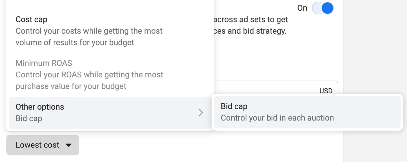
Options vary slightly depending on your campaign objective and your account. They typically include
- lowest cost, which delivers the most results at the lowest cost
- cost cap, which lets you control your costs
- bid cap, which lets you control your bids
- minimum ROAS (return on ad spend), which lets you control your return
But the bidding strategy isn’t the only way you can control what you spend on ads.
At the ad set level, you can also choose how you want to optimize ad delivery. The options depend on the objective you choose.
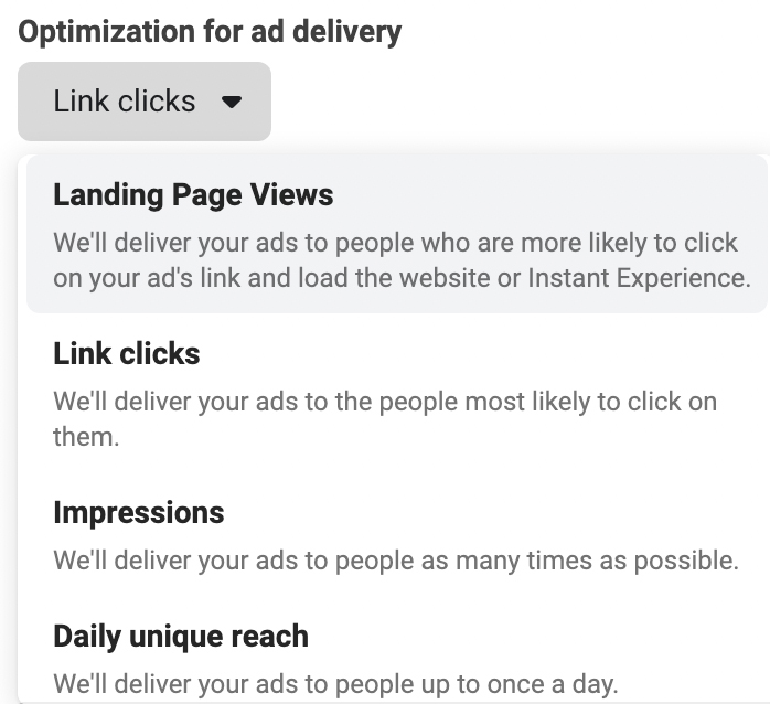
Check under “Optimization & Delivery” to see your options or choose a new one. You may be able to pick from
- impressions, which optimizes for delivering your ad as much as possible
- daily unique reach, which optimizes for as many different people as possible
- link clicks, which optimizes for clicks to your site
- landing page views, which optimizes for people who load your landing page
- conversions, which optimizes for the conversion event you pick
47. Never, EVER stop split testing
Your Facebook ad campaigns might be delivering great results.
But is that really the best they can do? What if we told you that there’s always room for more A/B tests?
With A/B testing, you can continually find the best audiences, creatives, placements, and other factors—and reach higher performance heights.
48. Master the anatomy of a Facebook ad
The three main text components in most Facebook ads are
- headline
- primary text
- CTA
Think about the last time you were scrolling through your news feed and saw an ad. Where did your eyes go first?
Most likely, you read the headline, then the CTA, and then the primary text.
Make sure you're capturing attention and encouraging people to read more every step of the way.
49. Leverage other platforms to compound your Facebook wins
If your Facebook ads are working, combine your social advertising efforts with organic content and ads on other social media platforms—like Instagram, LinkedIn, and Google.
Making your brand prominent across search networks specifically will help prime your most high-engagement audiences for conversion.
If you can leverage organic and other paid channels, you can increase demand for your brand before you even enter the Facebook arena.
Then a whole wave of highly-engaged Facebook users will see your campaigns and be ready to convert.
Put your Facebook advertising expertise to work
Creating irresistible Facebook ads is a process. But it’s one that you can master—especially if you start using the dozens of Facebook ads tips above to optimize your creative, copy, and targeting.
Ready to apply your newfound knowledge and start scoring more clicks? Get our best Facebook ads CTR tips to find out how you can get even more clicks and conversions.