Exit-intent popups can easily be either the worst marketing tactic...or the best.
There’s not much in between. That’s because at the end of the day, if you’re looking to leave a website, you’ve decided that you’re done. If something gets in the way of that, it can be reallllly frustrating.
And unfortunately, there’s a lot of aggressive and slimy marketers that have nearly ruined exit-intent popups for us all.
It’s the reason that in a recent HubSpot survey, 73% of respondents said they dislike online pop-up ads, and 51% of respondents said they consider pop-up ads to be “frustrating to deal with.”
But we’re here to tell you that it doesn’t have to be like this. Because when exit-intent popups are done well, they can have massively positive effects on your conversion rates and actually be useful to visitors.
Don’t get caught on the side of things that have website visitors clamoring to find the exit button. Once you read through this article you’ll understand what an exit popup is, when to use them (and when not to), as well as 16 hacks to make really good popups.
We’ve included screenshots and case studies so that you’re inspired and ready to optimize your own. You’ll have the confidence to know when you’re annoying your visitors (so you can stop) vs delighting them.
Get brand new conversion strategies straight to your inbox every week. 23,739 people already are!
What Is An Exit-Intent Popup?
An exit-intent popup is a message that shows up only when a website visitor moves their mouse to exit your webpage.
The style of popup or the offer presented can be different, but all exit popups include two characteristics:
- The popup appears over the on-screen content.
- The popup gives the user an extra incentive to stay.
To be very specific here, I am reiterating the “intent” part. These popups are not something that come up after a visitor presses the exit button, but when they display behavior that indicates they might be exiting.
This is a really important distinction. We’ll touch on the reason it’s important later on.
Do Exit Popups Work?
When users are done looking at your page, the cursor movement to close the browser tab is more-or-less automatic. If there’s an ounce of boredom, disinterest, or distraction users exit out of the page without really thinking about it.
It’s like closing the door behind you, locking your car when you get out or turning off the lights when you leave a room. You know you did it, but it’s such a natural movement that you don’t need any attention or thought devoted to it.
Exit popups interrupt that pattern.
There are tools with exit-intent technology that can tell when users are moving their cursors to close the tab. When the intent is detected, the tool serves a message to recapture the user’s attention and prevent that automatic motion.
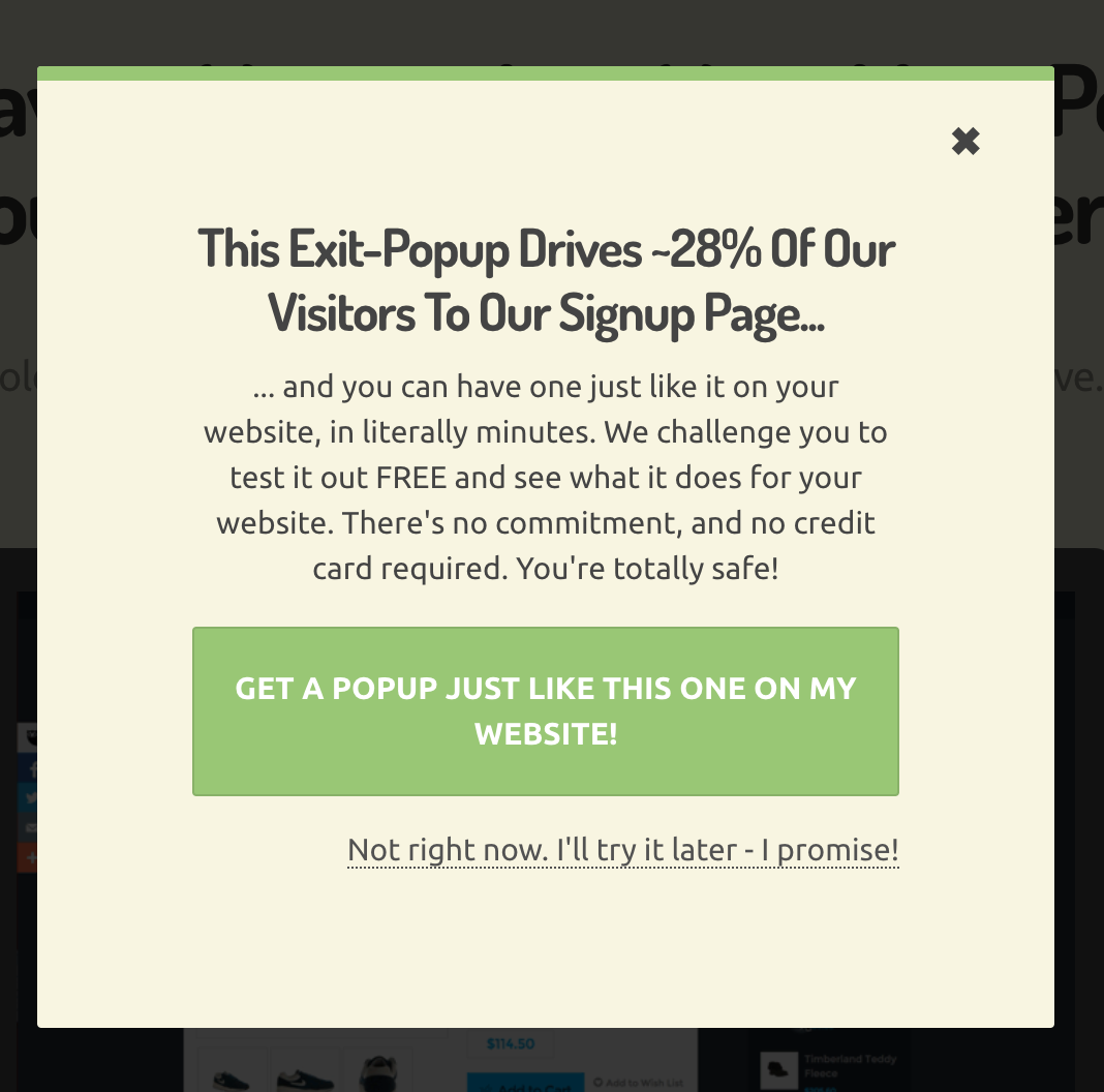
Hold On Stranger is an exit popup tool, so they have to practice what they preach.
But this particular popup does a great job of demonstrating the pattern interrupt technique. It comes up as you’re about to exit and gives you some food for thought… converting 28% of visitors that were about to leave? Okay!
And when this happens, even though more and more of these exit popups are implemented every day, you’re still giving the user’s brain a bit of a jolt and forcing them to pay more attention to the topic at hand.
And if you do it right by using some of the hacks we’ll show you, you’ll be able to use them to both improve your on-site experience and increase your conversions. (Like how Digital Marketer got an extra 2,689 leads in just two weeks.)
When to Use Exit-Intent Popups
Not everything needs to be an exit-intent popup, but with the correct setup, they can work really well for
- securing email subscribers
- lowering cart abandonment
- capturing social followers
- gathering feedback through surveys
- convincing potential customers to purchase
Put yourself in your abandoning visitor’s shoes. If you’re enjoying a website, there are plenty of actions you take. You’ve probably spent a significant amount of time reading the content, maybe you put some products in your cart, or even scrolled through a reviews page filled with social proof.
All you need is the cherry on top—the reason to convert. Exit popups are there to be the cherry on top for your engaged users.
So where do exit popups come into play with the non-engaged users?
Spoiler alert: they don’t.
When to NOT Use an Exit-Intent Popup
If someone comes to your site, spends five seconds looking around, and then quickly decides what you’re offering is not for them, an exit popup, no matter how wonderful the offer is, is not going to delight.
It’s going to piss them off.
Because while exit popups can be some of the most effective ways (besides retargeting) to recover lost visitors, it’s certainly not going to work if your website wasn’t relevant or helpful to begin with.
One way to do this is to calculate how long it takes someone to digest the gist of your page and only show an exit-intent popup if they start to leave your site after that amount of time.
A MarketingSherpa study found that 60 seconds was the best practice for an effective popup delay. If people are leaving your site in less than one minute, you might want to avoid showing them an exit-intent popup meant for more serious readers.
Another situation where you don’t want to use exit-intent popups is if it’s taking over your page. Users should always be able to access the exit button or get out the message.
In fact, back in 2017, Google announced that any intrusive interstitial on mobile devices, aka popups that make content hard to access would hurt a website’s search rankings.
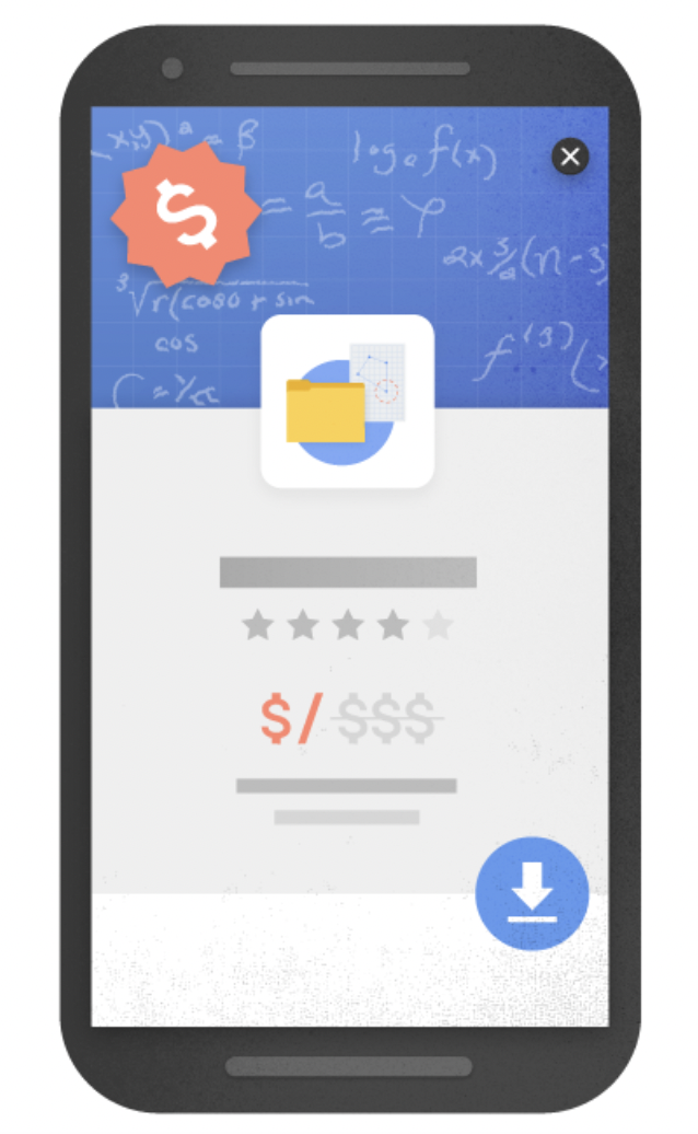
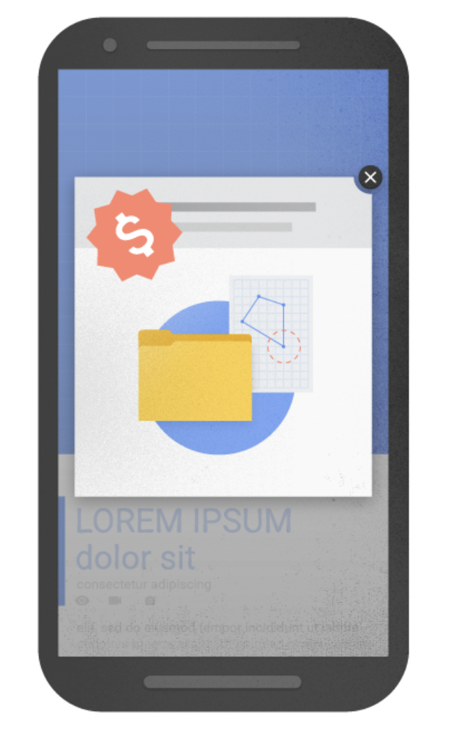
You can never have popup ads that block the exit button, hinder them from reaching it, or especially anything that shows up after hitting the exit. Basically, if it ruins the user experience, don’t do it.
22 Exit-Intent Popup Examples and Hacks
Now that you understand why exit-intent popups work, when to use them, and when NOT to use them, let’s get into the good stuff.
These optimization hacks that will make your exit popups super effective and help you create a great experience for your visitors.
1. Gamify It
Some of you don’t make time for fun and it shows. Don’t forget that your marketing doesn’t always have to be what people expect.
These days there are plenty of plugins and tools that will allow you to engage visitors in a little game in order to reveal their discount.
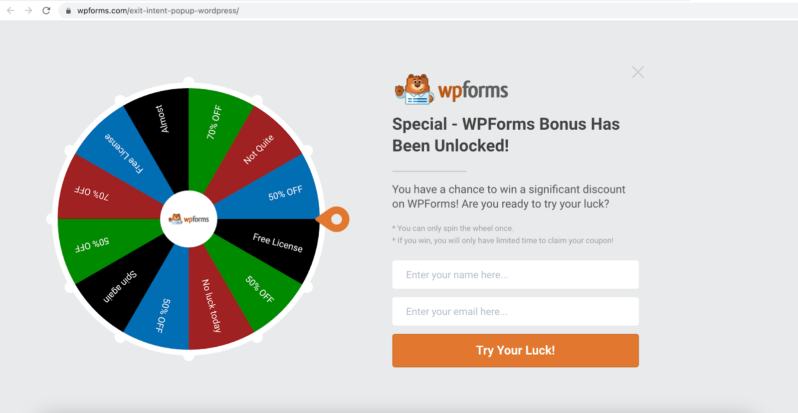
Check out a few of the ways you can easily gamify a wordpress site using plugins.
2. Personalize It
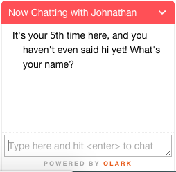
This chatbot used to pop up when I went to the KlientBoost site on another browser. Lord knows I’ve been here more than 5 times. But I have to say, very well played Johnathan, very well played.
Best to keep it up for a certain amount of time and then take it down. Get the info you came for and go. Or maybe only show it to new visitors to figure out creative ways to keep people on your site.
You can also think about personalizing the message by how they got to your website in the first place. For example, if you have a landing page specifically for Google Ads only, that’s relevant.
You know that the traffic may be pretty cold, so give extra attention to making that exit popup super valuable for them. Or read our 9 strategies on exit-intent popups specifically for Google Ads.
3. Run a Contest
Everyone loves a giveaway and free stuff. If someone is about to exit the page, let them know that they have a chance to win.
The key here though is making the barrier to entry pretty low. Ask for something like a social follow or an email.
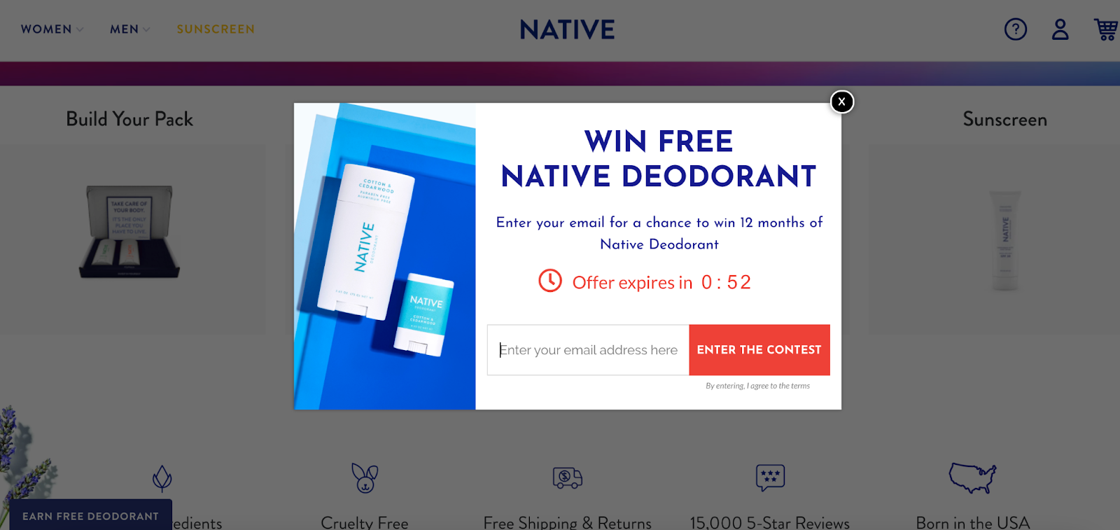
Because Native is giving away 12 months of deodorant, they can ask for something more valuable than a social follow. The countdown is the cherry on top that doesn’t allow for any extra time to think it through. Most visitors will convert right away.
4. Go For Laughs
Humor always helps lighten the mood. Giving visitors a reason to chuckle before they leave your page can help nudge them to take a desired action. Not to mention, it leaves a good impression. It always pays to end on a good note.
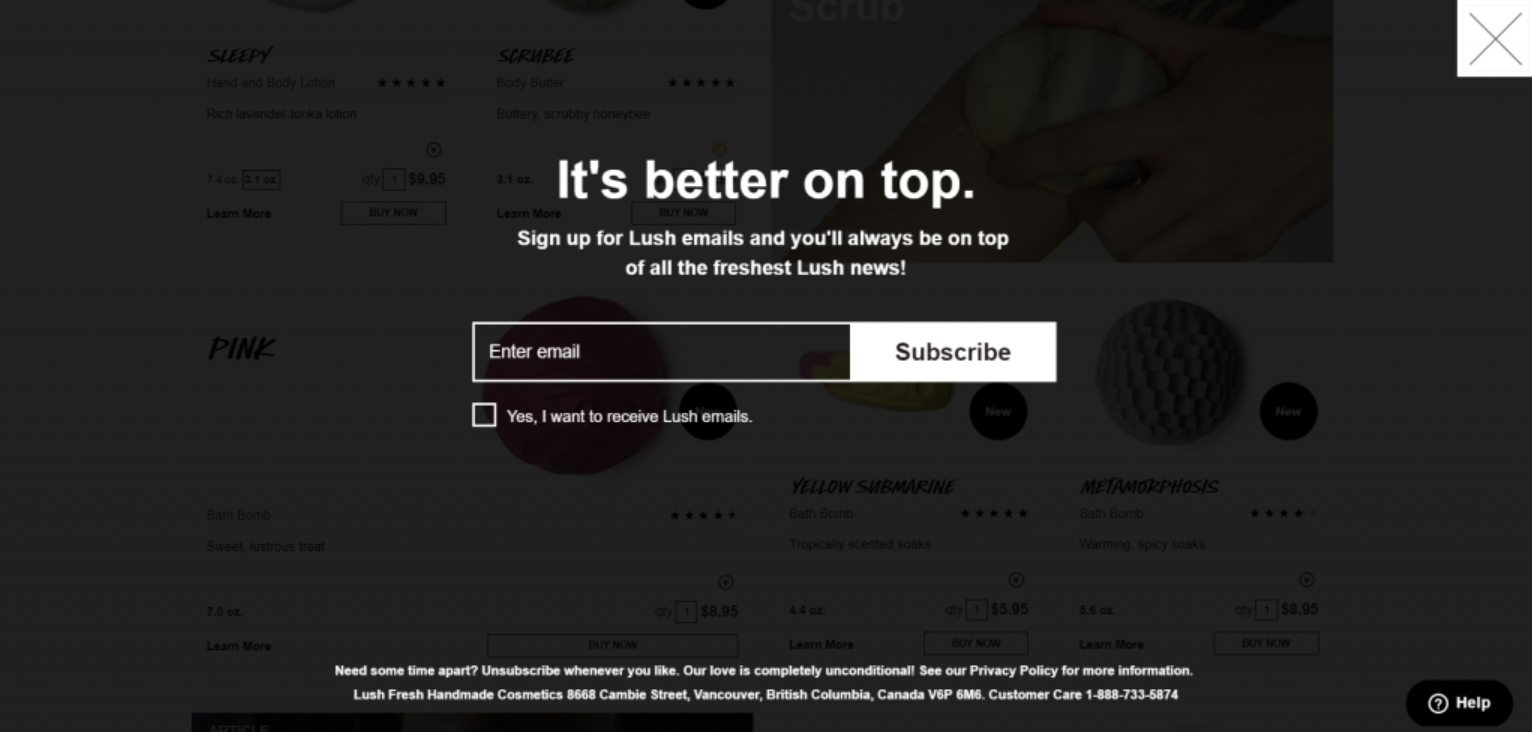
5. FOMO
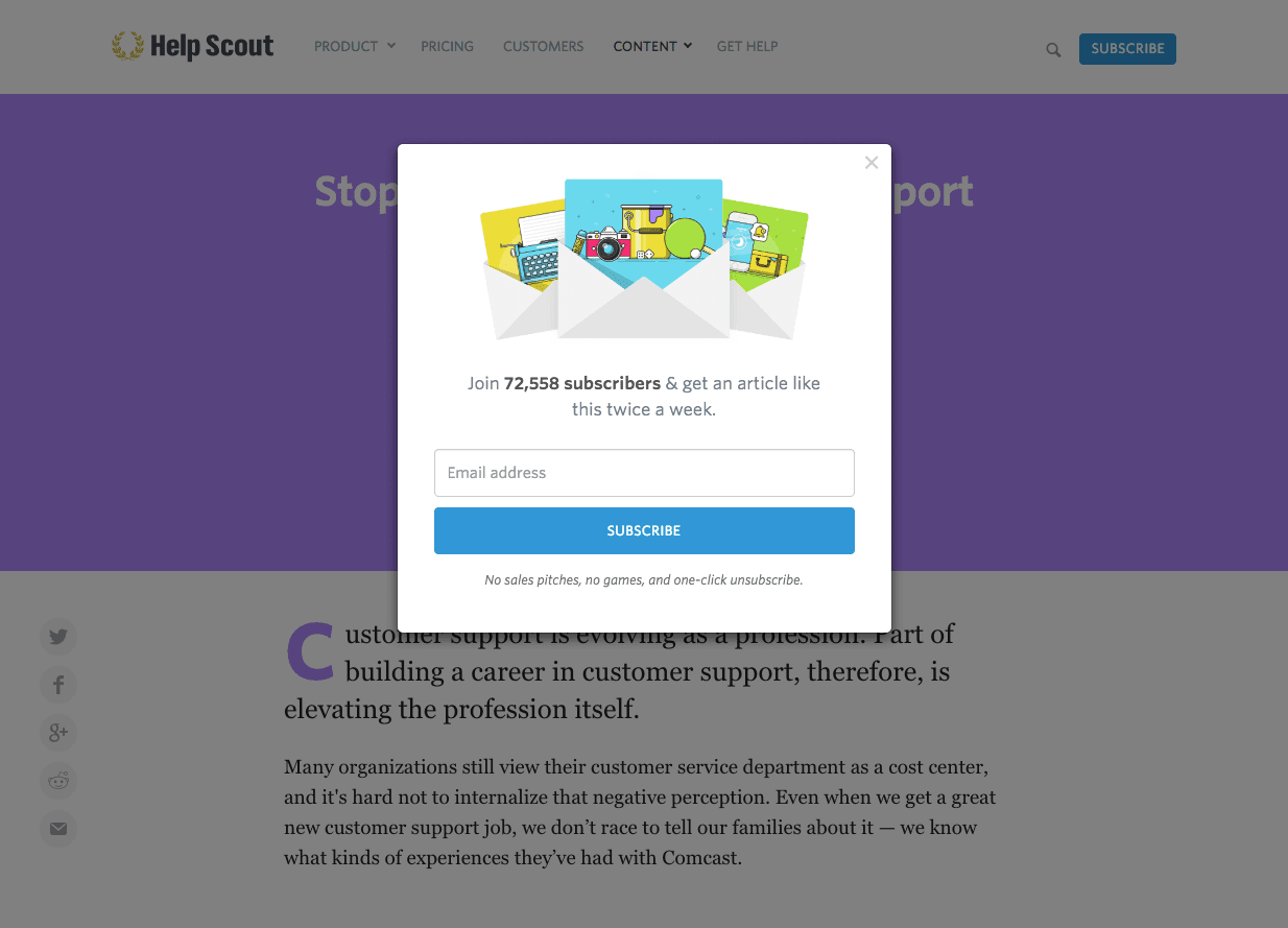
Missing out is the worst. By showing how many people have already signed up or downloaded a resource before a visitor leaves might just be the last push they needed.
Believe it or not, but 60% of millennials actually make reactive purchases because of FOMO.
6. Mystery and Intrigue
A simple language change can add mystery and intrigue. Tim Ferriss employs this strategy very well.

All he’s offering is an Ebook download like millions of marketers already offer, but by using the phrase “Unlock The Ebook,” he adds another layer.
Suddenly this offer becomes more enticing than just a download. So don’t be afraid to think outside the box and give visitors the ability to feel special.
7. Breadcrumbs
Giving away a name, phone number, or email can be intimidating. That’s personal information. If a visitor doesn’t know your brand that well, they’re going to be much less likely to want to give personal info away.
So stop asking for it up front. That’s the basic premise of the breadcrumb technique.
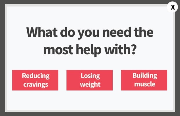
Reel visitors in slowly by asking easy questions that don’t give away their identity. You can start with basic questions of even multiple choice buttons that will then lead to a next step.
8. Let Your Customers Do The Talking
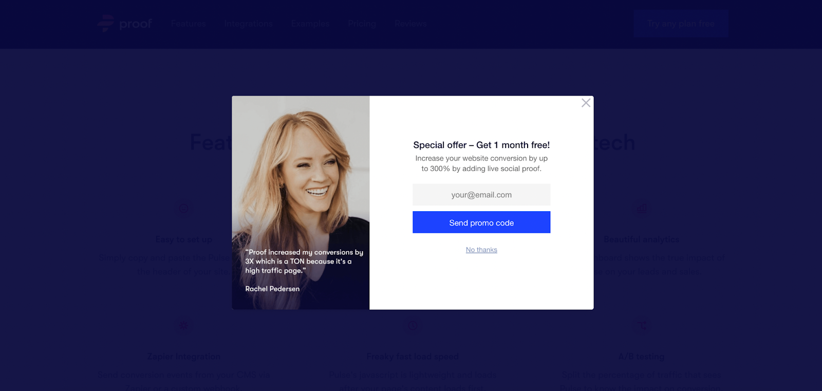
Testimonials are one of our favorite strategies to optimize landing page conversion rates. They help nudge the conversion, especially when done right.
The more realistic and credible your testimonials, the more relatable they can be to your visitors, which means your benefits and claims are substantiated.
9. Blog Post Specific Popups
If someone gets deep into an in-depth instructional blog post on your site and then closes the window, you’ve missed out on a conversion opportunity.
If your visitors love what they’ve been reading, they’ll be willing (now more than ever) to exchange their email address for a content-specific download. This is even more effective if you position the offer as something that will help them take what they’ve learned from your blog post even further.
Known as a content upgrade, a lot of content marketers are already updating their most popular blog posts with CTAs to prompt free downloads. Adding an exit-intent popup on these blog posts can help you capture the emails of those who have gone blind to traditional on-page CTAs.
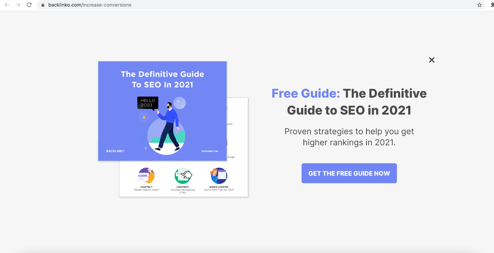
This popup from Backlink.io comes up when you’re reading their blog post on using content to boost conversions. After the visitor has scrolled through, a full-page popup shows a call to action to download a full SEO guide by providing an email.
If they liked the blog post, there’s a great chance they’re giving their newsletter to get the full guide.
But what if you don’t have a content upgrade like an e-book to tempt people with? You can still create a page-specific popup with relevant bullet points and prompt them to sign up for more relevant advice via your newsletter.
If they love what you had to say, they’ll opt-in.
10. Animation
Not all popups have to be boring. Animation not only adds an opportunity to have some fun with your popup, but they’re also extremely eye-catching.
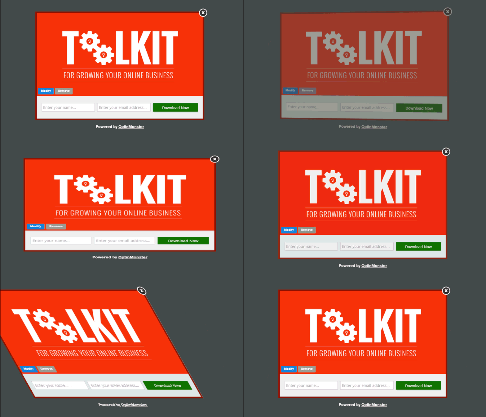
This could work to your advantage within your exit popups while making your visitor’s user experience even better.
Let me explain.
There’s this thing called decision fatigue that affects all of us every single day, whether we like it or not.
The basic theory is that as the day wears on, our mental energy wears out, so we’re more and more likely to take the path of least resistance in our decision making later in the day.
And since the average popup usually has a headline, maybe a subheading, bullet point benefits, and a CTA, that can be a lot to look at.
And it feels like even more to look at when you’re doing online research for your boss after lunch, when you’ve already finished all the hard, important stuff for the day.
In this case, tasteful animation that either points out the main benefit you’re trying to drive home before they leave your page, or to the actual CTA itself, helps reduce the friction in the brain.
11. Coupons to Reduce Buying Friction
When I was shopping online for Christmas gifts, there were a few times when I abandoned my shopping cart after seeing the final cost plus shipping.
So instead of finishing the buying process, I just closed the window and decided to come back to it later…with a plan to either shop around for less expensive options or wait to see if I could think of another item later to qualify for a free shipping limit.
A genius way to reduce the buying friction your visitor might be feeling at that point is to offer a coupon for free shipping or a certain percentage off to complete the order right now.
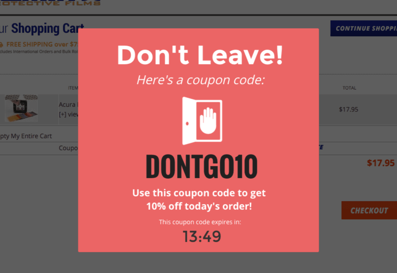
Here’s an example that catches you as you’re leaving and offers a 10% off coupon.
Between the bright color and the “Don’t Leave” copy, they’ve definitely got my attention.
This strategy is so important and effective (especially for an e-commerce site and shopping cart abandonment) that Shopify offers a free trial of their Exit And Leaving Coupon Offers app, letting the data from the trial speak for itself.
“Studies have shown that 8 out of 10 visitors who add an item to their cart never make the purchase and the main reason is price…
“If they were to leave and a coupon that makes the price of the product more acceptable for them appears, you can make an additional sale from a visitor that you would otherwise lose forever,” they say.
12. Full-Screen Eye Pattern Templates
It’s pretty much fail-proof. When people read websites, they read with an F-shaped eye pattern.
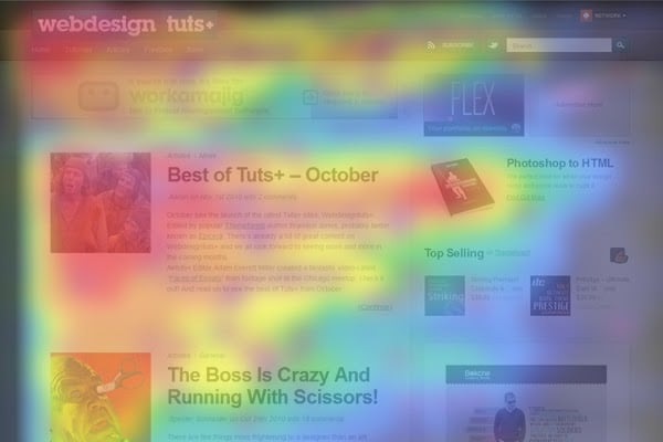
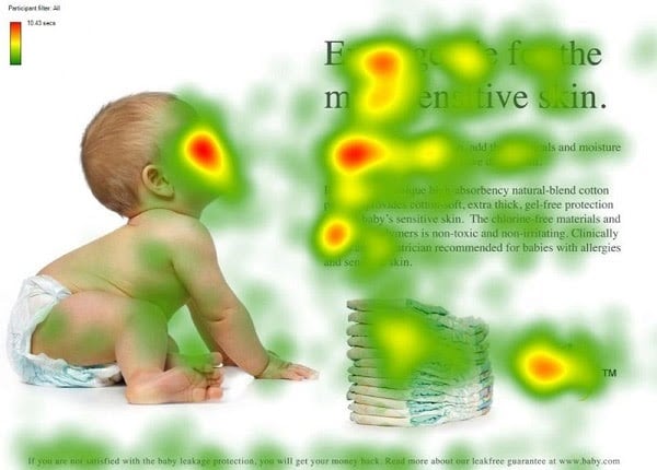
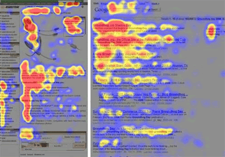
See what I mean?
So don’t think it’ll be any different with your exit popup, especially if you’re using a lightbox that takes up the full screen.
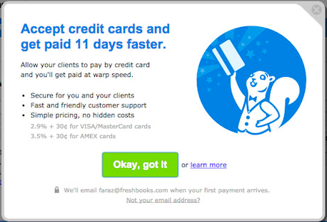
So, the left side of your popup carries more visual weight than the right side. When looking at templates or making a design, it’s better to keep your image on the right side so you can get more attention to the weight of your words or signup form.
Also, especially if you’ve only got one CTA button, you might not want to put it in the bottom right corner.
You know, the basics.
13. Be a Jerk in Your “No” Option Language
I’ll try to set my harsh judgments and condemnations aside for a moment and look at things objectively here.
I’m sure you guys know what I’m talking about. *cough* *cough*
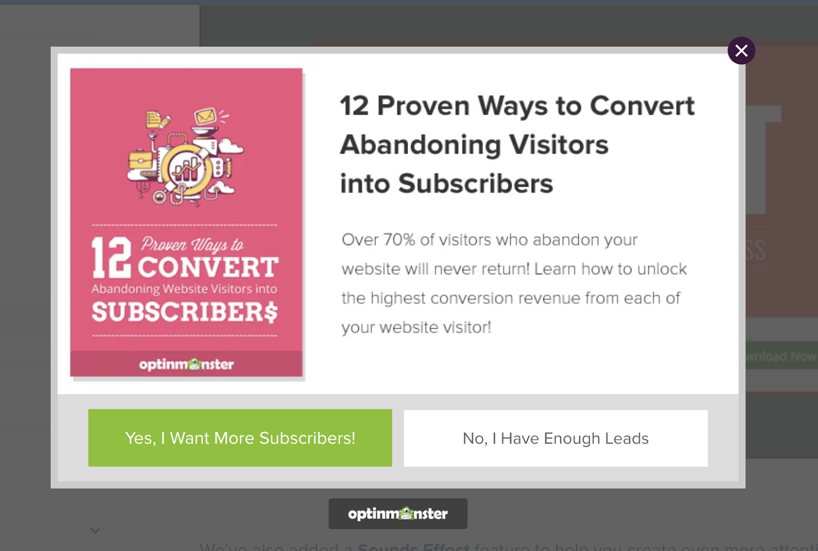
Doesn’t this just totally rub you the wrong way?
Lance Jones calls it “scuzzy.” And I agree. Though I might not choose such a nice word.
But as much as I’d love to say other people hate it as much as I do, the data says something different.
Because (trying to see the bright side here) I have to admit it does create an easy, no-brainer “yes.” And when someone clicks on that “yes”, it builds their momentum towards actually converting.
According to OptiMonk, adding the “No” option can increase conversions by 30% to 40% compared to an exit popup that only provides the opt-in option.
“This is especially the case when you add a reverse call to action to your ‘No’ as a subtext,”
said Csaba Zajdo on OptiMonk.
“For example, the opt-out or ‘No’ link can read, ‘No, I’d rather not receive free deals in my inbox.’
In this case, seeing this link, the visitor will reconsider their option to opt-out and think, ‘Ok, why not? I like free deals, I can read the emails when they arrive and decide later, ok I’ll signup.’
“A choice can leave doubt in people’s minds if they did make the right decision or not,” said Krista Bunskoek. “If someone said ‘No,’ that choice can linger on in their minds and there’s more likelihood of them coming back to your site anyway.”
Be careful, though.
“If you let yourself fall to the dark side,” warns Lance, “which is basically outright trickery – you may see some positive initial results, but you’ll be found out eventually, and in the end, your newfound customers will be pissed.”
14. Urgency That Doesn’t Feel Cheap
Let’s learn a little lesson about urgency. It does not have to look like this:
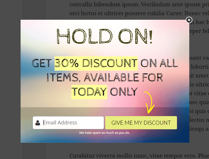
Today only! Except when I come back tomorrow, and see that it says exactly the same thing…
Not at all.
What you can do, though, is politely remind them that a certain deal only has a certain amount of time left.
Or give them a nudge that they can have something right now if they’ll just take the 60 seconds or so needed to fill out your request forms.
Here’s what I mean:
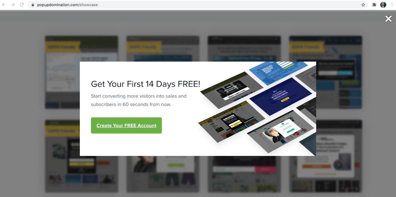
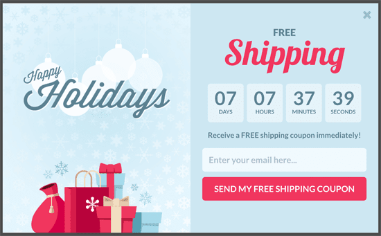
This countdown, available in WordPress, doesn’t fake urgency and keeps you accountable to only offering your time-sensitive offers during your set time periods. Also, it doesn’t “start over” just because a new person comes to your site.
Urgency with your exit popup can be classy, folks. And you don’t even have to employ the scarcity mindset that a lot of scammy online tricksters use.
15. But Wait, There’s More! (Billy Mays Discount Code Style!)
Anyone else here grow up with a childhood guilty pleasure of mindlessly watching Billy Mays infomercials?
I don’t know why I liked watching them so much, I don’t ever remember him advertising any product I actually cared about. But he was just so excited about all of it, and even though I didn’t do much house cleaning at that age, I had to admit, OxiClean could really take care of business.
And if the quality of the product in and of itself wasn’t good enough when the call to action came around and you had to call in with your credit card, he always threw in another container of OxiClean and some other awesome product to help you with your laundry. (Or something like that.)
And there was one thing I knew: if I was 18 and had a credit card, I would have been all over that special offer.
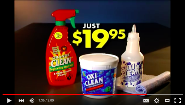
Not only did Billy Mays cut the price of the OxiClean tub in half from $40 to $19.95, he gave away a squirt bottle, a shammy, and Orange Clean.
Whoa.
The moral of the story is that even if you don’t double your offer for the same price, you must offer something of value. If you have a SaaS business, for example, a free month, a percentage-based discount on their order, or free shipping might work.
Decide what’s appropriate for your business model, and then go for it. But the bigger the offer, the bigger the lead magnet.
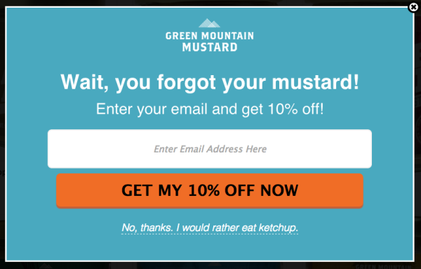
I love this popup that Shopify shared from one of their customers. You’ll notice that this strategy (an extra offer to get people to convert) really doesn’t have to be much more than saving a little money, like in Hack #3.
For example, rather than a 10% discount, Green Mountain Mustard could have offered a free recipe card if they processed their order at that moment.
16. Cart Abandonment
Maybe your visitor was shopping along, added something to their cart, and then got totally distracted by the other amazing content and products you have that they totally forgot to check out.
If someone’s about to close your tab but they’ve got an item in their cart that they haven’t purchased yet, by all means, remind them of it.
The practice of placing a popup notification about someone’s shopping cart as soon as they add in an item is pretty common.
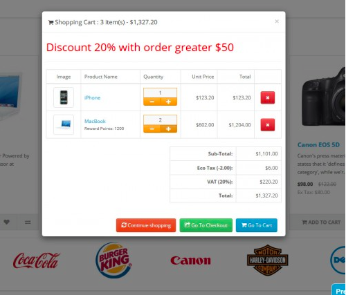
But imagine if this came up as an exit-intent popup… especially with the 20% discount reminder.
When ShoeMe.ca wanted to recover brand new customers that were about to abandon a shopping cart full of products, they created a 15% off exit-intent popup.
But since they didn’t really want to offer the coupon to everyone, they filtered out any returning visitors, so it only showed to first-time visitors who were about to purchase, and had a higher sensitivity towards exit-intent.
By doing that, they turned 6.87% of brand new visitors that would have otherwise been gone forever into full-fledged customers with the probability of a lifetime value higher than just that of their first order.
If you don’t have the flexibility to offer a discount, you can bring attention to a money back guarantee or your return policy. Want more ideas? We’ve come up with 26 Cart Abandonment Fixes That Don’t Require Discounts.
17. Social Follows
A lot of times, people will come to your website to read what you’re writing, and not much more.
They might love what you’ve got to say, but they’re not really at the point where they want to do much more.
But a chance to passively keep up with what you put out online?
Why not?
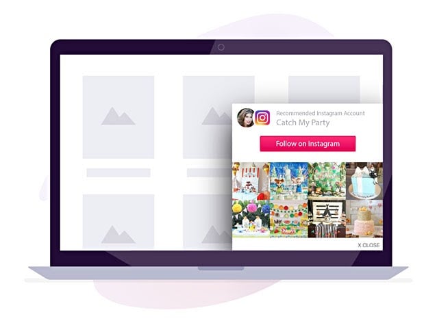
You could see your social influence growing quickly for no extra work than the time it takes to set up one of these bad boys. (Which is not much.)
Bloggers have a ton of success with this technique and there’s no reason why your brand can’t also.
18. Give The Customer A Chance To Talk
This one, in particular, won’t necessarily contribute to a wild increase in conversions… or any increase in conversions for that matter.
But while quick wins are definitely important, I’m guessing you’re also in this online business thing for the long haul, so pulling off something like this right as new visitors are about to leave could be incredibly valuable.
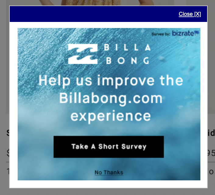
If you spend enough time on Billabong’s website and go through enough pages, a survey will popup as you’re getting ready to exit. This behavior-based triggers, lets you show the popup for a survey request at the most critical moment and gather some really good insight.
These popups are also a really good way to show that you value the person’s opinion and feedback. It works two-fold.
Be careful though — too much of this could make you seem whiny and needy. (And no one likes to hang out with the whiny needy type.)
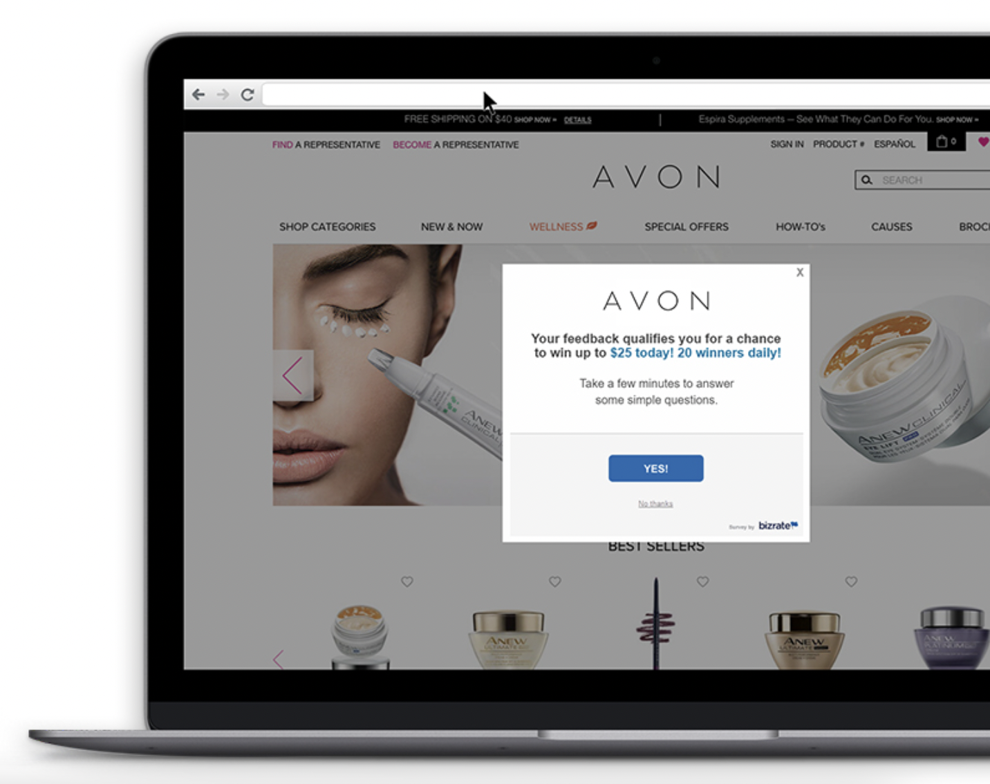
Pro Tip: You can still make this long-term hack, a good one for the visitor too by providing an offer if they take the survey.
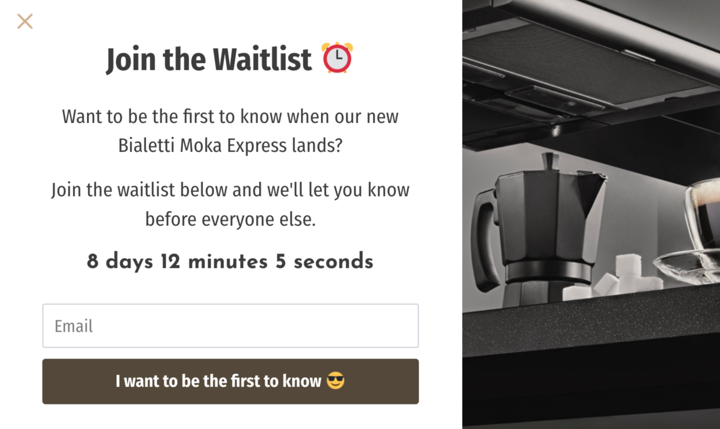
19. Employ Launch-Centric Scarcity
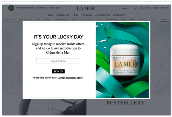
If you’re launching something soon, and particularly if a visitor was just on a landing page talking about the particular product that’s being launched, use exit-intent based scarcity to get people to think twice about opting in.
You could offer a pre-launch sales rate at a discounted price… but only for the first several who opt-in or for a limited time.
For example, if you decide you’ll sell access to a webinar at 40% off to the first 250 people who sign up, you could show a countdown ticker within the popup itself that shows how many tickets are left at that price, and how quickly they’re going.
Make sure you also mention the regular price for comparison, and when that will be available for purchase and download.
“Scarcity works because it forces action,” said Yaro Starak. “You can’t be a fence sitter if the product is coming off the market tomorrow. If you want it, you have to decide now.”
In fact, scarcity is so influential that it’s the sixth of Robert Cialdini’s six principles of influence.
“When our freedom to have something is limited,” Cialdini says of scarcity, “the item becomes less available, and we experience an increased desire for it. However, we rarely recognize that the psychological reactance has caused us to want the item more; all we know is that we want it.”
20. Suggested Reading
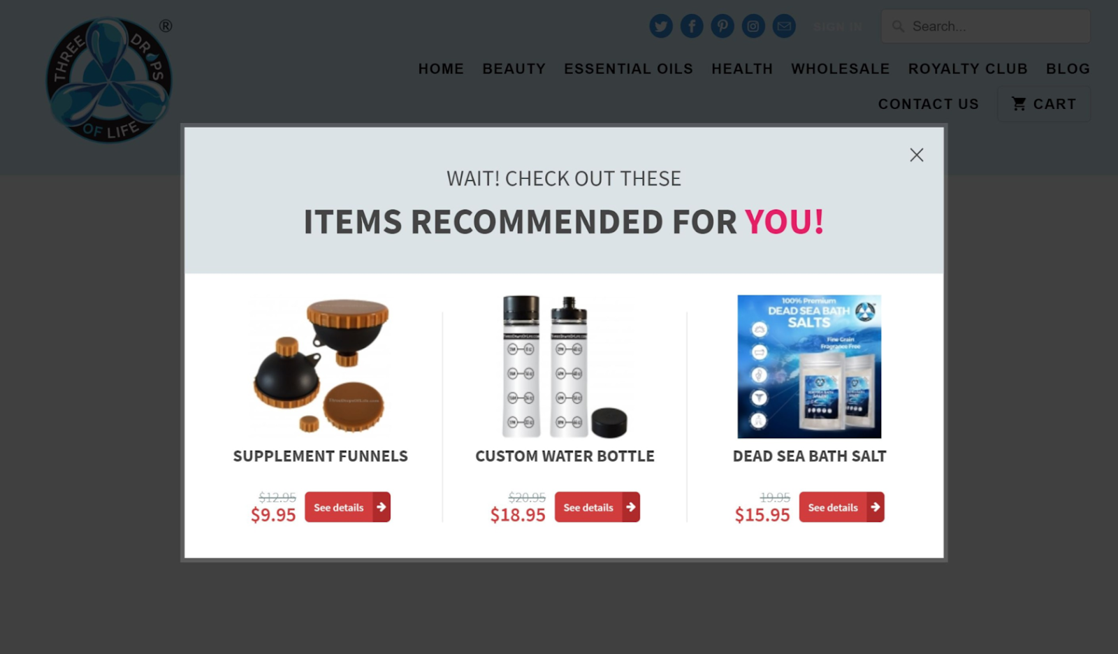
This works particularly well if you choose a popup plugin that has exit-intent prediction and factors in how long users have been on the page and how far they scrolled.
If they’ve spent enough time and done enough scrolling to read whatever it is that they’ve landed on but have finished and are trying to leave, suggest another blog post that’s incredibly popular and that readers of the given topic are also really interested in.
For example, if a visitor finished reading my post about classy vs. tacky copywriting and is moving toward the tab’s “X”, I might put in an exit-intent popup that leads them to a previous blog post about how to write better blog post intros.
This also works really well as a technique for an online store. There’s tools that can take into account all the other products that a visitor has looked at and if they go to exit, show products that person is likely to want.
21. Test a Two-Step Popup
Ever notice that when some popups appear in front of you, they don’t have a direct CTA?
Like, the ones with the “Yes” and “No” options that some people tend to be jerks with?
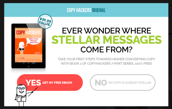
This is the first step in the Copy Hackers popup for a free eBook.
Only when I click on the “Yes” option do I proceed to the next screen of the popup, the actual opt-in, which creates momentum towards conversion.
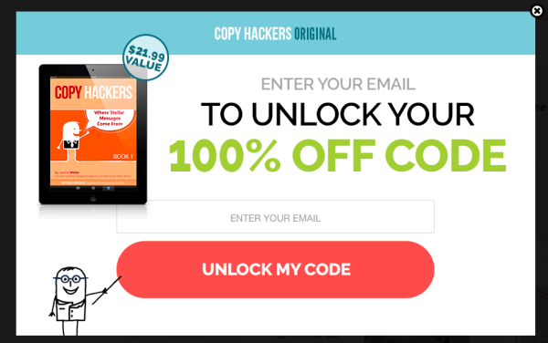
I’ve already said yes, so of course I’m going to be more likely to give them my email for their email list in exchange for a 100% off coupon code. It’s an easy lead magnet.
These tactics can get you more conversions as exit popups too.
In theory, when someone answers “Yes” to the question you’re asking, they’re building momentum to push through to the conversion. When the second step pops up, they’re more likely to enter their email address into the box than if you just shoved the blank box in their face from the get-go.
It works on the same principles as The Breadcrumb Technique, which states that users who take the first step, however small, are more likely to complete the process.
Even the people at LeadPages, who specialize in optimizing conversions, were able to boost conversions by 60% when they employed a two-step popup over the traditional single-step one.
22. Get SPECIFIC
This isn’t so much a tip exclusive to exit popups as it is for copywriting in general.
But if you want your exit popup to work for you, this is no time for generic language and vague promises.
Offering an eBook download to help your readers get more traffic might work. But an eBook offering advice to help them get 15,000 new visitors in a 50-day time frame will be much more effective.
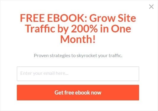
“What it mostly comes down to is the context and how the numbers are used,” said Neil Patel on ConversionXL, citing a study published in Science Direct. “For example, many cultures around the world are conditioned from a young age to infer that larger numbers means more of something.”
Use a number to grab visitors' attention and show them why they need to sign up for your newsletter or purchase your product.
Proceed With Caution
Before you set up an a/b test to start learning which of these hacks your audience responds to best, remember to tread lightly. Exit-intent popups can easily turn into an annoying message that turns off visitors.
It’s extra important to keep a close eye on all your analytics and make sure that anything you implement has the user in mind first.
Before you turn on a popup, think if it’s something you’d want to see.
Once you’ve hit go, if you see your bounce rate rising or the number of return visitors shrinking, take another critical look at your exit-intent pop to determine if it’s pushing people away.
(If you’re not 100% sure how or what to test on your website in order to keep tabs, we put together Five Steps To Knowing What To Test.)
And keep in mind that Exit Popups are only one type of popup. There’s seven other types of popups that you could be using, from timed popups to click popups, or scroll popups.
Once you’re popping up everywhere you should be (without being annoying), make sure you have all four pillars of high landing page performance dialed. With well-timed popups and an optimized landing page, you’ll be unstoppable.
So now that we’re going to start running an exit-intent popup experiment on our sites, do you have any exit popup hacks you’d like to add to the list? Or any particular thing you’ve tried with popups that have given you amazing results?
