You know when you’re super excited to sign up for a newsletter, only to wait several days to receive a boring welcome email?
That’s a sign of a poorly designed welcome email campaign that won’t wow its subscribers.
And in this competitive marketing that’s vying for everyone’s attention and loyalty, brands simply can’t stand to do that.
Luckily, we’ve got just the answers.
In this post, we’re going to cover the best practices behind creating a memorable and engaging welcome email. Plus, we’ll share our favorite 15 welcome email examples to inspire your next campaign so you can hit the ground running.
Let’s get started.
Subscribe to our weekly newsletter for tips so good that we might put ourselves out of business.
What is a welcome email?
A welcome email is a type of marketing email that companies or creators send to new customers, blog subscribers, or newsletter subscribers to welcome them to their email list.
A welcome email is an essential part of any email marketing strategy as it’s the first impression a subscriber or new customer will have of you.
You can use welcome emails to send special offers, tutorial videos, a sign-up form, or just a friendly greeting to build an authentic and long-lasting relationship with new contacts.
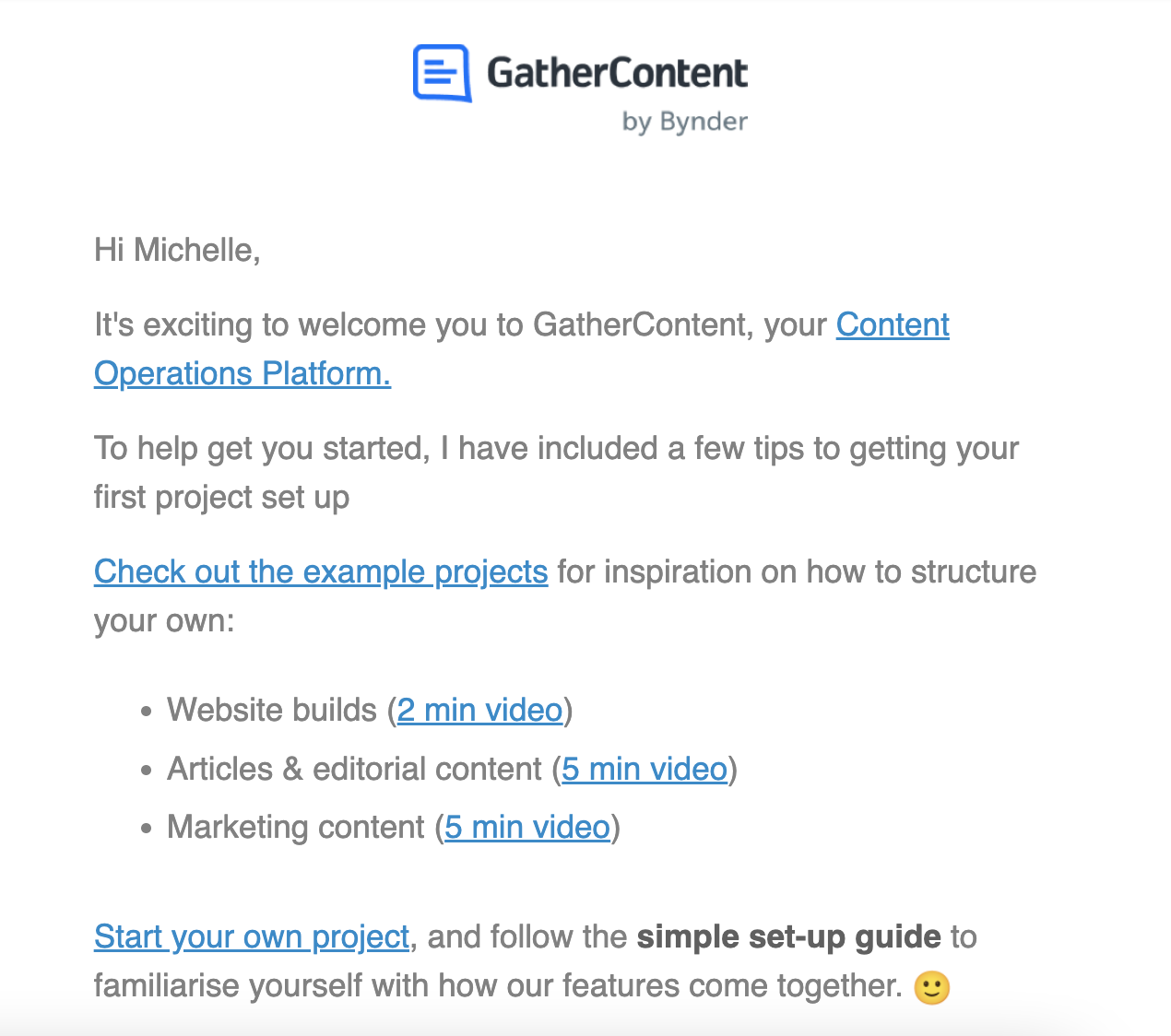
How to write effective welcome emails (8 best practices)
Welcome emails don’t have to be daunting. All you need is a set of solid guiding principles.
Here are eight email best practices to help you build stronger connections with your new subscribers and customers.
1. Send your welcome email immediately
And we mean immediately.
If someone has signed up to your email list, they want to hear from you. Waiting only diminishes the customer’s intent and your brand’s impression.
This is especially true if you’re an eCommerce brand and are incentivizing people to sign up for your newsletter with a discount code. If this is the case, you need to strike while the iron is hot and send them that special offer while they’re ready to purchase.
2. Personalize your email
71% of consumers expect personalization, so tap into this expectation and use your emails to build that connection and trust. It’s also said that personalized emails improve click-through rates by 14% and conversion rates by 10%.
So, why wouldn’t you personalize emails whenever possible?
Instead of pushing to make a sale straight away, think about how you can personalize the content to meet the consumer’s interests and needs. (Segmentation is a great way to do this.)
Depending on your audience, you might want to segment your email list by location, interests, or customer behavior. That way, you can send more targeted messages, increase your engagement rate, and straight-up make your customers feel valued.
Personalization can be as simple as using the customer’s name in the subject line or writing in the second person POV.
3. Focus on your value proposition vs. product
Not all customers want to receive endless product-centric promo messages. That can get old quick and come off as super spammy right off the bat.
Instead, focus on how you can communicate your brand’s mission and unique value proposition.
Remember, this is a welcome email. Now’s your chance to introduce your brand, what it stands for, how it differs from the competition, and what value it can bring to your brand new customer.
Save the product sales pitches and flash discounts for next time.
4. Set expectations
If you’re part of the 35% of marketers who send customers 3–5 emails per week, say so.
Your first email to any subscriber is an excellent time to set expectations about communication frequency.
When can customers expect a follow-up? Which days of the week will you send out a newsletter? How often can they expect to hear from you?
Outlining these expectations in your welcome email helps keep your customers fully informed. It may also make them less inclined to unsubscribe because they’re aware of the frequency.
5. Use high-quality imagery
Whether you choose to use photos of your product in action or illustrations showing people how to use your product, your images and graphics must be high-quality.
Your customers might be running for the hills if greeted with an email design that’s filled with janky images and half-loaded graphics. Not to mention, it just screams unprofessional.
Pro-tip: If it works for your target audience, consider using gifs and emojis to make your email stand out. 😍
6. Include a clear CTA
You have to consider what you want subscribers to do after opening your welcome email.
Do you want them to make a purchase with a discount code? Or do you want them to watch some product tutorials?
Direct your call-to-action (CTA) to a landing page, product sign-up form, or product page.
Whatever you decide, make it easy for readers to take next steps by including one very clear CTA. Avoid adding too many CTA buttons as they can lead to confusion.
Pro-tip: Optimize your CTA with continuous A/B testing to know what works for your audience and which is most successful.
7. Throw in a special welcome discount
70% of recipients open emails from a brand in search of a discount or a deal.
People love a discount, and your welcome email is a great place to encourage people to make that first purchase with you. Besides, nothing says thank you and welcome like a special offer.
You could include a discount code, free delivery, free expedited shipping, or limited offers to make a great first impression and a sale.
A win-win, if you ask me.
8. Write a catchy subject line
Think of the subject line as a welcome to your welcome email.
It’s gotta pack a punch, too.
A catchy subject line has the power to increase your average open rates and hook people into your first email message. Think about how you can be original and consider including emojis or questions to spark people’s curiosity.
More reading: Check out our entire blog on email subject lines for an optimized template, examples, and tips.
Bonus tip: automate when possible
So you’ve followed all the right tips but found that manually creating and sending a welcome email each and every time is costly and time-consuming.
Once you have a welcome email you’re confident with, consider using marketing automation tools and creating a few welcome email templates to streamline your email workflow.
15 best welcome email examples to inspire you
A great welcome email can be comprised of many different components, but at the very least, it has to
- thank and welcome the customer (a given)
- focus on the value vs. product
- include great email design
- include a clear CTA
Here’s our pick of the best welcome emails we’ve seen that combine all those elements and elevate them in their own ways.
1. Mollusk
Subject line: “Welcome Aboard!”
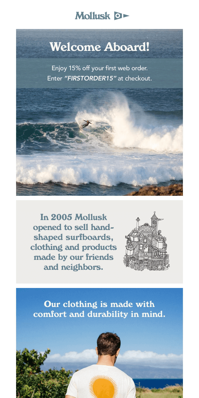
Why this welcome email example works: Surfboard brand Mollusk opens their welcome email with a clever pun that pays homage to their product offering: surfboards.
This first impression ties into Mollusk’s relaxed and casual branding.
Mollusk tells their brand story, explaining how they began, and some of what makes their offering different. Telling brand stories can help build trust and humanize your brand, making it more authentic.
Their welcome message also gives new customers a discount code to get 15% off their first order.
Way to make a splash, Mollusk. 🌊
2. Whistle
Subject line: “Welcome to the pack! Thanks for signing up to learn more.”
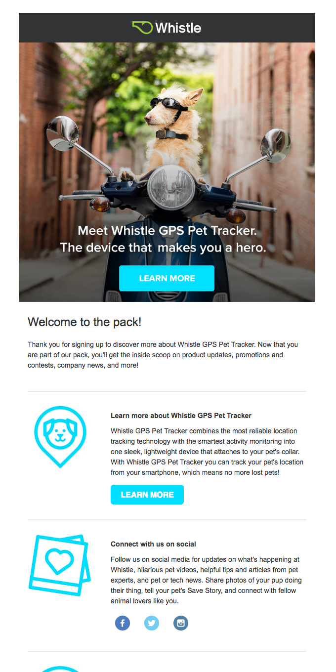
Why this welcome email example works: The first thing to catch my attention is the striking and funny image of a dog dressed to ride a motorbike.
GPS pet tracker Whistle uses its first email to introduce itself and its product in a way that immediately gets its customer(s) smiling. They also greet email subscribers with “Welcome to the pack!”, a message in line with their fun and quirky branding.
They provide new users with helpful resources on how they can learn more about the GPS tracker product and feature a clear CTA button to “Learn More.”
Whistle also uses its email campaign to encourage subscribers to connect with them on social media, strengthening their ties to the brand.
3. Spotify
Subject line: “Welcome to the Spotify Design mailing list”
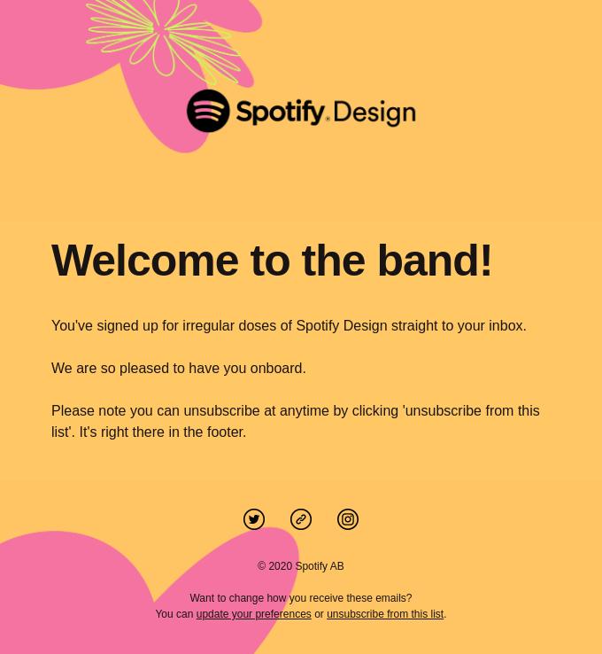
Why this welcome email example works: Spotify keeps its welcome email design simple with brightly-colored visuals combined with just a few lines of copy.
The music subscription platform opens its email with an on-brand nod to its product, “Welcome to the band!”
Instead of going in for the hard sell, Spotify instead points out that recipients can unsubscribe at any moment if they want to.
4. Bite
Subject line: “Welcome! You’re one in a billion ⭐”
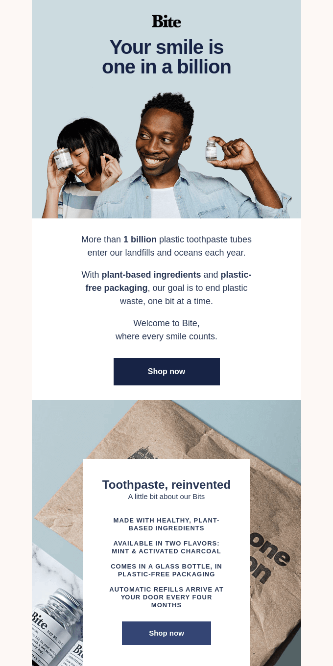
Why this welcome email example works: Toothpaste brand Bite uses a friendly and inviting header photo combined with fresh and clean copy—precisely what you’d expect from a toothpaste brand.
They open their message by directly addressing email subscribers with a nod to their individuality and uniqueness: “Your smile is one in a billion.”
Bite continues by sharing an impactful fact about the number of toothpaste tubes that end up in landfills every year before explaining its mission to reduce this number.
They also take the time to explain their brand story and how their product subscription system works, which is helpful for those new subscribers who might not know much about the product yet.
5. Zapier
Subject line: “Getting started: What's a Zap?”

Why this welcome email works: Automation software Zapier stands out from the crowd by embedding a video explainer in its welcome email. Instead of answering the question using lots of text, Zapier instead chooses a short explainer video to do the job.
There are also Zap templates so email recipients can see for themselves how they work. Zapier includes step-by-step visuals at the end of the email to explain what a Zap is, too.
6. Chipotle
Subject line: “The Best Tasting Email You’ll Receive”
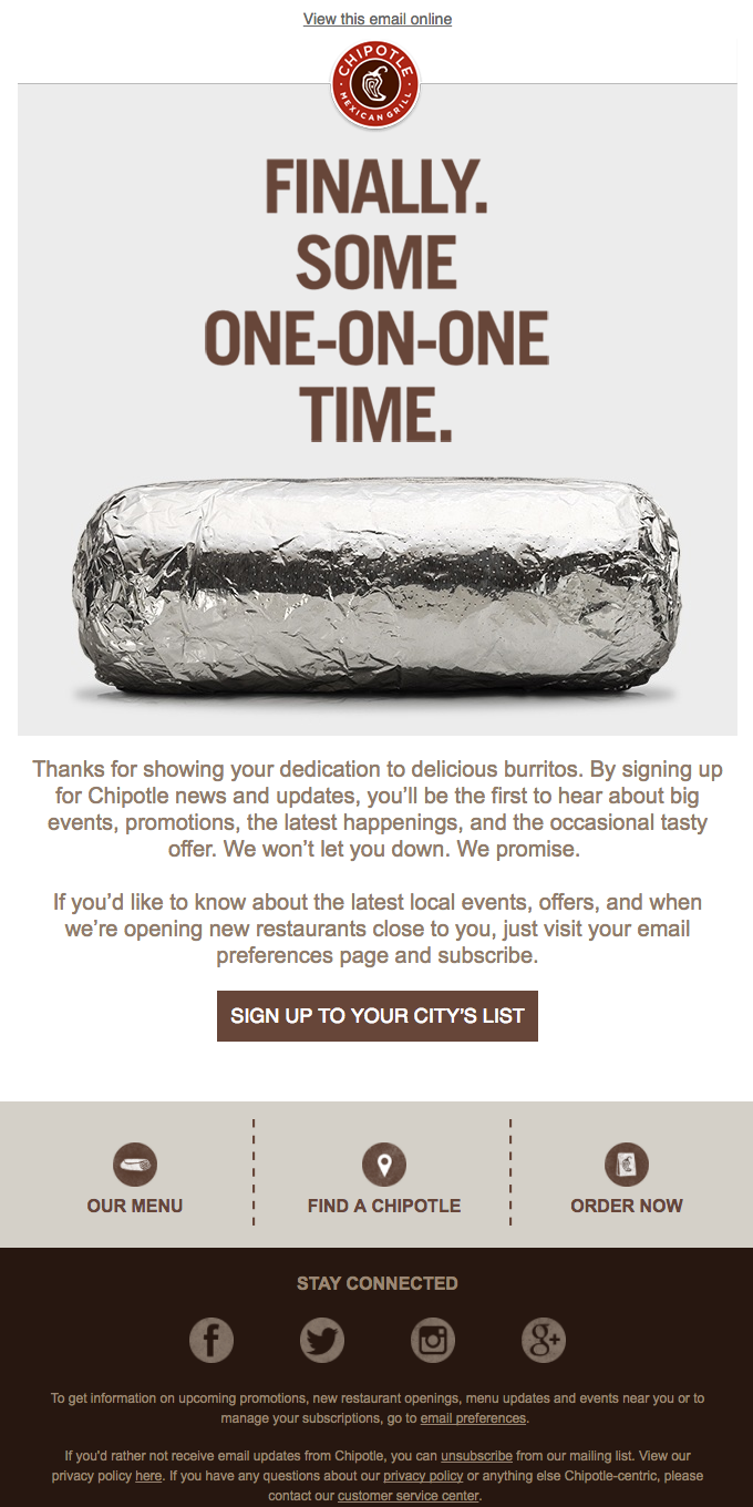
Why this welcome email example works: Chipotle’s fun and informal welcome email is in line with their playful brand that doesn’t take itself too seriously. They use the message to tell subscribers that they’ll be the first to know about any important news, hear about promos, and receive the occasional offer.
Clear and actionable copy drives readers to sign up for their city’s list, view the menu, or order now.
7. Miro
Subject line: “Welcome to Miro. Ready to Collaborate?”
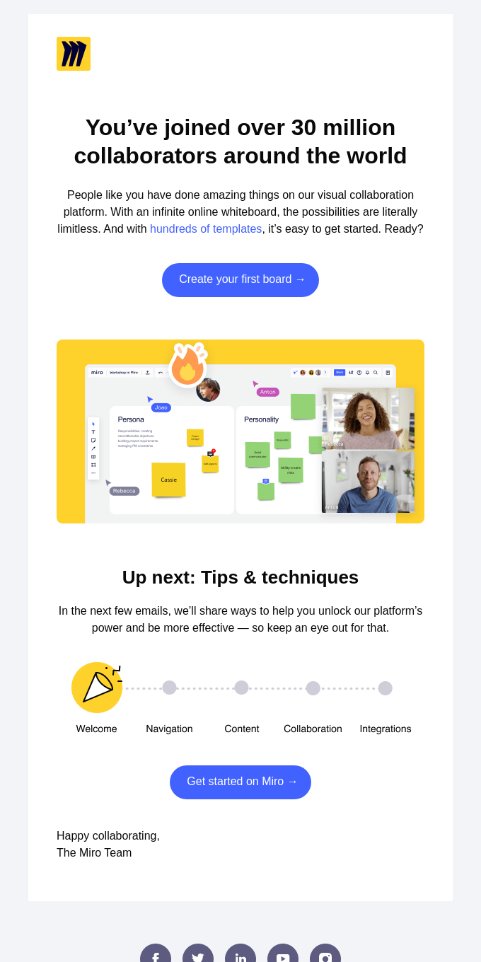
Why this welcome email example works: Miro’s welcome email is a great example of how to use social proof to open your message. They tell readers that they’re in good company with over 30 million collaborators around the world, reassuring new users that they’ve made a good choice.
After all, 30 million people can’t be wrong.
Miro also clearly outlines the next steps and shows readers what they can expect from future emails.
8. Loftie
Subject line: “Welcome to Loftie”
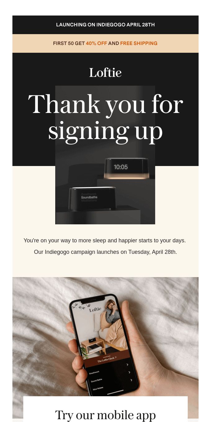
Why this welcome email works: Sometimes, a simple thank you paired with strong aesthetics is the way to go for a welcome email. Alarm clock brand Loftie offers a limited discount for the first 50 customers and free shipping to encourage people to convert.
The new brand also explains when their campaign launches on Indiegogo.
9. Zoe’s Kitchen
Subject line: “Welcome to ZK Rewards! You’ve earned 50 Stripes”
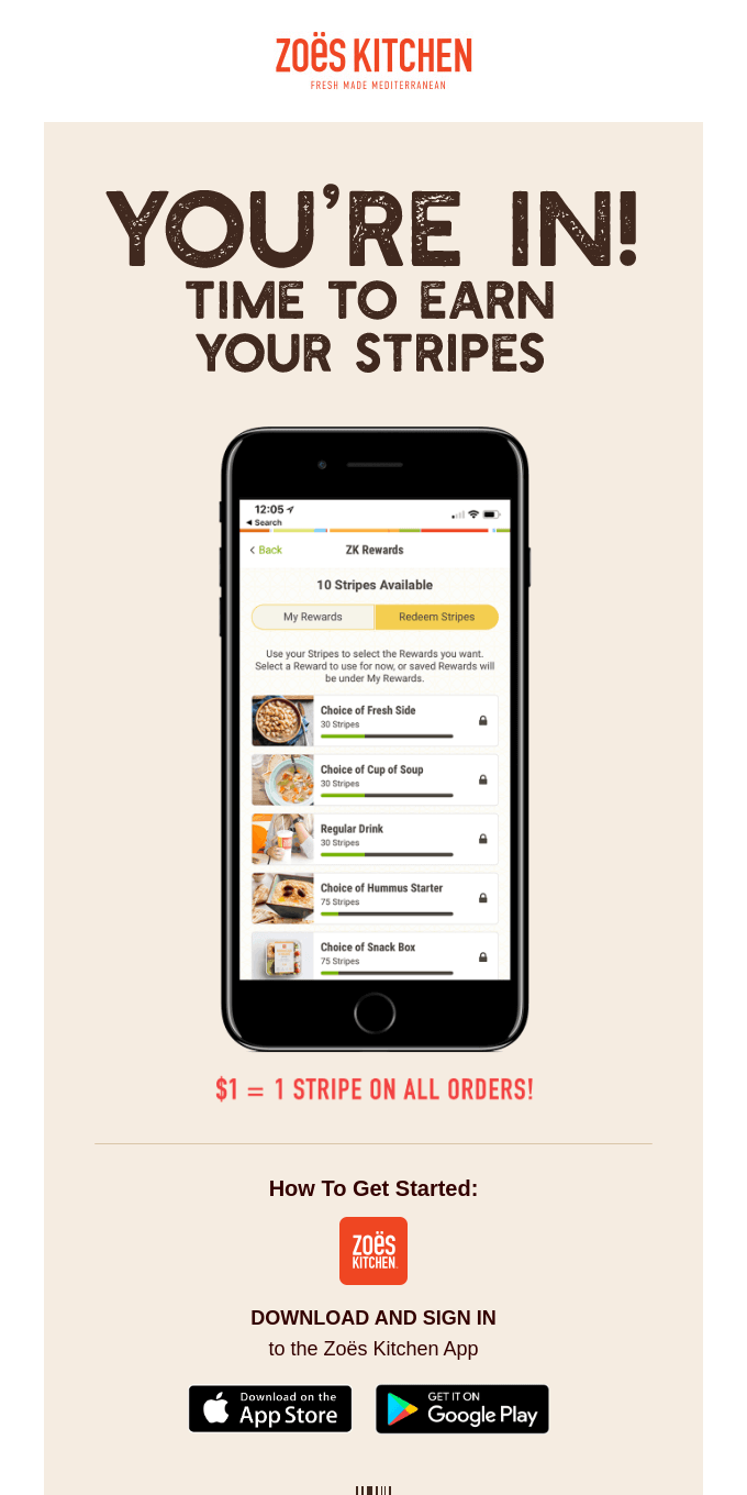
Why this welcome email example works: This ultra-clear and minimalist welcome email shows rather than tells recipients about the next steps. Instead of using a step-by-step guide or bullet points, Zoe’s Kitchen shows people how they can earn stripes with a high-quality graphic and a clear CTA button at the end of the message.
10. Glassworks
Subject line: “[🐣Welcome to Glassworks]”
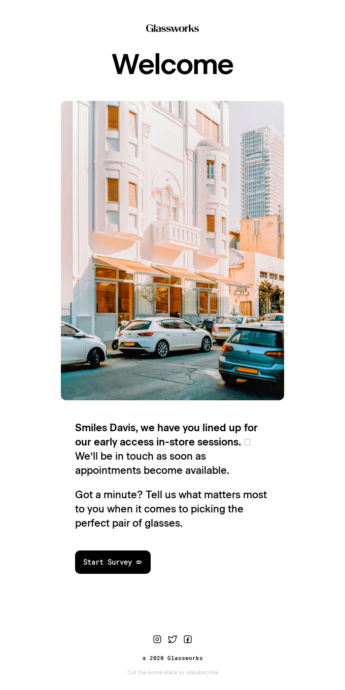
Why this welcome email example works: This is a great welcome email from Glassworks. The emoji in the subject line instantly stands out in a crowded inbox and encourages the recipient to open it.
Next, the personalized email addresses the customer by their name, helping to build an authentic connection. They then invite the potential customer to take a survey so that they can help them find the perfect pair of glasses.
Oh, and they include one of the sharpest images of a city block to reinforce their products’ high quality.
11. monday.com
Subject line: “Welcome to monday.com”
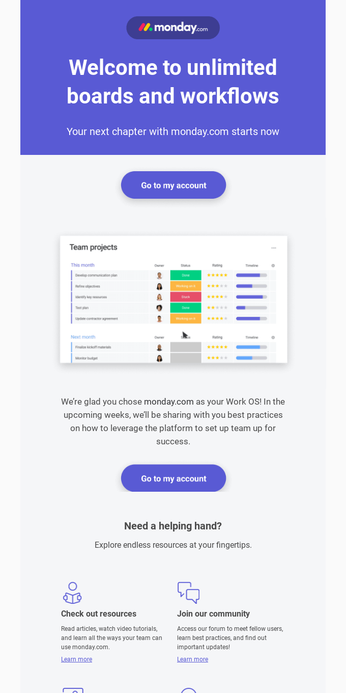
Why this welcome email example works: This message from monday.com is the first of an email sequence helping users get to know and make the most of the product. Monday.com is aware that it’s likely people’s first time using the product, so they share best practices for setting up workflows and boards.
For people that need some extra help, monday.com provides additional resources like tutorials to help them through the onboarding process.
12. MOO
Subject line: “Are you feeling lucky?”
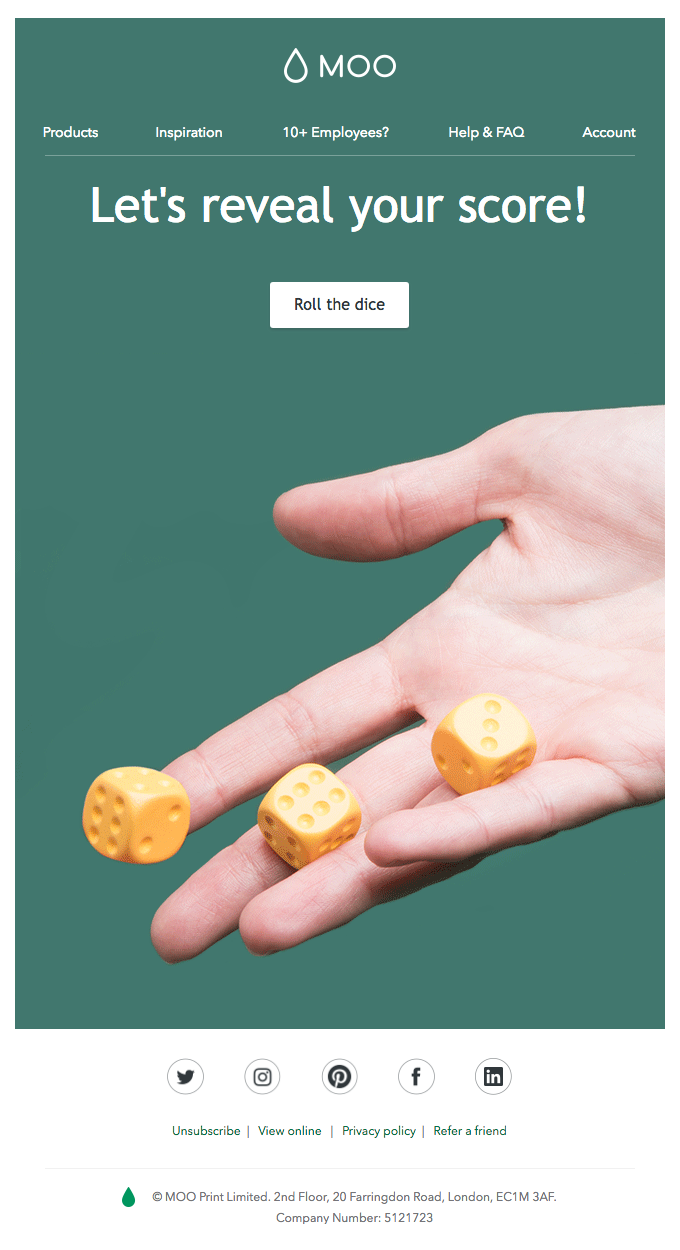
Why this welcome email example works: To start with, the welcome email subject line builds intrigue with recipients by asking a question. MOO then invites subscribers to play a game by rolling the dice. From the email alone, it’s not clear what kind of game it is or if there are any perks people can win.
I’m hooked.
By doing this, MOO should see a high click rate on their CTA since it’s impossible to resist seeing what the game’s all about.
13. NAADAM
Subject line: “Welcome to the herd. Your 10% off code is inside”
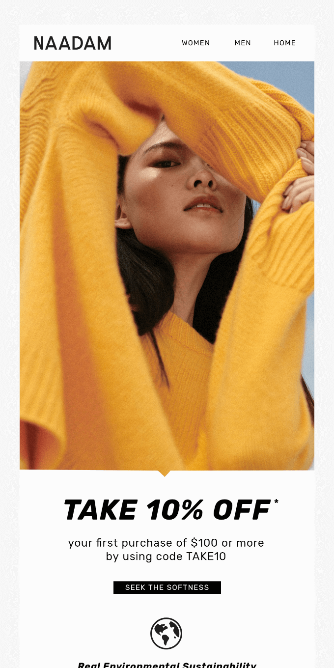
Why this welcome email example works: Clothing brand NAADAM uses its welcome message to encourage people to buy its products by offering a 10% coupon for the recipient’s first purchase.
Mentioning the special offer in the welcome email subject line is a great way of increasing their open rates, too.
14. Portrait Coffee
Subject line: “Thanks For Joining Us In Pouring A New Narrative!”
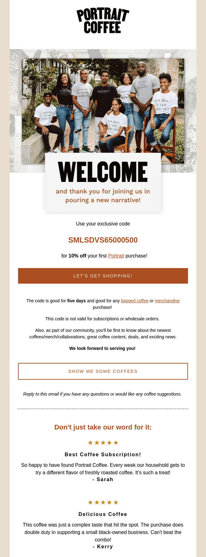
Why this welcome email example works: eCommerce coffee brand Portrait Coffee uses its welcome message to send recipients a discount code for their first purchase.
They also include a lovely image of their team and valuable social proof in the form of customer reviews showing new subscribers the quality of their product.
15. Munk Pack
Subject line: “A note from our founders”
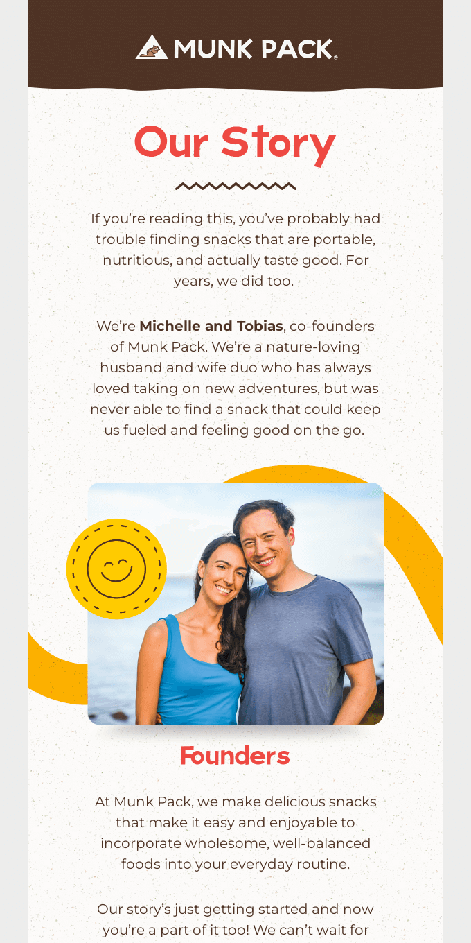
Why this welcome example works: Munk Pack chooses to humanize their brand and tell their email list the story behind it. The full email invites readers to become a part of their mission and learn more about the brand.
What’s more, they include a great image of the founders, forging a genuine connection and putting a face to the company behind it all.
Make a lasting first impression with welcome emails
Your welcome email is likely the first time your email has landed in your subscriber’s inbox. So make that first impression count and use the opportunity to start building an authentic relationship with your subscriber.
Give them a special offer, send them some helpful content, or say a meaningful hello.
Then, show them why they were right to subscribe with consistently engaging email newsletters and other marketing emails.
Not sure how to even start with email marketing?
Don’t worry, we’ve got you covered there, too.