


Are you using Google Analytics for CRO? If so, there are a goldmine of insights that can help you optimize. The insights gathered with analytics help you find opportunity areas for testing, as well as reason for test prioritization. One without the other is simply a sad story, money left on the table.
Yet most companies still operate with some sort of isolation between the insights team and the optimization/UX team. What the analytics team learns about customers often doesn’t get translated into actual experience changes on the website. But they can’t afford to be siloed anymore.
Thankfully, if you’ve got a basic level of Google Analytics knowledge, it’s not too tough to pick off some easy conversion optimization opportunities just by looking under the hood in your GA account.
This article will outline some of the top Google Analytics reports for CRO opportunities and give you clear takeaways for doing quantitative conversion research on your own site.
- 1. Conversions by Browser & OS
- 2. Conversions by Mobile
- 3. Site Speed Metrics by Browser & Browser Version
- 4. Site Search Report
- 5. Conversion by Acquisition Source
- 6. Conversions and Traffic by Hour of the Day
- 7. Landing Page Performance
- 8. Behavioral Data by Content Post
- 9. Sessions by Landing Page
- 10. Behavior by Event Tracking
- 11. Goal Funnel Visualizations
- 12. Horizontal Funnels
- Wrap Up on Google Analytics for CRO
Get brand new analytics strategies straight to your inbox every week. 23,739 people already are!
1. Conversions by Browser & OS
When looking in Google Analytics for CRO opportunities on your site, always seek out the low hanging fruit first.
In general, this means finding things that are broken. All you need to do is fix them, and conversions increase (or at least they won’t drop). It’s an easy way to put money back in the pocket.
There are two reports that are great for illuminating these opportunities: browser reports and device reports. The first one I’ll mention is conversion per browser.
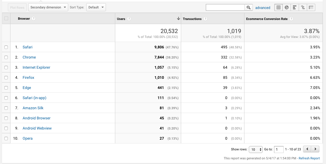
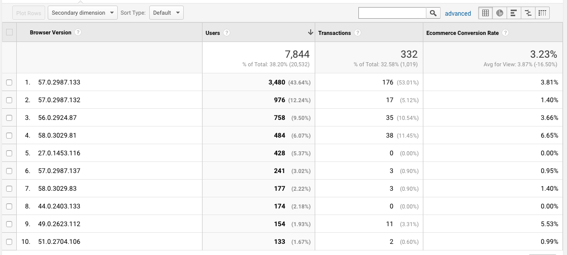
What you’re looking for first is high level trends. Does any particular browser convert much lower than all the others? If so, you can click on that browser to drill down on versions to see if there are any specific versions bringing the aggregate conversion rate down.
To find this data, simply go to Audience > Technology > Browser & OS. There you can choose to view by Browser, OS, Screen Resolution, etc. Otherwise, you can grab this custom Conversions Per Browser report here.
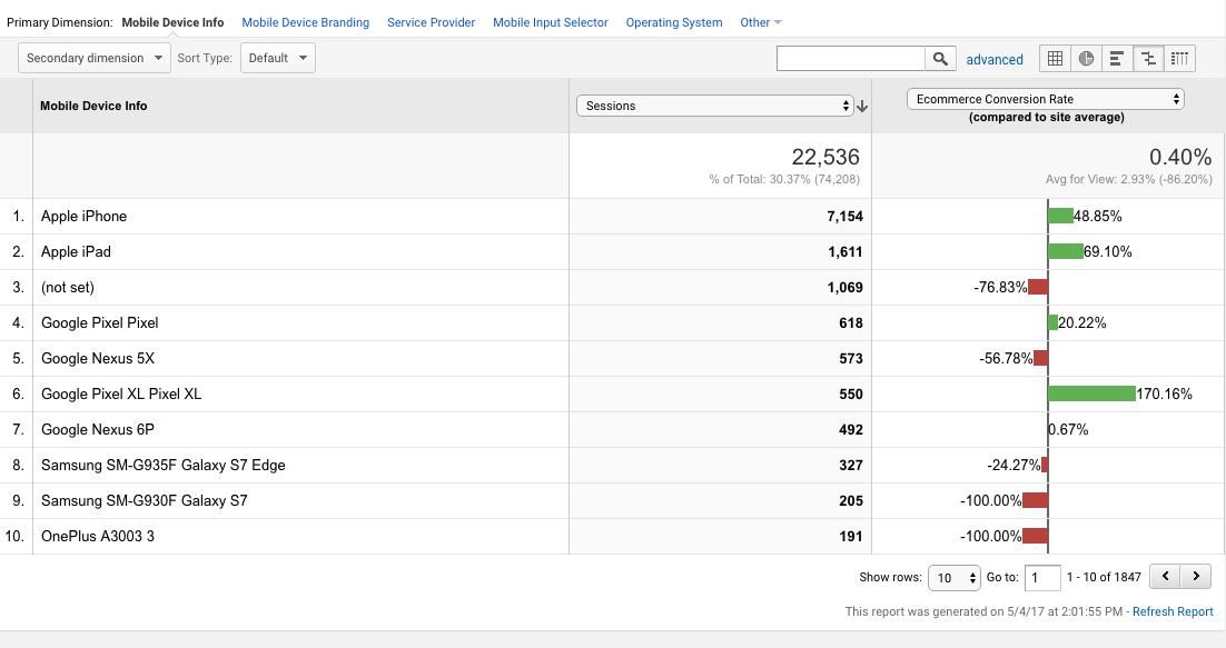
2. Conversions by Mobile
The goal with this report is the same as the first report: find some low hanging fruit in the form of technology bugs. If a certain mobile device represents a substantial portion of your traffic, yet a bug makes the UX horrendous, there’s a huge opportunity in fixing that bug.
This report is easy to grab. Just go to Audience > Mobile > Devices (or grab the custom report here).

One problem that may spring up here is how Google Analytics reports on specific mobile device brands and versions. For instance, take the iPhone. Seems there’s a lot of missing data when you drill down here....

A lot of the traffic just shows up as “iPhone” and doesn’t give you any information on what version. Without that information, it’s quite difficult to find and fix bugs on specific versions as it gets roped into an aggregate category of “iPhone.”
The workaround here would be to use screen resolution as a proxy. Here’s a slide that digital analytics and conversion optimization legend Craig Sullivan shared and talked about in his CRO Agency course…

While you’re here, you might also want to look at the general discrepancies between mobile, tablet, and desktop conversion rates. To do that, it’s just Audience > Mobile > Overview. Mobile is generally lower than the others, but tablet and desktop should be relatively similar. And if there is a huge discrepancy between any of them, it’s worth investigating.
Another thing I like to do here (and with the browser report, for that matter), is to look at the data from a comparison view. This lets you see how each device’s conversion rate compares to the average of the whole, and it sorts by session count so you can prioritize the biggest opportunities.
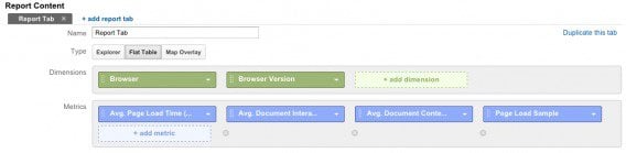
3. Site Speed Metrics by Browser & Browser Version
A better user experience leads to more conversions, and site speed has a huge effect on user experience (and therefore conversions).
If you care about UX, you care about site speed. Which browsers are experiencing slow page load times? Which versions of those browsers are suffering the slowest speeds?
You can build a custom report for that (or grab one created by Lunametrics here).
To set this one up, just click on “Custom Reports” and choose “Flat Table” as the type of report. Put in your dimensions (“browser” and “browser versions”) and your metrics (“Avg. Page Load Time,” “Avg. Document Interactive Time,” “Avg. Document Content Loaded Time,” and “Page Load Sample”).
This is what the report setup will look like:
You might also want to add conversion rate, transaction, and revenue metrics. That way, you can see how big the opportunity is to fix site speed and UX (i.e. how much money are you losing on this browser/browser version?). That will allow you to prioritize your patching.
Here’s what the end report will look like:
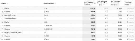
It’s sorted highest-lowest “Avg. Page Load Time (sec),” so that you can instantly see your biggest problem areas.
4. Site Search Report
It’s almost always the case that visitors who use site search tend to convert more. By what degree, though, is a matter to be investigated.
If you find, for instance, that not too many users are using site search, but those that do are vastly more likely to convert, it could inform an experiment to get more users to use site search.
Now, I want to note the difference between correlation and causation. Just because users who use site search convert higher doesn’t mean that using site search makes them do that; actually, they have have had higher propensity to convert anyway and therefore were more motivated to seek specific items via search.
But depending how your report looks, search may be an area in which you may want to experiment.
This report is easy enough to access. Just go to Behavior > Site Search > Usage, and you can see the difference between searchers and non-searchers.
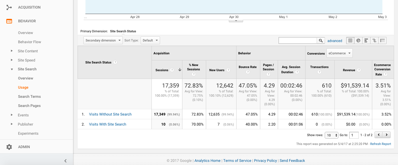
You can also set up advanced segments to view all other behavioral aspects of site searchers vs. non-searchers, but that may not be worth your time unless you deem it to be after viewing the data at a high level.
If you’re lazy, you can grab this custom report for Conversions by Site Search Status.
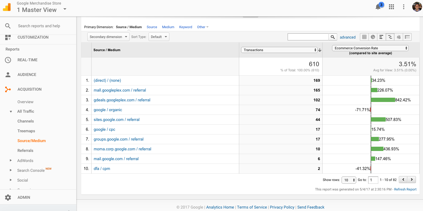
5. Conversion by Acquisition Source
The tie-in between conversion optimization and traffic acquisition is undeniable (or, in a perfect world, it should be). If you bring bad quality traffic to the site, not many persuasion tactics are powerful enough to change anything.
But when you’re able to see where your best converting traffic is coming from, you can make smarter decisions when it comes to acquisition investment. And if you find that some channels are lacking, perhaps you need to treat them differently via targeting rules or work on a different messaging strategy to better align with that channel’s intent.
Regardless of the fix, this is important information. Luckily, it’s a super easy report to pull. Just go to Acquisition > All Traffic > Source / Medium (or grab this custom report).
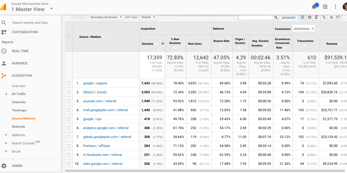
Here again, you may want to do a comparison view. But this time, I recommend sorting by transactions instead of sessions to find the best opportunity areas:
6. Conversions and Traffic by Hour of the Day
This report is sort of an anomaly on this list since it doesn’t directly give you A/B test ideas from viewing it.
However, viewing your data by time can give you tons of insights, not just for your visitors’ general purchase and site usage behavior, but for marketing campaigns, operations (customer support), and different offers and promotions.
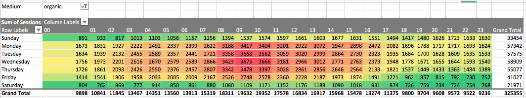
For instance, if you’re a publisher and you filter your traffic by organic and look at it day-by-day and hour-by-hour, you can see when most people are naturally coming to your site without your direct promotional efforts. This can help you decide when to publish, promote, and email your audience.
Here’s an example of a blog where you can clearly see the highest points of organic traffic are during the morning and Monday - Thursday, so it would make sense to publish early in the day and email in that time window as well:
Another use case: live chat converts well, but it costs money in the form of resources and time. If you can connect your live chat data with your Google Analytics traffic and conversions data, you can see when you most need to staff your customer support team to aid the conversion processes. Perhaps, there are times when conversion rates are high and support volume low - good indication you can lessen support resources here.
Anyway, it’s a good way to view some major trends in your site usage data, and there are many ways you can cut the data to draw insights from it. There are a few ways to draw out this data and visualize it.
My favorite way is to to pull Google Analytics data into R and visualize it there. I think it offers more flexibility than Excel, but it also requires you spend time learning R or hire someone who knows it. If you want to take a crack at it, this post outlines the necessary code.
The easiest way is to build a custom report in Google Analytics and export it to Excel.
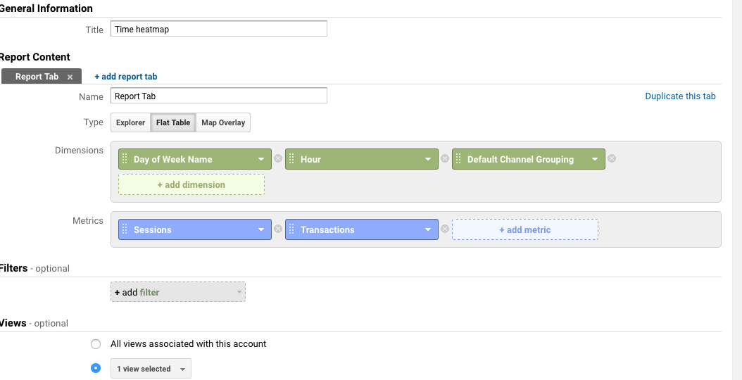
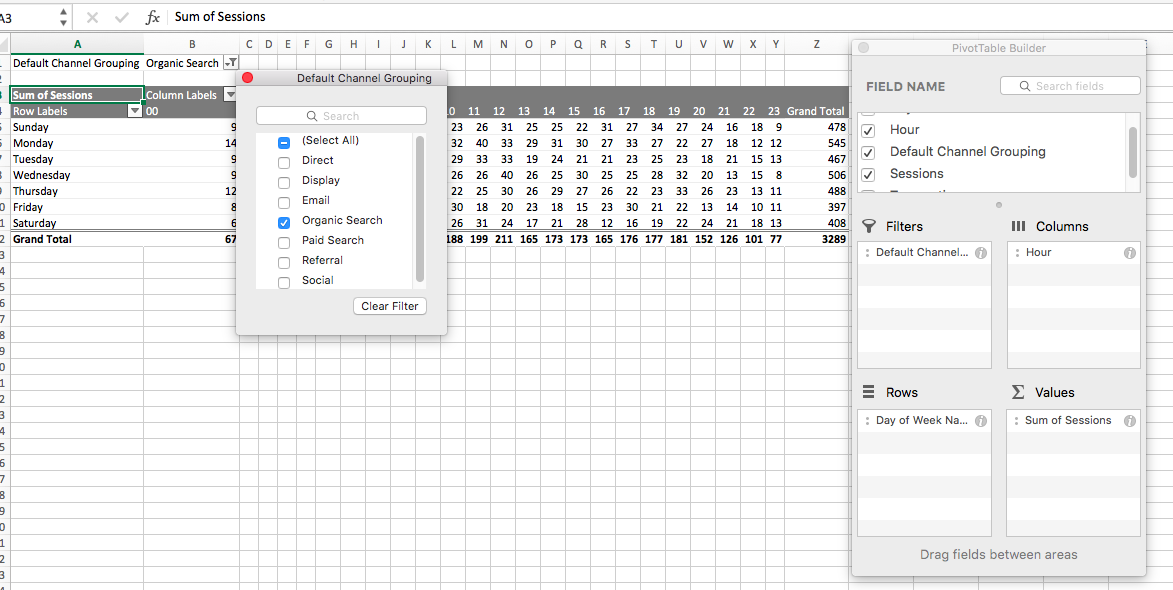
First, create a custom report and choose “Flat Table.” Your Dimensions will be “Day of Week Name” and “Hour.” I’d also add Channel to your dimensions to filter by traffic sources.
Add relevant metrics. For our purposes, these will likely be “Sessions,” “Transactions,” etc. You can choose what is relevant to your site.
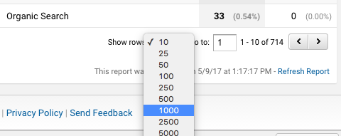
Create the custom report and make sure it’s showing all rows, then export it to Excel.
Note: You can also grab a Day of Week/Time of Day custom report here.
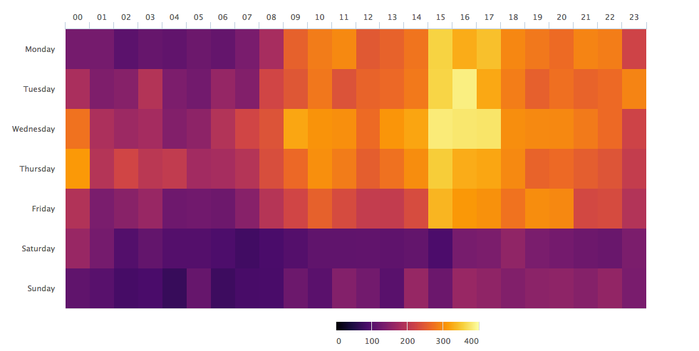
Pull it to Excel and set up a pivot table so that your rows and columns contain Day of Week and Hour (doesn’t matter which is row or column) and whatever metric you’d like to analyze is in “values.” If you want to filter by traffic source, add that as a “filter,” as shown here:
Then, apply conditional formatting to create a pretty looking heat map.
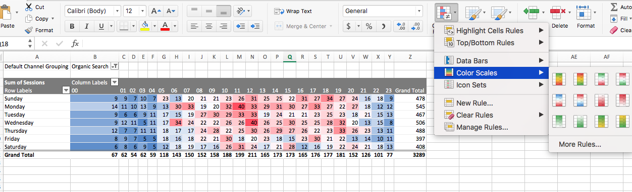
Now you can answer some fun business questions...Are your visitors more active during business hours? If the answer is no and you’re a B2B SaaS company, that might be a problem.
7. Landing Page Performance
This report is the bread and butter of a conversion analyst’s toolkit. It’s the one that most easily translates directly to conversion insights as it clearly shows you which landing pages need work. In addition, you can prioritize by the potential of the page as well.
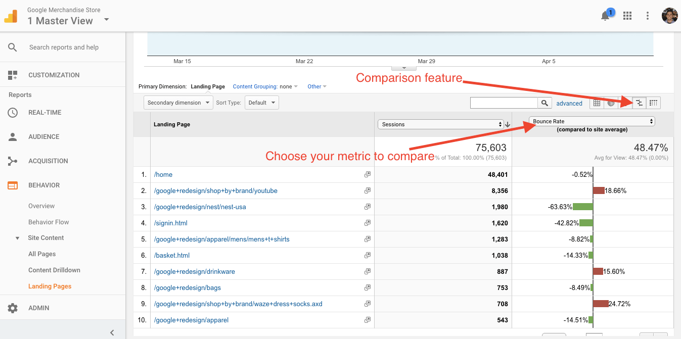
There are a few different ways to approach this. First, you can look at conversion rates by landing page. Second, you can look at proxy metrics (like bounce rate) to get a different idea of site behavior on landing pages.
Either way, it’s pretty easy to do. Just go to Behavior > Site Content > Landing Pages and use the comparison feature on the right hand side of the screen. Then, select Bounce Rate (or whatever you’d like to compare across landing pages) from the drop down menu:
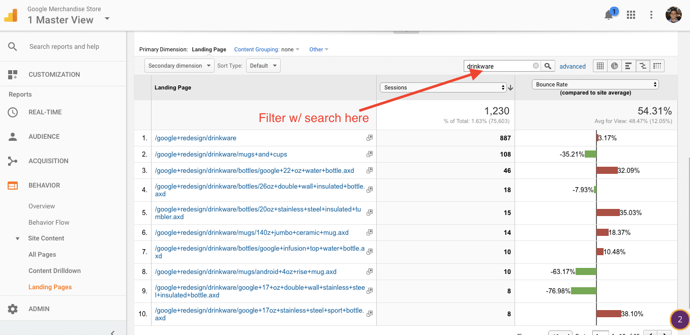
This shows you all pages on your site, but it’s likely that you’ll want to get more granular. For instance, if you have product category pages, you can narrow down and see the Bounce Rates of only pages in that category. Just search your category indicator (e.g. “drinkware”) and you’ll see only those pages and can nail down which ones need work:
No matter what framework you use for prioritizing A/B tests, we all have a limited amount of traffic, and we all need to consider the relative impact of a given experiment.
When you find high traffic landing pages with below average conversion rates or engagement metrics, you have found the highest potential impact pages. There’s a lot of room for improvement on these pages--and because they’re higher traffic, the impact is larger than the marginal increases in value you’d see with lower trafficked pages.
8. Behavioral Data by Content Post
If you produce a lot of content, you might wonder, “does this piece of content even help conversion?”
Maybe it’s the case that your top article by traffic volume doesn’t do much to move the needle. Maybe a particular category of content is much more efficient at bringing in revenue and conversions.
To find this out, we’re going to build an advanced segment. Here’s how to do it step-by-step:
- Copy the URL of the page you’d like to analyze.
- Click +Add Segment
- Look on the left hand side and find the options “Conditions” and “Sequences.”
- Set up a “Sequence” as step 1 for the page you’d like to analyze.
- Set up Step 2 so it is Transactions per user is greater than 0
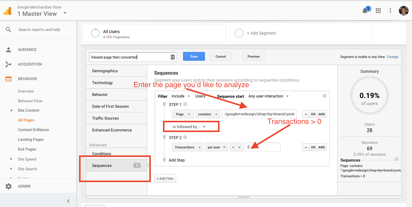
With this segment, you can see if your highest traffic pages perform well with regards to business value. Hint: at CXL, some of our highest trafficked pages don’t pull much in dollar value.
9. Sessions by Landing Page
Let’s back up for a moment.
When optimizing a website, it’s all about prioritization. What are the biggest opportunities to increase conversions? Though there are different formulas and frameworks for test prioritization, they all balance the potential impact (usually this includes both traffic and relative conversion rate) and the resources it will take to increase conversions.
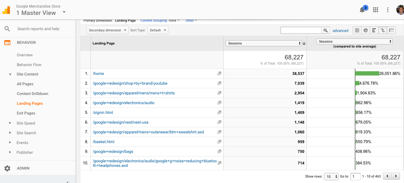
So, to rank our test ideas and locations, let’s step back and look at an incredibly simple report: traffic per page.
This report will help you answer fundamental questions like, “how important is this page, really?” Often people will simply view pages like the Homepage as important without asking what the relative traffic percentage is to the rest of the site.
To see this information, just go to Behavior > Site Content > Landing Pages, and order by sessions in the comparison view:
10. Behavior by Event Tracking
Though this requires a bit more implementation than Google Analytics gives you out of the box, event tracking is where you’ll find the more important insights when using Google Analytics for CRO.
You can see what events are being fired by looking at your Google Tag Manager set up (if you’re using tag manager for event tracking) or by looking at the following report in Google Analytics: Behavior > Events > Top Events:
You can then do a little investigation and analyze behavior by visitors who triggered a specific event.
Let’s say for instance that we’d like to analyze the behavior of those who start watching videos on our landing pages. All this requires is setting up an advanced segment. This time you can use “conditions” and simply set the condition to include whichever event you’re looking to analyze (video starts here):
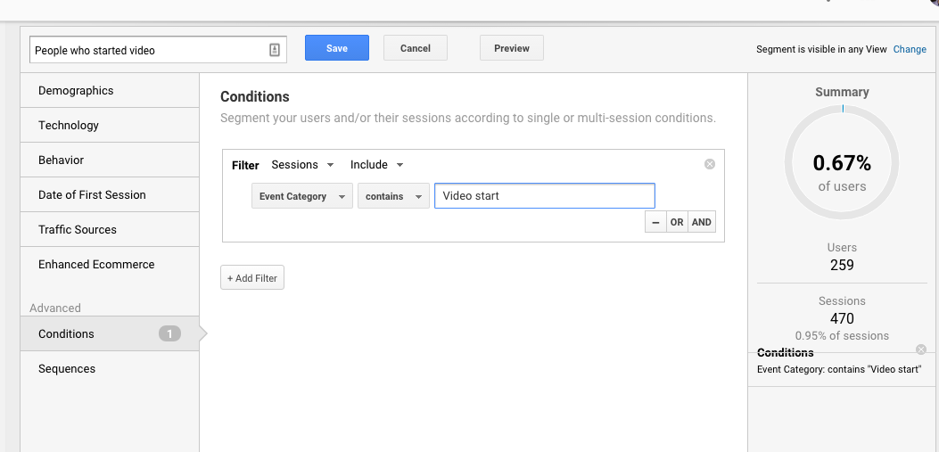
From there, you can view any of the out-the-box reports and how this segment behaved in them.
11. Goal Funnel Visualizations
One of the most important reports you can look at in Google Analytics for CRO insights is the funnel visualization. This Google Analytics report is easy enough to set up and will tell you how much traffic is dropping off at each funnel step. With this information, you can see which step of the funnel has the biggest opportunity for optimization. For instance, here’s a 3-step funnel:
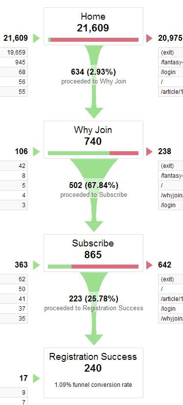
Every step has some dropping off, but here we can see that the first step (home) has the biggest leak.
However, this may not be a bad thing. Home pages generally get traffic with a greater variation of intent. That is, not everyone who comes to the site comes to buy.
But once they’ve entered the more targeted, linear stage of the funnel, where’s the biggest drop off? The Subscribe page.
Only 25.78% of people proceed to the next step. This is clearly the best place to start optimizing--because if one has put the effort into getting that far in the funnel, it’s assumed that there is interest and intent. It’s probably easiest to plug the leaks in the funnel in this step, and the most impactful.
Funnels aren’t just for e-commerce, either. They can be used for a variety of purposes – any time there is a preferred linear navigation path, really. Some other use cases could be multi-step sign ups, contact form completions, page navigation, and more.
12. Horizontal Funnels
If you’re a savvy Google Analytics user and you have enhanced ecommerce setup right, you can also view horizontal funnels (Conversions > Ecommerce > Shopping Behavior). They look like this:
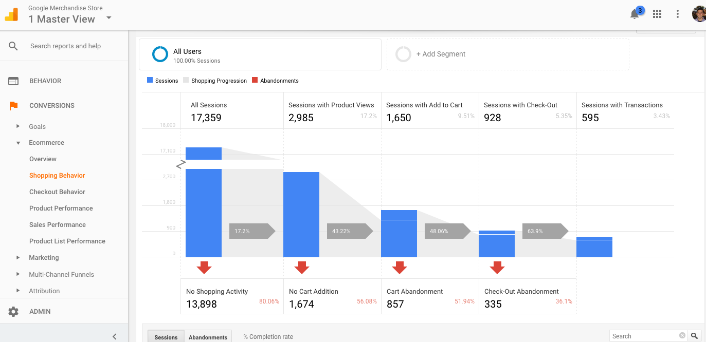
The benefit of this is that you can view the funnel across almost any dimension, like Browser, City, Device, etc. It allows you to slice up the data in many more ways that the traditional goal funnel visualization.
For more information on setting up goals and funnel visualizations, check out Krista Seiden’s excellent article on the topic here.
If you’re curious about the greater funnel visualization capabilities with enhanced ecommerce, check this post from Cardinal Path out.
Actually, you can use enhanced ecommerce for content engagement visualization as well. The world of digital analytics in regards to conversion optimization tends to be endlessly customizable to your specific purposes. You just have to be curious and willing to get creative.
Bonus: Tracking Experiments with Google Analytics for CRO Insights...
Always integrate your A/B test data with your analytics platform. This way, you can track visitor behavior by variation and get more granular insights on how people are interacting with your site.
Plus, you can check the numbers. Don’t always trust the numbers any given system gives you. It always helps to have a comparison to tease out the actual truth in your data.
Wrap Up on Google Analytics for CRO
Digital analytics is the lifeblood of conversion optimization, and these reports should give you an excellent footing in producing and prioritizing winning experimentation ideas.
However, data isn’t to be used as a crutch or a one-size-fits-all formula. It’s very likely that your particular business and website won’t fit the mold of all of the reports I’ve listed here. It’s very likely you’ll have to work outside-the-box a bit to pull relevant insights.
So, use these as a starting point or a beginning checklist, but don’t stop there. Think like an analyst and always approach data with the intent to ask critical business-focused questions.

