You’ve got an amazing product that should be flying off the digital shelves but you're seeing some cart abandonment. And by some, we mean a ton.
People are interested—there’s a good amount of traffic—but the sales don’t match up.
What’s the problem at the cart?
There are many reasons why someone almost buys but then bails:
- A complicated checkout process
- Hidden charges/shipping fees
- Getting distracted by something else on the site
- Long loading times
- Finding the product cheaper elsewhere
- A lack of assistance to finish the purchase process (e.g. live chat software)
In each case, you lose a customer you almost had.
Happily, there’s a lot you can do to transform those lonely carts into revenue.
By the end of this post, you’ll turn a frustrating financial frown upside down by potentially capturing 35.26% of those losses as conversions.
Sneak peek 👉 The main reason for cart abandonment is added fees (like shipping) that exceed a buyer’s spending threshold. They want your stuff, but they don’t want to pay for the delivery (which is why offering free shipping is always a good idea).
What else? 18 more things.
Read on.
Get brand new conversion strategies straight to your inbox every week. 23,739 people already are!
What is cart abandonment?
Cart abandonment is when a potential customer adds products to their online shopping cart but then drops out of the checkout process before they click to purchase.
And it’s no small thing.
Cart abandonment is responsible for $260 billion in lost sales for eCommerce sites every year.
👆💩
It’s a giant carpet knife slicing the bottom out of 86% of e-retail money bags around the world 😭. There’s a long list of common reasons why this happens (we’re getting to that), and a short list of things you can do to make immediate gains.
How to calculate cart abandonment
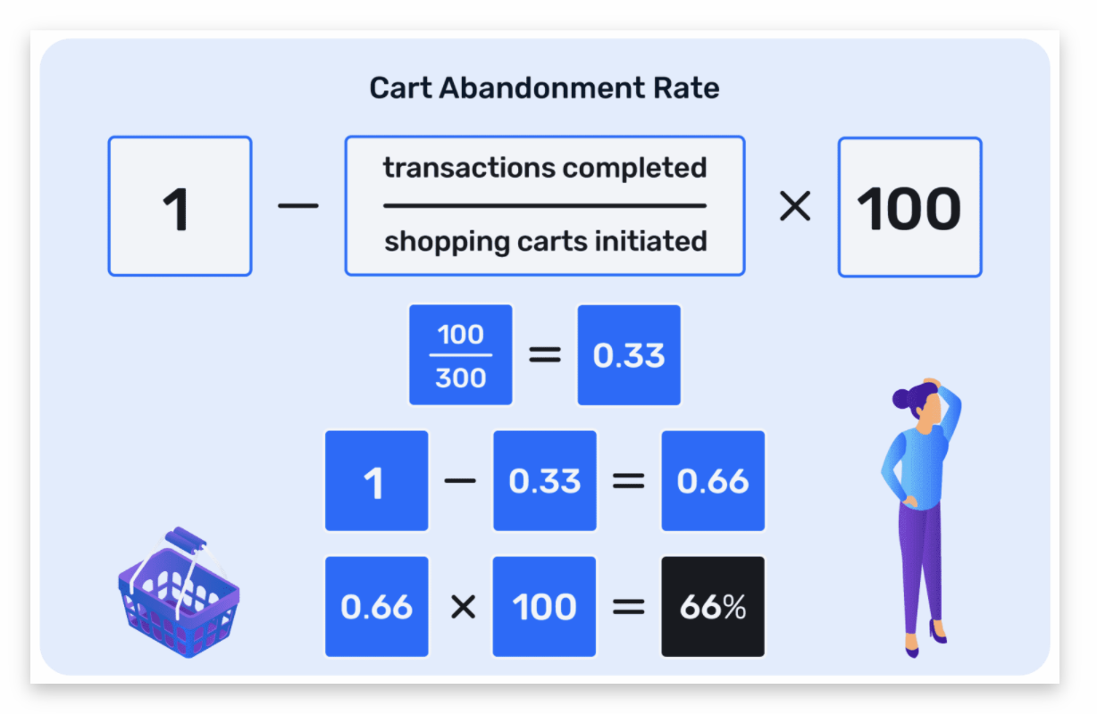
To figure out your cart abandonment rate, divide your completed purchases by the number of total carts. Subtract that result from 1 and multiply by 100.
Is cart abandonment bad?
Hell yes, it’s bad. It means you’re blowing up your end game somehow.
You put time and thought and money into advertising your products and designing a great customer experience that entices a purchase. When that doesn’t happen, the return on all that effort vanishes 😖
That’s not a sustainable model.
You have to figure out what part of your checkout flow is going wrong and why that transaction you’re trying to snag (the purchase part) isn’t happening.
Lucky for you, the reasons why aren’t wildly unpredictable; there are 20 main reasons why your cart loses a wheel.
And these 20 reasons are why cart abandonment is the beastly nemesis of eCommerce stores.
How beastly?
Ghastly 👿. Most purchases don’t happen because of it.
Side note: abandoned cart emails
If you’ve ever abandoned a shopping cart, you’ve probably gotten one of those “Hey, you left this in your basket!” emails sent out by retailers trying to convert that cart after the fact.
Those cart recovery emails are important but they treat a symptom, not the cause. In this article, we’ll address how to change your payment page to boost conversions on site, but we wrote an entire article on shopping cart abandonment emails (that happen after the fact) that you should also check out 🙂
What is the average shopping cart abandonment rate?
Insanely high.
The average cart abandonment rate across all industries is a whopping 70% 🤮 which translates into a staggering $260 billion in sales that never complete.
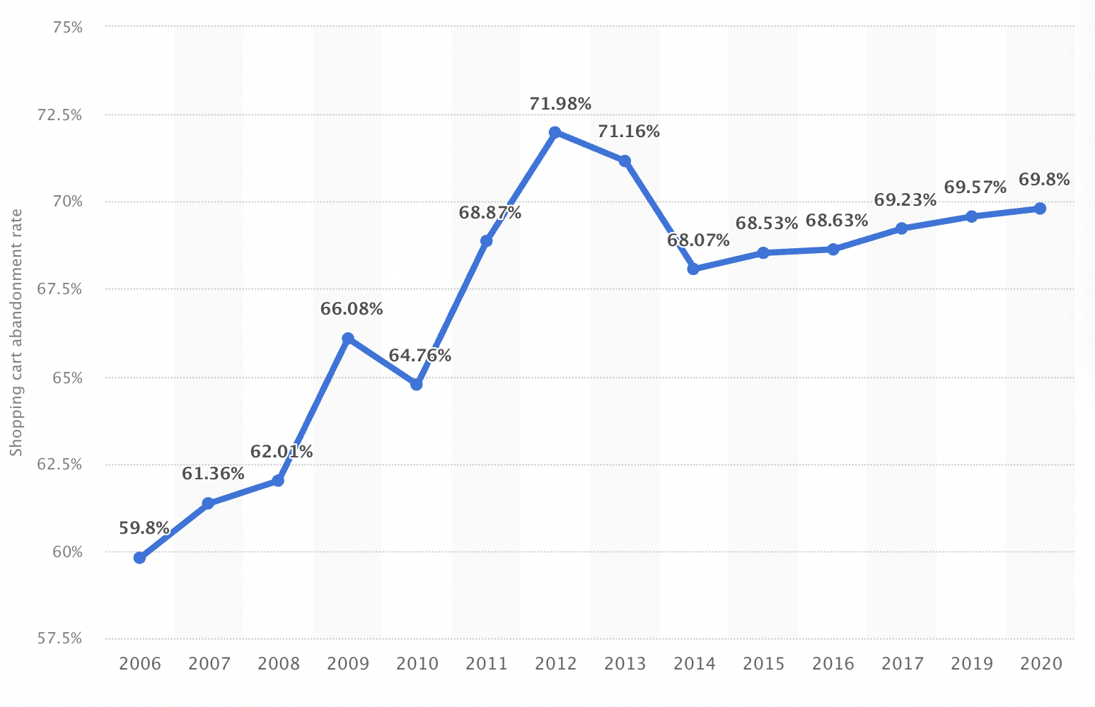
That’s frigging alarming, right? How do you work with a stat like that?
Well, it’s actually worse than that.
The 7/10 cart non-completions is what happens on desktops and laptops where screens are a nice size.
But more people than ever before make purchases using their smartphones, where the rate of cart abandonment hits 86% (and the smaller screen size cops the blame).
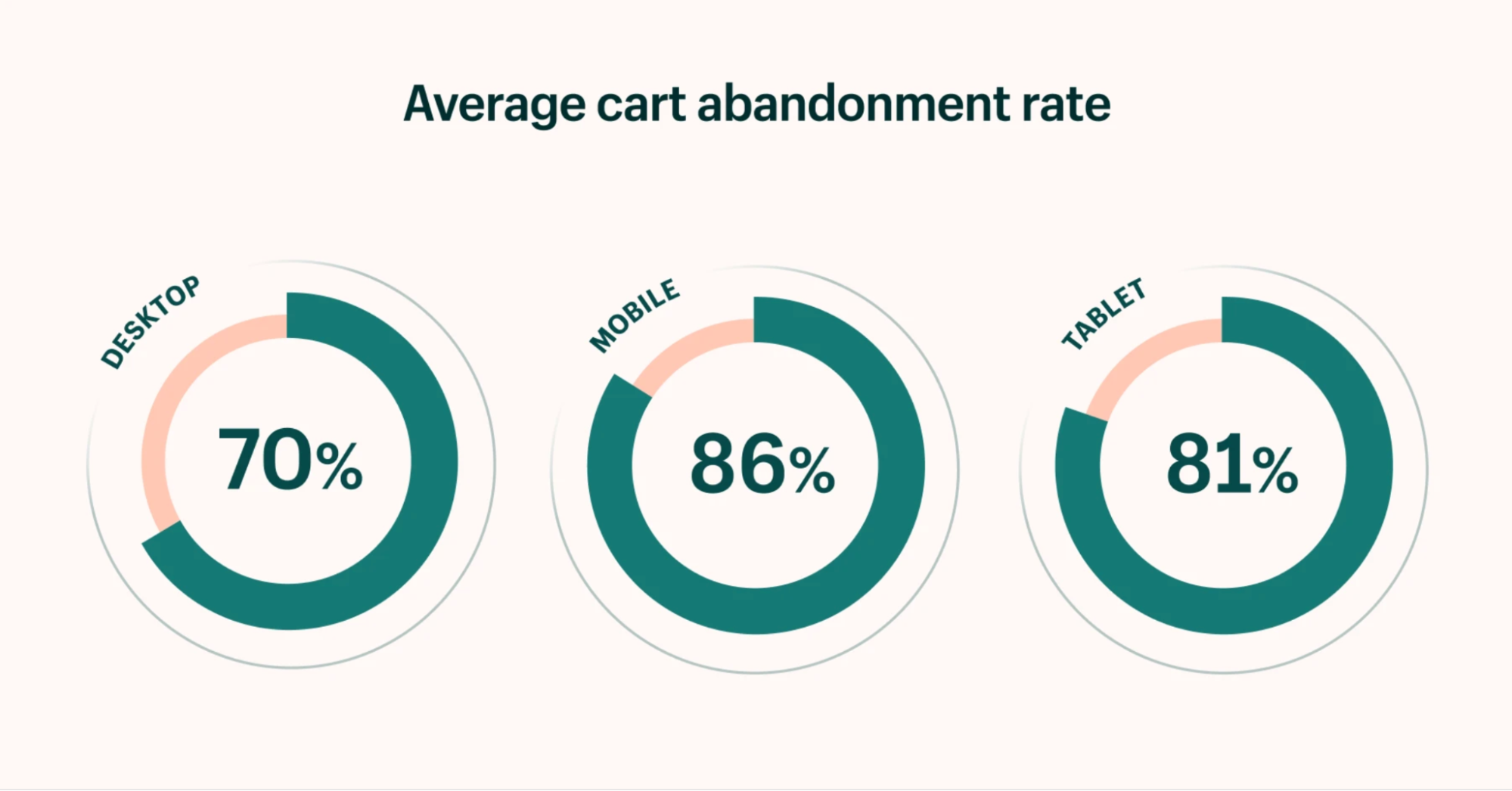
That’s pretty UGH.
If you run an online store, you’re running uphill under the heavyweight of some grim cart statistics, not gonna lie.
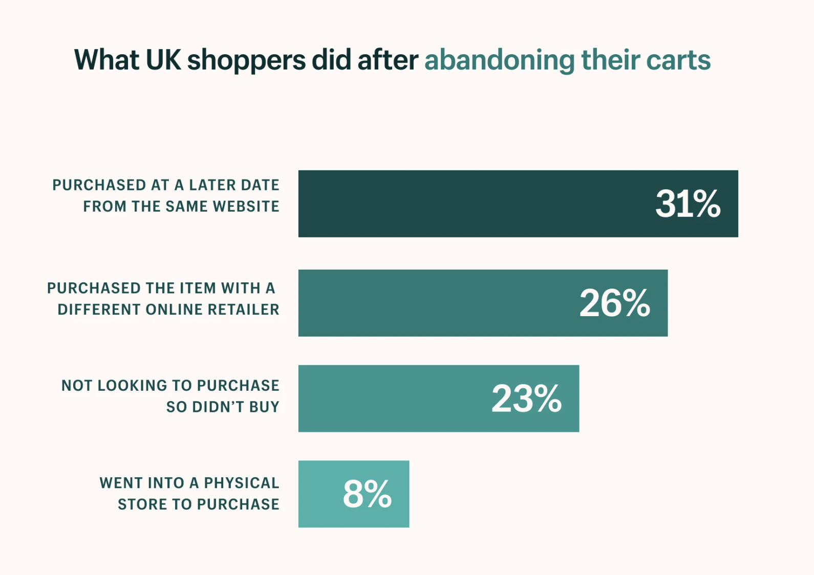
The good news is that there is some degree of shopping cart recovery without effort on your part. Just shy of a third of those full carts will convert into purchases some time later.
But don’t toss the confetti just yet because a solid quarter of the time, your cart gets ditched in an alley because the shopper found a better deal elsewhere.
And here’s a stat that pulls a leg off your chair: another 23% of the time, there wasn’t much intention to buy your product in the first place—your cart was used to save items something like an e-retail bookmark for comparison shopping.
What are some causes of cart abandonment?
That’s the $260 billion question, isn’t it?
Another way to ask that is “how do you prevent cart abandonment?”
The butterflies and lollipops answer is that you create a frictionless cart experience to increase your conversions through optimization.
🦋 Oh happy day 🍭 we’re done here.
Except that there are a thousand pounds of thought that goes into reducing friction at the point of purchase.
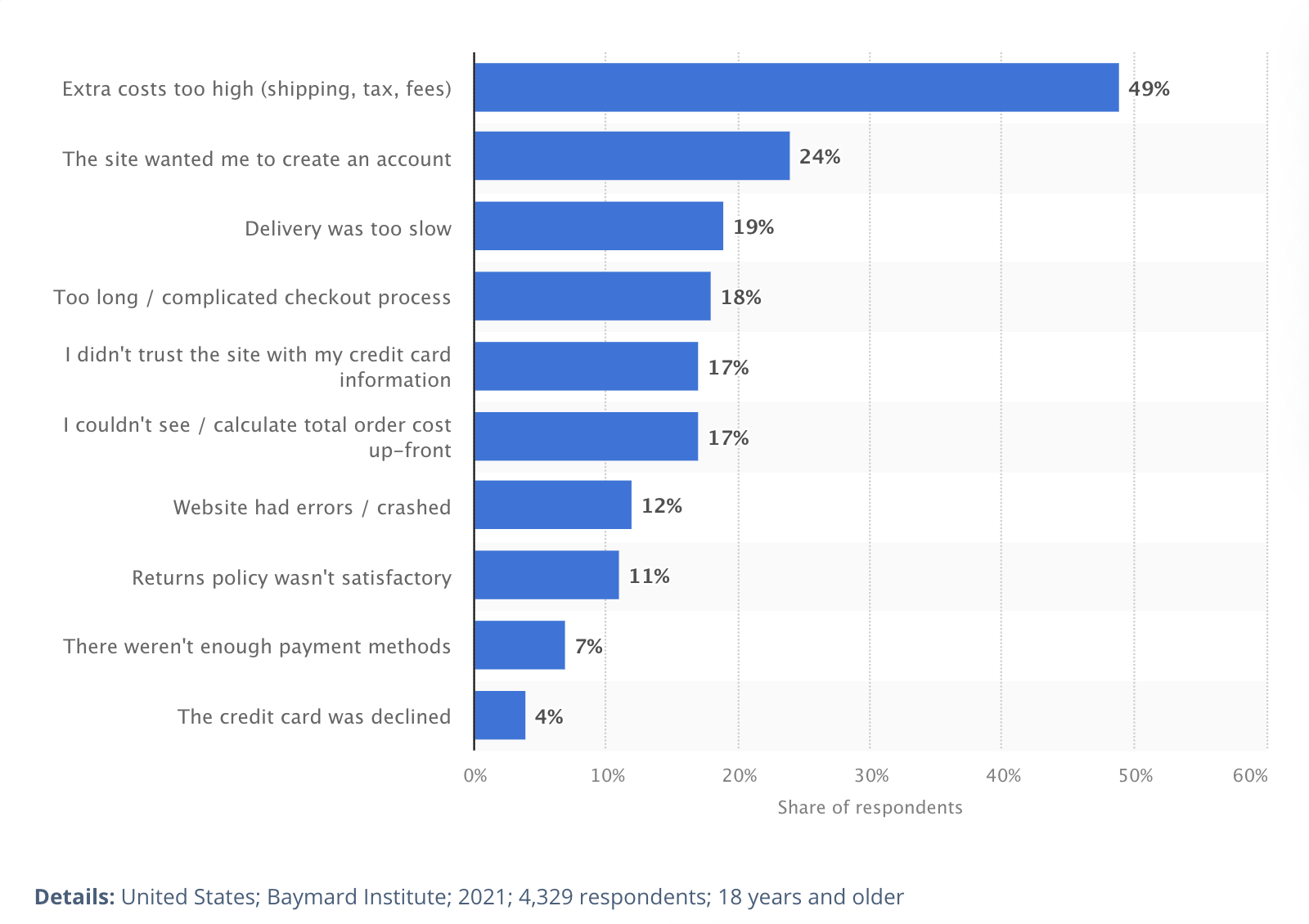
20 cart abandonment fixes
Let’s put our serious faces on and get to the most important reasons cart abandonment happens. Some of these reasons, like “just browsing” and declined payments, are trickier to address, but that the majority of these cart abandonment statistics are preventable, sometimes with just a minor tweak to the site.
1. Unexpected Costs
Let’s start with the biggest reason people are bouncing.
49% of shoppers admit that they leave due to bogus added costs. That means transparency all the way along is vital with your customers.
Be upfront.
I sent a college friend some flowers in Cincinnati and thought I found the golden flower shop. Beautiful flowers and at a super low cost (sucker, I know):

I started to enter my credit card information with a little voice whispering that this was too good to be true. I selected the standard delivery information and entered the destination address. That’s when I saw that the price had gone up from $26.99 to $36.99, and for no obvious reason.
How did that happen?
Then I noticed they snuck in a $4 card (that I never selected). Now those flowers were $42, not $27. By the time I was ready to shop, the price ended up being 32.5% higher than the original price that got me to click.
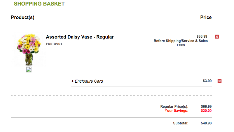
I don’t like getting a kick to the crotch like that, so I left those tarnished flowers right there and searched for a more trustworthy bouquet elsewhere.
I’m not alone. Half of all online shoppers react the same way.
It’s understandable that stores want to make their goods appear as desirable as possible, but a low price tag doesn’t help if it means that extra fees are added later.
In fact, it really hurts you. So don’t do it.
2. Free shipping is a must
Online shoppers expect free shipping everywhere and always these days, especially with Amazon Prime and other big brands offering it.
High shipping fees are a turn-off.
VWO ran an A/B test that showed “Free Shipping” next to their shopping cart in the top right corner of the page that followed the customer as they browsed the online store. What did they find?
Offering free shipping improves conversions significantly.
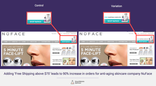
The test results showed that when customers were given the free shipping incentive, orders increased by 90% with a 96% confidence level.
What else? The company’s Average Order Value (AOV) rose by 7.32%.
Boom.
Not only does free shipping improve overall conversions, but free shipping works as an excellent incentive to buy even more.
So put it all out there, start to finish, and show your shipping rates if you feel you must charge for shipping. For Shopify stores, install the Estimated Shipping Cost app.
Or go one better: Tack $10 extra dollars onto the price and offer free shipping. The customer ends up paying most of the shipping cost and you get your conversion.
3. Showcase discounts or money saved
With almost a third of shopping cart abandoners leaving because they found a better price elsewhere, it’s clear that getting a great deal is important to online shoppers.
But it’s unlikely you can offer the lowest price for every single item in your inventory.
So what do you do?
You do the next best thing.
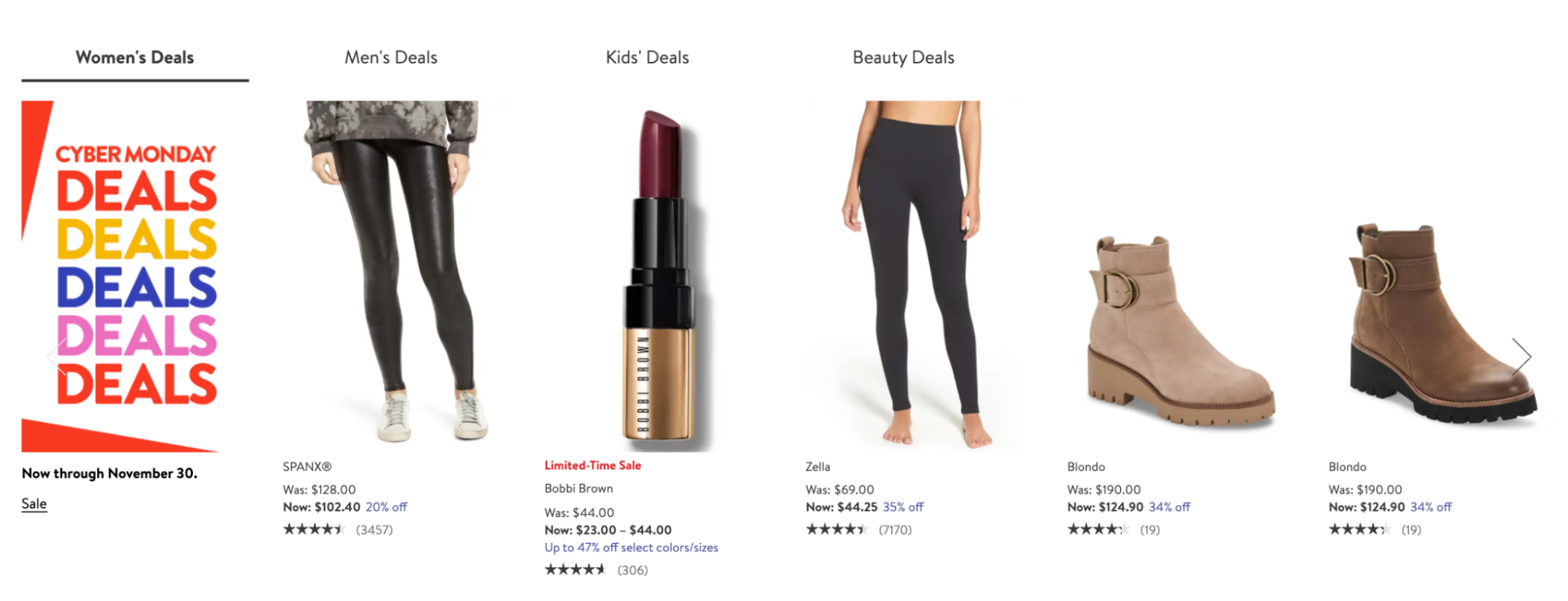
Use a product view that shows what things are on sale and emphasizes the extra % off.
There’s no guarantee that these products are the lowest price available, but the double hit of sale savings and the “You saved $22” at the cart goes a long way toward alleviating the fear that goods may be cheaper elsewhere.
4. Improve site speed
53% of all mobile shoppers will leave if page load time exceeds 3 seconds.
Site speed is more important than ever.
eCommerce will hit $666 billion in the U.S. this year, rising to a projected $845 billion by 2022.
53% of $845 billion is a lot of lost revenue due to an online retail page taking more than a few seconds to load.
Don’t flush $448 billion down the toilet.
- Optimize and compress images
- Combine and minify files, including CSS
- Use code to generate the page layout in place of images where possible
Go to Google’s PageSpeed Insights and see how you do. Thankfully, PageSpeed Insights breaks down your desktop and mobile versions and shows you how to fix speed issues. Hate to break it to you but, chances are, you’ll need to add speed improvement to your cart abandonment fix list.
5. Display local currency
Globalization has been a thing for over twenty years now and international shopping isn’t weird anymore.
You can buy things from anywhere (like custom-painted Nike Air Force 1 shoes from the Ukraine). So, as a seller, you need to make sure your site is optimized to accommodate any shopper from anywhere.
I fell in love with a fashion retail store in Denmark, Vero Moda. I buy Vero Moda clothes from their online retail store. Lucky for me, a popup appears right as I visit their site asking where in the world I am purchasing from:

This makes the purchasing process smooth because I don’t have to look up the current exchange rate from Danish Krones to U.S. dollars.
Shopify agrees:
“Most online retailers are now accepting international orders. If you are, it’s important that you display, or provide the ability to show, what the cost will be in the shopper’s local currency.”
Last-minute exchange rates can throw a visitor off and deter them from clicking that buy button.
6. Pictures and video
Ever have a customer return an order because it wasn’t exactly as shown?
Let’s hope not.
But if you have, it’s an easy fix: add more high-resolution photos with multiple angles, or even a short video. Today, video reigns and is pretty much expected.
Invest in your product shots.
Lululemon has five high-quality images from different angles, far away, up close, and video. This range really helps you see the overall look:
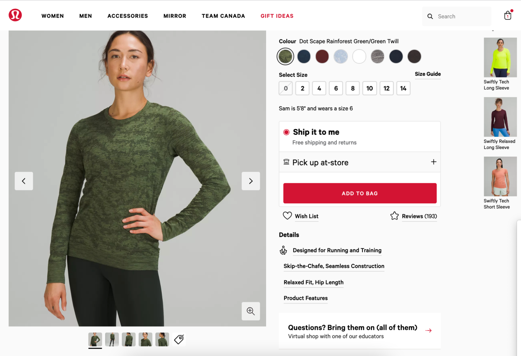
Here’s how Lululemon uses video.
ConversionXL points to a Cisco report that shows videos will account for 82% of all internet traffic by 2022. Retailers are jumping on board at speed.
Zappos pioneered the promo video to overwhelming success, keeping it real by featuring Zappos staff wearing the shoes, not models.
Video is king when it comes to giving customers a virtual test drive of your merchandise.
7. Add testimonials or reviews
Humans naturally follow herds and feel confident about purchasing something if someone else thinks it’s great. Use positive reviews to chip away at those abandonment rates.
Amazon didn’t invent the concept of adding user reviews, but they’re still one of the best at it. With tiers of power reviewers, Amazon’s review section is just as important as its descriptions of products themselves:
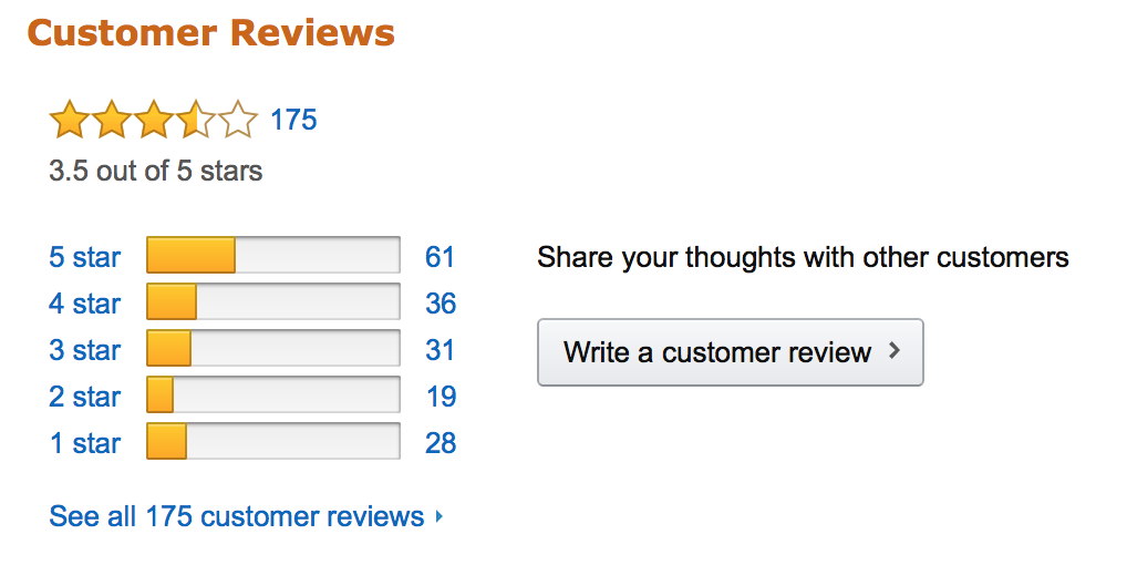
About 95% of customers read reviews before making a purchase on an eCommerce website. And, when higher-priced items display reviews, the conversion rate increases by 380%.
Reviews clearly motivate the checkout process.
So it makes a lot of sense to test different iterations of sales pages and checkout processes to boost sales.
8. Don’t force users to register
And another thing: don’t try to force users to create an account before they checkout.
Account registration is a conversion killer according to Shopify, which reports a 24% dropoff at the cart from it. Why? Two reasons:
- It takes time
- It forces you to remember yet another password (because biometric authentication isn’t yet standard across the e-retailverse
This makes guest checkout crucial to conversions.
eBay makes it easy for shoppers to check out as a guest:
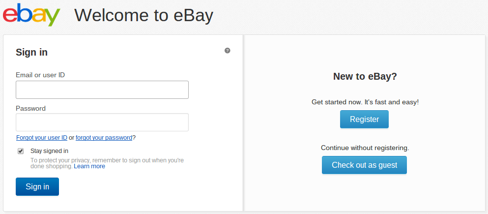
eBay offers three different CTAs, giving the customer room to decide which is best for them. If a customer prefers an online retailer, signing in will be the easiest option. But don’t make passersby commit.
Too many big online shops demand that account commitment, even though evidence supports guest checkout as a great way to reduce friction at the cart and, therefore, increase conversion rates.
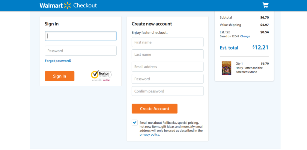
Walmart only gives the option to Sign In or Create an Account; no guesting around here.
Go with Guest Checkout, and make sure to A/B test this option to see what converts best for you.
9. Remove distractions
Make it effortless, or suffer soaring cart abandonment stats.
While adding social proof at the cart isn’t a bad idea, don’t overload your checkout page.
Here’s an example of a cluttered checkout process:
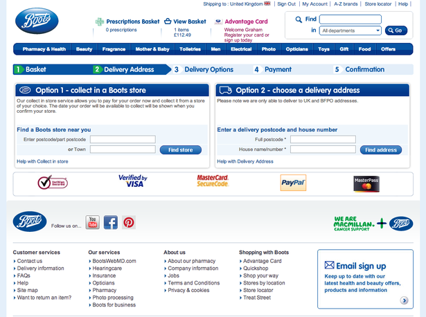
That screenshot is from 2016. Boots has since done some smart cart optimizing:
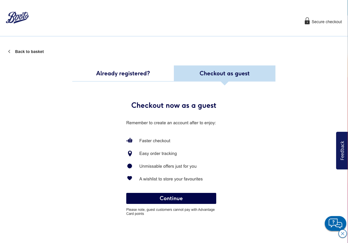
Minimize clutter.
Remove the top navigation menu and any sidebars or footers from the checkout page. Only display what’s required to make a purchase (credit card, shipping address, coupon field, and call to action).
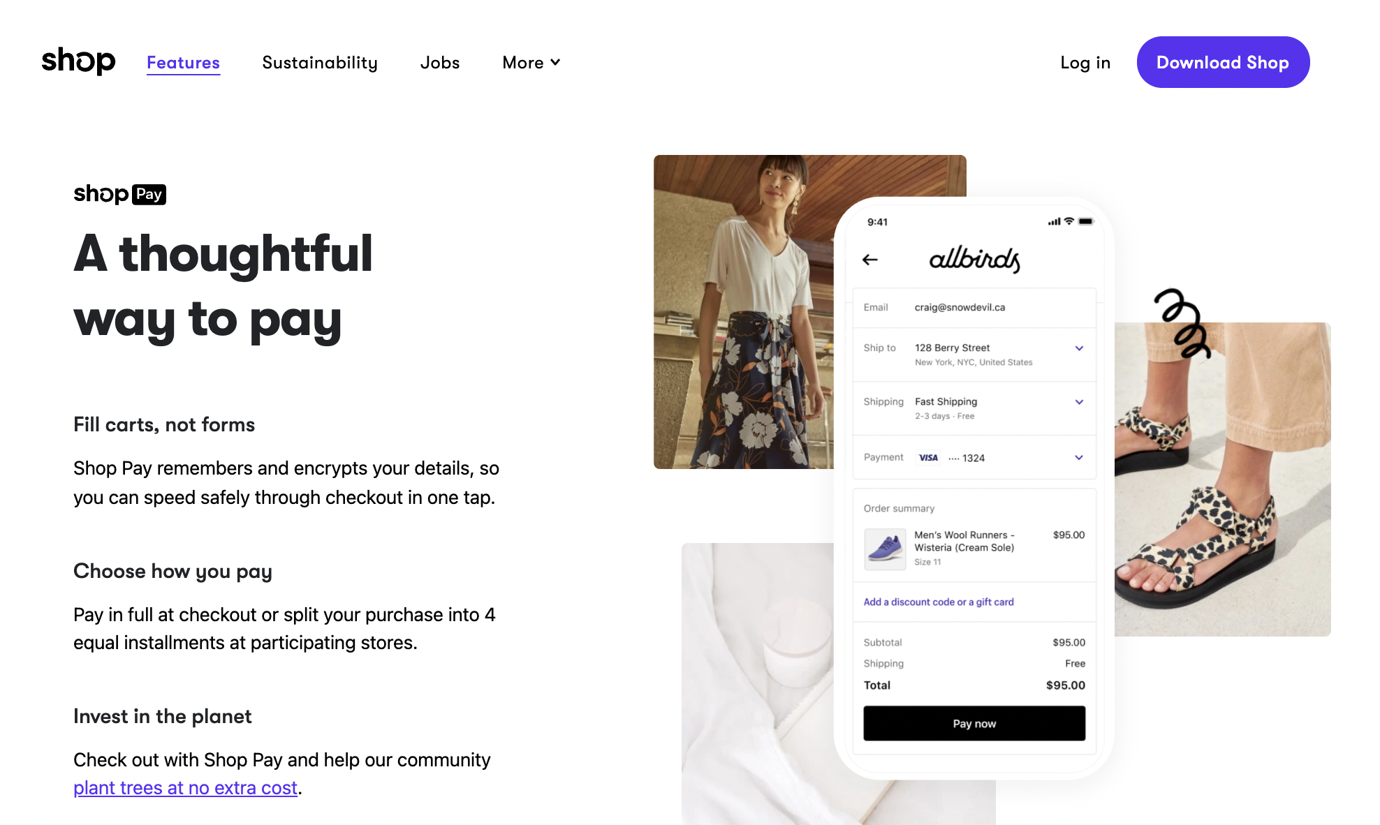
Shop makes it easy to streamline your checkout page, providing e-retailers a clean, clutterless cart experience:
10. Keep the cart visible
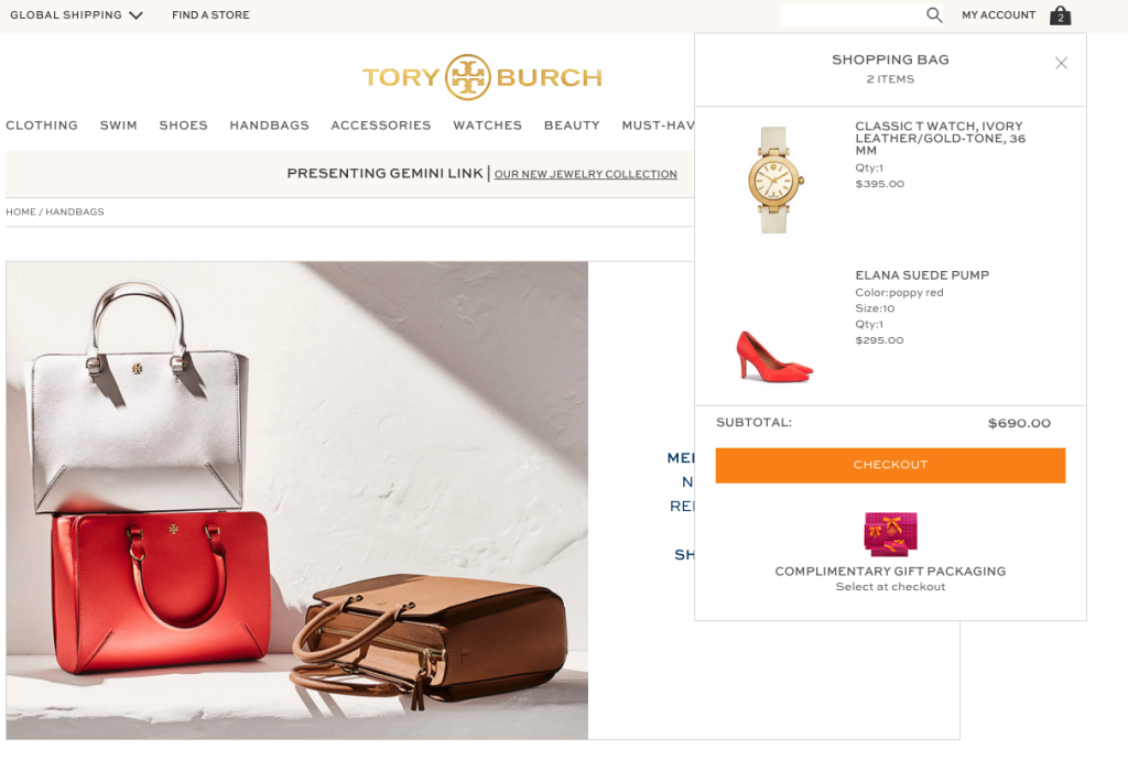
Ensure the cart is visible (sticky) from all product pages (top corner or bottom of the page). Don’t send users to the dedicated cart page every time they add something to the cart. That makes them click the back button to continue shopping and that’s a bad user experience—especially on mobile.
There’s a lot of ways to display your shopping cart, but here’s one example of the shopping cart icon, with the number of items in it:
11. Coupon caution
I know the title of this article is “20 Cart Abandonment Fixes For 2022—No Discounts Required,” but you might still want to consider using coupons as a conversion tool.
Post-purchase coupons and coupon codes in retargeting emails and social media campaigns get those already-interested shoppers ready to convert.
In fact, not offering coupons can stall your cart process as people search for an online coupon and, when they don’t find one, don’t return to complete their purchase.
Keep in mind that almost 90% of consumers used coupons in 2020 and coupon users will spend 24% more than regular shoppers.
A study by Juniper Research projects the value of e-coupon redemption to increase from $47 billion in 2017 to $91 billion in 2022 as browser extensions like Rakuten and Honey gain popularity.
Coupons are a valuable checkout conversion tool, no question.
So be warned: Not offering a coupon might deter a purchase when a shopper leaves to look for a coupon code and doesn’t come back (because they didn’t find one).
According to Statista, 8% of customers cite no coupon as the main reason for abandoning their cart.
12. Billing after shipping
Order matters here.
If someone walks through the process of entering their address details first, they’ll be more committed to finishing the process because they won’t want to waste that effort.
So put shipping form fields before the billing fields.
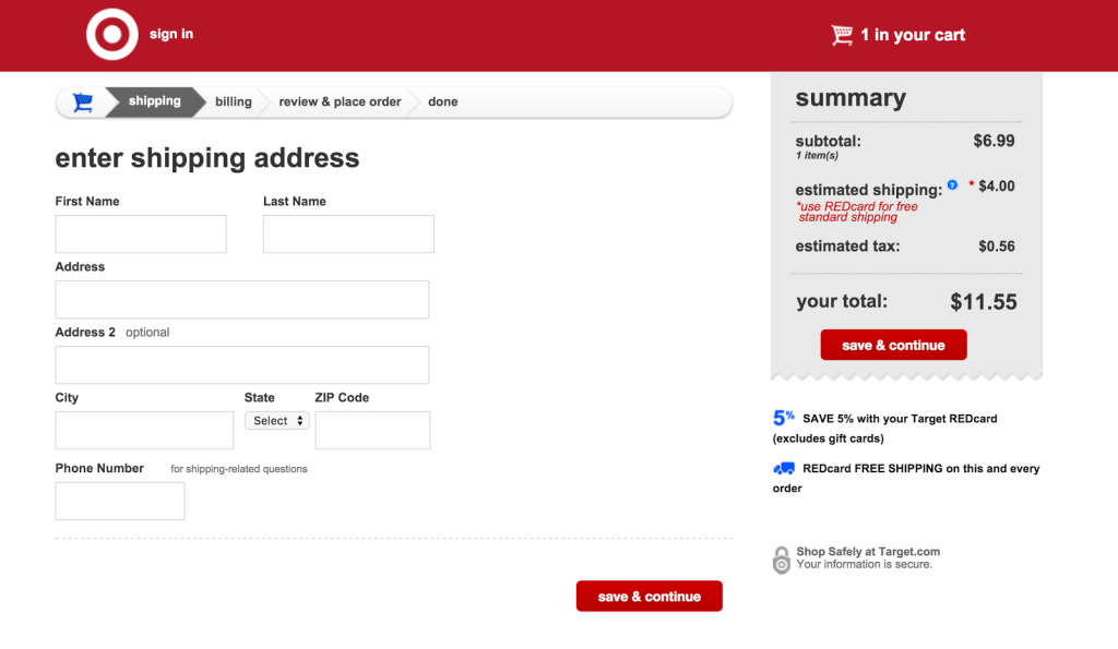
On top of commitment to the checkout process, it makes sense to focus on the customers’ thought process before your end goal. The customer wants to know when and where their product will be delivered, then, once that’s decided, they will enter their billing information.
13. Show progress
Ever tried to buy something online and found yourself bogged down in what feels like endless forms? I thought so.
Well, guess what?
18% of buyers don’t finish a purchase because the process takes too long (see the chart further up this page).
However, it may also help to make visitors aware how close they are to being done. And the shorter you can make the process appear, the better.
14. Allow editing
Let your customers 👏 change 👏 their 👏 cart.
Not only is it frustrating to be stuck at a dead-end cart, but it also reduces conversions. Customers must be able to change their minds and edit their shopping cart.
Shopify explains:
“Shoppers don’t want to be locked in to the checkout page. If they made a mistake in their selection or need to edit it for some reason make sure it’s easy for them to do so.”
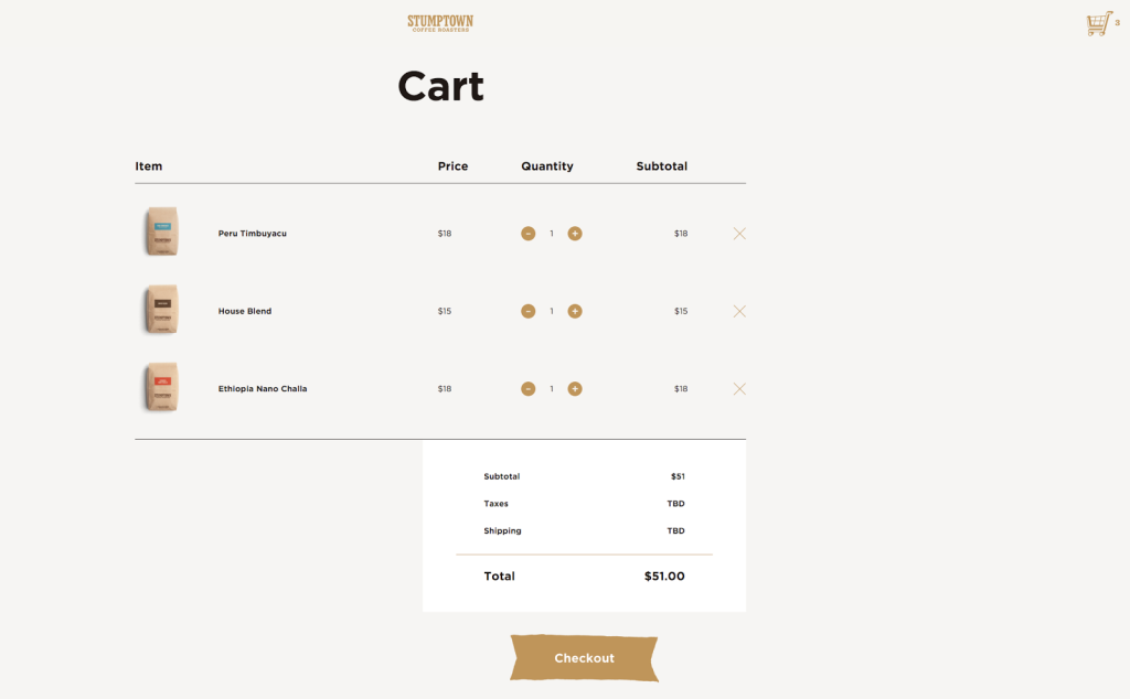
Stumptown Coffee Roasters gives the easy option of adding or subtracting quantities for each item and a simple “x” to remove the item completely.
15. Reduce Risk
eCommerce comes with risk pre-packaged.
Visitors might hesitate about a purchase because they aren’t sure about a site’s security or it could be that they’re worried about getting stuck with a product if they order the wrong size.
It’s difficult to identify how to reduce risk until you know what’s causing that purchase pause.
Peek by UserTesting will record a session of an everyday online shopper’s experience with any difficulties or misunderstandings the shopper goes through.
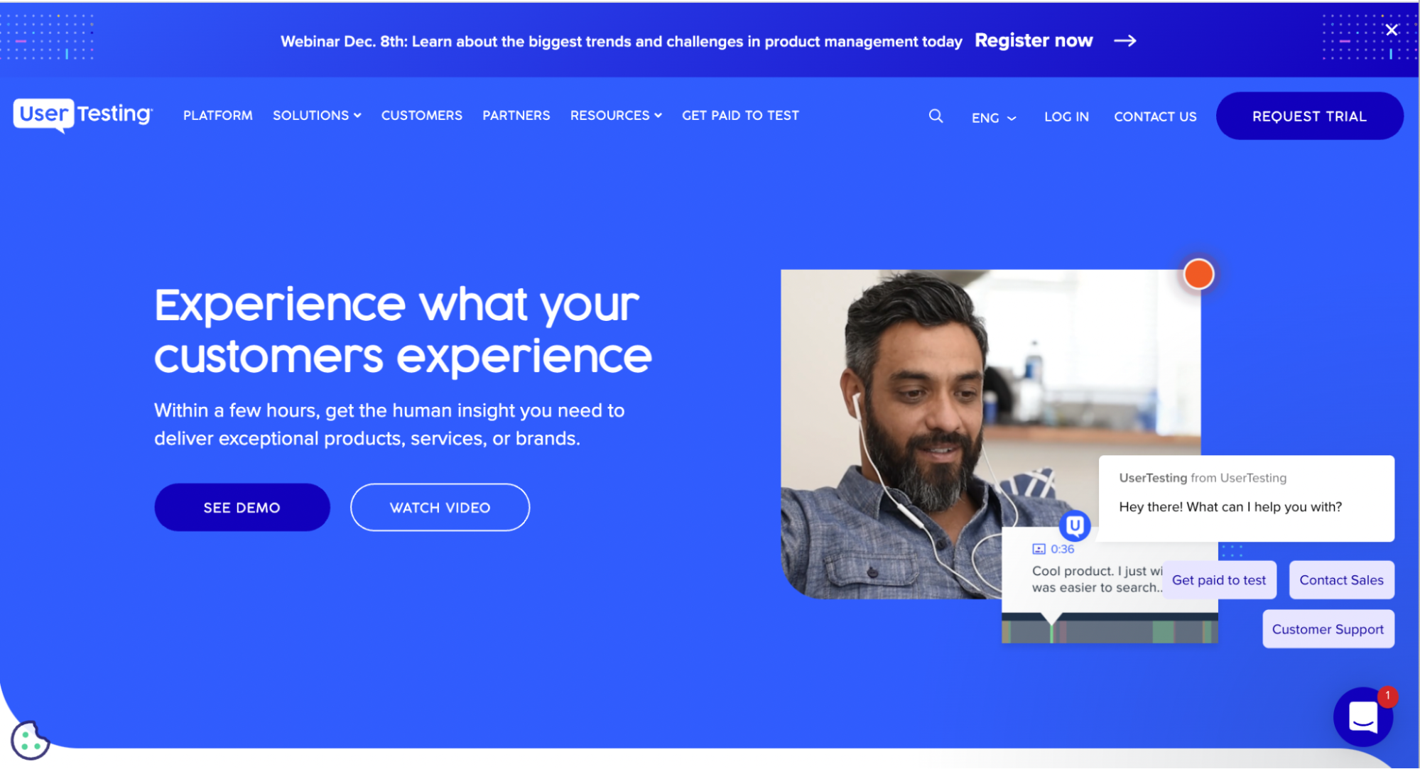
Who better to ask what’s stopping visitors from making purchases than your visitors?
Try other software to get insight into what visitors are doing on your page and what frequently causes them to leave.
Here are some apps that will help you understand why your visitors are abandoning their carts:
- Implement Qualaroo’s website surveys to trigger exit surveys just before people leave your checkout process and gather data about what went wrong.
- Try ContentSquare or UserTesting to view session playback of what people actually do while they’re on your site and, in this scenario, what makes them leave.
- Use HotJar’s software to see everything all at once (heat maps, surveys, analytics, etc.)
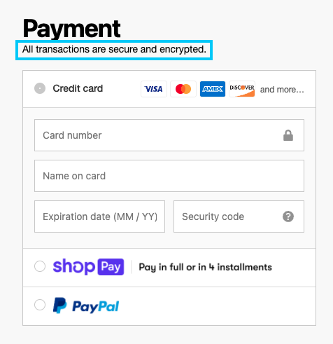
As for payment security, we’ve come a long, long way toward lock tight payment systems, with ShopPay providing the fastest and best-converting checkout experience on the internet.
It’s essential to use a trusted authority when you ask for someone’s credit card. It builds trust between you and the customer. Assure customers by adding transparent messaging about your payment methods.
16. Test checkout steps
Does a one-step or two-step checkout work best? You’ll have to test it.
GetElastic applied A/B testing to compare the user-friendliness of one-page checkout versus their traditional out-of-the-box plugin checkout software.
Not much of a surprise: single checkout increased their sales by a whopping 21.8%.
17. Live chat
Live chat reduces risk and risk prevents conversions. Ergo, chat increases conversion rates.
According to Forrester, consumers who use chat are 2.8x more likely to convert than those who don’t. Aaaaaand, more than half of consumers prefer chat over phone support.
An eMarketer study showed that thanks to chat, “62% reported being more likely to purchase from the site again. A further 38% of respondents said they had made their purchase due to the chat session itself.”
Nike’s website does a very good job of limiting the risk of purchases by highlighting their security, range of payment methods, and the fact that delivery is free.
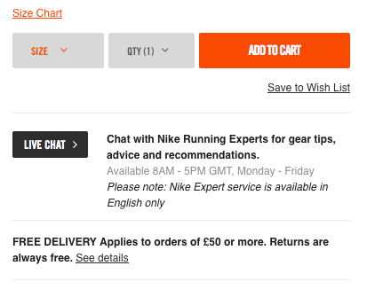
I also like the fact that Nike encourages visitors to chat with “Nike Running Experts” (not some run-of-the-mill robot).
LeadChat actually starts conversations with your visitors for you and is a great tool to incorporate live chat onto your site.
18. Good return policy
Online shopping is all about trust.
If your new customer is somewhat hesitant about trusting you, your return policy is a great way to guarantee they will be satisfied.
A staggering 61% won’t purchase if you have a bad return policy. And that’s a lot of shoppers considering that 15 to 40% of all online purchases are returned.
Not sure what to include in your return policy to make them convert?
19. Mobile is life
We could write an entire piece on this alone, but out of all the points I just made above, this one may be the most crucial to getting more conversions.
Optimize your shopping pages for mobile.
A full half of all online purchases are made from phones. Our world is definitely shopping on mobile more than on desktop these days and your site must be easy for them to navigate.
And here’s an interesting statistic:
80% of shoppers used a mobile phone inside of a physical store to look up product reviews, compare prices, and find other locations.
Domino’s Pizza does a great job optimizing for mobile
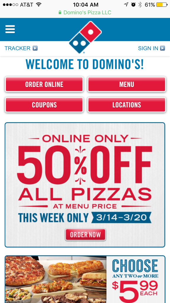
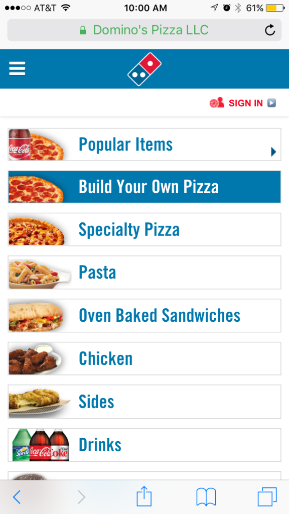
Then I can easily select the most popular pizzas, drinks, or sides. But I like to customize my pizza, sooo...
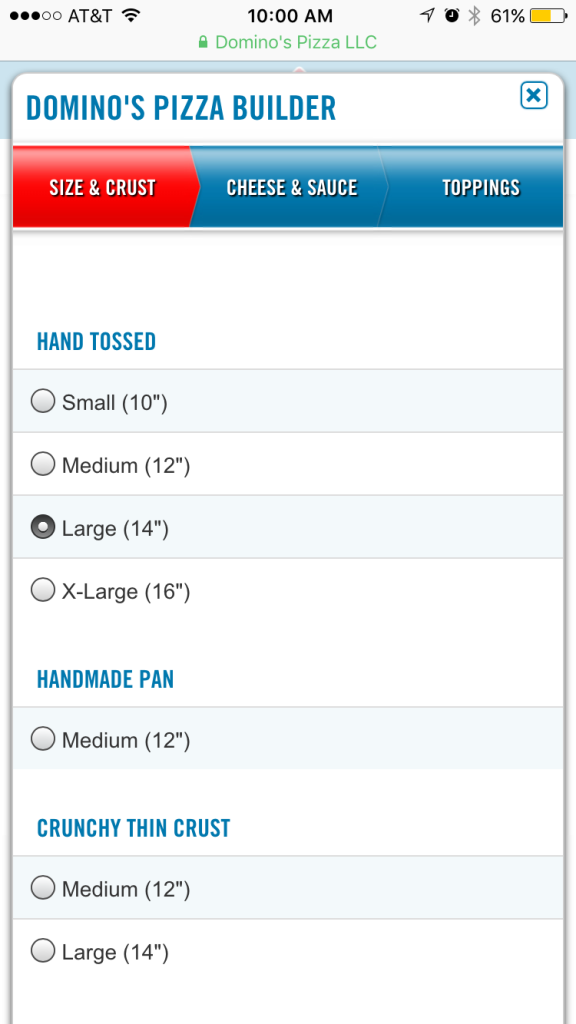
Aaaaaaaand then the best part:
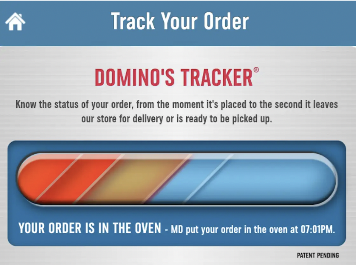
Whatever you sell, make sure it’s easy for your customers to navigate on mobile. Try using radio buttons and giving preselected choices instead of asking your visitors to type all the information in form fields to convert better.
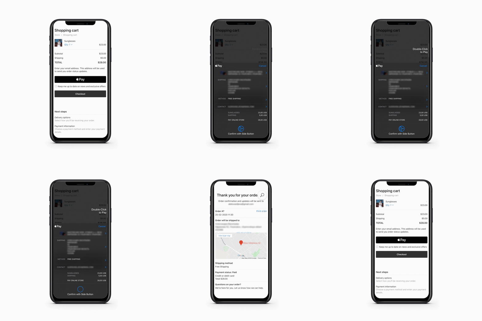
20. Remove friction with express checkout
Making checkout easier for visitors will drastically cut down your cart abandonment. With options such as ApplePay, Google Pay, Bolt, Fast, and many more, they allow purchases to be made with the click of a button.
When you offer convenient payment options like that, not having a wallet nearby or needing to rush out the door doesn’t matter anymore. Heck, visitors will buy the products before they even have a chance to think about it.
The future of shopping cart abandonment
Cart recovery emails (and remarketing, for that matter) are a great way to bring visitors back to a website, but email marketing is like a follow-up band-aid on cart problems. They certainly help, but you should tackle the source of your checkout abandonment issues first.
And it’s not a quick fix, but an ongoing process.
The emphasis has to fall on improving sales and product pages through split testing.
But will the next few years see other ways to reduce cart abandonment?
I think so. We’ll see artificial intelligence pair up with automation to create all sorts of cart completion triggers. I also think we’ll see a strengthening between channels.
Shopping cart abandonment, PPC management, and retargeting are different digital marketing tools, but they work together to make that sale. The lines continue to blur and marketers are starting to view sales recovery less as a siloed affair and more as a holistic system.
Go on and try some of the above actionable tips out today; many of them can be implemented in just a few minutes. Set your benchmarks, track the before and after metrics, tweak, test some more, and close those carts.
And don’t forget to thank your customers! That’s next.
