


It’s a pretty obvious trend that we’re all becoming more addicted to our mobile devices. Here are some stats if you don’t already feel clued in:
- Marketing Land claims mobile represents 65% of digital media
- eMarketer predicts by 2020 41.6 million US internet users will use mobile only, which will be 316% more than desktop/laptop only users
- ExpressPigeon states 50% of smartphone users grab their smartphone immediately after waking up
Ever notice how some mobile experiences are so seamless you don’t have to think twice about making a conversion?
These are the experiences that lead to high mobile conversions.
Trying to master the craft of creating a high converting mobile landing page can be quite the mission. It’s a feat that deserves its own set of attention, completely separate from building your standard landing pages.
We’ve put together some ideas for you, so you can conquer the skill of creating high converting mobile landing pages and smooth mobile landing pages experiences… to fly higher than your competition with more conversions, leads and sales.

Broken down by categories Functionality, Messaging and Design, here are 31 mobile landing page ideas you can start implementing today to convert more mobile visitors than your competitors.
Get brand new landing page strategies straight to your inbox every week. 23,739 people already are!
Functionality
Mobile Landing Page Idea #1: Be Wary of Ticking Time
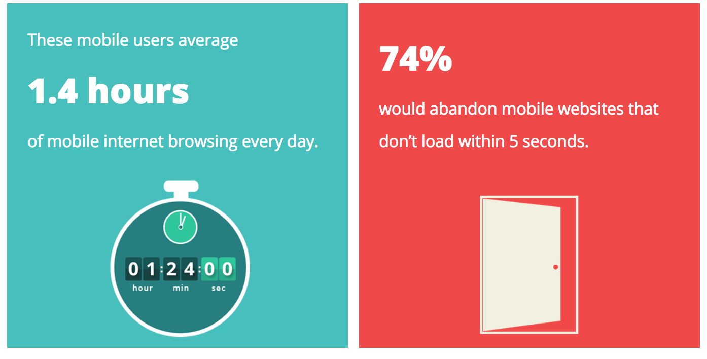
Be cautious of shorter attention spans on mobile devices, and take the effort to decrease loading time and increase site speeds.
According the Kinsta, 74% of mobile user abandon mobile sites if they don’t load within 5 seconds:
If you’re a company with volume the size of Amazon, that translates to $1.6 billion lost in sales for every one second delay.
You can use Google Analytics custom reports to monitor your mobile landing page performance by reviewing the Average Document Interactive Time report, which looks something like this:
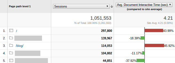
That way, you can scope out the slow-loading pages and find out where to put your optimizing attention first.
Here are a few more ways to test your mobile load time and speed performance:
- Google PageSpeed Insights - tests all devices
- WebPageTest - choose the mobile device browser
- GTmetrix - they have a mobile option
- Mobitest - tells you fast your mobile site runs
- mobiReady - tests your mobile website performance
You can build your mobile landing pages for users with limited data by decreasing your load time and following some principles, like these Unbounce tips:
- Clean up your code
- Minimize HTML and CSS
- Use GZIP compression
- Minimize redirects
- Relocate scripts
- Minimize WordPress plugins
- Upgrade hosting or use external hosting
- Resize and compress images
- Deliver images with a Content Delivery Network (CDN)
Mobile Landing Page Idea #2: Test Phone Number as CTA
You can turn your CTA into a click-to-call button and make it easy for your mobile users to call in to opt-in to your offer or request more info.
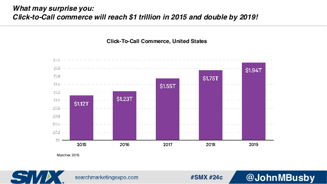
According to Search Marketing Expo’s John Busby, click-to-call commerce is projected to reach nearly $2 trillion in 2019:
Here’s a couple examples of what that could look like:

For companies that want more phone leads and incoming calls, the click-to-call CTA can be an effective option.
According to Google Inside AdWords:
“Research shows that 70% of mobile searchers call a business directly from search results.”
They also found that consumers use calls to research and transact:
“We found that calling is most important during the research and purchase phases, where 52% and 61% of mobile searchers respectively say it’s important to have the ability to call. This means that a large number of calls happen when someone is ready to buy or helps a consumer move closer in purchase consideration.”
Testing Tip: Try testing your click-to-call CTA above the fold on your mobile landing page to see if that brings in more phone leads.
Mobile Landing Page Idea #3: Geotarget
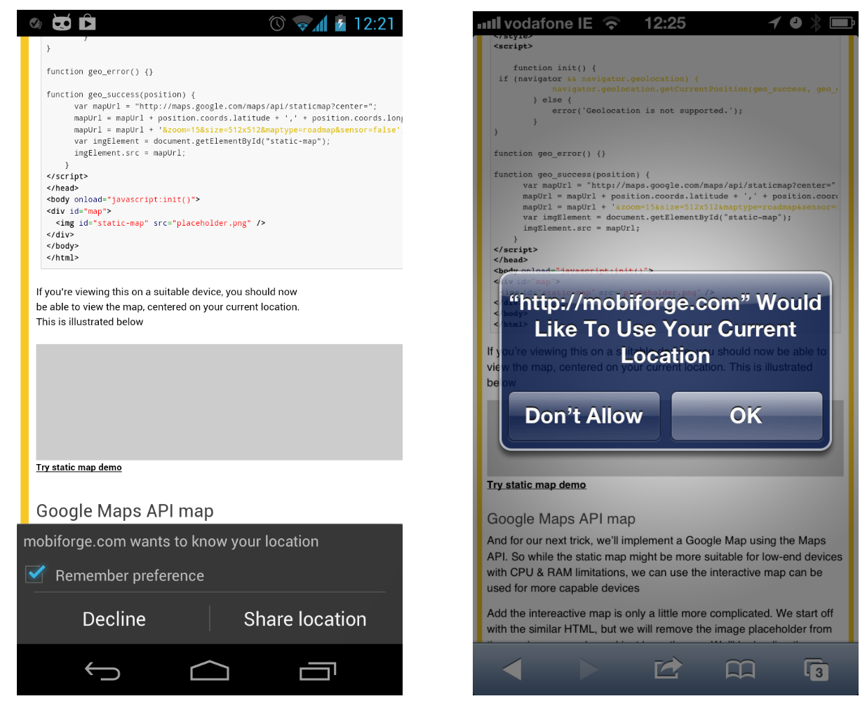
You can use HTML5 to use the Geolocation API, which’ll give your visitors a local option. Having a nearby choice can add relevancy to your visitor’s mobile experience.
Geolocation takes your visitors location in through the GPS receiver.
Permission needs to be granted by your visitor and looks something like this:
According to Search Engine Watch:
“50% of all mobile searches are conducted in hopes of finding local results, and 61% of those searches result in a purchase.”
And according to Business 2 Community, consumers act quickly after their local search and 47% more mobile visitors vs computer/tablet will visit a physical store within a day of their local search:
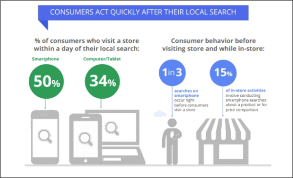
Don’t miss out on conversion opportunities by not using geotargeting in your mobile landing pages.
Mobile Landing Page Idea #4: Use Device Density for Testing
Use Google Analytics to determine the most prevalent mobile devices your customers and visitors are using and use that data to test out various mobile landing page design elements, like screen resolution and site performance.
You can first navigate to a device-specific custom report in your Google Analytics dashboard by navigating to Audience > Mobile > Overview. The report will look something like this:
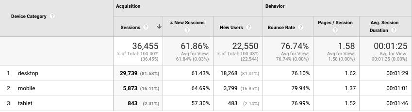
From there you can drill down into your mobile users and add screen resolution as a metric to prioritize which specific formats you should be addressing first in your mobile landing pages.
Here’s what that report could look like:
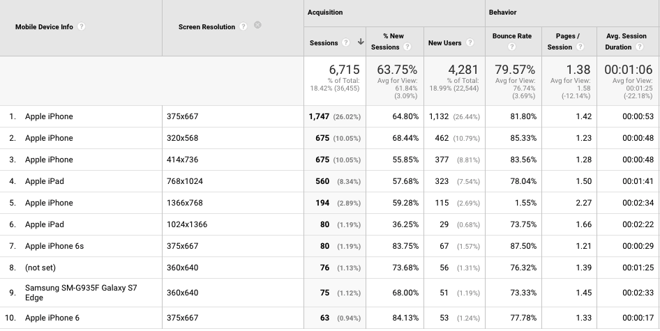
Now we know which screen resolutions to test for and optimize first for our mobile landing pages. The last thing you want to do is have a poor user experience on these specific devices.
Mobile Landing Page Idea #5: Mobile SEO Tool
Using a tool like Varvy can help you pinpoint any mobile SEO issues you might have. Simply type in your mobile landing page domain and click test to receive a report.
Here’s what the front end of the tool looks like:
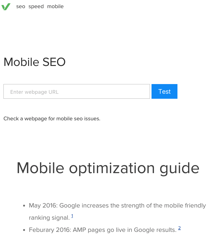
The report spits out full-blown stats on specific SEO items about your mobile landing page, like:
- Mobile friendly score
- Google access check
- Mobile speed score
- Page redirect check
- Mockup of mobile appearance
- Mobile markup detail
- Mobile HTTP headers detail
These points can help out with your mobile user experience, which can in turn, help boost your mobile landing page conversion rates.
Mobile Landing Page Idea #6: Allow for “Shop Later”
This concept can be carried over from standard desktop and laptop landing pages. According to Unbounce’s Oli Gardner:
“Shoppers who add items to the cart are more likely to make a purchase than those who do not.”
To make sure your visitor’s mobile user experience is just as convenient, be sure to include the Shop Later or Add to Cart or Add to Wish List features on your mobile landing pages. This is especially relevant to ecommerce businesses.
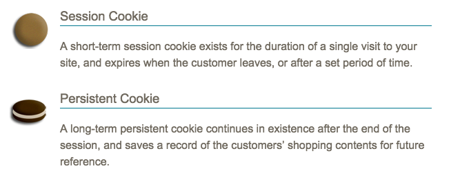
Magento calls these persistent shopping carts and defines them as:
“A persistent shopping cart keeps track of unpurchased items which are left in the cart, and saves the information for the customer’s next visit. Customers who are “remembered” can have the contents of their shopping carts restored the next time they visit your store.”
Here’s some cookie info about how persistent shopping carts are used:
By allowing your visitors to leave and come back to a shopping cart of items they’ve previously gathered, you can better accommodate the distracted on-the-go behavior of the mobile user.
Mobile Landing Page Idea #7: Consider Comfortable Thumb Reach
When placing your buttons be cognizant of where the user’s thumb is naturally placed and tailor your mobile landing page to that layout.
According to UXmatters, here’s how people hold and interact with mobile phones:
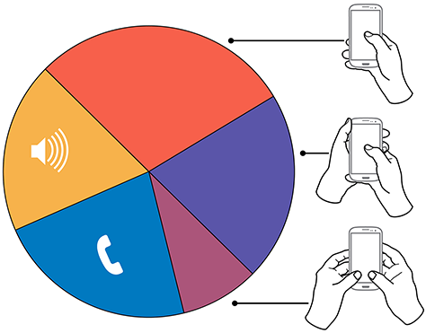
If following this pie chart, the majority of users have at least their right thumb chillin on the phone screen. This study observed 40% of users interacting with their mobile devices without inputting any data.
Steve Hoober conducted a study with 1,333 people and found out 49% of users hold their mobile phones one-handed.
Here’s a depiction of the “thumb zone” and how it’s changed on specifically the iPhone over the past decade:
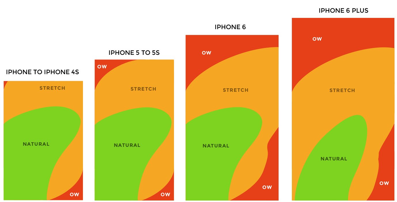
With this in mind have a CTA button on your mobile landing page within the general safe zone.
Mobile Landing Page Idea #8: User Experience
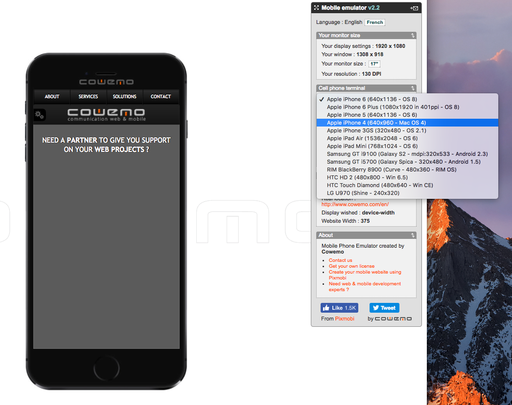
Test user interface (UI) on your mobile landing pages with tools like Mobile Phone Emulator. You can test in landscape and portrait mode and also determine how mobile accessible your pages are.
You have the option of emulating the mobile landing page experience down to the device and screen resolution size.
The initial interface looks like this:
Mozilla Developer Network recommends checking the following items for accessibility:
- Color - Color contrast should comply with WCAG 2.0 AA level requirements.
- Visibility - Don’t use content hiding technique exclusively to handle visibility and make sure the invisible stuff is truly invisible.
- Focus - All activatable elements should be focusable. Your links, buttons, form fields and other standard controls should be focusable by default.
- Text Equivalents - If there’s an element that’s not strictly presentational non-text, provide a text equivalent. This is especially relevant to mobile apps.
- Handling State - For custom controls (beyond your standard controls like radio button and checkboxes), provide state changes via ARIA States.
Some additional tips for you here…
Do This: Using HTML5, jQuery, JPG and GIF are recommended on mobile.
Don’t Do This: Frames, Flash, old plugins and pinch and zoom are typically things that you’ll want to stay away from.
Mobile Landing Page Idea #9: Adjust Keyboard for Each Form Field
If a visitor gets as far as completing fields in your form, a way to make the process as easy as possible is to adjust the keyboard for each form field.
If you’re requesting a zip code, quantity or phone number use the numerical keyboard. If you’re requesting info based on words use the alpha keyboard.
Here’s an example of the ideal adjusted keyboard matching the form field type:
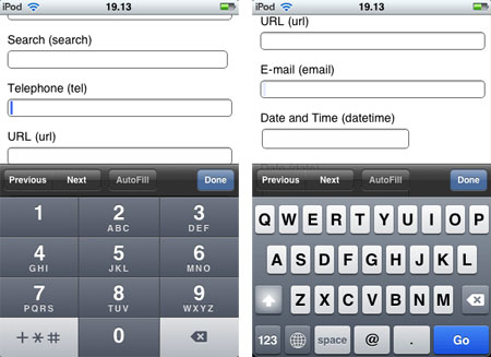
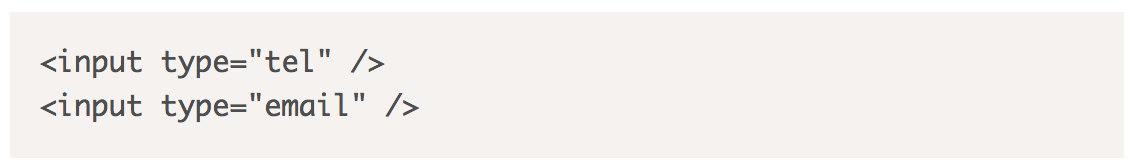
To work this custom keyboard experience into your mobile landing page, use HTML5 input types:
Messaging
Mobile Landing Page Idea #10: Be Customer-Focused
Reflect your visitor’s identity by personalizing your message. A tried and true way to do this is to understand your visitor’s goals and to find out where they are in the conversion cycle.
Here’s our version of the conversion cycle:
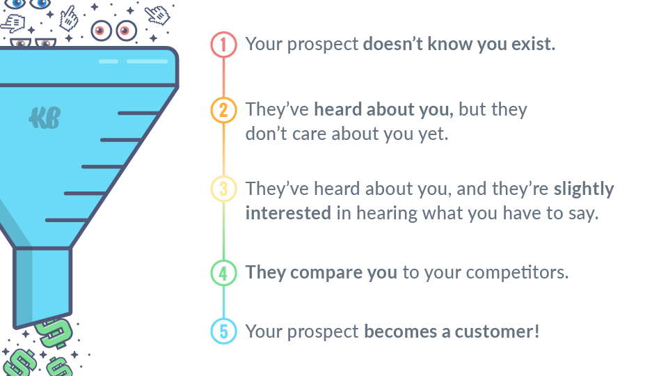
Speak to that stage in the conversion cycle with each of your mobile landing pages.
Mobile Landing Page Idea #11: Segment and Analyze PPC Traffic Sources
This one takes it a step further where you analyze your PPC traffic on mobile. Consider the differences in your customer journey and decipher between different traffic channels that your visitors came to your mobile landing page from.
If you’ve been following our blog, you’re likely to recall this:
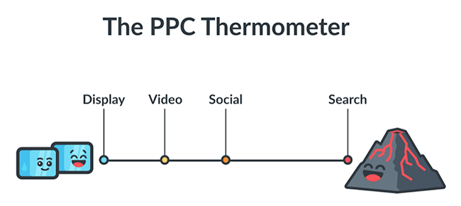
Visitors who came from search, social, video and display will all have different conversion intents and behaviors.
This is especially something to consider on for your visitor’s mobile experience since the screen and attention span are much smaller.
So when creating your mobile landing pages, consider being even more concise with your various offers.
Here are our ideas on how to tailor your offers to specific PPC traffic channels. We’ve found these to work well for our various clients:
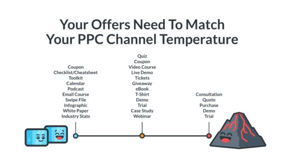
Not only should you be more direct with your offer on mobile, but you should also consider how the mobile experience differs from that of other devices and tailor the entire mobile landing page offer accordingly.
Here’s an example of what that might look like:
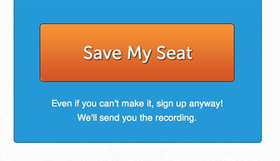
Mobile Landing Page Idea #12: Offer Exclusivity
This is especially relevant for ecommerce businesses since people have historically preferred to checkout on desktops over mobile devices.
A way to lessen the checkout or conversion friction is to offer something special to your visitors on mobile. Exclusivity in your offer can help create a sense of urgency and fear of missing out (FOMO), something that can help nurture the visitor’s mobile conversion experience.
Here’s how Kohl’s offers a mobile exclusive deal:

They even go as far as having a texting campaign to continue engaging the visitors.
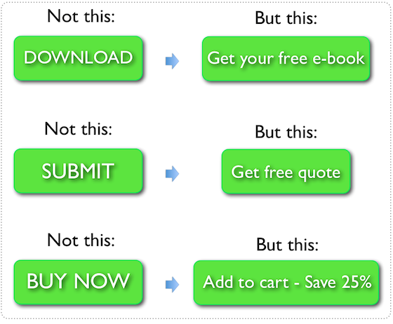
Mobile Landing Page Idea #13: Communicate Value Clearly
In the same way that you want to be succinct while copywriting your offer, be super clear about your offer’s customer benefits on your mobile landing page.
What exactly is your unique value proposition (UVP) and again, how will it change your visitor’s life for the better?
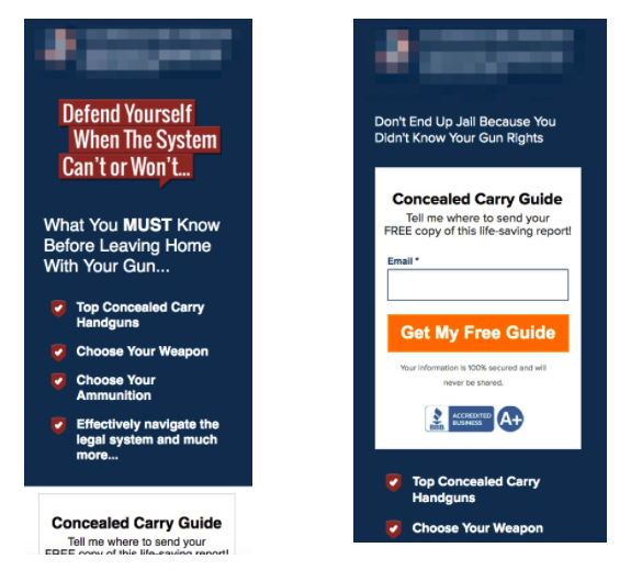
Here’s an example of an unclear vs clear value on mobile landing page:
You can hardly read the non-optimized version let alone understand the unique benefits. Don’t let this happen to you.
Mobile Landing Page Idea #14: Be Succinct
There’s not much real estate on the mobile screen, so every word counts even more vs other devices. You’ve heard this before but get to the point, be clear and use succinct actionable verbiage.
To clearly communicate, get to the point with fewer words and be clear about outcome of your offer.
Answer the question for your visitors as succinctly as possible: How will my life improve with this offer?
Here’s a test that compares succinct vs a plethora of options:
The results? The version on the left won with the following metrics:
- 16% more in page views
- 14% increase in hotel searches
- 22% decrease in bounce rate
The version on the right is not only challenging to visually navigate through, but it also doesn’t show off the UVP very clearly at all. The offer gets lost in the clutter of excess content.
Mobile Landing Page Idea #15: Short Action-Oriented Titles
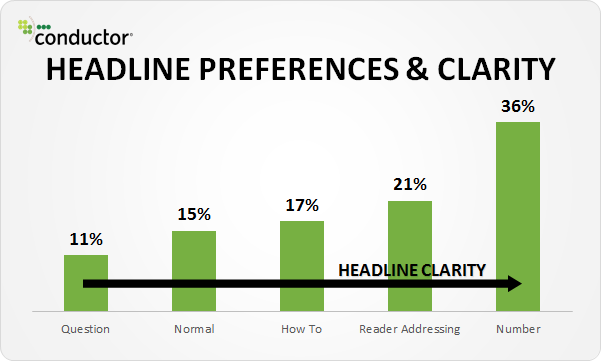
Headlines and titles are the first thing to stand out on mobile landing pages as well, so be clear, brief and action-oriented in your headline.
A Conductor study showed that the more explicit headlines that include facts and numbers, resonated more with readers:
Mobile Landing Page Idea #16: Avoid Using Filler Words
A way to avoid taking up too much precious mobile landing page space to avoid using superfluous fluffy words that serve as intensifiers or superlatives.
Steering clear of words like “ultimate,” “totally,” “smartest” and “best ever,” can help you minimize text.
Not only do they take up too much space, but they tend to come off as hard-to-believe also.
In Conductor’s study of headline superlative preferences, they discovered that respondents prefered the understated headline:
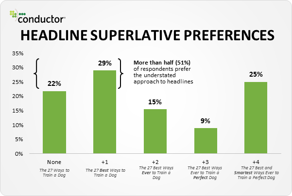
The trick is to find a useful descriptive without being too boastful and full of rubbish when copywriting on your mobile landing page.
Design
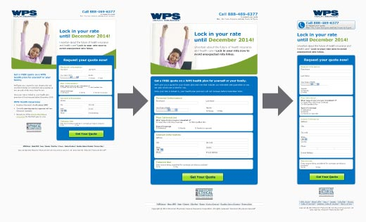
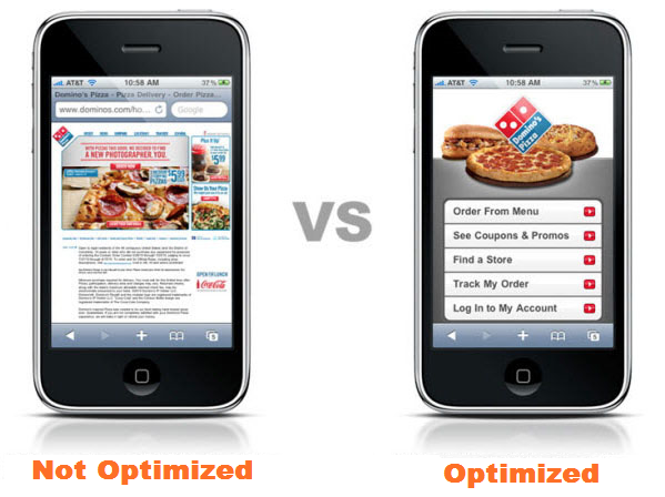
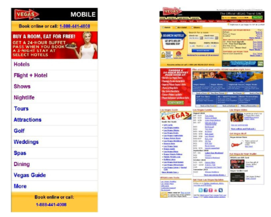
Mobile Landing Page Idea #17: Dedicated Mobile Page Design
Having a landing page design dedicated specifically to mobile is ideal vs a responsive page design.
The reason being responsive landing pages may not always translate properly to mobile screens, so having a full-proof dedicated design may be the better option.
Too often we witness people thinking that a responsive variation of a desktop landing page is all you need to have optimal mobile performance… which is so not the case.
Most of the time, a unique mobile experience is what your visitors need, and not just a responsive version of another device’s landing page.
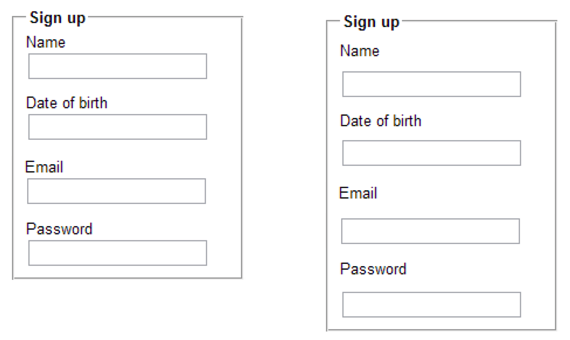
Here’s an example of how effective a single-column dedicated mobile landing page appears in contrast with one that’s not so optimized:
Mobile Landing Page Idea #18: Focus on One Goal Only
I’ve touted this one many times, especially in 47 Mammoth Landing Page Mistakes, and the idea is even more applicable to mobile landing pages.
Basically, when it comes to mobile landing pages, do everything in your power to keep your visitor distraction-free and focused on your one CTA goal.
This can mean many things. Here are some tips:
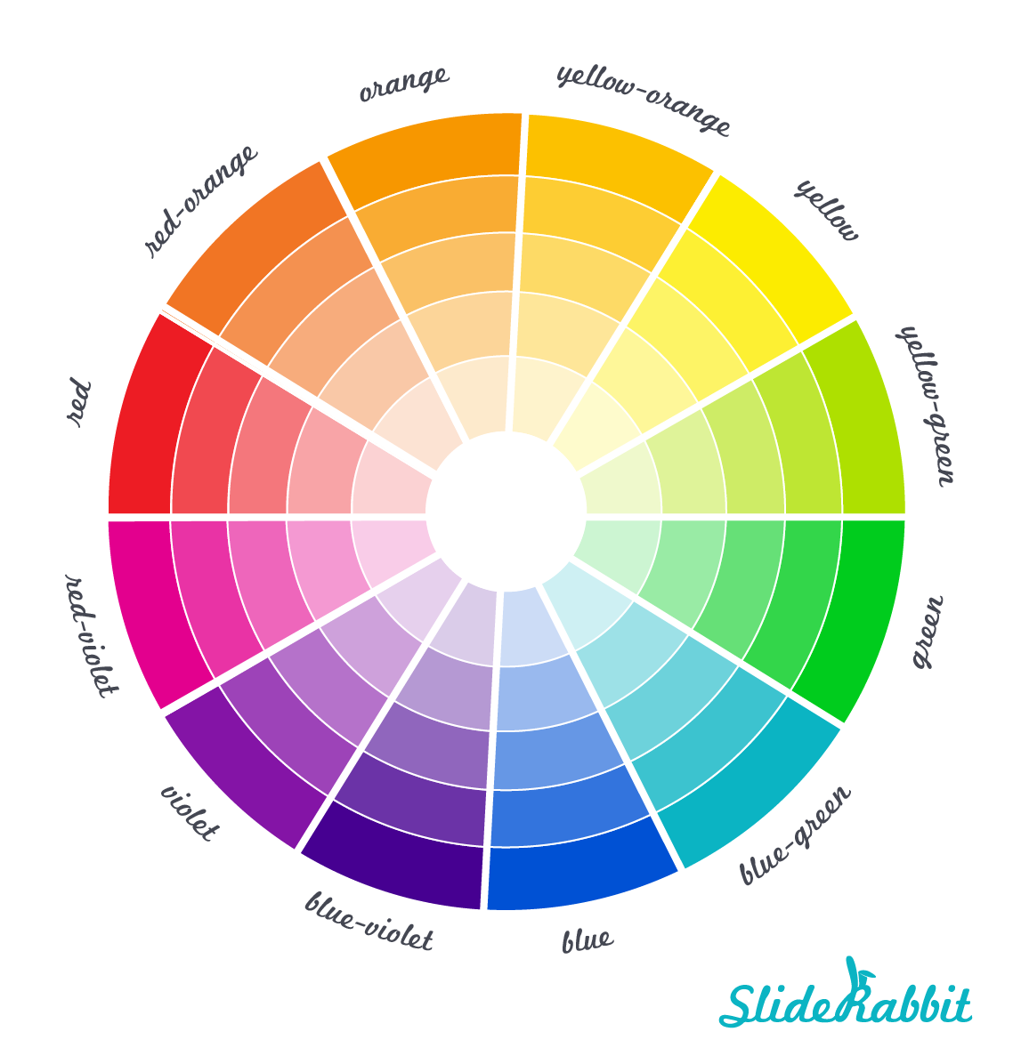
- CTA button color - The name of the game here is contrast. Be sure to create a button with a color that pops from the rest of the mobile landing page. If you’re confused about which colors to pick, you can choose a color that’s color wheel opposite from the main colors on the rest of your mobile landing page:
- CTA button copy - Using actionable, clear and explicit language when copywriting your CTA. Check out these 37 proven ways to create the strongest CTA copy for more tips.
- CTA button placement - Test out various your options since results could vary for various mobile landing pages. Unbounce advises us on what not to do:
- Don’t be afraid to go below the fold
- Don’t place your CTA in a busy or cluttered area
- Don’t have multiple CTAs unless they all have the same core purpose
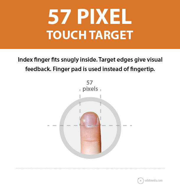
- CTA button size - Apple recommends following the 44x44 pixels rule, for a minimum target button size. The reason for this is based on usability and the average finger pad size.
- Closer statements - Include a supporting closer statement below the CTA button to remove any friction during the conversion.
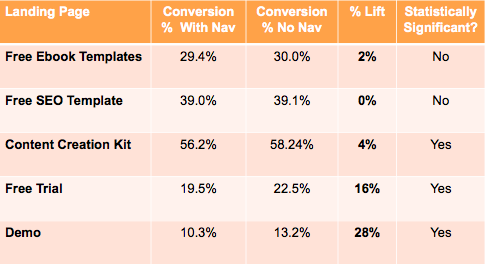
- Remove nav links - This includes removal of social share links. Hubspot A/B tested landing pages with and without navigation and there was a lift across the board:
Mobile Landing Page Idea #19: Consider Sticky Headers & Footers
Also known as fixed headers and footers, these sticky elements can assist with mobile usability and user experience especially when you have longer landing pages with scrolling or click-to-scroll options.
If your visitor should make their way down to explorative territory beyond the first fold, sticky headers and footers can make it super easy for them to find their way to your conversion.
Smashing Magazine conducted a usability study where participants found sticky menus to be 22% quicker to navigate.
Here’s a format of a sticky header:
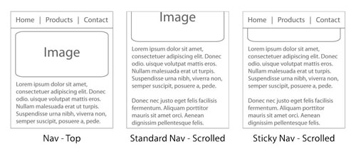
Caveat: Be wary of overloading your fixed headers and footers with too many options, since you want to keep your visitors focused on your one single mobile landing page goal (mobile landing page idea #18).
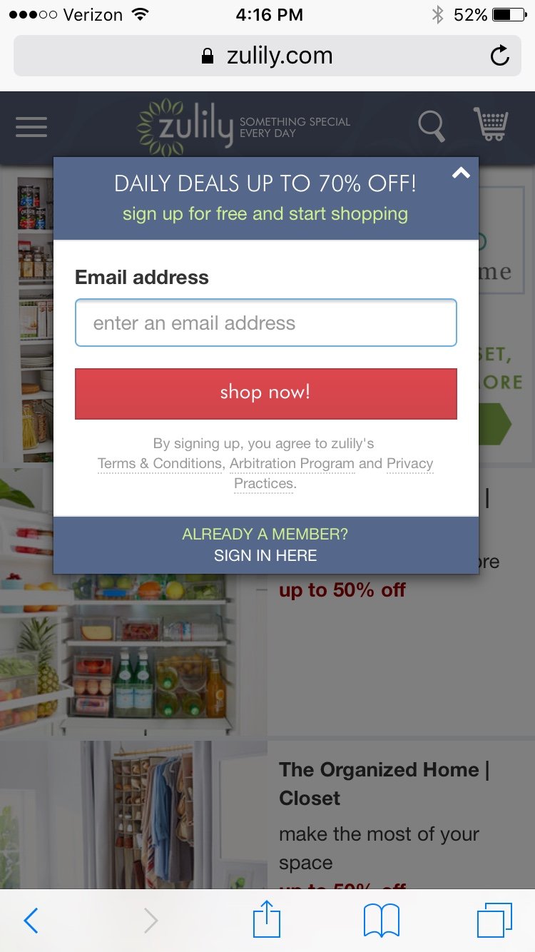
Mobile Landing Page Idea #20: Consider Mobile Popups
Similar to the effectiveness of sweet website popups on standard landing pages, offering enticing deals and opt-ins via mobile popups can also be worthwhile.
According to VentureBeat, MediaBrix conducted a study that found:
“Viewers were 2x as likely to have a negative emotional response to a full page interstitial ad than to a rewarded, opt-in ad.”
If that’s the case, then it might be worth testing out mobile popup offers based on rewarding opt-in experience.
Here’s an example mobile popup offer from Zulily:
Mobile Landing Page Idea #21: Use Scrolling Cues
An effective way to keep content compact yet still available to visitors that want to explore for more info on your mobile landing page is to use scrolling cues, like the click-to-scroll tactic.
Although Jakob Nielsen found in his scrolling and attention study that “web users spend 80% of their time looking at information above the fold,” on mobile devices you’ll want to give your visitors the opportunity to explore more information beyond the skeleton version of what’s on that first portion above the fold.
There’s not much room for additional exploratory content on the top portion of a mobile screen, so it can be beneficial to use scrolling cues to let your visitors know there is more info if they want it.
Mobile Landing Page Idea #22: Forms - Adjust Form Length
We’re big advocates of increasing the number of fields and using multi-step forms on your landing pages. Sure, there’s less attention span and less space on mobile devices, so do test out various form lengths.
Just keep in mind the advantages of increasing threat levels in your form fields as visitors progress through the form:
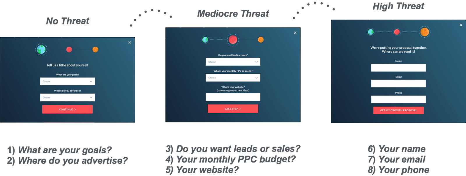
The same concept can apply with adjustments in the mobile landing page form. Test out options to find out the most effective mix of mobile form fields.
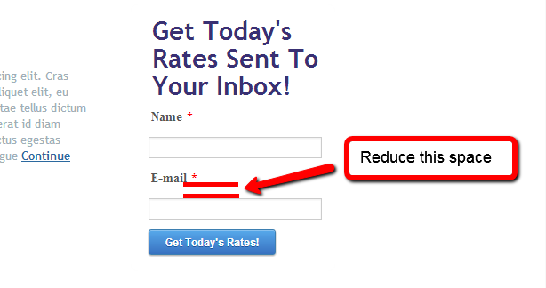
Mobile Landing Page Idea #23: Forms - Remove Space Between Fields
The proportions of your form fields on your mobile landing page vs desktop and other devices will vary, so adjust design elements for various reasons:
- Your form will appear shorter on mobile where people have shorter attention spans and less time to complete forms.
- You have less space to waste on a small mobile screen.
Even if it’s a minor space adjustment, a little space savings can go a long way in providing additional space on your mobile screen:
According to research conducted by Nielsen Norman, users should be able to complete forms quickly and without confusion. Their recommended tip:
“Place the label closer to the associated text field than to the other text fields… Items near each other appear related.”
This concept taps into the Law of Proximity where the brain tends to group things that are near each other together in a category.
In terms of form fields: When the label is closer to the form field, the two will be grouped together in the brain, making it less confusing for the user.
The Nielsen Norman Group recommends the form design on the left:
Mobile Landing Page Idea #24: Forms - Use Encouraging Error Messages
Because people behave with shorter attention spans on mobile vs other devices, it’s important to create nurturing messages that encourage your visitors to complete your online forms.
The last thing you want is for someone to make an error in your form field and then ditch out on the form because they feel discouraged.
Here’s how MailChimp acts as cheerleader when a visitor makes comes across a form error:
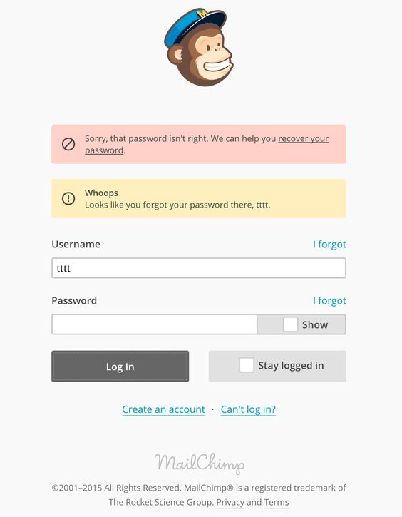
MailChimp makes it very clear what went wrong while completing the form and even offers a link to help resolve the issue. It’s even personalized by addressing the username in the error message.
Mobile Landing Page Idea #25: Consider Space Above the Fold
We’ve written about cases where there’s higher conversions for offers both above and below the fold on standard landing pages. When it comes to mobile landing pages, however, due to the limited space, consider keeping your offer within the first fold.
In this mobile landing page test, conversions increased by 201% when moved above the fold:
You can apply this concept to keeping any pertinent info above the fold, like phone number or your UVP. This’ll help you keep the prominent stuff front and center as your mobile visitors are distracted with shorter attention spans.
Mobile Landing Page Idea #26: Adjust Images
What works on desktop doesn’t necessarily work on mobile, so make the proper image adjustments when designing your mobile landing page.
To get to the point more quickly, show (don’t tell) your product or service features.
Some tips on image optimization from Kinsta’s Speed Optimization Guide:
- Format selection - JPGs can take limited processing and modifications before having to sacrifice image quality. Use PNGs for images with icons, logos, illustrations, signs and text. Save GIFs for small simple images and stay away from BMPs and TIFFs altogether on mobile landing pages.
- Proper sizing - Match the width dimensions by using browser resizing and responsive capabilities.
- Compression - Find the appropriate balance between image size and quality. For JPGs try a 60-70% compression.
- Fewer images - Less is more on mobile, so limit the number of images you use.
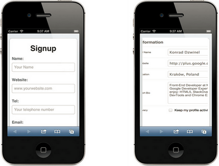
Mobile Landing Page Idea #27: Forms - Use Autocomplete
Another way to help speed things along in your opt-in forms is to have the information autocompleted for your visitors whenever possible.
Here’s an example of an autocompleted form when I went to download HubSpot’s How to Be More Productive ebook on my mobile:
Digital product leader Luke Wroblewski of wrote a UserTesting report for faster address collection and recommends including an address form field for the zip code only on lieu of city, state and zip:
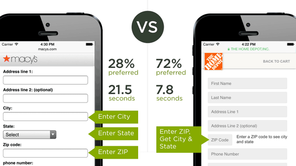
72% of visitors preferred entering the zip code only, which took a whopping 13.7 seconds less time to complete.
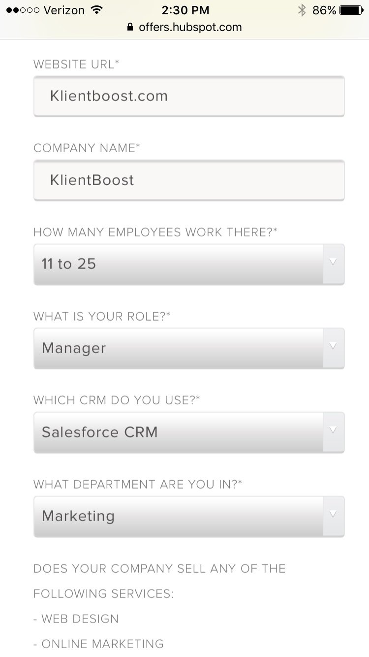
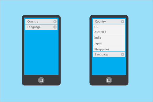
Mobile Landing Page Idea #28: Forms - Consider Collapsible and Dropdown Menus
You can avoid having your visitors scroll for days on your mobile landing page by including collapsible and dropdown menus.
By packing your form field options into nice and compact options, you can reduce the time spent completing your forms, which will increase the likelihood of your visitor completing your forms.
Here’s a form framework that uses both menus:
Mobile Landing Page Idea #29: Use Legible Fonts
With a tiny screen mobile space in comparison to desktop, the type and size of your mobile landing page fonts matter.
Using legible landing page fonts means cleaner styles and larger sizes.
If you’re looking for font style ideas, CreativeBloq recommends the following 10 font types for mobile:
- Open Sans
- Lato
- Old Standard TT
- Abril Fatface
- PT Serif
- Ubuntu
- Vollkorn
- Droid
- PT Mono
- Gravitas One
ClickLaboratory ran a study on two font sizes that looked like this:
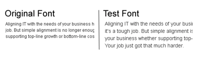
The results showed that the larger expanded font reduced bounce rates by 10%, lowered the exit rate by 19% and lifted the form conversion rate by 133%.
Caveat: Fonts that are too large will take up too much precious space on the mobile screen.
Design Shack recommends the optimal number of characters per line on mobile should be half the amount on a desktop format, which puts the ideal at 30 to 37 characters per line.
Mobile Landing Page Idea #30: Clear Out Clutter
Keeping a clean design with minimized distractions can be helpful in optimizing your mobile landing page screens. Some tips include keeping a single column layout with a decent amount of whitespace, to improve readability and a positive user experience.
Clean simple designs can help your visitors understand what the heck is happening on your page with much more ease.
Here’s a hotels4u test that compared performance between a cluttered vs clean single column mobile landing page:
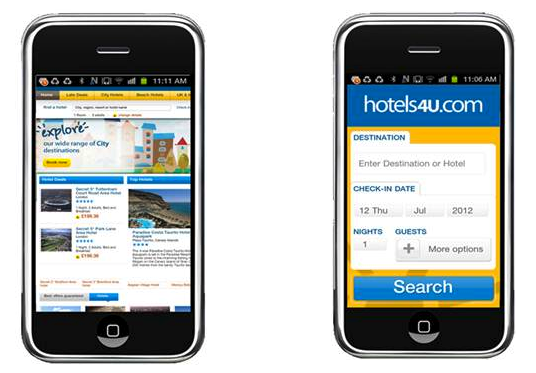
The version on the right with the lower cognitive load increased mobile visitor search use by 61.32% and 31.75% more visitors went on to the search results page.
Another stat that was tracked from the test was 14.45% more visitors went through to the online checkout stage.
Mobile Landing Page Idea #31: Consider Bullets
Bullets make it super easy to consume content and they also save space on your screens. If you want to include extra info beyond bullet points, consider using expandable accordions.
When people want to access quick and immediate info, bullets can be the way to go.
Here’s a test that you can apply to mobile landing pages. Google compared bullet points vs a video format on a website optimizer page:
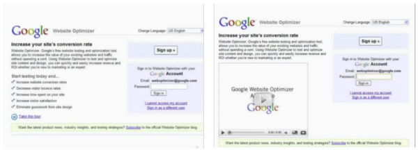
The version with the bulleted list won by 30% more conversions.
Although the Google website optimizer test vouches for bullets on general landing pages, it might be worth testing bullets vs other content formats on your mobile landing page.
Closing Thoughts
Now that you have 31 concepts under your belt, it’s your turn to go out and perfect your mobile landing page experience for each of your visitors.
Like everything, test each of these elements diligently... in case you come across an epic result that gives you mobile conversion magic.