Forrester reported that improving user experience design can potentially increase conversion rates as much as 400%.
That’s great news for conversion rate optimization.
Continually improving your conversion rate optimization (CRO) efforts depends on how well you understand user experience (UX) design principles in order to make dynamic decisions with solid data behind them.
In this article, we'll take a look at how using UX design thinking can improve CRO on landing pages, including what these terms mean, their fundamental principles, how they impact each other, and even where you can learn UX design to assist with problem-solving your hardest CRO challenges.
Get brand new conversion strategies straight to your inbox every week. 23,739 people already are!
What is UX design and CRO?

Both CRO and UX design are terms you’ve probably heard of in website discussions.
The two practices implement similar tactics, like user feedback and usability testing, in their processes to meet their individual end goals. That being said, they’re not the exact same.
CRO and UX design complement each other as overlapping design solutions.
Conversion rate optimization
So, what is CRO? Well, there are two definitions.
Traditional definition
Generally, CRO is described as “the practice of increasing the percentage of users who perform a desired action on a website.” While these actions can vary, one of the most popular actions is filling out a form:

Modern definition
Recently, a more holistic definition has surfaced: “the process of focusing on understanding what drives, stops, and persuades users, so CRO designers and strategists can give users the best user experience possible.”
So, why two definitions?
With both definitions, we can see the full picture of CRO. The traditional definition allows us to understand what the purpose of CRO is, while the modern definition explains why we should care about our CRO findings.
User experience design
Now that you know what CRO is, let’s move on to UX design — in certain cases referred to as product design or product development.
Defined by the inventor
While industry experts have differing opinions on how to define UX design, the inventor of the term, Don Norman, provides the following explanation:
“User experience encompasses all aspects of the end-users interaction with the company, its services, and its products.”
This means UX design mostly focuses on the complete digital experience, starting from the moment users first interact with the brand.
Categories of UX design
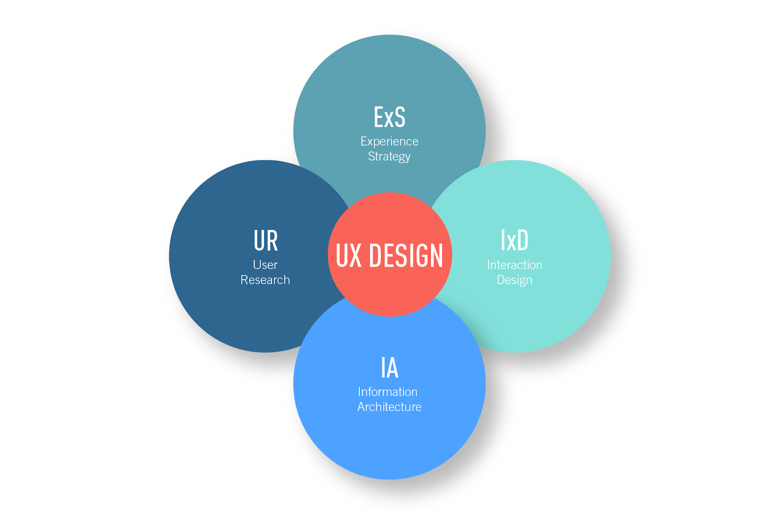
UX design is vast but it can be broken down into four main categories.

Experience strategy
Experience strategy focuses on holistic business strategies that include both the needs of the customers and the company.
Interaction design
Interaction design cares about how the user interacts with the digital product.
Key subcategories of interaction design are human-computer interaction design (HCI) and user interface (UI) design.
User research (UX research)
User research focuses on the research elements of design, including techniques like user testing and usability testing.
Information architecture
Information architecture pertains to organizing and structuring content by using user-centered design thinking.
What are the fundamentals of CRO and UX design?
Before we look at how CRO and UX design work together, we need to know more about them.
Fundamentals of CRO
There are 4 basic fundamentals of CRO:
- Design & layout
- Conversion copywriting
- Analytics, tracking & testing
- Conversion intent & funnels
Design & layout
94% of first impressions are related to design, so it's essential to lay content out in a way that looks nice and makes sense.
The most pertinent content areas are
- call-to-action (CTA) buttons
- the hero shot
- headlines
- subheads
- benefits
- features
- social proof
- confirmation page
Read this to learn more about these content areas.
Conversion copywriting
Copywriting can be difficult because relevant and persuasive copy can make the difference between users staying on a page or leaving. This case study by Forrester proved that focusing on customer-centered messaging increased conversions.
The most important copy is found in
- headlines
- subheads
- FAQs
Try these tips for writing effective copy.
Analytics, tracking & testing
A major part of CRO is testing and improving conversions using data.
For example, if a page has a high bounce rate, the next logical step would be to find out how to reduce it to increase conversions. But if that data isn't tracked, it's impossible to improve it.
Conversion intent and funnels
Conversion rates are heavily affected by the compatibility between the traffic temperature and location in the marketing funnel. Match them to maximize conversions.
Fundamentals of UX design
The UX Book by Rex Hartson and Pardha Pyla detail five key areas of UX design: usability, utility, functional integrity, visual design, and persuasiveness.

Usability
Usability is how easy something is to use, based on the discoverability and understanding of its features.
Utility
Utility is focused on usefulness and the value that it brings.
Functional integrity
Functional integrity relates to how a product works behind the scenes.
Visual design
Visual design is all about aesthetics. This can often be interpreted as user interface design.
Persuasiveness
Persuasiveness relates to a product’s ability to convince users to use the product and carry out key tasks.
How does UX design impact CRO?
We know the basics of CRO and UX design. Now, let's look at some stats and talk about how they relate.
Usability
85% of website problems can be prevented with tests including just 5 users.
If something isn’t discoverable or understandable, it’s as if it doesn’t exist.
Usability is easily the most essential UX design principle to CRO, because accessibility is the most prominent feature users notice.
Many CRO tests may involve changing a button color so it stands out more (e.g. discoverability) or repositioning content on a page so the order makes more sense (e.g. understanding) to improve usability.
Utility
39% of visitors will not return to a website if it has too much content.
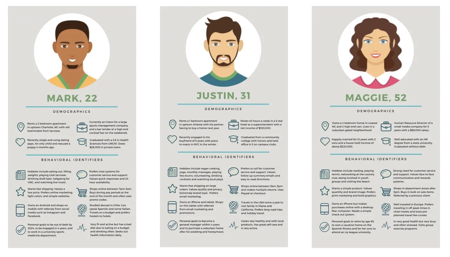
Utility can be user-specific, as users may assign different values to the same information depending on what they’re looking for. This is why it’s important to conduct UX research, create personas of your target audience, and understand your users' needs, so you can implement the highest utility possible.

Conducting user research and usability testing with feedback platforms like Hotjar can help improve CRO, as the data may reveal what information a user is missing while visiting the site, or if a user is being directed to a site that doesn’t match their interests.
If you're stuck on what to test, reference our five testing steps.
Functional integrity
50% of developers' time is spent fixing preventable mistakes.
A product can have low functional integrity if it fails to consistently load content or has a lot of bugs.
CRO designers and strategists must work closely with the development team to ensure the product is working as intended.
Visual design
48% of visitors think web design is an indicator of business credibility.
If there are two equally as effective products, and one is well-designed and the other isn’t, many people will opt to use the product with better visual design. However, if one product has better usability and utility, it doesn’t necessarily matter how well-designed the other product is, because it’s an inconvenience to use.
Although many times the product with good usability and utility but poor design will champion CRO tests over variants with poor usability and utility but good visual design, it’s important to remember that poor visual design can hurt still hurt businesses.
Persuasiveness
44% of shoppers will tell their friends about their bad experience with a website.
Persuasiveness directly impacts a user’s retention, brand loyalty, and likelihood to promote the product, which can affect new and repeated conversions.
While a product can have good utility, usability, functional integrity, and visual design, it can still fail to have the complete user experience if it isn’t persuasive. While much of persuasion is dependent on good copy, it can extend beyond that — to the gated content, checkout process, and more.
Since the ultimate purpose of CRO is to convert users to fulfill a specific action and complete conversions, persuasiveness is key.

Where can I learn UX design?
Thankfully, there are many opportunities to learn about UX design skills.
UX Design Resources
Bootcamps and LinkedIn Learning courses are very popular to learn about the UX design process. Most courses will cover
- design fundamentals
- research, strategy, and planning
- design thinking and
- website and app design
to help you become knowledgeable about UX design.
UX Design Skills & tools
Some common skillsets you'll learn about are
- accessible design
- color theory
- low-fidelity and high-fidelity prototyping
- personas
- typography & visual hierarchy
- wireframing
- user flows, user journeys, and user testing.
There are also usually sections for design tools such as
- Sketch
- Figma and
- InVision.
CRO & UX design is a match made in heaven
Good UX design provides long-term benefits to CRO.
Businesses like Summit Publishing Co. have noticed the connection between UX design and conversions for years, and many businesses have followed suit since.
Designers and strategists don't have to test ideas randomly to figure out what works best. We now know why and how to avoid poor UX design.
If we can design landing pages by using the fundamentals of both CRO and UX design, we can prioritize major issues and understand the user journey to deliver a better user experience and consequently, increase conversions.
