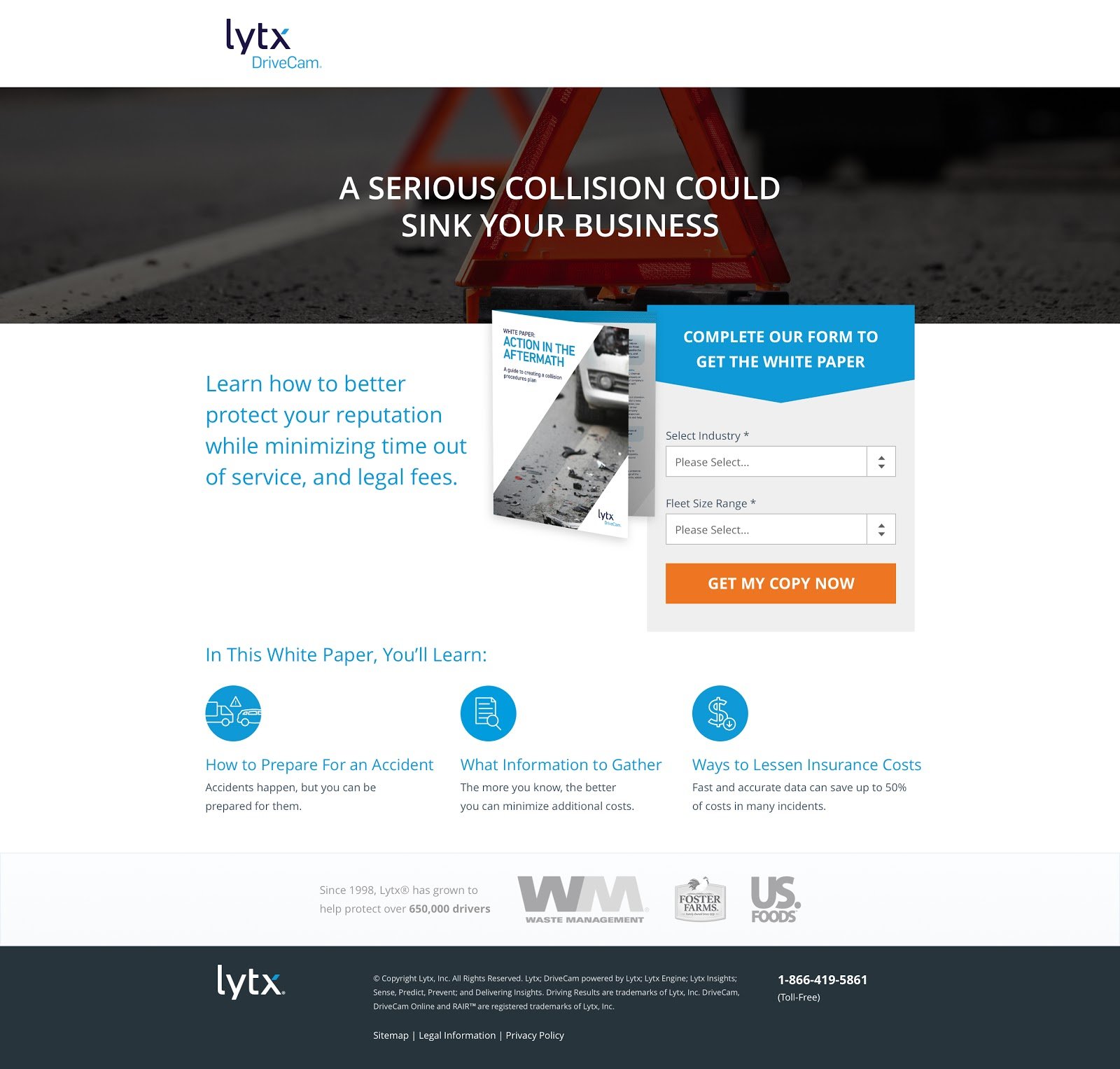
Is your landing page not converting -- or not converting as much as you'd hoped it would?
Every visitor comes to your landing page with different pain points. Some are barely getting to know your product or service, while others are ready for a phone call or purchase.
Making the right changes to your landing page should help increase your conversion rates, and can turn cold traffic into hot leads.
As landing page optimizer extraordinaire Aaron Orendorff says, “At their core, landing pages that convert speak directly to real people with real problems in search of real solutions.”
But what if you’ve pulled out all the stops and tried every possible way to achieve a higher conversion rate, and you're still falling short? At this rate, you might be asking...

We're glad you asked.
Because, as Thomas Jefferson (may have) said, “If you want something you’ve never had, you have to do something you’ve never done.”
So let’s take a look at some of the go-to landing page tests that we found generate the best conversion rate lift. These have been tested with over 120 clients (and counting) by the KlientBoost team.
(I promise most of these are worth a shot and aren’t difficult to implement.)
- 1) Keep It Minimal
- 2) Put an End to Fluffy Headlines
- 3) Honor the Golden 1:1 Attention Ratio
- 4) Stay Consistent With Your CTA
- 5) Polish Your CTA Button
- 6) Address & Reduce Fears With Disclaimers
- 7) Display a Progress Bar
- 8) Put a Face On It
- 9) Add Social Proof
- 10) Include a Pricing Plan When Necessary
- 11) Create a Sense of Urgency
- 12) Try the Infamous “Breadcrumb Technique”
- 13) Optimize for Mobile
- 14) Use Tracking Tools
- 15) Use The Decoy Effect
- 16) Create a Competitiors’ Page
- 17) Change Up Your Offer
- Wrap Up on Your Landing Page Not Converting
Get brand new landing page strategies straight to your inbox every week. 23,739 people already are!
1) Keep It Minimal
Did you hear about the 40-person band that headlined Coachella?
Me neither.
In fact, they probably don’t exist -- and for a good reason.
Too much of a good thing isn't a good thing. And when it comes to your landing pages, the phrase “less is more” can’t be stressed enough.
As marketers, we’re sometimes tempted to oversell by cramming in every bit of “useful” and “enticing” information we can. Sure, that might have been the right approach in 1997, but it can do more harm than good now.
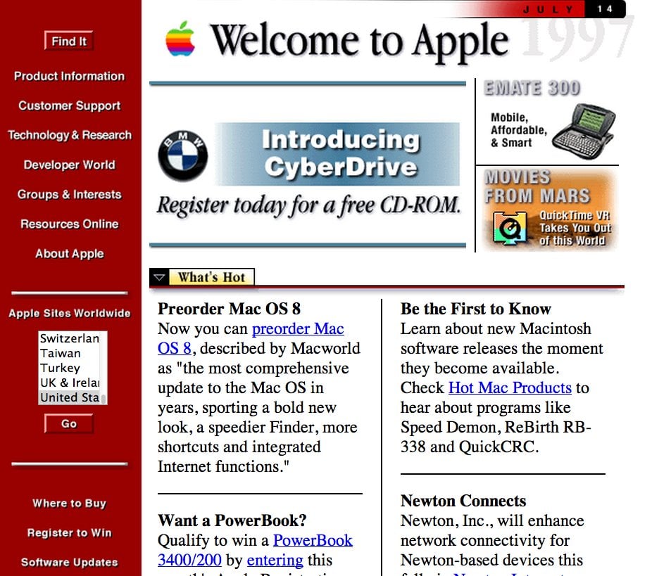
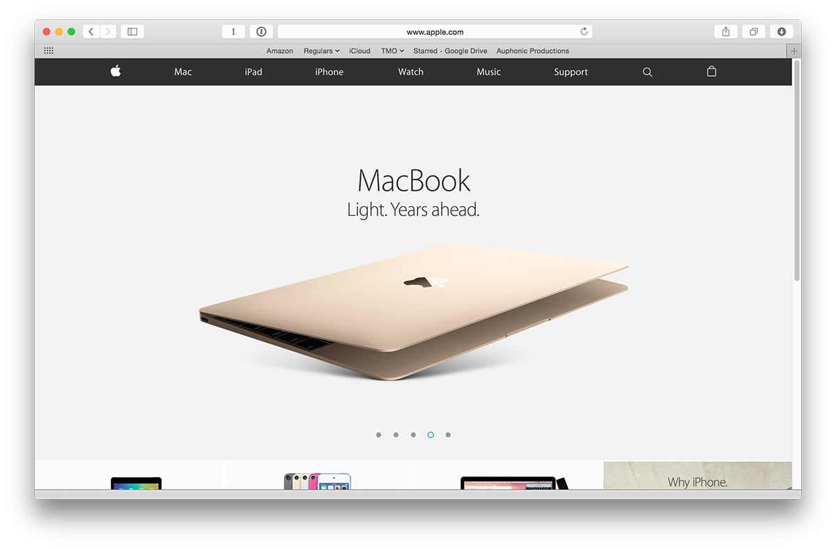
We might also think that including more images and copy helps landing page performance. But is that always the case?
A good tactic to try when you start testing is making a short landing page variant.
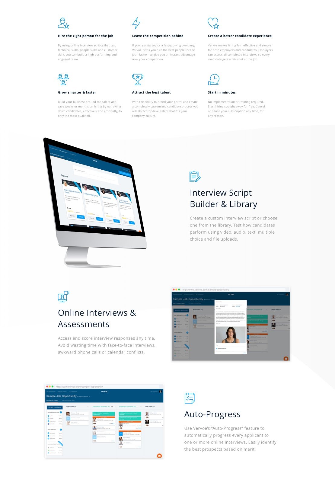
Take a look at the body content of this KlientBoost client landing page, for example:
Although all the imagery and content may seem necessary, the data proves otherwise.
By condensing some of the information and eliminating some benefits and screenshots, the conversion rate went up by 54%.
Now it's your turn. Ask yourself, “what portion of my page can I eliminate without sacrificing quality content?”
Here are a few more best practices to keep your page minimal if your landing page isn't converting:
- Break your copy up visually with numbers and icons.
- Be selective of how many images and fields you include on your page.
- Emphasize only what matters.
- Use white space effectively.
- Separate your landing page into sections.
- For form fields, use dropdowns in place of text fields to eliminate the need to type.
- If possible, use radio buttons instead of dropdowns to avoid an extra click.
2) Put an End to Fluffy Headlines
Landing page not converting? Try simplifying your headline.
Contrary to popular belief, the best marketing isn’t always the most creative.
Keep in mind that you only have about five seconds to pull your audience in upon entering your landing page. With that said, clearly communicate what’s being offered and promise a clear, specific benefit to the audience.
Your headline and subheader together should clearly convey your Unique Value Proposition (UVP) or what makes you unique as a business.
Square provides a perfect example of this:
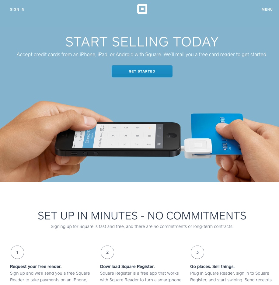
In five seconds, this page is able to clearly communicate what Square is all about, hitting the reader’s pain point.
The headline is simple and succinct. And it's backed up by a subheading that explains further about the product being sold.
“Start Selling Today” is extremely straightforward and provides an insight as to what you can expect when you hit the “Get Started” button.
Headlines have the power to provide a significant lift while taking a small amount of time and effort to change. Check to see if your headline contains unnecessary fluff, and consider testing a simplified variant.
3) Honor the Golden 1:1 Attention Ratio
Imagine you were given the option to choose from a selection of diamonds. You’d probably analyze the different options you have in front of you, weighing out your decision.
Now imagine you were only given the option to choose one single diamond on the table. More likely than not, you’d probably take that diamond.
The same principle applies to landing page optimization.
When multiple links are provided in your landing page, your audience has an opportunity to opt-out of the goal you’ve intended for your campaign.
But something incredible can happen when the only clickable action on the page is your main call-to-action -- your conversion rate will go way up.
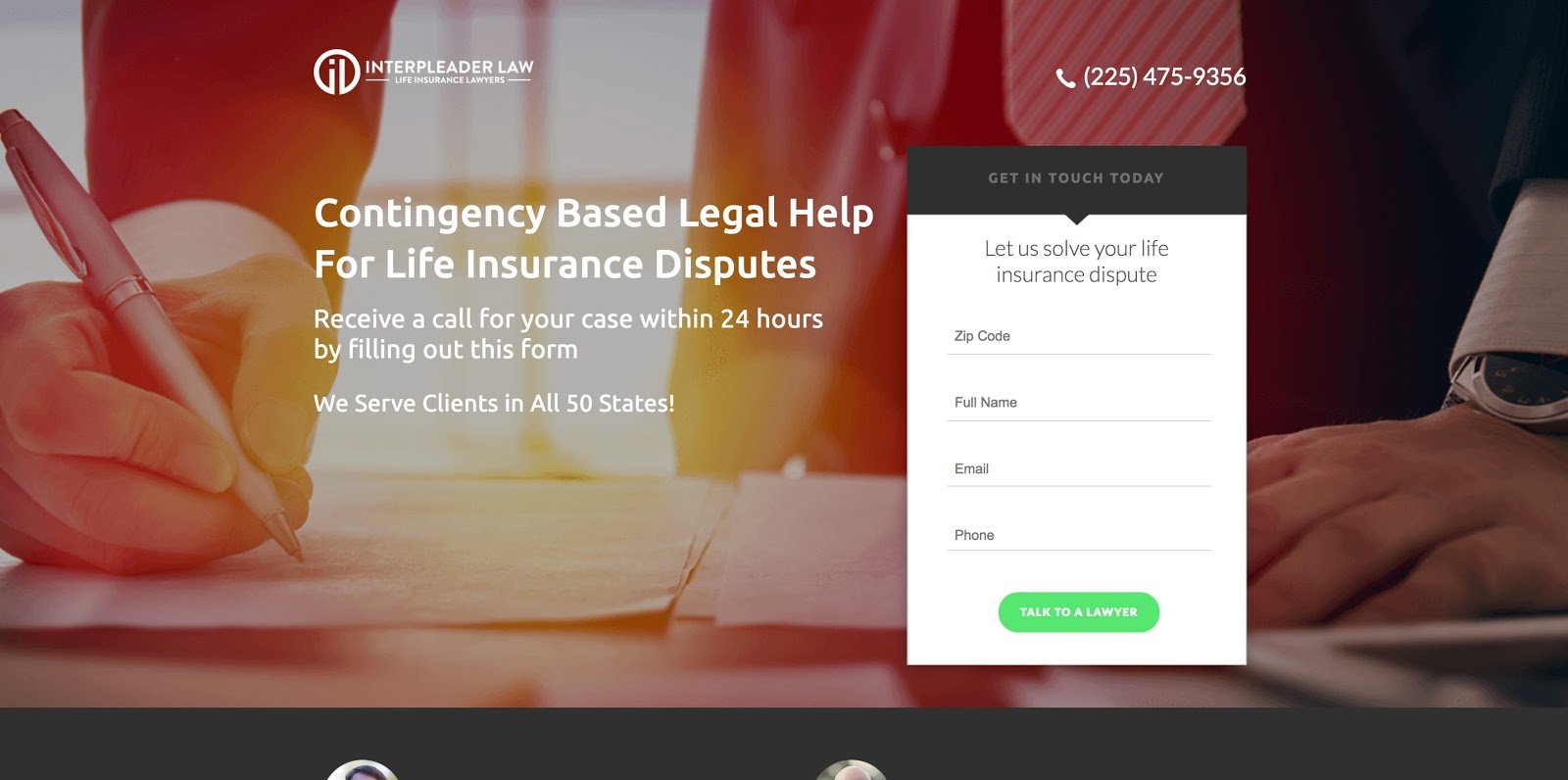
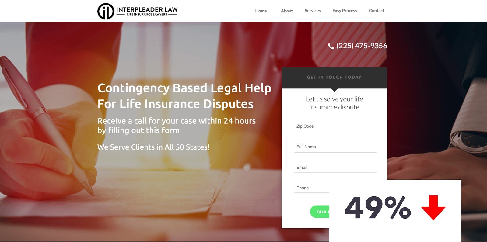
If you see your landing page not converting, consider this KlientBoost client example of what an added navigational menu can do to your page:
To optimize for conversions, your landing page must have only one goal.
Eliminate all distractions by removing all links except your one call-to-action button. It’s simply good practice.
This is possibly one of the most effective rules to implement if you see a landing page not converting. Honor the golden 1:1 attention ratio, which is the ratio of things you should be able to do on a page compared to the things you can do.
Remember: as attention ratio goes down, conversion rates go up.

4) Stay Consistent With Your CTA
Remember when you were learning about college writing in English 1A? One of the most important rules to follow was to have everything in your essay back up your thesis statement.
Look at your main call-to-action as your thesis statement.
If your call-to-action is to get a free ebook, everything in your landing page — from copy to imagery -- should support that ebook.
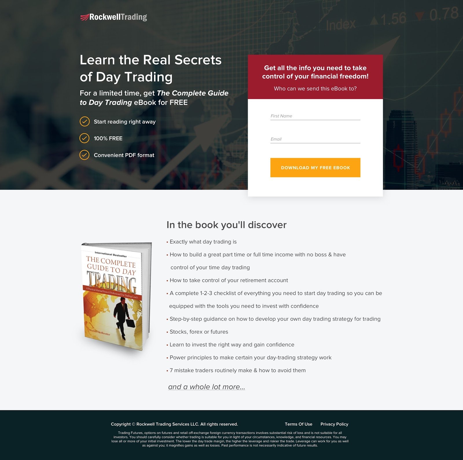
Take a look at this KlientBoost client ebook landing page:
Don’t babble on about your brand -- save that for a separate campaign. Instead, discuss what will be covered in the e-book and how people can benefit from it.
5) Polish Your CTA Button
I’m sure you’ve read many best practices on how to properly treat your main call-to-action button.
After countless A/B testings, I’ve found two reliable guidelines to increase the overall performance of a landing page not converting:
- Make it personal.
- Make it stand out.
Understand that what you’re selling is beyond a service or a product. You don’t sell mortgage loans -- you sell security. You don’t sell attorney services -- you sell peace of mind.
So, instead of having your CTA button say “Get Rates”, try saying “See How Much I Can Save.” And instead of saying “Get in Touch”, be more specific and personal by saying “Get My Free Consultation.”
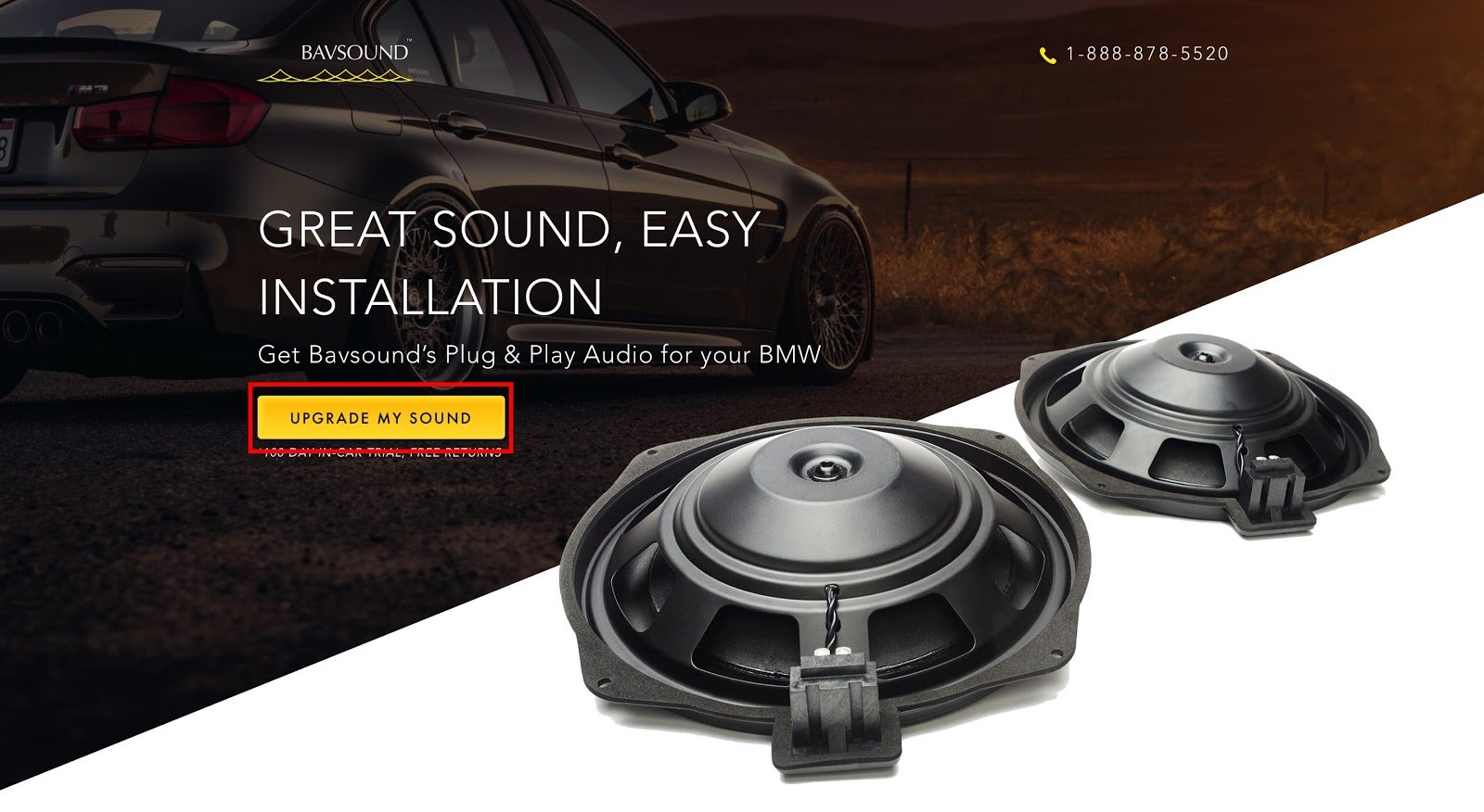
Another great KlientBoost client example is replacing the all-too-common “Get Demo” CTA with “Show Me How It Works.” The pattern you see here is words like “I”, “me”, and “my.”
Making your CTA button stand out is just as important. You can test this by experimenting with different colors.
As a designer, I know how cringe-worthy it is to go off-brand in any design layout. However, choosing an entirely different color for your CTA button might just be your saving grace.
For instance, if your page calls for purple and teal throughout the layout, I might suggest making your CTA button orange. (Crazy, I know.)
Like most of these practices, a simple color change requires just a minute of your time, so test it out!
6) Address & Reduce Fears With Disclaimers
Including a brief disclaimer near your CTA helps to neutralize anxiety.
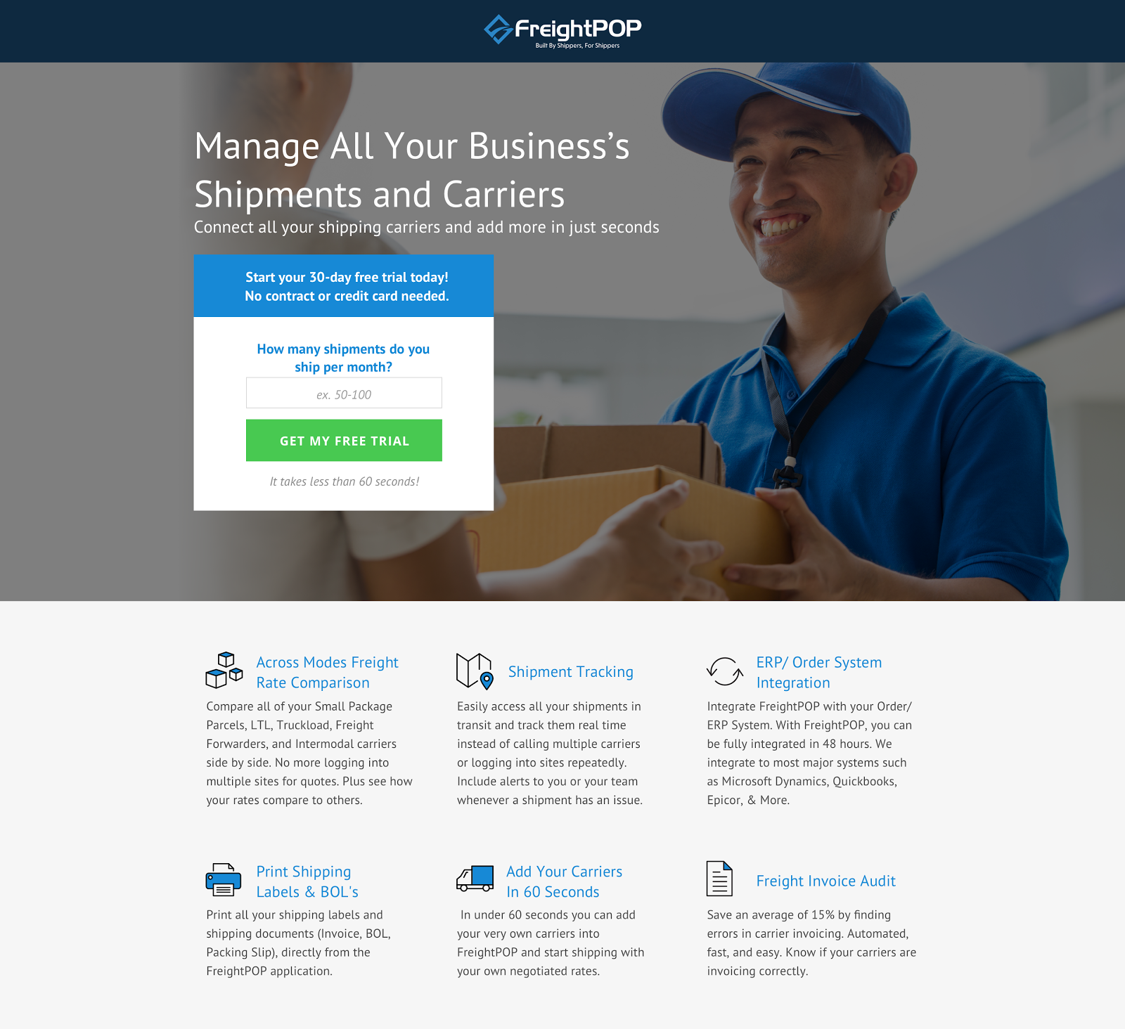
If your CTA button says “Get Free Trial”, for example, you can place a disclaimer directly below that says “no credit card needed.”
If you’re offering a monthly subscription, include a mention that lets visitors know that they can “unsubscribe anytime.”
A disclaimer might be the deciding factor for a potential lead to convert.
7) Display a Progress Bar
In a runner’s marathon, worn-out athletes often find a “second wind” once they see the finish line ahead.
If we were to translate this concept into landing page terms, it would be in the form of a progress bar.
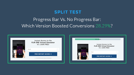
A progress bar conveys forward motion through a series of steps, allowing your audience to visualize the end goal.
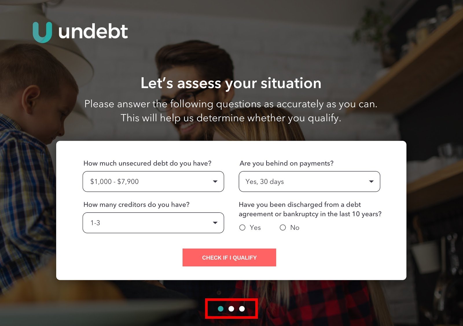
If your landing page contains a form with more than two steps, consider using a progress bar to indicate the form's length. This will show visitors where they are in the process and encourage them to complete the conversion action.
See an example of a progress bar on this KlientBoost client landing page.
A progress bar is especially effective when an assessment or questionnaire is involved.
8) Put a Face On It
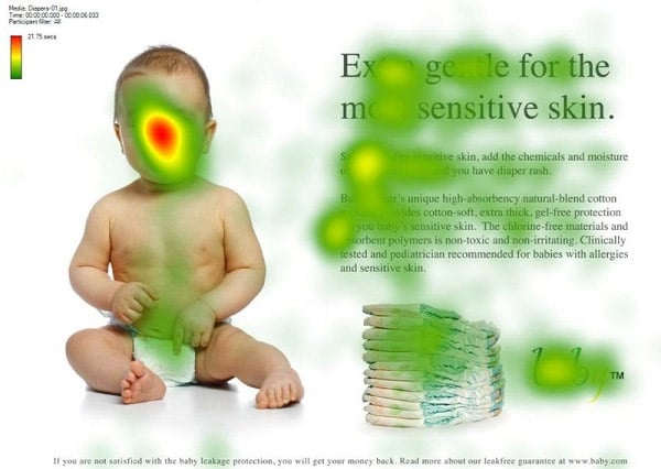
In a classic heatmap study example, a picture of a baby was included on a landing page to see what effect it would have on a visitor’s attention.
As illustrated, putting a face on a page creates a strong connection between the viewer and the subject matter, thus drawing more focus on the landing page.
When it comes to the types of human images to use, babies and attractive people tend to have a noticeable impact.
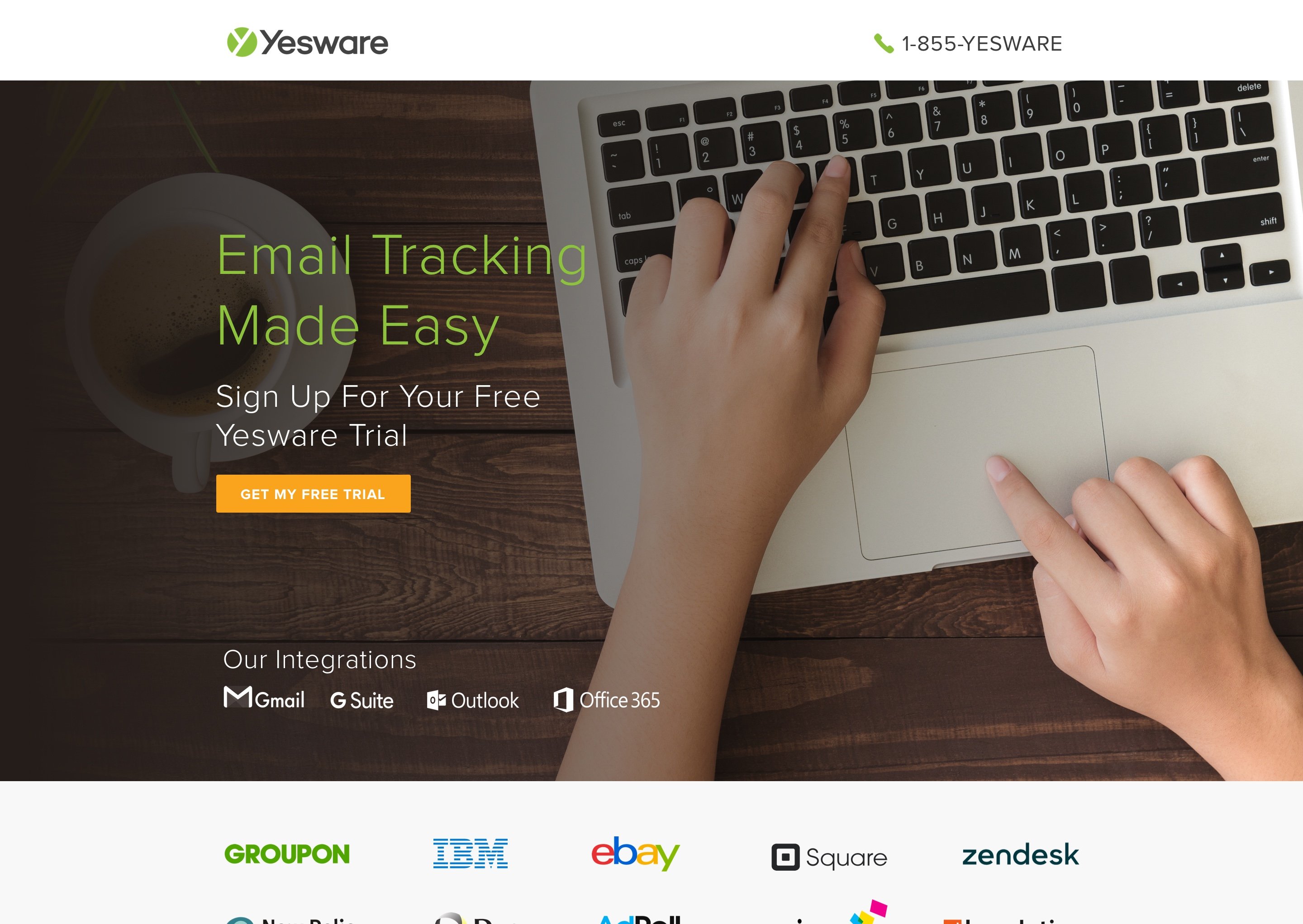
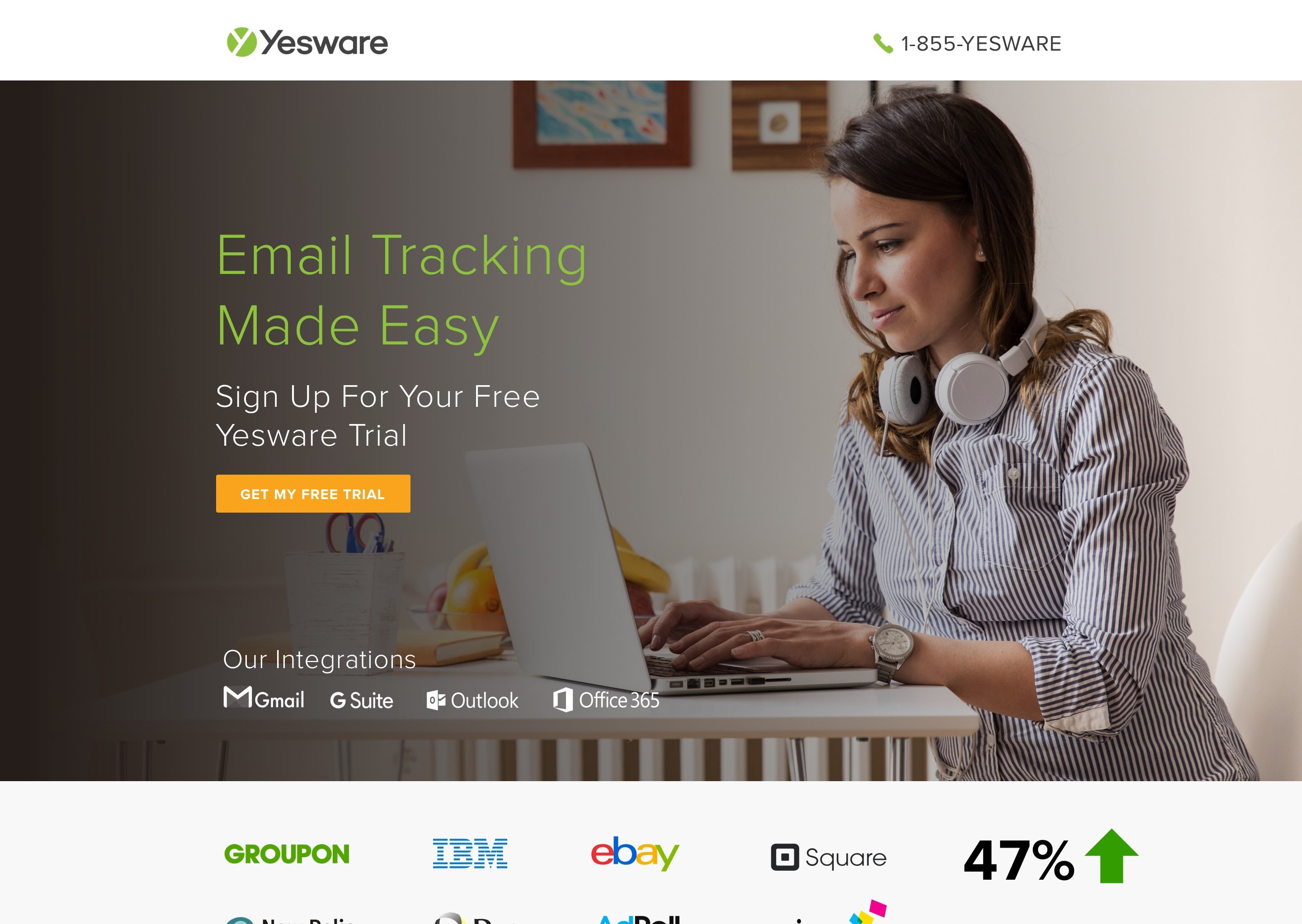
We put this notion to the test by replacing an existing hero image of hands typing on a laptop with that of a female user. The result for this KlientBoost client landing page was a 47% increase in conversion rate.
Note that the same idea can also be applied to testimonials to increase trust and relatability.
If you read our 41 Hero Shot Secrets From High Converting Landing Pages, you’d also learn that using a real person associated with your product instead of a stock photo increases conversion by 35%.
9) Add Social Proof
Remember when Interstellar came out in theaters and you were curious to see if it was worth the watch so you checked IMDB and Rotten Tomatoes for ratings and reviews?
You had no idea what that movie was really going to be about by simply watching the trailer -- but you knew you had to watch it because Christopher Nolan directed it.
Social proof on a landing page is kind of like that.
Whatever product or service you’re selling can always get a boost from added social proof.
In marketing, social proof is “a psychological phenomenon where people assume the actions of others in an attempt to reflect correct behavior for a given situation.”
In landing page terms, this is talking about added trust signals like testimonials/reviews and trust seals. Think of it as your cherry on top.
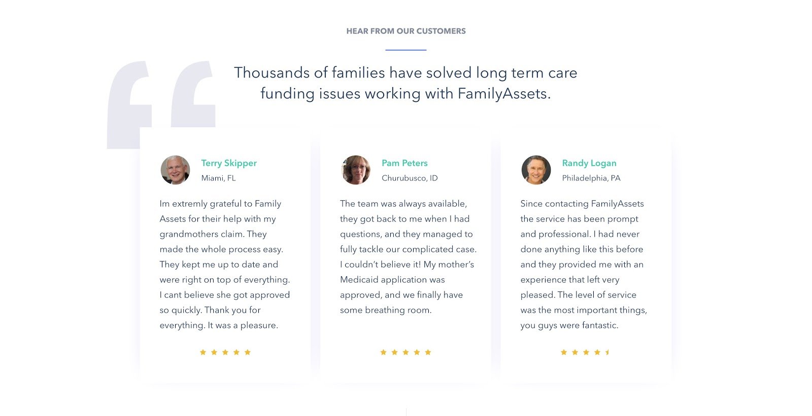
View your testimonials as the IMDB section of your landing page like this one we created.
Adding testimonials gives your visitors a chance to relate to your product or service. If they know others have experienced what you’re offering and are happy doing so, they’re most likely going to convert.
Including star ratings on your testimonials is always a good idea, but they can put a damper on your authenticity and hurt your conversion rate if not done properly.
In fact, selecting only five-star reviews to put up as testimonials on a given landing page can make a product or service seem too good to be true.
Want a quick fix? Select one 4-star rating to include among the other perfect reviews.
Trust Seals -- A Landing Page's Best Friend
Whenever possible, also include trust seals to gain credibility.
Trust seals are symbols that help reassure your audience that their sensitive information is secure with the company they're giving it to.
Remember that Interstellar analogy I brought up? Think of Christopher Nolan as your trust seal.
Because Nolan is widely recognized in the film industry, a movie with his name on it gives you a reason to trust the project.
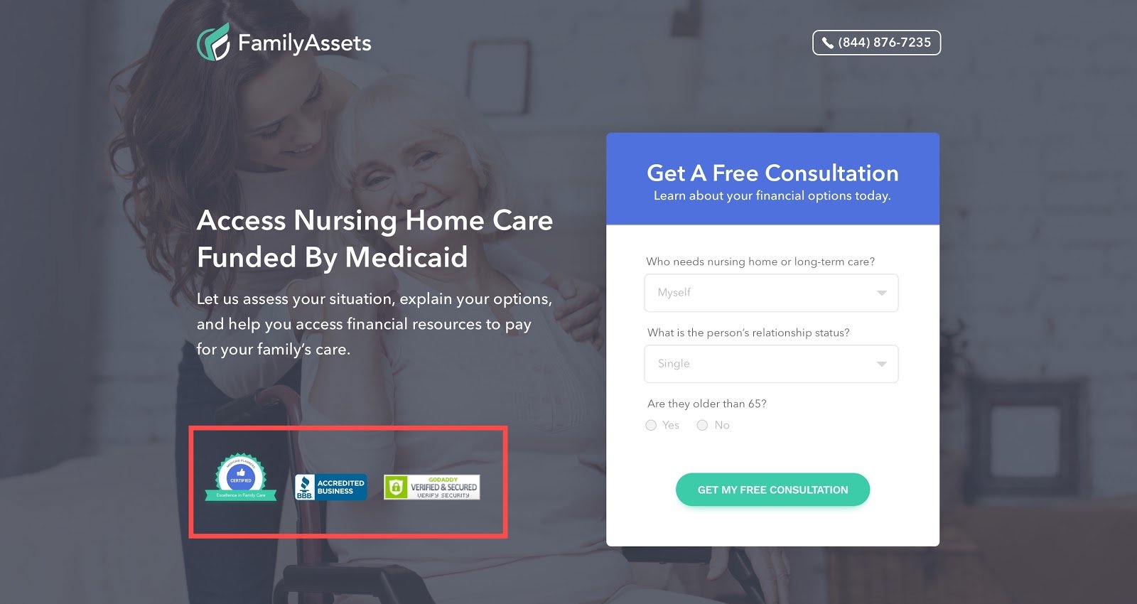
In the same manner, you can increase credibility on your landing page by adding trust seals, like KlientBoost did on the landing page above.
The Better Business Bureau logo is a common choice and a great addition to any landing page (if applicable, of course). You can even overlay seals on your hero image so people see them immediately when they land on your page. This is a surefire way to increase conversion rates.
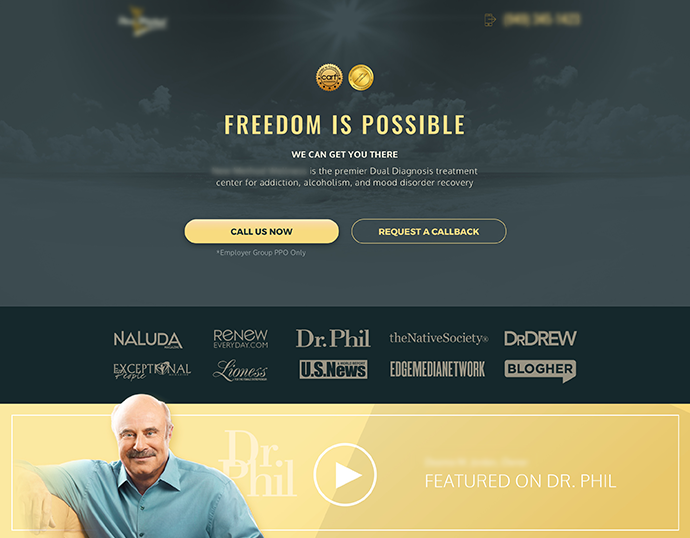
Another best practice is featuring logos of other companies that your brand has been associated with. For instance, if you're promoting a SaaS company with a landing page not converting, try displaying logos of some of their top clients. If your service is a treatment center to combat addictions, include outlets that your brand is featured in.
Also, if your product or service has been broadcasted or endorsed by a public figure, add that as social proof too.
In a real-life example, the conversion rate tripled when we included a video of our client as a featured guest on Dr. Phil.
10) Include a Pricing Plan When Necessary
You might’ve been told never to disclose pricing on a landing page in fear of low conversion rates. I’m here to tell you that the opposite can be true.
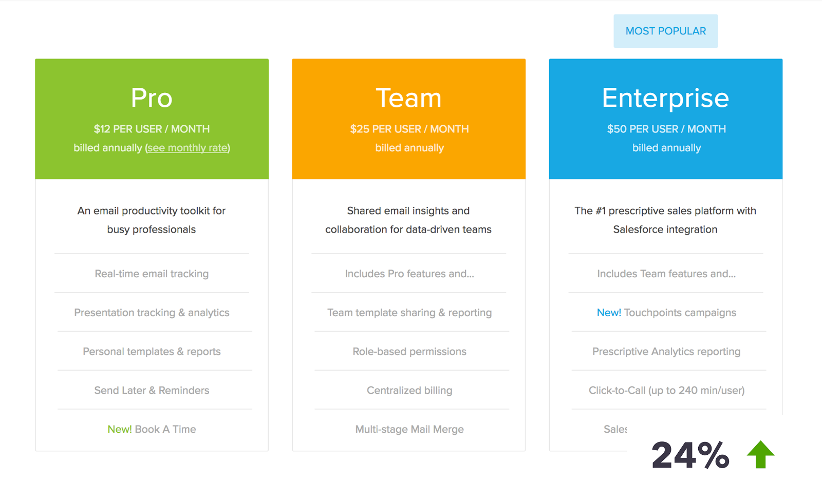
Contrary to popular belief, SaaS businesses and companies following subscription models tend to do better with a pricing plan included as part of their landing page.
This client got a 24% lift in conversions when a pricing plan was implemented by KlientBoost on their landing page.
This shows that people typically like to know exactly what they’re getting into, along with the options presented to them.
Not convinced? Test it for yourself and let us know the results.
11) Create a Sense of Urgency
Hurry! If you scroll down and look at the photo below now, you’ll learn the concept of creating urgency now!
Ok, maybe that wasn’t the best example. But creating a sense of urgency within your landing page can also boost your conversion rate.
Urgency is a state of mind that puts the brain on high alert. In a conversion context, urgency makes the customer want to buy now. Groupon does this well with a countdown timer that begins with “Sale Ends In...”
If you've seen your landing page not converting, or if you’re mindful about conversion rate optimization, you can adjust almost every element in your landing page — from the copy you use to the visuals and colors you choose — to create a sense of urgency.
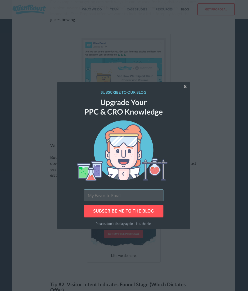
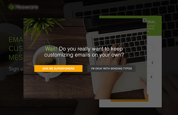
Exit-intent technology is an excellent way to create a sense of urgency and keep visitors engaged when they’re about to leave your page. The idea is to display a pop-up when it detects the precise moment when a visitor is about to leave the page.
In fact, by utilizing Wisepops, we managed to bring in a 51% conversion volume to our blog posts.
After scrolling 40% of the way down the page, the exit-intent technology pops up to ask whether the visitor would like to subscribe to our blog. This will show only three times for any one visitor to avoid harming the lifetime value of that customer.
A few strategic ways to use the exit intent pop-up are by providing an exciting offer, signing up for a newsletter, or simply reminding them one last time of the benefit you’re offering in your call-to-action.
12) Try the Infamous “Breadcrumb Technique”
We swear by the Breadcrumb Technique for one simple reason — it works. We love it so much we wrote a post about it, applied it to conversion funnels, and even adapted it for Facebook.
But if you’re not familiar, let me break it down for you.
Imagine meeting an attractive stranger at a bar. One would not simply ask for a phone number after making introductions.

No, you work your way up to that. The initial approach might be starting with a pick-up line, then a light conversation, and then, eventually, you might ask for that number.
Regarding a landing page not converting, the Breadcrumb Technique similarly suggests starting out with smaller requests before asking for things like a name, email or phone number.
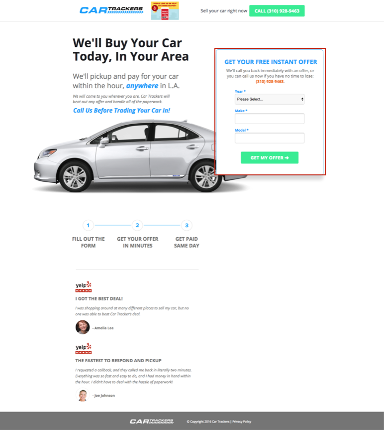
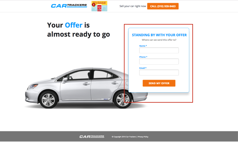
To do this, we implement a two-step strategy. It begins with asking non-threatening qualifying questions such as “How many employees do you have?” or “What’s your required loan amount?”
Take a look at this KlientBoost client landing page for example:
The psychology behind the two-step strategy is that people who have already started on something are more likely to finish it. People who complete a Step 1 are more inclined to complete Steps 2 and 3.
Going straight for the kill by immediately asking for their phone number and email might make them skittish, giving them a reason to opt out.
We even applied this principle on our own three-step proposal. (That’s right, we jumped right past two steps. We like to push the envelope ;) .)
13) Optimize for Mobile
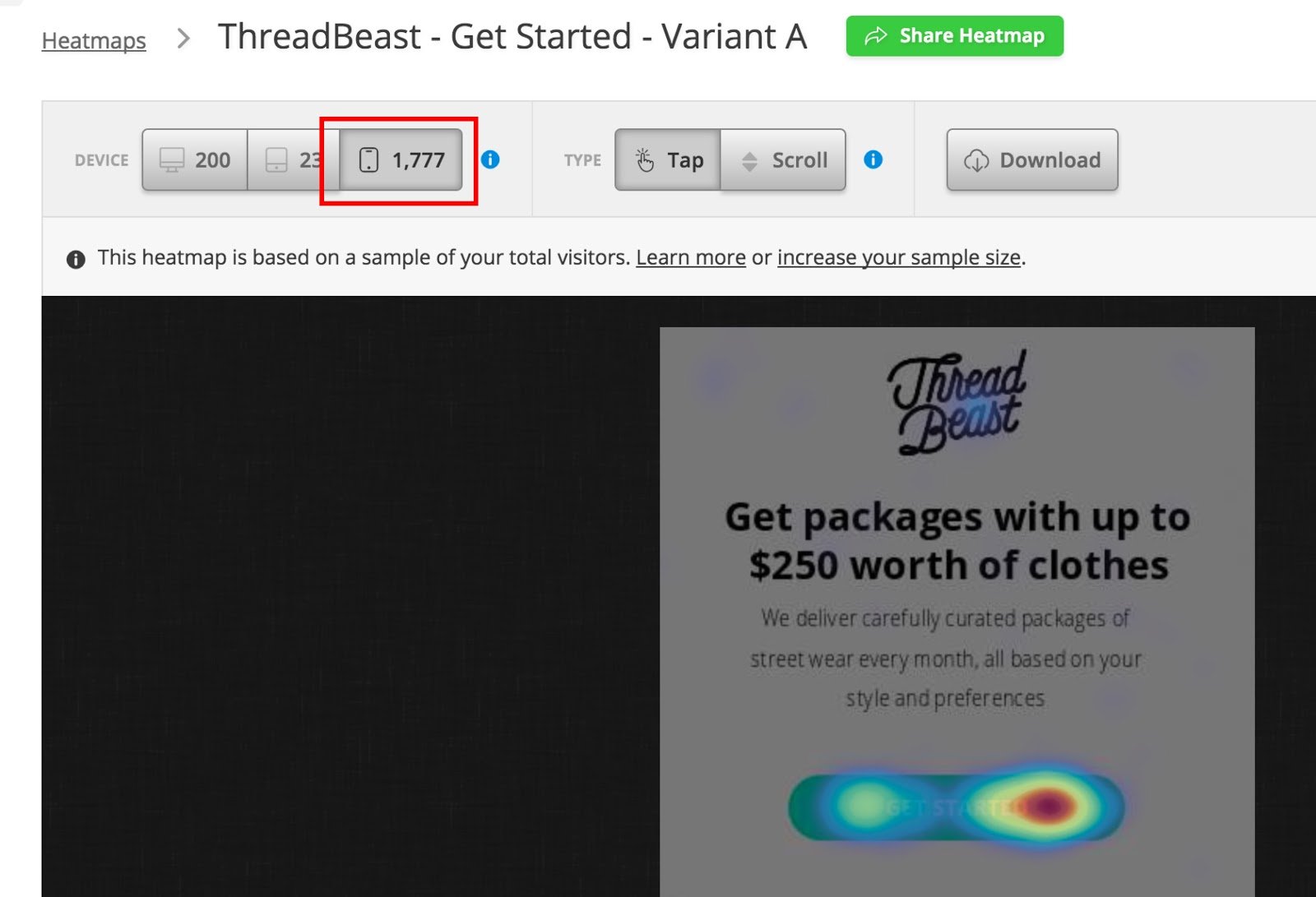
More often than not, we spend too much time making our landing page look pretty for desktop, and neglect the mobile experience.
This is a mistake.
These days, you always have to think about mobile optimization, especially if our product caters to a younger audience.
With tools like Hotjar, you can track how many visitors are actually viewing your page on mobile or desktop.
To optimize your landing page not converting for mobile view, consider the following best practices:
- Replace form fields with a “click-to-call” button.
- Eliminate the need for typing as much as you can.
- Cut back on copy without sacrificing the quality of your content.
- Legibility is key.
(Note that these recommendations are similar to concepts we mentioned earlier. Good ideas are good ideas, I guess...)
14) Use Tracking Tools
Are you using heatmap or eye-tracking tool to help with A/B testing?
If not, you’re missing out on an important way to get the conversion boost you need.
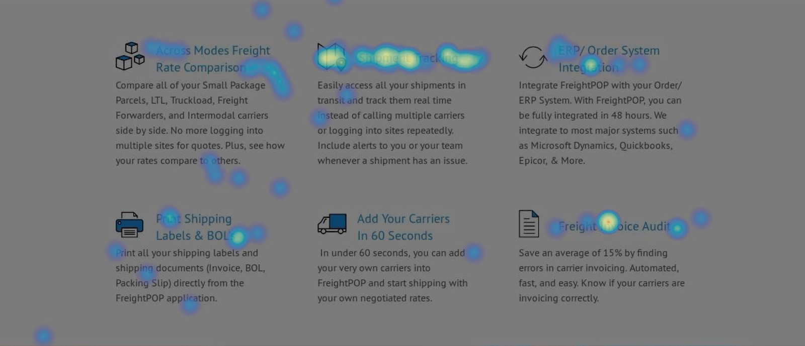
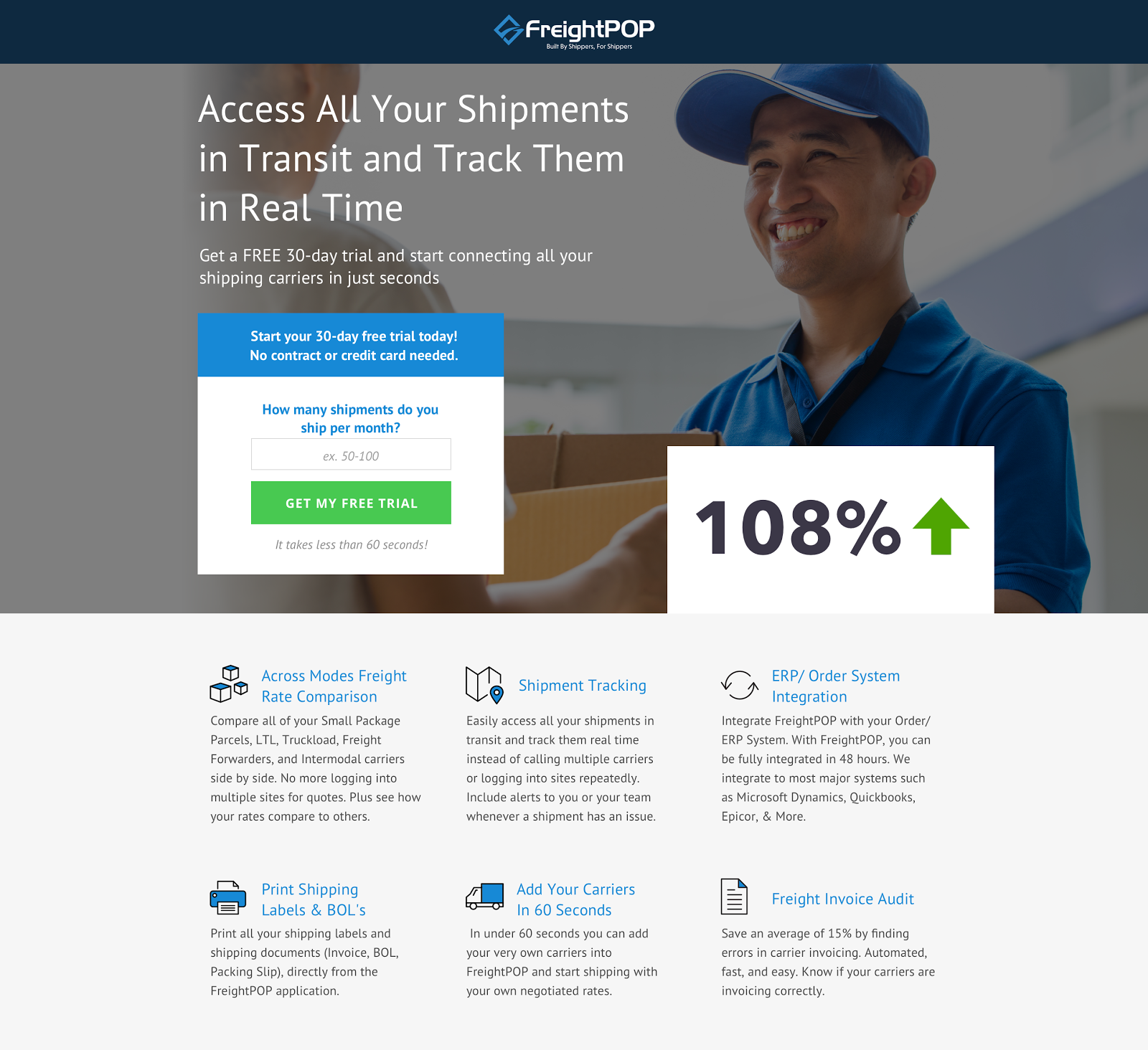
For instance, the following KlientBoost client landing page featured a headline and subheading that puts their unique value proposition upfront.
But when we ran this page through Hotjar’s heatmap, we noticed that one of the benefits picked up more activity than the others.
From our findings, we quickly rephrased the headline and subheader to match that specific benefit. The result was a whopping 108% increase in conversion rate at 100% confidence.
If you want a major lift in your performance, stop testing meaningless changes just for the sake of testing. By utilizing tracking tools, you’ll be able to detect what really works about your page in order to bring in more effective ideas for future tests.
As previously mentioned, Hotjar is a great tracking tool to study your individual pages. To compare the performance of multiple pages at once, we’ve found that VWO is an effective platform.
15) Use The Decoy Effect
If you haven’t read up on Olivia Taylor’s The Conversion Funnel: How To Keep The Pipeline Flowing, you’re missing out on greatness.
In particular, Olivia talks about how “a fake, more expensive product in your lineup ... makes the one you actually want people to buy not seem so bad anymore.”
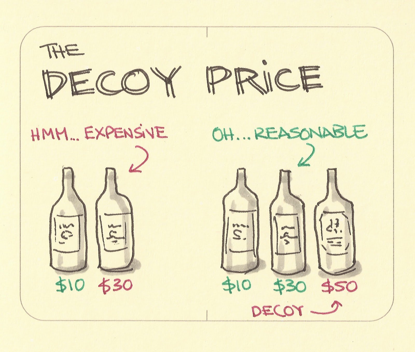
In a subscription-based model, the Decoy Effect can increase conversion rates by adding a sense of ease for buying the standard package.
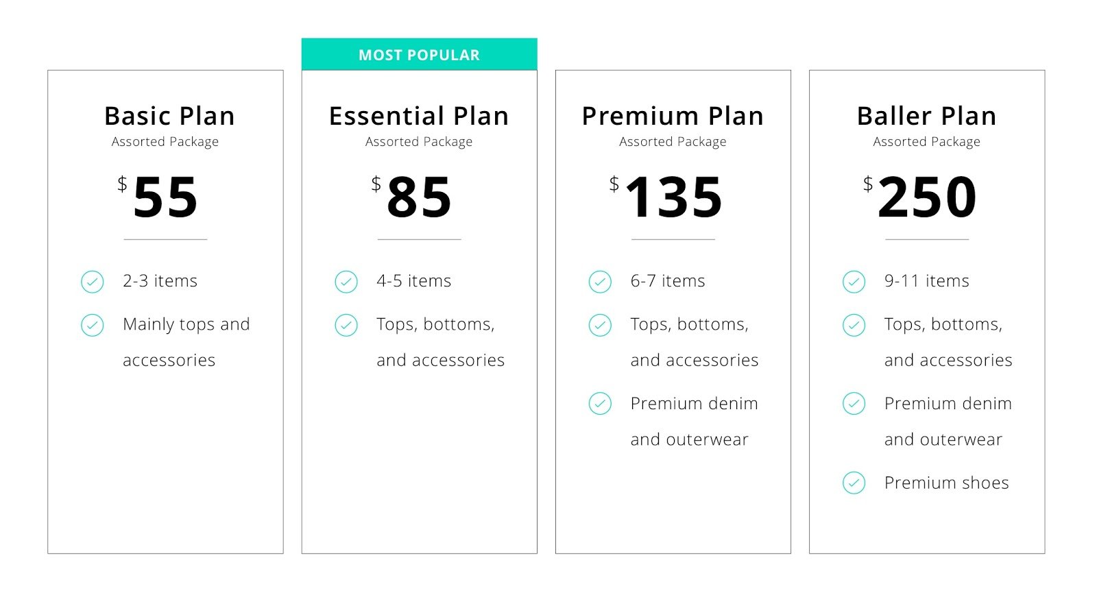
Take a look at this KlientBoost client landing page that offers curated streetwear packages through monthly subscriptions:
By including the $250 Baller Plan, the popular $85 option somehow doesn’t seem too bad anymore.
And let’s be real. When your target audience is mainly broke high school and college students, is anyone actually going to choose $250 worth of new clothes every month?
16) Create a Competitiors’ Page
From 1995 to 2001, professional wrestling made its way into mainstream media and into pop culture. The World Wrestling Federation (now WWE) competed with World Championship Wrestling (WCW) for TV ratings in a battle later known as The Monday Night Wars.
If you were a kid growing up in that era, you might argue that it was the peak of sports entertainment, idolizing the likes of Stone Cold Steve Austin and “Hollywood” Hulk Hogan.
So what spurred both global brands to grow and produce at such a high rate? In a word, competition.
If you know your business offers a specific, measurable benefit over others in your market, you can create a competitors’ page that clearly lays out all your winning features.
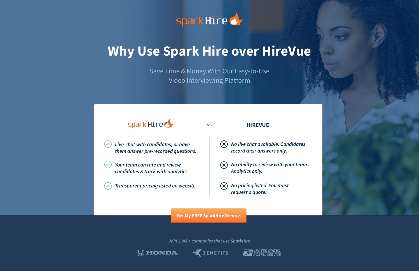
KlientBoost made a competitors' page for a client, which you can see here:
People are more likely to act when they feel confident, and they are more likely to feel confident when they have evidence to back up their choices. A comparison chart provides support to reinforce the original choice that brought them to your landing page.
A couple of best practices to follow include using checkmarks and x’s, colors that indicate clear differences (typically green for what is offered and gray for what’s lacking), and a difference in the logos' scale.
17) Change Up Your Offer
If none of the above gives you the lift you need on your landing page conversion rate (highly unlikely, but that's okay), you may want to consider changing up your offer.
Going back to the Breadcrumb Technique, one of the most critical mistakes we can make in conversion rate optimization is forcing your visitors to jump straight into making a purchase or a sign-up commitment.
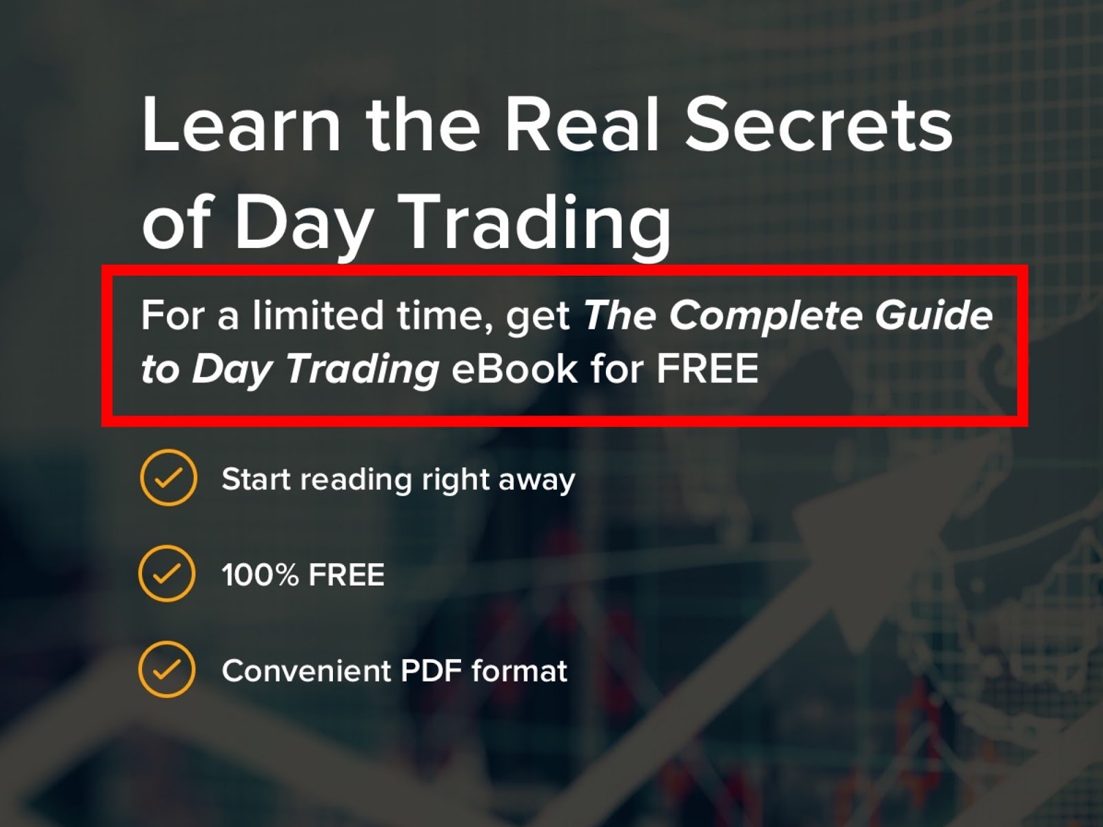
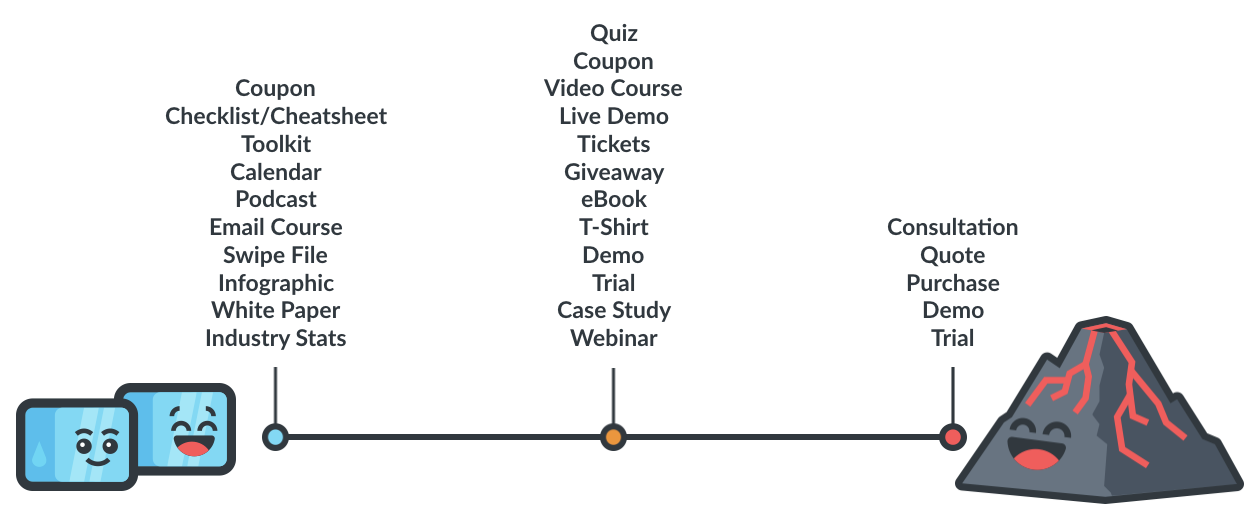
If your call-to-action to “purchase now” (higher threat offer) is giving you a low conversion rate, consider going for a gated content (lower threat) to educate your audience about your product first. Offer a white paper or infographic on how your product is used, along with its benefits.
Here’s an illustration on the different offers you can present your potential buyers as you bring them from cold traffic to hot leads:
Note that you always want to match your offer with your request.
It’s never a good idea to ask for a phone number when your offer is simply an ebook. A good rule-of-thumb for a lower threat offer is to stick with a one-step landing page that simply asks for name and email.
With lots of patience and persistence, you’ll slowly convert traffic into leads and become a CRO master in your own rights.

Keep in mind that your audience is on a journey to signing up or making a purchase. Guide them along that journey by taking the necessary steps from start to finish.
Wrap Up on Your Landing Page Not Converting
Improving the performance on your landing page is not the easiest thing to do. But with enough testing and experimenting, you’ll begin to see a lift in your conversion rate. There are truly a number of ongoing experiments and testing methods you can use to continue to increase it.
But what I am curious about is what you thought of these 17 pro tips for higher conversion rates.
Did you find them useful? Were there any that piqued your interest?
We would love to hear your thoughts as you apply these ideas to your next landing page.

