CRO stands for Conversion Rate Optimization. But how do you write copy for conversions?
“Writing copy for the web is a mix of art and science. It’s about weaving scientific persuasion tactics within prose and storytelling.”
—Sid Bharath
“Effective copywriting is not an art. It’s a science, first and foremost.”
—Joanna Wiebe, Copyhackers
Hmmmm… what’s the truth?
The truth is that it doesn’t matter if it’s artistic science or not. What matters is that CRO copywriting is a valuable tool that marketers use to reach their audience—so they can do awesome things for them.
The goal with CRO copywriting is to persuade a potential customer to do something (convert). That something might be to download a cheat sheet or start a free trial or request a video demo or purchase a service.
In this post, we’ll dive into what CRO copywriting is (it’s a copywriting niche), walk through some best practices to get more conversions, and talk about how to test its effectiveness.
We’ll also give you 18 tips to kickstart your CRO copywriting adventure.
- What is CRO copywriting? And how is it different from SEO copywriting?
- What’s a conversion?
- What are the benefits of CRO?
- Master CRO copywriting formula
- What type of traffic do you get?
- What’s your Unique Value Proposition (UVP)?
- 1.Headline
- 2.Subhead
- 18 CRO copywriting tips (and how to test them)
- Persuade with CRO Copywriting
Get brand new conversion strategies straight to your inbox every week. 23,739 people already are!
What is CRO copywriting? And how is it different from SEO copywriting?
Writing uses words to tell a story, and stories are how humans have shared knowledge since the beginning of time.
Copywriting is a version of writing where the story is promotional. The story a copywriter tells is about how a product or service will help a person or a company solve a problem. A professional copywriter uses actionable (snappy, witty, direct) words to sell something. That’s why copywriting is also called sales copy.
CRO stands for Conversion Rate Optimization, which measures how well something converts. That conversion can be a click action on an ad, a form, or a link.
CRO copywriting is a version of copywriting where the story promotes a conversion action. The thing CRO copywriting sells is a click (on a link, an ad, or a landing page form) in exchange for something valuable. The words move someone in your target audience toward a “yes.”
SEO stands for Search Engine Optimization. And it covers everything you do to optimize your web pages for the search engine results pages (SERPs), like Google. SEO has three levels: on-page SEO, off-page SEO, and technical SEO.
SEO Copywriting is part of on-page SEO and its purpose is two-fold:
- SEO copywriting gets Google to like your page (with keywords, alt text, anchor links, internal links, etc.) so you rank higher in SERP
- It gets people to click through (CTR) to your page with a killer snippet (the title tag and meta description that sells your page in the list of URL choices in SERP).
The difference between CRO copywriting and SEO copywriting is where they come into play along the conversion path.
SEO copywriting starts out being for Google. You write in a way that respects Google’s search engine ranking factors so Google features your snippet on page one of the SERP (high visibility).
Then SEO copywriting pivots its focus, from Google to people. If the SERP snippet is written well, it’s enticing enough to potential customers to click your link (CTR) and jump to your landing page.
SEO copywriting did its job if organic traffic flows from the SERP to your website.
And that’s when Conversion Rate Optimization (CRO) takes over. CRO copywriting speaks directly to the person who just landed there, selling the benefits of your offer so well that the prospect hands over their contact details to get what you promised them.
That means that CRO copywriting must engage; it must capture attention within seconds and connect with the reader. It must let the reader know they’re in the right place to solve whatever problem it was that caused them to Google their pain point in the SERP and click on an organic link (or paid ad—because Google Search Ads also send traffic to landing pages) to find an answer.
That answer is on the other side of a lead generation form. If the prospect wants that answer badly enough, they’ll fill out the form and click the button to get it.
And that’s called a conversion, and it means CRO copywriting did its job (in tandem with on-page CRO techniques).
What’s a conversion?
A conversion happens when a visitor does something you wanted them to. It can be something as simple as clicking a button on a form to
- download a free eBook
- register for a webinar
- join a group
- sign up for something (e-newsletter)
- talk with an expert (consultation)
- get a free marketing plan
- buy a product or service
The percentage of visitors who convert (compared to total visitors) is measured as your conversion rate.
What are the benefits of CRO?
To reiterate, CRO copywriting uses words to create a conversion.
CRO copywriting is a critical component of digital marketing because digital marketing is all about ✨winning✨ conversions. 🏆
An ad without the right words won’t get clicked. A homepage without the right copy doesn’t build trust or encourage internal clicks. An eCommerce product page without conversion-based copy doesn’t sell. And a landing page (also known as a sales page or squeeze page) without optimized copy won’t capture a conversion.
Content marketing depends on conversion rate optimization copywriting. Here’s why CRO copywriting is essential to the conversion process:
- It convinces visitors that your product or service is valuable to them
- It encourages visitors to hand over information that helps you, the marketer, better target and engage them
- It grabs micro-conversions that lead to the ultimate macro-conversion (the buy-in)
If CRO copywriting works, it convinces the user that what they’re getting from you (eBook, free trial, etc.) is worth what they’re giving you (lead information, money, etc.)
Want to learn how to write that persuasive copy?
Okay 👇
Master CRO copywriting formula
Guess what?
KlientBoost created a master formula for effective CRO copywriting.
I know, so good.
Making things epic and easy at the same time 🥳
Here it is:
- It starts with figuring out what your traffic looks like
- After you know that, you can write your value proposition which, in digital marketing, is all the stuff you see on a website above the fold
- Then you test those things
Simple: Traffic + your offer + testing
But wait, we only went and added in 18 CRO copywriting best practices to the end of this post to next-level that formula to the conversion fuggin’ moon 🌙
Let’s fling ourselves at the formula first:
What type of traffic do you get?
The type of traffic you bring in determines how you’ll write your copy (and how much of it you’ll produce).
Are you getting new visitors that don’t know your brand yet? Is it search or display traffic?
Top-of-the-funnel (TOFU) users might not know about your products and services, and they’ll want to learn more. So you’ll give them detailed information to boost brand awareness. They’re not ready to hand over their information yet, so you’ll focus on building trust first.
Those details result in a longer landing page.
Using social proof and testimonials will establish trust with new visitors, so you’ll add those on there. You’ll also want to list your beautiful benefits, so the user can see how the features fix their problem.
But traffic coming onto your landing page at the bottom of the conversion funnel (BOFU), is already familiar with your value proposition, so they don’t need all that convincing. For this audience, use a shorter page and focus on a clean conversion process.
Whether it’s TOFU newbies, seasoned BOFU’s, or the in-betweeners, cater your page information. Match the length of your page (and the information on it) to different traffic intent levels.
Say wha? Intent levels?
Oh, dang. Are you ever in for a mind-blow. 🤯
Do you know you can measure traffic by its intent temperature and that different temperatures tolerate different threat levels when it comes to your call-to-action (CTA) offer?
Understanding the temperature of your traffic informs your conversion copywriting. We write all about it in detail here, but here’s a five-minute rundown to get you excited:
What’s your Unique Value Proposition (UVP)?
Your unique value proposition (also known as your unique selling proposition) is the value you propose to your customers. Think about what sets you apart from your competition.
How are you different in a way that’s better? What’s the benefit of your product?
After you’ve nailed that elevator pitch (as it’s also called), write it out as a concise blurb at the top of your page with a headline and supporting copy and you’ve got your UVP.
Here’s a closer look at the 6 elements that go into your UVP:
- Headline (also called your H1)
- Subheadline (H2)
- Call to Action
- Form Header
- Bullet point benefits
- Testimonials
Alright already, let’s hold hands for a hot minute and really build these out together because a crappy UVP kills your conversions and that will never do.
1.Headline
You know that big question in a job interview that you know will make or break getting hired? That’s the sort of pressure you put on yourself here 😥 because...
“On average, five times as many people read the headline as read the body copy. When you have written your headline, you have spent eighty cents out of your dollar.”
—David Ogilvy
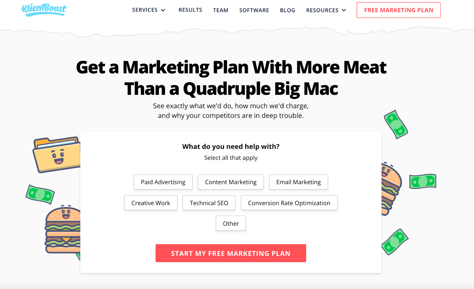
The headline is one of the first things users see when they land on your page; let’s not make it the last thing they see as well.
This is your chance to grab your users’ attention with an eye-catching opening. How you do that is by putting your value front and center with a few clear, short words—the most important CRO copywriting line of them all.
Use your headline (H1) to communicate how what you have is exactly what your user needs. Grab their attention and keep them on the page with a relevant headline focused on your offer and benefits.
Boil it down, keeping only the necessary information for a concise and kickass headline.
Check out this example:


For Inman Select example #1, the UVP isn’t clear. I know I’m getting something for a dollar, but I’m not sure what. The second example conveys the value of the product and that version performed 867% better than headline #1. Yes, you read that right.
Emotional triggers
If the product or service calls for it, use emotional triggers to nudge prospects toward a conversion. An emotional trigger are words that evoke a reaction. And that reaction can be
- excitement: announcing, free, best, transform, big, everything, exclusive, ultimate, double
- alarm: never, not, strange, wild, unusual, underrated
- urgency: today, new, introducing, immediately
- confidence: proven, need, how to, profitable, win, experts
Examples:
Landing Page Headlines: Everything You Need To Know
Lead Generation Forms: 6 Proven Tips For Higher Conversions
RLSA: The Ultimate 12-Point Guide To Bring Back Conversions
Remarketing Not Working? 32 Reasons Why + How To Fix It
Breadcrumb Technique: Double Your Landing Page Conversions
12 Best Google Ads Bidding Strategies To Win in 2021
12 Underrated Google Analytics Features According To The Experts
Single Product Ad Groups (SPAGs): Transform Your Google Shopping Campaigns
2.Subhead
“Sub” is a prefix that means “under, below, beneath.” A subheadline goes under your headline, and its purpose is to explain the headline with more detail.
The font size is smaller to indicate the headline is more important. Some people will skim a headline but not the subheadline. Others will read the headline and then read the subheadline if the headline grabbed attention.
Using one of my favorite websites of all time, Tushy (a bidet company), as an example:
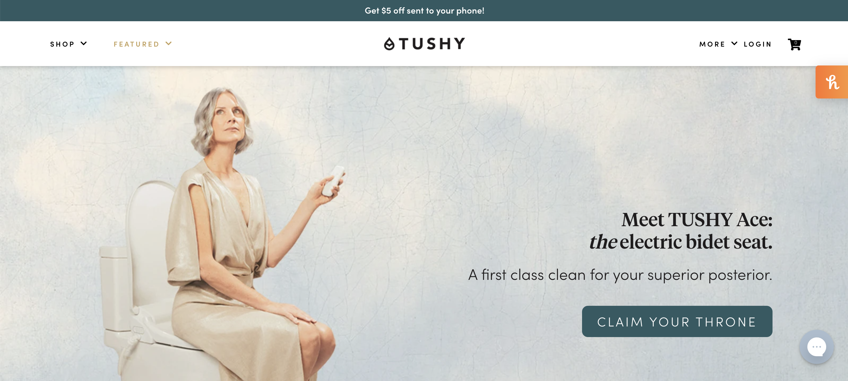
The headline tells you what it is: a bidet seat.
But the subheadline here really sells it: A first-class clean for your superior posterior. This isn’t any ol’ regular bidet that cleans any ol’ regular butt. It’s “first-class.” I’m so intrigued to find out how it’s first-class that I click the button. That’s when I find out it comes with a remote, heated water, and a heated seat. Not only that, it’s self-cleaning 🤯
All of those benefits are worth putting in the headline or subheadline, but Tushy cleverly hooked me without all the details; the headline and subheadline worked together so magically to create curiosity, I had to click.
So take that as your subhead goal: Use your subhead to reinforce your headline and create a spark of interest that convinces the visitor to keep reading.
3.Call to Action (CTA)
Call to Actions are buttons or links that call for an action (a click). Depending on your traffic temperature, you’ll cater the threat level of your action links from Learn more (top-of-funnel awareness) to Shop Now (bottom-of-funnel purchase).
Threat level has to do with the verbs you use.
Low-threat CTAs use verbs like “Learn,” “Try, “Get,” and “Enjoy.” The user doesn’t have to do much to get something.
Higher-threat CTAs use verbs like “Schedule,” “Register,” “Create an account,” and “Request a quote.” These imply that there’s commitment involved before getting something.
One thing you’ll never do is use a CTA that’s any of these because they are too generic and boring:
- Submit (oy-vey)
- Enter (the void?)
- Subscribe (eeek, run away)
- Sign-up (uuuugh, spam)
- Continue (to what?)
- Join (a cult?)
“Personalized calls to action (CTAs) increase conversion chances by 202%.”—HubSpot
Being clear and specific is a good thing. So it’s fine to use CTAs like
- Get started
- Learn more
- Read more
- Free demo
- Shop Now
But kudos go out to anyone who adds a little more creativity and specifics to the button:
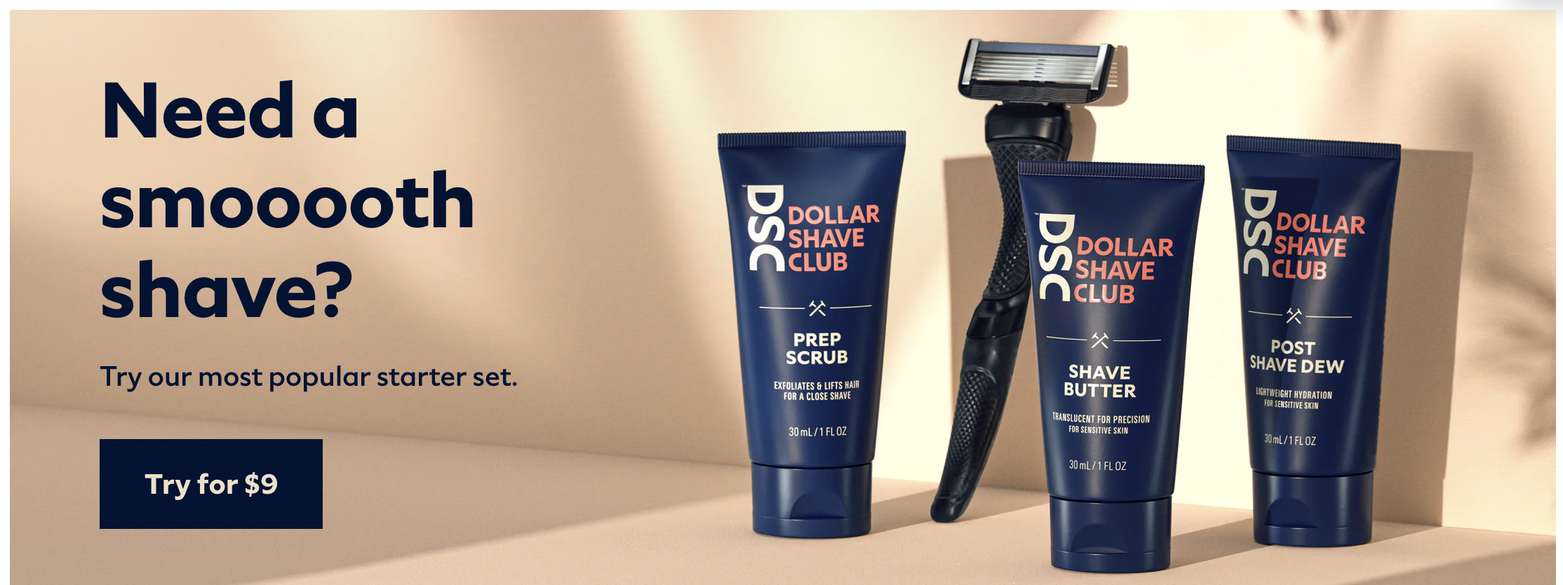

So be specific.
Instead of “Download” use a CTA that’s clear: Download Your FREE eBook.
Instead of “Join,” say what they’re joining (and why):
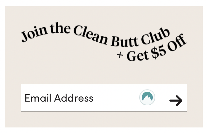
For users who are on the edge of buying your product, offering a discount can nudge that conversion.
CTA Click triggers
Don’t forget to add a click trigger to qualify the CTA the same way a subheadline qualifies a headline.
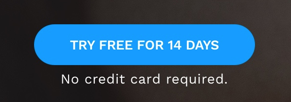
See Hotjar’s click trigger above 👆? “No credit card required” sells the Try it free button because we all know that “free” usually means “free trial” which requires a credit card that bills us at the end of the trial if we forget to cancel. That might stop someone from clicking that CTA unless they know right off the bat that they won’t have to enter credit card details.
That qualifying statement sells the click.
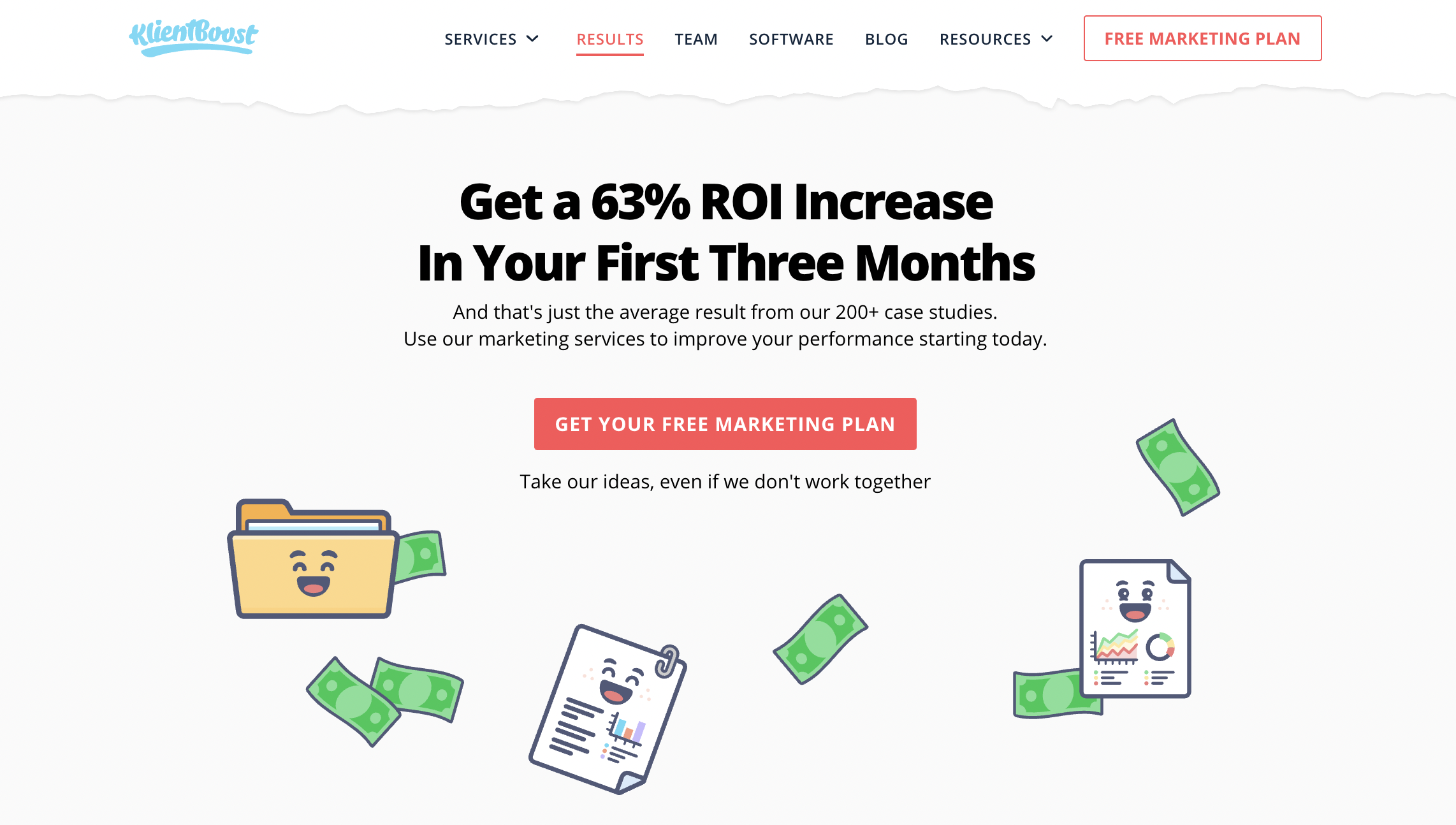
Specific, detailed CTAs get more conversions.
4.Form Header
Use your form header to remind people what they’ll get if they fill out your form.
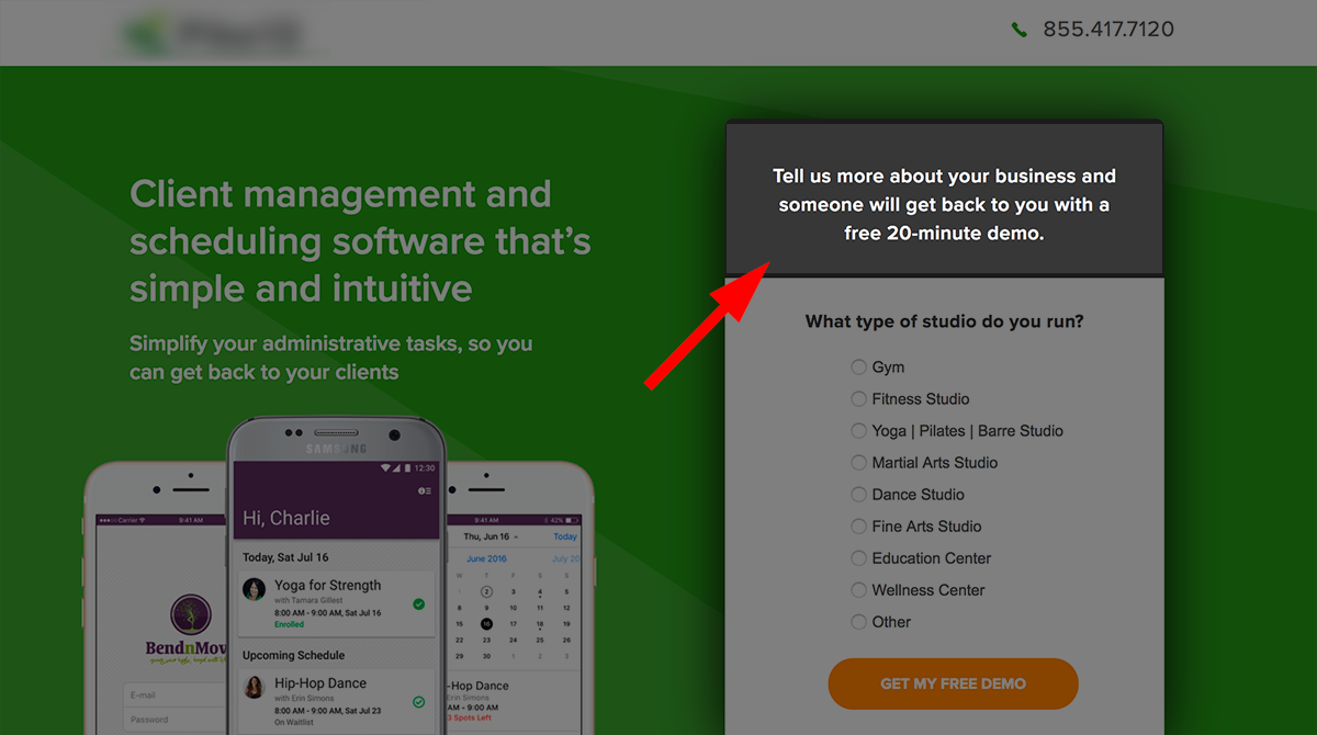
If you’re asking for contact info, make the benefit clear from the start. “Fill out the form to get the highest price for your used car” or “Understand your financial future with a free consultation.”
What’s in it for them?
5.Benefits
The features of your product are essential, but if your users don’t understand what those features can do for them, they’re going to bounce.
Say what the product does but really underscore why they need it.
Speak directly to them by using the word “you” when talking about those benefits because personalization is engaging.
Here’s an example:
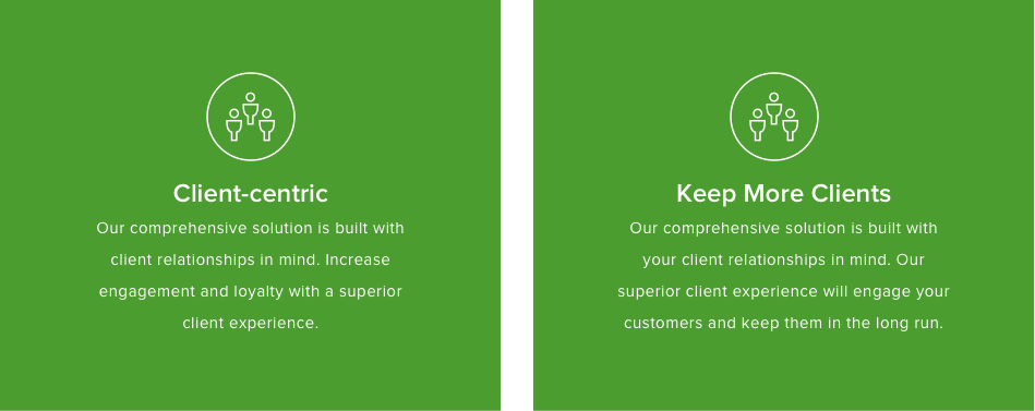
The copy on the left tells the user that the solution creates a superior client experience. But so what? Why is that beneficial?
The copy on the right emphasizes that that superior client experience will retain those customers in the long run.
Retention is a doozy of a benefit.
Similar wording, but different message. “Client-centric” doesn’t really tell me much about what’s in it for me, but “Keep More Clients” does exactly that.
Rewriting that blurb boosted conversions by 17%.
Don’t assume the features sell themselves. Always spell out what they’ll gain.
6. Testimonials
Someone else taking the risk first and loving what they got is a great way to create comfort in others. Brand loyalty is an effective sales tool. Let your previous customers’ words advertise for you, adding credibility and legitimacy to your brand.
KlientBoost dedicates an entire page to testimonials (social proof), both in written form and by video:
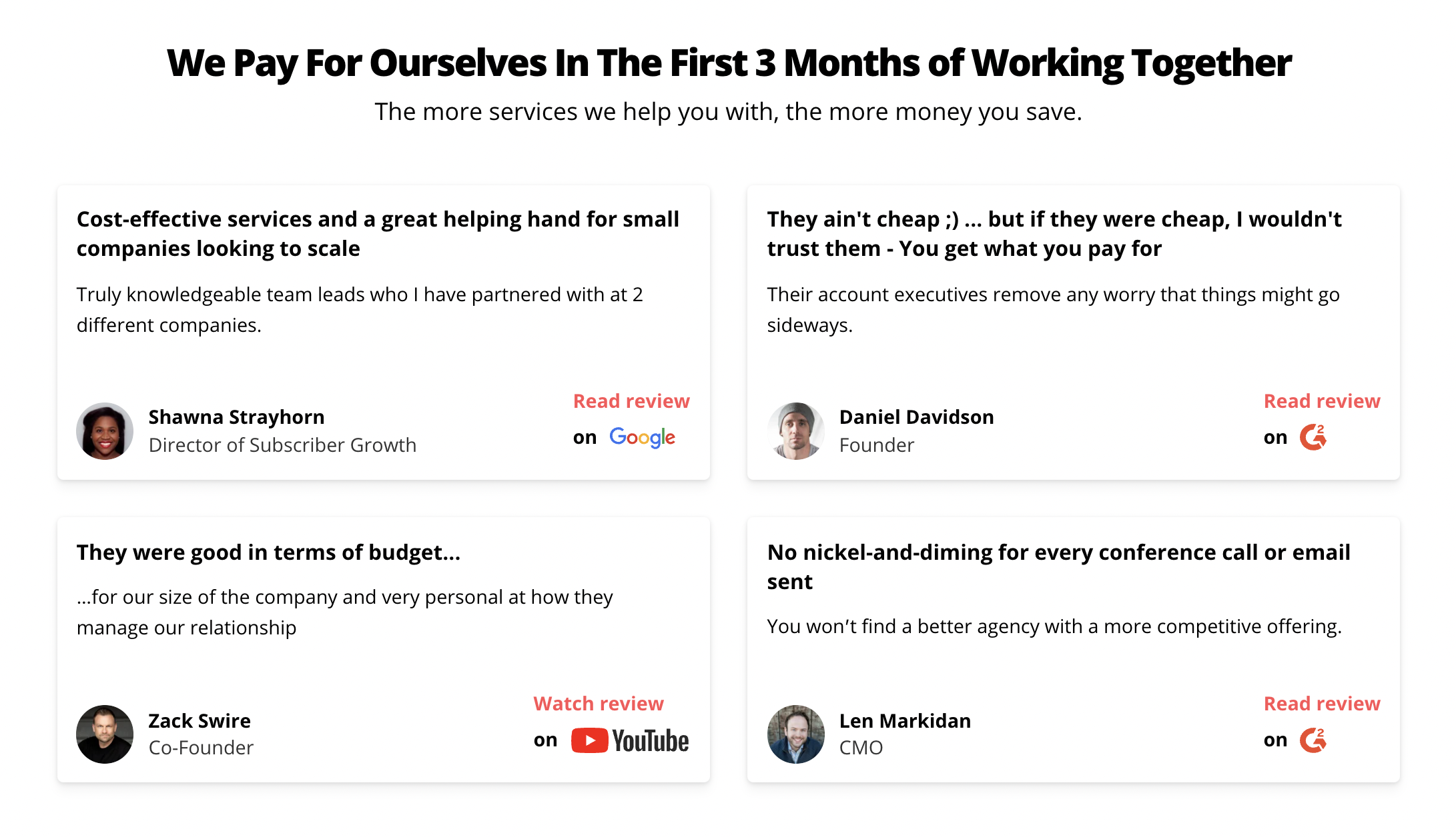
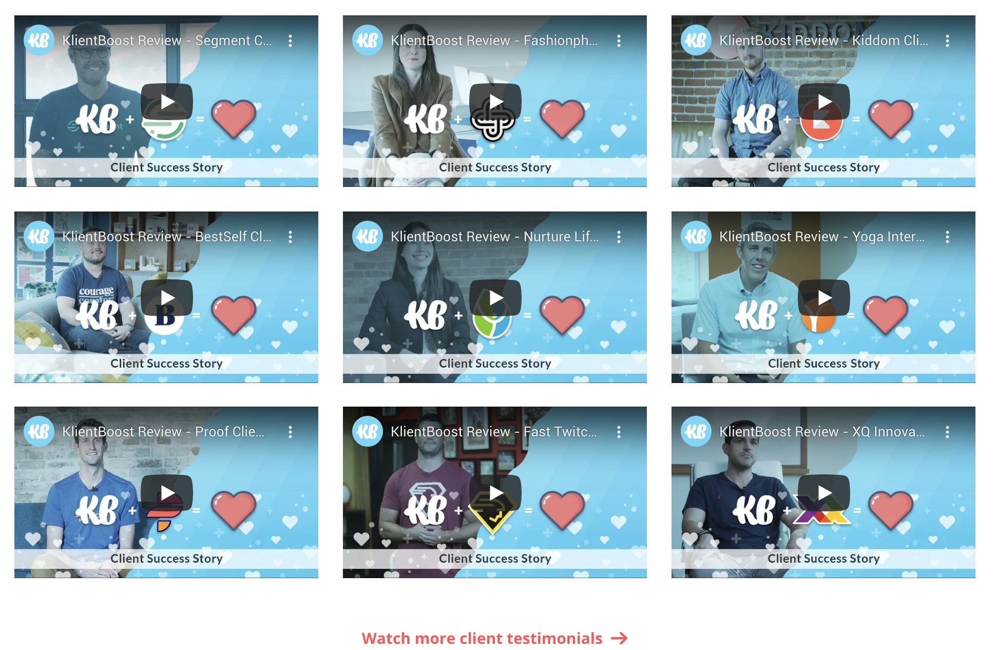
What makes a great testimonial?
- Use real names of real people (last names help a lot)
- Mention their position in the company, what company they work for, geographic location, etc.
Compare these two testimonials:


The first testimonial doesn’t explain how the product solved any problems; the praise was too vague and too general. But for the second testimonial, it was short and full of benefits.
Users higher up in the funnel will take more convincing, but bottom-of-the-funnel users already trust you. For them, an in-depth case study might work better because they can picture themselves in that scenario and feel that win.
Those are the six basics to writing your UVP. You know your audience and you know how to tell them about your value. The last part of the formula is all about CRO testing, and we cover that in-depth right there.
Now let’s dive into those CRO copywriting tips.
18 CRO copywriting tips (and how to test them)
You’re always learning about your audience and new audience segments may pop up over time. That’s why you A/B test and optimize the six elements of your Value Proposition we just talked about.
But how do you improve those elements based on those tests to increase your conversions?
Figuring out what’s wrong is the first part. Making things better is the second and most important part.
1. Keep copy clear and concise
A clean, concise message is the core of CRO copywriting.
Fluff kills. People don’t like extraneous bullshit because it makes skimming difficult.
“73% of people admit to skimming rather than reading a blog post.”—HubSpot
Dumb down your words and use short sentences. Speak to the customer like you’re chatting with them. Use active voice (that’s when you put the subject first and get rid of participles (words that end in ed, en, ing, ly, ion, etc.) and prepositions (by, with, at, of etc.).
Here’s an example of active vs. passive voice:
Advertisers write landing pages. (active) 👈 This one is to the point.
Landing pages are written by advertisers. (passive) 👈 This one is poop because it ads extra word junk.
Not sure if you throw prepositions, extra verbs, too many adverbs and adjectives, and other “word junk” into your writing? Paste it into the Hemingway app to strip what you’re saying down to it’s beautiful bones.
Why is this so important?
Because readers spend an average of 37 seconds on an article according to Newscred. And because the average American reads at a grade 7 or 8 level. And because too many words usually indicates that you’re compensating for an inferior product.
Here’s a CRO copywriting content blueprint to use as your bible.
2. Switch the subhead with the headline
Come again?
Sometimes you’ll write your descriptive subhead and realize it’s better suited for the headline. You gave yourself a little more room to nail the benefits and you see that the H1 wasn’t as powerful as you thought it was.
Check out these two examples and see if you can guess which one performed better:
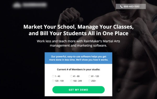
Headline: Market Your School, Manage Your Classes, and Bill Your Students All in One Place.
Subhead: Work less and teach more with our management and marketing software.

Headline: Work Less and Teach More with Our Martial Arts Software.
Subhead: Rainmaker is management and marketing software built to market your school, manage your classes, and bill your students.
Did you guess correctly?
Option 2 shot up conversions by a whopping 115%.
Sometimes the H1 and H2 switcheroo works. Other times, ditching the subhead altogether works better.
3. Remove your subhead
Daaaang, what?
Remember how I said less is more? Well if you can write a headline that says it all, don’t jam another line underneath just because it’s the typical thing to do.
On our homepage, the H2 is essential to explain the H1:
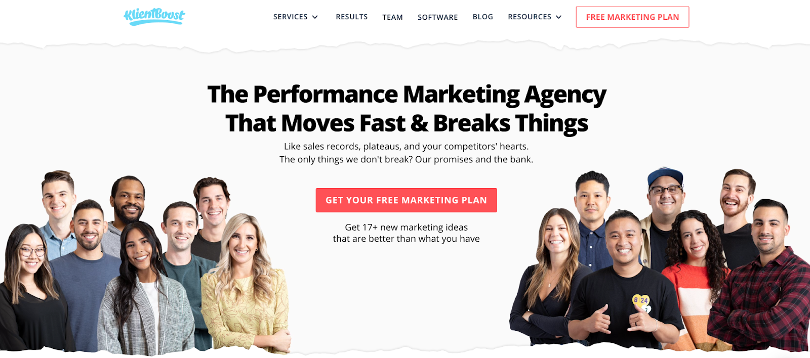
The headline grabs your attention but leaves you wondering (on purpose). The H2 brings it home.
But we don’t use H2s on any of our blog articles.
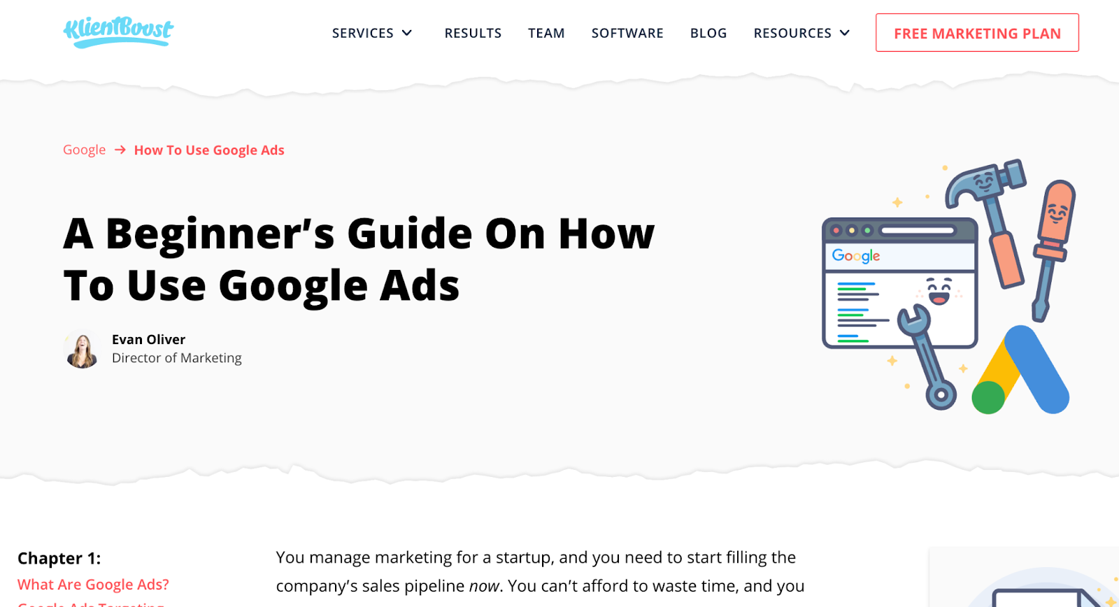
No H2 required. The H1 says it all.
4. Laser your CTAs
Do a CTA audit. You know you have some lingering buttons out there on your site that say SUBMIT. Let the potential customer know what they’ll get with a short, descriptive CTA. Looking for inspiration? We wrote an entire article on CTAs complete with 61 examples that you can’t help but click.
5. For CTAs, speak in first person
Shorten your CTAs, yes. Make them descriptive, more yes. But also, personalize them with Me and My.
Instead of: Get a Free Demo
Try: I want my free demo
The button’s narrative becomes something they control, not you.

6. Use click triggers (disclaimers)
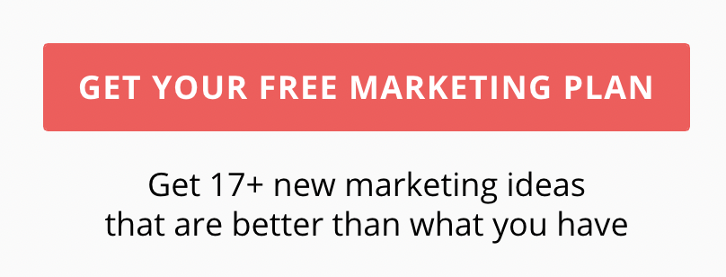
Add copy like “no credit card required,” “unsubscribe at any time,” or “it only takes 5 minutes” for visitors who don’t know you yet and are uncertain about giving you their information.
7.Whitespace
Don’t group giant blocks of text together. Visitors don’t want to read. So not only do you need to chop your copy right down to the golden nuggets, you also have to wrap those nuggets in a ton of whitespace to make what’s left easy to read.
Whitespace makes copy skimmable and skimmable copy gets read. And that’s important since you’re going for a conversion, not a dissertation.
Whitepace is a UX law. There’s science behind it.
8. Use lists
Bullet points are a great way to break paragraphs into skimmable copy that’s less intimidating to read than a chunk of words. And that’s all there is to say about that.
9. Use multi-step forms with staged copy
Multi-step forms perform better than giant forms that ask too much from the user. But to let users know they’ve moved onto the next step, change up the headline, form copy, and your CTA (or they might not realize the form fields have changed in step two). Use copy to identify the flow in a multi-step form.
10. Switch pricing visibility
Prices play a big role in conversions. Adding pricing on your page may deter top of funnel visitors. But bottom of the funnel visitors will look for pricing. What are your visitors’ goals? Use CRO research tools like Hotjar to find out what most of your prospects are looking for.
If pricing deters conversions, remove it.
11. Don’t get overly emotional
Emotional triggers, yes. Too much emotion, no.
Evidence suggests that getting sappy degrades your credibility. Go for logic and add in emotive copy when it's called for. Yes, this will be subjective, but don’t guilt people into converting.
12. Answer questions
What are the top 3 questions asked by potential customers and what are your answers? When we’re onboarding new clients we ask them what the top three questions are that their potential customers ask them? And we ask how they answer.
That information focuses your conversion copywriting.
If someone visits your page, why are they there? Put yourself in their shoes; what kind of questions would you ask?
Answer those questions.
Don’t let them leave with a question mark in their heads.
13. People love FREE stuff
People are emotionally triggered by the word “free.” If you have something to give away, go ahead and run a giveaway promo. Free stuff comes with little risk, so prospects are willing to try out your free thing. Maybe you get an email for it. Winner winner chicken dinner.
14. Message match
Your PPC ad copy and your landing page CRO copywriting should march lockstep, with some exceptions. They sell the same story. One brings a customer into your funnel and the other moves them down the funnel.
Your visitors clicked on your ad because those words intrigued them. When they jump to your page, they want that intrigue to continue without skipping a beat.
When the headline matches the ad copy they know they’re in the right spot.
Synchronicity is key.
Here’s an example of a message mismatch:
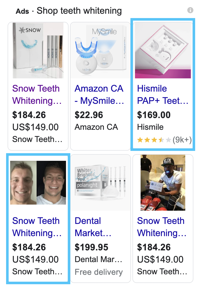
I did a quick search for teeth whitening. The ads for teeth whitening appeared at the right of SERP. The ad with Rob Gronkowski, the NFL football star, caught my attention right away. The other ad I clicked on had over 9,000 reviews.
I clicked on the Gronk ad first:

Sadly, the message between the ad and the landing page didn’t match. Then, I realized what I was looking at was a pop up. I clicked the X to get rid of the pop up. Underneath was Gronk’s smiling face and the Teeth Whitening headline. But I had to search for it. Some people won’t bother.
I clicked on the other ad:
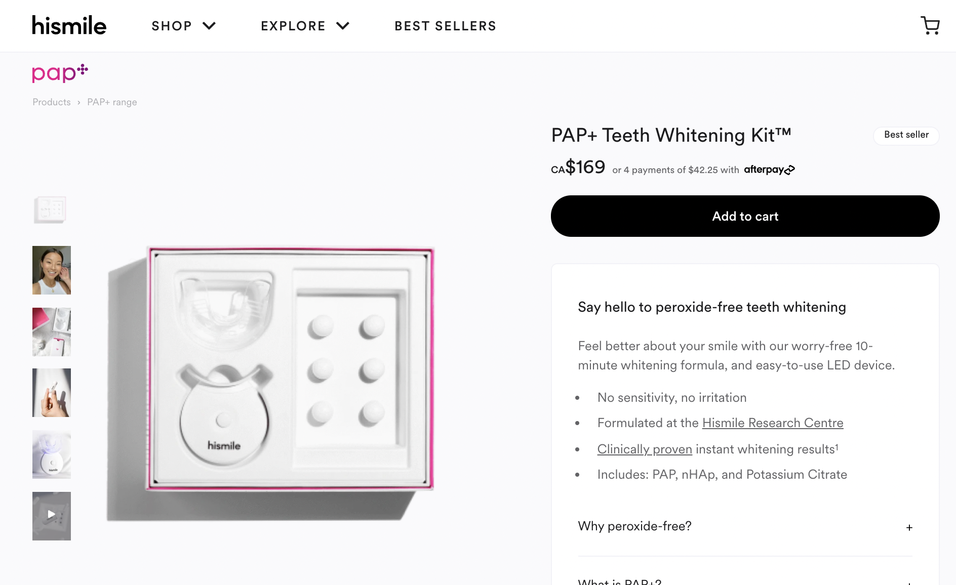
Teeth whitening kit is in the headline and the message on the ad matched the message on the landing page. Winner. Those two points are super clear indicators that I was where I intended to go.
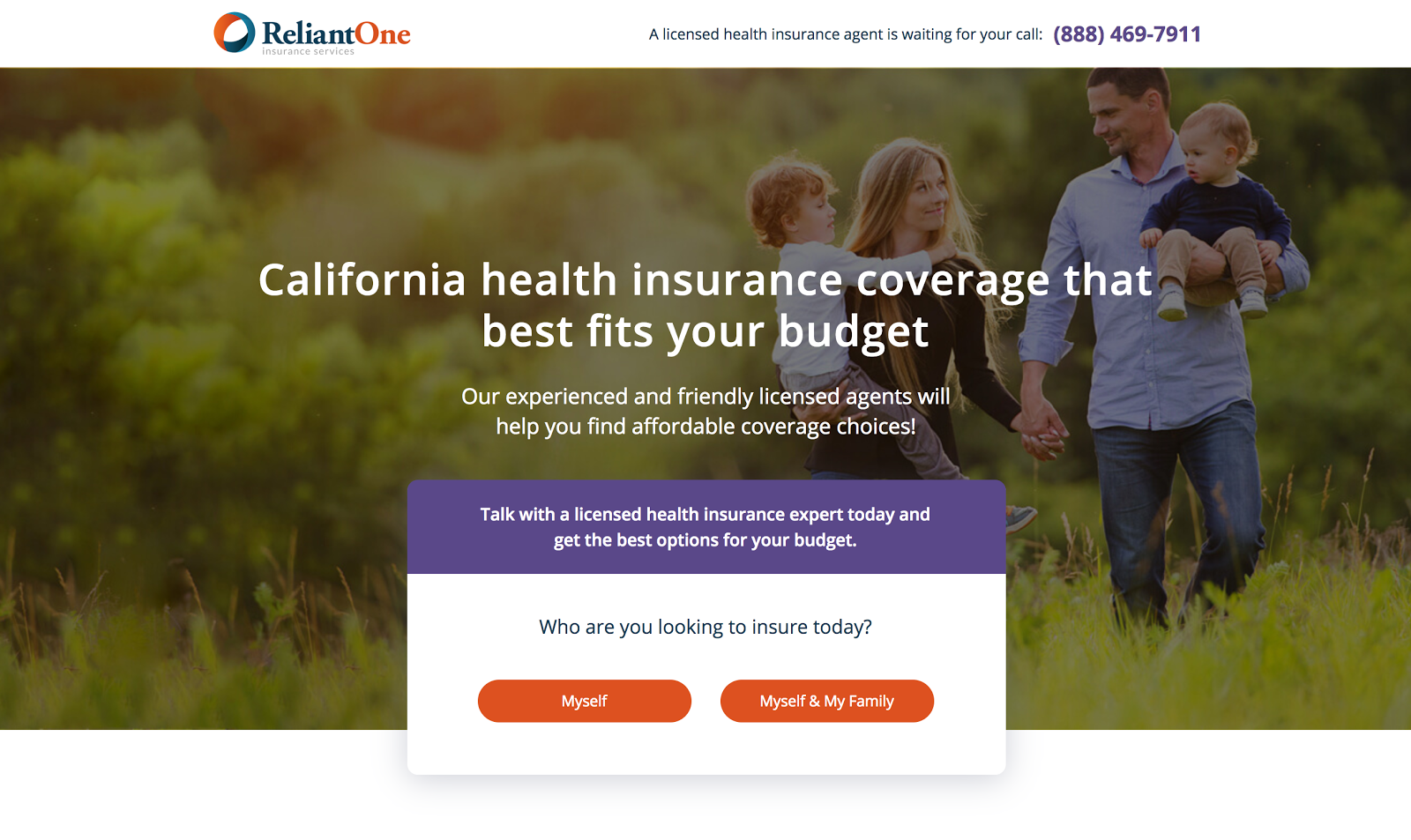
15. Use dynamic keywords
Dynamic keywords are uber-personalized. They change based on what a user searches for, but every version of it points to the same landing page.
That’s a guaranteed message match 🤯
Your headline speaks to more people, without having to build many different pages.
So if someone searches for “insurance coverage California,” they’ll see this landing page:
But if a user searches for insurance coverage in Texas, they’ll see this:
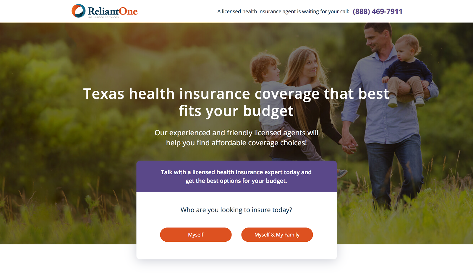
They’ll land on the same page, but the dynamic keyword will change to the state they searched.
When we enabled Dynamic Keyword Insertion on this page, there was a 41% increase in conversions.
16. Add numbers and statistics
Statements backed up by numerical proof add credibility. Here are some examples:
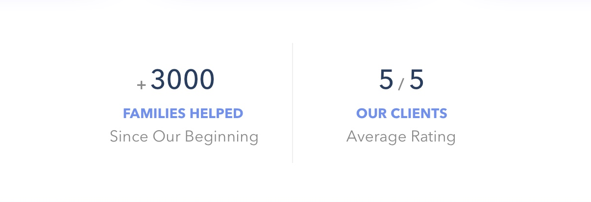
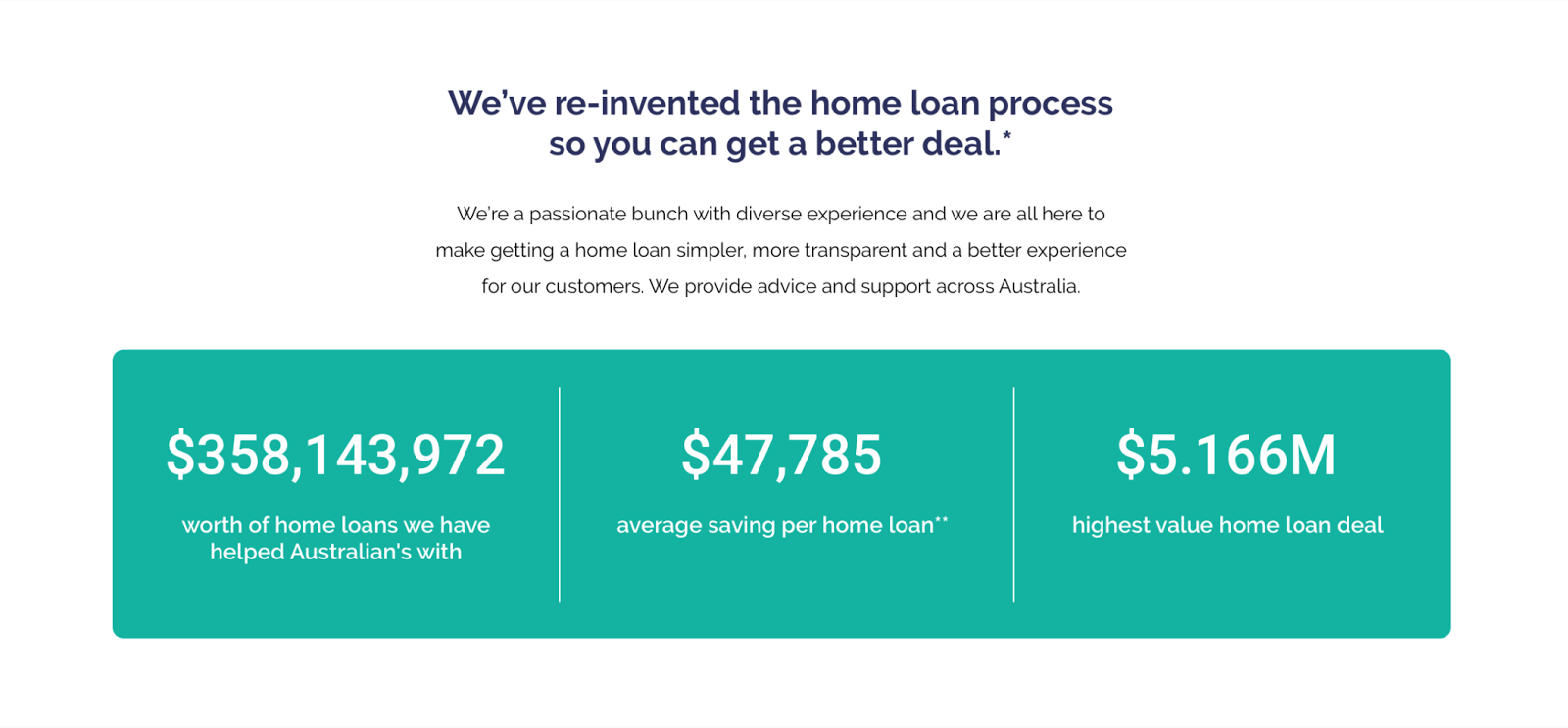
Statistics like this show your users that you’ve got a lot of experience under your belt or that your product is doing an awesome job. Use numbers to convince your visitors to convert.
Also, you can try testing a specific number vs an estimated number. For example “over 100,000 users” vs. “101,395 users.” Or “over 80% of users” vs “88% of users.”
Specificity is more persuasive than rough estimates.
17. Create a sense of urgency
Adding a time cap is a great way to make someone sh*t or get off the pot. It forces decisiveness. Try running offers and use phrases like “Limited Time Only” or “Only available for the next 24 hours.” A countdown clock is a useful landing page addition for this purpose.
18. And of course, always test
Throwing a dart is fun.
But testing which darts throw better—and at what speed, over what distance, under what lighting, against what board—will make you a better dart player.
Test one headline against another. Test subheadlines too. And CTAs, click triggers, form copy, form buttons, giveaway offers… all of it.
Your gut is a great place to start, but let the data do the talking in the end. Even slight changes affect conversions. Use that to your advantage.
Persuade with CRO Copywriting
In digital marketing, conversions are the name of the game. Learning to write in a convincing way (CRO copywriting) connects your audience with your offer so they understand the benefits and buy-in.
But first you have to know your audience. And you definitely have to know your value. Once you know that, use the 18 best practices in this post (along with some testing ideas) to connect their needs with your solution. Then test everything to finetune your message for even more conversions.
Once you’ve nailed your CRO copywriting skills, it’s time to look at how those words look on the page. That’s UX design, and that’s next.
