


Your ads are running. Your audience is clicking. They are getting to that spiffy landing page you designed and...
The dreaded bounce.
You watch as visitors land on your page... and disappear just as fast. Despite following every "best practice" for B2B landing pages, your carefully crafted content just isn't converting.
Why?
Because you played it safe. You followed the conventional wisdom that B2B marketing should be buttoned-up, conservative, and—let's face it—a bit dull.
Nope.
Boring white papers, 8-step forms asking for every piece of personal information, and cheesy staged photos are officially a thing of the past.Even the most "serious" products—from health insurance providers to SEO software—can tell stories that capture attention and drive action.
TL;DR
- What is a landing page?
- Why should I use a landing page?
- 7 B2B landing page best practices
- 32 B2B landing page examples
- 1. Bynder’s content download landing page
- 2. Monday.com’s clever sneak peek
- 3. CultureAmp’s clear messaging
- 4. Campaign Monitor’s simplistic approach
- 5. Netsuite’s exit-intent popup
- 6. Loomly’s use of precise numbers
- 7. Oribi
- 8. Salesloft’s branded search landed page
- 9. Typeform’s product-led approach
- 10. Samsara’s pricing-centric CTA
- 11. Oscar’s personalized touch
- 12. HappyFox’s competitor landing page
- 13. Oberlo’s bold branding choices
- 14. Snappy getting visitors in a buying mood
- 15. Allhands
- 16. Fortanix
- 17. Evisort’s gamifying approach
- 18. Scoro
- 19. HelloSign checking all of the boxes
- 20. Resultably’s embedded scheduler
- 21. Gusto nails it with simplicity
- 22. SparkToro’s stellar use of video
- 23. Vimeo’s bold landing page approach
- 24. Quickbooks’ use of urgency
- 25. Semrush’s CTA dead and center
- 26. Dynamic Yield’s optimizes for skimmability
- 27. Unbounce
- 28. Yellow Messenger’s use of interactive elements
- 29. Notion’s clean and simple branding pays off
- B2B high converting landing pages aren’t boring
Get brand new landing page strategies straight to your inbox every week. 23,739 people already are!
What is a landing page?
Great landing pages make sh*t happen. They have one goal: drive visitors to take action (lead generation) at high conversion rates.
That action could be
- Signing up as a user
- Booking a demo with your sales team
- Downloading a resource
- Making a purchase
- Filling out a form
- Subscribing to your newsletter
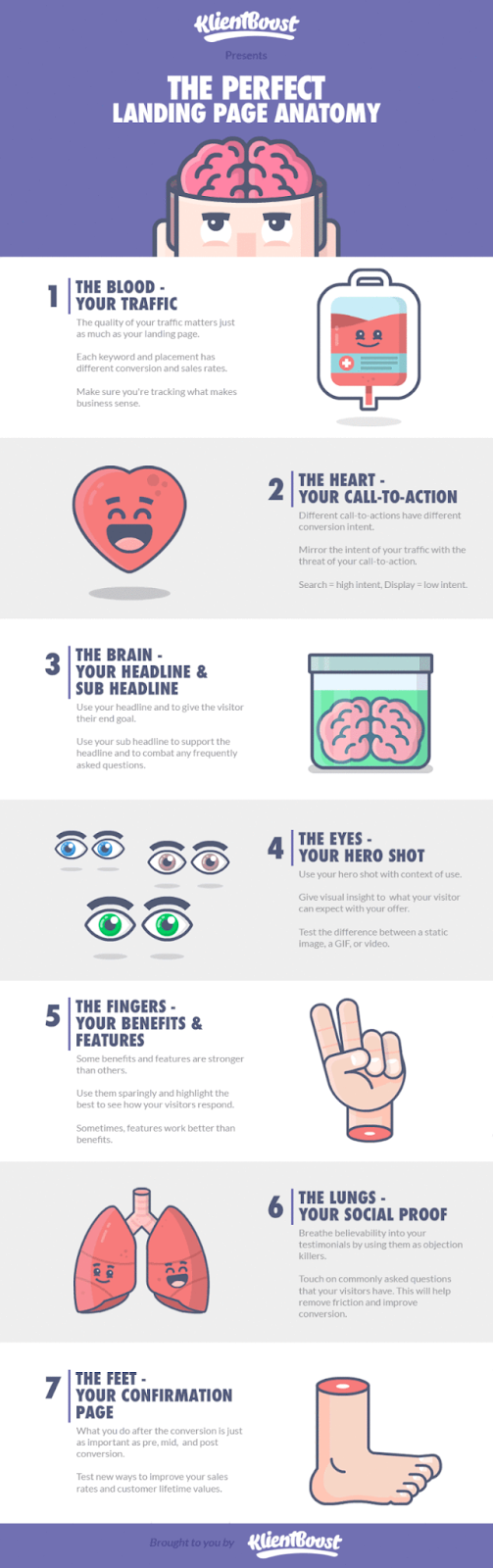
Landing page anatomy
A well-structured landing page includes these key features:
- Compelling headline: Grabs attention and clearly communicates the value proposition.
- Hero image or video: Visual elements engage visitors and support the headline’s message.
- Call-to-action (CTA): A clear, prominent button, link, or form that guides users toward the desired action.
- Lead capture form: If applicable, collects visitor information for sign-ups, demos, or downloads.
- Social proof: Testimonials, reviews, or logos of well-known clients to establish credibility.
- Trust signals: Security badges, guarantees, or endorsements that reassure visitors you’re the real deal.
- Minimal navigation: Unlike the rest of your website pages, you want less paths on landing pages.
The list goes on. But more on that later!
Why should I use a landing page?
On average, 48% of website visitors leave the primary landing page without engaging. Almost half of visitors land, don’t like what they see, and leave.
Accept that challenge.
Make it easy for visitors to see what they came to see and they’re more likely they are to convert.
High-converting landing pages are particularly helpful for B2B advertising, considering that sales cycles can be so long. That’s because it gives B2B marketers the opportunity to build dedicated landing pages across the entire buyer’s journey, which is different from B2C marketers who can send people directly to a product page.
Because there’s a longer cycle, you can create landing pages for
- Brand awareness goals through thought leadership content
- Mid-funnel goals to educate visitors the value your solution provides
- Bottom-funnel goals to drive signups or demo requests
By creating dedicated pages, you can display the most relevant and important information users need to take action. Rather than smashing together a slew of information their way, you can customize the offer, copy, and visuals on a landing page to be exactly what the visitor wants and needs. This results in
- Longer time spent on your page
- More conversions
- Improved campaign results
Landing pages are a very smart tool to use for your PPC or even email because they help keep the focus on the intended action—as long as you're following the best practices.
7 B2B landing page best practices
After successfully creating landing pages for multiple clients, we've identified a few best practices every good landing page needs:
- Ditch the top navigation: Remove unnecessary distractions.
- One clear CTA: Ok fine, sometimes two works, but there still has to be one clear, preferred action above the fold and at the bottom of the page.
- Strong copy: All the way through. And make sure your headline and subheader communicate your business' Unique Value Proposition (UVP).
- Hero image and visuals: We're not saying they need to be fancy, but a text-only page isn’t ideal.
- Benefits and key features: You’re trying to inspire action after all, so don't forget to communicate the why.
- Social proof: Of course you’re going to say nice things about yourself. What’s more powerful for building trust is leaning on what others say about you.
- Journey awareness: A good landing page tailors the CTA, copy, and visuals to where the visitor is in the sales funnel.
32 B2B landing page examples
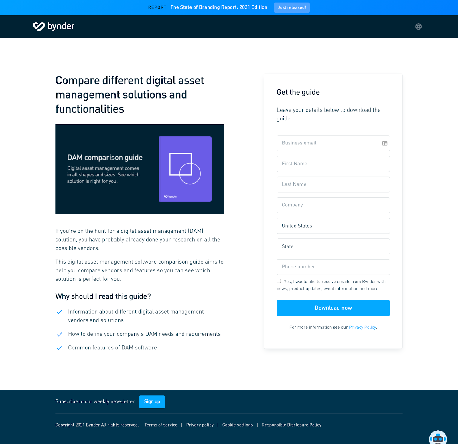
1. Bynder’s content download landing page
Why it's good: I was searching for “digital asset management system” and came across a PPC ad with the copy “DAM Comparison Guide - See How Bynder Stacks Up.”
- Strong copy: It speaks to what their target audience would be looking for at this stage of their buying journey. They’re putting value over sales.
- Clarity: The landing page design is simple and clear.
- CTA in the top of fold: It’s clear that the action they want visitors to take is to download the DAM comparison guide.
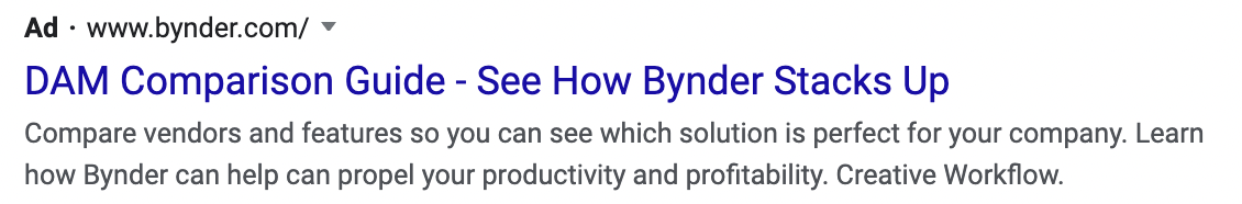
Bynder PPC ad.
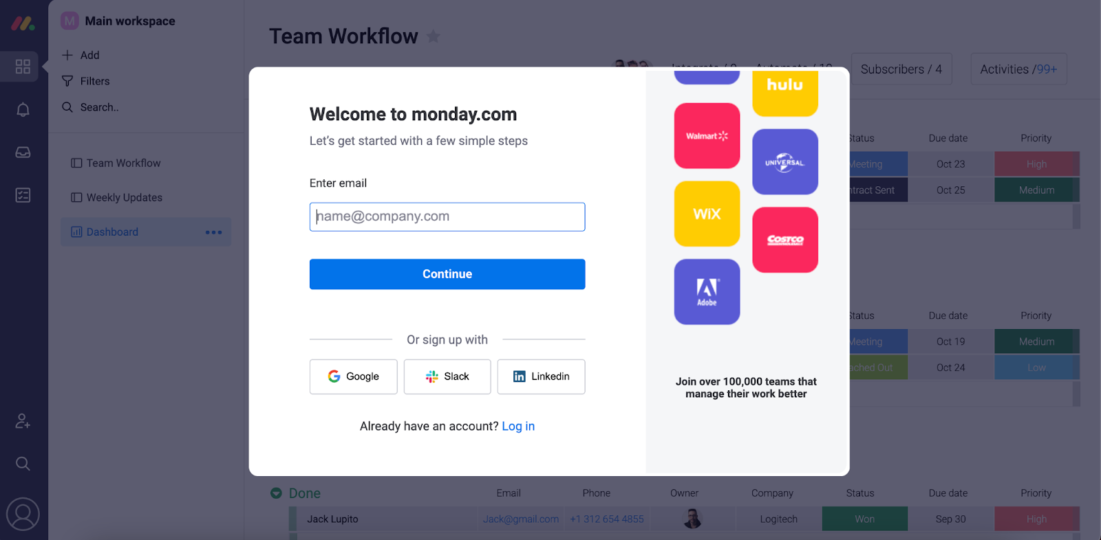
2. Monday.com’s clever sneak peek
This example uses one of our favorite techniques here at KlientBoost, the Breadcrumb technique (opens in a new tab). Rather than asking for personal information like a phone number or email upfront, they ask for non-identifying or non-invasive info first. It helps to get the visitor hooked and engaging. Once a visitor answers a series of non-identifying info, they then present the full form.
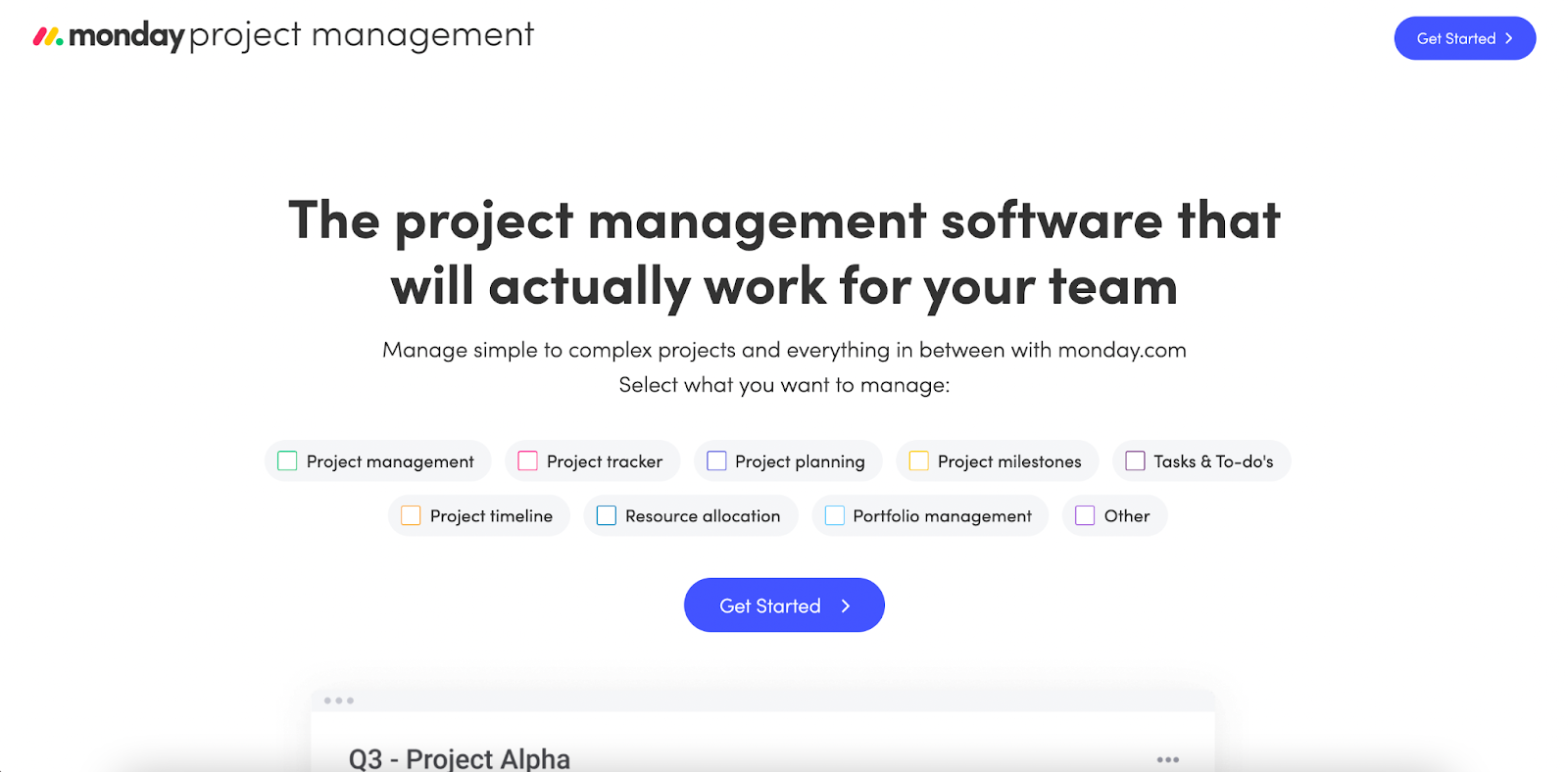
Monday.com then does something else pretty genius—they give you a little taste of what you can get. Right behind the form field you can clearly see the software which makes filling out the form even more tempting.
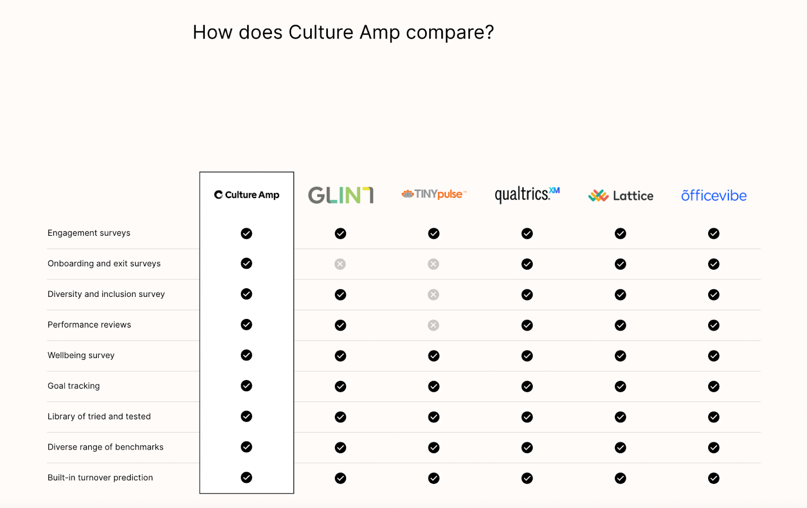
3. CultureAmp’s clear messaging
Simplicity + good design + functionality = *chef's kiss*
This landing page checks all the boxes:
- One simple CTA
- Strong copy communicating their unique value prop
- Headers explaining the product’s value
- Social proof through customer testimonials
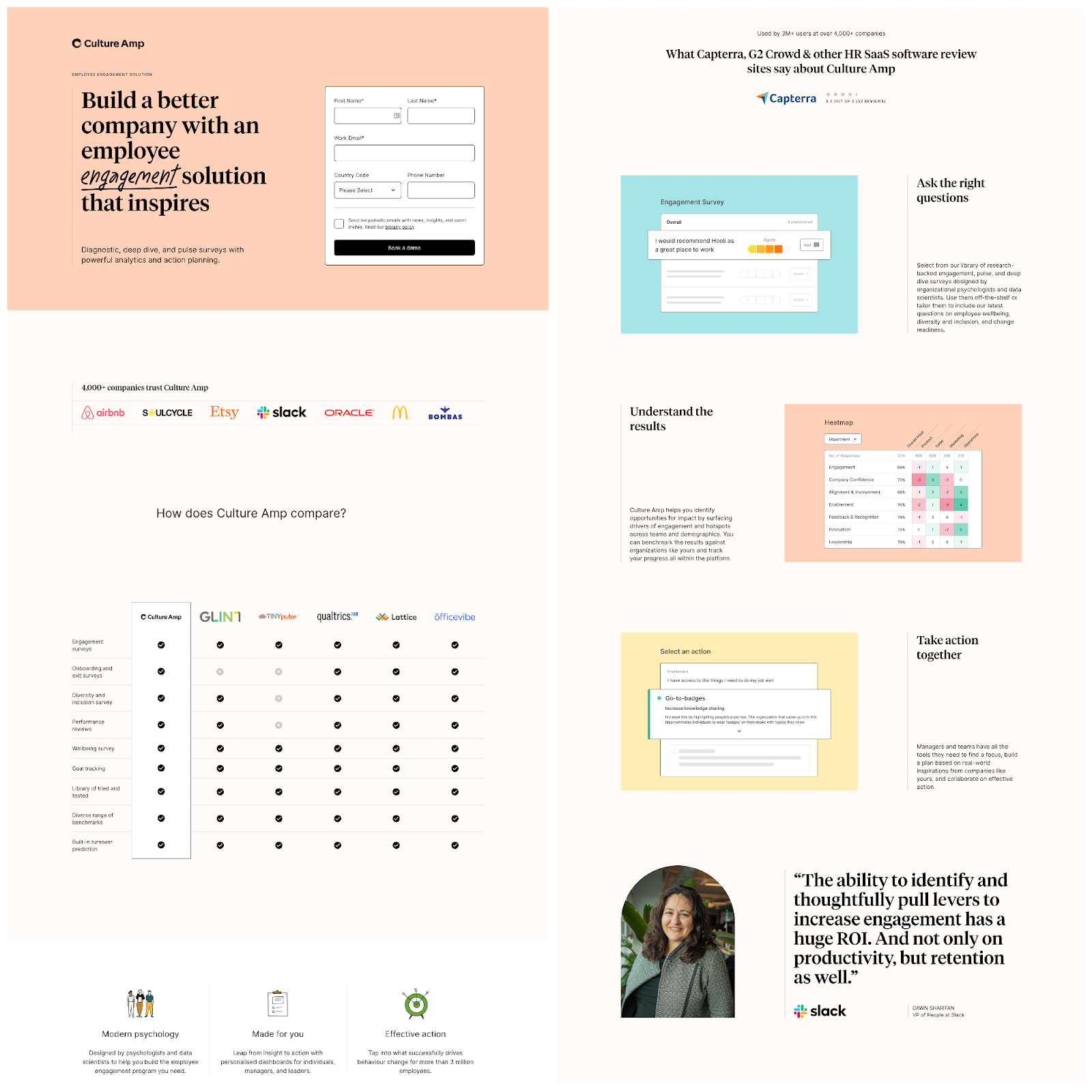
They even included a little bonus, my favorite part, the competitive comparison.
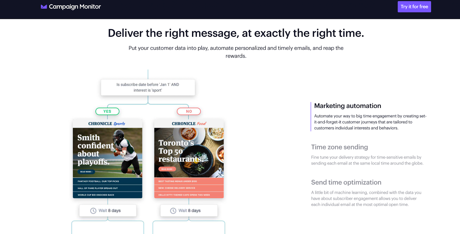
4. Campaign Monitor’s simplistic approach
This design is as simple as it gets.While it could be considered a little too simple, the minimalism puts all of the focus on the headline: “Email marketing campaigns made simple.”
Keeping things minimal helps visually portray the simple nature of the product right from the get-go.
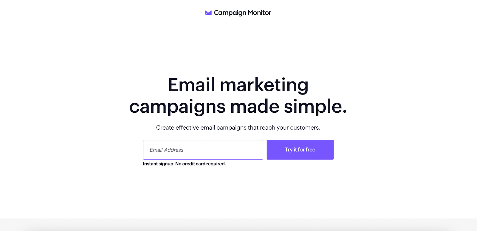
Thankfully they do provide all the info a visitor needs below the fold and they enabled a sticky bar at the top so the CTA button is always in clear view.
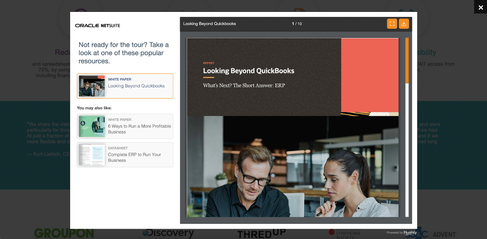
5. Netsuite’s exit-intent popup
I actually think this landing page could use some work. Especially in the lead form department.They might as well be asking for my social security number at this point.
But, this landing page did utilize an exit-intent popup (opens in a new tab) really well.
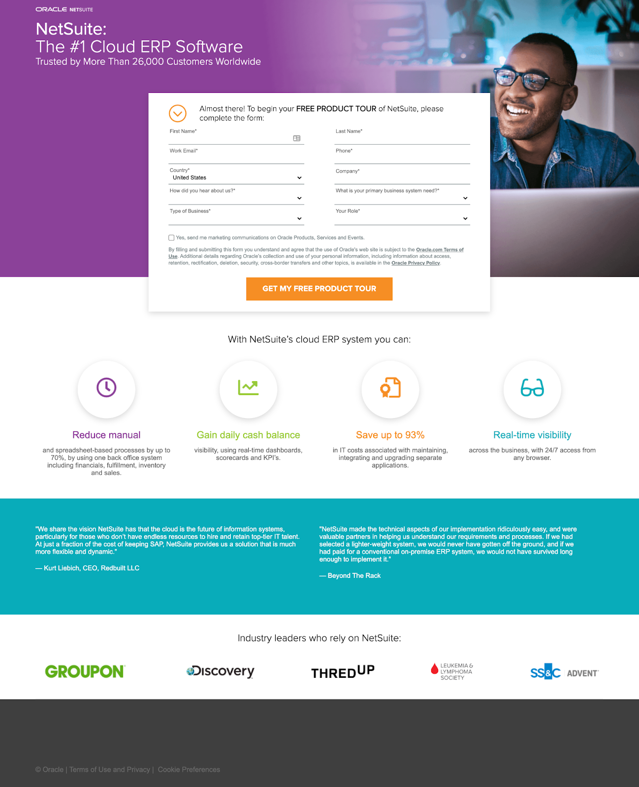
This exit intent helps to capture the visitors who ended up on the landing page, but weren't ready to give their information for a product demo yet. Netsuite perfectly timed their value offer of free resources.
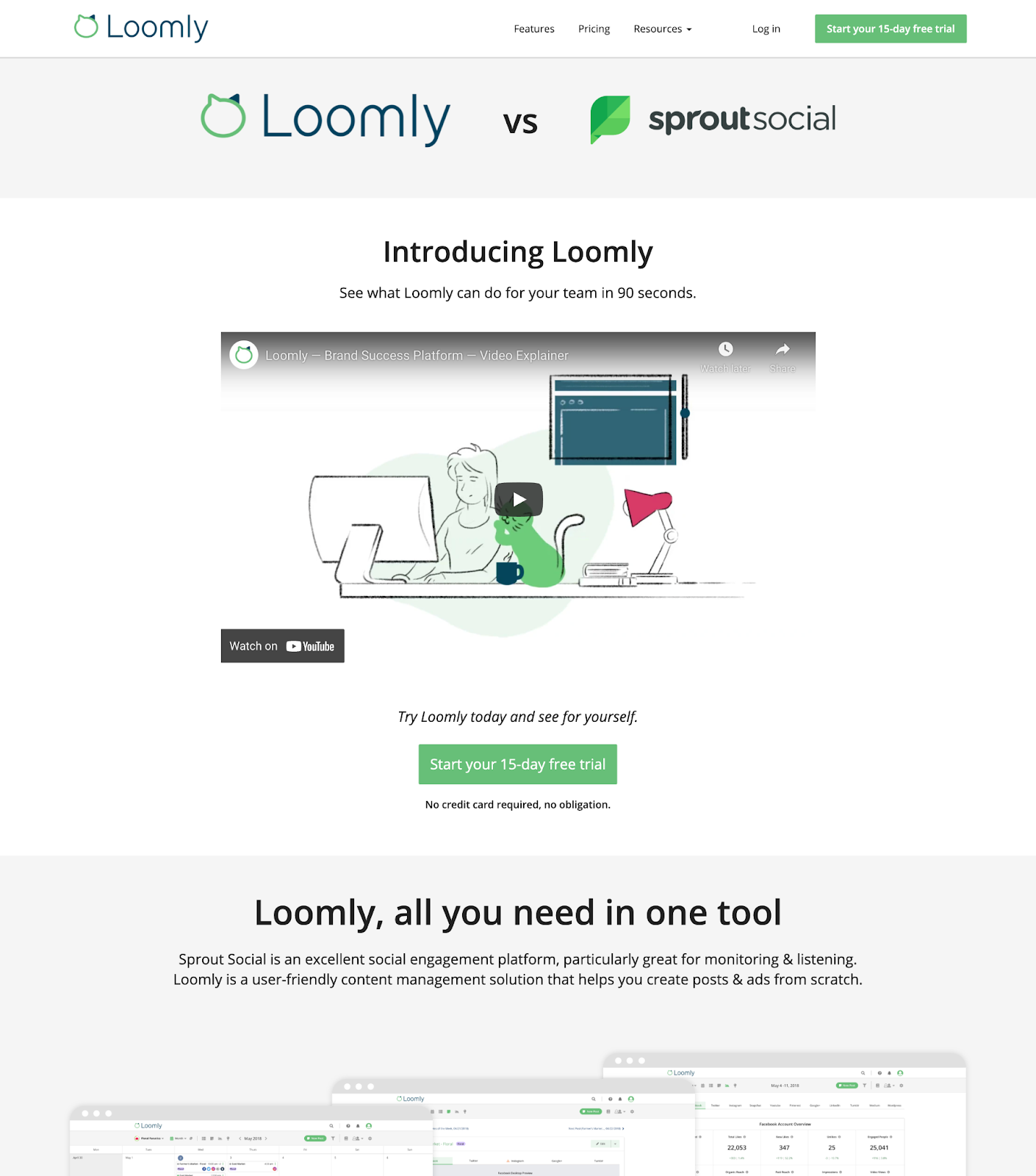
6. Loomly’s use of precise numbers
Loomly has two big things going from them when it comes to this B2B Landing Page:
- They directly call out Sprout Social, a competitor they know ranks #1 for all “social scheduling” searches. I love the directness.
- They use precise numbers. It's not a “free trial,” it's a “15-Day Trial.” They don't want you to just click play on a random video, they want to show what Loomly can do for your team in 90 seconds.
Columbia University's Malia Mason and her colleagues conducted a study that showed using exact numbers is more persuasive than rounded numbers. Exact figures provide a stronger sense of credibility when it comes to presenting or discussing data.
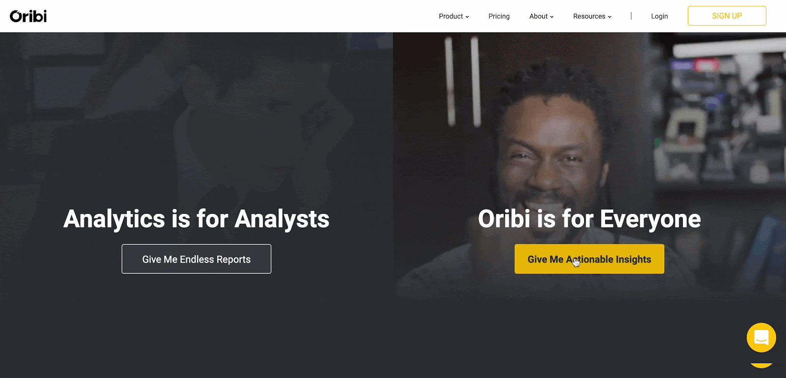
7. Oribi
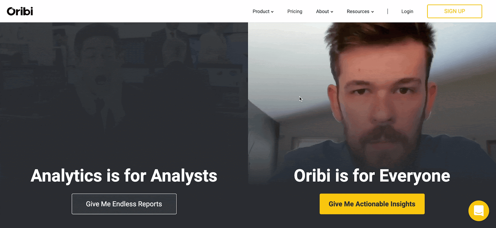
Once you press the “Give Me Actionable Insights” CTA button, Oribi leaves breadcrumbs (our favorite technique, mentioned earlier). There's no way you don't want to fill out the rest of the form fields at this point.
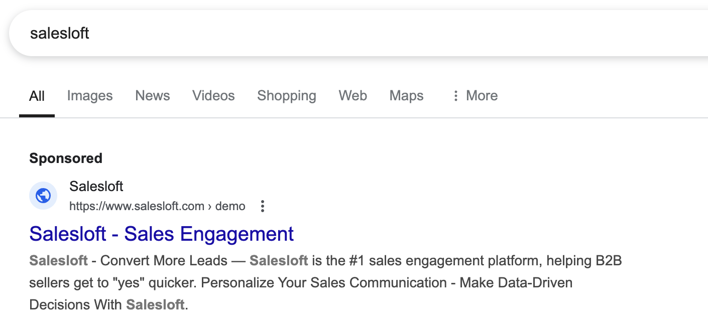
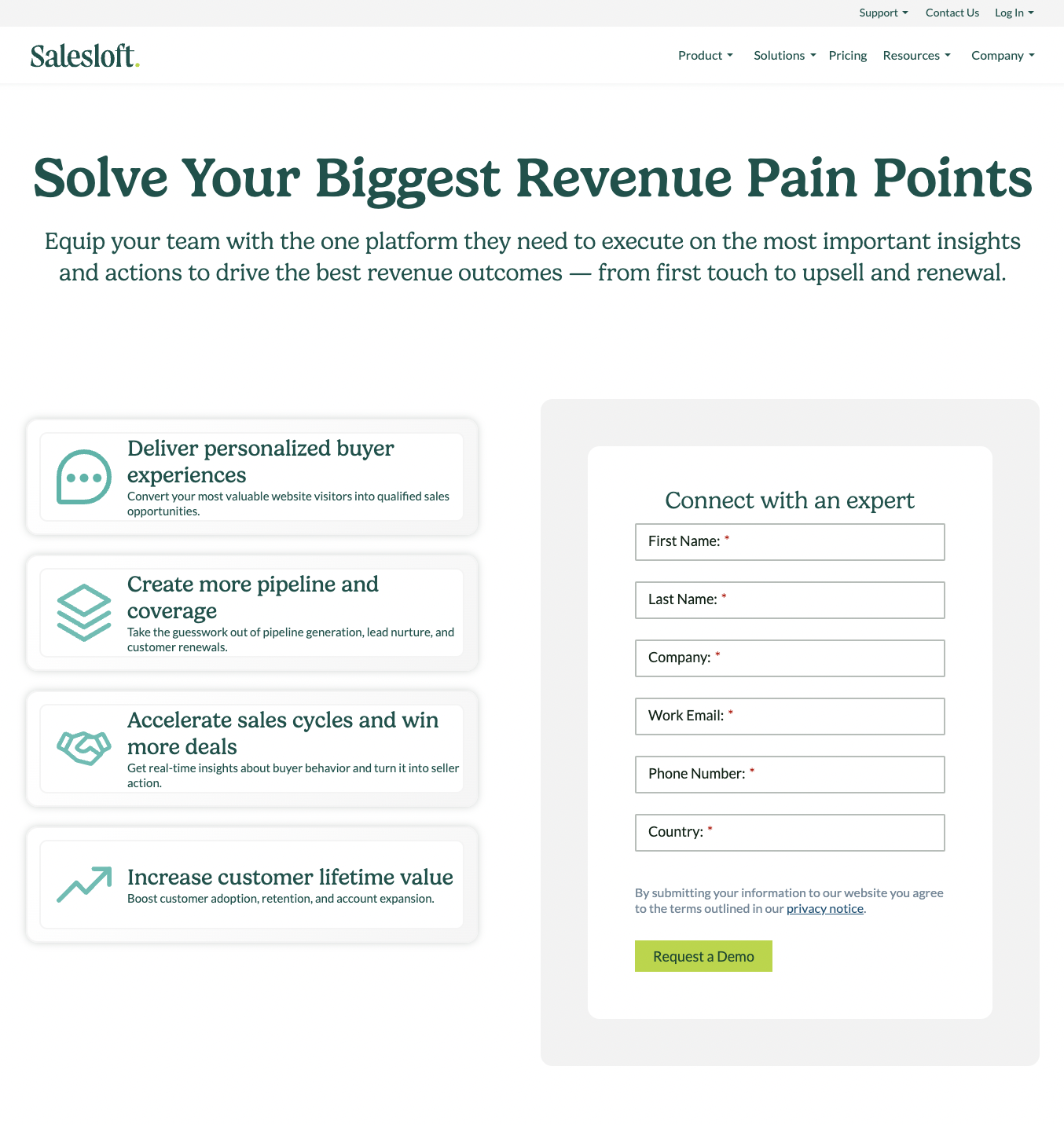
8. Salesloft’s branded search landed page
In some scenarios, brands will need to run PPC campaigns against their own branded search terms. In Salesloft’s case, other brands are bidding against their branded term, so their organic page gets pushed down.
Since this search campaign targets a high-intent, high-quality audience, Salesloft can make a few key assumptions when designing their landing page:
- Visitors already understand their product and services, so they don’t need to use valuable page space for education.
- These visitors are in the later stages of the buying journey, allowing Salesloft to be more direct with a demo booking CTA.
This approach keeps the page focused on conversion rather than awareness-building.
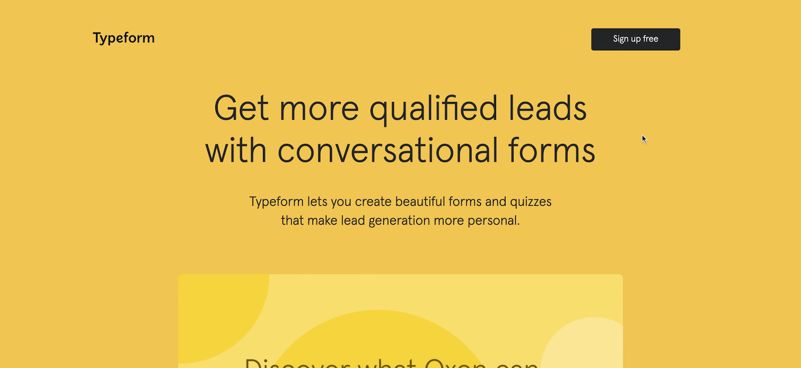
9. Typeform’s product-led approach
For SaaS products, showcasing what your product does makes for a better user experience. One of the best ways to do that is through a free product demo that doesn't require you to leave the page OR enter your email.
Typeform nailed this by offering an interactive experience that quickly engages visitors while showcasing their product.
Despite serving a wide range of businesses, they crafted universally relevant content and copy tailored to the visitors they expected from search and email.
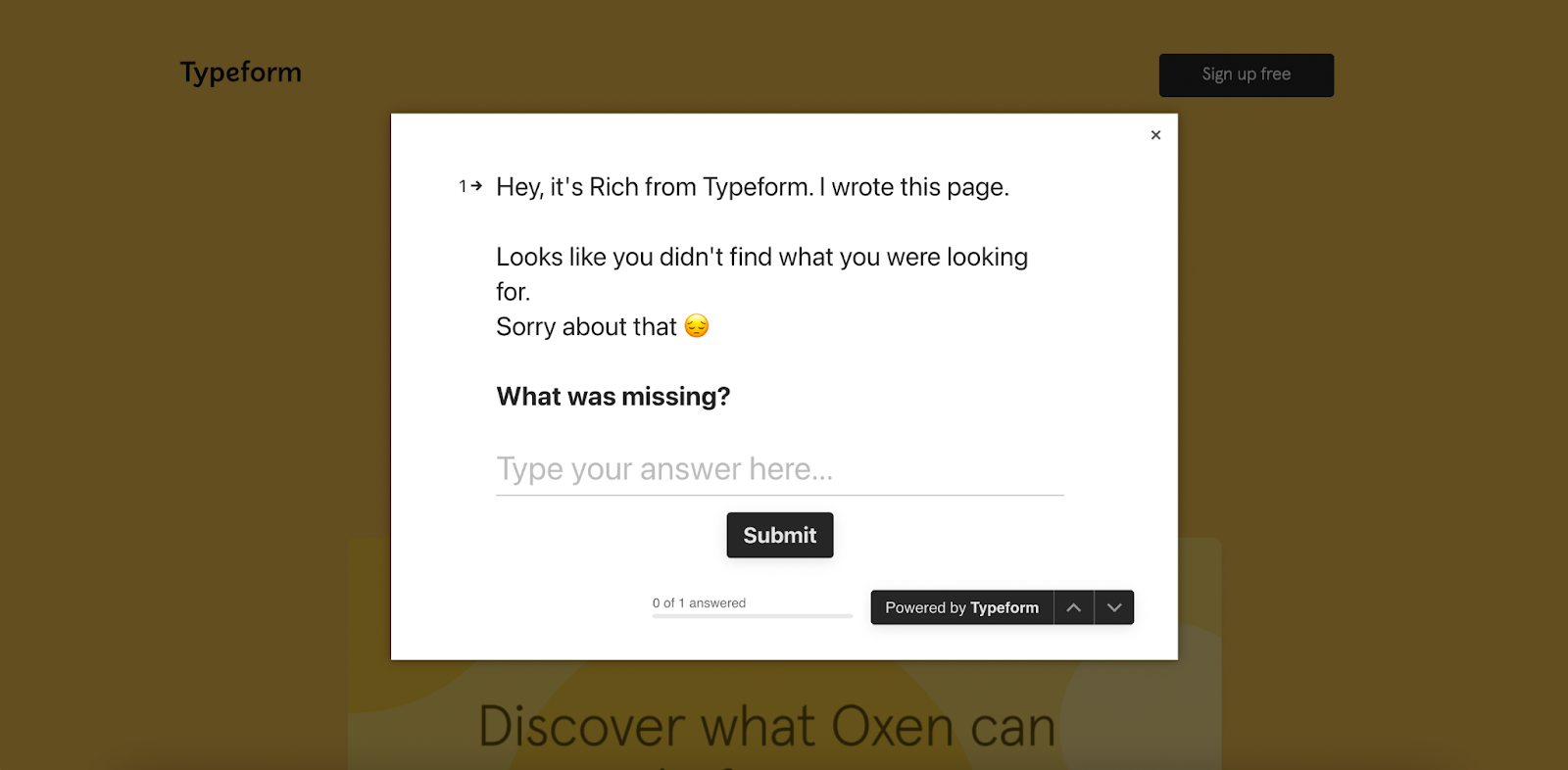
If the free demo doesn't do it for a visitor, Typeform gives it one last shot with an exit-intent popup. By introducing the person who wrote the copy on the page and giving them a name, the popup pulls on the heart strings of the visitor a little more.
The personal touch is the pièce de résistance. You don't want to offend Rich, do you?
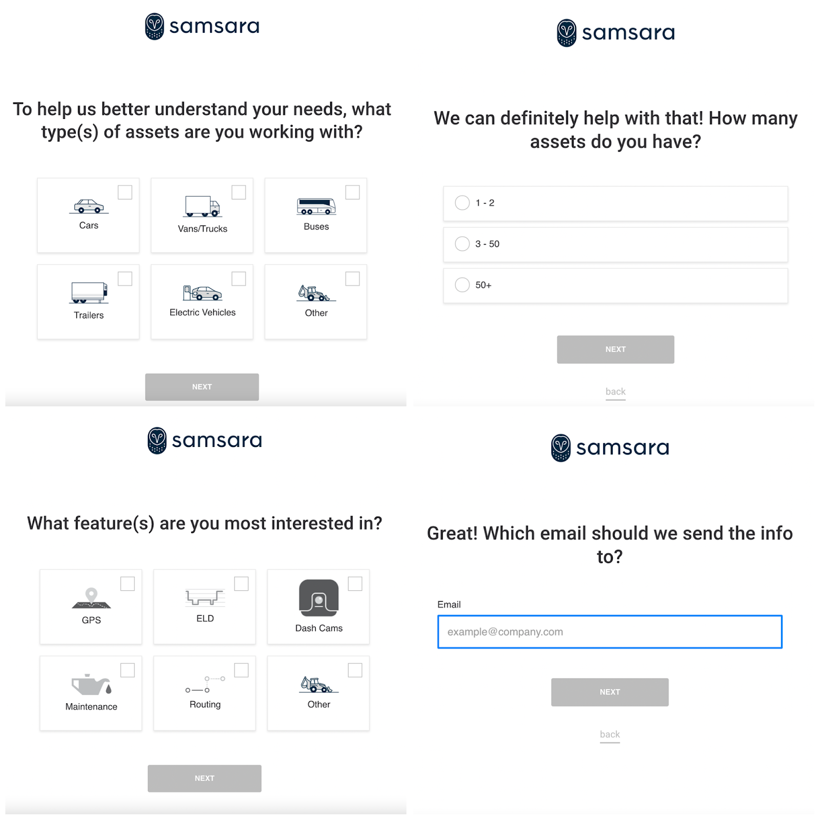
10. Samsara’s pricing-centric CTA
Samsara means business with their CTA
We're all used to seeing “Start My Trial” or “Request a Demo” on landing pages.
But let’s be real, isn’t the real question, Can I even afford this? Why go through the hassle of booking a demo if the price is out of reach?
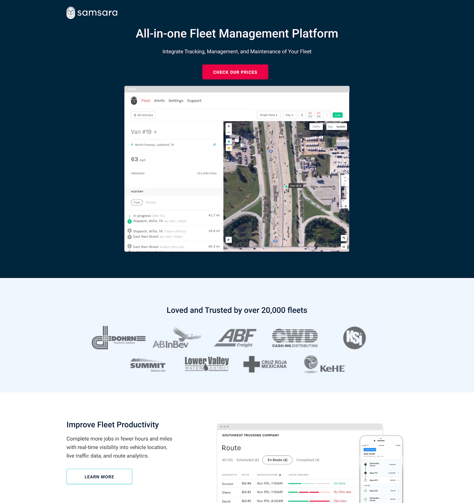
Bonus points for Samsara: A click for pricing info is a strong buy-intent signal, which is pure gold for fueling your retargeting campaigns. 💰💰💰
They’ve also built their form with the intention of learning more about your business, giving them the details they need to deliver more personalized marketing.
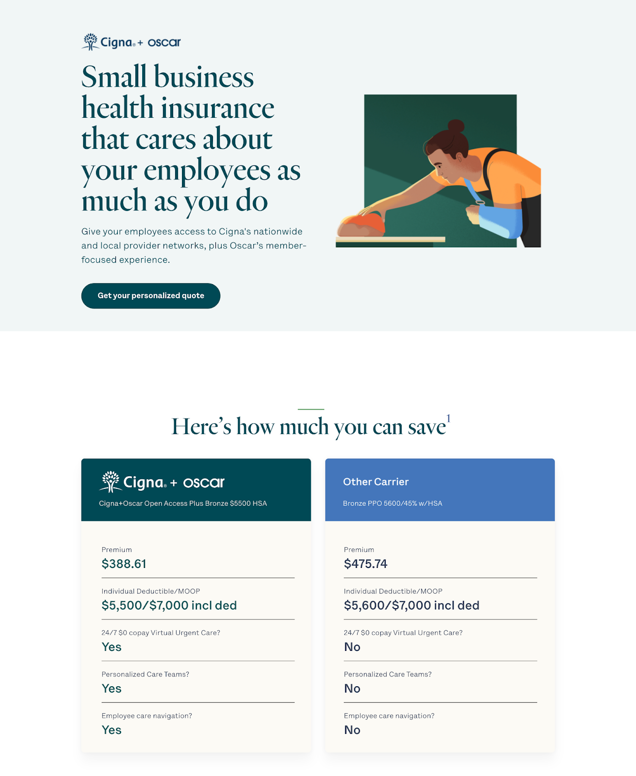
11. Oscar’s personalized touch
The top three selling points for this B2B landing page:
- The UVP in the header speaks to the fear a visitor is most likely feeling, evoking emotion to build trust right off the bat.
- The CTA notes a personalization option. By providing info, the visitor will get a quote that is unique to their situation.
- Using precise numbers, Oscar addresses the competition straight on with a side-by-side comparison.
The beautiful, simple but warm design gets an honorary mention as well.
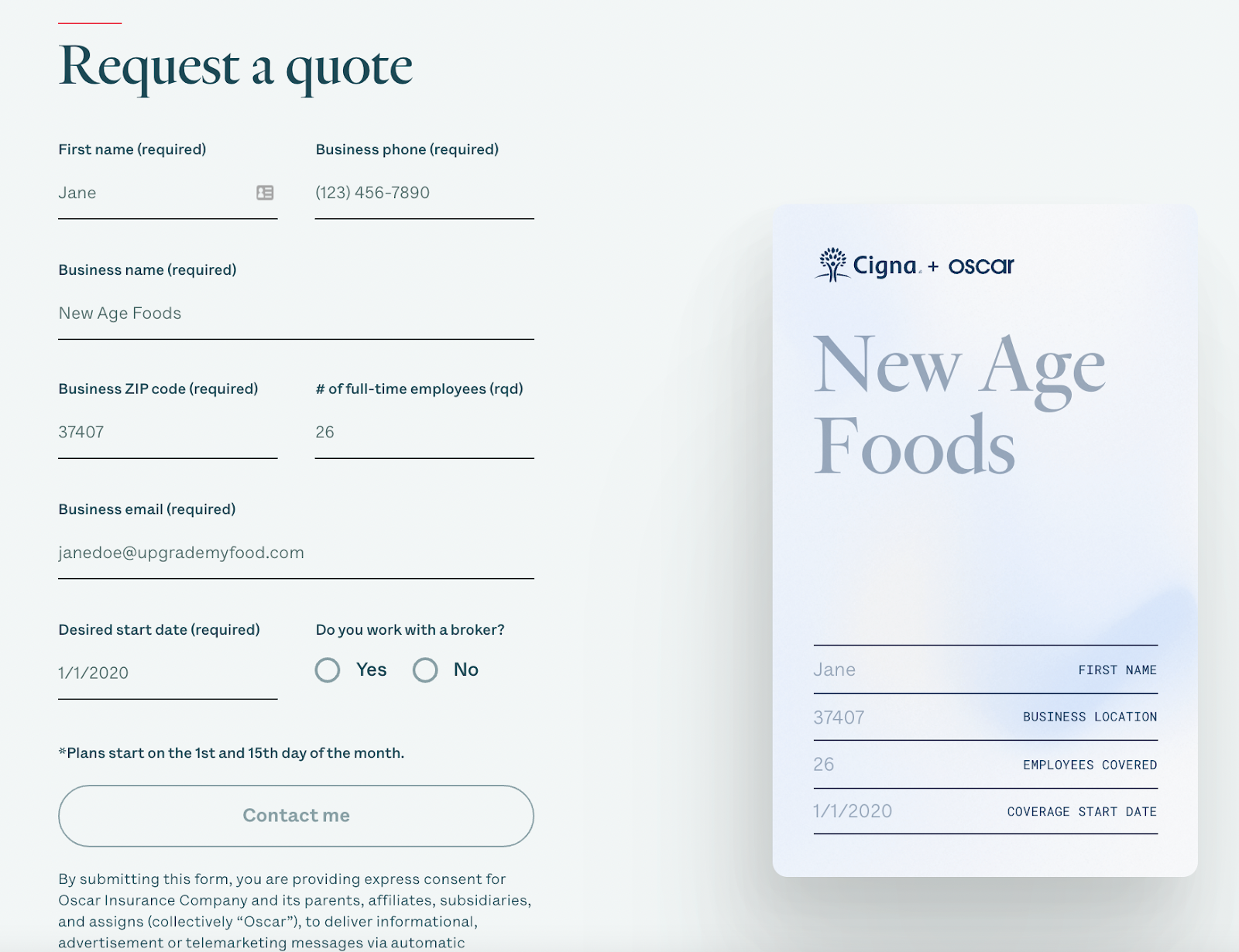
There's one other intentional move they made here. Next to their lead generation form at the bottom of the page, they include an illustration of a card or paper that matches the placeholder info in the form fields. By doing this, Oscar is giving emphasis to the quote the visitor will receive. It shows how it will be personalized and makes it feel like more a tangible object, making it more significant.
12. HappyFox’s competitor landing page
No mercy from HappyFox. They designed a landing page and ran a paid ad campaign against their competitor Zendesk.
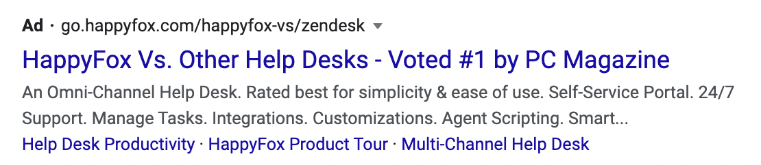
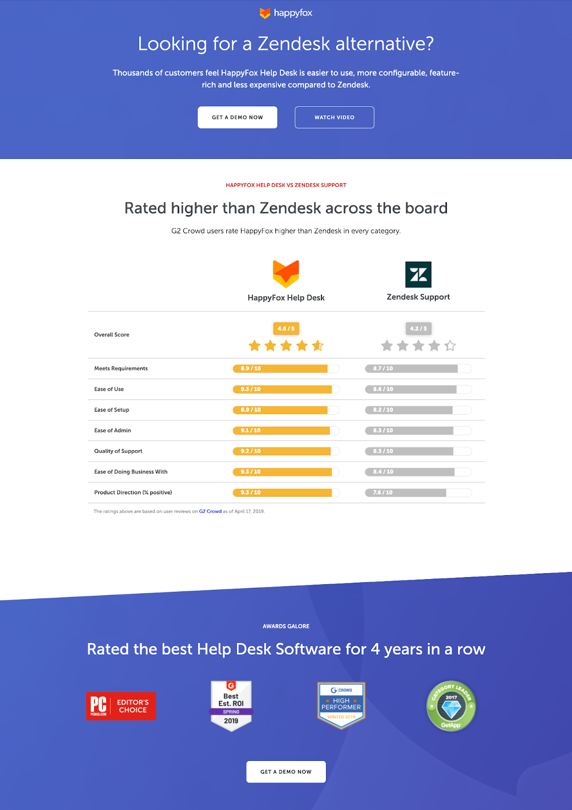
Not only does the copy directly call out Zendesk, but the side-by-side comparison helps to visually hammer their point home.
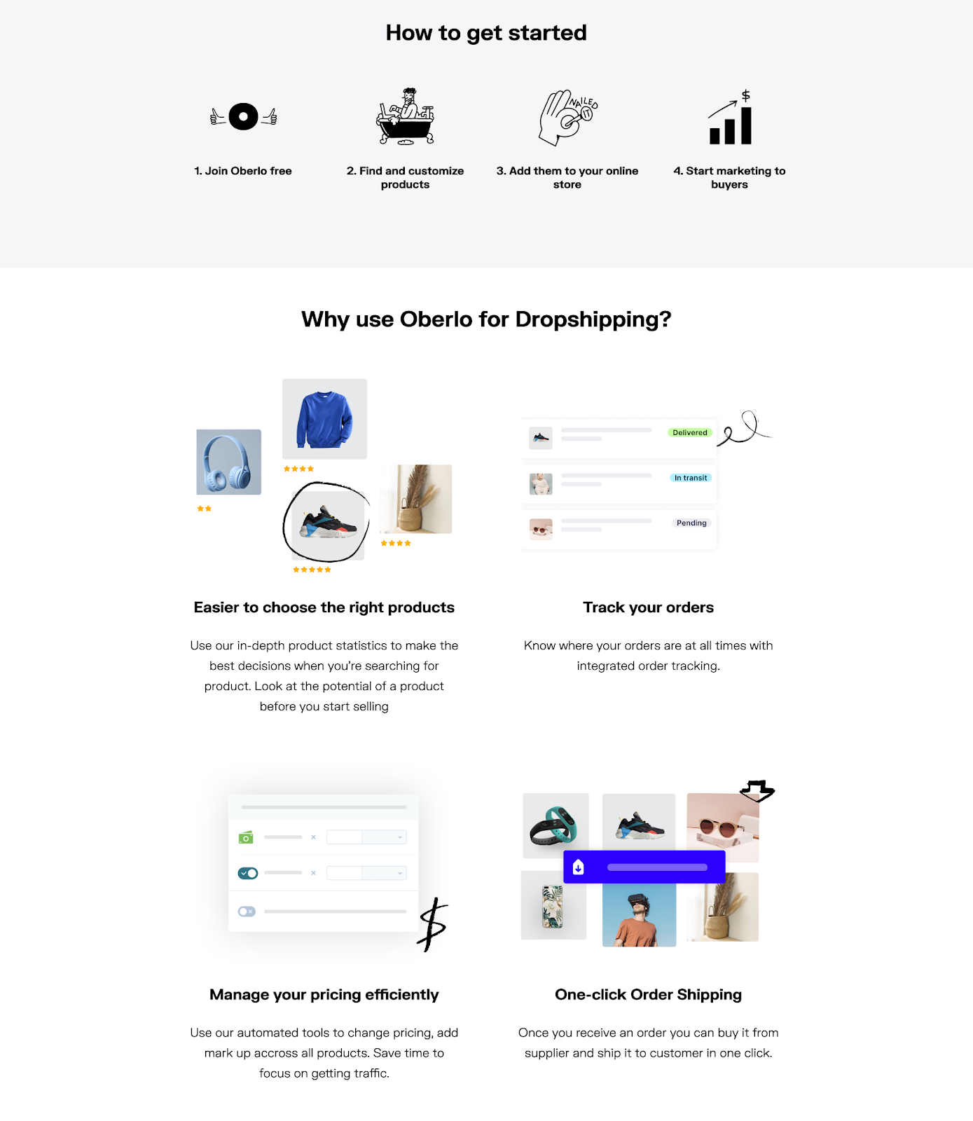
13. Oberlo’s bold branding choices
Oberlo's B2B landing page doesn't look like your typical B2B page—and that's a great thing. The bold font and bright colors capture your attention right off the bat.
Special shoutout to the social proof below the fold. The “people like you” copy makes it feel way more personal—like a friend vouching for Oberlo, not just a brand flex. And the cherry on top? Actual screenshots from social media too. This extra touch makes it feel legit instead of just another marketing tactic.
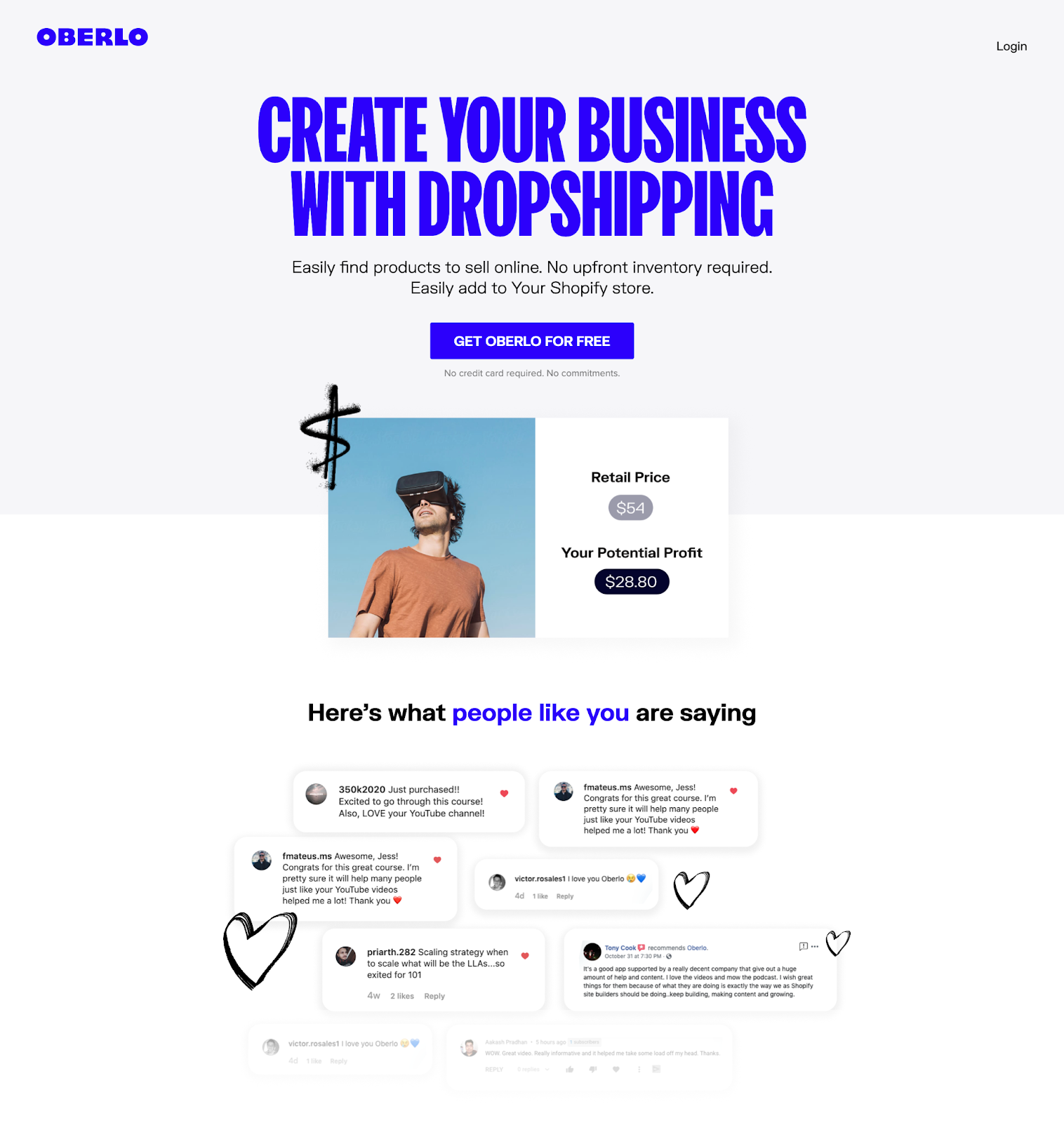
Using visuals, Oberlo succinctly leaves visitors with easy-to-understand bullets on exactly how the platform works and why they should use it.
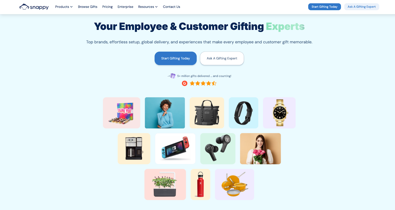
14. Snappy getting visitors in a buying mood
Snappy, a corporate gifting platform teases a catalogue of gift ideas to get visitors into a buying mood. They also include a CTA of “ask a gifting expert”, which is important because corporate gifting is very different to buying your best friend a gift—you’re shopping for many personalities rather than just one.
15. Allhands
Allhands uses bright colors and fun illustrations which makes so much sense for the product they're pushing. It's a software that helps bring energy to big team meetings. Of course the landing page has to bring that energy too.
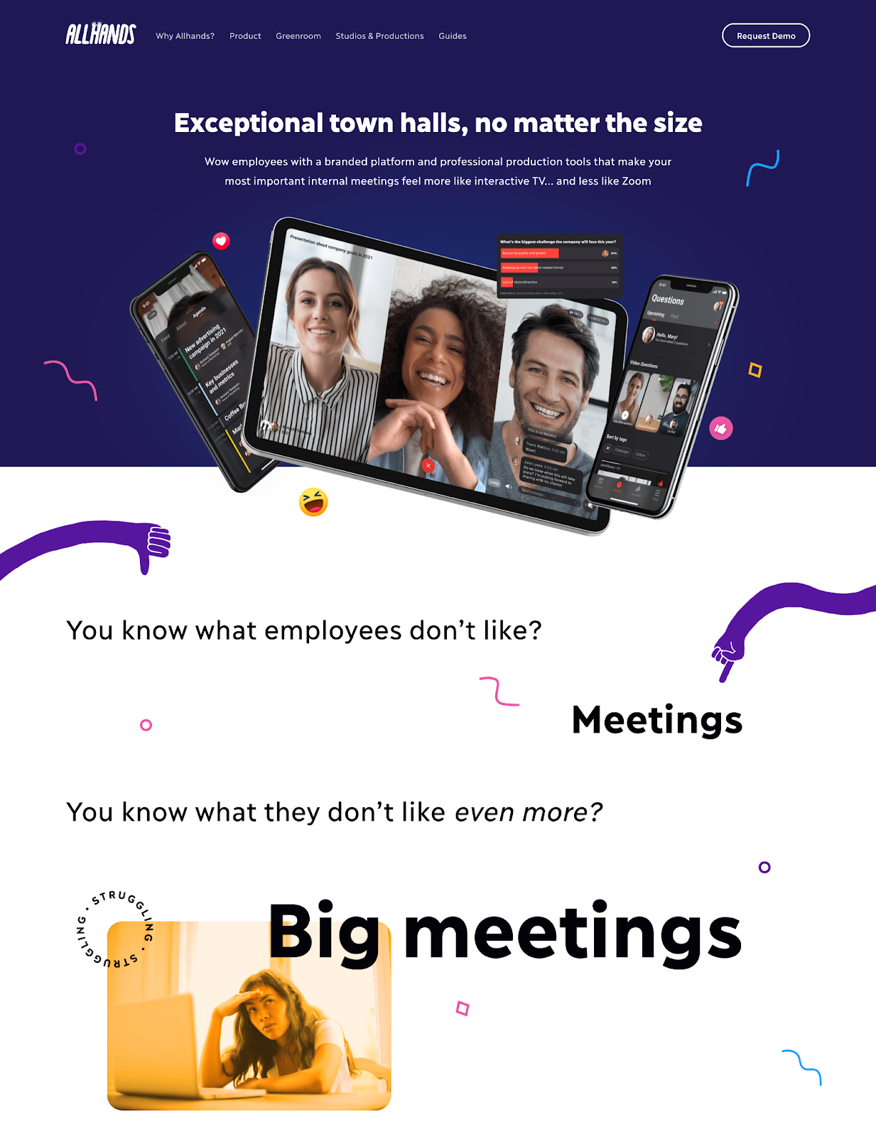
Even if it may take up a lot of space, the copywriting below the fold stops scrollers in their digital tracks. It makes them feel like yeah, Allhands really gets it.
Of course, good design is nothing without the best practices and basic functionality. They still provide the facts and figures to help a visitor learn about the product and decide if it's right for them. And you know there's a CTA accompanying every section of the landing page.
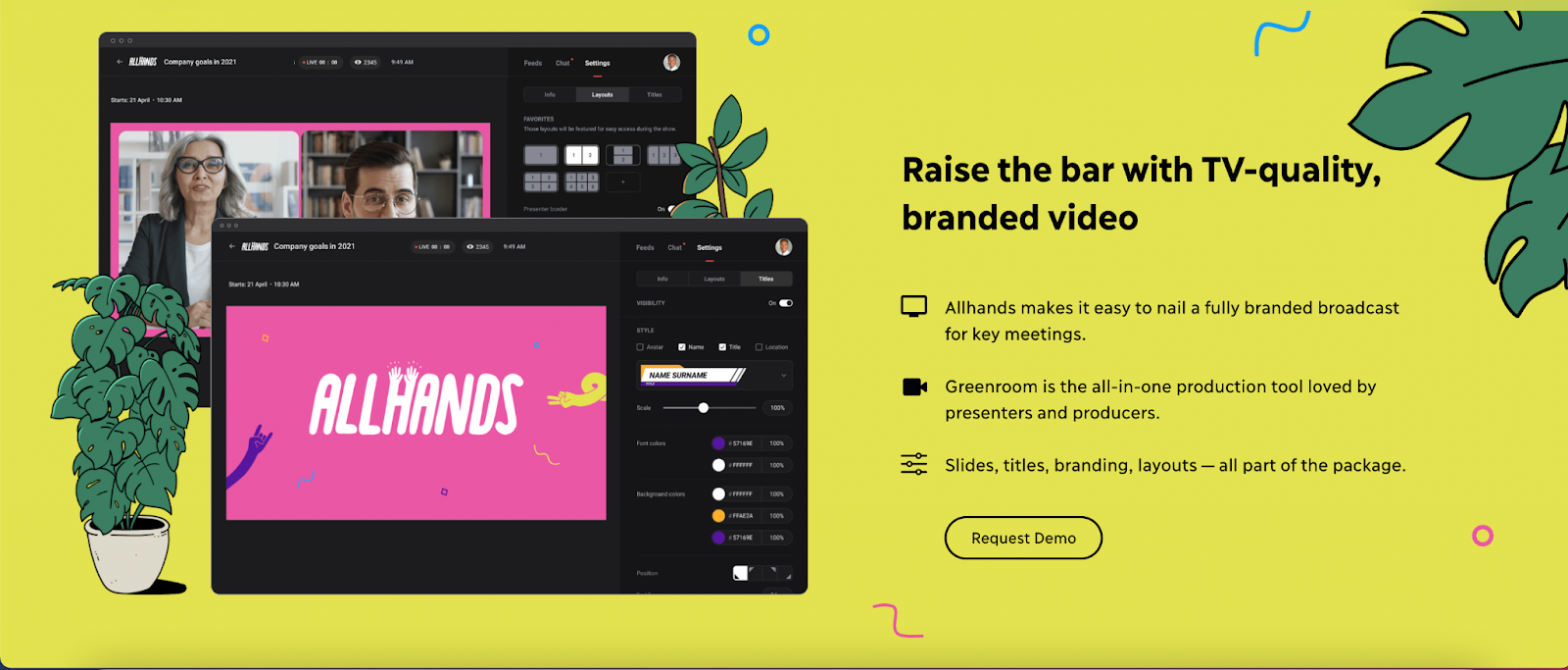
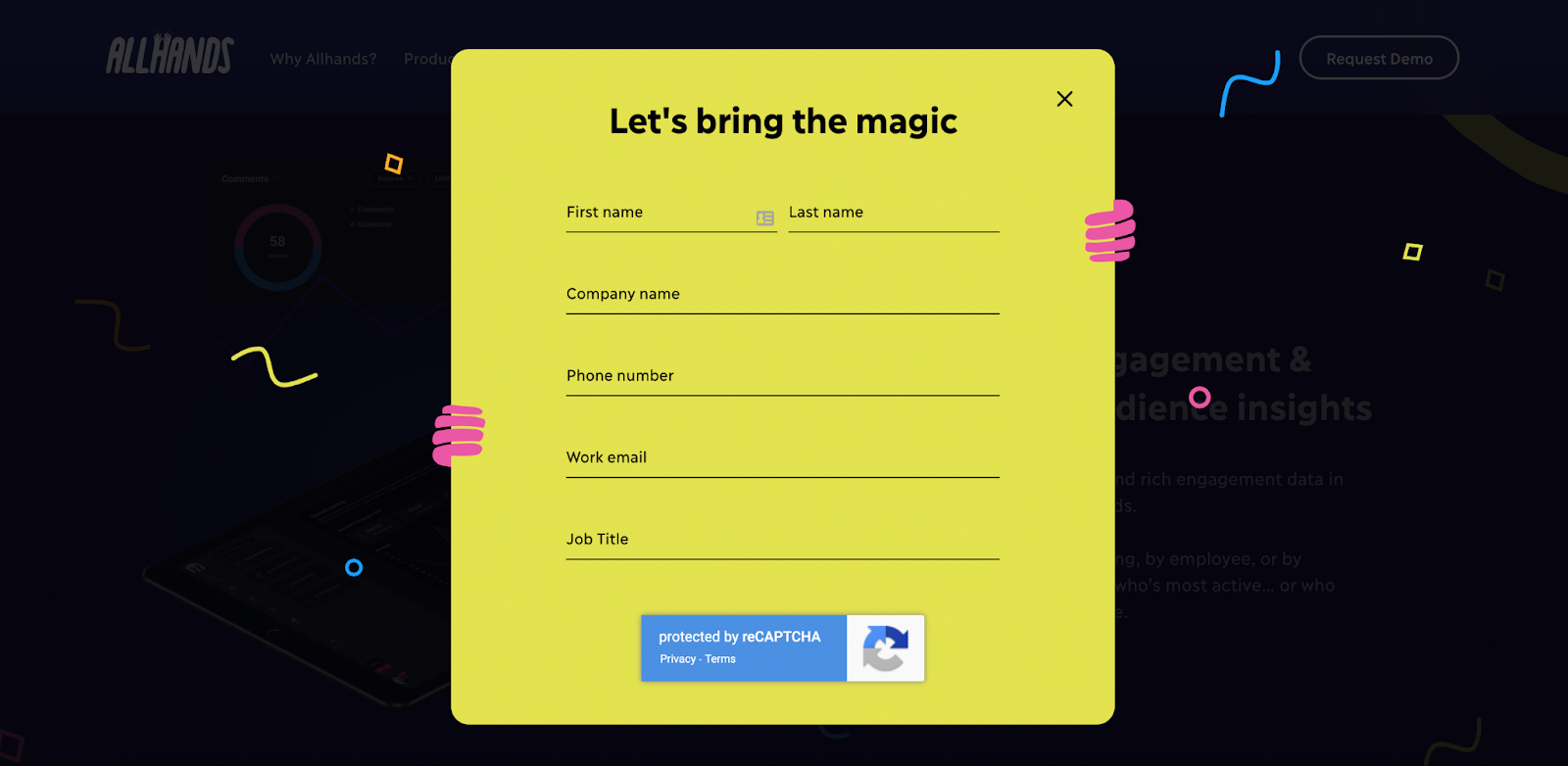
Had to include a screenshot of how the fun branding also made it to the form.
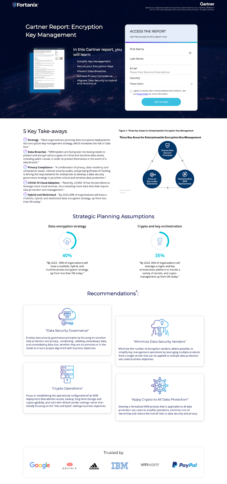
16. Fortanix
Every example so far has focused heavily on the B2B products or services being sold. Fortanix, a data security platform, took a different approach. They partnered with reputable research company, Gartner to produce a report on Encryption. Fortanix provides info on all the lessons visitors will learn within the report in addition to listing out 5 high-level key takeaways.
By providing value and expert information, they’re establishing themselves as a thought leader in the data security space. The thought leadership then does the selling for them. It's a long-term play, but a good one nonetheless.
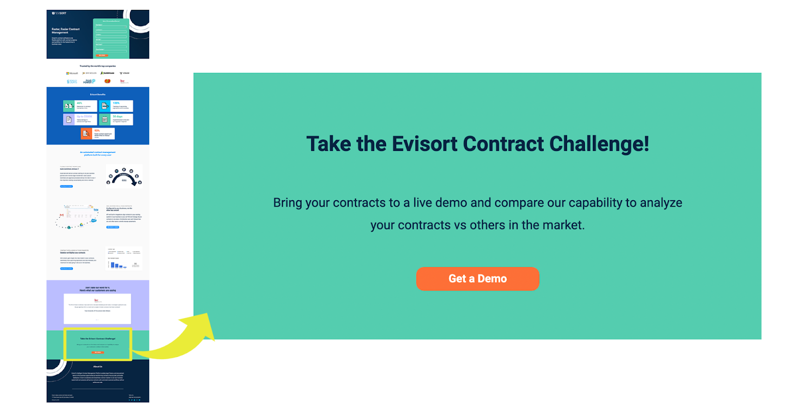
17. Evisort’s gamifying approach
To be frank, Evisort's landing page is nothing special, but they did something really cool and different to the rest. At the bottom of the page, they placed a CTA to “Take the Evisort Contract Challenge!”
I don’t know about you, but I’m quite competitive so this might just work on me.
It's a great example of how you can upgrade your CTAs by using out-of-the-box copywriting. This copy in particular helps to gamify the conversion and grab the attention of a visitor.
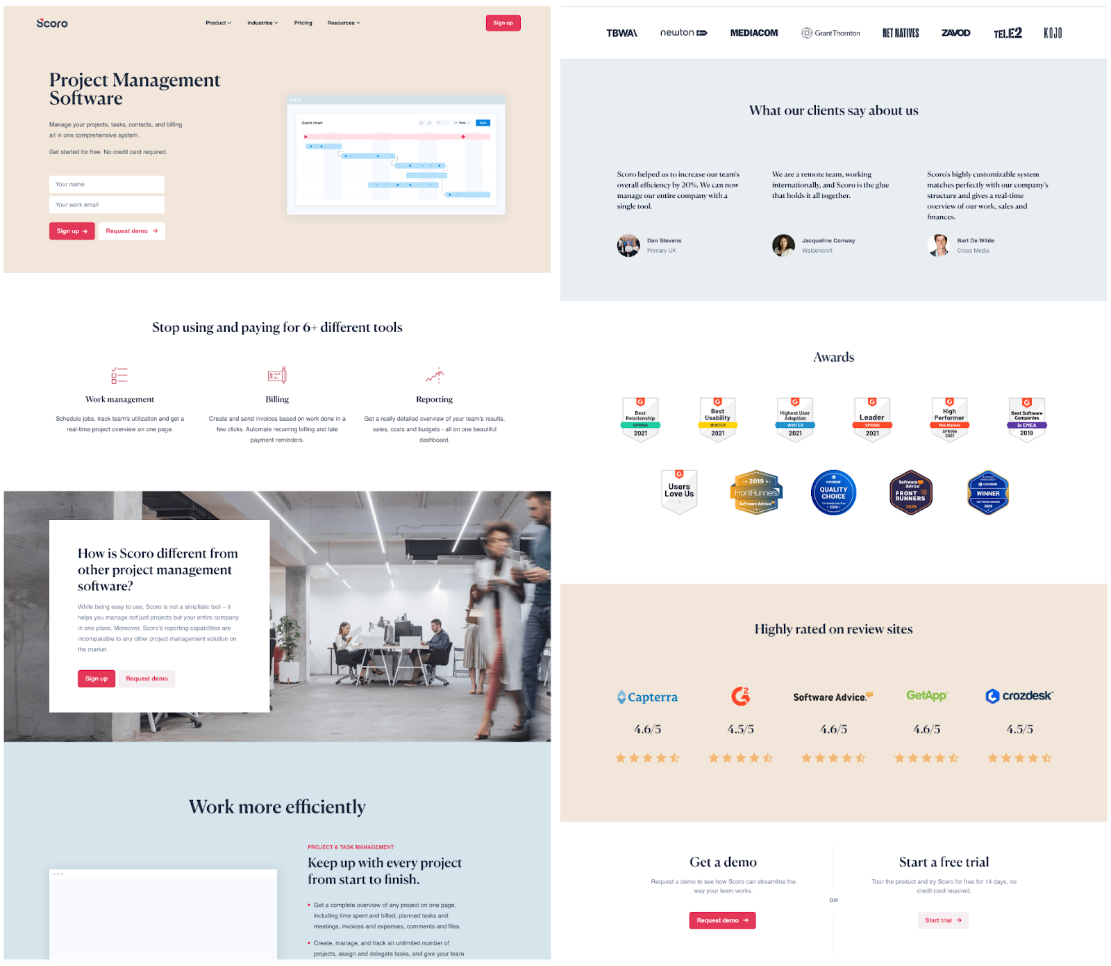
18. Scoro
Personalization over everything.
Scoro's genius was apparent once I realized that their copy changed dynamically based on what keyword I searched with. Since they service a variety of industries, they're able to personalize the landing page through that.
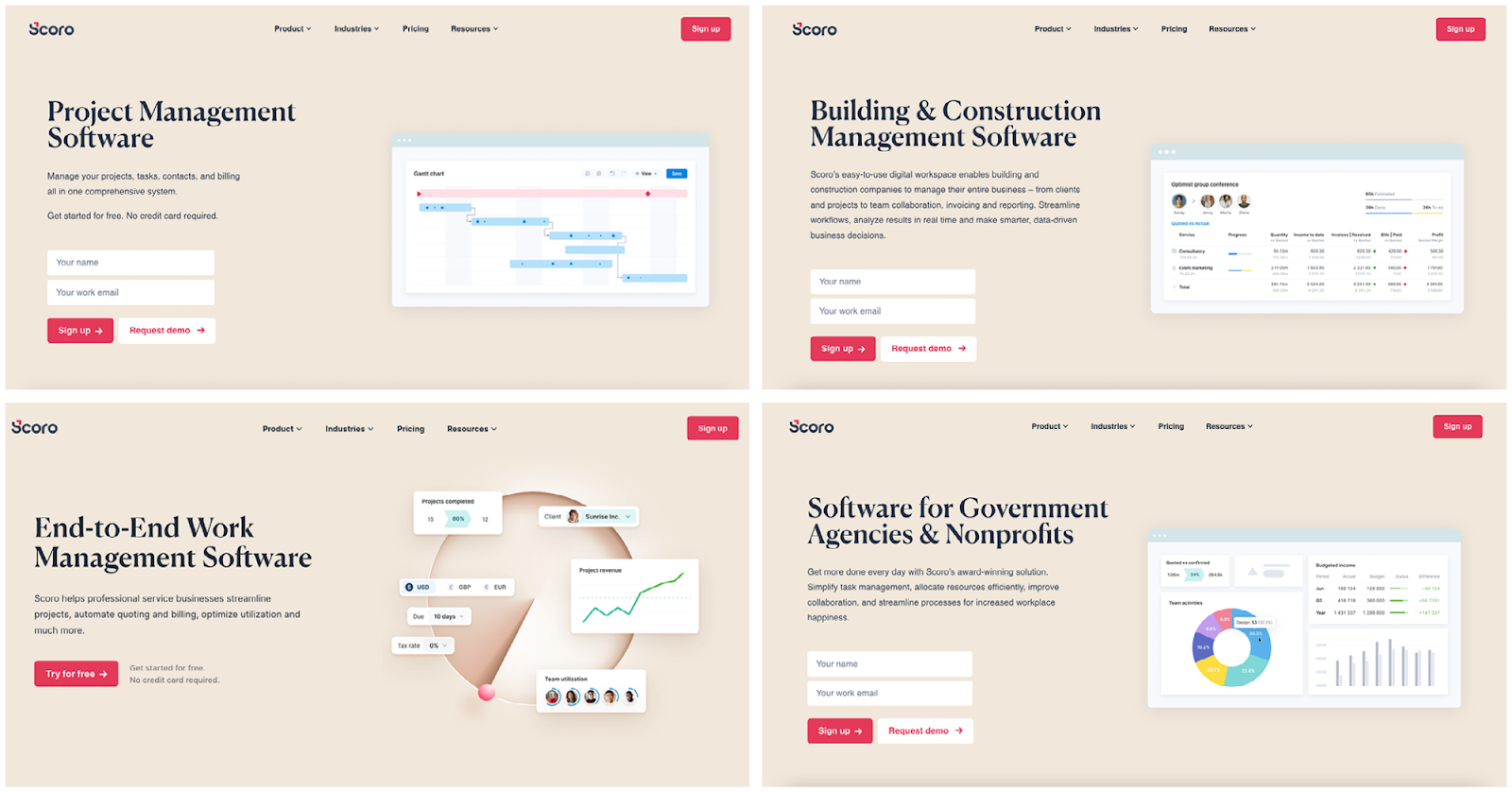
Below the fold did differ from search to search, but always contained the necessary components like
- Product descriptions
- Customer testimonials
- Relevant CTAs
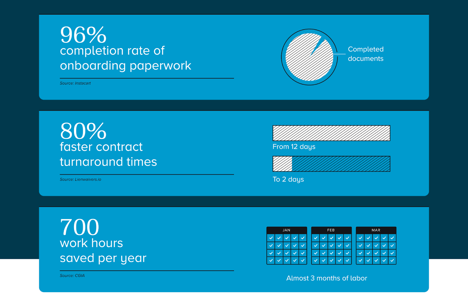
19. HelloSign checking all of the boxes
HelloSign did everything right:
- A simple but powerful UVP above the fold
- Precise numbers to show off their results
- Customer testimonials to add social proof
- Descriptive product information—both text and images
- A clear CTA
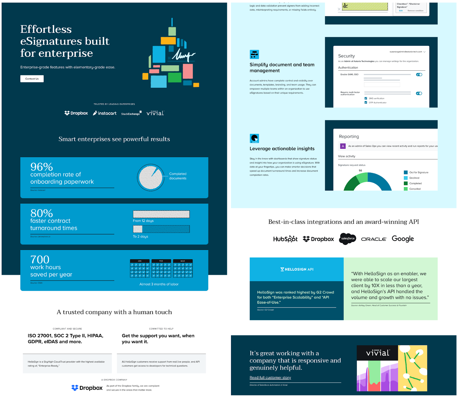
From a zoomed out view, HelloSign's landing page looks solid, but the quantitative facts just below the fold deserve a shoutout. They speak directly to the problems that the software solves. Rather than saying why you should use HelloSign, they use precise numbers to help visitors understand the real value they’ll be getting.
20. Resultably’s embedded scheduler
Resultably has a very solid B2B landing page:
- Product benefits are easily identified
- Visuals help guide the eye down the page
- Copy is focused on value over product
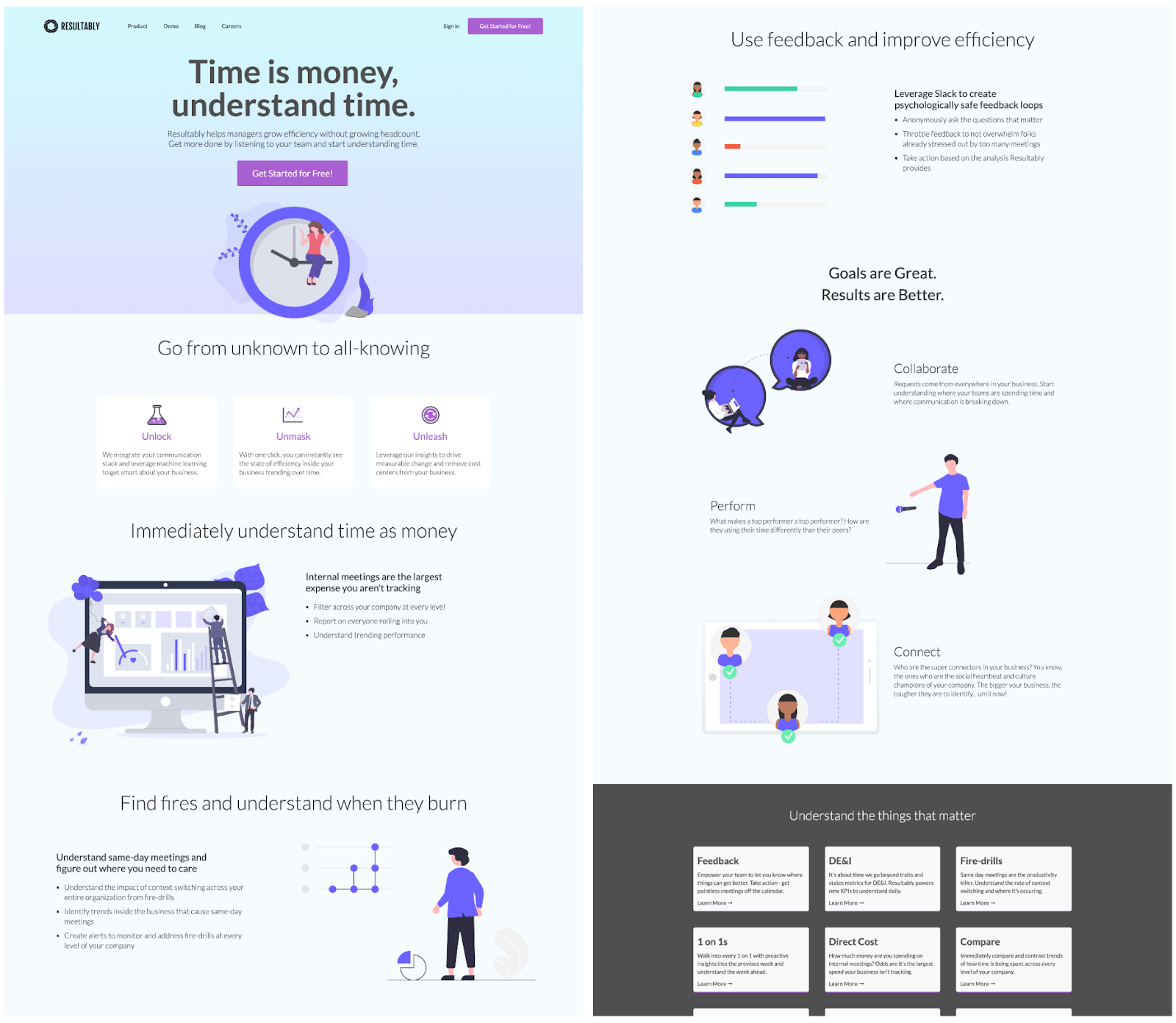
The highlight though is an embedded scheduler at the bottom of the page. Embedding a scheduler eliminates unnecessary steps for the visitor and allows them to get moving on the process in minutes.
By giving visitors the ability to book a time, they’re removing a point of friction in the demo booking process. Instead of making them fill out a form and respond to an email to book a time, visitors can skip the first step.
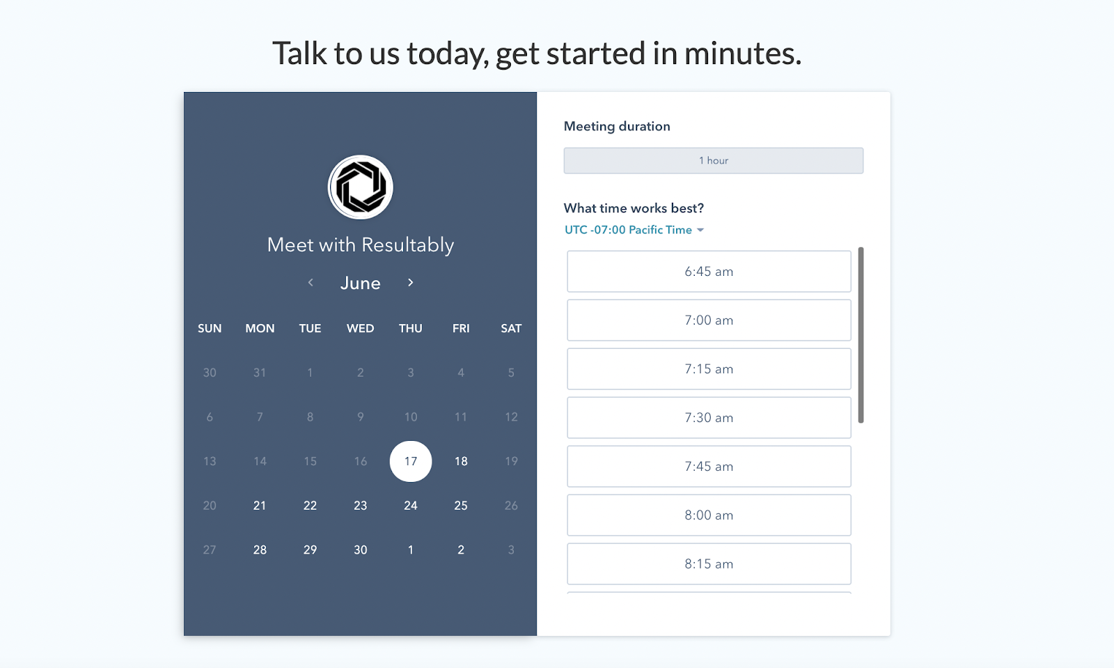
Quick note on the scheduler: An hour-long meeting feels too long and might turn visitors off. A 15-30 minute feels like a more reasonable commitment and could help bring up conversion rates.
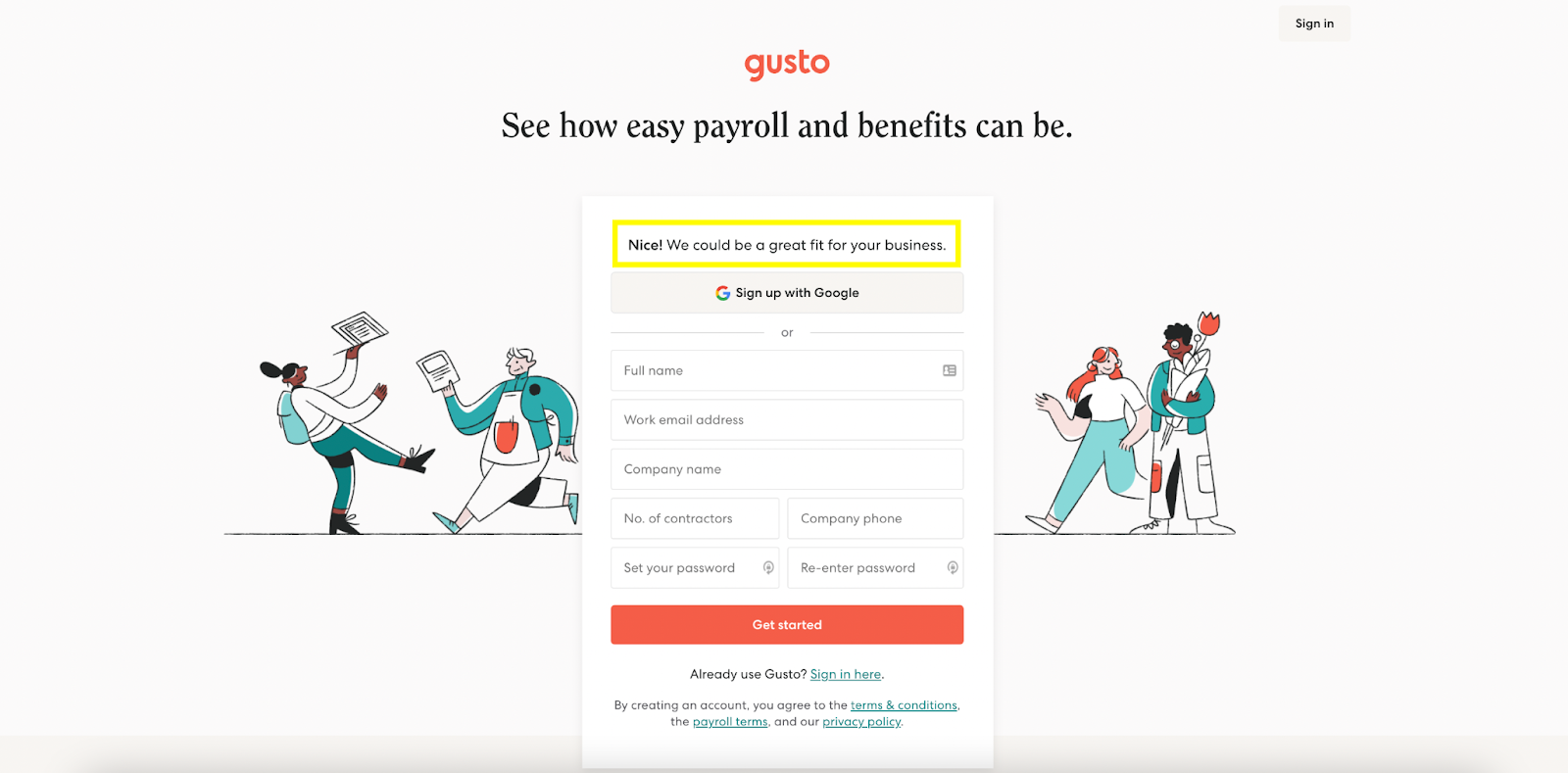
21. Gusto nails it with simplicity
Sometimes less is more. And with this Gusto example, it's definitely more.
The research phase of finding a new business or product on the internet can be overwhelming:
- So much information to read (like, way too much)
- A lot of reviews to sift through (and second guess yourself the second you see a single negative one)
- Use cases and integrations to consider
Gusto makes it easier for the visitor by giving them less to focus on and focusing on one engagement that can help the visitor (and Gusto) figure out if their product can help.
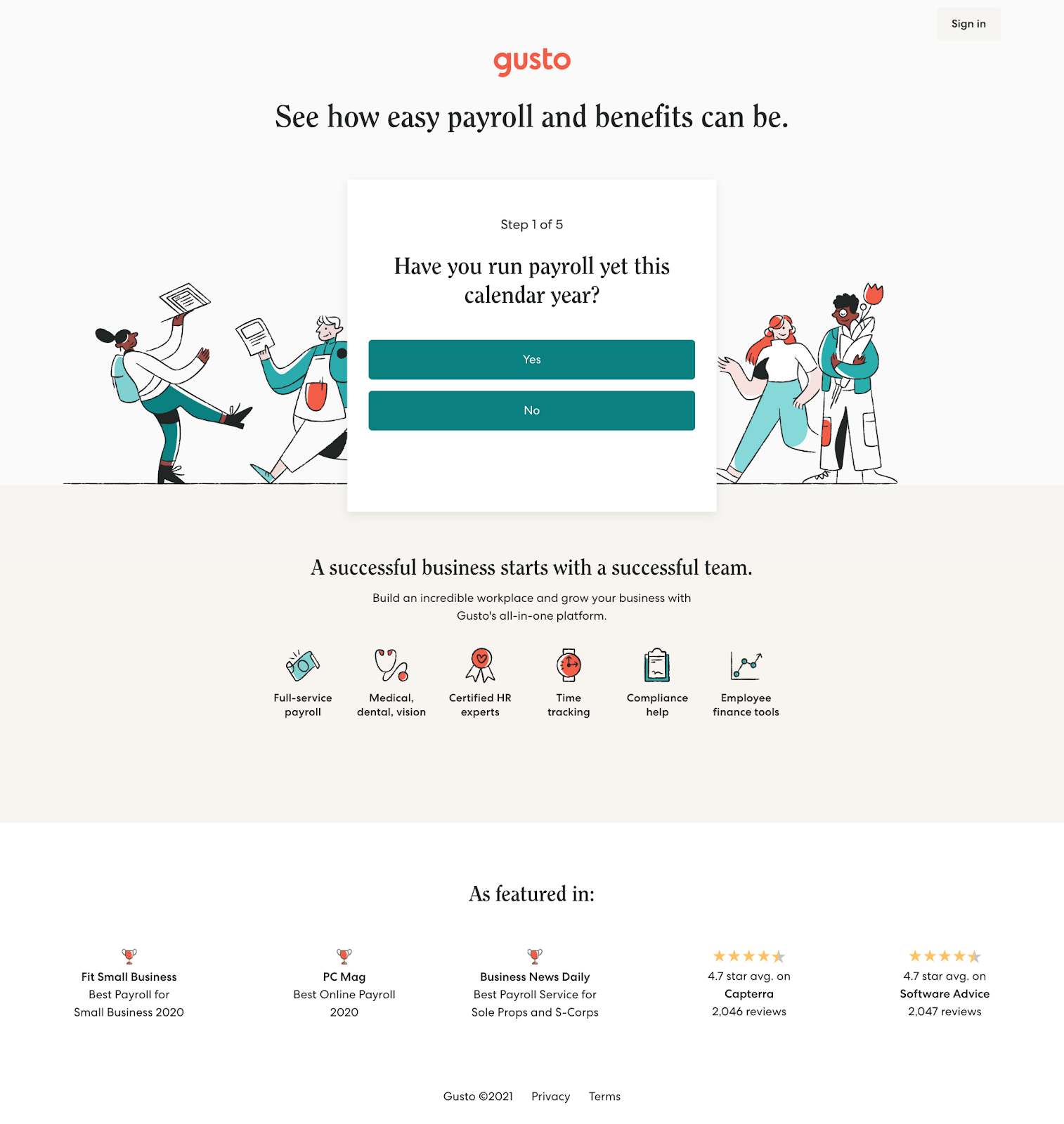
The form asks a series of non-personal questions to gather more information about your business and situation. At the end, they confirm whether it's a match or not. It's only at this point that they ask for your info.
Even though they're not providing a ton of info, they still include a short section of social proof that makes you want to keep learning more.
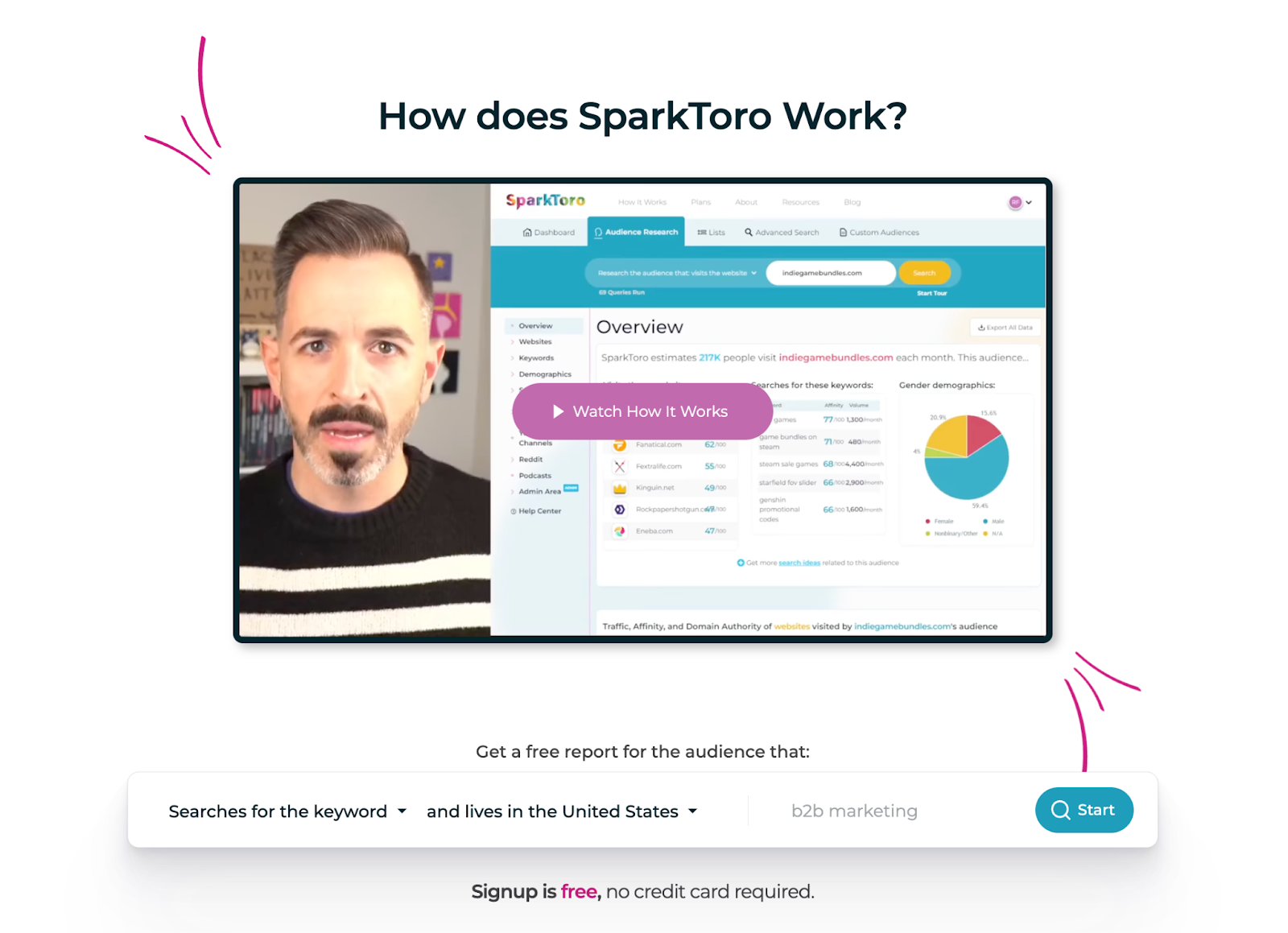
22. SparkToro’s stellar use of video
In the spirit of less is more, let's take a look at this B2B landing page example from SparkToro. It includes more information than Gusto, but still only refines the page to a few sections.
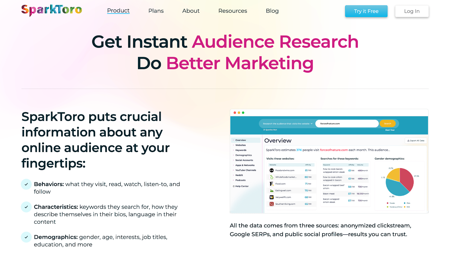
Despite the length of a 3+ minute video, SparkToro founder Rand Fishkin helps you figure out if their product is right for you.
Despite the length, Moz manages to communicate a lot about the product, mainly using a video as its hero image. This is great for helping the right potential customers opt-in and the wrong ones self-select out.
23. Vimeo’s bold landing page approach
I think you'll either love or hate this example. I've been looking at B2B landing pages for hours. When I came across this one I legitimately stopped and laughed.
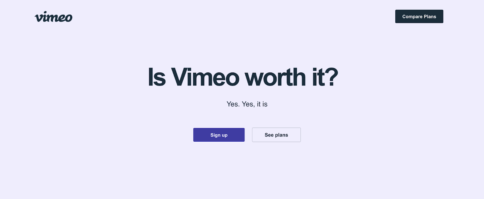
When looking up video hosting and marketing tools, there's a good chance you could stumble across this. You're in your research phase. You've heard of Vimeo and you just have a couple questions.
Vimeo answered them all. Bluntly.
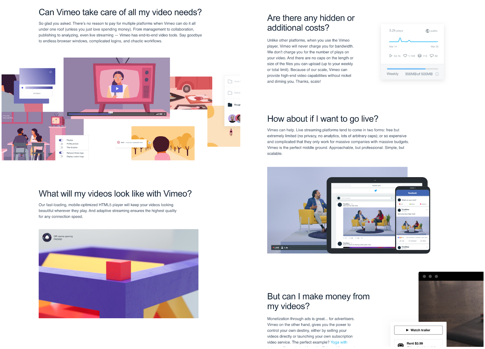
We love landing page examples like this because they help get you thinking outside the box.
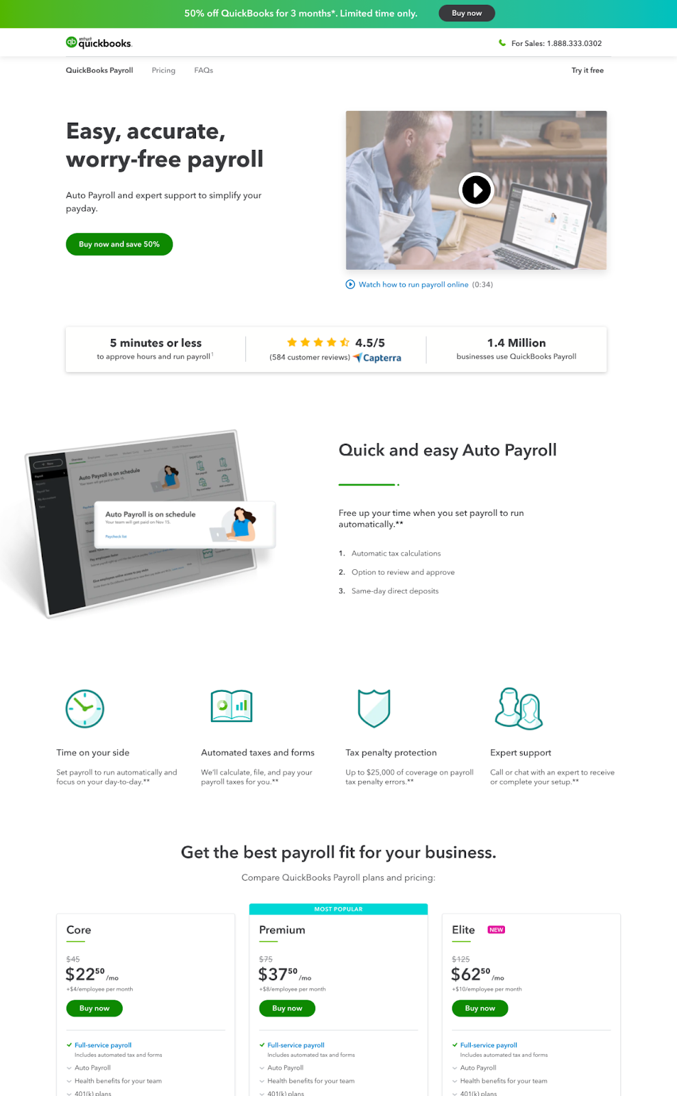
24. Quickbooks’ use of urgency
QuickBooks nailed it with a strong offer and a sense of urgency. Add in an explainer video (extra points for showing the short runtime to boost views) and a few punchy, number-driven facts, and they’re set up for conversion success.
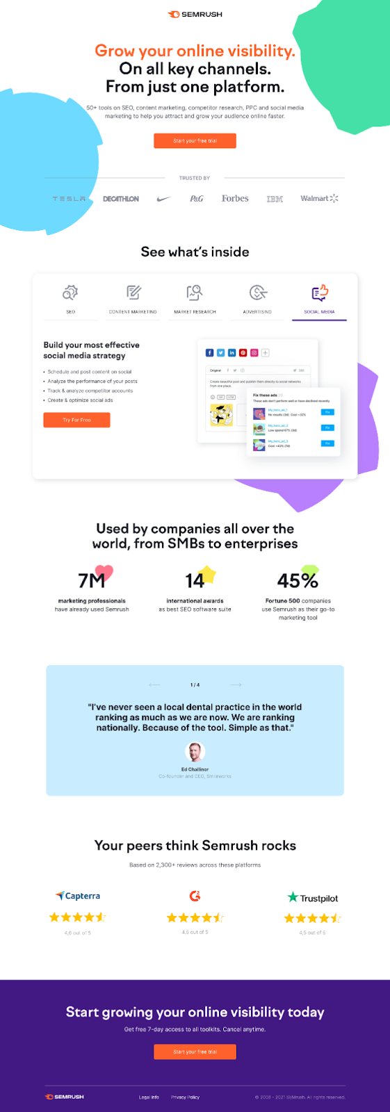
25. Semrush’s CTA dead and center
Semrush communicates what they're all about and places a centered, bright orange CTA right where the visitor will notice it.
In addition, they provide
- Three kinds of social proof
- Product features and images
And end it with a strong CTA. The “your peers” copy above the reviews section was a smart touch, too. It makes the reviews more personal.
Two thumbs up. 👍👍
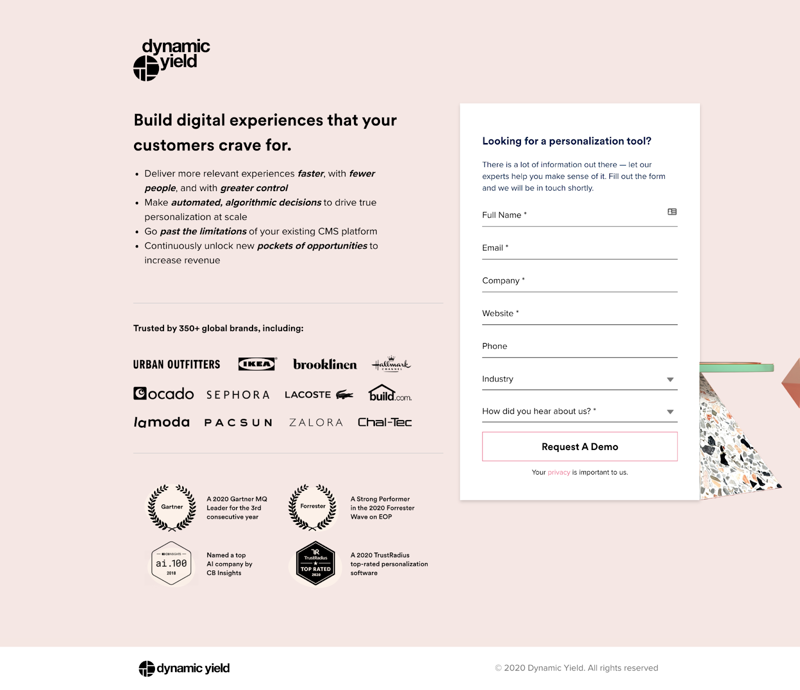
26. Dynamic Yield’s optimizes for skimmability
Dynamic Yield kept it focused. Rather than a few paragraphs of copy, they broke down the quick bulleted list of reasons to use their product. Bolding specific words allows for easy skimming.
Their social proof consists of displaying big brand logos that already use their product and noting a few awards.
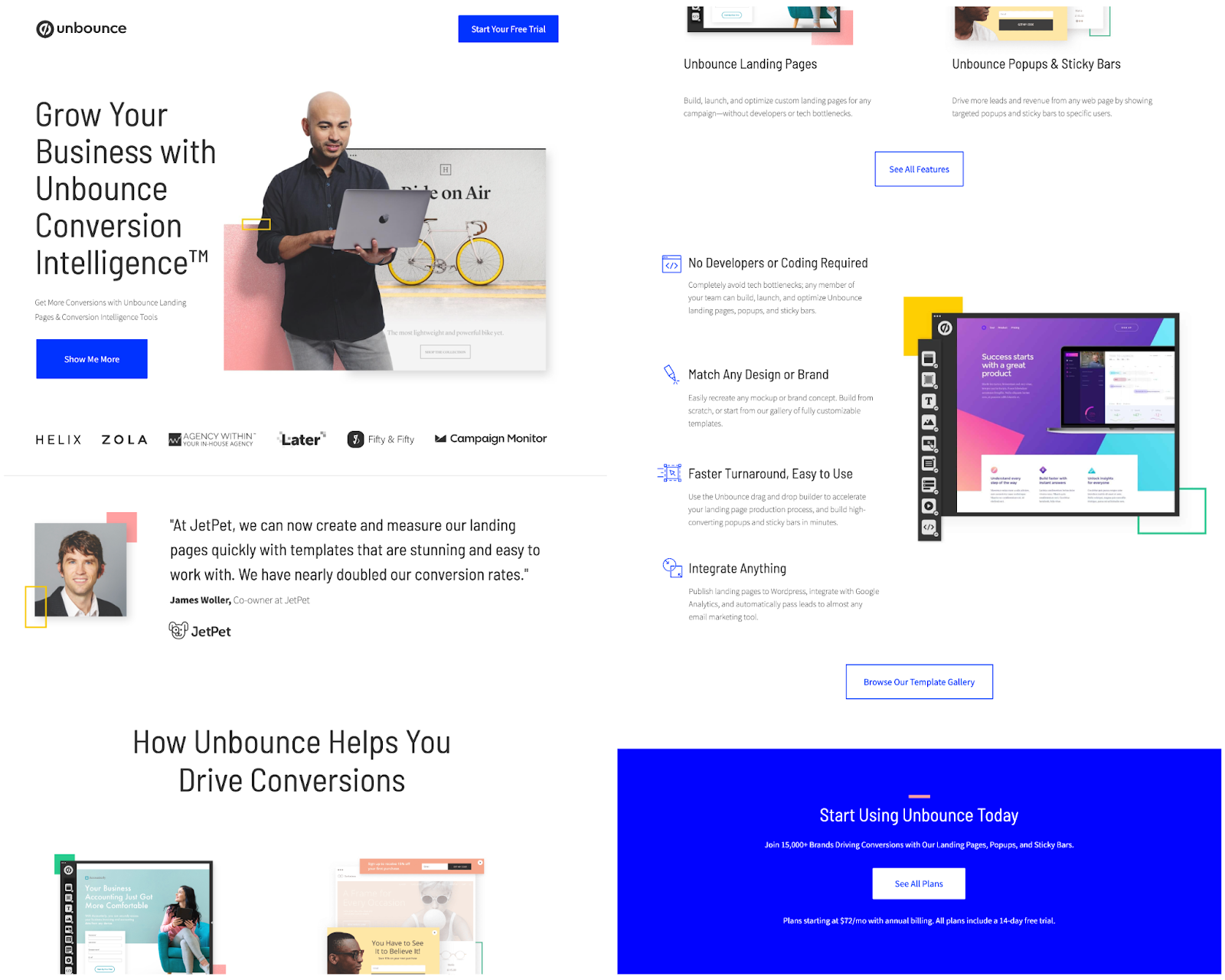
27. Unbounce
If you're looking for website or landing page design tools, you're bound to come across Unbounce. As the experts, Unbounce optimizes for conversions because they focus on the product benefits rather than focusing on features-only. Then they hit you with
- Social proof
- Information on how the tool will help with actual results
- Product-led designs to give visitors an understanding of what they can expect
Still not ready or convinced? They provide a second CTA to browse a template gallery for anyone who needs to see more.
By the time you get to the bottom, you're ready to join the 15,000 other brands that use Unbounce or at least try their free 14-day trial.
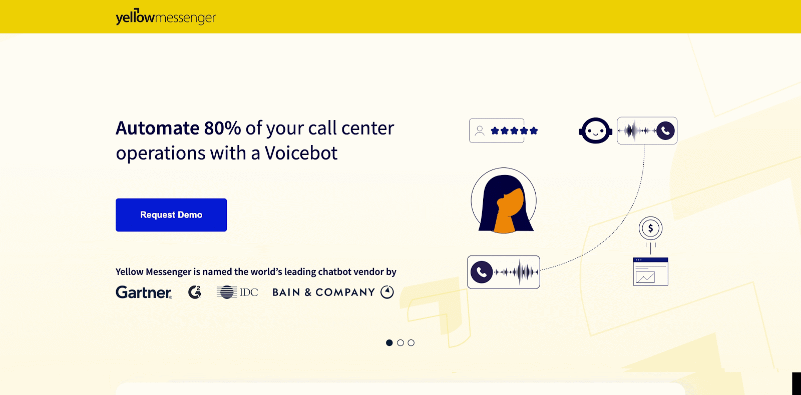
28. Yellow Messenger’s use of interactive elements
Yellow Messenger manages to stick out from the crowd.
Through good design and bright colors, they help make an unexciting service seem more fun. To be fair though, they are called “Yellow” Messenger, so they kind of had to use yellow across their branding.
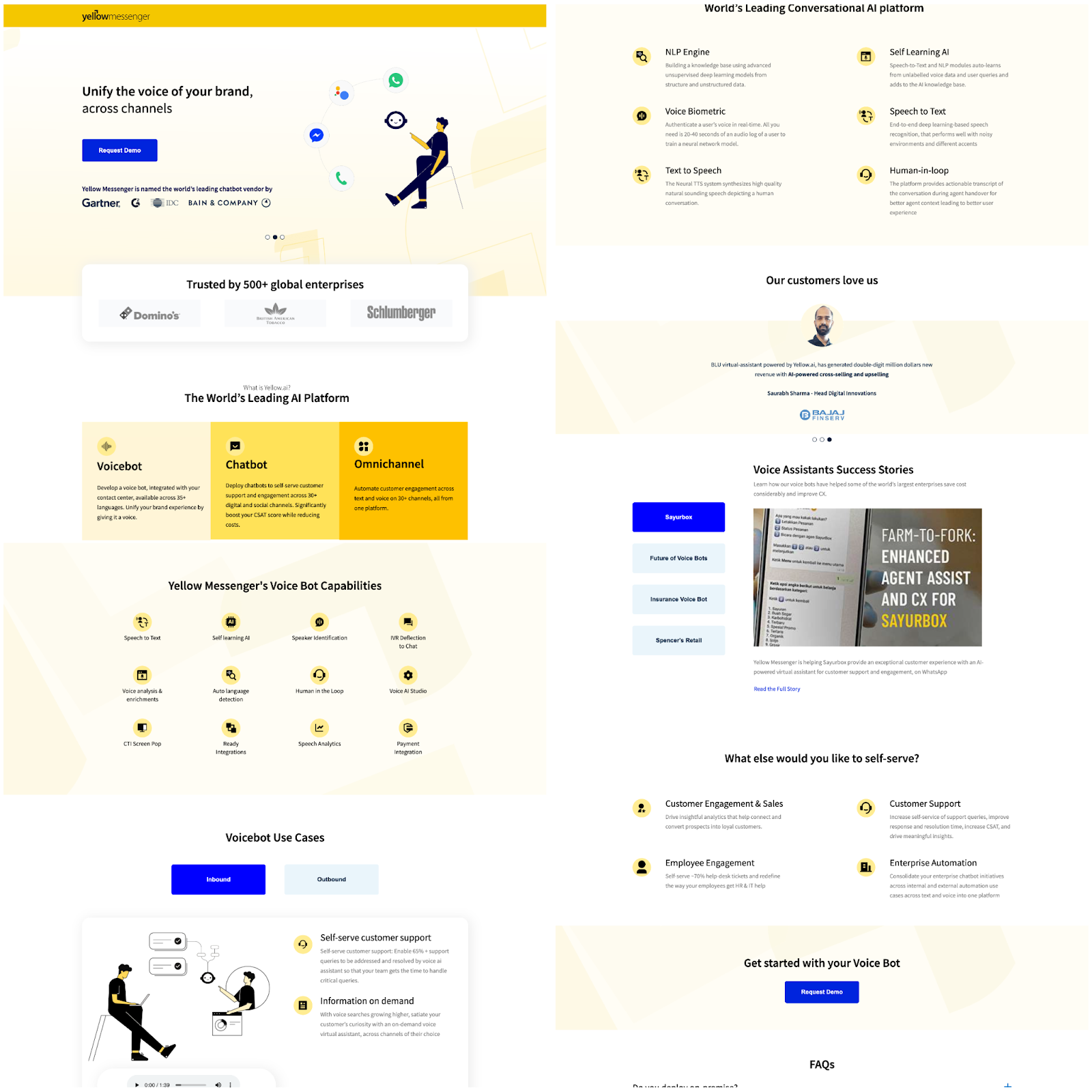
A rotating carousel upon landing makes sure that you catch their top three selling points.
Yellow Messenger's rotating carousel.
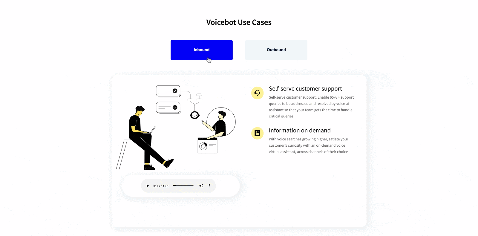
Another helpful section focuses on the two main use cases they see for their software: inbound and outbound. The ability to toggle between the two keeps visitors engaged with the page. They also embedded two audio samples into the page so visitors can easily sample the voicebot without giving away an email or leaving the page.
29. Notion’s clean and simple branding pays off
Right off the bat, visitors get a clean landing page with
- No main nav: Bye, bye distractions
- A clear CTA: Guiding visitors to the exact action they need to take
- Product-led imagery: No stock photos here.
They even embedded gifs that show off their features and outline everything the tool offers.
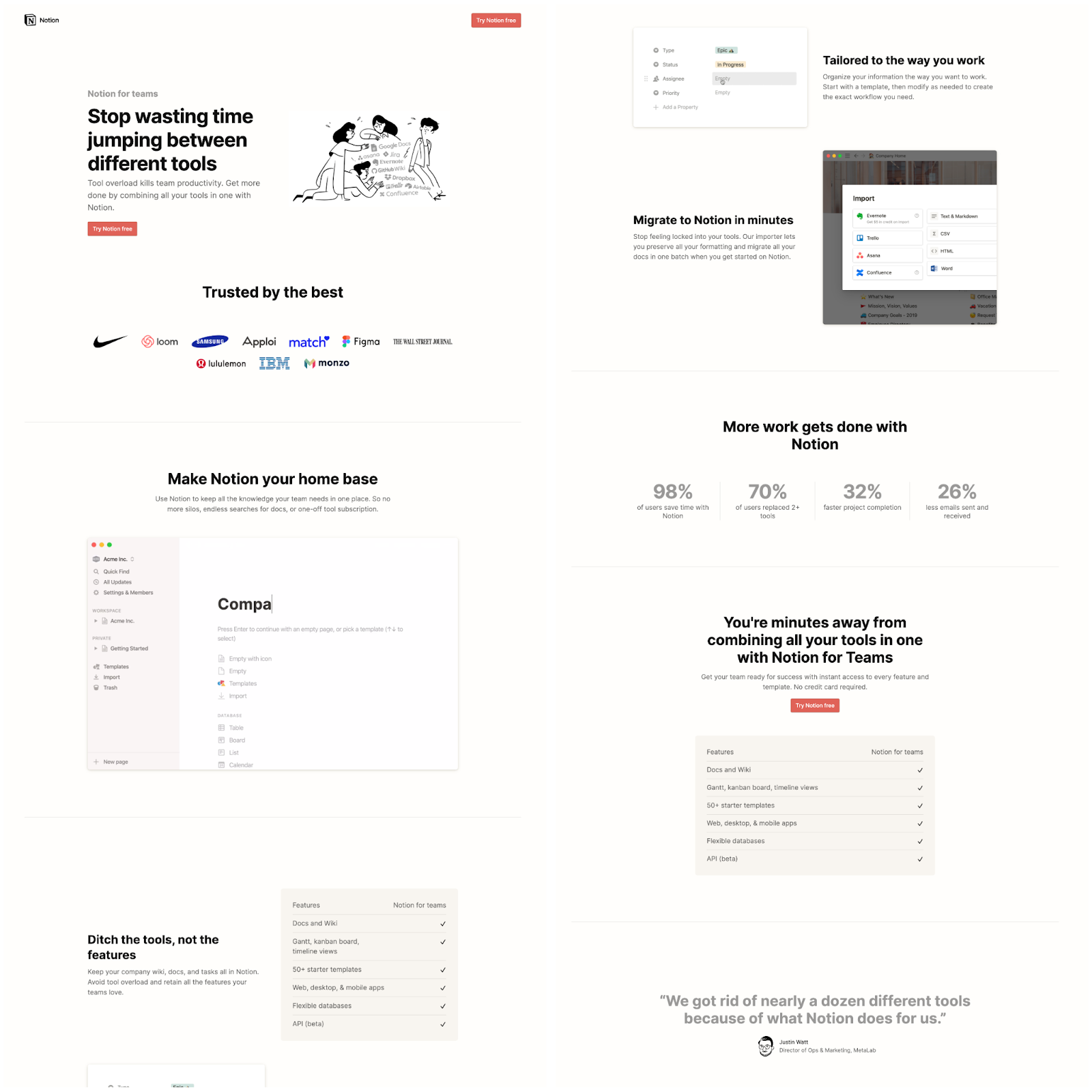
The real selling point is in the numbers.
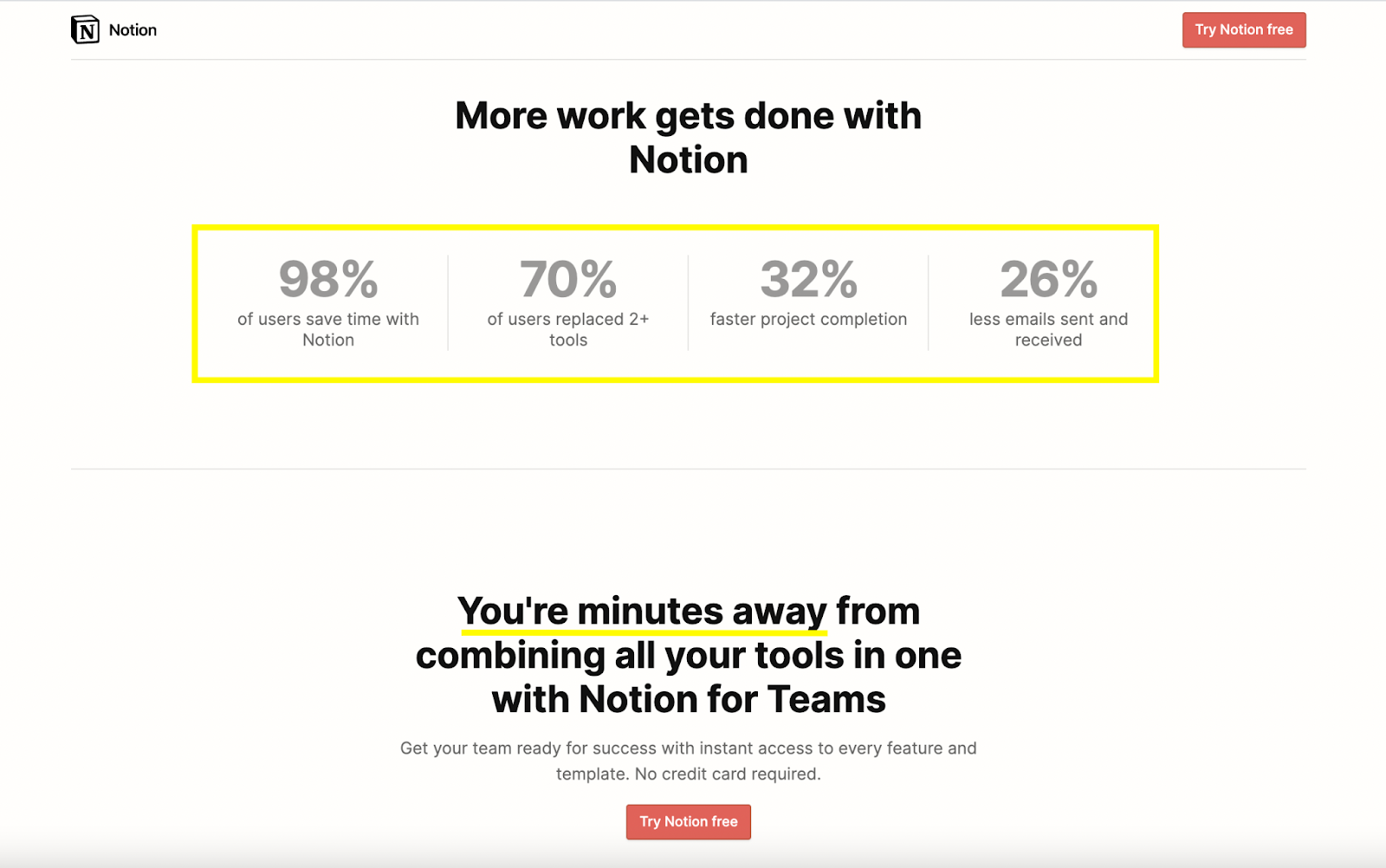
It's impressive to see exact results that their customers experience. Then they flow right into their final CTA that says you’re only minutes away from getting those results too. No waiting for a demo or scheduling a meeting, you just rock-n-roll.
B2B high converting landing pages aren’t boring
B2B doesn't have to be boring or stale. There are more and more B2B companies breaking the norm.
It doesn't matter how “boring” your company may seem. You have 29 examples of B2B businesses that are slaying the landing page game.
No matter your business' industry, size, or background, follow the best practices and you'll see conversion rates higher than you've ever seen before. Take these examples to your higher ups and let them know that the game has changed.
Challenge the mundane.
If you're not already inspired by these B2B marketing examples, check out the top performing landing pages we've created for our clients or get tips from the Conversion Rate Optimization (CRO) experts on how to get more conversions on your landing pages.


