There’s a lot to look out for if you’re new to the ad world—or even if you’ve been running Facebook ad campaigns for years.
Maybe you’re making half of these mistakes. Maybe just one or two.
But if you’re slapping your forehead repetitively as you speed through this list, take heart! That means you stand to make the biggest leap in financial gain by the end of it.
Who doesn’t love leveraging loopholes to land more legal tender?
Nobody doesn’t love leveraging that.
Here’s what we know: Facebook ads boost brand awareness and sales, but Facebook mistakes cost money.
So let’s plug those holes in your coin bucket by pointing out 30 Facebook ad mistakes you should fix right now to make bank.
Pre-starter side note: At KlientBoost, we’ve had tremendous success with Facebook’s Power5 blueprint. It’s a best practices playbook for structuring profitable ad campaigns that scale. Get a free KlientBoost marketing plan and we’ll walk you through it.
Big breath. Hold it……………………………… Okay, let’s do this.
- 1. Missing the Target
- 2. Low Audience and Offer Match
- 3. Targeting Audiences That Are Too Broad
- 4. Not Leveraging Custom Audiences
- 5. Not Excluding Past Converters
- 6. Using the Wrong Ad Type
- 7. Failing to Draw Attention
- 8. Too Much Text on the Ad Image
- 9. Headlines Without the Right Hook
- 10. Careless Copywriting
- 11. Missing a Clear Value Offer
- 12. Stuffing Ads with Too Much Text
- 13. Forgetting to Caption Video Ads
- 14. Bad Choice of Ad Placement
- 15. The 24/7 Ad Delivery
- 16. Amateur Ad Bidding
- 17. Slow Campaign Take-Off
- 18. Too Little Optimization Time
- 19. Guessing, Not Testing
- 20. A/B Testing The Wrong Elements
- 21. Testing Too Many Things at Once
- 22. Low Ad Match between Facebook Ad and Landing Page
- 23. Poor Landing Page UX
- 24. Not Tracking Conversions
- 25. Losing Sight of the Real Goal
- 26. Leaving Ads Unattended
- 27. Ignoring Ad Frequency
- 28. Not Using Auto-Optimization
- 29. Not Incorporating Video
- 30. Missing Out on the Conclusions
- 31. Not updating to SDK for iOS 14 version 8.1
- Final Words on Facebook Ad Mistakes
Get brand new Facebook ad strategies straight to your inbox every week. 23,739 people already are!
1. Missing the Target
Your Facebook ad copy is sharp, your design is bang on, and ad placement is perfect—your ad grabs! That’s awesome.
But...where the money at?
You don’t see the ROAS (return on ad spend) you expected.
It could be that people aren’t clicking your amazing ad because they don’t care about it.
What? How can that be?
Sadly, you’ve targeted the wrong audience.
The ad doesn’t get impressions because it doesn’t impress the right people.
Even tiny demographic misfires (like age) can bottom out your relevance score. Relevance score ranges from 1-10 and tracks how much engagement the ad creates (likes, comments, shares).
If your relevance score craps out, refine your targeting—because teenagers don’t want to see ads about critical illness insurance, for example. I mean, they should, but good luck with that.
Moz—a leading SEO company—made $1 million by interviewing their customers and improving their product’s relevance accordingly.
3 Tips To Avoid Targeting The Wrong Facebook Audience
1. Look closely at demographics
Go over your customer base. What are the audience demographics? Look at age, gender, location, job seniority, purchase behaviors, lifestyle, education, etc. Then, target those demographic groups on Facebook.
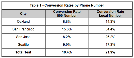
Geographic specificity in ads and on landing pages contributes to better campaign performance.
Engine Ready shows that conversion rates are often higher when businesses use local numbers instead of toll-free 800 numbers, for example.
2. Analyze interests
Use Facebook’s Audience Insights to dig for little golden demographic nuggets (what your target audience looks like, what they buy, and how they behave). This tool aggregates information people have already expressed on Facebook, along with information from trusted third-party partners.
If you know what interests them, it’s easier to create relevant ad messages and create a winning ad design.
3. Target niche interests
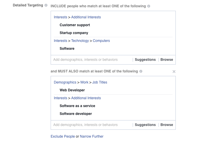
Don’t go broad. Broad interests cover hundreds of thousands of people! That’ll get expensive, real quick. Narrow your target audiences by adding layers of interest. Go for audience members who match at least one interest on each targeting level.
Facebook recommends niche audience targeting for advertisers aiming to reach a specific audience, e.g. people in a certain location or specialized interests.
2. Low Audience and Offer Match
Consider this: not everyone who sees your ad knows your brand.
Some audience members love your product and its benefits already—hooray!
Familiarity in the bag.
But there’s a better chance that ad viewers haven’t heard of you before. And that might leave them wondering, “Why do I see this ad?” Or possibly, “Why am I seeing this *expletive* ad?”
What do we suggest?
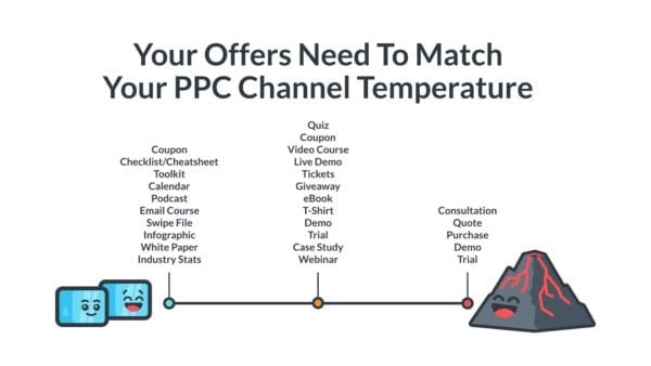
Categorize your PPC target audience into three different groups:
3 Types Of PPC Audience Traffic
Ice cubes
These are people who have never heard of you before. They haven’t visited your site or landed on one of your pages. In Facebook advertising land, ice cubes are usually the people you target with a Saved Audience.
Lukewarm audience
They know who you are but don’t know for sure what you do.
Volcano lava traffic
People who’ve bought something from you before. They’re at the bottom of your conversion funnel. They’re on the path to becoming a customer. You love these lava traffickers.
But if you want to reach each temperature level, dedicate a separate Facebook ad campaign to each one—and reach them effectively.
If your Facebook ad jumps straight to “Click Here! Buy Now!” that’s going to ding the spam alert bell. People don’t always enjoy threat-level ads.
Like, don’t tell me what to do, mang.
For example, this ad by Celebrity Cruises promotes an offer without explaining why someone should want it.
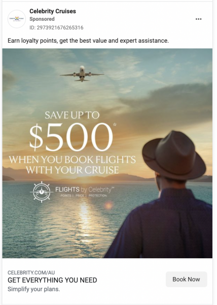
This ad would make sense if the ad viewer had purchased from the company before and knew the logistics and benefits of how flights tie in with the cruise and what the Celebrity Cruises loyalty offer is all about. But to a cold audience, this ad leaves some question marks in the air.
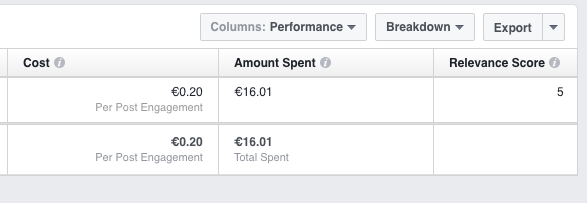
Match your ad to your audience and evaluate how you’re doing using the Relevance Score (how your audience reacts to a particular ad).
AdEspresso analyzed 104,256 Facebook ads and found that Relevance Score predicts both the cost-per-click and click-through rate.
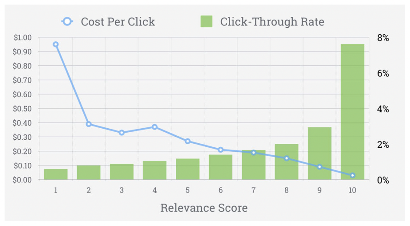
The higher your ad relevancy, the less you pay for clicks and conversions—yay!
Break down your Facebook report by Performance to see your ad relevance score (on a scale of 1-10).
3. Targeting Audiences That Are Too Broad
We’ve seen Facebook ad campaigns targeting over 20 million people in the U.S. alone. Unless you’re a household brand, your ad will struggle to be relevant to such a broad set of people. Another way of saying that is that your offer won’t reach the people with the highest purchasing potential before your budget runs out.
Take a look at this Facebook campaign:

The total potential audience size for all ad groups was over 1.1 million people. The ad reached 234,000 people—which means 850,000 people didn’t see the ad due to budget limits.
How To Tell When Your Ad Audience Is Too Broad
Start with cold hard numbers
If you’re targeting millions of people, are you sitting there in your lawn chair right now completely chuffed that millions of people are looking at your ad? Because, not to ruin your afternoon of lawn chairing, but... are there truly millions of people potentially interested in buying your product?” Do you really have the budget to reach them all?
If the answer is yes, turn up the music and double down on the lawn chair laze! But if the answer is—more likely—no, narrow that dog down using interest-based targeting.
What if the answer’s not a yes or a no? What if the answer is, “Umm, I dunno if millions of people are interested in my ad—I just hope they will be.”
There it is!
We love your honesty—you’re not the only savvy business owner who struggles with this kind of thing.
And don’t worry! You can figure out if your current audience is too broad with projected ad reach.
Facebook’s projected ad reach
Compare Facebook’s projected ad reach and total audience size to figure out if your audience is too broad. If, for example, during setup you see that a budget of $2,000 could potentially reach 250,000 people out of 2 million, you might want to consider downsizing your audience a bit.
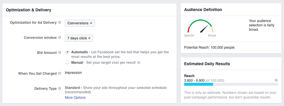
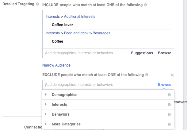
Restrict your audience by excluding people on purpose by interest, behavior, and demographics like custom age ranges and gender.
4. Not Leveraging Custom Audiences
The beloved Custom Audience. This is where the magic happens!
Creating Custom Audiences is one of the best ways to win with Facebook advertising.
Remember when we talked about PPC channel temperature and lava-hot audiences? With Facebook Custom Audiences, you’ll reach that toasty end of the audience scale.
SaaS company Scoro used Custom Audiences to score-o six times more conversions at the same ad budget.
Yep. There’s a lot of advertising potential waiting to be tapped with Custom Audiences!
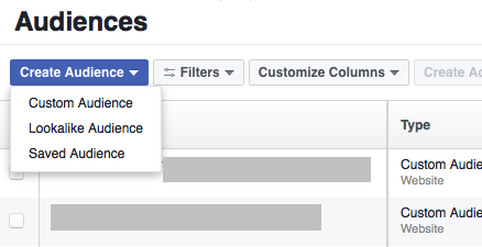
How To Get Facebook Custom Audiences Working for You—Remarket!
Create a remarketing campaign for collecting leads
Create a Facebook Lead ads campaign to collect contact information. Offer past blog readers an eBook or some other piece of high-value content in exchange for their email address. That’s a small ask aimed at people familiar with your brand (who are more willing to share their contact details with you).
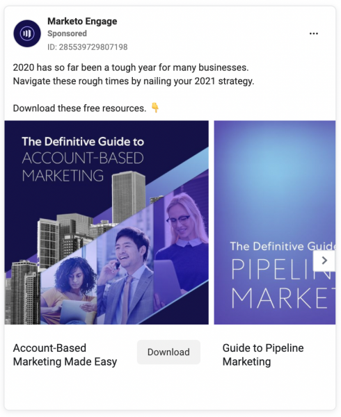
Remarket to landing page visitors
If someone lands on your landing page, that shows they are interested in a product you offer. Take a cue from that! Create landing-page-specific Facebook ads that match your audience’s interests.
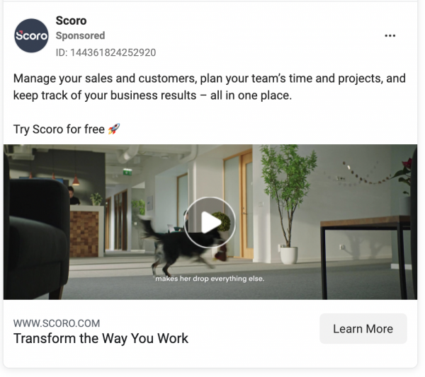
60% of U.S. online buyers notice ads for products they’ve already looked up on other sites.
Remarket to past purchasers
Set up a Custom Audience for people who have visited your thank-you page or checkout pages and retarget them to upsell!
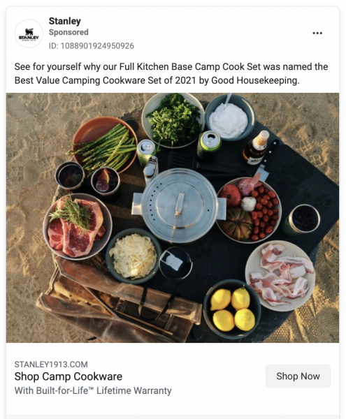
We created a complete overview of all Custom Audience types and smart Facebook remarketing tactics in our Custom Audiences guide. Check it out!
5. Not Excluding Past Converters
Did someone click on your ad? That’s awesome! It’s the best feeling when you convert a browser into a buyer. But want to know what isn’t the best feeling?
Paying for stuff twice.
Don’t forget to exclude those who convert!
Forgetting to pluck out people who’ve already clicked the ad takes away from your success for three reasons:
- You’re wasting your ad budget on people who already love you.
- Your ads are no longer relevant to those already converted.
- Ad frequency (repeatedly showing ads to those who’ve already made a purchase) is annoying for the purchaser.
- Not excluding the converted will increase ad fatigue and audience decay.
Facebook Ad Fatigue
Since the same people see the same ad over multiple days, their engagement with that ad is likely to drop, leading to higher costs for the advertiser.
The higher the frequency, the greater your Cost per Click (CPC), the lower your Click Through Rate (CTR).
What frequency starts to cause those frustrated eye twitches? Somewhere around five times.
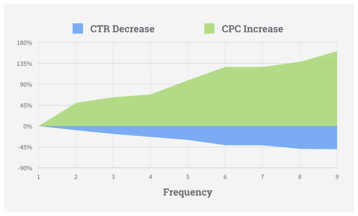
Facebook Audience Decay
You’ve found your peeps; they like your stuff, and they buy from you. This is the way the world is supposed to spin. But all good things take work, and some good things don’t last.
Targeting the same people continuously over time is like handing a kid a lollipop every time you see said kid.
Eventually, that kid’s going to puke and turn down your sugar ball on a stick.
Don’t take it too hard. That’s why saddles come with straps. Accept that interest is a fickle flower and anticipate that your message will wane over the long haul.

Look out for high ad frequency!
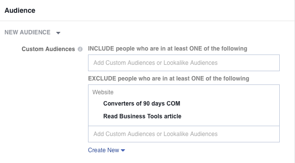
Exclude past converters from your Facebook audience like this:
- Create new Custom Audiences of people who have visited specific web pages (e.g. your thank you page).
- Next, use the EXCLUDE feature in your ad campaign to stop targeting past purchasers and people who landed on a specific landing page.
Whoo! First five in the bag.
6. Using the Wrong Ad Type
Facebook has different ad types, making it easy for advertisers to test out what works for their market.
Newsfeed Ads are one of the easiest ad types to create, but you might have more success with Video Ads, Lead Ads, or Stories Ads.
Have fun with it!
Run different ads at different times to minimize over-exposure (campaign fatigue). See what ad type makes your audience the click-happiest.
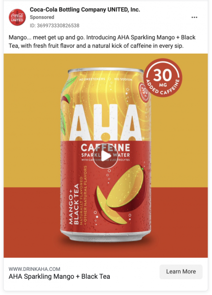
Newsfeed Ad
Newsfeed ads are usually the first choice of Facebook ad beginners because they’re simple to create and set up.
Right Column Ad
This is a basic Facebook ad with a headline, description, and single image. You can see these ads on your Desktop news feed.
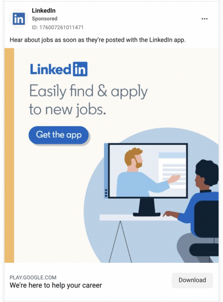
Lead Ads
Facebook Lead Ads are opt-in ads for things like eBooks, newsletters, quotes, and offers. These ads have a “Download” call-to-action button.
Carousel ads
Also known as Multi-Product Ads, this ad type slides through up to ten images (and links) in a single ad.
Dynamic Product Ads (DPA)
These product ads are remarketing ads that target users based on their past actions on your site… dynamically.
What does that mean?
It means that you provide a few images and a few different copy samples, and Facebook automatically combines them into different ads based on the audience.
Page Like Ads
This Facebook ad type’s goal is singular and simple: get more likes on your brand’s Facebook Page.
Why is this important?
More likes mean more loyalty. Loyalty is great for building authority. Authority builds confidence. Confidence builds trust. Trust gets you one step closer to conversions.
And the wheels on the bus go wound and wound. Money.
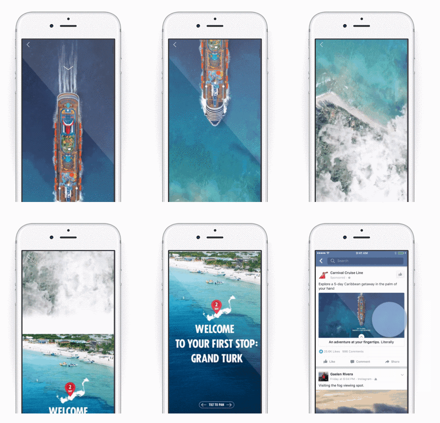
Canvas Ads
Mobile-optimized and animated ads tell your brand’s story.
Video Ads
Facebook video ads grab attention (to the tune of 8 billion views each day). Grabbing attention is qualitative—you can measure ad effectiveness.
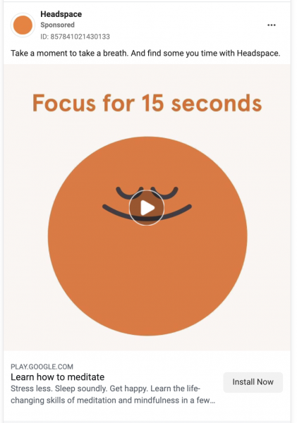
Some video ad tips
- keep videos short (20 seconds or less)
- Map out your video style, script, music, and captions (the same way you map out tone, headers, subheaders, and images before you write a blog article)
- Highlight the unique, stand-out, this-is-how-we’re-different features (look at competitor video ads to figure out your *sparkle*!)
- Make the intro shot compelling so the play button gets clicked (a picture is worth a thousand words)
- optimize for mute viewing
- end with a CTA
- Make two versions to A/B split test
Video ads range from basic GIFs to slideshows to full productions. Which one you use will depend on your brand, your industry, and your budget. But try to use at least one video type because research shows that combining motion (sights + sound) creates feel-good vibes.
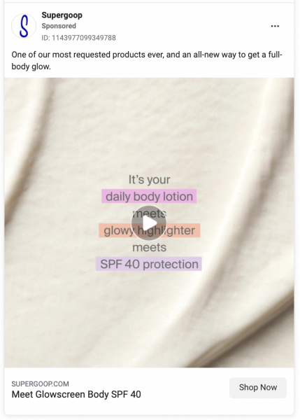
GIF Ads
GIF ads play the same way as all video ads. But they don’t require the same investment as production video ads. Simply upload a .gif file when you create a video ad in Ads Manager.
Don’t know how to make one?
Use Giphy’s GIF Maker. Easy! Also, keep in mind that subtle motion is best. Click here for more GIF ad tips.
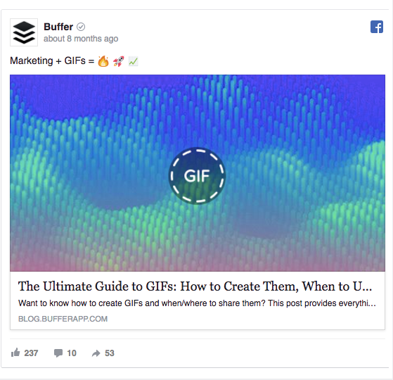
Event Ads
Guess what event ads promote?
Planning an event is a great way to interact with customers. Promoting the event on Facebook gets “foot traffic” (virtual or not) to your business. Try out a virtual coffee session or fundraise for your community. Whatever your event, promote it and boost attendance. Because 35 million people view a public event on Facebook every day.
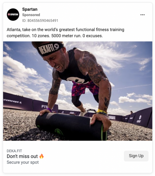
Mobile App Install Ads
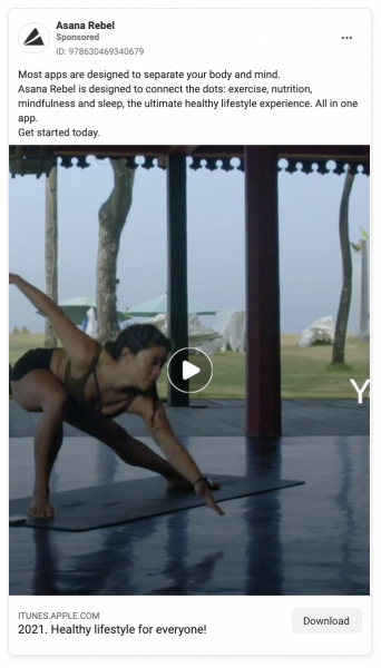
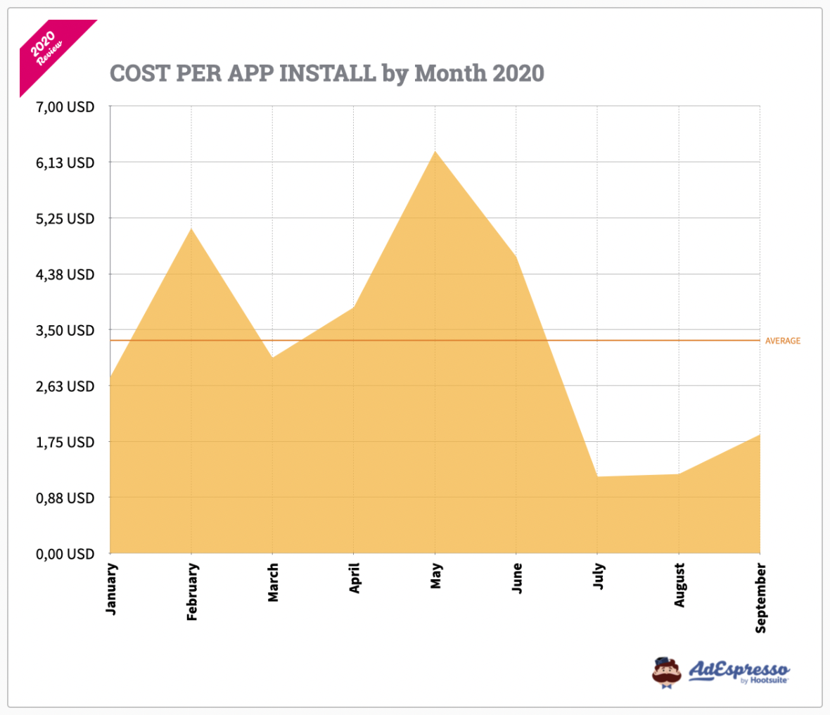
This ad type promotes your spiffy new app and puts a button right on the ad so people install it on their phones.
Polling Ads
Yay! Polling Ads.
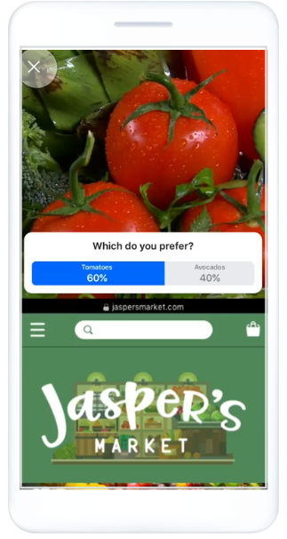
Ask a question and take a poll of the favorite answer—fun!
These ads are interactive and provide a positive experience that engages. Engagement increases conversions. Double yay!
Use Poll Ads to:
- see what products will gain the biggest applause
- test existing product favorites (to align your offer with your market’s wants/pain points)
- create a dialogue with your audience by attaching their opinionated answers to your personable questions—people want to be included in your next big idea
7. Failing to Draw Attention
Our attention spans aren’t great.
Grandma and grandpa could sit for hours next to dim candlelight reading poetic tomes typeset in minuscule cursive with a quarter-inch line-height and ne’ery a padded margin to be found—for hundreds of pages.
But us?
We swipe through Facebook ads while sitting on the toilet at a rate of about 2 per second until an image (still or motion) stops that scroll long enough to skim the headline. If that ad doesn’t pull a click before the poop plops, we’re back to speed swiping as we leave the bathroom, torquing our pants back to center with our free hand.
The attention 👏 grabbing 👏 threshold 👏 is 👏 high 👏.
Even if you’re targeting a niche Custom Audience and have a brilliant ad message that’s super relevant to this audience, there’s a pretty good chance they won’t read your ad copy.
Advertising legend David Ogilvy commissioned a deep dive into imagery. He discovered that first, people look at the image. Then, they scan the headline.
If your ad image and headline fail to catch attention in the Facebook newsfeed, it will be passed by.
Queue mournful violins.
Why doesn’t your ad grab attention?
It might be guilty of one of these mistakes:
- The featured photo looks like amateur photography or stock
- The ad doesn’t use bright colors, which might reduce viewability
- Ad image contains confusing elements and doesn’t match the offer
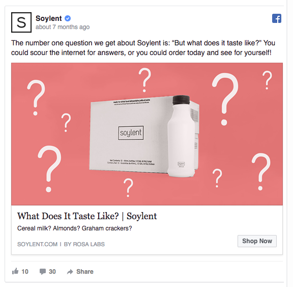
If you compare these two ads by 17hats and GetResponse, which one gets your attention first?
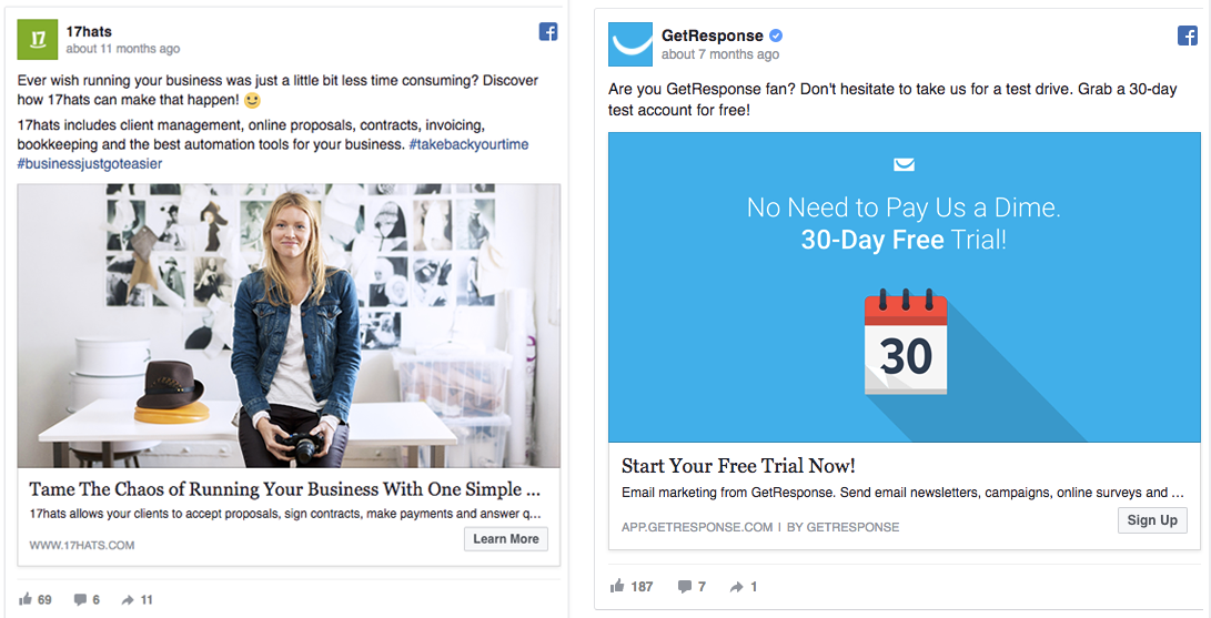
The smiling face? Or the color?
People make up their minds within 90 seconds of their first interaction with a person or a product. About 62‐90% base their assessment on colors alone. But smiling faces evoke positive feelings. Either ad could work!
Creating colorful ad images or incorporating happy people might increase the percentage of people who notice your ad, read it, and click through.
The takeaway: focus on the design because images account for 75%-90% of ad performance.
Tip: Make sure that your Facebook ad design is at least 1200 x 628 pixels wide (the standard) and that the colors look good on every screen.
For more Facebook ad design inspiration, see our lineup of 32 awe-inspiring Facebook ad examples.
8. Too Much Text on the Ad Image
Once upon a Facebook time, there was a rule about the amount of words you could put on an ad image. That amount was 20%. If 80% of the image didn’t show, Facebook could refuse to distribute your ad.
But as of September 2020, that rule went away. Facebook isn’t as strict about text rules these days, but Facebook still advises not to overdo the amount of ad copy for the sake of conversions.
Instead of getting a “Yes” or “No” from Facebook, your ad’s text density will fit into one of the four classifications:
- Ok
- Low
- Medium
- High
You can test your ad’s classification by using Facebook’s Text Overlay Tool.
We ran a test with this ad by Unbounce.
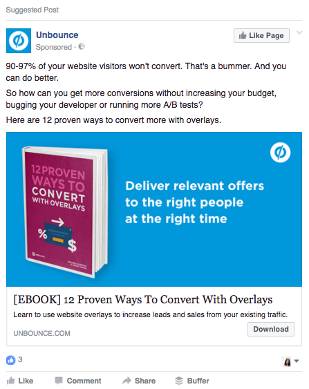
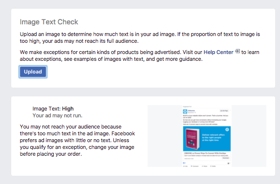
Facebook told us that the ad’s image concentration is high, explaining:
You may not reach your audience because there’s too much text in the ad image. Facebook prefers ad images with little or no text.
Unless you qualify for an exception, change your image before placing your order.
High text density on your ad images doesn’t mean that Facebook won’t deliver it anymore. But it does mean your ad will show to fewer audience members.
The good thing is that Facebook notifies advertisers by email, guiding their attention to text-heavy ads.
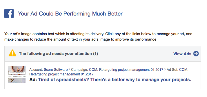
Final verdict: The penalty was removed, but the new permission is burdened by risk that messes with your ad results.
So keep text density low or use no text on the ad image at all to up your chances of a high ROAS.
9. Headlines Without the Right Hook
There’s a ton of power in your headline.
According to a study by computer scientists at Columbia University and the French National Institute, 59% of people don’t read more than the headline of a Facebook post before sharing or liking it.
If you also consider that, on average, we’re bombarded with 5,000 ads and/or branded messages per day, it’s no big surprise we’ve grown immune to ads.
If your Facebook ad headline fails to catch attention, you’ll lose 80% of your ad viewers.
Your headline had better be a high-hitting homer that makes hay (hallelujah).
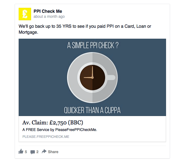
In this ad by PPI Check Me, the headline reads “Ac. Claim: £2,750 (BBC)”. The lack of context may confuse the reader (it certainly confused me) or fail to provide enough information to warrant engagement.
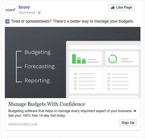
In contrast, this example from Scoro has a clear and actionable headline that explains the benefit of the product.
How To Write Better Headlines For Your Facebook Ads
Keep your ad headlines short and clear
Jeff Bullas measured the engagement rate of Facebook posts and discovered that the ultra-short 40-character posts received 86% higher engagement than others.
Use numbers in headlines
A study by Conductor showed that starting your headline with a number makes your ad 36% more likely to get a click.
Want more Facebook tips like this? We dedicate an entire post listing 50 of them.
10. Careless Copywriting
Facebook doesn’t like a lot of copy, but it allows custom copy for every part of your ads. Awesome!
But also not awesome.
That flexibility creates creative pressure! One wrong line of text could potentially extinguish the spark of interest in your readers.
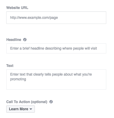
If you’re a rookie, focus on crafting to-the-point, sharp, minimal ad copy. To analyze whether your campaigns underperform because of poor word choice (or some other missing ad element), set up a split test. Experiment with multiple ad copies.
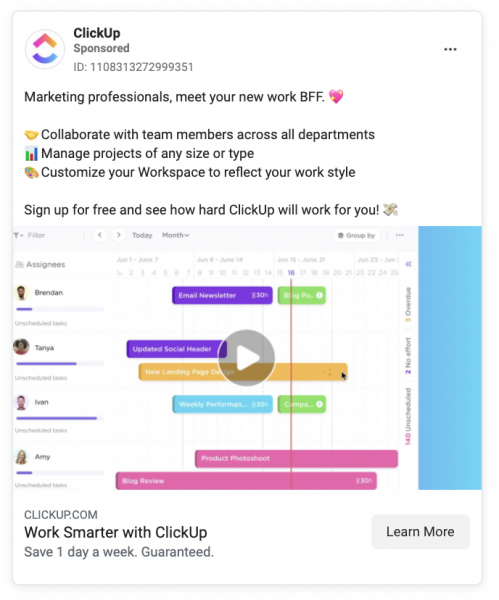
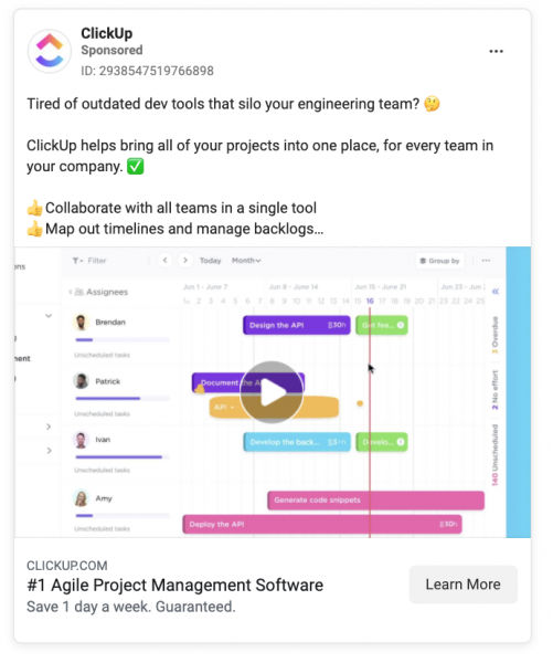
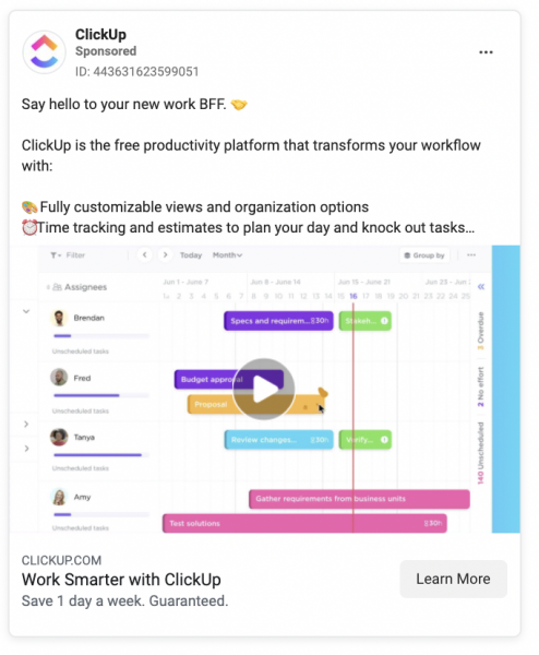
For example, ClickUp tried different text versions but kept the same ad design:
How to Write Compelling Facebook Ad Copy
Facebook ad copywriting starts by defining your goal.
As Joanna Wiebe from Copy Hackers explained:
“One of the most important principles to keep in mind when writing your Facebook ad body copy is this: give your body copy a single goal, and stick to it.”
Think about the goal of your ad campaign
Is your goal to
- get people to buy something from you?
- collect new leads?
- create more brand awareness?
Each sentence of your ad copy should support the goal, nudging the reader toward the right action.
Copywriting tips:
- Find the right tone of voice
- Stick to what’s important
- Write with the customer in mind
- Find the balance between the message and time
- Include testimonials
An article by Econsultancy pointed out that when a website has customer reviews, 63% of visitors are more likely to buy something (because there is a trust factor).
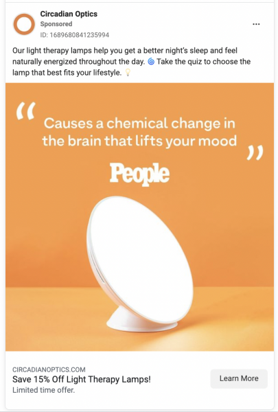
When writing Facebook ad copy, avoid sounding vague and cryptic as people might not understand your point. Focus on clear, trustworthy, and informative text.
11. Missing a Clear Value Offer
What is the value you offer?
What makes your product or service unique in a positive way so that people would choose your thing over all the other similar options out there? Speak directly to the customer when you explain that.
As Peep Laja from ConversionXL put it:
“Value proposition is something real humans are supposed to understand. It’s for people to read.“
Your unique value proposition (UVP) is your elevator pitch (how you describe your company’s purpose in 10 seconds or less). In as few words as possible, clearly define why your product is different from the competition and why that difference benefits customers.
If your ad’s goal is to get the viewer to take action, the value offer explains why they should take it.
Here’s a Facebook ad by Freshdesk with a value offer that could be improved. The ad copy is okay (not bad, not perfect), but it fails to differentiate the product from the competition or explain the final benefit of using the product.
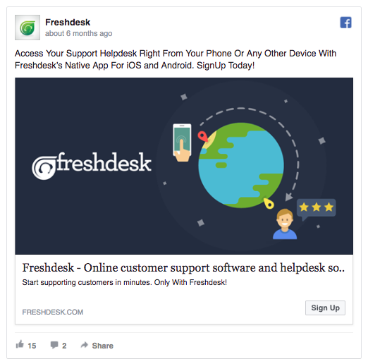
How would accessing the helpdesk from my phone help my company in the long term? If I’m not clear on that, I likely won’t sign up.
5 Tips For Defining Your Unique Value Proposition
- Use the customer’s language—this isn’t an essay; it’s a short conversation.
- Be clear: This is what the product is, this is why it’s better than the competition, and this is how it will work for you now and in the future to create this result.
- Actually be different. If you don’t have a differentiator, work on that. Not being different throws you into the sea of sameness where your competitors swim with life jackets half-zipped. Sameness is boringness. Why would anyone choose you if you look like everybody else and sound like everybody else? Make your offer a shiny yacht that floats above that sea. With twin engines. And bow thrusters.
- Avoid hype (don’t say stuff like “never-before-seen amazing miracle product”).
- Keep it short. On a landing page, aim for one line. For an ad, make it understandable in under 5 seconds.
Follow these five tips to nail a value offer that your audience will respond to.
Place your UVP in the headline or on the image of your ad, where it’s most visible to viewers. That’s a good way to deliver your most important ad message at first sight of your ad.
This LinkedIn ad breaks out the value proposition:
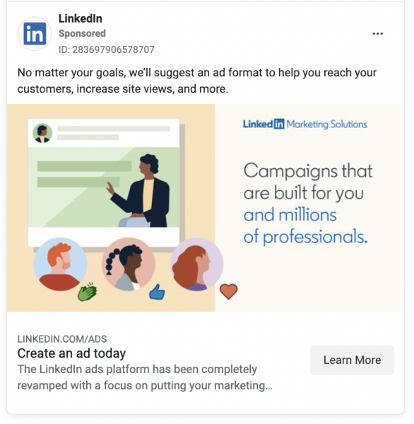
What it’s about: creating a LinkedIn ad—“Create an ad today.”
Why that’s a benefit: “Campaigns built for you.” LinkedIn handles the ad formatting—no matter what your ad goals are—automatically, so you don’t have to put in a ton of work.
Differentiator: It’s brand new (it’s been revamped), and you’ll get increased views and better reach because millions of professionals using the platform will see your ad.
12. Stuffing Ads with Too Much Text
Less is more when it comes to Facebook ads—or any marketing copywriting for that matter (like landing pages).
“The more visual inputs and action options your visitors have to process, the less likely they are to make a conversion decision.”—Peep Laja from ConversionXL.
The same rule applies to Facebook ads. Limit distractions in your ad copy and make it easier for more people to convert.
When analyzing the perfect length of Facebook posts, Sprout Social found that brief Facebook posts saw the highest engagement.
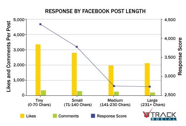
BlitzLocal analyzed 11,000 Facebook pages and found that engagement increased as posts got shorter.
On average:
- mobile posts are 104.9 characters
- user posts are 121.5 characters
- page posts are 157.7 characters
Posts between 140 and 159 characters long are, on average, 13.3% less engaging than posts between 120 and 139 characters.
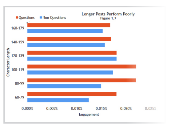
Why do shorter Facebook posts work better?
A clear, concise message registers with your reader at-skim.
That’s why.
Think of it as a drive-by opportunity.
Facebook ads are like billboards. People see them not from their cars at 60 mph but from their thumbs and eyeballs at two screens per second.
Your goal is to get your message across fast and not ask much from the reader as you do that. The more concise the ad, the better.
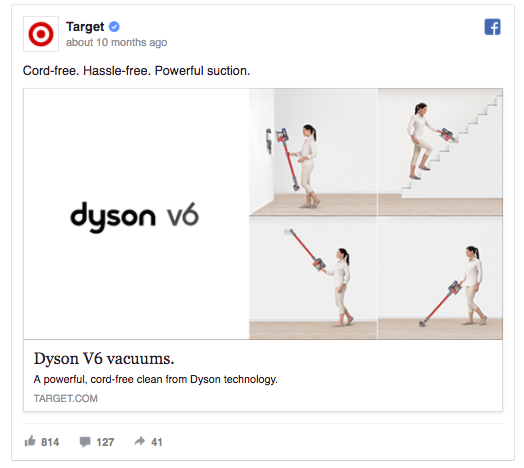
This Facebook ad by Target uses minimal imagery and scarce copy. It doesn’t ask the viewer to read more than the product name and three short benefits: powerful suction, cord-free, hassle-free.
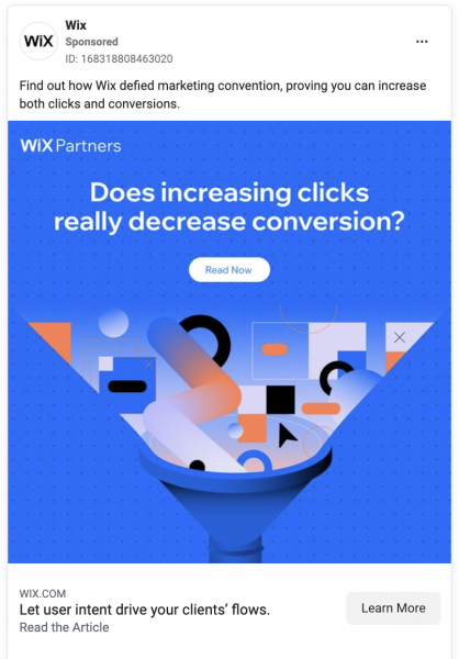
If your campaign promotes a blog article, adding more introductory copy makes sense. In this example from Wix, 1.5 lines of copy catch the reader’s attention and spark curiosity so that they want to read more.
13. Forgetting to Caption Video Ads
Don’t forget this single important fact: all the videos in the newsfeed are soundless by default.
According to Facebook, captioned video ads increase video view time by an average of 12%. In another study of Facebook video ads, 41% of videos were meaningless without sound.
“In mobile-feed environments, people prefer having the choice to opt in to sound. When feed-based mobile video ads play loudly when people aren’t expecting it, 80% react negatively, both toward the platform and the advertiser.”
Facebook tips:
- Showcase your brand — early and often
- Design for sound-off, but delight with sound-on
- Get out of your comfort zone—experiment
If you forget to caption your video ads, chances are people won’t click on the “Play” button and watch the entire thing. That’s because they won’t be able to see what your ad is about, only a video without sound or text.
Avoid these video ad mistakes
Social Media Examiner says these things contribute to low video engagement:
- Including an intro
- Using logos or credits at the beginning of the Newsfeeds video
- Trying to tell too much in a single video
- Having a person talking to the camera without sufficient context
Making a video can take multiple hours (or days), so think these through before getting to work.
14. Bad Choice of Ad Placement
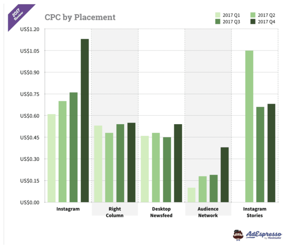
In a Facebook experiment, marketers at Scoro discovered that Desktop ads had a 534% higher cost-per-click than ads placed on Mobile + Audience Network.
They also discovered, however, that Desktop ads performed a lot better in terms of conversions.
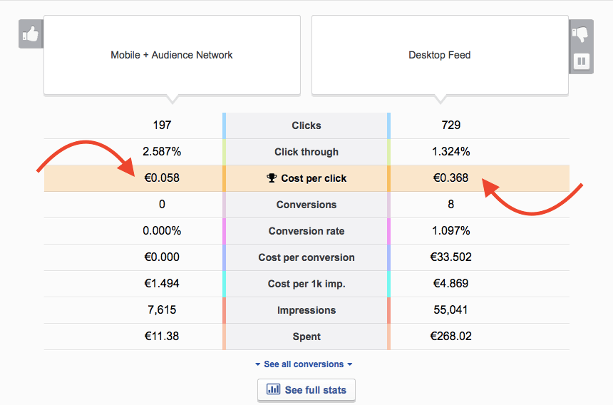
Since you’re trying to make money by saving money, be smart about where you place your ads.
Facebook’s Ad Placements Include:
- Newsfeeds (mobile and desktop)
- Facebook right-hand column
- Facebook Messenger
- Instagram stories
- Audience Network
- Instant Articles
How do you make an ad placement mistake?
Four words: Offer and placement mismatch.
Say you create a free trial for your business software. Instagram ads might not be the best option. People aren’t usually in the mood to deal with business while browsing images posted by their friends.
The best way to find out which ad placements result in the highest return on investment is to test multiple ad placements and analyze the results.
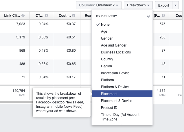
In Facebook Ads Manager, break down Facebook Ads Reports by ad placement and see which ones had the lowest cost-per-click and a high conversion rate.
Not sure where to start?
Facebook suggests starting with these ad placements:
- Brand awareness: Facebook and Instagram
- Engagement: Facebook and Instagram
- Video views: Facebook, Instagram, and Audience Network
- App installs: Facebook, Instagram, and Audience Network
- Traffic for website clicks and app engagement: Facebook and Audience Network
- Product catalog sales: Facebook and Audience Network
- Conversions: Facebook and Audience Network
15. The 24/7 Ad Delivery
Chances are, your Facebook offer isn’t relevant to your target audience 24/7 ‘round the clock. That’s because people tend to sleep to stay alive.
Why you shouldn’t run non-stop ads:
- People will tire of seeing your ad.
- You’re spending your budget on low-traffic hours with fewer conversions.
Avoid Facebook ad fatigue and keep your ad frequency under control with a custom schedule. Schedule ads for specific times of the day or week for tighter control over your ad spend.
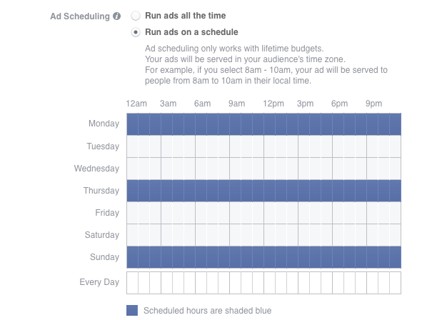
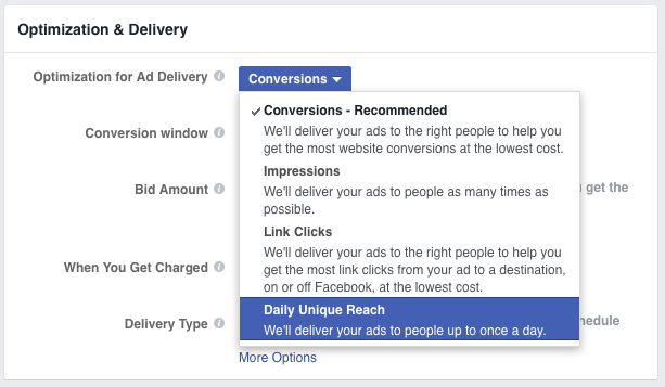
If you’re worried about Facebook delivering your ads to the same person too many times per day, you can use frequency capping a la Facebook’s Daily Unique Reach option.
16. Amateur Ad Bidding
Facebook operates on an auction-type bidding system, just like Google Ads.
Today, PPC bidding is almost scientific. Applying the right components could give your ad campaigns a real boost.
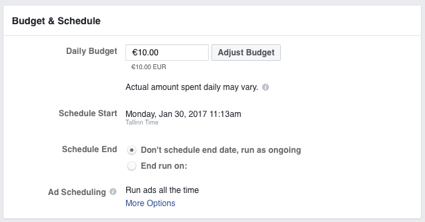
To customize and view your bidding options in Facebook’s Ads Manager, go to the “Budget and Schedule” section.
4 Different Bidding Options In Facebook Ads
Conversions:
Facebook will deliver your ads to people who are most likely (algorithmically) to convert. This bidding method is an excellent place to start as Facebook will optimize the ads for you.
Link Clicks
Facebook focuses on getting users to click on your ad to follow the link. If your goal is to get users to your landing page or to view an on-Facebook page, this could be a good option.
Impressions
Facebook optimizes your ads to be seen by as many people as possible. This is a good option for businesses looking to build brand awareness or sharing highly engaging content (e.g. blog articles).
Daily Unique Reach
Facebook optimizes your ads to show up once a day. This method is great for retargeting, ensuring that people will see your ads only once every day, (hopefully) preventing ad fatigue.
Three factors contribute to your ad cost:
- your bid
- ad relevance
- estimated action rates calculated by Facebook’s algorithm.
There is no 100% right or wrong bidding method for any ad type. Trial and error reveal the best ad bidding methods.
17. Slow Campaign Take-Off
There are a few reasons why your Facebook campaign might behave like an old horse tied in the stable:
- Too many ad groups of A/B test variations with low budgets
- The ad image doesn’t grab attention
- Your ad has low relevance—bad audience targeting
- Using the wrong bidding options
- Making rapid changes (impatience and reacting too soon)

So, what’s the cure?
Scoro’s digital marketing manager (and occasional KlientBoost guest blogger) Karola Karlson provided a formula on AdEspresso called Fast Take-Off (FTO) to get your campaigns back on their feet.
How The FTO Method Works
Assign Lifetime budgets that cross your planned budget. When starting a new campaign, you’ll need about 10,000 impressions to evaluate which ads work and which don’t.
If you want Facebook to use more resources at the beginning of the campaign, for example, use a $2,000 budget instead of the planned $400 to get things rolling.
According to Karola, here’s why it might just work:
“Facebook rarely uses the total daily budget. Unless your ads are super relevant to your target audience, Facebook shows the ads less often than you’d like. To serve your ads to more people at the beginning of the campaign, increase your initial budget and expand the audience size for a week.”
18. Too Little Optimization Time
Facebook needs at least 24 hours to optimize your campaign. You’re better off waiting for about 48 hours before you make changes.
A rookie Facebook ad mistake is hoping for instant gratification. Don’t expect your new Facebook campaign to deliver outstanding results in the first few hours or minutes.
After holding your breath for two or three hours and not getting results, it might feel like your campaign is a failure. According to Facebook:
“When we start delivering your ad set, whether at the start of a campaign or after you edit it, we don’t have all the data necessary to deliver it as stably as possible. To get that data, we have to show ads to different types of people to learn who is most likely to get you optimization events. This process is called the ‘learning phase.’“
Every time you make substantial changes to your campaigns, wait at least 24-48 hours before drawing any conclusions.
Take a look at a campaign results graph below. The campaign went live on February 12, and it took Facebook almost 48 hours to gather data and start delivering ads on full steam.
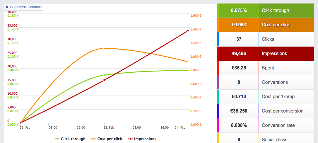
It takes up to 48 hours for Facebook to optimize your ads.
19. Guessing, Not Testing
Which one of these ads by Shopify works best, do you think?
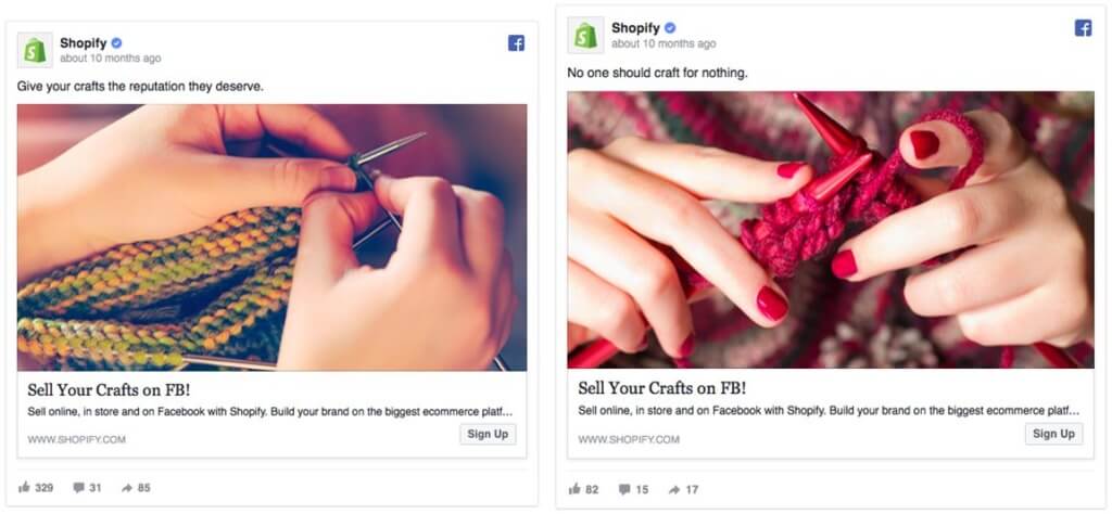
While we don’t have access to Shopify’s Ads Manager to uncover the test results, we can guess that Shopify was running an A/B test to discover the best-performing ad image.
If Shopify had picked just one image for the ad, Shopify’s team would never know if it was the best option for driving conversions.
A study of 37,259 Facebook ads found that most companies only have one ad, but the best had hundreds.
When SaaS startup, Scoro, started advertising on Facebook, the company tested over ten different ad images.
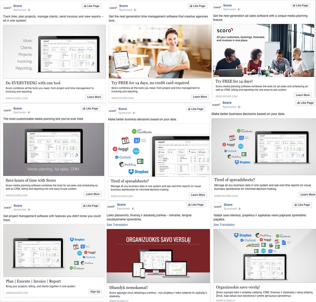
Whenever you’re unsure which target audience, ad copy, or ad image to use, test multiple variations and track the results. When you have enough results to see which version performs best, use that ad and discard the rest.
20. A/B Testing The Wrong Elements
Your marketing budget is limited. Your A/B testing capacity is probably restricted to a few tests per month—so you want to make sure you test the right stuff.
Hotwire’s site optimization lead product manager, Pauline Marol, advised:
“If you come to me with an idea and it’s not live in two weeks, it’s not because it’s a bad idea — it’s because I have better things to test.”
There are some simple A/B test prioritization strategies out there. Optimizely put together a great chart to help non-seasoned (and seasoned) A/B testers prioritize like a pro. But, basically, you should start closest to where your money is.
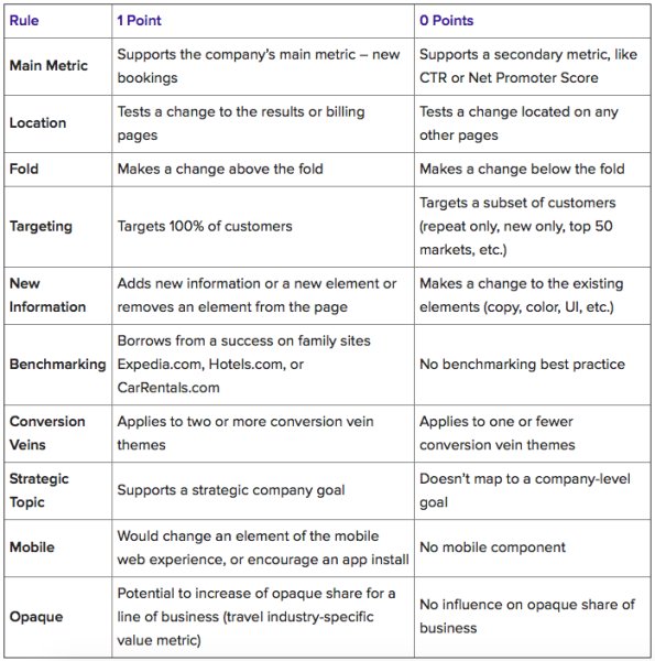
You can also check out ConversionXL‘s PXL prioritization framework, which provides specific questions about your ad’s impact on user behavior.

AdEspresso studied data from over $3 million in Facebook Ad spend experiments to create a list of A/B test elements that provided the biggest gains:
- Countries
- Precise interests
- Mobile OS
- Age ranges
- Genders
- Ad images
- Titles
- Relationship status
- Landing page
- Interested in
Many of these elements tie into your target audience, so refine your targeting to reach high-intent customers who are likely to convert.
21. Testing Too Many Things at Once
Do yourself a hairy favor and don’t get carried away with all those fantastic A/B testing ideas or your campaign might end up looking like this:
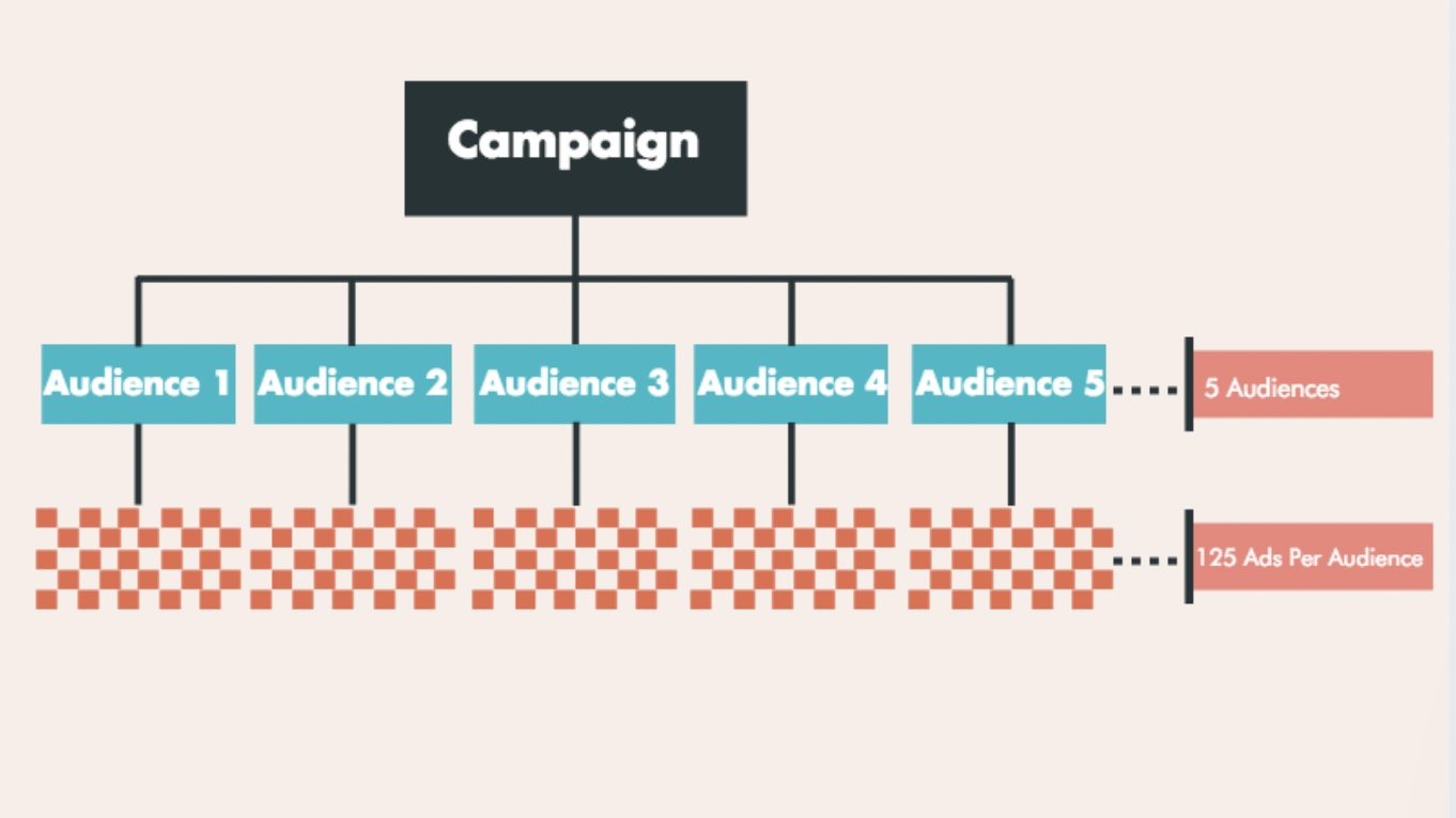
Facebook Ad guru Mike Murphy explained to ConversionXL that too much unfocused testing makes it tough to track results—even successful ones:
“Many folks will take their research from step one, gather their interests and then lump them all into one big list on the Facebook Ads Manager in hopes of reaching a large target audience. This is a grave mistake that will cost you far more in ad spend. And while you might get results, you’ll have no idea which interest brought the best results.”
In other words, don’t put all your split testing eggs in one basket. With every experiment you run, you want to have enough data for your results to be statistically significant.
Just like with website testing, aim to collect at least 500 conversions before making any conclusions. If you’re testing more than two variations, wait for even more ad impressions and conversions to determine the winning option.
22. Low Ad Match between Facebook Ad and Landing Page
This has no doubt happened to you before: You click on an ad and jump somewhere that feels like a mistake—the ad and the landing page look different. The page talks about logos, but the ad talked about whiteboard videos.
That’s wonk.
When you use an ad to promote something, the landing page had better deliver on the ad’s promise.
Like this:
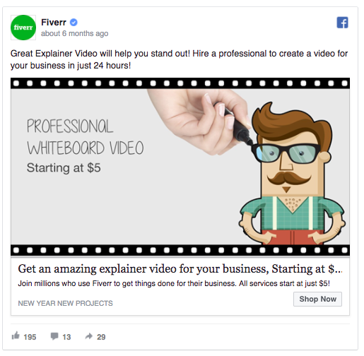
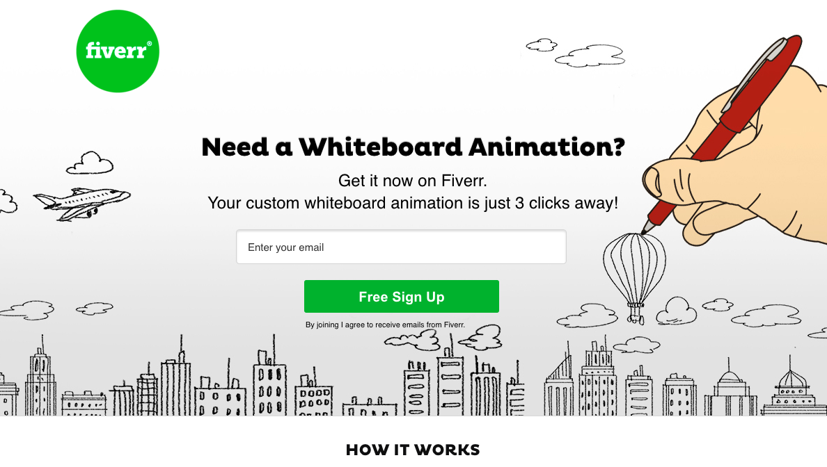
Fiverr’s landing page presents the same product as their ad. Simple, right?
Yes.
But, weirdly, too many Facebook ads lead back to a company’s home page or an irrelevant landing page.
Promising one thing in your Facebook ads and then failing to keep the message consistent throughout your sales funnel costs money. It’s a big mistake!
A person interested in a specific product who fails to find it on your landing page will leave—and now you’ve tarnished your authority, so they might not come back.
You’ve smudged the trust factor between you and your customer.
Directly align the UVP of your Facebook ads with your landing pages. Keep messaging consistent throughout your sales funnel.
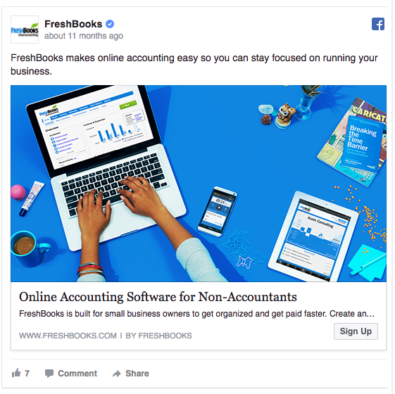
Also, avoid targeting everyone at once. Address niche audiences with highly targeted ad campaigns like FreshBooks.
23. Poor Landing Page UX
You’re spending time and brainpower on your Facebook Ads. And 🔥 you’re killing it! 🔥
But then you drop the ball in the end game. Ball’s loose!
Why would you craft a brilliant design for your ad that people can’t help but click but fail to carefully design the landing page they click to?
You’ll lose all the conversions you were meant to get.
And that’s sadness all over the place.
There are quite a few common landing page mistakes you should avoid. So many that we published a massive guide of landing page mistakes so you can avoid them. Targeting a mobile audience (ad placement), for example, means optimizing your landing page for mobile-first. And by optimizing for mobile, we don’t just mean picking a responsive design. We mean optimizing it for mobile.
“Creating a responsive design and calling your landing page or site ‘optimized for mobile’ is a cop-out,” according to ConversionXL’s Shanelle Mullin.
This Lost Password mobile landing page by Slack is a great example of straightforward, mobile-first design:
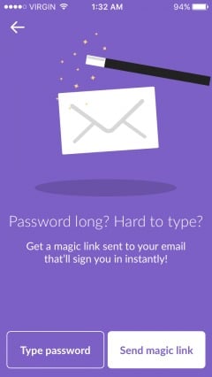
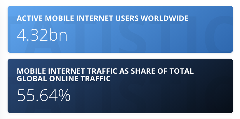
Mobile internet users keep growing, making it increasingly important to design a mobile landing page UX that’s top-notch.
24. Not Tracking Conversions
While it’s tempting to neglect tracking conversions in favor of getting your Facebook campaigns up and running ASAP, it’s not sustainable in the long term.
Reports inform tweaks.
Without proper conversion tracking, how do you analyze your ad results?
While you can see your ad’s click-through rate and some other ad metrics without tracking adjustments, there is no means for tracking off-site conversions.
Facebook tracks off-platform conversions via Facebook Pixel, which you’ll need to install on your website.
How To Set Up The Basic Facebook Pixel Code
- Go to the Pixels Page in Ads Manager
- Click Actions > View Code
- Copy the code and paste it between the <head> tags on each web page or in your website template to install it on your entire website.
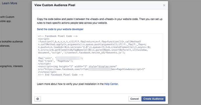
Each ad account gets only one Pixel code.
Use the Pixel code on every page of your website (or websites). You can also use Google Tag Manager to track and understand conversions, site analytics, and other metrics.
If you want to track specific conversions such as purchases or lead generation, you’ll also need to add a conversion tracking code.
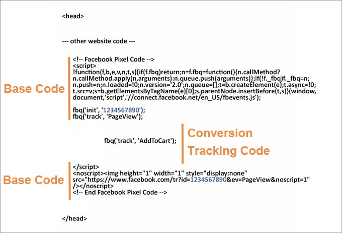
You can track nine different custom events with Facebook Pixel:
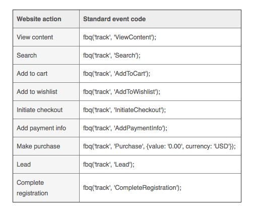
Use these implementation guidelines to add the Facebook Pixel to your website.
Setting up Facebook ad conversion tracking is a must-have for anyone looking to discover new advertising goldmines and conduct successful A/B tests.
25. Losing Sight of the Real Goal
Vanity metrics make you feel like you’ve just won an Oscar for your phenomenal work. When you log in to the Facebook Ads Manager, you’ll get a chance to binge on all sorts of vanity metrics: impressions, click-through rate, cost-per-click…
But none of these metrics matter if they don’t contribute to your ultimate goal—sales.
When you look at this pop quiz, which one of these ad keywords is performs better?
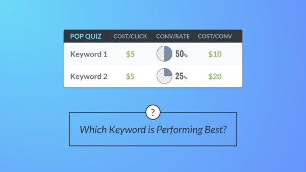
But there’s a bigger, more meaningful dimension to consider (CPC and conversion rate is one half of the story). You also have to look at the sales rate and cost of the sale.
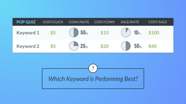
The story takes an unexpected turn.
Always, and I mean ALWAYS, focus on your end goal—your measurable objective—when analyzing Facebook campaign results.
Your goal might be to:
- Increase brand awareness
- Increase website traffic
- Increase leads to a landing page
- Make an immediate sale for a product (one-time promotion)
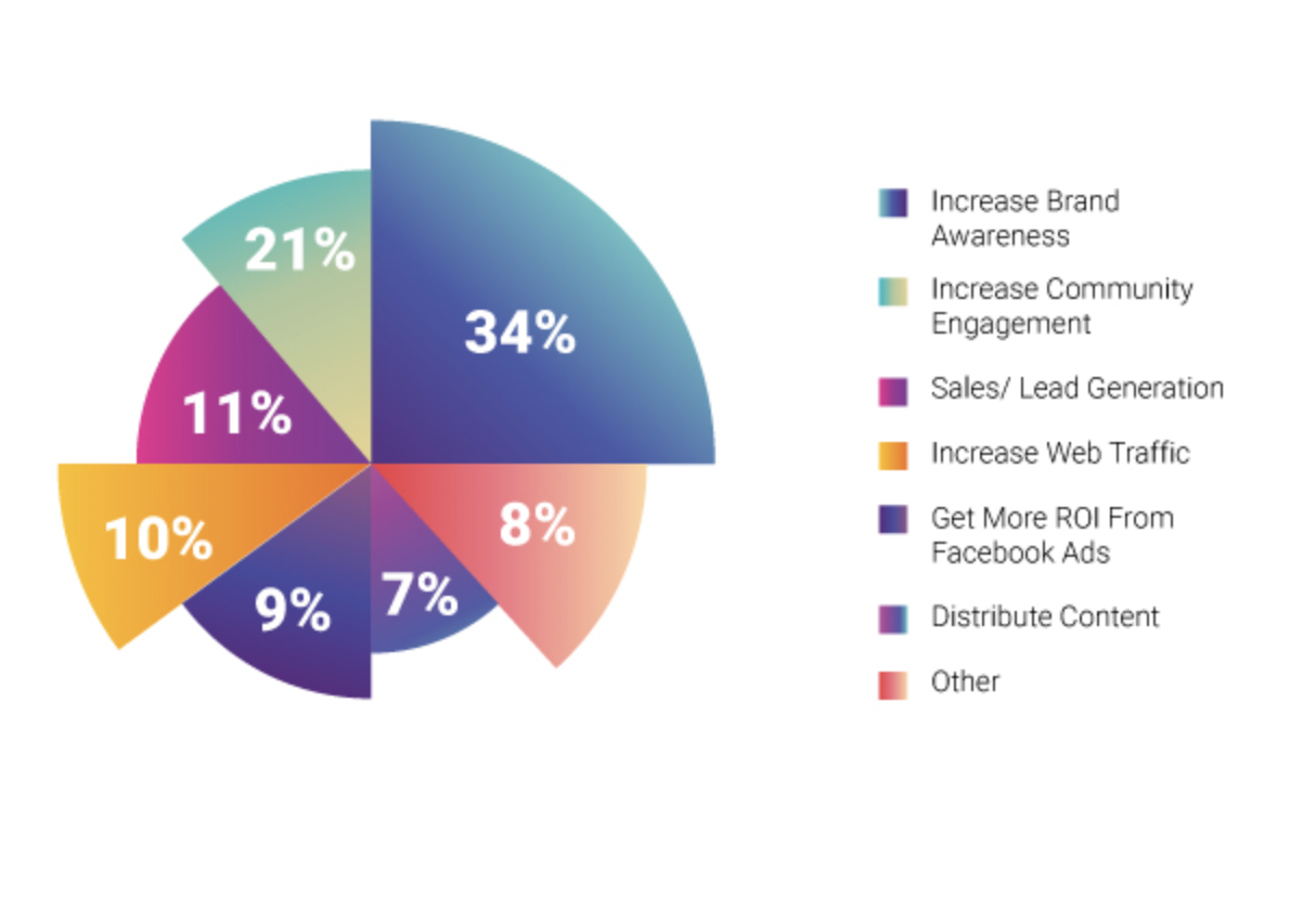
Know what you want to accomplish before you start your campaign (KPIs) and set a date on the calendar to evaluate performance. If things are going how you planned, awesome! If not, pause the campaign or change the parameters to protect your budget.
Poet Lewis Carroll said, “If you don’t know where you’re going, any road will get you there.” And poet Robert Frost said, “if two roads diverge in a wood, take the road less travelled.”
Wisdom!
But when it comes to Facebook ads, know where you’re going by taking both roads at the same time—then test the crap out of them to figure out how much it cost to make that sale.
26. Leaving Ads Unattended
Ads are like pets. If you leave them on their own, they lean toward making trouble.

AdEspresso learned this lesson the hard way; they set up well-crafted ad campaigns and left them running for several months.
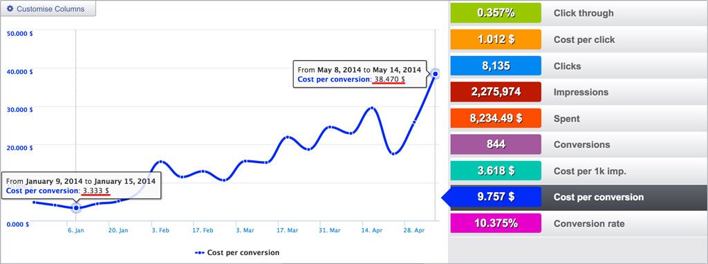
In five months, the average cost-per-conversion for the campaign climbed more than 1,050%, from $3.33 to $38.47. Yeowch!
Here’s what AdEspresso’s CEO Massimo Chieruzzi had to say:
“Our cost per conversion had increased ten times in just a few months! While, through split testing, I had found a great design and an audience that loved our product… it was a very small audience! Throwing a lot of money at this small audience, we soon saturated it after only two months, wasting a load of money in the process.
To keep your Facebook ad campaigns under control, conduct weekly checkups. It might be worth reviewing your ad campaigns even more often after the initial setup to stop your campaign from going off the rails.
Keep track of these eight Facebook ad metrics:
- Ad frequency
- Relevance score
- Click-through-rate vs. conversion rate
- Number of leads
- Facebook Ads customer churn
- Ad performance by placement
- Clicks by interests
- Ad engagement rate
27. Ignoring Ad Frequency
Ad frequency is a Facebook metric that shows how many times people have seen your ad on average. The higher your ad frequency, the more likely you are to annoy people. Annoyed people don’t click your ad. In fact, they might block you.
AdEspresso analyzed how ad frequency affects the click-through rate, cost-per-click, and cost-per-conversion of ad campaigns:
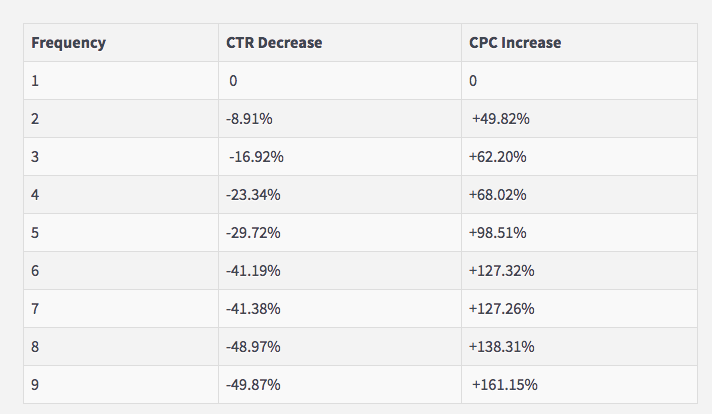
When people saw the same ads twice, the click-through-rate decreased by 8.91%. And when shown repetitive ads five times, the cost-per-click was 98.51% higher than the first ad delivery.
The general rule is to keep your ad frequency between 3-5 points.
But there are exceptions!
Some Facebook remarketing campaigns have shown good results even when the ad frequency was well over ten ad views.
Here’s a results chart of a Facebook remarketing campaign run by Scoro:
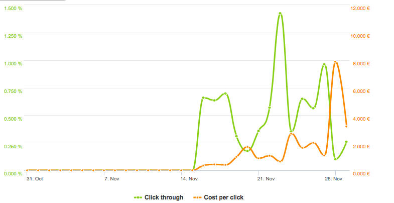
As you can see, the cost-per-click only increased at the very end of the campaign, when the ad frequency reached 15 points.

Don’t make the mistake of ignoring high ad frequency. Use it as an indicator that your campaigns might need some tweaking. Check other metrics to confirm the need for a refresh.
28. Not Using Auto-Optimization
If you’re afraid of high ad frequency and diminishing campaign results—not to mention spending hours checking your Facebook ad reports—there’s a way to escape this burden.
It’s called Facebook Automated Rules.
Automated rules keep your Facebook ad campaigns under control. When you meet your rule conditions, four different events trigger automatically:
- Turn off (campaign, ad set, or ad)
- Send notification to the ad manager (you)
- Adjust budget (increase/decrease daily/lifetime budget by…)
- Adjust manual bid (increase/decrease bid by…)
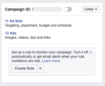
Apply the rules to specific campaigns, ad sets, or ads you’ve selected, or apply the rules to all active campaigns, ad sets, or ads.
Automated Conditions For Facebook Campaigns
According to Jon Loomer’s Facebook Automated Rules guide, automated conditions include:
- Cost per Result
- Cost per Add Payment Info (Facebook Pixel)
- Daily Spend
- Cost per Click (Link)
- Cost per App Install
- Frequency
- Cost per Add to Cart (Facebook Pixel)
- Cost per Initiate Checkout (Facebook Pixel)
- Impressions
- Cost per Purchase (Facebook Pixel)
- Cost per Lead (Facebook Pixel)
- Lifetime Spent
- Cost per Complete Registration (Facebook Pixel)
- CPM (Cost per 1,000 impressions)
- Reach
- Results
To create a new Facebook ad rule, select one or multiple campaigns, ad sets, or ads. Then click on Create Rule.

After selecting the campaigns or ads, you can create custom combinations of conditions that will trigger an action.
For example, ask Facebook to automatically turn off all active ads in the campaign with frequencies above four.
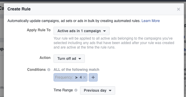
Automated Rules notify you when a campaign starts to get lower results, which guards against costs spiralling out of control.
29. Not Incorporating Video
Facebook’s data shows that as many as 15,000 pieces of content can appear each time you log onto your feed.
With so much out there, it’s no surprise engagement has declined across multiple ad types. There isn’t time to absorb all of the content available.
As interactions with image and link-based posts have declined, BuzzSumo found that that’s not true for video posts. Engagement actually increased by 10 percent year-over-year for video-based posts.
Initially, perceived barriers to high-quality production slowed video posts’ rise to prominence compared to other Facebook content.
Now video is everywhere!
That means you must capitalize on video-based ads! Not running video means missing out—not so much FOMO (fear of missing out) as AMO (actually).
30. Missing Out on the Conclusions
Some marketers run tons of Facebook campaigns but make the same mistakes over and over.
Avoid this hamster wheel by keeping a diary.
No, not a fluffy pink, princess-style diary (although that’d work fine— we’re not judging), but a spreadsheet where you note all of the key takeaways from each Facebook campaign.
Before you send an old Facebook campaign to the PPC cemetery, take a few minutes to examine what worked and what didn’t.
There are hidden takeaways from your ad experiences and, if you keep doubling down on the ideas that work, success will find you.
31. Not updating to SDK for iOS 14 version 8.1
Do any of your customers use iPhones?
Yep. A ton.
When Apple releases iOS 14, that might affect your ability to track conversion events in the Ads Manager. Why? Because the update will give iPhoners a slider to turn off tracking.
A prompt will appear allowing them to opt out of Facebook Pixel tracking to align with Apple’s transparency policy.
And people will opt out.
From Apple:
Privacy is a fundamental human right and at the core of everything we do. That’s why with iOS 14, we’re giving you more control over the data you share and more transparency into how it’s used. Starting in early 2021, receive a prompt when an app wants to track you across apps or websites owned by other companies for advertising, or wants to share your information with data brokers. Then decide if you’ll give permission.
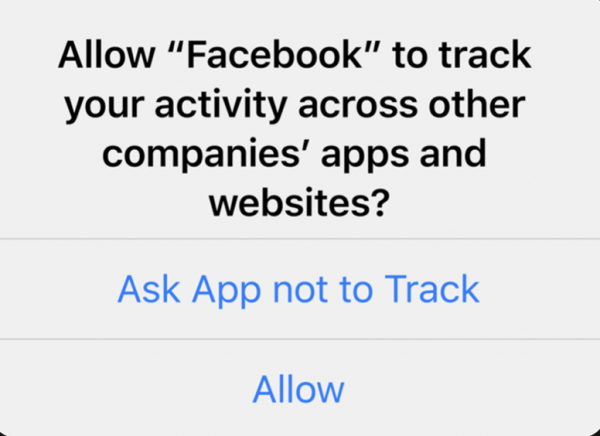
“Ask App not to Track” will limit the ability to report on app and web conversion events, creating a massive loss of signal in the Ads Manager.
As a response, Facebook suggests using Aggregated Event Measurement for web events from iOS 14 devices to measure campaign performance. To do that, update to Facebook’s SDK for iOS 14 version 8.1 from the Events Manager.
From Facebook:
You can use your existing ad accounts to advertise to iOS 14 users, but you’ll need to create separate iOS 14 app install campaigns due to reporting limitations from Apple’s SKAdNetwork API.
There are an expected waterfall of ad tracking limitations preventing Facebook from measuring segments related to campaigns.
As a response, Facebook created a hashtag #StandUpForSmallBusinesses and a page where small business owners can share how this change affects them.
We’ll know better what the fallout is and how to deal with it after the update!
Final Words on Facebook Ad Mistakes
Anyone with a Facebook ad account can launch a campaign, and with all of the options blinking on the cockpit dashboard, it’s thrilling! But just because there are no entry barriers doesn’t mean you should start clicking buttons without a plan.
Fortune favors the bold, as the Latin proverb orates, but Elvis clearly advised that only fools rush in.
Temperance!
We combine our intelligence with our gut instinct, and we learn by trial and error. But we can also learn by example. Avoid the above-mentioned 30 Facebook Ad mistakes that cut holes in your pockets and, to get you off to an even better start, check out these 163 awesome Facebook Ad examples for inspiration. Oh, and here are 20 Facebook Ad tips that get epic results.
Tada! You’re off to the races.
So that’s it.
You have what you need to jumpstart your Facebook Ad fixes.
Map out your strategy before you put your budget on it—don’t splash the pot—keep your design catchy, your copy minimal, and make adjustments according to trend lines.
We’d love to hear about your biggest Facebook ad failures—the crazier, the better. Tell your story in the comments section.
And remember this:You never lose. You either win or learn. —Nelson Mandela

