


You’ve defined your business goals and KPIs. Your homepage is up and running. What’s the next step for your marketing strategy?
Optimize the heck out of it.
The best way to do that? Testing.
Except, there are a gazillion things you want to test. The headline. The hero shot. The form. The CTA. The copy. The layout. The offer.
Your head is spinning with ideas but A/B testing only allows for one element at a time, so where do you start?
The initial idea of figuring out exactly what to start with and what to test next, or worse, which ideas to put on the back burner, can be intimidating and soul-crushing.
But, that’s the nature of conversion optimization.
If you don’t prioritize, you’ll only create a bigger mess for yourself, because you’ll test ideas that don’t move the needle as easily or as much as other ideas might.
So, how exactly do you choose what ideas come first? The answer is quite simple actually.
Go for the easy wins first. By easy wins, we mean low-effort high-win tests. They’re quick to accomplish and have a big impact on your results.
Not sure what those could be? Keep reading to see what we prioritize.
Get brand new conversion strategies straight to your inbox every week. 23,739 people already are!
A/B testing ideas to optimize for best UX practices
Good user experience (UX) design can potentially increase conversion rates by as much as 400%.
For us, that’s a great reason to prioritize easy UX changes for our tests. These are the best 5 A/B testing ideas to help optimize for the best UX possible.
1. Clickable social proof
Social proof can come in the form of ratings, social media reviews, or even company logos.
Since 88% of buyers are influenced by reviews during the buying process, it’s no wonder that it’s a best practice of ours to put social proof near or above the fold and in the hero section.
Not to self promote, but let's take a look at our homepage:
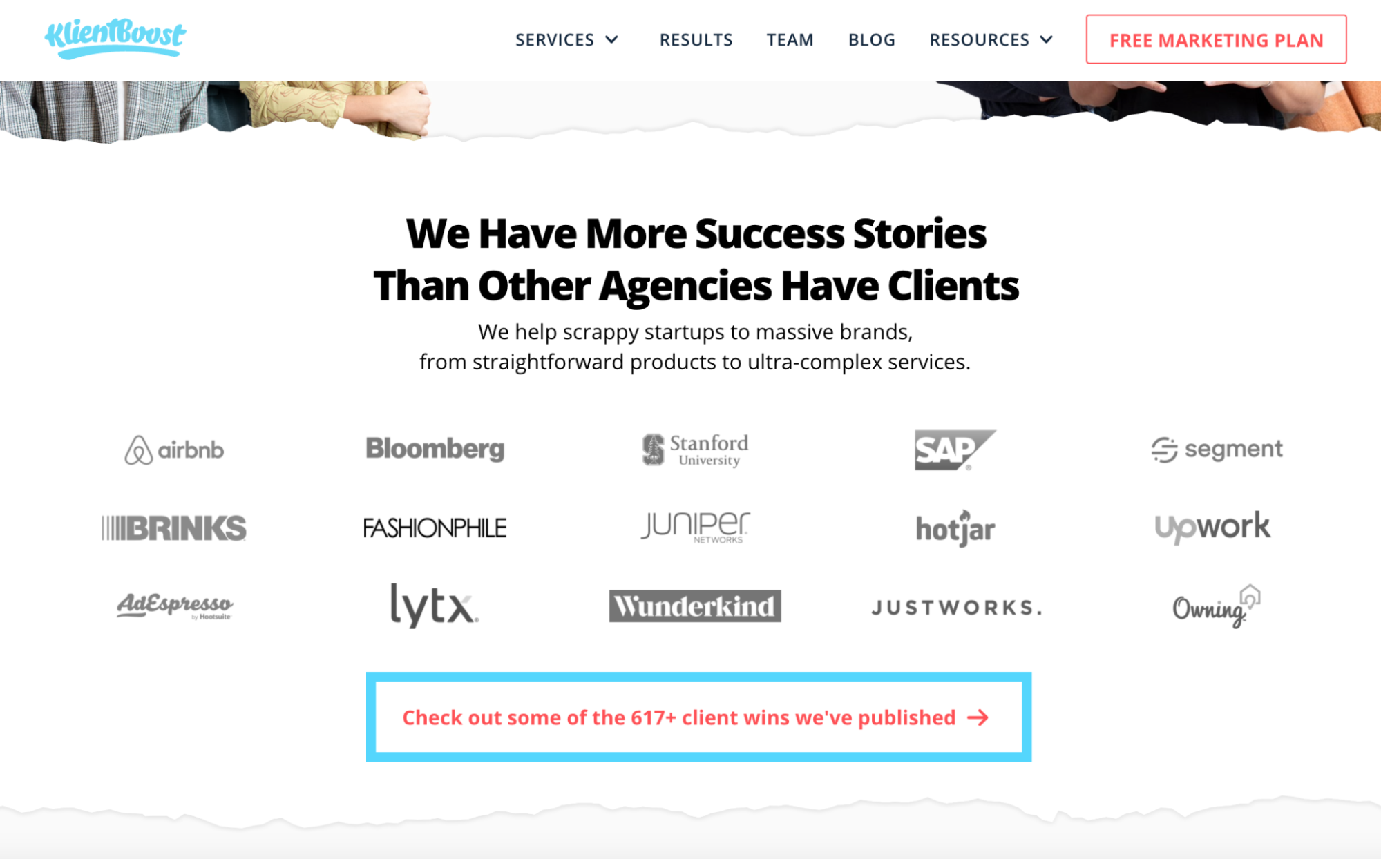
Oftentimes, people want to know more about the social proof, not just that people have rated it highly or that companies do stand behind the products or services.
They want to know why it’s so great, and that’s covered with testimonials. But, no one is going to scroll through the entire landing page to try and find them.
Test usability by implementing an anchor, a clickable page element, that links to another location on the same page or a testimonial page that can provide the in-depth review that potential clients need to make their decision.
2. Clear benefits
Users want to know how you’ll solve their problems with your products or services, so listing clear benefits of your offer is absolutely essential.
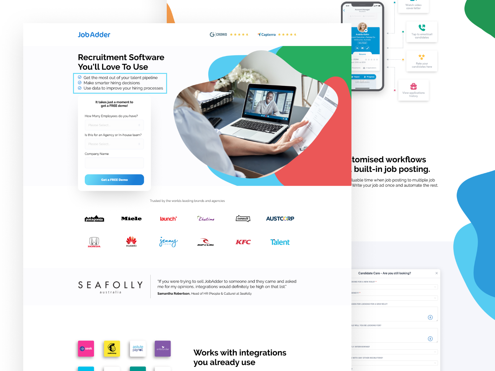
Let’s look at the JobAdder landing page. For the benefits, we’ve listed the following:
- Get the most out of your talent pipeline
- Make smarter hiring decisions
- Use data to improve your hiring processes
Immediately, users know exactly why they should use JobAdder. Testing the placement of the benefits in the hero gives this landing page high utility for its users right away to help increase conversions.
3. Fewer unnecessary page elements
Getting more conversions isn’t just about what’s going on on the front-end of a webpage.
Page speed can heavily impact whether your users convert or not, since 53% of visits are likely to be abandoned if pages take longer than 3 seconds to load.
You can check your page speed with PageSpeed Insights and other metrics with Google Analytics.
Test different ways to quicken your page speed to make a good first impression on users, starting with removing unnecessary elements like drop shadows. Here are 6 different tips to check for elements that are bogging down your page so things move faster. Put these to the test.
4. Different CTA button color
What do you want to stand out the most on your landing pages? Your call-to-action button since that’s ultimately the action you want users to take.
Set up heatmaps to see what visitors are doing on your page. If people aren’t clicking on your CTA, it may be time to revisit color theory and try something different.
A contrasting button color usually outperforms a CTA button with a color that blends into the rest of the page. Our go-to color is bright orange. Orange is typically associated with happiness, which does good things for conversions.
5. Shorter landing page
I’m sure you’ve heard the saying “less is more.” For landing pages, that can definitely be true.
The average attention span is only 8 seconds. So, chances are users will absorb more information on a shorter page better than a longer page.
Take advantage of this and create short, effective landing pages by placing only the most pertinent information in and around the hero section.
Speaking of the hero section, let’s talk more about tests to try there.
A/B testing ideas to optimize for the best hero
The hero is really the star of your landing page. It’s the first thing a visitor sees. To capitalize on that, we often reference the following tests for our A/B testing.
6. New headline
Talk about low-effort with this one.
Trying different headlines is a super quick and easy way to improve your conversions because headlines are just that powerful. Changing those few words could increase your conversion rates by over 60%. And no, we’re not exaggerating.
At KlientBoost we have well over 100 headline formulas that we test. Read about our best headline examples and tips (with results) here.
7. New subheadline
The subheadline is also important, as it’s responsible for elaborating on and clarifying the headline.
For example, if you’re offering a free trial, try using “No credit card required��” in the subheadline to assure your users it’s really a free trial and they’re not getting scammed.
8. Inverse the headline and subheadline
Sometimes you have all the right words, but they’re just not in the right places.
Try switching the headline and subheadline (and editing them as needed) to boost conversions. This simple switch is frequently a sneaky win.
9. New CTA copy
Never underestimate the power of your CTA copy. A CTA that matches the temperature of the audience and offer is ideal. A high-threat CTA such as “Buy Now” can seem threatening and contribute to cart abandonment or visitors avoiding the checkout page altogether.
Try adjusting your CTA copy to something less threatening, especially for top-of-funnel pages.
Another good tip for CTA copy is to be as specific as possible.
For example, if your offer is a 30-day free trial, test “Try Free for 30 Days” versus “Try Free” for the CTA. The former helps people know what to expect, so they not only see the value (a whopping 30-day free trial), but they also feel more comfortable trying your offer.
We’ve seen (and created) some irresistible CTAs. Here are 61 examples that you can’t help but click.
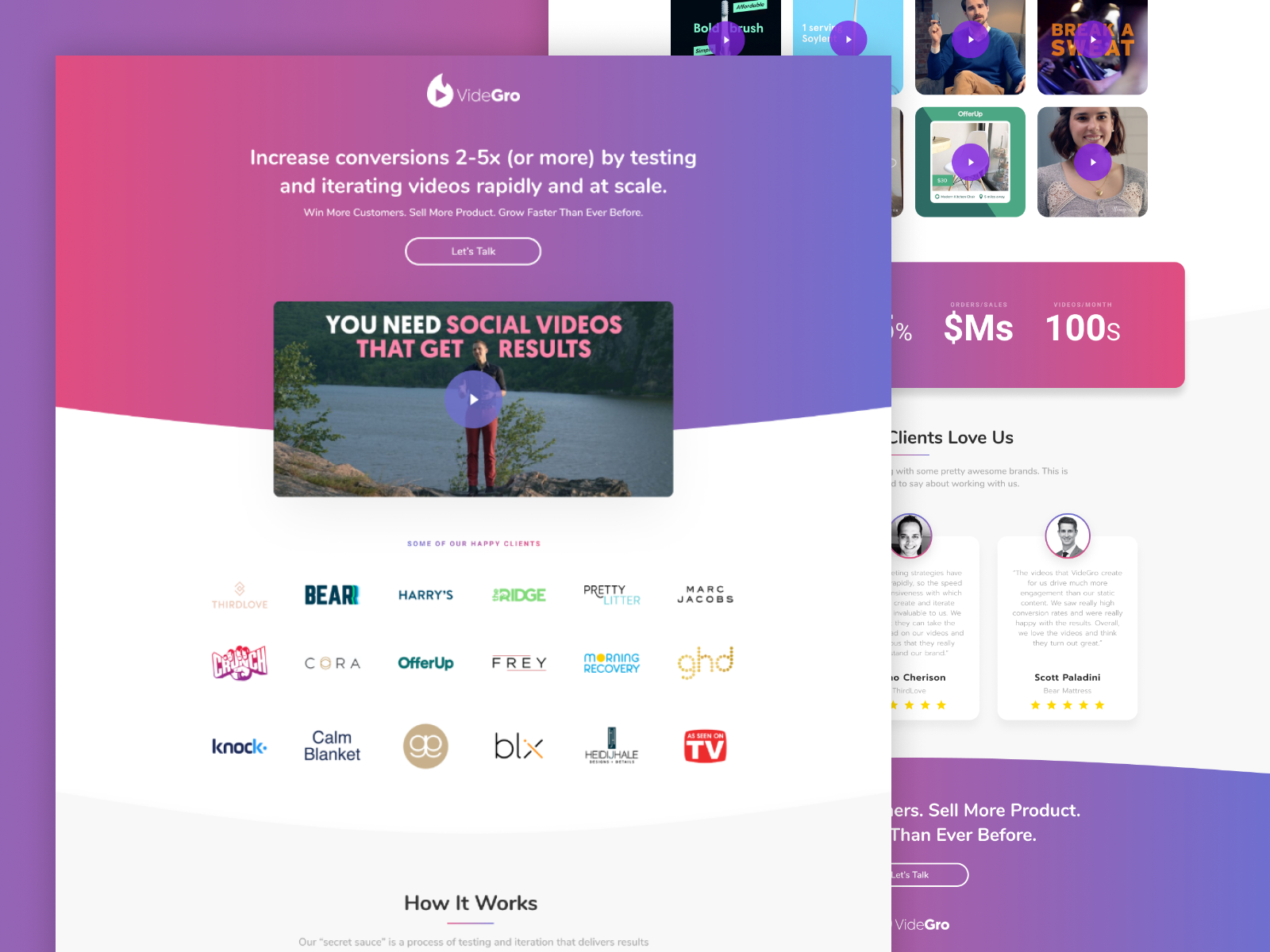
10. Use video
Adding videos to a landing page can boost conversion rates by 80%. As seen below, we used a video in the hero for our client VideGro.
For an eCommerce store (i.e. Amazon) product page, you might want to show a video of people using the products and detailing the product descriptions instead of a still product image with a shopping cart.
For lead gen, you may feature a case study or testimonial video by a happy customer in the hero instead of just an image of a person (our favorite).
Follow these 22 rules for landing page videos and you’ll witness an insane number of conversions.
11. Dynamic text replacement
We aren’t kidding when we say dynamic text replacement (DTR) is borderline magic.
DTR allows you to show different variations of your copy on your landing page to certain audiences, depending on what you set up.
Try using DTR to customize the location in your headline with the places you’re targeting (i.e. “Used Cars in [visitor’s city]”) and you can’t lose.
Now that we’ve talked about tests for the hero, let’s move on to the other most important part of the landing page for lead gen: forms.
A/B testing ideas to optimize a form
Forms can be tricky. Users aren’t necessarily keen on giving a company their information in a sign-up form, whether it’s for gated content or a free trial.
Thankfully, we’ve broken down our best form tips and tests to help users feel more comfortable giving you their information.
12. Two-step or multi-step form
If there are five fields you want users to fill out on your form, showing all five fields at once can come off as intrusive and be off-putting to users.
To try and keep users who are tempted to click out once they see the form, you might want to test breaking up your information into a two-step or multi-step form. (Note: We do not mean a multi-page form. We advise putting all the content on one page that utilizes multiple form steps.)
Showing two to three low-threat fields on the first step followed by the remaining fields on the second form step can make users feel more apt to fill out the information since it doesn't look like there’s as much to do.
On a two-step form, our best tip is to try testing “Last step!” as the header for the second step.
This can help incentivize users to fill out the rest of the information since they’ve already come this far (AKA compliance psychology) and this truly is the last thing they need to do.
13. Breadcrumb technique
One of our favorite tests to run is called the breadcrumb technique. Let’s look at this landing page we did for Sifted.
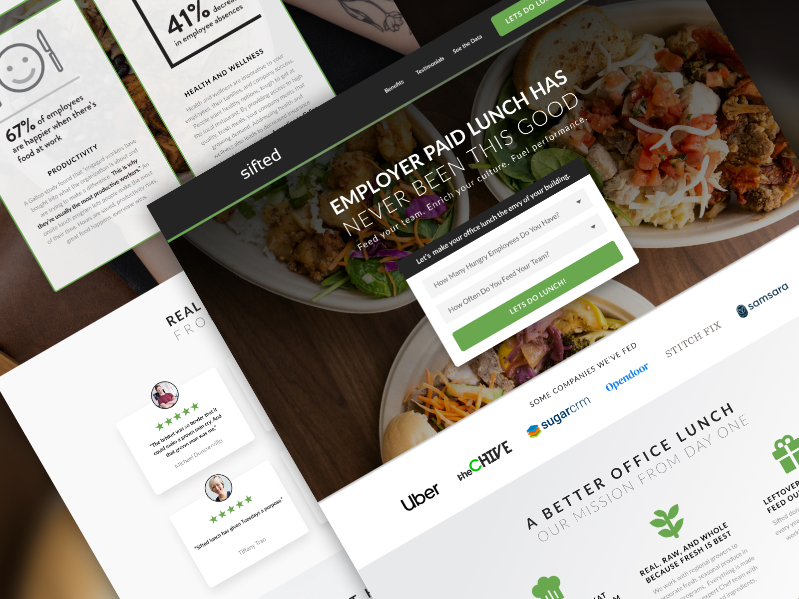
Essentially, start your form with one or two low-threat, lead-in questions that most people wouldn’t find invasive or feel uncomfortable answering.
For this landing page, we used “How many hungry employees do you have?” and “How often do you feed your team?” These questions are relevant to the client and consumer, but not personal enough that they’re threatening.
Then, on the other steps of your form, you can ask the rest of your higher-threat questions, as compliance psychology takes over.
14. New first question
Sometimes, changing the first question can make all the difference. If the breadcrumb technique isn’t doing everything you’ve hoped, it’s probably because the first question isn’t quite hitting the mark with your audience.
Let’s revisit our last scenario with Sifted.
Instead of using “How often do you feed your team?” we could try “How many paid lunch food services have you tried?” The threat is about the same, but it may just be the change your users need to click through the rest of the form.
15. Dropdowns
Dropdowns can be much more user-friendly (and therefore, conversion-friendly) than single-line text fields.
If possible, we highly recommend testing dropdowns in place of any text fields that don’t have to be single-line text fields. For example, the possible dropdown options for Sifted’s “How often do you feed your team?” question could be: once a week, two to three times a week, or every day.
The dropdown eliminates extra steps the users have to take to type in a number, but it also helps them feel more comfortable answering the question when they can give a range versus an exact number.
Start A/B testing (you’ve got this)
What we’ve covered here is just the tip of the iceberg when it comes to CRO testing (even if they are some of our best tips).
As you know, there are so many tools to use, trends to try, and optimization strategies to implement. But, we’ve done our best to fill you in on what we’ve seen work for us.
It’s important to remember that while prioritizing is important, completely accurate prediction is impossible. So don’t get down on yourself if one of your “grand ideas” turns out to be a moot point.
It happens to the best of us, and that’s why testing to actually find out what works best for you is so crucial.
Interested in hearing more of our ideas? Let’s look into our 10 Lead Magnet Ideas For Conversion Domination next.


