You know if potential customers like your product by the way they interact with your website.
If they don’t like your page, they’ll leave quickly—or potentially rage-click. If they love it, they’ll make your heatmap catch fire.
So to make sure they love your page, you need to check off a few website checkmarks:
✅ show off the value of your product/service
✅ make your site easy to use (good usability)
✅ Make your site fun to use (user experience)
To check off those goals, you first observe what sort of interaction is already happening on your website, and there are a few different methods you can use to test that.
In this post, we’ll
- touch on the popular methods for usability testing
- categorize them to make it easy to analyze test results
- give you some fast and budget-friendly techniques to try
- silver platter 14 super-duper testing tips
- suggest one website usability testing site that puts it all in one spot
- tell you what practical user feedback you should gather
At the end, you’ll know exactly what you need to do to make your products jump off your page and get your customers clicking that CTA.
- What is website usability testing?
- Why are website usability testing methods important?
- Analytics vs. usability testing
- Website usability testing categories
- Popular website usability testing methods
- 14 budget-friendly, fast website usability testing methods
- Feedback questions to ask
- Nine super-duper practical website usability testing tips
- How to analyze your results
- Gauging experience with website usability testing methods
Get brand new conversion strategies straight to your inbox every week. 23,739 people already are!
What is website usability testing?
Testing for website usability evaluates how easy it is for people to use your website (or app) to get to know your products.
You want your website to be highly usable, so you test different things in different user stages with a few different methods. Then you take those results and make scrolling around and navigating your page easy, intuitive—and fun.
You want to make it effortless for customers to discover all the ways your product is exactly what they want/need because anything short of amazing usability puts you in the average category where none of us want to be.
If you have an incredible product with a lackluster website/app promoting it, that’s a disservice to your product.
Use your website to show off the product, not take away from it.
Why are website usability testing methods important?
We all assume how users will interact with our products, but you know what they say about assumptions…they just make an ass out of “u” and “me” 🙃 An untested assumption is a wasted thought.
So test that assumption; that’s how you know for sure what’s working. Then do more of what’s working.
There are some popular testing methods that identify where your speed bumps are so you can get rid of the snags that cause frustration, confusion—and sometimes eye-rolls—that end in click-aways. Website usability testing also points out what features are missing that could really take your page over the top.
But website usability testing at its best shows you what you’re doing right.
You can see where users have great, streamlined experiences, and then take that smiley data to the design table to prioritize other website features.
Analytics vs. usability testing
Tools gather data on what your users are doing with your product. But here’s the thing: these metrics only reflect actions taken.
Isn’t that what we’re after?
Nope.
Some actions are executed by users who are frustrated—or even rage clicking (when people click an element of your page repeatedly out of frustration).
Just because the action happens, doesn’t mean you have a happy user making those clicks. Frustrated user actions won’t tell you if the environment you’re providing is the best it can be.
Analytics in a Petri dish isn’t helpful. You need to attach those analytics to a few key initiatives to make good decisions about developing, managing, and optimizing your website the best way.
Website usability testing categories
Testing isn’t a one-time thing, and it’s not always done the same way or in the same context.
There are three types of usability testing at your disposal:
- Exploratory
- Assessment
- Comparative
Explorative website usability testing
You have a new prototype and it’s in a raw design stage. This is when you want to know if users understand the purpose of your product. Use explorative usability testing to see if the early stage website is a good one before doing further website development.
Assessing usability
Explorative prototype testing went well, so now you’ll focus on the overall usability with real-time trials of the technology.
At this stage, you’re testing if users are satisfied with the website.
- Do they wish it had another feature?
- Do they think it could be simplified?
- Do they perceive it as being high-quality?
Comparative usability testing
Did you change something about your website after the initial testing? Did users assess it to have positive attributes but room for improvement? Did you make a second (and third) change based on these tests?
It's time to compare them and observe what users like or dislike about these new versions.
This is where you’ll quantify the comparisons, distinguishing strengths, weaknesses, and opportunities. Maybe you’ll track the number of steps it takes to complete tasks. In this type of usability testing, you’ll evaluate the pros, cons, and missed opportunities for additional features.
And keep this in mind: to get the most out of your website, you’ll go through each of these testing steps continuously.
Popular website usability testing methods
Yes, you’ll test numbers, statements, and movements. But what you’re really testing is the user satisfaction of potential customers. And how you do that comes in a few different packages from physical to virtual.
- In-person
- Virtual
- Moderated
- Unmoderated
In-person testing (physical)
This might sound boring, but person-to-person interaction provides a ton of insight.
For example, a company could have a test audience come into their office and have 30 minutes to use their website. They could be asked to purchase a product, sign up for a newsletter, or find an in-store location.
Your team can watch the interactions. After the session, you can also interview the test audience about their likes, dislikes, challenges, and what they enjoyed.
As a stakeholder, this sort of “in real life” interaction proves more valuable in some cases than other methods. A large sample size weeds out the rogue outlier comments so you head into the design process fully loaded with an informed new direction.
Virtual (screen shares)
Virtual testing is where you record the screen of the person performing predefined tasks with your website to gather data about their experience and observe their facial expressions and body reactions. This is remote usability testing, which has become the norm over physical in-person observation.
Tracing these actions is as simple as using a tool such as UserTesting that leverages real-time screen recording so you are seeing your landing pages exactly as your audience sees them.
Moderated
A moderator is someone who gathers feedback from live users. Moderated testing guides testers through tasks as the moderator answers questions and replies in real-time (doing their best not to lead the tester in any particular direction). Moderators have a hand in the outcome.
Unmoderated
Unmoderated usability testing happens without a moderator. No one guides anything. This is a quick and affordable way to gather data. Test participants complete tasks in their own space with their own devices and without a moderator present—which leads to the website being used naturally. The downside is that this type of testing delivers less-detailed results.
Can you mix and match these four testing processes? It would be boring not to.
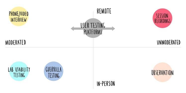
Here are a few ways website usability testing works in-person vs remote and moderated vs unmoderated (we’ll get to these below):
Okay, great. You have some different ways to gather input, but you’re wondering how you can get started on the cheap.
We’ve got you. Check this out 👇
14 budget-friendly, fast website usability testing methods
Not every testing method needs to involve a high-priced testing environment that takes hundreds of hours to run—usually over budget. There are 14 ways you can quickly gather usability data.
1.5-Second usability tests
What stood out? Like, what really made the biggest first impression?
Use a 5-second test to get instant recall answers. Users are told ahead of time that they will get only 5 seconds to scan your webpage and then they will answer a small set of questions like
- What is the purpose of the page?
- Who does the page target?
- Does the brand look trustworthy?
Sometimes 5 seconds is all you get. You’ll either capture attention or you won’t. Find out if you sell your product in less than a few seconds at a glance. If not, redesign the page or change the copy.
2. Click tests/conditional tests
What do testers click on? Can you reduce the number of clicks to achieve the same result?
Click clusters, dark maps, and heatmaps aggregate click results making it easier to visualize where your users focus. If they don’t focus/click on the one action you want them to, make that change.
At KlientBoost, we implement heatmaps and scroll maps to evaluate how our visitors interact with our pages.
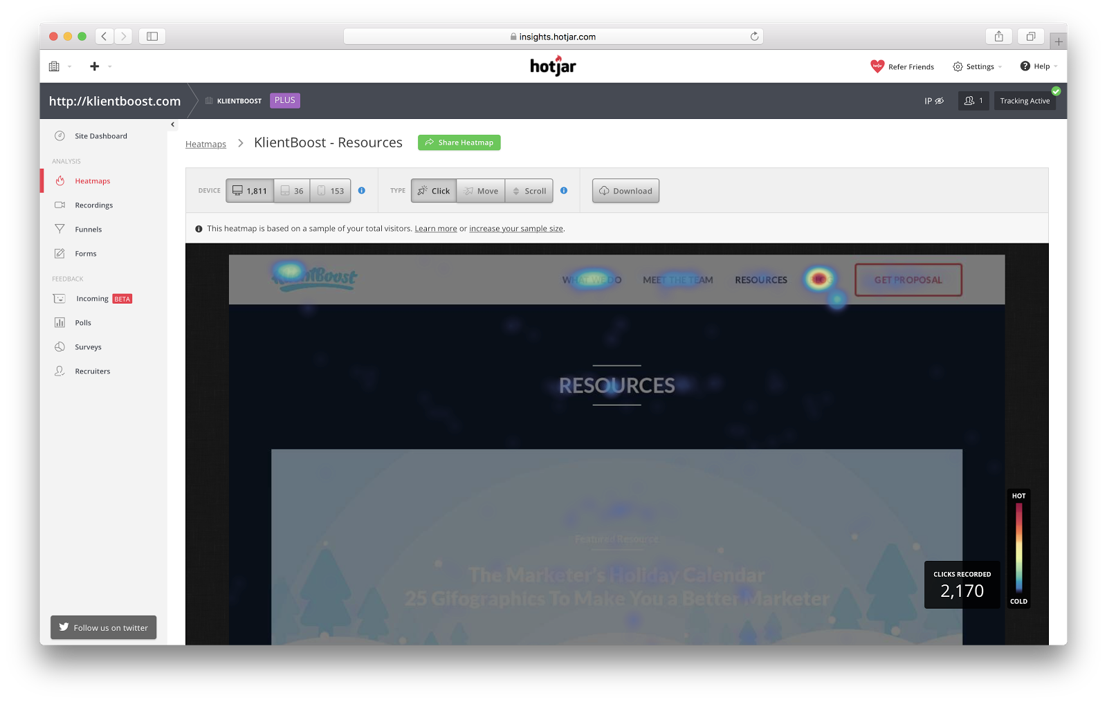
We wanted to know what resources on our Resources page got the most click action. We found that our guides and webinars were much more popular than our interviews and mentions, so we de-emphasized interviews and began working on additional guides and webinars for future marketing offers.
3. Content tests
Does your content make the grade? A Content Test gathers quantitative data (like readability, tone, word style, etc.) from your target audience to answer whether or not they understand and identify with your value proposition. It answers if your content passes with an A+ or causes pain points in the user experience.
4.Copywriting/cloze tests
Does your message ring true? Did you label things the best way? Are your features clearly marked? Is the writing likable? Is the promise believable? A cloze test lets you know.
5.Wireframe tests
Does the design of your webpage or app make sense? Do you want to test different layouts? When intuitive flow is the thing you want to test, this is the test for you. Wireframes are a great user research tool.
6. Tree testing
Tree Testing is an advanced usability mapping feature that tweaks the information architecture of the menus on websites, apps, and prototypes.
Pretty simple to use. Ask testers to map out a hierarchy of how they view the information.
This is the reverse of card sorting. Instead of giving users a bunch of cards to sort in a way that makes sense to them hierarchically, tree tests present stacked menus (main menu with sub-items) and ask users to find something.
Do they find it easily? That means it was where the user thought it should be in the menu structure—it verifies the findability of the information.
7.A/B testing
Give two controlled audiences two ways of doing something, but each audience has one (and only one) difference, be it the headline, the CTA, the layout, etc. You’re basically comparing two versions of the same thing with a slight change to see exactly which version wins (gets the most clicks or positive reactions).
8.Eye-tracking
This UX website testing tool tracks the eye movements of end-users to see how people engage with your website or design. It records visual user behavior, which is important to measure what area on a website or app grabs the most attention. It’s a pretty cool way to test the interaction between a user interface and the user-facing it.
9. Phone interview/contextual inquiry
This interview method tracks information about the user experience from real users in their own environment. A moderator instructs participants to complete tasks on their own devices and feedback is recorded remotely.
This method is cost-effective when testers are scattered in multiple locations, but it requires a trained moderator with high-level communication skills.
10. Card sorting
Usually in-person and moderated in a lab situation, testers are given a stack of cards with individual content or features markered on them. Users arrange the information architecture according to how they think categories and sub-items should go. A moderator then asks each user to explain their logic.
When logic is sound, look at the most popular card sort trend.
11. Open-ended question tests
Hooray, you don’t have to read minds.
You can straight up ask users what they think about anything. Open-ended questions are broad and give the user flexibility to describe something in detail e.g. "What do you think about this product?”
These questions are valuable because feedback from the user’s perspective, when combined across the entire sample, creates qualitative trendlines (as opposed to closed-ended multiple choice questions).
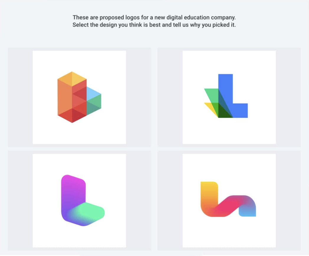
12. Preference Tests
The opposite of an open-ended question test, preference tests present users with a set of defined options to choose from. Preference tests point out the best design options for videos, logos, packaging, or animation.
13. Survey questionnaires (e.g. Survey Monkey)
Do people like my website or not? Why not ask 'em?
Surveys can fill up a spreadsheet full of feedback fast. If there are open-ended questions you may even get feedback about features you never even thought to ask about. Use this affordable and rapid rest to get a broad idea of customer experience happiness. Use it to test the success of your brand against your target audience.
14. Hallway Tests
Also known as Guerilla testing (and sometimes Guerrilla testing—with two Rs), this is a moderated in-person test that happens in a public place where you ask random passersby what they think about something.
This works great when websites are in the early design and wireframing stages.
Feedback questions to ask
You’re gung-ho to figure out your website usability score, so you set up a few usability tests and now you’re staring a test subject in the face—woohoo way to go 🥳
As you start your testing journey be sure to ask five great open-ended questions:
- Can you easily describe what this product does from just seeing the website?
- What website feature did you like the most?
- What was missing that could make the site better (what annoyed you because you expected to have this)?
- What’s the single coolest thing about this website that makes it better than the rest?
- What’s one thing the competition has us on?
Nine super-duper practical website usability testing tips
If you’re new to all of this, you’ll love these tests that give you mad feels.
Start gathering qualitative data and forming testing hypotheses:
- Define goals for your study: Understand the business priorities and user priorities. Your goals will shape the direction of your testing and the actions you’ll observe. There’s no room for the “ready-fire-aim” mentality here—have a plan.
- Test the right users: You should know who your ideal user is (your primary persona). Don’t optimize for people who aren’t relevant to your target audience.
- As a moderator, prepare your script: Keep the conversation loose. Structure your questions to keep your subjects talking about what they value and what they need. Shape every question into an open-ended question.
- Use segmentation: Segment your in-person users based on their LTV (lifetime value) metrics.
- Give subjects an action to perform: These should be based on the primary, secondary, and tertiary functions of your website.
- Use session recordings to segment your audience based on traffic sources, demographics, behavior, and actions.
- Don’t interrupt your users or lead them—that corrupts your data: For physical testing, do your best to be an impartial moderator with extremely limited interaction and direction.
- Time user observation: Identify friction points by noting moments of confusion. Look for gestures, pauses, exploratory scrolls, and clicks.
- Users who know they’re being observed might try to perform for you. They’re overthinking the tasks and this can muddy your data and skew your results. For best results, create a comfortable, natural environment for them to interact with your product.
If you follow these tips, you’ll fall in love with testing just like we did. But when the testing is over, you need to do something with the results.
How to analyze your results
Ok, you’ve got tons and tons and tons of results, so what now? There are two main ways to turn your qualitative results into actionable insights:
- Numeric: Quantify parameters and look for commonalities
- Depth: How frustrated or comfortable were your testers?
Numeric insight
Compare interactions and experiences across diverse users with a numeric scale and vary parameters to see the differences between all of your recorded testing sessions or observations.
Establish a hierarchy of actions or functions of your website that would affect a user’s experience while simultaneously affecting your product’s viability. Then, with your priorities in order, look for a pattern of similar experiences (good or bad).
A SUS (or System Usability Scale has been used for decades. Like a Likert scale, it’s basically ten questions where testers agree or disagree on a scale from one to five.

With responses on a numeric scale, you’ll be able to see trends much easier than reading review after review.
At KlientBoost, we A/B test our landing pages in Unbounce, a popular usability testing tool, and use it to look for trends.
The Unbounce dashboard omits tons and tons of other metrics like time on site, bounce rate, duration of visit, etc. It also isolates a simple analysis of how many visitors we’ve had, how many of them converted, and the comparison of how one variant compared to the other.
Unbounce does all the hard work for us, so we can easily see which variant is more successful.
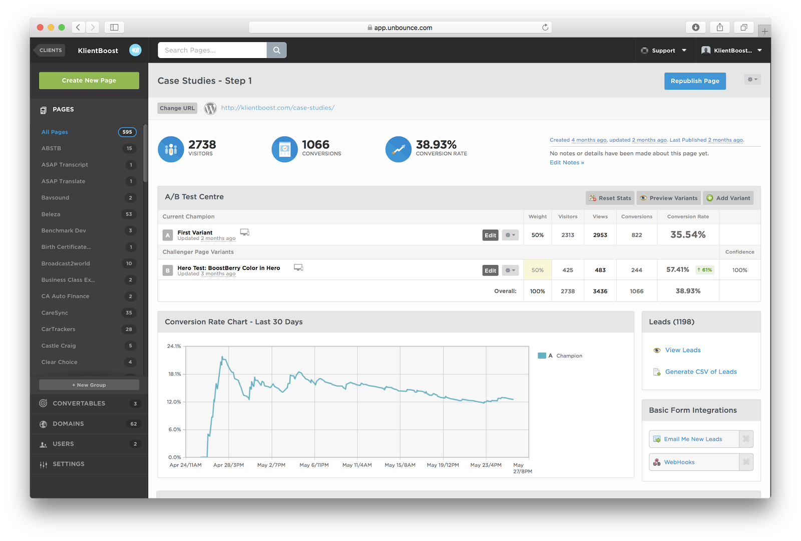
Here’s the result of a test we ran in Unbounce on a landing page for our case studies. Our design team hypothesized that visitors might convert better if the form was designed differently (to emphasize our call-to-action, messaging, and make the form more clickable overall). This alternate design improved the conversion rate by 61%, which is pretty cool 😎
That’s an example of what you’re trying to achieve: isolating commonalities to interpret successes and failures.
That’s how to measure results in a numeric system. But there’s also a more human approach…
Insight depth
Since website usability testing can be robotic, use interviews as a basis to establish a feeling or qualitative impression. Make it a human experience, and connect in a real way with your testers.
Conduct interviews with your in-person testers, or contact your recorded session testers for further analysis. These conversations lead your open discussions about when they became confused, frustrated, or distracted.
This is critical because they may not have been confused per se, but they still found the experience somehow frustrating. Visitors are much more than numbers and their experiences are complex, so this approach can point out how to optimize the overall user experience.
Gauging experience with website usability testing methods
Now that you’ve got some tricks up your sleeve, bring them to your next marketing meeting and impress your teammates. Lead the way forward by recommending which user testing methods you think will give the best results, whether that’s really fast, on the cheap, or in an in-depth way (like a boss) to gain game-changing insights.
Were there usability problems? Apply the results, make some changes, re-test that change, and tighten up your website until it turns into a conversion machine.
A good-looking website is a start. But the function is so much more important than form when it comes to conversions. Use website usability testing methods to test if how it performs is as good as how it looks—and start making more money from your website (yeehaw).

