


If you’re reading this blog, you already know how important it is to have great landing pages in order to maintain message consistency and increase your conversion rates.
But, have you ever thought about all the design decisions that go into making your landing pages effective?
Just like the arts of conversion optimization agencies and effective design optimization is all about emphasis, flow, and directing our potential customers to where we want them to go.
The great news is, you don’t have to be a designer to use these basic design principles to build effective landing pages.
Ready? Let’s get started with these landing page design tips!
Get brand new landing page strategies straight to your inbox every week. 23,739 people already are!
Landing Page Design Tips
Design Principle #1: Visual Emphasis
It’s likely that the most commonly known technique in gaining attention and conversions is providing emphasis.
The tricky part is knowing exactly when to provide emphasis and when not to.
The tendency many marketers and business owners have when building their landing pages is wanting to emphasize everything, because everything feels important.
After all, if you’re putting it on your page in the first place, it has a reason to be there.
But, when you emphasize everything, you emphasize nothing.
Some things that warrant the use of emphasis on a landing page are:
- Headlines
- Buttons
- Pricing Tables
- Forms
- Urgency Messages
- Testimonials
- Other Important Messages
Some elements that are not usually necessary to emphasize:
- Paragraphs of Copy
- Images and Graphics
- Decorative Design Elements
- Background Elements
How to Use Emphasis on Your Landing Pages
Here are some ways that you can emphasize elements on your landing pages.
Remember: only emphasize what’s necessary and consider how the emphasis is made in relationship to surrounding elements on your page.
Headlines
There are various ways to emphasize headlines. The most common are using larger and bolder fonts. You can also use colored fonts, decorative elements like borders and arrows, and background colors.
Example:
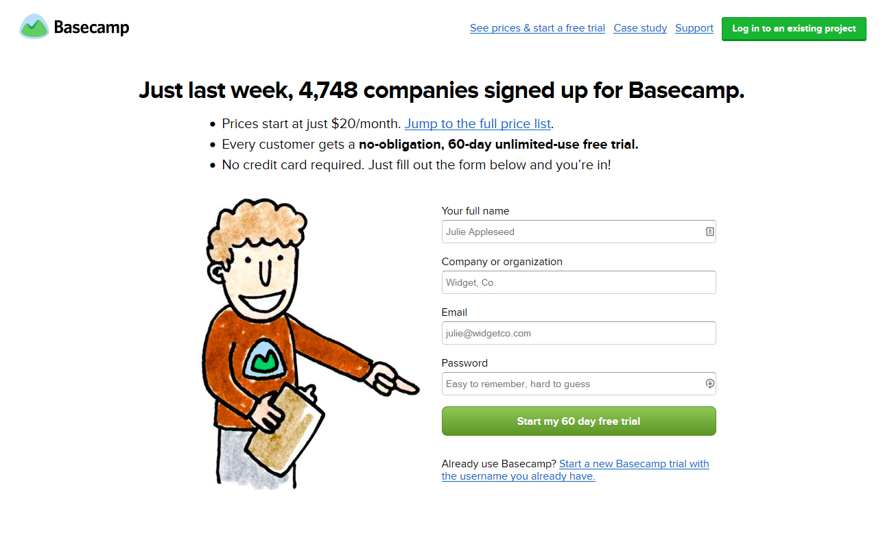
Before spending too much time thinking about creative ways to emphasize your headline, decide if a simple larger and bold font will do.
Basecamp is a perfect example of this type of emphasis, built with simplicity and a little bit of extra social proof.
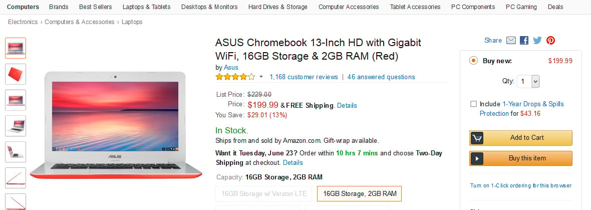
Buttons
Buttons are the most common thing people think of when they start focusing on emphasis.
A good way to think about buttons is that it doesn’t matter so much which exact color or style they are, but instead that they stand out compared with other elements on a page.
Example:
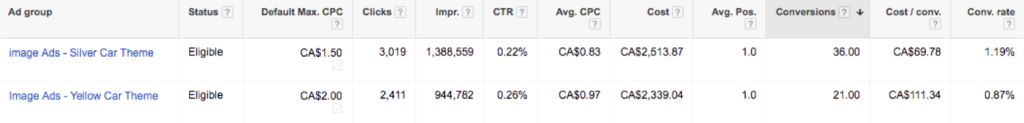
In this example one of our clients, we noticed that the bright orange car might be distracting from the actual CTA. So we put it to the test. We A/B tested the page alongside another one that had a silver car with an orange CTA:


Which version do you think got the most conversions? If you chose the silver car with orange CTA, you're correct:
Pricing Tables
Pricing tables are an excellent way to provide quick emphasis to product features and promote conversion on landing pages that even have just one product.
Example:
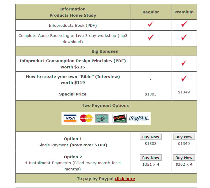
Sean D’Souza regularly uses this technique on his info-product sales pages.
With a few small variations in bonuses and pricing to increase value while barely increasing price; making the decision to sign-up then becomes a no-brainer.
Forms
Forms are an integral part of lead generation landing pages.
If the main call-to-action on your landing page is to get people to sign up for something or become a lead, then making a standout form becomes vital.
Example:
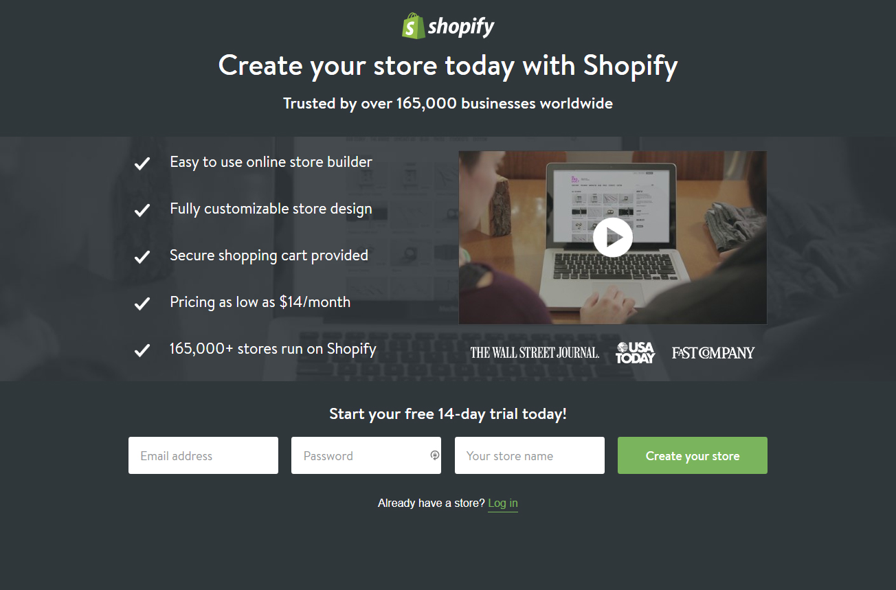
Shopify does a great job of emphasizing the sign-up form with contrasting white and green colors so that it’s immediately apparent to the visitor how to sign up.
Urgency Messages
The past few years, I’ve noticed quite a bit of backlash around urgency messaging on landing and sales pages.
Many people need time to think about their decision and don’t like to be rushed, which is completely understandable.
The trick here is to only use urgency messaging when something truly is urgent or scarce and people truly need to be aware of that. This might be in the cases of events, limited spots or limited-time sales.
Example:
Amazon has a great use of emphasis on their time-limited shipping without being obtrusive or annoying for potential customers. Since shipping times truly are time-limited, this works in a genuine and non-pushy way.
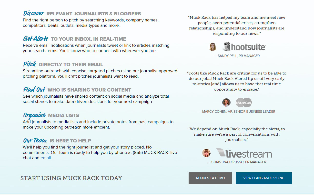
Testimonials
Testimonials are an excellent way to build credibility into your offers on your landing pages, although they are usually secondary in importance to your main calls-to-action. Think of them like happy supporters helping you increase your conversion rates.
The main rule-of-thumb here is that your testimonials are genuine and credible.
This means that they should include a picture, a full name (if possible), and can even be in video format. If you try to fake it, then people will notice, and you might be better off not having testimonials at all.
Your conversion rates will thank you for that.
Example:
Muckrack took emphasis a bit further by adding the logos of the companies that each person represents. It’s immediately obvious that these testimonials are genuine and come from real people.
Design Principle #2: Guiding Lines
Have you ever noticed how many lines there are everywhere?
Take a quick look around the room you’re in.
Your desktop or table makes a horizontal line, corners of the room make vertical lines, windows have angled lines.
Most everything made by humans has at least one line, depending on your view.
We rely on lines to help ground us and guide us in real life. On landing pages, they work just the same way.
Types of Lines
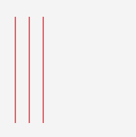
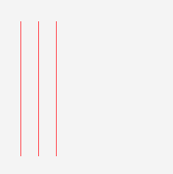
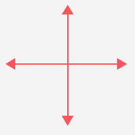
Vertical Lines
Vertical lines give the impression of stability and upward movement.
They will naturally guide the eye up or down your page.
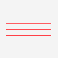
Horizontal Lines
Horizontal lines provide a sense of grounding and solidity. They provide rest and repose.
They are commonly used on websites and landing pages although they’re not always the best choice within the context they are used. More on this below.
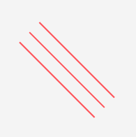
Diagonal and Angled Lines
These provide a sense of dynamism and movement.
These types of lines are great when you want to shake things up or illustrate the concepts of urgency, drama, or energy.
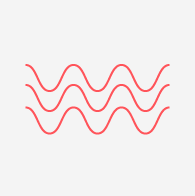
Curvy Lines
Curvy lines are less formal than straight lines.
They are best used when the feel of your page needs to be fun and a little bit more dynamic.
Thin Lines
Thin lines are gentle, elegant, and unobtrusive.
Most of the lines you see in web design are thin.
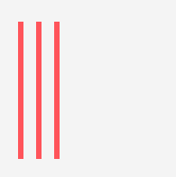
Thick Lines
Thick lines are best used when making a bold statement.
They suggest strength and power, but can easily become too demanding of attention when overused.
Arrows
Arrows are like assertive lines.
They demand attention, but need to be used sparingly in order to not distract and jarr your visitor from the rest of the page.
Arrows come in all shapes and sizes and can be attached to all different kinds of lines.
How to Use Lines on Your Landing Pages
The great thing about lines is that they are exceedingly helpful at guiding your visitor’s attention to where you’d like them to go.
And a great and effective landing page with high conversion rates is all about directing attention and flow so that your visitors find the information they need.
Here are examples of how you can use the different types of lines on your landing pages.
Vertical Lines
Landing and sales pages tend to be vertical in nature, simply because all of the information needs to be contained to just one page and you typically don’t want to send people elsewhere.
In this case, vertical lines create a natural flow downward.
This can be by having the whole page itself in a “box” with vertical sides or making sure that the objects on the page are stacked on top of each other in a way that creates a natural line.
Have you been trying to keep everything above the fold? That’s not necessary with the use of good vertical lines and flow.
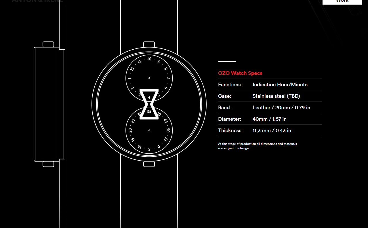
Example:
The OZO Watch work page has a creative use of vertical lines that encourage the visitor to scroll down and view more on the page. It’s a creative invitation to see more.
Horizontal Lines
Horizontal lines are extremely popular on websites and landing pages because they make great dividers when separating one section from another.
The problem with them is that they also provide feelings of rest and a certain doneness.
What you want to avoid is for your visitors to think your landing page is “done” and quit scrolling down when you want them to see more.
A practical way around this issue and keep separation between the sections on your landing page is to use alternating background colors instead of borders.
Example:
Here is a piece of a sales page we designed for a client that utilizes this technique.
The flow from one section to another is very subtle to provide separation without a sense of finality.

Diagonal and Angled Lines
Building in energy, movement, and play can be a great strategy for a landing page design that needs to reinforce a sense of speed or urgency.
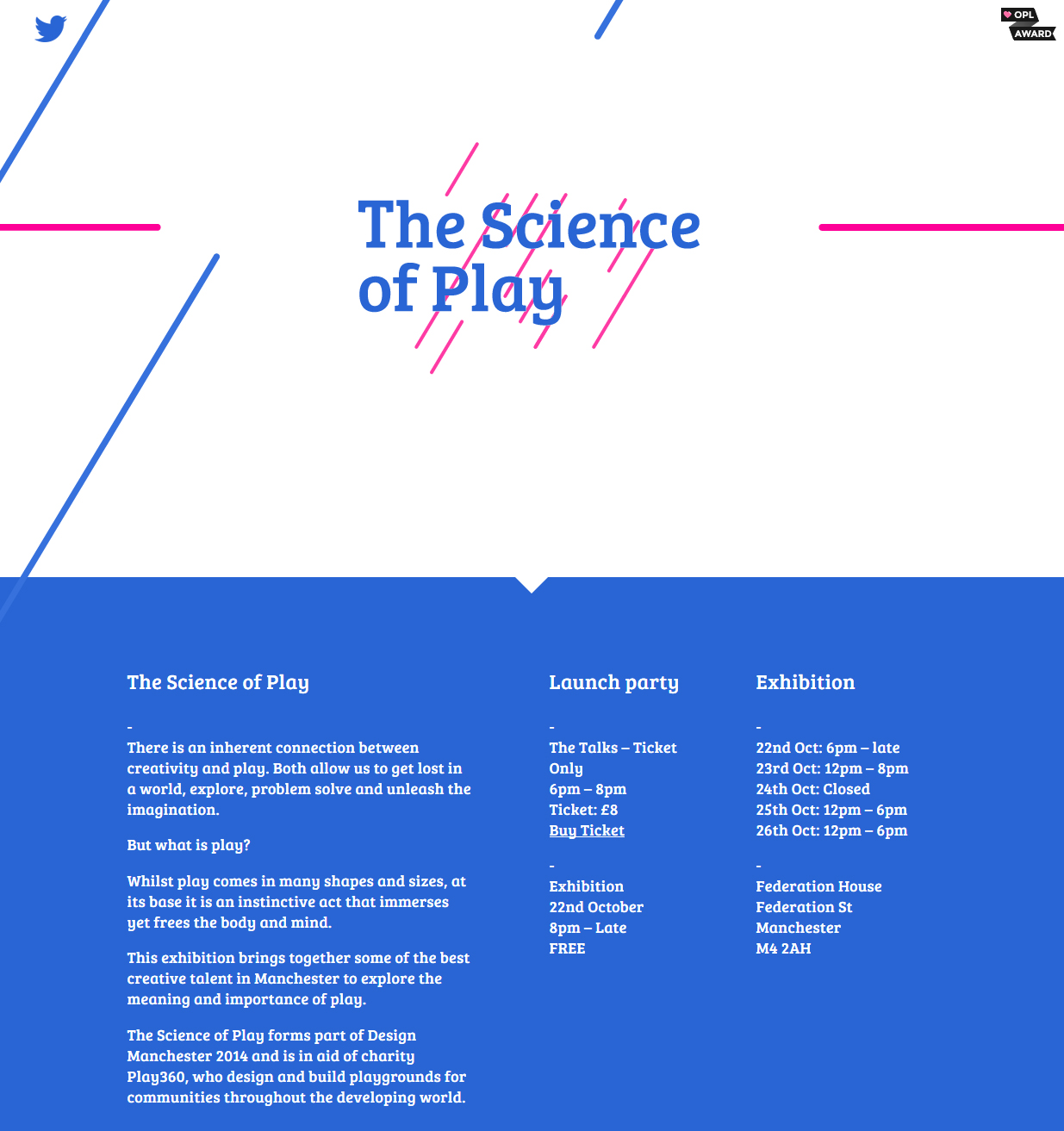
Example:
The Science of Play site perfectly exemplifies the concept of “play” with subtle animations and angled lines.
Curvy Lines
Curvy lines are rare in the digital world of grid and boxed-based design.
Using them can be a great way to call attention for fun and whimsical products and offers.
Example:
Here we used curvy arrows to guide the visitor down to each section, complement the fun feel of the brand, direct the flow downward, and bring attention down to the headlines in the copy.
Thin Lines
Thin lines are great when you need them to define and separate areas in your landing page’s layout without distracting attention from your call-to-action.
Most lines you see on the web are 1px wide because that is the smallest unit of measurement there is for the web.
Beyond using these types of lines for visual separation, they’re also handy for creating boxes.
Lately, they’ve been in use a lot with the flat design trend as call-to-action “ghost” buttons and forms.
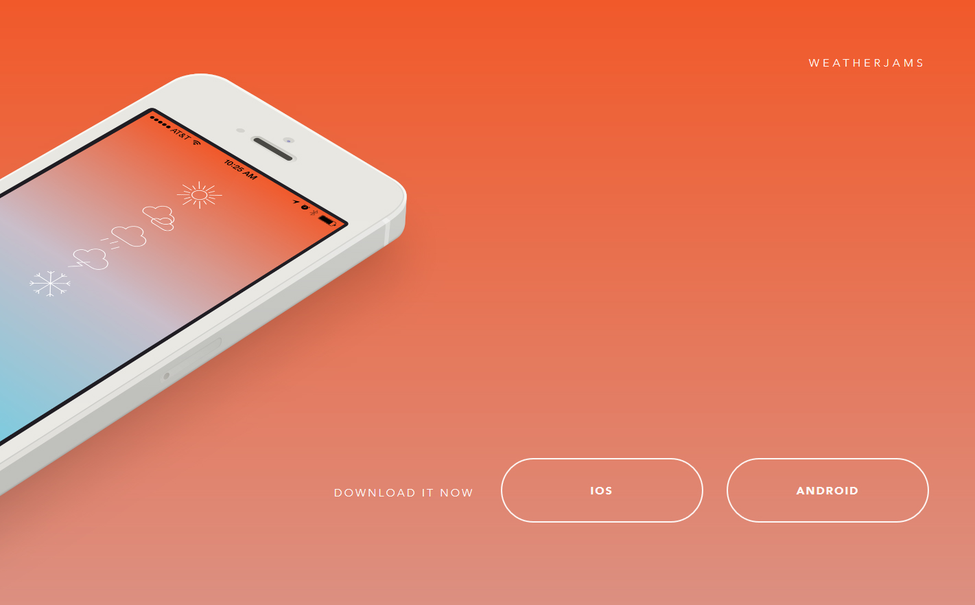
Example:
The Weather Jams app website has a great use of ghost buttons. The simplicity of the rest of the page draws all the attention right to the download buttons.
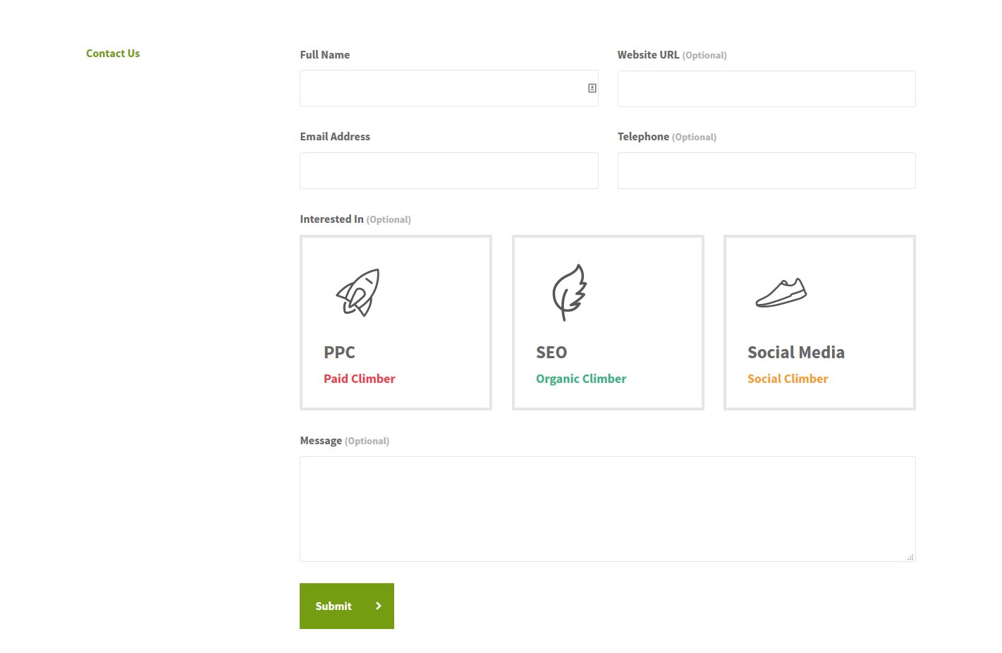
Thick Lines
Thick lines can be very useful in helping calls-to-actions stand out, especially when they are contrasted against thin lines.
Examples:
Alone, the thick lines in these examples wouldn’t be very exciting.
But, contrasted against the thin lines on the rest of the page, the action to choose a specific interest becomes more clear.
Arrows
Arrows are extremely effective on landing pages when used with moderation. A great rule of thumb is to use them sparingly only on your main call-to-action or another element that needs special emphasis outlined above.
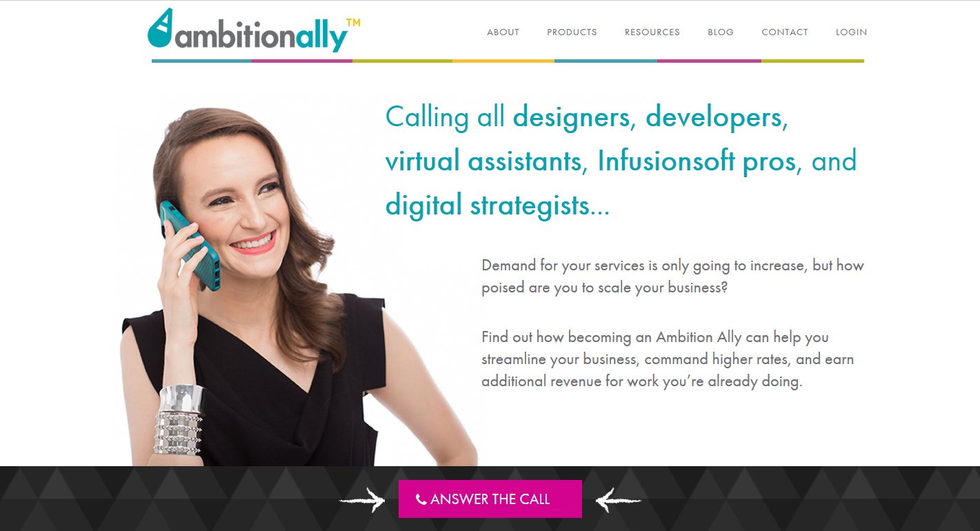
Example:
Here is an effective use of arrows we implemented on the Ambitionally home page.
Design Principle #3: Rhythm
Rhythm is what helps create flow on your landing page and allows visitors to build confidence and more easily find the information they’re looking for.
Without good rhythm, everything becomes a chaotic mess of cacophony.
Some ways that rhythm are used in effective design and conversion-oriented landing pages are:
- Style Consistency
- Repeating Elements
- Good Transitions
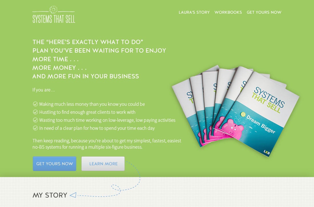
Style Consistency
This is where having really good branding and style guidelines prepared comes in handy.
So often, we’ve seen clients struggle with gaining consistency and flow on their landing pages simply because they are looking outside and trying to copy the styling of another brand.
This is easily solved by making a concerted effort to use colors consistently, using patterns and decorations consistency, and using the same fonts and other decorative elements that you use for your main overall brand.
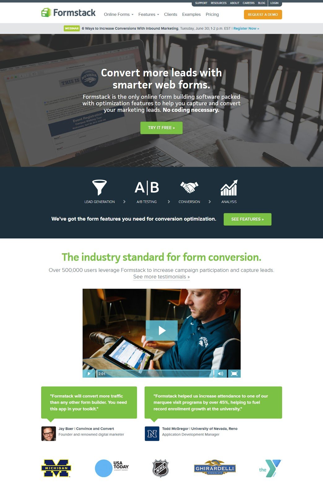
Example:
The Formstack home page does a great job at keeping style consistency and flow by sticking to its main brand colors of greens and blues with orange to emphasize buttons and icons.
Repeating Elements
Repeating the same types of elements goes a long way in providing confidence for your site visitors.
This could mean repeating headlines with the same types of styling, repeating boxes of information with the same background colors, or, in the case of longer-form sales pages repeating buttons where it makes sense.
Example:
In this example, we made use of an unusual kind of button styling for emphasis and repeated the buttons down the page where it made sense within the context and flow of the page.

Good Transitions
Good transitions are all about creating a natural flow for your visitors to move from one area on your landing page to the next.
If you’ve ever studied writing or copywriting, you may already know how important it is to have transitional phrases at the end of each paragraph to introduce and ease your reader into the next paragraph.
The same concept applies to design.
Example:
Purple Rock Scissors do an excellent job of applying transition on their case studies pages.
The visitor is encouraged to scroll down the page through a type of visual storytelling and is also guided by an interactive navigational table of contents on the left.

All of this said, I know keeping all of these conversion optimization tips in mind while you’re setting up and designing your landing pages can be challenging if designer isn’t in your job title.
Here’s a quick handy checklist you can use for your next landing page project.
Which elements on your landing page are you emphasizing?
- Headlines
- Buttons
- Pricing Tables
- Forms
- Urgency Messages
- Testimonials
- Other Messages that are important for your visitors to see
What types of lines are you using on your landing pages to increase conversion rates?
- Vertical
- Horizontal
- Diagonal
- Thin
- Thick
- Curvy
- Arrows
How are you promoting rhythm and flow on your landing page?
- Style Consistency
- Repeating Elements
- Good Transitions
P.S. Learned something new? Please share this with your network!


