Landing pages are the backbone of any successful ad campaign.
Get them wrong and kablooey—watch as your masterfully-crafted ad campaigns hemorrhage money.
There is some good news, though. As a landing page design agency that has launched thousands of landing pages and researched thousands more, we see the same common landing page mistakes over and over again.
And in this article, we’re going to teach you how to identify them and fix them before it’s too late.
What are the 17 most common landing page mistakes crippling your conversions?
We’re glad you asked.
- Landing page mistake #1: Too many conversion goals
- Landing page mistake #2: Assuming shorter forms convert better
- Landing page mistake #3: Including a navigation menu and footer
- Landing page mistake #4: Not matching ad copy with landing page copy
- Landing page mistake #5: Not optimized for mobile
- Landing page mistake #6: Forgetting your thank you page
- Landing page mistake #7: Using a single conversion path
- Landing page mistake #8: Not emphasizing value with your CTA copy
- Landing page mistake #9: Letting objections go unhandled
- Landing page mistake #10: Forgetting social proof
- Landing page mistake #11: Burying your value proposition
- Landing page mistake #12: Talking like a robot
- Landing page mistake #13: No visual hierarchy
- Landing page mistake #14: Slow load time
- Landing page mistake #15: More features than benefits
- Landing page mistake #16: Stock photography
- Landing page mistake #17: A/B testing without enough data
- Closing thoughts on landing page mistakes
Get brand new landing page strategies straight to your inbox every week. 23,739 people already are!
Landing page mistake #1: Too many conversion goals
Research shows that when you ask your landing page visitors to make too many decisions, they end up making fewer. In fact, adding a second conversion goal to your landing page can drop conversions by as much as 266%. Yikes.
This means a high-converting landing page should present its visitors with a single, well-defined conversion goal, not many.
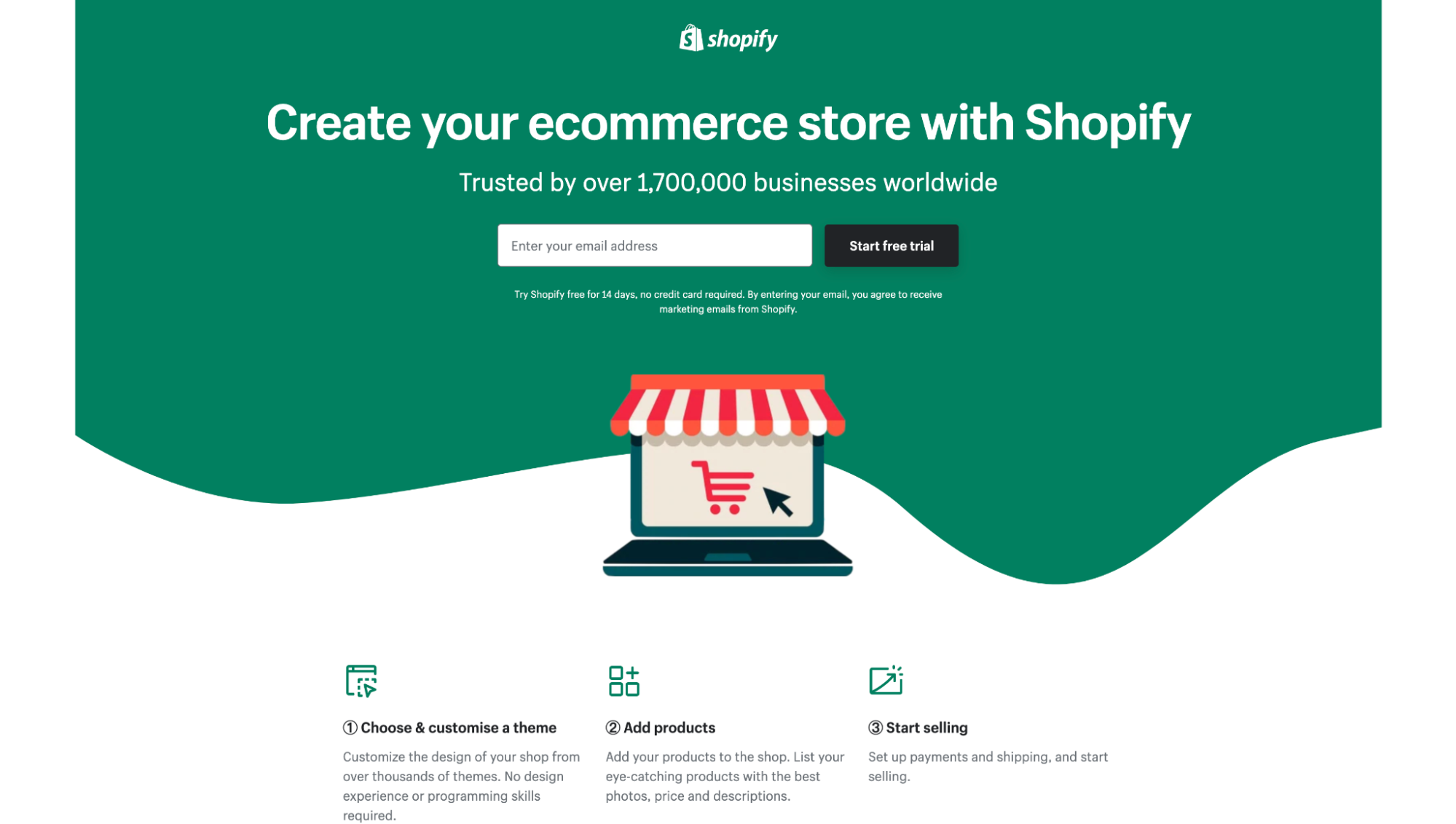
For example, notice how Shopify doesn’t ask its visitors to watch a demo, start a free trial, and learn more about its features, all from the same page?
Instead, it simply asks them to start a free trial.
One conversion goal. Not many.
Fix this landing page mistake
Instead of sending different sources of traffic (e.g., Instagram, LinkedIn, Google) with different levels of purchase intent to the same landing page, only send one source of traffic with one clearly-defined purchase intent.
For example, branded queries on Google search (active channel) have higher purchase intent compared to cold traffic from Instagram (passive channel).
So instead of sending both groups of visitors to the same landing page (where you’d have to provide an offer for both stages of the buyer journey), split them up into their own campaigns (each campaign with its own conversion goal aligned with the intent of the visitor).
We call this the Ice Cubes and Lava Scale here at KlientBoost.
You wouldn’t want to ask cold Instagram traffic to book a demo if they’ve never heard of you before, right? Of course not.
Just like you wouldn’t want someone who searches for “KlientBoost PPC agency” to download a free guide before they buy (because they’re ready to buy now).
So act accordingly. Get more granular with your campaigns so you can build your landing pages around a single conversion goal.
Landing page mistake #2: Assuming shorter forms convert better
Over and over again, we’ve been told that fewer landing page form fields result in more conversions.
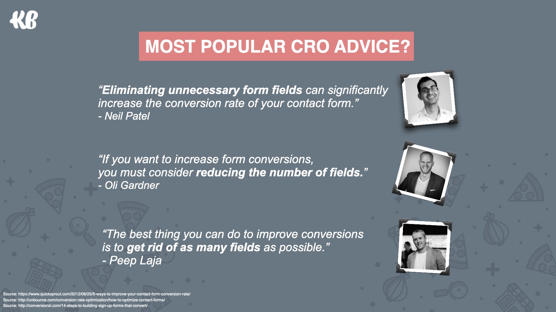
In many cases, that’s absolutely true. Eliminating unnecessary form fields (i.e., form fields that you don’t need) can, and usually does, lead to more conversions.
But that’s not always the case.
Sometimes, longer forms convert better and deliver higher-quality leads.
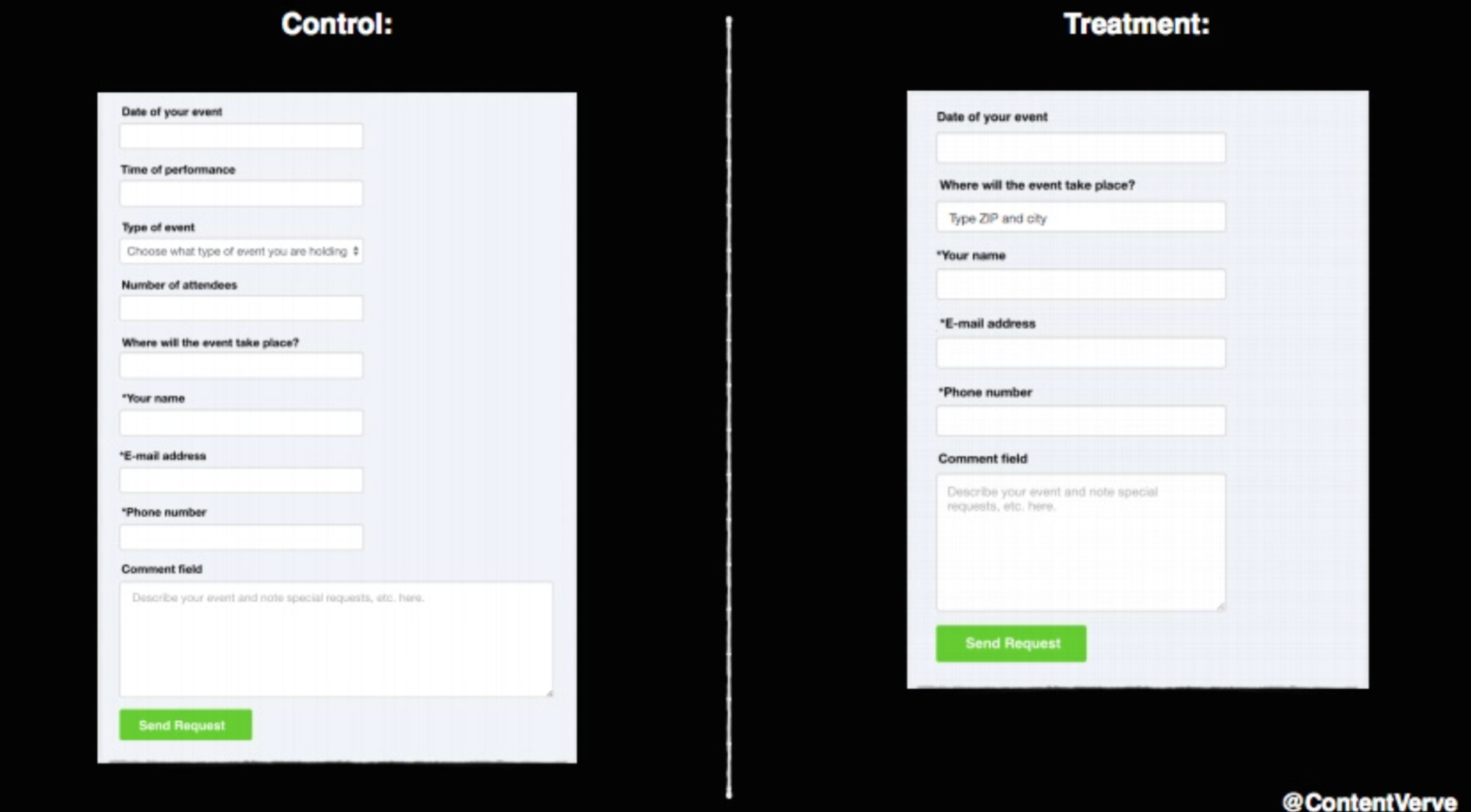
For example, in a now-famous test, Micheal Aagaard (formerly of Unbounce) discovered that reducing his lead capture landing page form from nine fields to six fields resulted in a 14% decrease in conversions.
The problem with too short of forms is two-fold.
First, shorter forms may take less time to fill out, but when you remove everything but name, email, and phone number, you’re leaving visitors with a highly threatening proposition, even if it’s a short one.
Second, though shortening forms may lead to higher conversions, it often leads to lower quality conversions. That’s because “window shoppers” or “looky-loos” are less likely to fill out a longer form than serious prospects.
No bueno.
So why not have the best of both worlds of slightly longer forms and higher conversions?
Fix this landing page mistake
Enter: The Breadcrumb Technique.
The Breadcrumb Technique is our version of a multi-step form.
Instead of presenting all your form fields in a loooong, single column, break them up into 2-3 part steps.
For example, notice how our form technically asks six questions, but no step has more than three questions?
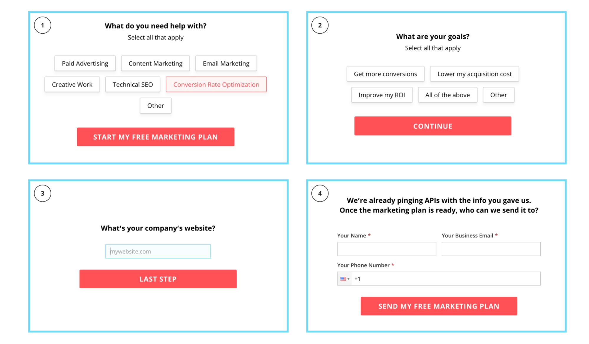
The Breadcrumb Technique uses behavioral psychology to micro-convert prospects from one stage to the next by asking easy questions first and hard questions last.
Notice how the first two questions ask for interests and goals, not a phone number or email?
By getting your landing page visitors to commit to a non-threatening, low-ask question first, you increase the likelihood that they’ll complete the more threatening questions last. Turns out humans like to finish what they get started, and getting started is most of the battle.
So does it work? Absolutely.
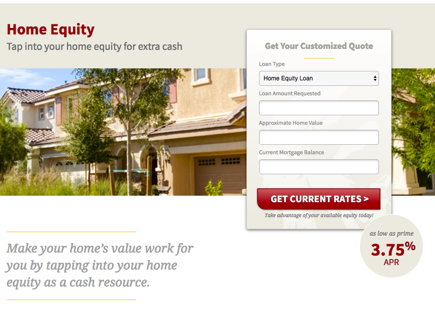
After breaking one of our finance clients' forms up into multiple phases using the Breadcrumb Technique, we increased conversion rates from 1% to almost 20%, increased conversion volume from 6 to 135 per month, and reduced our CPA from $800 to $35.
Here’s the landing page:
Here are the results:

Landing page mistake #3: Including a navigation menu and footer
Attention ratio was a concept first introduced by Oli Gardner from Unbounce.
It states that because your landing page visitors have limited attention spans, every landing page should do its best to keep the ratio of links on the page to the number of conversion goals as close to 1:1 as possible.
In other words, if you want your visitors to “Buy now,” then don’t provide them with any other options but to buy now.
Everything else is just a distraction (or potential exit opportunity). So cut the navigation menu and footer, and keep your visitors’ eyes on the prize.
Fix this landing page mistake
With the exception of your terms and privacy policy links, how many other links do you actually need on your landing page?
Likely none.
At least not if you’ve done your job of focusing on a single conversion goal.
So instead of burdening your visitors with mega menus, dropdowns, social links, and footer links, remove them entirely.
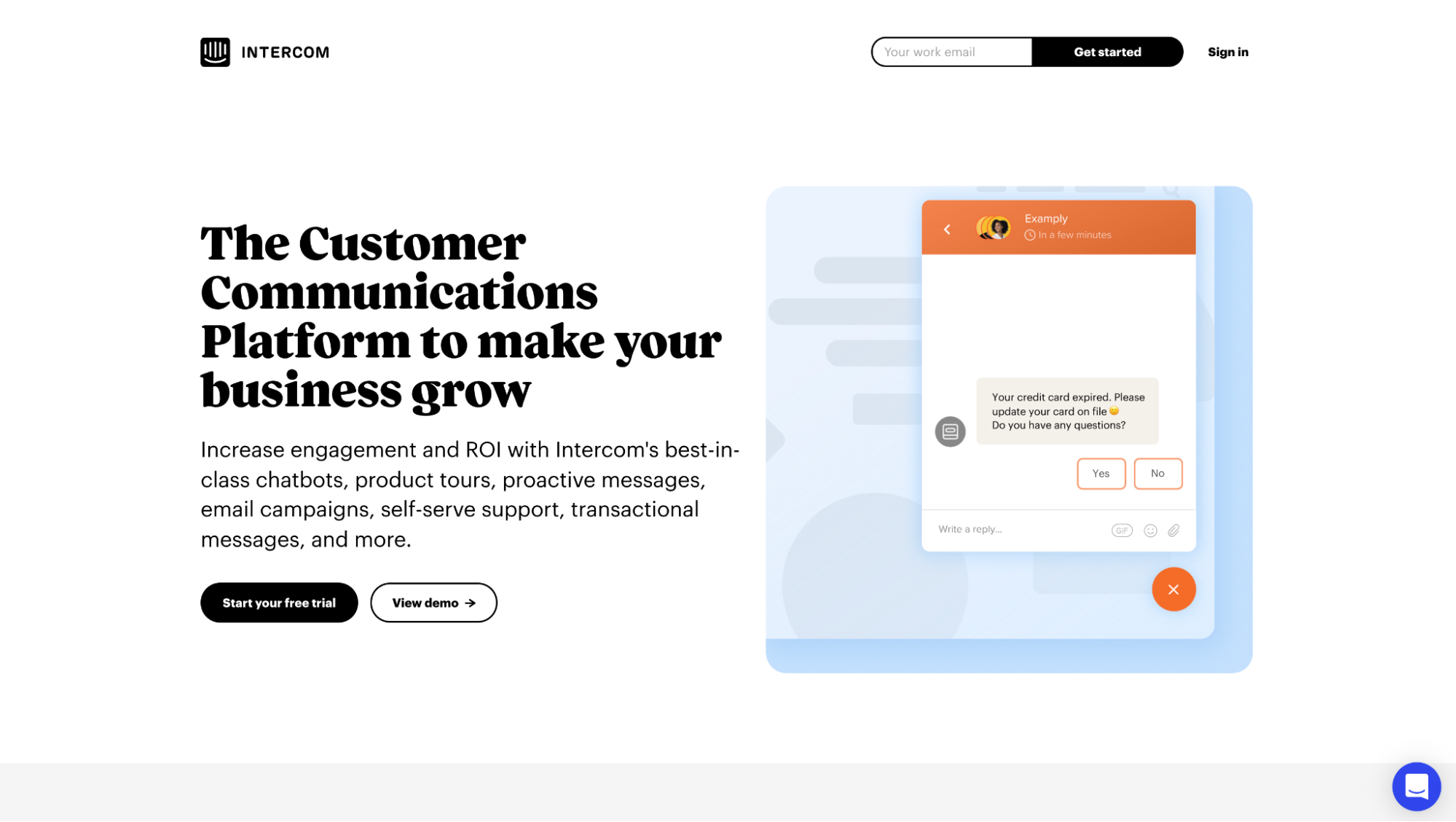
For example, take a look at how Intercom has removed their navigation and footer entirely and reduced the number of links (with the exception of their terms, privacy policy, and sign-in) to just two: “Start your free trial” and “View demo.”
Landing page mistake #4: Not matching ad copy with landing page copy
Message match refers to the concept of matching the style, tone, voice, and copy of your ads to the style, tone, voice, and copy of your landing page.
When the two differ (ad to landing page), it’s like asking visitors to travel from one side of a mountain to the other, only without a bridge.
Not to mention performance: PPC and conversion rate optimization (CRO) are like conjoined twins. When one improves, so does the other. This means aligning your message leads to fewer bounces and more conversions, which also leads to high Quality Scores and lower cost-per-click (CPC).
Fix this landing page mistake
When a visitor clicks on your ad and arrives on your landing page, it should feel like one seamless experience.
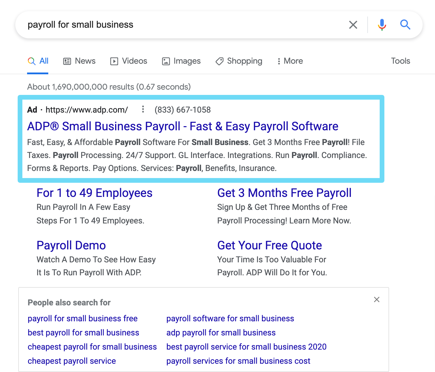
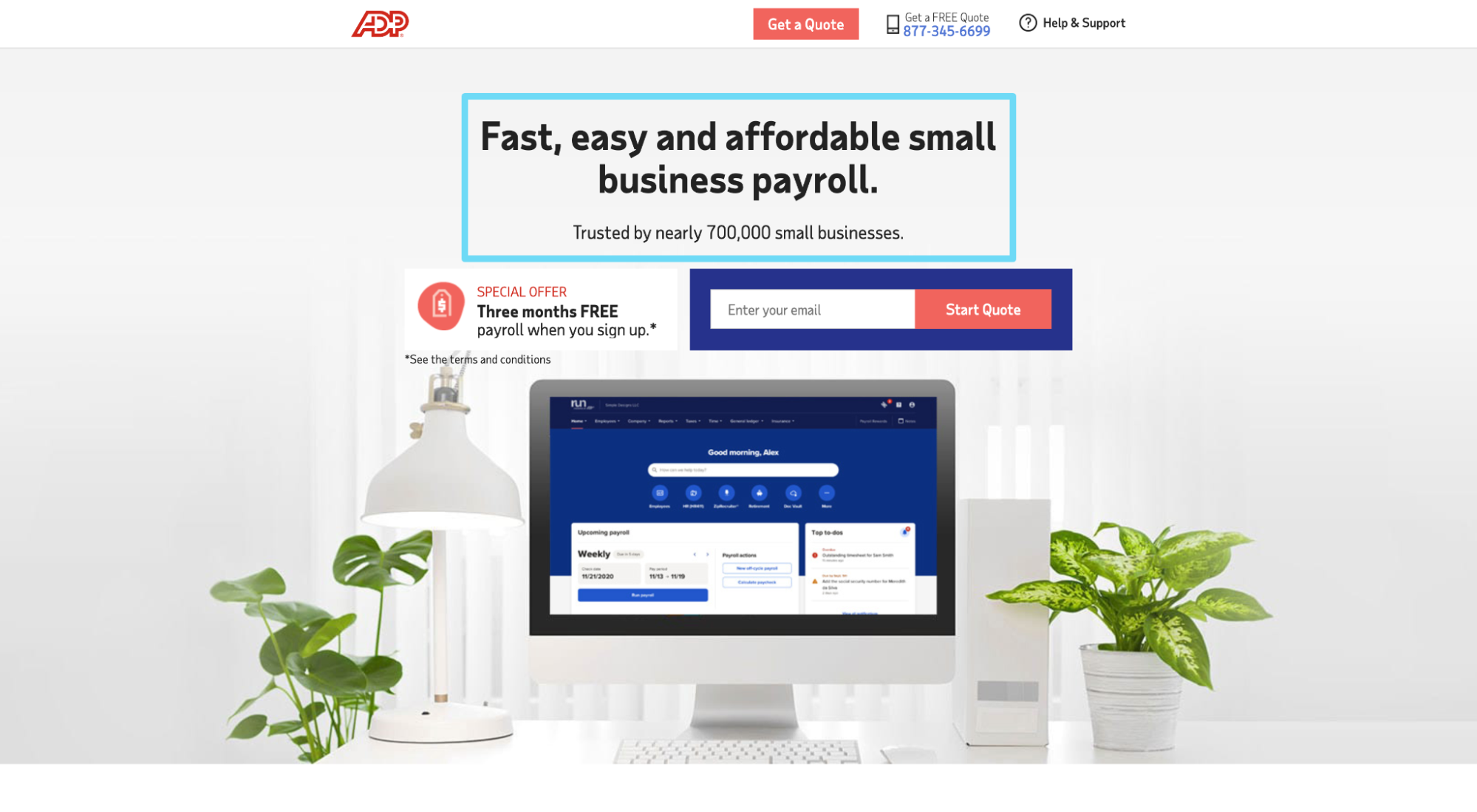
The benefits and call-to-action (CTA) you emphasized in your ad should match the benefits and CTA you emphasize on your landing page.
For example, notice how ADP’s Google PPC ad copy and CTA match the landing page copy and CTA:
Landing page mistake #5: Not optimized for mobile
In today’s digital landscape, mobile optimization should go without saying.
Sending mobile ad traffic to mobile-unfriendly landing pages is like sending your dog to obedience training when it’s 12-years old: pointless.
If you’re going to run mobile ads, run mobile landing pages, too.
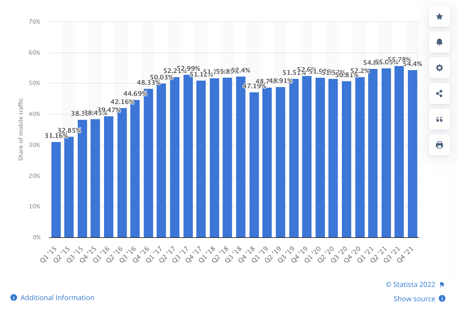
(By the way, I hope you’re running mobile ads because mobile traffic makes up over 50% of all internet traffic.)
Fix this landing page mistake
When it comes to mobile optimization, you have two options:
- responsive design: same page for desktop, tablet, and mobile, only resized and reorganized for a smaller screen size
- mobile-dedicated: a version of your landing page built specifically for mobile ads only (this takes more resources and time but also allows a bit more control)
Either way, ensure your mobile landing page passes the Google Mobile-Friendly Test Tool.
Landing page mistake #6: Forgetting your thank you page
It’s easy to forget that a click-through or form fill is only one step in the journey and that a few more (sometimes many more) will follow.
But it’s the truth. Once you get your visitors to convert on your landing page goal, your job isn’t over. You need to get them to the finish line as frictionless and efficiently as possible.
If it’s an “add to cart” conversion, you still have a cart and a checkout page to optimize.
If it’s a “book a demo” conversion, you still have a thank you page to optimize.
And if it’s a “free trial” conversion, you still have an account creation page to optimize.
Fix this landing page mistake
When it comes to thank you pages or checkout pages, two elements reign supreme:
- social proof: your account creation page, checkout page, or conversion page should especially feature social proof in the form of testimonials, client logos, or user stats to remind visitors why they came this far in the first place
- efficiency: your visitors have committed to buying, so your thank you page or conversion page should get them to the finish line as quickly as possible
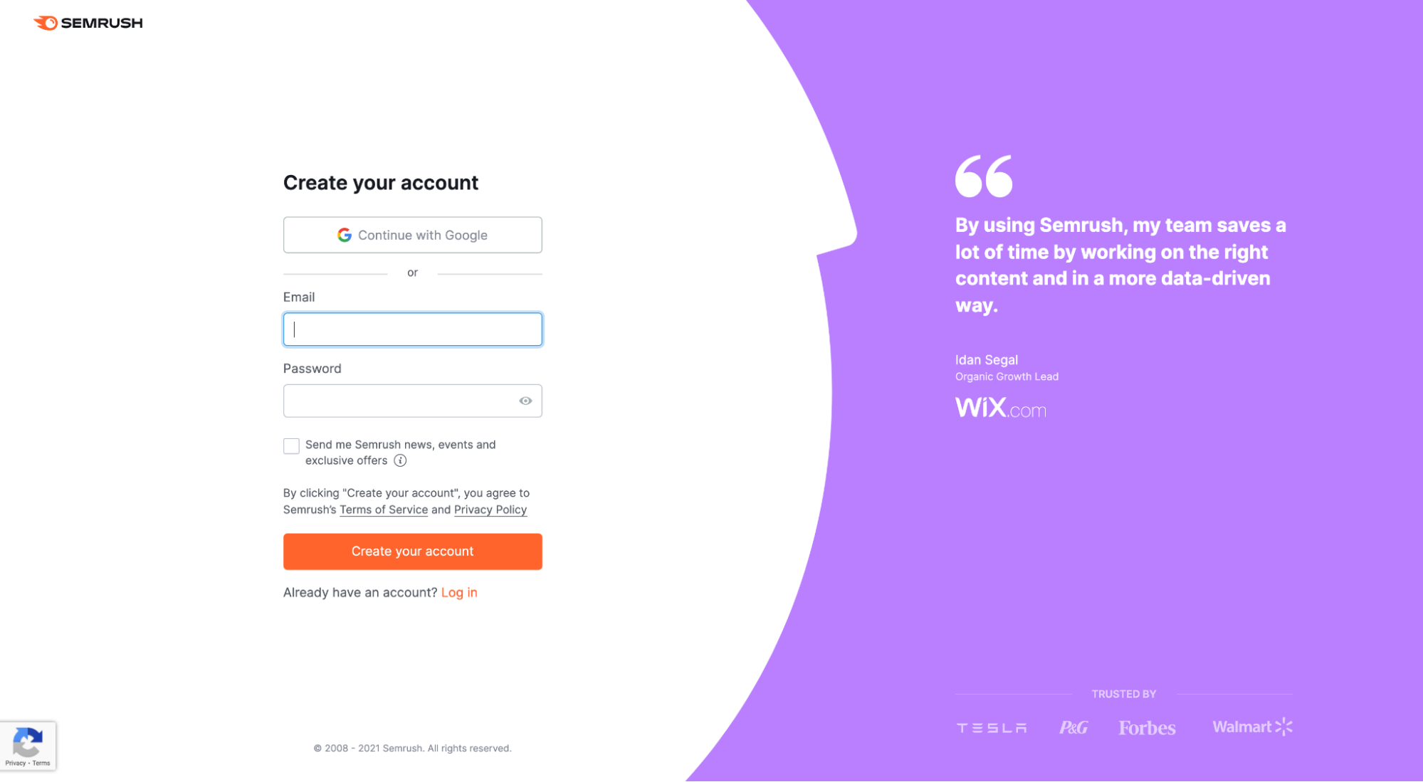
For example, Semrush places a testimonial from a Wix employee and four client logos (Tesla, P&G, Forbes, Walmart) directly on their account setup page.
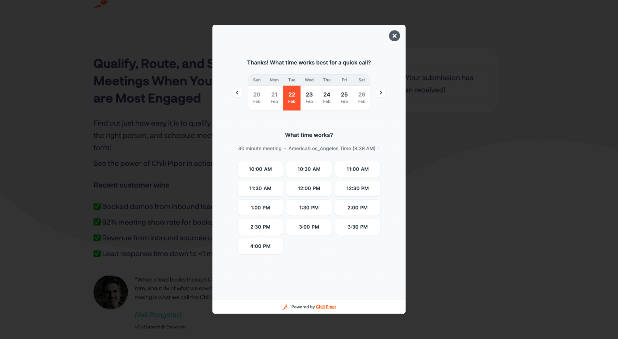
As for efficiency, after I request a demo from Chili Piper, they don’t send me to a generic thank you page with generic copy telling me to check my inbox for next steps.
Instead, they send me directly to their calendar so I can book a time immediately.
No friction. Immediate gratification.
Bottom line: If the visitor has signaled high intent, use the thank you page or conversion page to move them along faster.
Landing page mistake #7: Using a single conversion path
While your landing page should remain laser-focused on a single conversion goal, it’s still a good idea to offer multiple paths to complete that goal.
For example, most people prefer to avoid sales reps or customer service by using a simple online form or checkout; others like to call directly. Whatever they prefer, you should aim to provide those options.
Fix this landing page mistake
Give people options, such as
- a form
- live chat
- chatbots (chat greeters)
- phone number
- email address
Depending on what you sell (e.g., direct-to-consumer eCommerce vs. B2B software), the available paths to conversion will vary.
But if you offer the path, make it available. Then test the results.
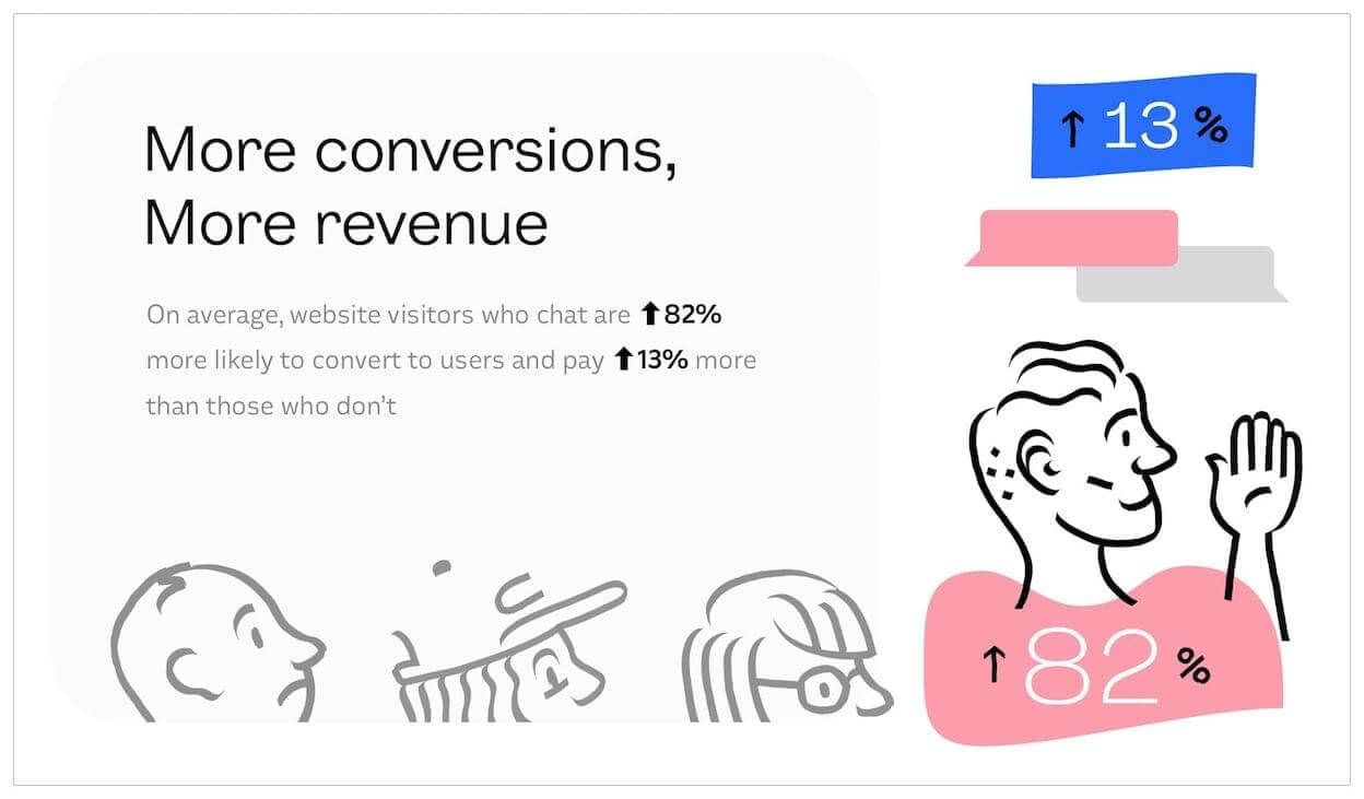
Bonus tip: Simply having a phone number on your landing page has been shown to increase conversion rates, even if no one ever calls it. Furthermore, visitors who use live chat are 82% more likely to convert.
Landing page mistake #8: Not emphasizing value with your CTA copy
CTAs are called “calls-to-action” for a reason: they’re supposed to motivate people toward a desired action.
Makes sense.
But the best CTAs aren’t just calls to action; they’re calls to receive value.
They don’t just open a clear and specific door; they increase motivation to walk through it.
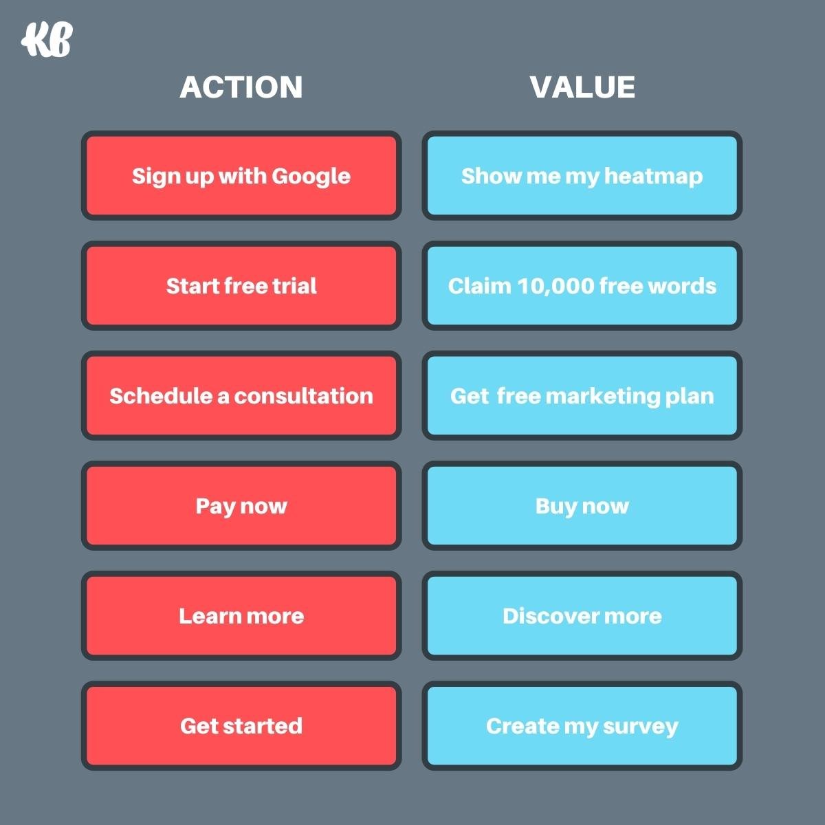
When it comes to landing page CTA button copy, lead with value, not just action.
Fix this landing page mistake
Don’t just entice clicks with a strong verb (though that’s a good start). Increase motivation by reminding your visitors what’s on the other side of a click.
For example, notice how Jasper (formerly Jarvis) doesn’t say “Start free trial” within their landing page CTA. Instead, they say, “Claim your 10,000 free words.”
Their conversion goal remains the same: to start a free trial.
But by emphasizing the value of the offer (not just the action), Jasper is able to increase motivation and the stakes. And with that comes an increase in conversions.
Let’s take a look at some calls-to-action vs. calls-to-value, and you be the judge:
Landing page mistake #9: Letting objections go unhandled
Your potential customers have all kinds of objections about your product or service, right? Right.
But they also have objections about your actual offer (as in the CTA offer), whether it be a download, subscription, demo request, purchase, or free trial.
For example, someone who wants to book a demo might also object to lengthy demo calls or relentless email follow-ups, regardless of the actual product.
Or someone who wants to start a free trial might object to handing over their credit card information, sitting through a lengthy sign-up process, or onboarding without a customer service rep.
Or someone who wants to buy now may have concerns about a return policy if the item doesn’t fit.
The list goes on and on.
Last-minute objections are conversion killers. But there’s an easy way to handle them: click triggers.
Fix this landing page mistake
A click trigger is a type of microcopy under or around your CTA buttons designed to handle objections about your offer or your product.
In a subtle and non-intrusive way, click triggers let you address common last-minute objections that could be causing hesitation.
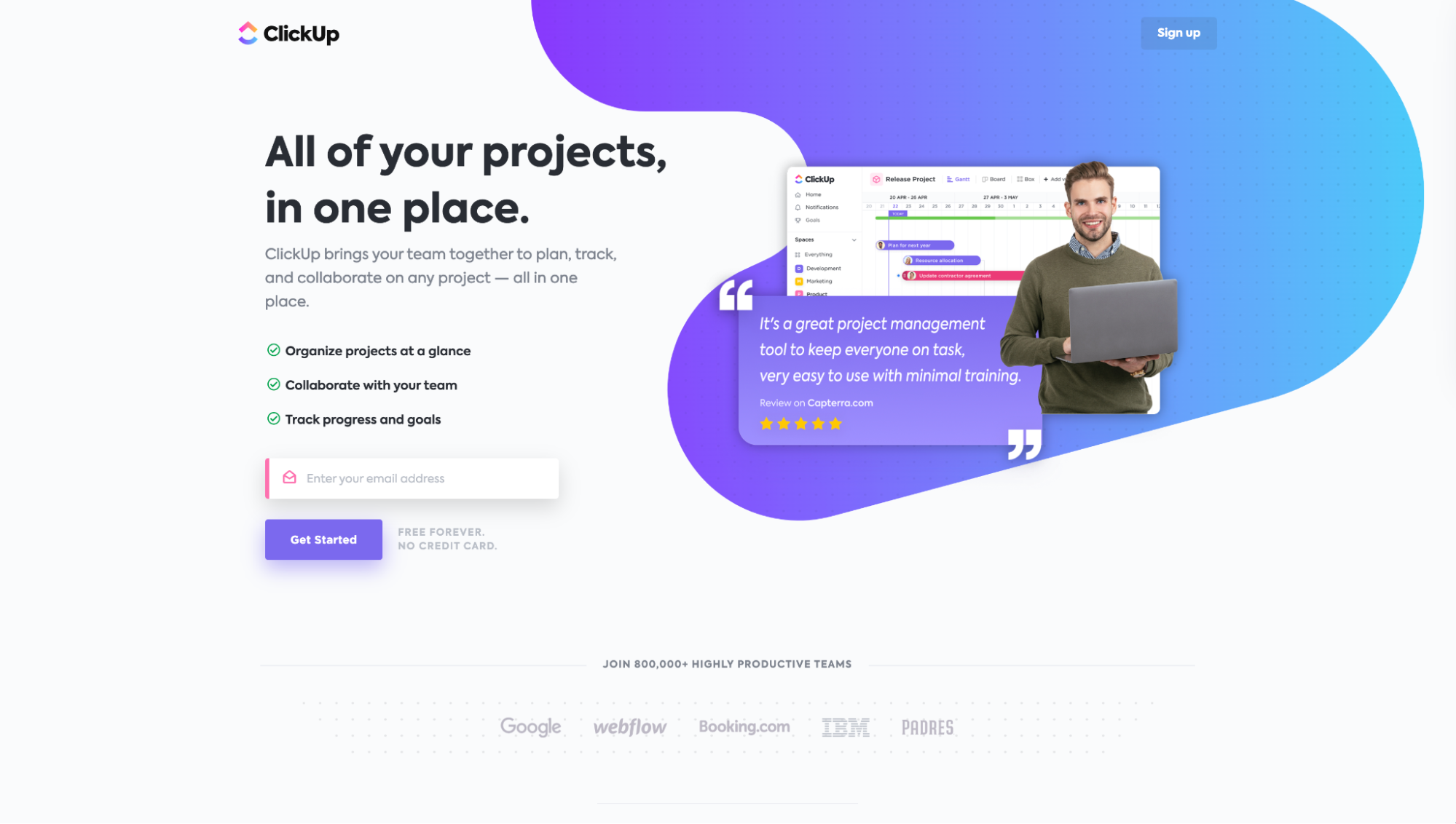
For example, notice how ClickUp uses the “Free forever. No credit card” click trigger to remind visitors that their free trial offer truly is just a free trial.
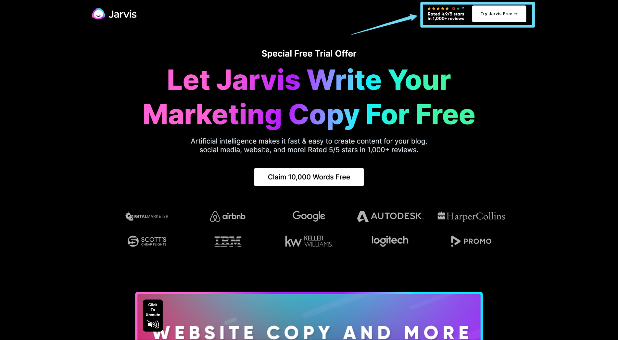
Or notice how Jasper places star ratings right next to their free trial button.
Landing page mistake #10: Forgetting social proof
Landing page social proof is any third-party recommendation or endorsement of your product or service, whether implicit or explicit.
Common forms of social proof include
- testimonials
- case studies
- star ratings
- client logos
- user stats
- celebrity or influencer endorsements
- awards
- trust badges
When it comes to conversions, don’t expect many without a healthy dose of social proof.
After all, when people don’t know which products or services to choose, they look for inspiration from their peers or colleagues who’ve already made the decision and had success.
Read more: Social Proof Examples That Build Trust And Boost Conversions
Fix this landing page mistake
We wrote an entire article on landing page social proof, so I won’t go too deep here.
Just remember that social proof isn’t a one-time job; you should have a system in place for growing social proof over time (and not just testimonials, but a variety of types and formats).
As for placement, we recommend peppering social proof everywhere on your landing page:
- above the fold
- benefits section
- forms
- click triggers
- in its own section
- thank you pages
- conversion pages (e.g., sign-up page, checkout pages, etc.)
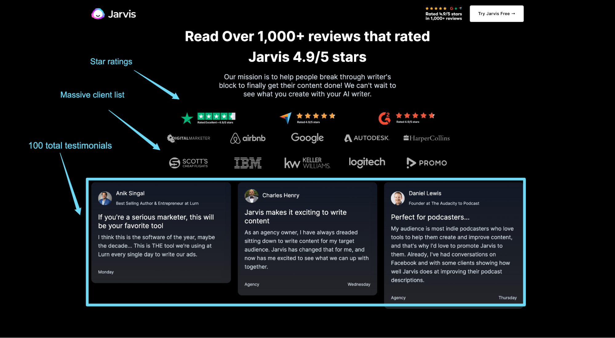
For example, Jasper features an indomitable social proof section chock-full of reviews, star ratings, client logos, and badges. But they also pepper social proof throughout the entire page.
Landing page mistake #11: Burying your value proposition
I can’t tell you how many times I’ve arrived on a landing page, felt confused about the value proposition based on the headline and subheadline, only to find a zinger of a value proposition somewhere buried between two sentences halfway down the page.
This is why your landing page value proposition needs a sharp point, and it needs visual prominence on your landing page.
Don’t hide it. Don’t be gimmicky. Get to the point immediately.
Fix this landing page mistake
Too often, we overthink the headline and subheadline (because we know how important it is) and end up burying the message behind a chunk of industry jargon and fluff.
Don’t do that.
Writing an effective value proposition comes down to three simple steps.
- What promise do you plan on making to your audience? What benefit do you promise to deliver?
- How do you plan on delivering that promise in a way your audience can trust?
- Who is this benefit for? Who is this benefit not for?
That’s it.
There are dozens of ways to architect your what, how, and who.
It doesn’t matter which way you choose. It only matters that you deliver it with the utmost clarity.
For example, let’s look at GatherContent’s current value proposition below. Their current unique selling proposition (USP) doesn’t bring clarity to what they do, who they do it for, or how they get it done. Actually, it’s rather confusing.
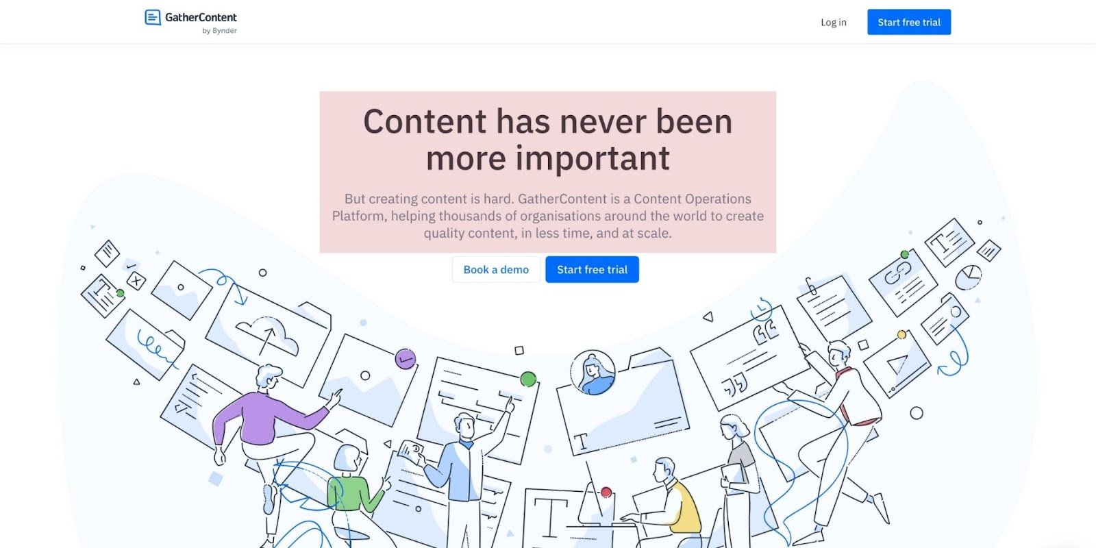
Now compare that with an edited version I whipped up.
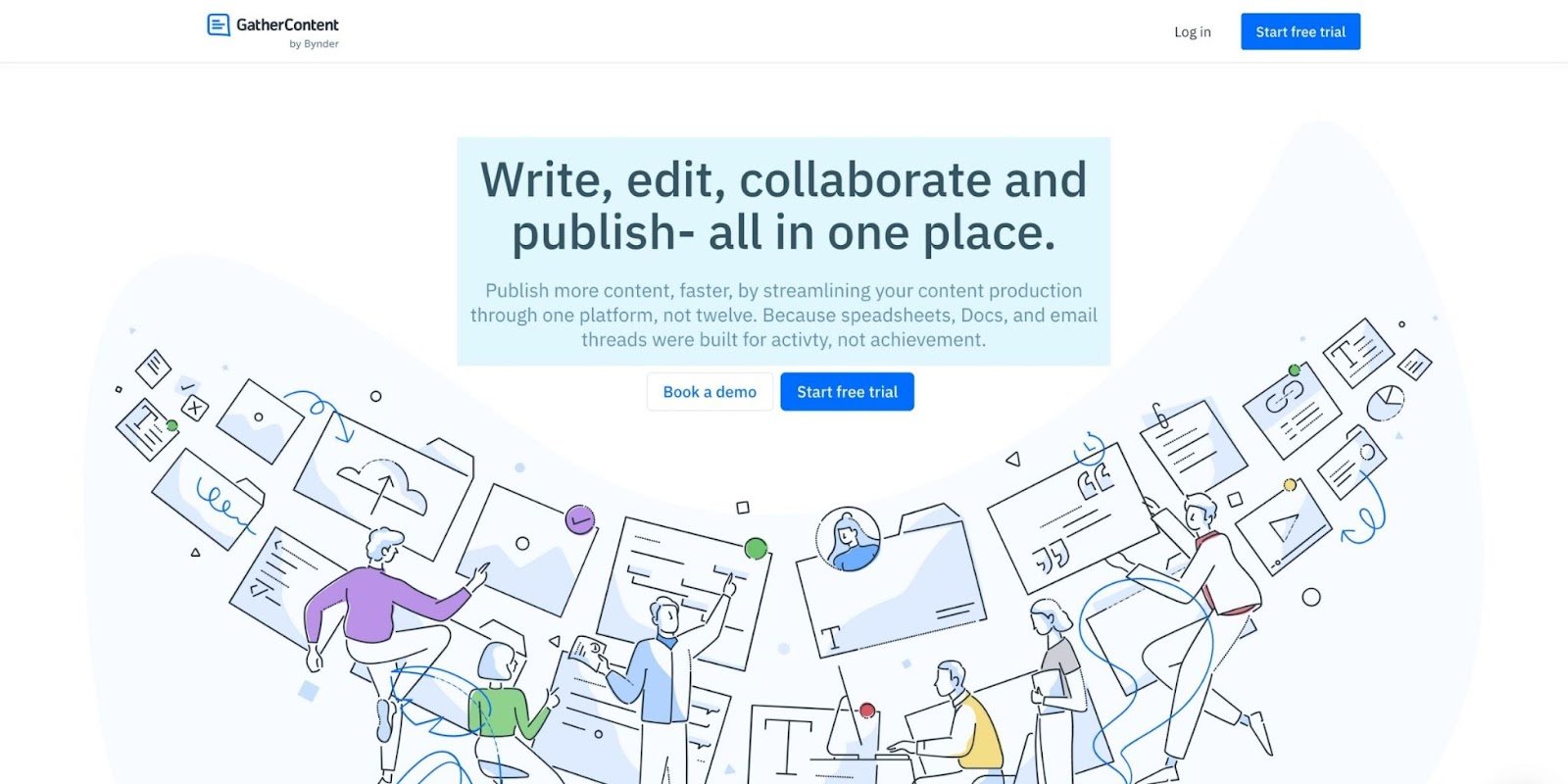
Much better, right?
I’ve used GatherContent in the past, so I’m familiar with the value they deliver. But I found most of this copy located halfway down the page.
The words are usually somewhere; you just gotta find ‘em. 😉
Landing page mistake #12: Talking like a robot
Speaking of industry jargon and fluff—there is no room for it within your landing page copywriting.
Clarity reigns supreme, always. This means describing your offer in a way a third-grader can understand.
And make your prospects feel like you're talking to them, like they’re the only person in the room. Not like you're talking at them.
Learning about a new product or service is daunting enough. Lessen the burden by conversationalizing your landing page copy.
Fix this landing page mistake
Write like you talk. Period.
We wrote an entire article on landing page copywriting that explores conversational copy. But let’s review the four simple steps here:
- Write in the 2nd-person: Address your audience directly as “you,” not indirectly as “them.” Your visitors should read the copy and feel like the events are about them, not a group of people.
- Avoid industry jargon: Stop talking about synergy, proprietary solutions, premier this or leading that. Make core concepts understandable to the layman. If you wouldn’t use it when explaining your job to your parents, don’t use it when talking to your customers.
- Break grammar rules: You’d never write a one-word paragraph or incomplete sentence in a formal paper. But when writing for a conversational tone, both successfully mimic spoken language. When it comes to well-crafted copy, learn the rules of grammar so that you can break them the right way. 😉
- Let your personality shine: Formal copywriting all read like the same person wrote it. Let your personality shine through your words. Bring your unique style. Help your visitors feel like they’re talking to a real human.
Landing page mistake #13: No visual hierarchy
People don’t read every single word on your landing page. They skim headlines and subheadings.
In fact, only 16% of website visitors read every word; the rest simply skim.
That means your landing page needs to communicate your value proposition, core benefits, and reasons to believe, all within the headlines and subheadings.
And information needs to flow from top to bottom in the same way your visitors prefer to read it.
Structure and hierarchy make skimming easier. Skimming makes comprehension easier. Comprehension makes action easier. Simple.
Fix this landing page mistake
The best landing page designs adhere to a strict visual and informational hierarchy.
Visual hierarchy refers to the pattern of design used to highlight certain elements of your landing page over others.
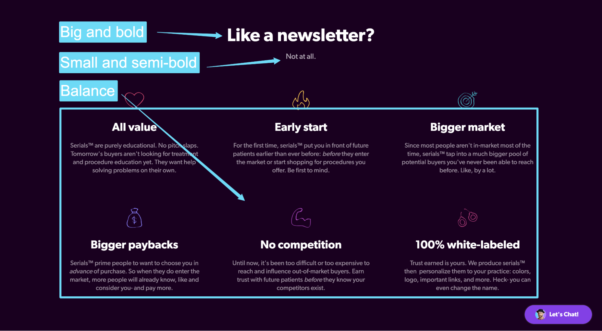
For example, notice how the landing page below makes use of color contrast, size contrast (scale), balance, and repetition to visually order the importance of copy?
Informational hierarchy, on the other hand, refers to the way your content flows from top to bottom. It should align with the way your visitors read a page (from left to right, top to bottom).
You have two data-backed options: Z-shaped or F-shaped.
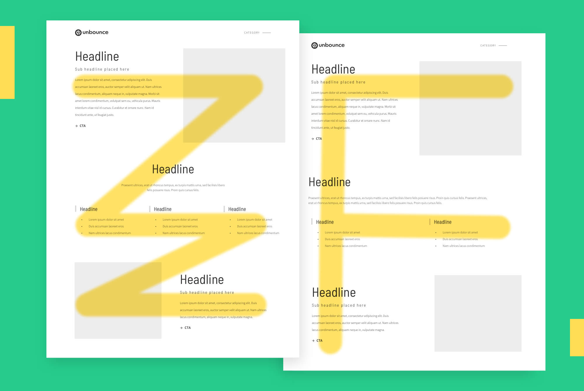
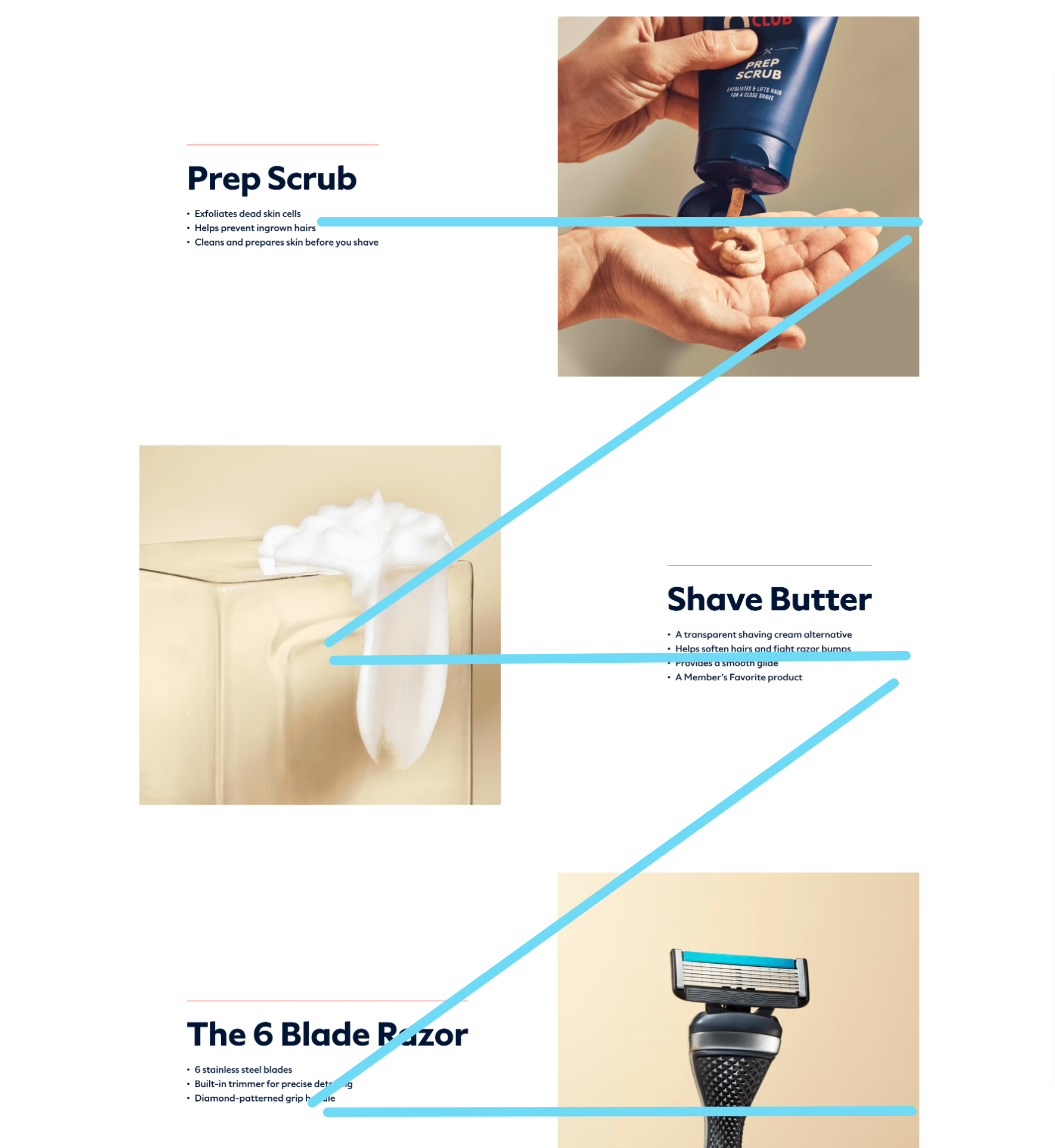
Hard and fast rule: Use a Z-shaped hierarchy for image-heavy landers. Use an F-shaped hierarchy for text-heavy landers.
Then place important elements (benefits, visuals, CTAs) on the points of the Z or F to add emphasis.
For example, Dollar Shave Club uses a Z-shaped hierarchy to emphasize their benefits and custom visuals.
Landing page mistake #14: Slow load time
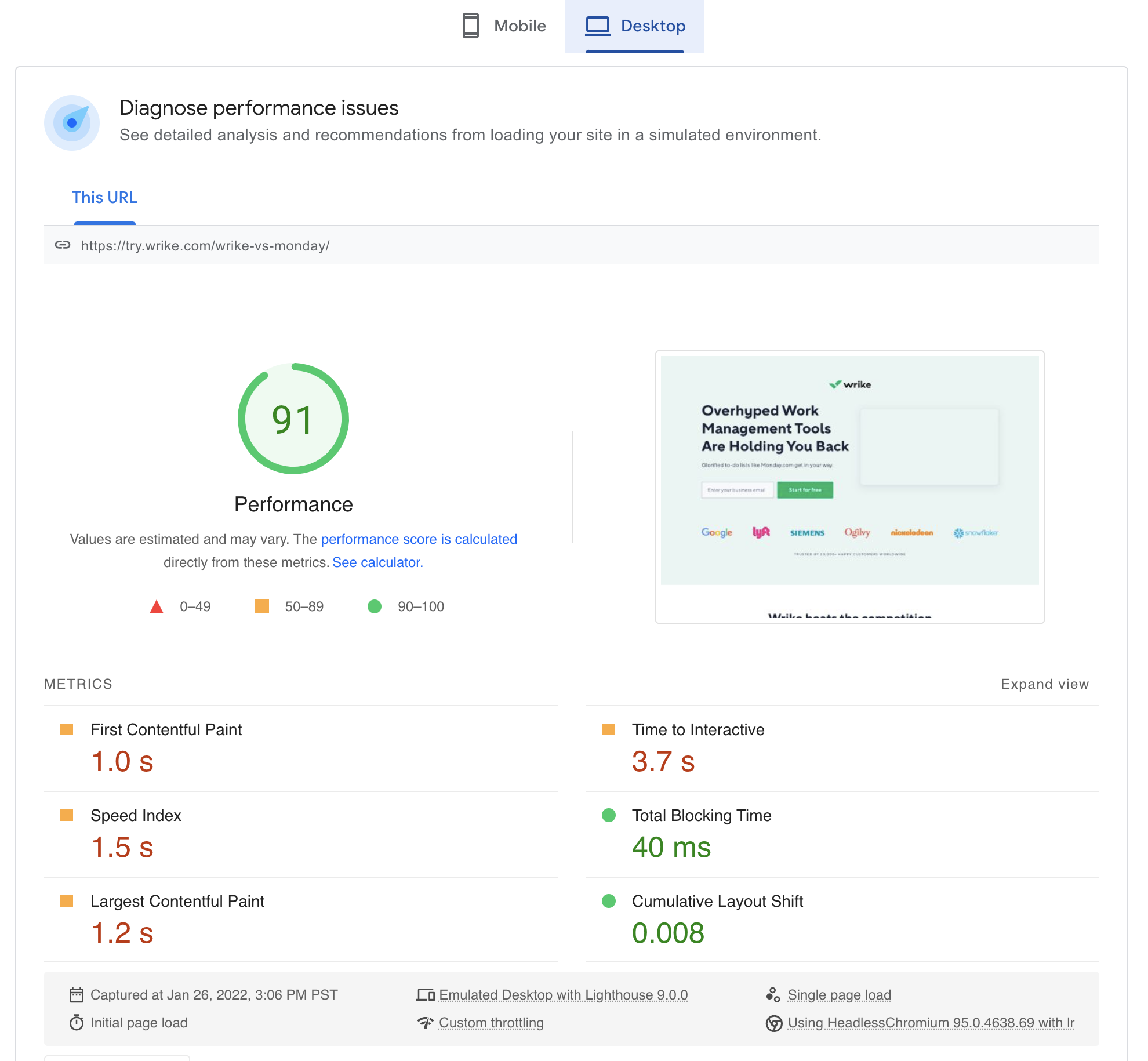
We’ll keep this short. If your landing page load time doesn’t pass Google’s Core Vitals report and their PageSpeed Insights test, you’ve got work to do.
Thankfully, both free tools offer an abundance of instructions on how to fix the speed errors they uncover.
So here’s the bottom line: according to Google, the probability of a bounce increases 32% as page load speed goes from one second to three seconds. The probability grows even more so when that load time jumps to five seconds.
Fix this landing page mistake
We wrote an entire article that explores ways to increase page load speed. But let’s cover the basics here:
- minimize time to first byte (TTFB)
- leverage browser caching
- use a content delivery network (CDN)
- reduce redirects
- minify CSS, Javascript, and HTML
- optimize images (compression, file formats, image size)
And if you’re using a landing page builder like Unbounce, don’t go crazy with custom JavaScript.
Not only could this cause issues with the landing page user experience (custom code breaks often when using a builder), but it can bog down your page speed.
Landing page mistake #15: More features than benefits
Your landing page visitors don’t care as much about how you deliver results as they do about what results you promise to deliver.
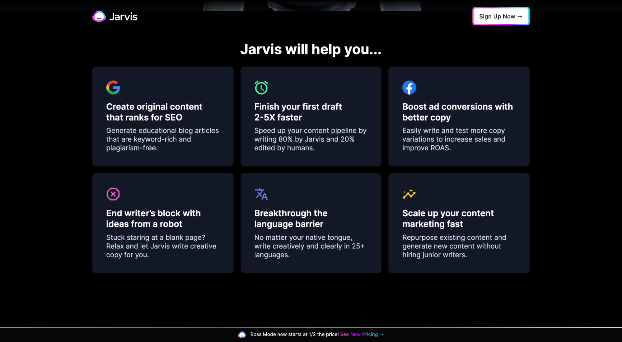
This means your copy should spotlight core outputs, not inputs; benefits, not features.
For example, do I care more that Jasper offers language translation, artificial intelligence, and machine learning? Or do I care more that they will help me boost ad conversions, write 2–5x faster, and break through language barriers?
The latter, of course.
Fix this landing page mistake
Features still matter, but only as they relate to benefits.
The trick is to tie them all together.
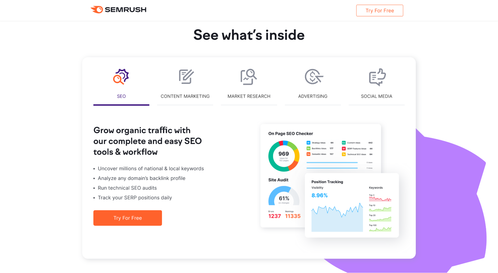
For example, Semrush uses their features as the titles of different tabs (market research, advertising, social media, SEO, etc.). Then when you hover over each tab, it expands to a section that explores the benefits of those features.
Landing page mistake #16: Stock photography
Don’t do it. Seriously.
When was the last time you landed on a web page, was met with a deluge of fake smiles, perfect poses, and generic imagery, and thought to yourself, “Wow. This company really gets me.”
Never.
If you’re using stock imagery, you’re committing landing page heresy.

Fix this landing page mistake
Delete. Delete. Delete.
Instead, opt for custom photography, images, and graphics that add context to your copy. Show your visitors what your products or services look like in the real world, and cut the out-of-context smiling people everywhere.
Custom visuals cost more and take longer, but they also give you full control over your creative.
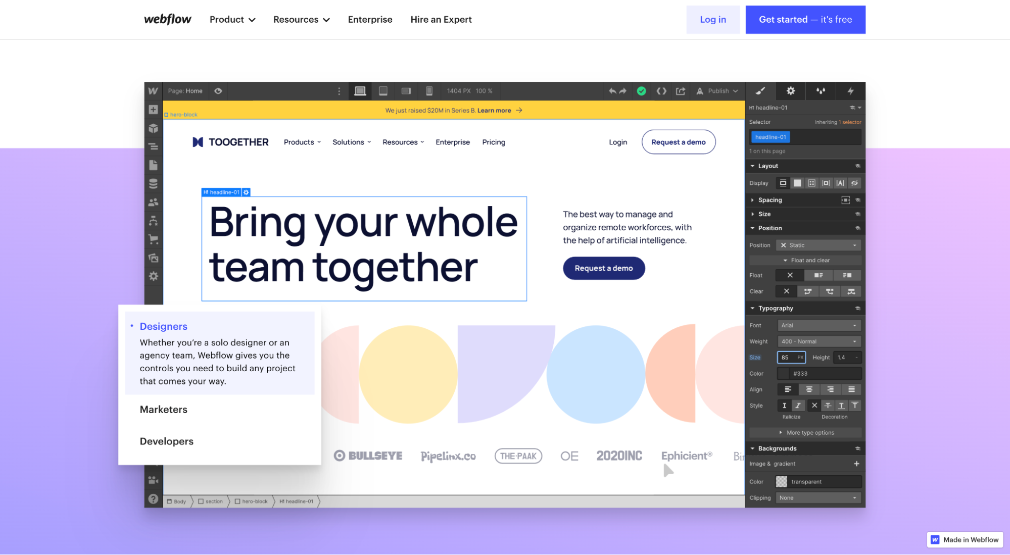
For example, notice how Webflow brings their software to life by showcasing real screenshots.
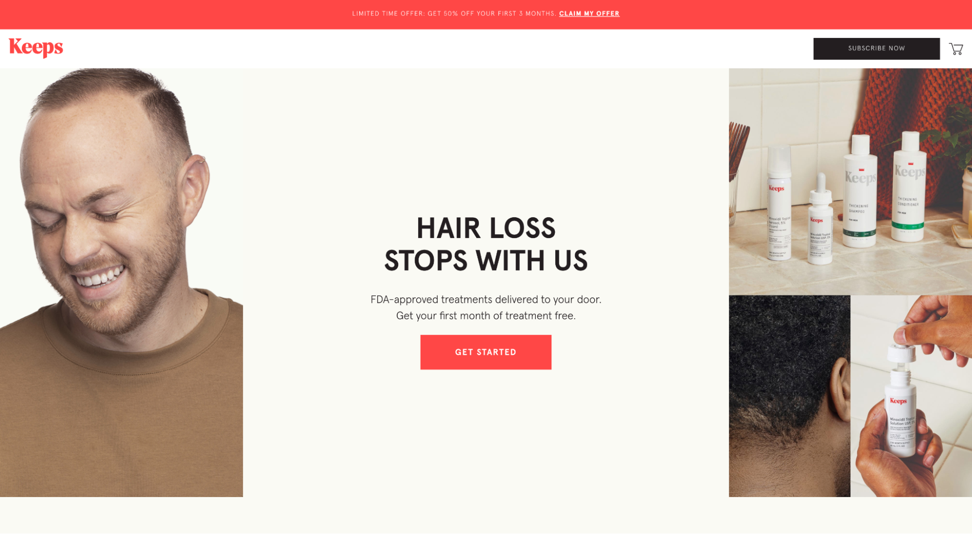
Or notice how Keeps uses real photos of real customers.
We know that stock photos are the shortcut everyone wants to take. But we can’t stress it enough: go the extra mile and opt for custom, unique, and relevant imagery.
Landing page mistake #17: A/B testing without enough data
We’re a conversion rate optimization agency, so it’s safe to say that we’ve recommended A/B split testing landing pages more than once.
But the truth remains: running an effective split test requires more than just two variants and a landing page builder.
Here’s how it usually goes wrong:
- Poor insights: Too many landing pages don’t collect data via heatmaps, session recordings, form analytics, or conversion tracking. This leads to ill-informed hypotheses about what to test.
- Poor hypotheses: Because marketers then misdiagnose the problem, their proposed solution also fails. Or worse, they rush to test arbitrary variables like button color without a real hypothesis to begin with.
- Not enough traffic: You can’t run a reliable A/B test with 200 visitors. You need volume to reach statistical significance (multivariate tests need even more volume than A/B tests). Most landing pages lack volume.
- Not enough time: You also can’t run an A/B test for one week and expect reliable results. Volume takes time, and time takes money—money (and patience) that many don’t have.
Fix this landing page mistake
For an A/B test to predict with confidence that one version of your landing page will convert higher than the other (in perpetuity), it needs a statistically significant sample size and time.
Without enough traffic or time, your data could be lying.
How many people need to see each variant? Usually in the thousands.
How will you know if you have statistical significance? We use CXL’s A/B test calculator (it does all the calculations for you). All A/B tests should shoot for a 90-95% confidence level.
Closing thoughts on landing page mistakes
We see landing page mistakes all the time.
It happens. And it’s going to happen again.
But mistakes don’t need to become habits.
So before you launch your next landing page, learn from these mistakes and ensure you’re headed down the right path.
If you need a little more direction, then head to our next article all on landing page optimization, where you can learn even more tricks of the trade.
